3D-Printed from food-grade silicone, Reusable is a collapsable, pocket-friendly cup you can carry anywhere

Recycle and Reuse have become the buzzwords today. Most materials – single-use plastic excluded – are being recycled, and some plastic items such as bottles are reused to restrict them from reaching the landfills. Plastic pollution is therefore a big menace globally that designers are trying to solve with potentially innovative ideas. In that league we came across the Reusable: a collapsable, reusable cup that is made from food-grade material and fits right in your pocket so you can carry it wherever your routine takes you.

Disposable paper cups have been around for a long time now. Not essentially made with the purpose of being reused, such cups have to reach the landfills after one time use. All right, some of these to-go cups are recyclable, but some paper cups contain a plastic or wax coating – to prevent leaks – rending their unrecyclable. This is where a solution like the Reusable makes a lot of sense, not essentially because it can be recycled at the end of life, but since it can be reused a multitude of times before it can be retired from the lifecycle.

Designer: Kalina Gotseva

The brainchild of British-designed Kalina Gotseva, the Reusable has been 3D printed from durable, food-grade silicone. Made in a unique twisted design, after thousands of iterations on paper and other materials, the Reusable is made collapsable, transforming the cup from a full-sized option to a compact form factor that allows it to fit in the pocket.

Making a silicone cup with all the intricacies to make it reusable, the cup is a direct benefit product for millions of tea and coffee drinkers around the world, whose day wouldn’t start with the pipping hot beverage picked from the driveway in a throwaway one time use cup. This scenario could change with the benefit of Reusable which you can flip out of your pocket and have your drink served to you in it.

With the foldable and reusable design, the question of safety and convenience does arise in the mind. Gotseva has taken care of every detail, starting with making the entire foldable design self-contained. For that, the designer ensured that the body of the cup folds down flat and it can then fit securely in its cap to remain intact and dust-free in your pocket/bag. The protective cap is not just the Reusable’s case, in fact it has a tested push-and-pull slider on the drinking hole, which offers leak-proof convenience, so you can carry and drink your beverage safely, at your convenience.

The Reusable despite all the nifty features has sleek aesthetics paired with an ergonomic grip and three interesting color choices to pick a cup that matches your style. Created from BPA-free silicone, the cups are colored – with food-safe options – during the injection molding process. These are available in dark blue, light aquamarine, and vibrant orange colors to choose from. I don’t know about you, but I’m waiting for the Reusable to hit the market. My pick is orange, what’s yours?

The post 3D-Printed from food-grade silicone, Reusable is a collapsable, pocket-friendly cup you can carry anywhere first appeared on Yanko Design.

Elago Game Boy style MagSafe iPhone charger looks fun but comes up short

Nostalgia is a powerful emotion, as proven by the number of successful crowdfunded projects and launched products that try to capitalize on this ongoing retro trend, especially in the gaming industry. Vintage designs of the past are today’s quirky oddities, and there are many who are quick to jump on the bandwagon. While many of these retro designs try to also recreate the experience of holding a real gaming console or turntable with some modern features and conveniences, others are just content to copy the aesthetics of old-school products and leave it at that. This MagSafe iPhone charger might be in that latter category, and while it is charming in the way it brings back fun, playful memories, it could have probably gone further if it really wanted to.

Designer: Elago

To be fair, the Elago WS M5 Charging Stand does exactly what it says it does, which is to offer a fun MagSafe charger in the design of the Nintendo Game Boy Advance SP. In that regard, it does its job well, providing a stable and useful stand for charging the phone. The fixed 30-degree angle, for example, is claimed to be perfect for watching videos or using iOS Standby Mode at night. It even has helpful support on its back to prevent the charger from tipping backward from the weight of the phone.

Elago never claimed that the stand was a functional gaming device, despite all visual indicators. It’s simply meant to inspire a trip down memory lane and nothing more. The buttons do nothing and you can’t fold the charger close like the original handheld it was based on. For a $25 MagSafe charging stand, that’s a bit disappointing. It sort of raises expectations and then dashes them quickly, making those good old days really feel more like a distant memory.

It’s also a missed opportunity for innovation and distinction. Sure, it won’t make much sense to turn it into a makeshift game controller, but having the buttons trigger some action on the phone or do anything at all is significantly better than making you feel like an idiot for expecting that a button press would actually result in something. A clamshell design would have also made this charging stand a bit more portable while relying on a kickstand mechanism to provide that same stability and support.

What this Game Boy-like MagSafe charger really accomplishes is to demonstrate the biggest benefit of this magnetic wireless charging technology. Sure, charging without cables is convenient, but its speed still leaves a lot to be desired. Instead, it’s the freedom to design a wider variety of accessories, from chargers to stands to docks, that MagSafe really shines, and this Elago WS M5, underwhelming as it might be, is just the tip of the iceberg of what’s possible.

The post Elago Game Boy style MagSafe iPhone charger looks fun but comes up short first appeared on Yanko Design.

Unlock Seamless Connectivity with a Tiny Device That Redefines Device Integration

The AURGA Viewer transforms connectivity by serving as a versatile, lightweight wireless HDMI dongle that seamlessly integrates a wide range of devices across various platforms. It combines the functionalities of a wireless video streamer, mouse, keyboard, touchscreen, and digitizer pen, extending the usability of devices far beyond their standard capabilities. This dongle supports high-definition video streaming at 1920x1080p 60Hz alongside 48K audio, ensuring a high-quality viewing and interaction experience.

Designer: AURGA Design

Click Here to Buy Now: $72 $99 (Use coupon code “YANKO” to get an additional $7 off). Hurry, deal ends in 48 hours!

Ideal for diverse applications, the AURGA Viewer can be used with computers, laptops, single-board computers like Raspberry Pi, and gaming consoles such as the PS3, PS4, PS5, Xbox Series, and Nintendo Switch. It also connects seamlessly with mini PCs, cameras, DSLRs, and TV boxes, enhancing its versatility. The device itself is incredibly portable, measuring only 79.4mm by 26mm by 11mm and weighing just 14.5 grams, making it easy to carry and use anywhere.

For Designers – Turn your tablet into a pen display for Windows 10.

For Professionals – More screen space by seamlessly extending your desktop.

For PC enthusiasts and technicians, the AURGA Viewer offers a particularly valuable solution. Typically, setting up a computer to access BIOS settings or conduct tests requires a complete setup with a monitor, keyboard, and mouse. The AURGA Viewer simplifies this process dramatically by allowing for platform-agnostic remote control with just an HDMI and USB connection—eliminating the need for a monitor or even an operating system installed on the PC. This can be a game-changer for testing PCs, bare motherboards, or any “headless” device, providing both display and control access directly from a mobile device or tablet via the AURGA app.

Amplify your Mini PC – Connect your iPad for greater computing power.

For Photographers & Videographers – A larger monitor screen to make sure your videos are perfect everytime.

A compelling use case also exists for Nintendo Switch users. The Switch operates in different performance modes—handheld and docked. In handheld mode, the display is limited to 720p, reducing visual quality to conserve battery life. However, when connected via the AURGA Viewer, the Switch can output its display to devices like PCs or tablets, allowing users to enjoy the enhanced visual quality of docked mode on a larger, more vibrant screen. This feature is useful when the TV isn’t available or when traveling, ensuring gamers still enjoy high-quality gameplay.

For Developers – Seamless coding experience with extra screen real estate.

For Gamers – Turn your mobile device into a portable gaming console.

Acting as an extension for PCs, the AURGA Viewer serves multiple purposes beyond entertainment, such as allowing a tablet or a second laptop to function as an additional screen. This element is particularly valuable for professionals looking to increase their productivity by expanding their available screen real estate. Additionally, it also allows for interactive control over the primary device using the secondary one, which includes using touch inputs or connecting peripheral devices.. This capability adds significant flexibility and efficiency to any workflow, enabling users to manage tasks and execute commands directly from their secondary screens. Whether for complex professional tasks, creative projects, or general multi-tasking, the AURGA Viewer integrates smoothly into a variety of digital environments, streamlining operations and extending the functionality of connected devices.

The device operates by connecting to devices through HDMI for video output and USB for power and peripheral connectivity. It does not require any software to be installed on the host device, making it a plug-and-play solution that’s easy to set up. The video and control signals are transmitted over a local Wi-Fi network, accessible through the AURGA app available for Windows, macOS, iOS, Android, and even Android TV with some additional setup.

The AURGA Viewer is a versatile tool that broadens the functionality of electronic setups from gaming consoles to professional workstations. As a compact device, it offers robust solutions for enhancing connectivity and streamlining the use of various devices, making it an essential addition for anyone looking to optimize their digital interactions.

Click Here to Buy Now: $72 $99 (Use coupon code “YANKO” to get an additional $7 off). Hurry, deal ends in 48 hours!

The post Unlock Seamless Connectivity with a Tiny Device That Redefines Device Integration first appeared on Yanko Design.

10 Best Accessories Designed To Be Clever Desk Hacks for Remote Workers

If you’re a remote worker who works from home or often works on the go – you do need a desk to work on. Whether it is at home, or in your favorite cafe, employees always find a comfy desk to work on. You may be typing away to glory, munching away on a snack, or simply fidgeting with a random object – you do end up spending hours on your desk. And hence, your desk must be neat, tidy, and uncluttered. Not only will this improve your work routine and productivity, but it will also help you maintain a clearer and more streamlined mindset. And, I’ve discovered that adding limited, quality, and innovative products to my desk setup can help me in achieving these goals! The desk accessories you place on your desk are an integral part of your home/corporate office. And we’ve curated a collection of ingenious desk accessories for your desk!

Altar I Keyboard

The Altar I keyboard is made from sustainable materials such as post-consumer waste-derived plastic. It has a unibody aluminum framed peripheral with both U.K. and U.S. layouts with 78 and 77 key layouts. It is the first product made from eco-friendly materials by the electronics startup Electronic Materials Office.

Why is it noteworthy?

The keycaps are made from recycled polymers and hence aren’t a threat to Planet Earth. It is created for touch typing and can be used on two devices at the same time, which is an excellent option for those who switch between their laptop and tablet.

What we like

  • Features a minimalist and crisp font
  • Made using recyclable materials

What we dislike

  • Only available in black, no other color options

2. Serenity Pen Stand

Meet the Serenity Pen Stand – a nifty and minimal little product that stores your prized pen. Pens can be lost quite easily, and this pen stand with its minimalist design and metallic hint supports your pen, allowing it to stand upright, keeping it ready for you to pick up and use!

Click Here to Buy Now: $39

Why is it noteworthy?

This pen stand offers quick and easy access to your pen at all times. It safeguards it and makes sure you never lose it. Crafted from aluminum and copper, the Serenity Pen Stand includes a well-balanced cylinder, which adds some charm to your desk.

What we like

  • Minimal and sleek design which is easy to carry around and set up

What we dislike

  • Features a small size, so you could lose the stand as well, if not handled well

3. Gravity Pen

The Gravity Pen is the perfect companion for the Serenity Pen Stand! It is a unique pen that places the center of gravity close to your fingers, ensuring that the pen is easy to hold and write with. It has a larger grip than the barrel, which facilitates a comfy and efficient hold.

Click Here to Buy Now: $45.00

Why is it noteworthy?

The pen has a faceted form which makes it quite easy to grip, creating a stable and sturdy grip. It has an ergonomic form, owing to the clever application of minimalist design principles and physics.

What we like

  • Has an ergonomic design that is easy to use and hold
  • Lightweight and sturdy body

What we dislike

  • Not available in different color options, hence there is a limited choice

4. Pen Fan

Meet the innovative Pen Fan – an innovative stationery design that is a cross between a stationery set and a Pantone shade card. The design features 8 different flat-headed sketch pens in a compact, efficient, and easy-to-carry, as well as an easy-to-use set.

Why is it noteworthy?

The various flat pens are interconnected, creating a cute little Japanese-fan-style layout that proudly showcases all 8 colors, letting you pick and choose from them. The pens are detachable, and you can easily snap on and off the pens, to create a palette that caters to you.

What we like

  • The set is portable and quite easy to carry
  • Ensures you don’t lose any of the pens

What we dislike

  • Only 8 colors to pick from. They could have added more color options

5. DESKRISK

Called DESKRISK, this collection of desk accessories is designed to protect us from the adverse effects of sitting on your desk all day long, straining our eyes and neck. This collection includes a desk clock, which reminds us to take a break from constantly staring at the screens.

Why is it noteworthy?

The second product is a lamp, which reminds you to move along with the light source, so you’re not constantly bowing down and looking at your desk. These products function as an intervention, urging you to take a much-needed break from your desk, and from working all day long.

What we like

  • Great collection for people who are at risk due to the nature of their work

What we dislike

  • The magazine rack is supposed to resemble carpal tunnel syndrome, and we’re unsure how it will help with wrist problems

6. Bookish Bookmark

Dubbed the Bookish Bookmark, this compact & convenient product is a must-have for book lovers. If you’re someone who enjoys reading a book or two on their workdesk, while completing other tasks, then you need to get your hands on this. The bookmark keeps your book open for you, and you don’t need to use something heavy to put it down.

Click Here to Buy Now: $65

Why is it noteworthy?

The bookmark is an excellent option for those who want to read while multitasking. It has a clear transparent design, and it keeps your book wide open, adding an interesting and thoughtful element to your desk.

What we like

  • Lets you display your favorite book in a neat and convenient manner
  • Lets you read while multitasking

What we dislike

  • The bookmark seems to be too big for small books, and not the best option for those who prefer simple and discreet bookmarks

7. Anywhere-Use Lamp

This compact, minimal, and simple lamp design is called the Anywhere-Use Lamp, and it is a clever lighting solution in a space where glaring screens and bright lights reign supreme. The lamp has an adorable mushroom-shaped head, which emits a soft, relaxing, and ambient glow.

Click Here to Buy Now: $149

Why is it noteworthy?

The lamp is powered by four AA batteries, and it features a modular design that offers atmospheric enhancement wherever it is placed. The lamp is equipped with six high-color rendering LEDs, and it creates an oasis of peace and relaxation in your home.

What we like

  • Features four brightness levels
  • You can easily disassemble the lamp, and take it anywhere with you

What we dislike

  • The lamp isn’t water-resistant, can be an issue if you carry it outdoors

8. Plant-Inspired Desk Accessories

These plant-inspired desk accessories try to inspire you to think about real greenery and try to create the same peaceful and calm experience you would have if an actual plant was standing on your desk. These accessories are designed to elicit emotions of tranquility and relaxation.

Why is it noteworthy?

The plant-inspired accessories are of course just excellent imitations, and not the real deal. The collection includes great products such as the Greenery Pencil Holder which includes a ‘leaf’ that functions as a container, or the Greenery Clock which is an abstract product that functions as a minimalist digital clock.

What we like

  • Lets you add some green hues to your desk

What we dislike

  • It’s a concept, so we don’t know how well it will translate into a tangible product

9. Everlasting All-Metal Pencil

Called the Everlasting All-Metal Pencil, this unique pencil includes a tip that can’t be replaced and doesn’t need to be sharpened. The pencil lets you focus less on the lead, and pay more attention to your creative process! It is an excellent alternative to traditional graphite pencils which tend to wear down soon.

Click Here to Buy Now: $19.95

Why is it noteworthy?

The Everlasting All-Metal has an octagonal shaft made from aluminum with a special alloy core. The pencil draws like a real pencil and doesn’t wear down even after many marks.

What we like

  • The pencil uses a metal core, so it wears down so slowly, that you may think it will outlive you

What we dislike

  • Not the best for people who use smudging techniques, since it doesn’t smudge

10. World Clock

If you need to keep an eye on the time always, or else you’ll end up lagging in your tasks, then you may as well purchase the World Clock. The World Clock isn’t your everyday typical desk clock, it features a unique dodecagonal shape and has only one hand on its minimalist and simple face.

Click Here to Buy Now: $49

Why is it noteworthy?

The unique form of the World Clock is thoughtfully designed, as it offers the right information about your region, while also incorporating some fun details on the time in other parts of the world. You can tell the hour with one quick glance, while a longer look will tell you which quarter of the hour it is.

What we like

  • The clock features individual markings for a city that represent a specific timezone

What we dislike

  • The  World Clock has only 12 set time zones, you miss out on the other time zones

The post 10 Best Accessories Designed To Be Clever Desk Hacks for Remote Workers first appeared on Yanko Design.

This sleek lunar wall clock adds some adventure to the ultimate space lover’s home

How many times do we look at a clock each day, whether it’s on a wall or on our wrists? Chances are, you don’t let an hour pass without looking at a watch or clock to check the time, even if it’s an ironic waste of time to do so again and again. Given that frequency, it’s essential for clock designs to not only be functional but also visually appealing, evoking a sense of calm and awe to offset the usual stress one carries when fretting over the time. Even better, clocks might even become sources of inspiration, providing not nagging reminders but gentle hints at how to live our lives to the fullest, not shackled by the tyranny of time. That’s the subtle message that this beautiful minimalist lunar-themed clock tries to convey, reminding the observer of man’s aspirations to break free of Earth’s gravity and reach for the moon and beyond.

Designer: Sora no Kakera

Click Here to Buy Now: $275 $325 (15% off at checkout & Free Shipping). Hurry, Earth Day sales end in 48 hours!

The moon has always been a thing of beauty and mystery, its pockmarked face bearing witness to the history of our celestial neighborhood as it gracefully illuminates the night sky. It is also the nearest heavenly object we can reach, and unsurprisingly, the object of many space travel achievements and fantasies. It seems only fitting that it would be the inspiration for a clock that invites you to make a trip to the moon, even if only in your head, at each moment you check the time.

Made from stainless steel finished with a mirror-like polish, this Moon Trip Clock displays the seemingly magical visage of the moon, half bathed in light and the other in darkness. Although the image of the moon is accurate, it isn’t aiming for a scientific illustration that clearly lays out the topography of the moon. Instead, it is trying to bring the otherworldly charm of the moon to your wall and your living space.

The numbers that line the edges of the metal disc look as if they’re floating rather than etched or glued to the surface. At some point, they even seem to disappear, only to reappear again at another location, mimicking the eternal waning and waxing of the moon. This visual effect is possible thanks to a special polishing technique, adding an air of mystery to the already enchanting lunar design.

And when you start to really look at the time, you will be greeted by a charming yet meaningful detail that tickles the mind into a more thoughtful state. While the hour and minute hands are simple yet elegant bars, the seconds hand has the shape of a rocket ship at its tip. You’re tempted to watch this spacecraft make its way around the clock at each tick, perhaps making you reminisce of old childhood dreams of conquering the moon and beyond like an adventurous explorer. That may just be a fantasy, but this lovely Lunar Voyage Clock reminds you not to let opportunities pass and to live your life to the fullest, shooting for the stars and making your dreams come true.

Click Here to Buy Now: $275 $325 (15% off at checkout & Free Shipping). Hurry, Earth Day sales end in 48 hours!

The post This sleek lunar wall clock adds some adventure to the ultimate space lover’s home first appeared on Yanko Design.

Nothing Ear and Ear (a) Buds Review: It’s Nothing To Scoff At

PROS:


  • Vibrant and more ergonomic Nothing Ear (a) design

  • Beautiful, eye-catching design with a competitive price tag

  • Quality audio output with plenty of convenient smart features

CONS:


  • Nothing Ear only available in Black or White options

  • Nothing Ear (a) case only has IPX2 water resistance


RATINGS:

AESTHETICS
ERGONOMICS
PERFORMANCE
SUSTAINABILITY / REPAIRABILITY
VALUE FOR MONEY

EDITOR'S QUOTE:

The Nothing Ear and Ear (a) builds on an already successful formula without straying from the brand's design identity.

It’s not unusual to see a company take a different direction after it launches a successful product or two. Improvements have to be made, of course, but there are times when upgrades turn into almost completely different products that seem to stray away from what made those successful designs successful. By renaming its earbuds to a simple “Ear” and dropping the number after it, some might think that Nothing has gone back to the drawing board to rebrand and redesign. Fortunately, there’s nothing to worry about since the new Ear and Ear (a) look almost exactly the same, so we give it a test to see, or rather hear, if its beauty is skin deep or if it’s something you’ll want to listen to.

Designer: Nothing

Aesthetics

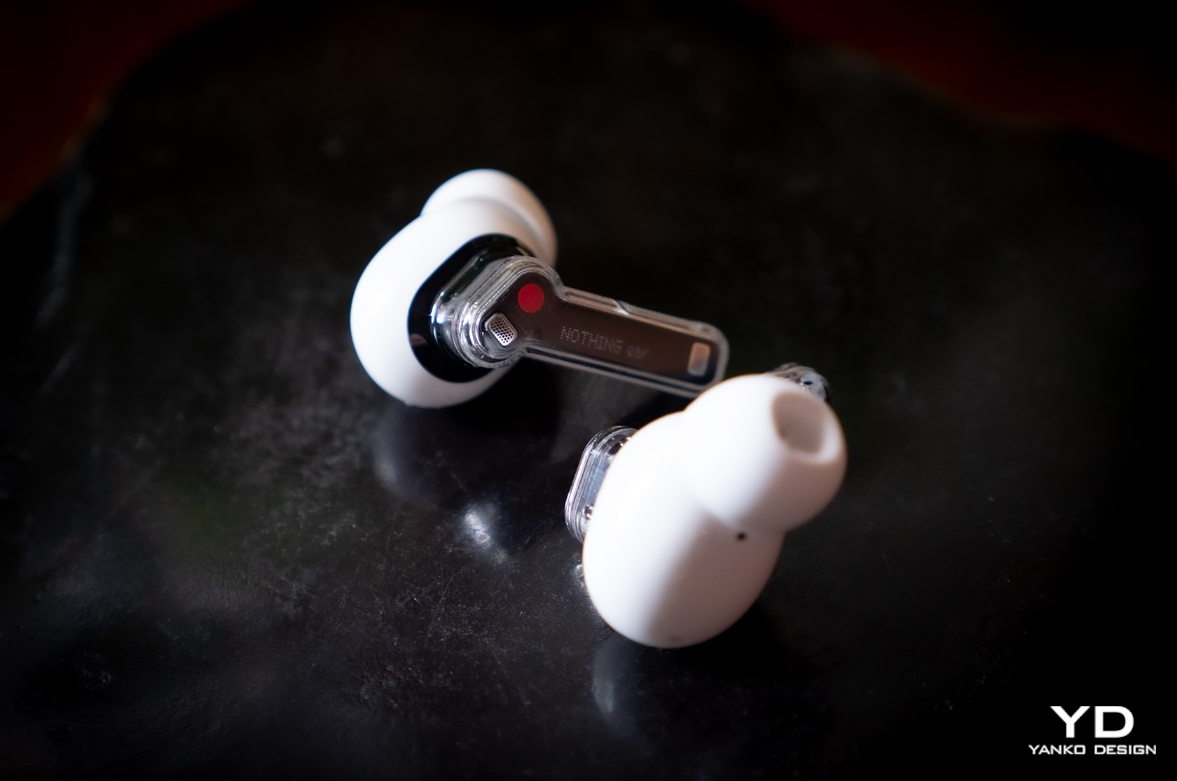
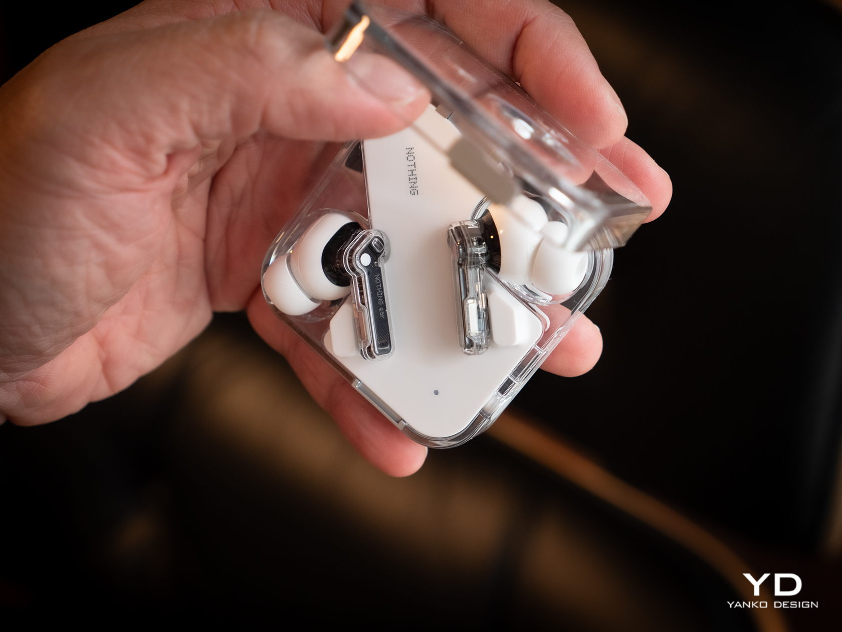
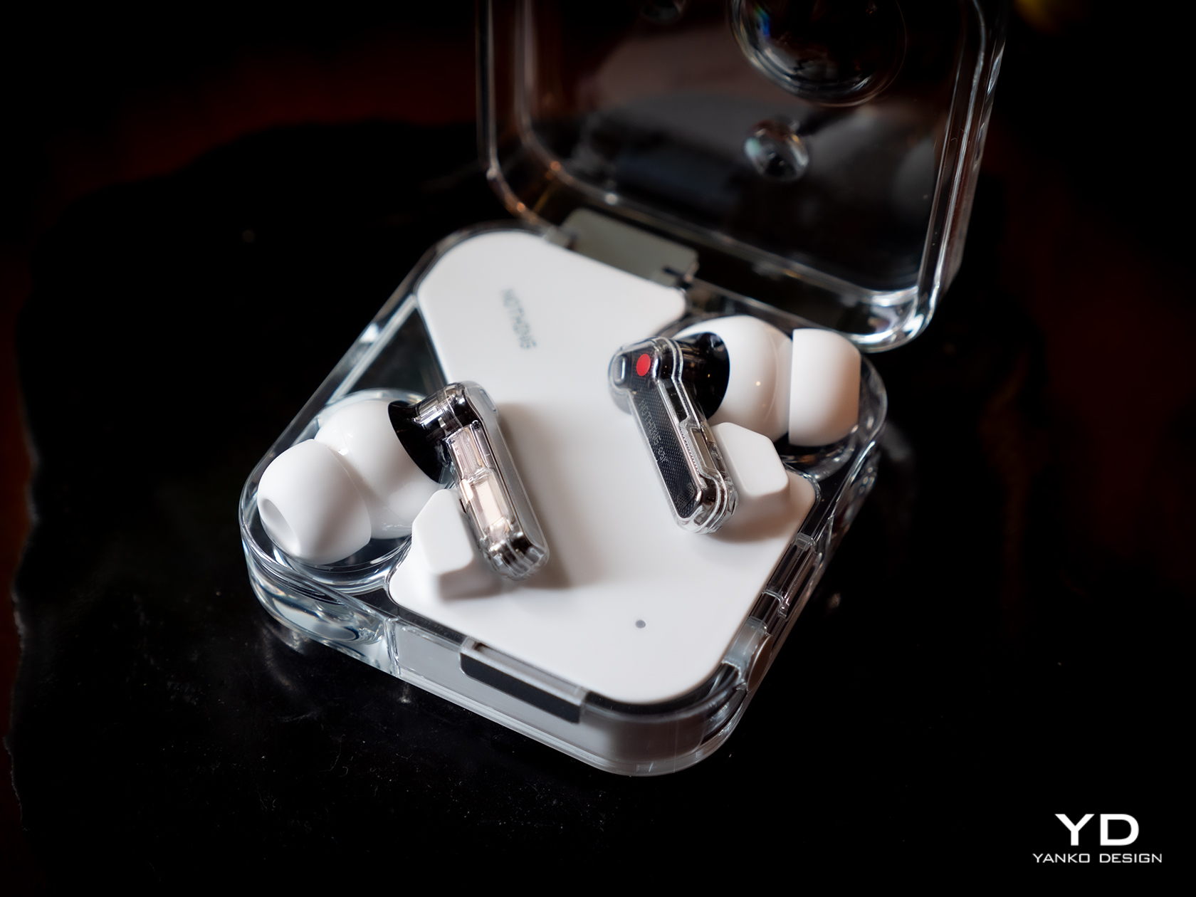
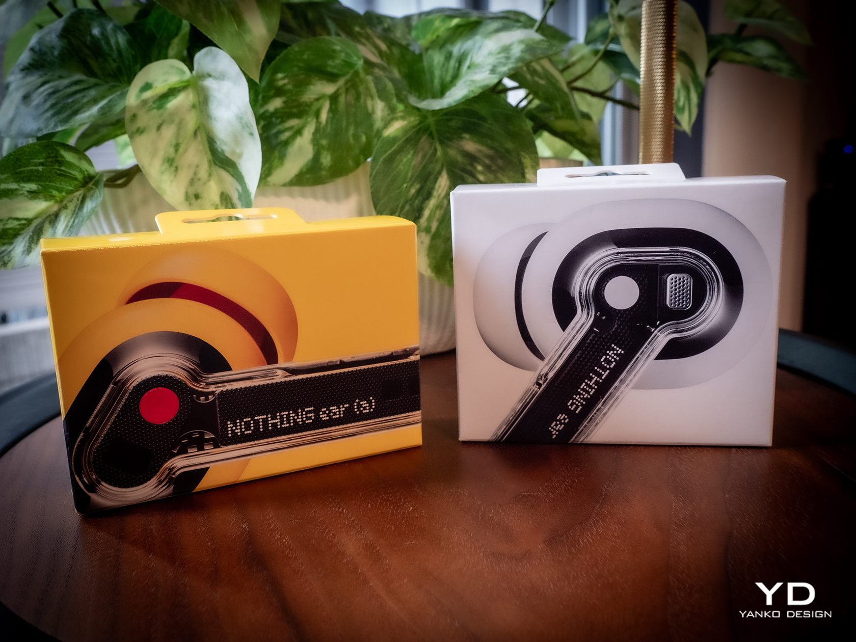
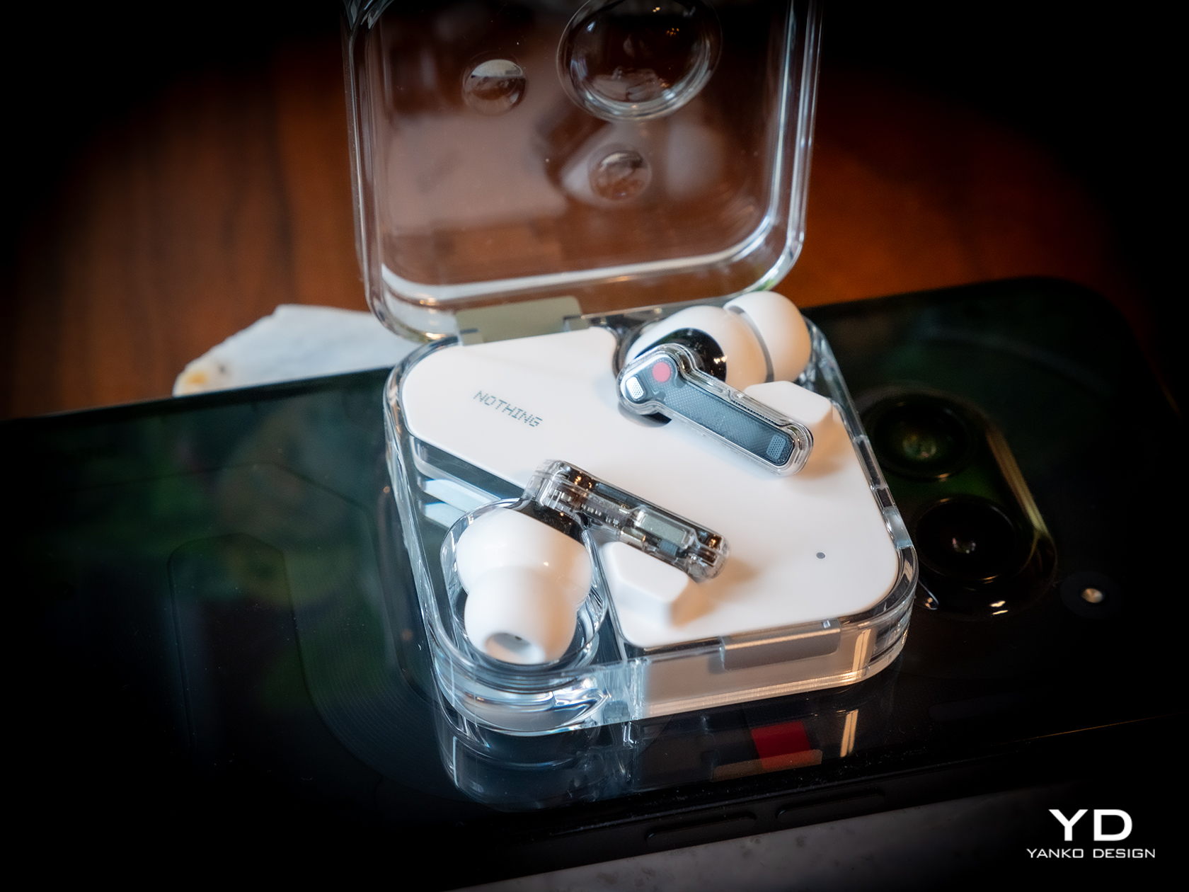
At its birth, Nothing made bold claims and used Apple-like language to describe its design philosophy, and for the most part, it has been able to prove its words. It has established a distinct aesthetic not just with the Nothing Phone at also with all iterations of its Ear wireless buds. Technically the fourth generation after two numbered Ears and one Stick, the new Ear and Ear (a) thankfully retains that transparent stem design paired with opaque buds, staying true to form and keeping what its customers love about its products.

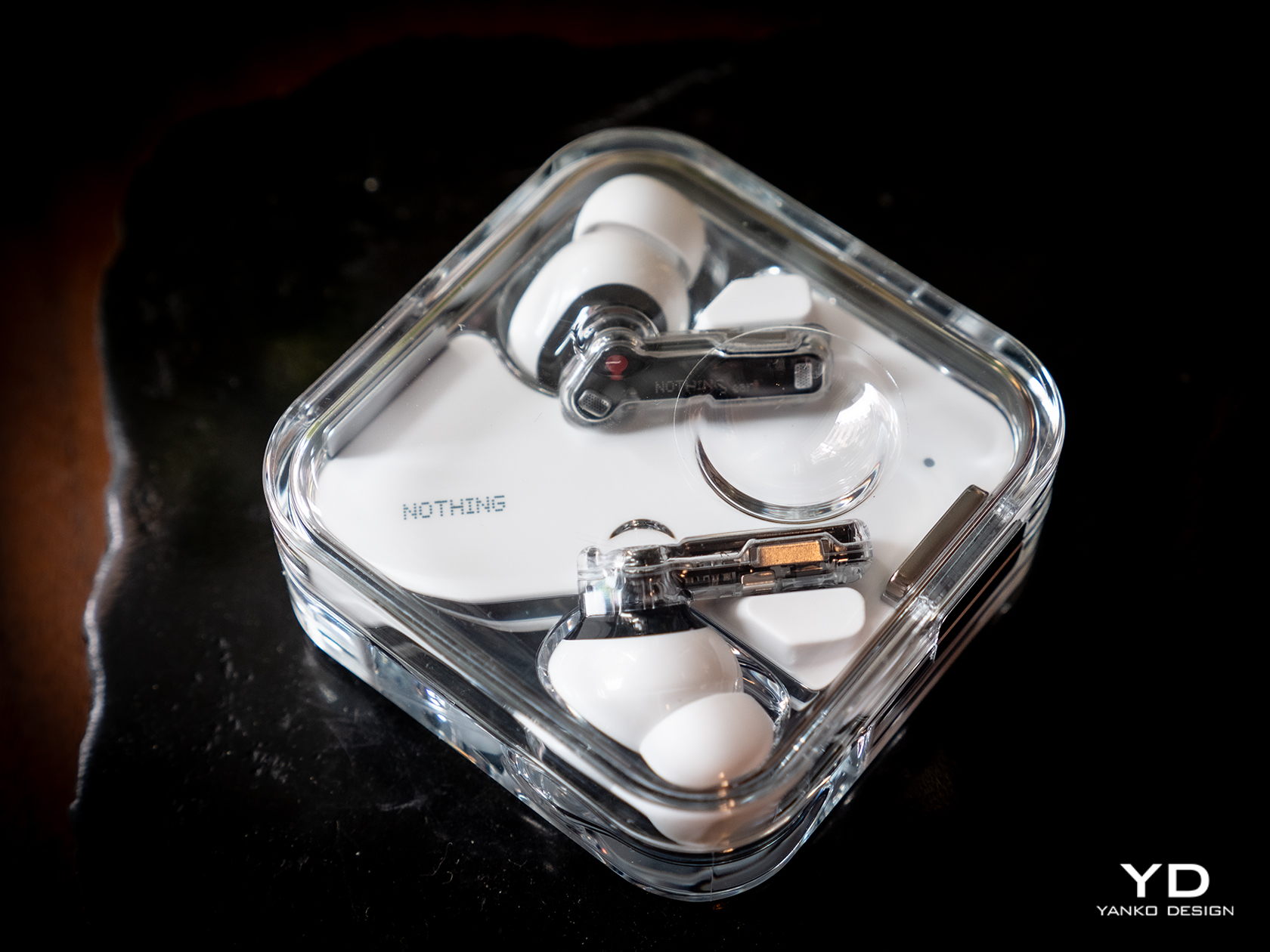
Of course, that does also mean that you won’t be able to distinguish the new Ear from the Ear (2), at least not visually. All of the changes are internal, which you can technically see because of the transparent design but not recognized. You get the upgraded experience and new features without losing the Ear’s eye-catching design, nor do you miss out on the quality materials that give the buds and its case their premium character.

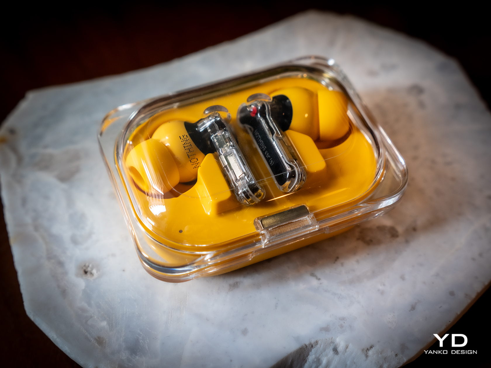
If you want something fresh, you’ll have to look at the Nothing Ear (a) instead. While the buds themselves remain the same, the case transforms into a more rectangular shape that still has a transparent cover like the regular Ear. The new case also has a few important usability improvements, which we’ll get to later. The biggest difference between the Ear and Ear (a), however, is the bright new yellow color available only for the Ear (a) model. The choice of color wasn’t simply based on a whim, as Nothing compares it to its design philosophy of transparency, stripping away unnecessary colors and leaving only the primary hues. Perhaps it’s a hint that future Ears will be available in Cyan and Magenta.

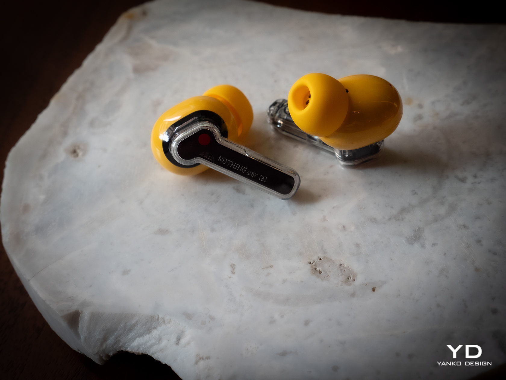
In terms of aesthetics, Nothing has thankfully stayed true to both the spirit and the application of its design philosophy. You have an elegant and minimalist earbud design that embodies transparency literally and figuratively. The Ear (a) takes that a bit further in the direction of joyful play with a bright yellow finish. It would have been great if both Ear and Ear (a) shared the same color selection, but it’s understandable that Nothing wants to target different groups with different designs while still holding true to its core design values.

Ergonomics

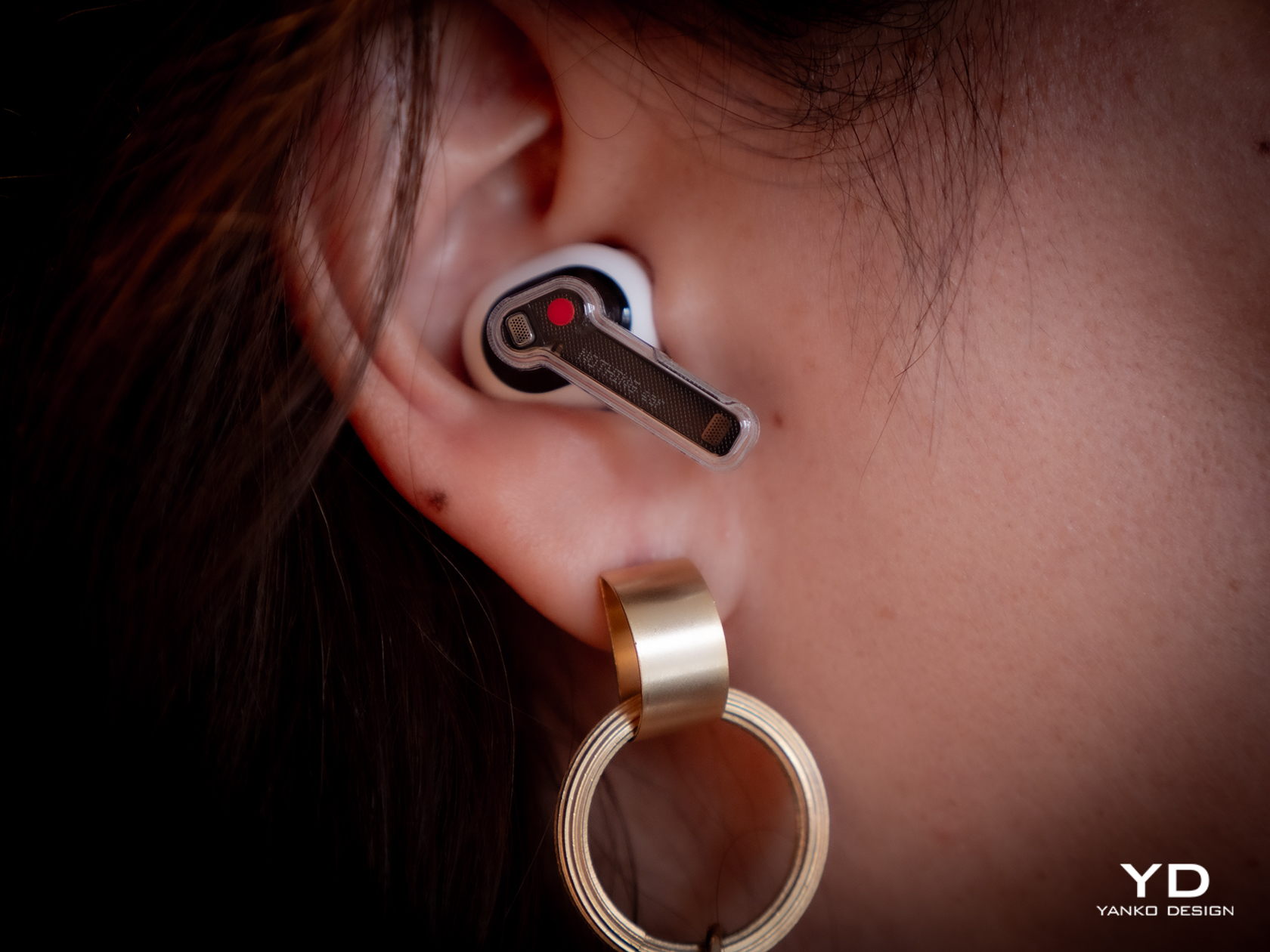
One of the benefits of sticking to a tried and tested design is that you don’t have to worry about whether it works or not. In this case, the Nothing Ear’s usability has already been proven since the first generation, so you can be sure that you will be enjoying a tight seal and a comfortable fit like others before it. That said, there will always be exceptions, especially for those with ear shapes that the included tips don’t support. Unfortunately, Nothing has yet to provide a solution to that problem, like with extra tips to fit less common ears.

Since the case of the Nothing Ear hasn’t changed in the slightest, its ergonomics remain the same as the Ear (2). You still have a compact square shape that opens up like a clamshell, complete with that odd dimple that lets you precariously use the case as a fidget toy. It almost means, however, that the new Ear’s case still bears the same shortcomings as well, which the Ear (a)’s case thankfully fixes.

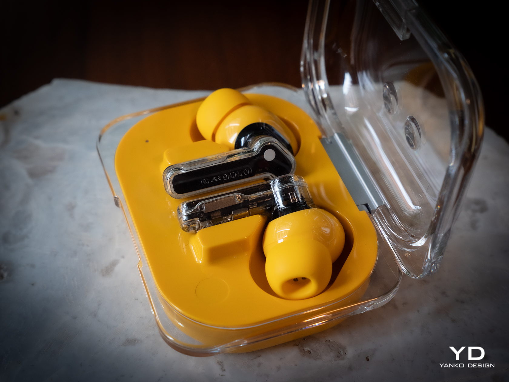
The rounded rectangular case of the Nothing Ear (a) has softer edges that make it more comfortable to hold in the hand. More importantly, however, you can clearly see its orientation so you won’t have to pause for a second to figure out which direction it opens. And unlike the Nothing Ear case, this yellow bubble-like container has markings to make it easy to see which bud goes in which slot. The red dot matches the dot of the same color on the right Ear (a) bud, while white is the color for the left bud. It’s a trivial addition but one that has a significant impact on the product’s usability.

Performance

You’ve undoubtedly come across designs that are so captivating yet fail to impress when it comes to functionality. That is fortunately not the case for the new Nothing Ear and Ear (a), and this is where the earbuds really prove to be worthy upgrades. Suffice it to say, you won’t be disappointed by the sound that you will hear, especially when you consider how much the buds cost.

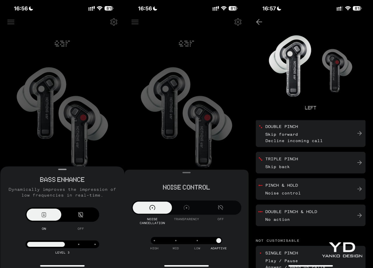
The Nothing Ear and Ear (a) both boast new 11m drivers, though the higher-end model uses a ceramic material for even better audio clarity. In practice, this means that both buds are nearly equal in terms of audio output, producing clear, bold sounds with depth, especially when you turn on the bass enhance setting on the Nothing X app. Admittedly, it’s not going to compete with premium earbuds that cost nearly twice as much, but you won’t find both Ears lacking either. You get a well-balanced audio performance that makes listening to music, especially to classical music, a joy.

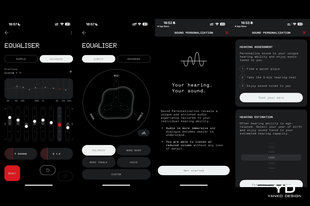
You can, of course, tweak the experience with the equalizer available in the mobile app, but the Nothing Ear does one thing more than the Ear (a). You can create a personalized sound profile by going through a series of tests so that you can be assured of the best quality possible given your ear shape and the tips you’re using. It takes the Ear’s performance to the next level, but not all people will be willing to pay the literal price for advanced features they may or may not even notice.

The good news is that, for all intents and purposes, the two new Nothing earbuds have the same feature set and perform quite similarly in that regard. Active Noise Cancellation, which has three levels of sensitivity, is quite effective, though definitely not on the same level as those more expensive brands. You can also set the app to automatically switch between ANC levels depending on the amount of ambient noise, which doesn’t always kick in immediately. There’s also a transparency mode that works in the opposite direction to let external sounds in, useful when you need to talk to someone or be aware of your surroundings.

Another trait the two share in common is dual connectivity, where you can pair the buds to two devices at the same time. They will switch between the two depending on which device is active, so you can take a call on your phone and then resume listening to music from your laptop afterward. In-ear detection is also automatic, and it will pause or resume playback when you remove and put back one or both of the buds in your ear.

Battery life is also one of the key upgrades in this generation of Nothing earbuds. The Ear can last a little over 5 hours with ANC on, while the Ear (a) somewhat ironically lasts longer over 5.5 hours in the same condition. Those figures nearly double if you turn ANC off, and the cases can charge the buds around three more times for extended use.

Sustainability

Nothing has always been a strong proponent of sustainable practices from the get-go, and the Ear and the Ear (a) thankfully don’t diverge from that path. The buds themselves might not be made from recycled materials, aside from the 100% recycled tin solder paste, but everything else about their manufacturing and packaging takes positive steps towards taking care of the environment. In addition to plastic-free packaging and carbon footprint labels, Nothing also uses renewable energy in the final assembly of the earbuds.

Given their size, the tendency to lose at least one of the pair, and their fragile designs, many earbuds have become almost disposable accessories, even if you’d cry over their price tag. The Nothing Ear and Ear (a) are thankfully built to last, though not exactly on equal footing. Both buds are IP54 dust and water-resistant, but only the Ear’s case enjoys an IP55 rating. The Ear (a), unfortunately, can only claim IPX2 water resistance, so you’ll probably be more careful that the yellow box doesn’t meet accidents.

Value

Despite the upgrades, the Nothing Ear doesn’t change its price tag from the $149 of its predecessor. The Nothing Ear (a), on the other hand, introduces a new $99 option in between the Ear and the $79 Ear (stick). Given its impressive performance and eye-catching design, those prices are quite a steal. The bigger question, however, is which of the two you should grab.

Unfortunately, things don’t seem to be in favor of the Nothing Ear. Yes, it has more features like a personal sound profile, a slightly better audio quality, and a more durable case, but not all of these will be deal breakers. In contrast, the Ear (a) offers comparable performance, a slightly longer battery life, a more ergonomic case, and a new yellow color option in addition to the typical white and black, all for a $50 lower price tag. There is a chance that the majority of buyers will prefer the Nothing Ear (a), especially the yellow option, but more discerning audiophiles won’t go wrong with the higher-end Nothing Ear.

Verdict

At first glance, the Nothing Ear seems like a simple rehash of an old design. It does, however, invite us to look deeper to go beyond what the eyes can see, and the product’s transparency is exactly a metaphor for that mindset. It brings together a familiar, stylish design and quality performance without extraneous features that distract you from the essentials. Best of all, it doesn’t even ask for more despite the noticeable improvements in the overall experience.

The Nothing Ear (a) sends a slightly different message with its vibrant color and more playful shape. It still clearly has Nothing’s design DNA but mixes it up with a fun identity that doesn’t skimp on the important bits. It says that you don’t have to go overboard, both in features and in price, to have a good time, and both the Ear and Ear (a) offer a delightful design that not only gets the basics right but goes above and beyond for a truly memorable experience each time you put them on.

The post Nothing Ear and Ear (a) Buds Review: It’s Nothing To Scoff At first appeared on Yanko Design.

ASUS ROG Mjolnir solar power station is shockingly real, but is it worthy?

One of the worst days to announce or tease a new product is April 1st. Most people already presume that the majority of “news” going out that day is a hoax, especially if it’s about something outlandish or unbelievable. Then again, it might also be the best time to get as much attention, even if it means being doubted until the product actually lands on store shelves. That’s the kind of situation that ASUS’ Republic of Gamers created when it teased one of the weirdest-looking yet also most interesting portable power stations to grace the industry, only to reveal that, no, it is no April Fool’s joke. But is this Mjolnir-lookalike worthy to be wielded by gamers and enthusiasts or is it just a dastardly plot by Loki to have a laugh at everyone’s expense?

Designer: ASUS ROG

Myeu-muh? What’s a Myeu-muh?

Even if you’re not a comics or movie buff, you’re most likely to already be familiar with the icons of Marvel’s Cinematic Universe given the media over-saturation. This is especially true for the most popular icons and their paraphernalia, such as Captain America’s shield, Iron Man’s mask, and Thor’s hammer. That hammer has a formal name, even in the original Norse mythology, though few will probably be able to utter Mjolnir’s properly unless they watched the first Thor film. It’s MYOL-neer or MYOL-nur, by the way. You’re welcome.

That hammer is the subject of today’s speculation. On the 1st of April, probably one of the trickster god Loki’s favorite days, ASUS’ gaming brand teased and then announced Mjolnir, not as a weapon but as an electrifying computer accessory. It’s a power station that indeed resembled the movie prop to some extent, with a large rectangular box whose sides tapers a bit, and a rod extending from the body acting as a handle. ROG was quick to point out that it’s a real thing, not a hoax, but that in itself could be the joke. But maybe it would have been better if it remained hidden from mortal hands.

What We Know So Far

To be fair, there’s not much we know other than what ROG itself has revealed, but there’s quite a bit already available. The most important is that this power station can be charged using solar energy, drawing power from the sun instead of lightning. How it does that, however, is still anyone’s guess. The teaser showed a dark rectangle on the station’s front that could be a tilting solar panel, though that would be too small to supply the power that this large box needs and was probably just a placeholder graphic.

On the front, you will see an assortment of ports typically found on power stations. There are four AC outlets, two full-sized USB-A ports, and two USB-C ports. There’s an LCD display above these ports that shows important information about the input, output, and remaining battery capacity. Noticeably missing here, however, are DC and car charging ports, which hints that this power station might not have outdoor adventures in mind.

The teaser also mentions that the ROG Mjolnir can illuminate your path with the light it summons, but it unsurprisingly doesn’t say how. That panel on the back could be a very bright flood light, but the better theory is that the handle itself is some sort of lighting component. Either the handle lights up or, more likely, it’s a removable flashlight, which is a better design for a part that would otherwise simply be a cosmetic detail that gets in the way.

Cracks in the Hammer

There’s no denying that the ROG Mjolnir has an interesting design, one that will appeal to a large segment of the market, especially the brand’s gaming audience. Its upturned hammer shape sets it apart from other portable power stations, if the ROG branding doesn’t already make sure of that. The bigger question, however, is whether that design is actually good for the product’s usability or hinders it.

That handle is going to be the biggest point of contention, with a tall rod sticking out from the top of the box. If it acts as a removable flashlight, then it’s not as big of an issue. But if it’s permanently fixed in that position, it will become a problem when storing or moving the power station. It’s not like you can carry the Mjolnir using its handle for real. But if that handle were removable, it also introduces a different kind of problem, one of durability and reliability. There’ll be a hole where the handle connects to the body, which means an opportunity for dust and liquid to get into the sensitive electronics. Definitely not a smart design.

It doesn’t look like the power station is designed for easy carrying either. Depending on how much battery it’s packing inside, this power station can end up being a bit heavy to carry with one hand without a handle. You’d have to hold it with both hands, but there doesn’t seem to be any grips to make that convenient. Admittedly, it doesn’t look too big beside a smartphone, but that’s just a render that might not reflect the product’s actual size.

True Power

There’s admittedly not much we know about the ROG Mjolnir Solar Power Station yet, including its specs, its price, and whether it’s really an actual product or ROG has just been pulling our leg and chuckling at the buzz going around their vaporware. Then again, it’s a pretty niche design as far as a power station is concerned, anyway, and there are plenty of other options in the market, albeit with less sensational aesthetics.

When it comes to solar portable power stations, the BLUETTI AC2A comes with all the bells and whistles, including proven product quality and durability. There are only two AC outlets, yes, but it makes up for it with a wider variety of input and output ports. You will need to plug in a solar panel, but that might also be the case for the ROG Mjolnir anyway. The BLUETTI AC2A is indeed designed more for outdoor use, though it can be an emergency backup for computers at home as well. As far as we know, the ROG Mjolnir is primarily designed to serve gamers’ needs, with rather questionable outdoor survivability.

Designer: BLUETTI

Is the ROG Mjolnir Power Station going to sell? It will probably have a few fans, especially those who will readily throw money at cool-looking and unique designs. It is going to be a practical and usable product? It’s definitely too early to say, and ROG might still end up surprising us, or completely disappointing us with the harsh reality of a month-long joke. Either way, we don’t expect the ROG Mjolnir to be a ground-breaking new design beyond its unique aesthetics, and if you’re looking for truly gamer-ready power solutions, you don’t have to wait for the truth to be revealed.

The post ASUS ROG Mjolnir solar power station is shockingly real, but is it worthy? first appeared on Yanko Design.

First Time Using the Apple Vision Pro: It Blew My Mind

From the moment I set my eyes on the Apple Vision Pro, the intuitive nature of its interface struck me. Controlling the device through natural gestures—like tapping fingers together for selection or pinching to zoom—felt like an extension of my own movements, creating a seamless user experience that was truly impressive. “Everything’s all eye track,” I marveled, amazed by the device’s responsiveness, which made every interaction feel intuitive and natural.

Designer: Apple

During the initial setup, the Digital Crown—borrowed from the Apple Watch—brought up the home view with a simple press. The blend of futuristic technology with familiar elements made the icons react as I looked at them, creating a magical experience. This immediate and responsive engagement reinforced the intuitive nature of the user interface. As I explored this advanced technology, I remember thinking, “I haven’t read any reviews on the Vision Pro, and that’s a good thing.” Approaching the device without any preconceptions allowed me to truly immerse myself in the experience.

As I navigated through a demo photo library, the ambient lighting dimmed, focusing my attention on images that transported me to places like Iceland and the Oregon coast, displayed panoramically. “That was so amazing,” I exclaimed, overwhelmed by the vividness and the immersive experience the photos provided.

Viewing spatial photos and videos added incredible depth to everyday moments. Watching a family birthday party captured with the Apple Vision Pro felt as if I stood among the celebrating children, bringing these moments to life. “So no one else can see this except you and me, huh?” I remarked to Avnish, my guide through this journey, who was able to see what I saw through an iPad. This added layer of interaction enhanced my appreciation for the technology as I watched a spatial video shot with the iPhone 15 Pro, captivated by the depth and realism.

The design of the Apple Vision Pro was notably sleek and modern, with a lightweight, comfortable frame suitable for extended wear. The minimal physical buttons enhanced its streamlined appearance, highlighting its advanced gesture and eye-tracking capabilities. A dedicated button for capturing spatial photos and videos added real-world interactions into vivid digital clarity, showcasing Apple’s meticulous attention to hardware design.

Manipulating my environment with a turn of the Digital Crown was particularly impressive. I could adjust my immersion levels from partial to full, exploring digital renditions of places like Mount Hood National Forest as if I were truly there. This smooth transition back to reality, while remaining connected with those around me, showcased the device’s seamless integration into personal and social settings.

Spatial multitasking introduced a new way to interact with applications, allowing me to manipulate windows in a spatial context as if handling physical objects. This dynamic, intuitive approach transformed traditional interfaces into a vibrant, three-dimensional workspace.

The entertainment capabilities of the Apple Vision Pro were striking. Watching 3D movies like “Super Mario Bros. Movie” and “Avatar: The Way of Water” transformed any space into a personal cinema. The high-resolution display and spatial audio created a viewing experience that far surpassed traditional setups. “That’s impressive,” I remarked, blown away by the depth and immersion of the features.

The Apple Immersive Video demo was a highlight, transporting me to the center of the action—flying over landscapes, diving with sharks, and standing on a soccer field. This segment was so engaging that I was left nearly speechless, managing only to say, “That was so amazing.”

An interactive session where a butterfly landed on my hand and a close encounter with a dinosaur showcased the Apple Vision Pro’s unique capabilities, blurring the lines between digital and physical realities. These experiences felt real and tangible, enhancing my appreciation for the device’s ability to create such vivid and interactive moments.

Finally, with the Apple Vision Pro, I got the chance to rehearse—well, more like pretend—to present Apple’s infamous “one more thing” on the stage of the Steve Jobs Theater. It felt so real that I almost waved to the nonexistent crowd! I’ve been to press events there before, but never on stage. The closest I’ve gotten was the last third of the theater.

Photo credit: YouTuber MKBHD demonstrates Keynote on Vision ProMKBHD on YouTube

After the demo—and yes, I highly encourage anyone and everyone remotely interested in spatial computing to visit your local Apple store—I had the option to purchase a brand new Vision Pro constructed right there. The Solo Knit Band, Dual Loop Band, and importantly, the Light Seal are available in size 21W, which fits me perfectly. Apple has streamlined the sizing process in the Apple Store app, which now includes a 3D scan of the face for a customized fit, guiding you through capturing the necessary facial dimensions.

The Apple Vision Pro demo was a breathtaking introduction to futuristic technology that felt straight out of science fiction. Its intuitive interface and gesture controls impressed me immediately, making every interaction feel natural and fluid. While the immersive experience of exploring vibrant, distant locales and engaging with life-like spatial videos was captivating, the demo ended too soon, leaving me eager for a more extended, immersive exploration with the Vision Pro. I’m looking forward to delving deeper into its potential in a longer session.

The post First Time Using the Apple Vision Pro: It Blew My Mind first appeared on Yanko Design.

Reviving Elegance in Design – The Porsche Pepita Edition by Vitra Blends Classic and Modern Mastery

The Porsche Pepita Edition by Vitra represents a masterful integration of automotive heritage and contemporary design, where each piece fulfills a functional role and also carries a legacy of innovation and timeless design as it finds a place in homes and offices. Vitra’s limited release of iconic chairs, such as the ‘Eames Plastic Side Chair,’ ‘ID Trim L,’ and ‘Petit Repos,’ show the synergy between traditional craftsmanship and modern aesthetics. This houndstooth pattern, a long-standing feature in Porsche interiors since 1965, symbolizes a tradition of exceptional craftsmanship and aesthetic finesse.

Designer: Porsche x Vitra Collab

First introduced in the interiors of Porsche vehicles in the 1960s, the Pepita fabric is a distinctive duotone checkered pattern that resembles abstract four-pointed shapes. It is often rendered in black and white, though it can be incorporated through a specific weaving process that interlaces two contrasting colors to create a visually striking and uniquely recognizable broken check pattern. Pepita fabric has become synonymous with high quality and sophisticated taste.

Initially featured as upholstery in the iconic Porsche 911 models, the rarity of Pepita fabric has increased as fewer manufacturers choose to undertake the labor-intensive production of true houndstooth weaves. This scarcity has made genuine Pepita a coveted element in both the automotive and interior design sectors. Vitra’s reintroduction of this fabric through limited edition pieces revives a classic style and maintains its exclusivity, making it highly treasured among collectors. The combination of its limited availability, storied heritage, and intricate aesthetics solidifies Pepita fabric’s status as a rare and distinctive feature across design and automotive history.

In the 1960s, the introduction of the iconic 911, launched in 1963, exemplified Porsche’s commitment to combining performance with sophisticated comfort. The interior design focused on functionality and luxury, resonating with discerning customers through the use of durable and tactile materials like leather and the stylish Pepita fabric for seat coverings. The clean and driver-oriented dashboard design emphasized ease of use and clear visibility of essential instruments, with the tachometer centrally positioned to align with Porsche’s performance-driven philosophy. Subdued color schemes of blacks, greys, and browns dominated, though brighter colors were also available, reflecting personal preferences and the vibrant styles of the 60s.

The unveiling at the ‘The Art of Dreams’ event in Milan highlights the seamless integration of innovation and design excellence between Vitra and Porsche. The collection prioritizes exclusivity, mirroring significant Porsche models and milestones, such as the ‘Eames Plastic Side Chair Pepita Edition’, limited to 1,963 pieces to commemorate the year Porsche introduced the Pepita option in its 911 model. These chairs are more than functional items; they are collector’s pieces that echo the narratives of their creators and pivotal moments in both design and automotive history, celebrating a rich heritage and the evolution of design.

The post Reviving Elegance in Design – The Porsche Pepita Edition by Vitra Blends Classic and Modern Mastery first appeared on Yanko Design.