Ultrasonic cleaner concept masquerades as a beautiful piece of sculptural art

We have recently become a bit more concerned not only about the air that we breathe but also about the objects we touch or put on our faces. In addition to air purifiers, there has been a rise in all sorts of sanitizing devices, from those using UV-C light to other less common methods like ultrasonic washers for glasses. What binds all these machines together is how they look like machines, things that would stand out and look out of place in a living room or an art gallery. These boxes and towers don’t really have to be designed that way, only that it’s the most common and, therefore, cheapest manufacturing option. Fortunately, the trend seems to be changing, and there have been a few more aesthetic redesigns of these sanitation devices, such as this ultrasonic cleaner that could easily be mistaken as an artistic pot among other decorative pieces in a room.

Designers: Sohee Park, Deric Jeon (above.studio)

Granted, an ultrasonic cleaner is not exactly a common household appliance even today, but they serve an important purpose in some locations, particularly those that may deal with bacteria or dirt that could be harmful not only to health but also to other objects within that space. That includes laboratories, museums, and art galleries where your accessories could accumulate dirt or microorganisms that, when transferred, could damage equipment or get people sick.

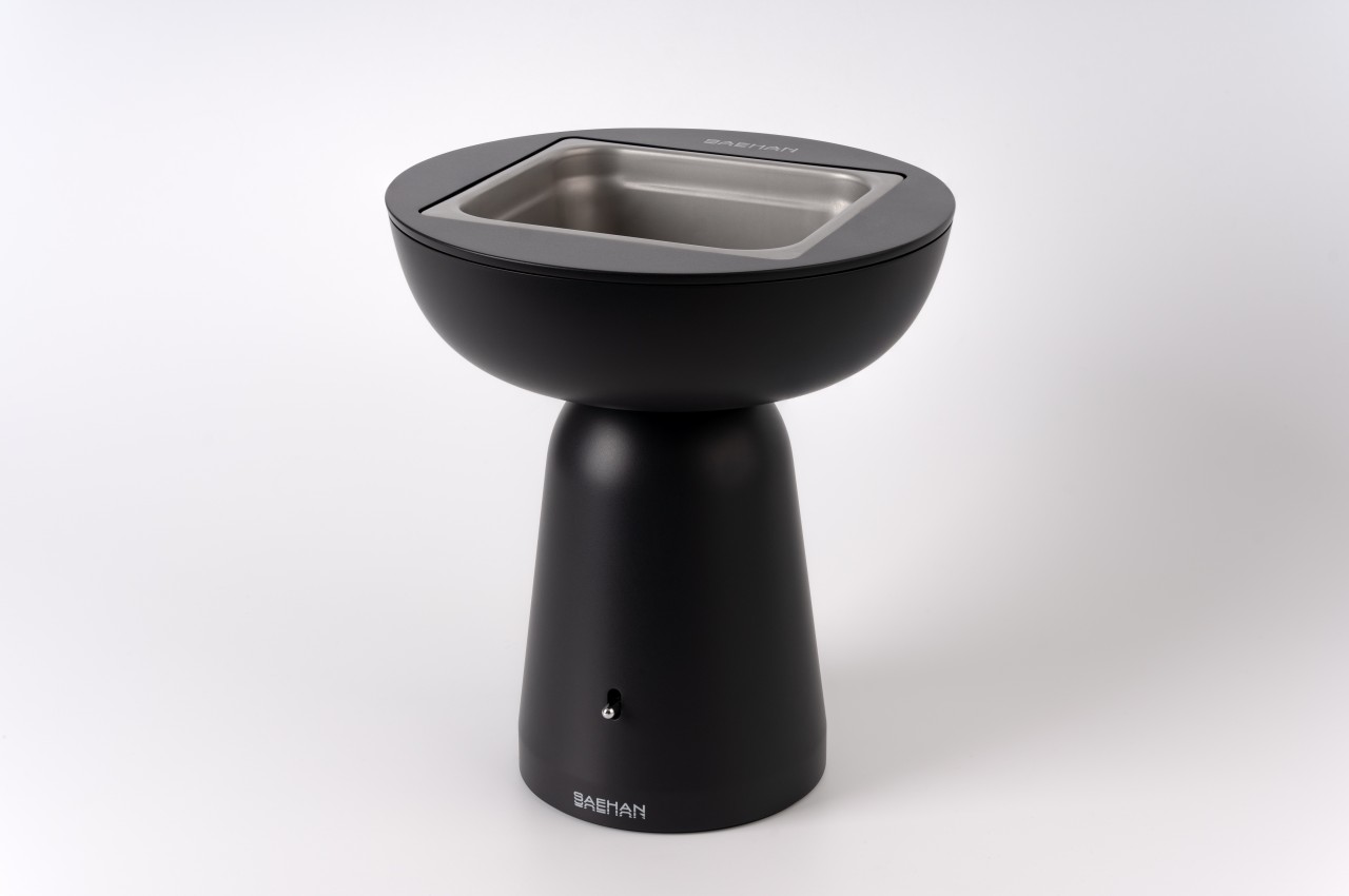
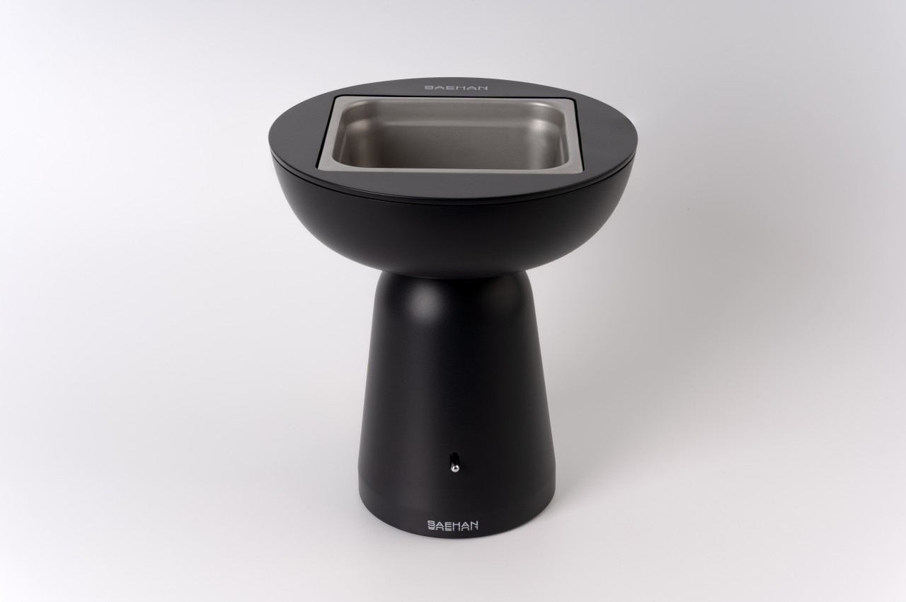
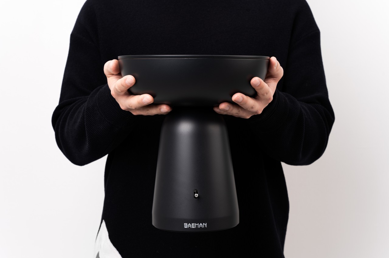
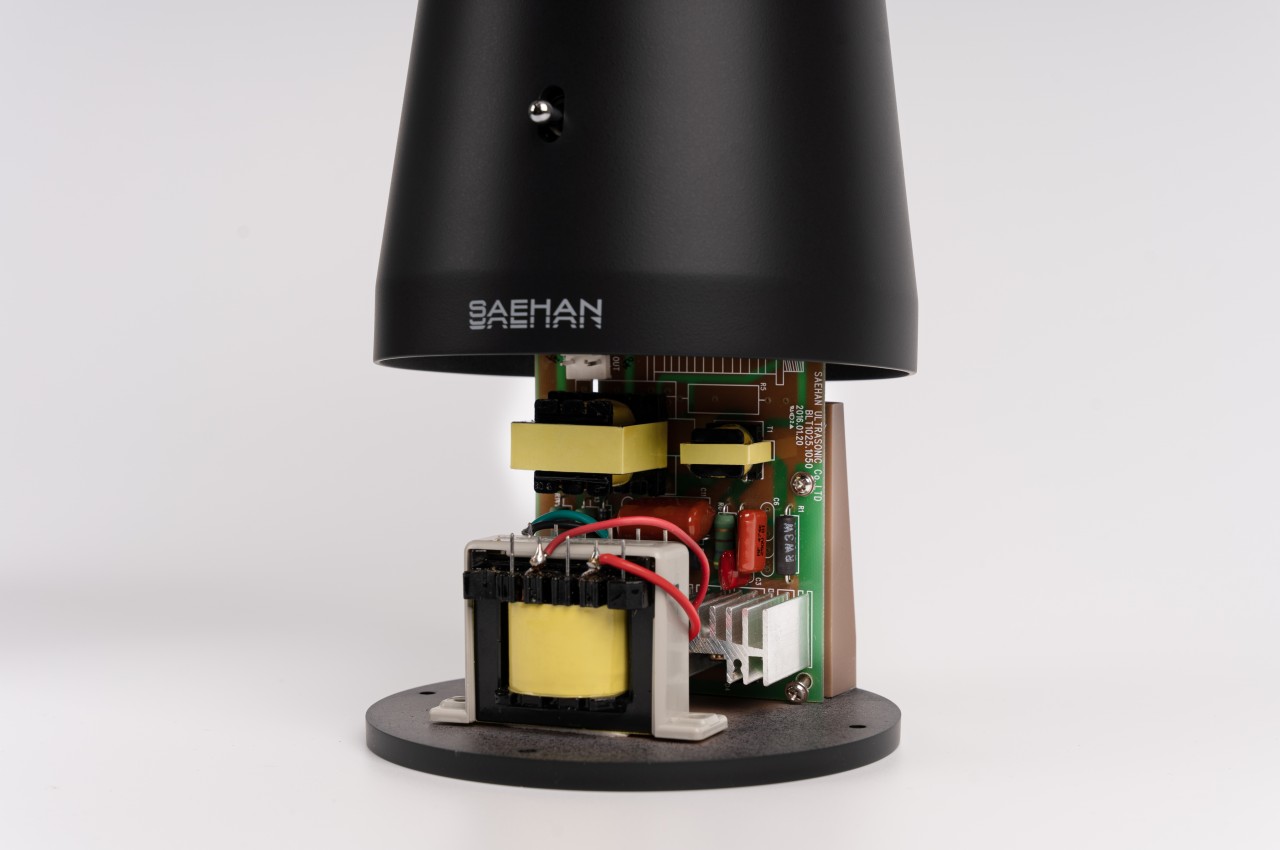
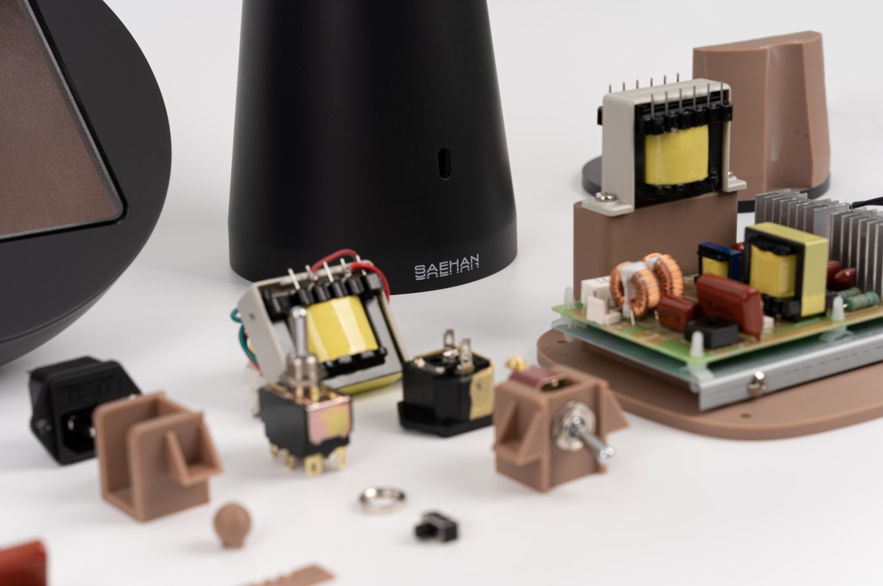
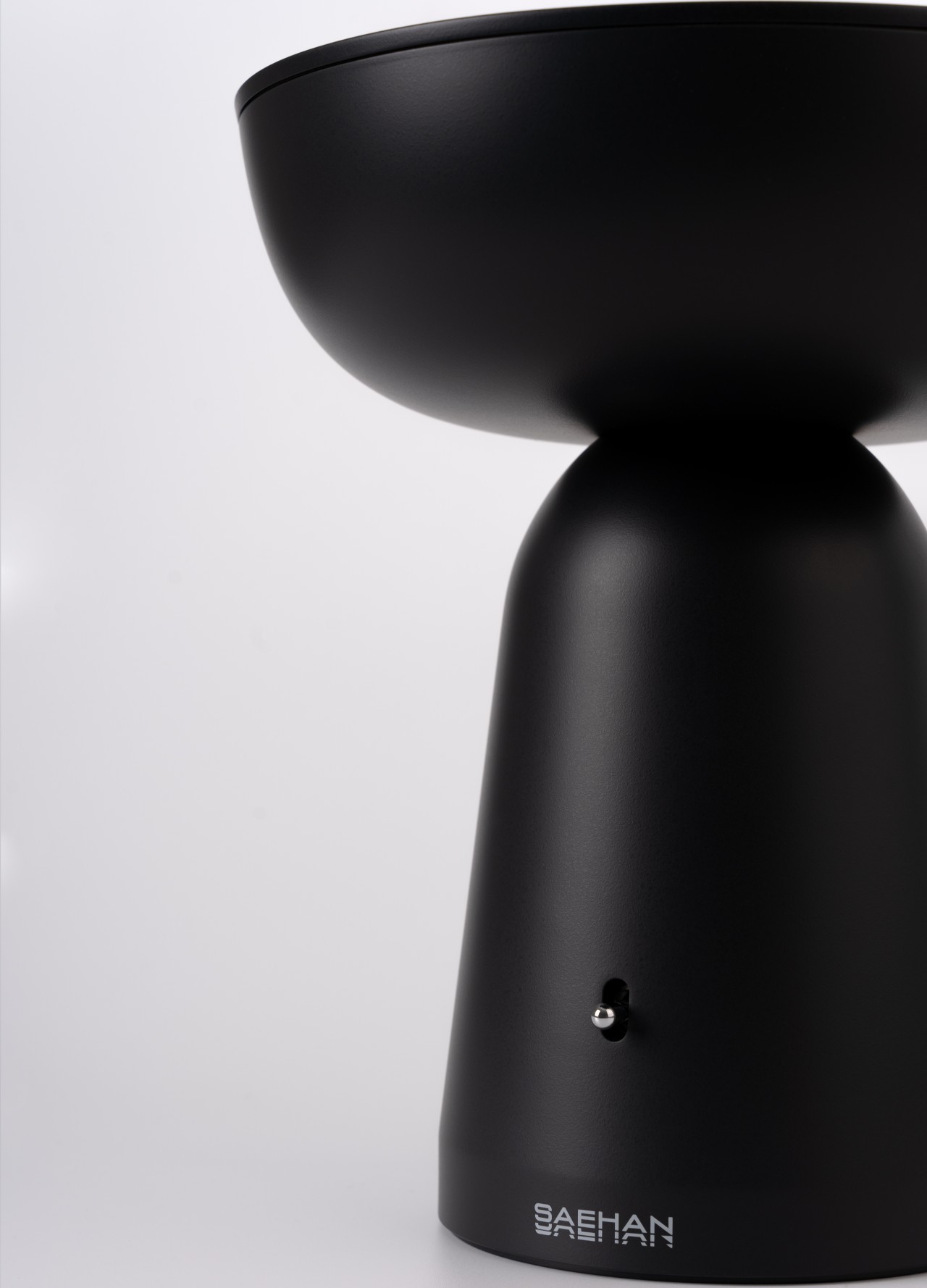
Ultrasonic cleaners fire off high-frequency sound waves through the liquid to scrub immersed objects, such as eyeglasses, without physically touching them to reduce the risk of damaging the objects themselves. These machines often come as uninspiring and very technical boxes with a small metallic basin embedded at the top. It’s the most convenient design for such a machine, but with today’s technologies, designs don’t have to be that limited, which is what this redesign concept tries to accomplish.

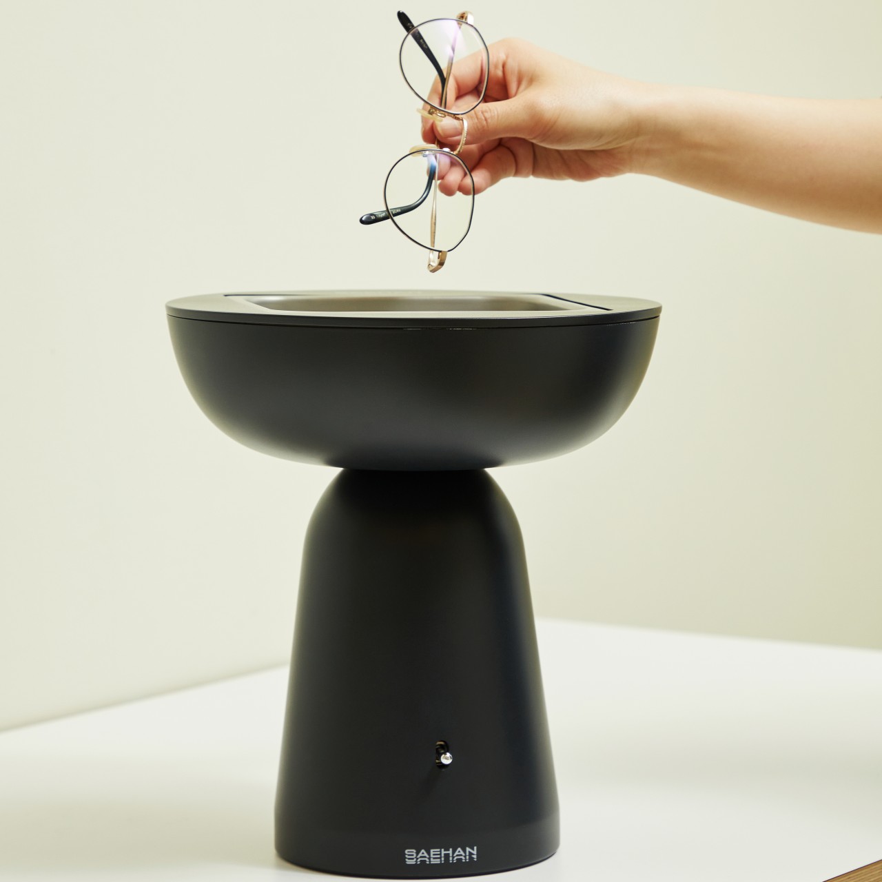
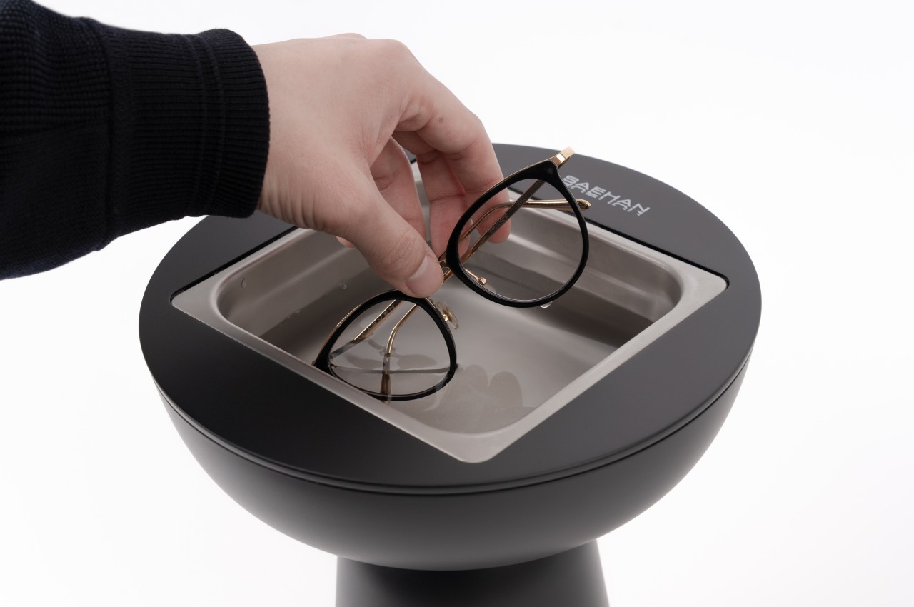
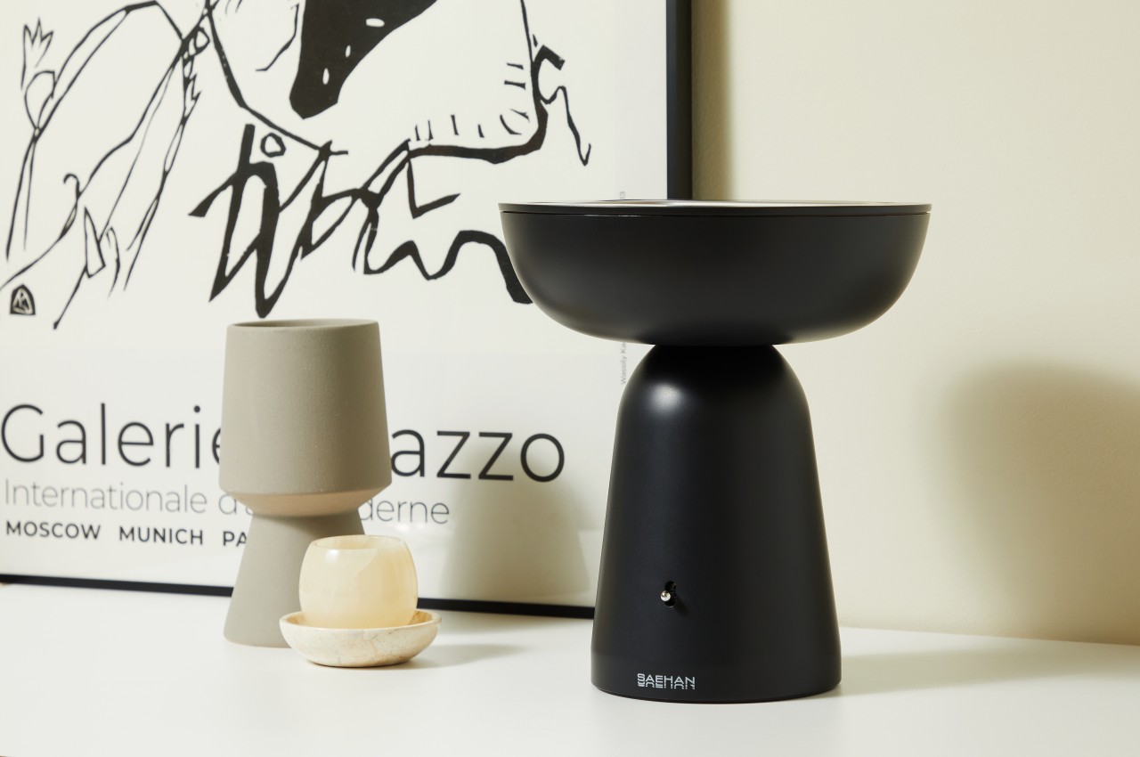
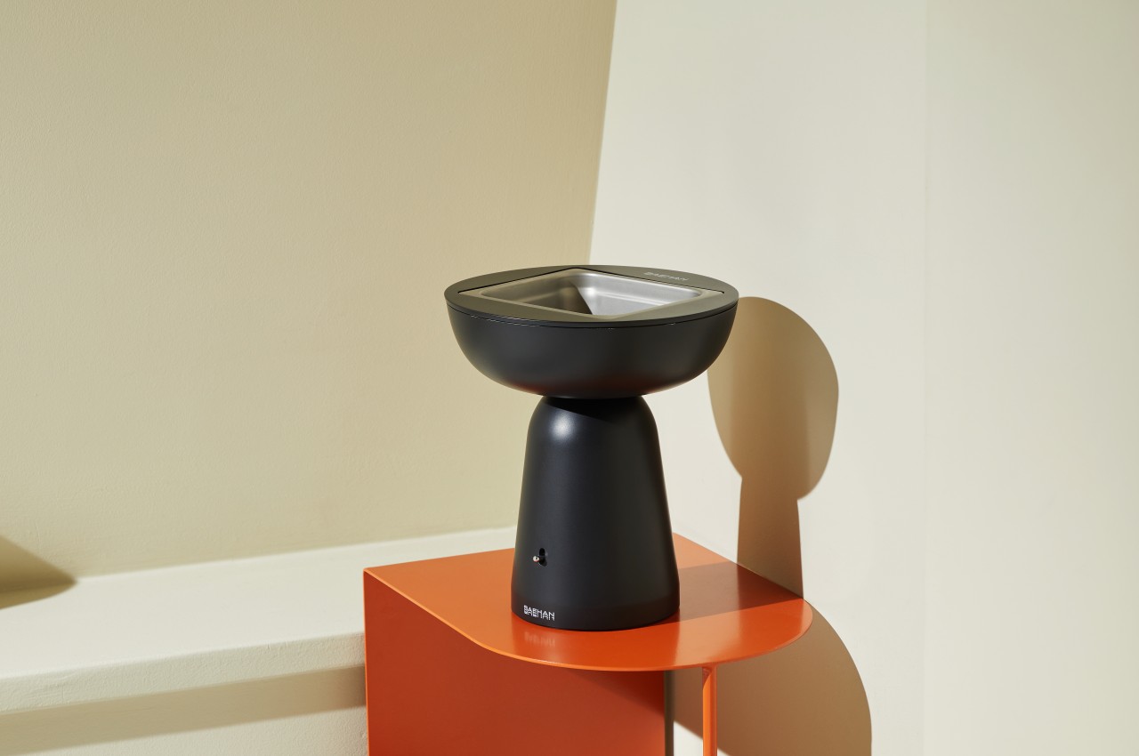
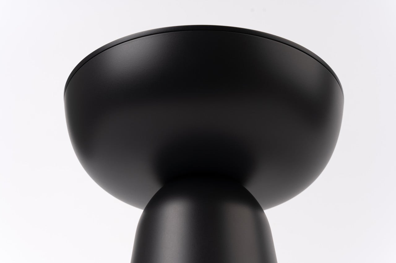
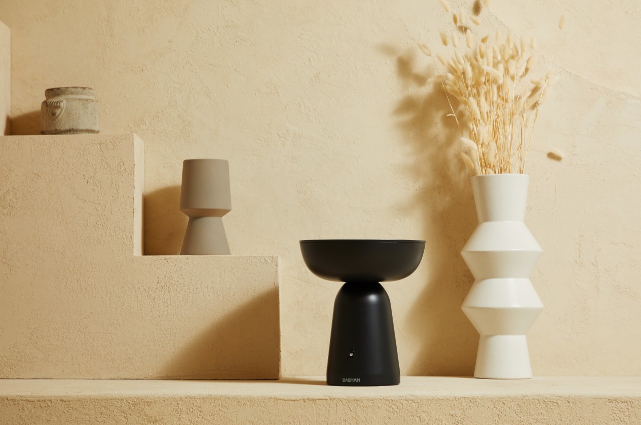
The metal tray that holds the cleaning liquid and objects to be cleaned is still there, but it’s now embedded in a bowl-like structure that better signifies its purpose, which is to hold something potentially important and precious. And instead of a clunky metal box with knobs and switches, this black bowl sits on top of a paraboloid structure that serves as its base, creating a shape that almost looks like a large goblet that is smooth and almost devoid of details. Standing beside vases and decorations, this ultrasonic cleaner would look very much at home, disguising its true nature and purpose until it’s actually needed.

The redesign doesn’t fundamentally change the function of an ultrasonic cleaner, though finer control might be lost due to the absence of those knobs and switches. It does, however, make the device look less daunting and more approachable, especially in places where a metal box would stand out as an eyesore. Such designs could even make cleaning and sanitizing devices more commonplace, increasing their use and popularity in households, which, in turn, could help prevent the spread of diseases inside homes.

The post Ultrasonic cleaner concept masquerades as a beautiful piece of sculptural art first appeared on Yanko Design.

IKEA + Apple redesigned their AR app, improving user experience and playing with your interior styling!

Two things were certain during the pandemic– we all redesigned our homes and shopped online…a lot. While some of us took this time to peruse IKEA and design the home that we’ve been planning for years, the rest of us took a riskier approach and just bought what caught our eyes. To help mitigate the embarrassing effects of buying furniture without seeing how it fits in our room, IKEA in continued partnership with Apple has given their AR app, now called IKEA Studio, a complete overhaul.

Previously called the IKEA Place App, the augmented reality app allowed users to position furniture even outside of the bedroom – landing sofas and armoires in distant factory lots and busy city streets. Nowadays, retail brands across the interweb are implementing AR apps into their online shopping experience– from sunglasses to makeup companies, consumers are more aware than ever of what’s headed for their doorstep. While IKEA largely started the AR app trend four years ago, since more brands are catching on, the retail tech company turned to SPACE10 to transform IKEA Place App into IKEA Studio, a reenergized and sensor-oriented AR experience.

Still operating in beta, IKEA Studio relies on LiDAR sensors in the iPhone to register and analyze rooms, allowing iPhone users to completely redesign their living spaces. Relying on iPhone’s LiDAR sensors to capture physical spaces, IKEA Studio captures complete 3D plans of the user’s living space including the measurements and placement of every piece of furniture from the window sill to the loveseat. Replacing their current furniture with white boxes, users can furnish their virtual room with new IKEA pieces, redesign previous color schemes, and then generate the final rendering in either 3D or 2D to export and share with others. Similar to IKEA Place, IKEA Studio still does not have a shopping feature so users have to exit the AR app to purchase furniture online or just fill up their shopping carts with prospective purchases.

Those interested in following IKEA Studio to its final stages can sign up for beta testing and start the design process as soon as they get approved. While the AR app is currently limited to a mobile application exclusively built for the iPhone, designers at SPACE10 are also envisioning a future AR experience that replaces the mobile application with glasses that users can wear to envision and redecorate their home spaces as they see fit, literally.

Designers: IKEA, Apple, SPACE10

With help from the iPhone’s LiDAR sensors, IKEA Studio captures and registers every piece of furniture’s exact measurement and placement within the room.

Additional functions within the app include features that allow users to redesign previous color schemes of living spaces.

IKEA Studio works by replacing old furniture with blank white spaces that generate virtual space for newly chosen pieces of furniture.

Redesigned AirPods Pro Case looks sleeker and slips into your pocket more easily!

If you’ve ever felt like the AirPods Pro case looks like a dental-floss box, you’re not the only one. The AirPods debuted in 2016, rapidly rising to occupy the #1 place when it came to TWS earphones, but the case sort of feels like an afterthought. It’s clunky and doesn’t really sit well with Apple’s design philosophy of sleekness, so designer Iván Antón decided to redesign it to make it sleeker and more memorable-looking.

Antón’s redesign turns the Apple AirPods Pro case from something that looks like a ‘box of floss’ to a really classy-looking ‘chewing-gum-stick dispenser’. The rounded-box shape gets ditched for a taller and sleeker capsule shape, with lids on both ends, allowing individual earpieces to fit into each end of the case. Sure, the redesign presents some structural issues – like where would one place the Qi charging coil, or the battery, but what Antón’s concept really provides is a sense of variety, while sticking to Apple’s design philosophy of building sleek products.

The redesigned AirPods Pro case also fundamentally changes the UX of the AirPods. The two separate openings house the left and right earphones, and while they do that, they also hint at a behavior that’s common within the AirPods user community of using just one AirPod at a time to maximize battery life. While Antón’s AirPods Pro case redesign is just a fan-made concept, it’s definitely visually interesting… primarily because it highlights that the AirPods don’t NEED to go in a boxy-looking case. Instead, the case could be a whole lot sleeker and easier on the eyes!

Designer: Iván Antón