Gantri’s latest 3D printed lamp looks like curtains from the front, and a switch-icon from the top!

Aptly named Encore (not just because of the curtain reference but because it’s also Sam Gwilt‘s second lamp for Gantri), this lamp is filled with visual metaphors. It comes 3D-printed in Gantri’s special Plant Polymer (GPP), and even though the body of the lamp’s made entirely out of hard plastic, its curtain-inspired form, combined with the material’s inherent translucency, gives it a delicate, fabric-esque appeal, allowing it to look less industrial and more soft and inviting.

The Encore, just like Gantri x Gwilt’s previous lamp, the Weight, is all about visual poetry. While the Weight flipped the ‘light’ aspect of the lamp, making it something that’s actually visually heavy, Encore is rich with an element of performance. Inspired by the curtains that separate an audience from the stage, the Encore lamp plays the very apt role of stage-lighting that brings the room to life when switched on. The Encore’s switch sits on its power-cord, with a diffuser slider for you to adjust brightness, but cleverly enough, its top-view is a modern reinterpretation of the switch… designed to look like the digital icon found on touchscreen interfaces.

Each Encore lamp comes with an 8.5W E26 LED Bulb on the inside that casts a soft, diffused warm white glow both upwards and downwards, making it a beautiful table-lamp as well as an ambient light. The lamps are available in white, peach, and a rich red that’s reminiscent of theater-curtains. Each lamp is manufactured sustainably using zero-waste 3D-printing at Gantri’s headquarters in California.

Designer: Sam Gwilt for Gantri

The constant evolution of Product Design and how semantics stole my job…

Hey I’m Sam, and I do design.

What type of design do I design? Well… I don’t know any more.

I studied at university as a product designer. We were there to learn how products are designed on an industrial scale. Not handmade, not batch produced, but on a global and industrial level. For this reason, product design was also often called industrial design. I could interchange the term I used, depending on who I was talking to, and the terms were synonyms of each other, depending on who you asked.

But that was 6 years ago. That was a time when we were still mourning the loss of skeuomorphism in the iPhone. It was a time when digital design had finished copying the real world in order for users to “understand” the interface, and it had started to make its own way in life. We saw flat design and multi-tap gestures that weren’t possible in traditional product design.

However, 6 years later, it is clear that digital design didn’t have a clean divorce from product design. It decided instead to take its name. Now the entire design industry refers to anything digital, service, user experience, or user interface design, as “product design”.

I spent four years at university studying what I thought was the cutting edge of User-Centered thinking and empathy within product design. My head was buried in an industrial design dream.

Now that I’ve emerged from the other side of graduation, it has suddenly hit me that I’m not a product designer any more. That title was adopted by the UXers and UIers. Product design is now any service that a consumer can interact with. I can only officially call myself an industrial designer now (though I have started calling myself an “item” designer, even if it’s not catching on just yet).

At the end of the day, I’m the designer that wraps the “product” in an outer shell that customers can buy. The item is a physical embodiment of the product which is stored on local chips and on cloud servers. Arguably, the shells are a deciding factor when choosing an “item”, but no way near as much as the “product”. Few would turn down the new iPhone 11 and iPhone 11 Pro because they don’t like the camera design. People care more about the photos it can take and the services it provides (product) than the shape of the camera bump (item) in that scenario.

The real question is (and this is the question that keeps me awake at night): how long will it be before a product doesn’t need the shell at all?

That’s actually the exciting thing about the creative field we’re in.

The human race has been creating since the dawn of time but “design” as we know it is relatively new. The industrial revolution that kicked it all off was 200 years ago. “Modern” design thinking brought to us with Bauhaus was 100 years ago. When compared to the artists and craftspeople of ancient civilizations, modern design is still taking its first steps. As such, we are collectively pioneers; steering our profession in ways that would have seemed impossible even 20 years ago. Our industry is malleable and never still.

By its very nature, our profession pushes the boundaries of what human creativity is capable of. Design works with social, business, and environmental constraints that must be navigated to design a good product. That process in itself is a skill that is ever-changing. In the time it took me to choose a degree and finish it, the landscape has shifted to a brand new location.

As creatives, it’s no longer the case that we learn one discipline and stay segregated for the rest of our career. The skill sets that we pick up are heavily transferable to different sectors, and I would argue that it’s best to learn as many disciplines as possible. Want to future-proof your job? Learn the skill that may replace it.

Our job is to literally change the world. I don’t mind if my job title changes along with it – I just need to remember that I need to as well.


ABOUT THE AUTHOR

Sam Gwilt is an industrial designer with an eclectic mix of skills. He graduated Brunel University London and worked for Paul Cocksedge Studio, specializing in bespoke lighting installations and exhibitions internationally. He now works with clients globally at consultancy Precipice Design, and also runs an Instagram Page and YouTube channel – Sam_Does_Design – where he shares industry tips with the community.

The top five design portfolio tips of 2019 from ‘Sam Does Design’

Hey I’m Sam and I do design. Some of the most popular YouTube videos I make are about portfolios and tips on getting a design job. For that exact reason, I wanted to write about portfolios here so I can share this information with you.

I’m the first one to admit that I have limited experience in the real world, with just two years of post-grad experience to my name. However, now that I’m sat on the opposite side of the interview desk, I have already started to see patterns emerging within the vast number of portfolios that I see. That also means that I can spot the mistakes that people make again and again. In order to help you, and to save myself from going through another portfolio with mistakes from someone who doesn’t know any better, I’m here to let you know EXACTLY what I look for.

Using these 5 techniques will be sure to improve your portfolio and make it a pleasure to read. If you’re unsure on what format your masterpiece should take, make sure to catch up on my last article for the pros and cons of PDFs, personal websites, portfolio websites, and printed books.

Tip 1: Only show your best work

The real world is different to university. As much as I would like there to be, there is no mark scheme, work schedule, or banded grade system. This means that you do not get extra points for showing more work. You actually lose points for showing filler work. I am guilty of this too, but it’s definitely worth only showing the work that you are truly proud of. Your portfolio is only as good as your worst project.

Tip 2: Show the type of work you want to be doing

As I mentioned in my last article, a red carpet set design company needs to see that you can design red carpet sets. Without seeing the work that the company needs help with, they cannot employ you because it becomes a risk when compared to someone who showcases it. You need to show the company that you’re already doing the work that they need help with. If that means spending some time on a personal unpaid project, then it could make all the difference when applying to your preferred design field.

Tip 3: World-build with a story

Each project needs to clearly show the problem that it’s solving, the journey the design took, and the decision making in the process. I find the best way to do this is to imagine each project is an article for a design website. This means capturing the audience with an in-context hero shot at the very beginning, followed by “the behind the scenes”, and then finishing with hero shots at the end. Without seeing the context shot at the start, there is no clear direction for the “behind the scenes”. Without the “behind the scenes”, there is no substance. Without the final hero shots, there is no finale. Using this formula can be seen in my portfolio reviews again and again.

Tip 4: Show, don’t tell.

While it is important to explain the whole story, it is industry standard to spend a maximum of 10 seconds flicking through an entire portfolio. Designers and hiring managers don’t have time to read all 100 portfolios they see word for word. Paragraphs should be kept to a minimum at all times. That means showing your skills naturally through visual means, and in turn means integrating your skills into the projects. From what I have seen, those with less experience will have dedicated “sketching” and “rendering” pages – showing a mish-mash of projects and segregating their portfolio into skills. This is something that schools and universities may use to assign marks or check that the work is being done, but it is not how the real world works. Your skills should be apparent and wrapped in the narrative of your project case studies, which should be beautifully laid out, with as little text as possible.

Tip 5: Compare yourself to others.

I can’t believe I just wrote that on the internet and I feel like a horrible person for suggesting it. But this is the one time in life when you should compare yourself to others, because your employer will be doing so as well. Ask yourself, would you employ yourself if you saw your portfolio for the first time? How about when compared against 5 other portfolios? What can you do to improve? You should be critical of your own submission before the employer gets a chance to be. As the saying goes, you are your own worst critic.

You can see how I documented the Gantri Weight light throughout this article. By using these 5 tips, I’m sure that your portfolio will be the best it can be. Good luck!


ABOUT THE AUTHOR

Sam Gwilt is an industrial designer with an eclectic mix of skills. He graduated Brunel University London and worked for Paul Cocksedge Studio, specializing in bespoke lighting installations and exhibitions internationally. He now works with clients globally at consultancy Precipice Design, and also runs an Instagram Page and YouTube channel – Sam_Does_Design – where he shares industry tips with the community.

PDF, Printed Document, or Portfolio Website? What works the best for job applications?

Hey I’m Sam and I do design. Some of the most popular YouTube videos I make are about portfolios and tips on getting a design job. For that exact reason, I wanted to write about portfolios here so I can share this information with you.

Sharing your work as a creator can be a daunting task, especially if you’re attempting to summarize solving a complex problem that took 6 months to define, and 6 months to develop the solution. In situations like this, it’s important to remember that the reader (your recruiter) must understand the project at face value as they’re speed-browsing through hundreds or even thousands of job applications. I make a point in my videos to flick through portfolios as fast as possible when first looking at them, with no time to read the headings or the body text. This reflects exactly what happens in industry, even if it does appear unfair to the designer on the other side of the portfolio. This is also the reason why each portfolio should be tailored to the job you’re applying for. For example, a red carpet set designer won’t be interested in seeing the baby walker that you designed (true story, I didn’t get that set design job).

Every employer will have different application specifications. My current job still asks for a PDF portfolio from students. We ask for them because we can archive them, and pull them out if we have a specific project that the specific designer can help with. And if they supply a completely different type of portfolio? Well, it unfortunately shows they can’t follow employer instructions. Next!

Beyond specific employer instructions, how should you show your work? There honestly isn’t one perfect be-all-end-all format. There are pros and cons to all of the solutions, so let’s run through some of them now to help you decide which is best for you.

PERSONAL WEBSITE

A personal website is a great way to show creativity and give the impression of a professional and well established designer. The pages and layout are also a showcase of how you think and organize information, and the format of a website means you can have multiple types of projects that your potential employer can choose to look for, or choose to ignore if they don’t suit the particular role available (just like a baby walker or set design). A personal website is great for these reasons, IF it works. The problem I personally had with my first portfolio website, especially as a student, was that it was expensive to keep it running. It came to the point where I needed to choose between renewing the website domain, or eating that week. I chose the latter. That meant that any potential employers that I had given my website details to now couldn’t find me if they had a project that would suit my talents. And even if they could find me through the email address I also gave them, a broken website gives a horrible impression anyway.

PDF DOCUMENTS

A PDF document is a traditional method by today’s standards. They lack the fancy animations that websites can have, and they need to be emailed around and stored locally. However, this can also be seen as a positive point, as each portfolio can be tailored to include only the most relevant project for maximum impact with employers. Having a PDF that pinpoints the exact type of projects that the employer needs help with shows that you are capable not only of the design work itself, but also understand the company’s needs and shows how you can help. If a website is a great place for employers to come and choose what they’re interested in, a PDF is a great way for you to show that you understand what they need.
However, dealing with file sizes and compression can be the difference between a 500mb monstrosity, and a file that’s pixelated beyond recognition. This is the final hurdle of a PDF document, and one that many designers trip on. A sensible file size is 5mb-10mb, and there are ways to compress your document while keeping the image quality high. I have a YouTube tutorial on that very problem!

PHYSICAL PRINTED BOOK

A physical copy leaves the most impact on a potential employer. In a world where everything is increasingly digital, it seems that providing a beautifully made book always provides that “wow” moment. There is just something about turning each page to reveal the next piece of information that is so satisfying, and the physicality of it often means that I would flick through a book slower than I would a PDF.

However, there are of course drawbacks with a physical portfolio. They are expensive. Very expensive. And it’s almost impossible to tailor each portfolio to include the exact projects specific to the job at hand. I’ve seen workarounds with binders and replaceable pages and projects, but that gets even more expensive.
In addition, while books are suited to archiving and being stored, they don’t possess the magical “search” feature that PDF’s and websites have. In 6 months time if I have a project that a designer could help with, and I can only vaguely remember that their work was in a book (and definitely can’t remember their name), then it takes a lot of effort to go searching. The effort I might spend searching could easily be re-assigned to finding a new designer with similar skills, even if the “wow” factor of the book was so nice 6 months ago.

COMMUNITY PORTFOLIOS

Community websites like Behance are more stable than personal website, but they also bring attention to the competition and their design work. While it’s very easy to plug in your images and copy into the pre-existing templates with fancy animations, it’s also true for every other designer on that website. The very nature of these types of sites mean that they make it oh-so easy to click through to find more designers and more work.

It could work in your favor by showing your projects are better than the competition, or it could show other designers and their work as well. You can rest safe in the knowledge that your links are going to work for as long as your project is on the website, but is it worth also potentially exhibiting the competition too?

THE BEST OF ALL WORLDS

It may be a catch-all cliche, but I do think it’s best to have a mix of portfolio types up to date at all times. It’s really important to be able to provide a current portfolio at any given moment as you never know when the next opportunity can come along. The best plan of action is often to use two or more types of portfolio for the same submission. PDF portfolios plus physical or website is also common. Remember, if specified, always listen to the employer’s instructions when it comes to formatting. Beyond that, a portfolio is a reflection of your mindset and your creativeness. The more creative you can be with a portfolio, the better. But don’t forget what a portfolio is used for once it’s left the drafts folder on your computer and out in the real world: it should be to the point, tailored, archive-able, and searchable. Oh, and don’t forget the “wow” factor.


ABOUT THE AUTHOR

Sam Gwilt is an industrial designer with an eclectic mix of skills. He graduated Brunel University London and worked for Paul Cocksedge Studio, specializing in bespoke lighting installations and exhibitions internationally. He now works with clients globally at consultancy Precipice Design, and also runs an Instagram Page and YouTube channel – Sam_Does_Design – where he shares industry tips with the community.

Rendering Realistically in Keyshot with Sam Gwilt

Hey I’m Sam and I do design! I recently made a YouTube video demonstrating how to Render Realistically Really Rapidly! This process helps break down your 3D models and turn them into photorealistic renders. Below are a few tips that should help you get some eye-poppingly real Keyshot renders.

I recently attended a talk at Develop3D Live by Luxion Chief Scientist Henrik Wann Jensen and was amazed by how detailed the algorithms behind Keyshot are. He showed sample renders of the Ford Interceptor renderings used as adverts in car magazines, as well as various glasses of milk that, by inputting the chemical compounds of each into the Keyshot algorithm, could even distinguish between skimmed, semi-skimmed, and full-fat!

WANT GREAT RENDERS? THINK LIKE A PHOTOGRAPHER

If realism is what you’re looking for, it’s important to understand what you’re trying to replicate. Keyshot’s algorithms can do a lot behind the scenes, but making realistic renders means understanding photography theory, and knowing what to look for when it comes to image styles.

There are three golden rules that make up a good photograph:

• Subject matter: what is the thing you’re capturing?
• Composition: what is the right angle and the framing?
• Lighting: How is the scene lit?

The same principles apply to renders. In Keyshot, the first thing I do is import the data I want to render, and start laying things out to get the composition right. Camera settings also contribute to the composition: as a rule of thumb, I usually stick between 50mm and 80mm lenses. These are typically what photographers use for portrait and product photography, as it replicates what our eyes naturally see.

Here you can see the two image layouts I chose to render, before applying the materials.

The difference between a 30mm and 50mm lens can be seen here. The 30mm gives this coffee pot a strange perspective, whereas the 50mm is a lot more natural.

THE MORE ACCURATE THE MATERIALS AND LIGHTING, THE BETTER THE RENDER

With the scene set, it’s time to apply the materials. Keyshot’s material graph has become incredibly powerful recently. It’s possible to fine tune each material to have an exact base colour, reflection, translucency, opacity, and much more. Adding in these complex material nodes increases the render time so, while you’re still fine-tuning your scene, I would recommend keeping things simple with just the base materials (and possibly reflection maps to check the highlights aren’t blown out).

Once the base materials are set, it’s time to light the scene. Deciding on the lighting setup really depends on the style of image that you’re aiming for. A soft white light in a studio environment or a sharp warm 2700k temperature light simulating a sunrise with crisp shadows can really change how the scene looks, so remember to replicate real photography if you’re going for realism. I’d recommend learning the basics, like colour temperature and 3-point lighting as a starting point, and then you can really start to have fun!

IMPERFECTIONS MAKE IMAGES FEEL MORE NATURAL

The final push for realism comes from disrupting the perfect geometry that only computers can create; nothing in the real word has a mathematically perfect straight line. This is where rendering is different from product photography, even though the end goal is the same. Photographing products in the real world involves post-production editing in which all of the imperfections are airbrushed out to produce an “ideal reality”. Renderings come from the opposite direction; starting with perfect geometry and applying precise surface imperfections to make it look realistic. The end goal for both is to hit the ideal reality target, without falling into the uncanny valley, which would make the product look like an eerie airbrushed painting.

Adding displacement maps, refraction maps, specular maps etc. are great ways of adding these surface imperfections. Combining these textures, along with the three golden photography rules, will help create realistic images could one day be on the front of a magazine. Now the only thing left to decide is; would you like to advertise cars or milk?

For more tips and tricks, don’t forget to check out the @sam_does_design Instagram and Youtube pages, and www.samdoes.design


ABOUT THE AUTHOR

Sam Gwilt is an industrial designer with an eclectic mix of skills. He graduated Brunel University London and worked for Paul Cocksedge Studio, specializing in bespoke lighting installations and exhibitions internationally. He now works with clients globally at consultancy Precipice Design, and also runs an Instagram Page and YouTube channel – Sam_Does_Design – where he shares industry tips with the community.

YD Talks: With ‘Sam Does Design’ about designing The Weight lamp for Gantri

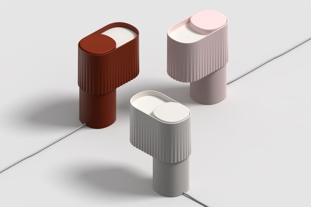
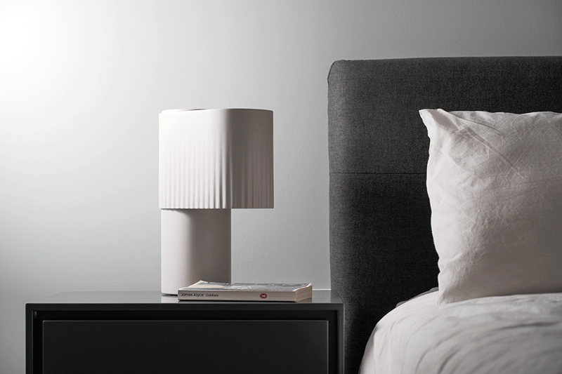
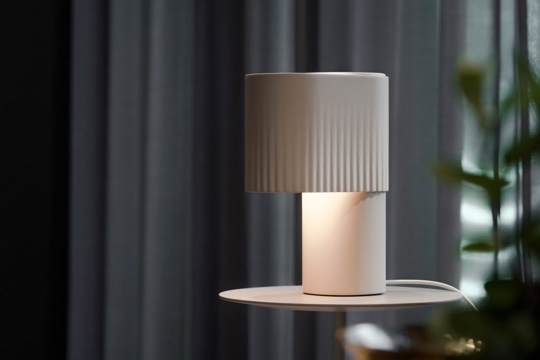
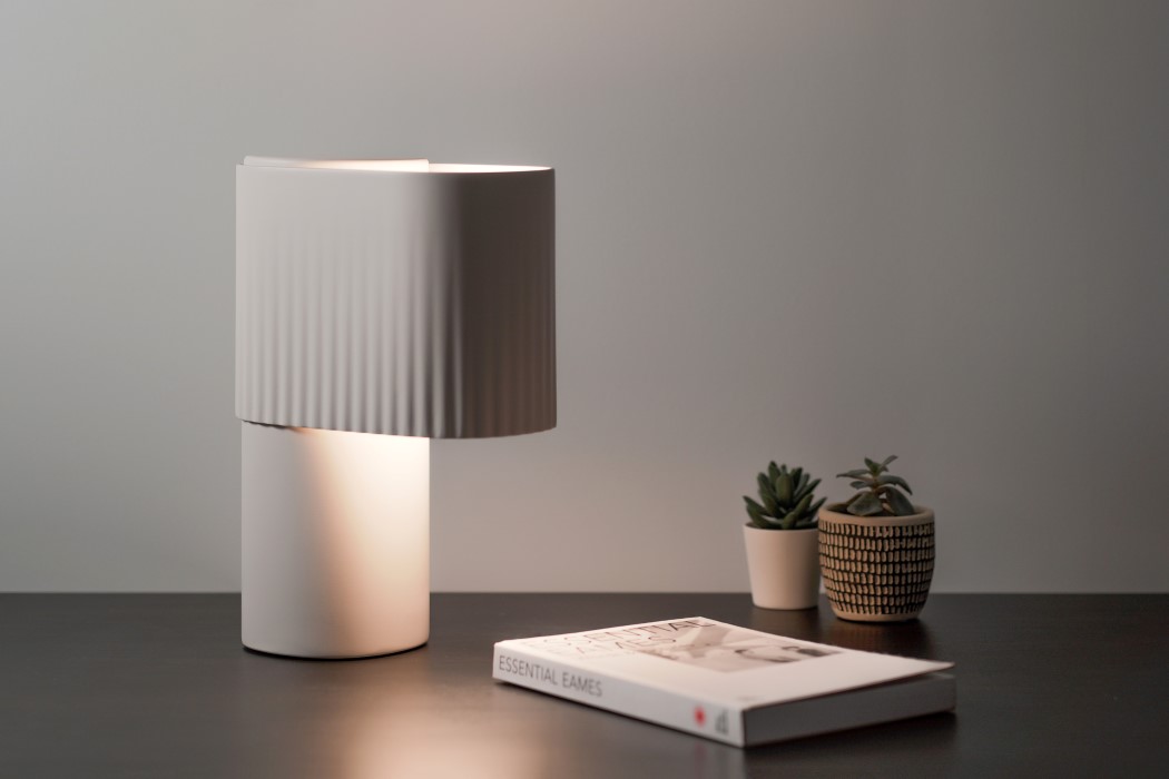
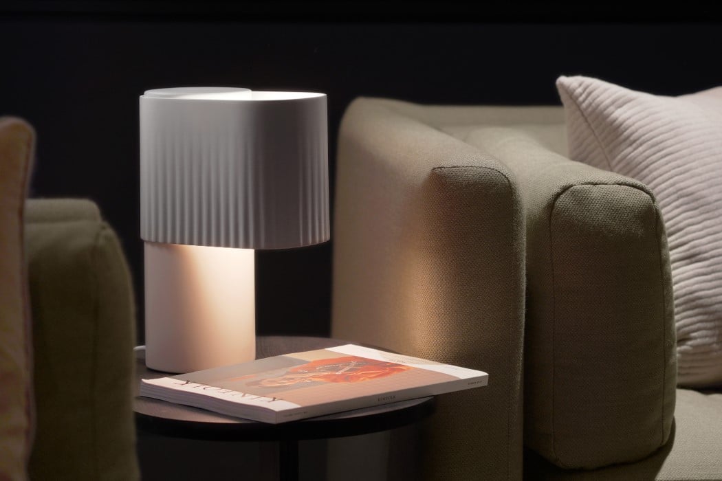
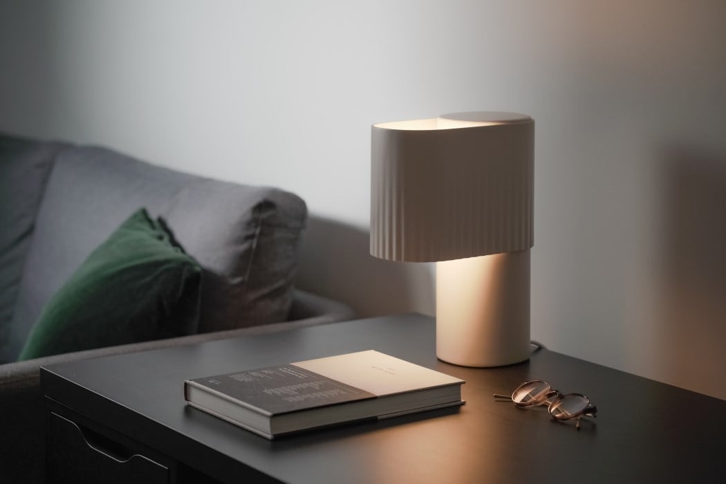
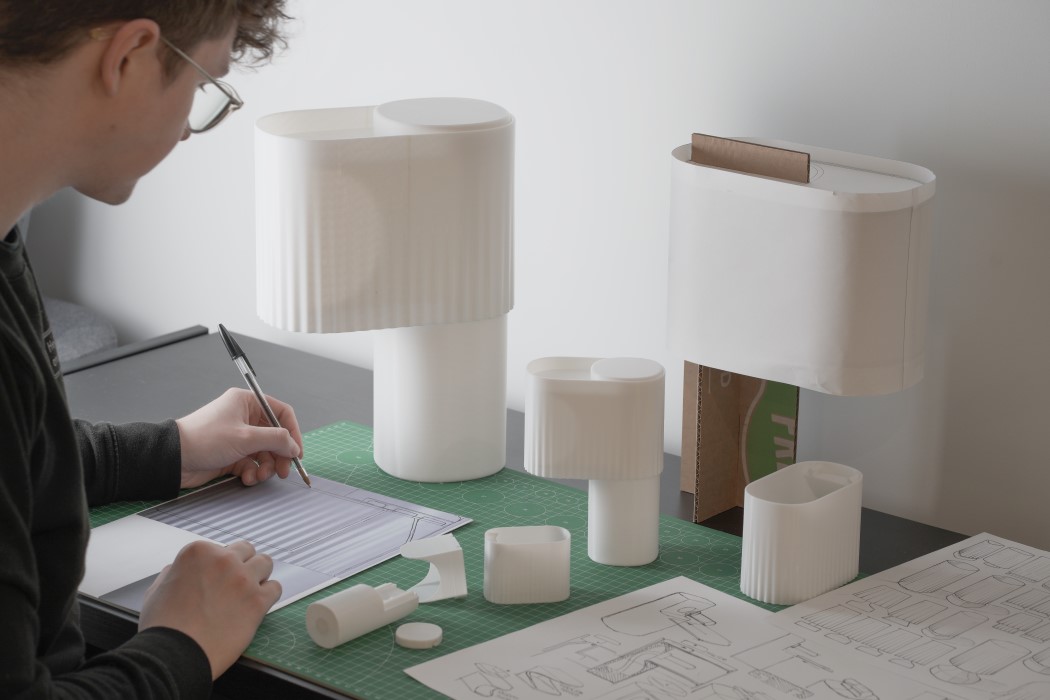
Sam Gwilt started his fledgling YouTube channel to capture his journey as a designer. Over time, that YouTube channel helped build a community that, along with Sam, ‘does design’. Sam’s channel ‘Sam Does Design’ hosts a variety of videos, from sketching and rendering tutorials, to Q&A’s to even portfolio reviews, and has helped Sam build a strong audience/community of designers and design students. Sam recently designed a lamp, titled The Weight, for Gantri, an online studio that partners with designers to create modern-day lighting designs exclusively using 3D printing. The Weight plays on the word ‘light’ and creates a visual contrast by being the opposite… heavy. Designed to look like an orb that weighs down on a platform, causing it to visually deform, The Weight is entirely 3D printed (and is actually quite lightweight). Its soft design (and soft lighting) instantly adds a touch of playfulness to a room while also lighting the space up with a soft glow.

We got a chance to sit down with Sam and talk to him about The Weight, the design process behind it, his YouTube channel, and got him to share some portfolio tips with us. We even asked him about the can of San Pellegrino that went viral on his Instagram page!

Yanko Design: Hi Sam! Tell us about yourself and how you came to ‘do design’
Sam Gwilt: “Hey I’m Sam and I do design!” I’ve been interested in design for as long as I can remember. One side of my family are engineers, the other side artists, so I’ve always had a deep appreciation for both disciplines. Luckily for me, there was a technology college close to my childhood home. That was where my first lessons in design were taught, which laid the foundations for my career without me even knowing.
I studied industrial design at Brunel University London where, alongside my studies, I gained two years of industry experience. That was how I managed to get my foot in the door and secured my current job at Precipice Design. I also worked with Made in Brunel as a Social Media Manager. I was part of the student-led programme that connects students with industry and organises the design events throughout the year. I used the skills I learned there to help run Sam Does Design, which in turn helps to teach others.

YD: You recently designed a lamp in partnership with Gantri. Do tell us more about the ‘Weight Lamp’.
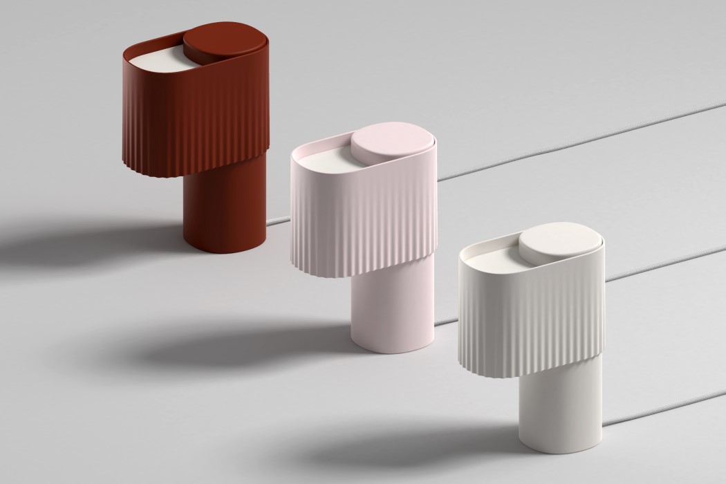
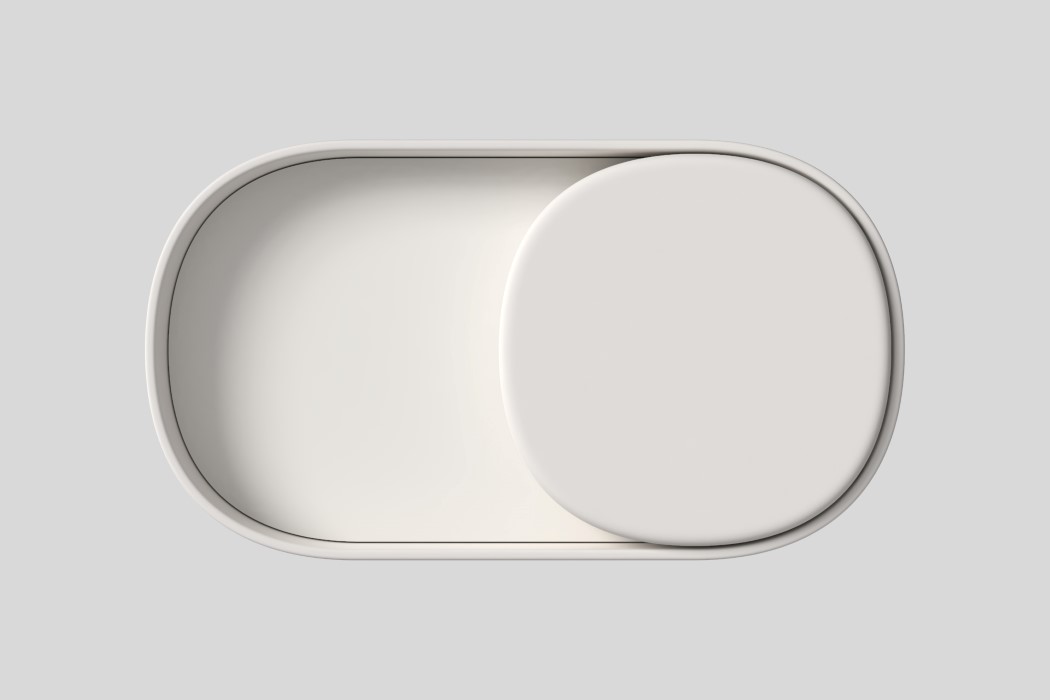
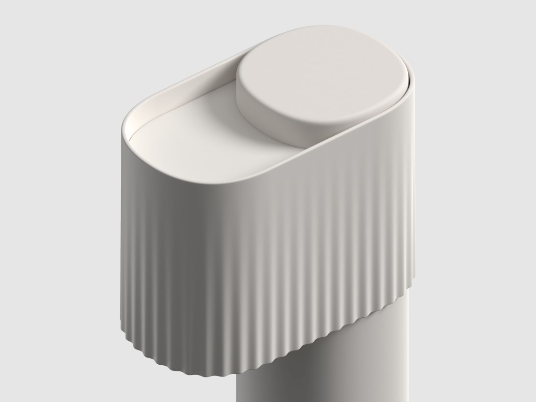
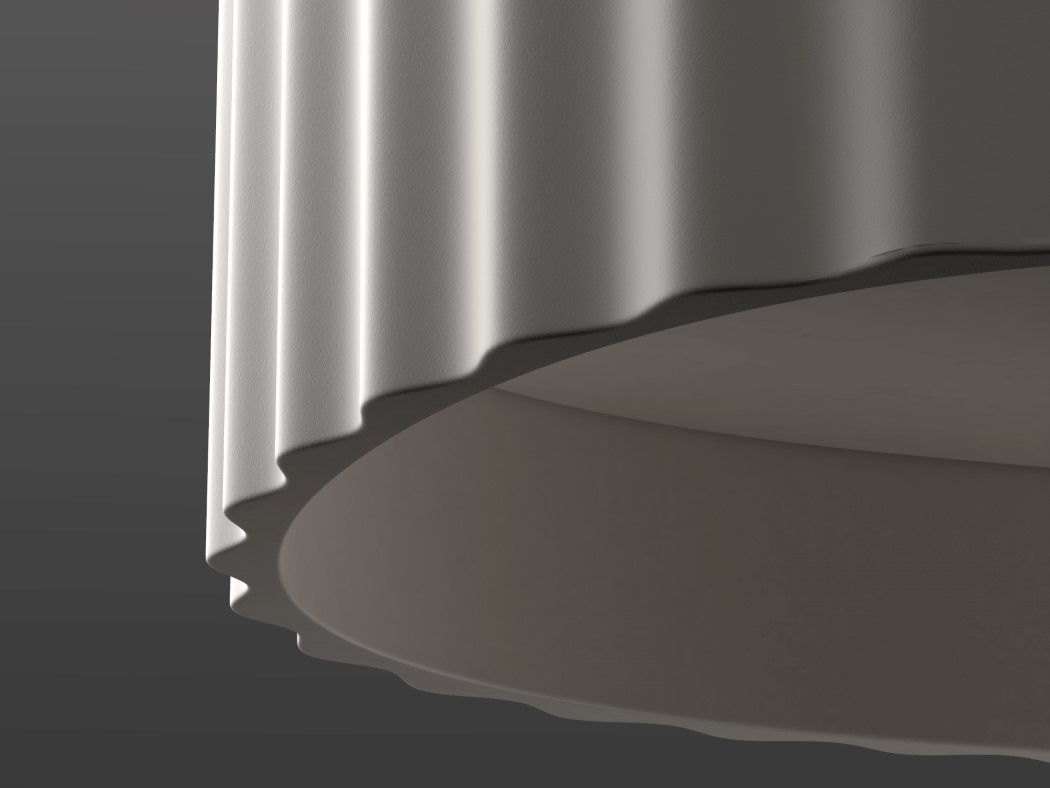
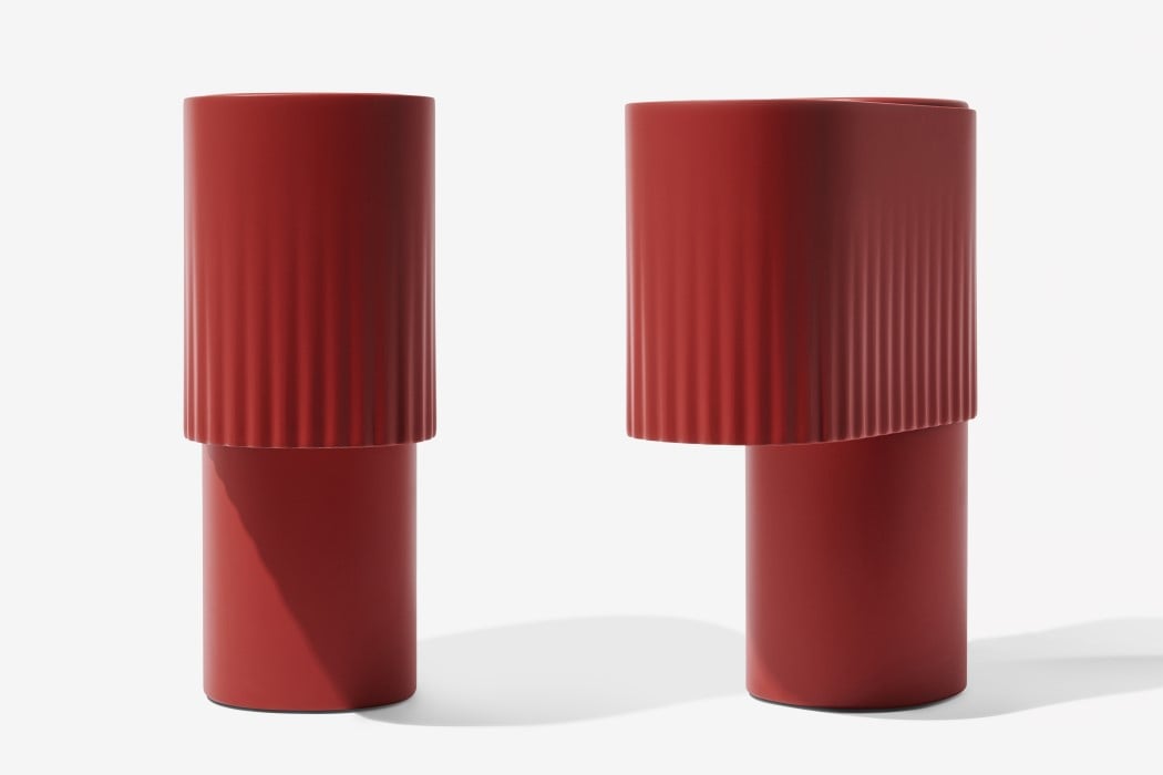
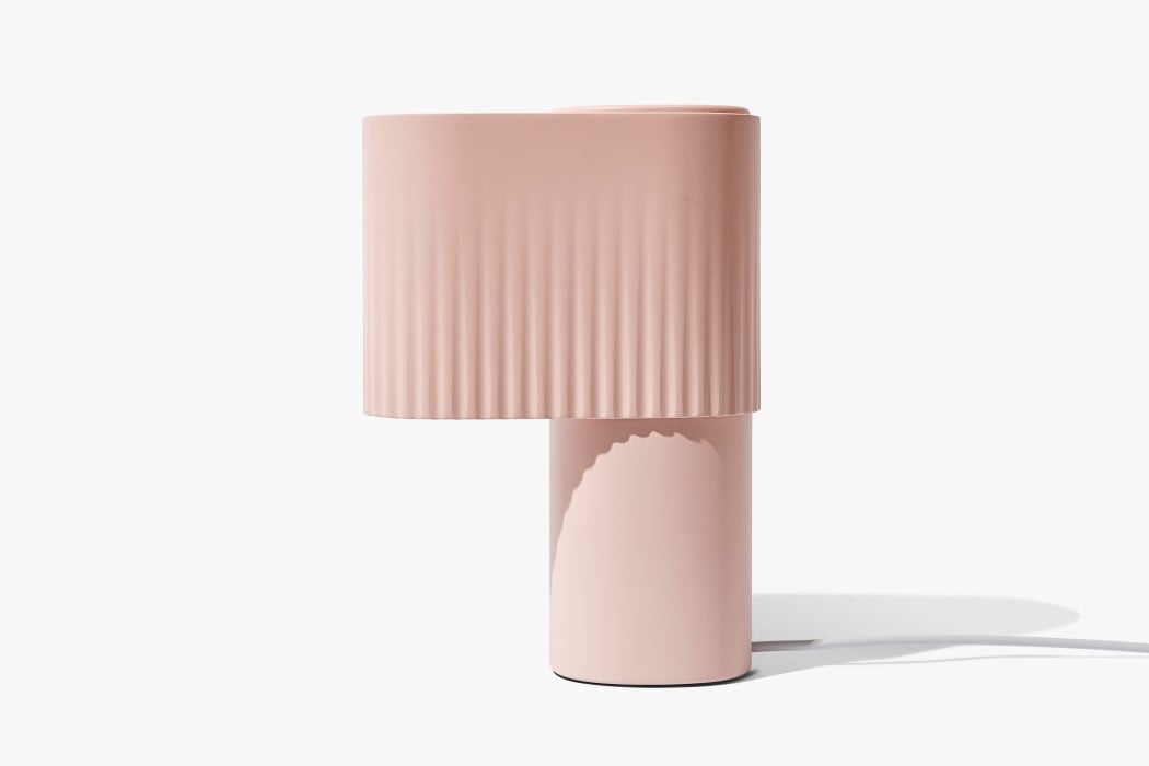
SG: Weight is an ambient light with a 360-degree glow. It was designed specifically for 3D printing and is made from a corn-based polymer. I wanted to play with the concept of weight and mass; how heavy could I make light seem? The 3D printing process means that plastic becomes molten as the product is made, and I wanted to capture that aspect of the process. The intention was to make the final form seem soft and malleable. The sphere appears to have fallen onto the base and has deformed the shape, where it now seems suspended in time.

YD: How did this collaboration with Gantri come about?
SG: I posted a separate concept design to my Instagram page, and I saw a comment that said: “this looks like a design for Gantri”. That was the first time I’d heard about them, so I checked out their website and was really impressed by their process and existing designs, and eager to find out if there was a way I could work with them. I reached out to see if they were looking for new designers and the stars must have aligned because the timing was perfect. After chatting with the team at Gantri, I began working on the concept about a month later.

YD: So, what was the design brief? And how long did it take to go from idea to final product?
SG: The brief was refreshingly open to interpretation. Gantri has an amazing in-house design and engineering team but the big-picture concept and specific scenario were up to me to define. I presented three completely different concept routes that I thought could be interesting, and we decided to develop the strongest one based on how easy it was for potential customers to understand the concept at first glance. It was important for the product to be understood without needing to be explained with any sales copy. I had ideas that explored aspects other than weight but still kept surface and material exploration as a theme, and I hope to revisit those designs in the future. I’d love to work with Gantri again: their streamlined design process and fast prototype turnaround meant that from concept to sale took around three months.

YD: The Weight lamp is designed specifically for 3D printing. How different is that from designing for injection or blow molding?
SG: No draft angles! The geometric design lends itself to 3D printing as nothing needs to be de-moulded. That meant that all sides could be geometrically perfect. The flip side is not being able to print past 45 degrees due to printer constraints, but some clever engineering and internal structures meant that the cylinder base prints perfectly every time. Another benefit was working on the whole product without the need for split lines or multiple parts. It’s a sad moment when a split line needs to interrupt a nice clean surface due to pesky manufacturing constraints. Creating the part for 3D printing meant that wasn’t an issue.

YD: If you had to list a couple of design references for the Weight, what would they be?
SG: I loved the idea of mixing genres of design using technology as an enabler. I wanted Weight to be minimal and contemporary but fun and whimsical. The base and sphere reflect many different styles and also pay homage to past designs: the Memphis Bay lamp and Wilhelm Wagenfeld’s Bauhaus Lamp to name a couple.

YD: Any designers you particularly look up to?
SG: I got my first taste of lighting design at Paul Cocksedge Studio during my time at university. I helped develop the designs and travelled the world building the installations. The hours were long and intensive, but I’m grateful for the inspiration and experience. Coming from a particularly engineering-based university, it was freeing to be immersed in an environment where nothing had been tried and tested before. We were the first and only team ever to produce the manufacturing methods for Paul’s pieces.
There are other designers that I’ve had the pleasure of working with both in the industry and at university that inspire me greatly. In fact, I don’t think I’ve ever met a creative that doesn’t inspire me in one way or another.

YD: Tell us a little bit about Sam Does Design. Do you ever think about pursuing it full time?
SG: I love that Sam Does Design as a channel is giving back to the community that I’ve learned so much from. I originally started the page to post daily sketches and asked for constructive feedback from the wider design circle. Eventually, I began to notice that people were asking me how I achieved certain things within the world of design, and I began to make the switch to share the knowledge I’d gained. It’s still funny to me that the tiny decision to make an Instagram when I was bored three years ago is having such an effect on my life now. If I thought that it would go anywhere as a career, I would have chosen a better name!
In terms of going full time, I’m so happy at my current day job as a consultant at Precipice. I’ve worked on a variety of amazing projects alongside a multidisciplinary team. Being surrounded by such talented people has helped me grow as a person and designer.

YD: You recently began doing portfolio reviews. Could you give our readers a few quick pointers?
SG: Quick tips: Tell a story. Your portfolio isn’t a siloed list of your skills, it’s an advert for your thought process. Only show your best work. Only show the work relevant to the job you’re applying for. Each portfolio should be tailored to the company. Show work you love doing along with work you want to do more of. Sell your project to me with in-context hero images; I won’t read anything you put in a paragraph.

YD: Any upcoming projects you’d like to talk about? What’s cooking!?
SG: I’m working on some amazing projects at Precipice that I’m unfortunately not allowed to talk about. The Sam Does Design projects coming up include multidisciplinary collaborations across the design world, branching out from industrial and product design. I’m hoping to share a more in-depth process through various collaborations and formats. I’m very excited about how one, in particular, is panning out. Watch this space! “Don’t forget to like, comment, subscribe, hit the bell button and everything else that YouTube asks you to do!”

YD: Lastly, what ever happened to that can of San Pellegrino?! (Sam managed to capture a stray can of San Pellegrino Limon and turn it viral on his Instagram page. I’m surprised the can doesn’t have its own Instagram profile yet.)
SG: The San Pel can that was stuck above the glass elevator for 6 months lives on in our thoughts! A lucky maintenance worker drank it and I caught them on my Instagram Stories. I honestly still think about it every time I have a can, which is more often than I’d like to admit.

Visit Sam Gwilt’s Website or his YouTube Channel for his work/vlogs. Click Here to visit Gantri’s Webstore to buy The Weight.