Hand-worn smart display concept safely shows information for bikers, mountaineers

Smartphones can provide all sorts of useful information and features, but there will always be occasions when you can’t just whip out the phone from your pocket to use it. Smartwatches are supposed to solve that problem by offering more condensed information on your wrists, but that can still be problematic for some class users, especially those who engage in outdoor activities. Although smartwatches are often marketed for athletes and people with active lifestyles because of their health-tracking features, actually using the wearable once the gloves come on can actually be difficult, if not impossible. Fortunately, your wrist isn’t the only body part you can use for a wearable, and this design concept tries to place a bigger display on the back of your hand instead.

Designer: Anuj Pate

Smartwatches are the most popular kind of wearable design simply because they are the most convenient and the most familiar. That doesn’t exactly mean they’re the best or only design possible, definitely not for all kinds of people. The rising interest in smart rings does indicate a sort of “smartwatch fatigue” that’s making people think outside the box on how to deliver some of those features through other means. A smartwatch’s display, for example, is only useful if can see it, which often means having to twist your wrist at the very least to have the screen at a proper angle.

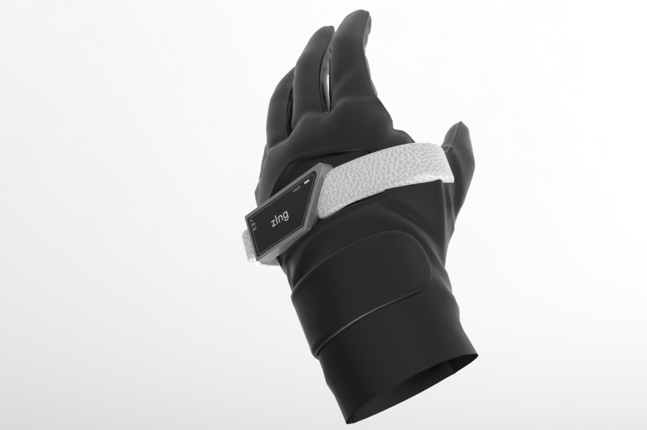
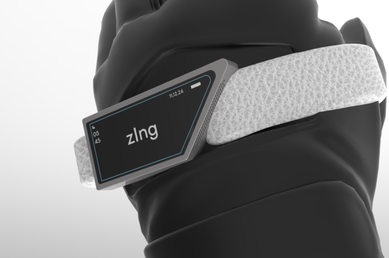
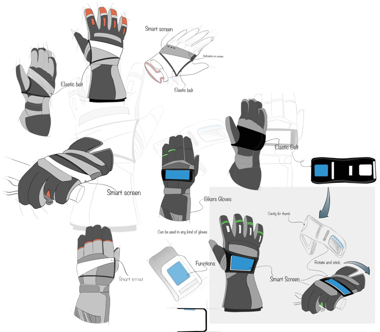
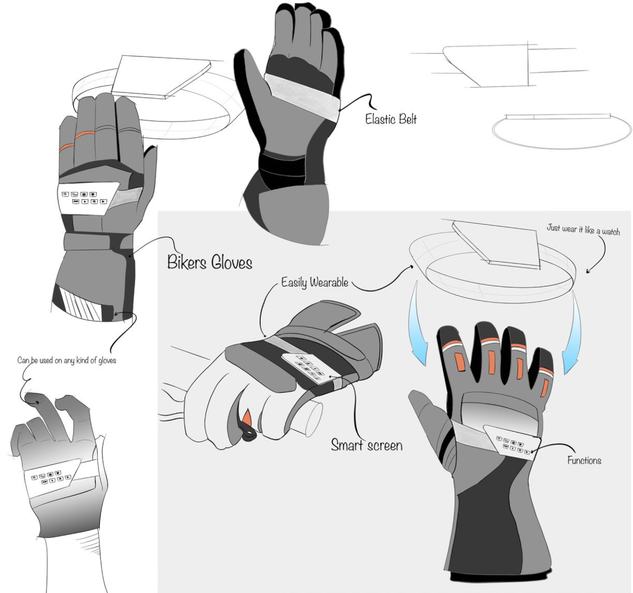
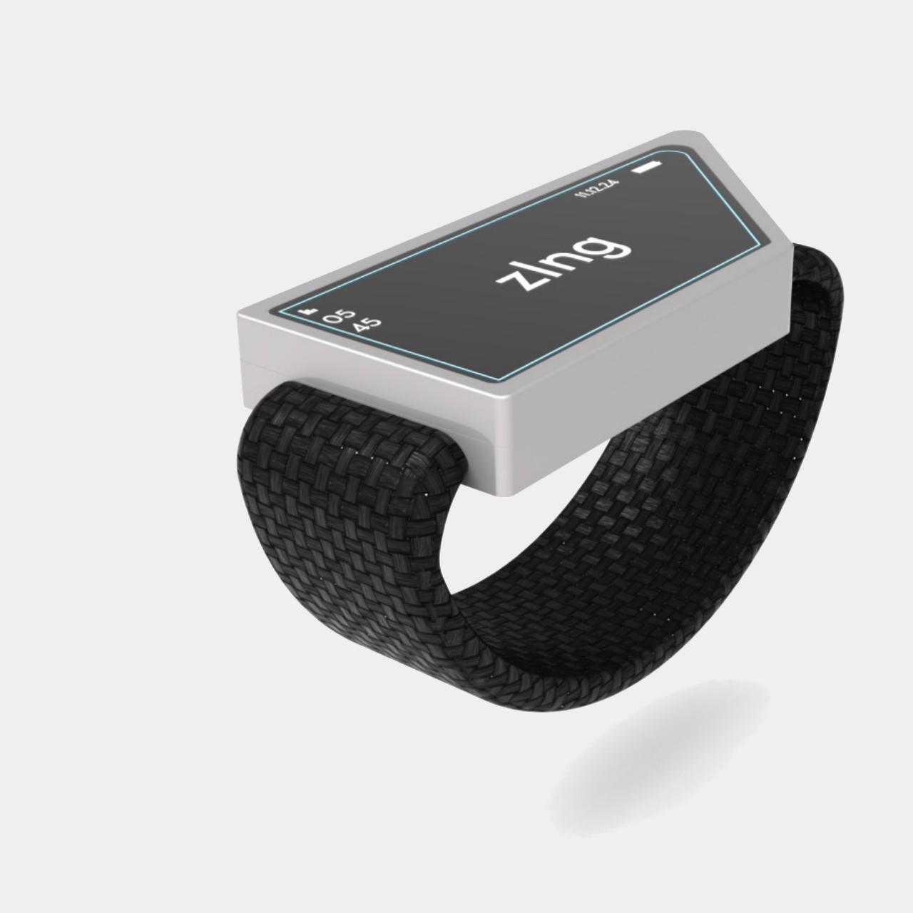
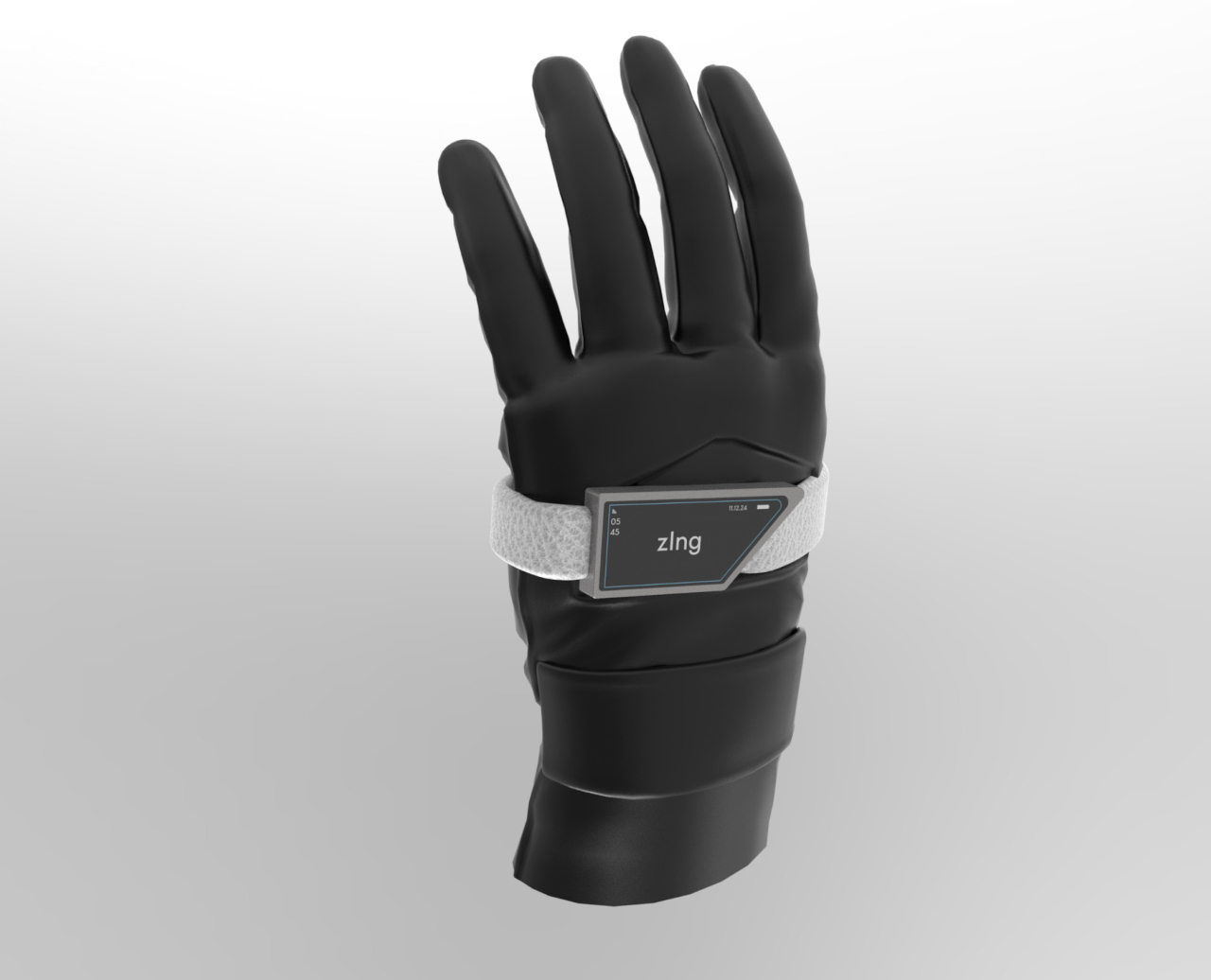
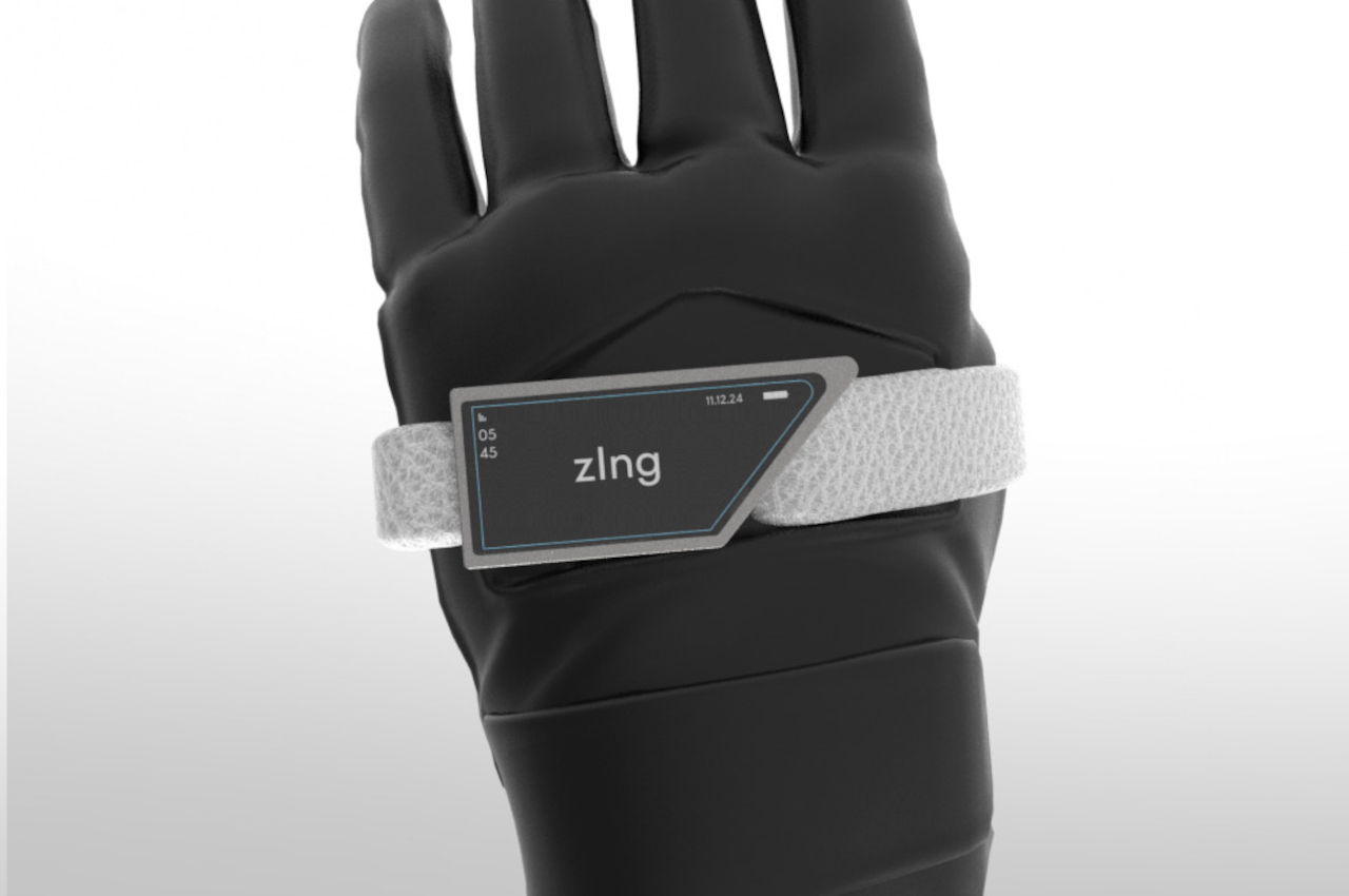
Unfortunately, that’s not easy or even safe for some people whose hands have to be in a fixed position or can’t easily touch the smartwatch screen once they’ve started wearing gloves. That’s the case for cyclists, bikers, and mountain climbers who still need access to some critical information but can’t see their smartwatch for one reason or another. Rather than rely on complicated and distracting solutions like audio notifications or augmented reality goggles, zIng simply moves the display to a position where it can be easily seen even without twisting your wrist or squinting your eyes.

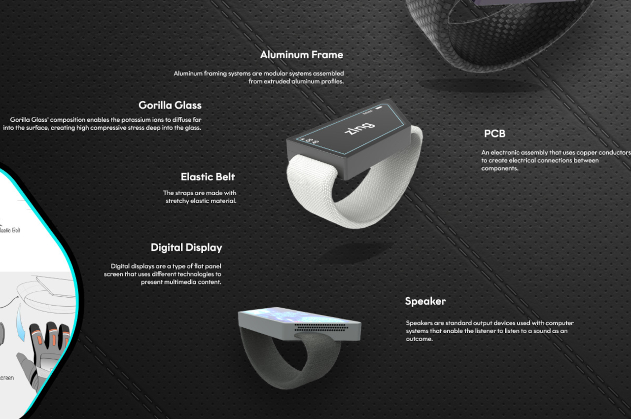
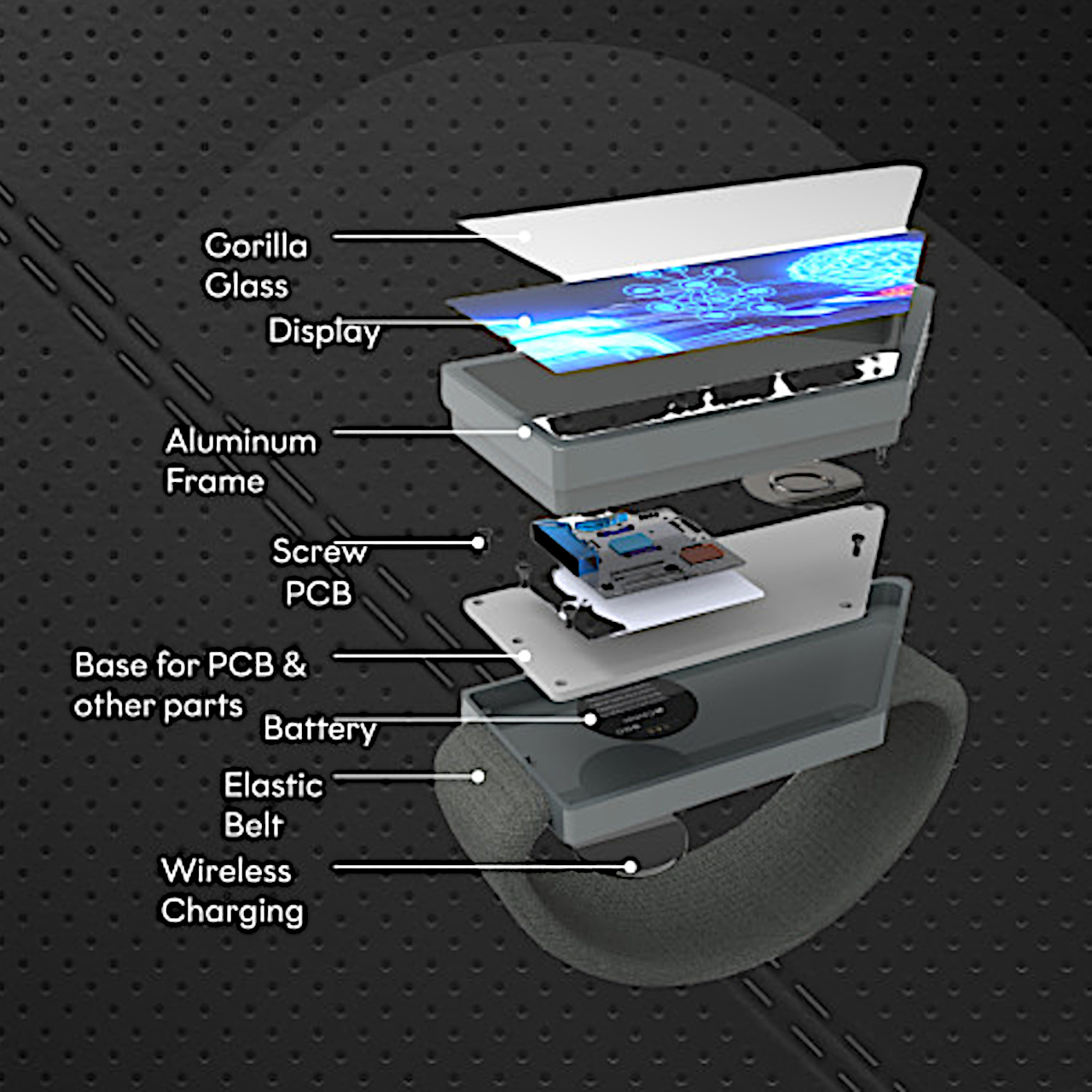
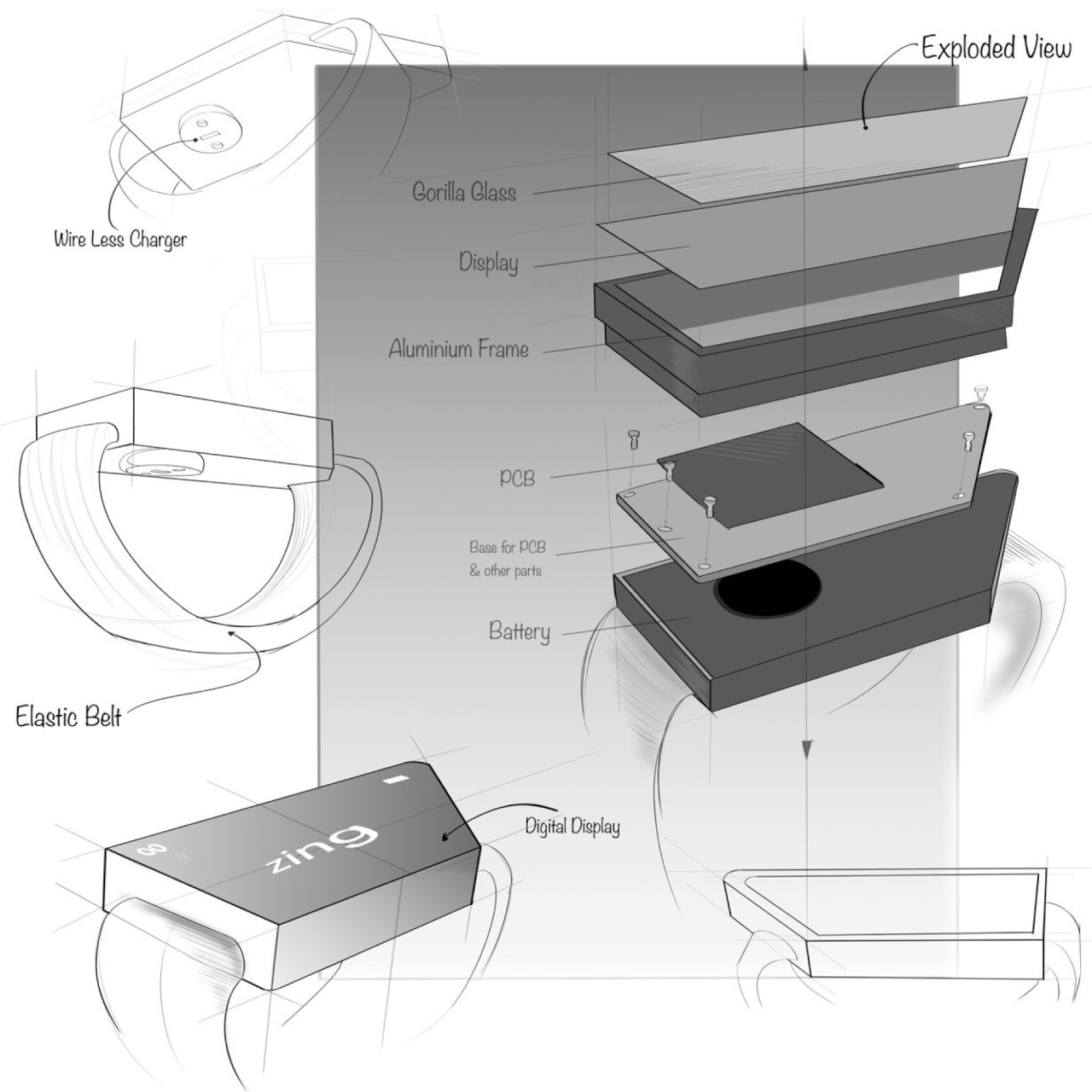
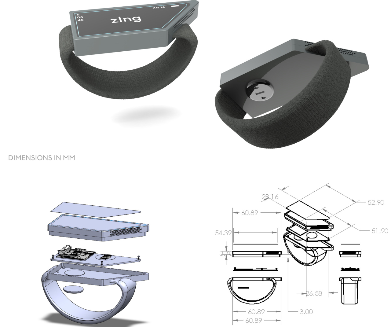
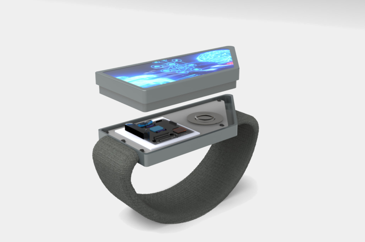
The wearable design concept practically puts a decently sized trapezoid-shaped display on the back of your hand. If you have your hand forward like when you’re holding bike handles or gripping a mountain wall, this immediately puts that screen within your vision. The display is also large enough to tap with a finger even when you’re wearing very thick gloves, which is often the case for biking and mountaineering gear.

zIng is just one of a new generation of wearable designs that are challenging the status quo of smartwatches. An ergonomic Apple Watch band moves the smartwatch away from the wrist and onto the back of the hand as well, this time a little below the thumb, though that doesn’t solve the cramped screen space. Admittedly, the zIng concept targets a very niche market, but it also clearly shows that there’s no one-size-fits-all wearable design that will be perfect for all use cases.

The post Hand-worn smart display concept safely shows information for bikers, mountaineers first appeared on Yanko Design.

Smart display concept puts a cute face on smart home technology

As our homes start to get more connected to devices and the Internet, the number of screens also starts to increase. In addition to the phones, tablets, computers, and TVs that are already a staple of modern life, there are also smart displays that try to offer visual feedback to the things we usually only hear by voice from an AI-powered assistant. While many smart display designs try to blend in with the rest of the room, it’s really hard to hide a large conspicuous screen that needs to always to in view to be useful. This design concept tries to soften the blow of having such impersonal tech products inside your living space by giving a smart display a rather comical face that makes it feel more alive and a little bit friendlier.

Designer: Kai Xia

Smart displays are pretty much the evolution of voice-controlled smart speakers, giving a visual representation of the information you would normally get only through audio. Of course, it could also be used for other purposes, like displaying photos similar to a digital photo frame, playing videos, or even making video calls. The standard design of these devices, however, has more in common with those speakers or, worse, simply look like tablets slapped onto cylinders and boxes.

The Smart Pad concept tries to liven things up by changing the core design of the smart display. Objectively speaking, the 4-inch screen might actually seem too small for its purpose, but that also means you’re forced to show only the essentials rather than flooding the user with information. The smart display is also shaped like an egg, reminiscent of the old, colorful iMacs or even some vintage CRT TVs. This angles the screen at a comfortable level without having to resort to stands and external mechanisms.

The more important feature of the concept, however, is the cartoon-y face that can be displayed on the small screen. It might be a minor and optional detail, but it lends the gadget a bit of personality, making it feel more approachable and even human to some extent. It makes the Smart Pad feel less like an appliance and more like a companion, putting a face to that disembodied voice we always hear when we talk to such devices.

Of course, it’s also capable of the standard things that smart displays can do, at least in theory. That screen can play videos, display photos, and show information, but it might be less expressive because of its small size. That makes the device more suited for desks and bedside tables rather than living rooms, where seeing the screen up close is more natural.

The post Smart display concept puts a cute face on smart home technology first appeared on Yanko Design.

Apple HomePod with a Screen is coming to revive a forgotten smart home category

Although they look and seem like they’re made just for playing music, smart speakers are, of course, a lot more capable than simple wireless speakers. In fact, they were born to showcase the power of AI-powered smart assistants like Amazon Alexa, Google Assistant, and Apple Siri, which is also why the speaker quality of the first generation of speakers left much to be desired. While controlling your devices and appliances using your voice felt almost magical, it also became quite tiring quickly, especially when you could do things faster using an app on your phone. That’s the reason why smart speakers with displays, a.k.a. smart displays, were born, and that design might finally be coming to Apple’s ecosystem, potentially bringing life back to stagnant waters.

Designer: Apple (via MacWorld)

It’s been a while since we’ve seen a new smart display coming from the major brands. The latest Amazon Echo Show last year is actually just an upgraded Echo Show 5. Google launched the 2nd-generation Nest Hub in 2021, though some might argue that the Google Pixel Tablet and its speaker dock actually fall under this category. After all, most of these smart displays do look like smart speakers with a tablet stuck on top of them.

Amazon Echo Show 10

Amazon Echo Show 10

That design might be coming to Apple’s smart home device category, thanks to clues found in the latest beta testing of tvOS 17.4. There is no direct evidence, of course, just a new device codenamed “Z314” that just happens to share some internal hardware with the iPad mini 6. The HomePod was actually discovered to already be running tvOS, which would have been weird if it didn’t eventually get some visual capabilities. Again, much of these are based on speculation, but the hints seem to be building up and pointing toward a spring 2024 reveal.

Google Nest Hub 2

Google Nest Hub 2

A HomePod with a touch screen, even just a 7-inch one as indicated by rumors, will offer a significant upgrade to people’s user experience. Although the HomePod already offers physical controls for quickly controlling music, anything else has to be done either through Siri or through a connected iPhone or iPad. The latter scenario, however, can cause additional battery drain to mobile devices, so a dedicated display will go a long way in making it more convenient to access Apple Home settings, media controls, and more. Of course, sticking a tablet on top of a HomePod isn’t the only possible design option available, as our very own Sarang Sheth explored in a piece that envisioned an aesthetic that matched Apple’s style more closely.

That said, it also isn’t certain how far Apple will go in what features it will provide on that screen. The likes of the Amazon Echo Show and Google Nest Hub offer video capabilities, though that has also been a thorny subject as far as YouTube is concerned. Apple is traditionally even more conservative in what it allows on its devices, so we can probably expect functionality limited to smart home control, FaceTime, and, of course, its own library of tunes and videos.

Google Pixel Tablet

Google Pixel Tablet

Google Pixel Tablet

Google Pixel Tablet

The post Apple HomePod with a Screen is coming to revive a forgotten smart home category first appeared on Yanko Design.

The Pixel Tablet Sucks: Here’s What Google Should Have Made Instead

Controversial hot-take: Smart Displays suck. Companies don’t know what they’re doing with them, and their approach feels a lot like they’ve got a solution in search of a problem. No company has successfully flip-flopped on the smart home display issue as much as Google. They acquired Nest, designed a Nest Hub Display, forgot about it a year later, killed the Nexus tablet, forgot about tablets altogether for almost a decade, and then designed the Pixel Tablet as a strange crossover between a tablet and a smart home display. Everyone who’s reviewed it says the same thing – nothing makes sense. Designer Chris Barnes, however, has a better idea… and it borrows directly from an unlikely source of inspiration – the Apple Watch.

Designer: Chris Barnes

Every year, Tim Cook takes the stage at Apple’s main keynote, talking about how the Apple Watch helped save the lives of hundreds if not thousands of people. The watch made a successful impression as a health device, helping detect unusual heartbeats, body temperature, breathing, or even detecting if someone’s fallen. Perpetually strapped to your wrist, the Apple Watch is the perfect ‘guardian angel’ designed within the Cupertino company’s product ecosystem. Google doesn’t have that (yet), but this unique smart home display by Barnes proves to be exactly that. It combines the functionality of the Apple Watch with the large size and usability of a smart home display. Meet the Google OMA concept, an ideal gadget for the elderly or technologically un-savvy to use within their homes.

The Google OMA is an intuitively designed, smart alternative to your average landline and provides an important connectivity experience for elderly people, allowing them to stay in touch with their families. While the Apple Watch does something somewhat similar (allowing you to monitor stats of the elderly wearers for safety’s sake), the Google OMA easily allows both parties to video-call each other whenever possible, providing a video-based communication bridge that’s in line with current technological capabilities.

In essence, the Google OMA is a smart display that’s designed keeping the elderly in mind. Its large screen makes visual elements easy to read and tap, and the circular profile means you’re never holding the Google OMA the wrong way. No matter how you hold it, the circular display orients itself to stay vertical. The Google OMA comes with a curved body that sits on a charging base, and can be un-docked and held in both hands sort of like a cup, allowing elderly people to easily hold their device in a manner that suits them well.

The Google OMA works as a smart personal display rather than just a smart home display, doing the job of a landline, a phone, or an Apple Watch. It sits on a countertop and can be used to play games like sudoku, log in your mood, or contact people using a rotary phone-inspired contact list that just feels familiar. The OMA device can be held in your hand while video chatting, or to your ear for a conventional audio-only experience. It’s designed for people who aren’t used to a lot of new technologies, coming with simple features and functions… and yes, a dedicated home menu also lets you access smart home features, allowing it to do the job of a smart home display too.

What the Google OMA has that the Pixel Tablet doesn’t is clarity of the problem it’s looking to solve. The OMA helps elderly people stay connected with their families, guardians, and friends in an easy, intuitive, and meaningful way. Unlike smart home displays that end up just being glorified screens for album art or the weather, the OMA has a sense of purpose, thanks to a well-defined design brief. Moreover, it allows non-tech consumers to benefit from technology, bringing more people into Google’s ecosystem… and that’s only a good thing.

The post The Pixel Tablet Sucks: Here’s What Google Should Have Made Instead first appeared on Yanko Design.

Google Pixel Tablet tries to redefine tablets with a homier design

Perhaps save for the Apple iPad Pro and its equivalent Samsung Galaxy Tab S, there are still some people who are not yet sold on what a tablet is for. Some simply see it as a larger phone, which has become less relevant these days thanks to larger phones and foldables. Others treat them like the next step from laptops, at least those that are powerful enough or can run the apps they need. Most, however, probably still can’t find a purpose or even a need for a tablet in their lives, so Google is trying to provide yet another possible answer. With its new Pixel Tablet, it’s practically saying that devices are meant to stay at home to keep you company and keep you connected to other people without ever having to step outside.

Designer: Google

If you were looking for the next step in the evolution of tablets, especially in design, you might come off very disappointed with the new Google Pixel Tablet. Compared to the likes of the iPad Pro or the Microsoft Surface Pro, the 11-inch Google tablet seems almost nondescript and might even look too plain. It meets Google’s intended purpose for the tablet, though, which is to never leave home and to almost stay attached to its speaker stand.

Together, the Pixel Tablet and its Charging Speaker Dock do make a minimalist couple that would actually look at home in your, er, home. If the basic design language of muted colors and fabrics seems familiar, it’s because it’s the same language that the Google Nest family of smart home devices speaks. In fact, the Pixel Tablet and the Nest Hub Max look almost too identical, except for the fact that you can detach the Pixel Tablet when you want to watch a video more comfortably.

Therein lies the purpose of the Pixel Tablet, which despite its name, is really meant more to be a Smart Home Display with a detachable display. You can use it to control your smart appliances, whether via touch or voice, and you can use it to chat with others on a screen larger than your phone. But when you want to sit back and binge or play games, you simply detach the tablet and carry on.

In any other context, especially outdoors, the Pixel Tablet would look almost boring, though thankfully, it isn’t as plain inside as you might expect. When it comes to hardware specs, Google didn’t really hold back in giving the Pixel Tablet much-needed power. The screen is a bright 2560×1600 LCD panel, and the entire party is run by a Tensor G2 processor, accompanied by 8GB of RAM. The Charging Speaker Dock has a 43.5mm full-range speaker inside and can charge the tablet through pogo pins at a maximum 15W rate.

The Google Pixel Tablet is now available for pre-order for $499, and it fully launched on 20. You can’t buy the tablet alone, but, amusingly, you can buy just the dock for $120 in case you need extras around the house. While the Pixel Tablet’s design and purpose might sound underwhelming compared to the competition, it definitely has some muscle to make it useful for more than just home use. Perhaps more importantly, its arrival comes with Google’s commitment to really push for developers to make Android apps work better on larger screens, a commitment that will hopefully last beyond the lifetime of this device.

The post Google Pixel Tablet tries to redefine tablets with a homier design first appeared on Yanko Design.

Lenovo Yoga AIO 7 offers a massive 27-inch screen for casting and other productivity needs

Lenovo Yoga AIO 7 Where to Buy

Lenovo continues to deliver modern gadgets that prove to be really useful. The brand remains one of the more prolific mobile device makers with its phones, tablets, and laptops.

The latest from the company is the Yoga AIO 7. This 27-inch display offers 4K IPS display resolution. It provides 95 percent DCI-P3 and different viewing angles. The narrow-bezel display allows more extensive viewing. It’s adaptive to however you want to use the display, whether for entertainment, work, or creating.

Designer: Lenovo

Yoga AIO 7 Home Office

The Lenovo Yoga AIO 7 is easy to adjust with a simple push of a finger. It boasts a flexible hinge design so that the device can rotate 90 degrees. It can work as a secondary screen for your smartphone when you want a larger view.

The computer system is powered by AMD Ryzen 6000 Series. The AMD Radeon RX 6600M graphics with AMD RDNA 2 architecture are optional. For audio, the dual JBL 5W speakers are powerful enough. It’s not just a secondary display because it’s an all-in-one desktop computer.

Lenovo Yoga AIO 7 Design

The packaging of the computer allows for a smaller footprint. There is no need to get or build a more powerful CPU because this one from Lenovo can offer the decent computing performance you need. It’s ideal for the modern home and is good enough for a hybrid work-home-school lifestyle.

The Yoga AIO 7 is suitable for wireless casting via these standards: AirPlay, LElink, Miracast, and DLNA. As smartphones become more powerful enough for work, your phone may need a more prominent display when you need to finish a task or a project. Feel free to check your social media networks on a larger display, watch your favorite TV series or movies, or view photos.

Lenovo Yoga AIO 7 Specs

The 27-inch screen may be used vertically or horizontally. The computer has a Type-C port so that you can use a keyboard and mouse. This 4K all-in-one PC follows a previous model priced at $1,599, so the price range could be the same. Unfortunately, it will be available in select markets, not including North America.

Lenovo Yoga AIO 7 Product

This Yoga AIO 7 is ideal for sharing and collaboration. It can be used for work or school or simply for entertainment. In addition, the display is massive, which makes it great for creatives and designers.

There are other impressive Lenovo products we’ve featured before. The Lenovo Y90 gaming phone left a durability question unanswered. The Lenovo ThinkBook Gen 3 also arrived with a secondary screen to keep users productive and creative in a strange way. We also won’t forget that Lenovo Yoga Pad Pro tablet with its own stand. We also enjoyed looking at the Lenovo Lavie Mini.

Lenovo Yoga AIO 7 Details

The post Lenovo Yoga AIO 7 offers a massive 27-inch screen for casting and other productivity needs first appeared on Yanko Design.

From Bitcoin prices to the weather, to even calendar alerts, this lo-fi LED Smart Display handles it all


A retro display for your rustic mid-century tabletop, the Tidbyt gives you the best of both worlds – a cutting edge IoT display that lets you see the weather, news, stock and currency prices, images and album art, inspirational quotes, etc. in a steampunk-ish display that uses a matrix of LEDs to supply you with your info in a lo-fi 8-bit style.

Designer: Tidbyt

Conceived as a Kickstarter project earlier this year, Tidbyt brings information to you in a uniquely pleasing format. Unlike Amazon and Google’s smart displays that come with clear bright OLEDs, the Tidbyt has a retro charm of its own, with a walnut-wood enclosure on the outside, and a matrix of 2048 LEDs on the front, arranged in 64×32. The layout lets you pretty much display anything on your Tidbyt, as long as it fits on the 64×32 resolution screen.

The Tidbyt can be controlled/customized entirely through its companion smartphone app. The team behind Tidbyt is constantly upgrading the app with new widgets for the Tidbyt, and if you’re a bit of a coder, the display’s open-source API lets you customize your experience. The app lets you cycle through different screens for your Tidbyt too. You can choose multiple apps to be displayed on your Tidbyt at the same time. It will cycle or rotate through, displaying each of them for either 5, 10 or 15 seconds (which you configure through the app). This allows you to easily cycle through multiple stock tickers, time and weather in different cities, multiple subway stops, a bunch of fun messages, or all of the above.

Each Tidbyt comes with a set of controls to help you adjust the brightness of your display. Based on where you’ve kept it (on your work table, your mantelpiece, or bedside), the Tidbyt’s LEDs can be dimmed or brightened for clarity. The app even comes with an auto-dimming feature that follows the sun, and a night mode that kicks in around bedtime, keeping the display running at its lowest brightness so you can sleep with your Tidbyt on.

Post a successful campaign on Kickstarter (which got fully funded in just 2 hours), the Tidbyt is now in its production stages as it prepares to ship to its backers. For people who missed the campaign, the Tidbyt’s up for pre-order on its site for s price of $179 with shipping in November.

Spotify launches its first hardware device, a touchscreen player for your car called the “Car Thing”

While its name probably makes it sound like something an executive at Spotify thought of overnight, the Spotify ‘Car Thing’ has been in the works for years. It honestly makes sense, considering every one of Spotify’s competitors is in the hardware space too – Apple has the HomePod Mini and the AirPods complementing its Apple Music, and Amazon has the Echo series of smart speakers tying in with Prime Music. The Car Thing helps Spotify enter the hardware space too, and solidify its position in the one area where the market still remains untapped, and where honestly people require music/radio/podcasts the most… the car.

Picture this… you’ve got a long, 30-minute drive to work. A decade ago, you’d switch the radio on and listen to the news or some music. Now, you’re most likely to tune into your favorite podcast episode, or play music from a playlist on your streaming service. The software has evolved, although the hardware’s still playing catch-up. Not every car comes with a smart dashboard, and it can be a nuisance to constantly lift up your phone and unlock it to pick a song or a podcast episode… especially when you’re driving. That’s where the Car Thing comes in.

Issued as a limited release, Spotify’s Car Thing provides a bridge between your car’s speaker system and your favorite online streaming service. Available for free to a select group of applicants (you can sign up on Spotify’s Car Thing microsite), the Car Thing is a nifty little dashboard that brings Spotify to life in your automobile. It runs a version of the streaming company’s Car View, a simple interface that’s easy to use and navigate while driving, and while the device DOES have a touchscreen, it comes with physical dials and buttons that you can instinctively operate with your hand as you keep your eyes on the road.

The Spotify Car Thing is built to be compatible with vehicles regardless of make or model and displays a home screen with a touch-sensitive navigation dial slightly overlapping the screen to make the device look visually dramatic. The device comes with voice-controlled search too, and you can simply summon songs, artists, and playlists by using the command “Hey Spotify” before your query. Alternatively, you could rotate the dial to navigate the dashboard, increase or decrease volume, or press it to select songs or play/pause music. A button right below the dial lets you go back to the home screen, and 4 preset buttons on the top let you instantly play songs, stations, podcasts, or playlists of your choice.

Ultimately, the Car Thing works as a bridge between your phone and your car’s speaker system. It doesn’t sport a speaker of its own, instead, it connects to your car’s built-in speaker system either via Bluetooth or an aux cable. It still requires your smartphone too, given that it can’t connect to the internet independently. Sure, that sounds like a bit of a drag, but what Spotify is betting on is a much more intuitive and easy-to-use interface that lets you listen to your favorite talk shows and music without fiddling with your phone as you drive. The Car Thing ships with three mounting accessories for connecting it to a vent, the dashboard, or the CD player, and can be powered either by the USB port in your car, or a USB adapter that fits into the lighter socket. Sadly, the Car Thing isn’t quite available to the general public yet. You need to sign up on the Car Thing website and Spotify states that the device will only be available to “select” Spotify Premium members. To make up for that, the company is giving the Car Thing away at a 100% discount on its $79.99 price-tag. All you really need to pay is a nominal $6.99 shipping fee.

Designer: Spotify

The Car Thing sports a 4-inch touchscreen, with a durable construction and matte-textured rubber controls that are responsive and easy to use.

A rotating dial lets you quickly cycle through elements on your interface, and you can simply push the dial to select an item within your menu or press the home button below to go back to your home screen.

The upper edge of the Car Thing spots 5 buttons – 4 for dedicated presets, and a recessed button on the extreme right lets you either quick/mute a song, or access your settings. The device even comes with 4 microphones on the top, laid out in between each of the buttons, that run Spotify’s adaptive interference cancellation technology to help tune out the background noise and focus on your voice commands.

Each Spotify Car Thing ships in a kit that includes a USB cable to power the device, a 12V adapter for your car’s lighter socket, 3 different mounts to choose from, and a rubber cover for extending the primary dial’s lifespan.

Amazon Echo Show 10 review: A rotating screen is a pricey novelty

Ever since the original Echo Show, smart displays have proven to be pretty useful around the house. They’re great for quickly looking up information, recipe instructions, video calls and more. But here’s the problem: They’re completely stationary. Yo...