Samsung’s Visual Display of Essential, Innovative, Harmonious Design at Milan Design Week 2024

At Milan Design Week 2024, Samsung Electronics unveiled its “Newfound Equilibrium” exhibition. This impressive showcase is all about Samsung’s forward-thinking design philosophy, which they call “Samsung Design Identity 5.0: Essential∙Innovative∙Harmonious.” It focuses on drawing inspiration from people and shaping the future. Samsung has over 1,500 designers spread across seven global studios, all working to keep their design language fresh and relevant for their customers.

Designer: Samsung

INNOVATIVE, the second exhibition space of Samsung Design’s Newfound Equilibrium

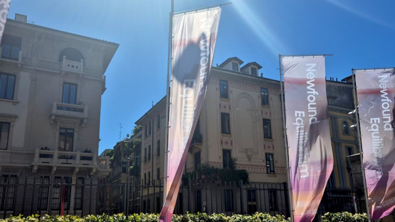
The exhibition is in the Leonardo da Vinci National Museum of Science and Technology in Milan, specifically in Le Cavallerizze. This place is a mix of 16th-century architecture and modern design, showing off Samsung’s knack for blending old and new.

Leonardo da Vinci National Museum of Science and Technology in Milan, Italy, where Samsung Design’s Newfound Equilibrium exhibition is being held.

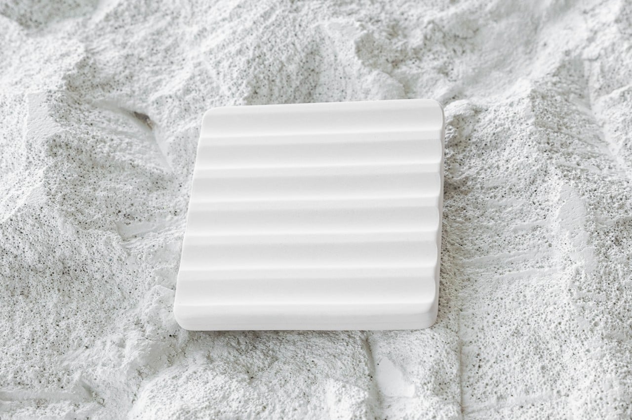
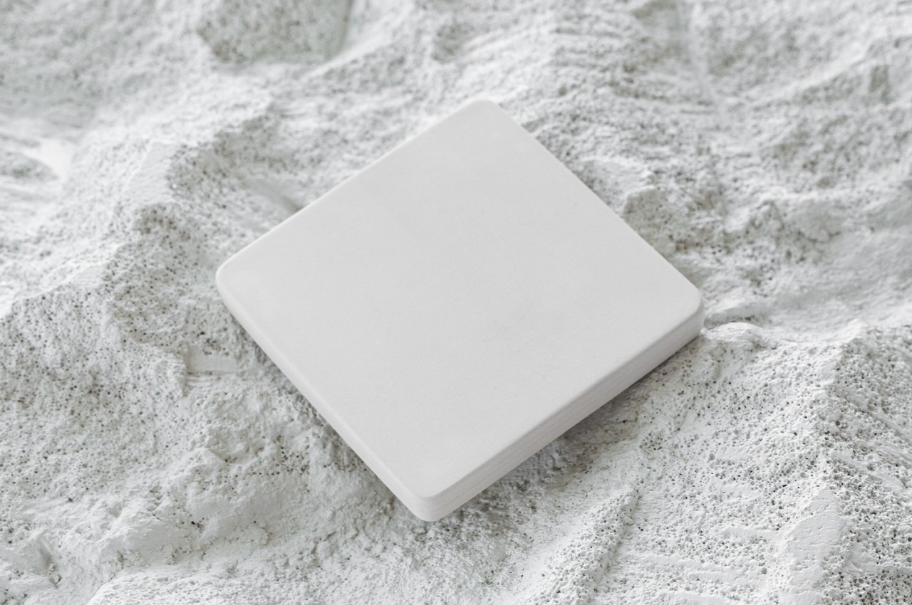
First up in the exhibition is the “Essential” area. This is all about getting back to basics and focusing on what really matters. It’s shown in the sleek design of the Galaxy S24 series and some really practical home appliances like the all-in-one washer and dryer. There are also some awesome minimalist installations with translucent cubes and playful lighting that really get the point across.

ESSENTIAL, the first exhibition space of Samsung Design’s Newfound Equilibrium

ESSENTIAL, the first exhibition space of Samsung Design’s Newfound Equilibrium

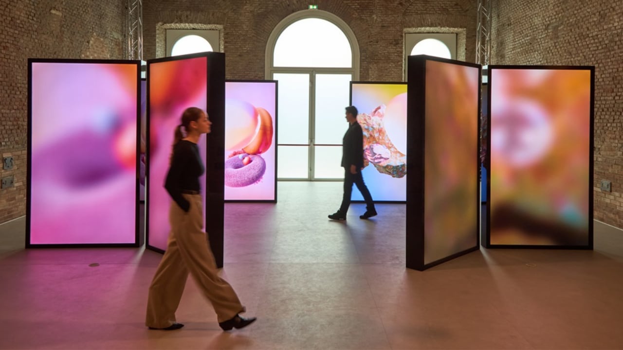
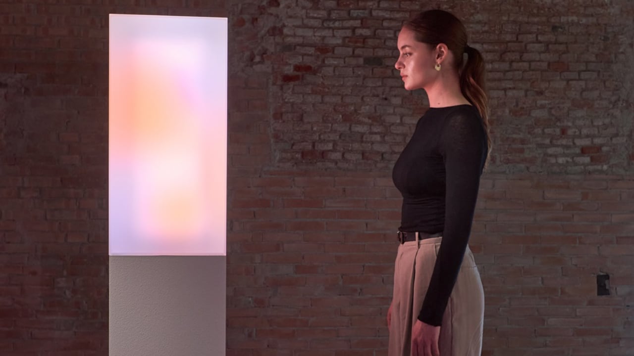
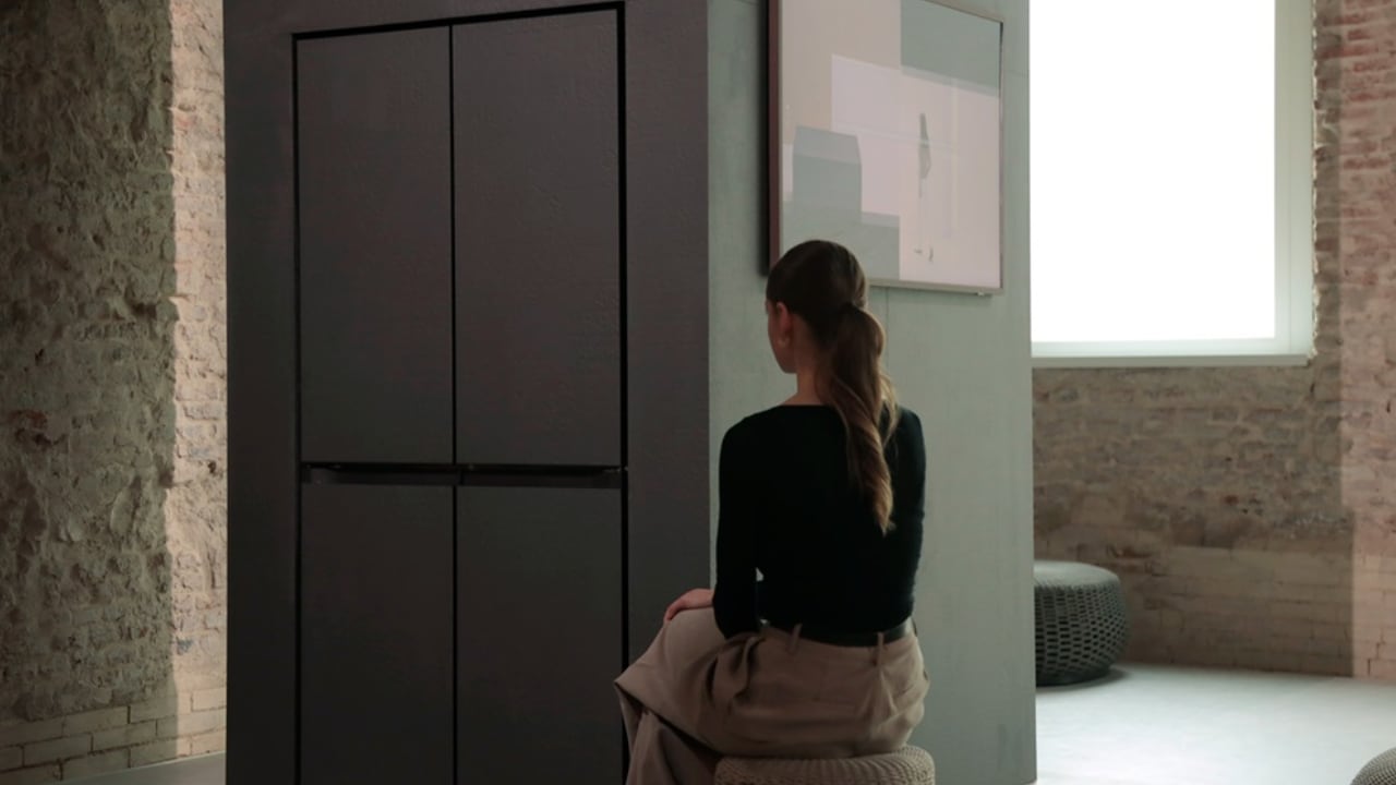
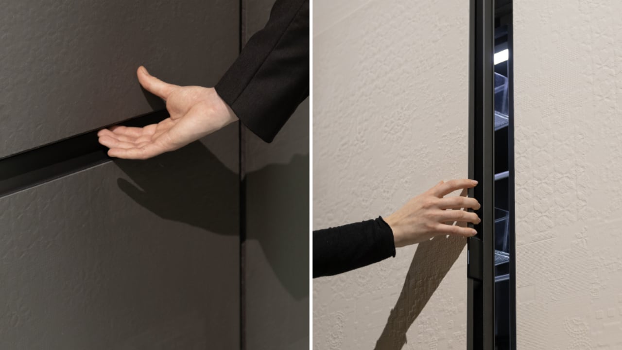
Next, we move to the “Innovative” section. Here, Samsung shows off its drive to make everyday life better with functional advancements. There are interactive displays that change based on how close you are to them, just like Samsung’s smart TVs and vacuum cleaners that adapt to your needs. This part really shouts about Samsung’s ambition to push tech boundaries.

A display shown at INNOVATIVE, the second exhibition space of Samsung Design’s Newfound Equilibrium, displays forms that shift from solid to ethereal textures as guests move closer or farther away.

INNOVATIVE, the second exhibition space of Samsung Design’s Newfound Equilibrium

INNOVATIVE, the second exhibition space of Samsung Design’s Newfound Equilibrium

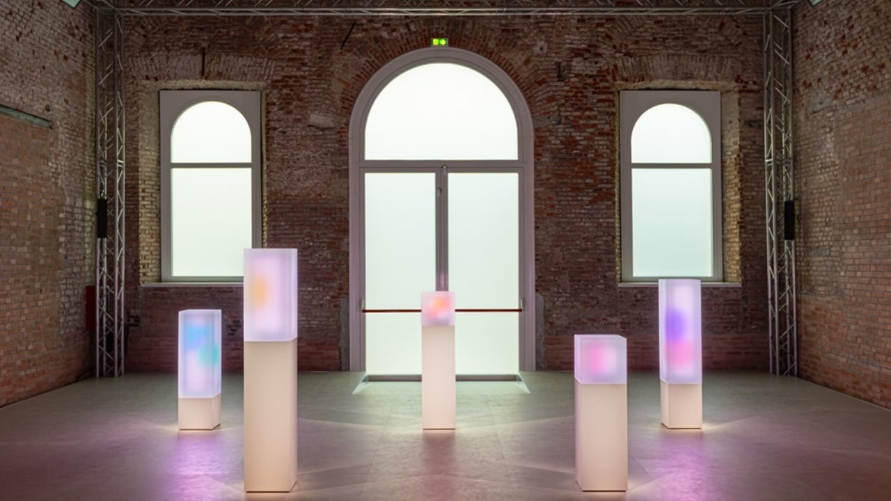
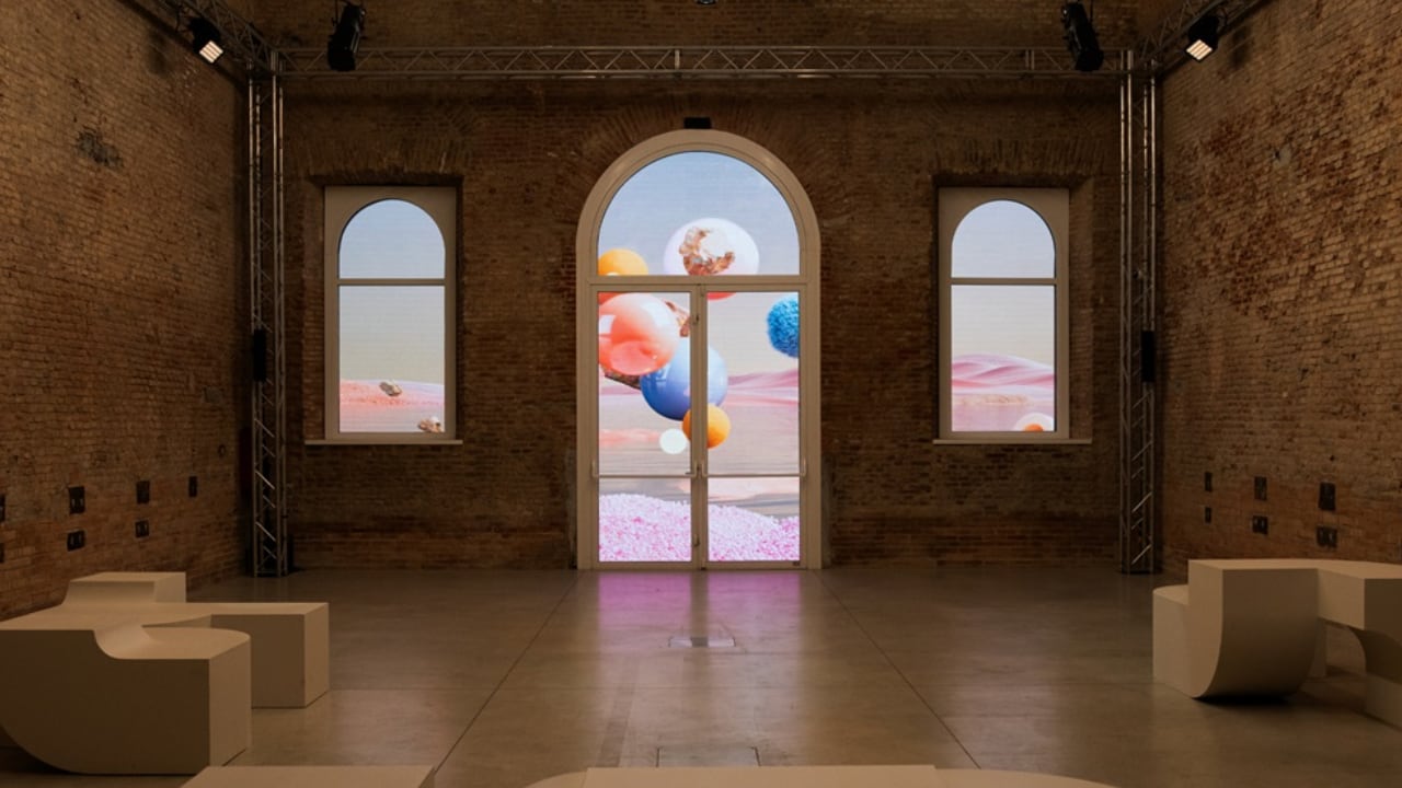
Then there’s the “Harmonious” section. This is all about how tech can blend into daily life, like the SmartThings ecosystem and the Music Frame that enhance your home without taking over. There are interactive LED displays that mimic natural events, inviting visitors to imagine a world where tech fits in naturally with human and environmental needs.

HARMONIOUS, the third exhibition space of Samsung Design’s Newfound Equilibrium

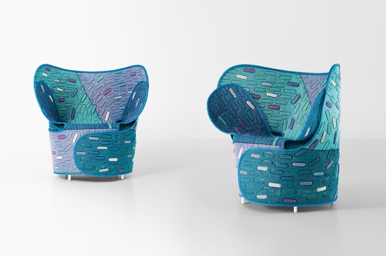
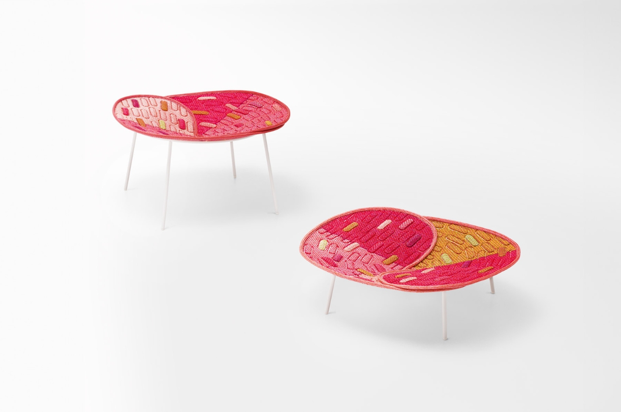
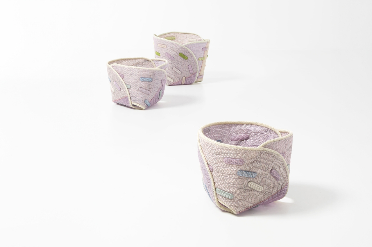
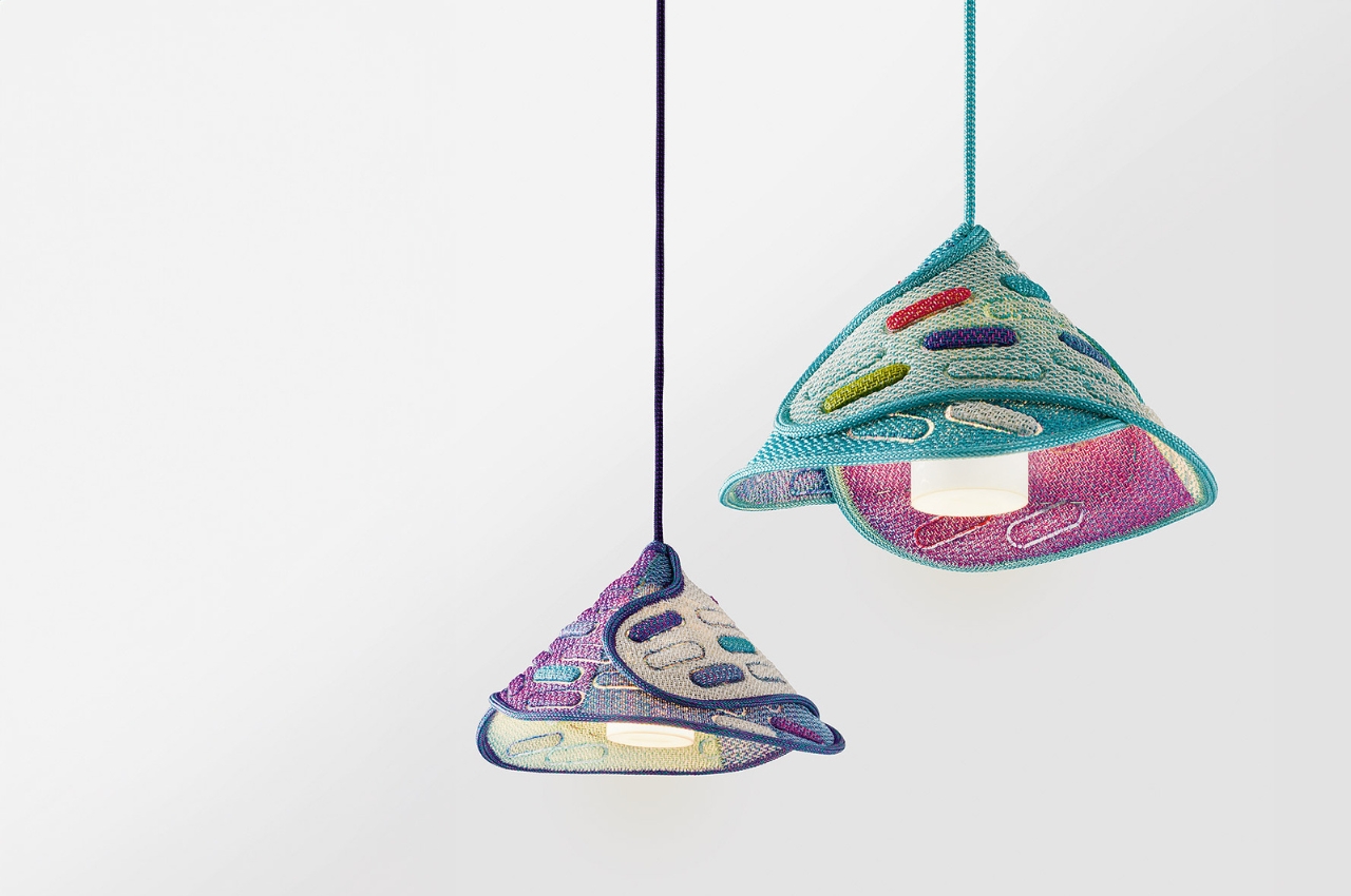
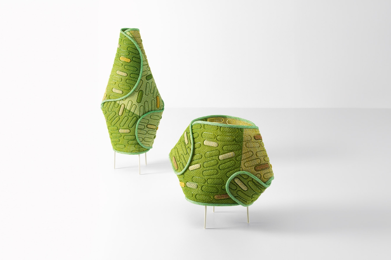
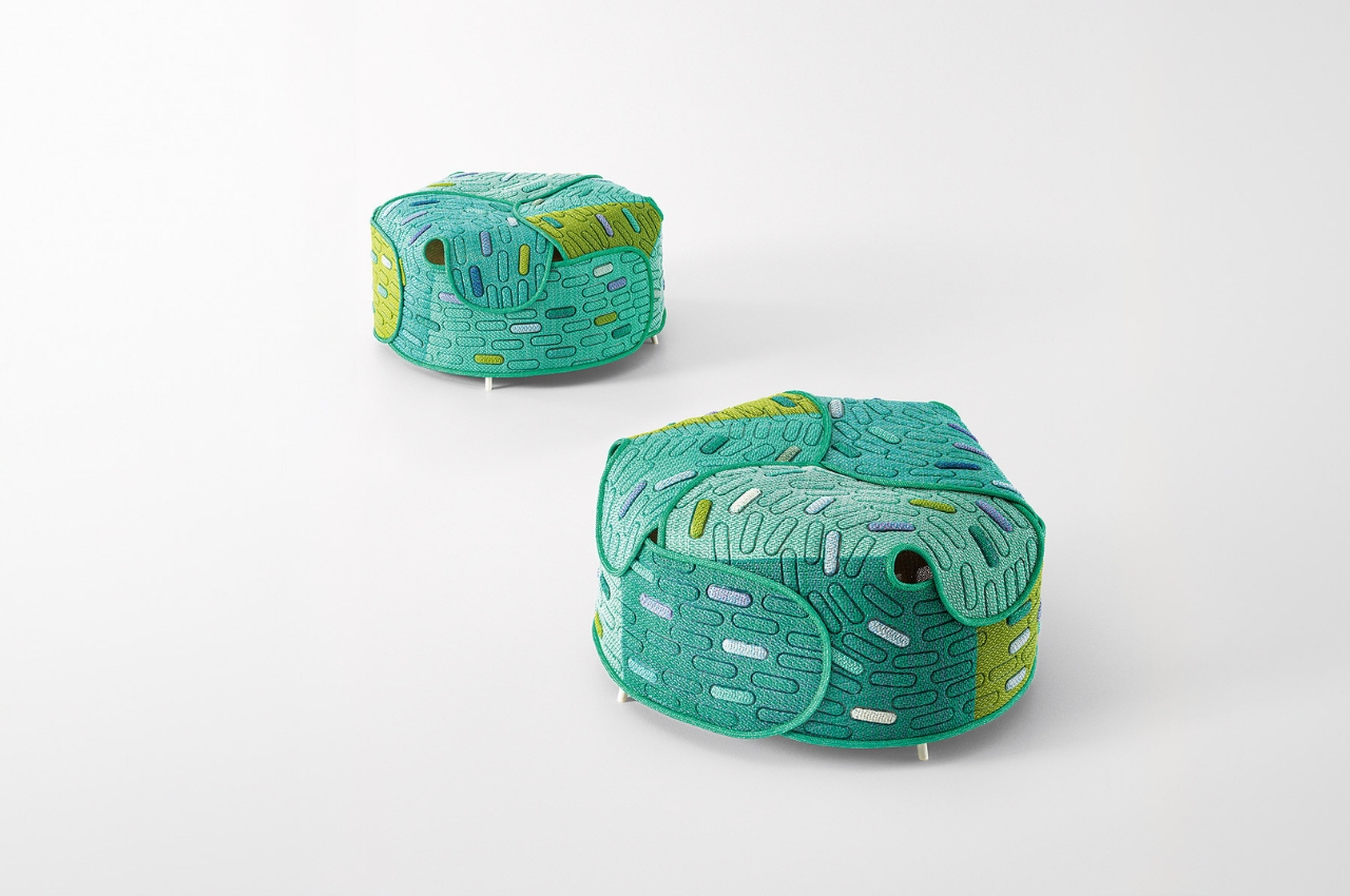
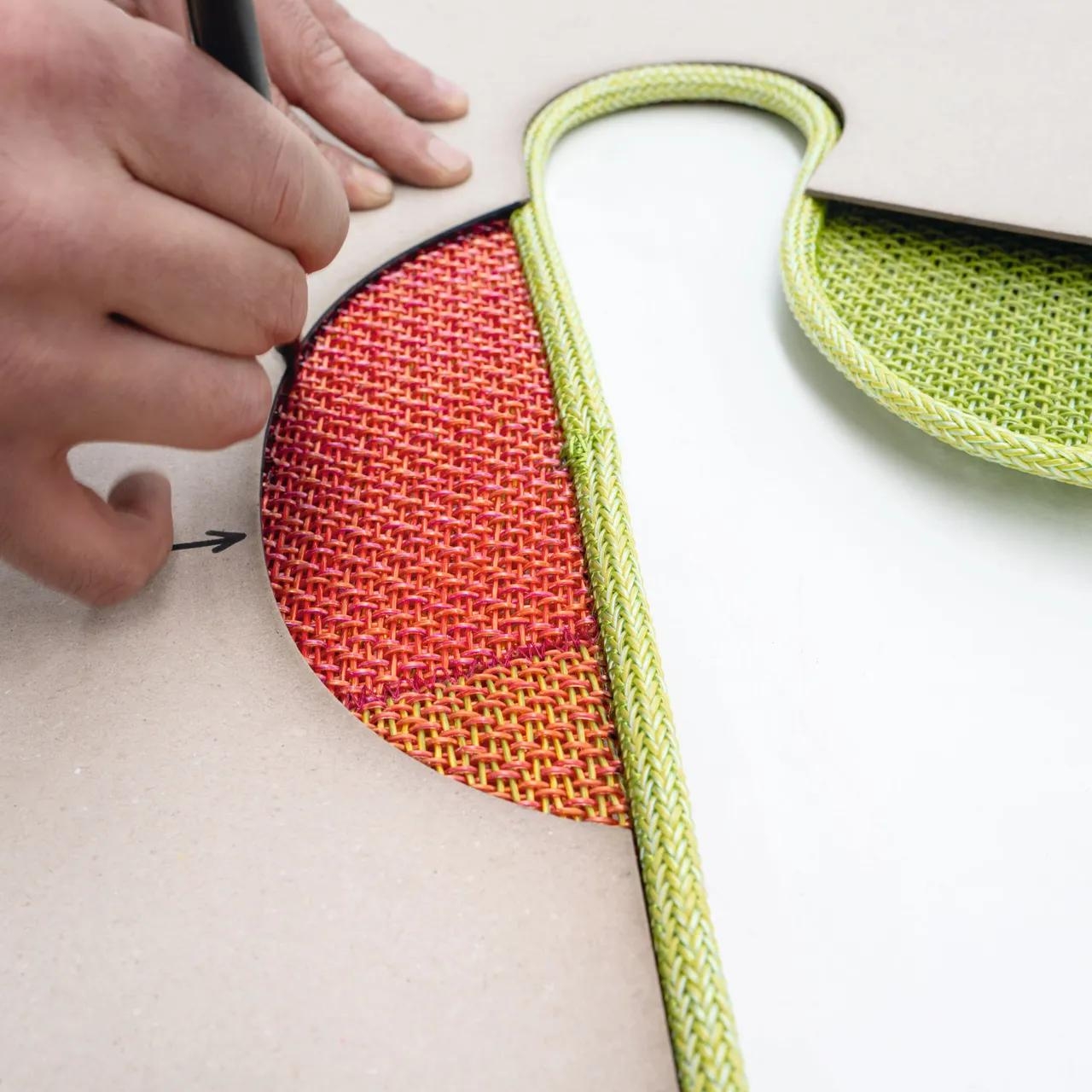
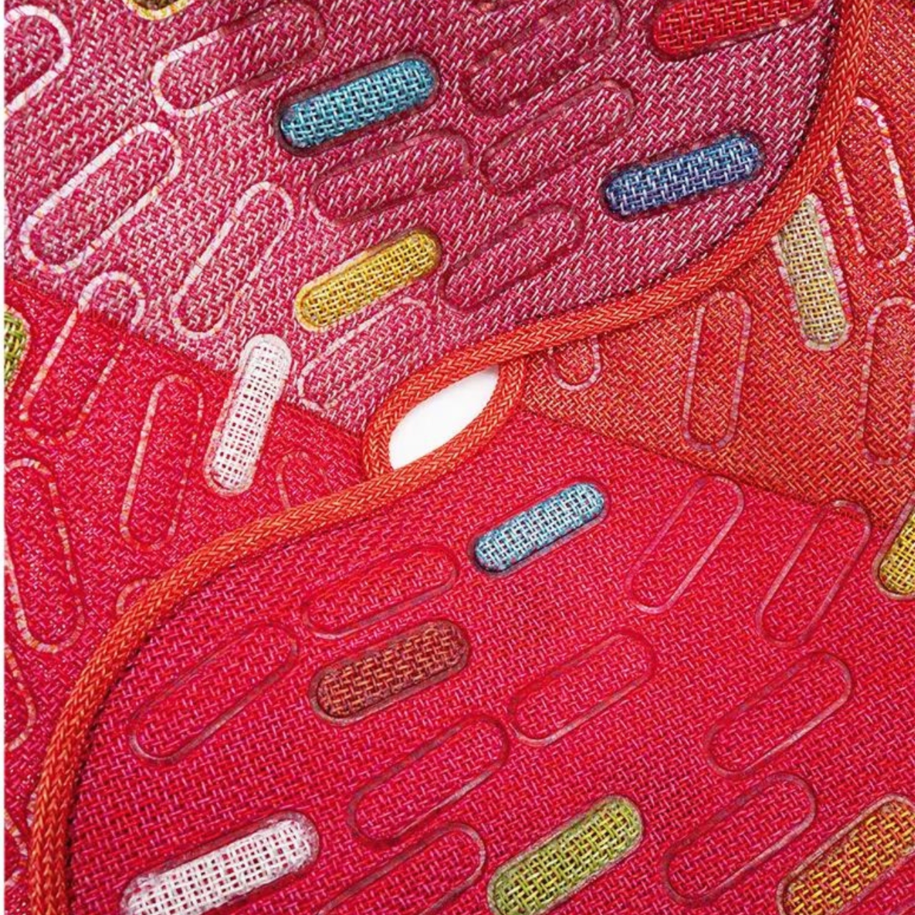
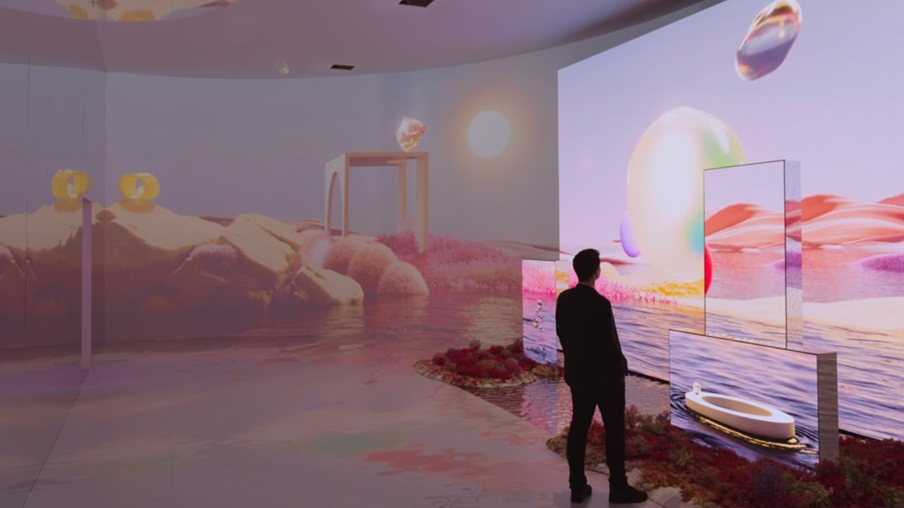
The exhibition wraps up with the “Infinite Dream” and “New Dawning” spaces, which celebrate the blend of modern tech with traditional craftsmanship, through collabs with artisans like MUTINA and ALPI.

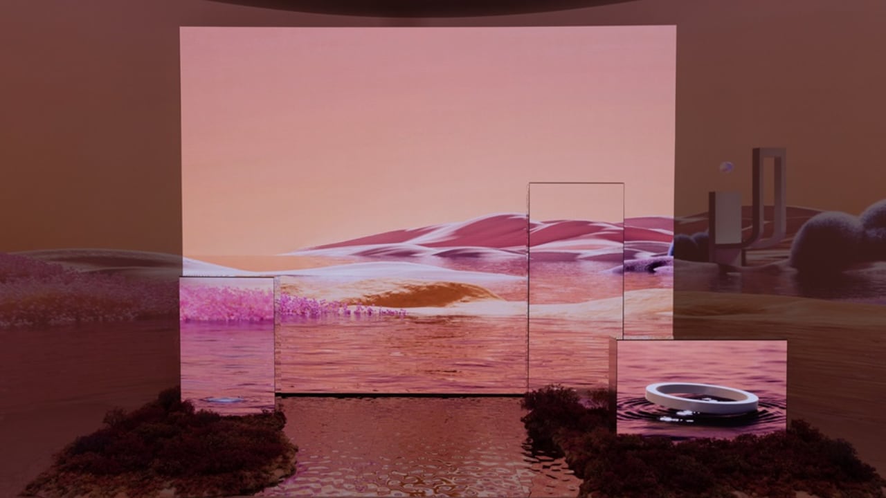
INFINITE DREAM, the fourth exhibition space of Samsung Design’s Newfound Equilibrium

In a nutshell, the ‘Newfound Equilibrium’ exhibition at Milan Design Week 2024 shows off Samsung’s big ideas about the future of tech and design. It’s about tech and design, living together, and making life better for people all over the world. Samsung’s ongoing commitment to thoughtful and progressive design is clear, and it’s really exciting to see what they’re doing to make tech a force for good in our lives.

Bespoke creations that blend modern technology with traditional craftsmanship are showcased at NEW DRAWING, the concluding exhibition space of Samsung Design’s Newfound Equilibrium.

The post Samsung’s Visual Display of Essential, Innovative, Harmonious Design at Milan Design Week 2024 first appeared on Yanko Design.

Geometric chair concept almost looks like an Escherian optical illusion

Chairs can come in all shapes and sizes. Some can take on complicated and organic forms, while others can be extremely minimalist or even brutally raw. They can range from designs that take inspiration from nature to those that adhere to simpler geometric shapes. The Euclid concept is one of the latter, aptly named after the ancient Greek mathematician. But while it draws its shape from a simple cube, its execution sparks a bit of wonder and curiosity as it resembles more the skeleton or wireframe of the shape, represented by almost unbroken lines that are reminiscent of Escher’s famed optical illusion, the impossible cube.

Designer: Sonakshi Gupta

Admittedly, it’s a bit difficult to see the Euclid chair as a cube, since most of us have this idea of a cube as having 12 lines that are all connected at eight corners to form six faces. Then again, that popular Escher object already shows an impossible depiction of that shape, and those familiar with that print might see some of that characteristic in this chair when viewed from certain angles. Overall, it creates a dynamic form that has your eyes following the lines and moving all over the place, sometimes confused about where the front and back sides are.

Its unique form isn’t the only notable thing about this concept, however. Its use of reclaimed wood gives it more than a sustainable character. That material, in a way, carries some history from what it was before becoming a part of this chair. Even if that past is unknown to the new owner, simply knowing it has one could give each Euclid chair its own unique charm.

And then there’s the method used to bring all the pieces together. Instead of requiring screws or even glue, a mortise and tenon joinery is used to provide stability without introducing complicated mechanisms. In theory, this could make it easy to later take the chair apart if some pieces need to be replaced, though that could also start to weaken the connection over time if done too frequently.

The Euclid concept chair offers a design that is minimalist, sustainable, and visually interesting. Whereas a cube is pretty much the epitome of symmetry, the missing edges and disconnected faces give the chair a bit more volatility. That said, it doesn’t seem like the most comfortable chair to sit on. Even if you put a cushion on the seat, the hard edges of the armrest and especially the backrest could give your body some grief after a long period of time.

The post Geometric chair concept almost looks like an Escherian optical illusion first appeared on Yanko Design.

Digital nomads can live and work in self-sufficient mobile home

One of the advantages of people who can work remotely (digital marketers, writers, virtual assistants, etc) is that they can work from literally anywhere. As long as there’s internet and a power source for when their devices run out of juice eventually, these digital nomads have the freedom to set up shop wherever they are and to live in things like mobile homes. We’re seeing a lot of products and concepts targeting this segment and I for one am very interested to see these come to life.

Designer: Institute for Advanced Architecture of Catalonia (IAAC)

The Mobile Catalyst, nicknamed MOCA, was developed by masteral students from IAAC. Not only is it a perfect space for those that want to work while staying anywhere with a view but it is also an experiment into sustainable and self-sufficient habitat with a digital twist. It is basically a 5.4 meter long, 2.4 meter wide, and 3.6 meter high minimalist space that gives you the basic necessities of living. Its interior is made from dowel-laminated timber produced at the IAAC itself but sustainably harvested of course.

The front part of this mobile home has the basic amenities you would need to live in it like a kitchen, toilet and shower, and electric and water systems. In the middle and the back part is the space that can be turned into an office, a meeting area, a library, a recreation room, or even a space for small events. If you need privacy or partitions and also protection from different weather conditions, there are glass doors and a water-resistant cotton fabric that slides or folds with a pulley. There are also two beds on its “mezzanine” floor and you can reach it through a movable ladder.

And of course since MOCA is designed to be sustainable, you have three light-flexible mono-crystalline solar panels on the roof and LED strips as an interior lining. The house can run on its own for around 24 hours before it needs recharging. Water is also self-sufficient as the system stores, filters, and returns the shower water into reusable water. The entire mobile home is built with digital nomads in mind so they can live, work, and play anywhere they want, as long as the trailer can move and fit in that area.

The post Digital nomads can live and work in self-sufficient mobile home first appeared on Yanko Design.

Unbuilt Visions and Architectural Narratives of Frank Lloyd Wright in Southwestern Pennsylvania

Photo Credit: THE NATIONAL BUILDING MUSEUM

Saturday, April 13, marked the grand opening of “Frank Lloyd Wright’s Southwestern Pennsylvania” at the National Building Museum in Washington, D.C. This collaborative effort between The Westmoreland Museum of American Art and Fallingwater, guided by the Western Pennsylvania Conservancy, showcases a detailed exploration of Frank Lloyd Wright’s architectural vision through both his realized and unrealized projects.

Designer: Frank Lloyd Wright

Photo Credit: THE NATIONAL BUILDING MUSEUM

The exhibition, curated by Scott W. Perkins and Jeremiah William McCarthy, who are recognized for their expertise in American art preservation and curation, provides an intricate look at Wright’s proposals from the 1930s through the 1950s, considering their potential impacts across various landscapes. Noteworthy are the animated reconstructions of five projects that were conceived but never executed. These include innovative designs such as the transformation of the Point in 1947, a futuristic self-service garage at Kaufmann’s Department Store in 1949, and the Point View Residences planned in 1952 for the Edgar J. Kaufmann Charitable Trust.

Photo Credit: THE NATIONAL BUILDING MUSEUM

Enhanced by state-of-the-art three-dimensional rendering technologies that parallel those used in contemporary cinema, these animations by Skyline Ink Animators + Illustrators bring Wright’s unrealized ideas to life. The experience is augmented in a dedicated viewing theater, complete with a specially composed musical score by Daniel May and Marty Ashby, which accentuates Wright’s meticulous attention to material detail, textures, and the interplay of light and shadow.

Photo Credit: THE NATIONAL BUILDING MUSEUM

Aileen Fuchs, the president and executive director of the National Building Museum, expressed her enthusiasm for the exhibition, noting its fit with the museum’s dedication to showcasing innovative and inspiring works. The exhibit highlights Wright’s architectural genius and encourages visitors to explore the ‘what might have been’ of his unrealized projects.

Photo Credit: THE NATIONAL BUILDING MUSEUM

The exhibition also underscores Wright’s significant influence in Pittsburgh, a connection initiated by Edgar J. Kaufmann, Sr., who introduced Wright to the city in 1934 and advocated for his involvement in various civic projects. This partnership often aligned with the goals of the Allegheny Conference on Community Development, which aimed to tackle urban challenges and enhance the city’s cultural landscape.

Photo Credit: THE NATIONAL BUILDING MUSEUM

“Frank Lloyd Wright’s Southwestern Pennsylvania” will continue to engage visitors until March 17, 2025. It enjoys the support of The Heinz Endowments, The Hillman Exhibition Fund of The Westmoreland Museum of American Art, and donors like Wendy and David Barensfeld. Contributions from The Frank Lloyd Wright Foundation, The Museum of Modern Art, and the Avery Architectural & Fine Arts Library at Columbia University further enrich the exhibition.

This display commemorates Wright’s architectural legacy and functions as an educational platform. It merges historical context with contemporary technological displays to invite visitors to appreciate the blend of artistic expression and architectural innovation.

The post Unbuilt Visions and Architectural Narratives of Frank Lloyd Wright in Southwestern Pennsylvania first appeared on Yanko Design.

Sustainable and minimalist desk tray collection lets you mix and match to your needs

Desk trays are an indispensable part of any organization system, and their designs vary wildly to meet different needs and aesthetic tastes. While wooden desk accessories are not uncommon, the most standard materials used for these products are often virgin plastics that, given the volume of their use, spell trouble for the planet. Fortunately, a few designs nowadays do try to utilize recycled or even upcycled materials to ease the burden on the environment, but good design doesn’t have to stop there. This concept, for example, seems to check all the right boxes by offering not only a sustainable solution with a beautiful minimalist design but also one that lets you combine pieces as you see fit or use them solo in different places as needed.

Designers: Hoyeon Shin, Seokhyoun Han, Joae Kim, Yeongha Kim, Zoae Kim for Haus Bari

Truth be told, this design is actually four separate products sharing a similar DNA. One design, however, can’t meet all the needs of all users, so rather than make a monolithic product that wastes space and materials, this series of trays simply offers four unique designs that can be used for a variety of purposes, including in places that don’t involve work tables and stationery.

All four pieces share the same thin square platform, but that’s pretty much where the similarities end. One “block”, for example, has a fixed cylinder that can be used for holding writing instruments, tools, or maybe even flowers. Another has a circular indentation that invites you to place a mug or glass on it, though it can also fit small items such as an AirPods charging case. The tray with a wavy surface can be a bed for pens and pencils without having them jumbled up together. The fourth member has a simple flat surface, but flip it over and you will behold the Bari branding underneath. It can also function as another coaster thanks to that circular groove again.

The trays use diatomaceous earth, a sustainable material that is gaining popularity among product designers. It also gives the tray a textured appearance that resembles rough, unpolished stone, making the minimalist products look a little more visually interesting. It also makes it possible to place wet or damp objects on top of the tray, such as sponges or even soap, thanks to the material’s moisture resistance and self-drying properties.

1

Although each of these trays functions as an independent unit, you can also combine them as a single organization system where you have free reign over how they are arranged. You can have them for a line, put them in a grid, or spread them out all over the desk. Of course, you’re not limited to just one of each piece, either, and can form an army of trays and containers ready to keep your mess at bay. It’s an admittedly simple solution to desk and life organization, but one that offers beauty and flexibility in a package that tries to reduce its negative impact on the environment.

The post Sustainable and minimalist desk tray collection lets you mix and match to your needs first appeared on Yanko Design.

A Sustainable Circular Home that displays Discarded Toys on the Walls as Unique Decor

Architecture is more than just bricks and mortar; it’s a canvas for expressing cultural nuances, socio-cultural issues, and environmental concerns. From the grandeur of Romanesque cathedrals to the intricate designs of Gothic structures, architecture has long served as a medium of storytelling. In contemporary times, architects continue to push boundaries, as exemplified by architecture studio Wallmakers’ latest creation: Toy Storey, a circular home nestled in the verdant landscapes of Kerala, India.

Designer: Wallmakers

Established by Daniel in 2007, Wallmakers has earned acclaim for its innovative approach to design. However, their latest project takes innovation to a whole new level. Toy Storey isn’t just a residence; it’s a living monument to nostalgia, childhood, and environmental consciousness.

The concept behind Toy Storey is simple yet profound: repurpose discarded toys as structural components and decorative elements within the home’s walls. Approximately 6,200 toys, considered unsuitable for recycling, find new life in this unique dwelling. Plastic, a ubiquitous material in today’s world, particularly in the realm of toys, takes on a new identity, serving as a reminder of simpler times and prompting reflection on our consumption habits.

Located in Vadakara, North Kerala, Toy Storey’s design is deeply rooted in its surroundings. The circular layout, accessible from every side with a verandah supported by toys and old Mangalore tiles, harmonizes with the local landscape. The use of compressed stabilized earth blocks (CSEB) and Mangalore tiles, alongside toys, creates a visually striking facade that blends tradition with contemporary sensibilities.

The architectural ingenuity doesn’t end with the exterior. Inside, Toy Storey is a testament to thoughtful design and community-centric living. Divided into public and private segments, the home fosters a sense of togetherness while respecting the need for personal space. Japanese-style shoji screens serve as translucent partitions, allowing light and visual connectivity to permeate the interior.

The incorporation of a central courtyard and composite CSEB-Toy Jaali wall enhances cross ventilation and insulation, ensuring a comfortable living environment year-round. Additionally, a secluded basement level, accessed via a central staircase, offers space for a library and bedroom, further enriching the home’s functionality.

Toy Storey isn’t just a dwelling; it’s a conversation starter. It challenges conventional notions of architecture and consumption, urging us to rethink our relationship with the built environment and the objects that inhabit it. In a world saturated with disposable goods, Toy Storey stands as a beacon of sustainability and creativity, reminding us that even discarded items can find new purpose and meaning.

As Toy Storey demonstrates, architecture has the power to transcend mere functionality and become a reflection of our values, aspirations, and collective memories. In repurposing childhood relics to create a home, Wallmakers has not only crafted a physical structure but also woven a narrative that resonates with people from all walks of life. In the heart of Kerala, Toy Storey stands as a testament to the potential of architecture to inspire, provoke, and delight.

The post A Sustainable Circular Home that displays Discarded Toys on the Walls as Unique Decor first appeared on Yanko Design.

Japanese-inspired furniture line is made from recyclable, colorful fabric

There are pieces of furniture that serve their purpose in your living space even if they’re not always that well-designed. Then there are those that you don’t really understand what they’re for but they’re just so pretty or fits into your aesthetic that you just know you need to have them. Of course if those pieces are also sustainable and eco-friendly, that’s a great bonus. Well, it would also be great if they can actually do what they’re supposed to do while looking pretty and saving the earth.

Designer: Nendo for Paola Lenti

Italian furniture brand Paola Lenti unveiled their collaboration with Japanese design firm Nendo at the Milan Design Week. The Hanara-shi series of furnishings and complements look like art pieces at first glance. Their shapes and designs are inspired by Japanese culture of course, specifically the cherry trees that are starting to be in full bloom in Japan right now. There’s also some inspiration from ancient samurai armours if you look closely at the fabrics and patterns.

While their colors are really attractive and eye-catching, I couldn’t figure out at first what they were supposed to be. But upon closer inspection (of the photos and the website), there are suspended lamps, baskets, floor lamps, armchairs, and poufs/ottomans included in the collection. The fabric used is Maris mesh which is recyclable and made from 100% polypropylene waterproof material. Unlike other furniture which starts from the design, this one started from showing the fabric that they will be designing and that’s when the ideas started to flow.

Since the material is rigid, marbled in colour but textured, flexible, and malleable, they were able to fold and wrap them on themselves to create this line of products. There are of course welded elements to put them all together but the main star of this Hanara-shi series is definitely the fabric and how they designed it to create these pieces of furniture. The upholstery and inlays used are also recovered cutoffs from previous processes so you can say that not only are they beautiful but they’re also friendly to the earth.

The post Japanese-inspired furniture line is made from recyclable, colorful fabric first appeared on Yanko Design.

The Beluga Chair Is A Stylish Revolution in Sustainable Living by POLIMAIR

The Beluga Chair is a symbol of hope in the landfills flooding with plastics. It’s crafted from recycled fishing nets sourced in France, embodying POLIMAIR’s commitment to environmental responsibility. Designed by Arthur Gaudenz, this innovative chair represents a paradigm shift in furniture design, being the first chair in kit form crafted entirely from 100% recycled plastic.

Designer: POLIMAIR

At its core, the Beluga Chair embodies the ethos of sustainability and durability. Its mono-material construction utilizes discarded fishing nets sourced and recycled in France, eliminating the need for additional materials such as steel screws, glues, or wood. This not only reduces waste but also minimizes CO2 emissions, paving the way for a more eco-conscious future.

POLIMAIR’s visionary approach recognizes the evolving role of plastic—from a durable substitute for ivory in billiard balls to one of the most pressing ecological challenges of our era. In response, the design team advocates for a return to the essence of plastic as a material designed to last. The Beluga Chair stands by this philosophy, embodying four foundational pillars that prioritize sustainability in furniture production.

Central to POLIMAIR’s ethos is the commitment to local craftsmanship and environmental responsibility. From the design conception in Paris to the raw material sourcing from coastal regions such as Brittany, Normandy, Provence, and Occitania, every step of the production process integrates local expertise and promotes sustainable practices. The label “100% Made in France” not only ensures quality but also reinforces the company’s dedication to supporting local communities.

One of the most innovative features of the Beluga Chair is its 100% life guarantee, a testament to its durability and longevity. With the kit format, any damaged part can be easily replaced, ensuring that the chair remains functional for a lifetime. This commitment to product longevity aligns with the company’s mission to prevent its furniture from ending up in landfills. Furthermore, the option for customization allows users to tailor the design to their individual preferences, enhancing the personal connection between the product and its owner.

By embracing the aspects of DIY assembly and customization, it elevates the value of the Beluga Chair beyond mere functionality. It fosters a sense of ownership and creativity, empowering users to actively engage with the product and participate in its lifecycle. This not only enhances the user experience but also underscores the chair’s status as a sustainable lifestyle choice.

The Beluga Chair’s versatility extends beyond its environmental benefits, making it a suitable choice for various interior design aesthetics. Whether paired with a rustic farmhouse table or a sleek modern desk, its minimalist yet elegant design seamlessly integrates into any setting. Furthermore, its vibrant color options add a touch of personality to spaces like studies, libraries, or foyers, where it can serve as a statement piece. Whether opting for bold hues to accentuate contemporary décor or choosing more subdued tones for a classic ambiance, the chair offers endless possibilities for customization, allowing individuals to express their unique style while promoting sustainability.

The post The Beluga Chair Is A Stylish Revolution in Sustainable Living by POLIMAIR first appeared on Yanko Design.

Odd sustainable stool concept prioritizes minimizing materials over recycling

The majority of sustainable designs today focus on using responsibly sourced or biodegradable materials as well as the ability to recycle components at the end of the product’s life. While these are indeed a big leap compared to common production practices, it’s still from the ideal. Even sustainable materials like wood, metal, or bioplastics produce material waste that still gets discarded at the end of the production process. And depending on the materials involved, recycling can actually consume more energy and even result in more pollution, offsetting whatever benefits it should have brought. Another approach to sustainability is to actually reduce the materials used and, therefore, the materials that need to be recycled, as what this rather unconventional “two-piece” stool design tries to propose.

Designer: Kitae Pak

The less materials you use for a product, the more products you can make out of that material. If a single 1,220mm x 2,440mm sheet of plywood would normally yield 24 circular plates with a diameter of 310mm, you could potentially squeeze 219 plates with a diameter of 120mm. That’s the kind of increase in yield that the Dots stool concept is claiming, making more efficient use of a material without compromising on quality, at least in theory.

The concept accomplishes this by completely redesigning what a stool is expected to be. Yes, it’s still a piece of furniture for seating, but there’s no hard rule that the seat has to be one large and whole piece. Instead of a single big circle, the Dots stool utilizes two smaller discs to support the body at rest, hence the name. It delivers the same function but at a significantly lower material consumption right from the start.

With this minimalist design, which consists of two wooden rods for legs and recycled plastics to connect the pieces into a stable whole, you can make 4 times more Dots stools than a regular stool using the same materials. This kind of conservation means that the production process itself would use less materials and energy to produce the same number of stools, while recycling would also use less energy and water as well. And since it’s mostly made of wood, the stool can also be repurposed for other designs or returned to the Earth one way or another.

While the design does check all the right sustainability boxes, it does raise questions on conform and stability. It’s arguable that it does serve its function well, but neither its appearance nor its ergonomics inspire complete confidence. It’s not a complete loss, however, as the experiment proved that there’s still a lot of room for improvement even for already sustainable designs.

The post Odd sustainable stool concept prioritizes minimizing materials over recycling first appeared on Yanko Design.

eBook readers are about to become a little bit more sustainable

eBook readers, often just called eReaders, have come a long way since the earliest days of the likes of the Amazon Kindle. Not only do some of them now support pen input for jotting down notes, some even have color E Ink screens that add a bit of life to There are also some that are practically Android tablets with e-paper displays instead of LCDs or OLEDs, offering a more eye-friendly digital lifestyle. Unfortunately, those new features do add up, making the newer generation of these devices more expensive than their forebears. That means that these color eBook readers are even more of an investment than before, and their longevity is now more important compared to the past. Thankfully, manufacturers are taking notice and may have started the journey toward a greener future for this market with Kobo blazing the trail.

Designer: Kobo

Amazon’s Kindle might be the household name when it comes to eBook readers, but it is hardly the only game in town, not by a long shot. In fact, when it comes to innovation, you could even say that it lags terribly behind, banking only on its industry clout and expansive library to maintain its lead. As far as major brands are concerned, Kobo can be considered second place, but its latest moves have definitely put it ahead of the game in some aspects.

It has recently launched three new eReaders, two of which have color E Ink screens. While the technology is hardly new, it is the first time a major brand adopted it. In contrast, Amazon has only been rumored to be working on a similar device, but given how long it took to come out with a pen-enabled Kindle, it might still take a while. Then again, now that Kobo has stolen its thunder, it might be a bit motivated to expedite its schedule.

What’s more interesting, however, and one that almost flew under the radar, is that Kobo’s three new readers will also be its most repairable devices. It has apparently partnered with self-repair experts iFixit in making the new Kobo Libra Colour, Kobo Clara Colour, and Kobo Clara BW more repair-friendly, which means that repair kits and instructions will be made available. As of this writing, details are still non-existent, but it’s still a huge step forward and a first for the eBook industry.

What this practically means is that these three devices could very well become the longest-lasting of their kind, allowing owners to replace certain parts for as long as those parts are available. As eReaders graduate from cheap and almost disposable plastic devices into powerful and sophisticated machines, the need to make them more durable and resilient also grows. To its credit, Kobo has been making major strides toward sustainability, including the use of more than 85% recycled plastic in its devices. This pleasant surprise goes above and beyond what any eReader manufacturer has so far done, putting Kobo on the same track as the likes of Apple, Samsung, and Google in the smartphone market.

The post eBook readers are about to become a little bit more sustainable first appeared on Yanko Design.