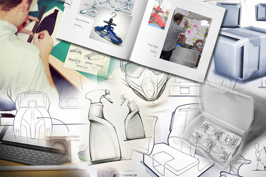
For an Industrial Designer, there are few things more significant than your portfolio. It’s the number one reason you still haven’t landed your first design job. Alternatively, it’s the main reason you got the job you are in. We all understand its importance, so here are a few pointers.
By no means have I figured it all out or published a blueprint for the ultimate portfolio. However, I’ve learned a lot along the way and received some great advice from top guys at places like IDEO, Nike, Fuseproject and Google – and I feel there are some really great points to pass on. So, here are 10 thoughts to consider:
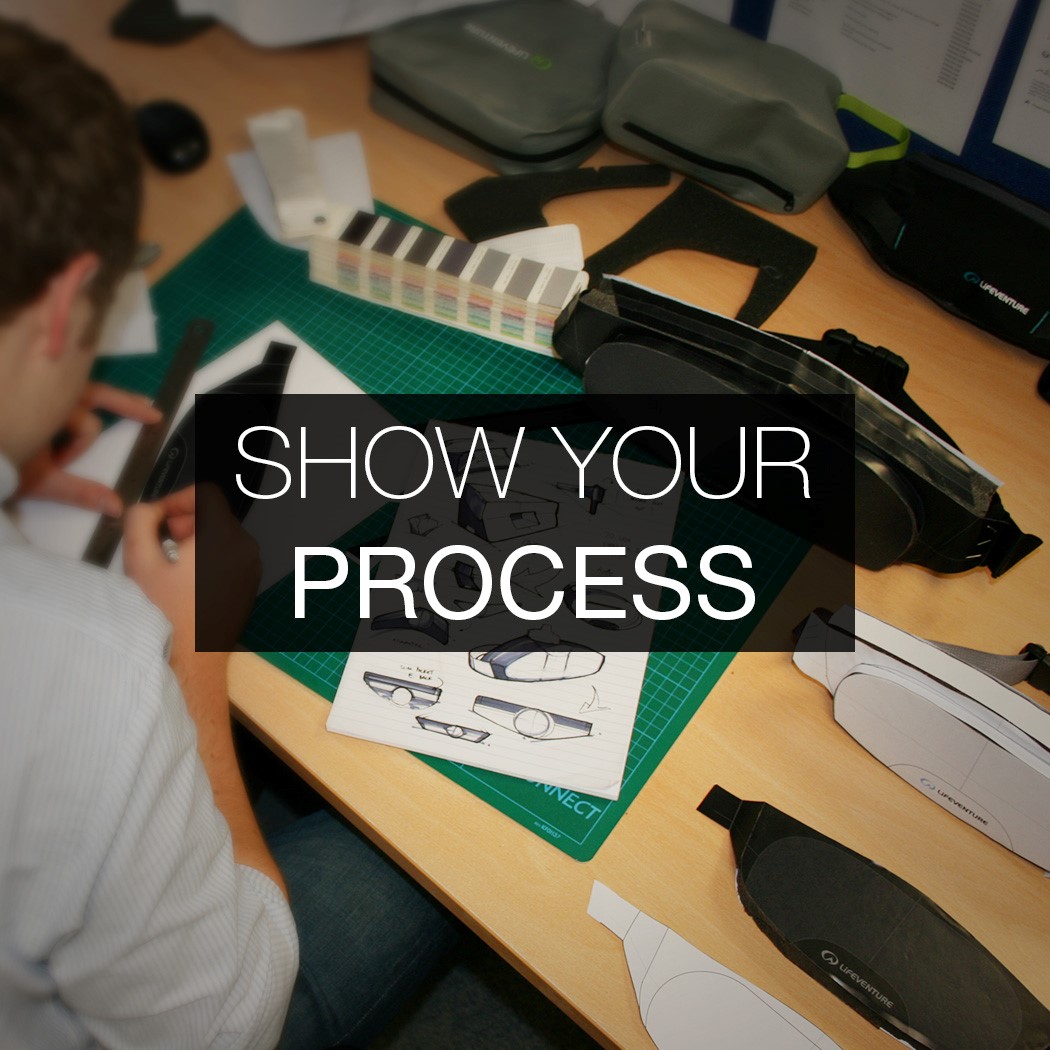
01. SHOW YOUR PROCESS
Your portfolio should not look like a catalog of the products you’ve designed. You’re not trying to sell your products, you’re trying to sell YOU. In order to do this, you need to show your thought process and how you got to the end solution. If you only show images of the final product, then that is the only thing you can be judged on. With no evidence of initial ideas and how you approached different aspects of the project, you make it impossible for a reader to assess the thinking behind your approach. If I’m reviewing your work, I may dislike a certain aspect of the final design, but might appreciate the way you got there. If you don’t show the development journey then you don’t allow for this appreciation.
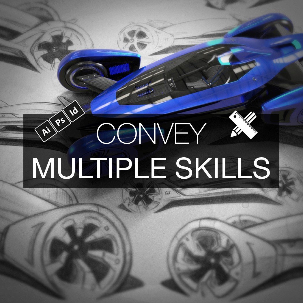
02. CONVEY MULTIPLE SKILLS
In order to sell YOU, think about what capabilities you can convey. One great exercise is to note down a list of the skills you have, and make sure these skills are evidenced in your portfolio.
Rendering is only one skill. A lot of portfolios fail to show a range of skills beyond KeyShot, so think about incorporating hand sketches, Photoshop renderings, Illustrator linework, and prototypes.
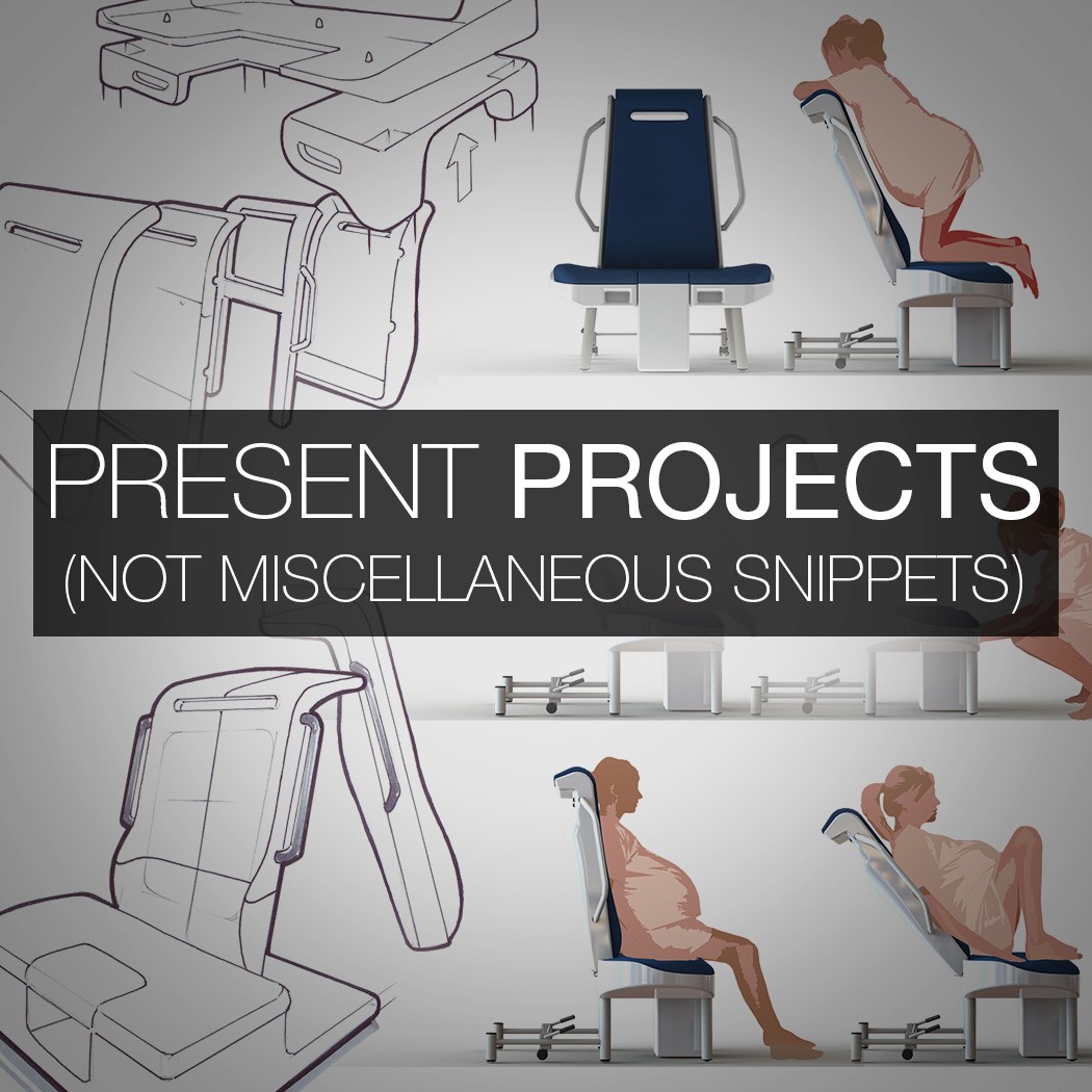
03. PRESENT PROJECTS, NOT MISCELLANEOUS SNIPPETS
In recent years, I’ve seen graduates compile a page of random drawings and group them on a page titled ‘Sketching’. This presentation style of miscellaneous snippets is NOT the way to go. The work should not be grouped by skill. There’s no story in that. More importantly, there’s no storytelling ABILITY being conveyed.
Instead, your portfolio should be presented through projects, and the skills are entwined within those projects. Not every project needs to communicate EVERY skill. One project might focus more on a mechanical challenge and another may focus on form, but the skills are integrated into projects – not isolated in a separate section.
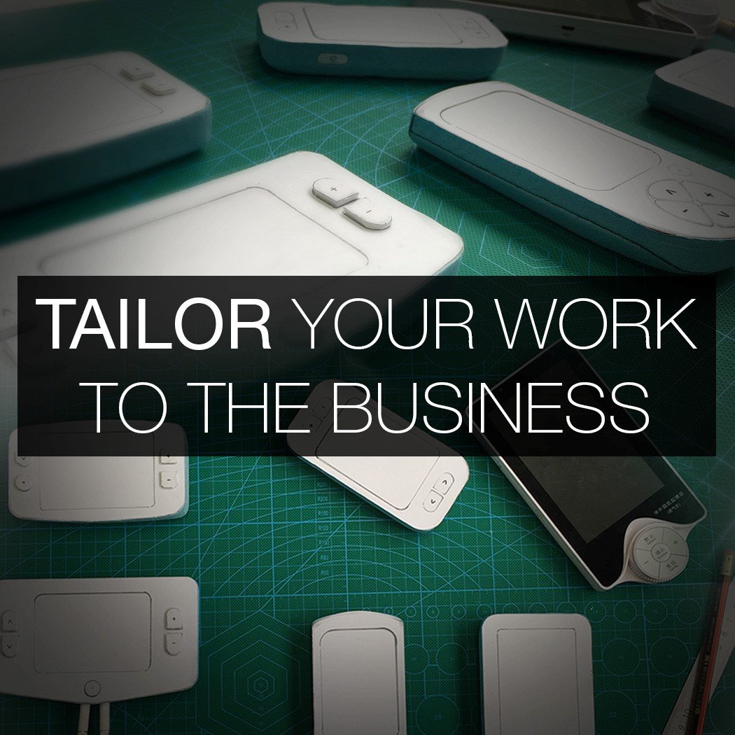
04. TAILOR YOUR WORK TO THE BUSINESS
When you build your level of design experience, you have more projects in your locker than you need for an application. So, you base your decision of which projects to include based on which are the most relevant to that specific business.
When you are just graduating, you can still adopt the same mindset even though you have a limited number of projects. The way you can do this is by shifting the focus of the project. You are in control of your portfolio and have the ability to draw attention to whatever you like. For a large, complex project you will not go through every aspect of the design in an application portfolio. So, if you know that the particular role you are applying for requires more of an understanding of mechanics, then draw more attention to that aspect of the project. Tailor your portfolio for each application.
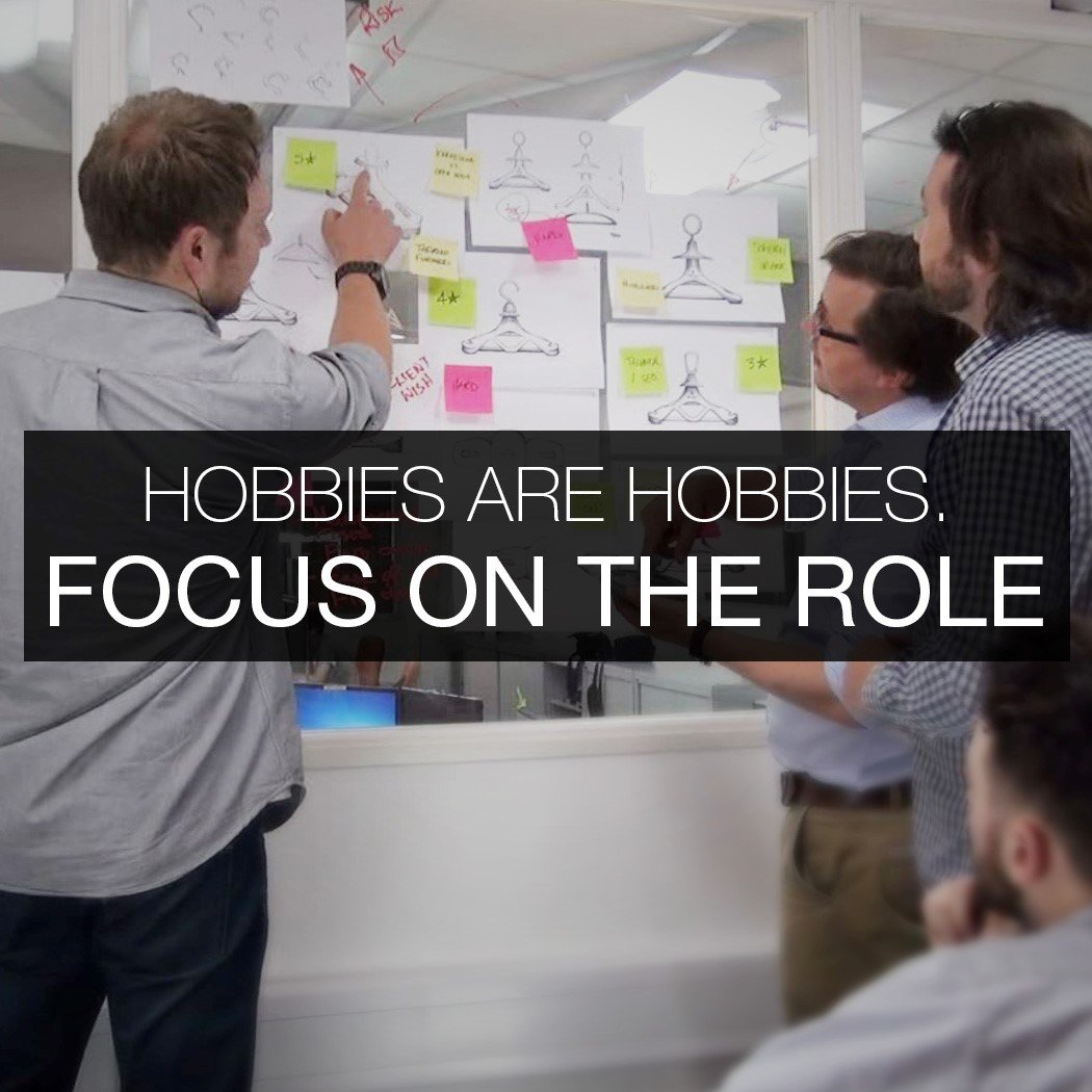
05. HOBBIES ARE HOBBIES. FOCUS ON THE ROLE.
I often get asked by ID students if they should include graphic design work within their portfolio. The answer is always no. The reason is because your portfolio itself should be a shining example of your sensitivity to graphic design, layout, and proportion. The question normally comes from those who enjoy developing brand identities on the side or have a graphics freelance gig designing menus for local restaurants. There is a tendency to include things just because you CAN do them. Just because you can, it doesn’t make them any more relevant.
Photography skills are important as a designer, but not as important as being a great designer. That is what must come first and foremost. Make sure that you don’t infringe on your ability to present yourself as a great designer by clouding the portfolio with a lot of ‘side skills’. I’ve seen 22-page
design portfolios where the last 8 slides were personal photography. This is detrimental. Instead, plant a seed in your résumé by mentioning other skills and present more detail in the interview (if you land it). First and foremost, focus on communicating the fact you can design great products.
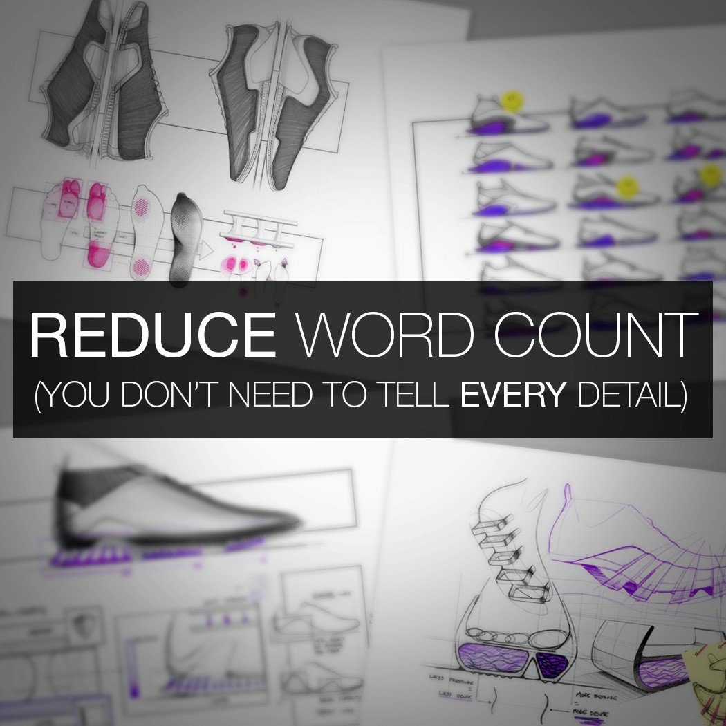
06. REDUCE WORD COUNT. YOU DON’T NEED TO TELL EVERY DETAIL OF THE STORY.
The purpose of the initial application portfolio is not to land the job. It’s to land the interview. When you adopt this mindset, your application portfolio will improve. It only needs to create enough intrigue for the Design Manager or Senior Designer to say “Ok, let’s bring her in for an interview”. The speed at which the reader will flick through your work is rapid. Barely enough time to read sub-headings, let alone a huge paragraph. Engineering roles are different, but for Industrial Design positions, I skim it incredibly fast and stop when something jumps out and makes a visual impact. Only then will I read a few of the details. There are two main levels being assessed. One is the quality of the visual communication. The second is the quality of the actual ideas and concepts. (Behind a great idea drawn badly, is still an individual with great ideas). Both are being judged.
However, the point to take away here is that it MUST be visually impactful in order to catch attention in the first place and draw the reader in. You don’t need to describe every task and every detail in long paragraphs. You can tell the full story in the interview. Telling the story through text is too easy. It’s lazy. A key differentiator is in being able to capture the important aspects of a story in a visual and creative way. So, reduce your word count and make a visual impact.

07. CLARIFY THE PREMISE
One thing that contributes to a poor experience from the reader’s perspective is when you are 4 pages into a project and have seen various sketches, images and renderings, yet you STILL don’t fully understand what the project is about. You’re still asking yourself what the whole point is and what problem is being addressed.
This happens when you don’t clarify the premise at the beginning and make it completely understandable. By not filling this gap in the reader’s understanding, you skip on before they are on the same wavelength. It’s what Chip & Dan Heath refer to in their book Made To Stick as ‘The Curse Of Knowledge’. As in, because you know the subject area so well and are very close to it, you struggle to break it down effectively for someone seeing it for the first time. Taking a step back and being able to do this is a very important skill for any designer.
You must take the reader on a journey where they understand each step. When you do this well, and clarify the problem, it means the reader fully understands what needs to be addressed, and can therefore have a heightened appreciation for the actual ideas within the ideation pages. They get a greater sense of what you are trying to achieve and start connecting with your work on a level deeper than just seeing nice visuals. Allowing for this deeper connection through more effective storytelling is the difference between a good portfolio and a great portfolio.
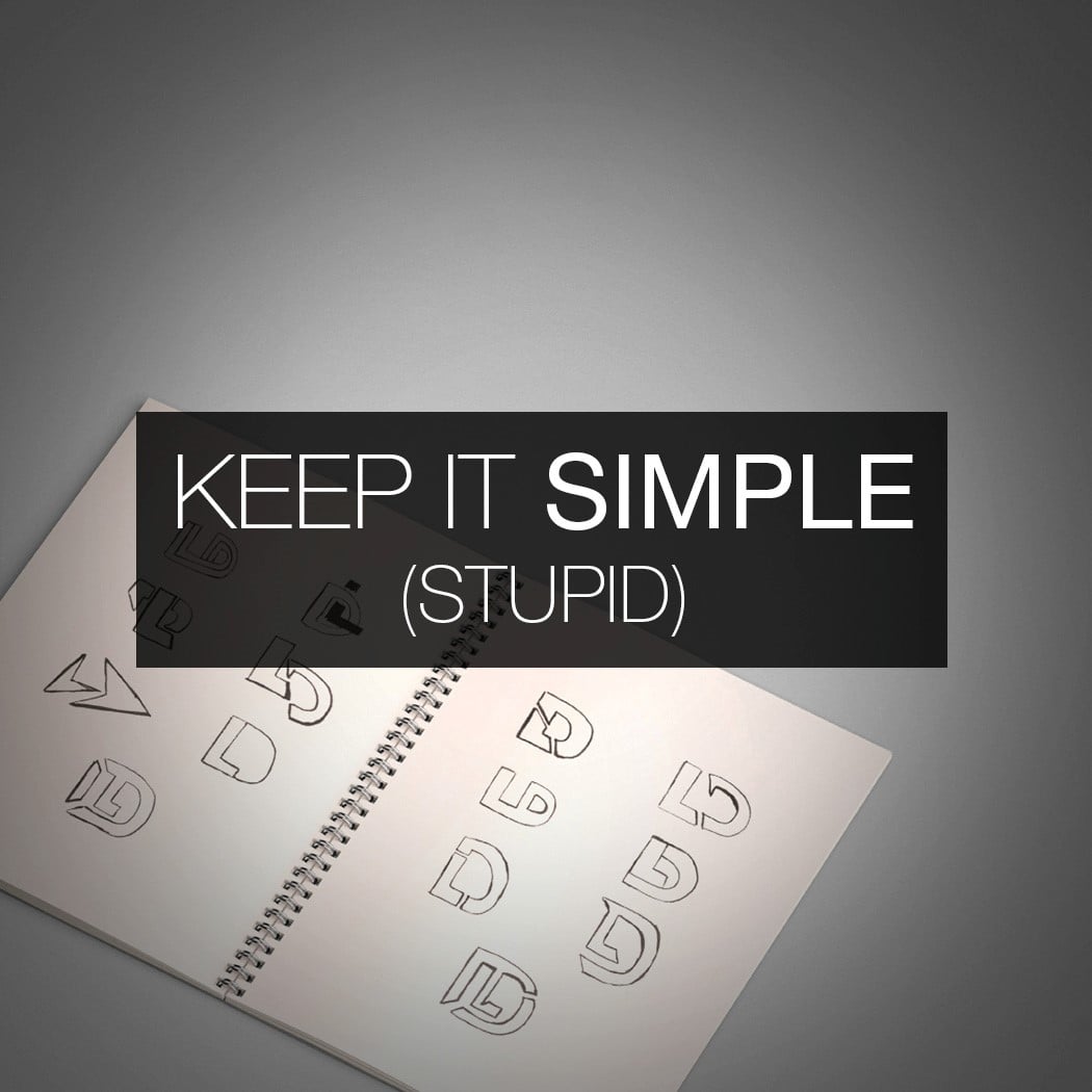
08. KEEP IT SIMPLE (STUPID)
I often come across individuals who are trying to land their first job in a design team, presenting themselves as ‘JHS Designs’. It’s not appropriate. You are John Smith, trying to land a job, so put your name on the cover and not some corporate nonsense. The other thing I see is initials turned into a logo that’s barely readable, and garish borders on every page. Stick with your full name in a simple typeface and get rid of the border. Do away with the clutter, go full width and let the work speak for itself. Keep it simple (stupid).
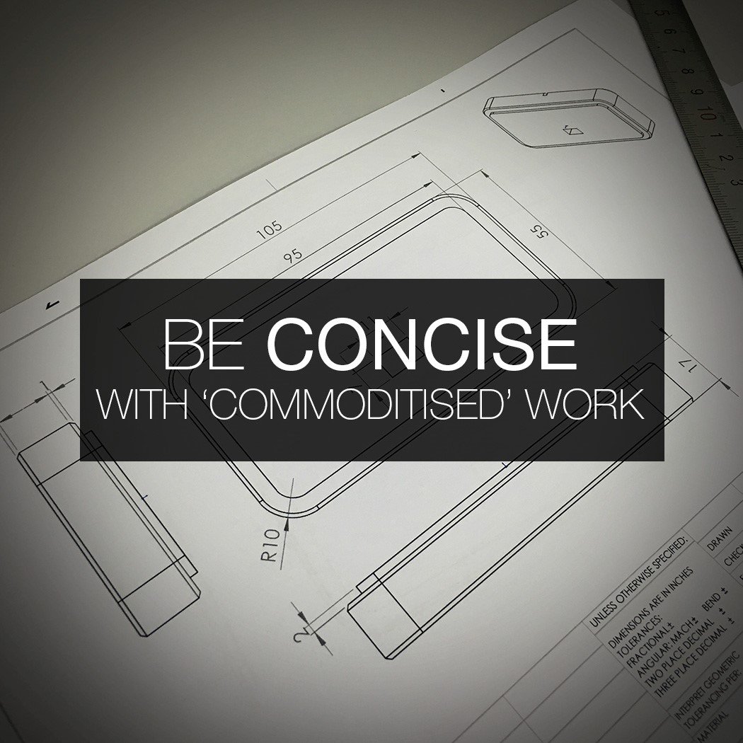
09. BE CONCISE WITH ‘COMMODITIZED’ WORK
What I mean by ‘commoditised’ work is the type of content that doesn’t really show how good you are as a designer. I’m talking about the types of pages that anyone could put together, that don’t show the skills that help separate applicants.
For example, statistics from market research sat next to generic images you found online, followed by a page of existing competitor products and their features, followed by a page explaining target users. Although these are things that may be carried out during the project, they are the types of things that should be done as concisely as possible (if at all) in an application portfolio. It comes back to the point about not needing to tell the ENTIRE story in the initial application because you can go into the detail in the interview. Graduates show too much of this sort of work.
Naturally, we are drawn to pages that are rich in ‘hard skills’. Sketches, ideation pages, visuals of refined concepts and exploded view renderings. These types of things are more individual and help give a better steer as to whether you would bring them in for an interview because they are ‘easier’ to separate if they’ve been done poorly or to a high standard.
Although research stats and personas help with the understanding of the details of the project, they have less influence on the decision to bring in for an interview. Therefore, your portfolio wants to have a high concentration of ‘skill-rich’ pages. People often don’t do this because they lack confidence, so put in the hours and make those pages great. There’s no other way around it.
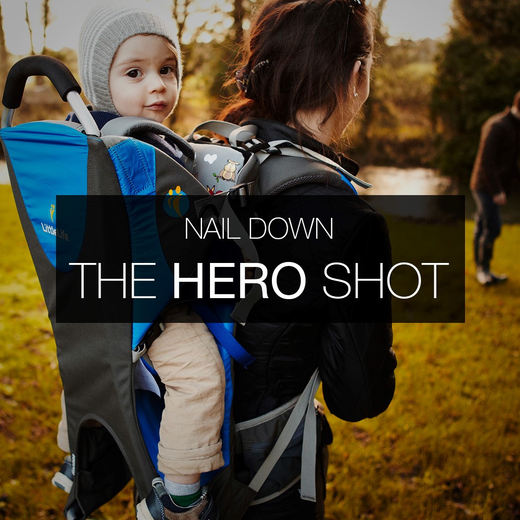
10. NAIL DOWN ‘THE HERO SHOT’
Although your portfolio should not look like a catalogue of renders and photographs of the final product, your presentation of the final product is still a VERY important element. The advice I’ve received time and again from some big-hitters in the industry is that less is without doubt more.
Many portfolios show multiple photographs of the final product on one page in a grid layout. This is the fastest way to lose all visual impact. Less on the page is the way forward. It requires a lot more skill to select ONE image. The right image. The one that simultaneously shows the product in context, communicates its purpose and is visually striking. A picture paints a thousand words, but only if it’s a great picture.
When thinking about your hero shot, don’t look at what other students are doing. If you are designing a wireless speaker for the home, go and see how Bang & Olufsen are presenting their latest product in GQ magazine. Look at the billboard campaigns for the latest Tom Ford sunglasses or social media ads for the latest Dyson fan. Look to the best in the world for inspiration, not the best in your class. You will instantly up your game.
Also, creating an image of the product being used in context usually requires more skill to make it look great, compared to rendering out of context against a white background. Sometimes these clean renders in white space are appropriate, but if you know the ideal image is to show the product underwater on someone’s wrist, then push yourself to visualize this. You’ll develop this ability faster and contribute to your own growth, instead of building a moat around your skill set.
So, that concludes ten things to consider when putting your portfolio together. We wish you the best of luck in crafting the best version you can, and moving closer to the job you want most. Go ahead and bookmark this page for future use, or share it with a friend who’s gearing up for that job interview!

ABOUT THE AUTHOR
Nick Chubb is a Senior Industrial Designer at IDC in London, designing consumer products and medical devices for some of the world’s leading brands. He has a 1st Class Masters Degree in Product Design and assesses hundreds of design portfolios each year. He acts as lead portfolio advisor at Arts Thread, and is often invited to give talks at leading Universities on the subject of design. Learn more at nickchubbdesign.com
ONE-TO-ONE PORTFOLIO IMPROVEMENT PROGRAM
If you wish to take your design portfolio to the next level and land more interviews at the companies you love most, check out Nick’s One-to-One Portfolio Improvement Program. Learn more at nickchubbdesign.com/portfolio-improvement-program