Keep on reading while sipping your tea with this unique book-shaped bookmark

Bookmarks are great for those times you need to put a book aside for a while to do other things. There are even quite a few designs available for these, from simple cards to decorative fixtures or even multi-functional night lamps. But when you want to keep your book open just to reach for a drink or a snack, however, bookmarks can’t do squat. Especially if you actually want to keep on reading the open book. Fortunately, the solution doesn’t require sophisticated designs or complicated mechanics. All you need is some outside-the-box thinking and put a book on a book, just like this rather unconventional acrylic bookmark that, oddly enough, also looks like a book.

Designer: TENT

Click Here to Buy Now: $55 $65 (15% off at checkout). Hurry, sitewide Post-Cyber Monday sale ends in 24 hours!

There are admittedly a few bookmarks made from clear acrylic, but those run in the more common design of rectangular pieces meant to be inserted in between pages. There are some that are pretty much paperweights to hold a page down, but their design doesn’t really make that convenient or elegant. You might as well just put weights on every corner of the book to keep it open.

The moment you take a look at Book on Book, you know it’s not your average bookmark. It looks like more than just a regular book but an open book at that, a true page-turner if there ever was one. Sure, it won’t lay nicely flat on a desk if you place it there unused, but that’s definitely not what it was designed for anyway. This bookish bookmark is supposed to sit on your book and keep it open so that you can have your tea (or preferred drink) and keep on reading calmly.

The acrylic bookmark’s unique shape ensures that the book not only stays open but also in its natural curved form. It has enough weight at 220g to make that happen, but it doesn’t force the book to lie flat and damage its binding in the process. It’s the perfect way to keep the book open while you use both your hands for other things, like snacking, sewing, or cooking.

Of course, the “bookception’s” transparent body makes it possible to read the text underneath. Its size is perfect for covering a pocketbook from end to end, but it can be used for larger books as well. If it can cover the entire page, it can also protect the page from, say, oil smudges or crumbs. Now you have the perfect way to keep that cookbook open while you toil in the kitchen over a recipe.

There’s no denying that this open bookmark, despite its simple shape, is also a thing of beauty, like a mystical crystal tome that almost deserves to be enthroned on a shelf like any other book. You can definitely do that, but that would deny it its true purpose, a purpose that encourages you never to stop reading, even when your hands are busy with something else.

Click Here to Buy Now: $55 $65 (15% off at checkout). Hurry, sitewide Post-Cyber Monday sale ends in 24 hours!

The post Keep on reading while sipping your tea with this unique book-shaped bookmark first appeared on Yanko Design.

LG teases experimental transparent OLED TV that doubles as a shelf, notification center, and artificial fireplace

Although transparent OLEDs haven’t really become mainstream yet, it’s worth thinking about some of the places they could actually be useful. Take the OLED Shelf, for example – an award-winning concept from LG. Designed to blend right into your home’s decor, the OLED shelf comes with a mantelpiece on top, and a transparent glass panel on the base, running all the way to the floor. Where reality truly blurs into magic is when a part of the transparent glass panel comes to life with pixels, turning into a television. Designed to be a shelf, television, notification center, or even an ambient light, the OLED Shelf truly puts transparent displays to good use – and with the ability to selectively activate pixels, it really creates an experience that feels magical, with transparent glass suddenly turning into opaque dynamic images!

Designer: LG Display Co., Ltd.

With every sufficiently advanced technology, its most important metric of success comes from its perceived application. A good product drives customer adoption, which then helps bring down the price of the tech, making it even more accessible. It’s the reason why folding phones and rolling TVs have failed to bring down the price of flexible OLED touchscreens because the tech hasn’t become the commercial success companies hoped it would. Transparent OLEDs suffer a similar fate – the right product isn’t driving the right demand, which is a prerequisite to help bring costs down and production up. That’s where LG’s OLED Shelf hopes to rectify things.

Sort of a Serif TV moment for transparent displays, the OLED Shelf is both a television as well as a mantelpiece, allowing you to place objects on top of it. The TV, for the most part, remains transparent (and therefore blank), but switch it on and the glass magically springs to life. The plain wall behind the TV provides the perfect blank canvas to allow you to see images clearly (a patterned wallpaper would probably create a visual conflict). Moreover, the transparent panel can be more than just a TV, doubling up as a space for widgets, notifications, or even as a faux fireplace!

The OLED Shelf is a winner of the Red Dot Design Concept Award for the year 2022.

The post LG teases experimental transparent OLED TV that doubles as a shelf, notification center, and artificial fireplace first appeared on Yanko Design.

Orbital is an expanding dining table that shows off its beautiful complexity

When we buy dining tables, we often take into account how many people there are in the household, plus two more people just in case. That said, while we have more control over the size of our own family, we can’t always predict how many people might be coming over for a meal or a party. Expanding dining tables are pretty much the only flexible solution for that problem, but most designs for this kind of table are either cumbersome or unattractive. This elegant dining table, in contrast, is already beautiful on its own, especially with its class transparent tabletop. It also uses a seemingly smooth yet nontrivial mechanism to expand itself, and it’s not ashamed to put that on display, especially since it only adds to its appeal.

Designer: Pininfarina

Most expanding tables, whether for dining or for work, are made of wood, probably because it’s a material that lends itself well to moving parts. The most common designs involve either flap on one or both ends that can be raised to expand the available surface or sliding panels that may or may not involve moving the table’s legs as well. Either way, these tables require a bit of effort to expand or contract, making them inconvenient and discouraging to set up unless absolutely necessary.

The Orbital dining table makes that process effortless and even has some level of finesse that matches the table’s appearance. The tabletop and its extensions are made from clear tempered glass, which makes the aforementioned mechanisms impossible to use. Instead, the table has an automatic mechanism that moves the extensions from under the table using a smooth, circular movement. You don’t have to worry about lifting or pushing fragile glass since the complex mechanism takes care of that for you.

Better yet, the table makes this mechanism the visual centerpiece of the design as well; its metallic body and arms can be clearly seen from the top as well as the sides. It doesn’t hurt that this part of the table is as well-made as the rest, making it as much a work of art as a product of engineering. It definitely adds to the table’s charm, making it a great conversation starter for guests and friends alike.

The tabletop and mechanism are supported by a rigid polyurethane column that has a large central opening that makes it feel like the table is defying physics. It helps emphasize the Orbital’s character of transparency, both in the way it works as well as the way it looks. It is a minimalist design that belies the sophisticated mechanism that makes it work, yet at the same time, is unabashed in revealing its guts, albeit in a very classy way.

The post Orbital is an expanding dining table that shows off its beautiful complexity first appeared on Yanko Design.

Nothing phone (1) Review – Resurrection of the Android Flagship Killer

PROS:


  • Great value for money

  • Perhaps the cleanest version of Android on a non-Google phone

  • Premium design with a smooth UI and surprisingly good camera

CONS:


  • Phone heats up significantly during use

  • Glass back is incredibly slippery and fingerprint-prone

  • Still not everything that Nothing promised.

RATINGS:

AESTHETICS
ERGONOMICS
PERFORMANCE
SUSTAINABILITY / REPAIRABILITY
VALUE FOR MONEY

EDITOR'S QUOTE:

The phone is just remarkable for its price and fits wonderfully into the flagship killer category. The Glyph Interface feels like a compelling feature - but the lights there are entirely utilitarian. They weren't meant to be played with and enjoyed as an individual element... and that feels like somewhat of a let-down.

Pei made a promise to give us a phone that challenges the status quo by being fun and functional together. To a decent extent, the Nothing phone (1) fits that very description that Pei painted before us… but perhaps the most important thing about the Nothing phone (1) is its timing. At a time when the hype for OnePlus has absolutely died down (with ardent fans now turning against the brand), combined with the fact that Google doesn’t seem to care even a bit about getting people excited about their phones (the Pixel 4 and 5 were absolute marketing disasters), this empty period of nothingness seemed like a perfect time for a new contender to emerge. Almost through sheer coincidence, the brand was named Nothing.

Click Here to Visit the Nothing Website

About The Phone

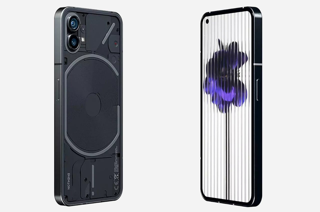
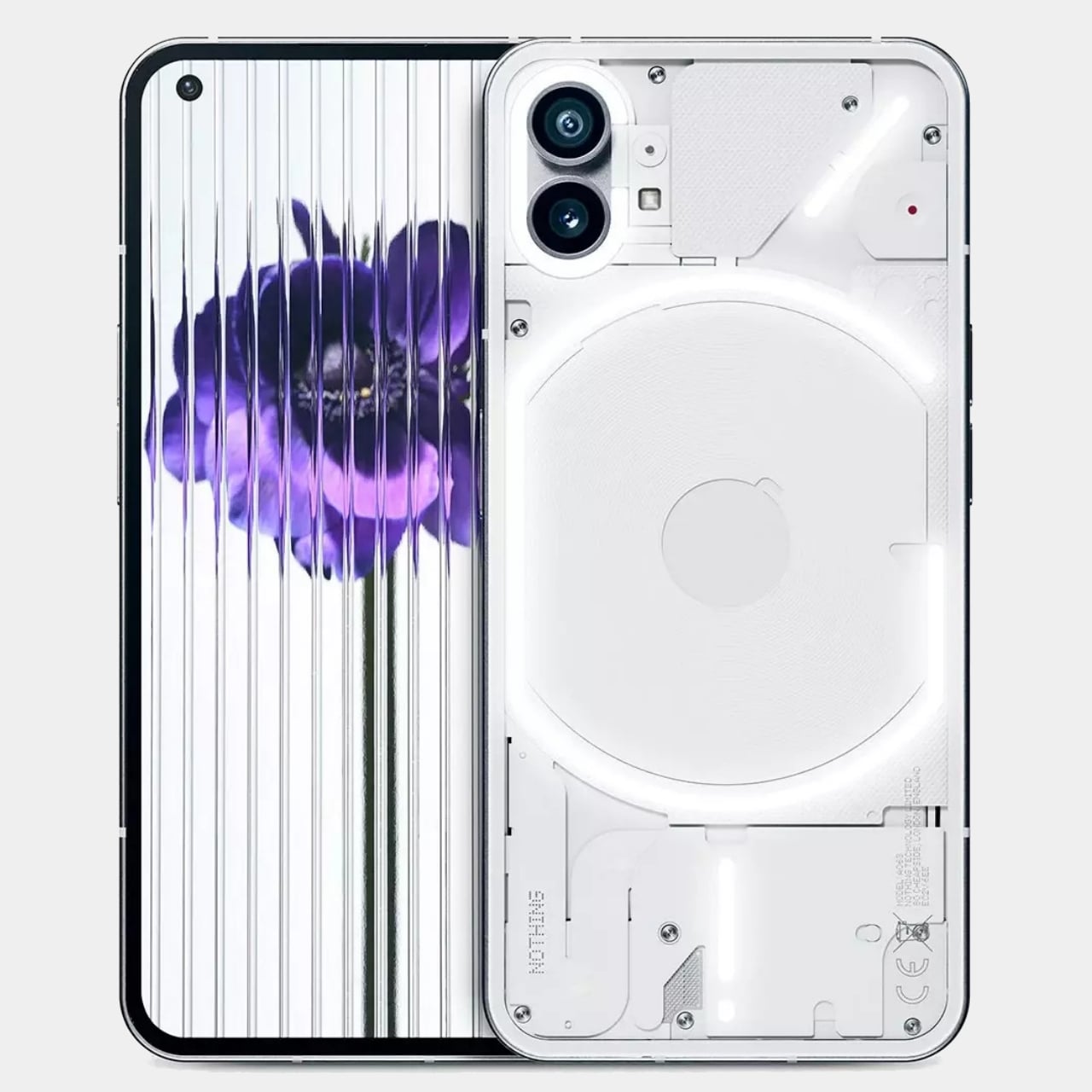
Although we did cover the phone in great detail when it launched back in July, here’s a brief overview of what this phone is and what it hopes to achieve. When founder Carl Pei took to the stage in March of this year to talk about Nothing’s next product, he set a few things straight. Phones were becoming boring, operating systems becoming bloated, walled gardens were being created, and there was an empty space in the market – a space Nothing hoped to fill. The phone’s launch in July definitely felt like it did justice (to a certain degree) to Carl’s little March monologue. The Nothing phone (1) is easily the most interesting-looking phone I’ve seen in a while. It comes with a unique transparent back that comes to life thanks to a Glyph Interface – or a series of lights, that flicker when you get calls or notifications. The phone, very competitively priced, is incredibly premium for its price. It comes with a Snapdragon 778G+ processor, has an iPhone-mimicking exterior, supports wireless charging, and has a clean OS. Its few shortcomings aside (and I’ll get to them in a bit), the phone absolutely nails the brief, the price, and the timing.
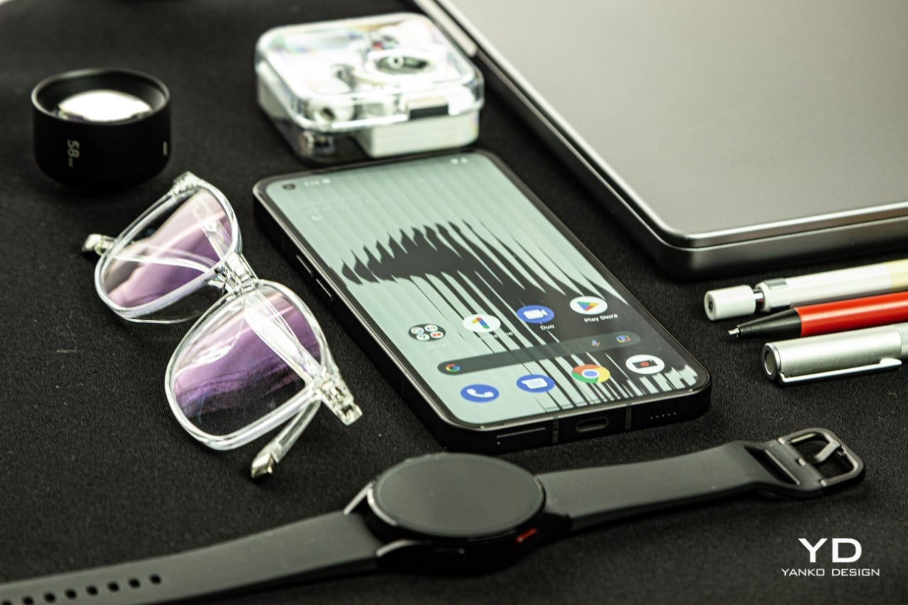
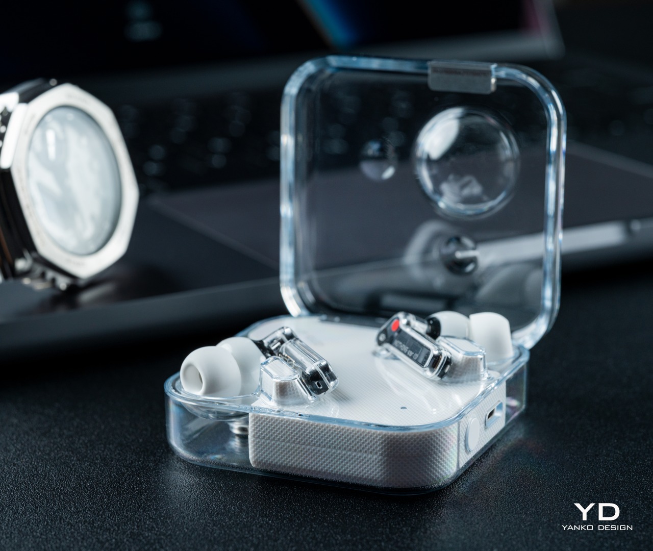
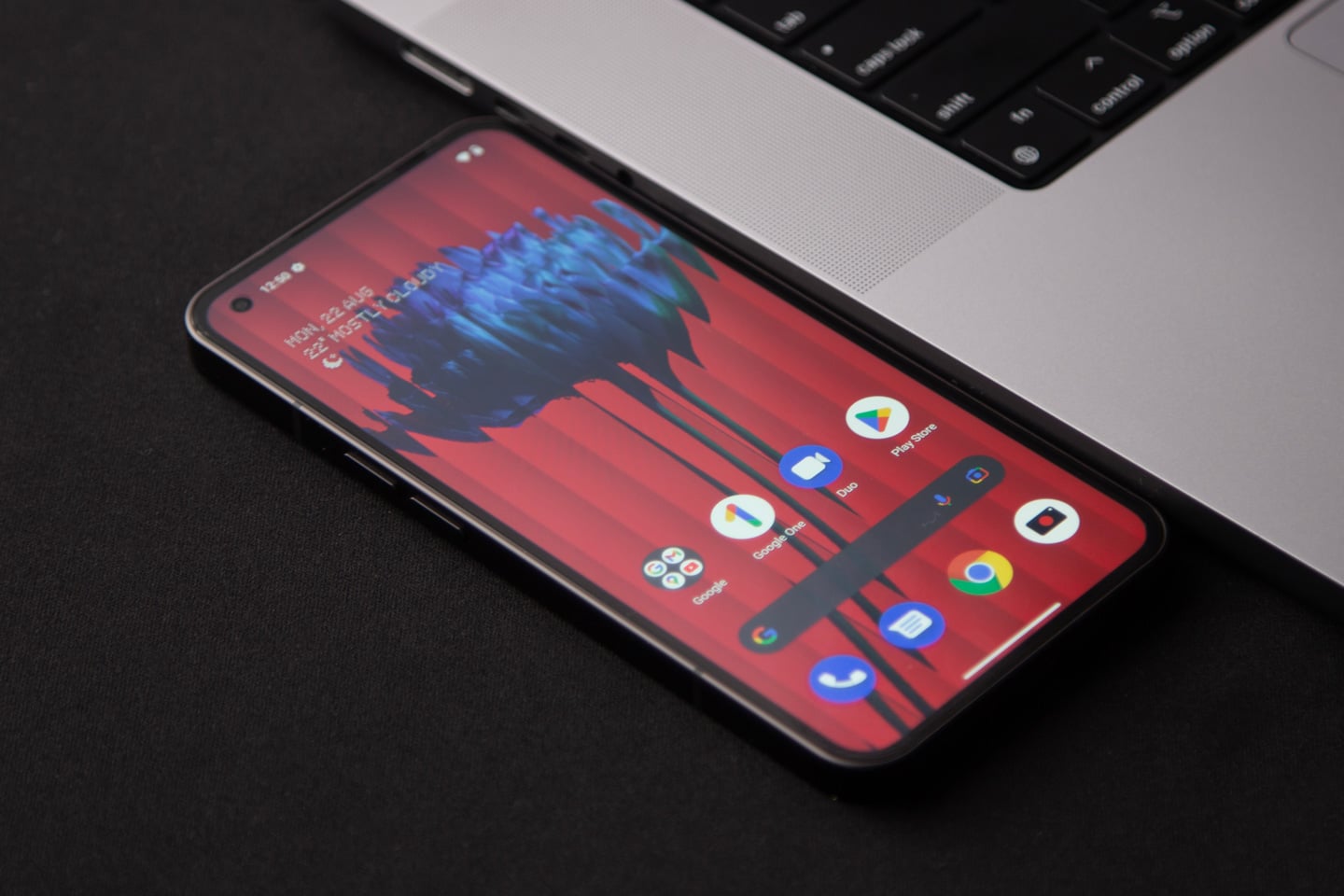
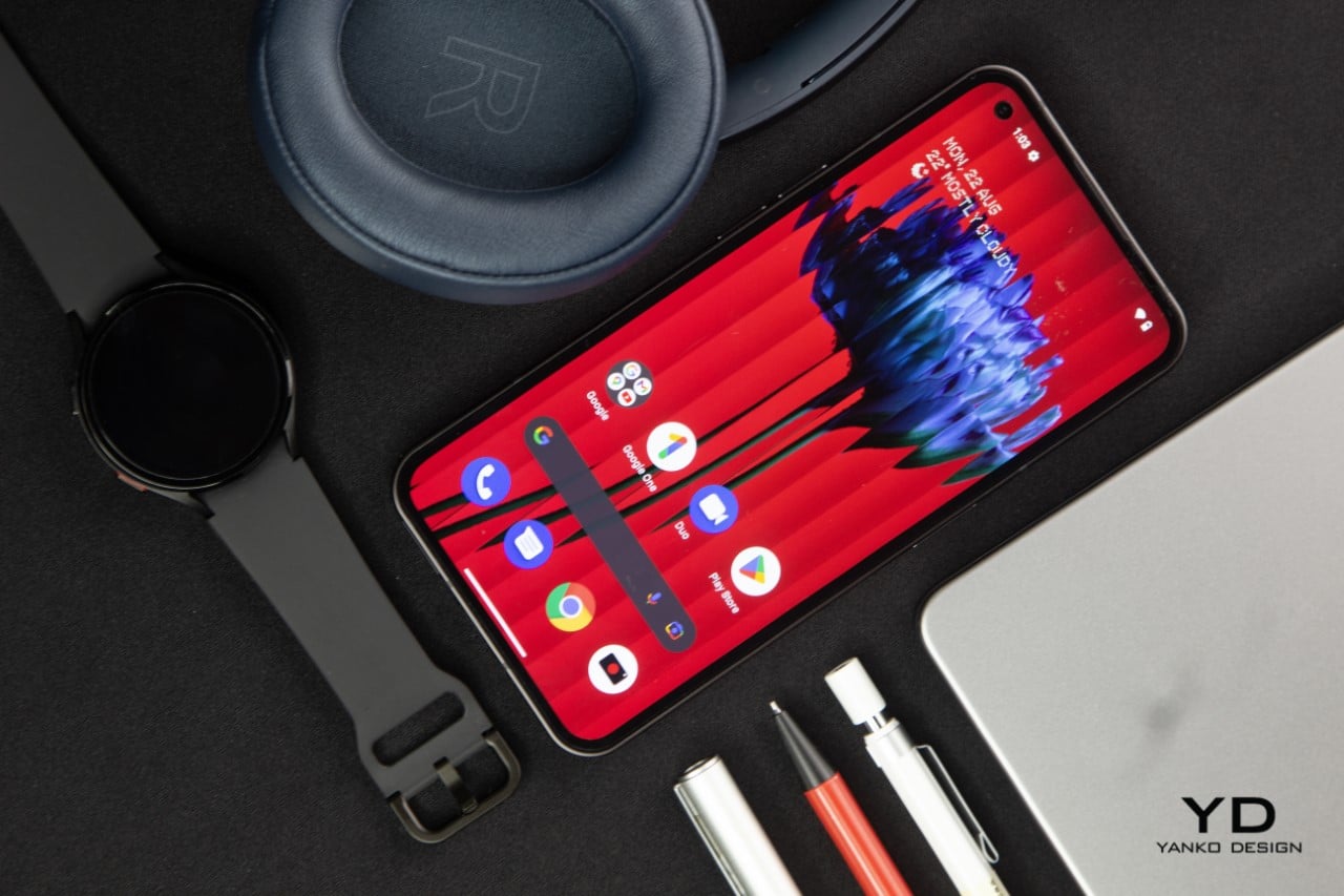
The Design

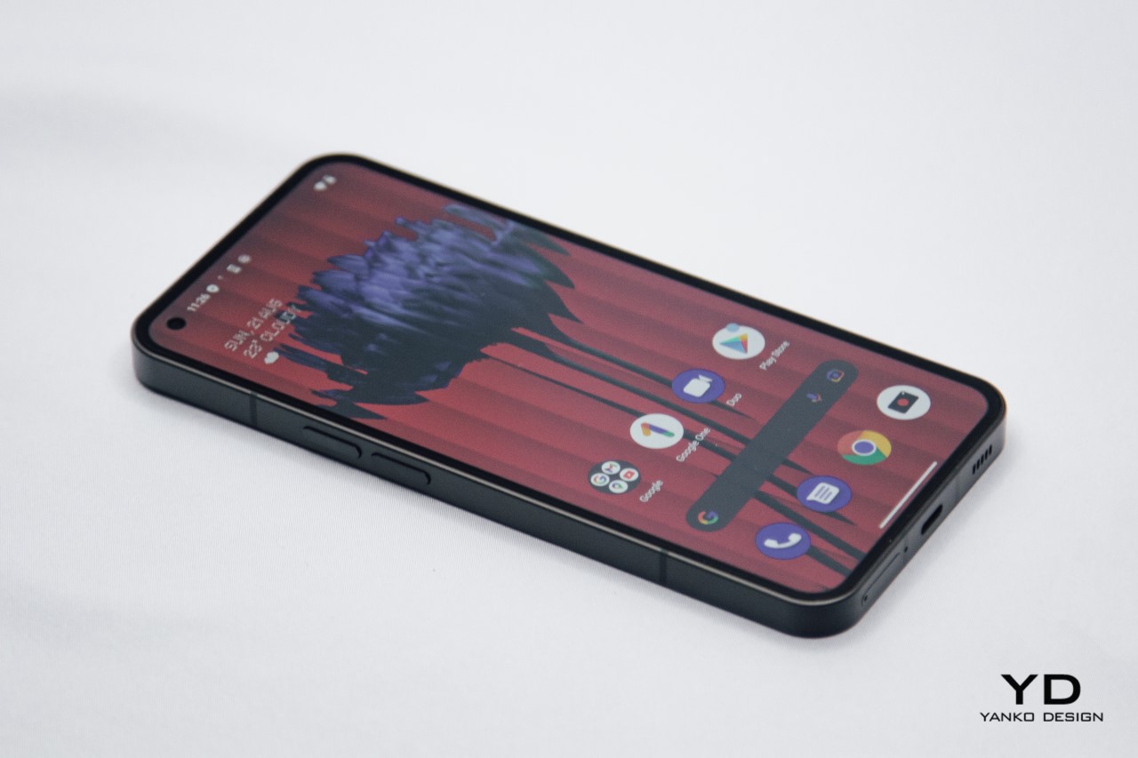
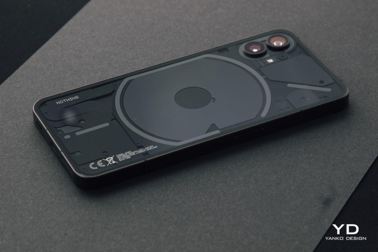
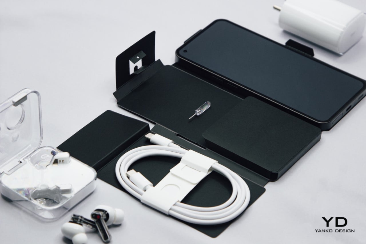
Unboxing this smartphone is an experience, to say the least. The Nothing phone (1) oozes sex appeal with its slim design and aluminum frame. The bezels around the screen are just perfectly uniform (there’s no chin), which makes the phone (1) really feel top-notch. The screen’s marvelous too, thanks to that 120Hz refresh rate that makes using the phone a dream. There’s a deceptive lightness to the phone, which, when coupled with its thin form factor, makes the device feel magical in your hands. However, I do have two significant complaints.

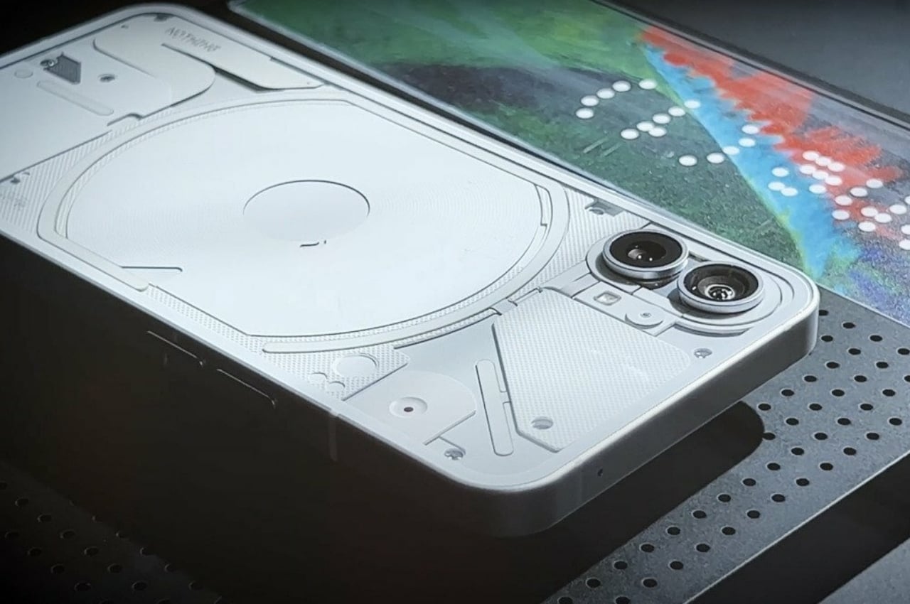
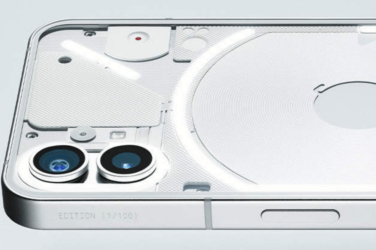
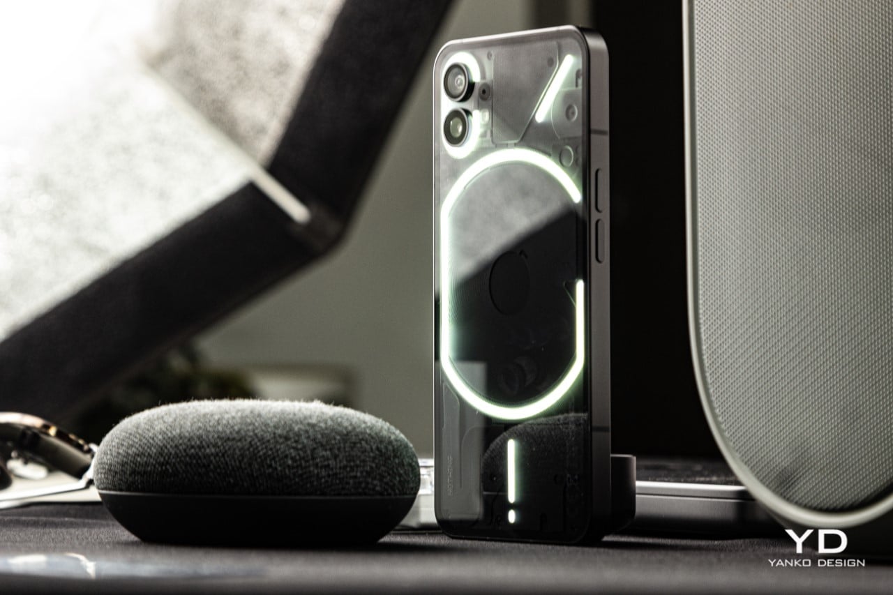
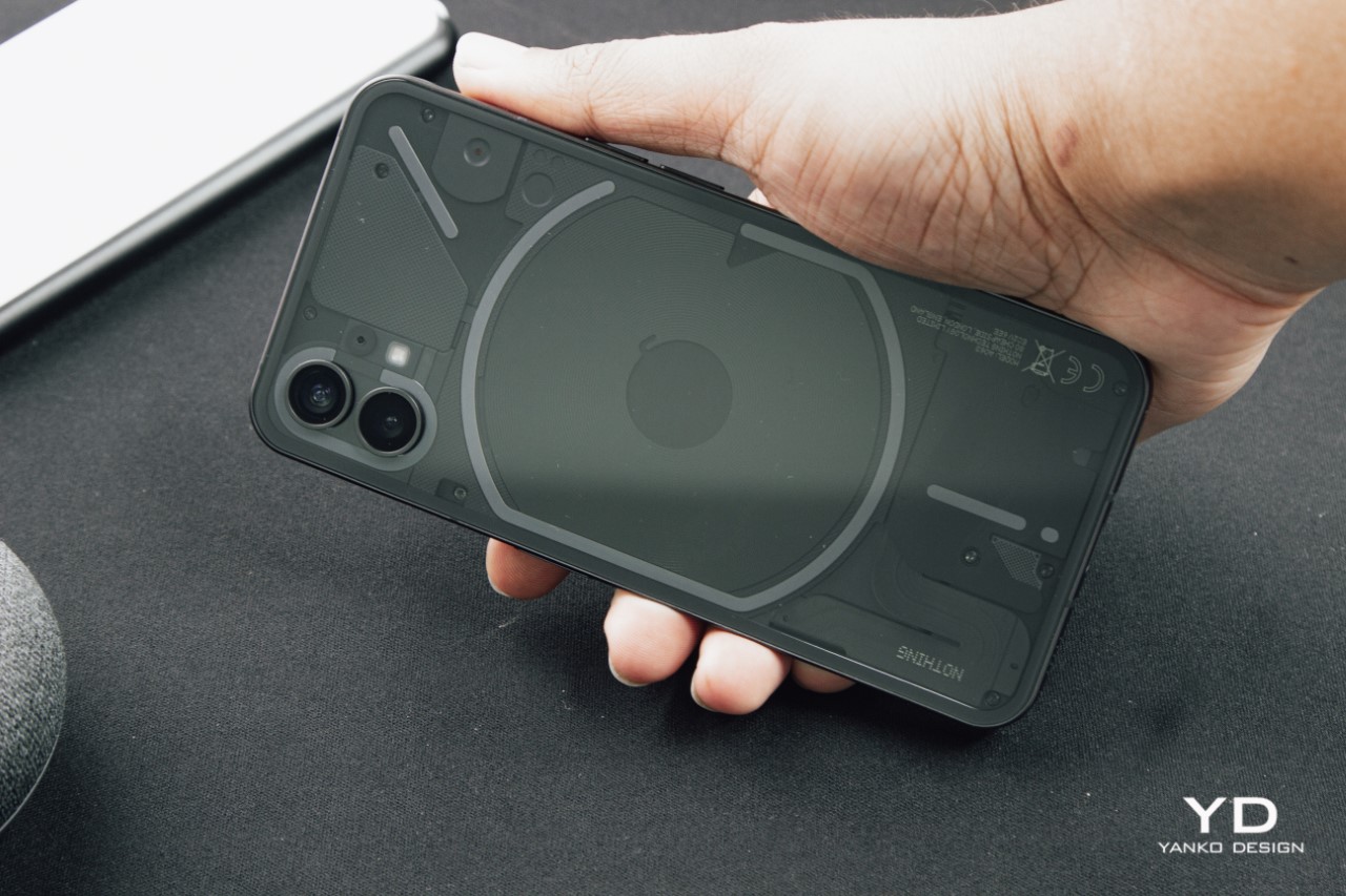
In order to make the phone’s interiors visible, the rear uses a glossy glass panel which is A. incredibly slippery, and B. an absolute fingerprint magnet. Customers who buy the white variant won’t have a problem with the latter, but at least on the black model, the back is incredibly prone to smudges, dust, and prints. This isn’t so much of a problem in the grander scheme of things… at least as much as the fact that this phone is just ridiculously slippery. It will almost certainly slide off surfaces that aren’t perfectly horizontal (don’t even THINK of putting it on your car dashboard), and I couldn’t even seem to keep the phone on my lap without having it just glide right off. It holds fairly well in your hands, but does rather poorly on other surfaces that offer less friction like tabletops, countertops, and more notably, car dashboards. The solution is simple – slap a case on the back. However, given the phone (1)’s unique back, that seems like a shame.
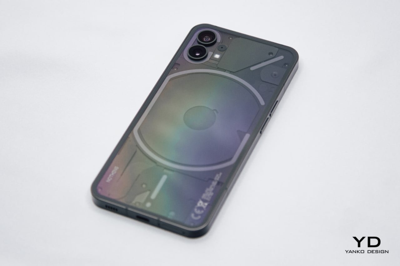
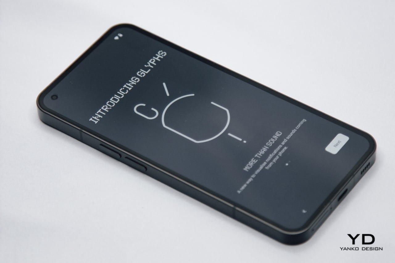
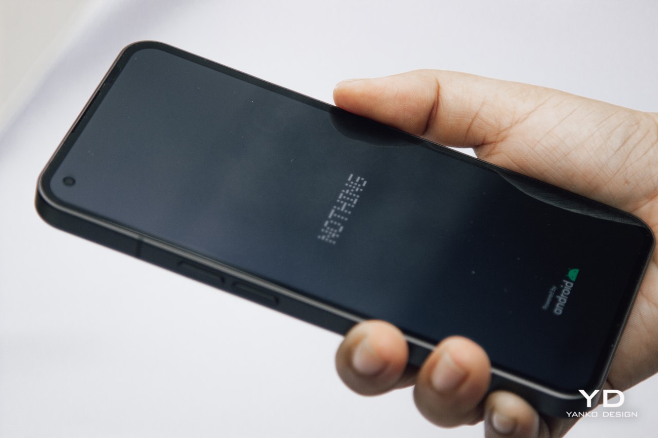
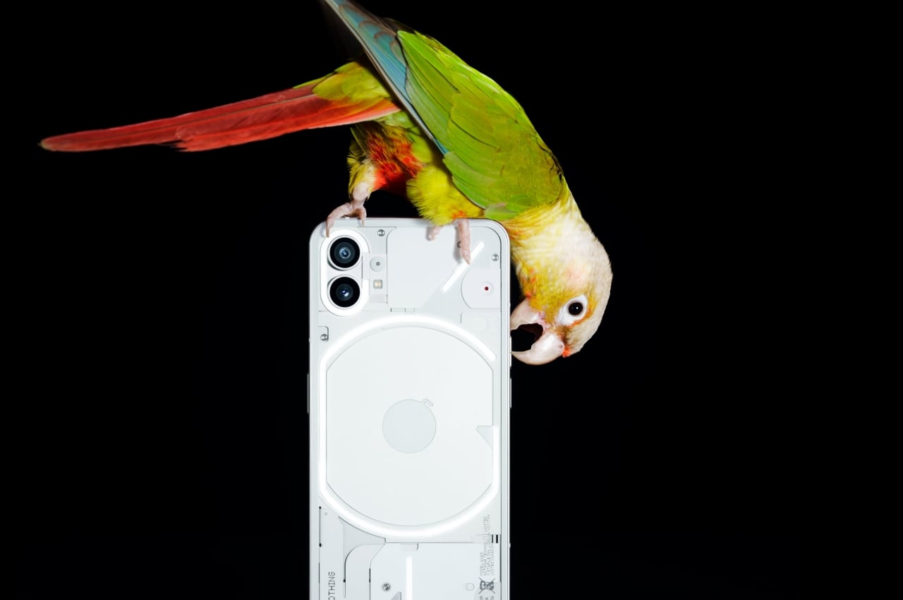
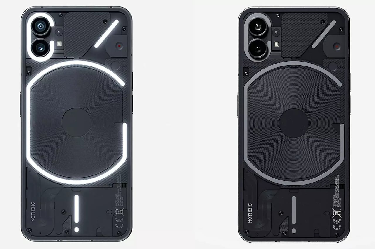
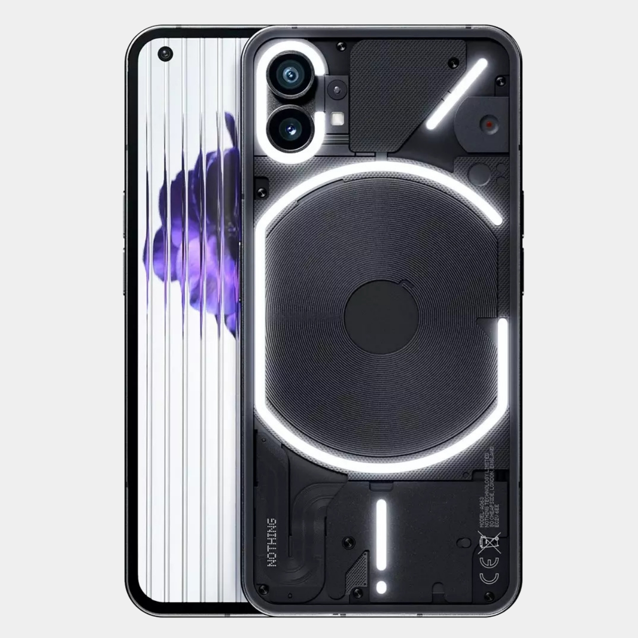
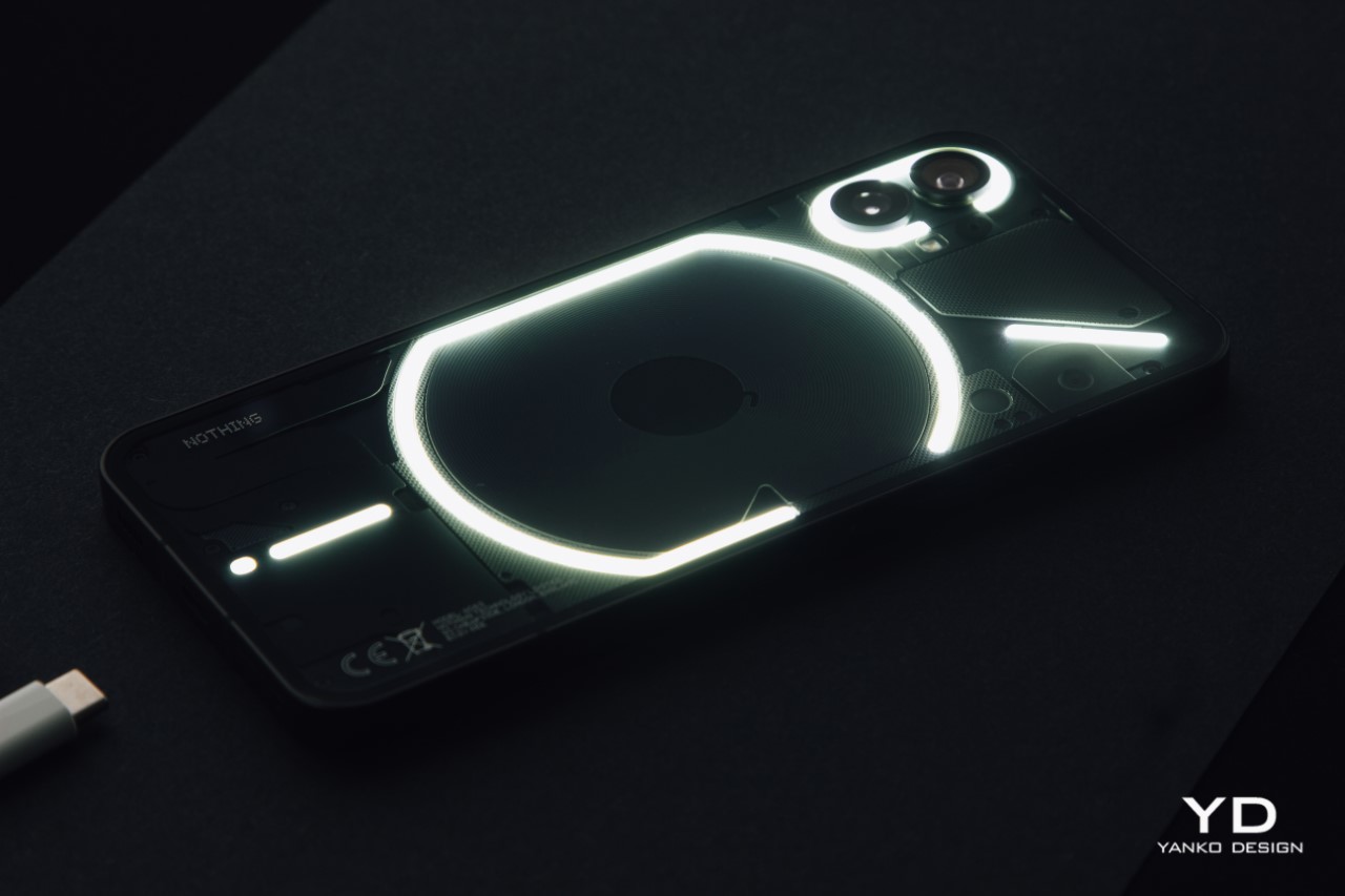
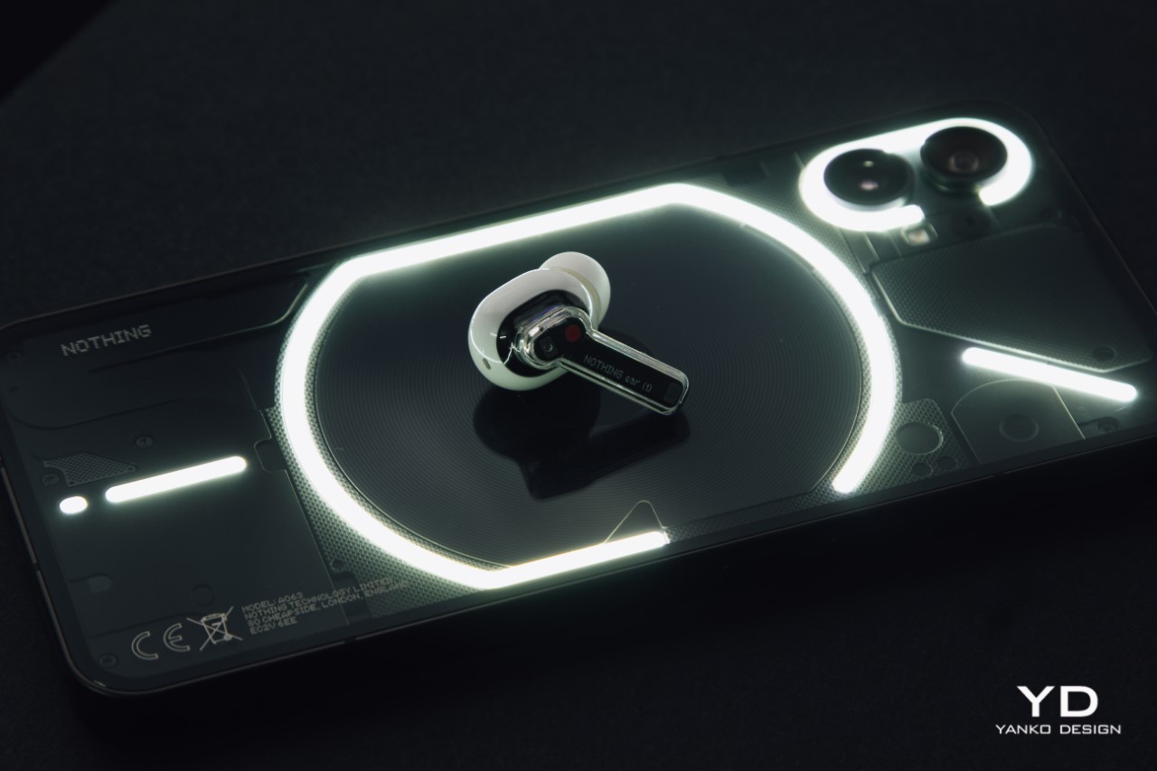
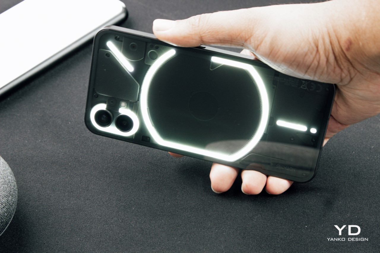
The Glyph Interface

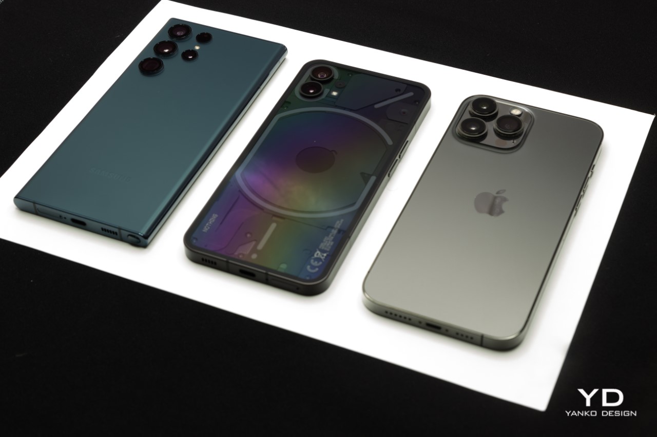
This unique back is quite literally what everyone is most likely to talk about. If you kept an iPhone, a OnePlus, a Pixel, and a Nothing phone (1) face down on a table, 9 times out of 10, people will pick up the Nothing phone (1) to get a better look. The phone’s back manages to look interesting even when static (which is a massive achievement), but things only get better when that Glyph Interface comes to life.

The Glyph Interface was designed to be a communicative feature that could alert you during calls and notifications. The lights flash and dance to your ringtones, giving the phone a flair that other smartphones only dream of. It’s easily the most publicly enjoyable part of the phone and I honestly wish Nothing’s design team did a little more with it. Here’s what I mean.

The lights on the Glyph Interface can be activated in one of three ways – when you get a call/notification, through the camera app that allows you to use the Glyph Interface as a makeshift flash, and finally while charging when the light shows a progress bar. It seems like there’s no other way to tinker or interact with the lights, which really was one major let-down for me. The most fun part of your phone wasn’t designed to be played around with. You can’t activate the lights on the back as a torch (the torch feature only switches the camera flash on), and it seems like Nothing really missed out on a bunch of opportunities. There’s a test feature that lets you sync the lights to music, but with most people listening to music on AirPods with their phone in the pocket, I doubt this would end up being used as much. There should easily be a slew of games based on the Glyph Interface like spinning the dice, rock paper scissor, etc., but that isn’t the case as of now. This setback, however, isn’t necessarily a permanent one. Future updates could easily introduce new features to the phone (1)’s Glyph Interface, although future predictions don’t hold much weight in a present-day review.

The Operating System

Perhaps one of the MOST impressive bits about the phone is its interface. As an ardent Google fan and Android enthusiast, the Nothing OS struck me as the cleanest, most beautiful version of Android I’ve ever seen on a modern phone. Outdoing perhaps even Google itself, the Nothing OS is crystal clean, incredibly responsive, and comes with absolutely NO bloatware. None, whatsoever. The only apps that come with the phone are Google’s app suite, YouTube + YouTube Music, and the basic apps you’d expect from your dialer and message apps to your camera and recorder apps.

Pei spoke at length about the latter during his summer reveal of the phone’s OS. There’s an analog beauty to the recorder app, and the camera app is intuitive and responsive. Speaking of responsive, the phone’s in-screen fingerprint reader is buttery smooth, unlocking the phone before you can even think about what you want to do next.

The OS also ditches the signature 3-button Android interface for a bar that feels heavily inspired by the iPhone. At times I did miss the back button, but the bar is something you’ll easily get used to… and if you’re an iOS convert, it’s something you’ll find very familiar. Notably missing in the OS, however, is Pei’s vision of an expansive ecosystem. Pei fired shots against Apple for their walled garden and claimed that the Nothing OS wouldn’t be as restrictive. Promises were made of an open ecosystem with integrations for all sorts of products, but that feels like something that won’t happen overnight. Here’s hoping.

The Camera

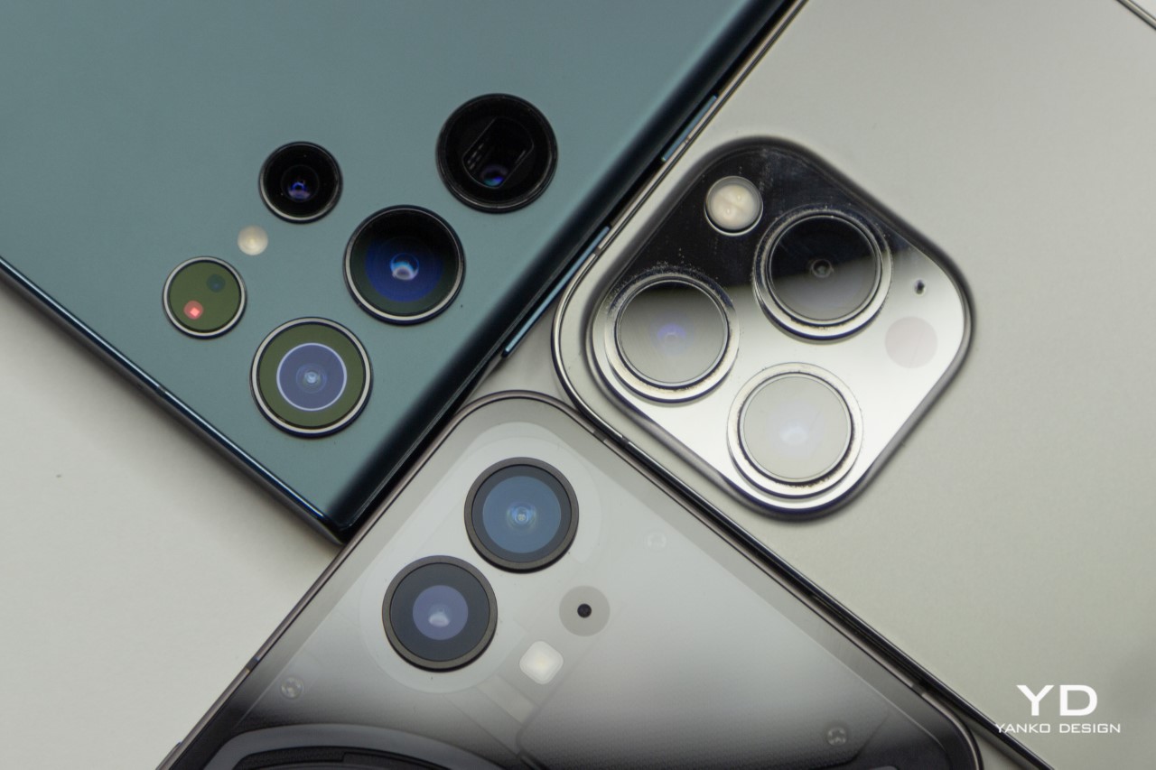
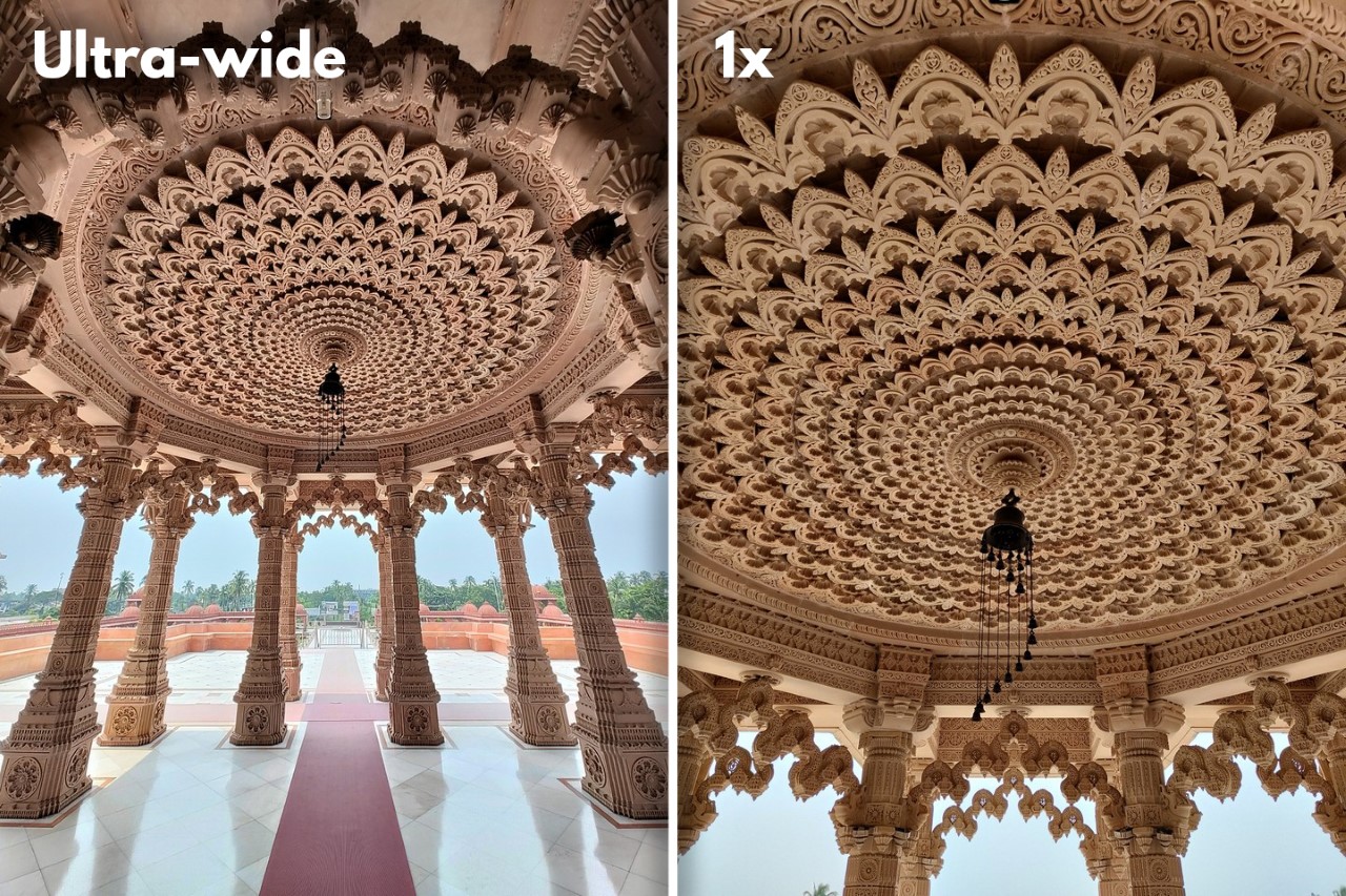
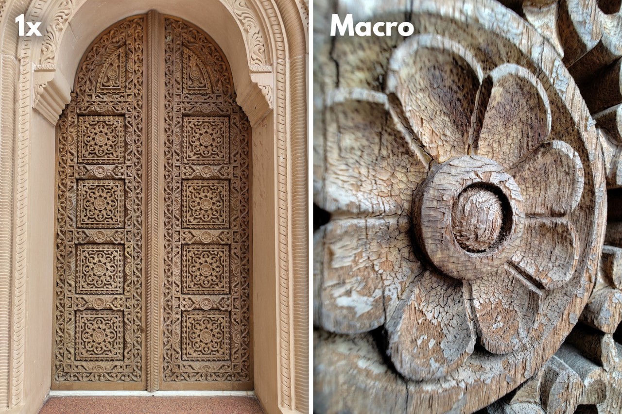
I’ll keep this part short and sweet. The camera is GREAT… for its price. Don’t expect the phone (1) to dethrone an iPhone Pro or a Pixel 6, but apples to apples, you can expect that the phone (1) will put up a really good fight. The phone’s capable of recording 4K video and shooting with a 50-megapixel output in RAW format. The videos aren’t exceptional – the phone’s image stabilization system feels great in the viewfinder, but the videos still feel slightly choppy. The photos, however, are surprisingly good. The ultrawide camera takes great landscape shots (although there’s a slight white balance shift as you switch between cameras), the portrait/pano/expert modes work pretty well, and I was pleasantly surprised by the macro mode (although there’s a fair amount of computational distortion + blur happening around the edges). The front-facing camera does a stellar job too, with the portrait mode being just about as good as it can get. With just two lenses on the back, the phone (1) manages to take on the 3 and 4-lensed flagships.

Shot on the Nothing phone (1)

Shot on the Nothing phone (1)

The Performance + Battery

The one significant hardware setback I had with this phone was its tendency to rapidly heat up. The phone comes with an aluminum frame and a glass back, both of which heat up quite significantly (sometimes even while charging). While the phone’s designed to do some heavy lifting, it does heat up a bit (especially right behind the hole-punch camera on the front) – enough to make you feel a little uncomfortable. Keeping the camera app open for 5-6 minutes (or even running a heavy game) can cause the phone’s top edge to get warm and even hot sometimes. This problem could be limited to just my handset, although it’s certainly the first thing I noticed about the phone as I put it to charge for the first time.

Speaking of charge, a 4500 mAh battery on the inside does a decent job of getting you through the day. Moderate usage will comfortably get you through the day with just one charge, although if you’re relying on many apps, using heavy programs, and just keeping your phone running for hours, you may need to bust out your charger for a bit. That being said, it’s worth reminding you that the Nothing phone (1) doesn’t come with a charger inside the box.

The Price

While it’s important to judge a phone objectively, its price says a lot about its intent and overall quality both intentionally and unintentionally. With the Nothing phone (1), the intent to disrupt the current status quo is extremely evident. When presented to people without context, nobody would ever guess that this phone is in the sub $500 category. It’s an extremely compelling alternative to phones almost double its price, as far as aesthetics, branding, and vision go… however, the fact that the phone is priced at roughly $499 makes me be a little more critical of its capabilities and flaws. That being said, the $499 price tag is probably the best thing about the Nothing phone (1). I can confidently say that it’s probably the best phone you can buy for that price, and while I don’t see it dethroning the flagship iPhone any time soon, you can expect that it’ll cause a major dent in the Android market, stealing customers from OnePlus, Nord, Poco, and even Google. Who knows, even potential iPhone SE buyers could switch over to the Nothing brand.

The Verdict

For a new company just trying to make its mark in the pretty vast sea of smartphones, Nothing does a phenomenal job. I do tend to take shots at the company for how much they hype stuff up, but given how young they are and how far ahead their competitors have gotten, it seems like a winning strategy. After all, they did a much better job marketing their product and generating interest than Google ever did for the Pixel phones.

My verdict hinges heavily on the phone’s impressions and its price. For starters, even though Carl paints a vision of Nothing offering an alternative to Apple’s walled garden, don’t quite expect the phone (1) to be an iPhone replacement. The phone (1) is still a first attempt, and has a long way to go if it needs to overtake Apple’s 15-year headstart in the smartphone market. Carl’s entire vision of an open ecosystem seems like something that’s still a work in progress, so it’s important to take note of what you’re getting NOW rather than what’s being promised a year or two later.

What you’re getting NOW is a pretty slick-looking phone that’s full of surprises and doesn’t break the bank. The phone (1)’s UI is super minimal and buttery smooth (thanks to that 120Hz display) and stands out clearly against the bloated phones from OnePlus, Xiaomi, Oppo, etc… but its heating issues stood out within the first hour of using the phone. It seems like something maybe an update could fix, but whether that would mean throttling the performance is something I can only speculate.

However, what keeps bringing me back to this phone is its price. It costs 60% of what I paid for my OnePlus 8 Pro two years back but feels just as incredible (if not better). At that price point, you’re more likely to be impressed with a Nothing phone than you are with some other mid-tier Android device. For a first smartphone release from a nascent brand, Nothing definitely deserves to pat itself on the back. I can’t wait to see where the brand goes from here.

Click Here to Visit the Nothing Website

The post Nothing phone (1) Review – Resurrection of the Android Flagship Killer first appeared on Yanko Design.

Partial Screen concept solves the problem with transparent displays in a curious way

Display makers like LG, Samsung, and TCL are trying hard to push not just deformable screens like foldables and rollables but also transparent panels. This obsession with transparent screens is perhaps fed by science fiction props and futuristic concept designs. Reality, however, doesn’t always match expectations and fantasy, and transparent displays, especially TVs, have one particular problem that makes them less ideal for actual, everyday use, especially in bright rooms where colors can get muted and blacks virtually nonexistent. That, of course, doesn’t mean that manufacturers and consumers have to give up on that dream. They only need to find a suitable solution to this problem, like this rather interesting frame that uses shutters to make a transparent TV temporarily opaque.

Designer: Jiyoun Kim, Hannah Lee, Jaehyuk Lim

Transparent displays look almost magical because of how we’ve become accustomed to knowing there are electronics or even backlighting behind the screen. It is admittedly a technological marvel that deserves some praise, but its novelty quickly wears off when one starts to show normal content. In particular, transparent OLEDs like the ones being pushed by LG have problems with black colors because of how ambient light can shine through the back. LG Display collaborated with designers to think of possible solutions, and the Partial Screen is one such concept with a literal twist.

In this concept, a 55-inch transparent display is framed inside a wooden box, with what looks like wooden slats behind it. These 25 shutters are individually motorized, and each can turn independently of one another, which makes it easy to have them move in succession or in specific patterns. While the shutters look interesting themselves, they serve a greater purpose of turning the transparent display into a regular screen.

What happens is that when all the shutters rotate and face forward, they completely block any light from shining through the back of the enclosure. This, in effect, creates an opaque background that will finally make blacks pop out and increase the display’s contrast. And since LEDs emit their own light, unlike LCDs, the “blinds” don’t prevent the display from showing other colors. In fact, they might look even more lush and vibrant, thanks to the increased contrast.

More than just enabling the transparent screen to better display blacks, however, the Partial Screen actually enables other use cases that make the display look more interesting. Since the shutters can be moved individually, they can probably be programmed to rotate in different ways, which could be in sync with what’s being displayed on the screen. This can create an interesting dynamic visual where the shutters seemingly dance to the screen’s contents, allowing it to display black portions in one moment and become fully transparent in another.

Of course, none of these complicated solutions would be necessary if the screen wasn’t transparent in the first place. Indeed, some people regard these fancy displays as a solution looking for a problem rather than something that fills a specific need. Granted, this could very well be where the display panel industry is heading anyway, so it pays to be prepared to have solutions ready when transparent TVs become commonplace.

The post Partial Screen concept solves the problem with transparent displays in a curious way first appeared on Yanko Design.

Nothing Phone(1) looks a little busier in black

There is probably nothing more frustrating than being emotionally invested in an upcoming product, only for its very creators to take the wind out of its sails. That is undoubtedly what some of the believers of Nothing’s inaugural smartphone felt when the company officially revealed what the phone would actually look like. On the one hand, the startup tried to beat leaks to the punch so that no one could claim they didn’t protect their secrets well enough. On the other hand, they are tempting fate by either confirming fears or calming them, and, as expected, camps are split on whether the white Phone(1) does live up to the hype that Nothing itself built. Fortunately, the story doesn’t end there completely, and the black finish of the same phone could still win some people over. Or it could cement their decision to stay away completely.

Designer: Nothing (via Roland Quandt)

It almost seems like Nothing’s early years will be marked by a lot of controversies, partly thanks to how it has been building up expectations about the company’s mission. Just like OnePlus, which Carl Pei also helped found, Nothing presents itself as a revolutionary that is trying to go against the excesses of the smartphone industry. Well aware of the current trends in the design industry, Nothing espoused values like transparency and minimalism, which would translate to both product design and company management.

Its first product, the Nothing Ear(1) TWS buds, already divided people between those who lauded its unique, partly transparent design and those that felt short-changed from the brief hype that preceded it. History is repeating itself with the Phone(1), which Nothing has been teasing as nothing short of revolutionary, pardon the pun. That, however, might only be in relation to what is available in the market, so it’s not exactly lying in that regard.

After official revealing the transparent yet occluded back of a white Nothing Phone(1), unofficial images of a black variant have now become available for everyone to see. Compared to the white phone, the black plate underneath makes the “glyph” lights even more visible. In a way, this makes the back look even busier compared to the white model, which sort of takes away from the minimalism appeal of the phone. Then again, if the Nothing Phone(1)’s back were completely transparent, it would definitely be a lot more chaotic inside.

There is also some disappointment or at least growing concern about the choice of hardware that will go inside the Phone(1). Nothing has already confirmed that it will use a custom Snapdragon 778G+ processor, which was made specifically for it, adding wireless charging and reverse wireless charging capabilities that are absent in the plain version of the silicon. It is, however, what would be considered a mid-range chip, which sounds a little disheartening for a new flagship phone. Pei explains to Input magazine, however, that the choice goes in line with the company’s message that tech specs aren’t always relevant. In terms of balancing performance, thermal management, efficiency, and overall sustainability, the Phone(1) will do just fine.

Whether that will be enough to translate interest into sales, we’ll see in two weeks when the Nothing Phone(1) is officially launched. The company is taking a more cautious approach, however, mimicking the chaotic invite-only system from the early years of OnePlus. Of course, that also creates an artificial scarcity that makes the product look like a very limited edition, pumping up the hype even more.

The post Nothing Phone(1) looks a little busier in black first appeared on Yanko Design.

This transparent rollable TV divides your living space and unifies your family

Rollable TVs are coming. It’s really only a matter of time before they become the next big thing after curved TVs and super slim panels. The idea for them might be to simply save space or remove distractions when the TV is not in use. That also leaves wasted opportunity, however, especially for the base that takes up space on a shelf or edge of a wall. In anticipation of this next weave of TVs, there have been some ideas on how to better take advantage of this new technology in the home of the future. One such idea pushes the TV from the edges to the center of the living room, creating something that visually divides the space but also serves as a focal point for people to gather around.

Designer: Kurz Kurz Design

There are plenty of reasons for a rollable TV to exist, but few of them can really be considered practical or essential. It definitely gives someone plenty to brag about, but its novelty will eventually wear off. And just like a regular TV, its usefulness ends when you turn it off, or in this case, when it rolls back into its house. That house is still there, taking up space, and it is begging to be used in some other fashion.

One potential use case is to have it act as a speaker since it will most likely be a soundbar already anyway. This Skyline concept for speaker manufacturer vifa, however, extends that even further by making the transparent screen peek just a little bit out of its box. This way, part of the screen can still be used to display something and, given today’s display technologies, use considerably less power than when the screen is enabled in its entirety.

In this “descended” or “risen” mode, the screen can be used to show calming fire or maybe an aquarium. The transparent display, which is no longer science fiction today, makes an excellent medium to show this kind of fake content. You can also use it to display a night sky or flowers, though those would look less convincing in that position. And, of course, you can also show family photos, calendars, or today’s weather, turning it into a smart display for everyone to see.

This kind of functionality actually makes the Skyline an excellent centerpiece in any spacious area of the house or, alternatively, a divider for those spaces. The concept includes a Hi-Fi speaker inside the large cabinet box, with fine fabric covers that make the piece stand out even if the screen is fully retracted. The only problem is that the display will be facing only in one direction, so it’s best not to show things that would have to be read in a particular direction also, like text.

The Skyline transparent rollable TV concept rethinks the purpose of this upcoming breed of TVs and flips the idea on its head. Instead of a TV that rolls down into a smart display of sorts, it is a divider that can become a TV when needed. This transforms what would normally be a piece of equipment into a piece of furniture, one that can change the way people live and interact in that space.

The post This transparent rollable TV divides your living space and unifies your family first appeared on Yanko Design.

Nothing Ear(1) Review

Although there have been Bluetooth speakers, headphones, and earphones long before it, the Apple AirPods truly started a new chapter for the audio equipment industry. Truly Wireless Stereo or TWS earbuds started becoming more prevalent and, unsurprisingly, started to look a lot like one another. Many laughed at the AirPods’ unorthodox “stem” when they first came out, but it is now one of the most copied earbuds designs in the market. That state of affairs inspired a former smartphone company exec to strike off on his own and build a company on a theme of transparency. It’s against that backdrop that the Nothing Ear(1) was born, and we tried it out to see just how far its clarity goes.

Aesthetics

Nothing co-founder Carl Pei wanted to introduce a niche design trend in the mobile market starting with the Ear(1) buds, and he does hit the target, though only barely. There is already a sub-trend in minimalist design circles that call for transparent frames and chassis that reveal a product’s internals in all its glory, and it’s something that even tech-loving people fall for. Phone skins that fake a transparent back are quite popular among this crowd, and there are even one or two phones that deliver a translucent design for these people.

Unfortunately, the Nothing Ear(1) isn’t really completely transparent. In reality, only the buds’ stems let you see the minute electronics inside, from the microphones to the sensors to even the magnets. The buds themselves, particularly the part that houses the speakers and the battery, is completely opaque to the outside world, shattering any expectations of a fancy view of what makes a wireless earbud tick.

More disappointing perhaps is the Ear(1)’s charging case, which shows off no electronics at all. Yes, the cover and base are transparent to let you see the buds when they’re nested inside, but that’s pretty much it. At least you won’t be caught by surprise when you notice that one bud is missing from its cradle.

The Nothing Ear(1) is definitely aesthetically interesting, but it’s just a few steps away from feeling a tad too gimmicky. In terms of the overall design, Nothing doesn’t really offer anything revolutionary to set it apart from the crowd. Without those transparent stems, there is really nothing to keep it from being mistaken for the Apple AirPods Pros.

Ergonomics

Fortunately, the startup doesn’t disappoint when it comes to the feel of the accessories. As something that most people will put in their ears for hours on end, comfort is one of the most important design considerations, even for tiny TWS buds. In that area, the Ear(1) definitely delivers.

The buds offer a comfortable fit, and the three different silicone tip sizes ensure they won’t accidentally fall off when you’re sweating it out. It’s almost too easy to forget they’re even there, given how light they are at 4.7 grams. Of course, that’s an exaggeration because you will always notice them since you’ll be enjoying your favorite workout tunes or podcasts while wearing them.

The Ear(1) does support that exercise scenario but be careful not to go overboard. An IPX4 rating means it’s minimally water-resistant, at least against some accidental splashes of water. There is absolutely no protection against dust, so forget about bringing it to the beach unless you’re very, very careful.

Sustainability

Nothing wants to reinvigorate and revolutionize the consumer tech market, but it has so far failed to address one of the biggest problems with that industry. Earbuds, in particular, are the epitome of unsustainability and electronic waste, and the Nothing Ear(1) is no different. Despite claims of its durability and longevity, the buds will eventually break. And when that happens, there’s really not much choice but to throw them out.

Despite its unconventional transparent design, the Ear(1) is 100% conventional when it comes to the materials used for its construction. That translates to a lot of plastic, and not even the recyclable kind. Given how earbuds like these are often lost or aren’t exactly long-lasting, the chances of a pair finding its way to landfills will happen quite often.

It wouldn’t be as bad if the buds were easily repairable but, then again, almost no TWS earbuds are. They are extremely difficult to open up, and their soldered parts make it impossible to replace broken components. No wonder, then, that repair expert iFixit gives it its lowest score.

The one silver lining is that co-founder and CEO Carl Pei is well aware of the sustainability concerns hounding consumer electronics and is promising to work towards fixing that as well. He said that the Ear(1) would be carbon neutral in its production by the end of last year, though he stopped short of explaining the steps the company has taken to achieve that. That, however, still leaves the question of the materials used, and that will probably be more difficult to address than carbon emissions during production.

Performance

It’s almost too easy to write off the Nothing Ear(1) as some fancy buds with an artsy gimmick and nothing more. With the price tag it carries, not to mention the age of the company, it’s also too easy to presume you’ll be getting what you pay for. The surprising reality is that it isn’t the case at all.

We could hardly describe the Ear(1)’s audio output as mind-blowing, but it’s definitely unexpected for something in this price range. Mids and highs are clear and discernible and bass is present, though definitely lacking in punch. The companion mobile app offers some equalizer presets to swing towards more bass or more treble, but those won’t really do much to compensate.

The buds are actually feature-packed, which is another surprise given that same price tag. There are touch gesture controls that are somewhat configurable via the mobile app and automatic pause and resume when you remove or put on the buds. The biggest feature, however, is the presence of Active Noise Cancellation, something that you’d only typically see on more expensive pairs. Sadly, ANC performance isn’t exactly impressive, and there’s still a good amount of sound that gets through.

With that many features, it’s almost disappointing to discover that the Ear(1)’s mobile app is almost the exact opposite. Going for simplicity, it doesn’t offer much control over the buds. You can change some of the touch gestures, sure, but you are forever stuck on the EQ presets that Nothing has provided. The buds themselves also lack some high-end features like high-quality aptX codec and Bluetooth multi-point, but some might consider those as luxuries rather than essentials.

Value

The Nothing Ear(1) costs $99 and is easily one of the most affordable TWS earbuds in the market. That alone might already convince some to try a pair, but its value goes beyond the tag. You aren’t getting what you pay for because you are actually getting more.

While ANC isn’t the top of its class, few $99 buds can boast of even having that feature. Audio quality is also decent and should be enough to satisfy the average music lover. It doesn’t have all the bells and whistles, for sure, but you probably won’t expect that from a $99 pair anyway. Unfortunately, that price tag also makes it feel like the buds are disposable, which doesn’t do well for its impact on the environment.

Verdict

The Nothing Ear(1) is a rather surprising first product for a man whose name has been associated with one of the most successful smartphone startups in recent history. Just like how OnePlus used “Never Settle” as its battle cry, Nothing is making “Transparency” as its prime directive. The design definitely conveys that, but the Ear(1) is, fortunately, more than just a pretty face.

It is far from being the best in class, but Nothing really packed quite a whopper inside a $99 package. The company’s goal of breathing new life into the consumer tech market falls a bit short, though, especially in blazing a trail for sustainable products. The good news is that the company is at least aware of those shortcomings and is steering its ship in the right direction. For a first try, the Ear(1) is definitely nothing to laugh at.

The post Nothing Ear(1) Review first appeared on Yanko Design.

Small Transparent Speaker Review

PROS:


  • Clean and transparent design

  • Excellent audio quality

  • Extensible with new features

  • Designed with sustainability and recycling in mind

CONS:


  • Replacement parts are not readily available

  • Handling requires wearing gloves to avoid smudges

RATINGS:

AESTHETICS
ERGONOMICS
PERFORMANCE
SUSTAINABILITY / REPAIRABILITY
VALUE FOR MONEY

EDITOR'S QUOTE:

The Small Transparent Speaker's clean and clear design puts its excellent audio quality front and center, and its focus on sustainability and business transparency makes it timeless in more ways than one.

Let’s face it. Unless you’re an audiophile or a connoisseur, audio often takes a backseat in our lives, even when it comes to entertainment. We only become acutely aware of the critical role that sound plays in life when it’s gone or when we meet face-to-face, or ear-to-ear rather, with cringe-worthy soundscapes. Over the past years, especially with the rise of Bluetooth audio products, there has been a renewed emphasis and interest in the art of sound. For Stockholm-based Transparent, however, delivering high-quality audio isn’t enough anymore, even when it comes in a uniquely designed speaker. Its Small Transparent Speaker, generic as the name may sound (no pun intended), is one of the expressions of the company’s vision of a timeless product, both in terms of design and as well as in use.

Aesthetics

Nothing says Scandinavian design than minimalist looks, clean lines, and no extraneous visual elements. The Transparent Speakers embody that aesthetic perfectly, and the Small model in white almost takes that to perfection. Combining a white-coated aluminum frame and a clear tempered glass enclosure, the Small Transparent Speaker is both designed to almost disappear into the background while ironically putting audio front and center.

Also available in a black finish, the see-through speaker can match almost every home design, at least if you want to really put it on display. While it is primarily designed to be placed on a flat surface, it also comes with wall mounts to let you hoist it up in the air, giving the illusion of a floating soundbox. The beauty of the Small Transparent Speaker’s design and smaller size is that it can figuratively and literally fit anywhere, and it wouldn’t look out of place.

Of course, there are parts of the speaker that are completely opaque, but those, too, are tastefully executed with a Scandinavian touch. Aside from the two large 3-inch drivers, the only other noticeable items on its face is the 3.5mm audio input, the volume knob, an old-school flip switch for power, and an LED indicator made to match the appearance of the audio jack. Everything else, such as the cables and ports that drive the speaker, is conveniently hidden from view, accessed through a bottom compartment.

Ergonomics

While many dig the clean, minimalist look most often associated with Scandinavian designs, others will also point out how they sometimes give off a cold and harsh vibe. You probably can’t get colder and harsher than aluminum with sharp edges, and that might be the impressions your hands get when first touching the speaker. Fortunately, you probably won’t be doing that often with your bare hands, even when setting it up for the first time.

While the Small Transparent Speaker’s size makes it more conducive to be carried around wherever its services are needed, the design doesn’t exactly make it convenient to do so. Not only does it lack any handles or carrying mechanism, the glass enclosure pretty much makes it sure that touching the surfaces is a huge no-no, unless you want to spend a lot of time wiping smudges off the glass. As if anticipating that problem, Transparent actually ships its Transparent speakers with white gloves for handling the product.

Using the speaker couldn’t be easier, as we’ll soon see, especially if you’re the type to rely on wireless audio sources most of the time. You do have the traditional 3.5mm input jack on the front, but any other audio source has to go through the Small Transparent Speaker’s bottom. This is something to keep in mind if you regularly add new sources of content or expansion modules, as it will require handling the speaker’s frame every single time.

Performance

Some audio experts and speaker manufacturers might think Transparent has gone insane for choosing glass as its primary surface material. While it’s definitely mesmerizing to watch the speakers vibrate while they are seemingly suspended in the air, there will be concerns about speaker quality being compromised because of the glass. Fortunately, that is definitely not the case, and the Small Transparent Speaker can get very loud without showing any problems from either the speaker or its glass enclosure.

Audio quality is also excellent, although not exactly the faithful studio reproduction that Transparent advertises. Vocals and high tones are clear and crisp, but while the bass is solid and full, it lacks a bit of punch. That’s probably to be expected in a speaker of this size, and its focus on vocals and higher tone ranges seems almost fitting for its design roots.

The Small Transparent Speaker is primarily a wireless audio sink, and it supports quite a number of sources, including Bluetooth, Apple AirPlay, Google Cast, and Amazon Echo. It also has a “True Wireless” feature that lets you pair two Small Transparent Speakers to better fill up the room if needed. For everything else, the 3.5mm jack and USB port beneath the speaker provides expansion options, and Transparent even sells its own Wi-Fi module to create a multi-room audio system with other Transparent speakers.

Sustainability

The Small Transparent Speaker is more than just a design or audio statement. It’s also a lifestyle statement that makes sustainability the very reason for its existence. Although it hasn’t reached a point where it can use recycled materials to build its products, everything else about the speaker is designed for maximum longevity. In fact, the choice of aluminum and glass isn’t just to give it a timeless look but also to give it an almost timeless life.

Transparent’s speakers are designed to be repaired, and the company even provides instructions on how to take apart the speaker if necessary. Granted, you probably won’t be replacing those parts yourself unless you’re an expert, and even then, you’ll probably need access to replacement parts that fit the speaker’s design and specs. The company, unfortunately, doesn’t provide those.

If there is one hitch to Transparent’s sustainability efforts is that it doesn’t make it easy for owners to do the repairs on their own. In a nutshell, repairing or replacing a broken speaker involves contacting the company and sending the item back to them. While it does ensure that parts are properly disposed of and recycled, it might also discourage all but the strongest believers in the company’s mission to provide long-lasting products.

Value

The Small Transparent Speaker currently costs 500 EUR, and you’ll find US retailers like B&H Photo and Video selling it for $550. For a Bluetooth speaker with very basic functionality, that might sound a tad overpriced. For a designer product as beautiful as this, it’s almost worth every cent. Still, it’s quite a hefty investment that might give some people pause.

In the end, however, you are paying for more than just the product and the design. You are also investing in Transparent’s vision for the future of consumer products. More than just something beautiful and functional, the company is pushing for a new model of business where everything is transparent, including the processes involved in making a product.

Verdict

The Small Transparent Speaker might be smaller than the original, but it is also better in its own ways. The more compact design hides all but the essentials, including the components that actually drive the speakers. Despite its diminutive size, it delivers high-quality audio for almost every type of music, although you might forgive it for lacking a bit of oomph on the lower range. Its ability to expand its features makes sure that it will be useful even as new technologies come and go, as long as they work with a 3.5mm audio jack and a USB-A port.

The speaker’s value, however, goes beyond its utility and its looks. It may even go beyond its lifetime. Although it’s still a few steps short of its sustainability goals, Transparent is definitely making a bold change in the right direction, making the Small Transparent Speaker a truly one-of-a-kind product that bares its soul for everyone to see, literally and figuratively.

The post Small Transparent Speaker Review first appeared on Yanko Design.

This wireless speaker enchants with its lantern-shaped design and a flickering mood light within it


Designed with a multisensorial experience, the Light Speaker from Transparent appeals to your eyes as much as it does to your ears. Styled to look less like your conventional speaker with front-firing drivers, or like the ubiquitous smart speaker with a cylindrical fabric clad, the Light Speaker champions a lantern-inspired design… and in true lantern fashion, also comes with a light on the inside that flickers as the speaker’s drivers vibrates, creating a hauntingly beautiful audiovisual allure.

In its lamp-shaped avatar, the Light Speaker rubbishes the notion of what a Bluetooth speaker should look like. Taking on an appearance that looks aesthetic even when the lamp isn’t on, the Light Speaker is a compact little number that comes with a handle that can be detached if needed. The speaker’s design is entirely modular, something its maker Transparent believes wholeheartedly in, and comes with two drivers, one on top, and another below, with a glass chamber in between. The chamber acts as the viewing glass for the so-called flame, which glows at the base, reflecting off the vibrating cone of the lower audio driver. As you pump up the volume, the diaphragm vibrates more, and makes it look like the flame is flickering hard. While this looks rather alluring, it does mean you need to play louder music to get the flame to flicker more, which may end up conflicting with the mood you’re trying to set. That being said, at its brightest setting, the speaker actually works as a lantern, doing a fairly good job of illuminating a dark room with a soft wash of light.

The Light Speaker’s design uses borosilicate glass and aluminum grills, and it has an IPX2 weather rating, which makes it fairly usable outdoors, although you may want to stay away from the rains. The borosilicate glass means the Light Speaker isn’t as rugged as the everyday outdoor wireless speaker, but then again, it has the appeal of something that doubles as home decor, and not as a utilitarian product meant for rugged outdoor use.

Each Light Speaker comes with a two-knob interface, which ties in with the speaker’s minimalist design. One knob controls the volume, and the other the intensity of the light within. The speaker features an adjustable light-temperature setting too, allowing you to go from a deep amber light to a yellow and even a white light. Understandably, the light’s flickering effect is best enjoyed in the dark, although even in the day, you’ve at least got a rather pretty postmodern-looking lantern to admire while the Light Speaker pumps out sound.

The Light Speaker comes from the same folks who brought you the Transparent Speaker, and encapsulates the same design principle of being pure, responsible, and infinitely serviceable. The speaker can be pulled apart at any time, and its parts repaired, replaced, or even upgraded, championing a circular economy that’s rare in most consumer electronics today. It’s priced at $350, which is definitely on the higher side considering you could get 3 HomePod Minis for the price and still have change left… but then again, seldom can you ever say that your wireless Bluetooth speaker also looks like and functions as an ambient lantern.

Designer: Transparent

The post This wireless speaker enchants with its lantern-shaped design and a flickering mood light within it first appeared on Yanko Design.