
Animated by video studio RED SIDE, this is a 3D visualization comparing the size, speed, and range of various missiles used by multiple nations. Even the slowest missile is fast, but the quickest missile makes the slowest look like it’s standing still, and the slowest is traveling over 2,000MPH!
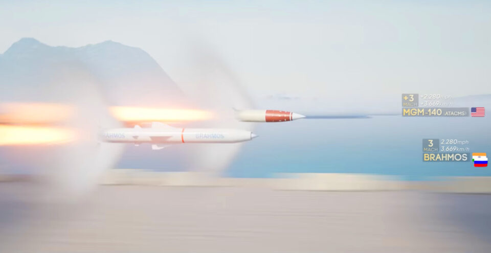
The video starts with a “drag race” comparing the missiles from slowest (the Mach 2.9 Novator Kalibr, ~2,225MPH) to fastest (the claimed Mach 27 of the Avangard, aka Objekt 4202, ~19,884MPH). It then provides an animation of how each missile is typically launched, its different stages, and what a flyby of the rocket at full speed looks like. The third part details each missile’s range; the last part is a size comparison, with all the rockets standing next to one another. I learned a lot by watching it. Mostly, I wouldn’t want to get hit with any of these, even without an explosive payload.
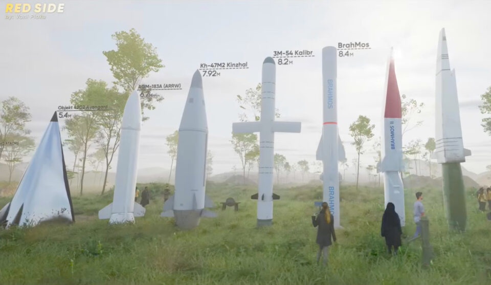
Which missile was your favorite? I found them all rather terrifying. Technologically impressive, sure, but scary to think about. And probably infinitely scarier to try to ride like a mechanical bull.
[via TheAwesomer]
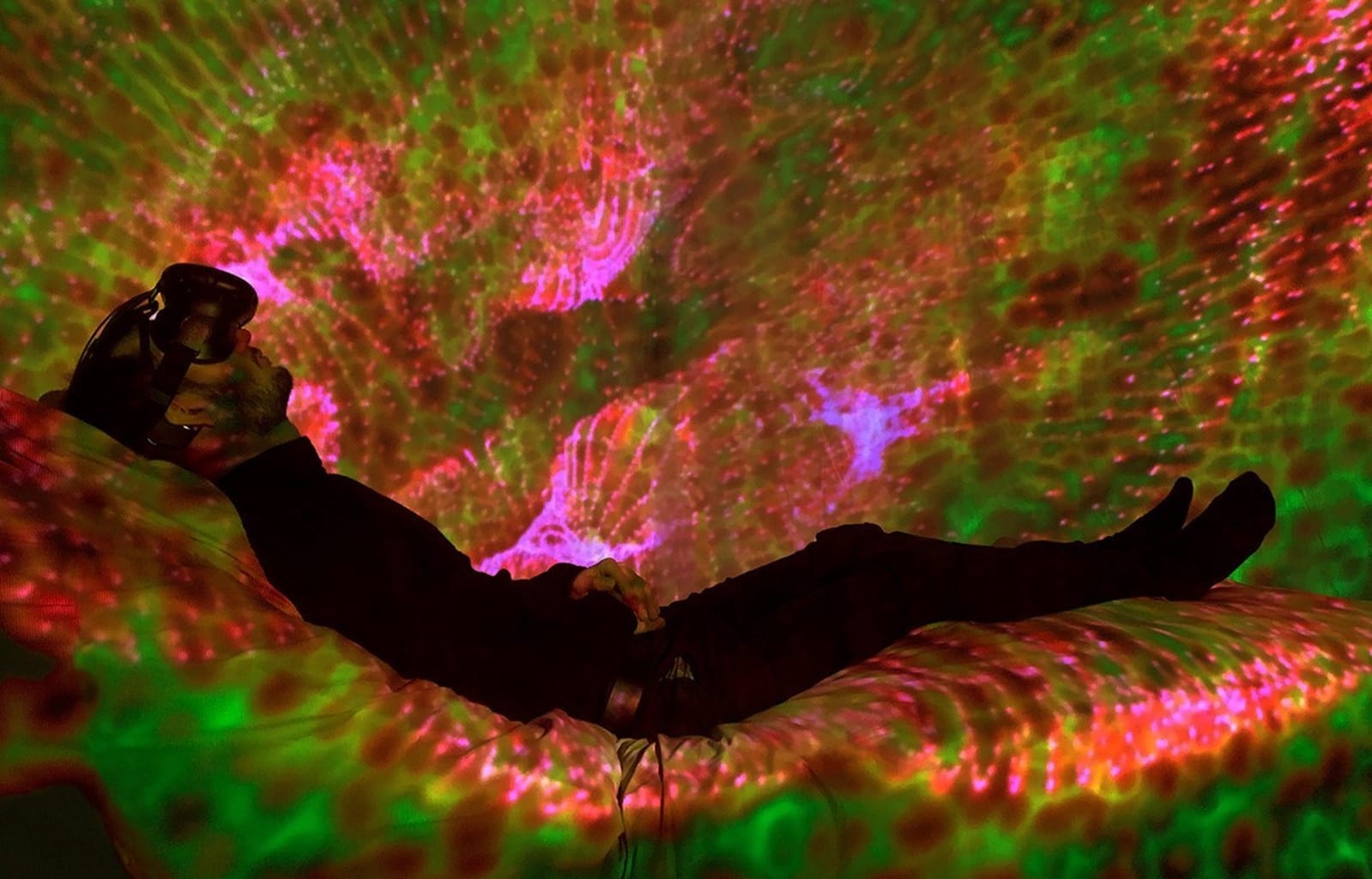 By most accounts, technology wreaks havoc on our sleep. Even tools meant to help us sleep better can make insomnia worse. But sleep and tech don't have to be mutually exclusive. Artists and researchers from Royal Melbourne Institute of Technology (RM...
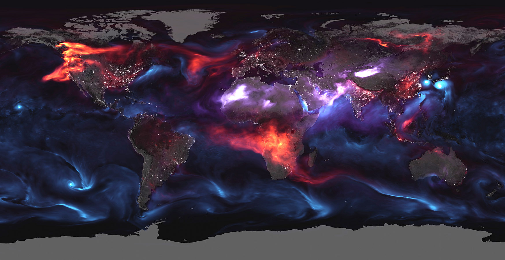 Heatwaves, hurricanes and other extreme weather might be the "face of climate change," but it's not the only sign. A grim new visualization from NASA shows another problem caused indirectly by global warming: airborne particles and droplets. These "a...

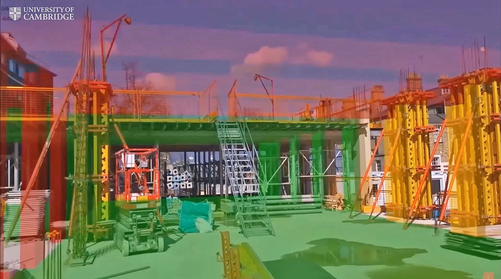 With its ability to give the real world a digital assist, mixed reality can trump the insular cocoon of VR. Microsoft is showing again how HoloLens can be particularly useful for designers thanks to a collaboration with the University of Cambridge's...
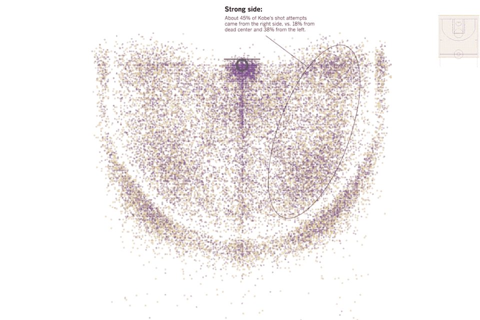 Information is beautiful, none more so when data is combined with the power of the web to let us visualize the previously unseen. It's one of the reasons why data journalism is so engaging, since it helps show things that you would have otherwise had...
 Scientists have created the first ever video of neurons firing in a freely moving animal, a technique that could lead to greater understanding about how our own brains work. The Princeton-led team first programmed a nematode worm's neurons to create...

