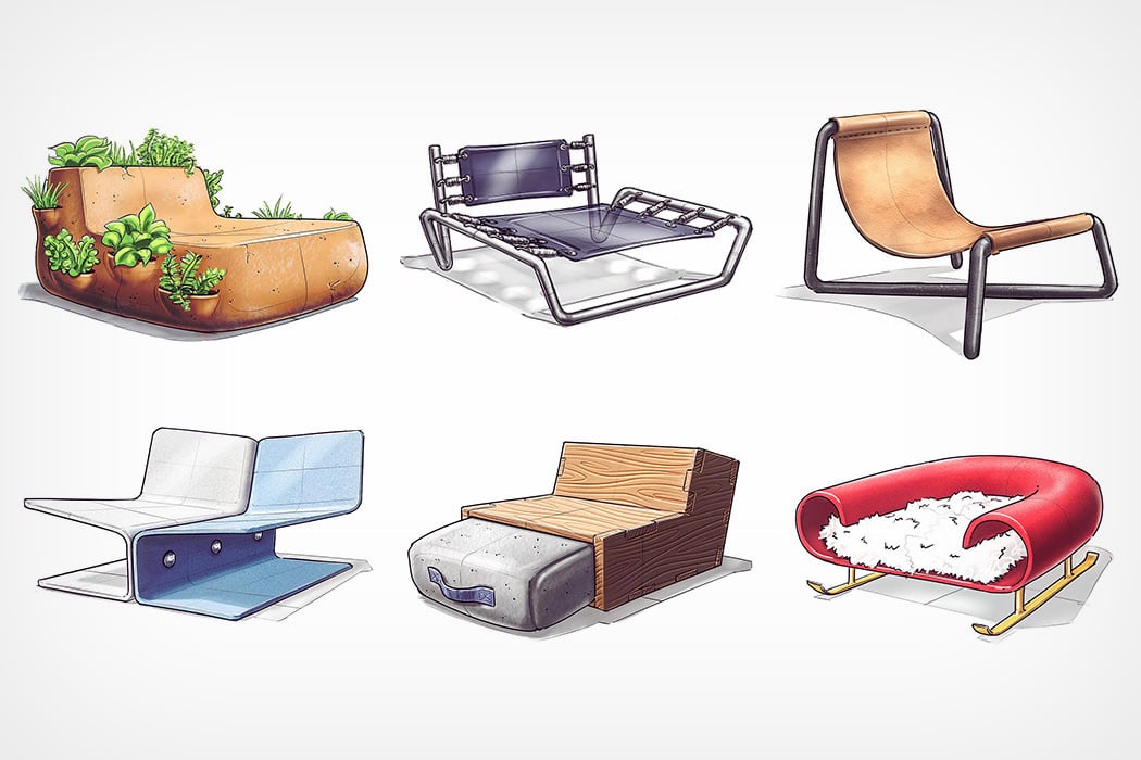
Every week (although the timing isn’t particularly fixed), I see a chair sketch on my Instagram feed, and after having seen and liked dozens of them, my mind can almost instantly recognize @nickpbaker’s style and brand of creativity anywhere.
Given the hashtag of #nickschairsketches, Baker uploads unusual conceptual chair designs almost every week. The chairs showcase inventiveness that one rarely sees in furniture design, as concepts take inspiration from quite literally anywhere. Scroll down to see a few of our favorites.
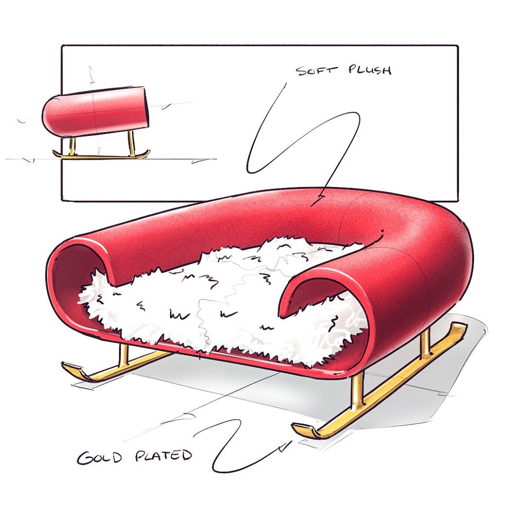
Highly appropriate, given the season we’re in, this chair takes direct inspiration from Santa’s sled, and isn’t ashamed of it too! In fact, it ditches the chair legs for sled-skis too! Don’t go pushing this chair downhill though!
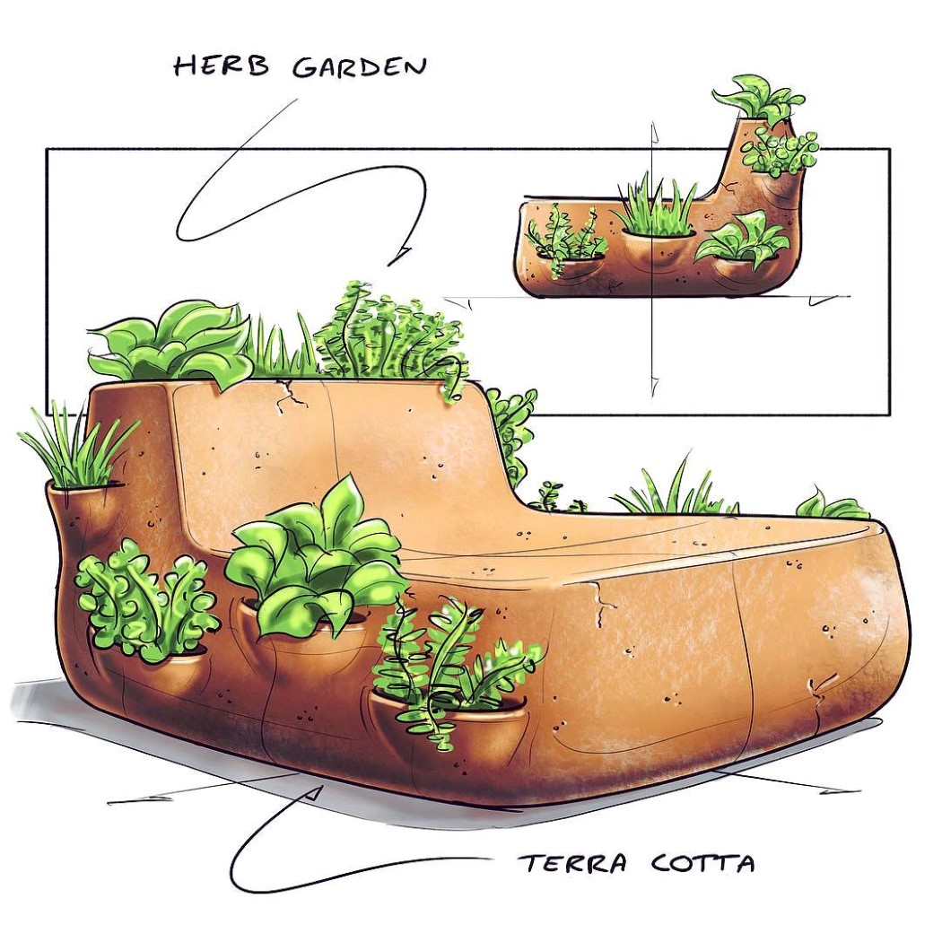
A result of Weekly Design Challenge’s 99th design brief (Plant Pot), Nick combined the two challenges to make a full-scale terracotta seat with planters integrated into its sides, so you can smell the roses as you sit outdoors!
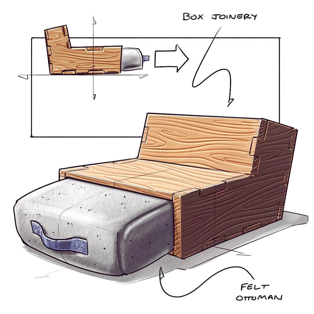
Made of six pieces of wood and a felt cushion, this concept chair turns into a lounger when you pull the cushion outwards (almost like a cabinet drawer). Pull it further and you’ve got yourself an extra Ottoman stool to sit on, as one chair magically transforms into two!
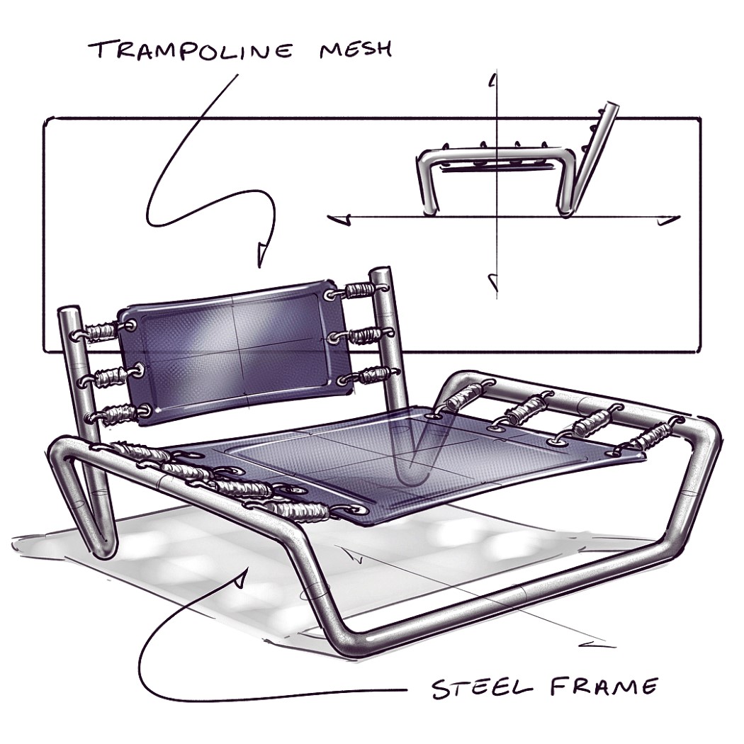
Guaranteed to bring the child out in you, this chair literally has some bounce. Part trampoline, part seat, this concept keeps you active while you’re seated, although your productivity may take a slight hit as you bounce up and down in childlike glee through the day!
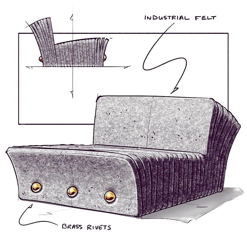
This chair’s build is what makes it interesting. Multiple pieces of felt are stacked together, giving the 2D sheets a 3D mass. After a point, the sheets become longer, and bam! You’ve got yourself a backrest. The sheets of felt are held together by brass rivets at the bottom.
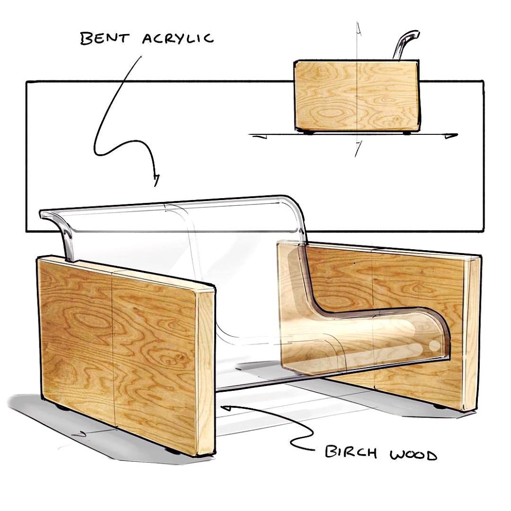
This visually delightful chair may have one of the most simple constructions yet. A transparent sheet of acrylic is thermoformed into the shape of the seat, while a routing machine carves notches into two pieces of wood that allow the acrylic sheet to fit in. Voila! Instant chair!
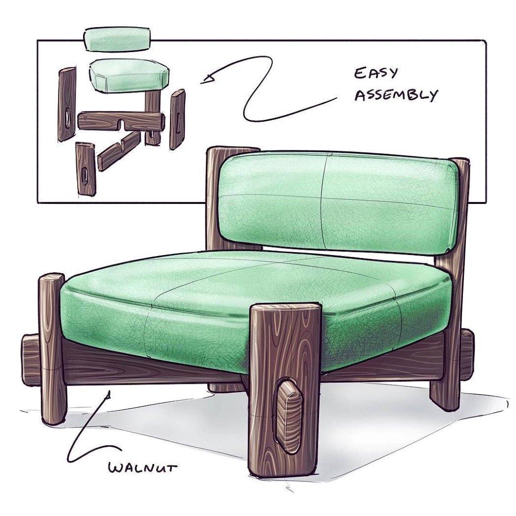
The beauty of this chair is in its DIY assembly. Two cushions and four pieces of wood are flat-packed and shipped to your home. Putting them together is as simple as plugging the wood pieces in, resting the cushion on top of the X, and gluing or nailing the backrest in place.
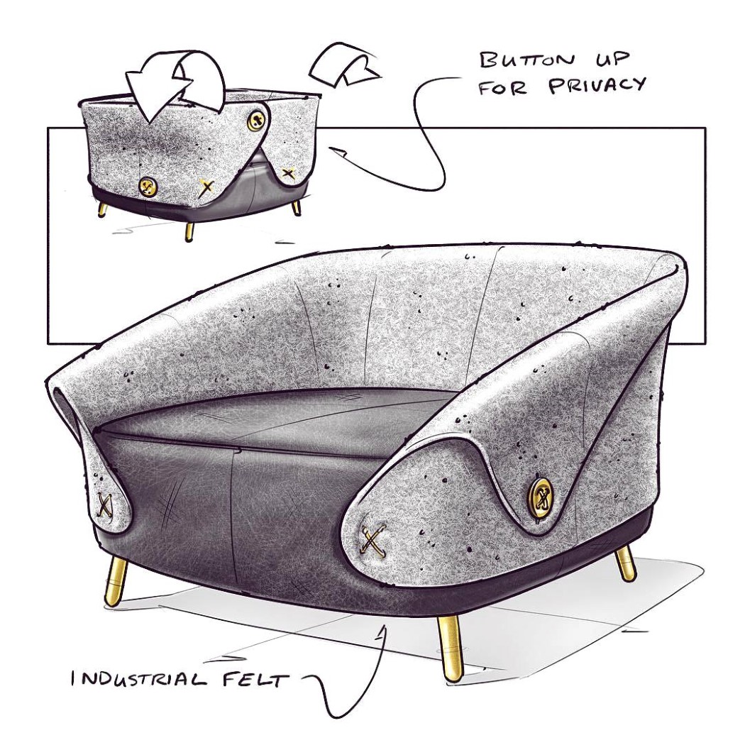
This chair comes with the additional option of cocooning yourself into your own private little space. The chair comes with a draping of felt around the back and sides. Keep the draping open for regular seating, or lift the drapes up and button them together and you’ve got a completely enclosed (and even sound-absorbing) enclosure that lets you work or relax in peace.
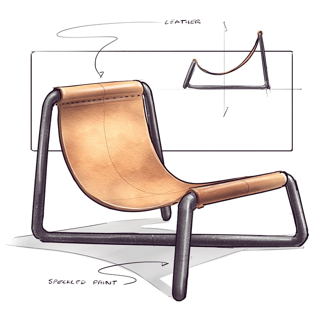
A single bent piece of pipe forms this seat’s structure while a leather sheet gives you a hammock-like seating area. Sit regularly or sideways, this chair is comfortable, and adds a touch of simplicity to its surroundings.
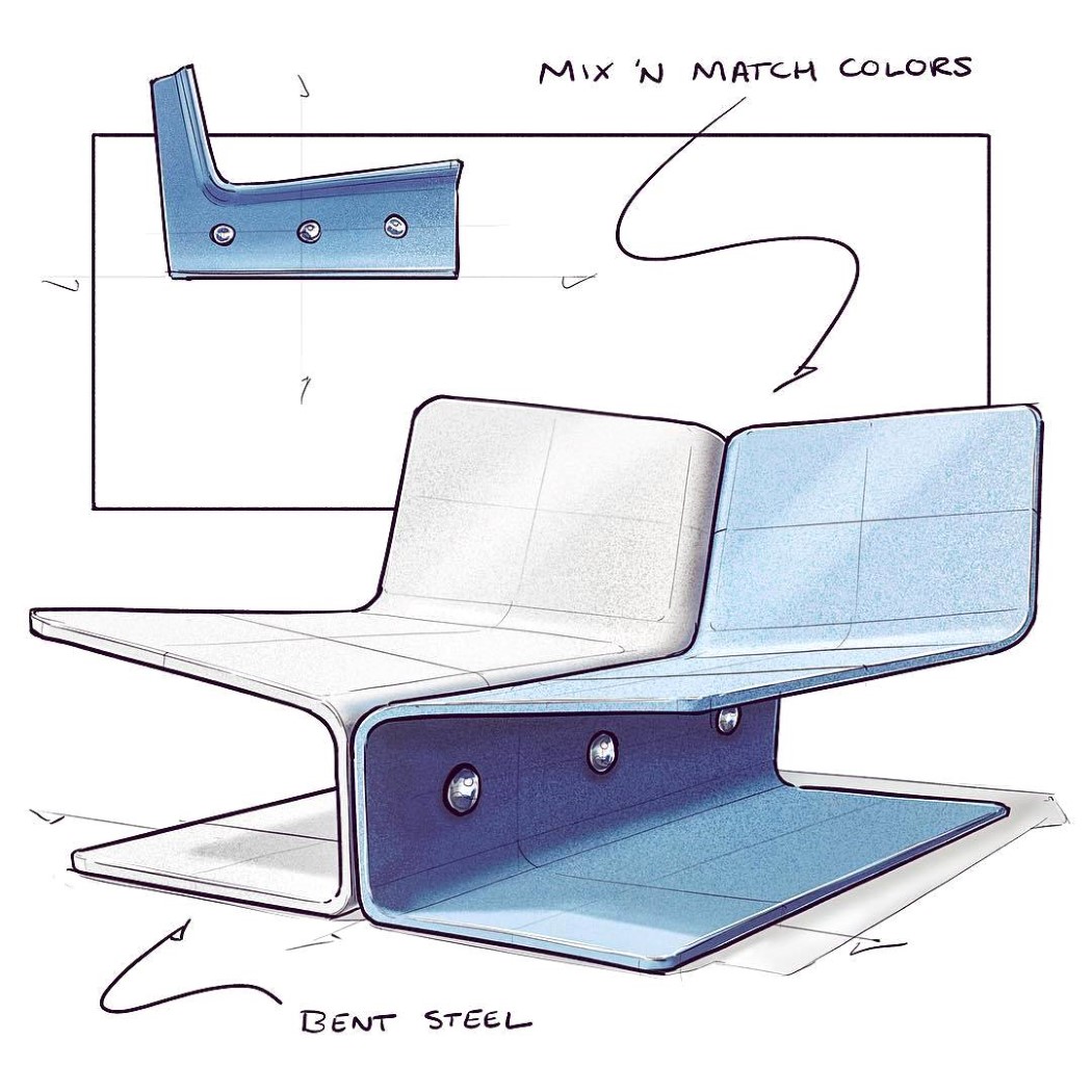
Literally a definition of bilateral symmetry, this chair comes in two identical halves, fastened together at the center. Made out of bent sheet-steel (cheap, reliable, and long-lasting), the two modules can be mixed and matched to give you color combinations that suit your space well. The colors are brought about by simply powder-coating the steel, preventing it from rusting and giving it a nice, glossy color finish. Finally, the two mirrored pieces are riveted together at the base, giving you a chair that’s unusual but comfortable! __ Click Here to check out the rest in the Nicholas Baker’s Chair Sketch Challenge series
Every week (although the timing isn’t particularly fixed), I see a chair sketch on my Instagram feed, and after having seen and liked dozens of them, my mind can almost instantly recognize @nickpbaker’s style and brand of creativity anywhere.
Given the hashtag of #nickschairsketches, Baker uploads unusual conceptual chair designs almost every week. The chairs showcase inventiveness that one rarely sees in furniture design, as concepts take inspiration from quite literally anywhere. Scroll down to see a few of our favorites.
Both a regular sofa and a rocking sofa, this chair can be flipped 180° depending on which feature you want. The reversible sofa can be sat on both ways, and the handles come with a flat side that gives you a stable sofa when you need, and a rocking sofa when you’re in the mood for some fun!
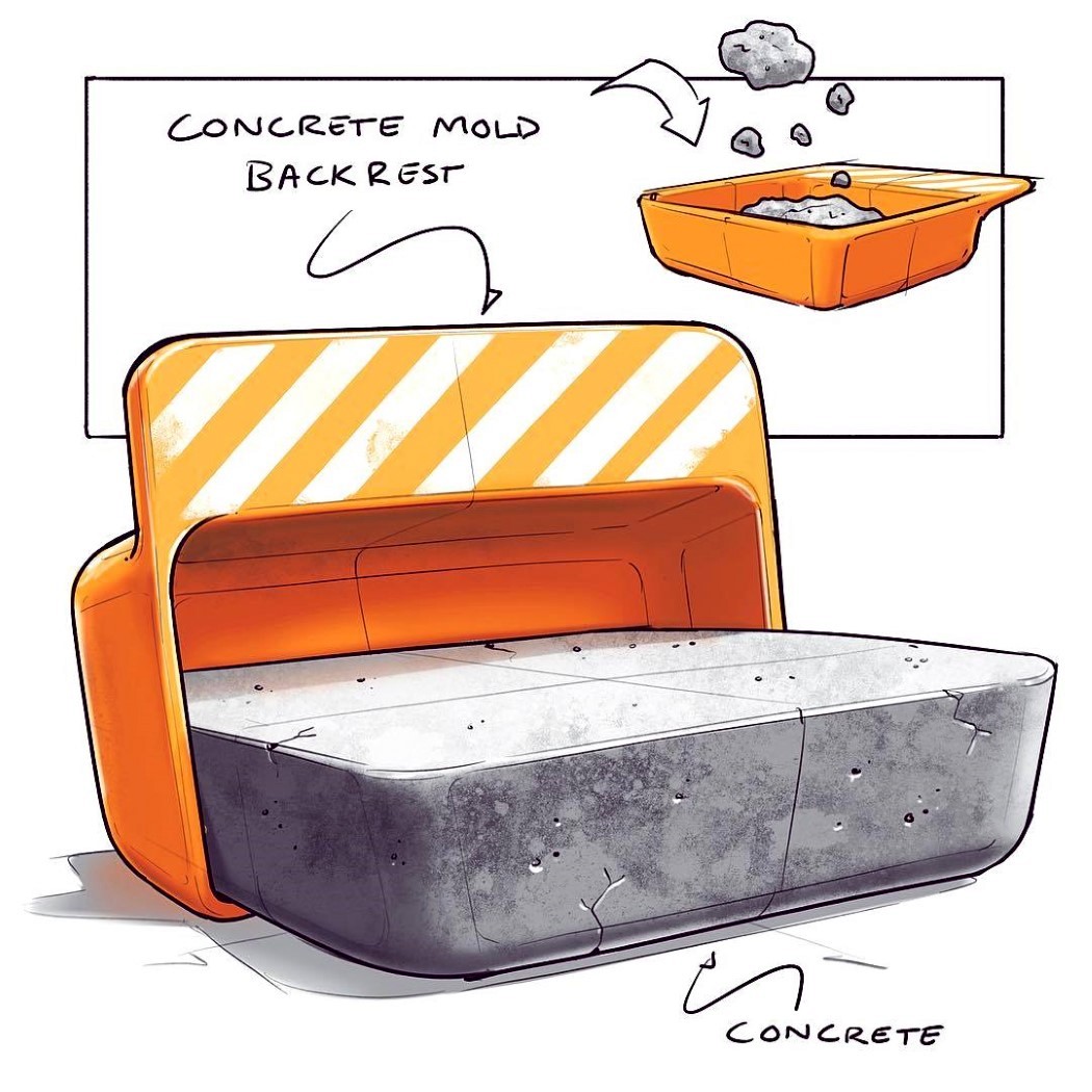
A different kind of DIY chair, this one requires some concrete and a hard-hat. The chair comes as a mold that also transforms into a backrest as the mold cavity allows you to craft the seating area of the chair. Ingenious!
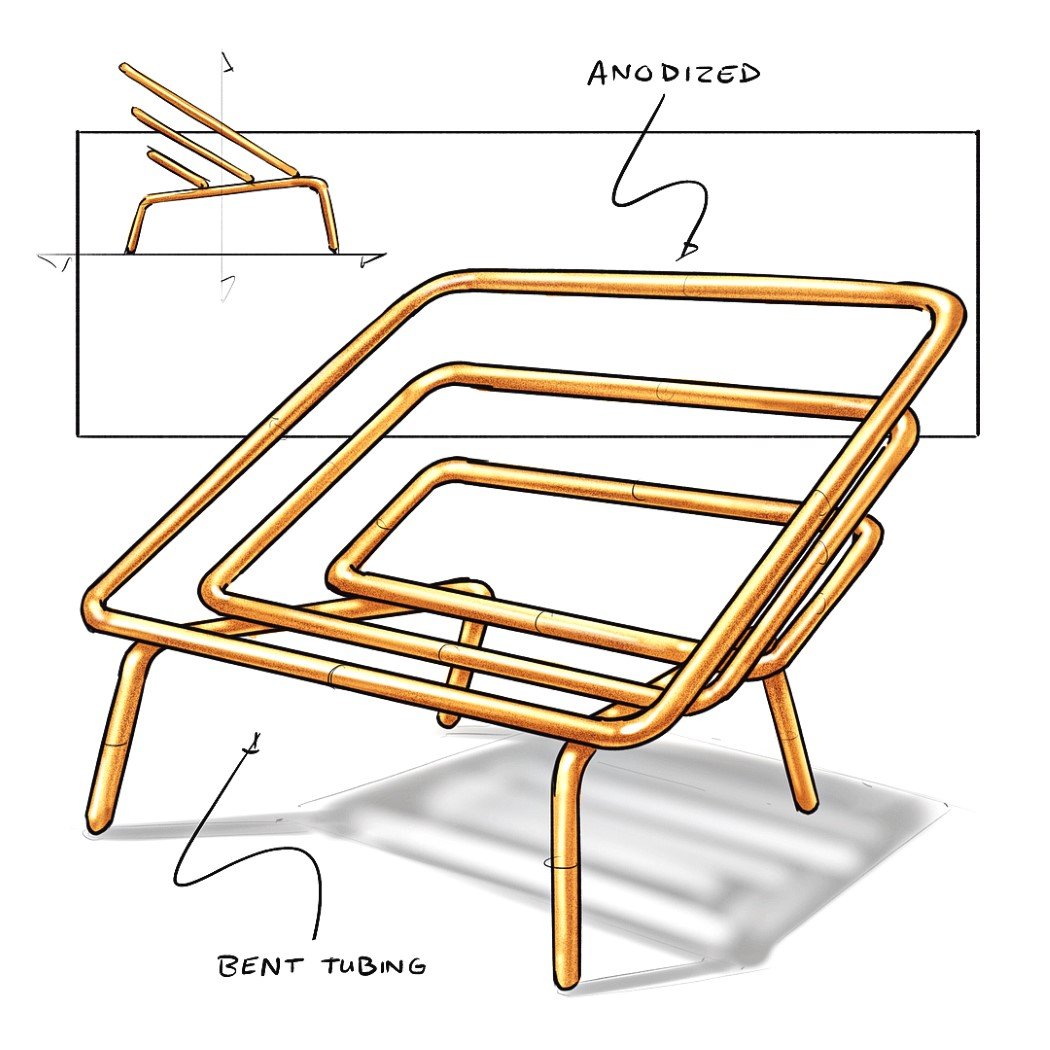
A simple chair made out of a single material, this concept showcases minimalism along with creativity. The bent tubing forms the legs as well as a wide seating area and backrest. You’d probably need a cushion though.
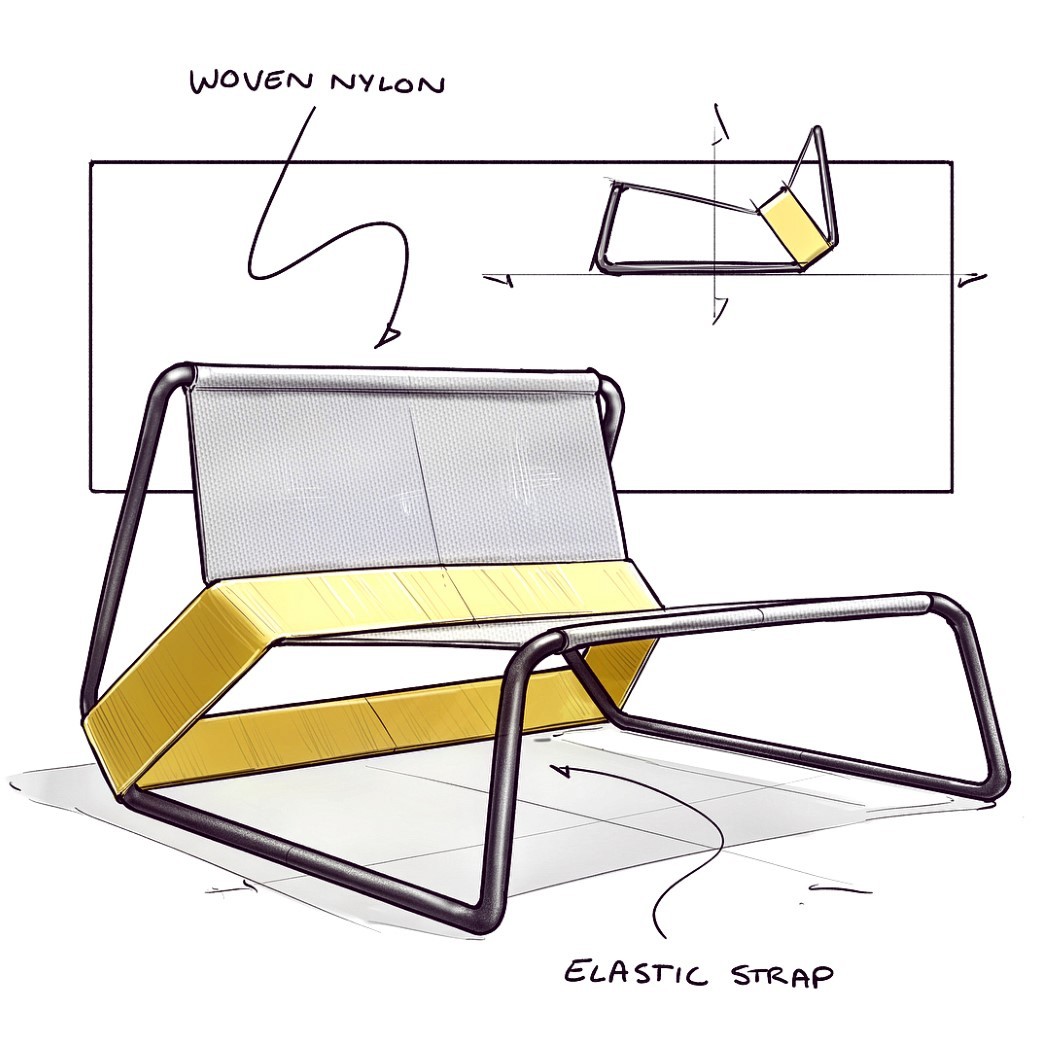
There’s something just wonderful about how the elastic strap adds punctuation to the chair’s design, giving it definition as well as its form. Without the strap, the chair’s almost like a hammock that you can’t really sit on. Introduce the strap and you’ve got a detail that catches eyes and derrières!
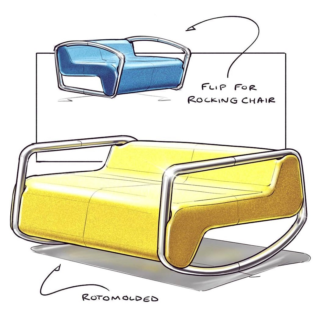
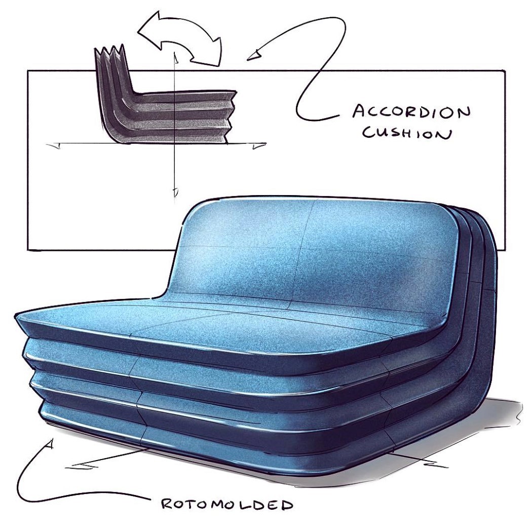
Inspired by the Bellow, this chair’s cushion effect comes from its unusual design! The roto-molded chair is sturdy, but its accordion- construction gives it a little flexibility as you sit down on it. The seat and backrest flex in their own directions, giving you a seating that’s hard yet soft!
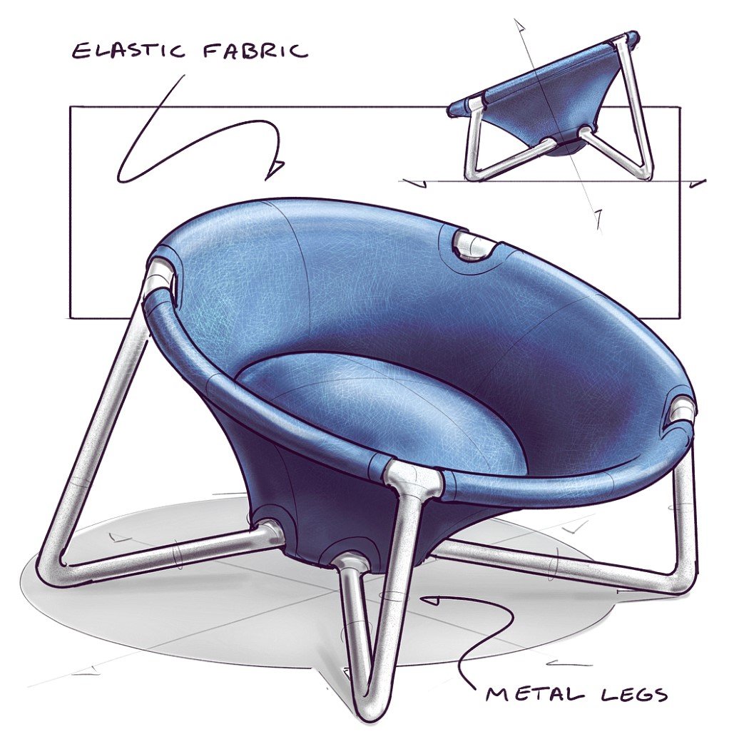
This chair reminds me a lot of the Red Dot Chair we wrote about earlier. It, however, comes with a cushion that gives you a clear indication of where to seat yourself! The elastic fabric also flexes to accommodate the shape of your body so you’re comfortable no matter what!
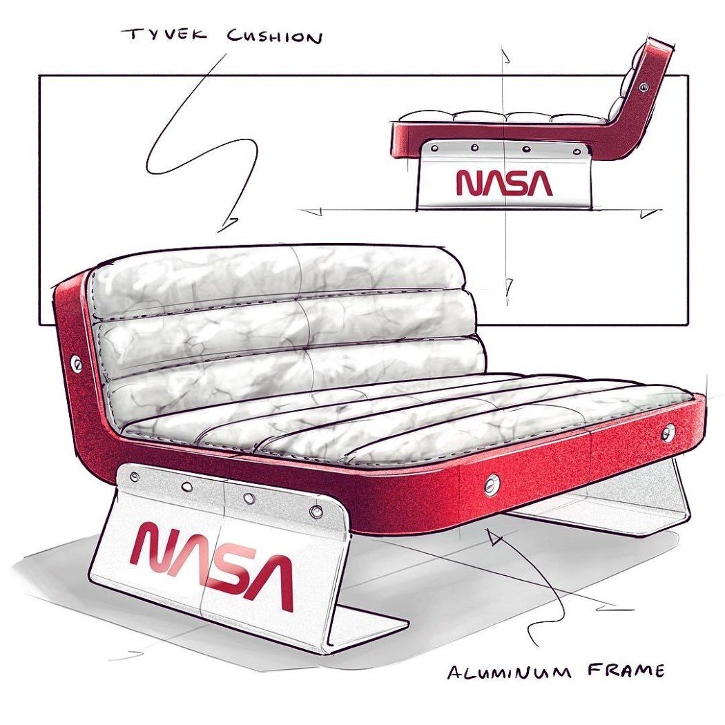
Inspired by the Anicorn and NASA collaboration over the limited edition watch commemorating NASA’s 60th anniversary, this chair is Nick’s hat-tip to NASA on their 60th birthday. It comes with an aluminum frame and a Tyvek cushion, both materials that are used in the aeronautical industry, and bent-sheet-metal legs that give you a feeling of weightlessness!
Taking a page from the Elastic Band chair from earlier in this series, this chair uses four parts. Two cushions and two bands that come together to form a soft chair with fabric-band armrests.
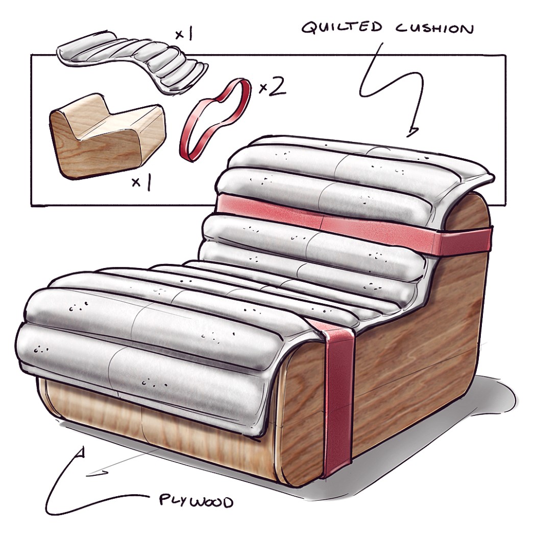
Another elastic-oriented concept, this chair comes with a hard wooden base and a soft quilt-like cushion secured around it using elastic straps. The quilt can easily be taken off and washed periodically, and you can even get your own quilt-cushions custom-made and draped over the chair!
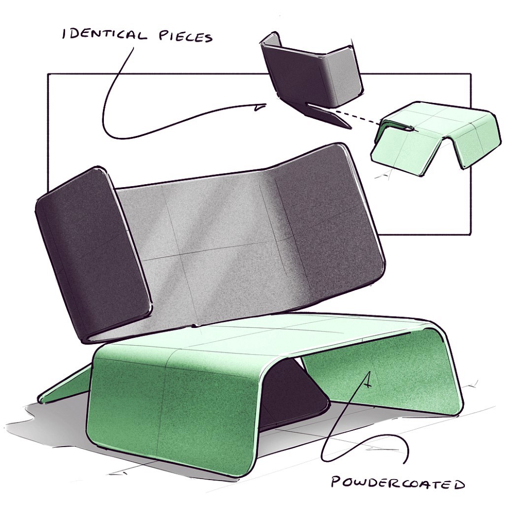
This chair is made of two identical powder-coated sheet metal pieces that ship together stacked/nested within each other to save space. Assembling them involves simply sliding one piece into another to lock them into a chair formation. Nifty, eh?? You can practically ship dozens of units together by simply stacking the parts within each other to save up on space during shipping!
Every week (although the timing isn’t particularly fixed), I see a chair sketch on my Instagram feed, and after having seen and liked dozens of them, my mind can almost instantly recognize @nickpbaker’s style and brand of creativity anywhere.
Given the hashtag of #nickschairsketches, Baker uploads unusual conceptual chair designs almost every week. The chairs showcase inventiveness that one rarely sees in furniture design, as concepts take inspiration from quite literally anywhere. Scroll down to see a few of our favorites.
I dub this chair the inside-out chair because of the way it’s built. With a hard, molded plywood outside, and a removable plush felt cushion inside, the chair can be used both as a hard seating device or a soft seating device, or even a lounging device by combining the two. Clever, isn’t it?!
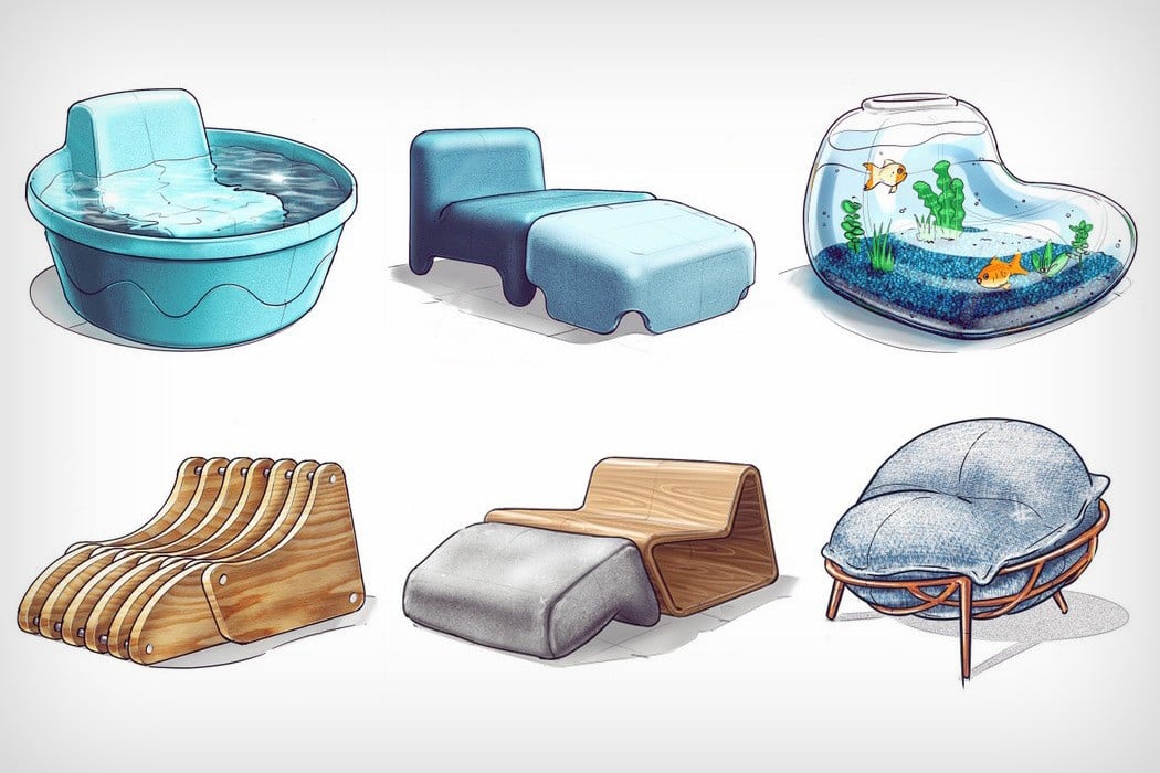
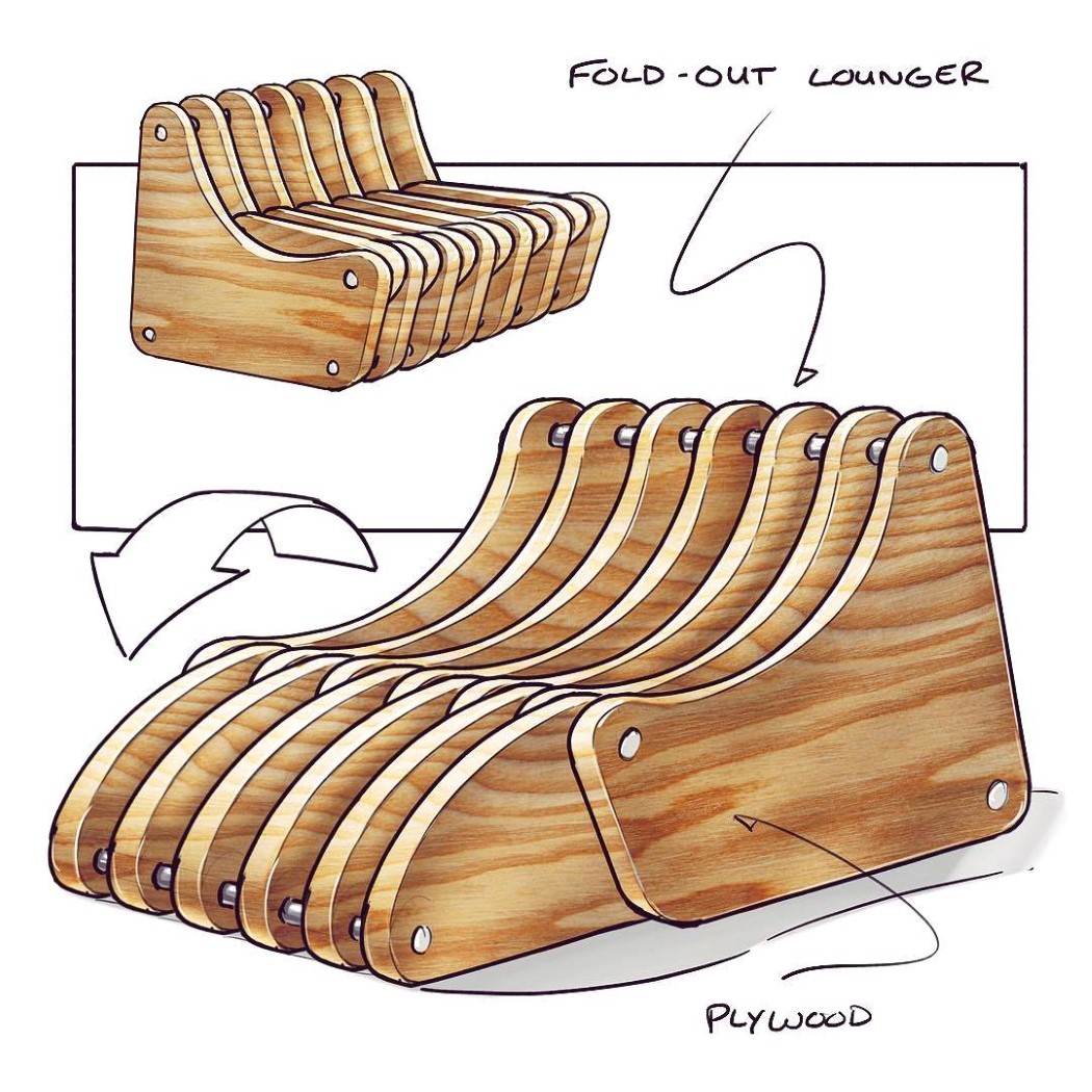
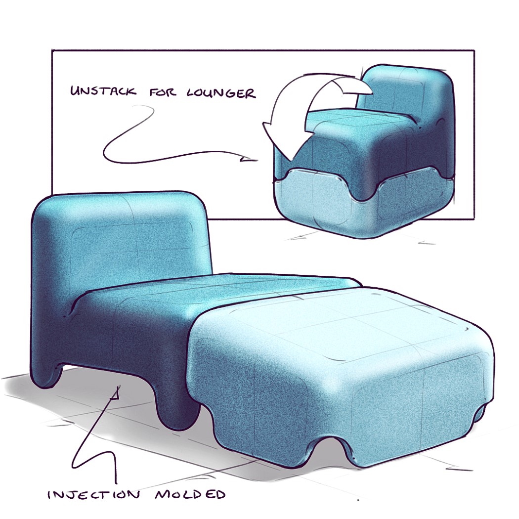
Building on the idea of converting chairs into loungers, this design actually comes with a slatted construction and a hinge that allows the lounging module to fold right into the chair. Fold it in and you have a nice, sturdy chair. Fold it out and you’ve got a chair with a nifty leg-rest!
Here’s a third way of going about it. Stackability! The chair comes with the leg-rest right under it. Lift the chair up and flip the leg-rest over and you’ve got a chair that’s slightly shorter, but has a nice comfortable place to keep your outstretched legs… or maybe use the leg-rest as an ottoman stool or side-table.
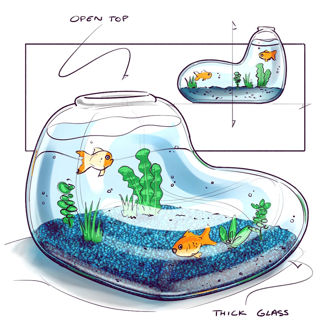
I’d imagine a villain from a Pixar movie having this chair with piranhas inside it. Probably not the kind of chair you’d see in Peta’s headquarters, this one is actually an aquarium you can sit on. Made from thick glass, the aquarium is shaped like a chair and can actually accommodate a human on it, although I doubt if the fish would like that view.
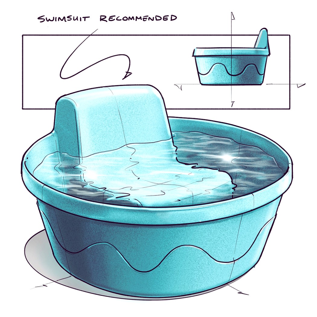
However, if you’re going to combine chair and water, this is absolutely the way to do it. This chair/pool hybrid is perfect for people of all ages. Just fill the water in and beat the heat! Hey Nick, how about building a bottle-holder into this one.
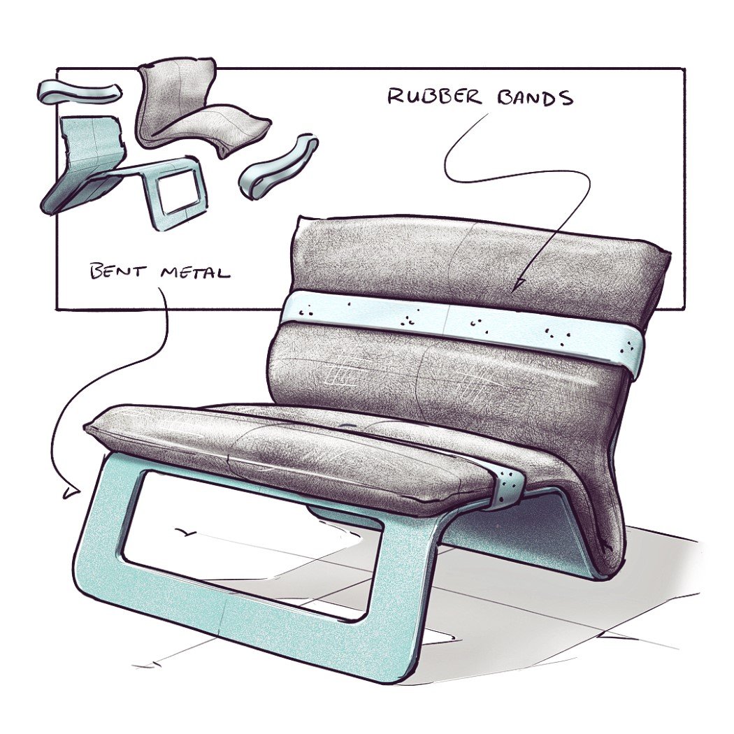
Two likely materials and one unlikely material come together to make this chair. First, you’ve got a bent-metal base/framework, on which lies, secondly, the cushion that covers not just the seating area but the backrest too, and then right at the end, you’ve got rubber-bands that hold the cushion to the base! Quite unconventional, if you ask me…
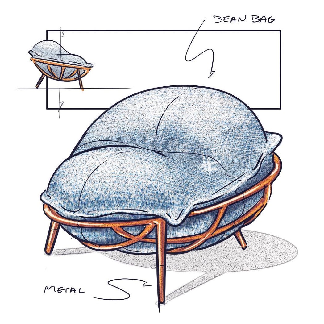
Another metal+cushion combination that has my heart. This concept actually creates an enclosure for the beanbag, giving it a more defined structure than being a lumpy blob of leather on the floor. The beanbag sits in the metal framework, and can easily accommodate one human. Who knows, sitting on this sort of beanbag may actually be more comfortable!
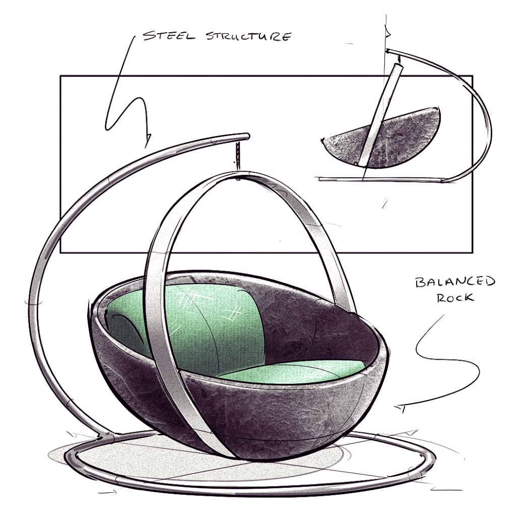
Perfect for the person who wants to sit but gently swing too, this chair concept comes with a steel framework from which it hangs. Nothing too unoriginal here, but I actually love the form on this one, and the use, or rather overuse, of arcs and curved lines.
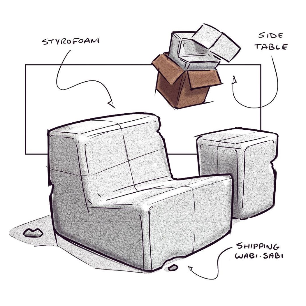
This concept challenges the very idea of packaging. Most products come packed in styrofoam to protect them from damage, but what if your product IS the styrofoam? Designed around a cuboidal form (because of shipping boxes) this chair comes with its own side-table. Made entirely from styrofoam (polystyrene), the chair practically weighs nothing, but can easily take the weight of one, or even two humans on it. And don’t worry if some of the styrofoam chips off a bit. It only adds to the chair’s unusual charm!
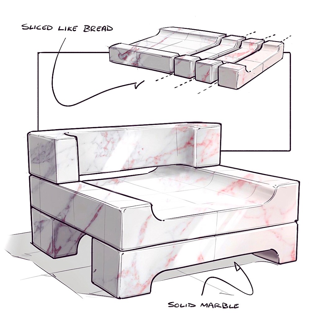
This concept is made from a singular form of marble, sliced into four pieces (quite like bread). The largest bit becomes the seating area, while the remaining three pieces become the two legs and the backrest. Aside from the scooped detail, this design doesn’t require much effort or time to put together, since it literally involves slicing and assembly (with no glue or fasteners involved either). The choice of marble gives the chair its premium appeal, and I’d love to see a variant made in granite!
Every week (although the timing isn’t particularly fixed), I see a chair sketch on my Instagram feed, and after having seen and liked dozens of them, my mind can almost instantly recognize @nickpbaker’s style and brand of creativity anywhere.
Given the hashtag of #nickschairsketches, Baker uploads unusual conceptual chair designs almost every week. The chairs showcase inventiveness that one rarely sees in furniture design, as concepts take inspiration from quite literally anywhere. Scroll down to see a few of our favorites.
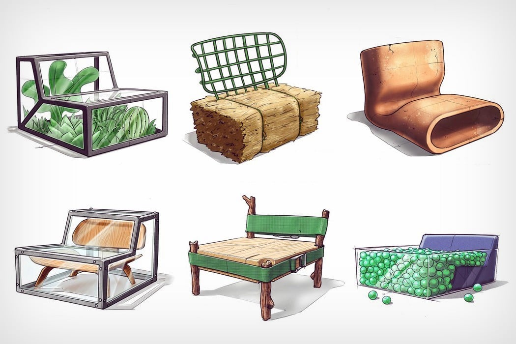
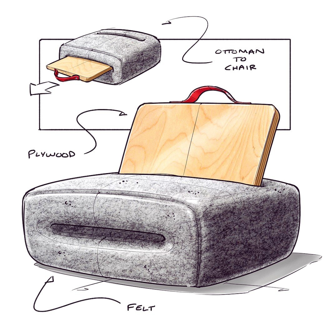
Taking inspiration from the laptop and its sleeve, this chair comes with the wooden backrest docked inside it. Use it as an ottoman stool, or pull the backrest out and dock it vertically to create proper seating!
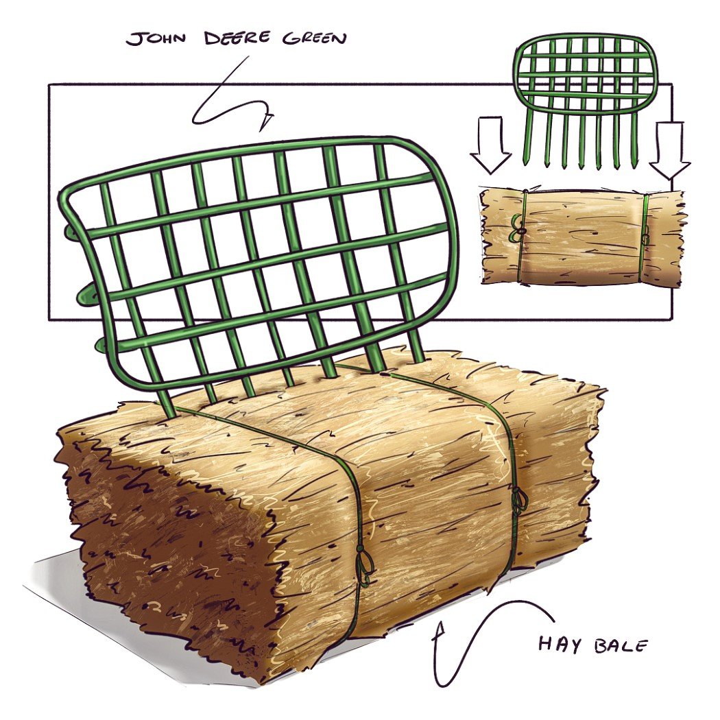
This pronged attachment literally turns a bale of hay into a rustic seating device! The prongs prod right into the hay, giving you a backrest you can angle-adjust to your liking by simply adjusting the penetration angle.
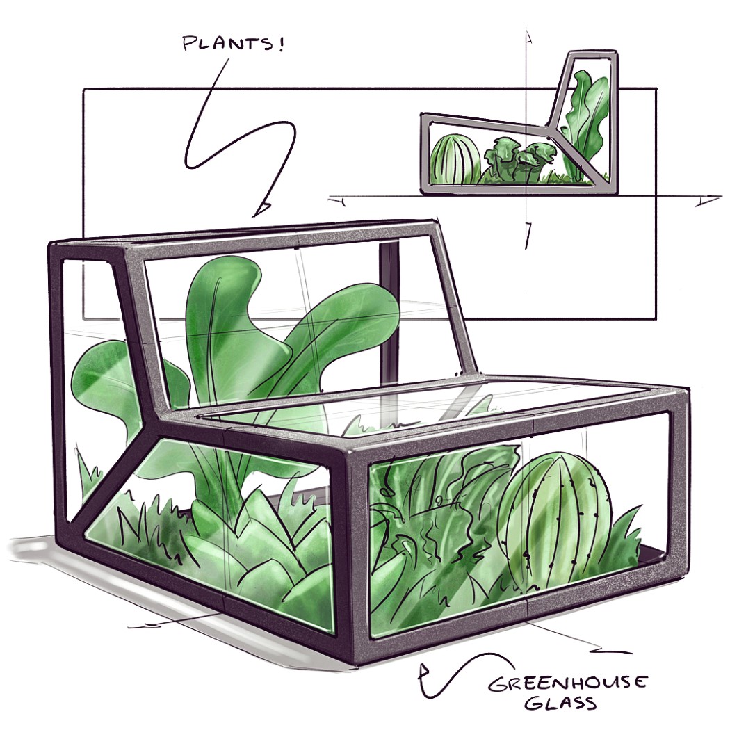
Turning greenhouse into seating, this conceptual chair isn’t a terrarium, but rather is a chair-arium! (I laughed)
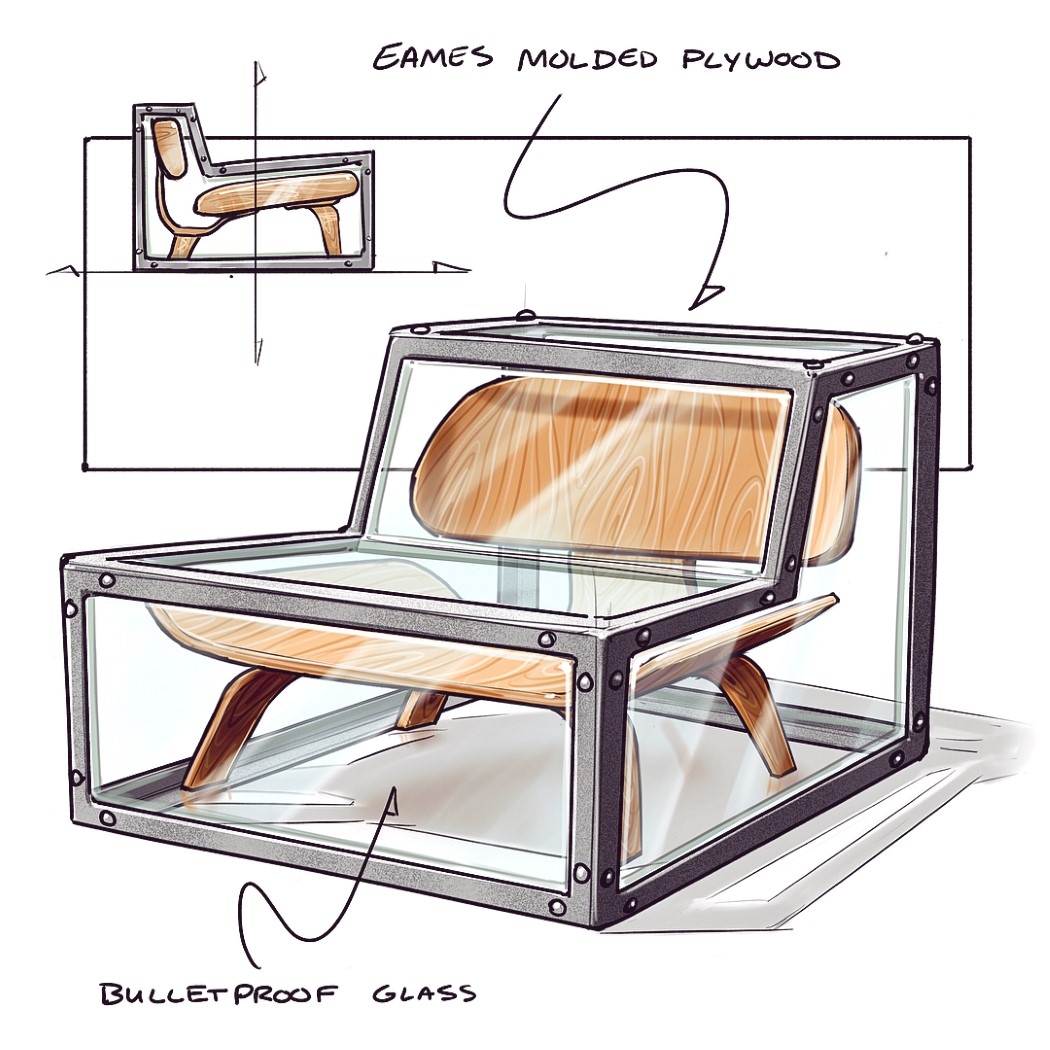
Quite similar to the previous concept, this chair is a surreal representation of seating. Preserving a seating device within glass makes this chair quite metaphorical, poetic, and worthy of being an art installation (that you can rest your bum against).
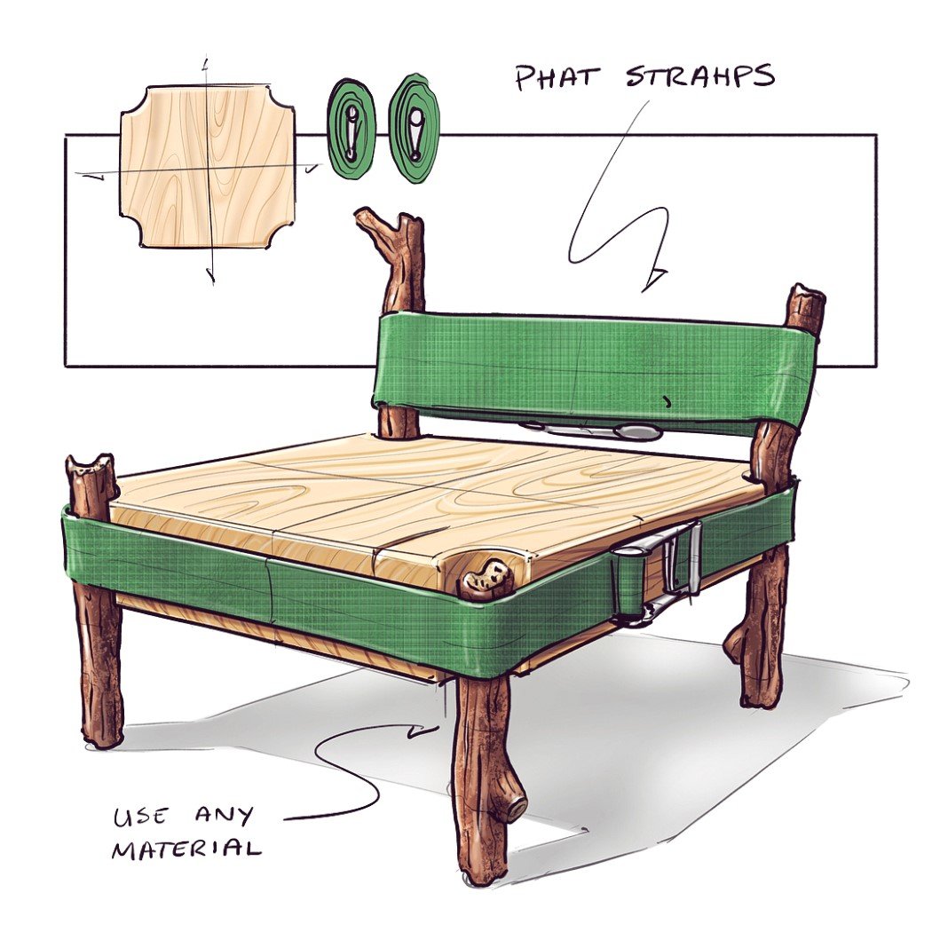
Titled the Strap Chair, this design gained a lot of popularity because of its unusual construction that a lot of people believed wasn’t possible or feasible. The appeal mixed with negative feedback led to Nick actually building a prototype that not only worked, but could take the weight of a person with relative ease.
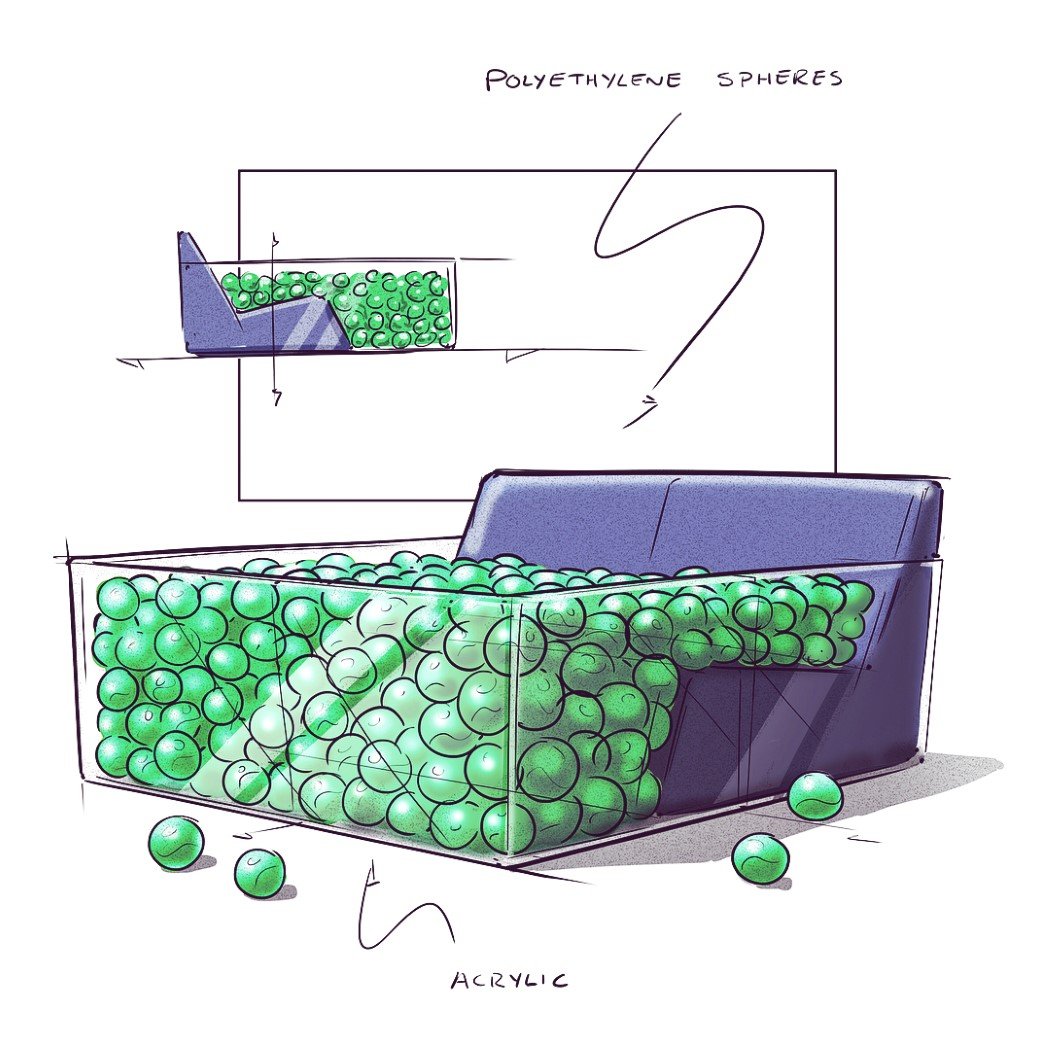
Bringing an element of fun into furniture, this chair is quite literally a ball-pool with a backrest. Straying away from tradition completely, this concept shares a bit with a beanbag, but ultimately stands on its own in terms of creativity and innovative thinking.
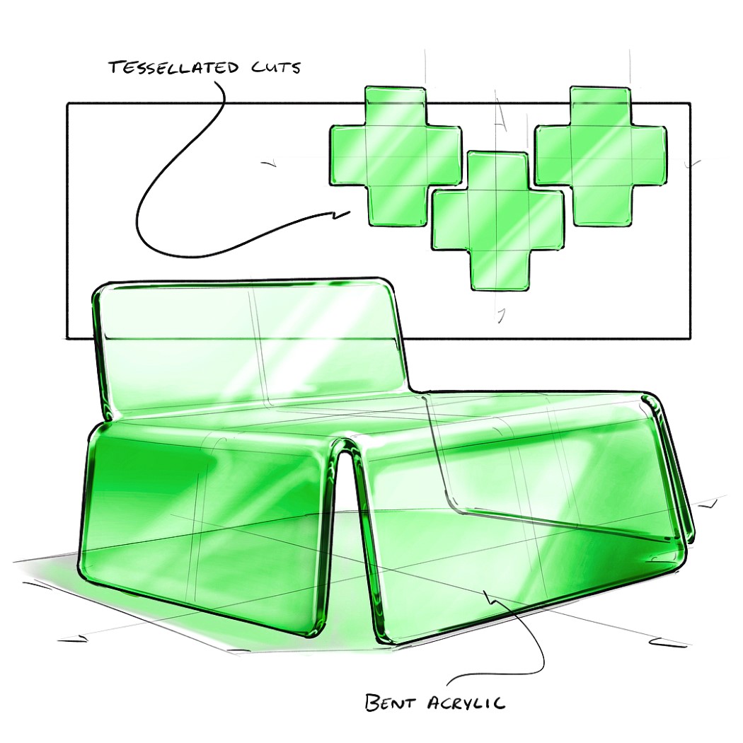
This chair could have just as easily been made out of sheet metal (and it sounds like a more practical choice of material), but it employs fluorescent acrylic sheet instead, that’s cut into the shape of a cross, before being heat-bent into the form of a funky, translucent chair with a backrest.
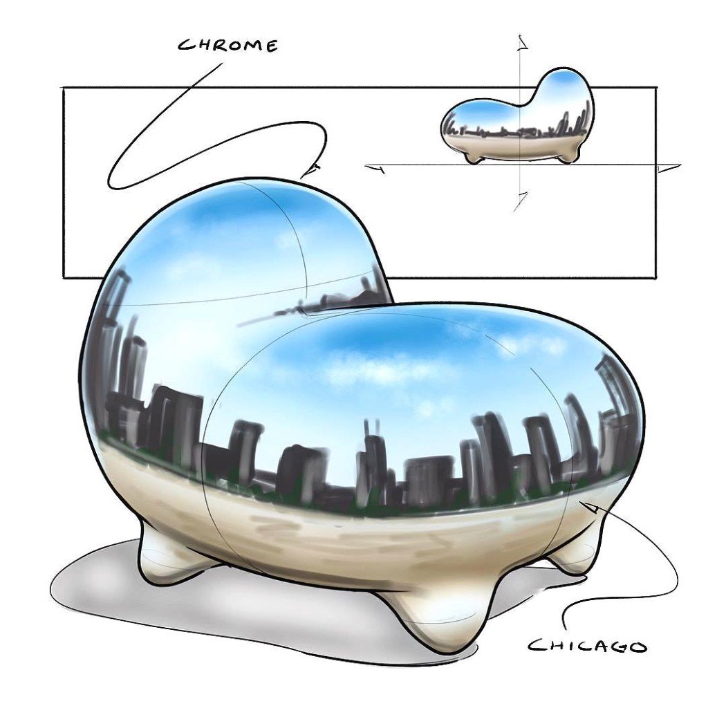
Taking clear inspiration from Anish Kapoor’s Cloud Gate, the chair is a sort of homage to the rounded, chrome-plated art installation. It even features a reflection of the Chicago skyline. Apt!
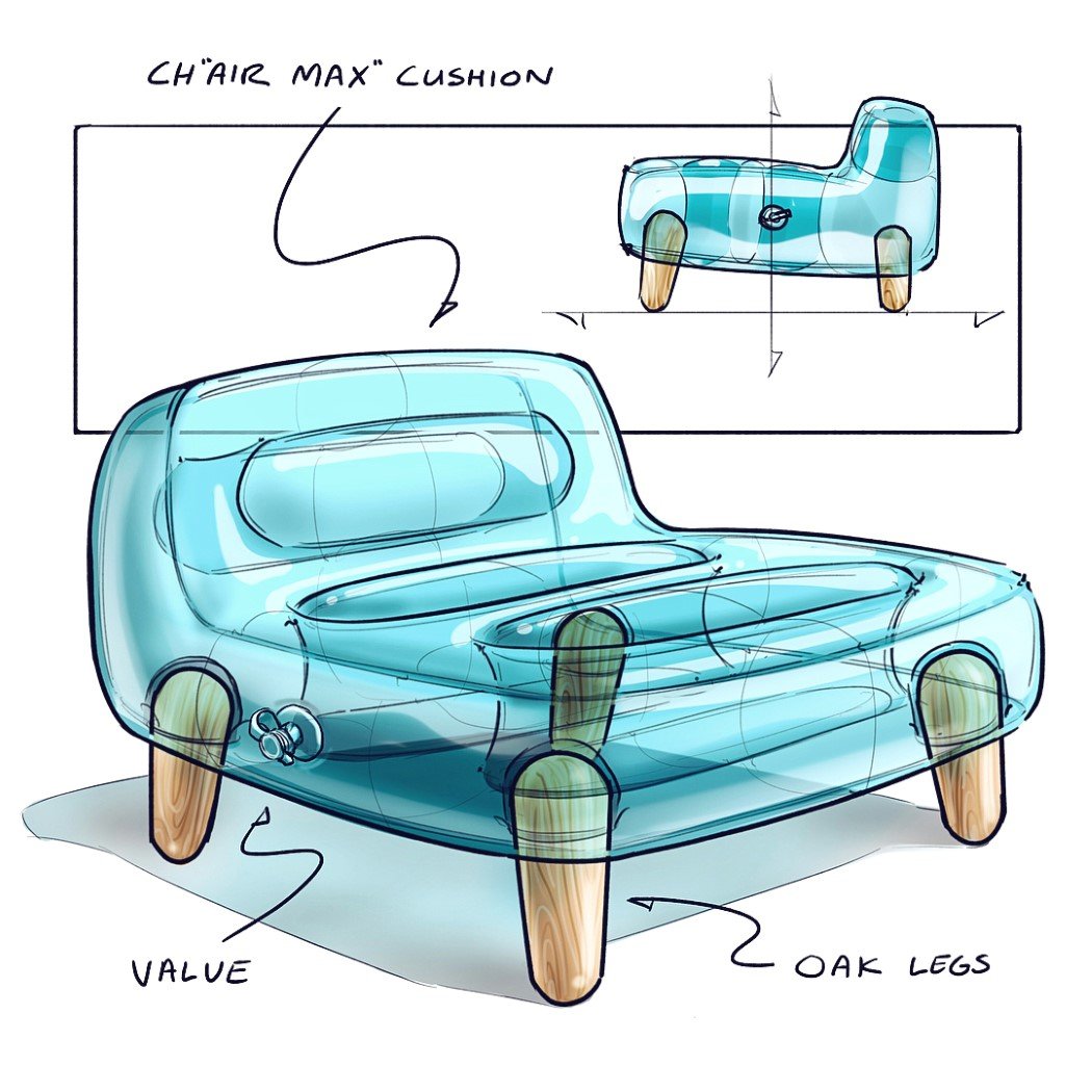
The Ch”air max” Cushion chair quite unusually combines inflatable furniture with wooden construction. The inflatable cushion props itself up on oak wood legs that conveniently fit inside dedicated slots made for them. I’d love to see a functional prorotype of this one.
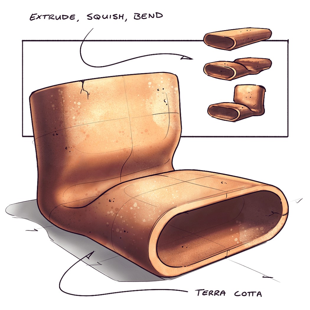
Unusual form, as a result of an unusual material choice as well as unusual manufacturing process, this terracotta chair is perhaps the most innovative of the lot! The terracotta is extruded in the capsule shape, before being pressed, and bent into the shape of the chair. Baking it gives it its earthy brown color, as well as hardening it. The terracotta remains cool in the summers, making it a nice chair for the outdoors during the day!
YD has always had a large focus on concepts. The only way to pave the future, I believe, is to conceptualize, and we’ve seen so many products develop only years after the concepts did. So as far as they go, conceptual designs pave the way for real-world products, and they’ll always have their place on YD. Having said that, there’s no observing conceptual designs without stumbling across those made by Jonas Daehnert, or as the internet calls him, Phone Designer. Jonas’ conceptual phones range from pretty-well-chalked-out to tongue-in-cheek… although some of his conceptual designs feature rather logical details based off rumors, brought to life by his photorealistic rendering skills. We had a chance to have a word with Jonas, delving into his process, passion for phones, and what he designs apart from them. We’ve even taken a look at some of his phones we’ve featured on YD.
Yanko Design:Hey Jonas! Big fan! Tell us a little about yourself, your background, what you do…
Jonas Daehnert: Hey! My name is Jonas Daehnert, I’m a 31-year-old designer from Germany. In 2007 I started studying product design at the Bauhaus University Weimar. During this time I learned how to develop and design products. But, of course, even out of school, learning continues. Currently, I work as a freelance product and concept designer. Sometimes I design new product concepts for companies or other design agencies, sometimes I visualize their products for packaging, advertising or for presentations, like MWC in Barcelona. In my free time, I’m a natural born geek.
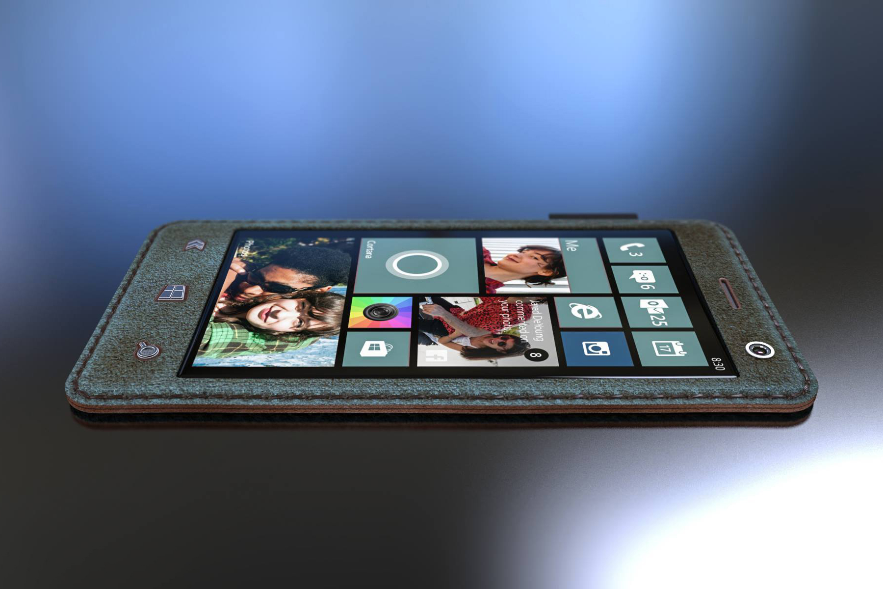
Daehnert’s Leather Phone imagines an era where phones are flexible, so a leather construction provides a beautifully premium clad.
YD:How and when did you venture into the “concept phone” domain?
JD: In addition to studying, I founded a video game development studio with a friend, 9 years ago. He was, and still is, an excellent computer scientist and I was able to design the graphics, sounds and game mechanics. We did a good job. But even in 2010/11, it was hard to get attention, especially when you developed apps for Windows Phone 7. To increase our downloads we were looking for a way to advertise our apps more effectively. Then I came up with the idea to promote our apps on fictional devices. As chance would have it, Microsoft revealed their first Surface devices in June 2012. One week later we presented our games on the new fictional “Surface Phone”. I’m really proud of it, because it was my first phone concept and people really liked it. We got a lot of attention. It was also the birth of the Surface Phone myth. From that point on, I started developing phone concepts in my free time.
The Surface Phone was Jonas’ first concept phone, modeled off the Surface Tablet that released in 2012.
YD:Softwares! What do you use to model and render?
JD: Like a lot of product designers I use Rhino 3D for modeling and Keyshot 7 Pro for rendering. Both applications are relatively lightweight, versatile, affordable, and easy to learn — but hard to master. They work perfectly together.
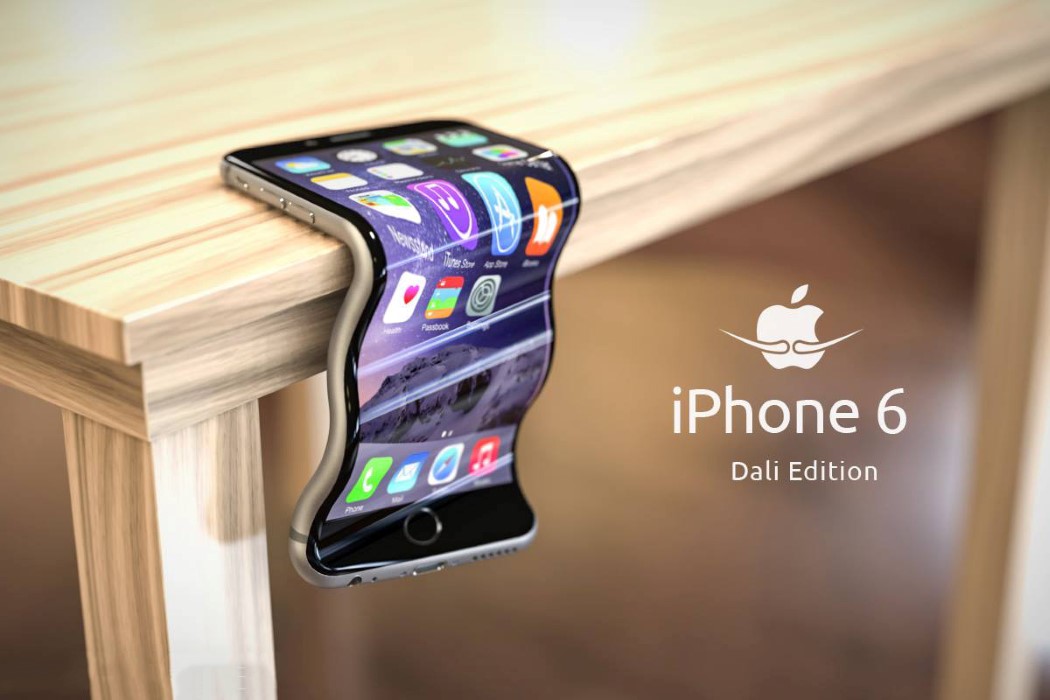
A poke at the #bendgate controversy surrounding the iPhone 6 launch
YD:How do you start with your concepts? Do you follow the rumor-mill?
JD: My first concepts just followed the rumors and as a product designer it is always a good exercise to work on fictional things for companies you have never worked for. It’s like a role playing game. You analyze their design philosophy and create new products for them, without restrictions or limitations. It’s just a typical design process with a lot of research, sketching and failures. But in the last two years I stepped back to just do some smaller stuff on Twitter, because these days I don’t see any advantage to designing smartphones under a false flag. Most companies became boring, predictable giants. The biggest topics in the last six month were notches, great cameras and the disappearance of the headphone jack. That’s it. I would like to go further and design my own visions under my own concept brand. For nearly a decade I’ve called myself Phone Designer. This doesn’t mean that I’m only focused on phones, though. Currently I’m working on a laptop concept, which will be totally unique.
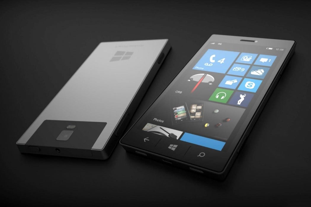
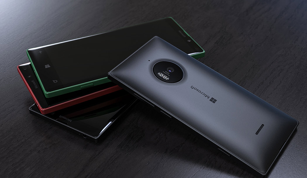
The Lumia 940 was built on rumors and these incredibly realistic renders probably circulated more than the actual photos!
YD:Share some of your tips for photo-realistic renders!
JD: Of course for every render scene the quality of the 3D model, its details, textures and materials are important. But even more important is the arrangement of the 3D models, the camera and light settings. Many 3D artists make the mistake of using very low focal lengths and aggressive viewing angles in their camera settings. As a result, lots of renderings are distorted and the original character of the product is destroyed. Be more conservative in terms of camera settings and spend more time developing a sophisticated light setting to push the product characteristics. Having some knowledge about photography is really helpful, too.
The Pixel concept actually used Google’s brand colors as product lighting, creating a beautiful atmosphere for the render!
YD:Favorite phone of all time? What phone do you own?
JD: Definitely my first phone, a C35i by Siemens. It is an extremely durable phone with two weeks of battery life. And it still works, after 18 years. I’ve spent a long time with Windows Phone and I’m still a fan of the Lumia phones, especially its Fabula Design language. But Windows Phone is dead, so I switched to Android. Actually I use an old Moto G4 — it’s enough for my needs. I prefer purism and simplicity.
Jonas bid farewell to the Windows Phone in a rather humorous way. It’s pretty comical how the Windows Mobile tile-UI fits into the crucifix design too!
YD:Do you ever plan to make concept wearables like smartwatches or VR headsets, etc?
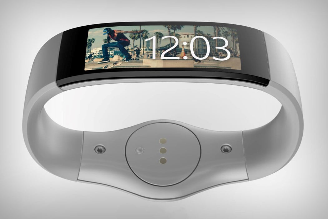
JD: I already did. A couple of years ago I designed a wristband that could have been a product by Microsoft, before they launched their first Microsoft Band. The similarities were surprising. I also created a fictional VR headset, the Google Nexus Glasses. For a real client, I’m currently designing a wearable, which will be used in the sport of boxing. It’s not released yet.
Jonas dropped his own version of Microsoft’s Band in 2014, when the watch market had just begun developing with the Apple Watch.
YD:Lastly, one thing you really wish you could change about the smartphone industry.
JD: There are over 3000 smartphone brands in the world. Each company should produce less devices per year and focus on durability, their software services and updates. Planned obsolescence generates the money. This is a problem. That’s why I really appreciate Google’s Project Treble, which tries to change the current situation. We should also think about our material choices. Using aluminum or glass for the backsides of the phones requires a lot of energy and resources that are not recyclable. We should use less glue and more screws. We have to prevent the garbage from landing in Africa. The whole industry has to change its attitude towards pollution. Finally, as a geek I say: We need more battery life.
(I couldn’t agree with you more, Jonas…)
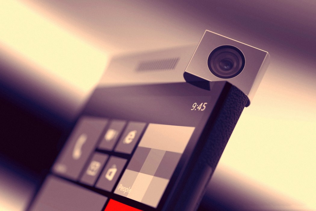
Daehner’s Spinner Phone, also from 2014 (not inspired by the fidget spinner), explores a rotating camera module machined in metal, allowing you to click incredible photos and selfies… using the same camera.
To check out more of Jonas’ work on YD, click here.
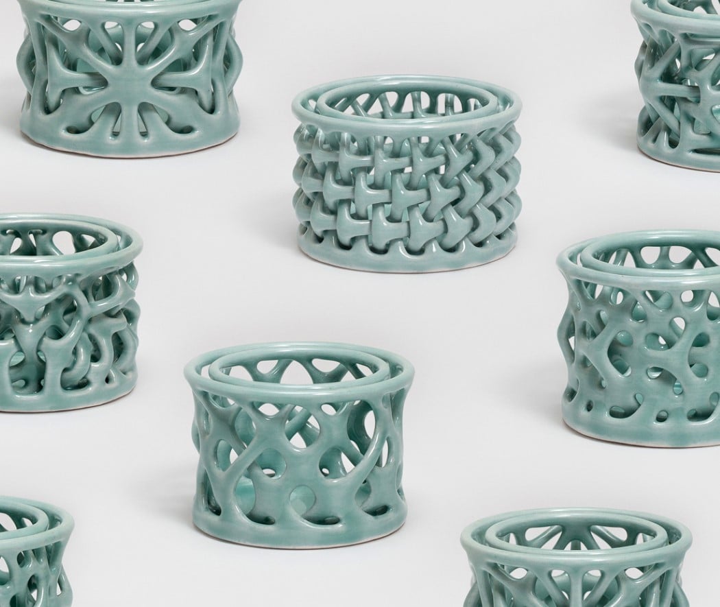
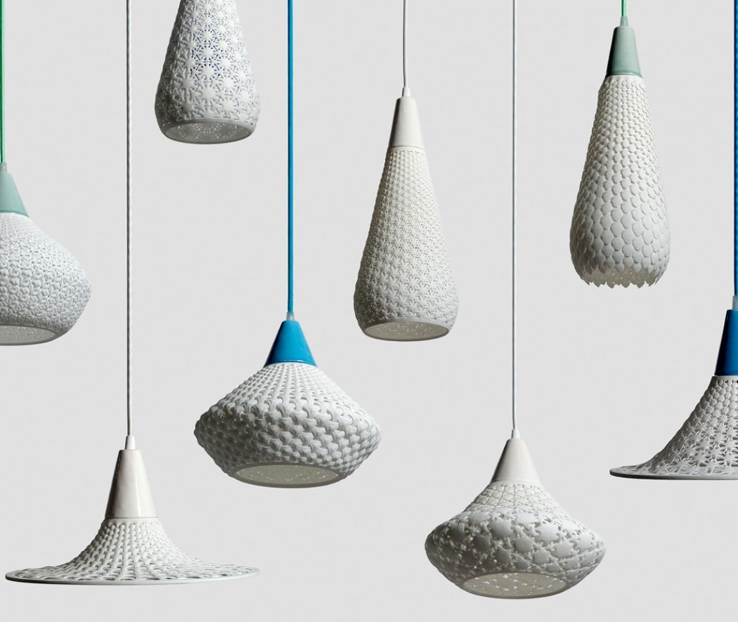
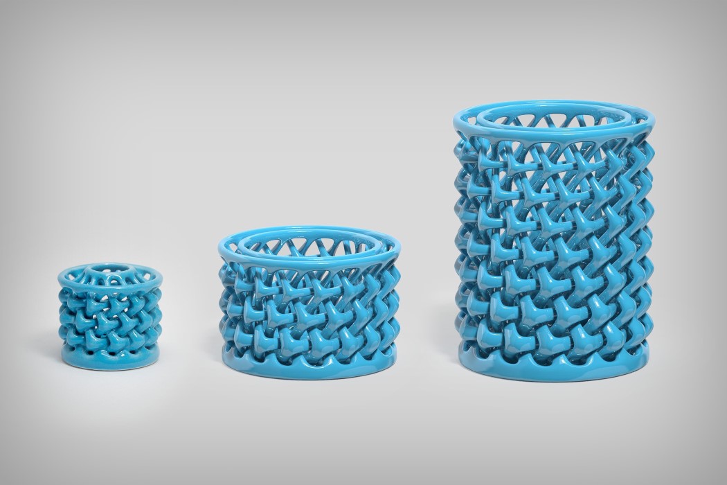
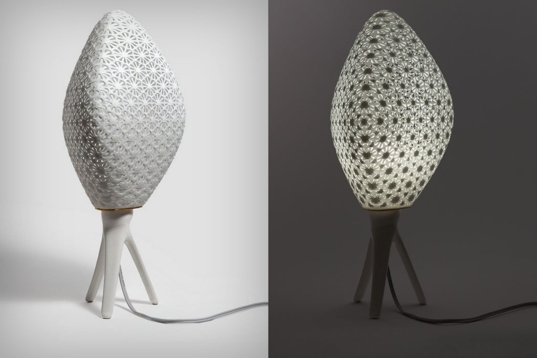
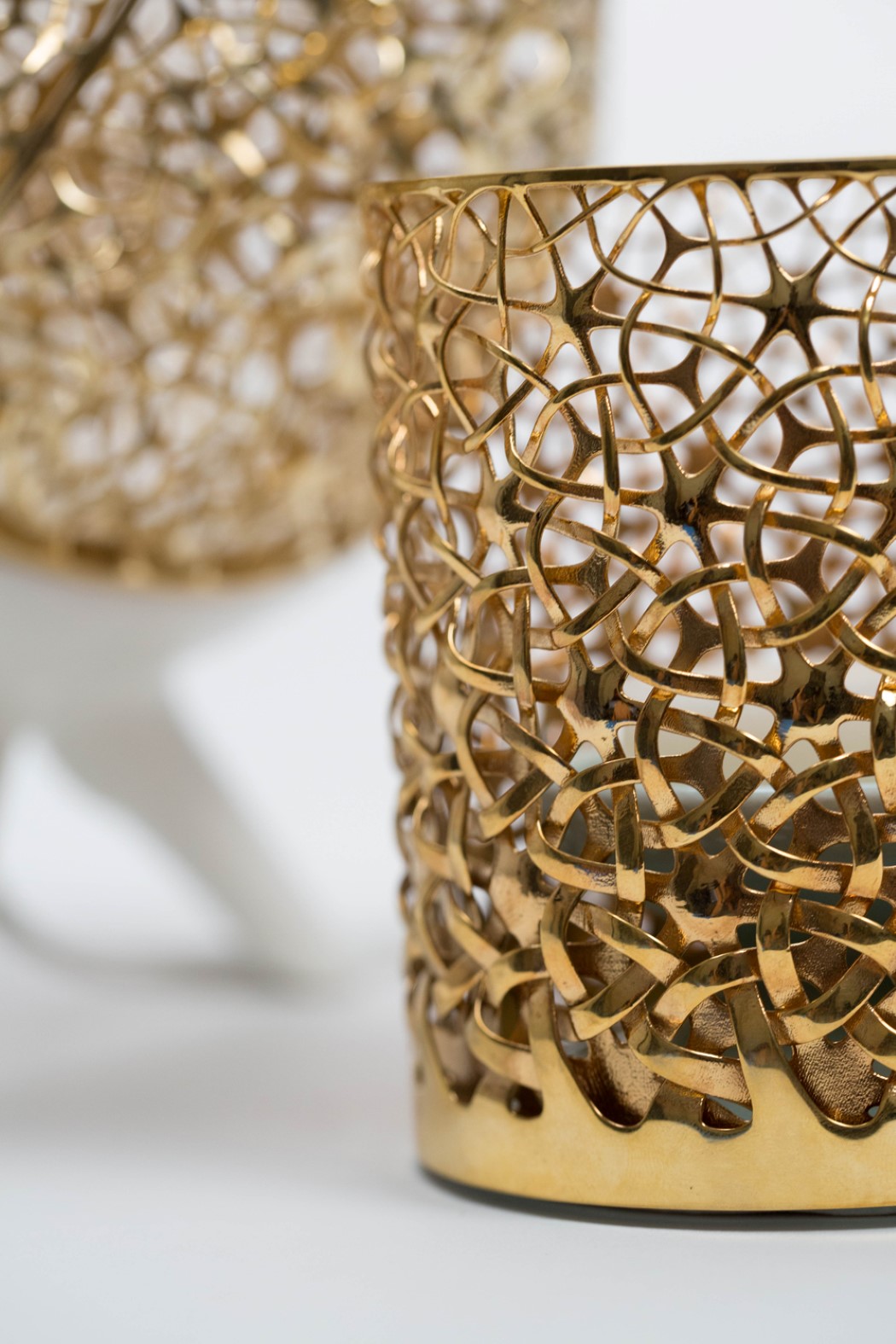
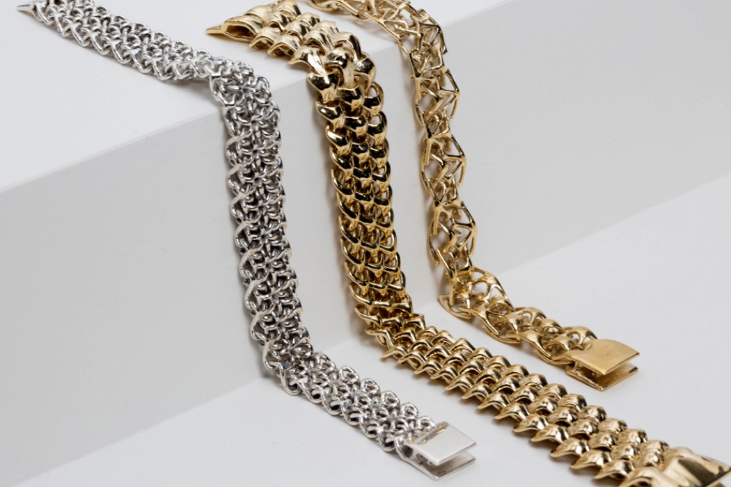
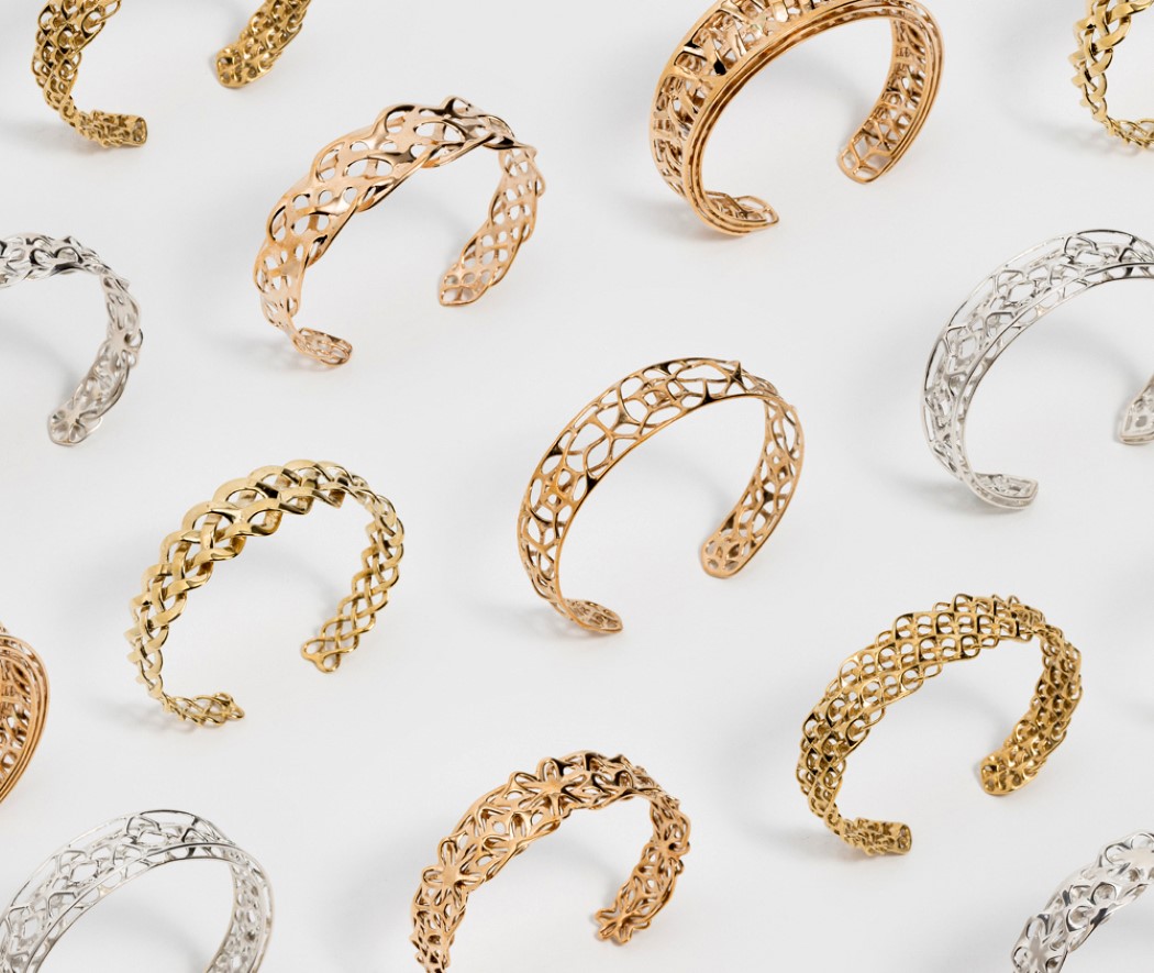
I guarantee you will never find work more incredibly intricate and ornate than those by Travis Fitch. Truly pushing the boundaries of design, art, science, nature, mathematics, and technology, Travis Fitch (under the moniker Fitchwork) creates some of the most mind-numbingly beautiful objects. Completely embodying Charles Eames’ quote, “The details are not the details. They make the design.”, Fitchwork’s creations empower designs through repetitive details, creating patterns you’ll rarely (if not never) have seen in man-made designs. Using art and geometry in a way that makes it feel like Mother Nature meets 3D printing, Fitchwork’s products utilize a unique design process combines user customization with new fabrication technologies to create distinct and personalized items. With a wide variety of patterns that combine geometry with organic design, Fitchwork creates products that are molded but look woven. Each of the patterns is scalable, and products, ranging from ornaments to home decor, come in both ceramic and metal variants. I could go on about how unreasonably beautiful these designs look, but I’d rather let the work speak for itself. Scroll down to witness some of the most awe-inspiring design details your eyes will have ever seen.
BKID Co is the brainchild of BongKyu Song, an award-winning Korean Designer. It’s also one of the only design studios that boasts of having a design language unique to it. You can look at a BKID product and there’s something innately BKID-ish about it. Their human-centered, design-based approach is evident in the work that they do, and each product has a playful quality to it, projecting technology as more docile, rather than trying to look superior. The result is a product that looks inviting to people of all ages, and that looks friendly and ready-to-help, rather than cutting-edge and intimidating.
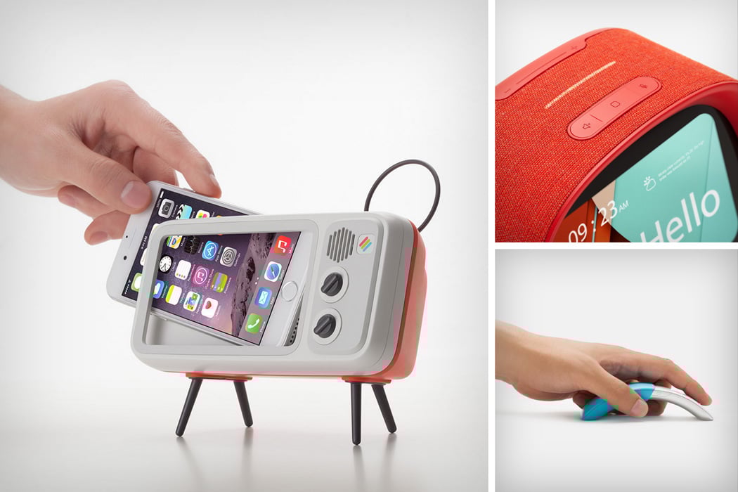
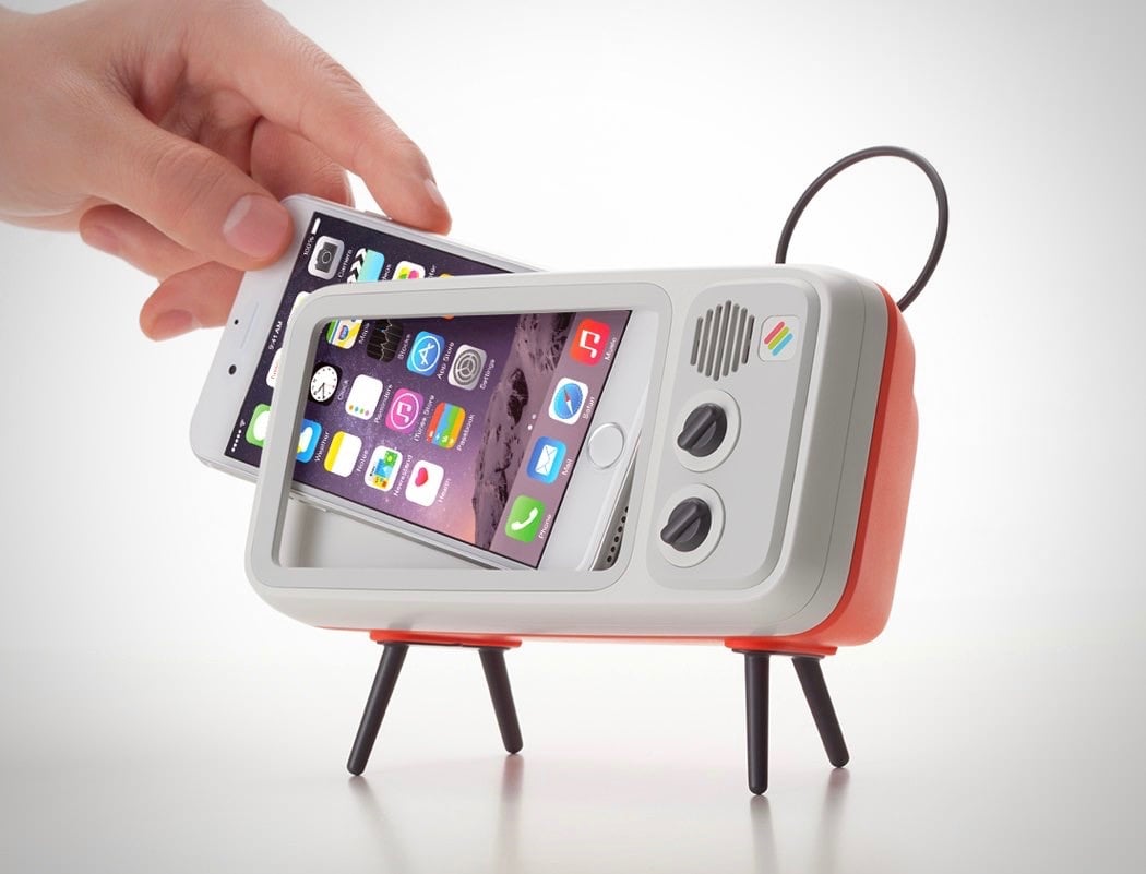
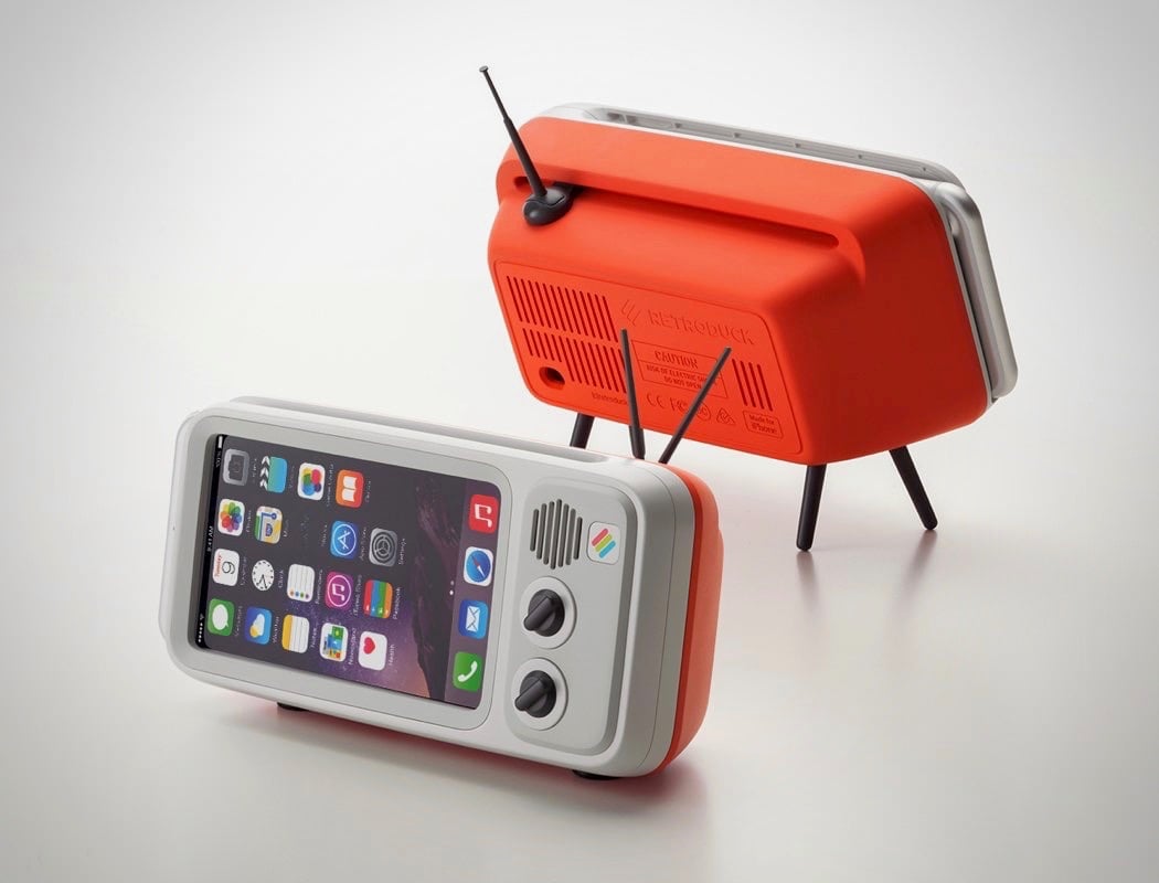
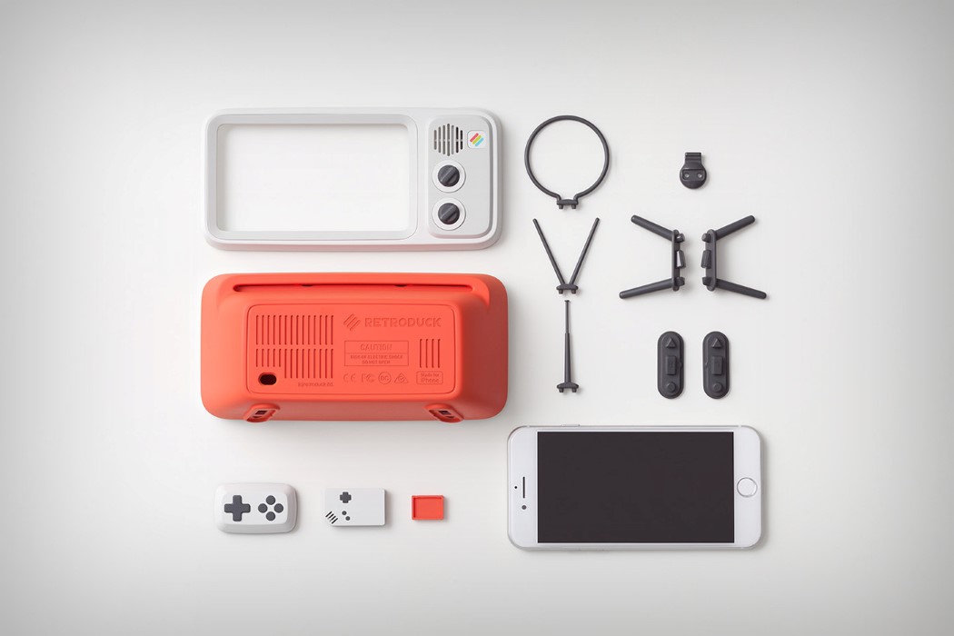
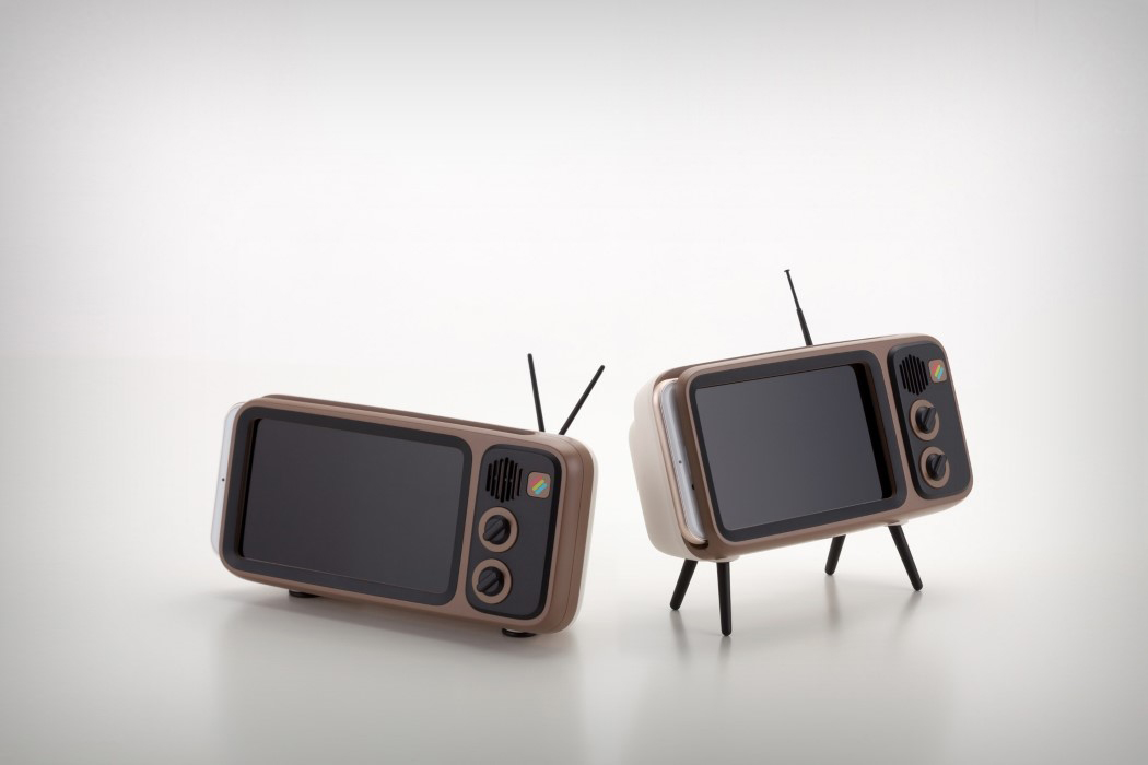
The Retroduck by BKID for Wisekids is probably one of our favorite projects. It pays tribute to one of the earliest forms of entertainment, the Cathode Ray Tube Television. An iconic appliance found in almost every home in and around the 60-70s, the TV set looked bulky but beautiful, and who can forget those knobs for adjusting the channel and volume on the side?! Retroduck harnessed that nostalgia with its ability to dock the iPhone into its housing in a manner that turned the retina screen into a retro appliance. BKID’s design of the Retroduck employed a beautiful color palette of red and white, while also keeping things original with the brown and black combo. Soft curves dominated the design, and its plastic build gave it a more inviting appearance than the usual metallic, cold demeanor of the iPhone.
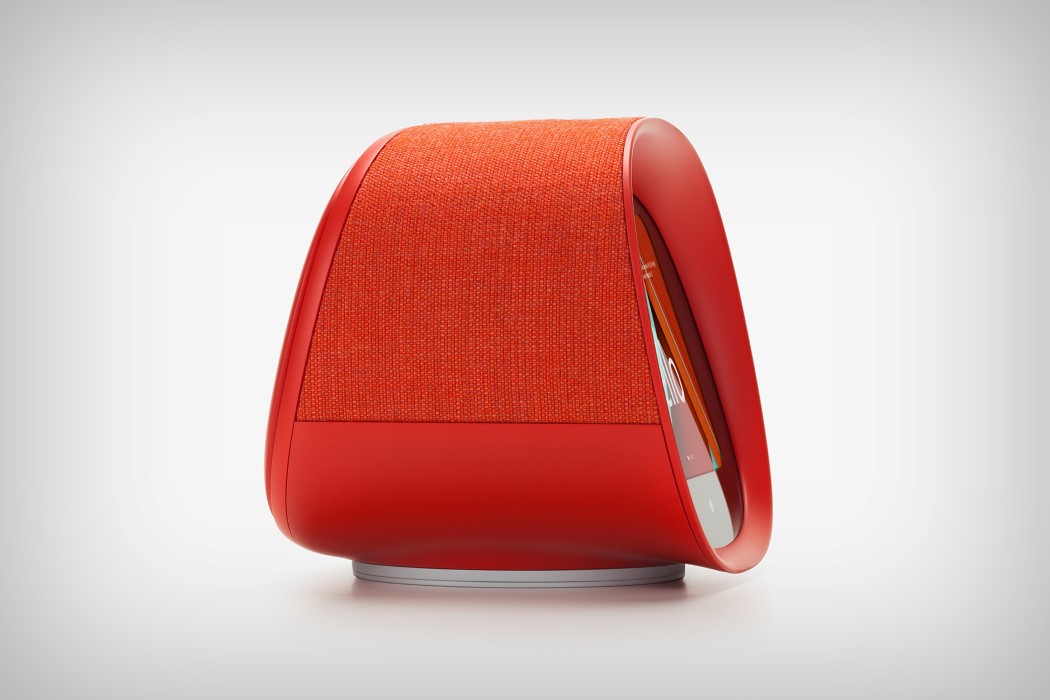
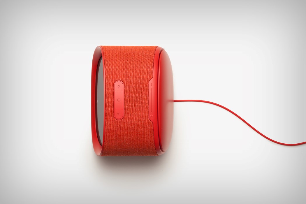
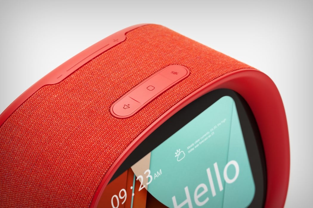
The Fairy for SK Telecom probably most clearly outlines BKID’s approach to product design and how different it is from the others. Pit the Fairy against the Google Home, or the Amazon Echo Show, or even Apple’s Home Pod and you’ll realize that the Fairy was designed with a character, while the others just played along to the character the AI had assumed. What’s more, the Fairy, with its soft, red, almost plush-like design, looks much more approachable than its competitors, even though it’s just as advanced. Think of it as Wall-e and Eva’s love-child in 2017.
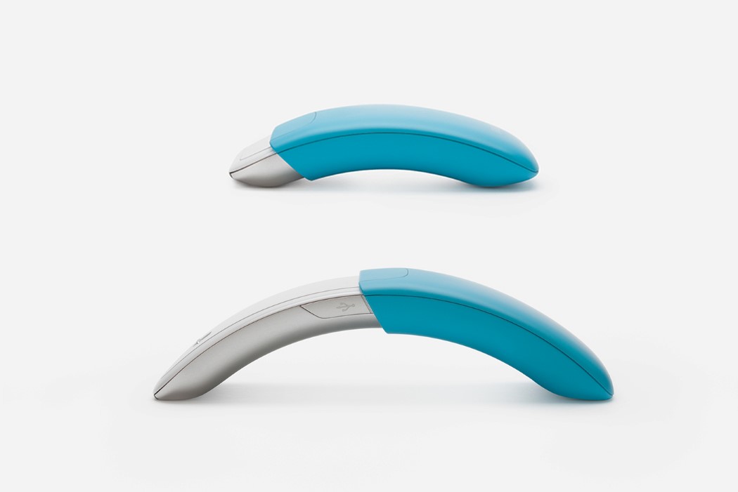
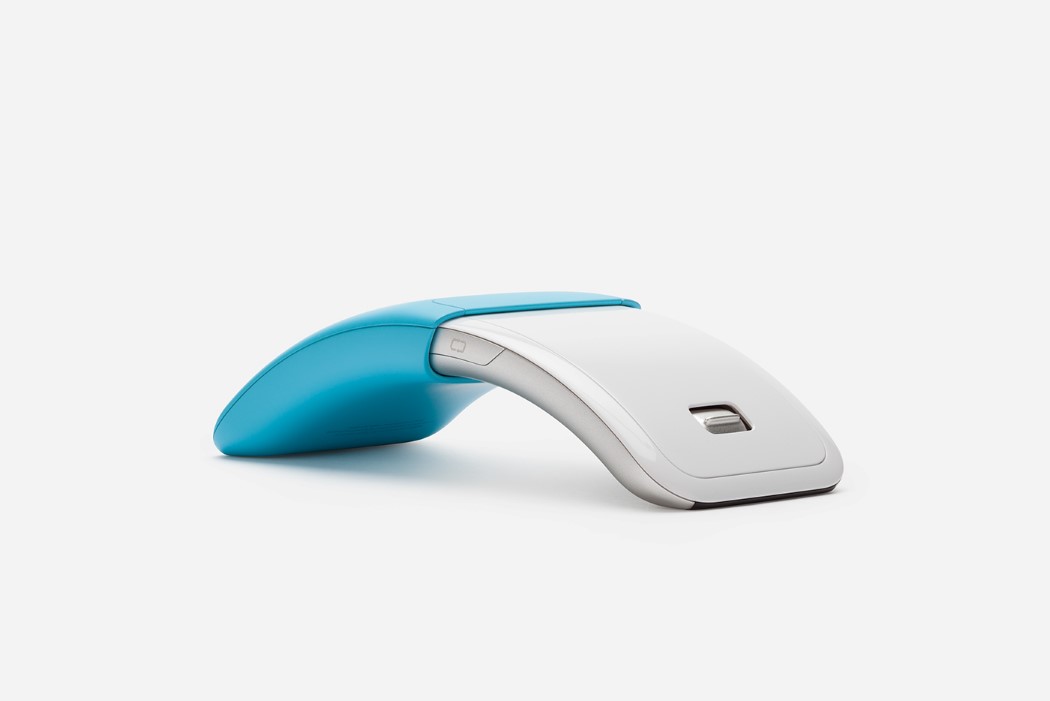
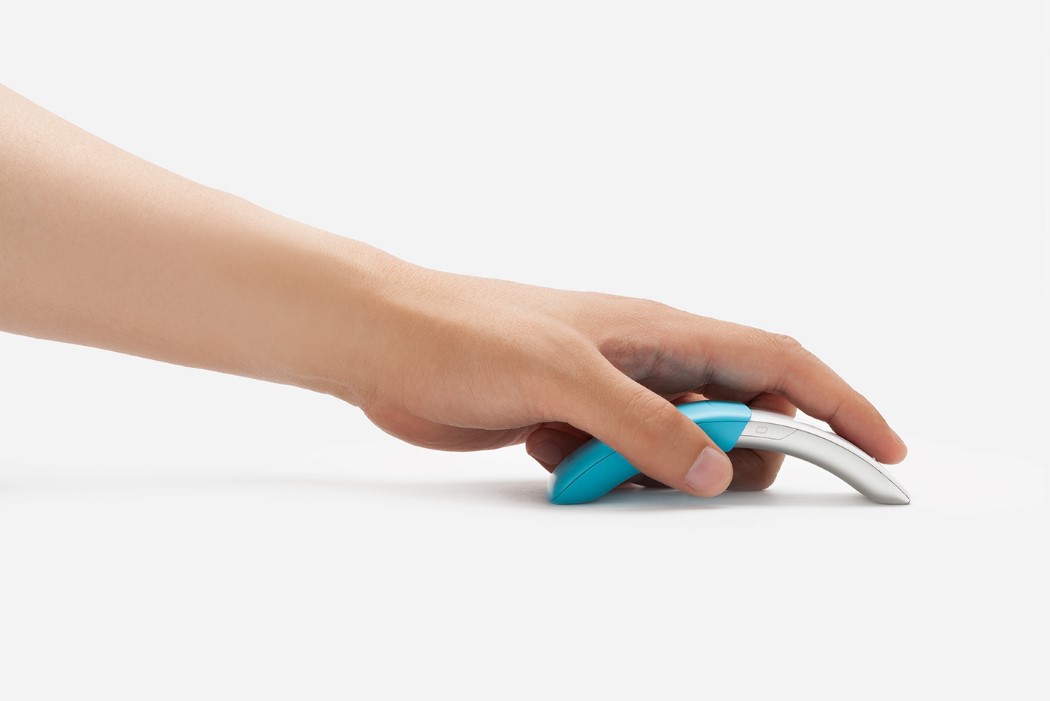
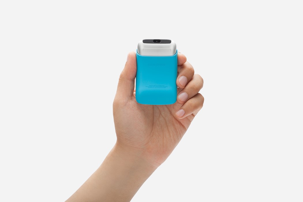
The Samsung Mouse brings design thinking to something that’s essentially an accessory, and therefore, an afterthought. Mice are usually taken for granted until the minute you realize you don’t have one, or that the one you have isn’t working. BKIDs mouse design for Samsung brings a refreshingly different dynamic to mouse design, pointing out a pain-point that most people have with mice (they’re too bulky), and proposing a solution that is full of dynamism and playfulness, but at the same time doesn’t take away from the fact that the mouse is more than capable of being highly useful when needed. The mouse’s telescopic design feels like it would be the primary reason I’d buy it! The silver and blue color duo go together beautifully, and the arc the mouse forms when opened completely feels solid in one’s hand, allowing it to have mass when needed, and turn into a tiny, pocketable device when folded inwards.
BKID’s products never isolate the user. In fact they play well to human’s ability to trust and adore things that look ‘cute’ and ‘friendly’. BongKyu Song does a marvelous job of using soft curves, rounded forms, and a vibrant, almost childish, color palette to make products look friendly as they solve problems, allowing humans to bond emotionally with them, and therefore always leaving the users with a smile on their faces… and ultimately, isn’t that what we all want??