Personally, I prefer wearing an analog watch — ironically, I type this while wearing a Fitbit gifted to me last year. I understand the useful features that smartwatches offer, such as text alerts, setting a camera timer, sending emails, tracking health stats, etc. However, I don’t need those extra features — I just want to know what time it is.
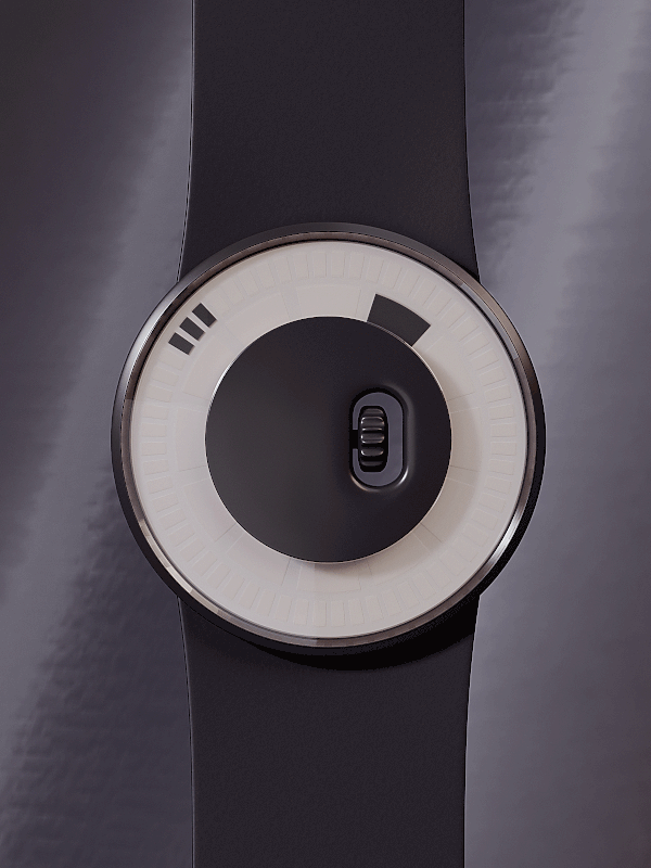
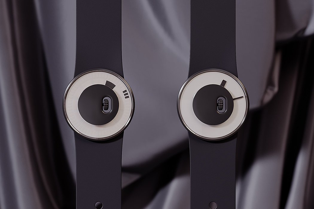
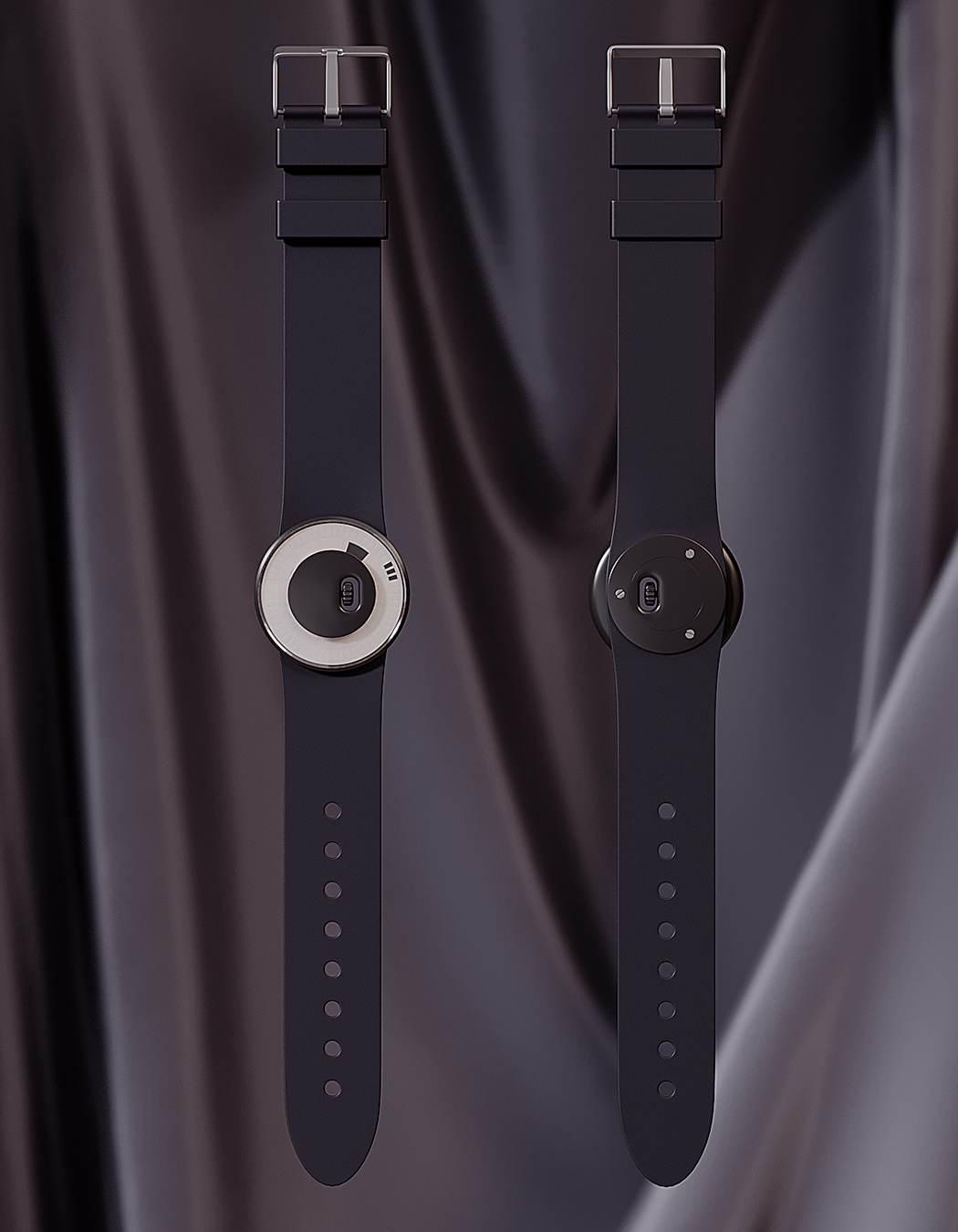
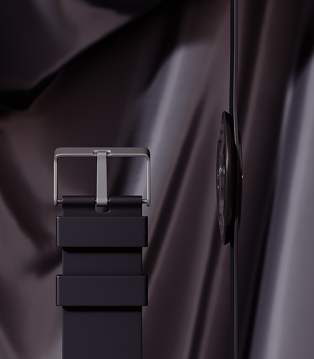
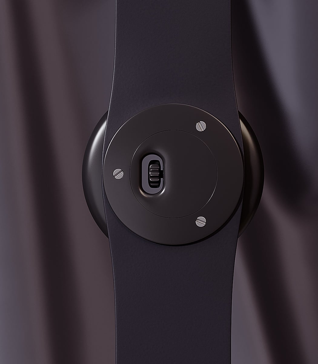
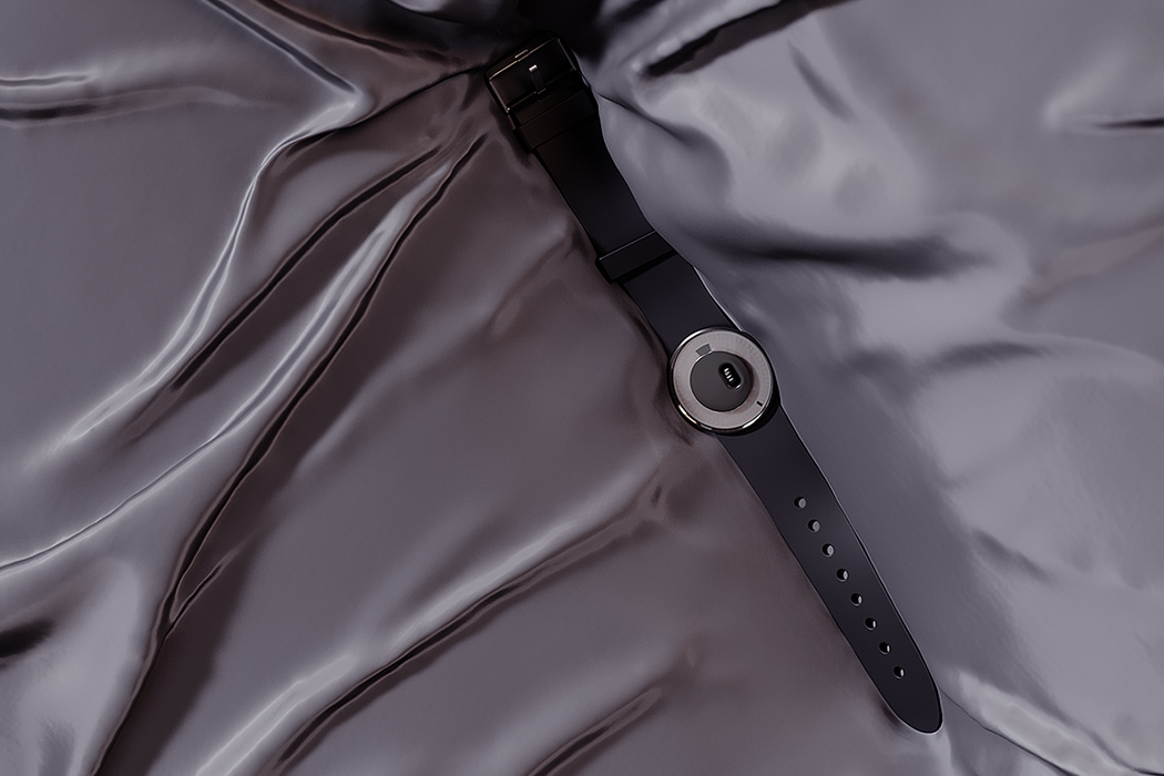
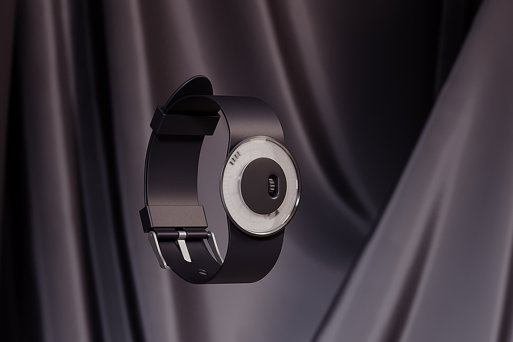
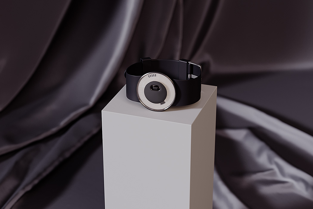
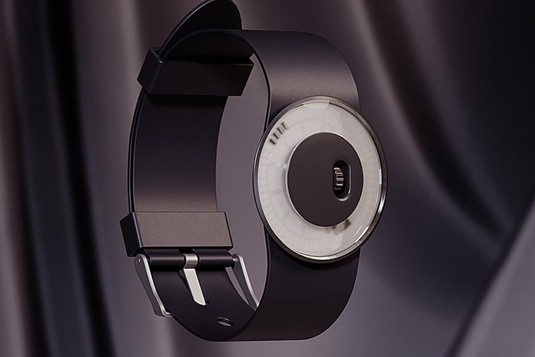
The “another interpretation of watch” design presents a unique time-telling mechanism. How do you read the face? The watch’s “minute hand” is represented by a series of box-like icons that inch their way around the screen. The “hour hand” is represented by a slightly wider, the shorter block located closer to the center. Does this visual make it easier to tell time … not exactly. But, that’s not the purpose. The purpose of this design is to present a unique, abstract visual. Another attention to detail is the rotating gear that is located in a non-traditional center of the dial – yup, in the center instead of the traditional side placement that helps you retain that smooth circular silhouette this watch boasts of.
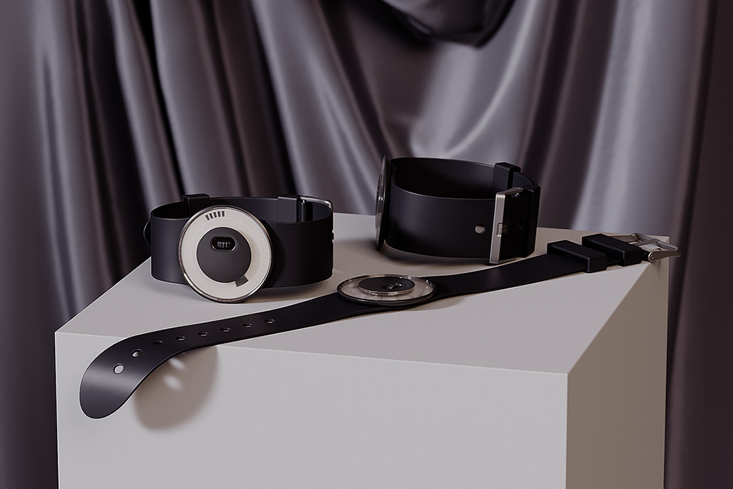
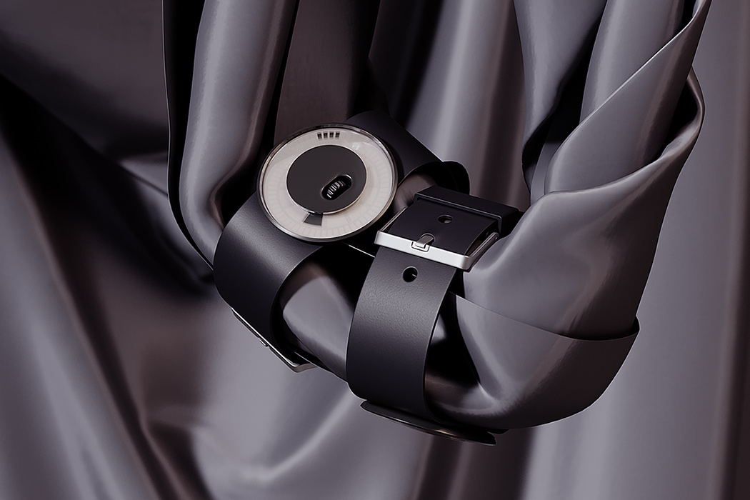
I’m personally charmed by this design. It reminds me of the Time Off! watch, an equally simple product that I covered previously on Yanko. Both of these watches have a simple black band and minimal functionality. It would be easy to forget I was wearing one of these two watches – but that seems to be the intent of their design. I prefer analog watches because they are low-maintenance; they don’t need to be recharged or synced to a companion app. They simply blend into your wrist until you need them.
Designer: Sergey Butskoy