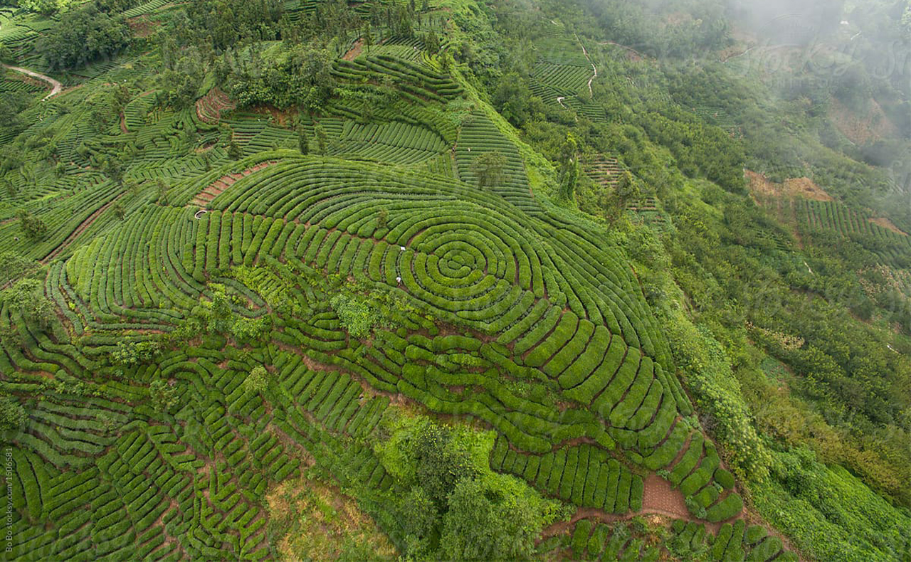
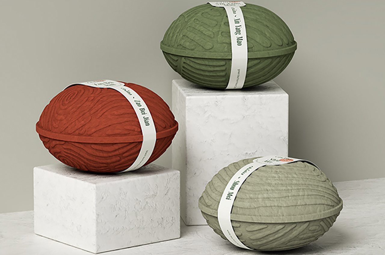
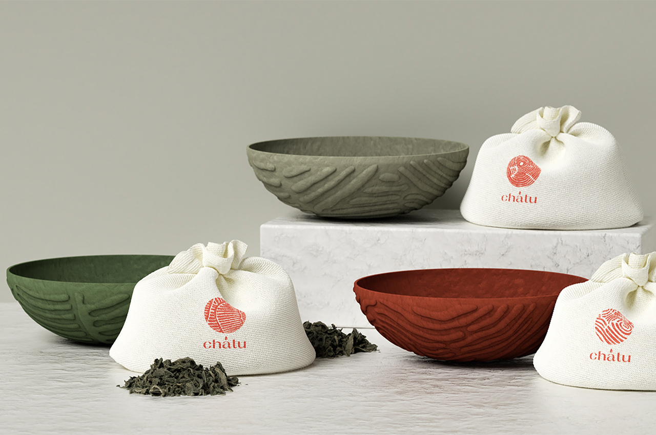
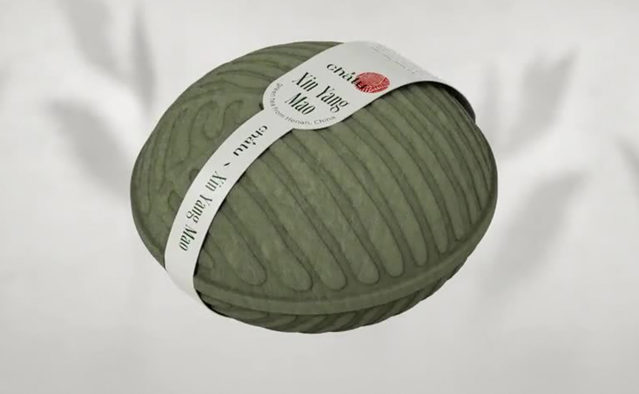
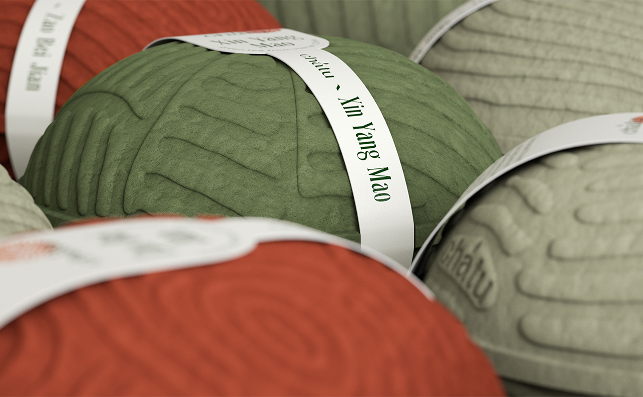
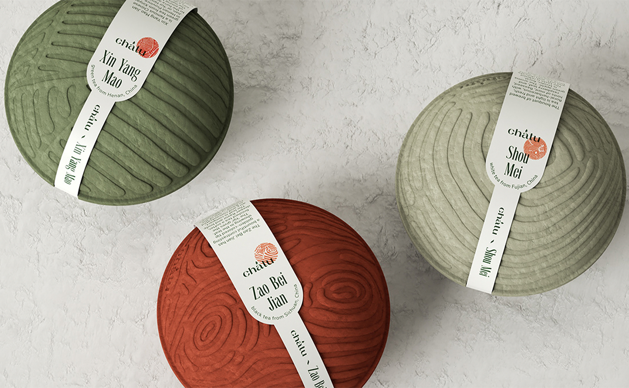
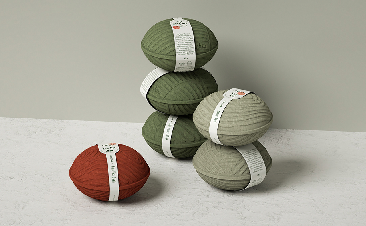
Packaging designs that pay homage to what’s inside or the process or creating it truly tug at our heartstrings. Especially, eco-friendly packaging designs because they showcase the best of innovation and sustainability. Chatu is a shining example of all of that – the packaging is an ode to the tea plantations in Sichuan, Henan, and Fujian provinces from where the premium Chinese tea is collected. Each tea package has a unique shape that represents the terrain and resembles the patterns on the hands of tea pickers.
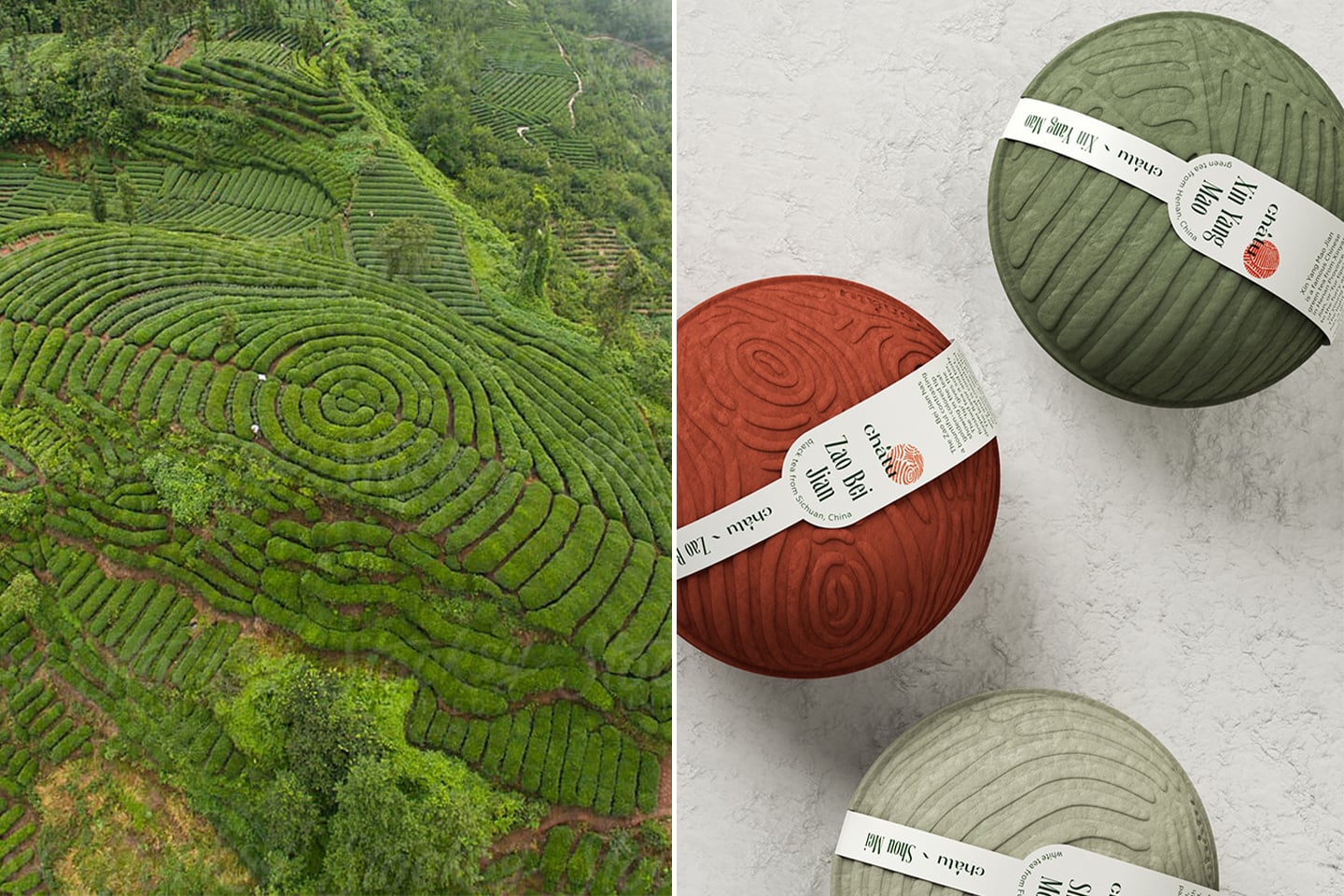
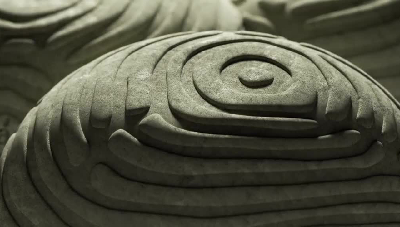
The Chinese tea plantations were the source of inspiration for the packaging design. The texture of the package mimics the shape of the land on which the tea is harvested which is so sacred to the tea pickers. Even the colors were carefully chosen to match each of the three types of tea – white, green, and red.
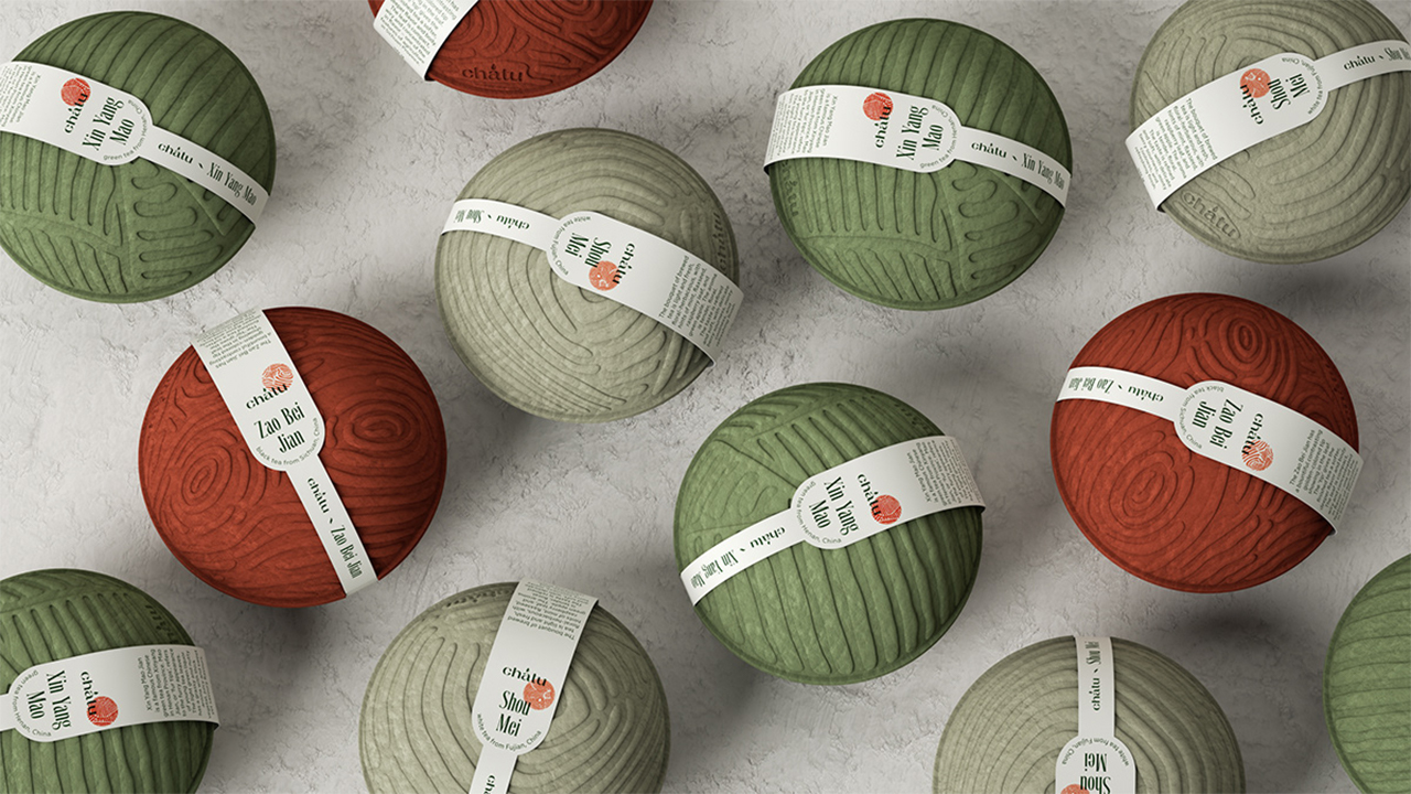
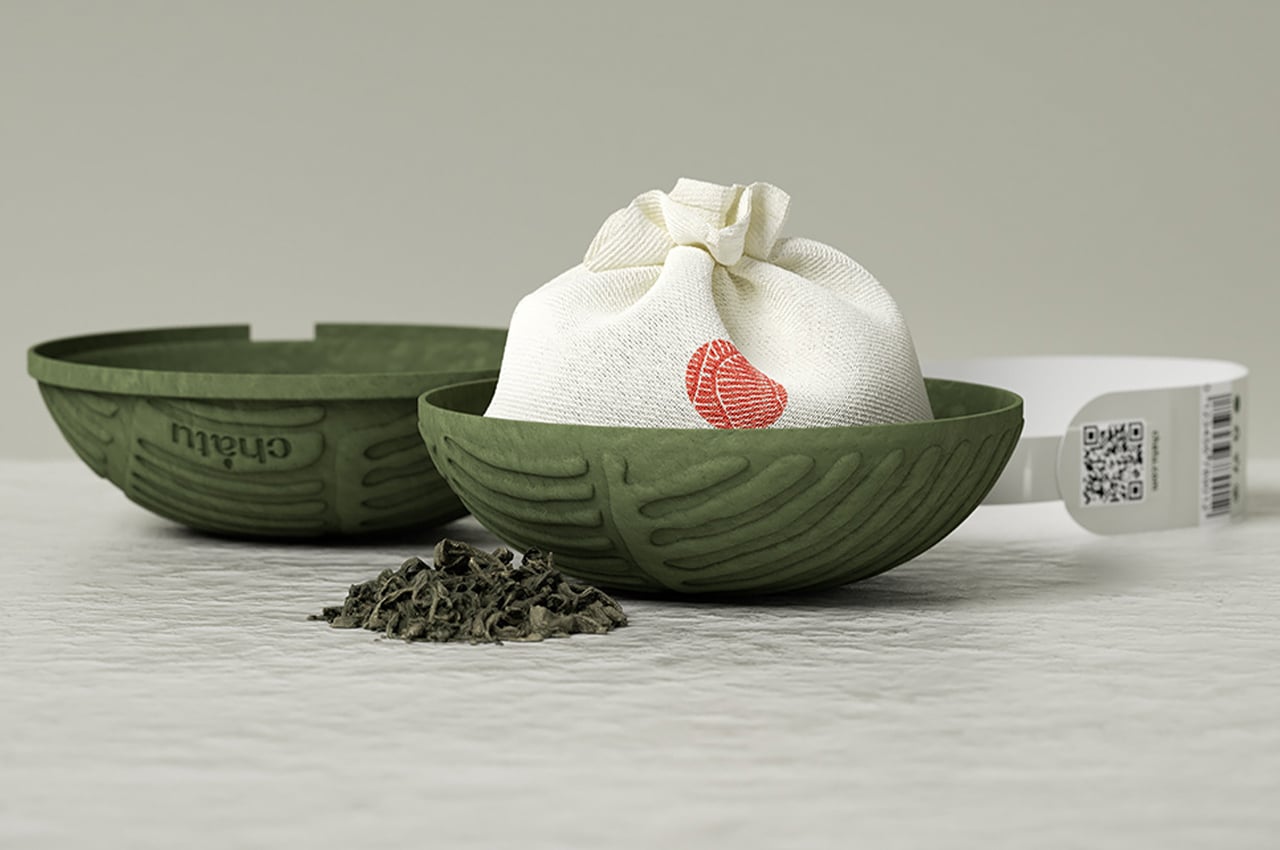
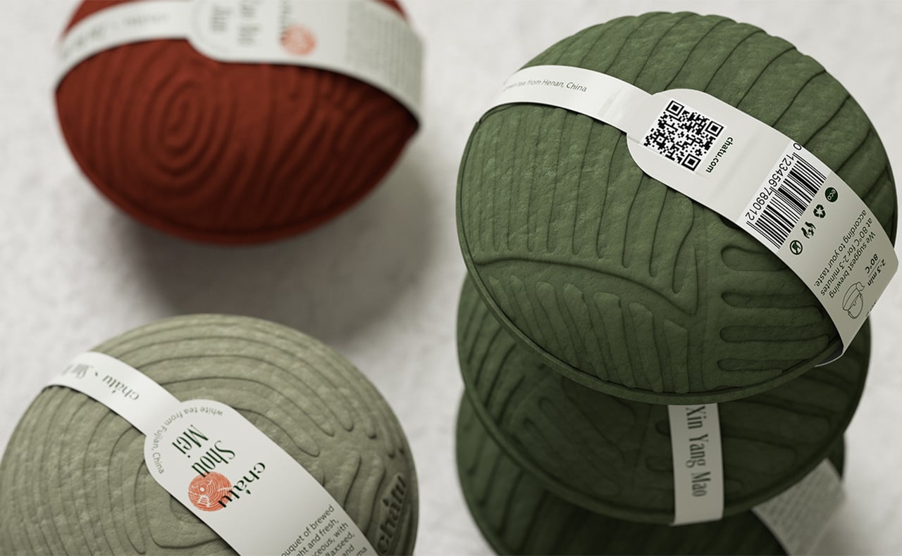
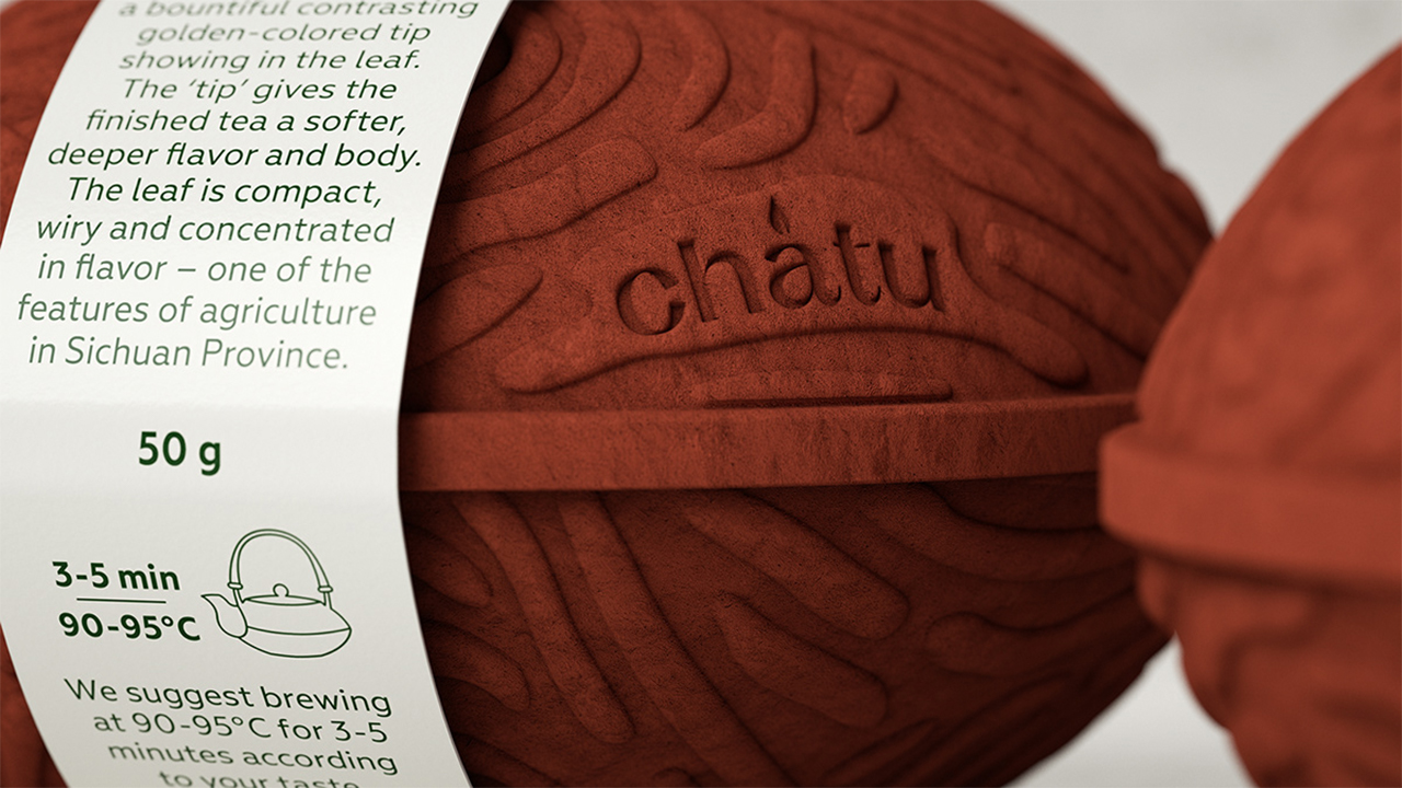
The packaging is made by molding pulp and then colored with natural dyes. The shape resembles traditional Chinese teapots while the texture is a reminder of the plantations. The loose-leaf tea leaves are packed in two-layer cotton bags because it is breathable and environmentally friendly.
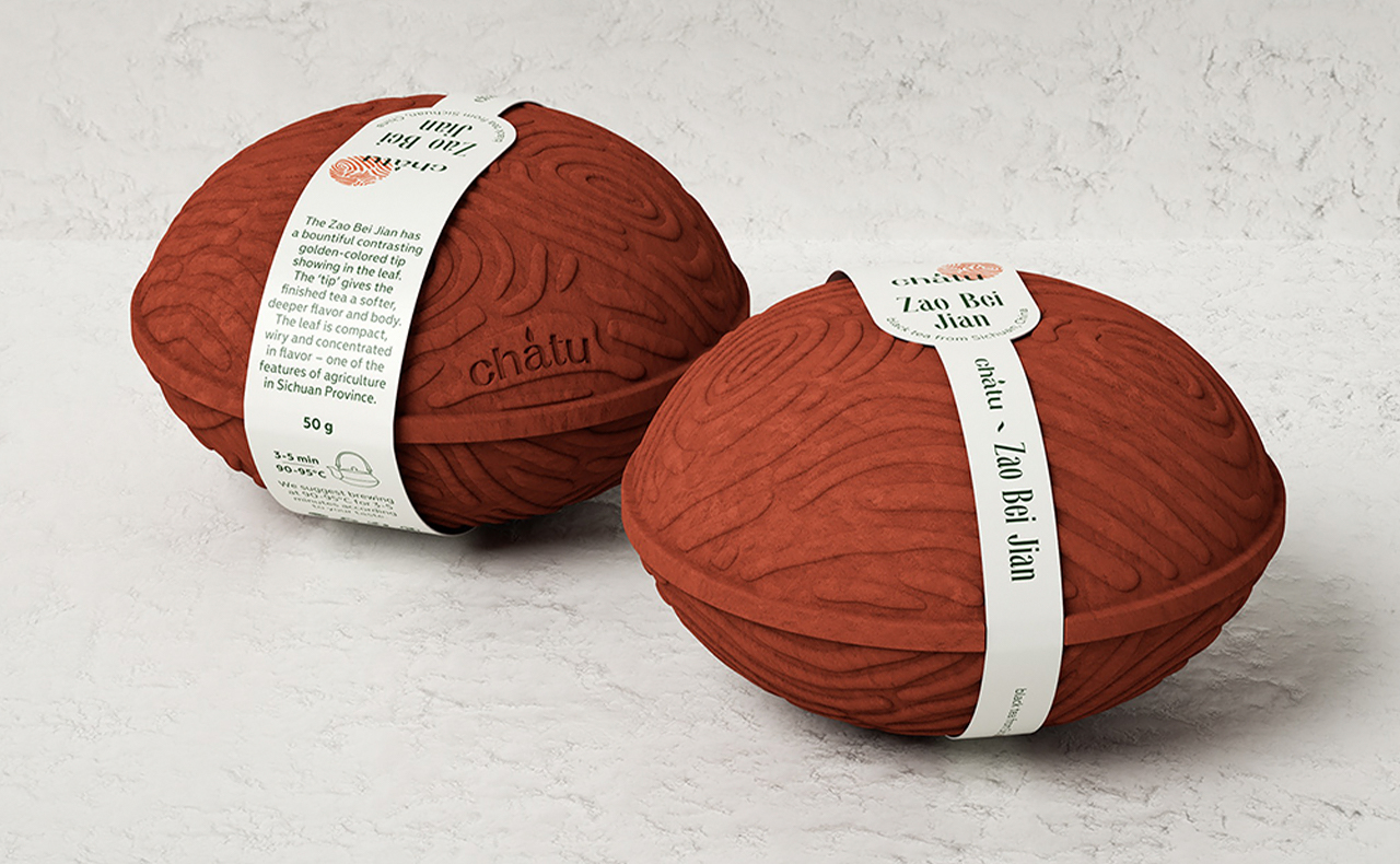
Each package also comes with a note that gives you more information about the province and the type of tea – it educates you about the flavor and the agricultural features of the plantation that make it special. It also tells you how the tea should be brewed for the optimum experience. Chatu is minimal but yet so powerful in communicating about the product, the process of making it, the art of brewing it, its origins, and more in the most simple yet elegant form.
Designer: Xenia Alexandrova