Foldable mouse concept combines two familiar designs into one ambidextrous design

Despite being the most popular pointing device for computers, the venerable mouse is filled with design problems that have never completely disappeared. Common mouse designs favor right-handed users, force people to choose between ergonomics and portability, and are often unattractive to behold. There has been a rash of concept designs recently that try to rethink the mouse from an ergonomic angle, and these often end up looking a bit alien and confined to be used on desks only. It’s almost as if there’s no way to combine all these great ideas together, which is what this particular design tries to disprove by reworking two of Microsoft’s most famous mice into something that could be used and enjoyed by almost everyone.

Designer: Carl Betterley

Microsoft has two kinds of computer mice that have become quite popular for almost opposite reasons. The older Arc mouse has a quirky shape that prioritized portability by folding flat when not in use. Unfortunately, this design limited the mouse to a narrow, almost rectangular shape that is practically uncomfortable, especially after long hours of work. The newer Surface mouse, on the other hand, has a fuller and more ergonomic shape but isn’t easy to stow inside bags because of its bulkier form. Combining these two contrasting sets of properties is one of the biggest design challenges for mice, and the Form Travel concept solves it in a rather interesting manner.

On the one hand, the mouse takes inspiration from the Microsoft Arc, with a core shape that is rectangular and flat. Like the Arc, it folds into a curved form when it needs to be used so that it can remain flat and space-efficient when it’s time to slip it inside a bag or briefcase. Unlike the Arc, however, it has a wider shape when, thanks to “wings” that fold to the side and are kept in place with magnets, giving your entire palm and fingers a place to rest.

This rather peculiar shape, which looks like a manta ray when unfolded and laid flat, also carries over one other benefit of Microsoft’s current mice. It can easily be used in either hand, with no predisposition for right or left hands. The “head” of the mouse is completely flat as well and uses gestures to implement clicking and scroll wheel actions. It’s more similar to Apple’s Magic Mouse in that regard, instead of a typical two-button mouse like the old Arc Touch.

One side effect of this creative solution is that the mouse actually takes up more horizontal space when it’s flat. That said, it will still be less than the surface area of a, well, Microsoft Surface. If you have room for a laptop or tablet, you will definitely have room for a wide yet flat Microsoft-inspired Form Travel Mouse.

The post Foldable mouse concept combines two familiar designs into one ambidextrous design first appeared on Yanko Design.

Ergonomic seat cushion is a doctor-designed lifeline for your lower back

Even before computers became a staple in the workplace, most office work required people to sit in front of their desks for hours. While it is often advised to stand from time to time or, better yet, to stand while working, that isn’t always an option in many offices. You can’t even have your choice of ergonomic chair to keep your back in a proper position and prevent long-term injury to your body from bad posture. The least that we could do is to add support to what we’re sitting on, but simple cushions just won’t do. That is where the Lifted Lumbar memory foam seat cushion comes in, allowing you to assume a proper yet comfortable posture while you’re sitting, reducing strain and protecting your health, even if you have to sit for hours to finish your work.

Designer: Dr. Aaron Fu, DPT

Click Here to Buy Now: $59 $129 (54% Off) Hurry! Just 11 days left!

Our bodies are designed to have a natural position when standing, sitting, or lying down. Deviating from those for long periods of time puts strain on parts of the body that eventually lead to injuries and other physiological conditions. Our spines, in particular, are said to have a “neutral position” when in perfect posture. Of course, very few people are able to maintain that perfect posture when sitting down, especially when there are just too many factors that make us slouch. Ergonomic chairs can help, but when you don’t have a choice of seats, the Lifted Lumbar is going to be your best bet.

Designed by a professional physical therapist with years of experience and research, this memory foam seat cushion gets your back into that neutral spine position while making it feel so comfortable that you wouldn’t have any reason to slouch ever again. Unlike other support cushions that advertise the same goals, Lifted Lumbar pays extra attention to the small things that make or break that comfy experience. For example, there are two trigger point knobs that gently put pressure on your back to provide added relief, ironic as that may sound. The cushion also has the effect of “hugging” your body to allow for better blood flow to your legs.

Lifted Lumbar is also made from the finest materials to give your body the quality experience it deserves, and it’s not just the memory foam. Actually, it’s a bamboo charcoal-infused memory foam that offers better cooling, kills germs, and is also more sustainable. Anti-slip silicone grips ensure that the cushion stays in place, and the adjustable posture straps are made from heavy-duty material to last a very long time. Best of all, the cushion is designed to be easy to carry, so you can use it anywhere, even on an outdoor bench that doesn’t have a backrest.

It’s no wonder, then, that the Lifted Lumbar is close to reaching $1,000,000 on its Kickstarter campaign, 1,000 times more than its target funding goal. Considering that a single Lifted Lumbar goes for only $59 for the Early Bird price, that’s a lot of people putting their trust in this doctor-designed cushion that will not only save their backs but also make them enjoy the best experience wherever they sit.

Click Here to Buy Now: $59 $129 (54% Off) Hurry! Just 11 days left!

The post Ergonomic seat cushion is a doctor-designed lifeline for your lower back first appeared on Yanko Design.

Modular laptop concept combines three computers in a more ergonomic design

Unless you are a PC gamer, you are more likely to reach for a laptop rather than a desktop. That might not even be completely true, given how many gaming laptops have been popping up every year. While laptops today offer powerful computing that you can literally carry around, it often comes at the expense of your comfort and your body’s health. Laptops are the least ergonomic computer designs around to the point that people often hook up external keyboards, mice, and even monitors to solve that problem. That solution, however, breaks apart when you need to work away from your desk and without those peripherals, so it’s more of a workaround than a proper fix. A better answer would be to change the laptop’s design without losing its portability, something that this design concept tries to accomplish in a very interesting way.

Designer: Johnny Jia-Sheng Chen

Despite its popularity and ubiquity, there are many ergonomic flaws in the laptop’s design. Even with a large screen, the display is way below the person’s normal eye level, forcing them to bend their neck. A laptop stand can help raise the screen, but that makes the keyboard unusable at that angle. The keyboard itself is a source of many bodily pains and problems, but the fact that it’s permanently attached to the laptop limits how you can solve the posture problem.

Named after soldiers that adapt to land, sea, and even air, the SEAL concept design transforms the laptop design that basically lets it function as a regular laptop, a desktop, and a tablet depending on the situation. And you don’t need any additional accessories to make that happen since everything is included in the design. In fact, the laptop includes parts you would normally use a separate accessory for, like a wireless charger for mobile devices.

Man in a tattoo salon. Guy working. Man create a new tattoo

A laptop that turns into a tablet is already commonplace today, but the way SEAL does it is quite different in the way that it combines different designs into one. You can, for example, fold the display completely backward like a Lenovo Yoga, but you can also detach the screen completely from the rest of the frame, almost like a Microsoft Surface Pro. If you do leave it on the frame, the other half of the laptop turns into a stand that props up the tablet at an angle for more convenient drawing.

Young woman working on a laptop, concentrating on solving a problem, study for assignment, texting with a friend.

What really sets the SEAL apart is how it can become a desktop computer or at least the likeness of one. The lower half of the laptop is actually made of two segments, one holding the removable keyboard and another holding speakers and a wireless charger. These two can fold independently and can be positioned to lift the display up to a more ergonomic height while still keeping the separate keyboard usable. Technologies that would make this design possible already exist, but it would still take a bit of testing and integration to make sure all parts work properly, whether together or apart. It is definitely a creative design that we wish major manufacturers would pay attention to.

The post Modular laptop concept combines three computers in a more ergonomic design first appeared on Yanko Design.

from() design concept uses intuitive tactile controls to operate devices

Technology is meant to make human lives easier, but there might be such a thing as being too much. When it comes to operating products and devices, we seem to be moving towards ultimate convenience at the expense of experiences that can give us delight and make us feel human. In the near future, most of us might resort to just issuing commands to the air and waiting for a disembodied voice to respond. Of course, these can empower many people who might not have complete access to parts of their bodies, but it is hardly the only way we can control such things. This design concept tries to offer an alternative that puts the focus not just on physical controls but also on the intuition and familiarity of using certain things in a certain way.

Designers: Mingwan Bae, Adrian Min

To some extent, the driving force behind the development of touch screens and voice controls is the desire for simplicity, removing confusing buttons and knobs in favor of more direct and sometimes literal interactions. At the same time, however, these simpler controls bring their own complexity, like the confusion arising from human speech and lingo. It also makes the presumption that simple operation means removing all physical interfaces. That isn’t always true, however, judging by how simple it is to pour water from a pitcher just by titling it or pulling a strap to adjust its length.

The from() design philosophy uses these very same familiar interfaces and applies them to unrelated products and devices. Those straps, for example, are used as a way to adjust the frequency and the volume of a minimalist radio. The radio’s simple and all-white box design puts the visual focus on these black straps that you use to control it in lieu of a typical slider or set of buttons.

A dimmable lamp, on the other hand, uses a scroll of paper or cloth as a metaphor for its controls. Unrolling the scroll takes it from its off state to its fully lit state, with various levels of intensity in between, depending on how much you have unrolled the material. A bit less intuitive is the timer, which uses the analogy of tiling a container to pour its contents, which, in this case, is time.

And there’s a water purifier nozzle that you can squeeze just like a wet towel to get water from it. Admittedly, this might be taking that “intuitiveness” to the extreme at the cost of making you work hard to get a drink of clean water. While the from() concept design does bring back some of the joys in tactile experiences, it also demonstrates how difficult it is to balance such elements, especially when considering the accessibility of the design for people with less-than-capable hands.

The post from() design concept uses intuitive tactile controls to operate devices first appeared on Yanko Design.

Onyx BOOX Leaf 2 Review: Simple Does It

PROS:


  • Dedicated buttons for page turning

  • Very usable for left-handed readers

  • Runs Android 11 with Google Play Store support

  • Affordable price tag

CONS:


  • No stylus support

  • No dust and water resistance rating

  • Not ideal for newspapers and magazines

RATINGS:

AESTHETICS
ERGONOMICS
PERFORMANCE
SUSTAINABILITY / REPAIRABILITY
VALUE FOR MONEY

EDITOR'S QUOTE:

The Onyx BOOX Leaf 2 offers a powerful, no-nonsense eReading experience wrapped in an elegant and ergonomic package with an accessible price tag.

Our smartphones are veritable gateways to wonderful new worlds, and tablets are their larger cousins that can expand your view, literally. The powerful features they provide and the colorful screens they offer rich experiences that fit perfectly with modern lifestyles. They come with a steep price, however, both literally and figuratively, especially when it comes to comfort and eye health. When you’re reading a lot of things, like books or even websites, a smartphone or even a tablet might actually be the worst device for you. Fortunately, eBook readers have been around for quite a while now, offering a much-needed reprieve and a better experience that now come in a variety of shapes and sizes. The Onyx BOOX Leaf 2 is one of the latest to join that growing army, and we give it a thorough test to see if going back to basics spells its victory or its doom.

Designer: Onyx

Aesthetics

Ever since the first generations of eReaders came about via Amazon’s Kindle brand, expectations of these devices in terms of aesthetics have been pretty low. They’re generally small slabs of black plastic that are handy, portable, and utterly uninspiring, designed to let you enjoy content without distractions or getting in the way. While the objective might have been good, it makes the presumption that book lovers don’t actually pay attention to the appearances of their reading materials, which is quite the opposite when you consider how much attention they pay to book covers.

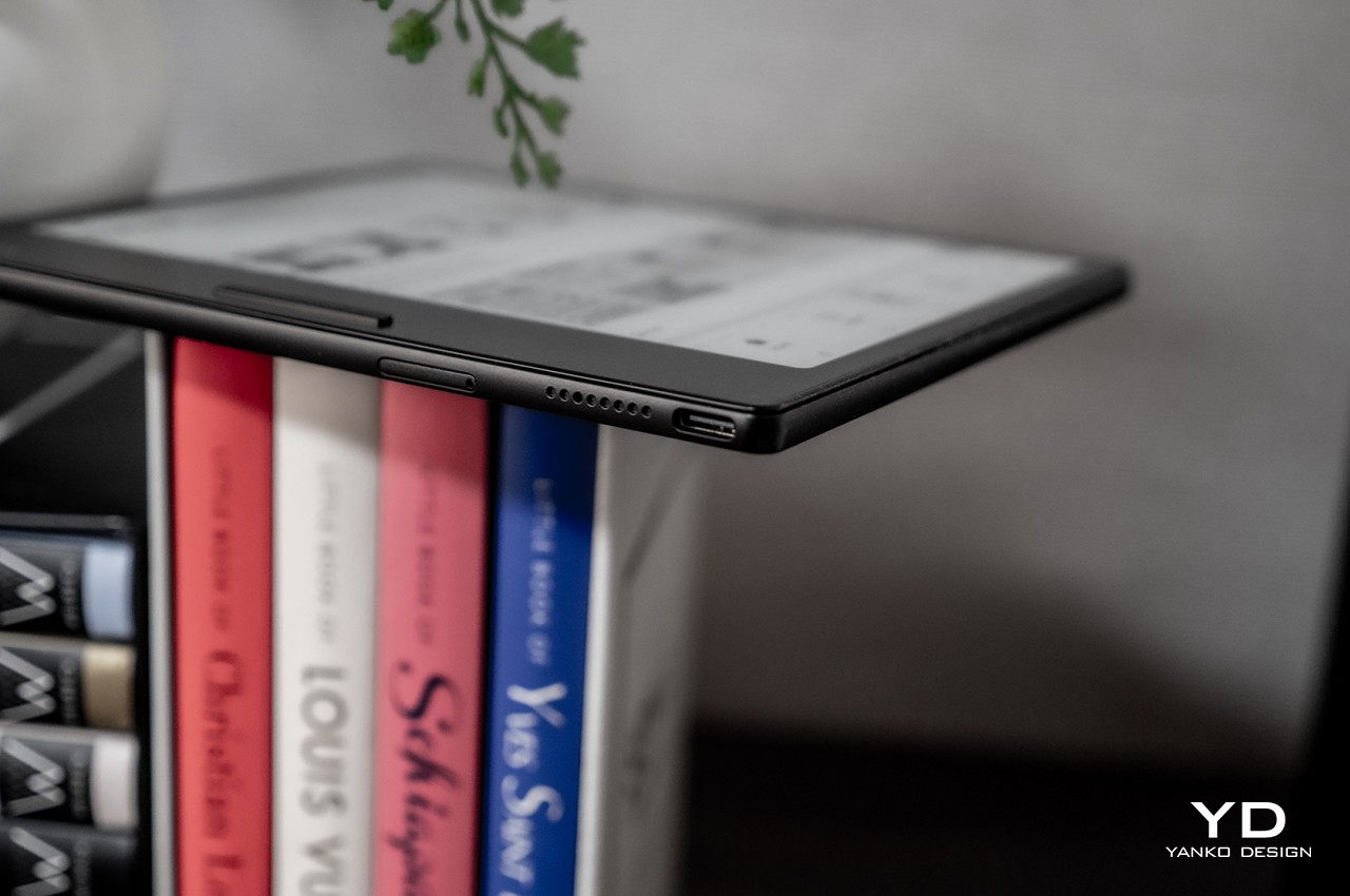
Fortunately, the Onyx BOOX Leaf 2 has learned from the lessons of the past and arrives as quite a fine-looking piece of hardware. Yes, it’s still made of plastic, which has both advantages and disadvantages, and it’s a smudgy piece of plastic at that. You might find yourself obsessively wiping its back very often just to maintain its pristine appearance. It doesn’t have anything in the way of decorative elements, and the only parts that literally stick out are the power button and page turn buttons. It clearly embraces minimalism’s best aspects.

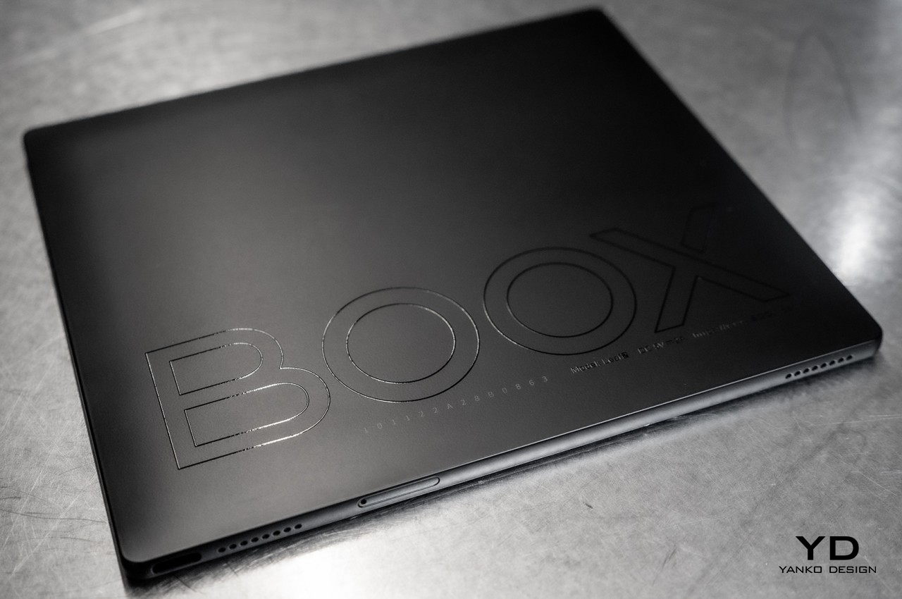
It also applies a design language that’s now common to phones and tablets, meaning it is largely flat on all sides, save for round corners. The edges are plain and clean, broken only by holes for the speakers, the microphones, the microSD card slot, and the USB-C port. The back is also completely flat, unlike the tendency of most eReaders to bulge a bit. Fortunately, it doesn’t affect comfort and usability at all.

The BOOX Leaf 2 comes in two colors that differ in minor yet significant ways. The black review unit that we have has the E INK screen completely flush with the frame, protected by a layer of glass. This makes it trivial to wipe off dirt or anything else that accidentally drops on the display. The white variant, on the other hand, has the E INK panel completely exposed but sunken into the body of the device. Its advantage is that there is no glare or reflection from a glass layer that could get in the way of your reading.

Ergonomics

Despite their basic and almost crude looks, eReaders have always been designed to be easy to carry and hold in one hand to make reading for hours on end a comfortable experience. That has remained true save for larger devices, and the BOOX Leaf 2 is gladly no different. With only a 15g difference in weight (the black model is heavier because of the glass), both variants are light and small enough to carry in a large pocket. Given how some of Onyx’s devices have been growing in size lately, it’s definitely a nice break and a return to roots.

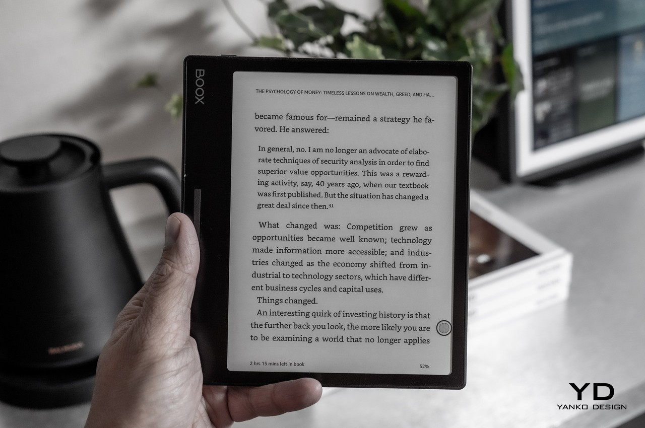
What makes the BOOX Leaf 2 even more ergonomic is that one of the edges extends a bit, forming an area that your hand can conveniently hold without accidentally touching the screen. Even better, there is a rocker button that you can press to turn pages, saving you from having to lift your other hand to touch or swipe at the screen. Admittedly, the lack of demarcation between the two halves of that button could be a bit disorienting but it is definitely not a deal-breaker.

Even better, the device has a G-sensor that can detect the orientation of the device and adjust its contents accordingly. What this means is that you can comfortably use the BOOX Leaf 2 whether you’re right-handed or left-handed since you can rotate the device to where you’re most comfortable rather than letting its form dictate the way you use it. This is one of the major flaws of eReaders with “spines” like this, so it’s great that Onyx has finally resolved it.

Like all E INK displays, the BOOX Leaf 2’s screen doesn’t emit light on its own, but it does include front lighting to let you read in the dark. These lights don’t shine in your direction, saving your eyes from strain. There are two lights, cold and warm, that you can adjust independently to mix to your tastes. Contrast can also be adjusted on a per-app basis, so you can have different settings for different reading apps, depending on what you’re comfortable with. All in all, the BOOX Leaf 2 lets you decide how you want to use it rather than dictating its terms.

Performance

Today’s eReaders are a far cry from yesteryears models when it comes to hardware and power. Although not in the realm of phones and tablets, the BOOX Leaf 2’s quad-core processor, 2GB of RAM, and 32GB of expandable memory are plenty for something that is designed for just reading. Then again, the device is definitely more than your average reading device.

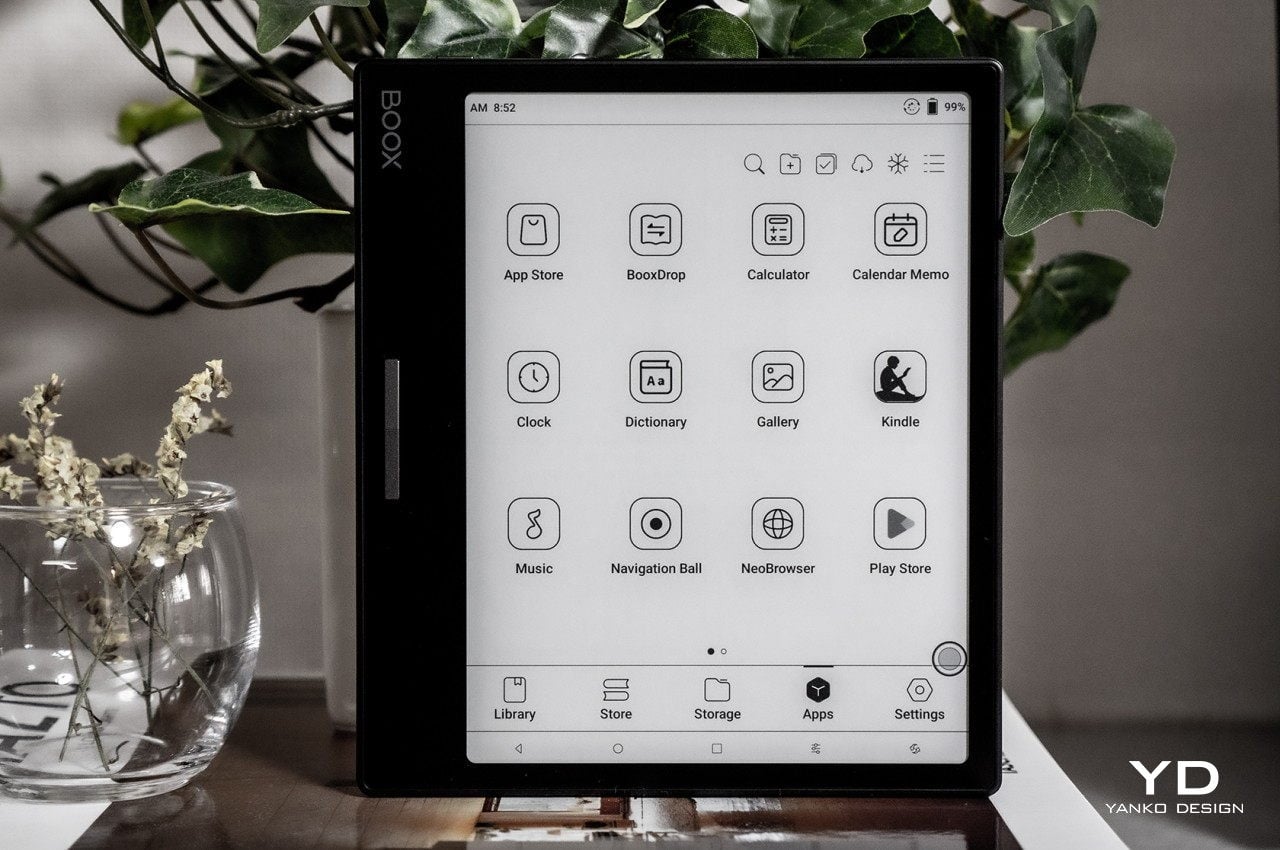
It runs Android 11, which means you can install a wide variety of apps on it, even those that might not make sense on an eBook reader. It also supports running Google Play Store, and although it needs some extra steps to enable, you won’t have to go out of your way to get it up and running. These two facts alone open a whole world of content and uses for the device, including watching videos or playing mobile games. For reading, it also means you’re not locked into a single content provider and still have access to Amazon, Kobo, and other libraries of your choosing.

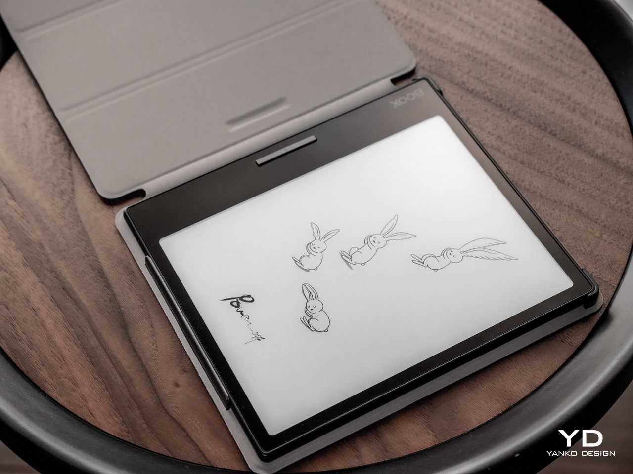
The BOOX Leaf 2 bears a 7-inch E INK Carta 1200 display with a resolution of 1680×1264, giving it a rather high pixel density of 300PPI. That means that content will always be crisp and clear, at least as far as grayscale content goes. It is definitely a pleasure to read eBooks and manga on the device, though the size makes it less ideal for certain types of content. You will find yourself pinching to zoom a lot on newspapers and magazines, which could be inconvenient but definitely not unusable.

Like almost all of Onyx’s devices, the BOOX Leaf 2 offers four display modes that speed up the refresh rate at the expense of resolution and quality. For the majority of reading content, you’ll want to be on Normal mode for the best quality with a bit of ghosting. But if you ever feel the need to watch black-and-white videos or play games, the fastest “X” speed will make do. The device does have two speakers and two mics for multimedia, but these are more for recording voice notes or playing podcasts than for a multimedia experience.

What the device doesn’t have is a Wacom digitizer layer, which means it doesn’t support the use of a stylus for taking handwritten notes or sketching. That feature has always been an extra for eReaders, though it has now become more common that even Amazon added it in the Kindle Scribe. It doesn’t take away anything from the BOOX Leaf 2, though, and its simplicity might actually appeal to more readers, especially those with more limited budgets.

Sustainability

Because of its plastic construction, the Onyx BOOX Leaf 2 suffers from the same sins as almost all eBook readers when it comes to environmental impact. There are some eReaders, including a few from Onyx, that do use metal, but these do come at the cost of adding some heft to the device. Given its objective to be a basic eReader, Onyx had to prioritize portability and price above other aspects, and we can’t really fault it for that.

What makes the overall longevity of the device a bit more worrisome, however, is its lack of any sort of dust or water resistance guarantee. Given how delightful it is to use, owners might be tempted to bring it anywhere and everywhere, forgetting that it might not be able to withstand accidents. That, in turn, would mean having to either repair or replace damaged parts, which adds to the BOOX Leaf 2’s negative impact on the environment in the long run.

Value

Onyx is one of the most prolific eReader manufacturers these days, aiming at almost every market segment and price tier. Its most recent slate of devices has focused a lot on powers and features, even going as far as introducing a true Android tablet with an E INK display and user experience. Given that trend, some of the brand’s fans may have feared that Onyx has forgotten its roots and snubbed those with simpler needs. The BOOX Leaf 2 is clear evidence that it isn’t so.

At $199.99, the BOOX Leaf 2 is clearly targeted at entry-level users, those who just need a no-frills eBook reader with none of the extra bells and whistles. At the same time, however, the device isn’t really lacking in any feature, especially when it comes to support for apps and almost all kinds of digital content imaginable. As far as a comfortable and pleasant reading experience is concerned, the BOOX Leaf 2 comes close to perfect, and that price tag easily pays for itself over time if you’re any type of bookworm.

Verdict

It might come as a surprise, but people do plenty of reading on their phones compared to watching videos or playing games. That includes reading from the Web or social media, activities that would eventually tire eyes out, if not damage them in the long run. E INK displays are designed exactly to make reading comfortable and enjoyable, and the Onyx BOOX Leaf 2 delivers that kind of experience in an ergonomic and flexible package. Sure, we wished the device had a more sustainable form and that the company would take bolder steps in that direction, but other than that, there are very few flaws to note on this device. Plain yet elegant, simple yet powerful, the BOOX Leaf 2 offers a well-rounded eReading device with a price tag that many will be able to reach.

The post Onyx BOOX Leaf 2 Review: Simple Does It first appeared on Yanko Design.

Kensington SlimBlade Pro is a stylish wireless trackball with HAL 9000 vibes

Tech companies and visionaries would have us believe that the future of computer interaction will all be either touch screens or holograms floating in front of our faces. Our present, however, is still very much tied down to indirect pointing devices like mice and touchpads. These aren’t the only input methods for computers, though, and some prefer a type that traces its origins even farther back than the venerable mouse. There are some people who still swear by trackballs that may now look alien to our eyes because of the convenience and precision they offer. Kensington is definitely still heavily invested in this market, and it just launched a wireless version of its elegant trackball that eerily calls to mind one of pop culture’s less savory AIs.

Designer: Kensington

Although mice became the predominant computer pointing device, it was hardly the first one. To some extent, the older trackball had an advantage in precision and economy of movement since you won’t have to lift and move the base around. It may look and feel weird to the majority of people who have grown around the mouse, but there is no shortage of professionals that find it more ergonomic and more usable. Kensington was actually one of the first to make the trackball popular with its Expert Mouse, and the new SlimBlade Pro tries to keep it ahead of the game.

The SlimBlade is one of the company’s most recent trackballs, and this new “Pro” model cuts off the cord to help keep your work desk neat and tidy. You can still use it with a USB-C cable if that’s what floats your boat, but its selling point is the wireless and Bluetooth connectivity options. It uses a built-in rechargeable battery that’s advertised to last up to four months on a full charge, freeing your mind of worries as much as it frees your desk of an additional cable.

The Kensington SlimBlade Pro definitely looks classy and refined on your desk without the wire. The base’s black surface contrasts nicely with the shiny red ball that serves as the main control of the trackball, almost like a crystal ball or gem that gives you power over your computer. Seen from the top, though, the trackball is almost like a glowing red eye staring at you, reminiscent of HAL 9000’s iconic and notorious appearance.

A trackball may now be the distant minority compared to even touch screens, but its design offers ergonomic benefits over a conventional mouse. The Kensington SlimBlade Pro even takes that to the next level by providing a finger-operated design that can be used by either the left or the right hand. It will definitely require retraining muscle memory, but for the professionals who have gone through that process, it was well worth the growing pains.

The post Kensington SlimBlade Pro is a stylish wireless trackball with HAL 9000 vibes first appeared on Yanko Design.

This ergonomic Nintendo Switch concept was inspired by a classic video game baddie

Although it was hardly the first portable gaming console, the Nintendo Switch undeniably re-ignited a gaming market that was ready for something novel and mobile. In terms of raw power, it couldn’t stand up against its Xbox and PlayStation contemporaries, but its portability and flexibility quickly endeared it to the current generation of gamers and their more itinerant lifestyles. Over the years, however, the design flaws of the Switch’s form surfaced, particularly when it came to the comfort and ergonomics of the handheld device. Since Nintendo itself doesn’t seem keen on addressing those pain points, third-party manufacturers and designers have taken upon themselves the task of coming up with solutions, some more unconventional than others. This concept, for example, retains the basic Switch design but puts a unique twist that also ends up making it look a little bit more interesting.

Designer: Duncan Crosse

The innovation that the Nintendo Switch brought to the gaming world was its ability to be a handheld gaming device as well as a home console in one. The secret sauce is, of course, the removable Joy-con controllers that opened a whole new world of use cases, including a pair of exercise equipment. For all the advantages that they brought, the Joy-cons lacked that final polish when it came to ergonomics. It wasn’t exactly terrible, but gamers could definitely feel the strain after a few hours.

Third-party accessory makers started pushing out Joy-con alternatives, some with Nintendo’s blessing even, that tried to improve that aspect of usability. The designs vary slightly, but the basic concept remains the same. By changing the shape of the Joy-cons to match the shape of typical game controllers, the Switch’s comfort can be improved significantly. This concept design, however, challenges that assumption by changing not the shape of the Joy-con but only its vertical position.

Named after one of the enemies of the iconic Invaders computer game, the Small Invaders design concept only makes a single adjustment to the Switch’s structural design. It adds an additional “Session” mode where the Joy-cons can sit lower down the side rails of the main Switch body. This creates a way for the player’s fingers to wrap around the Joy-cons, similar to how they would wrap around the bulges of conventional gamepads. That said, the device could still be used normally in a “Casual” mode where all three parts are aligned perfectly. The design also throws in small details that will delight Nintendo fans, like the use of element icons for the buttons, a nod to Pokemon’s four basic types.

With this concept, there is no need to change the somewhat flat design language of the Nintendo Switch. In fact, the Small Invader design takes that even further by applying some design cues inspired by Teenage Engineering, particularly with the use of clean geometric shapes. Of course, Small Invader would require a re-engineering of how the Joy-cons physically connect to the Switch, so it’s never going to happen. Still, it’s a worthwhile thought exercise that actually resulted in an interesting and fun design that we do wish would become a reality.

The post This ergonomic Nintendo Switch concept was inspired by a classic video game baddie first appeared on Yanko Design.

This gamepad concept looks like a vacuum cleaner chopped and reassembled

Gamepads or game controllers have evolved over the decades to accommodate more controls as well as apply new lessons in ergonomics. That said, their core design hasn’t exactly changed that much. It’s still a horizontal piece of plastic held in both hands with buttons and whatnot on each side. That leaves the design a bit open for experimentation, with some more successful than others when it comes to hitting the sweet spot of power and comfort. There are also a few unusual designs that deviate from the norm, like this game controller concept that tries to apply Dyson’s distinct design language, whether it actually works or not.

Designer: Shivendu Verma

Dyson is a brand best known for appliances revolving around spinning fans, whether it’s for sucking up dirt or blowing your hair dry. More than just the kind of appliances it makes, however, it is known for the design style that its modern products embrace. These products are marked by their elegant industrial design and a penchant for using plenty of cylinders in their forms.

That’s exactly what this gamepad design concept looks like, even if it adheres to that design language in a rather odd way. The overall shape of the controller is formed from the intersection of three cylinders, almost as if you chopped a Dyson vacuum’s tube into three pieces and glued them together. It admittedly looks like it would be at home in Dyson’s catalogue, especially with its shiny glass surface and accents that lie on the blue to purple range of hues. It might, however, not be the most usable gamepad design if it were to be sold in the market.

1

Instead of “wings,” the two cylinders on each side act as grips, but they might not be the most comfortable nor the most stable, especially considering the slippery glass material of this design. The extruded parts of the horizontal cylinder that join the parts together could also get in the way of reaching the controls that might it be far too high. There are also no visible shoulder or trigger buttons that have become standard by now.

1

Still, it’s an admittedly interesting design, at least visually speaking. It does, however, drive home the fact that products like these aren’t supposed to just look good. In fact, older game controllers might look hideous by today’s standards and are unsurprisingly less comfortable to use as well. Even today’s gamepads, though, still have a lot of room for improvement, and hopefully, designers won’t quit challenging the status quo to come up with something that is both usable and attractive even to a non-gamer.

The post This gamepad concept looks like a vacuum cleaner chopped and reassembled first appeared on Yanko Design.

Orbit PC mouse gives your upper body an exercise to avoid strain injuries

The computer mouse today may look a bit different compared to its first incarnation, but the fundamental design of this important input device hasn’t exactly changed over the decades. That, unfortunately, also means that the problems associated with this old design haven’t really disappeared either, especially those that cause physical injury over time. There has been a great deal of interest lately in redesigning the mouse to be more ergonomic, but not everyone agrees that changing the shape is enough. This design concept, for example, takes a very different approach to resolving the problem of repetitive strain injury or RSI, mostly by shifting the movement away from the arm and wrists and giving your upper body a workout instead.

Designer: Simon Hochleitner

The computer mouse and even the computer keyboard are very unnatural interfaces as far as our bodies are concerned. Especially with the mouse, the hand and the arm it’s attached to are forced into an unnatural position, whether it is in motion or at rest. The movements associated with prolonged and repeated use of the mouse eventually lead to what is sometimes called “mouse arm,” as well as the injuries that come with it. You might think that your arm is getting some exercise, but it’s really the wrong kind of movement and resting position that actually causes those injuries.

Ergonomic mice can only do so much since it simply shifts the tension and strain to other parts of the hand and arm. Orthopedists and physiotherapists might have a different idea on how to solve this problem, and it unsurprisingly involves using correct movements and posture. What may come as a surprise, however, is how this can be done by simply changing the way we use the mouse.

James Dyson Award national winner Orbit redesigns the mouse not by changing its shape but by changing the way we move it across a flat surface. Instead of simply sliding over a mouse pad, Orbit has three resistance bands that hold the “mouse” in the center. To move the mouse, you have to exert a bit of effort to counter the resistance, which, in turn, shifts the force to other muscle groups, particularly the ones responsible for posture. With this system, the body is forced not to slouch and use those upper body muscles instead of relying on wrist and forearm muscles to move the mouse.

Orbit actually does change the design of the mouse by turning it into a joystick. Unlike a typical joystick, however, you still have to move it across the surface, much like a mouse. The only difference is that the joystick shape keeps the arm in a more natural position to reduce stress. The touch-sensitive ring on top acts as a mouse wheel so that you don’t have to change your hand’s position or stop the movement just to use it. There is also a “flat” version that more closely resembles a traditional mouse that’s designed for gamers.

Whether it’s changing the shape of the mouse or adding some resistance, it’s encouraging to see designers challenging the status quo when it comes to this input device. It might still take some time before the industry embraces these ideas, but increasing awareness about the problems with computer mice is an important first step in changing people’s perceptions.

The post Orbit PC mouse gives your upper body an exercise to avoid strain injuries first appeared on Yanko Design.

This ergonomic mouse concept tries to break free of traditional designs

Sticking to a familiar product design carries some benefits, such as inspiring confidence that you don’t have to retrain your brain on how to use the product. At the same time, though, it also carries a risk of making a product stagnate and refusing to fix flaws in the design for fear of the unknown. The tech industry has many examples of these, particularly with things like keyboards and mice that are critical to using computers. The mouse, in particular, hasn’t seen a major redesign every since its conception, even if its core form has been known to lead to wrist injury over time. It’s probably time to rethink ye olde mouse design into something that takes into account today’s needs, just like this take on an ergonomic mouse that looks nothing like your typical mouse.

Designer: Dongjun Choi

Ever since it was first unveiled in 1964, the fundamental design of the computer mouse hasn’t changed significantly. You still have a block-like shape with buttons on top and a mechanism underneath for moving the screen cursor. A few more buttons have been added on top or on the sides, but the core design has remained the same. Unfortunately, the same ergonomic problems that lead to repetitive strain injuries have also become a constant for all but the most unorthodox mouse designs.

Although almost everyone knows there are problems and limitations to this design, the industry still sticks to it because it is so familiar to people today. There are, fortunately, a few creative minds that dare to imagine something better that takes into account the lessons of the past decades. This concept, for example, takes into account the hand’s natural position, which is more vertical than the horizontal position that common mice force our hands into.

Given how we’ve been conditioned to use such mice for years, the design of this input device is admittedly alien and might even look awkward. You grip the elevated part of the device like a joystick, nestling the curve between your thumb and index finger. This idea is similar to a few other concept designs, suggesting there could really be something to this ergonomic form. What makes this design rather unique is the placement of buttons on the mouse, which is to say, there are no visible buttons at all.

There are no distinct mouse buttons, but there are three pressure-sensitive areas where the thumb, index finger, and middle finger would normally rest. Rather than being mapped to the typical left, right, or middle buttons, the mouse relies on gestures instead. A pinch would correspond to a left click while pressing the thumb and middle finger could be a right click. There’s also the option to press all three areas, which could be configured to act as the middle button.

The concept design still relies on the same optical technology used by today’s mice, so you’ll still have to move your hand around the desk to move the cursor. That, unfortunately, could still lead to injury and also needs to be addressed as well. In the ideal future, we probably wouldn’t need mice or even keyboards anymore, but that would be an even bigger leap compared to simply changing the mouse’s design today.

The post This ergonomic mouse concept tries to break free of traditional designs first appeared on Yanko Design.