Stools are truly the way to go in today’s world! Stools deserve to be given way more credit than they get. Stools are often overlooked, maybe because they occupy minimum space, and aren’t overbearing. But these traits are what make stools so great in my opinion! I mean, they’re compact, and a great space-saving furniture option for our modern homes. They are also super portable, and if you make them sustainable, well they’re everything you could need. And, we’ve put together a collection of stool designs that not only provide a healthy seating experience while promoting a good and stable posture but most of them are created from sustainable materials as well. From a minimal stackable stool with slim wooden legs to a stool made from recycled bike parts – these well-designed stools are the furniture pieces you need to add to your home.
1. Drum Stool
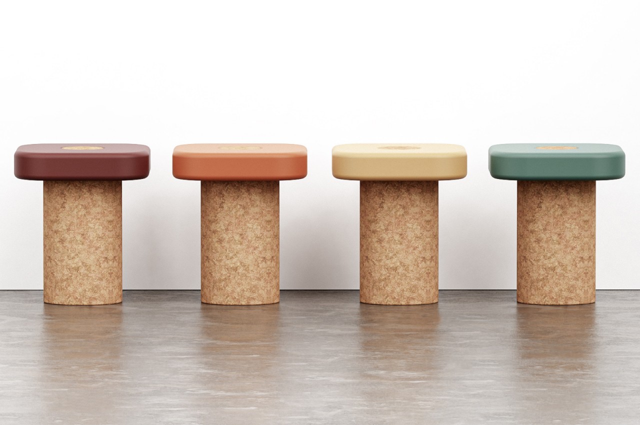
Dubbed the Drum Stool, this stackable, minimal, and sustainable stool looks like a cute little wine cork when you first look at it. But as you dig and look deeper, you realize the stool has quite a lot to offer. The sustainable stool is made using cork and wood, creating a sturdy and durable seating design that is truly eco-friendly, and also quite aesthetic to look at.
Why is it noteworthy?
Cork and wood were selected to build the wood, rating it pretty high on sustainability. The seat was built using cork, while wood was used to build the legs, creating a sustainable and eco-friendly seating solution, that will integrate well with modern contemporary homes.
What we like
- Equipped with a round trimmed surface that gives it a fun and playful shape
- Functions as a cohesive and harmonious furniture piece
What we dislike
- The trimmed cork seat doesn’t look too comfy to sit on for longer durations of time
2. The 2 Stools from 1 Bicycle
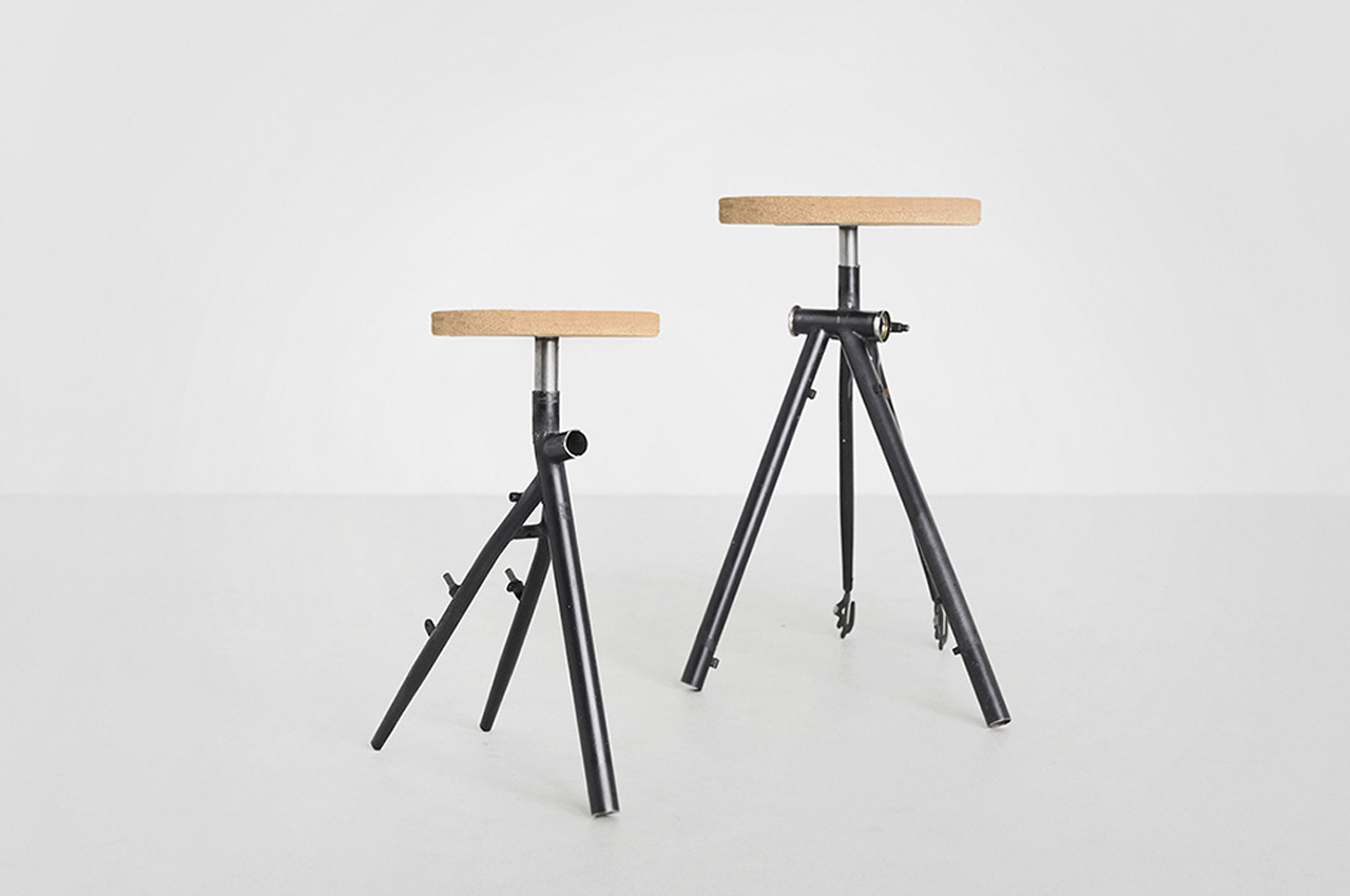
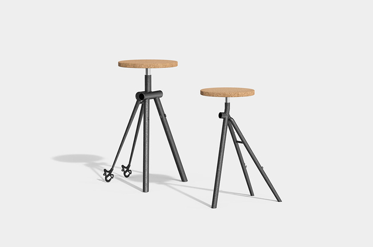
The 2 Stools from 1 Bicycle project upcycled old bikes to create new stools. They create a product that can be easily used by everyone, and won’t be easily thrown away by people. The stools feature unique and noteworthy aesthetics, that will add some personality and charm to your living space, and you won’t feel like giving them away at all.
Why is it noteworthy?
The stools feature slanted legs which offer it a usual and unique shape, which brings to mind the image of the original bike frames they were taken from. One stool is equipped with three legs, while the other has four legs. The seat is crafted from recyclable cork, which isn’t from the bike, it does maintain the stool’s sustainable personality.
What we like
- Unusual and unique aesthetics
What we dislike
- The stools don’t look too comfy to sit on for long periods
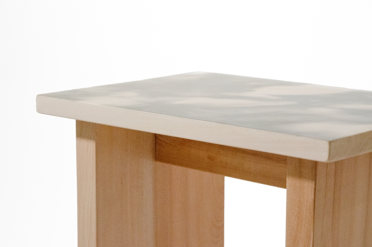
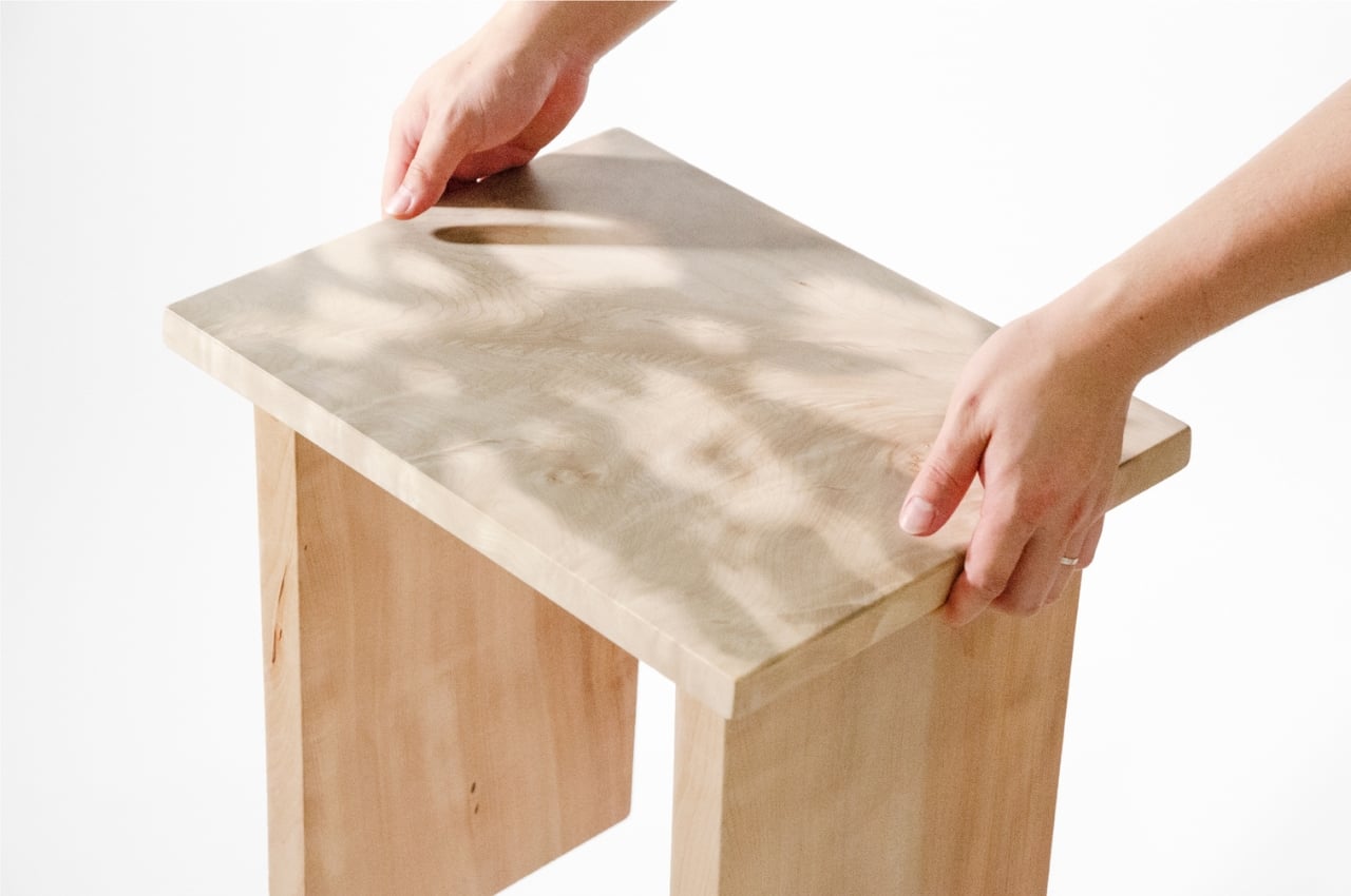
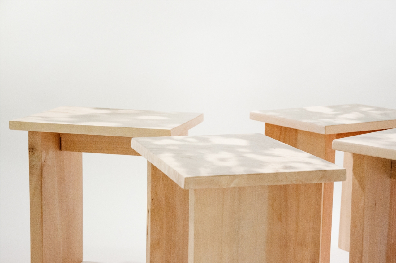
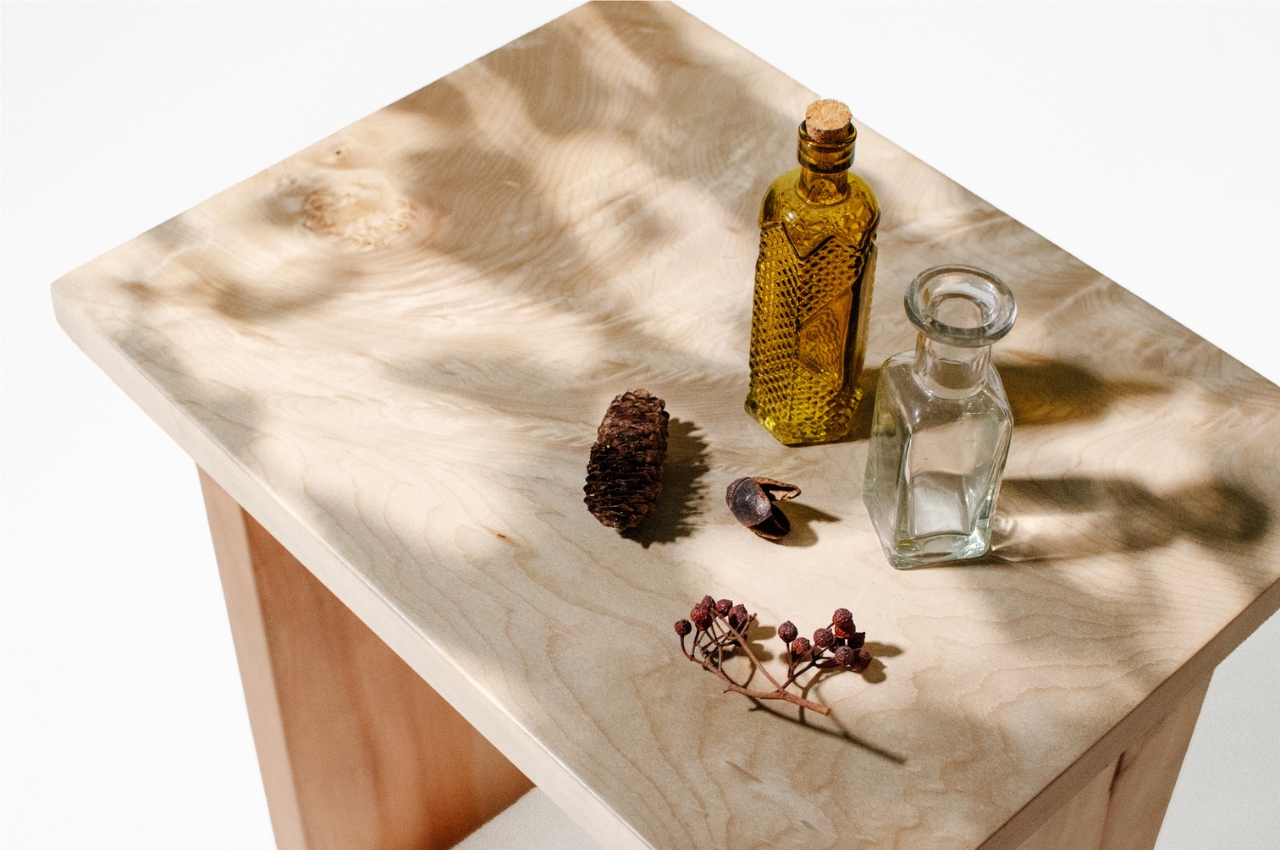
3. The +52 Stool
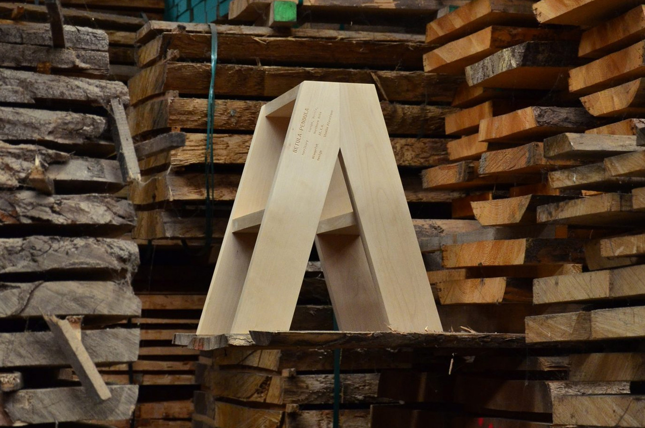
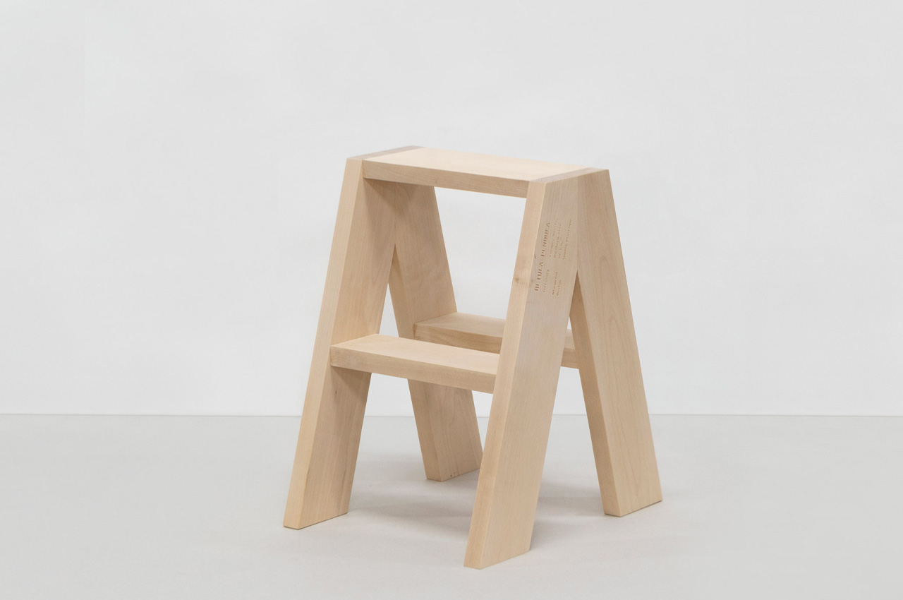
Studio Plastique conducted extensive and deep research on the current timber designs in the market and their manufacturing. They then utilized all their knowledge to build a unique and sustainable wooden step stool called the +52 Stool. The +52 stool isn’t just a typical furniture design and is created to be a scenario.
Why is it noteworthy?
The stool captures and showcases the potential of the undervalued wood types, and how they can be used as sustainable alternatives to the typically-used wood types. The stool is manufactured using non-commercial woods such as koto, willow, elm, acacia, and birch.
What we like
- The stool is created to address the lack of awareness regarding lesser-known wood species
What we dislike
- The look of the stool is pretty rustic and raw, which won’t be preferred by everyone
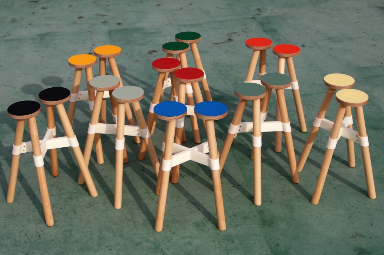
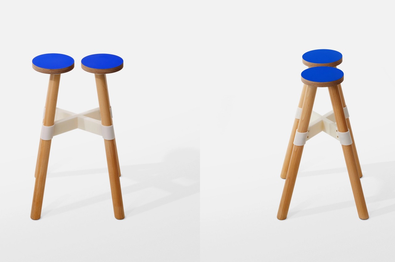
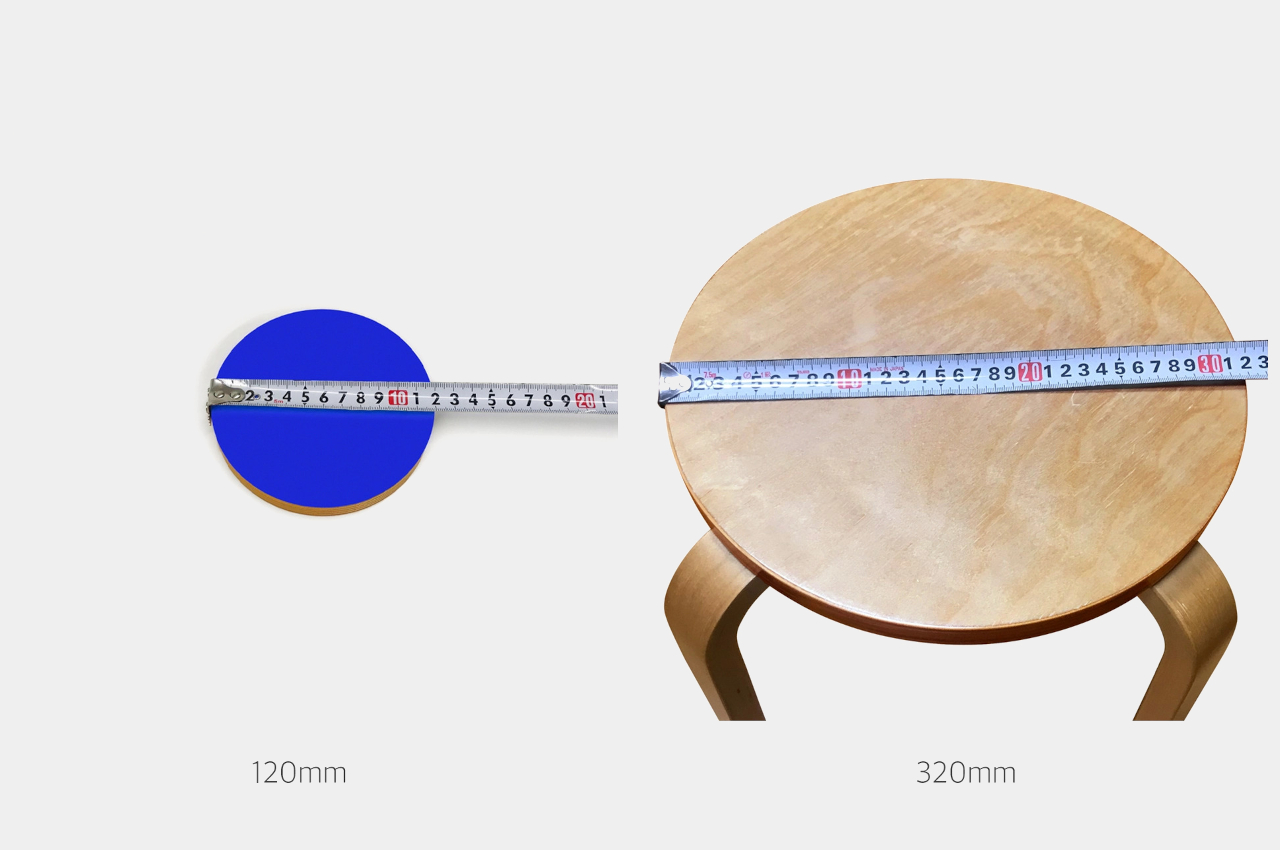
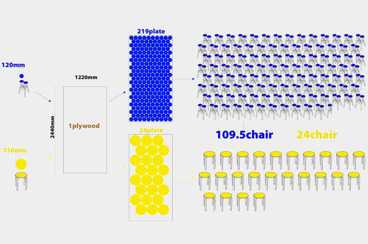
4. Superpop Tables
These colorful little stools/tables are called the Superop tables, and they have mesmerizing terrazzo-like surfaces that have been crafted from recycled plastic. The Superpop tables are designed by Paolo Cappello for Miniforms, and they function as attractive little furniture pieces, that add a much-needed pop of color and character to your living space.
Why is it noteworthy?
The Superpop tables are quite versatile, and they can be utilized as side tables, stools, or even coffee tables. They are versatile, lightweight, and sustainable furniture pieces with a pop of fun!
What we like
- Feature versatile functionality with a universal appeal
What we dislike
- Since they’re so colorful and eccentric, could be difficult to match them with different interior styles
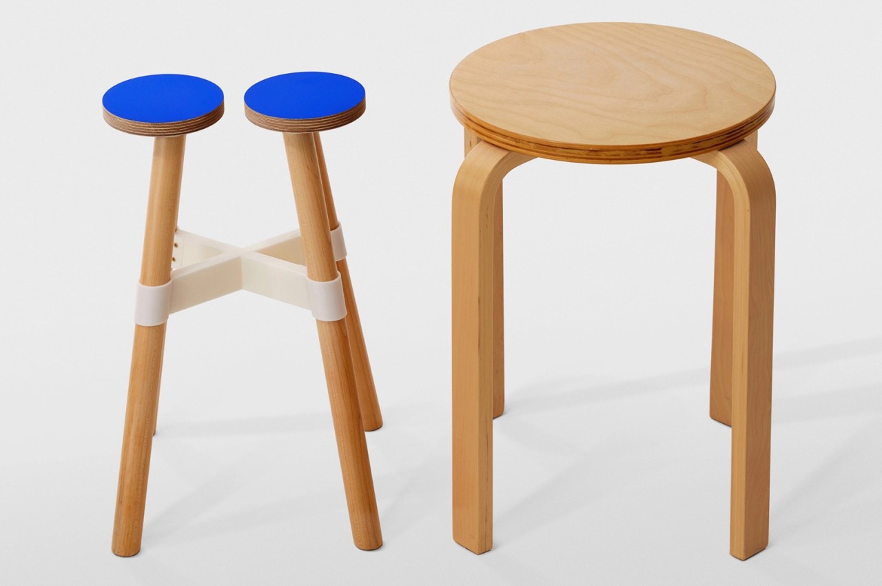
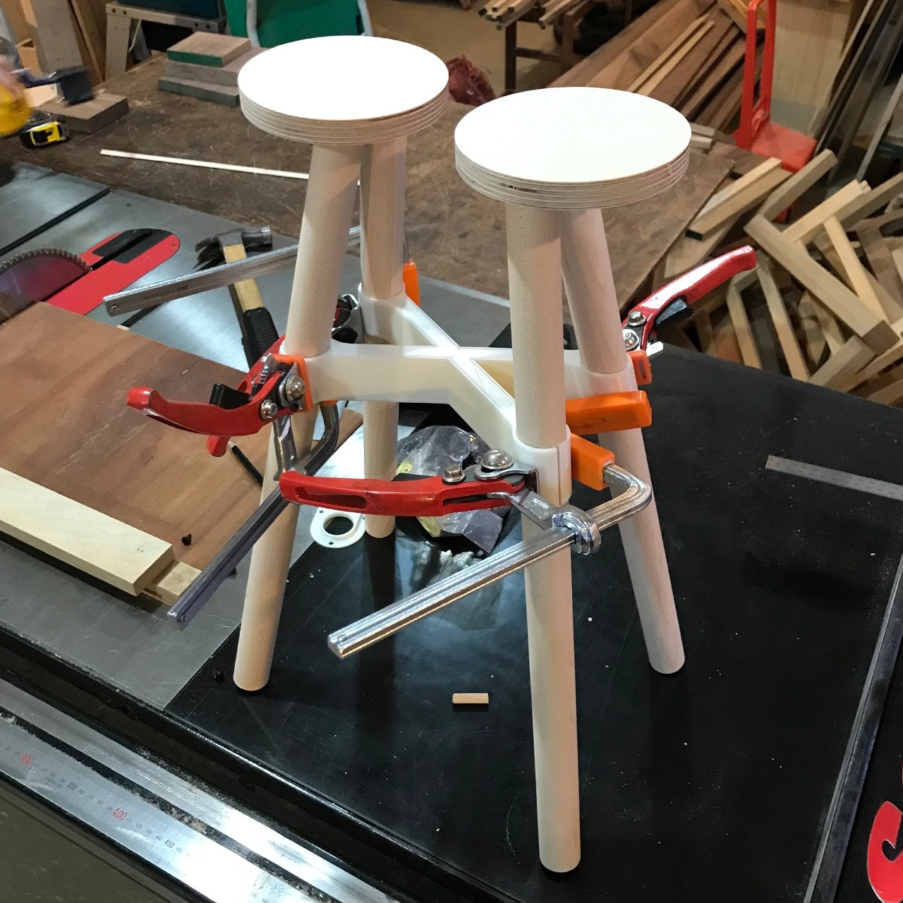
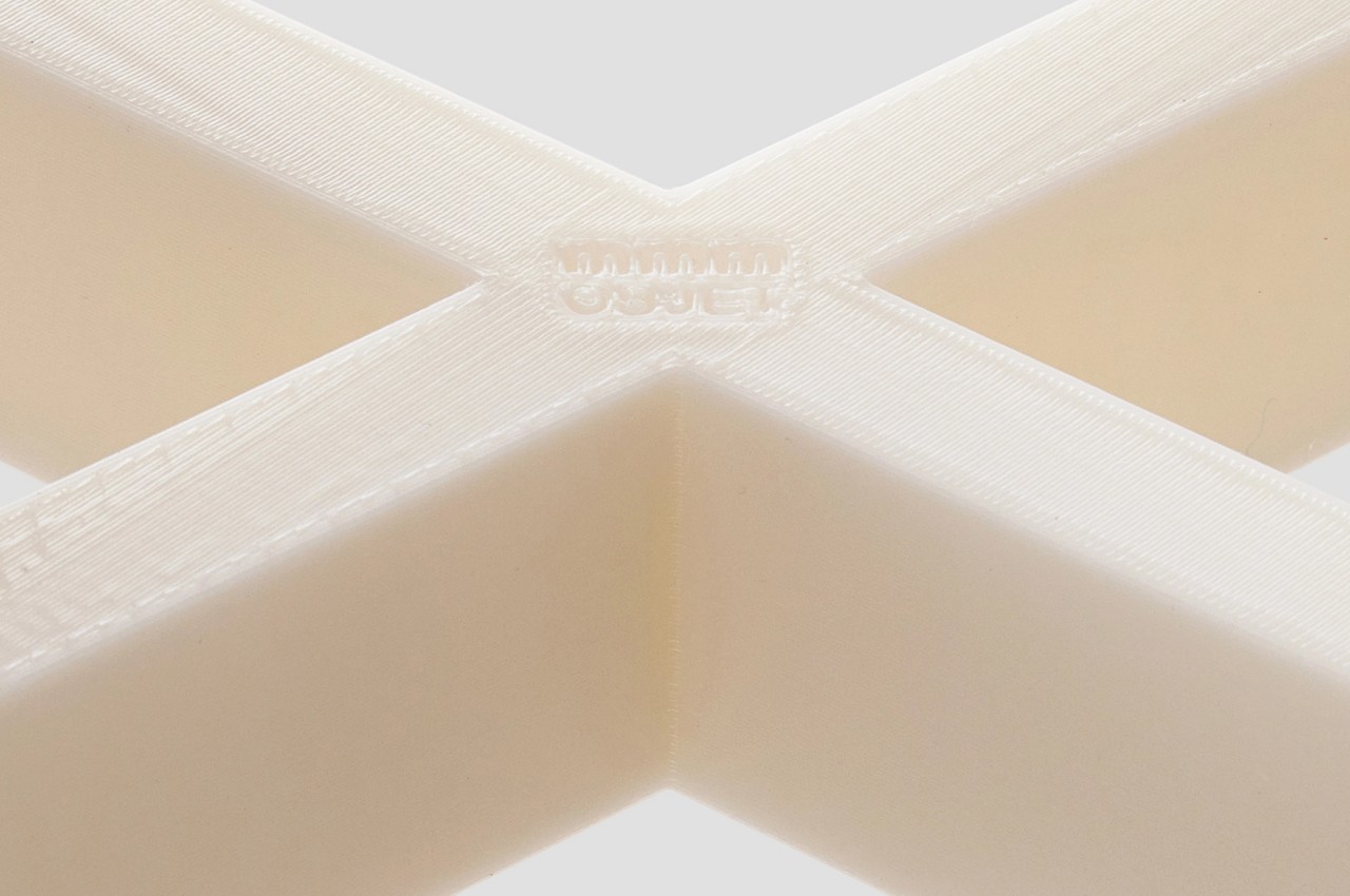
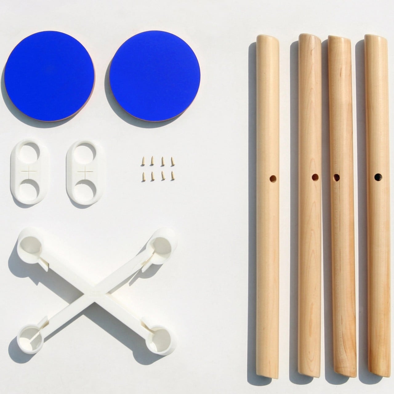
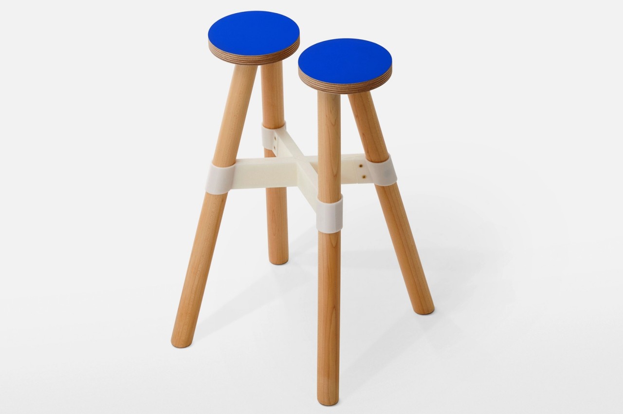
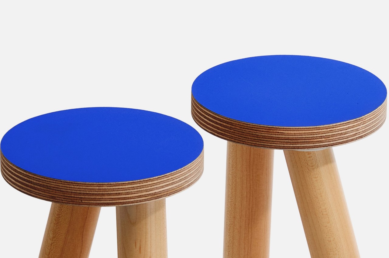
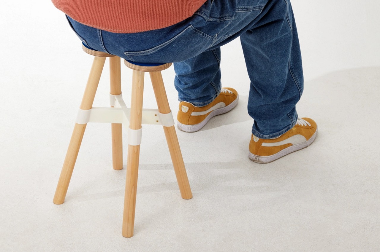
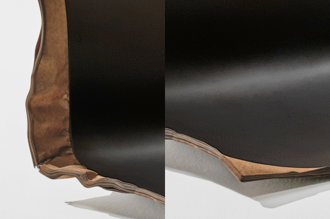
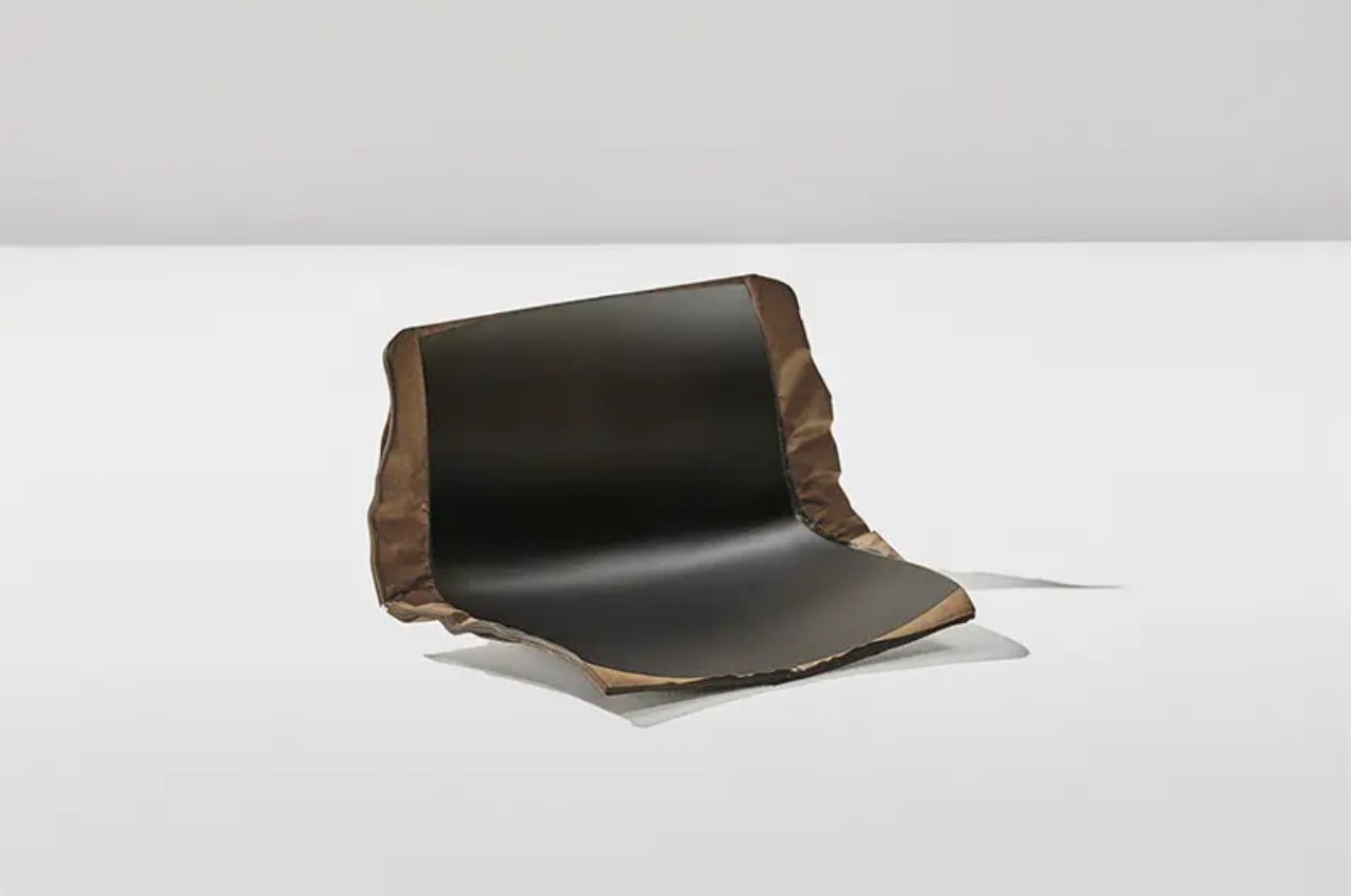
5. Plastic Translation Stool
Named the Plastic Translation Stool, this interesting stool design recreates a plastic form, building a form that is familiar and yet unique. This enables the unique wooden stool to possess a character of its own, adding some wooden minimalism and subtlety to your living space.
Why is it noteworthy?
Since the wooden legs won’t offer the same stability as the plastic bits, another element – the Birch plywood buttresses is added to the stool. It evens out some of the force across the beechwood legs, allowing the buttresses to be held together. This increases architectural stability, as well as visual amplification.
What we like
- The stool doesn’t need screws or nails to be assembled
- Features a fun puzzle-like design
What we dislike
- Options to customize the stool are currently missing
6. Stump Recycled Stool
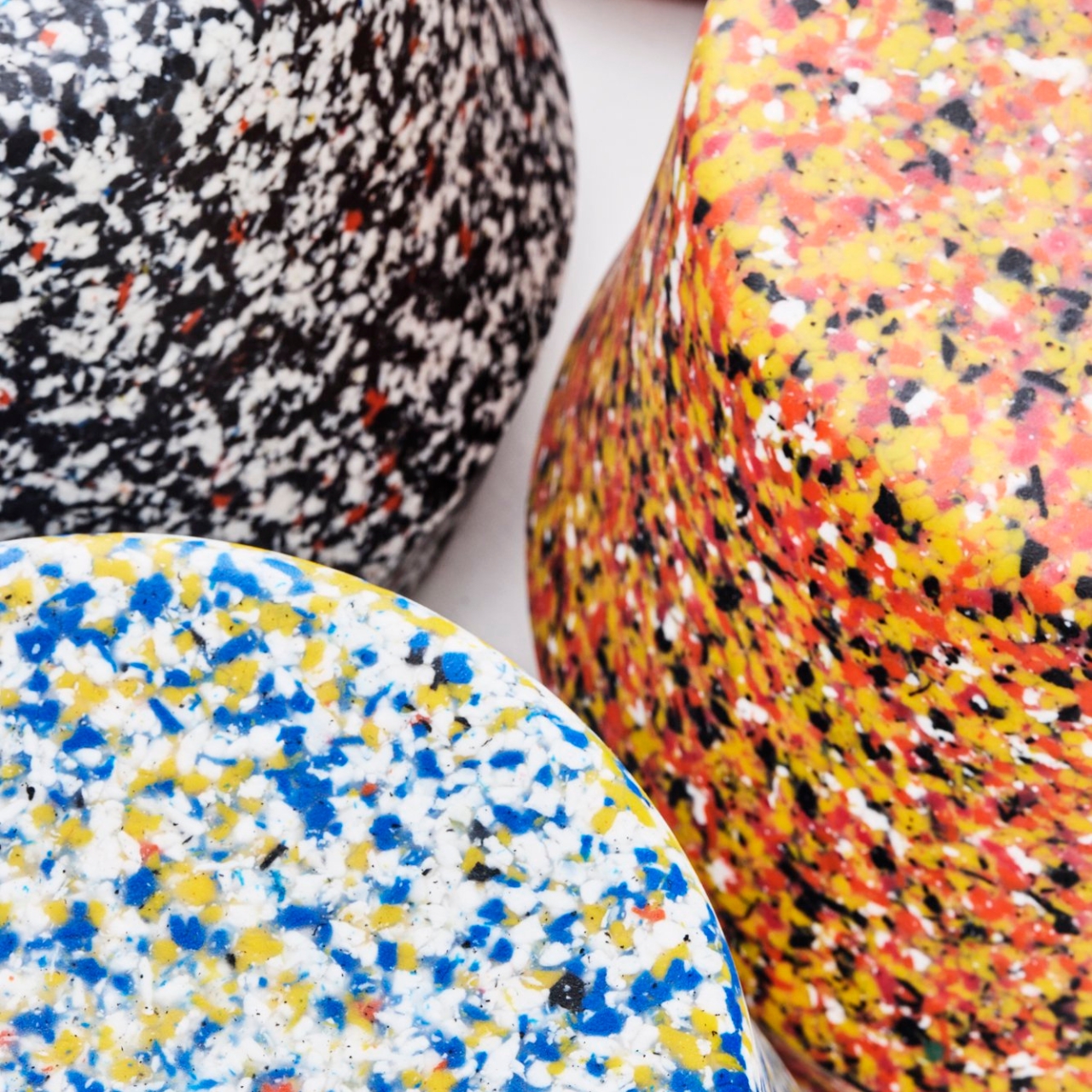
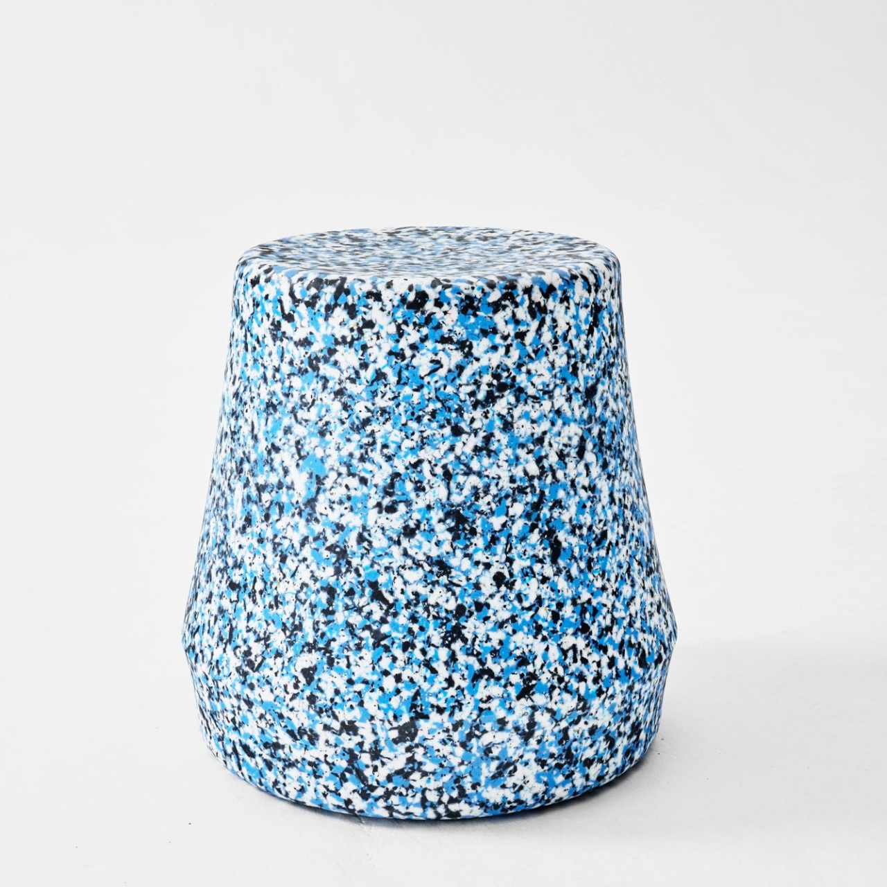
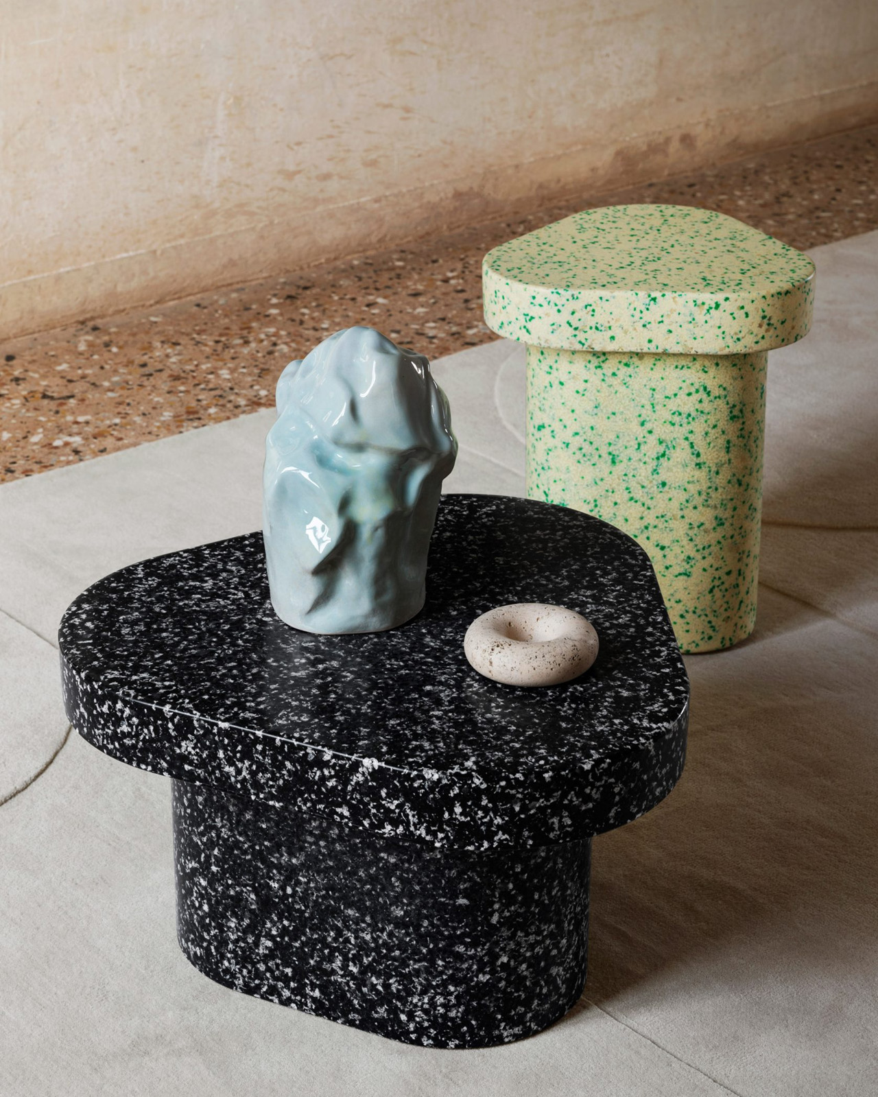
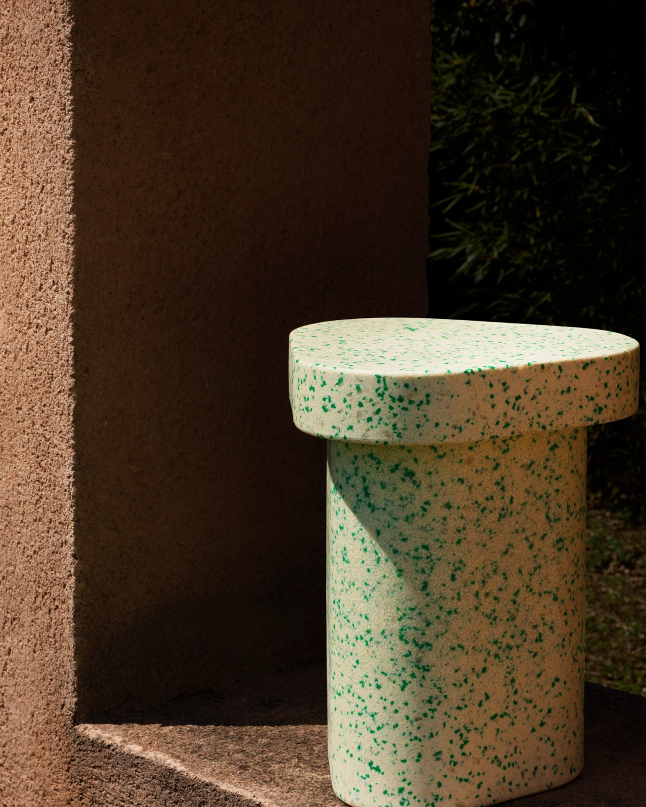
Derlot designed the original Stump stool sometime ago, and now they’ve unveiled the new Stump Recycled stool which has the same structure of the OG Stump stool, but it is interesting built from 80% recycled post-industrial plastic LPDE. The Stump Recycled stool is quite colorful and visually intriguing to look at, which adds extra brownie points besides its sustainability.
Why is it noteworthy?
The new Stump stool features a different design, as the patterns form a terrazzo-like design that offers the stool a textured and colored look. You can pick stools with a kaleidoscope-like finish, which provides a fresh interpretation of how recycled materials can be used to elevate a design.
What we like
- Offers a new and fresh take on how recycled materials can be utilized
What we dislike
- The stool is quite small and doesn’t look too comfy to sit on for long
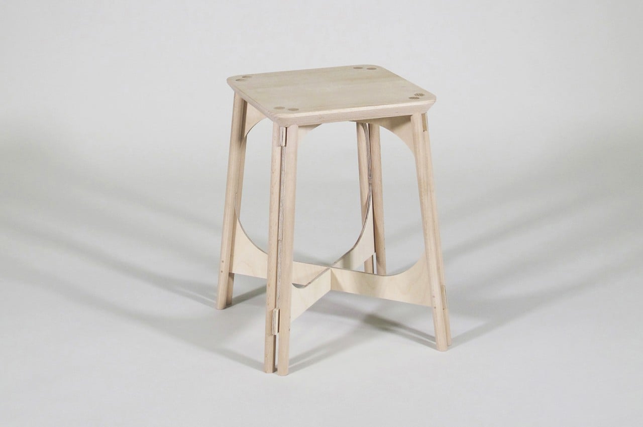
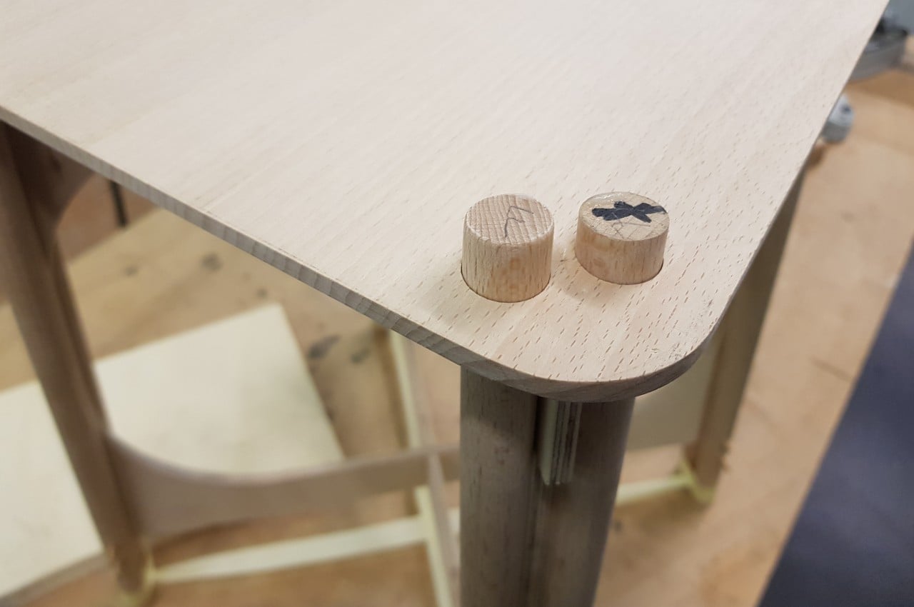
7. Tie Stool
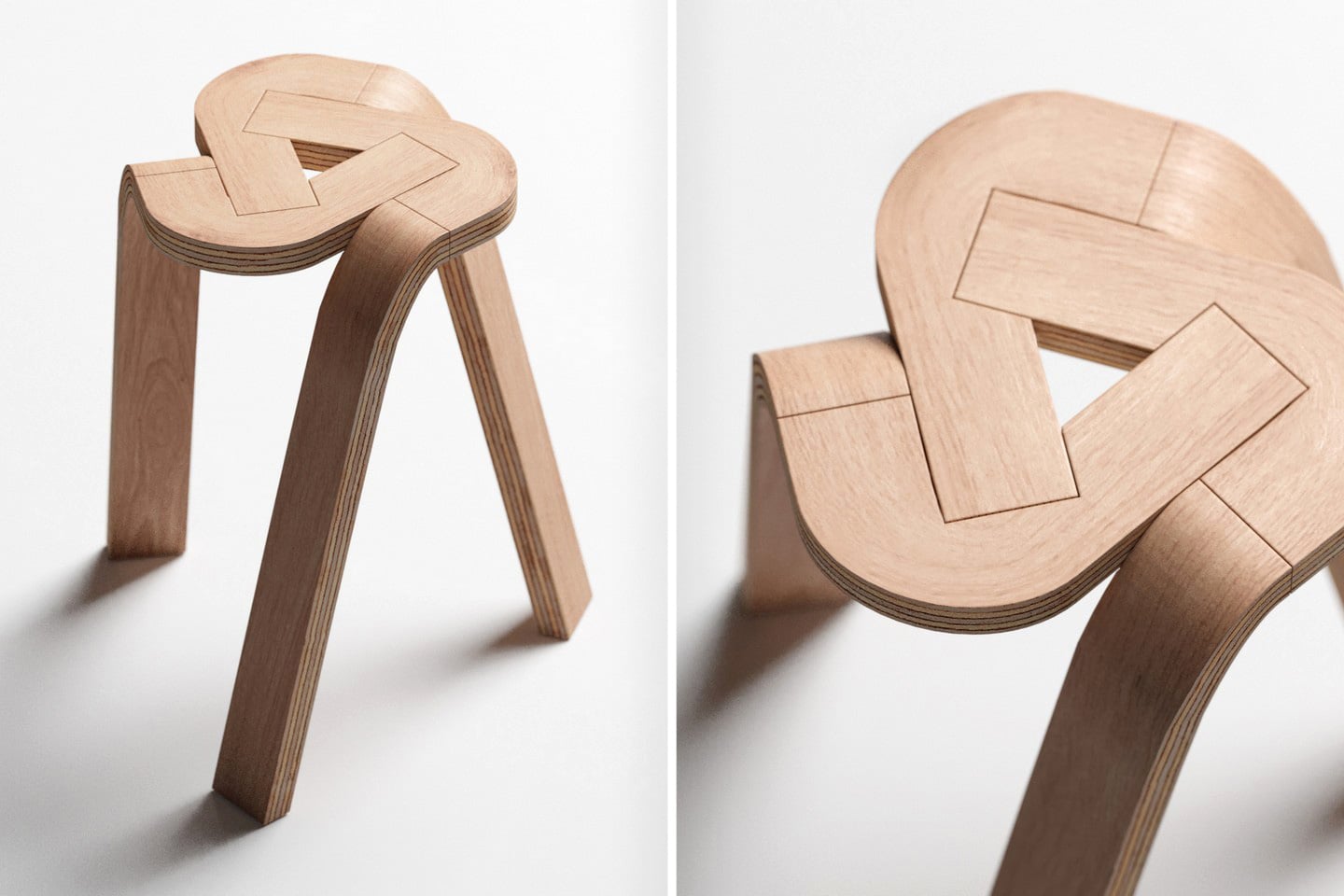
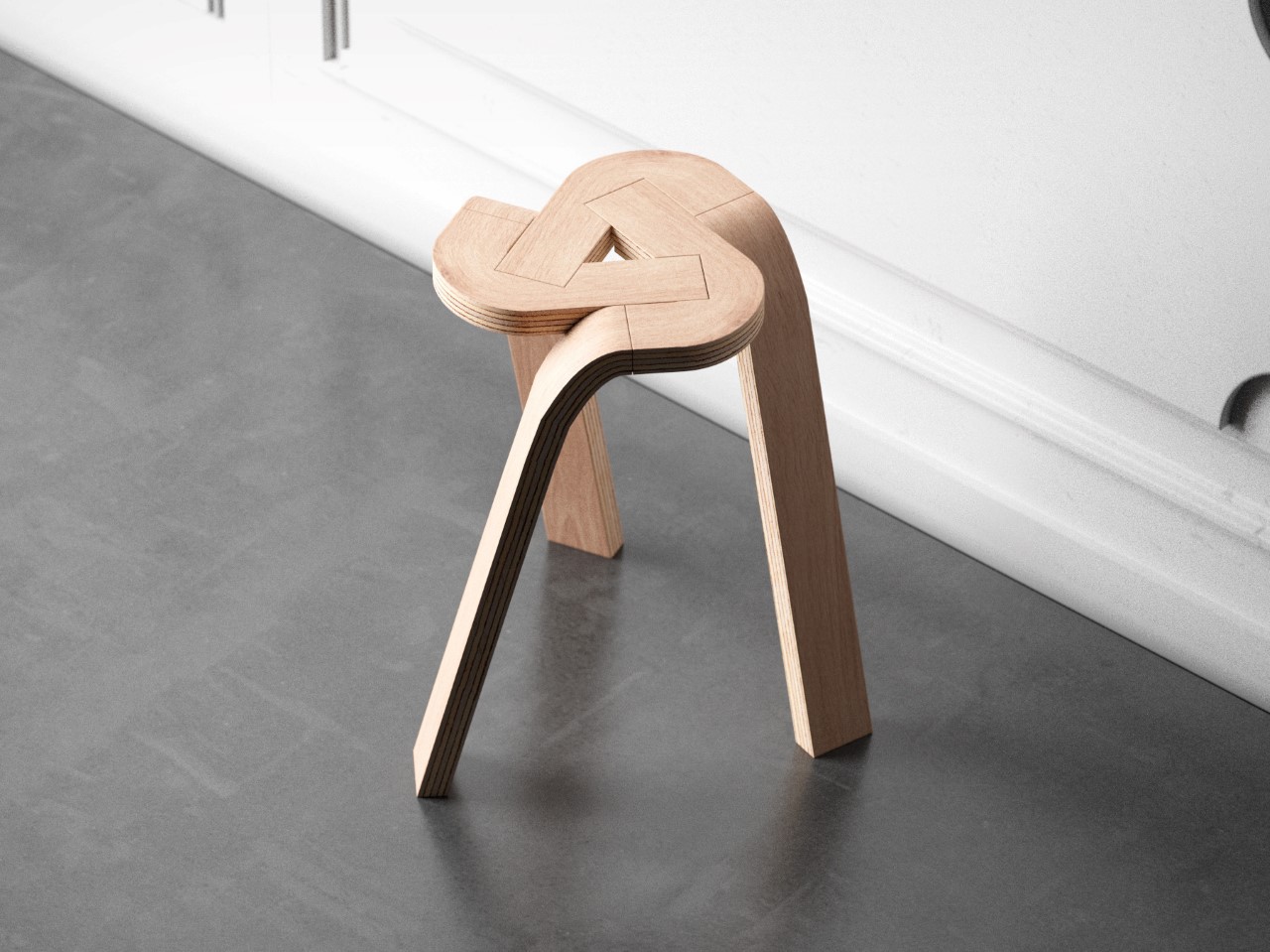
Dubbed the Tie Stool, this stunning stool is made from three bent pieces of plywood that effortlessly lock into one another, creating a unique tripod form that is quite comfy to sit on. It is a simple stool made using minimal materials making the stool quite a beauty.
Why is it noteworthy?
The three plywood strips can be split into 6 total parts, forming individual parts that are built using high pressure, causing the plywood to bend and retain its shape. The cutting processes are performed on the parts allowing them to interlock into one another.
What we like
- Flat-packed and shipped to customers
- Features a stackable form
What we dislike
- Its compressed design means it needs a tabletop to add more space on the stool
8. TAKEoSEAT

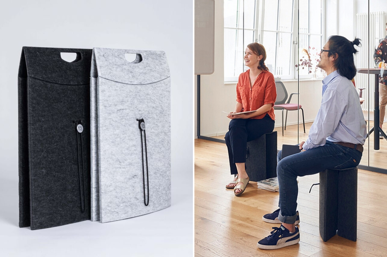
Meet the TAKEoSEAT – a folding stool unlike any other. Designed by KRETHO, this portable stool allows you to simply pick it up, and move around as you please. You don’t need to rearrange furniture or sweat over a particularly heavy chair. It flattens down to a large portfolio and looks like a stylish bag made of felt.
Why is noteworthy?
The TAKEoSEAT is made from PET felt, and this felt is derived from plastic bottles that we often use and throw away without giving a second thought about where they may end up. They are put through a special process, to create material that is familiar to touch, but also strong and sturdy.
What we like
- The stool is crafted from PET-felt
- Has an easy-to-carry and portable form
What we dislike
- Folding designs are quite common these days, so not much to set the stool apart
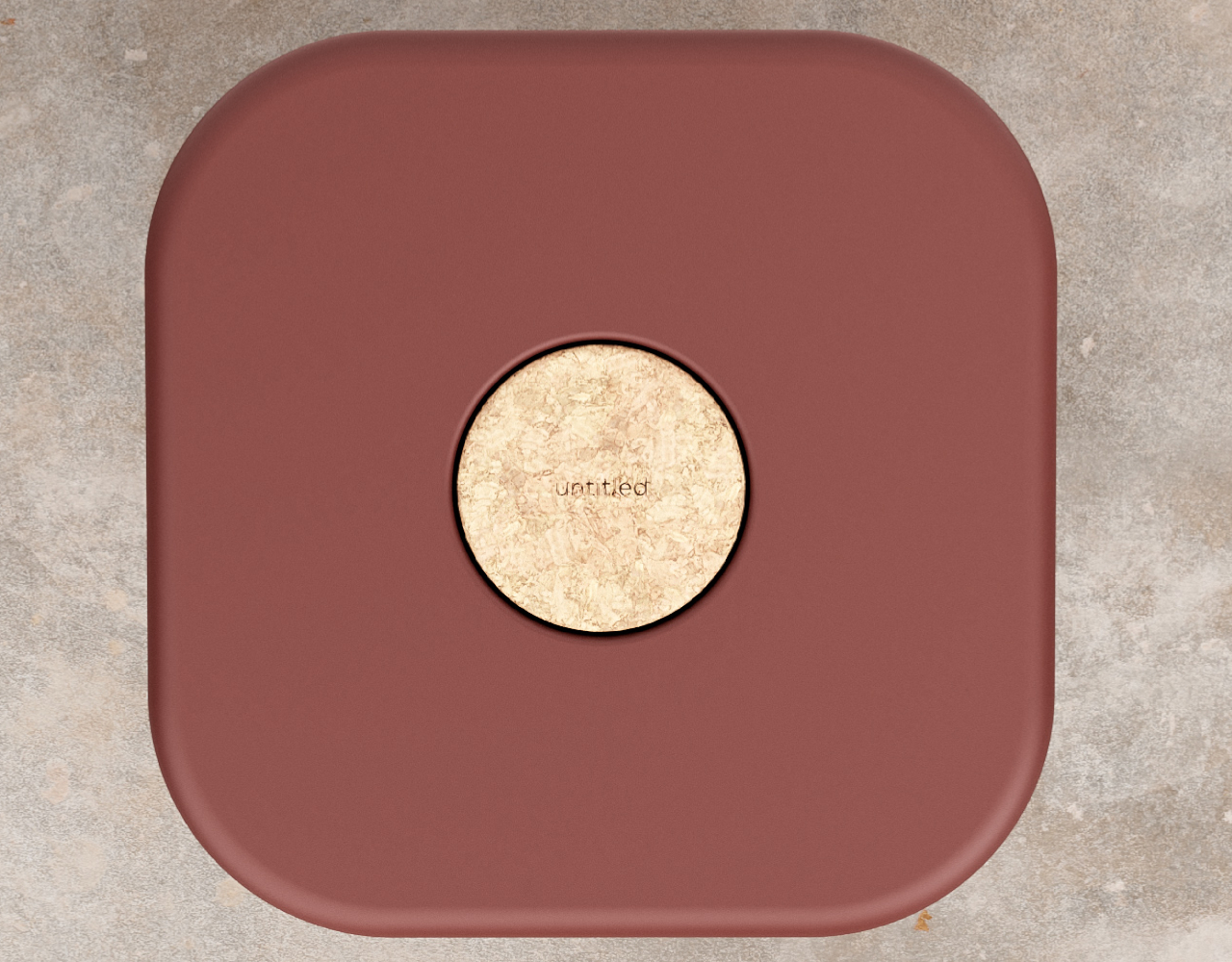
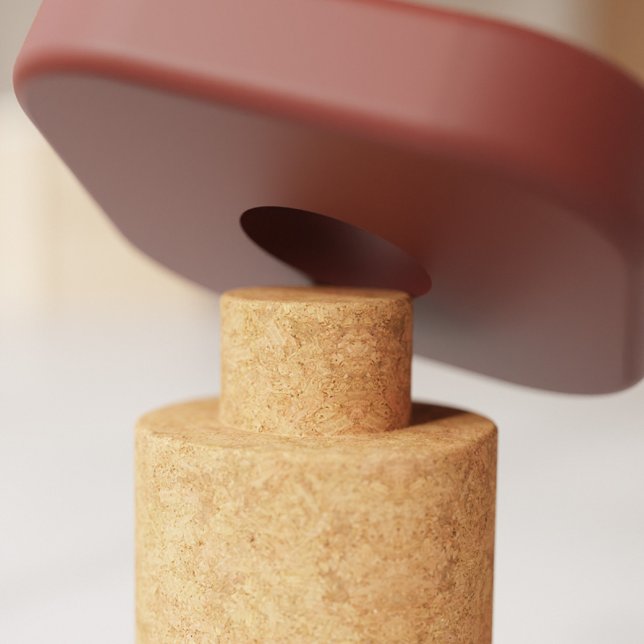
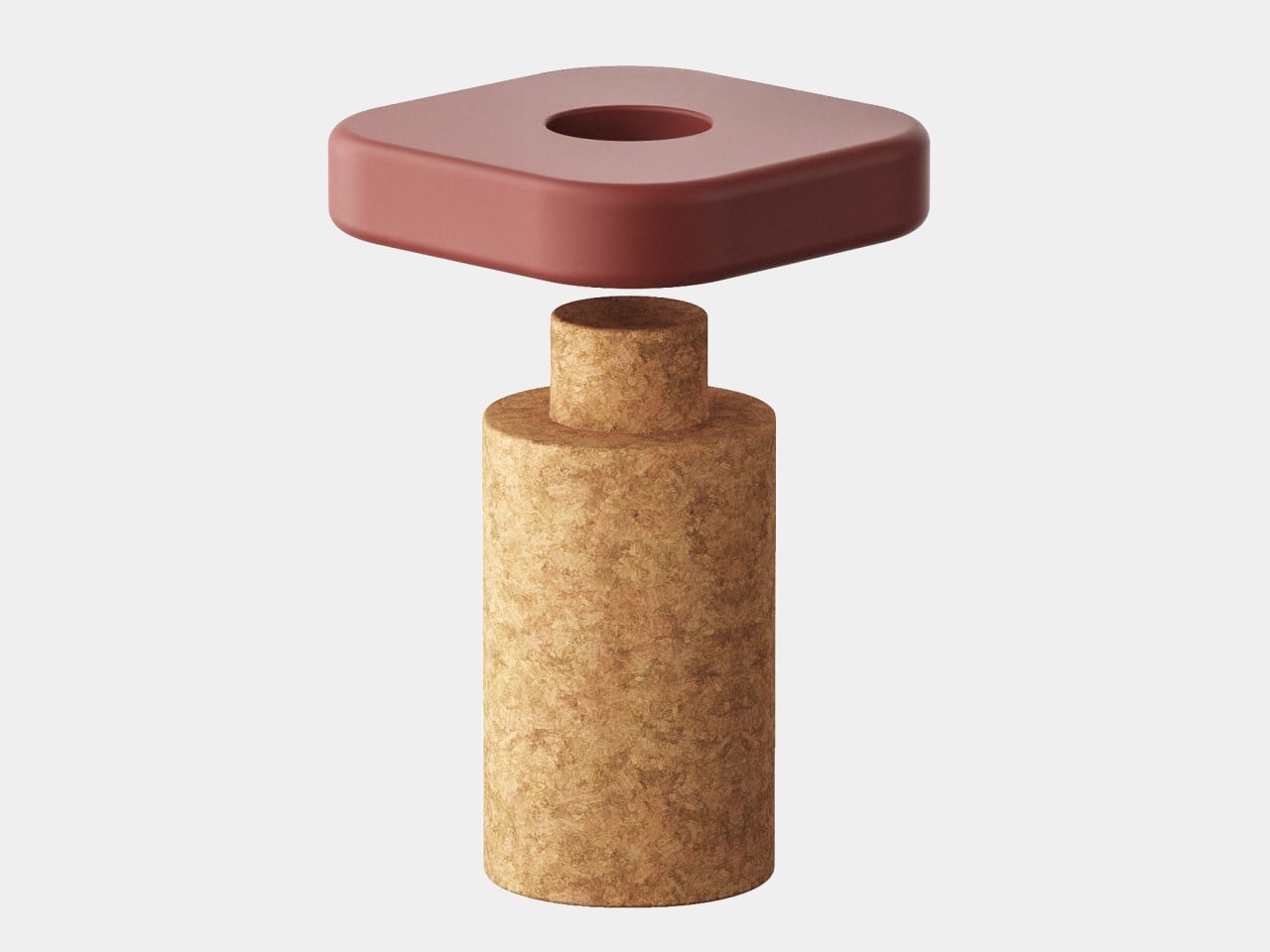
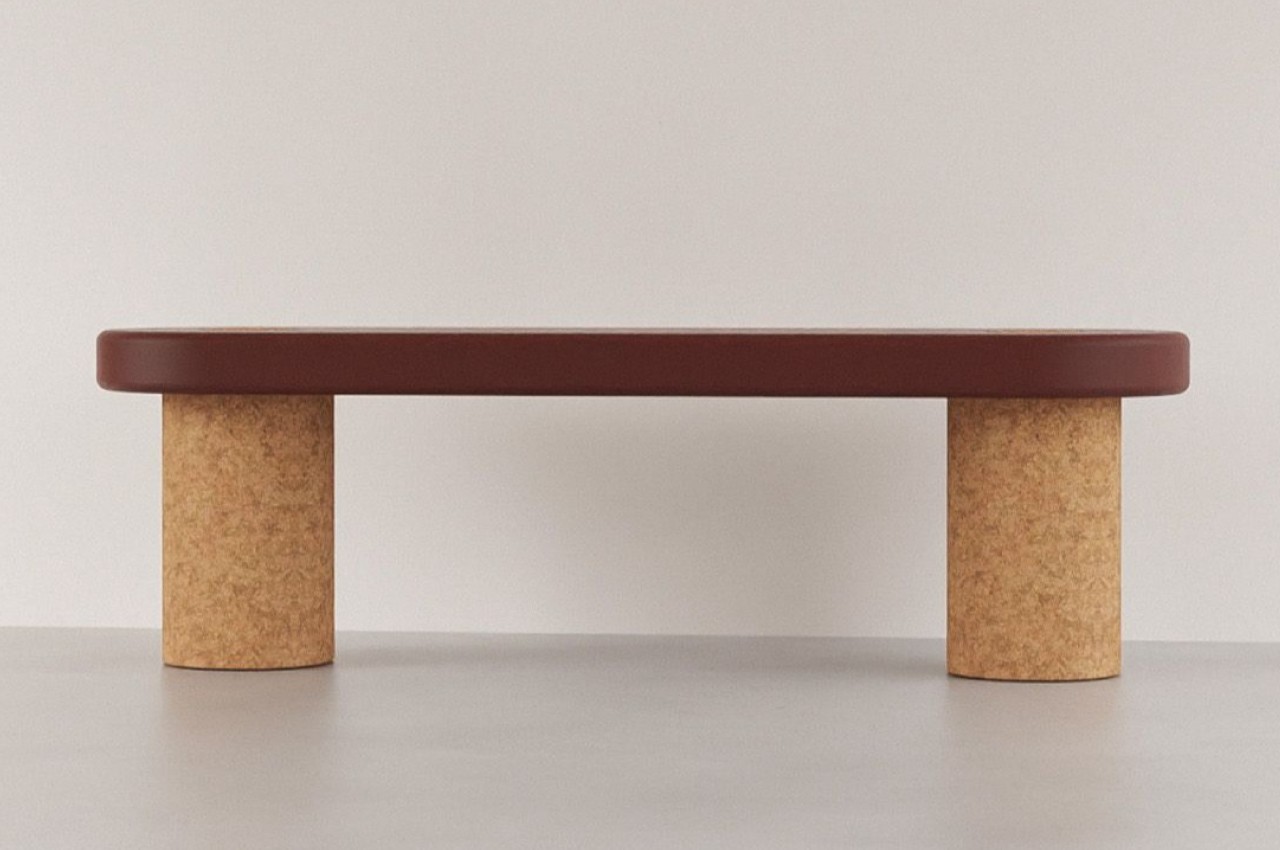
9. Cork Stool Concept
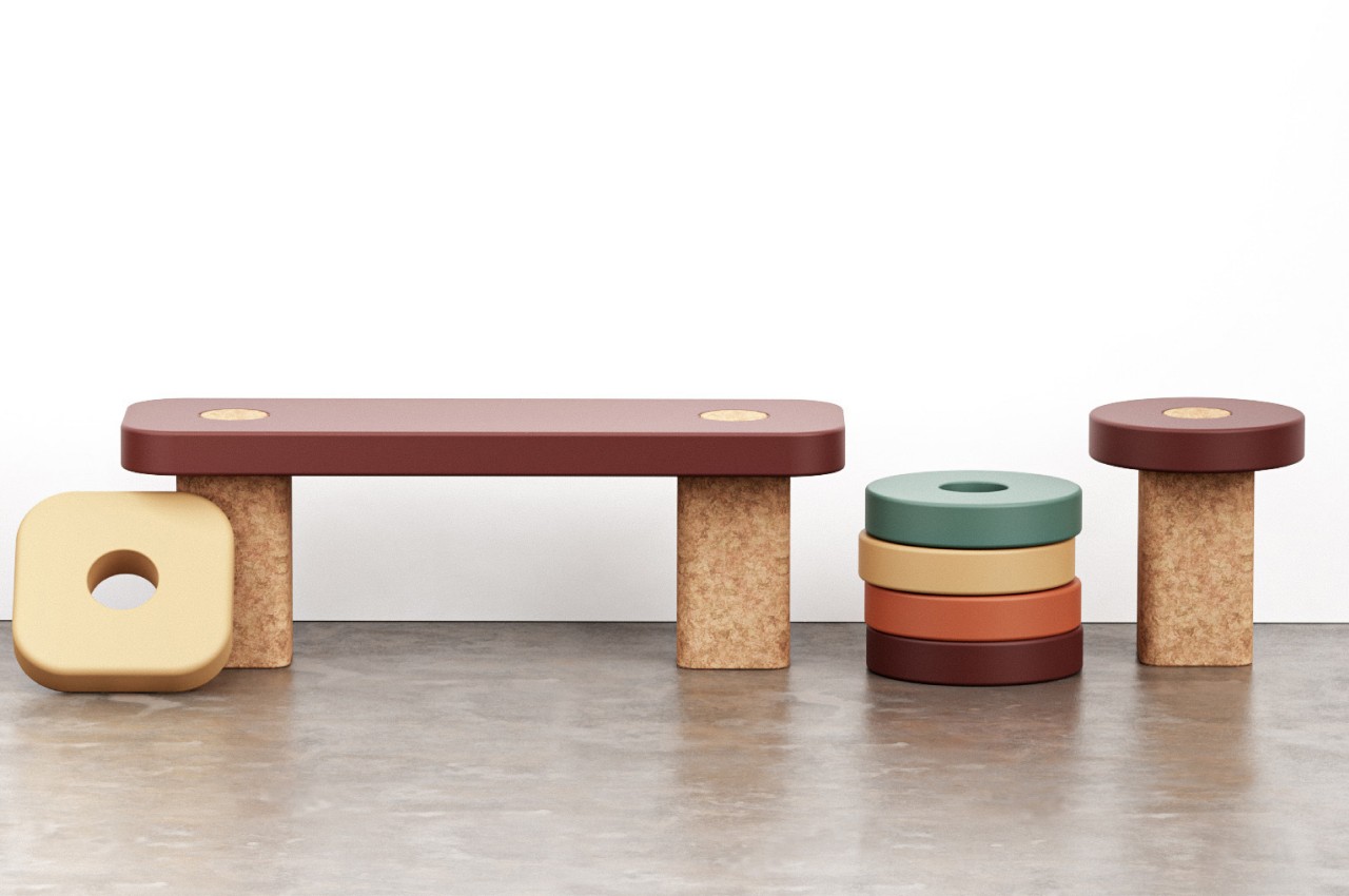
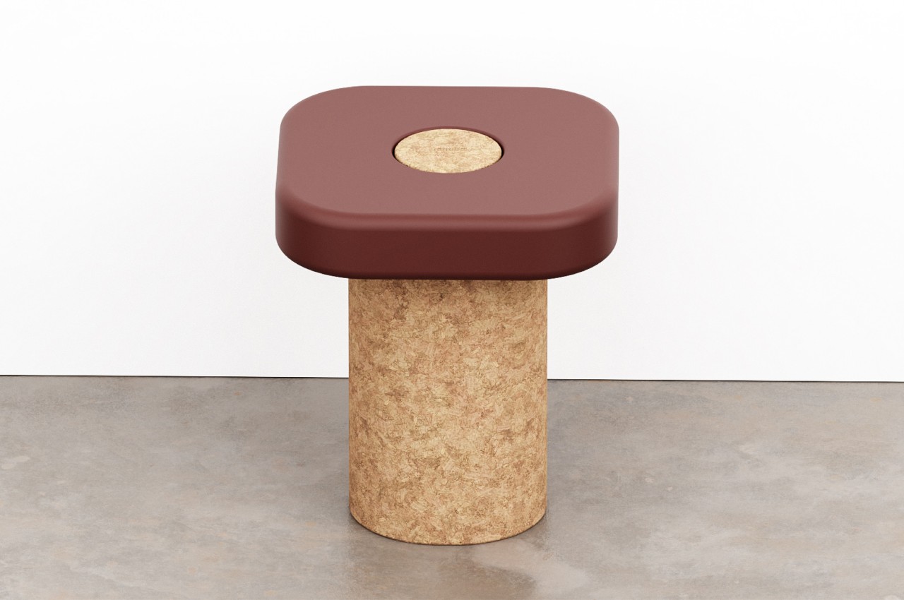
Made from cork, this minimalist stool concept is designed to offer you a sustainable seating solution, that reduces waste by converting two stools into one single bench, and then back again, as and when needed. It is like an “unknown” stool design, but it features a modular nature which leaves it interestingly open to interpretation and implementation.
Why is it noteworthy?
The design has a core element of a sturdy column of cork, which functions as a single cylinder, and forms the center of the stool. However, a smaller circle connects it to the removable seat with a hole in its center. It functions as a simple system that doesn’t need any extra parts or screws.
What we like
- The seats can be changed or replaced without throwing away the cork
What we dislike
- The bench variant will occupy substantial space in your home
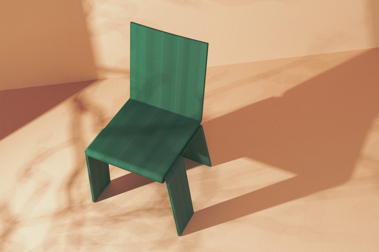
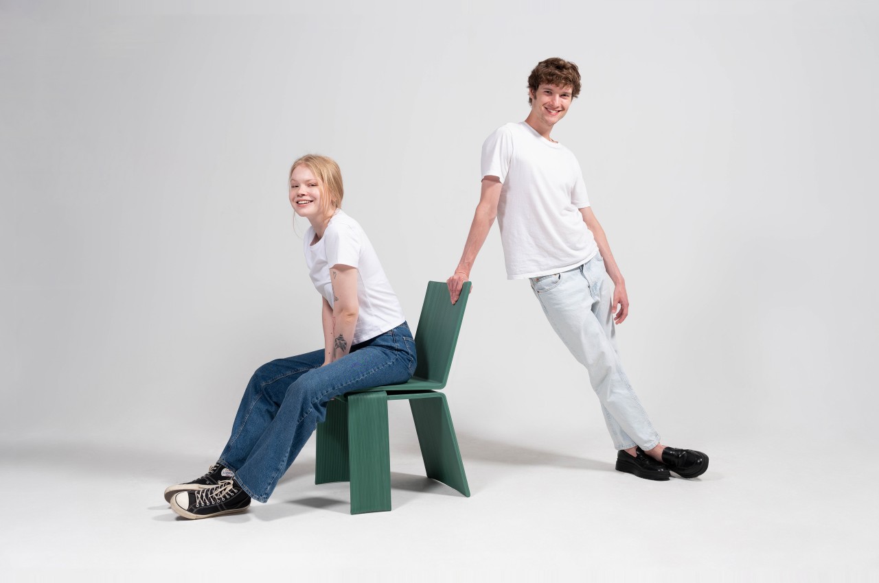
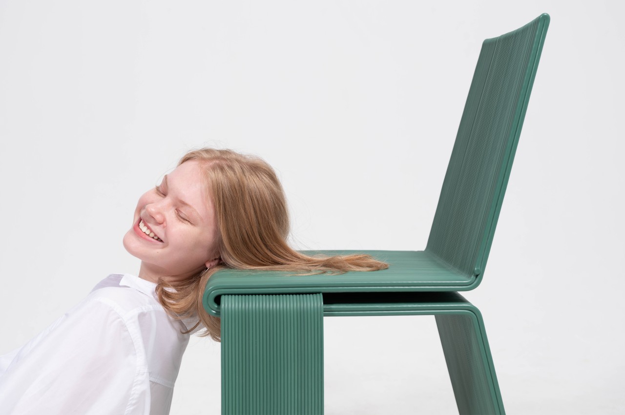
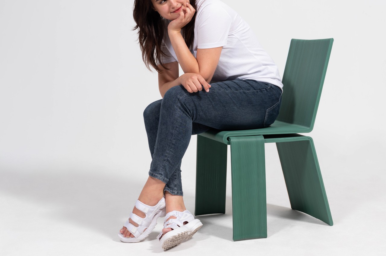
10. Vale Collection
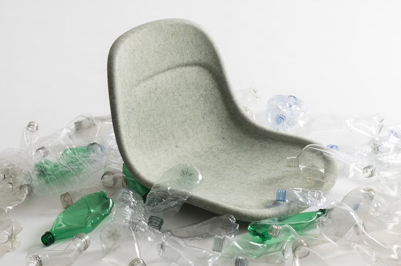
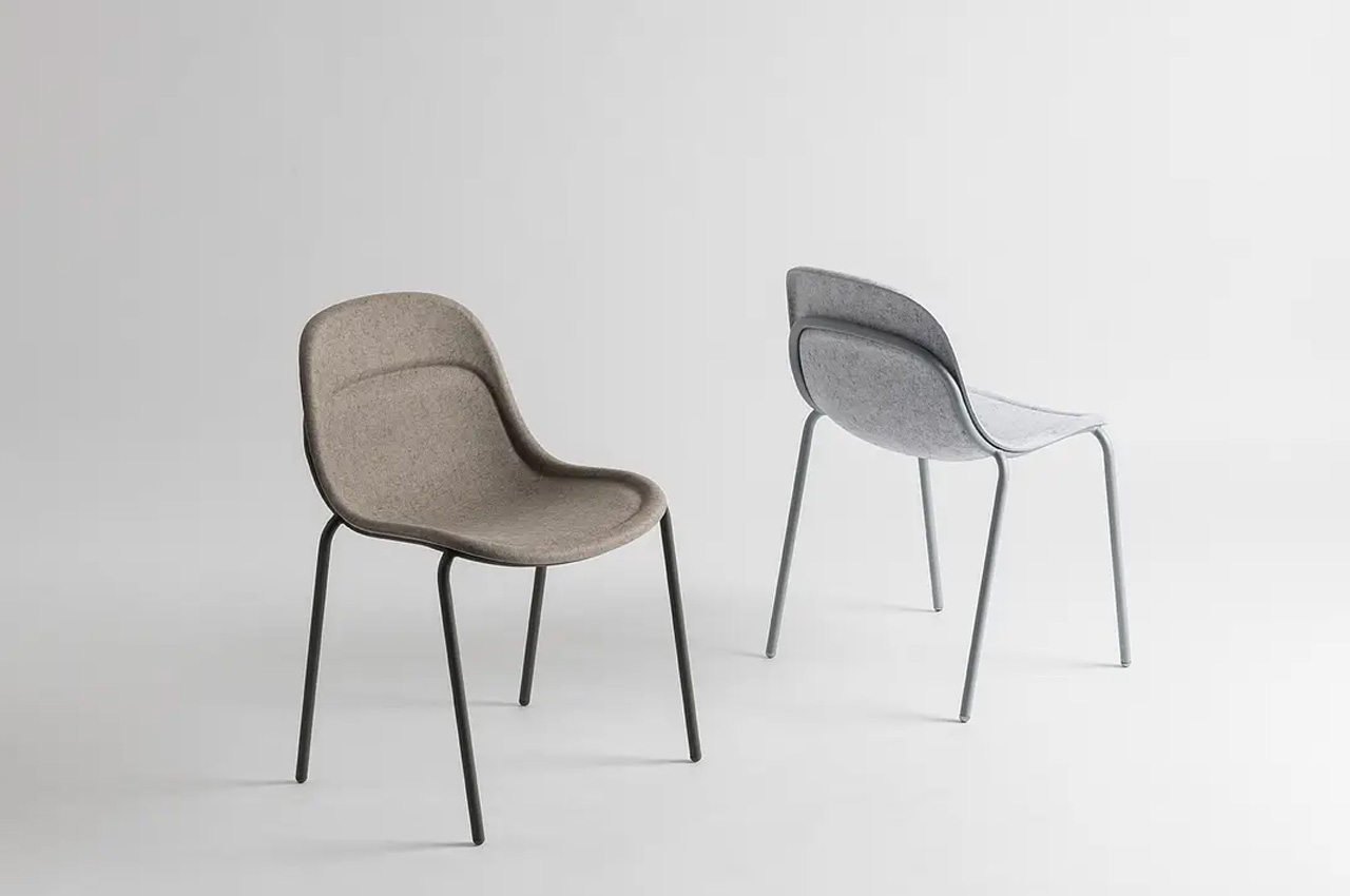
Named the VALE collection, this range of eco-friendly chairs and stools by Layer was designed for the US furniture brand KFI Studios. The furniture is made from recycled PET bottles and was created to protest against the plastic waste that often drowns and pollutes the oceans and landfills.
Why is it noteworthy?
The innovative collection is designed to be an eco-friendly and sustainable solution to the rising issue of plastic waste. The furniture is a refreshing change and an excellent specimen of sustainable furniture, in today’s world when 9 million tons of furniture are thrown in landfills.
What we like
- The furniture is made using a material derived from recycled PET bottles. The material is durable and eco-friendly
What we dislike
- The looks of the chairs and stool are a bit boring, more aesthetic details could have been added
The post Top 10 Sustainable Stools To Incorporate Eco-Friendly Furniture Designs In Your Home first appeared on Yanko Design.