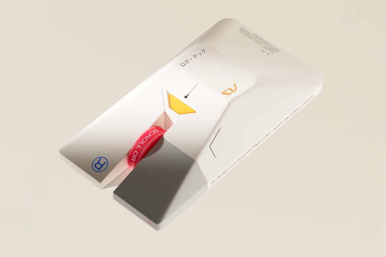
As a design website, we’ve had the distinction of covering practically every computer mouse there is. Regular mice, ergonomic mice, vertical mice, gaming mice, inflatable mice, even origami mice… so the BM1 doesn’t come as any massive surprise in terms of the visual design department. Modeled on the Lambda-class T-4A Shuttle from Star Wars, the mouse balances ergonomics with a rather inventive design that pays tribute to one of the greatest cinematic universes of all time.
Designer: Braz de Pina
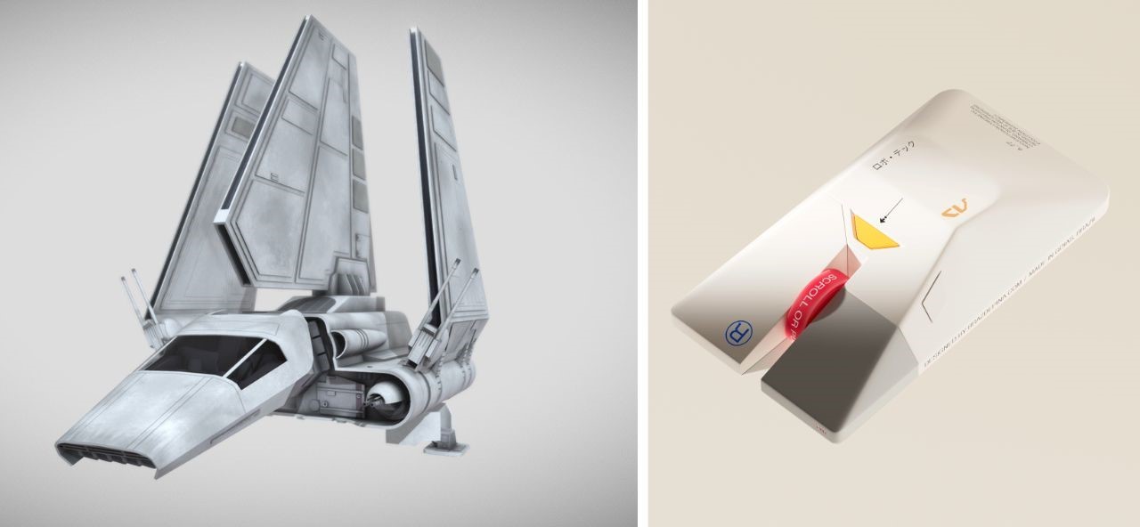
Crafted by a visionary designer with a profound love for the Star Wars universe, the BM1 Mouse pays homage to one of the saga’s most iconic vessels – the Lambda-class T-4a shuttle. With its sleek contours and unmistakable resemblance to the Imperial Shuttle, this mouse beckons adventurers to embark on a journey through the stars, where every click and scroll resonates with the pulse of interstellar warfare.
For the legions of Star Wars aficionados and gamers alike, the BM1 Mouse offers an unparalleled experience, seamlessly blending the allure of the Galactic Empire with the thrill of virtual conquests. At first glance, the echoes of the Lambda-class shuttle resonate through the sleek contours of the mouse, with its central body mirroring the iconic vessel’s silhouette (if you exclude the wings).

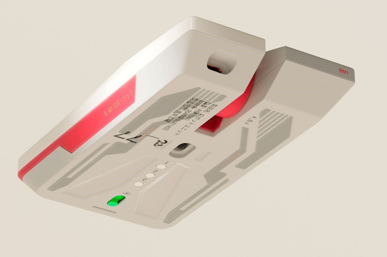
The fusion of form and function reaches its peak with the mouse’s primary features – the left and right clicks, reminiscent of the cannons adorning the front of the Imperial Lambda. Each click resonates with the exhilaration of battle, offering gamers an immersive experience akin to piloting a starfighter through the vast expanse of space.
Beyond its striking resemblance to the Imperial Shuttle, the BM1 Mouse boasts a visual identity that exudes sophistication and ergonomic brilliance. Chamfered edges provide not only aesthetic appeal but also enhance grip and comfort during prolonged gaming sessions. The streamlined shape evokes a sense of speed and agility, reminiscent of the starships that dominate the Star Wars universe.
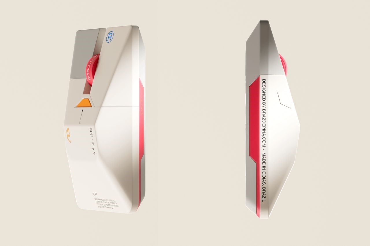
Not to be overlooked is the mouse’s scroller – a distinctive feature that commands attention with its futuristic design. Easy to spot and effortless to use, the scroller serves as a tool for navigation in the digital realm, guiding users through galaxies far and wide with precision and ease.
Moreover, the visual cues and font selection evoke a sense of futurism, drawing parallels to the technological marvels of the Star Wars universe. The color palette, a delicate fusion of greys, whites, and vibrant primary hues, further accentuates the mouse’s futuristic appeal, transporting users to a realm where technology and imagination converge.
A closer look at the mouse’s underside reveals a flat base adorned with sleek depressions, reminiscent of the underbelly of a spaceship preparing for flight. This attention to detail not only enhances the mouse’s aesthetic appeal but also reinforces its identity as a vessel for digital exploration and conquest.
The post A Mouse That Enhances Your Gaming Experience Inspired By Star Wars first appeared on Yanko Design.
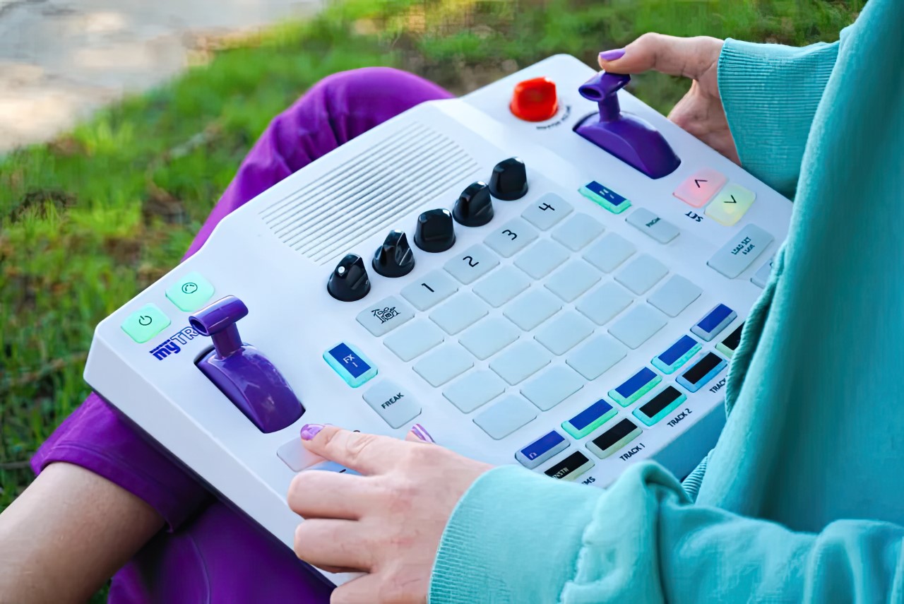
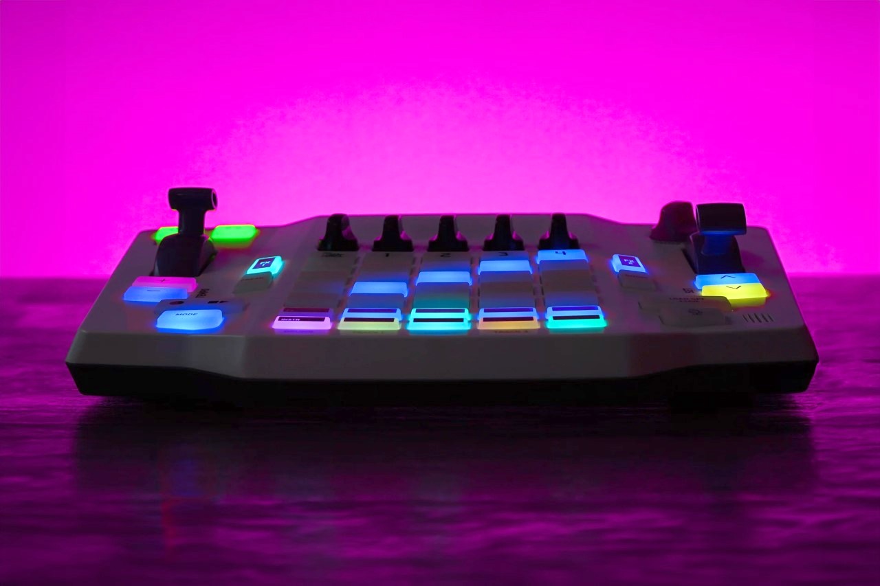
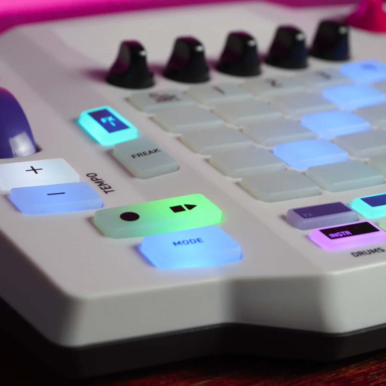


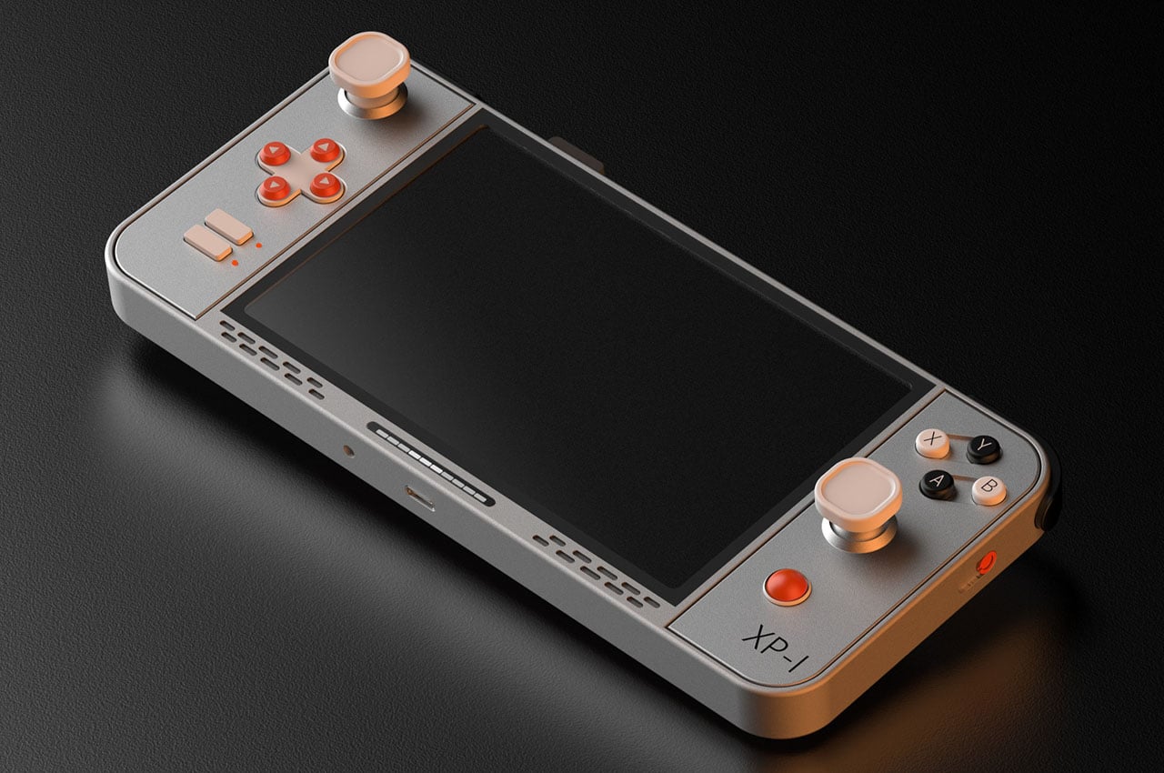
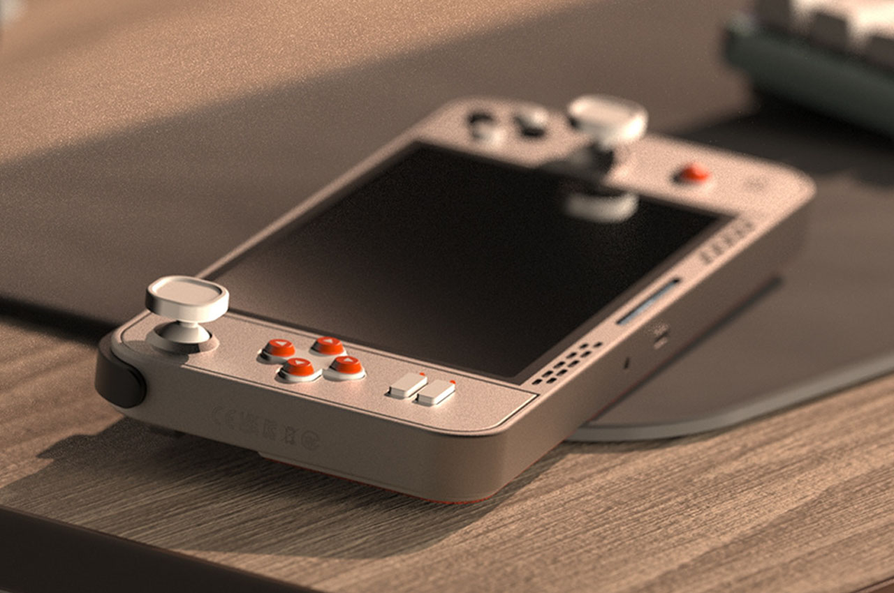
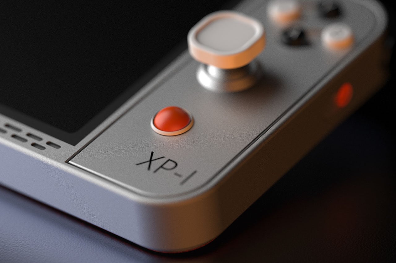
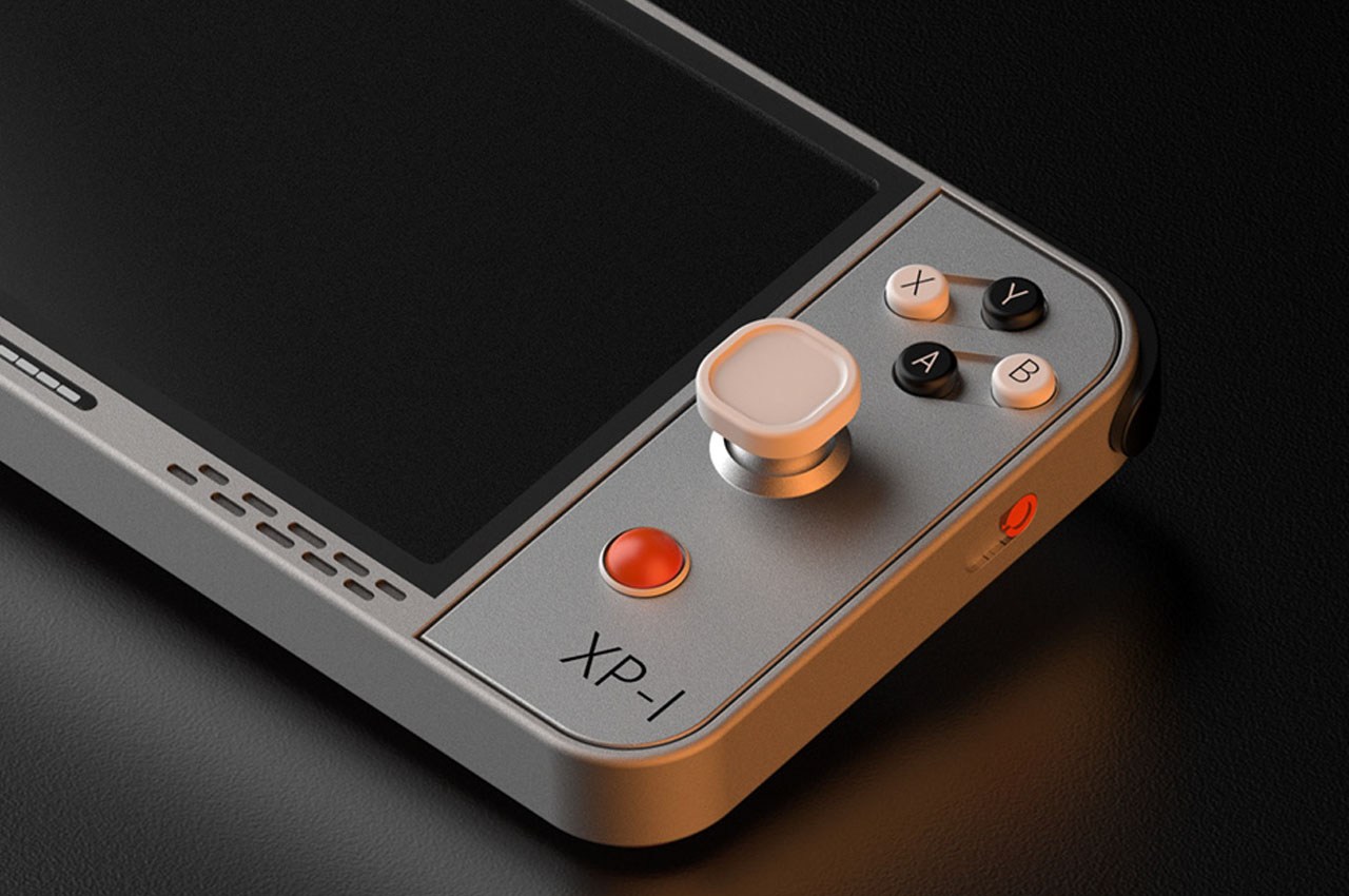
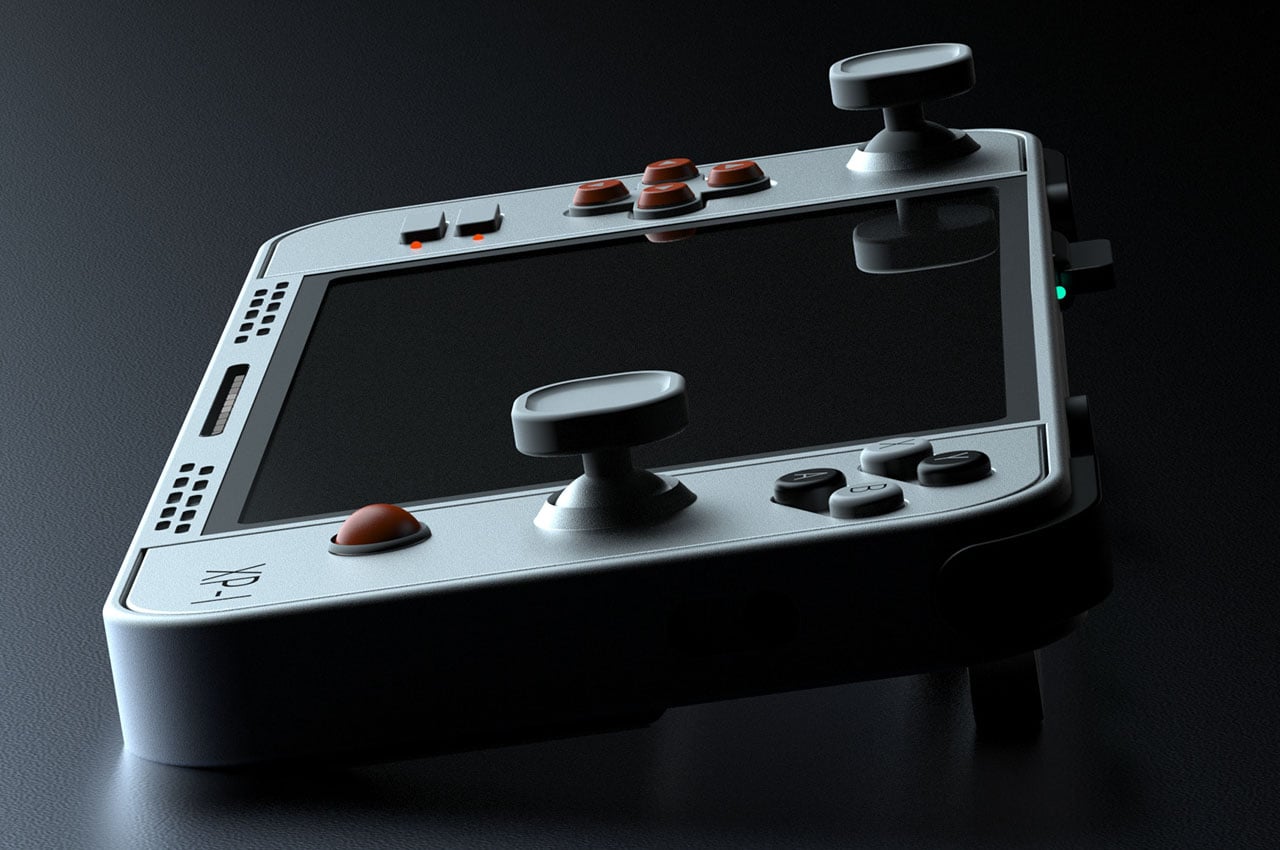
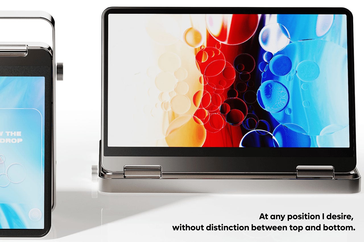
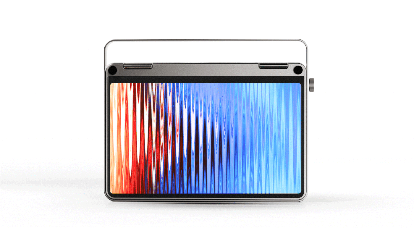
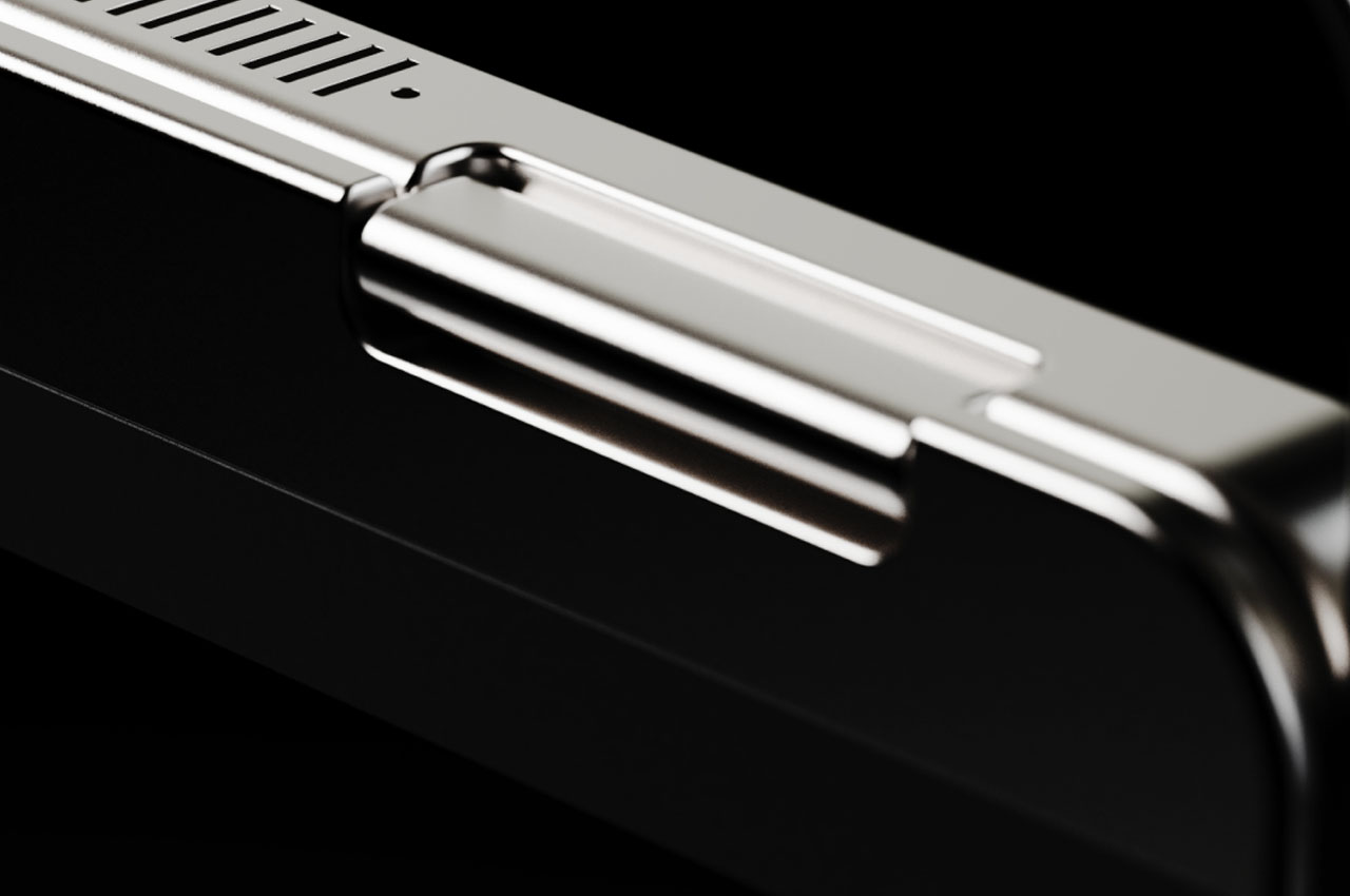
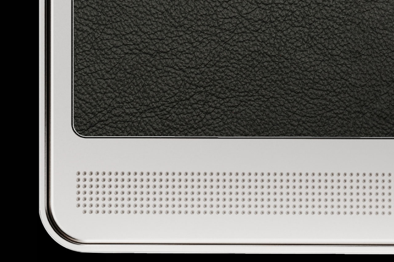
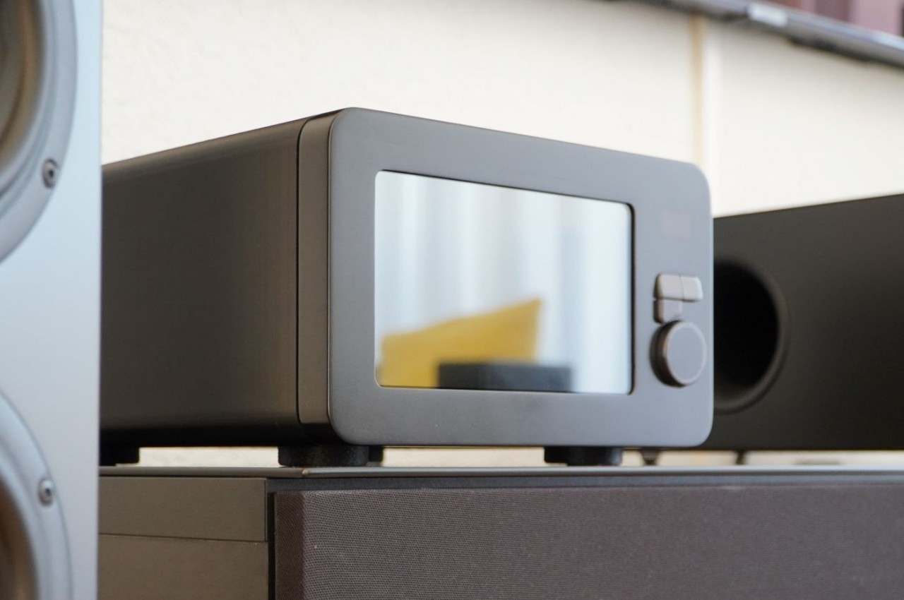
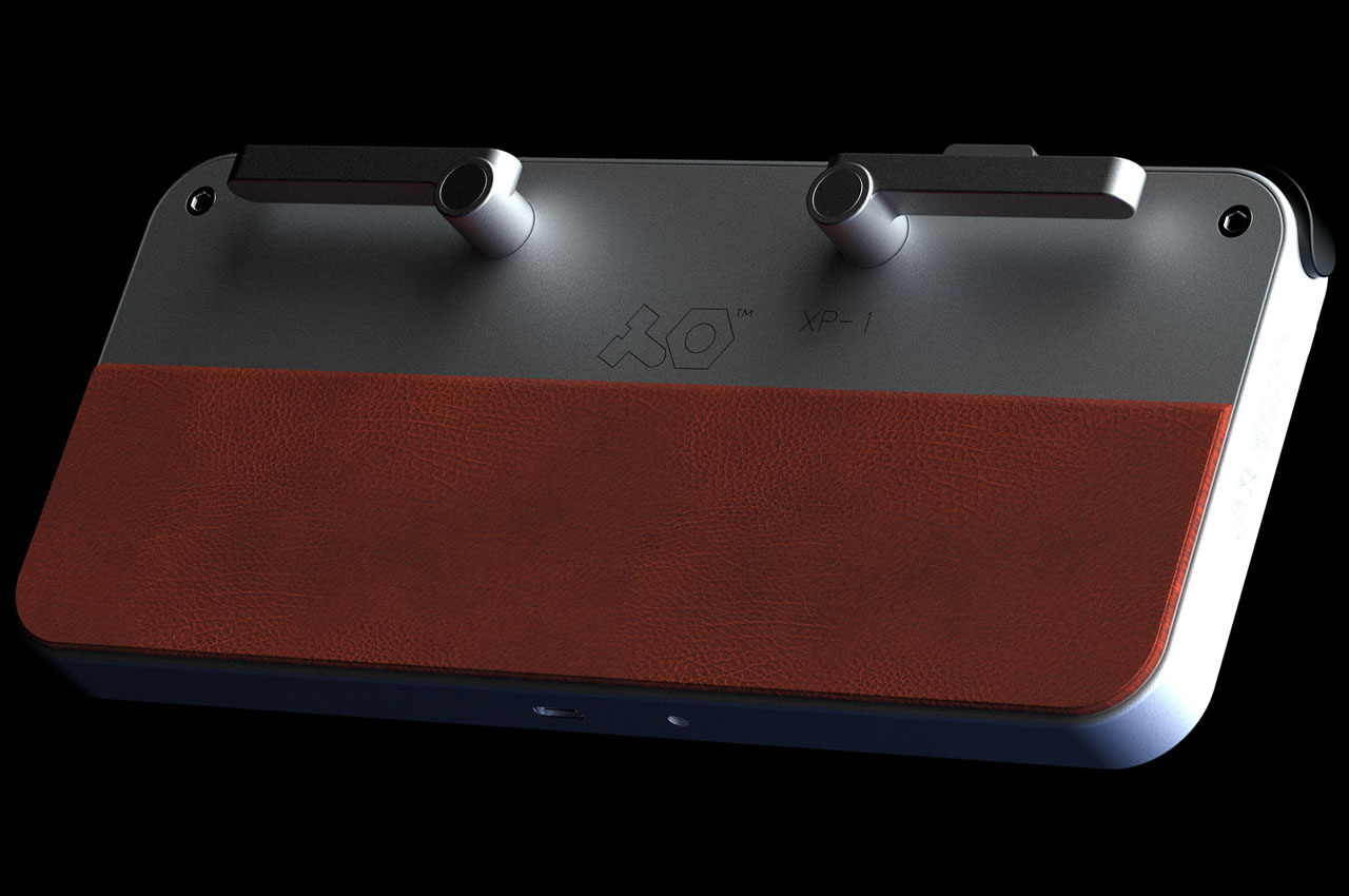 The rear bottom of the handheld has leather padding for comfortable holding during long gaming sessions. The body shell is done in a titanium grey finish contrasted with the signature Teenage Engineering color scheme in orange, black and white. I personally like this one better compared to the earlier concept. Which one do you fancy more to one day join the TE line-up?
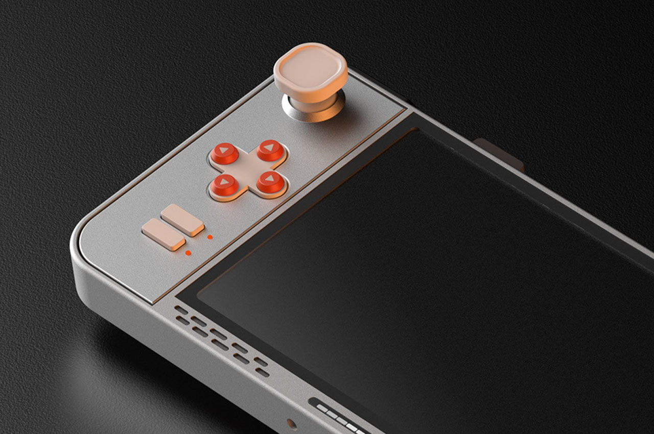
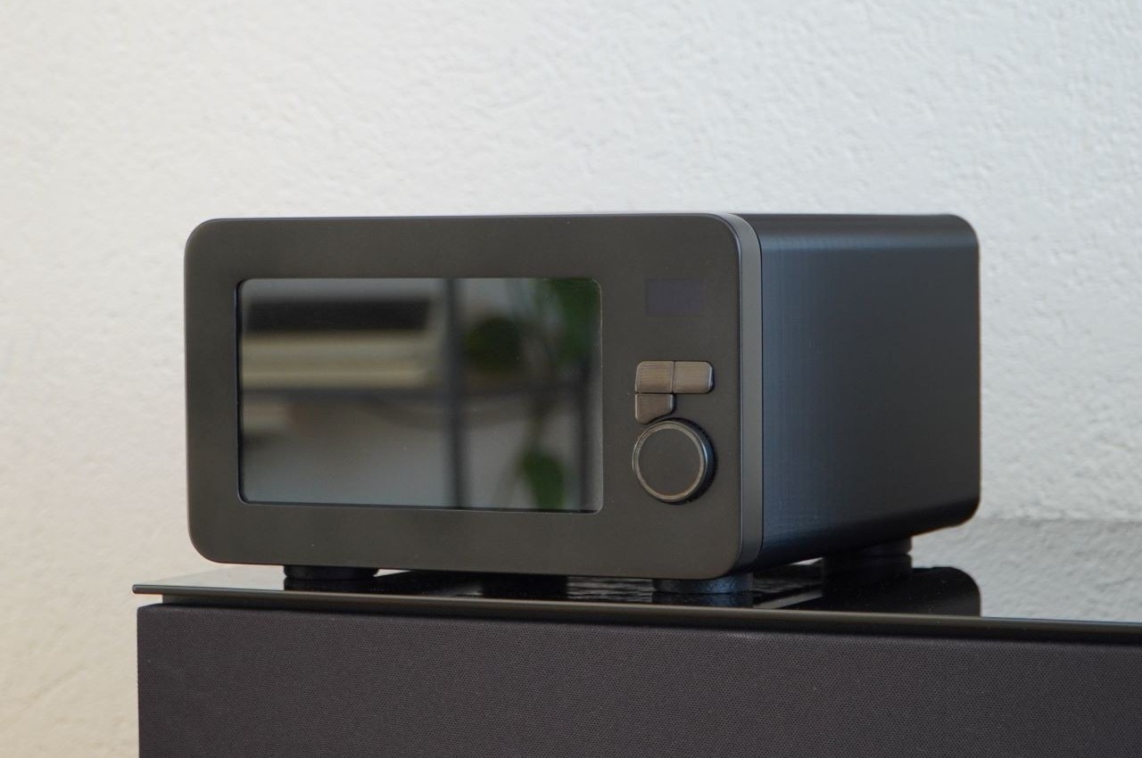
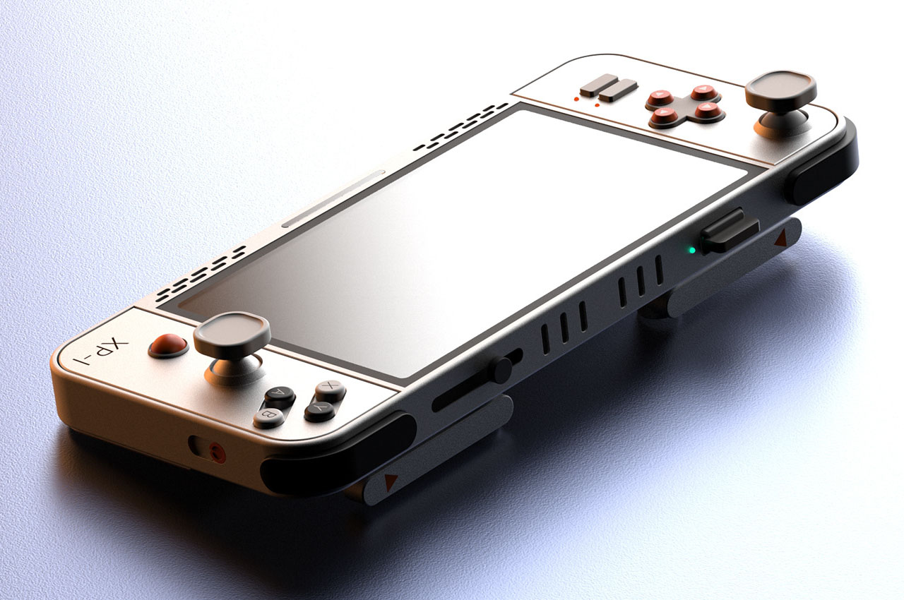