Caviar’s bejeweled iPhone 14 Pro comes with a $133K price tag and an actual Rolex stuck on the back

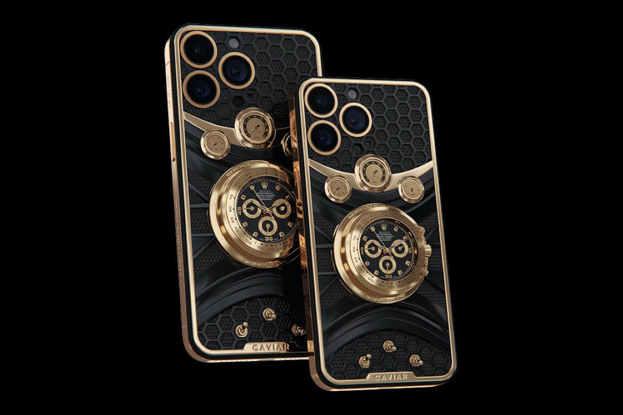
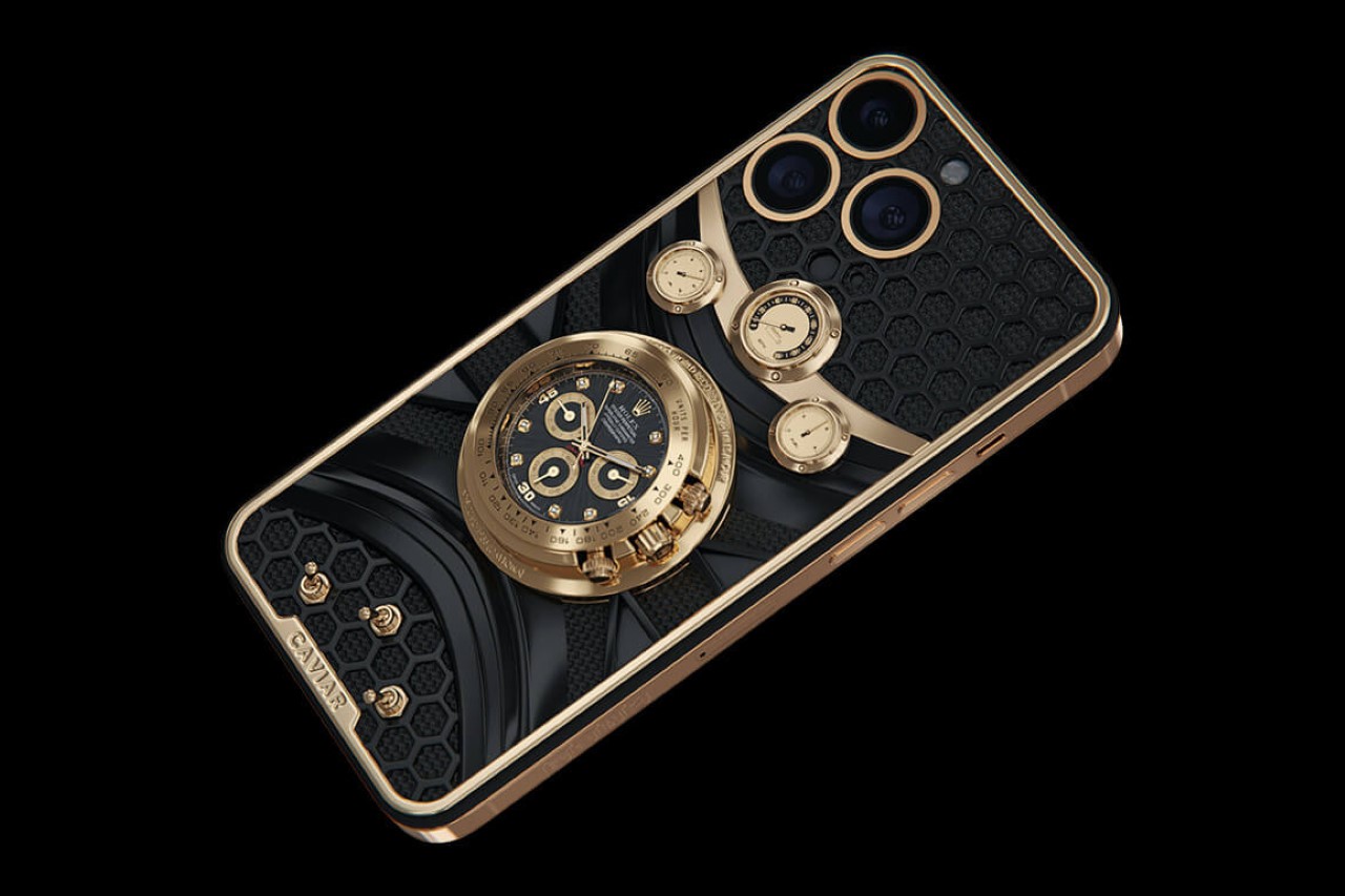
Forget the Dynamic Island on the front… check out the Rolex Island on the back.

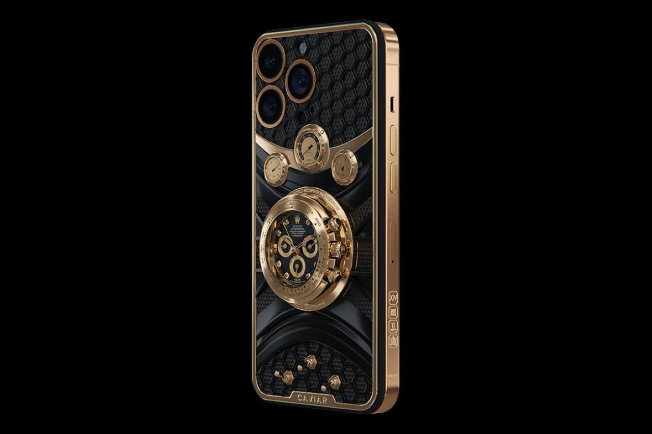
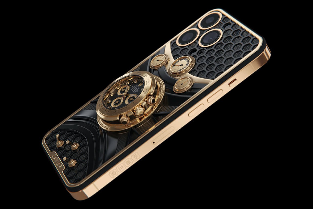
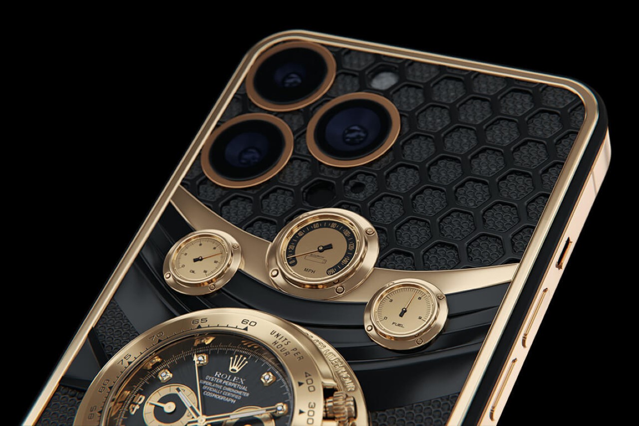
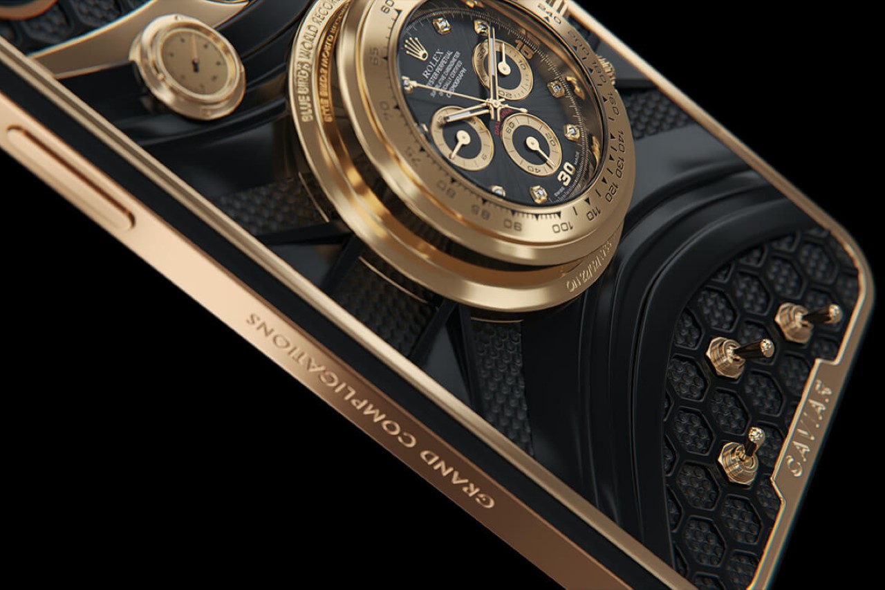
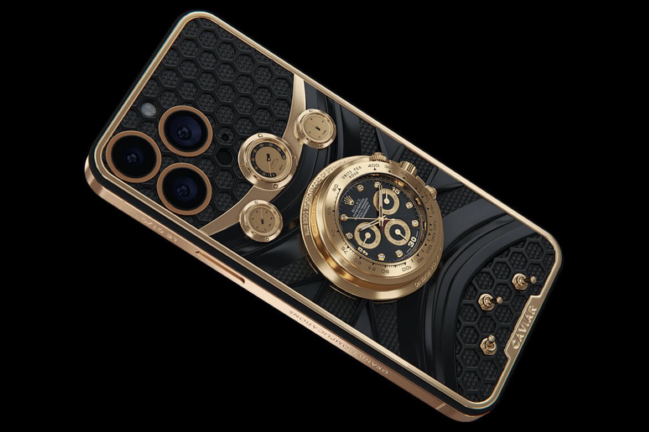
There’s a fine line between a good Medium Rare steak and a steak that’s pushed just over the edge into Rare/Well-Done territory. I’d argue Caviar’s Rolex Daytona iPhone 14 Pro sits rather firmly on the latter end of the spectrum. Designed to clearly be showcased on tabletops (because there’s no way this could comfortably fit into most pockets), the latest custom iPhone from Caviar comes with a massive Rolex Daytona timepiece stuck to its back, making the smartphone’s camera bump look like the sleekest design detail ever. The Rolex Daytona (functional, might I add) isn’t the only detail on the back of the iPhone – clearly doubling down on the racing-inspired theme, the phone also comes with decorative dashboard dials modeled to look like a speedometer and oil + fuel indicators, and actual functional flip switches, all crafted from 18K gold. The Rolex and gold details sit on a bespoke titanium case that wraps around the iPhone, with a black PVD finish and gold accents that match the ones on the Rolex Daytona timepiece. Is it elegant? I’ll leave that to you, the beholder, to decide. Is it ridiculously opulent? Well, given that the Caviar Daytona starts at $133,670, I’d probably say yes.

Designer: Caviar

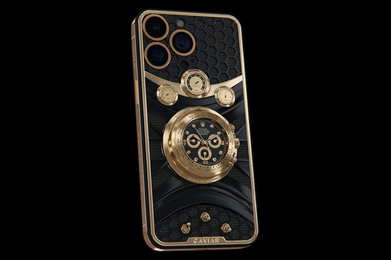
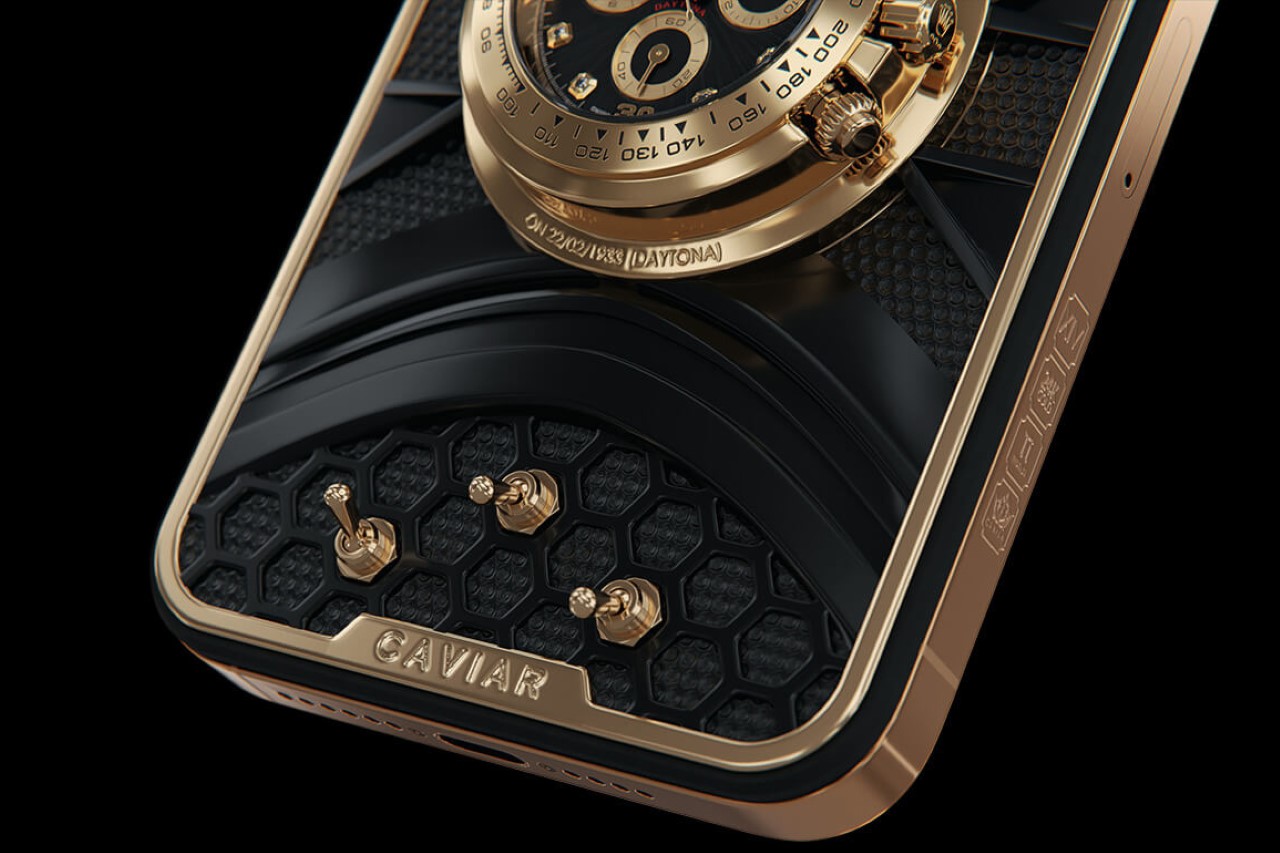
This work of art (?) takes inspiration from Malcolm Campbell, professional racer and the first ambassador of Rolex’s Daytona series. The watch’s visuals pay homage to Campbell and his Blue Bird car, which broke the land speed record in 1928. The back of the Caviar Daytona is an artistic twist on the Blue Bird’s dashboard, showcasing the Rolex Daytona timepiece front and center. On the top, you’ve got artistic sub-dials representing the three main dials seen on a car’s dashboard, and below are 3 flip-switches that can be fidgeted with, but don’t actually do anything. The watch sits there in its entirety, sans the straps, and can be controlled/adjusted using the crown and buttons on the side.

There’s no wonder this limited-edition smartphone costs as much as it does. Sure, Caviar’s entire schtick is to make luxury phones, but the Daytona pushes the limits with 18K gold detailing (including the smartphone’s frame) covered with jewelry-grade enamel. The back panel of the phone uses PVD-coated titanium, arguably giving the iPhone a more happening rear than the front. Although with all those bells and whistles crammed onto the back of the phone, don’t expect it to be able to rest it rear-side-down on any table or flat surface.

As remarkable as the phone is to look at, the Caviar Daytona isn’t designed to be used and carried like your everyday smartphone. That side profile is chaotic at best, and will not easily slip into pockets or handbags. You can forget about cases or even MagSafe chargers/accessories, considering the Rolex Daytona timepiece sits exactly above the wireless charging coil and magnetic ring.

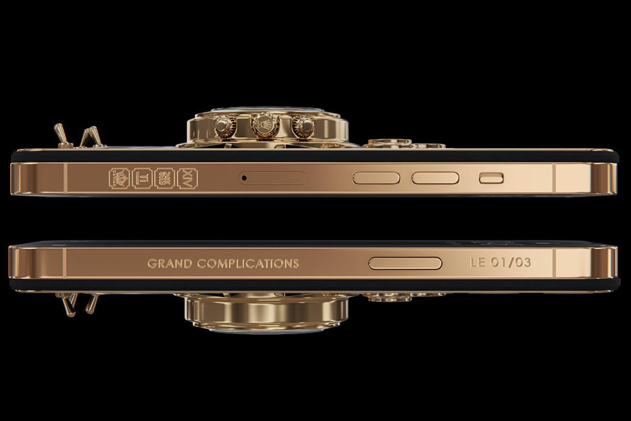
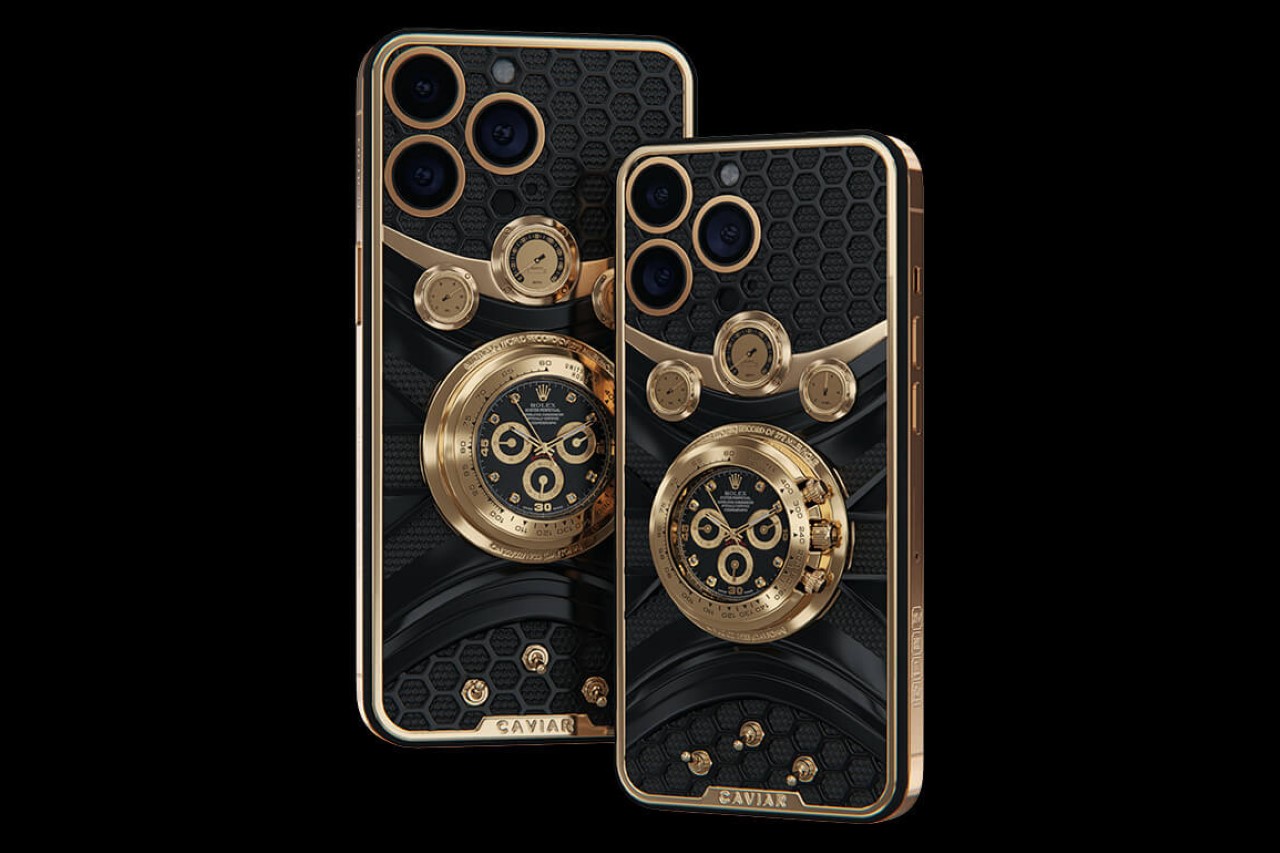
This Frankenstein-mashup of phone and watch from Caviar is limited to just 3 units per variant. There are a total of 8 variants to choose from – 4 storage tiers for the 14 Pro and 14 Pro Max respectively. The starting price for this limited-edition series begins at $133,670, going up to a whopping $135,420 for the highest tier.

The post Caviar’s bejeweled iPhone 14 Pro comes with a $133K price tag and an actual Rolex stuck on the back first appeared on Yanko Design.

Twelve South’s iPhone 14 Pro case + wallet disguises your smartphone as a vintage hardbound book!

Created as the latest edition in Twelve South’s Book Book series, this variant for the iPhone 14 Pro comes with a rather quirky-looking hardbound book design, complete with a detailed spine, a built-in wallet with space for cash and 4 cards, and a magnetic docking system that lets you detach your iPhone when you want, so you’re not stuck with a relatively bulky-looking book all the time! It’s perfect for people with a sense of whimsy, and who like the idea of having a bifold-style iPhone cover with a built-in wallet. Think of it as the perfect Halloween costume for your iPhone 14 Pro…

Designer: Twelve South

Click Here to Buy Now

The Book Book for the iPhone 14 Pro isn’t for everyone… but if spotted on a table, I guarantee people will want to have a second and third look. Designed to look almost like a tiny pocket-Bible, the Book Book has this wonderful vintage hardbound finish with metallic text and motifs, and even distressed leather that makes the ‘book’ look old and weathered. However, underneath its antiquated exterior lies Apple’s most cutting-edge iPhone yet.

The Book Book doubles as an iPhone cover-case as well as a wallet, giving you all your essentials in the palm of your hand. Unlike the MagSafe wallet which holds a mere 2 cards, the Book Book holds 4 as well as a few banknotes. The cards and cash stay hidden from view, and can be accessed whenever needed. Moreover, just the idea of having your iPhone disguised as an old book ensures that it’s less likely to be flicked while kept on the table.

Although a little clunky to look at and hold, the Book Book comes with a detachable design that lets you ‘unplug’ your iPhone when you need to take calls, tap for Apple Pay, or when you just want to use your phone without all that excess weight. Using a magnetic fixture, you can snap the iPhone on the case and pull it off on command, giving you an experience that lets you rightfully choose between ‘feature-laden’ and slick. Don’t want to carry all those cards with you? Just pop the iPhone off and carry it independently. The Book Book comes with its own sleek iPhone case that will still protect your smartphone from accidental drops and scratches. Rather neat, eh?

The Book Book for iPhone 14 Pro comes in two styles – a black hardbound, and a tan/brown hardbound. Both styles come with different artwork on the spine, giving them their own distinct flavor. The ‘books’ are both made from premium leather, with suede interiors to protect your phone from scratches and scuffs. The case for the iPhone is MagSafe compatible, allowing you to charge your iPhone simply by popping it out of the Book Book leather cover and snapping a MagSafe charger on the back. When you’re done charging, the case snaps back into the Book Book, completing the experience and giving you your phone and wallet all in one convenient place. The Book Book by Twelve South is available for the iPhone 14 and 14 Plus, as well as the 14 Pro Max.

Click Here to Buy Now

The post Twelve South’s iPhone 14 Pro case + wallet disguises your smartphone as a vintage hardbound book! first appeared on Yanko Design.

Apple spent 3 full minutes talking about THIS feature on the new iPhone 14 Pro…

Dubbed the ‘Dynamic Island’, this new hardware feature has some incredible UI/UX potential. With the notch gone, Apple has arrived at a more meaningful ‘pill-shaped’ camera cutout called the Dynamic Island… and it isn’t just a camera cutout, it’s an interactive part of the OS, offering a unique way to experience notifications, multitasking, and background apps. The notch walked, so the Dynamic Island could run.

Of the 22 minutes devoted to the iPhone 14 Pro, VP of Human Interface Design Alan Dye spent 3 full minutes just talking about the pill, or what the company likes to officially call the ‘Dynamic Island’. For reference, that’s more time than they spent talking about their new A16 Bionic chip (which clocked in at around 2 and a half minutes). Heck, the Dynamic Island even got its own separate video on Apple’s YouTube page, showing exactly how important it is for the company and how integral it is to the iPhone’s experience moving forward.

For years, phone companies have tried to hide their notches and camera hole punches using clever tricks and illusions. Apple itself stands conveniently guilty of using dark stock wallpapers to make the notch disappear on phone adverts, and Android companies even designed wallpapers that rather cunningly camouflaged the hole punch camera cutout. I don’t think there’s anyone who thinks that the pill is a step back from the notch. Pretty much everyone agrees that the Dynamic Island is progress – to what degree is something that’s debatable.

There are two schools of thought regarding the island and its dynamism. There’s one group of people who think it’s Apple making the best of a bad situation, and then there’s the other group that I’m a strong, vocal member of – that instead of ignoring or hiding behind the cutout, Apple’s found a way to celebrate it in a manner that feels refreshing and truly inspired. The Dynamic Island isn’t just a front-facing camera cutout anymore. It isn’t an area that resembles the lack of a display. It’s its own interaction element that forms the practical backbone of the OS. Apple’s basically created a new button. A button that serves as a dynamic notification bar, as a means to access and view important information, switch between active apps, and multitask seamlessly. It almost seems like a secondary feature that this button also clicks selfies and scans your face to unlock your phone. The name ‘Dynamic Island’ is incredibly corny (even Marques Brownlee thinks so), but heck, it describes the pill’s shape and purpose perfectly. Apple has a strong ethos of doing something brilliantly or not doing it at all – it’s why they still haven’t made a calculator app for the iPad, and why they waited four long years to ditch the notch. In parlance that youngsters would understand, it’s either a hell yes, or a hell no.

The Dynamic Island relies on the iPhone 14’s OLED screen, which has the ability to switch off individual pixels, causing them to turn pitch black. This is what drives the island’s shapeshifting effect, causing it to magically expand and contract in different ways and forms. The execution, at least from what Apple showed us, is flawless. The island stores background apps, giving you hints of context regarding information that may be important – like the music you’re listening to, charging stats, how far your Lyft is, and whether your phone’s on silent. Unlike with the MacBook Air’s new notch that sometimes ends up obscuring menu buttons and bits of text, Apple’s presentation of the Dynamic Island perfectly hides the cameras and sensors in plain sight. Digital elements don’t get blocked out by the camera, which means you don’t even notice the camera is there. The Dynamic Island is an evolved version of Apple’s iconic home button – but placed on top.

That being said, there’s one small problem with the Dynamic Island. No, it isn’t the fact that it still overlaps on top of videos on YouTube. It’s, in fact, the island’s placement. Located right at the top of your phone’s screen, the island is difficult to reach with your thumb. Quite like Apple’s unfortunately placed ‘back’ button, users with average-sized hands will have a degree of difficulty tapping on notifications and accessing other apps in single-hand usage. Given that this zone is now the de-facto hotspot for all app-related activity, the island is easy to view, but will require your non-phone-holding hand during interaction. Is that a deal-breaker, though? Not even close. Apple’s managed to pull off something remarkable here, and one could argue that it’ll probably set the standard for other phones moving forward, because the pill absolutely has everyone talking… talking for more than just 3 minutes!

The post Apple spent 3 full minutes talking about THIS feature on the new iPhone 14 Pro… first appeared on Yanko Design.