Eslam Mohamed is a graphic designer whose collection of work has piqued my interest and quite honestly captivated me! He creates 3D renders of conceptual stores and booths of famous brands. But these aren’t ordinary store models, these little concepts draw major inspiration from the product range, soul and essence of the brand itself! For example, he modelled a Starbucks booth after the quintessential Starbucks cup! He even created a McDonald’s booth shaped after a soft-serve cone. Each of his designs is innovative, intriguing and exciting! If they ever manage to become a reality, I’m sure they would become a worldwide wonder! Let’s cross our fingers and hope for the best.
Designer: Eslam Mohamed
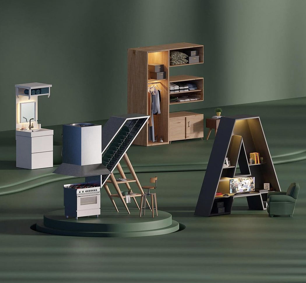
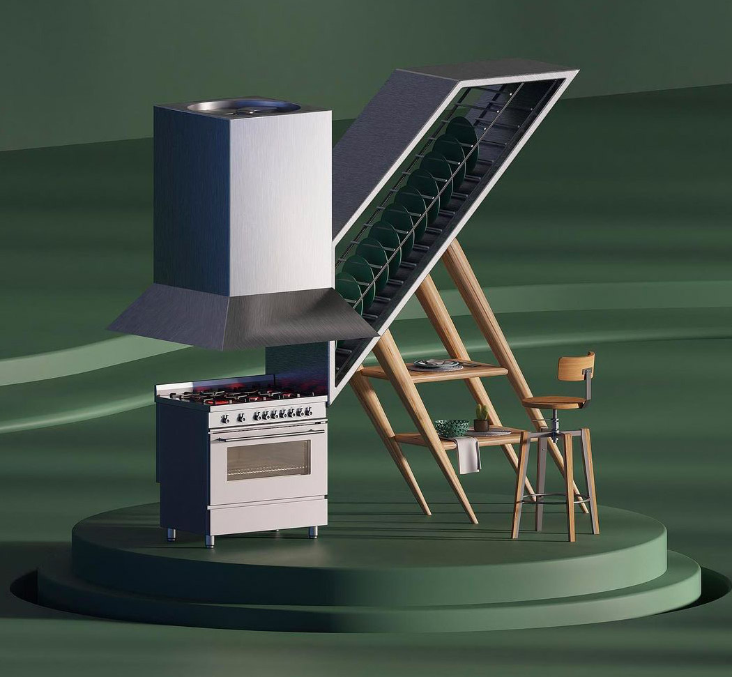
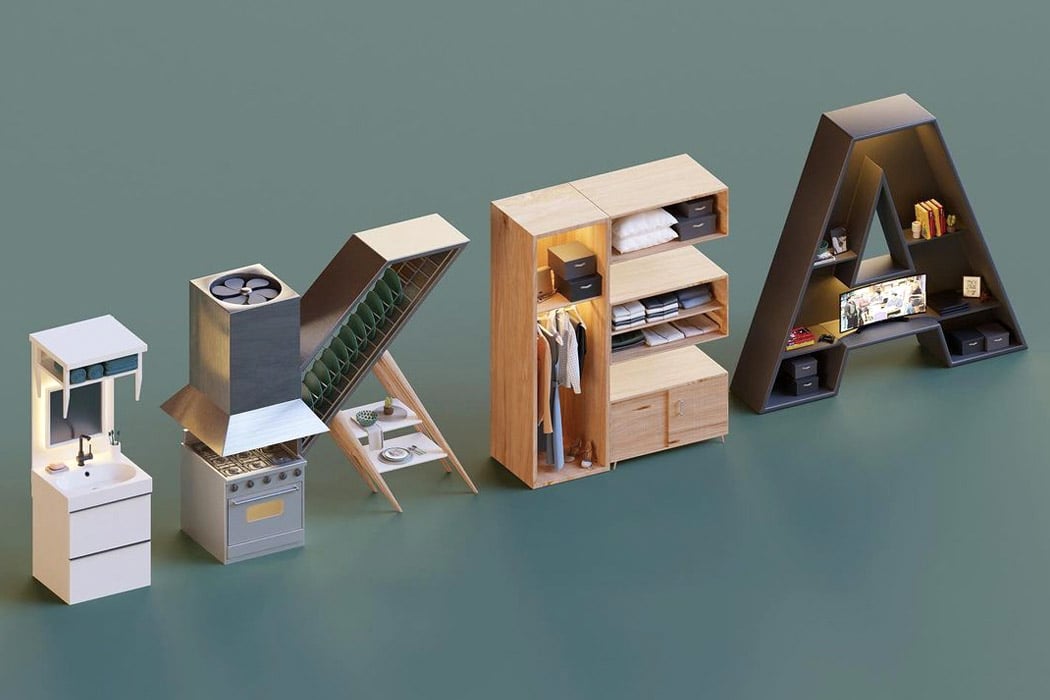
This IKEA logo is by far Eslam’s most popular work! The smartly created logo has been modelled to display what the brand sells or does in reality! Each of the letters have been modelled after a piece of home furniture or appliance. The I represents a bathroom counter or sink. The K is a combination of a kitchen stove, exhaust, shelving unit, and dinner table! The E is a bedroom wardrobe, whereas the A is a shelving unit for the living room with space for a TV, books, and other knick-knacks! This piece of work is my personal favourite.
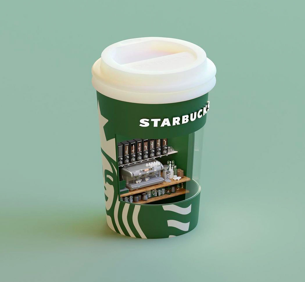
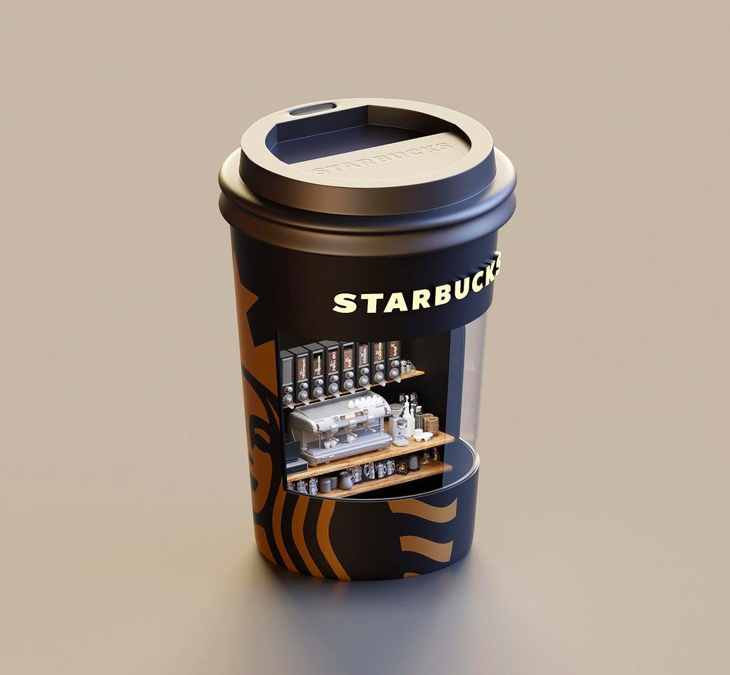
This little Starbucks booth has been modelled after the Starbucks cup! You can spot the mini coffee machine and the coffee cups within the booth. Eslam designed the booth in two colour schemes – one in the quintessential green and white Starbucks theme, and the other one in a darker sultrier coffee shade!
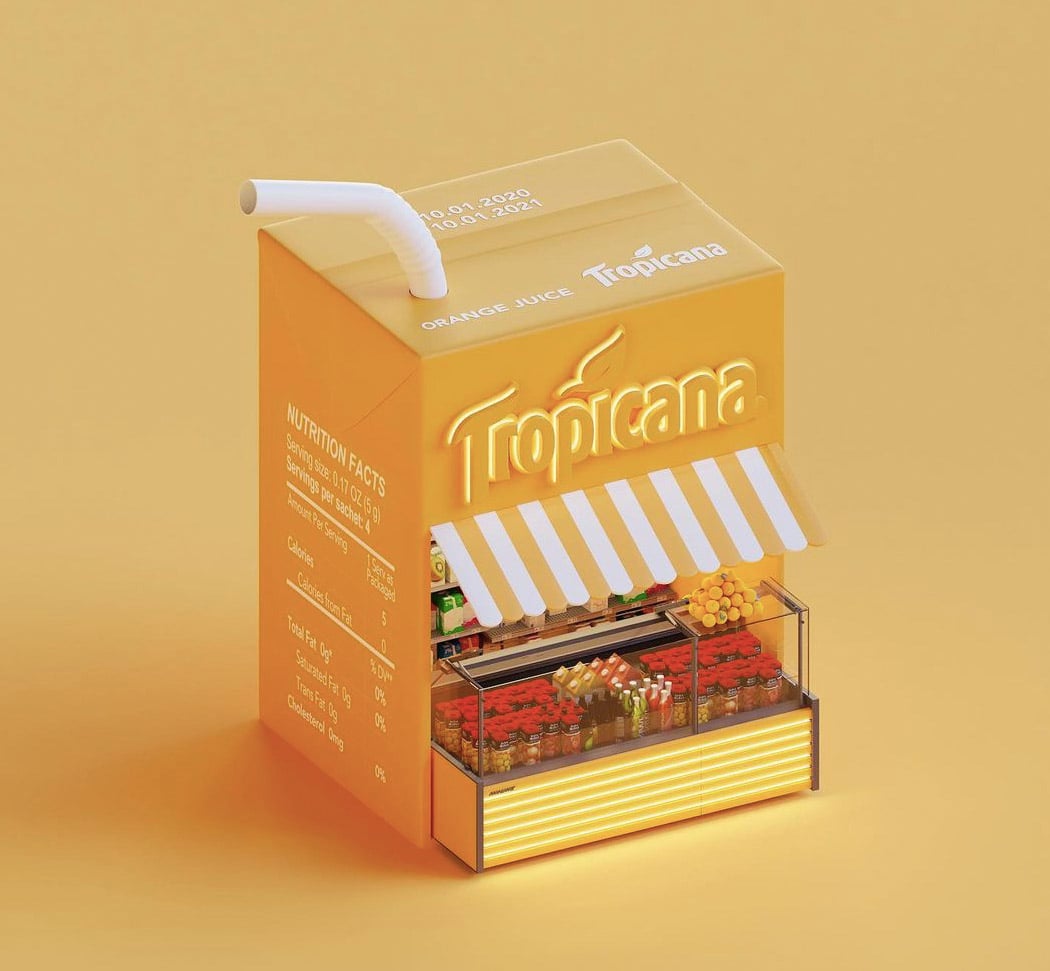
I spent the majority of my childhood sipping on Tropicana’s mixed fruit juice! Those cute little juice boxes have been an integral part of our childhood. And Eslam created a Tropicana booth shaped after the tiny tetra packs we sipped our juices from. Don’t forget to notice the nutrition facts printed on the side of the mini store!
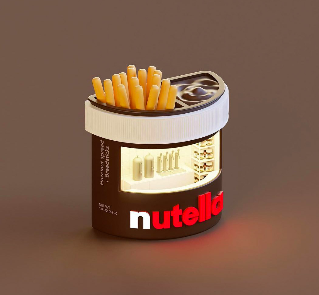
Nutella & Go! is probably one of my all-time favourite snacks! Malted breadsticks dipped in a yummy hazelnut spread? Sounds like heaven to me. And I guess Eslam had the same sentiments because he created a mini Nutella store shaped after a Nutella & Go! box. Imagine dashing off to the nearest Nutella store to grab a jar of your favourite spread? How convenient!
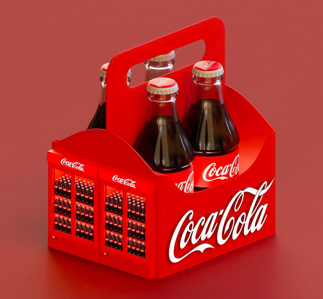
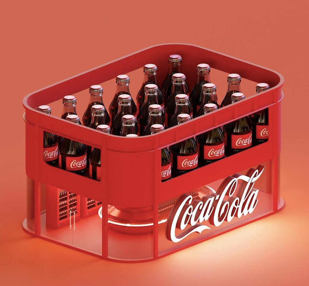
Eslam also designed two Coke stores modelled after two different types of crates used to store and carry Coke. The first one is more of a vending machine style booth, whereas the second one is a proper walk-in store. How excited are the Coca-Cola lovers after seeing these renders?!
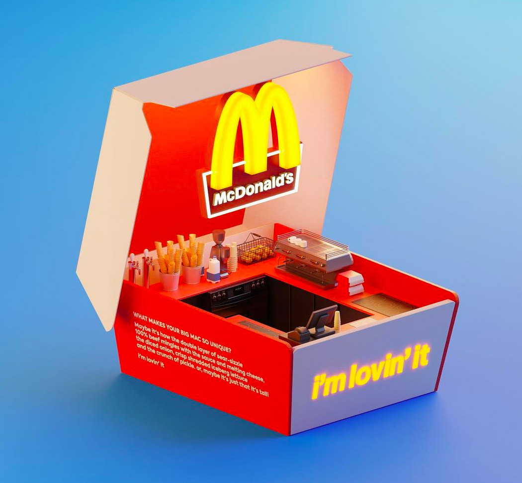
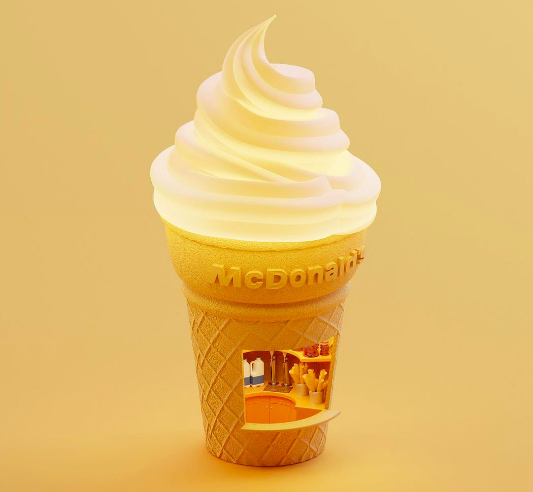
Of course, McDonald’s had to be a part of Eslam’s collection! It is everyone’s favourite fast-food chain. He created two options for a McDonald’s booth. One is shaped after the box in which McDonald’s serves its burgers and the second is shaped after a soft-serve ice cream cone!
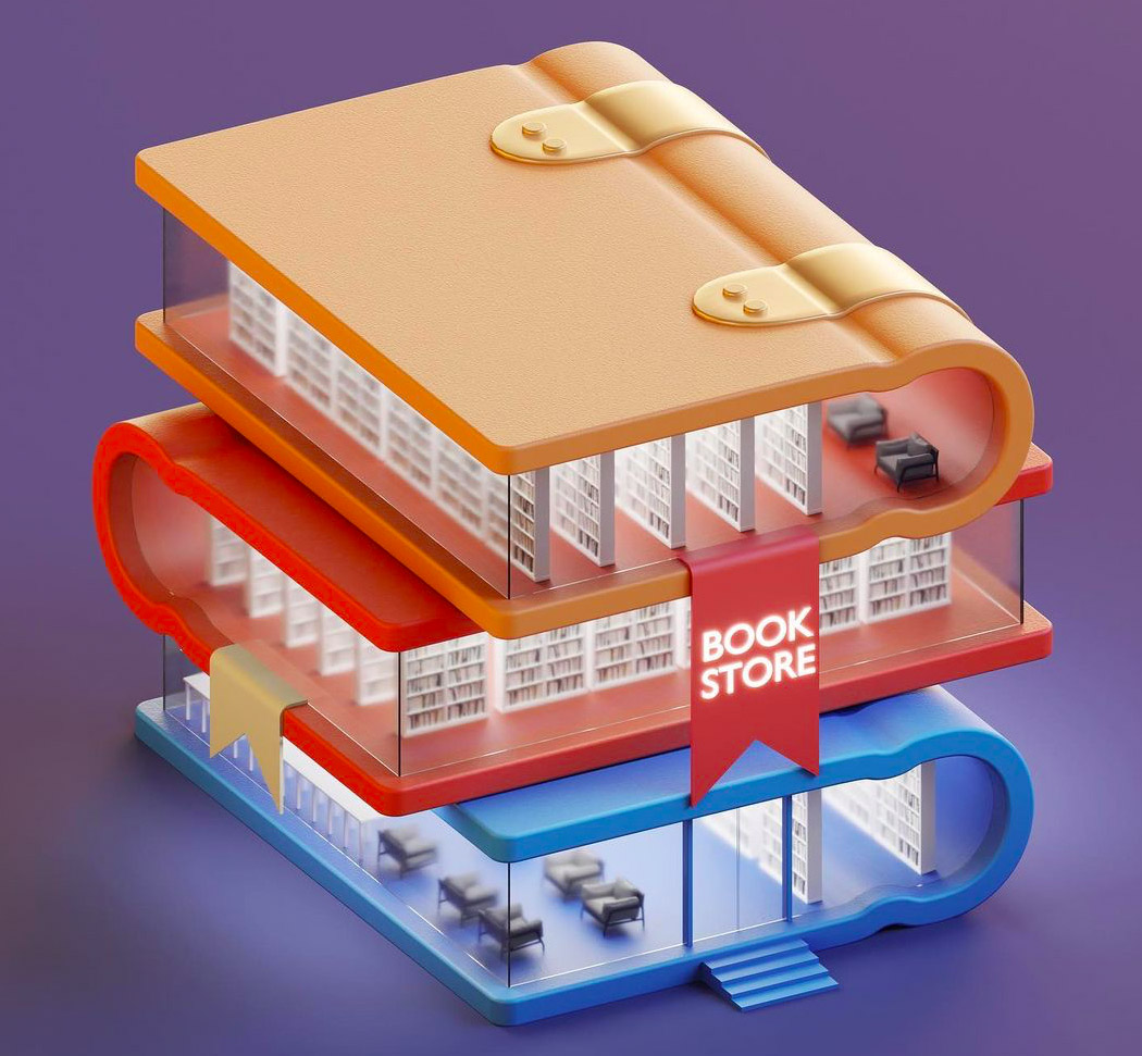
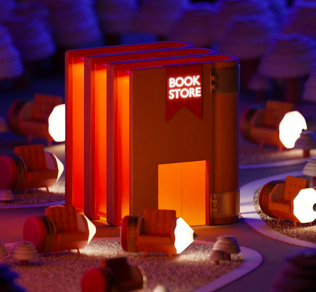
These book store designs are something I would love to see in reality! Modelled after piles of books placed horizontally and vertically, these stores are a dream come true for all book lovers. Peep the little pencil sofa lamps in the second model!
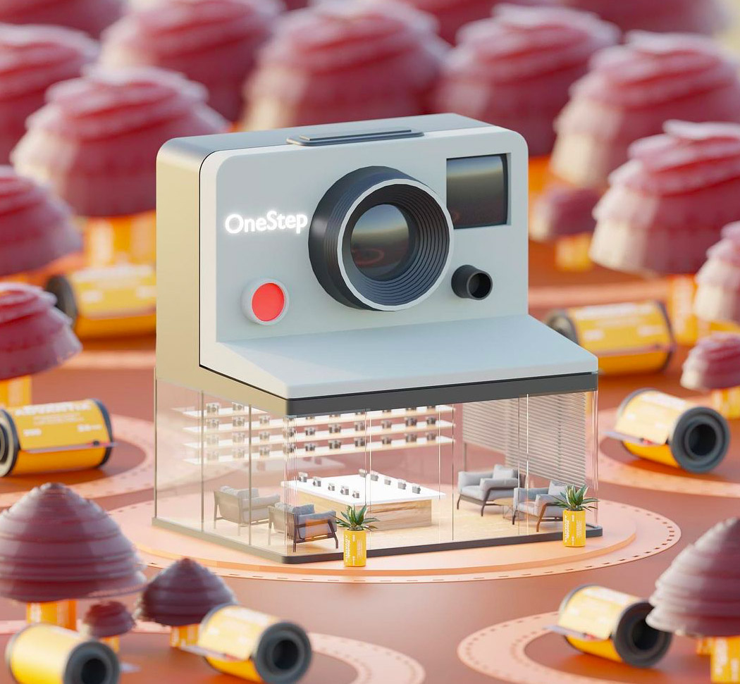
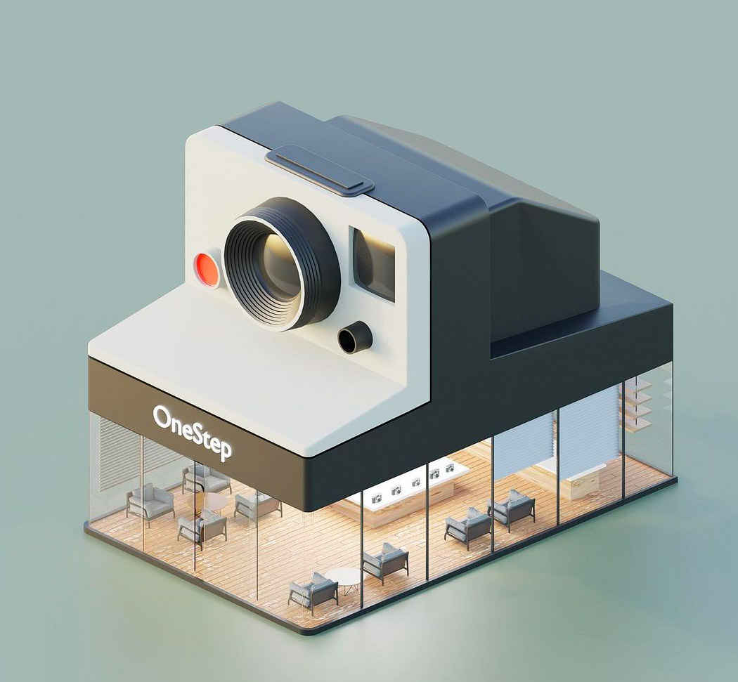
This conceptual camera store is so innovative and unique! The roof of the store has been shaped after a camera. The transparent floor-to-ceiling windows let you glimpse into the store. Did the little camera reels placed around the store catch your attention as well?
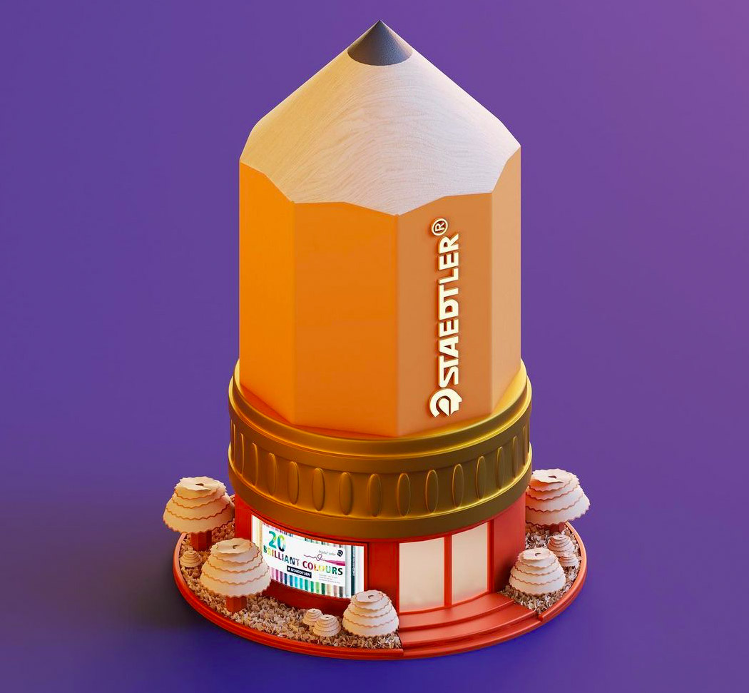
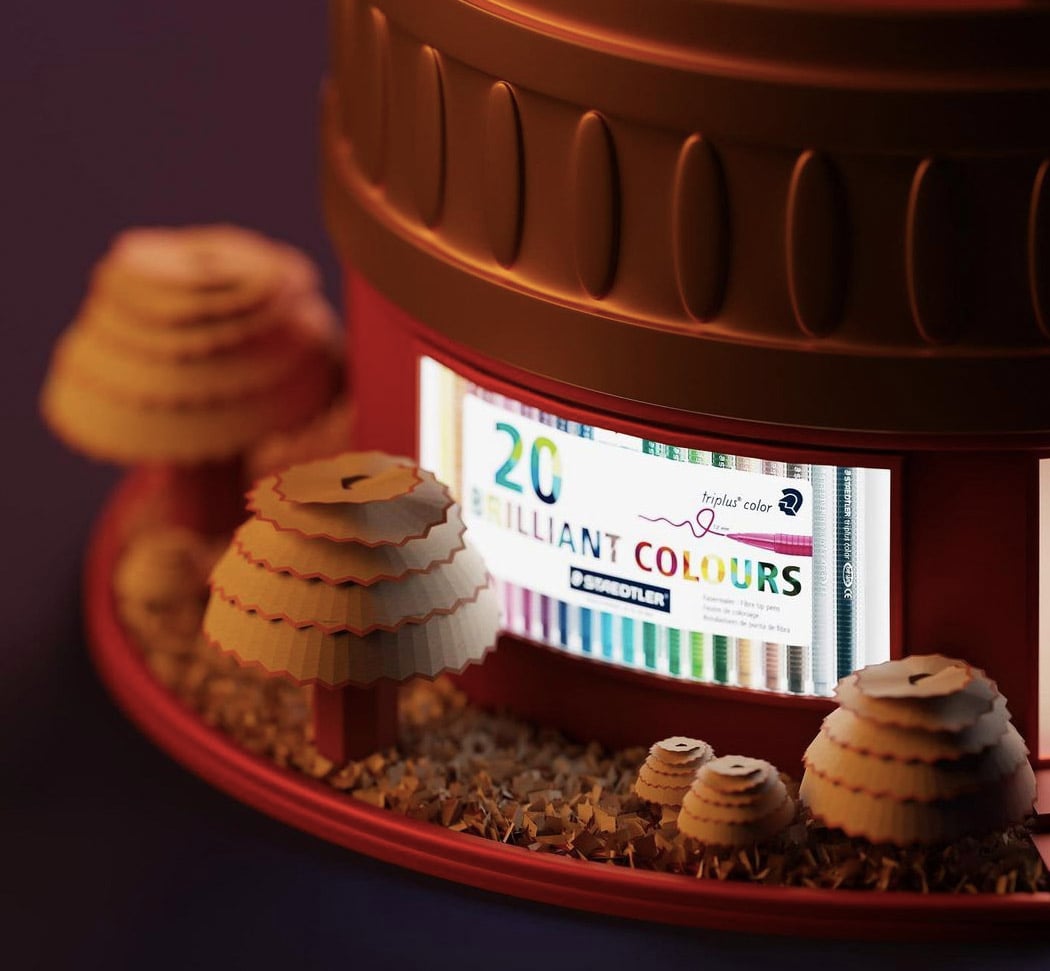
This Staedtler stationery shop has been modelled after the iconic Staedtler pencil! I love stationery, and wouldn’t mind visiting a stationery store like this from time to time. He’s even incorporated pencil shavings in the render by creating mini trees from them!
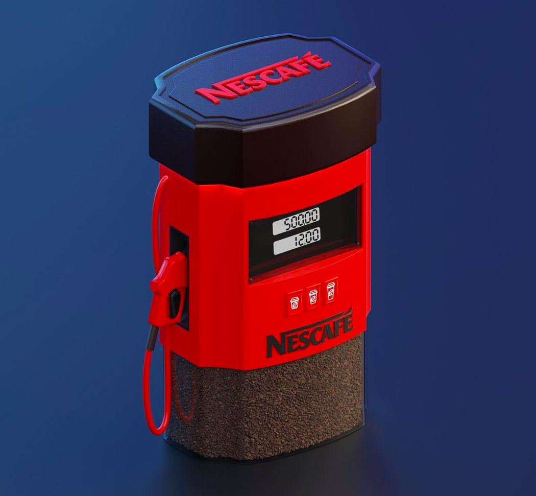
This Nestle coffee pump could be the future! Imagine driving up to one of these, and grabbing a cup of coffee, the same way you would drive to a petrol pump to fuel up your car.
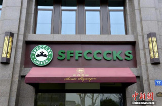
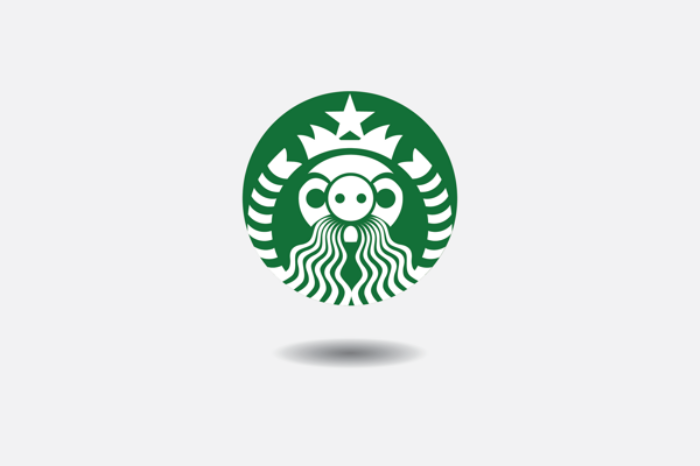
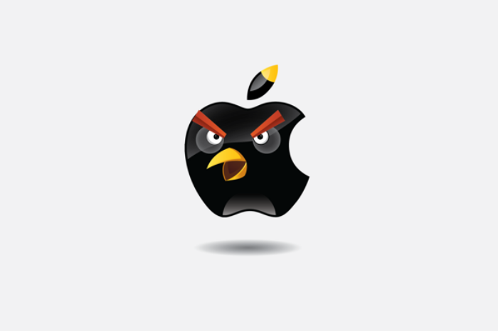
 A digital studio called Hello Velocity has created a typeface that embraces well-known corporate logos and is still somehow far less annoying than Comic Sans. The studio says it creates "thought-provoking internet experiences," and its Brand New Roma...