The Diode e-Bike’s Design is Cyberpunk Minimalism at its Very Best

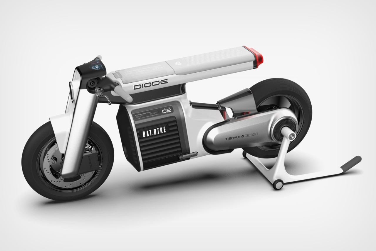
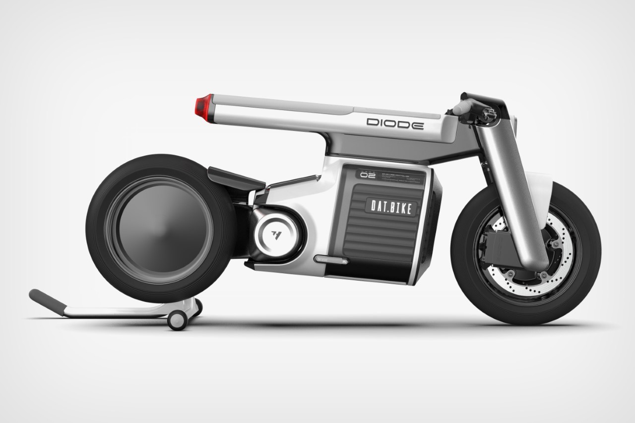
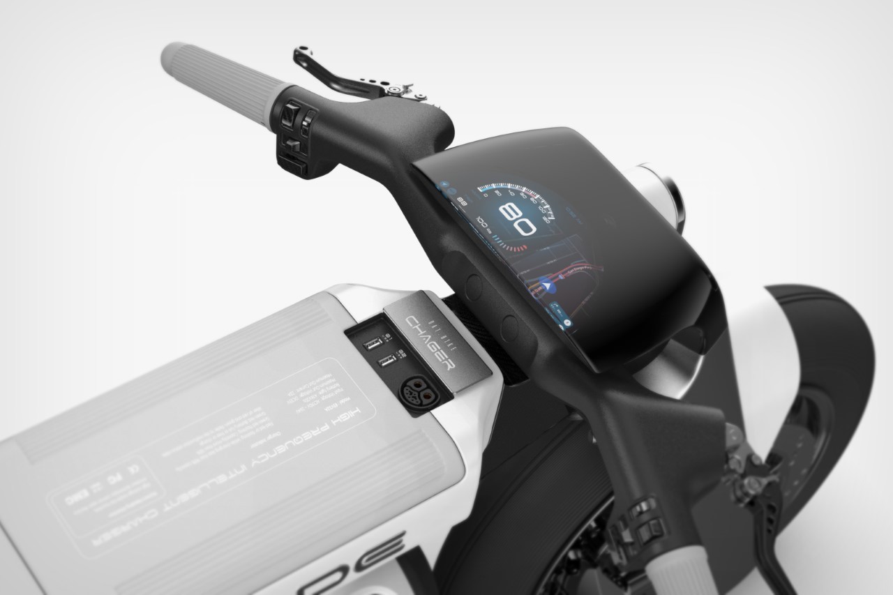
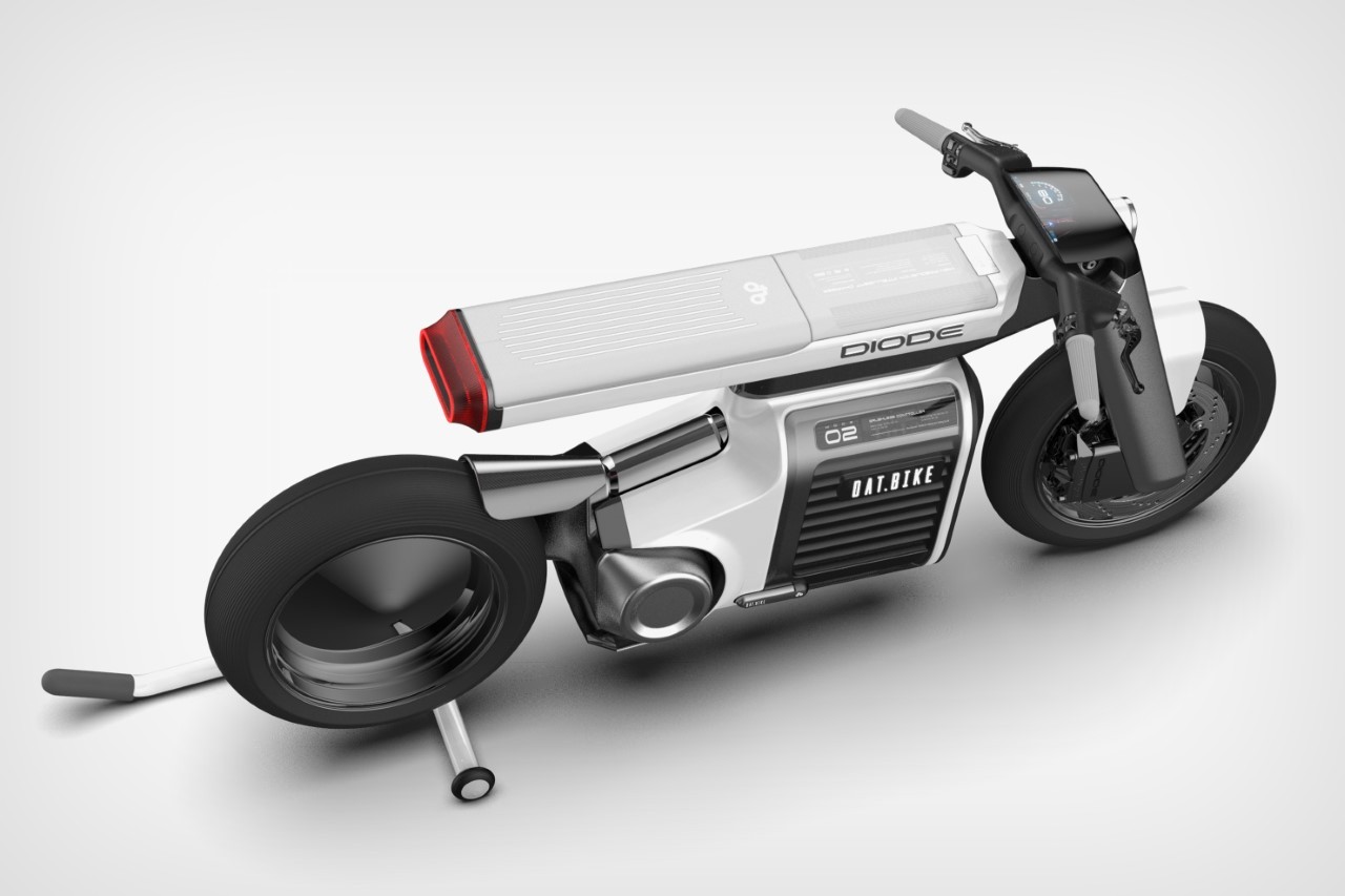
Relying on the basic building blocks of both automobiles as well as technology, Tien Hung’s Diode e-bike concept sports a neo-minimalist design that celebrates the future of the electric power train. The bike’s form is practically invisible barring one singular horizontal pillar that travels from dashboard to taillight, and the large battery module located under it. Despite its bare-basics approach, the e-bike doesn’t compromise on essentials, with a powerful rear-wheel drivetrain, a comfortable seat, USB charging points located near the bike’s charger inlet, and a digital dashboard that does everything from serving as a speedometer to even having its built-in GPS.

Designer: TienHung.Design

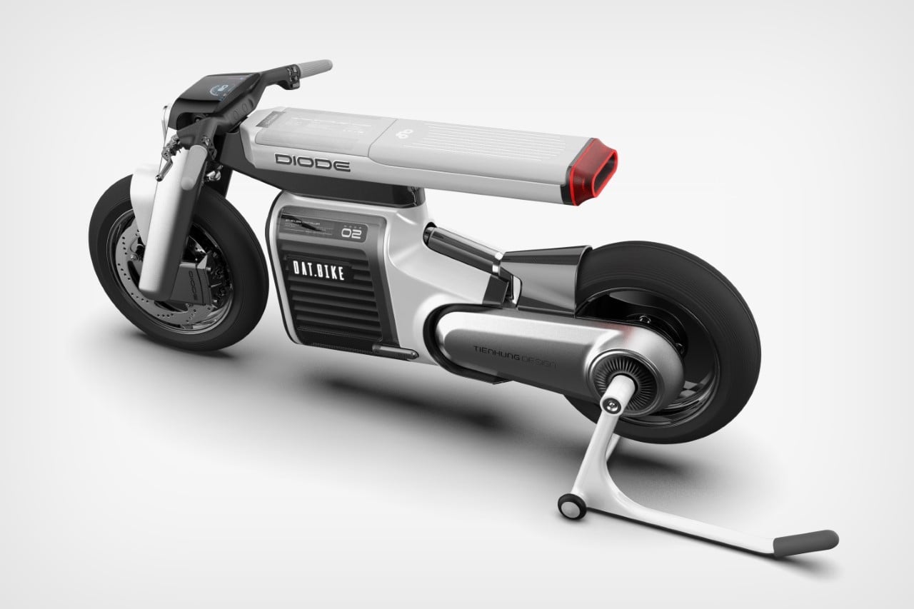
The beauty of the Diode lies in its abstraction of the conventional motorcycle shape. Most motorcycles are sculpted like horses, evoking the feeling of sitting on a saddle with a wild animal in your reigns. The fuel tank has an almost sinewy shape, resembling the torso of a stallion or bronco. All that goes out the window with the Diode, which takes a form-following-function route to design something that’s sleek. The fact that EV technology allows for cars/bikes to be more liberal with their component placements helps this further.

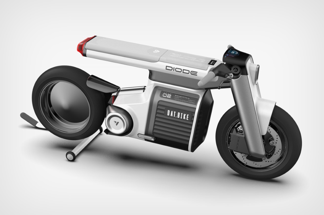
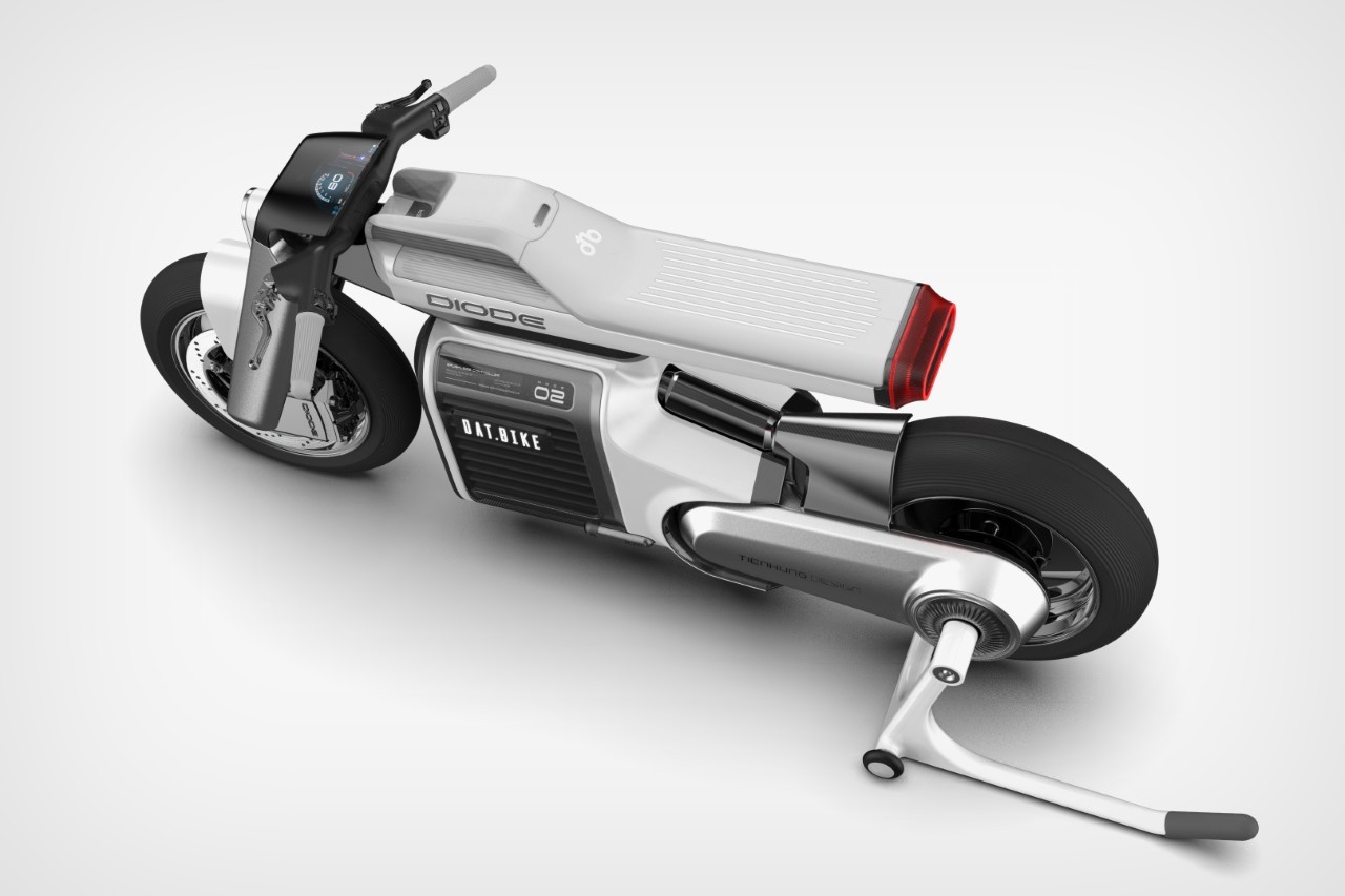
The entire e-bike’s design highlights how technological advancements have allowed two-wheelers to be more expressive with their forms. The electric powertrain means components don’t need to be arranged in a certain way. The battery sits between the riders legs, assuming whatever shape you need it to be in, while the motor sits mounted against the rear wheel, opening up the Diode’s overall design to a great degree of minimalistic expression.

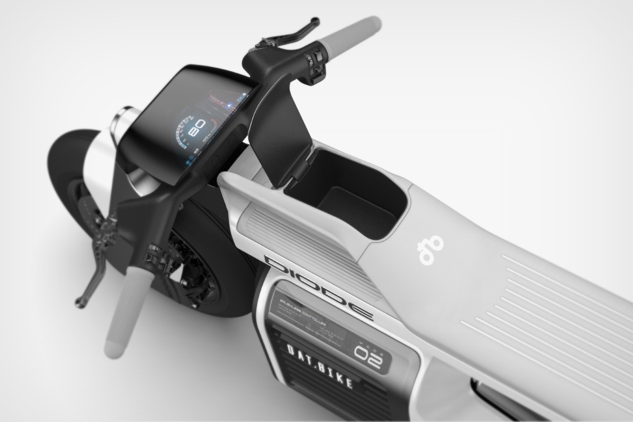
The area where a fuel tank would once be located is now an empty cavity in which you can store your phone, TWS earbuds, and wallet. Right above it is the Diode’s charging port, along with two USB-A outlets that let you juice your phone and other gadgets directly using the EV-s battery pack. The headlight and taillight are minimal yet expressive too, relying on LED strips that can be formed in any shape rather than the traditional parabolic reflector lamp seen on most cars and bikes.

Lastly, the Diode gets a neat white and black paint job with metallic accents, giving it that futuristic appeal popularized by most EVs today.

The post The Diode e-Bike’s Design is Cyberpunk Minimalism at its Very Best first appeared on Yanko Design.

This hearing aid’s sleek redesign turns the medical device into a fashion wearable

“Medical devices don’t need to feel like a burden. Glasses are cool, so why can’t hearing aids be too?”

The spectacles are a stellar example of a medically corrective device that’s successfully transitioned into being an object of haute fashion. The pandemic saw a similar treatment to N95 face masks too, but for the most part, medical devices aren’t designed to ‘look good’. They’re either designed to be invisible (like those invisible braces that keep popping up in Instagram’s ads), or have such a medical-forward design that they actually end up deterring people. Nobody likes showing off their asthma inhaler or nebulizer, and people would much rather prefer a stylish walking stick over a pair of crutches.

Hearing aids fall within that domain too, with most people agreeing that they have a design that can attract unwanted attention or sympathy, even though the people wearing them would just like to live a normal lifestyle. Designed to look modern rather than medical, the Overtone hearing aids are just about as stylish as high-fashion TWS earbuds. They sit comfortably around your ear, with a minimal design that features a small ear clip and a metallic disc that looks almost like a Neuralink implant.

Designers: Nick Morgan-Jones and Gray Dawdy (Overtone)

The Bluetooth-enabled hearing aids work to enhance your listening powers while being ‘unapologetically visible’. The individual earpieces hook to each ear, and pair with your smartphone to let you set up your hearing profile. Once configured, the Overtone earpieces let you clearly listen to sounds around you, while Bluetooth connectivity allows you to take calls or listen to music/watch videos through the earpieces themselves.

The Overtone was created by Berlin-based designers Nick Morgan-Jones and Gray Dawdy, who wanted to uplift hearing aids to a new fashion standard. “We’re building the hearing equivalent of designer eyewear,” said Morgan-Jones. To that very end, the Overtone has a design that feels minimal and universal. The transparent material and stainless steel details borrow directly from eyewear, while the overall design is made to augment your appearance by making you look like you’re from the future.

The Overtone is currently under development, with a waitlist open for people looking to buy their own pair of hearing wearables. The devices come with a 24-hr battery life on a full charge, and ship with a charging case that gives them an additional 36 hours of use.

The post This hearing aid’s sleek redesign turns the medical device into a fashion wearable first appeared on Yanko Design.

Here’s what a ‘minimalist’ Lamborghini supercar looks like… and I can’t stop staring

If you had to describe a Lamborghini car in 5 words, I assure you neither of them would be ‘minimal’. The raging-bull Italian luxury car brand is known for building some of the edgiest, most aggressive-looking cars (and even yachts) but they’re all built on the principles of creating automobiles that look like they can dominate. This often means angular surfaces that create aggressive light and shadows, edges that look sharp, and an overall silhouette that looks like a crouching predator. The Lamborghini Ravietta concept, however, is a deviation from this standard. Designed by Cesar Olivera, who wanted to bring the bare-basics style of ‘brutalism’ to Lamborghini’s automotive design, the Ravietta is a slick beast, with form that seems to elevate Lamborghini’s DNA to a new level.

Designer: Cesar Olivera

Most companies are adopting the ‘flat design’ trend with their logos and branding, and it seems like the Lamborghini Ravietta is carrying that forward into the actual design of the car itself. The concept visually celebrates some of Lamborghini’s classic cars like the Diablo and Murcielago (it has the rotary-phone rims from the Countach too), while bringing their simple, sleek surfacing into the future with more dynamic and exaggerated angles, and some of the thinnest headlights ever seen on a car!

The Ravietta sports a pair of razor-sharp Y-shaped headlights that are a hat tip to the Lamborghini Sian and Terzo Millennio, although the headlights blend right into the car’s surface edges, practically camouflaging when switched off and coming to life when the car’s started. Its taillights, interestingly, are built into the slab vents on the car’s rear, marking a deviation from the usual Y-shaped taillights seen on the rear fenders.

For Olivera, the Lamborghini Ravietta was a design exercise in blending some of Lamborghini’s most classic design details with a fresh, clean design aesthetic and some rather fascinating futuristic details like the forward-leaning rear-view cameras, and an overarching windscreen that extends all the way to the top, giving the rider a beautiful glass roof too.

“The Ravietta features a simple bone line, or crease, on the body side that goes from the front corner to the rear corner of the car, thus creating structure on the body,” Olivera mentioned to Carscoops in an interview. “The simple shape of the vehicle is split in half (top to bottom) in a dynamic manner to create a sense of motion, while the red finish on the lower part of the body highlights the stance and the aggressive nature of the design.”

The final result shows that even though minimalism and aggressive detailing, or minimalism and luxury automobiles don’t necessarily go hand in hand, there’s definitely a way to distill Lamborghini’s design DNA into something that’s simple to observe yet equally impactful. A minimalist Lambo… what a solid way to end 2022!

The post Here’s what a ‘minimalist’ Lamborghini supercar looks like… and I can’t stop staring first appeared on Yanko Design.

LG’s Display Showcase OLED TV concept comes with a bold skeletal frame and no bezels

Designed as a proof of concept by Seoul-based Jei Design Works, the LG Display Showcase TV visually abstracts and caricatures the idea of a television having a large frame and bezels. Quite like the Samsung Serif TV‘s own personal take on the television ‘frame’, the LG Display Showcase does a wonderful job of reinterpreting the television archetype. The TV itself is an incredibly slim OLED panel with practically no bezels, and it sits in a stunning metallic skeletal frame that feels like looking at an old TV through an X-ray machine. The frame is large yet visually weightless, adding drama without adding volume. In a world where companies are trying to build televisions thin enough to disappear into the wall, the LG Display Showcase unapologetically occupies space in a way that still doesn’t feel heavy.

Designer: Jei Design Works

The beauty of the LG Display Showcase is truly that rose gold frame that surrounds the TV. It’s rare for a television’s bezel/frame to look more alluring than the panel itself (and an OLED panel no less), but the LG Display Showcase does it wonderfully, almost like the precious metal surrounding a gemstone. The purpose of Display Showcase, according to the designers at Jei Design Works, was to have a television that could look like a work of art, beautiful enough not for just homes, but also offices, galleries, and retail spaces. The frame’s design, to that very end, can be placed on console tables thanks to its feet, but it can also be mounted on walls or from ceilings using hooks that let you ‘hang’ the frame.

The visual lightness of the LG Display Showcase is enhanced by the fact that the display in its center literally has no discernible bezels. It sits well aligned within the rose gold outer skeleton, which also conveniently helps with cable management.

The TV, as thin as it is, houses a set of speakers on the top that help fill the room with audio. Given that the television is never placed completely against the wall means there’s always a chance that the audio will bounce around and get amplified a slight bit, although that’s purely based on my own gut feeling.

Ultimately, the LG Display Showcase is a stunningly minimalist OLED TV that really sits front and center in any kind of space. It takes terms like sleek and modern and reinterprets them differently, going for something more artistic than simply a paper-thin TV that sits flat against your living room wall. The LG Display Showcase’s unique frame design becomes its own mount, allowing it to sit on tabletops as well as hang on walls and from ceilings. The OLED TV has character but blends well into all sorts of decors, making it perfect for homes, offices, galleries, retail spaces, and experience centers.

The post LG’s Display Showcase OLED TV concept comes with a bold skeletal frame and no bezels first appeared on Yanko Design.

Minimal toaster shaped like a slice of bread shows that minimal design can be sensible and espressive

Perhaps one of my favorite moments in the design-documentary “Objectified” is when Alice Rawsthorn draws the analogy between analog and digital products. She brings up the example of a chair versus an iPhone, stating that if a Martian were to land on earth, chances are that they could look at a chair and roughly guess what its function was. On the other hand, the iPhone with its black slab design, really doesn’t tell you what the device is or what it’s capable of. In a lot of ways, the forms of analog products are easy to understand even without knowing their history or background. Yezin Shin’s Toaster follows that same line of logic.

Designer: Yezin Shin

A toaster is simply an oven for your slices of bread. Place the bread slice into its slots and heating coils ‘bake’ the bread to golden perfection. While it’s fairly easy to identify a toaster by simply looking at its form with the two slots on top and the lever on the side, Shin decided to distill its form down even further. Her toaster celebrates the shape of the ubiquitous white bread slice, with a form that follows its inspiration. Designed to toast one slice of bread at a time, the toaster is quite literally shaped like a slice of bread, allowing you to instantly make the association. Shin’s toaster also provides the ability to work vertically as well as horizontally, sort of like a traditional oven.

While one could say that Shin’s toaster is a bit of an oversimplification (with no strong need for it, given that toasters are pretty well designed the way they are), her redesign is more of a thought exercise that compels you to question the very things you take for granted. For decades, we’ve associated the toaster with being a vertical appliance that ‘pops’ out a cooked slice of bread once it’s ready. Shin challenges that archetype with a toaster that can even be used sideways, so you could potentially cook your bread with butter, cheese, or a variety of toppings on it. In a parallel universe where popping vertical toasters weren’t such a strong social norm, I’d like to imagine that Shin’s toaster design would be the much more accepted standard. Besides, props to Shin for that beautifully bare-basics design!

The post Minimal toaster shaped like a slice of bread shows that minimal design can be sensible and espressive first appeared on Yanko Design.

Tokyo’s unique Blue Bottle Cafe offers a safe experience for introverts & coffee lovers!


If I want to be more productive, I usually go work in a cafe to have a change of space or do a coffee run as a reward for finishing my tasks. But ever since the pandemic started, it has almost been impossible to work in a cafe but it has also become trickier to pick up coffee while making sure sanitizer doesn’t get into it! But this Blue Bottle Coffee pop-up in Shibuya, Tokyo is making that little normal part of our lives safer by creating a contactless experience to get our coffees using AI robots.

The interior architecture is designed to utilize the technology of AI cafe robot ‘Root C’ which is a service that lets you order from a screen and pick up your fresh coffee from a capsule. There are multiple slots that make up a whole wall of lockers and it almost looks like capsule hotels but tinier for your drink!

Designed by the Schema Architectural Plan, the capsules resemble a beehive. Wood is used to add warmth and translucent acrylic that covers the capsule is inspired by the glow of honey. It is designed to make you feel comfortable even if you are staying for a short time, taking home a drink.

It is a simple way to adapt to the demand for contactless service and safety while still making it a pleasant experience (especially when compared to a drive-thru!). When the barista places the coffee in the locker, the capsule glows to alert you that you can pick up your drink.

The ordering and receiving locker system is only available in Blue Bottle’s Shibuya location for now. Not only does it reduce the risk of transmission and protect people, but it is also a blessing for introverts in all circumstances – ordering without interacting with anyone.

Designer: Schema Architectural Plan, New Innovations, and Blue Bottle Coffee

The post Tokyo’s unique Blue Bottle Cafe offers a safe experience for introverts & coffee lovers! first appeared on Yanko Design.

This laptop desk is cushioned, has storage space & makes working from couch more ergonomic!

Let’s be real – we spend a lot of time in the day figuring out the most comfortable work-from-home position because the bed is where we start slouching into a nap and the desk is too upright. Tony Heap was going through a similar problem and after making a makeshift laptop desk that let him work from his couch, he made it even better by adding in storage and taking care of ergonomics. Heap, really heard our cries for a comfortable laptop desk and that’s how LAPOD (laptop desk + storage pod) was born!

Whether you’re a digital nomad or a remote worker, LAPOD allows you to easily and comfortably work from anywhere. The lap desk holds all accessories such as chargers, cables, portable drives, without adding clutter to your ouch or side tables. The storage pod is also cushioned to make it comfortable when it is on your lap. No more balancing your laptop on your knee, battery indicator flashing, juggling charger, and plug while searching your bag for your earbuds to take that incoming video call!

The gentle sweeping ergonomic shape is the result of a carefully considered form designed to fit you just as well as fit your things. Raising your work up off your lap reduces wrist angle and neck-craning. “Ergonomically, we work in a multitude of different positions: sitting upright or reclined, knees together or spread, maybe one leg over the other, or sitting cross-legged yogi-style in the lotus position. To add to this, we aren’t really designed to stay sitting still, so it’s often a combination of all of the above in some sort of human posture shuffle,” adds Heap.

Single-handedly access whatever you have inside the storage pod without disturbing whatever you have on top of your desk. Need to plug into portable drives or power packs? LAPOD’s simple cable routing slot has you covered. It also features a cutaway slot in the work surface that allows you to run cables or charge batteries without navigating a ‘spaghetti junction’ at your feet or losing any valuable desk space.

Heap believes that balancing the often diverging properties is key to great material selection and development. LAPOD’s storage pod is made from high-quality rigid P.E.T. felt as it is super durable while being tactile and aesthetically pleasing. The desk is slim, lightweight, resilient, and completely hand washable. This lap desk is currently topping our list of work-from-home essentials!

Click here to shop!

Designer: Tony Heap

The post This laptop desk is cushioned, has storage space & makes working from couch more ergonomic! first appeared on Yanko Design.

This Japanese A-frame structure looks like a cozy Ghibli movie home got a modern yet minimal makeover!

Japanese architecture is the epitome of minimalism and warmth, especially when it takes shape as an A-frame cabin. The Japanese culture and lifestyle have many deep-rooted practices about reducing waste, using only what you need, and living with essentials but not necessarily without luxury. All of these elements are seen in Hara House, an A-frame cabin that is all about minimizing your footprint, being efficient, and using as little material as possible. It was designed for a young couple who wanted a new home in a small agricultural village about four hours north of Tokyo that would restore the fading communal connection that they were witnessing.

Hara House is built out of 5-inch square timbers set 6 feet apart. A tent-like white steel rooftop the home mixes private spaces with a semipublic, open-air living and dining area – a stiff, yet giving structure that assimilates all human behaviors. “The estate already contained an assemblage of buildings and farmland that depended on one another. Our design direction was to create a home that revitalized these on-site structures and had the potential to adapt to new functions as the need or mood changed,” explains architect Takayuki Shimada.

The A-frame structure draped over a rectangular interior volume was the solution to create that semi-public space the couple desired. A set of parallel glass doors in the central living/dining room allows air to flow through the home and connect the residents with neighbors passing along the adjacent street. Instead of a traditional self-reliant building, Hara House is a space where workshops, meetings, and events can spill out onto the land and open the home to the village.

Two parallel pitches expose the central living and dining room to the outside air via sliding glass doors. The low openings give the impression of a tent that’s been propped up to reveal what’s going on inside and is reminiscent of older Japanese architecture. An open space on one side of the structure serves as an entrance and an informal gathering spot for the community while the covered, veranda-like spaces on both sides provide shady areas to sit and relax. The heart of Hara House is the large living/dining area that simple radiates warmth!

At one end of the first floor, a small bedroom and a bathroom create a private living area for the family. There is a loft area above that features a cozy workspace. The sleeping zone is on the first floor which has a spacious master bedroom. Interiors feature minimalist shelves for storage and a large pane of glass brightens the space as well as the loft above. Hara House’s high ceiling creates the traditional tent-like vibe, while the raised platform serves as seating as well as additional storage space.

“We started our design by conceptualizing the building as incomplete. The home should invite people from the village to utilize it, thus becoming part of the community. By establishing this type of architecture, with its blank canvas, a space is born that establishes itself as an attraction of interest and activity,” says Shimada. Hara House looks like a house from a Ghibli movie but with a modern makeover that doesn’t strip the magic from a wooden A-frame structure. It is reminiscent of a glowing lantern in the night that welcomes the community into a safe space.

Designer: Takeru Shoji Architects

The post This Japanese A-frame structure looks like a cozy Ghibli movie home got a modern yet minimal makeover! first appeared on Yanko Design.

This minimal desk’s special design element is inspired by pianos!

I played piano for a decade and I was so used to reading with my book upright on the music shelf (the little fold-out flap where you keep your music sheet) that I started to keep my textbooks for school upright too – it just felt more convenient! The Piano desk gives that traditional design a nod by incorporating it into your familiar wooden desk with some additional inspiration from the Standard chair by Jean Prouvé that elevates the minimal piece.

The Piano desk created so the designer could experiment with a hybrid material selection and play with interesting visual contrasts. On the one hand, we have metal which is a cold material that is beautifully balanced by the warmer wood. On the other hand, the same metal which allows for a slimmer silhouette is given the sturdiness with the addition of wood. The key factor in the briefing was to design a product with a democratic approach. That is how the minimal desk without any complex production processes was born while still featuring a small design element that other minimal desks didn’t have – the dipped shelf!

It has rounded corners on both wooden and metallic parts which smoothly connects both shapes and materials visually. The choice of discarding drawers led to a different conceptual solution that came from looking at the way some piano players hold their music notes, hence the name. The metal stand is perfect to hold books and documents and it is a fair substitute for the drawer in some cases. You can also add some decor like a succulent or your favorite bobblehead! The Piano desk is perfect for your home office with its pleasing CMF, evergreen character, and improving its integration within the space in the most eloquent way.

Designer: João Teixeira

A giant blue slide sits in the middle of this modern family home!

Who said slides were only for kids? Reflect Architecture answered the calls of all us adults who still love the thrill of going down a slide and no longer have to be embarrassed about it. The team renovated a house for a young family living in Toronto, Canada, by brightening its otherwise minimal interiors with a pale blue slide that runs in the center of the structure. It is a skill to have a slide in a family home without taking away from the grown-up aesthetic. This is the only way I would like to leave the home for work or come down for breakfast!

The renovated house is named Walker and the updated layout aimed to create lighter, open spaces that better serve the family’s lifestyle while pro more bonding and playtime. At the heart of the house is the children’s twisting blue slide which connects the basement level to the ground floor. It was included to liven-up the lower-level, bring in natural light to the space, and make it “not basement like”. The parents are entrepreneurs in the health and wellness space so it was important to have a feature in the house that encouraged better mental and physical health, therefore elements were picked to integrate play in their lives. “When I got the initial design brief, they noted wanting to keep the second floor as a separate unit to rent out and hence we combined the basement level with the lower level to create a single-dwelling for the family,” said the team.

The now brightened-up basement is where three children’s bedrooms are located with three bathrooms and a guest bedroom. The ground floor is where the couple gets their space with the master bedroom and ensuite. Common areas like the study kitchen, dining, and entertainment zone are also on the ground floor. The two floors are also connected via a folding wooden staircase next to the slide. This staircase is lined with a perforated-metal balustrade and lit by night lights integrated into the ceiling so nobody has to crawl up a slide – something we have all learned is basically a kid’s version of mission impossible. Windows were expanded and sliding doors were added to open up the house some more. The street-facing side of the lower level features metal panels, wooden louvers, and dark wood cladding that has been treated using the Japanese technique of ‘shou sugi ban’. Walker’s interiors showcase a simple and minimal material palette of light wooden textures, marble countertops, white walls with pops of color in cabinets, and of course the slide. The client wanted a “calming canvas to live their life on” and Reflect Architecture delivered!

Designer: Reflect Architecture