Pac-Man-inspired USB Mic rests snugly on the top corner of your desktop monitor

Using a neat 3/4th circular shape to cut the blocky design of your laptop or desktop’s screen, Andrew Edge’s Pac-Man microphone drifts away from your average microphone design and opts for something much more eye-catching.

The microphone, which Andrew designed for Render Weekly’s Instagram Challenge, sports a circular design that’s made to intersect with the corner of your monitor. While Andrew didn’t really give the microphone a name or identity, someone in the comments was quick enough to point out how similar it looked to Pac-Man and that reference immediately clicked. To me, it feels almost like a yellow dialogue-box emerging from the corner of your laptop – a reference that seems perfect considering the gadget is, in fact, a microphone!

Cleverly enough, Andrew’s design doesn’t need a stand. It comfortably rests on the corner of your desktop monitor, connected to your computer via a USB-C cable that trails at the back, obscured from view. The yellow microphone by default ends up facing the user (because your desktop screen almost always faces the user too), and a nifty little light at the center lets you know when the microphone’s operational and recording – not only letting you know whether you’re on mute during a video call, but also giving you a quick heads up if a website or program is spying on you!

Designer: Andrew Edge

The post Pac-Man-inspired USB Mic rests snugly on the top corner of your desktop monitor first appeared on Yanko Design.

Designing products that break biases with Render Weekly and Ti Chang!

If you are a part of our Instagram community, you could have not missed this viral (and controversial!) post that shed light on gender bias in the design world. As conversations progressed, I realized the bias goes beyond genders and there are MANY segments of our audience who are underrepresented. We need to talk to and more about women, BIPOC, LGBTQ, and disabled groups – pay attention to their experiences, their needs, parts where they have felt left out of consideration when using a product or service. The post was a conversation starter but it needed to be followed by action, so Yanko Design teamed up with designer (and powerhouse) Ti Chang as well as Render Weekly to encourage participation from the global community with the aim of designing to break a bias.

“This is a chance to start to redesign products and experiences that do not address the needs of womxn and many underrepresented groups and historically marginalized communities. Let’s reimagine what could be! Let’s get these ideas out there by collaborating with EACH OTHER! Talk to your community, reexamine your privilege, reach out to this community and see if you can team up with them! Offer to realize other people’s ideas if you are super strong in rendering! If you have a great idea reach out to someone who is a great sketcher! Just get these ideas out there for us to see what a more equitable world COULD look like,” said Ti Chang.

Here are some of our favorites from the #RWDesignBias challenge –

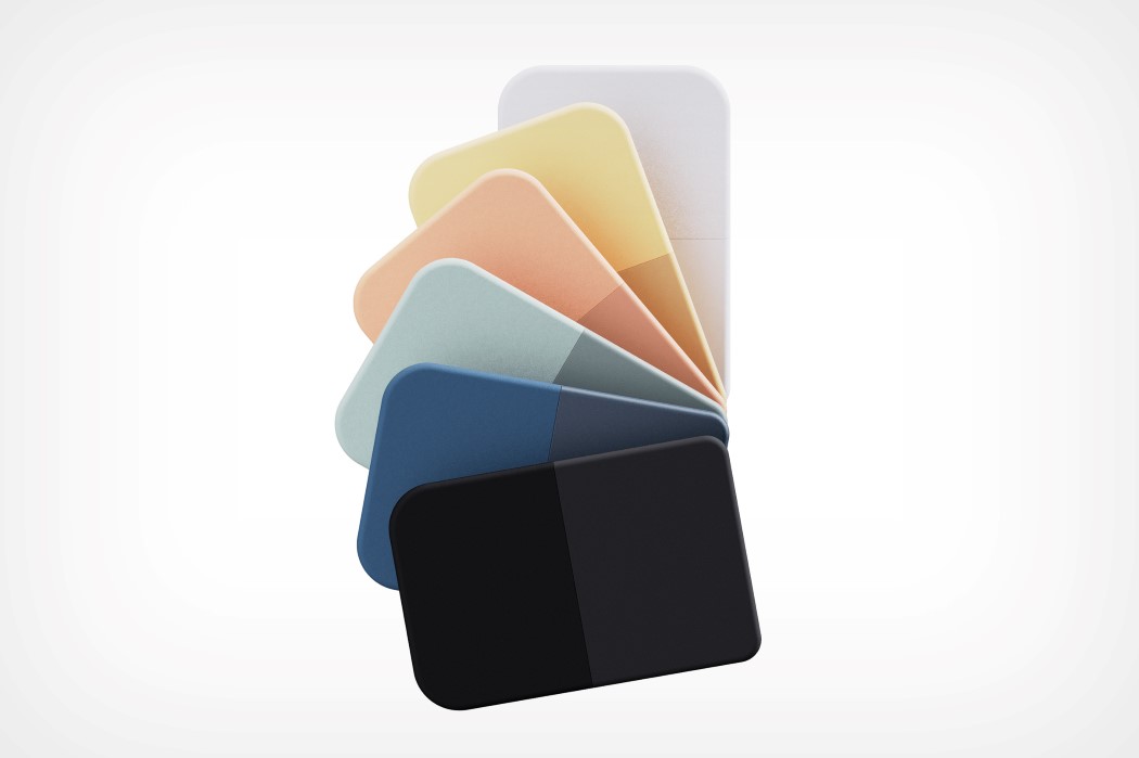
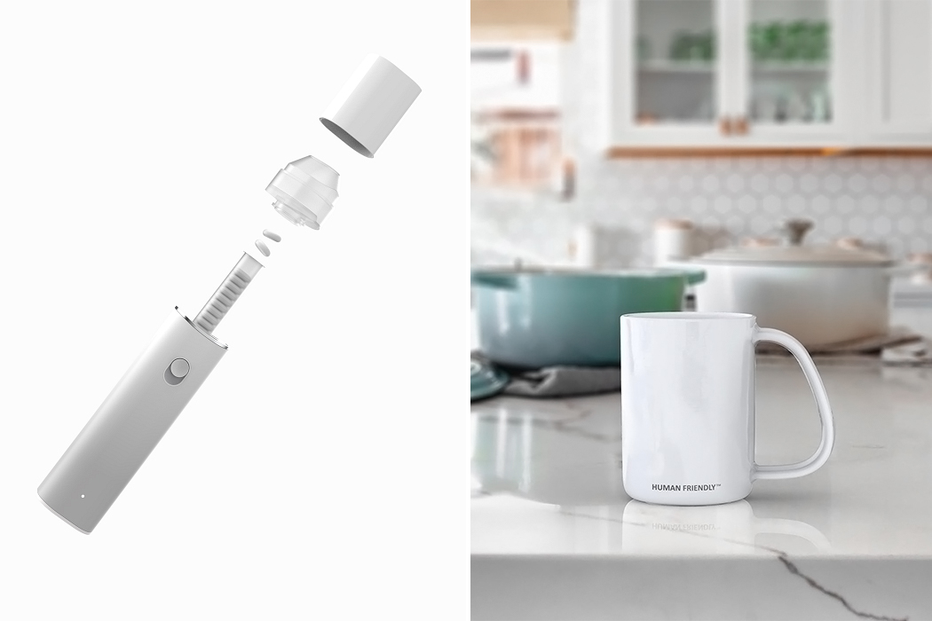
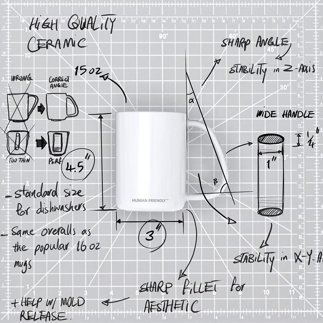
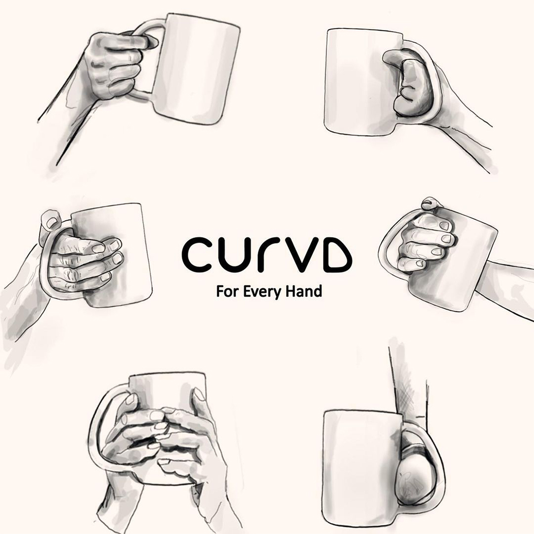
CURVD by Amin Hasani

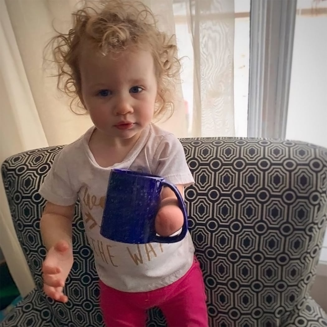
Hasani is one of the co-founders of CURVD, a universal mug that works for everyone! “Disabilities do not exist, design flaws do. When a product fails to serve a person, that person is not disabled, the product just wasn’t designed right. The CURVD mug was designed to allow all hands, regardless of their hand capability or shape, to be able to enjoy a beverage without limitations,” says Hasani. The mug was launched as a human-friendly design with a patented handle that allows all people, regardless of their hand capability, to be able to enjoy a beverage without limitations. Enjoying a warm beverage is a universal joy and deserves a universal design.

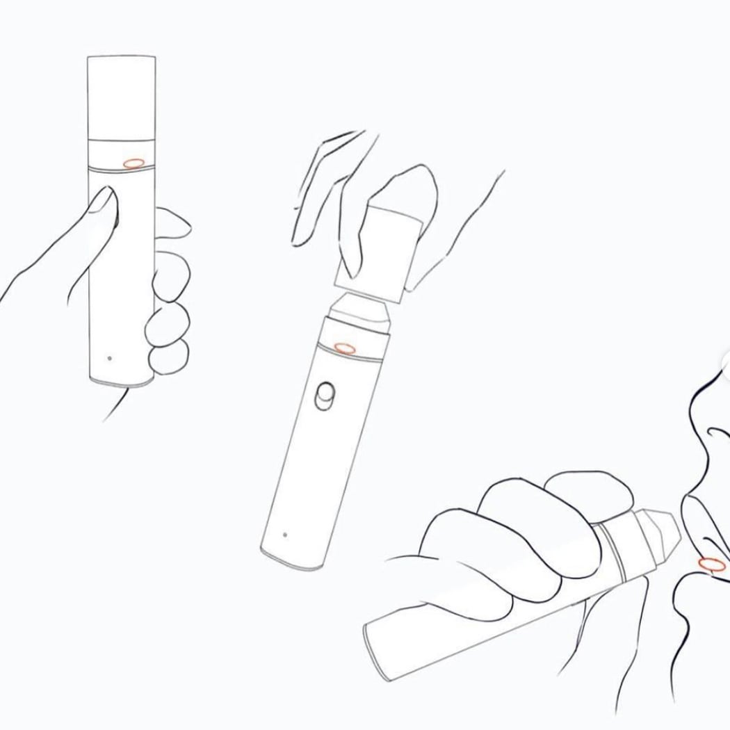
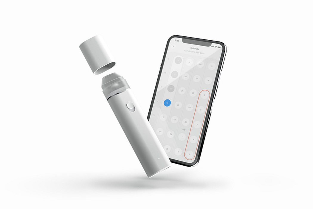
Maria Contraceptive Pill Dispenser by Romane Caudullo and Theotim Auger

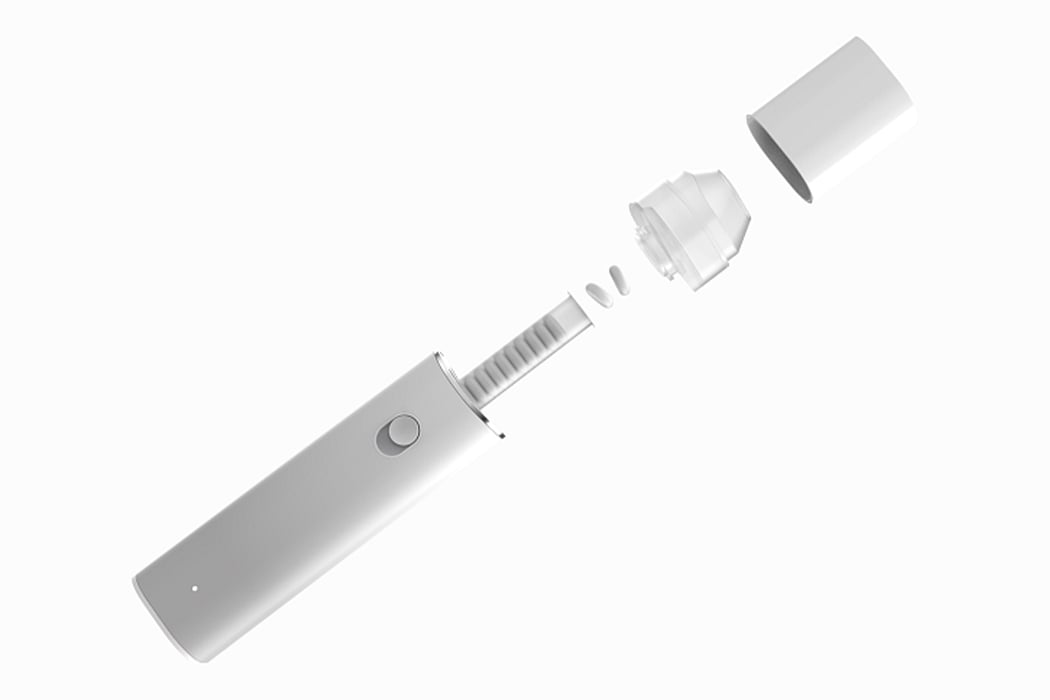
Maria is a smart pill dispenser specially designed for the contraceptive pill with the aim to free women from pill omission pressure and its side effects. “Because, while the pill benefits the whole couple, the woman is often alone in managing this contraceptive, the constraints, and stress associated with it. It seems to us right and necessary to use design to improve this treatment,” says the team. Maria makes it easy for women to take the pill and improves its effectiveness by making the process more efficient. A much-needed redesign that comes 60 years after the FDA approval of birth control pills!


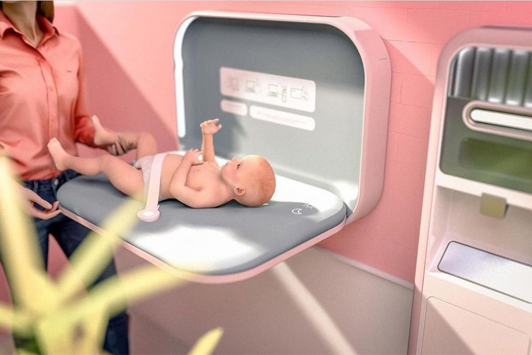
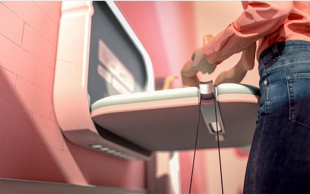
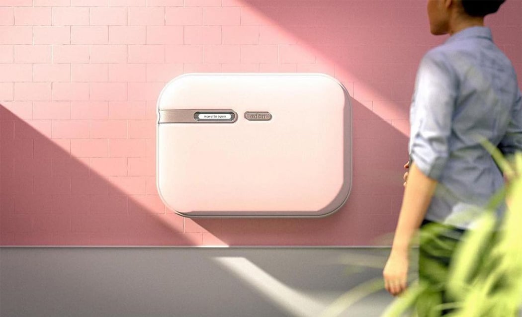
Changing Station by Claudia Miranda-Montealegre

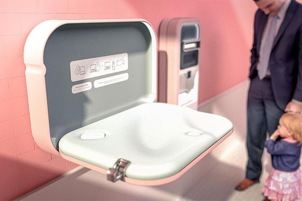
Baby stations in public are only found in women’s bathrooms and do not take into account the needs of male caregivers. The current design does not feel safe, or hygienic, which leads to people using surfaces that might not be ideal (cars, floors, and counters/tables). This puts the burden on the female partners and takes away equal access from male partners. This conceptual baby changing station has a touch-less opening system, includes UV and alcohol self-cleaning capabilities, as well as integrated adjustable lighting. It upgrades the safety features to provide a comfortable experience for parents and infants alike. It also includes details such as hooks for bags, safety belts that can be adjusted using one hand, and a diaper dispenser for a seamless experience.

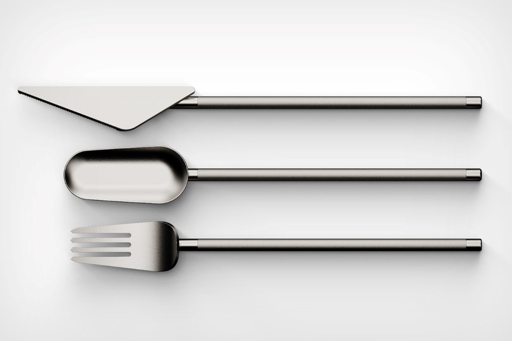
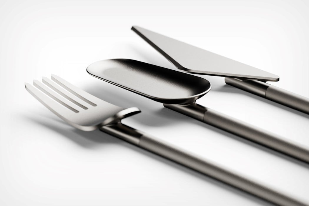
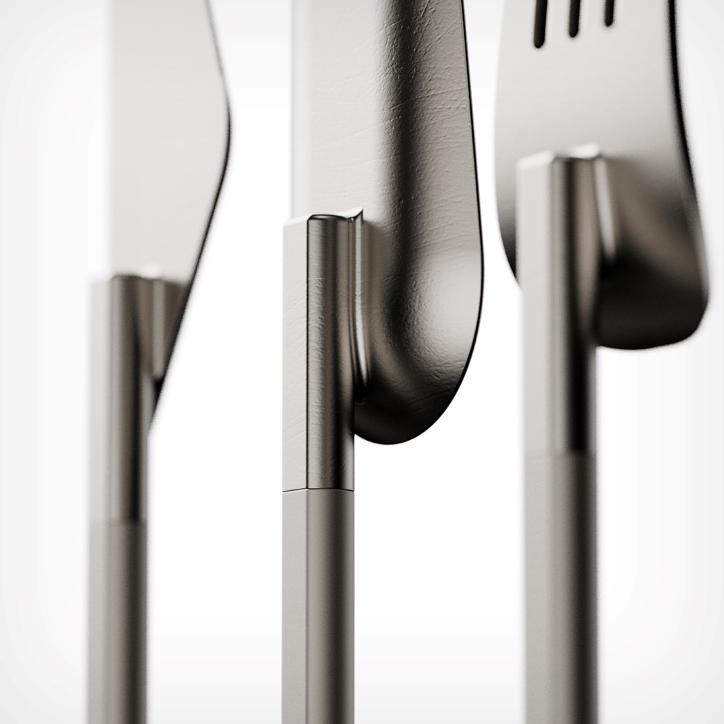
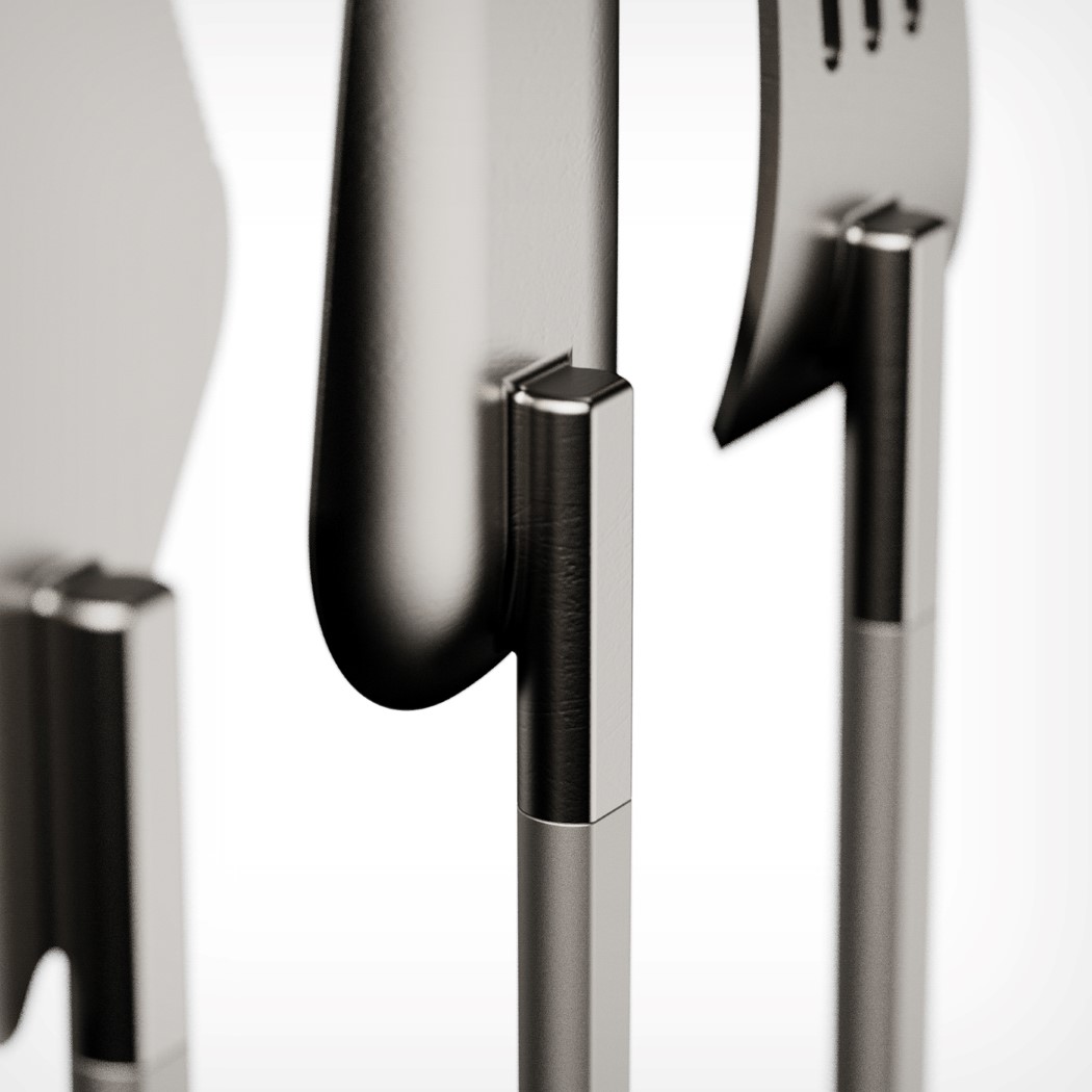
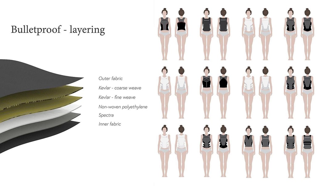
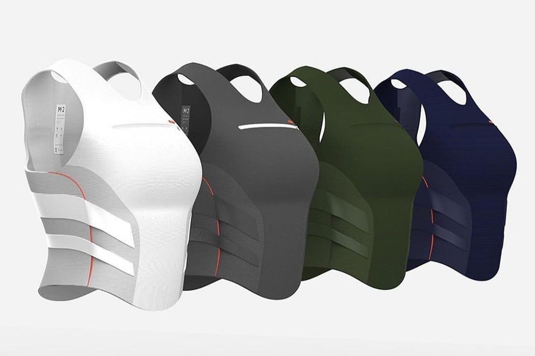
Pivot by Iris Ritsma

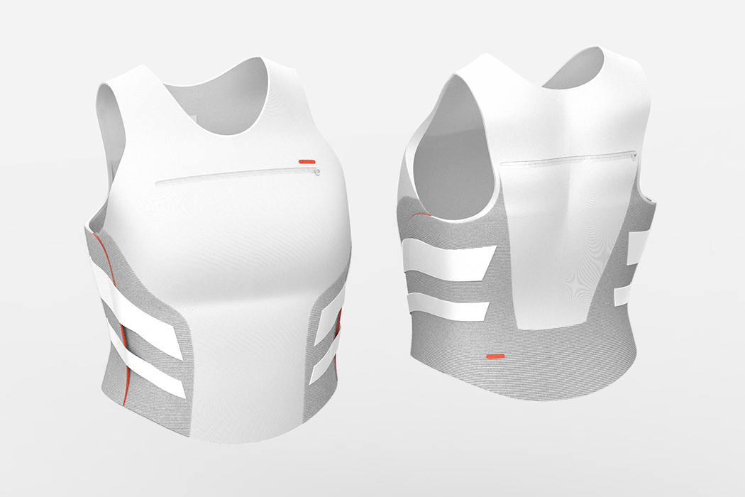
Even in 2020 majority of Personal Protective Equipment (PPE) is still being designed for the male body including body armor which is made to protect people from being harmed or even killed by gunfire. 71% of women working in emergency services wear PPE that is designed for men – it doesn’t fit women, their bodily movement, health issues, and more. Pivot is a soft concealable armor designed to optimally fit the anthropomorphic characteristics of women’s bodies. Each size comes with three variable chest sizes and the diagonal straps fit neatly around women’s naturally tighter waist with raised sides on the bottom provide extra freedom of movement in the hips. Pivot provides optimal protective coverage, maximizes women’s mobility, and increases women’s comfort significantly.

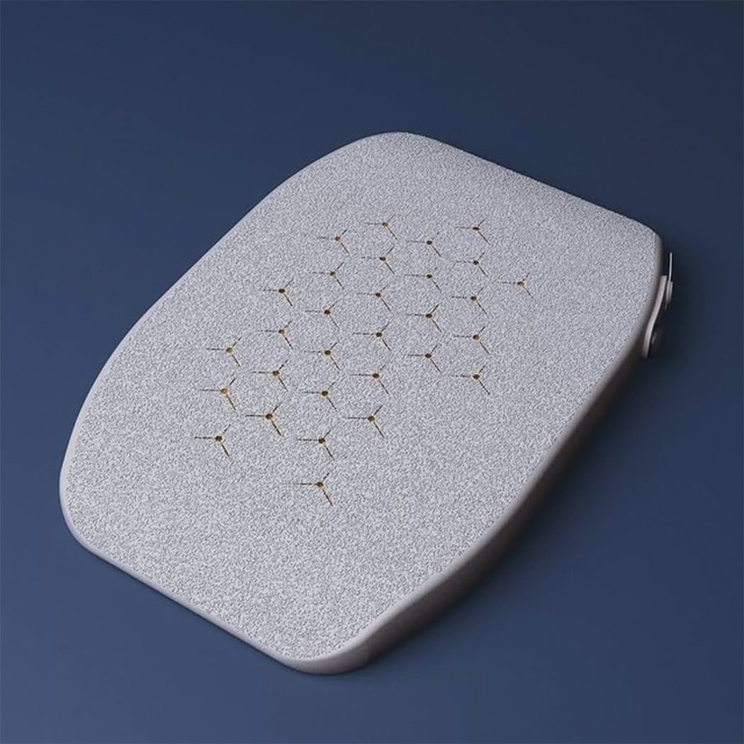
Liberia by Nipuni Siyambalapitiya

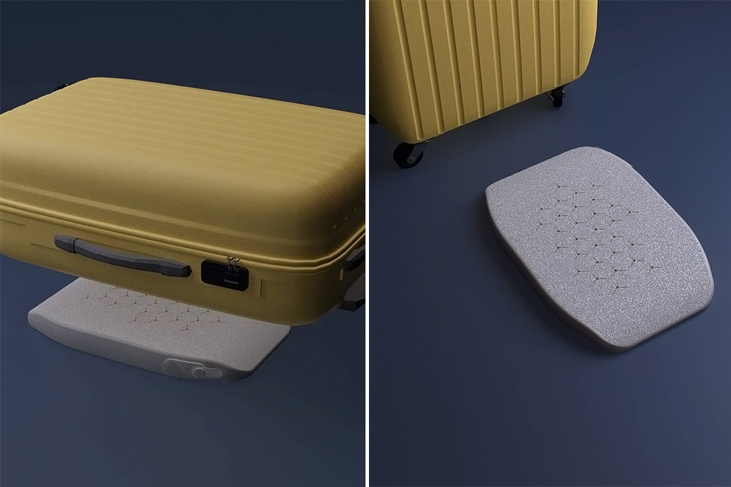
Current luggage scales in the market assume that most people can lift up a 50 lb/23kg on a hook/strap and weighed, it doesn’t take into account the elderly or those with disabilities. Liberia is a pneumatic luggage scale that allows you to weigh your bag WHILE packing! It is a pillow-like scale and accompanying app. It comes with an electronic air-pump that inflates it and a pressure-sensitive valve that records change in air pressure inside the scale as the weight on top changes. Buttons and tabs are large enough for people with low grip strength and have different tactile qualities, making it easy to maneuver the scale even if you can’t see too well. Simply place the deflated scale on the floor, put your bag on top, inflate the scale via the app and start packing while Libera tells you the weight in real-time.

Interruption Buzzer for women by Kristi Bartlett

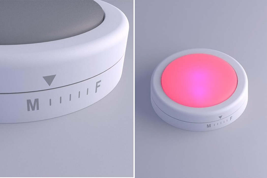
Trump interrupted Hilary Clinton 51 times during their debate and in 2020. This buzzer is inspired by the board game Taboo and aims to make group discussions easier. The AI-enabled meeting assistant combats the phenomenon of women being talked over in meetings. Put it in the center of the table at your meeting and adjust the dial to reflect the gender makeup of your group to make sure the contributions follow the proportions. The device will buzz annoyingly and loudly when it detects a woman being interrupted by a man or another woman. It will also turn blue if it detects that men are speaking more than 50% of the time and pink if the same applies to women. The goal is to keep your meetings purple – equal chances!

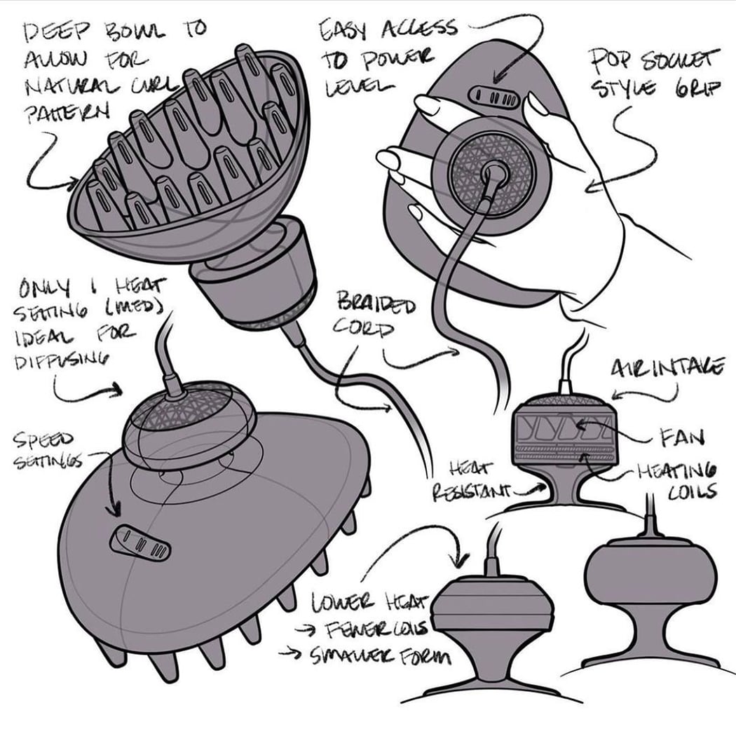
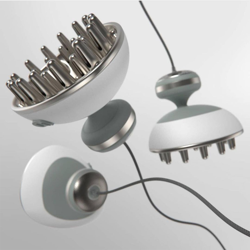
Diffuser by Caterina Rizzoni

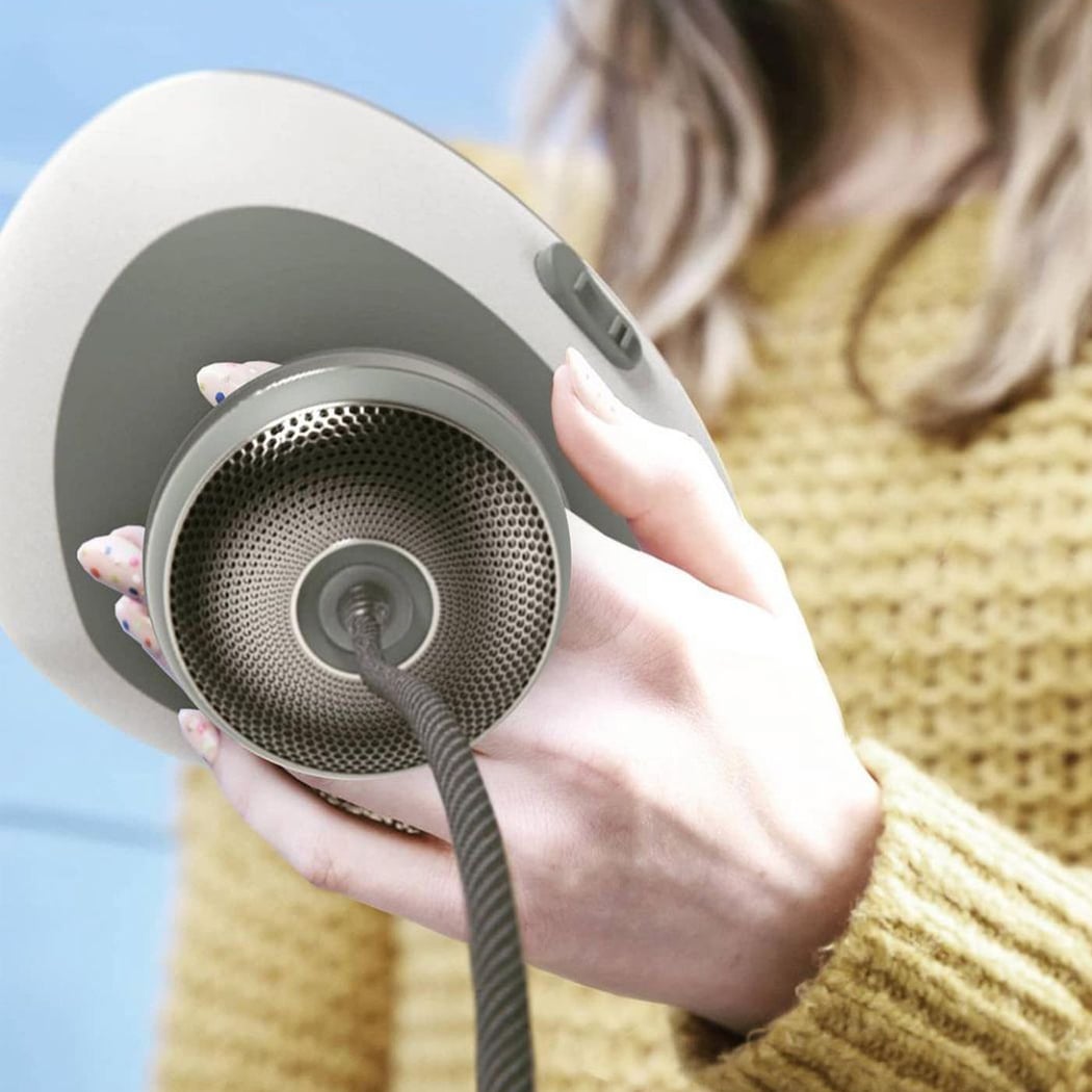
This diffuser re-imagines blow-drying curly hair, using a handheld form factor to help users offset discomfort and pain when using diffuser attachments on traditional dryers. Caterina spoke to over a dozen curly-haired womxn and relied heavily on design for usability. She aimed to reduce the ergonomic pain points present in the current design. This dryer was designed to protect naturally curly hair – the extra deep bowl saves room for curl pattern formation, while the dished fingers naturally conform to the user’s head. The use of metal for the diffusing end allows for even more drying from radiant heat, which means less airflow and less frizz! The soft braided cord easily swivels out of the way during use, and the soft heat-resistant over-mold on the body is easy to grip + easy to clean. Curly hair people are often forgotten like left-handed people and we need to break this bias.
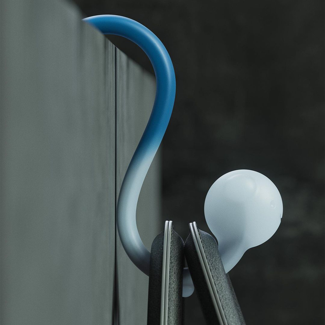
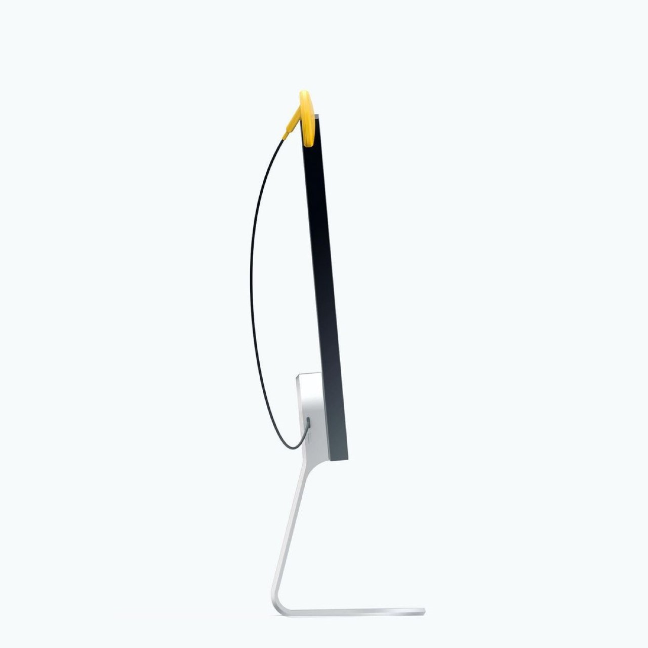
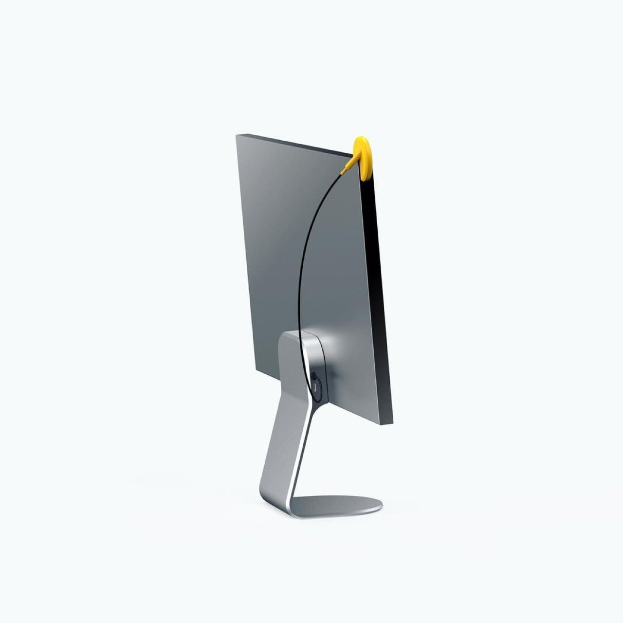
BAGPAL by Tim Zarki

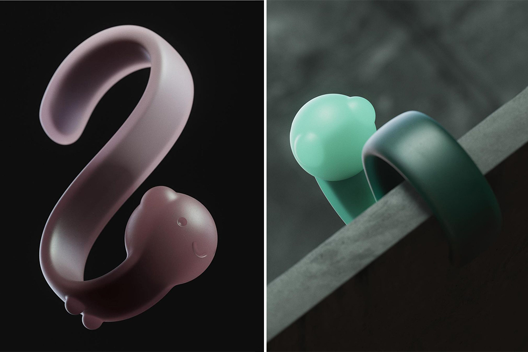
Public restrooms lack hooks to hang your bag from, and no one likes putting their bag on the gross public restroom floor. It is an uncomfortable and stressful experience, especially for women as they carry bags more often than men. BAGPAL can be used to hang your bag when you are using a public restroom and need both hands to change a tampon or pad. It is a multipurpose hook-shaped product that travels with you to hold your things when you can not. It has a strong stainless steel skeleton and colorful waterproof skin that is easy to clean when you wash your hands. With the pandemic, people are all the more careful of common surfaces and we don’t want to carry germs back home with us on our bags!

Not-Your-Average Cutlery detaches form and function to create a beautiful contrast!

The Disconnect series was created as a part of a Render Weekly challenge, but to be honest, it looks like something from the mind of Nendo. By separating the two elements of cutlery (the part that interacts with food, versus the part you grip), the Disconnect creates a form that is distinctly twofold. The two elements of the cutlery get individual treatment, instead of being like regular cutlery, where elements blend into each other to create a singular, homogenous form.

Designed by Francesco Brunetti, the Disconnect series breaks down cutlery into its separate elements, but at the same time retains a sense of minimalism. The slick handle comes with a slim, cylindrical design and a matte-finish, while the functional end of the cutlery uses a balanced, geometric approach with a slight satin finish. The cutlery series was envisioned in silver, space-grey, gold, and rose-gold, and I can’t really testify to whether it would be comfortable to use, but I’ll be damned if I don’t admit how incredibly eye-catching they are!

Designer: Francesco Brunetti

This Star Wars-inspired smart assistant will turn your home into X-Wing Starfighter!

Nadeem Hussain, a United Kingdom-based designer, recently rendered a smart assistant robot that was inspired by BB-8 from Star Wars for Render Weekly’s Instagram showcase. Sometimes the most eye-catching designs find their inspiration from well-known film and television characters. If the designer channels their inspiration well, then the final product won’t be a spitting image of that character, but a gentle reminder of how art forms are inherently interconnected.

When design feels inspired by something as iconic as Star Wars, the tricky part doesn’t have to do with imitating the franchise’s original creativity, but with evoking a feeling of familiarity. Hussain’s render of a new smart assistant is as charming and functional as Star Wars’ BB-8 robot but resembles a futuristic robot that might reside elsewhere in the intergalactic universe. BB-8 is described as an “astromech,” or repair droid with humanlike qualities such as general skittishness, a fight or flight response system, and an overall softly charismatic disposition. The same can be said for Hussain’s interpretation of the household smart assistant. In today’s world, where technology is depended on for repair work just like the astromech is in the Star Wars universe, it’s vital to bridge cutting-edge innovation with familiar, natural design attributes, and this vision of a home smart assistant does just that. Thin, gray fabric lines half of this two-bulb miniature robot in order to indicate the product’s speaker features, and a true-tone, computer display fills out the smart assistant’s touch screen face. The smart assistant’s bigger globular base slides across surfaces with so much ease that it imitates a hovering orb, the likes of which we’ve been acquainted with time and time again on the silver screen.

As our world quickly develops into a technological hub of digitized timelines and self-driven cars, it seems that references from film and television connect us more than we might know. Smart assistants are becoming more and more popular in today’s households since there’s still room for both software and hardware developments. It’s comforting to know that creatives behind such iconic stories like Star Wars have imagined this future long before. Nadeem Hussain’s rendition of a smart assistant proves adherence to today’s technology and a familiar acknowledgment of generation-defining franchises, which is exactly what makes such artful displays of passion so eye-catching.

Designer: Nadeem Hussain

Quirky tactile calculator is inspired by the suction cups on an Octopus’ tentacles!

Isn’t it a weird coincidence that the octopus’s suction cups are actually what give its tentacles incredible grip underwater… and when that same detail is carried forward to the design of a button, it increases the button’s tactile ability? A suction cup helps hold onto things in water, but it also provides the perfect concave surface for your fingertip, resulting in a uniquely enjoyable UX.

The Calctopus (no need trying to decode the name there) was created as a Render Weekly challenge on Instagram. Inspired by the cups on the base of the octopus’ tentacles, the Calctopus uses a similar texture on its keyboard layout. Its curved form, matte finish, and pastel hues make it rather comfortable to look at, and those concave keys are an absolute pleasure to press as your fingertips intuitively find their way around the layout, landing on the right key every time… almost echoing the tactile joy of the Olivetti Divisumma 18 calculator from the early 70s!

Designer: Francesco Brunetti

This redesigned traffic cone is minimal, visible, durable, and stackable!

Designed as a part of Render Weekly’s concept-creation sprints, Gary Clarke’s take on the traffic cone offers a stronger, classier take on the conical road-barricade. Most traffic cones/barricade come either rotationally molded or injection-molded from plastic, whereas Clarke’s alternative uses bent metal piping.

Made to be slightly larger than traditional cones (for everyone who’s arguing that minimal cones would impact visibility), Clarke’s design is tetrahedral and manufactured from a single pipe that’s bent and powder-coated in bright metallic orange before being finished off with a couple of stripes of reflective paint. Like most cones, these ones are stackable/nestable too, but fill the hollow piping in with sand or gravel and you’ve got cones that are also much more durable than their plastic counterparts, i.e., can resist breakage, and can withstand strong winds too!

Designer: Gary Clarke

Face Mask designs for a surreal future where wearing masks is humanity’s new norm

2020 has surely brought about a change in our priorities. Where Instagram was earlier filled with people jet-setting across the globe to exotic, unseen locations and inspiring wanderlust for everyone else, our mindless focus on self and not caring enough about the natural resources that quietly supported us led to this COVID-19 pandemic. The question that arises here is humanity learning from its mistakes? History shows that we rarely do and a dystopian future where wearing a mask is a part of our daily life might just happen, sooner than later. So what can a mask do? With the design world’s unending creativity applied, they can do a lot of things – from being inclusive, supporting audio output to even supporting your favorite organization, Render Weekly’s ongoing face mask challenge has us excited! These renders are sure to form the foundation of some exceptional designs in the future.

Michael Soleo created a stylized version of the original face mask by Ashley Lawrence that allows those who are hearing impaired to still read lips! Everyone is equally affected by the crisis and what is now the new normal for us might be severely distressing for the differently-abled. Inclusive design is now more important than ever. Masks have become a global icon for COVID-19 and we are glad someone stopped to think “Okay, but how will people who rely on reading lips communicate for the next 6 months?” – it’s the little things, the simple designs that can have a deep impact.

Inspired by the audio leaders AIAIAI, this modular mask by David Olivares can be easily opened up and detached for the user’s choice of personalization. “Modularity is key to deliver products with top quality, reducing the number of disposable pieces, and providing great user experience. In this case, you can change the cover to match your outfit, the bands to adjust to your head, or a different filter to suit your routine demands.” says David. And seeing how masks have become a part of everyday life across the globe, we agree that customization is the key to improve the sustainability of the usually disposable product.

Inspired by the AIRPOP masks, designer Oliver Perretta created a multifunctional mask. With usability being the keystone of any design, the mask not only filters the air but also acts as an air quality monitor! The quality monitor accurately transmits data to your smartphone, helping you be aware and keep yourself safe.

Speaking of multi-functional designs, we are totally geeking out over this design by Zack Massos and Eitan Adika that merges a reusable face mask with headphones! How do you ask? The answer is bone conduction tech! Dystopian as it may sound, but in a future where wearing masks is the norm, this face mask-headphones hybrid could help you commute and stay connected all while staying safe!

Another gem by Oliver Perretta, this mask takes the AIRPOP-inspired masks to the next step. We know that germs accumulate on the outside of your mask, creating a potentially loaded situation for when the mask is removed. Based on the ‘G Volt electrical sterilization breathing masks’ this interpretation utilizes a graphene-based material combined with an electronic textile. Activated by an electrical current, it sterilizes the surface of the mask preventing contamination and repelling viruses and bacteria. The concept works by utilizing a rechargeable power supply connecting to the e-textile to activate the graphene sterilization. A single mesh filter has been incorporated for extra precaution.

Ugo Fontana and Matt K (of Itiwit) have taken the humble face mask to the next space-worthy iteration with this soft full face mask. Initially designed for welding, this version lets the user breathe with ease in a relatively enclosed space, with an extensive array of functions to help the user stay in comfort while navigating their surroundings.

Roshan Hakkim aims to solve a nasty consequence of the COVID-19 pandemic – the non-reusable elements that are the necessary evil medical world needs to fight this. His solution? Using recycled PET bottles to create reusable plastic face shields! Hitting 2 targets at one time, this Nike-inspired sustainable mask can lay down the guidelines for future pandemics, which is guaranteed if humans don’t clean up their acts.

From the team at RenderWeekly comes another mask with the ability to be personalized. If you are going to wear a mask to cover your face, the most identifiable part of you, it makes sense that the mask speaks your language. I can truly imagine users customizing the strap from homemade to buying them from their favorite brands, just to make an impact.

Have we considered how this normalization in the usage of masks will affect the kids? Coming from the complete freedom and joy they are accustomed to being in, this new world with masks and instructions to not touch anything is a scary change. Oliver Perretta wants to make this process more comfortable for the kids by creating this child-friendly mask that lets the kid dress up as their favorite animals and have fun while staying safe!

Wear your colors across your face, or at least your brand colors as shown in this New Balance-inspired face mask designed by IJ! Now we can literally see the Instagram influencer market jumping at the bit to get these if any brand launches them. I would like one in support of my favorite charities please!

This Japanese kettle’s detailed design will leave you wondering “real or render?”

Japanese culture has so many little practices that exude a sense of calm. My most favorite thing (besides enjoying a soulful bowl of ramen which I think is a form of meditation) is enjoying a warm cup of tea. There is nothing that can soothe you like a freshly brewed cup of tea and during these complex times I am definitely seeing an increase in the number of cups on my table so I started looking for a kettle and I came across the Seramikku.

When I saw it, I fell in love with the design of the kettle – it was a perfect balance of archetypal Japanese forms and minimalistic modern details. Its shape and texture are inspired by ‘Uwade kyusu’ which is one of the more traditional Japanese teapots known for their distinctive, almost floating, handles that hover on top of the lid. The designer has envisioned the Seramikku to be made from ceramic and iron with an electric heating base. Sadly, it is not for sale because it is concept design which a part of a Render Weekly challenge – yes, I had to look at it thrice because the detailing was so realistic that I wanted to believe I had stumbled upon my future favorite teapot.

I am going to go and brew myself a cup of Jasmine tea to recover from being in love with a design and then heartbroken by the lifelike render.

Designer: Shail Iyer

You can adjust this lamp’s lighting by simply flipping over its shade!

Born as a result of an Instagram Render Weekly challenge, the Flip lamp from Joe Fentress makes me question why we’re still living in a world with boring lamps that don’t have flipping shades. Check out the GIF below and you’ll see what I mean. The Flip Lamp comes with a truncated conical base and a light-source at the top, but where it introduces a fun bit of interaction is in its lampshade, which can flip over 180° to focus light downwards or upwards. This unique detail allows the Flip to work either as an ambient light, illuminating an interior space, or as a task/desk light, illuminating a table or workspace. The lamp uses an LED light source too, to make sure the shade doesn’t heat up. It’s fun, it’s functional, it’s flippin’ amazing!

Fentress created the lamp as a simple concept for a render challenge, but hopes to take it further by developing on the design.

Designer: Joseph Fentress

The GHOST Keyboard has markings on the front of the keys for a stealthy minimal appeal

Created as a part of Render Weekly’s design challenge, the Ghost Keyboard is interesting for its use, or rather overuse of minimalism (to the extent of possibly being counter-intuitive). The keyboard looks pretty standard, except for one crucial detail… the markings on the keys. Wellens’ Ghost keyboard doesn’t traditionally have the markings on the top of each key, as is expected, but rather takes on a different approach, with markings etched onto the front surface of the keys. Its stealthy appeal comes from the removal of a rather elemental detail, but the result is something incredibly interesting.

The Ghost keyboard should evoke one of two reactions. Exhilaration or confusion. To some, the lack of perceivable markings may be a major deal-breaker, but to others, who are so comfortable with typing while looking at the screen that they really don’t need the markings (because muscle-memory is a powerful tool), the Ghost keyboard is an incredibly unique and hauntingly beautiful keyboard that even comes with its own cushion-wrist-rest for the seasoned typist. My only concern about lusting over this beautiful piece of hardware? I haven’t memorized which punctuation mark sits over which number key. 🙁

Designer: Shaun Wellens for Render Weekly