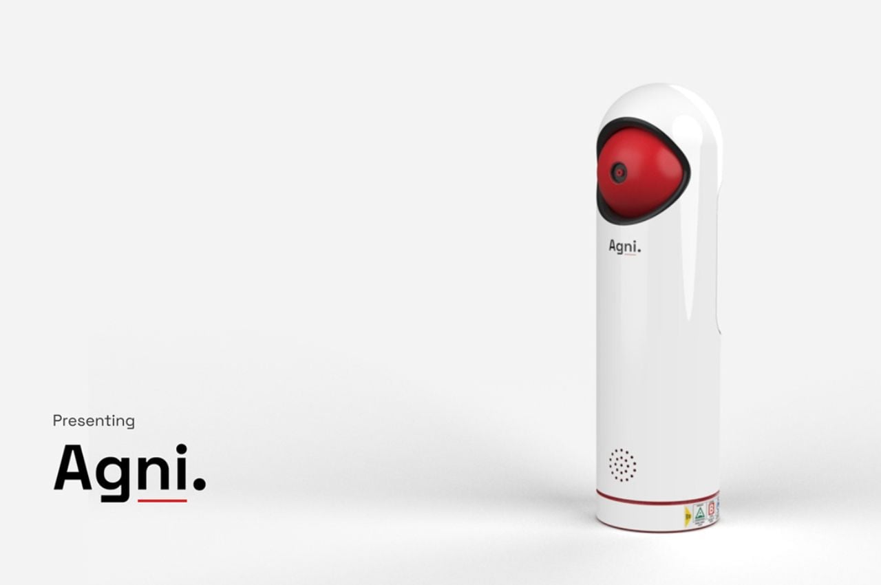
Fire safety is an essential aspect of any home or workplace, yet the traditional fire extinguisher often remains an overlooked necessity until an emergency arises. The Agni Fire Extinguisher Redesign challenges this status quo by seamlessly integrating safety with aesthetics, making it an indispensable addition to any living space. This innovative design aims to revolutionize fire safety by addressing usability concerns and enhancing the overall user experience.
Designer: Inika Jhamvar
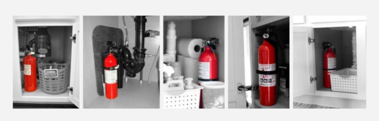
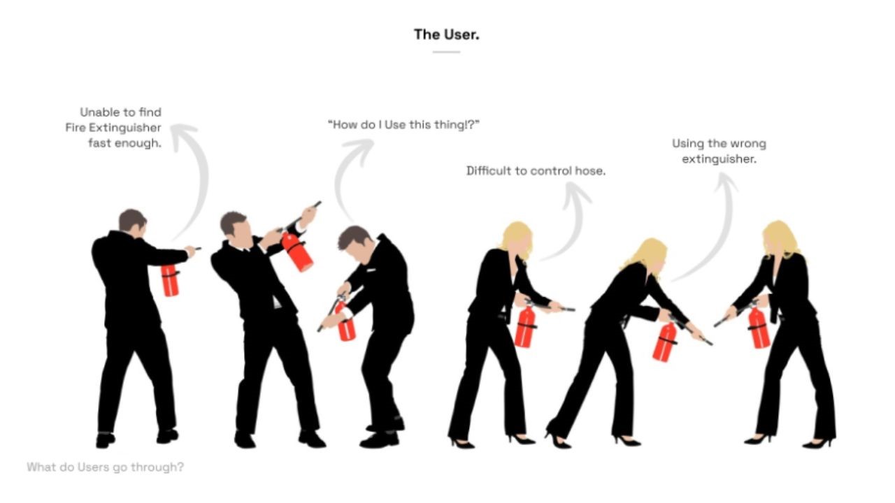
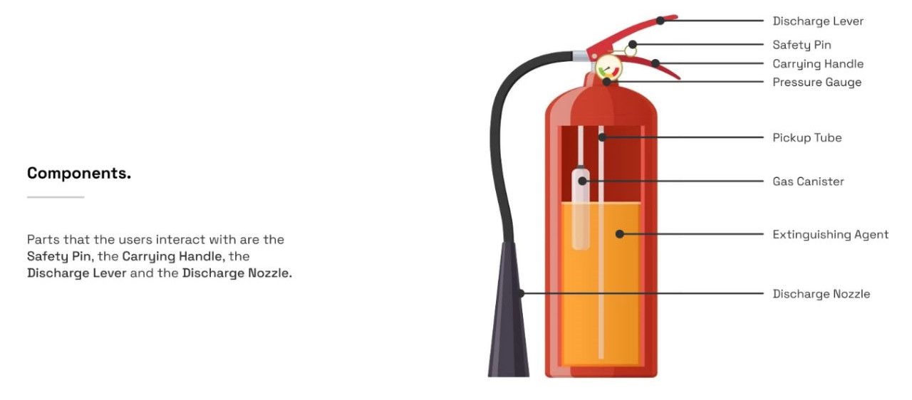
We’ve all obviously seen the conventional fire extinguishers on every floor of our residences and workplaces. Have you ever been taught how to use one? Or even know how to use one with confidence? God forbid we ever have to use it, but it’s always good to be prepared. The directions on it appear straightforward and doable, but are you mentally prepared to read, grasp, and implement them? Some of us would rather have to first take lessons to learn how to keep cool in stressful times.
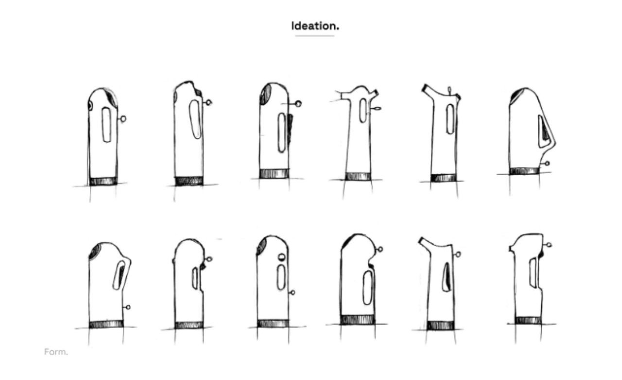
Intuitive design has always been an important aspect of the design process and thinking, but it has recently gained prominence. The Agni Fire Extinguisher Redesign acknowledges these limitations and emphasizes the need for an intuitive design that promotes quick and effective usage. This redesign aligns with the contemporary trend of prioritizing intuitive interfaces in all facets of design.
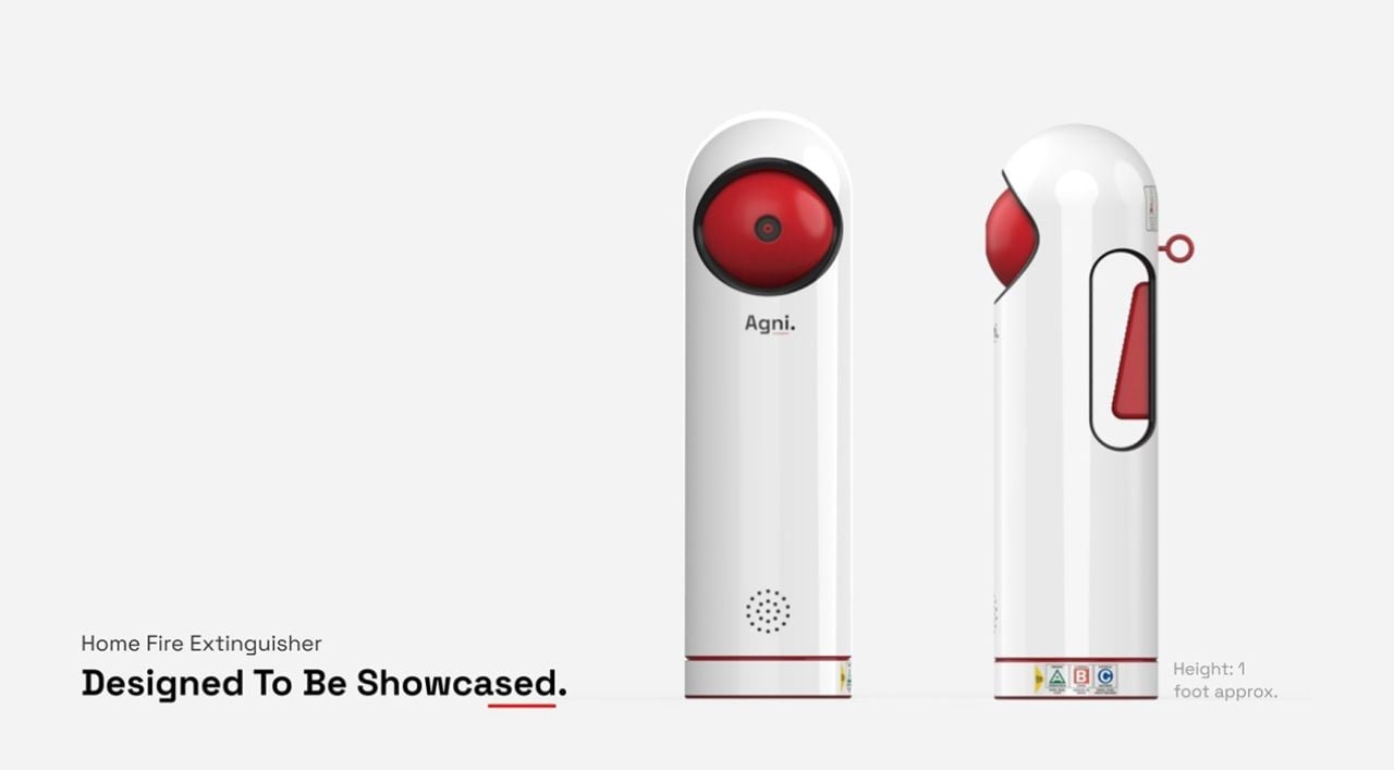
The choice of red as the primary color for fire extinguishers carries significance. Red is universally associated with danger and fire, instantly alerting individuals to the presence of a fire safety device. Moreover, red is highly visible even in low-light environments, such as a smoke-filled room, ensuring that the extinguisher is easily locatable during emergencies. The Agni Fire Extinguisher Redesign stays true to this color while incorporating subtle highlights for enhanced visibility.
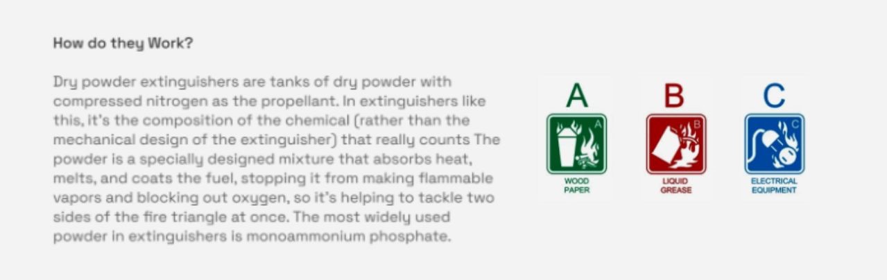
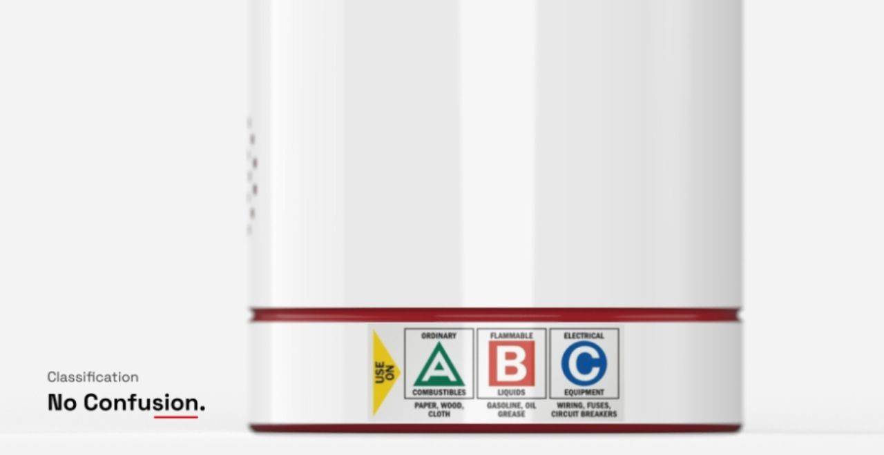
What do the Letters on a Fire Extinguisher mean?
The letter on a fire extinguisher indicates its classification:
• Class A puts out ordinary combustible fires (wood, paper, plastic, etc.).
• Class B puts out flammable liquid fires (oil, gas, petroleum, etc.).
• Class C puts out electrical fires.
• Class D puts out combustible metal fires (magnesium, titanium, potassium, sodium, etc.).
• Class K puts out cooking fires ignited by flammable oil and grease.
Since Class A, B, and C fires are all found in conventional homes and businesses, ABC fire extinguishers are designed to put out all three types of fires.
The letters on a fire extinguisher serve as a classification guide. Class A, B, C, D, and K fires require different extinguishing agents, ranging from ordinary combustible fires to flammable liquids and electrical fires. The Agni Fire Extinguisher Redesign unifies these capabilities, offering a versatile solution to combat various fire types.
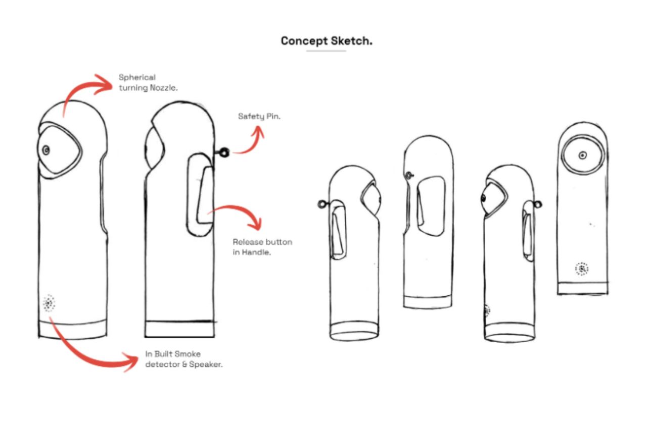
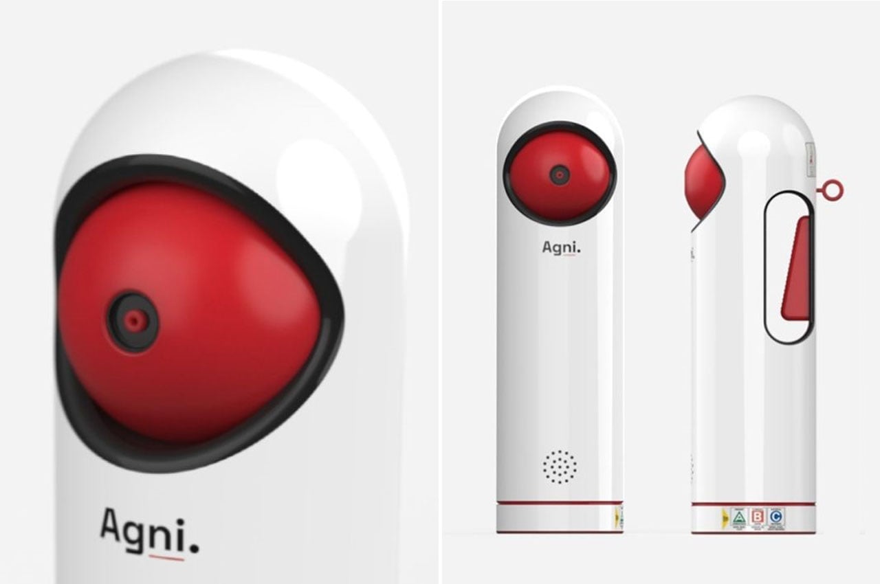
The Agni Fire Extinguisher Redesign introduces several innovative features to enhance usability and safety:
Enhanced Control:
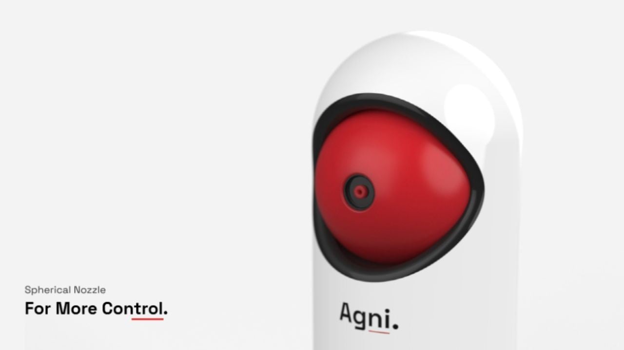
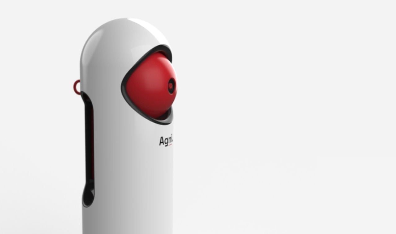
The elimination of long tube nozzles provides users with greater control and precision while aiming and operating the extinguisher. This addresses a common concern among users regarding the difficulty of effectively directing the extinguishing agent.
Ergonomic Design:
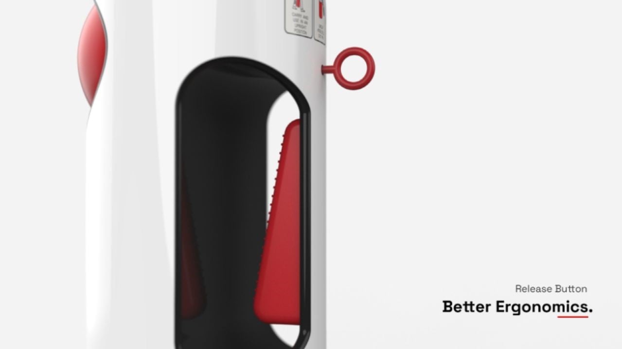
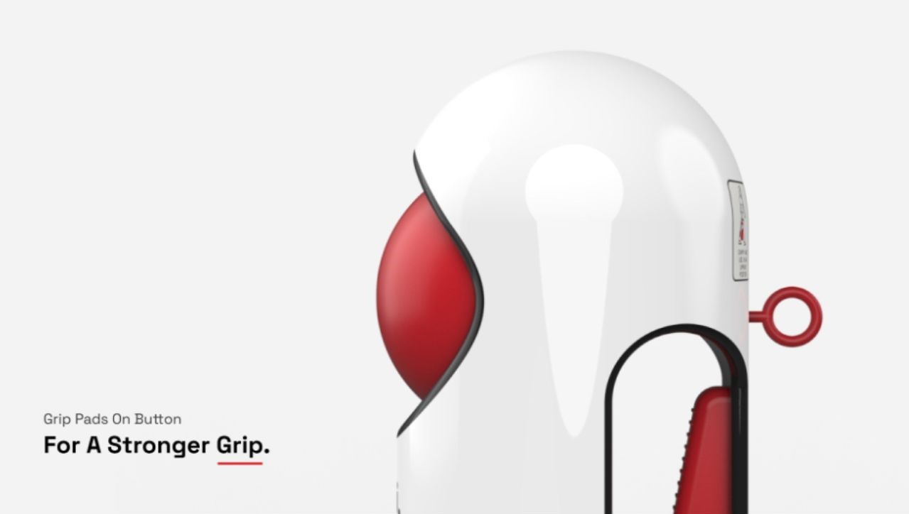
The redesign incorporates improved ergonomics into the handle, minimizing discomfort and wrist strain during use. This ergonomic approach ensures that users can confidently grip and control the extinguisher, even in high-stress situations.
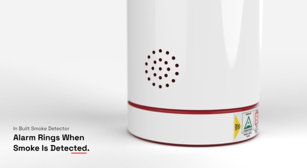
Smoke Detection Integration:
An in-built smoke detector, connected to a speaker, alerts users to the presence of heavy smoke. This dual functionality not only warns of potential fire hazards but also pinpoints the extinguisher’s location, enabling a swift response.
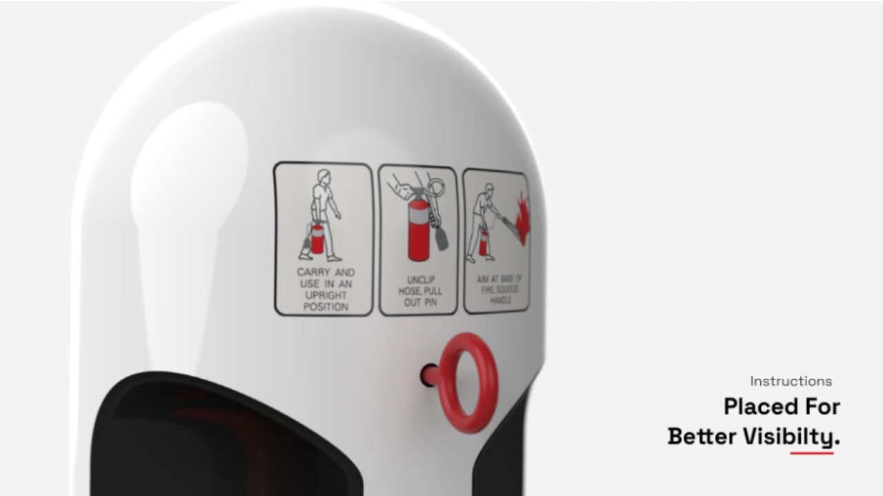
User-Centric Instructions:
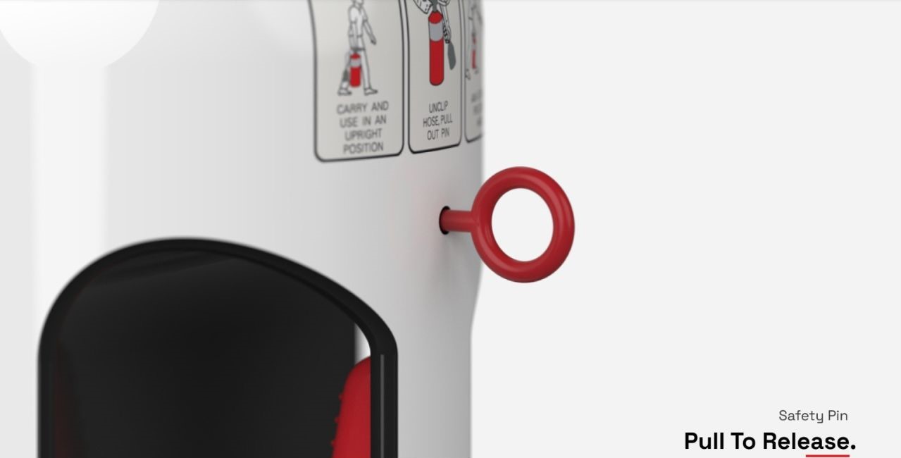
Instructions for use are strategically placed at eye level, ensuring immediate visibility and comprehension. This addresses the challenge of reading and understanding instructions in stressful situations. The inclusion of a QR Code scanner, mentioning detailed information regarding Pressure, Expiry, How to Use, Types of Fires, and even Alert Authorities.
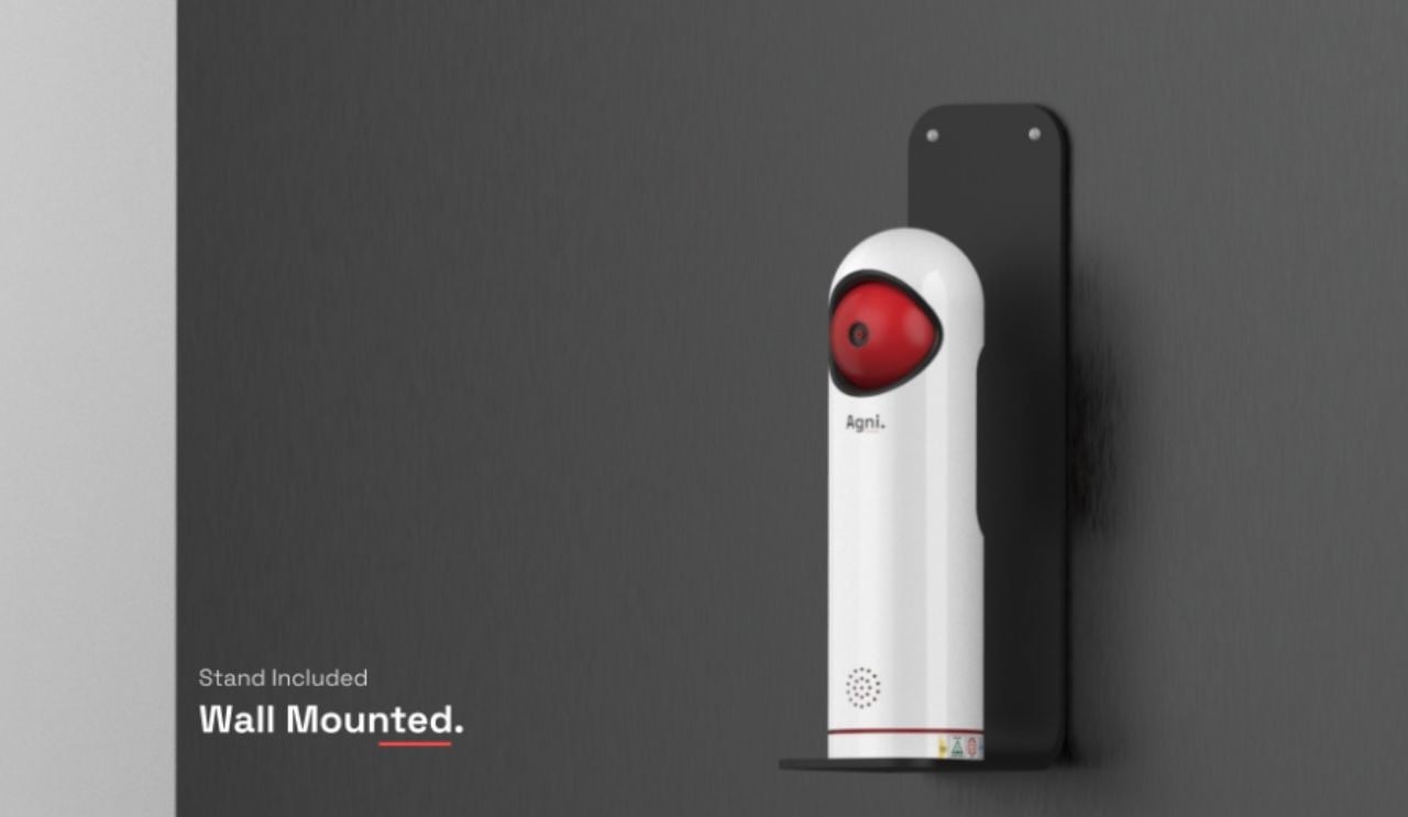
Wall-Mounted Stand:
The inclusion of a dedicated wall-mounted stand provides a designated and easily accessible space for the extinguisher, eliminating the need for storage that compromises accessibility.
Improved Aesthetics:
Since a neutral color has been chosen, it encourages people to place them anywhere around the house without having to store them in an enclosed space. However, the color Red is still included as it is very directly related to fire extinguishers and will help recognizability.
The Agni Fire Extinguisher Redesign marks a significant advancement in fire safety, yet opportunities for improvement are evident. Incorporating interactive instructions with visuals or augmented reality could enhance user engagement and understanding during the extinguishing process. A comprehensive fire safety network, integrating extinguishers with smoke detection devices throughout homes, promises a more effective initial response system. Offering customizable color options would allow seamless integration with diverse home decor. Moreover, providing detailed dimensions through Computer-Aided Design (CAD) would aid architects in smoothly incorporating the extinguisher into building plans. While already innovative, the Agni Fire Extinguisher Redesign’s potential lies in refining interactivity, broadening integration, enabling personalization, and streamlining architectural assimilation for an even more sophisticated fire safety solution.
The Agni Fire Extinguisher Redesign redefines fire safety by seamlessly blending intuitive design with essential functionality. By prioritizing ease of use, accessibility, and aesthetics, this innovative approach transforms the traditional fire extinguisher into a discreet yet indispensable element of modern living spaces. As we continue to embrace user-centric design solutions, the Agni Fire Extinguisher Redesign sets a new standard for fire safety products that prioritize both form and function.
The post Fire Extinguisher Disguised as an Air Freshener for Ease of Use and Enhanced Safety first appeared on Yanko Design.