What will they think of next? A smartphone that can 3D print?? (Okay scratch that, that would actually be pretty awesome)
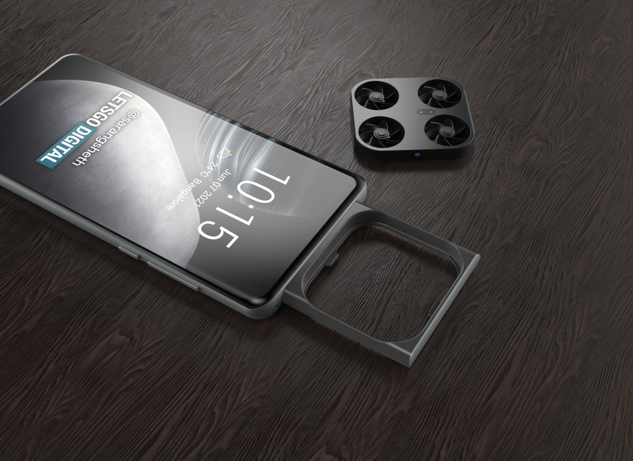
Just last week (Friday to be specific), LetsGoDigital uncovered this rather outrageous patent filed by Chinese phone manufacturer Vivo at the World Intellectual Property Office (WIPO) showcasing a phone with its own drone camera. Sort of like how Marvel superhero Falcon had his own flying sidekick ‘Redwing’, Vivo’s phone had its own mini-drone that could pop out on command and click photos at you from any vantage point.
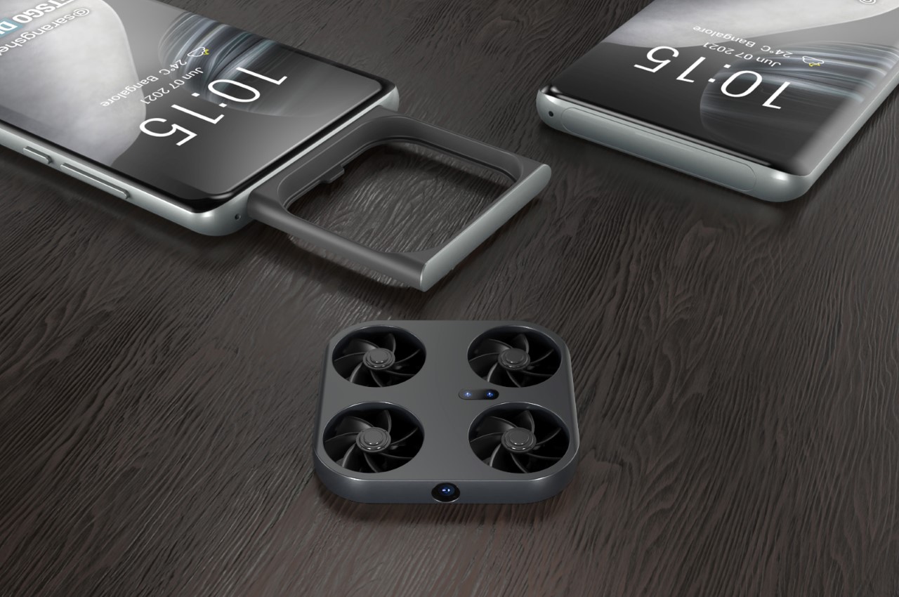
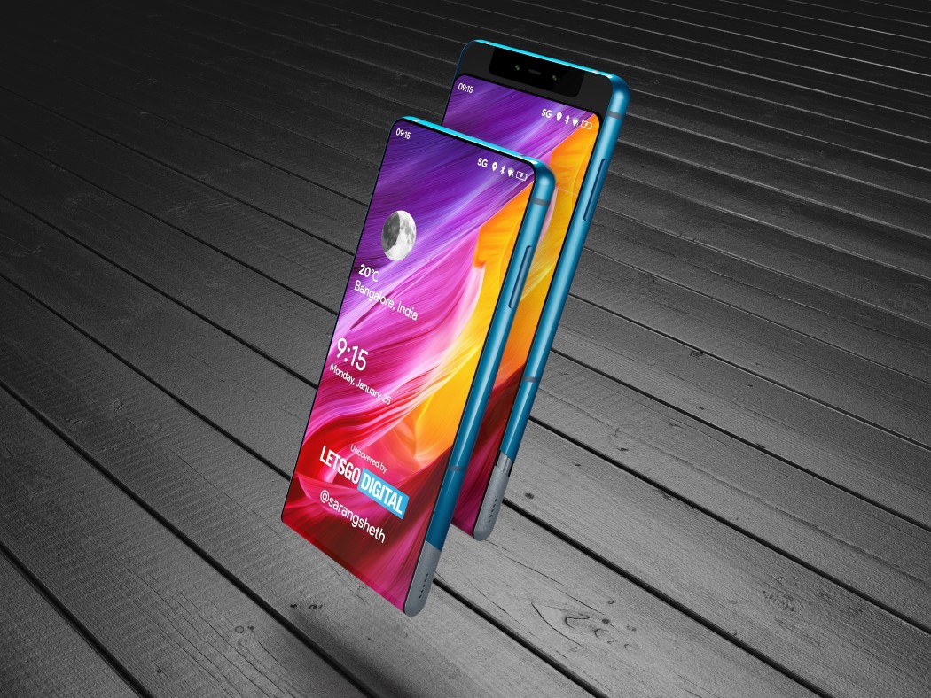
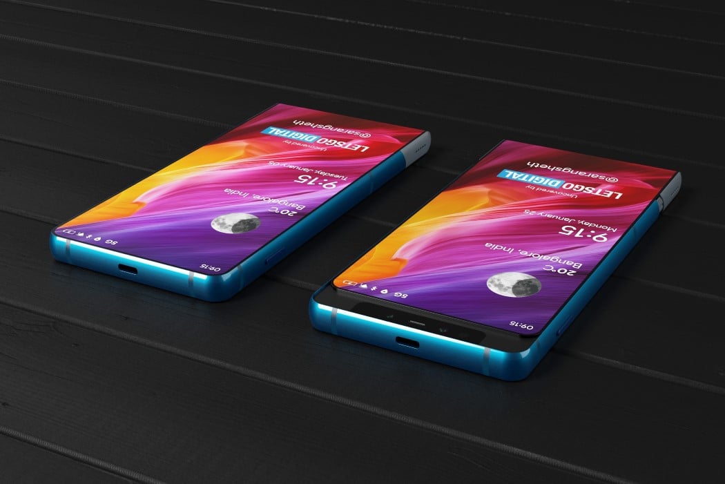
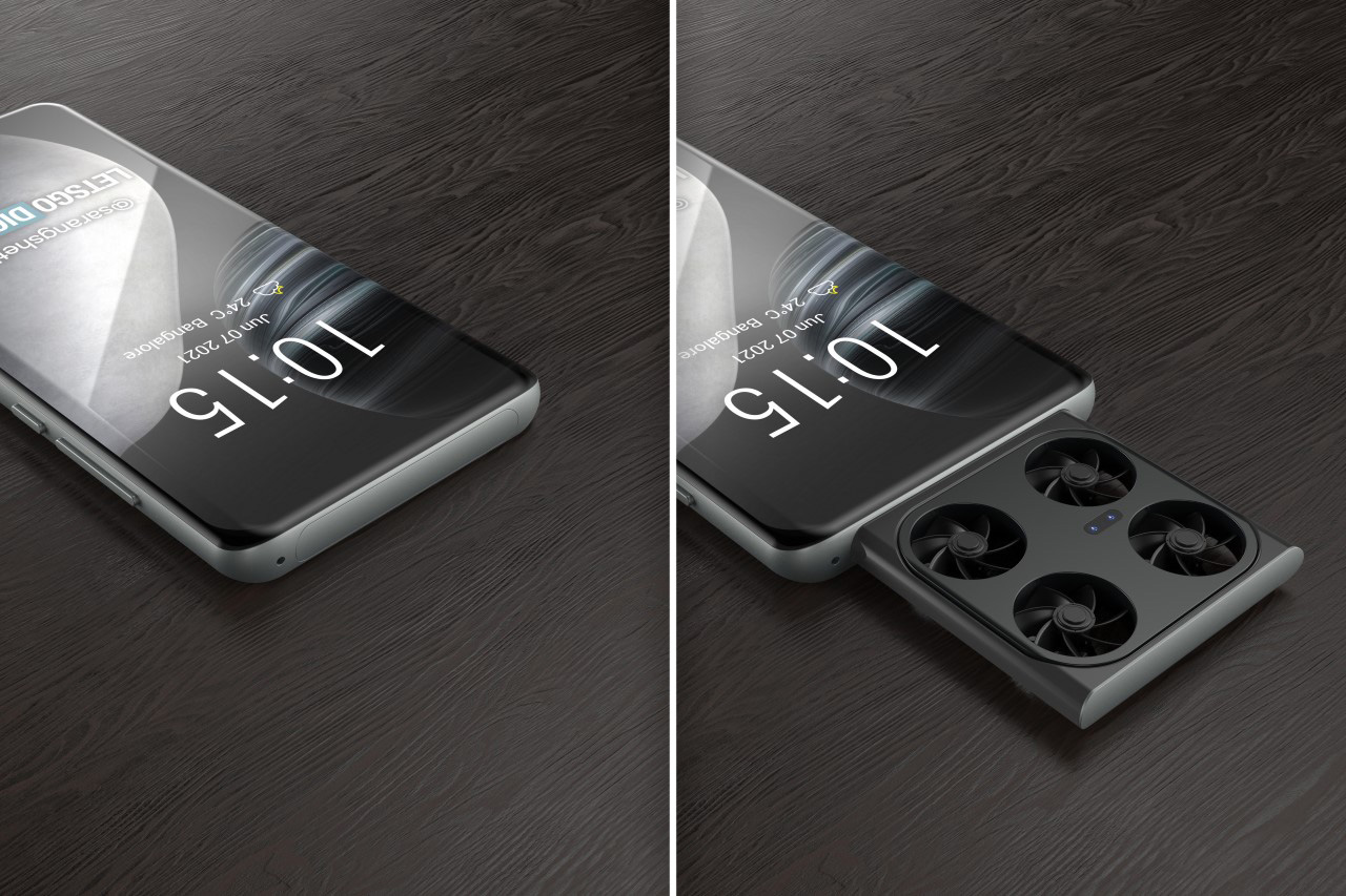
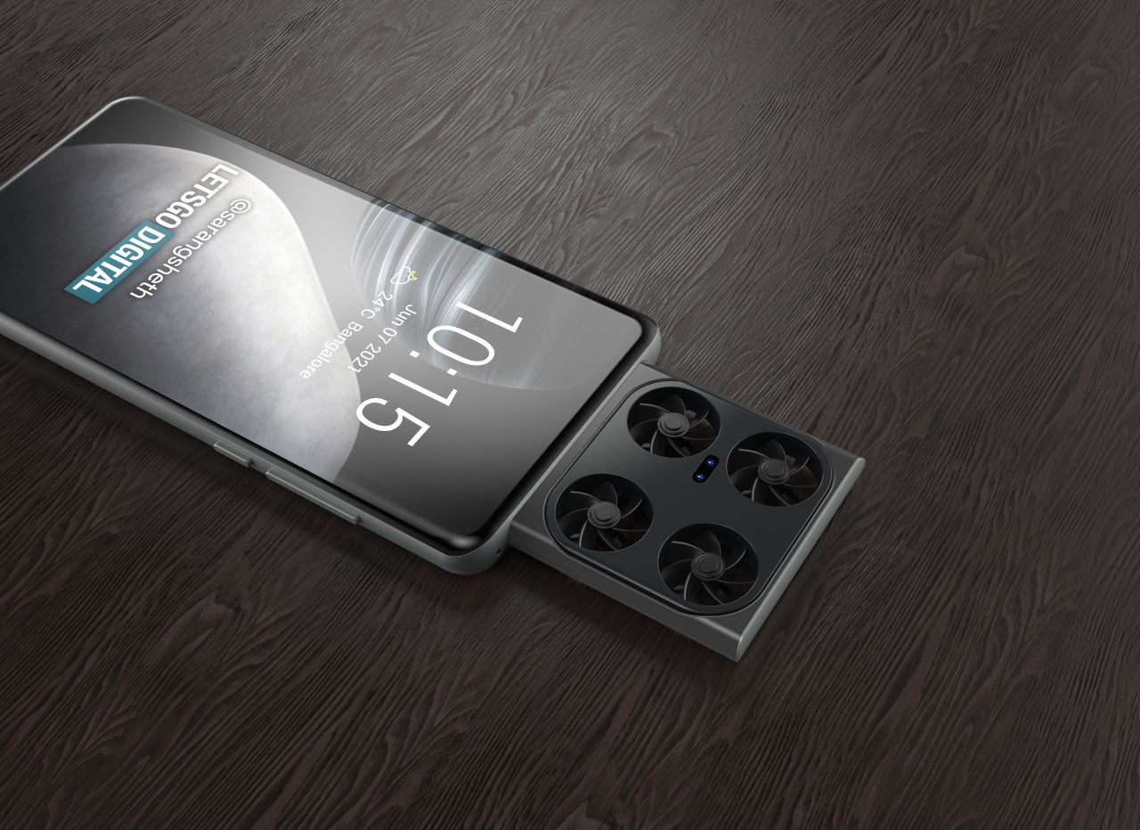
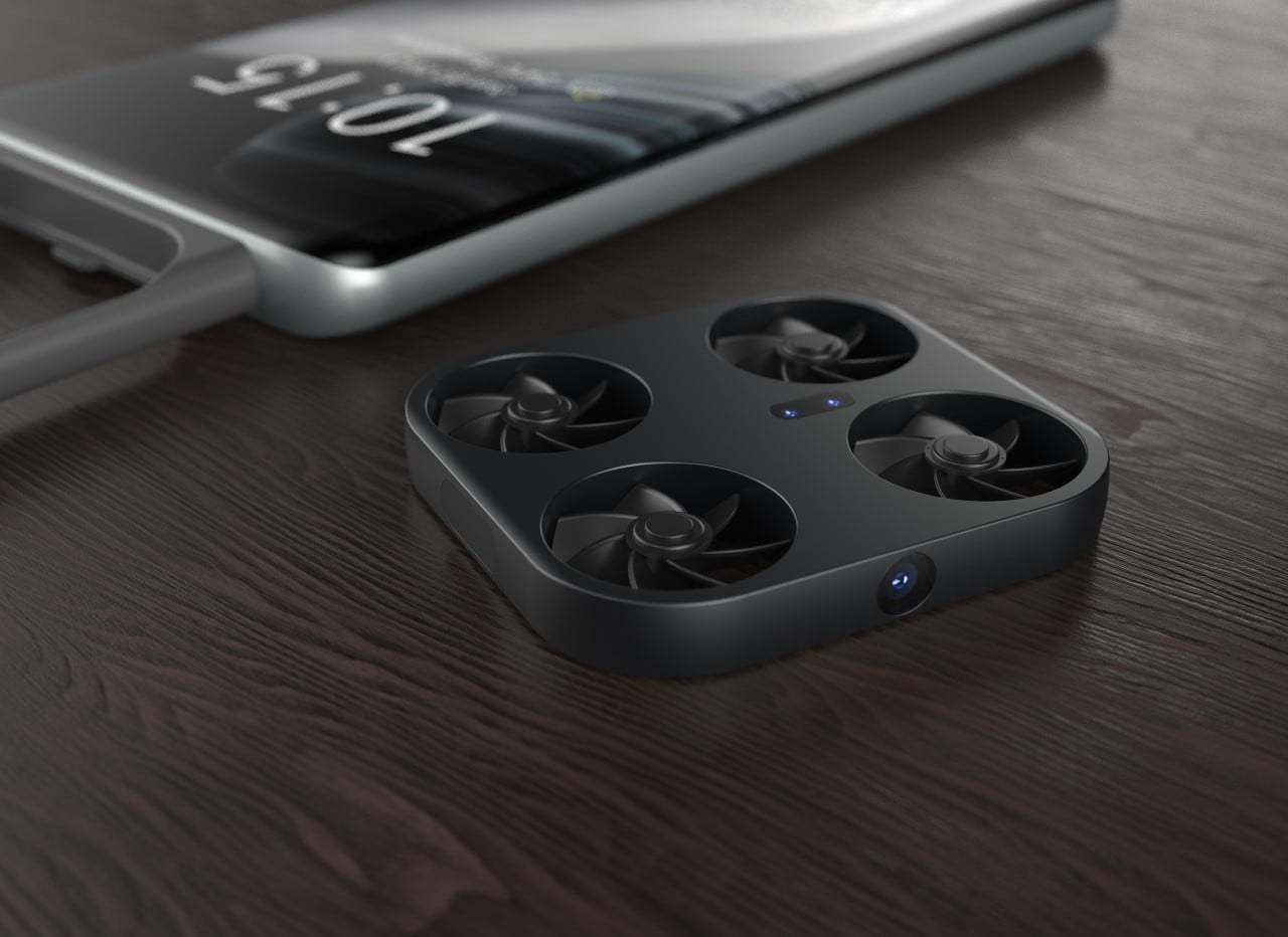
Sliding cameras on smartphones aren’t new, although Vivo’s concept takes it a couple of notches ahead. The patent shows a phone with a massive pop-out tray on the front. Within it, sits a tiny drone (sort of like the Air Selfie Drone from AirPix but smaller) with four propellers and a bunch of cameras and sensors. Fire your camera app and the tray instantly pops out and the drone takes off. A front-facing camera on the drone’s body lets you click photos (either of yourself or of landscapes) from a variety of vantage points, going above and beyond what your smartphone camera and your outstretched hand can do. Given how small drones, it isn’t entirely an idea I can actually dismiss… although what would Vivo’s marketing team call it? A Dronephone? A Smartdrone? A Phdrone?!

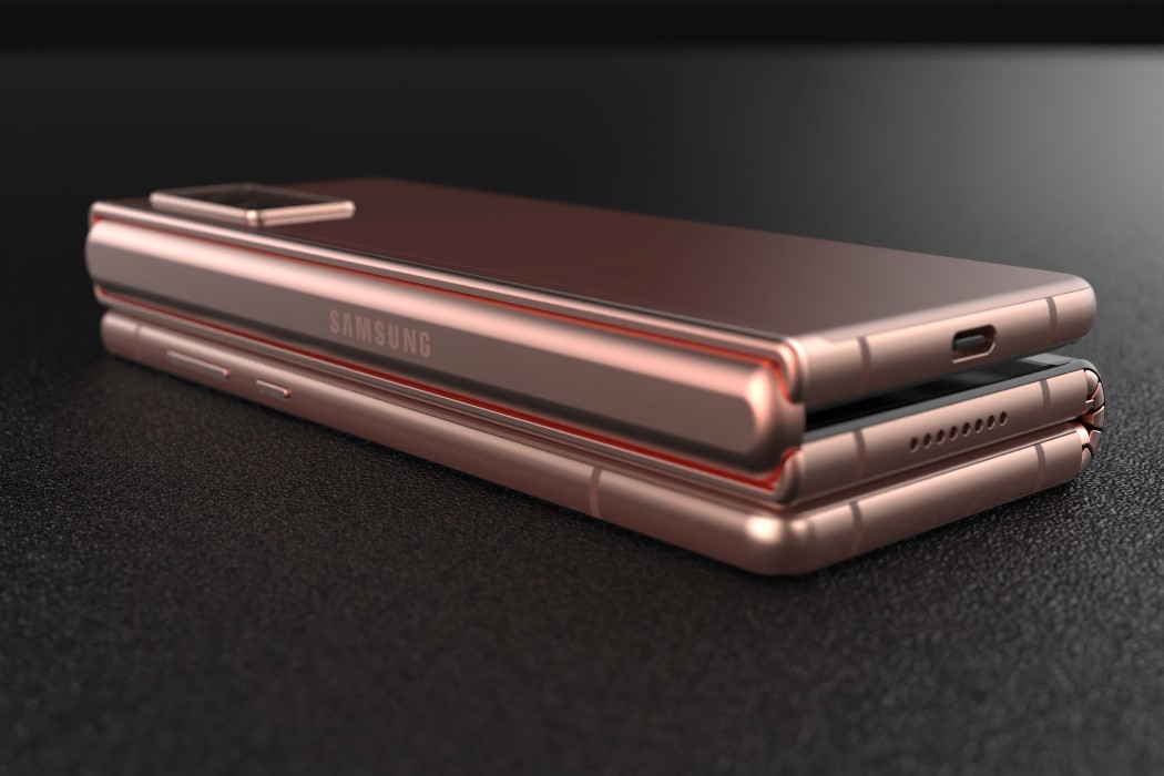
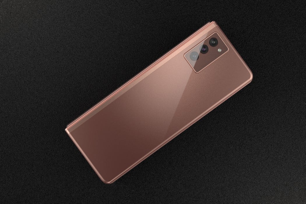
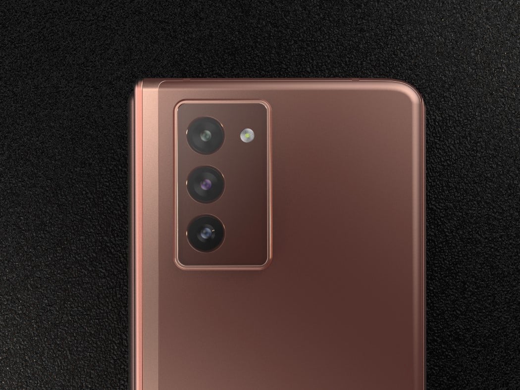
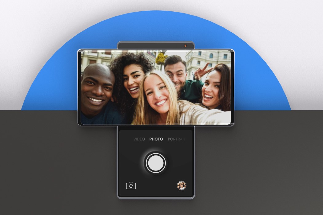
Practicality aside, the tech isn’t too far-fetched. The drone fits right into the phone’s slightly thick body, and comes with dual portrait-mode cameras on the top (that directly face you when the tray pops out), a main camera on the front (that works as the drone’s eyes), and IR sensors on the left and right that help the drone detect and avoid objects. The presence of cameras on the drone mean Vivo’s smartphone doesn’t need any cameras at all. This means no front-facing camera and a clean notch-less hole-punch-less display, as well as no massive camera bump on the back. The smartphone is a complete monolith of glass, metal, and screen, punctuated by a charging port and a set of buttons. The drone tray sits flush against the phone when closed, and pops up only when you fire up the camera app. (I’m assuming the app has drone controllers built in too)
Now let’s argue practicality from both sides of the argument. There’s a fair amount of evidence to say that this is a terrible idea. Moving components on a smartphone are historically the first to fail – Dust gets stuck in it, components wear out, parts accidentally break. The presence of a drone would mean saying goodbye to water-resistance, and there’s also a high chance your drone can get lost or stolen, leaving you with absolutely no camera (that’s if Vivo implements something exactly like this). Not to mention the fact that it practically means the end of privacy as we know it. (Imagine hundreds and thousands of drones flying around in every public space, or worse, or a drone entering a private space).
That being said, drone photography is truly the final frontier in consumer photography. The smartphone camera is already comparable to a DSLR, so now imagine being able to point that camera from any vantage point. You could take distant selfies without selfie sticks, sunsets from inside your house, and get better photos at concerts. It’s safe to assume that the drone would have a rather small battery (given its size), but one could easily make the argument that the drone could also wirelessly charge while docked inside the phone). As far as safety and privacy go, companies could build safeguards and throttles into the drone, preventing it from flying too far from its smartphone. There’s a lot to discuss and unpack here, although at the end of the day, fair reminder – this is just a patent and it’s likely that we won’t see anything like this for at least a couple of years. It’s fun to dream though…
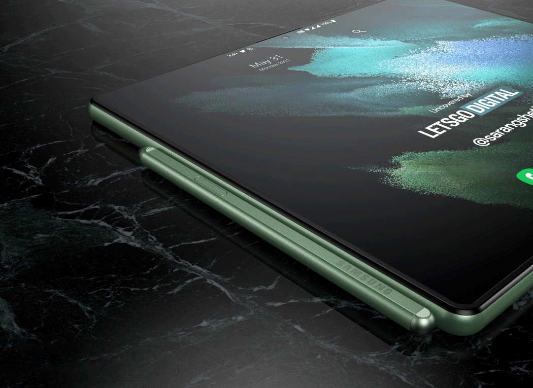
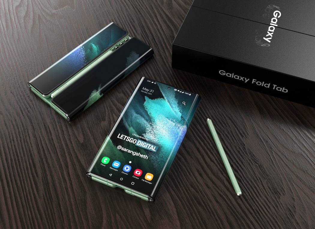
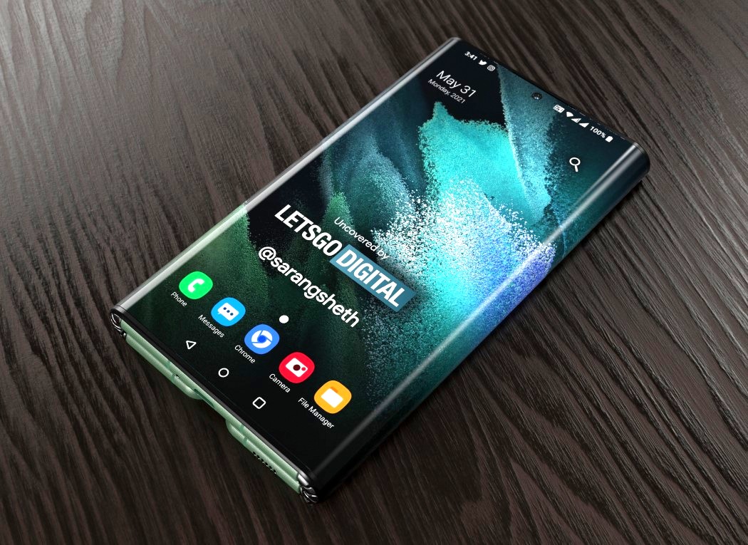
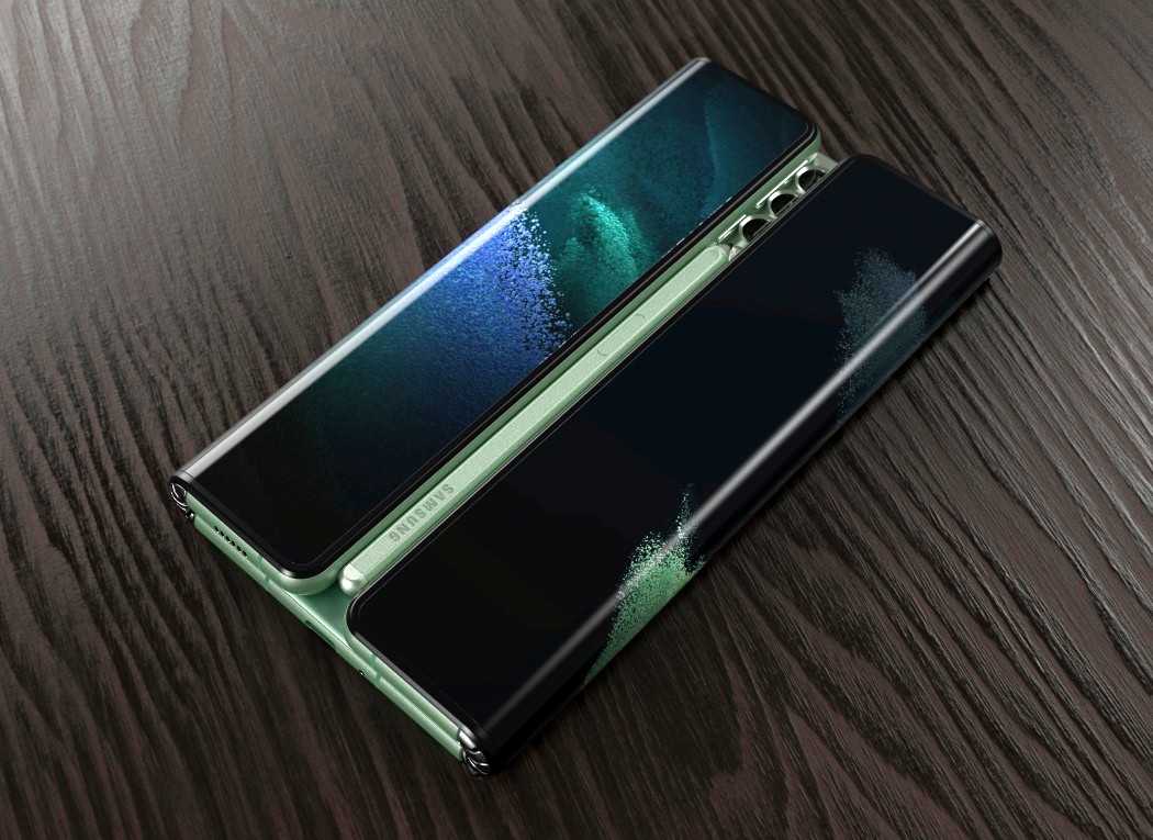
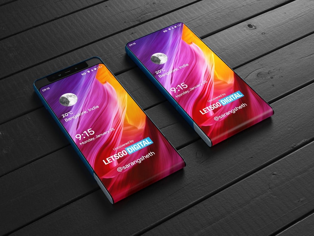
Designer/Visualizer: Sarang Sheth for LetsGoDigital
This concept was first published on LetsGoDigital. Click here to view the original piece.