The lamp with 20 faces

u34_lamp_1

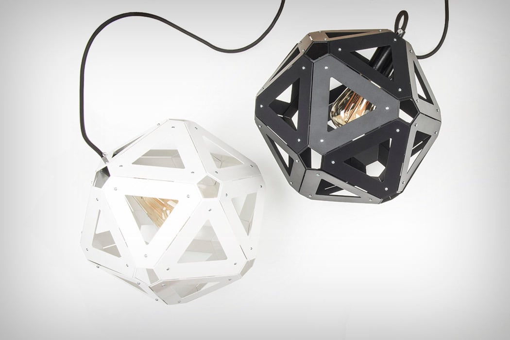
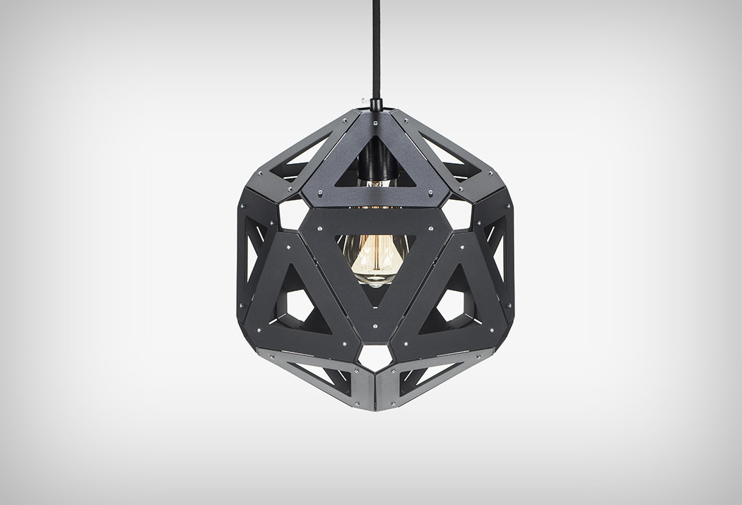
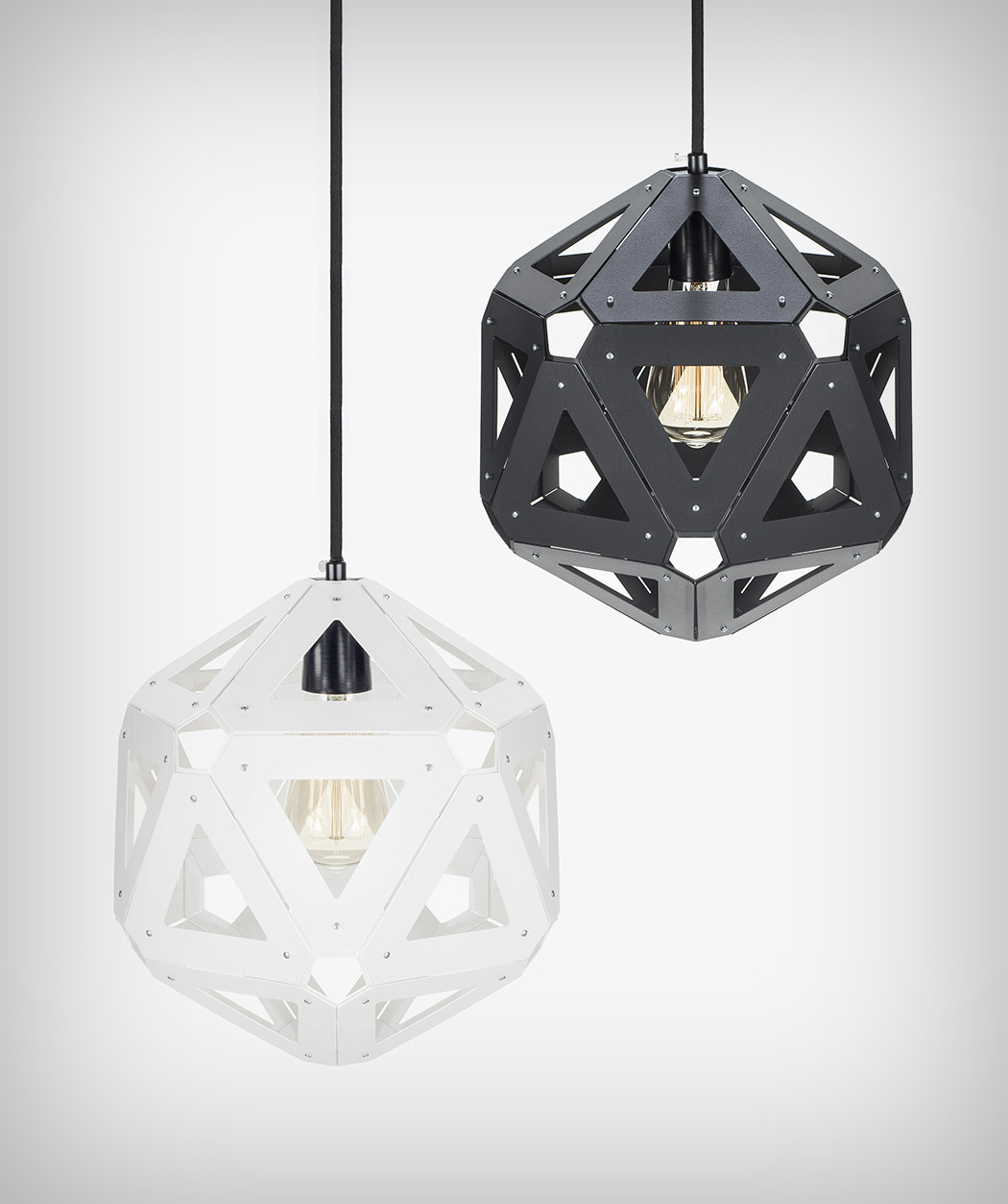
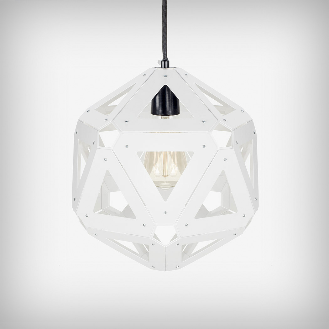
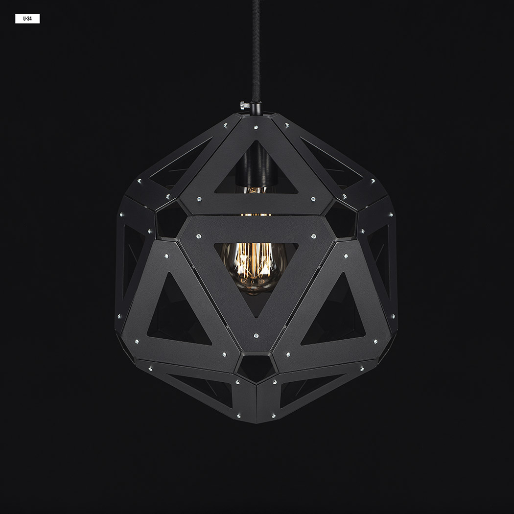
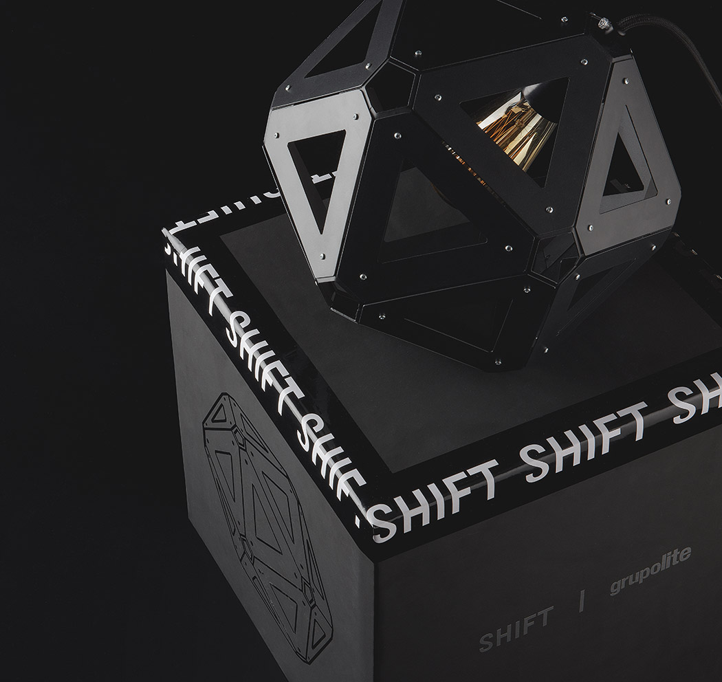
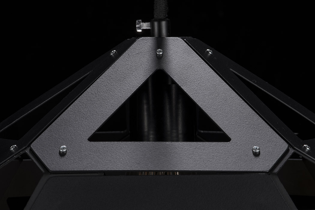
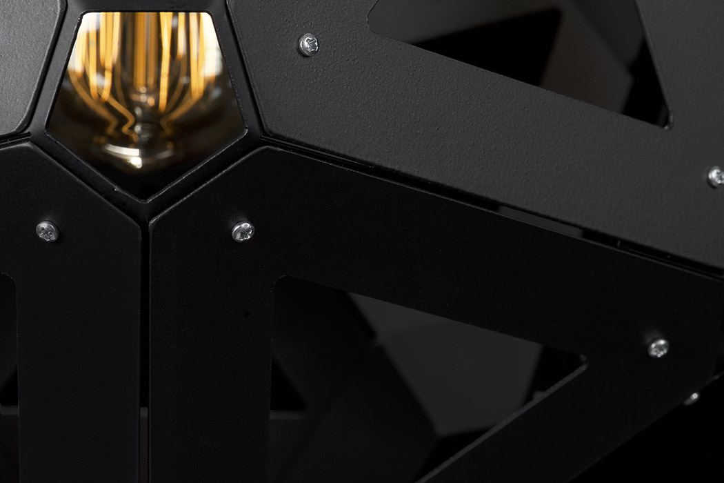
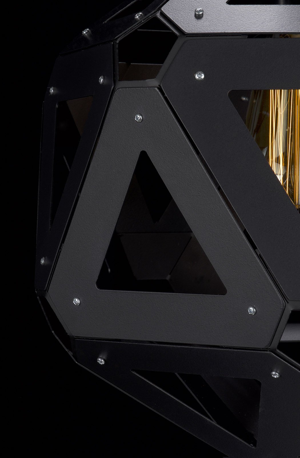
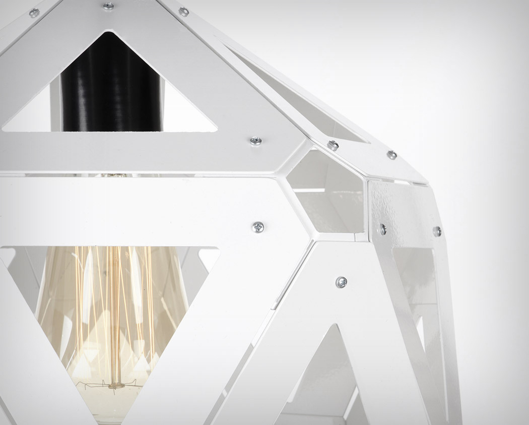
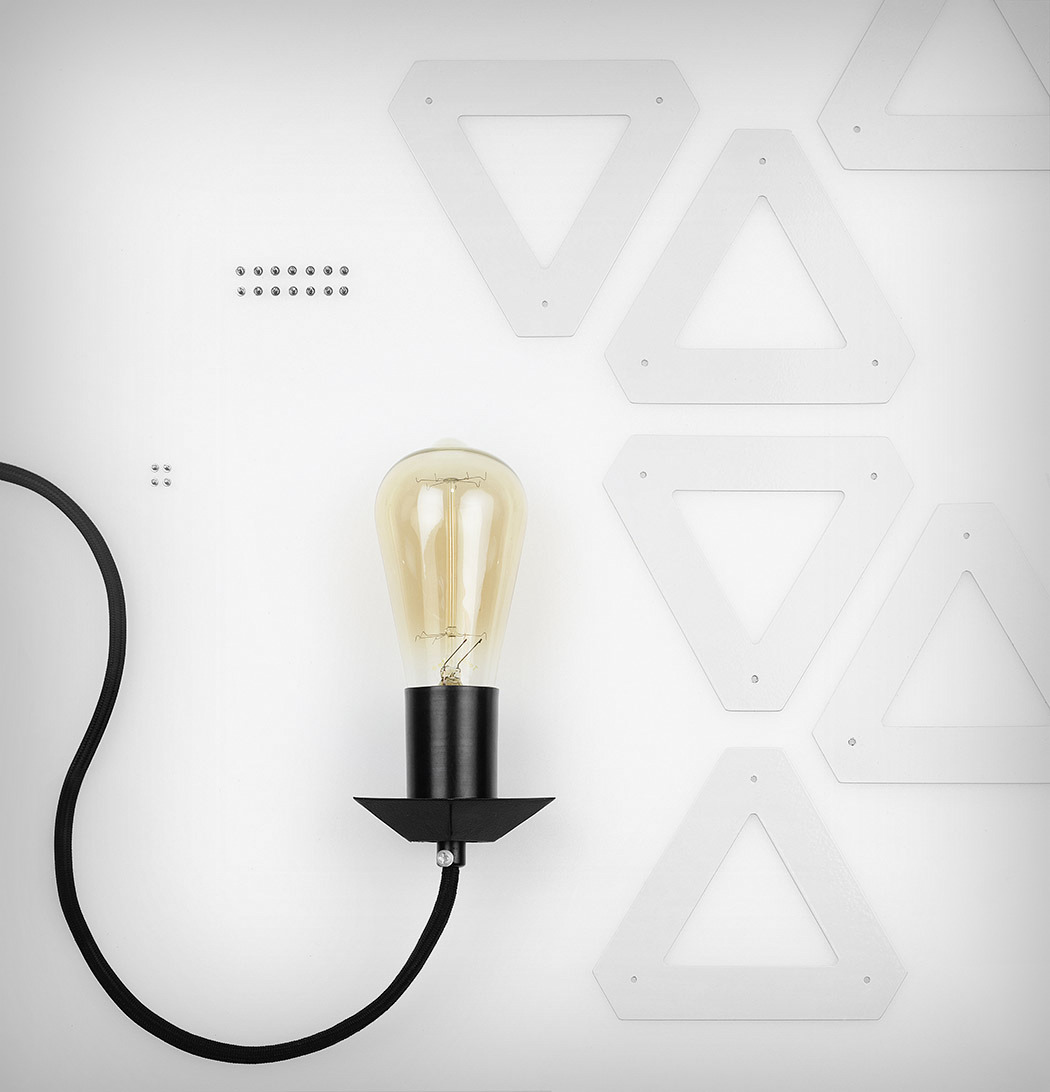
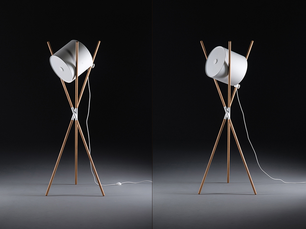
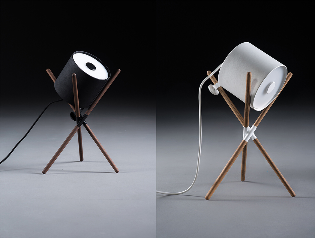
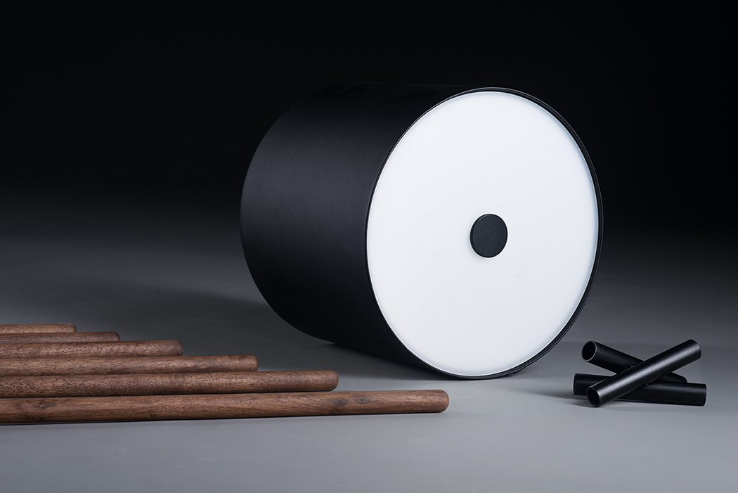
The U34 lamp is all about efficiency through repetition without sacrificing style. The 20 faced icosahedral shape is formed by repeating equilateral triangles of identical dimension. Simple yet versatile, this allows for easier production and assembly. The resulting aesthetic is sculptural with an industrial edge. Who thought 20 triangles could make something this simply beautiful!

Designer: SHIFT

u34_lamp_2

u34_lamp_3

u34_lamp_4

u34_lamp_5

u34_lamp_6

u34_lamp_7

u34_lamp_8

u34_lamp_9

u34_lamp_10

u34_lamp_11

Flat-Pack Never Looked So Pretty

shift_00

Despite its structural footprint, Shift is unbelievably designed to be flat-packed! To get so flat, the shade is made of perforated metal sheeting covered in leather, the diffusers are flat and easily placed, and of course, the wooden struts are long but not substantially wide. A sort of minimal twist on the director’s lamp, it’s easily adjusted to provide directional and background lighting in a wide array of angles. In three different sizes and a selection of wood finishes and colors, there’s one for every spatial requirement.

Designers: Ruder Novak-Mikulic & Marija Ruzic

shift_01

shift_02

shift_03

shift_04

shift_05

shift_06

shift_07

shift_08

shift_09

shift_10

shift_11

shift_12

shift_13

shift_14

shift_15

shift_16

Packaging that makes food tasty

tia_ofilia_packaging_1

Good design shouldn’t be restricted by discipline. Even as a product designer, I myself have scrolled through graphic design websites, branding case-studies, etc. Tia Ofilia’s packaging takes on a comfortable style that gives it that pleasing, pure and fresh look, making you instantly have a warm connection with the product and the brand. The Packaging revamp is done by Shift for Tia Ofilia (Mexican for Aunt Ophelia), an organic foods brand from Monterrey, Mexico. The shapes, contours, and colors are all familiar and harbor trust. Minimal usage of design translates into people perceiving the product as raw and pure, just the way home-made organic food should be!

Designer: Shift

tia_ofilia_packaging_2

tia_ofilia_packaging_3

tia_ofilia_packaging_4

tia_ofilia_packaging_5

tia_ofilia_packaging_6

tia_ofilia_packaging_7

tia_ofilia_packaging_8

tia_ofilia_packaging_9

tia_ofilia_packaging_10