SME smartphone concept aims to aid the visually impaired

Smartphones are mostly created for those of us that are seeing or at least not visually impaired. But for those that want to be more inclusive, there are not that many similar products in the market that would cater to those that have some sort of visual impairment. Good thing that there are product designers out there who are thinking of such things and if their concepts are viable, I really hope that they get the funding to produce devices like this or at least major telecom brands adopt these ideas and create product lines for those that may need smart devices to communicate but are unable to use the usual ones.

Designer: Eslam Shafik

The SME is one such concept for a smart phone for the visually impaired. Unlike regular smartphones that are usually in a rectangular or square-ish shape, this one looks more like a smart speaker or a smart home hub. This a specific design direction that will make it easy for them to carry it around on the palm of their hand without a concern for its orientation. It also has a fabric mesh so you get a tactile grip on the smartphone and the materials used do not conduct heat so it’s comfortable for the user.

It even has a walking mode so the built-in high-quality camera will be able to guide the visually impaired as they’re walking. The voice assistant, Loutaz, can issue warnings when there are obstacles at a distance of not less than 50 centimeters. This assistant, powered by ethical AI, can also read out messages, social media posts, and other digital assistance you may need. It has a base for charging and to dock it when you’re not moving so it can still act like a smart home hub when you’re at home.

If further developed, this can be a pretty interesting, not to mention, useful device for those who need something like this. The 3D modeling seems to have dealt with the ergonomics and design aspect of the SME so what needs to be enhanced are the actual features and functions that will be truly helpful for the visually impaired.

The post SME smartphone concept aims to aid the visually impaired first appeared on Yanko Design.

Nothing Phone (2a) Review: Nothing Beats the Beauty of Essentials

PROS:


  • Beautiful and distinctive semi-transparent design

  • Decent dual 50MP cameras, 32MP front camera

  • Huge 5,000 mAh battery

  • Good value for its price

CONS:


  • No dedicated telephoto camera

  • Average mid-range performance

RATINGS:

AESTHETICS
ERGONOMICS
PERFORMANCE
SUSTAINABILITY / REPAIRABILITY
VALUE FOR MONEY

EDITOR'S QUOTE:

The Nothing Phone (2a) distills the smartphone experience to its most important essentials and wraps it in a gorgeous design you will never get tired of.

Smartphones are getting more and more powerful every year, but that power comes at the cost of complexity and cost. While there’s nothing wrong with a super powerful, uber-luxurious, and expensive device, it’s just not for everyone. Unfortunately, those who prefer to stick to the important basics are often left compromising in terms of performance and especially aesthetics. Nothing is a young brand that is trying to shake up the status quo with a heavy focus on thoughtful design, transparent practices, and accessible technology, and it has already been making headlines with its smartphones and accessories. With the Phone (2a), it’s dipping its hands into a different segment of the mobile market, so take it for a spin to see if it has anything substantial to offer or if it’s nothing at all, pun totally intended.

Designer: Nothing

Aesthetics

Nothing made a name for itself with the distinctive design of its products, especially its phones. While it was not the full transparency idealized by risky DIY hacks or printed skins, Nothing’s decision to have a semi-transparent design actually made better sense. It gave the phone a cleaner look, without the distracting noise of electronics and labels, but still had enough character to stand out from the crowd quickly.

The Nothing Phone (2a) is clearly a member of this family but also differs in significant ways. The arrangement of components is very different, with the camera bump now lying horizontally in the middle, surrounded by a Glyph Interface that’s also completely new and unique to this model. The camera array is enclosed in a circular area from which a covered path snakes down to the bottom, almost like the ribbon connectors between components you’d see inside phones. This distinctive design gives the phone a facsimile of a robotic face, friendly and welcoming like those in cartoons and kids’ shows.

Unlike earlier rumors that worried Nothing fans, the Phone (2a) does indeed have the Glyph Interface, except it’s also simplified like the rest of the phone’s design. There are only three components this time, two asymmetrical arcs on the left of the cameras and a vertical bar on the right, that delivers that same dynamic lighting but with less fanfare. Considering how you’re usually holding your phone, this makes sure that the glyphs will always be visible to everyone in front of you when they light up, rather than having parts of it covered by your hand.

The Nothing Phone (2a)’s aesthetics pretty much reflects the overarching theme of the phone. It delivers the essentials for a pleasing user experience without being showy but still having enough impact to be worth your while. It strives to strike a balance even harder than its older siblings in order to cater to a market that has long been in need of that kind of design that doesn’t compromise too much for the sake of driving down costs.

Ergonomics

The Nothing Phone (2a) is also an anomaly in the sense that it’s actually a large phone that weighs almost like nothing. With a 6.7-inch screen, it’s definitely one of the bigger slabs in the market, yet its 190g weight feels almost nothing in your hand. And that’s despite the large battery it hides inside, which makes the phone a bit of a mystery.

This means that the Phone (2a) is quite comfortable to hold, even for long periods of time. It doesn’t weigh down on your hand that much, though you might also be worried its lightness can become a liability instead. Fortunately, the flat edges of the phone do provide a bit of grip to aid your hand. All in all, it was a pleasurable experience to hold the phone, perfectly matching its pleasing aesthetic.

Performance

There’s no going around the fact that the Nothing Phone (2a) is not your super-powerful high-end premium flagship. Nothing partnered with chipmaker MediaTek for a custom Dimensity 7200 Pro chip, but that is also two tiers from MediaTek’s own top-of-the-line series. Even the GPU technology is from back in 2021, and benchmark scores seem to paint a rather disappointing picture. It’s theoretically better than its peers, the Snapdragon 7s Gen 2 and Snapdragon 782G, but those are mid-range processors as well.

The good news is that it hardly really matters because the Phone (2a) still manages to hold its own with most tasks you throw at it, especially with 12GB of RAM. Gaming is going to be less impressive, of course, so you’ll have to dial down the settings a bit, but it’s still a decent experience. The Nothing Phone (2a) is meant to be an everyday phone for everybody, rather than a hyper-focused tool for gaming or photography, and when it comes to general activities, it thankfully does quite well despite those numbers being stacked against it.

As mentioned earlier, the Nothing Phone (2a) has quite a sizable battery, specifically a 5,000 mAh pack. That’s actually very generous even by premium smartphone standards, and given the rest of the specs, it’s sure to give you more than a day’s worth of use, at least with reasonable measure. Charging is capped at 45W, which isn’t exactly the fastest but still an upgrade over previous technologies. As expected, there is no wireless charging, which is one of the very few compromises this design does make.

In addition to its unique semi-transparent design, the Nothing Phone was characterized by its Glyph Interface, basically a light-based notification system that adds a bit of flavor to the user experience. Some considered it gimmicky at first, but it’s actually a useful tool for minimizing distractions. You can keep your phone face down on your desk and only see the glyphs light up for important events, like a call, an important message, or a timer. You don’t have to glance at your phone’s screen every time something comes in, reducing the risk of you getting distracted when you other notifications as well. And because the glyphs are confined to the upper portion of the Phone (2a), they’re also less invasive and more restrained, focusing on just the essentials of the function rather than the glamour.

When it comes to the cameras, the Nothing Phone (2a) is a bit of a mixed bag. As you may have noticed, there are only two cameras, but both of them, fortunately, have 50MP sensors. The main Samsung GN9 camera features OIS and autofocus, while the ultra-wide Samsung JN1 has a 114-degree field of view. Both perform rather well, even at night, with clear details and low noise. Unfortunately, there is no dedicated telephoto camera, so you’ll have to settle for the main wide camera’s cropped 2x zoom, which is less impressive than regular shots.

The front-facing camera has an impressive 32MP sensor, and it definitely shows in the quality of selfies you can take. There’s no aggressive beautification like what you’d find in other brands, so what you see is really what you get. That means this camera isn’t just great for social media but, more importantly, for video calls and meetings as well.

Sustainability

Right from the start, Nothing wanted to be different from the way it ran its smartphone business, which also included its commitment to sustainability. From the use of recycled materials to the packaging, Nothing has been ensuring that its products reduce their negative impact on the environment. The Nothing Phone (2a) thankfully follows that practice, and although it’s not yet on the same level as bigger brands, it’s definitely a strong start.

That commitment to sustainable design is helped by the fact that the Nothing Phone (2a) is also made to last longer. With an IP54 dust and water resistance rating, it’s guaranteed to hold up against most accidents. It’s not the highest rating, of course, but just that mark goes a long way in assuring owners that their fun-looking mobile partner isn’t going to abandon them at the slightest incident.

Value

Given all the specs and features, it’s perhaps pretty clear that the Nothing Phone (2a) is the brand’s foray into a segment traditionally considered to be mid-range or mid-tier. In fact, its $349 price tag confirms that classification and that figure is nothing to scoff at. There’s a certain negative connotation to the phrase “you get what you pay for,” but this is a case where you’re actually getting a whole lot more than that price value.

Yes, performance is decent at best, but the Phone (2a) has enough power to get you through the day and more, both in terms of raw power as well as battery life. The cameras are serviceable, though you’ll definitely feel the absence of a proper zoom camera. Best of all, you’re getting all of that in a distinctive and eye-catching design that’s pleasing to the eyes and light in the hand. In other words, you’re getting a beautiful, no-nonsense smartphone that feels worth more than what Nothing is asking for.

Verdict

Nothing has definitely stirred up the waters by challenging the market giants with an ambitious vision and a visionary design. But while the first two Nothing Phones served to put the brand on the map, there was still a segment that was left underserved by these premium products. To bring its design to everyone, Nothing also needs to target different tiers, tiers with different needs and budgets.

The Nothing Phone (2a) was clearly made to address that need, offering an experience that focuses on the essentials without all the bells and whistles that, in the end, could also burden the user. It packages that in a design that is bare-bones yet distinctive and characteristic of Nothing’s design language. It distills the Glyph Interface down to its core purpose, to provide a distraction-free way to get notified of important events. The Nothing Phone (2a) is a laudable example of a design that deftly balances features and costs to craft an experience that is clearly made with the user in mind.

The post Nothing Phone (2a) Review: Nothing Beats the Beauty of Essentials first appeared on Yanko Design.

iPhone SE 4 renders say goodbye to the Touch ID home button, hello to USB-C

All good things must come to an end, or so they say. Of course, the definition of “good” will always depend on who you ask. Some might be pining for the “good old days” when the iPhone was curvy, small, and didn’t require your face to unlock it. For some, the 3rd-gen iPhone SE from 2022 was their recourse, but could finally be the last of its kind. No, Apple will apparently still launch an ultra-affordable iPhone, but it will no longer be that safe haven for lovers of old technologies and designs. According to this latest visual leak, the iPhone SE 4 expected to launch next year will be taking after the iPhone 14 design, now also considered a “last-gen” design, except for one curious feature that’s both surprising yet makes total sense as well.

Designer: Apple (via 91mobiles)

The iPhone SE, which stands for “Special Edition,” has always been an oddity in Apple’s lineup. Although it was regarded to be the cheapest and smallest iPhone from the company’s catalog, those points aren’t always true as each new model is introduced. To some extent, it feels more like the iPhone SE is an ode to technologies and designs that are being put to pasture, whether it’s the small design and headphone jack of the first iPhone SE or the physical home button of the iPhone SE 3.

Unofficial CAD renders, uninspiring as they might look, offer some clues to the design changes that Apple intends for the 2025 iPhone SE. For one, it finally bids farewell to the small-sized iPhone with what is allegedly a 6.1-inch screen. Second, it also removes the thick bezels of the past, embracing a screen that has been around since the iPhone X, which also means finally embracing the notch. More importantly, however, this kind of bezel-less display also has no room for Touch ID, so fingerprint authentication will finally be gone for good, at least on iPhones and iPads.

For all intents and purposes, the iPhone SE 4 looks like the iPhone 14 from 2022, which itself sported a design that was significantly unchanged since the iPhone X from 2017. The only major difference, at least from a design perspective, is that the camera on its back retains a single circular bump more reminiscent of the iPhone 8 and earlier eras. Given there might only be a single camera anyway, that’s a better choice than having a square bump with barely anything inside it.

The renders do suggest that the 4th-gen iPhone SE will also adopt a USB-C port, a technology that Apple introduced to iPhones only last year. This is quite a modern feature for an iPhone SE model, but considering the pressure on Apple to adopt a standard charging port, it doesn’t come as a surprise. That said, these are still all unofficial, so details might still change before the new iPhone SE launches, which is expected to happen next year.

The post iPhone SE 4 renders say goodbye to the Touch ID home button, hello to USB-C first appeared on Yanko Design.

Vivo V30 Pro Review: Putting The Focus Where It Counts

PROS:


  • Thin, lightweight, and beautiful design

  • 50MP wide-angle selfie camera with autofocus

  • Impressive triple 50MP camera system

  • Long-lasting, fast-charging battery

CONS:


  • No stereo speakers

  • Thin edges make it difficult to grip and pick up

  • Limited global availability

RATINGS:

AESTHETICS
ERGONOMICS
PERFORMANCE
SUSTAINABILITY / REPAIRABILITY
VALUE FOR MONEY

EDITOR'S QUOTE:

With breath-taking elegance and ZEISS-tuned Triple Main Cameras, the Vivo V30 Pro offers unbeatable value to mobile shutterbugs and design-conscious buyers alike.

It’s really difficult these days to pin a phone down to a specific market tier or device range, especially since brands tend to advertise every single model as the best in its class. Technology has advanced to a point that what some might consider mid-range due to one or two features might surpass flagship models in other aspects. That seems to be the case with the Vivo V30 Pro, arriving on the heels of the Vivo V30 that we reviewed just last month. The “Pro” in its name is pretty telling, promising a higher level of experience while still staying faithful to the spirit, not to mention the design, of the base model. In what ways does the Vivo V30 Pro actually improve on the Vivo V30, and are those enough to warrant giving this pricier version a serious look? We give it a whirl to find out.

Designer: Vivo

Aesthetics

Something can be beautiful without being too flashy. A flower’s charm, for example, often comes from its simplicity and the pleasing way it combines shapes and colors in a way that only Mother Nature can really accomplish. The Vivo V30 Pro tries to capture that spirit almost literally, combining subtle details and minimalist aesthetics in a composition that delights the eyes without being distracting. It’s no coincidence that Vivo’s designs for the V30 Pro are clearly patterned from nature, and it definitely pulls this feat off with aplomb.

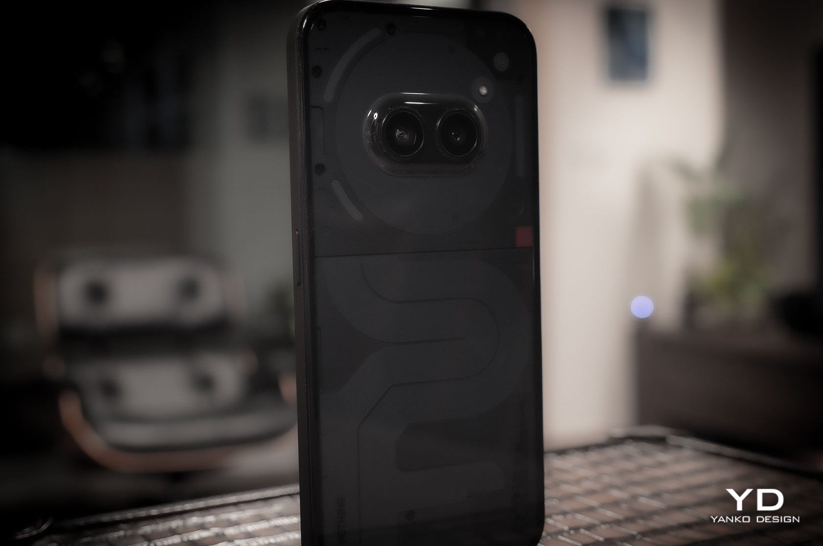
It’s not just a matter of painting patterns on the phone either. Our Bloom White review unit, for example, looks like it has flowers pressed on its back. This “3D Petal Pattern” was accomplished by 3D engraving 13 million tangent lines on the material’s surface using photolithography. The greenish-blue Waving Aqua, on the other hand, employs thousands of tiny magnetic particles to create the illusion of rippling waters. The visual effects are subtle, almost invisible unless you take a second look, but they definitely add to the Vivo 30 Pro’s elegance.

Coupled with its thin profile and lightweight body, the Vivo V30 Pro exudes class and beauty without being overbearing. The process and cost of such designs might sound overkill for what would be classified as a mid-range phone, but these designs not only demonstrate Vivo’s manufacturing prowess, they also reflect the evolving tastes of smartphone owners today who want an attractive phone they won’t need or even want to cover up with a case.

Ergonomics

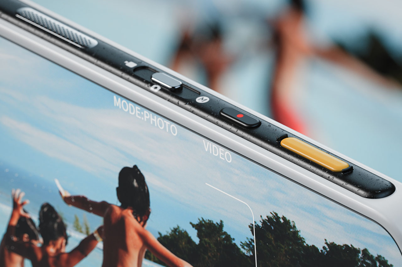
Despite the large 6.78-inch screen, Vivo manages to make the impossible possible with a thin and lightweight handset. Only 7.45mm thin and 188g light, the Vivo V30 Pro is comfortable and pleasurable to hold, even after long periods of time. That thinness is very accentuated by the curved edges of both the screen and the rear panel, a trend that is slowly dying and being pushed out by flat edges. Some defend that this design is gentler on your palms, but others criticize it for also reducing the phone’s grip, making it more likely to slip from your grasp.

If there is one drawback to the Vivo V30 Pro’s very thin edges, it’s that it makes it a bit tricky to pick it up from a table or any solid flat surface. There’s very little area for your fingers to grip the edges and you might find the phone slipping or sliding before you can have a solid hold on it. The included clear case adds some thickness and texture to fix that, but it also puts a less premium layer of material between you and your phone, no matter how transparent it is.

Performance

Gone are the days when you could easily predict a phone’s performance by simply looking at its specs, especially the processor. The time when MediaTek’s silicon was considered cheap and underpowered is long over as well, and the Vivo V30 Pro is living proof of that. Granted, the 4nm Dimensity 8200 processor it’s using is actually last year’s generation, but it’s hardly any slouch. In fact, it manages to beat Qualcomm’s Snapdragon 7 series from the same generation in some benchmarks, which is quite telling.

What all this means in practice is that the Vivo V30 Pro can handle everyday tasks without breaking a sweat. Sure, you shouldn’t expect it to run toe-to-toe with high-end and more expensive smartphones, but setting graphics settings to medium is sure to still satisfy your gaming needs. The cooling system is effective, though not exactly stellar, so expect your hands to feel some heat after prolonged gaming. The best part of its performance, however, is the generous 5,000 mAh battery that’s guaranteed to last you more than a day of average use. With the included 80W charger, you don’t even need to wait long to get it from zero to full, just a little under 50 minutes, in fact.

The large 6.78-inch 120Hz AMOLED display mirrors the phone’s back in providing a beautiful sight, though it’s naturally flashier and more eye-catching. The panel is bright and the colors are vibrant, though they tend to lean more towards being very saturated by default. While the visual experience is superb, the same can’t be said of the audio aspect. There’s a single bottom-firing speaker that is very basic. You’ll be hard-pressed to detect much bass, for example, and the quality degrades noticeably at maximum volume. You might be better off connecting Bluetooth speakers if you really want to spread your tunes around.

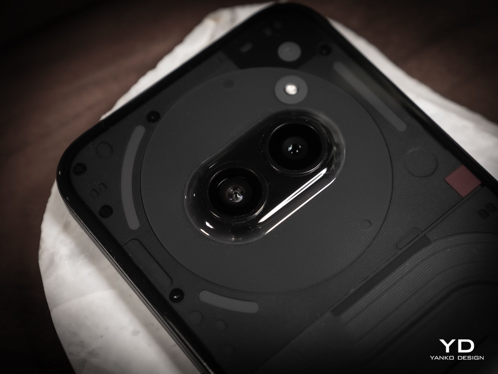
Smartphones these days almost feel like cameras that just happen to have phone functionality because of the heavy emphasis put on mobile photography. The Vivo V30 Pro is no exception and, in fact, celebrates it and takes it to the next level. It challenges the status quo of using different sensors for different cameras and comes bearing 50MP cameras for primary wide, ultra-wide, and 2x telephoto. In fact, it even uses a 50MP sensor for the front-facing camera, complete with a wide-angle lens and autofocus.

For its camera system, Vivo enlisted the expertise of optics experts ZEISS, and the results definitely speak for themselves. The output of the main camera is clear, highly detailed, accurate, and just gorgeous. That is true even at night, with Vivo’s special night mode kicking in. The 2x optical zoom of the dedicated telephoto, while not that far in reach, is still better than relying on digital zoom and cropping the way the Vivo V30 does. The ultra-wide camera, while decent, isn’t as impressive as these other two, but you’ll still get clear and detailed images from it, regardless of the lighting condition.

One special feature of the Vivo V30 series, which can be seen from the unusual design of the phone’s camera bump, is the square Aura Light that sits below the cameras. If you’re familiar with the effect of ring lights in diffusing a gentler glow on your face, then you’ll know how this feature works. Instead of a focused light like a typical LED flash, it spread the light around more evenly, making it the perfect illumination for portrait photos. Even better, the Aura Light can automatically change its intensity and warmth depending on ambient lighting, all thanks to AI, of course. Now if only Vivo could do the same for the front-facing camera, then it would really be able to leave its competition in the dust.

Sustainability

Despite the Vivo V30 Pro’s nature-inspired design, the phone itself isn’t exactly that environment-friendly, at least as far as its build materials go. It’s not exactly an outlier in this regard and it merely follows the industry status quo. Sadly, it’s also an opportunity for Vivo to rise above the rest and set a new industry standard, but we’ll probably have to wait a bit longer for the company to really take its sustainability efforts to the next level.

At least the Vivo V30 Pro is designed to last long, especially with an official IP54 dust and water protection rating. It’s far from being the highest and is, in fact, the bare minimum for waterproof devices, but it’s also something that’s usually missing from most smartphones on this tier. When accidents do happen, however, you have very little option other than to send it to Vivo or its authorized repair centers for servicing. Self-repair is just not a thing in this space yet.

Value

Truth be told, it’s hard to find any fault with the Vivo V30 Pro. Yes, it doesn’t max out all the potential that more powerful hardware can provide, but it also doesn’t tax buyers for features they may never use in the first place. It has a pretty good balance of features and tends to perform well in areas that matter the most, such as mobile photography and battery life. Plus, it looks stylish and classy, so you’ll probably fall in love with it quickly.

The expected $500 price tag brings a bit of uncertainty, though. It’s definitely higher than its sub-$400 peers, but it offers features you won’t find on more expensive handsets either. The biggest deal-breaker, however, is its availability. The Vivo V30 Pro will only be sold in select markets in Asia, at least for now, so all that beautiful design and impressive cameras will be out of reach for many people around the world.

Verdict

Smartphones are no longer just tools for communication or even for staying connected to the Internet. They have become irreplaceable partners in creating and preserving memories, as well as extensions of our personalities and aspirations. Smartphone designs have matured over the years, shedding off flashy and gimmicky features for reliable functionality and appealing aesthetics. This trend has trickled down even to the so-called mid-tier market, as embodied by the Vivo V30 Pro.

Inspired by nature, the Vivo V30 Pro’s beauty is subtle yet impactful, employing innovative manufacturing techniques to create more natural designs that catch the eye and soothe the soul. It’s no racehorse, but what the phone lacks in raw processing power it makes up for in reliability and value, offering a more balanced product. At the same time, its Triple 50MP Main Camera system and 50MP front-facing camera challenge the status quo and prove beyond reasonable doubt what is possible even on this tier. All-in-all, the Vivo V30 Pro is a well-rounded contender that you’ll want to consider for your next phone purchase, presuming it’s even available in your area.

The post Vivo V30 Pro Review: Putting The Focus Where It Counts first appeared on Yanko Design.

Galaxy Z Fold 6 renders reveal sharp design, rumors of Ultra model appear

MWC 2024 has seen several foldable phones that have either already launched or are still yet to come, showing that this growing market is, in fact, still growing. But even with the number of new players or new models popping up regularly, there’s no denying that one brand stands at the top in terms of both market share as well as mind share. That’s the advantage of being one of the first and one of the most aggressive to market foldable phones, but it’s an advantage that won’t last long if Samsung chooses to rest on its laurels. Previous rumors about the Galaxy Z Fold 6 hint at a very mixed bag, and fresh 3D renders of Samsung’s next foldable seem to prove that it is indeed going after iterative refinement over sensational new features.

Designer: Samsung (via Smartprix and Steve Hemmerstoffer/@OnLeaks)

Depending on how you look at it, the Galaxy Z Fold 6’s design pictured in these unofficial renders could either be sleek or boring. It admittedly shares much in common with its predecessor, save for one detail. The corners are now more angular, which gives it a sharper appearance, literally and figuratively. In a sense, it resembles the boxy Galaxy S24 Ultra now more than ever, putting it in the same category as that “pro” smartphone.

The more interesting details, however, aren’t exactly apparent in these renders. The illustrations were based on unofficial sources which claim that when unfolded, the Galaxy Z Fold 6 will have a dimension of 153.5 x 132.5 x 6.1 mm. While that does “confirm” that the phone is shorter and wider, it also indicates that the thickness hasn’t changed at all. That, in turn, could raise hopes that there might still be some room for an S Pen inside after all.

Other than that, there aren’t many changes expected for the next big Samsung foldable, especially when it comes to the cameras. That said, there are now whispers of an “Ultra” model apparently in the works, one that could have those much-awaited features like a built-in S Pen and upgraded cameras. This goes in the completely opposite direction of earlier rumors of a more affordable Galaxy Z Fold model. Then again, Samsung could also opt to lower the price of a “base” Galaxy Z Fold 6 ever so slightly in order to position the Galaxy Z Fold 6 Ultra better.

Regardless of how its actual design will come out, it will be an interesting and critical time for Samsung’s foldables. While it’s still popular, it is no longer the only game in town and its competitors are gaining ground quickly. Sooner or later, it will need to take bigger and bolder changes, especially ones that people have come to expect from one of the biggest smartphone makers in the world.

The post Galaxy Z Fold 6 renders reveal sharp design, rumors of Ultra model appear first appeared on Yanko Design.

nubia Music phone has two headphone jacks and a large speaker on its back

Once upon a time, music was played to be enjoyed by an audience. While that still happens today, most of the time we have become enclosed in our own little audio bubble thanks to smartphones. Earphones and earbuds keep the music to our ears, and smartphone speakers can’t get too loud without losing the music’s quality and clarity. Even worse, the venerable headphone jack that audiophiles use and love has been banished from mobile devices. In an effort to bring back that social listening experience, nubia is launching what could be its most distinctive smartphone yet, one that is a clear ode to a golden age of music that brings together features and design elements that will let you share your favorite tunes with ease.

Designer: Nubia

There may be no room for a thick 3.5mm port inside extremely thin phones, but what if thinness was never a problem in the first place? Aiming for a different priority, the nubia Music doesn’t just bring back the headphone jack but actually adds an extra one. Yes, there are two headphone jacks on this phone, and it’s a clear indication that this device is meant for listening to music. In fact, it’s designed to let you share that music with another person, a friend or a partner perhaps, provided they also have wired earphones.

There might be times you’ll want or even need to play music that everyone can hear. That’s where the nubia Music’s ultra-loud speaker comes in, promising 600% more volume without the distortion. That’s already a huge improvement over your typical smartphone loudspeaker, but what’s even more interesting about it is the way it’s added to the phone’s design.

As if dual headphone jacks weren’t odd enough, the nubia Music even has that ultra-loud speaker on its back. But rather than just simply slapping it on like what some other rugged phone manufacturer did, nubia opted to add a charming design to this unusual feature. The circular speaker and the two cameras are set opposite each other on a raised rectangle, recreating the appearance of a turntable that music lovers will be able to immediately identify. It’s a very nice touch that should tickle the hearts of audiophiles of all ages.

The entire phone is designed with that vibrant, lively, and youthful character, presenting a device that loves to party as much as you do. With mid-range specs and a price tag that starts at only $149, it is clearly targeting a younger crowd, though any music lover will surely find the nubia Music something worth looking at and, of course, listening to.

The post nubia Music phone has two headphone jacks and a large speaker on its back first appeared on Yanko Design.

Forget Flip Phones, this Smartphone has a Flipping Side Button Panel for Regular, Gaming, and Camera Modes

When mobile phones began scaling up, they used physical buttons for navigation. Steadily touchscreen smartphones took over more rapidly than mobile phones to reach our pockets in the first place. This was because of two considerable reasons: larger display real estate and lighter and slimmer design. But what we had to forgo in this barter was the tactile feedback on the press of a button that good old mobiles offered.

It has been seen that mobile gamers and camera enthusiasts prefer the tactile feel of the phone and this has given surge to a new league of accessories that make this possible from an everyday smartphone. Now a designer believes there is a scope of adaptation for a smartphone with tactile buttons for camera and gaming mode, in addition to physical volume rockers and power button of the touchscreen phone.

Designer: Wayne Lu

Appropriately christened the Phone One, this as the tagline suggests, is a multi-mode smartphone that revives the physical buttons for a tactile feel. The interesting aspect here is that these buttons do not take up the screen space but are provided in a uniquely designed three-pivot side panel of this smartphone.

The pivot allows the right-side panel of the phone to rotate within the phone frame itself, transitioning from normal phone mode to gaming mode and further into camera mode and back to the phone mode. The normal mode with volume and power buttons ensures the Phone One looks as close to normal as possible for daily usage.

The magic starts on the first twist of the side panel that reveals the game mode. This shows up a speaker grill in the center and D pa- style four buttons in as many colors. Taking things further into the optics arena is the camera mode that appears on the next pivot of the side panel. This mode with all the physical buttons for recording, clicking, flash and more has a very camcorder-like appearance.

Besides the bespoke pivoting side panel, Phone One is a run-of-the-mill smartphone with an edge-to-edge HD display and a slim profile. It has a single camera cutout on the back and a plasticky white body with the Phone One branding on the pivoting side that protrudes slightly from the main body. Of course, we do not have details about the possible innards of the Phone One, but it is an interesting concept worthy of seeing the light of day.

The post Forget Flip Phones, this Smartphone has a Flipping Side Button Panel for Regular, Gaming, and Camera Modes first appeared on Yanko Design.

The Honor Magic6 Pro focuses on AI – Here are things we like

HONOR launched two new AI-focused products, the HONOR Magic6 Pro smartphone and the HONOR MagicBook Pro 16 AI PC, at MWC 2024 in Barcelona. The global technology brand’s latest products demonstrate a significant advancement in its all-scenario AI strategy. The HONOR Magic6 Pro is the latest addition to the HONOR Magic Series and comes with impressive improvements in photography, display, and performance, all of which are enhanced by AI. The smartphone runs on MagicOS 8.0, an Android-based operating system, and now includes platform-level AI capabilities. The HONOR Magic6 Pro also debuts the industry’s first intent-based user interface.

Designer: HONOR

To enhance user experience, the Magic6 Pro includes features such as Magic Capsule and Magic Portal. These are designed to provide streamlined access to information and simplify complex tasks. For example, Magic Portal can recognize addresses in text messages and guide users to navigation apps. This improves the efficiency of daily interactions with the device.

There are also collaborations with global partners, including Qualcomm, to integrate the LLaMA 2 large language model. This allows the Magic6 Pro to perform tasks such as Q&A, text creation, and reading comprehension in an offline environment.

Stepping into the spotlight, the HONOR Magic6 Pro’s camera system is nothing short of a photographic powerhouse. It’s spearheaded by a jaw-dropping 180MP Telephoto Camera that brings distant scenes closer with a 2.5x optical zoom, ensuring that what you capture is as sharp as if you were standing right there. And when you need to reach out, the camera can push up to a 100x digital zoom, bringing the farthest of details into clear view.

But that’s not all. The Magic6 Pro also packs a 50MP Ultra-Wide Camera, perfect for those expansive landscape shots or to get the whole gang into one epic selfie. And let’s not overlook the main 50MP camera, a true chameleon with its variable aperture. Whether you’re capturing the thrill of a nighttime street race or the vibrant colors of a butterfly in broad daylight, this camera adjusts to let in the right amount of light, ensuring your photos are always lit to perfection.


All of this is wrapped up with Optical Image Stabilization (OIS) to keep your shots steady and Electronic Image Stabilization (EIS) to smooth out the action. So, whether you’re snapping photos at a football game or chasing the perfect sunset, the HONOR Magic6 Pro is designed to deliver stunning clarity, detail, and color in every shot.

Durability and viewing comfort are also emphasized in the HONOR Magic6 Pro, featuring the industry’s most drop-resistant screen glass and a 6.8-inch LTPO Eye Comfort Display with various dimming features to reduce eye strain.

The HONOR Magic6 Pro delivers exceptional performance with the Snapdragon 8 Gen 3 Mobile Platform, enhancing CPU and GPU by 30% and 25%, respectively. This upgrade results in a staggering 98% improvement in AI feature performance over prior models.

As for battery innovation, the Magic6 Pro introduces the second-generation Silicon-carbon Battery, featuring a robust 5600 mAh capacity that excels in low-temperature performance. This allows for extended use in harsh conditions, with the ability to watch videos for over an hour at -20°C on just 10% battery.

Charging is ultra-fast, with 80W wired and 66W wireless options, fully charging the device in just 40 minutes. This rapid charge is a game-changer for those who are always on the go.

The device’s leading-edge battery capabilities are part of why it earned the top spot in DXOMARK’s global display rankings and received five DXOMARK labels for its superior camera, audio, display, battery, and selfie features.

In addition to the smartphone, HONOR has launched the MagicBook Pro 16, a laptop that uses AI to enable cross-OS compatibility. They also revealed the HONOR Pad 9, which boasts a large display and an eight-speaker audio system.

The HONOR Magic6 Pro will be available in Black and Epi Green, with pricing incentives for early subscribers and bundle offers. The company’s strategy aims to deliver human-centric innovations and an interconnected AI experience across devices, focusing on addressing consumer needs and enhancing the efficiency of daily interactions.

The post The Honor Magic6 Pro focuses on AI – Here are things we like first appeared on Yanko Design.

Samsung Galaxy Z Fold 6 Design: What We Know So Far

Foldable phones are one of the more curious members of the mobile tech market. They seem like an answer looking for a problem, though some consider them as something they never knew they needed until they laid hands on one. It’s not exactly a stable market either, but that’s stopping Samsung from pushing out new models every year. 2024 won’t be any different, but the Galaxy Z Fold 6 might be, at least in some ways. Unlike its early days, Samsung seems to be content to move more slowly this time, letting its designs simmer longer even while its hardware grows by leaps and bounds. That’s especially true for its next foldable based on unofficial information, but that also paints a very mixed picture that could leave Samsung playing catch up in the very market it created.

Designer: Samsung

Thin and Square

While foldable phones over great flexibility, they come at the cost of not only complexity and price but also ergonomics. These devices are practically two narrow smartphones joined together, so their combined thickness when folded is also twice that of regular smartphones. The most basic solution would be to make the device thinner, but like with regular smartphones, you’re bound to hit the limits of how thin you can go without compromising durability or safety.

Pushing those boundaries has been one of the biggest obsessions that foldable phone makers have, and it seems that Samsung is joining the fray this year. According to the latest leak, the Galaxy Z Fold 6 will be 11mm thick only when folded shut, a significant diet compared to the 13.4mm thickness of the current Galaxy Z Fold 5. That would make the unfolded form only about 5.5mm thick, which is crazy thin even by regular tablet standards. If true, that hopefully won’t come with compromises to the phone’s structural integrity and battery life.

The profile isn’t the only thing expected to change in the Galaxy Z Fold 6. The external Cover Screen is also tipped to be a bit wider this time around, more in line with the standard aspect ratios of non-foldable phones. In theory, this would make it less awkward to use it as a regular phone when folded, but that also means that the unfolded aspect ratio will be more square than any Galaxy Z Fold before it.

S Pen No Home

Making the Galaxy Z Fold 6 thinner is going to be a dream come true for some fans, but it will also probably disappoint a certain group because of the consequences of that change. If you make a phone thinner, you either have to shrink or reduce the size of other components, for example, the battery, or spread them around wider. Either way, it’s going to be a cramped space inside, which leaves no room for an S Pen silo yet again.

Although the Galaxy Z Fold series has supported Samsung’s Wacom-powered stylus since 2021, the S Pen never really had a proper home inside the device itself. Contrast this with the Galaxy S Ultra series that, inheriting the Galaxy Note spirit, came with an S Pen as part of the package. There might be debates on the ergonomics of such a thin stick, but owners at least had the option of not buying two extra accessories just for that writing and drawing experience.

Yes, two accessories, because you’re likely to buy a compatible case if you’ll be investing in an S Pen Fold Edition. There really is no other convenient alternative to making sure that you don’t lose the stylus in your pocket, bag, or anywhere else. Unfortunately, designs for these cases feel more like works in progress and it seems it will continue to be the case for another iteration.

Camera Shy

The biggest disappointment, however, might come from the Galaxy Z Fold 6’s cameras. The latest word is that the upcoming foldable will sport a 50MP main camera, a 12MP ultra-wide shooter, and a 10MP telephoto camera on its back. The external front camera will be a 10MP selfie shooter while the internal front-facing camera has a 4MP under-display sensor.

Those are very much the same cameras used in the Galaxy Z Fold 4 from 2022, and although we don’t know yet of any hardware or software tweaks that Samsung will make, they’re still disappointing to hear. This is one area where the brand is being left in its competitors’ dust and where the product doesn’t feel deserving of its premium price tag. Some might actually forgive Samsung for putting a large camera bump on the phone’s back compared to reusing the same cameras for the third year in a row.

Of course, all of these are still unofficial information, so we might be pleasantly surprised by a more noteworthy Galaxy Z Fold 6 in August. Given the trends, though, that doesn’t seem to be likely, as Samsung is taking a more iterative approach to design with its large foldables. Maybe it doesn’t feel the heat from its rivals that don’t have the same market reach as the tech giant, but it’s also very close to stagnating and killing off the very trend that it started.

The post Samsung Galaxy Z Fold 6 Design: What We Know So Far first appeared on Yanko Design.

Google Pixel Fold 2 renders say goodbye to a distinctive design

The foldable phone market is still very young, which means there’s plenty of room for design improvement across the board. We can expect manufacturers to experiment with different combinations that try to cram as much hardware as possible inside super-thin bodies. Change is inevitable but not every change will be welcomed with open arms. Some are bound to be controversial, especially when they involve removing something that people have grown fond of. That might be the case with Google’s second foldable phone, which will trade its somewhat iconic “visor” camera design for a rather unusual spin on the common camera bump that might prove to be quite unappealing if these unofficial renders are correct.

Designer: Google (via Smartprix, @OnLeaks)

Granted, the Google Pixel’s rear camera bar isn’t exactly loved by everyone, but it still gives the smartphones a distinctive appearance that can be considered Google’s signature design. That’s not exactly easy to pull off on a foldable phone like the Pixel Fold, so Google had to modify it to be less elegant but still shouted “Pixel” nonetheless. Whether you liked that design or not, it might not be sticking around on Google’s foldable for long, and maybe not even on its future smartphones.

Renders based on leaked information reveal the alleged Pixel Fold 2 design that is so different from the first-gen foldable. Gone is the horizontal bar, replaced by what almost looks like a more conventional rounded square in the corner. That illusion quickly breaks down, however, when you notice the two horizontal pill-shaped cutouts for the camera lenses. In addition to possibly being very thick, this could easily be one of the least attractive camera designs today.

The more subtle changes can be found in the sizes of the two screens. Not only are they larger, they also have different aspect ratios. The external Cover screen, for example, is a bit narrower and taller, resulting in an unfolded shape that is more square than the first Pixel Fold. The bezels around the internal display are also much thinner, which leaves no room for a camera. Apparently, this could also be Google’s first phone to use an under-display camera as well.

None of these details are guaranteed, of course, and Google might surprise us with a Pixel Fold 2 that looks almost exactly like the Pixel Fold 1, except more refined. It is definitely within Google’s right to change its designs as it sees fit, but there are also times when you’re just left scratching your head at the oddity of it all. Fortunately, the Pixel Fold is hardly the only foldable phone available, especially with OPPO confirming it’s still in the race.

The post Google Pixel Fold 2 renders say goodbye to a distinctive design first appeared on Yanko Design.