PROS:
- Exceptional imaging capabilities
- Great display
- Snappy performance
CONS:
- Front facing video is capped at 1080p
- Limited market availability
RATINGS:
SUSTAINABILITY / REPAIRABILITY
EDITOR'S QUOTE:
The Vivo X100 Pro currently stands as one of the best camera phone on the market, transforming even the most maudane scene into form of artistic expression.
In the landscape of mobile phone space, making a significant impact can be challenging unless you belong to the elite trio of Apple, Google, and Samsung. The task becomes even more formidable for an underdog like Vivo. If you are not familiar with Vivo, the company was founded in 2009 and has since become a significant player in the mobile phone industry with a strong presence in Asia and the Middle East with its footprint extended to certain regions in Europe. The company is known for offering devices with innovative features, and its X-series flagship, in particular, has gained attention for its impressive mobile imaging performance, through continual collaboration with the renowned lens manufacturer Zeiss. Vivo’s new flagship X100 Pro, which was launched in China on December 19th last year, is yet another Vivo device with outstanding camera capabilities.
We’ll explore how Vivo continues to push boundaries in the realm of mobile photography and invocation. From its sleek aesthetics to the powerful internals, the X100 Pro promises an immersive user experience. Join us as we uncover the nuances of its design, performance, and unique features, providing you with a comprehensive insight into what makes this smartphone a noteworthy contender in the ever-evolving world of mobile phones.
Designer: Vivo
Aesthetics
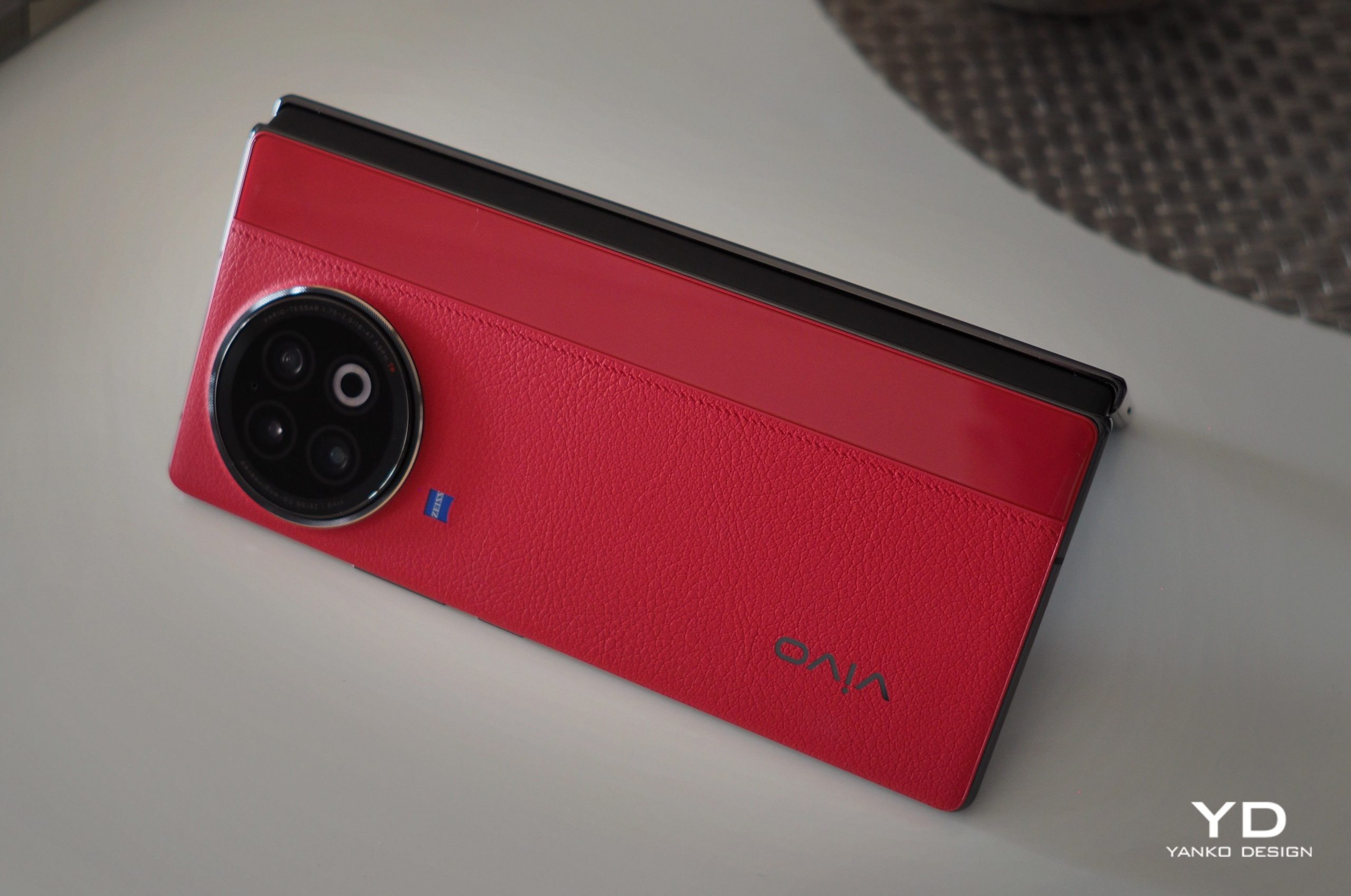
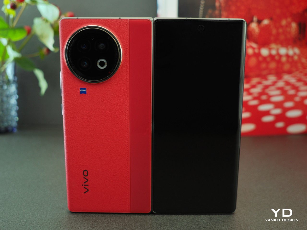
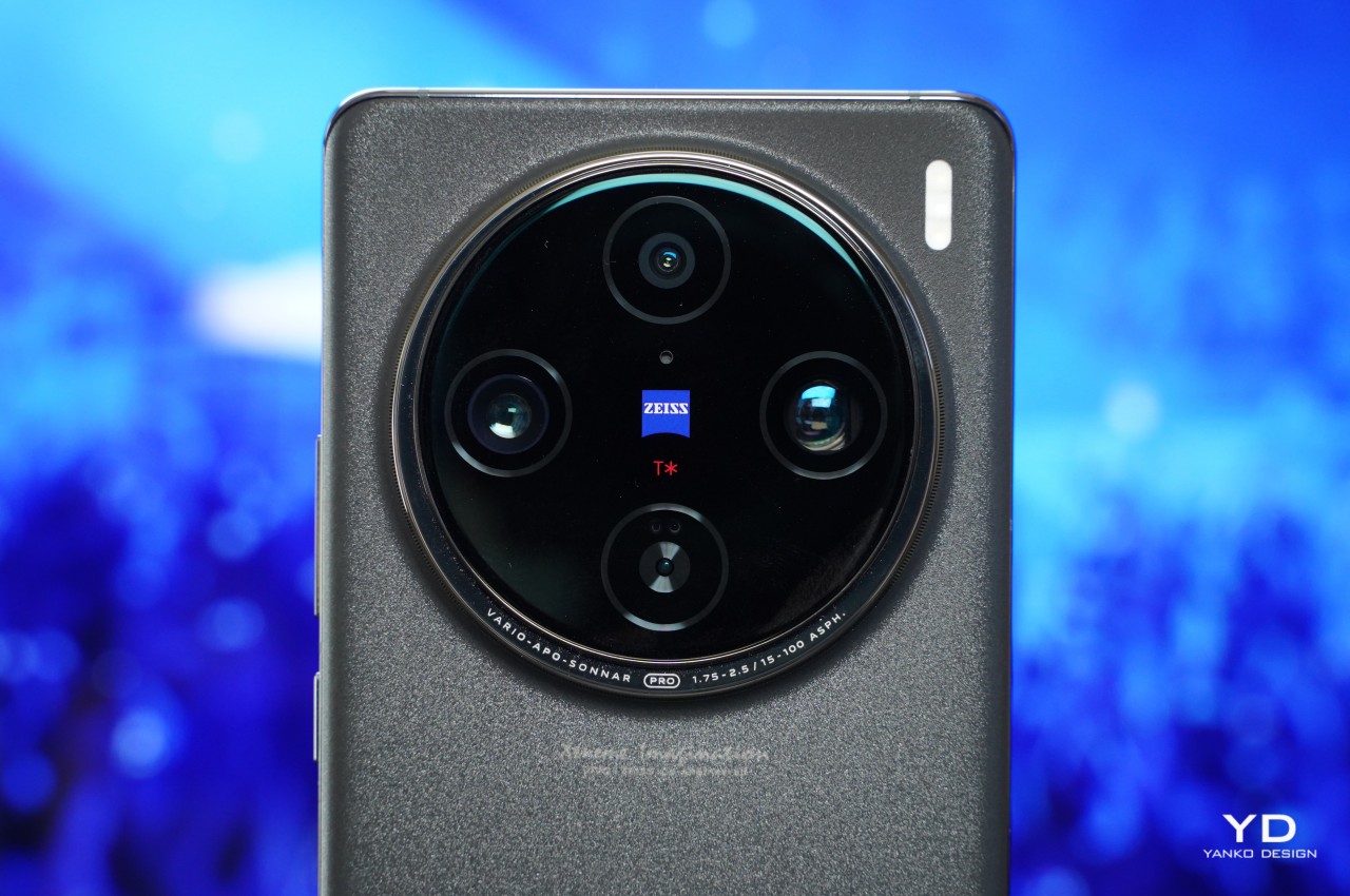
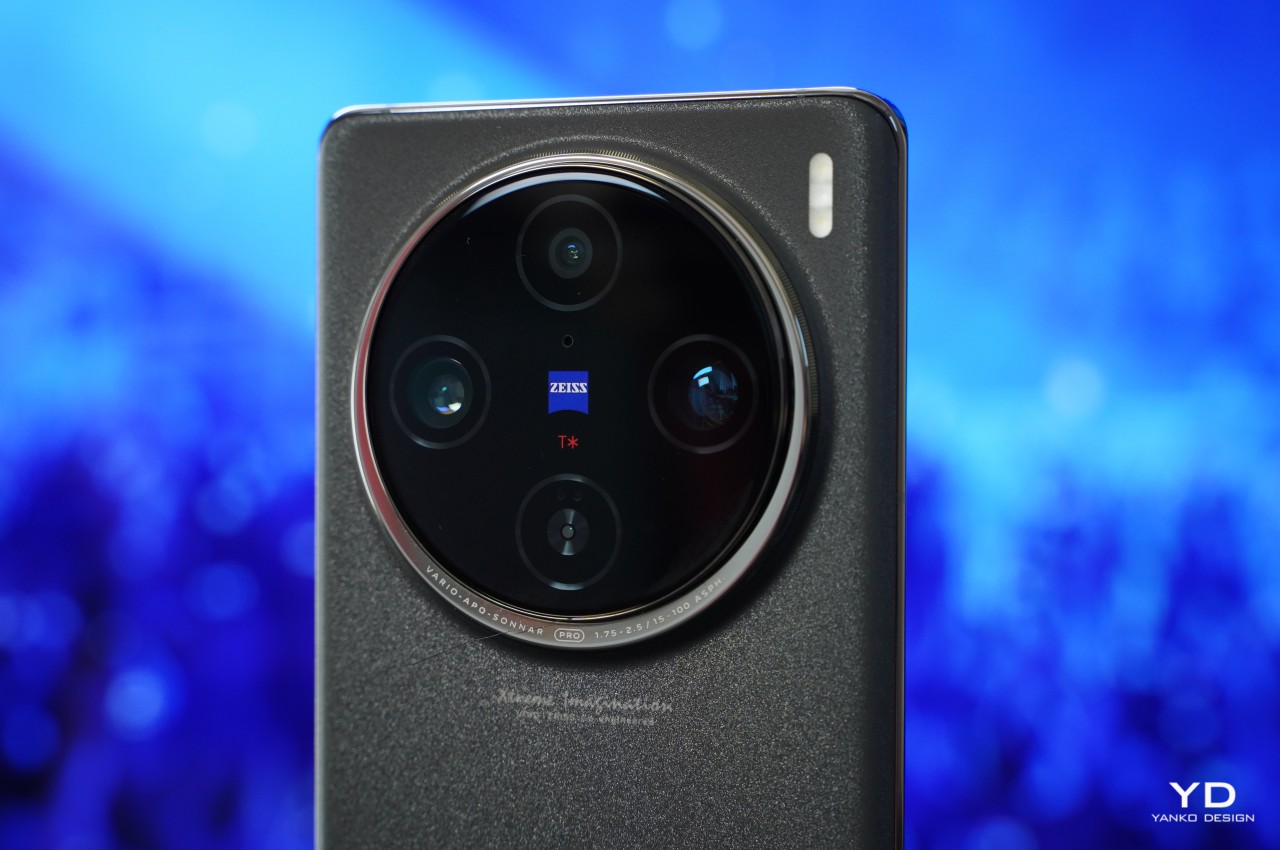
A large, circular camera module proudly graces the top of the device and rightly commands attention. Aside from the massive camera module, Vivo does not shy away from splashing X100 Pro’s camera capabilities. At the center of the camera module, the Zeiss logo gleams, accompanied by the red letter T* beneath it to indicate the anti-reflective coating that significantly increases light transmittance and helps accurately reproduce colors, according to Vivo. Made of aerospace-grade stainless steel, the “Sun Halo” or “Moon Halo” Ring surrounds the camera module with lens specs on the ring. Underneath the camera module, you’ll find “Xtreme Imagination” Vivo Zeiss Co-engineering branding. On the bottom, you’ll find big, but subtle Vivo branding. If all these texts on the back of the device are not enough for you, look at the top of the phone, and you’ll find a “Professional photography” sign.
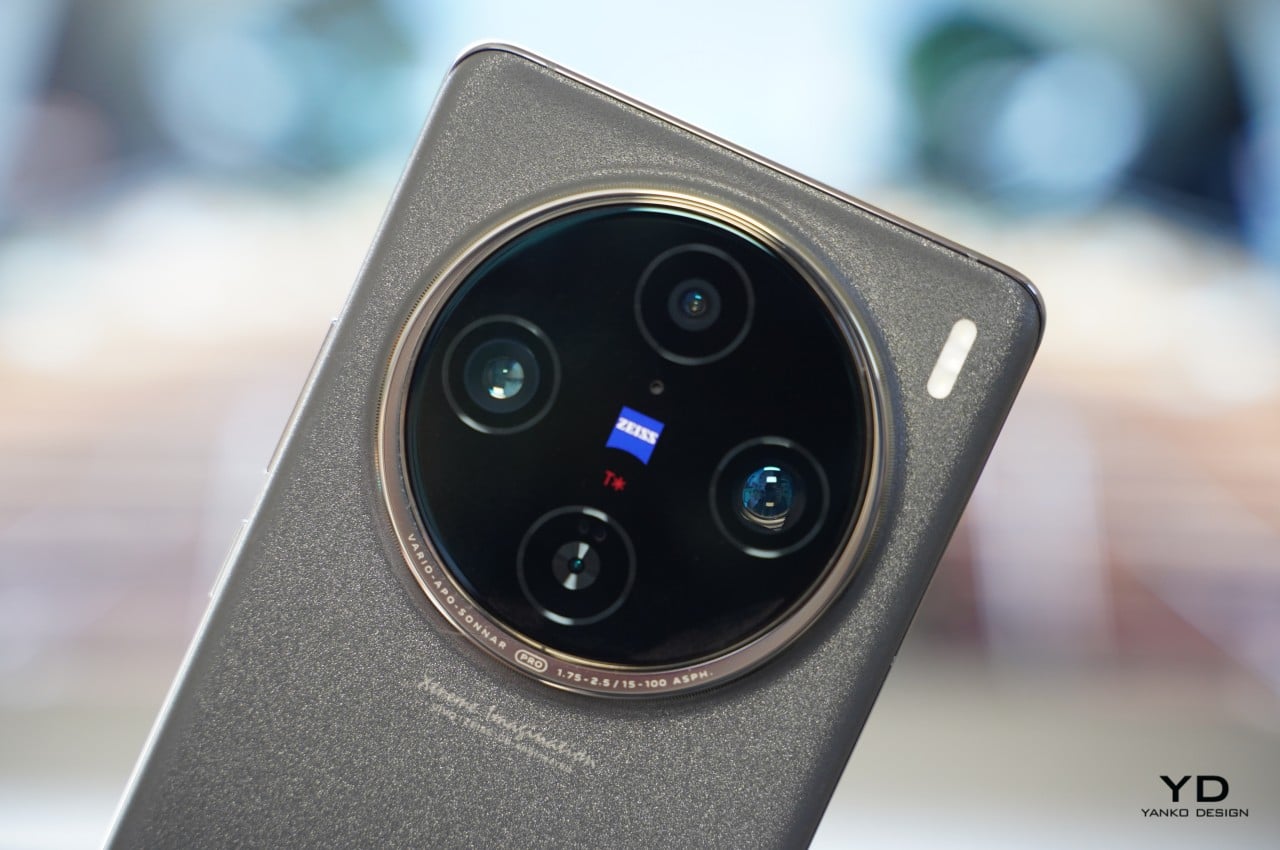
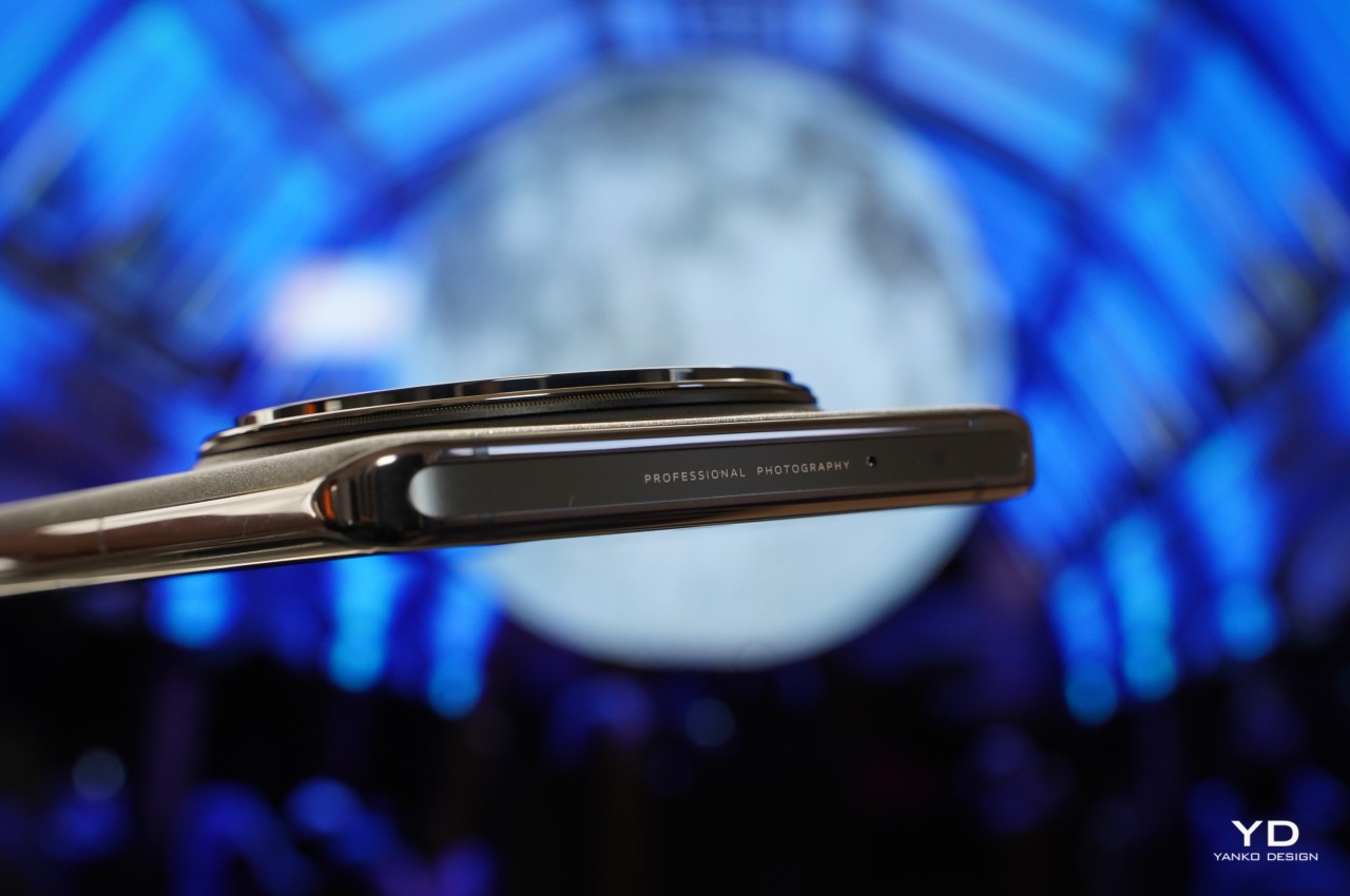
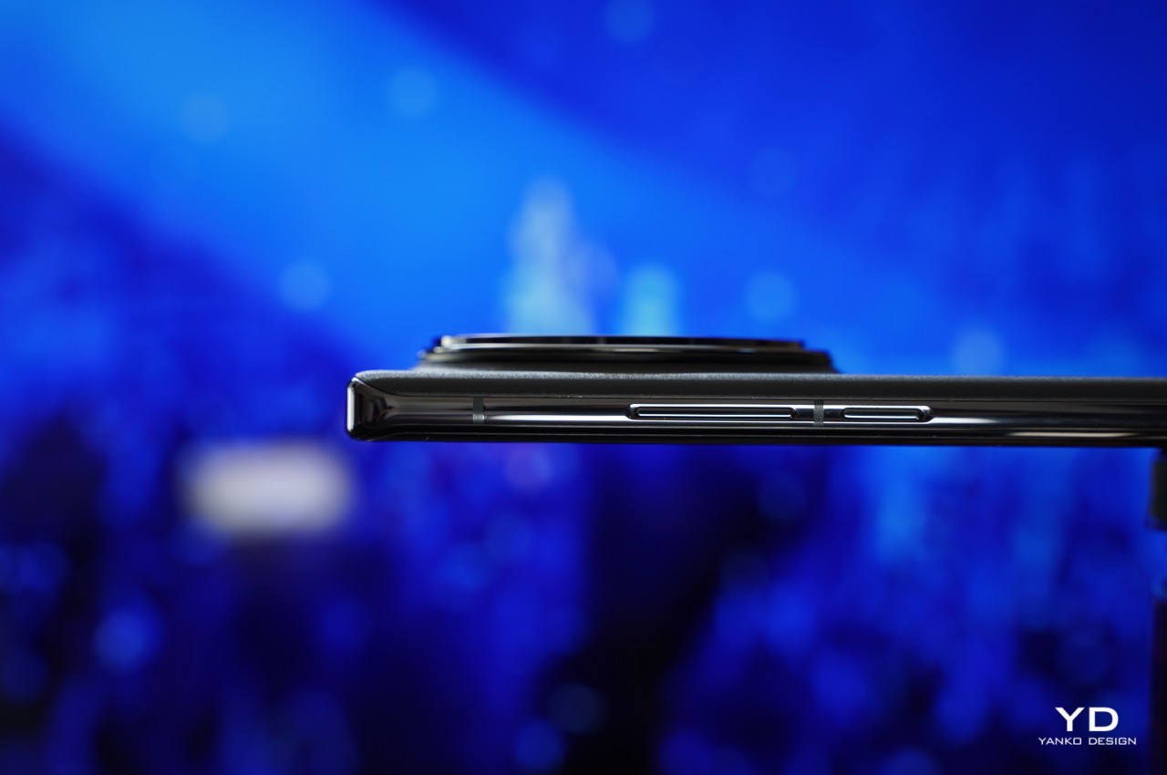
A bit cluttered with texts aside, the X100 Pro is a sleek-looking device. It is available in two color options: Asteroid Black and Startrail Blue. We received the Asteroid Black variant which has a glass back panel with a matte finish, resembling sandblasting. The Startrail Blue variant also boasts a glass back panel but distinguishes itself with patterns that emulate the streaks of light created in the night sky.
Ergonomics
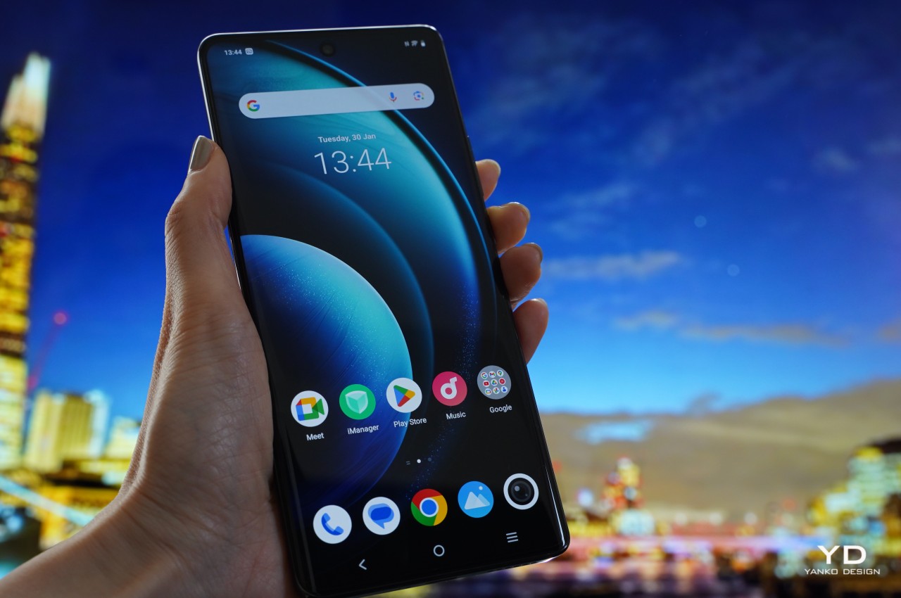
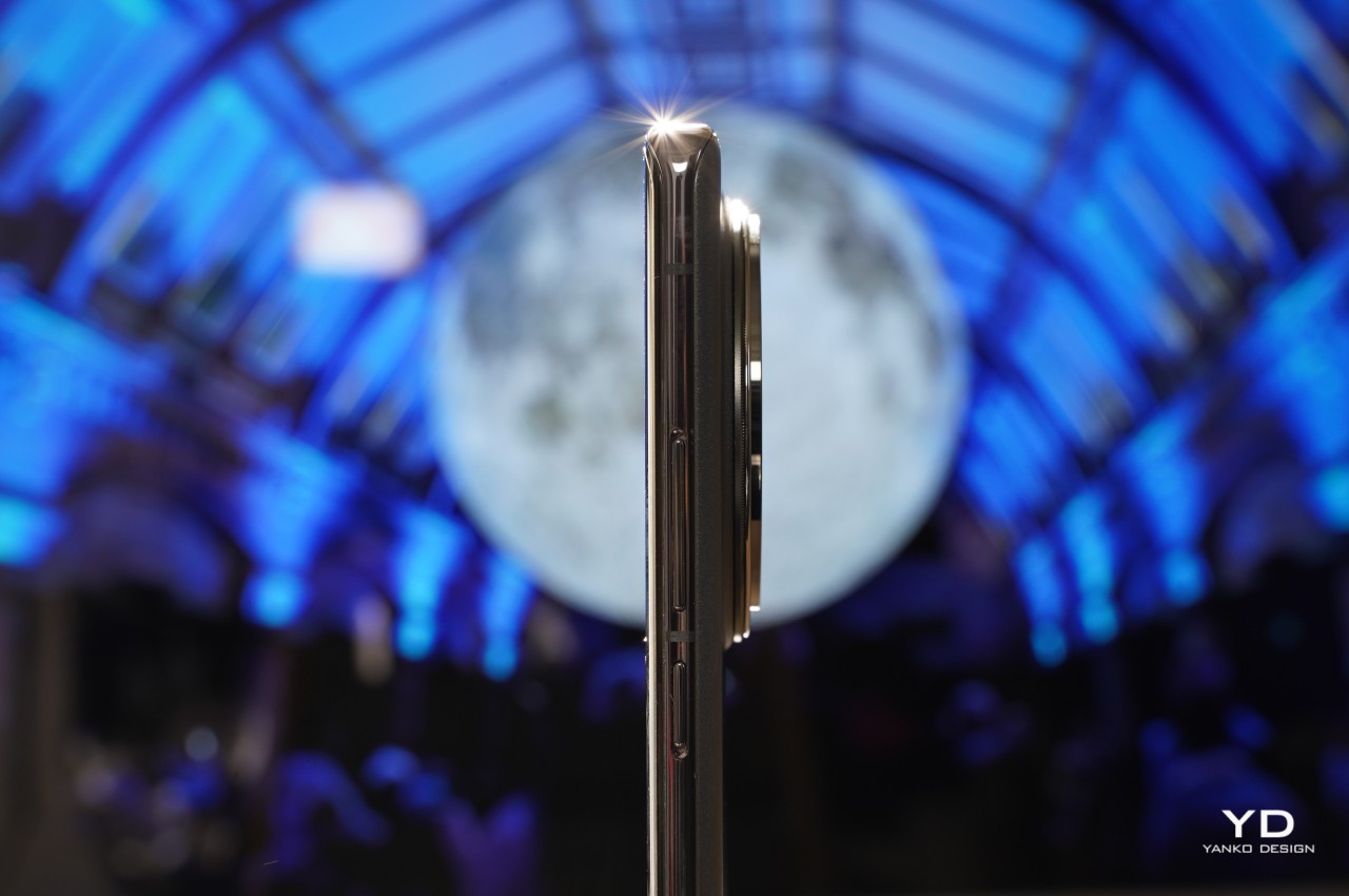
Vivo X100 Pro measures 164.05 x 75.28 x 8.91 mm and weighs 225 g. The display features slightly curved side edges. The side edges of the back panel are also slightly curved. The device fits nicely in the hand and thanks to the curved edges, it does not bite into the palm. In the Asteroid Black variant, the glass back panel offers a velvety touch that is quite pleasing but tends to be a bit slippery. Luckily the textured gray case came with the phone to provide a nice grip, though it tends to show scratches easily.
Like numerous other smartphones with an in-display fingerprint scanner, the positioning of the scanner near the bottom edge of the display can present a challenge for swift unlocking and seamless navigation with one hand. Fortunately, the fingerprint proves to be fast and accurate. The arrangement of the physical buttons and SIM tray is also similar to other phones, with the volume control button situated on the right side, and below it, the power button. At the bottom, you’ll find a SIM tray, primary microphone, USB-C port, and speaker. Meanwhile, on the top, there is a secondary microphone and an IR emitter.
Performance
There is absolutely no doubt that the main attraction of the Vivo X100 Pro is its upgraded ZEISS co-engineered imaging system. Before delving into the details, I’ll spill the beans – it is phenomenal. X100 Pro boasts a triple camera setup. The main 50MP camera uses a Sony 1-inch IMX989 sensor with an aperture of f/1.75. However, the true standout in the triple camera setup is the Zeiss APO floating telephoto camera with an aperture of f/2.5. The telephoto camera features an innovative periscope group structure called the Floating Elements Design, enabling sharp focus both up close and at a distance, by allowing individual lens elements to move freely. Both the main and telephoto cameras support OIS. Rounding up the triple camera setting is a 50MP ultra-wide with an aperture of f/2.0.
The main camera produces excellent images with plenty of details and a wide dynamic range. The photos are sharp and color rendering is realistic. The 2x zoom photos, captured with the main camera, are great as well.
The ultra-wide does its job well, and the photos captured are equally impressive as those taken by the main camera. However, it’s not very wide (119-degree field-of-view) compared to some other phones.
Both the main and ultra-wide cameras are also very capable in low-light conditions, capturing images with the right level of exposure, excellent dynamic range, and substantial details even in dark areas.



However, as stated before, 4.3x Telephoto is hands down the star of the triple camera setup, delivering superb photos in nearly every lighting scenario. Even in low-light settings, the handset takes photos with plenty of details, balanced exposure, and minimal noise. With the 100mm equivalent focal length, you can get close to your subject and snap the photos with a nice bokeh, and if you need to get even closer to the subject, the device is capable of digitally zooming up to 100x.
I took the Vivo X100 Pro to Ed Sheeran’s show in Osaka, Japan, and captured many photos and videos using mainly telephoto throughout the show. My seat was located on the first floor of the baseball stadium, which had been transformed into a concert venue with a capacity of 36,447. I was very impressed with the photos and videos I snapped at the show where lighting was constantly changing and tricky.







Given that this is an imaging-focused mobile handset, the device offers an array of shooting modes and styles to cater to your creative vision. There are Snapshot mode, Night mode, and Portrait to name a few. In Photo mode, the users can select from three distinct color treatments: Vivid, Natural, and Zeiss. The Portrait mode offers various styles to choose from, with my personal favorite being Vintage, delivering a film-like output.


With photos captured in Portrait mode, you have the flexibility to adjust the focus point and aperture after the fact, allowing you to customize the desired focal point and level of bokeh.
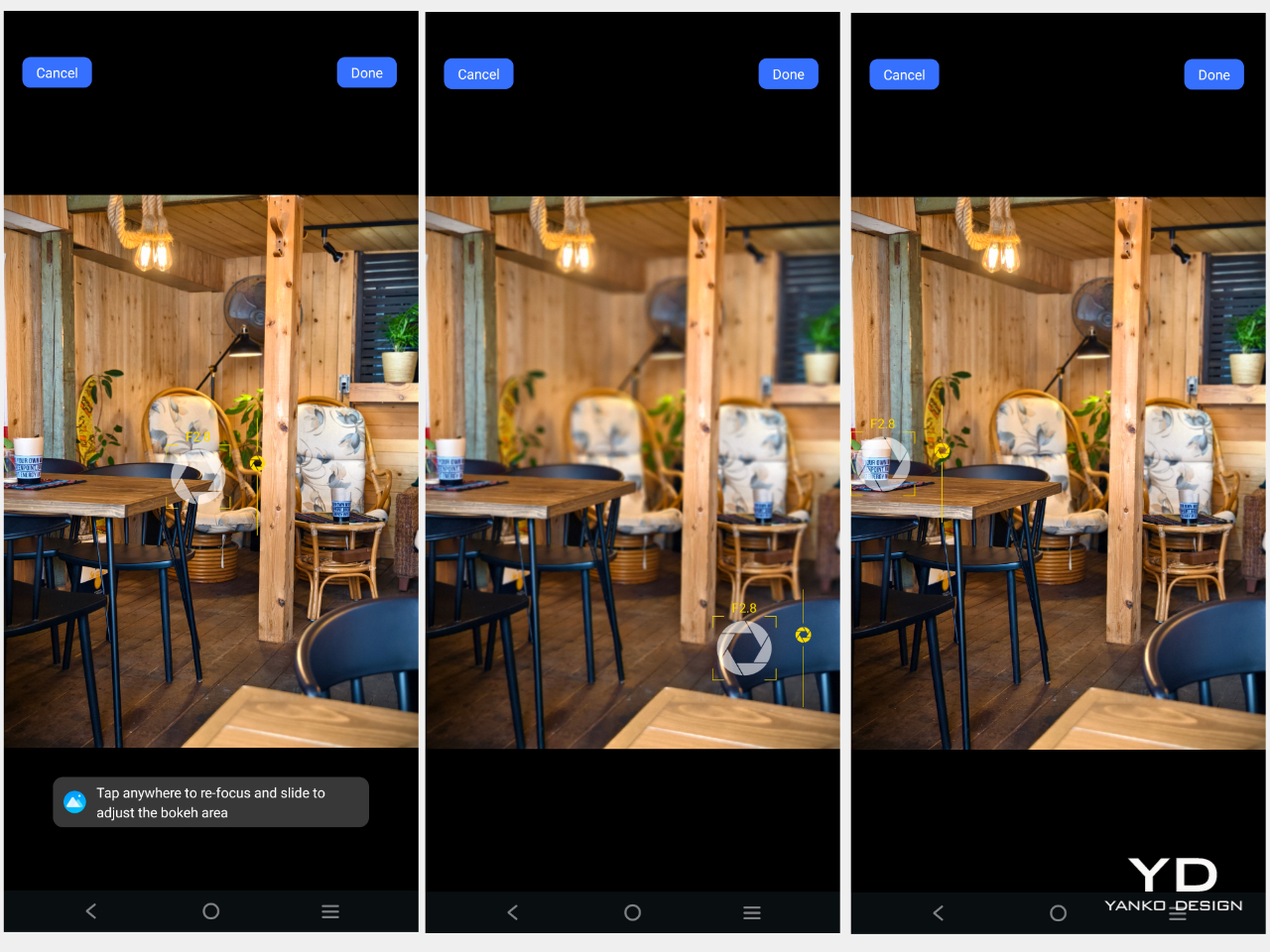
I usually don’t find much interest in Macro mode as the photos produced are subpar. However, the X100 Pro proves to be an exception. It produces sharp images with a pleasing bokeh effect, as you can see in the sample photo below.


Vivo X100 Pro’s excellent capability does not stop at taking photos. The device takes great videos as well. The phone is capable of taking up to 8K 30fps video with its main camera. The telephoto and ultra-wide cameras can record videos up to 4K at 60fps. Unfortunately, the front-facing camera is maxed out at 1080p at 30fps. Stabilization works very well in well-lit conditions but struggles a bit under low-light conditions.
There is a 4k Cinematic Portrait mode that offers automatic focus switching, similar to Apple’s Cinematic Mode. While its performance can be inconsistent, it takes artistic videos when it gets right.
Powered by MediaTek’s latest and most powerful Dimensity 9300, the device offers a seamless experience whether you are playing graphically demanding games or multi-tasking with numerous apps opened. Despite the phone’s responsiveness and speed, the battery performance can be somewhat underwhelming depending on what you do on the phone. Equipped with an enhanced 5,400mAh battery, the phone provides ample power for normal daily use. If you take tons of photos and videos(which with the phone this good, you will be inclined to do so), topping up during the day might be required. Fortunately, it supports 100W FlashCharge and 50W wireless FlashCharge.
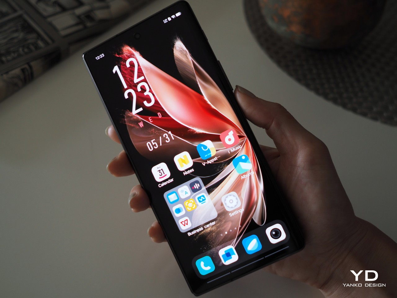
Vivo X100 Pro sports a 6.78-inch AMOLED screen with 2,800 x 1,260 resolution, a refresh rate of up to 120Hz, and is equipped with LTPO technology for dynamically adjusting the refresh rate while saving the battery. With a local peak brightness of 3,000 nits, the screen is ample bright even under direct sunlight. It delivers smooth images with vibrant colors.
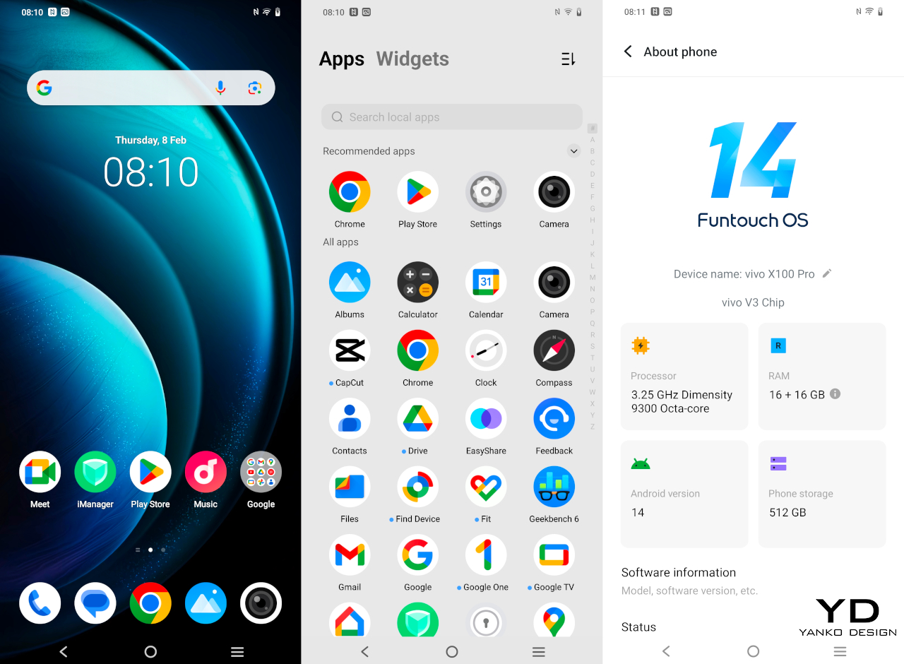
Running on Funtouch OS 14 on Android 14, the photo provides smooth performance. There are many customization options for things like lock screen styles and useful features like split-screen and small windows. Another welcoming change is having less bloatware.
Sustainability/Repairability
With its exceptional ability to capture high-quality photos in diverse situations, the likelihood of reaching for the Vivo X100 Pro to snap moments becomes a natural inclination. Considering the exposure to elements like water and dust, it’s comforting to know that the device has an IP68 rating, meaning it can endure submersion up to a depth of 1.5 meters for a duration of up to 30 minutes.
Vivo does not specify the use of sustainable materials for the phone. However, the material used for the ring around the camera module is crafted from aerospace-grade stainless steel, known for its resistance to wear, high temperature, and corrosion, ensuring durability.
Value
Vivo X100 Pro X was launched in China with a price tag of 5,499 CNY (about 770 USD)for the 16GB RAM/ 512GB storage variant. Since then the company has gradually rolled out the device into other Asian markets including India, Malaysia, and Thailand. It has finally reached some European markets. It’s worth noting that the price is higher than anticipated, at 1,199 Euros (about 1230 USD). However, given the phone’s quality, particularly its exceptional and versatile imaging capabilities, it is not excessively expensive.
Verdict
If mobile photography is your priority when choosing a phone, the Vivo X100 Pro currently stands as one of the best camera phones on the market. Whether capturing moments with friends and family, street scenes, or exploring the intricacies of subjects like flowers and bugs in macro mode, this device has the remarkable ability to transform even the most mundane scene into a form of artistic expression, thanks to its exceptional camera features. The images captured by the telephoto camera are just another level, setting the new standard for mobile photography. Beyond its impressive camera capabilities, the Vivo X100 Pro is a solid device with a vibrant and sharp display, responsive software, great build quality, and fast wired and wireless charge capabilities. The handset also offers a well-rounded and high-performing smartphone experience.
The post Vivo X100 Pro Review: A strong contendar for the best camera phone of 2024 first appeared on Yanko Design.