Pantone Lifestyle Gallery opens in Hong Kong, using color to invigorate, motivate and keep you going this 2021!

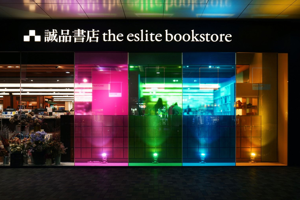
Pantone’s authority on colors is acclaimed around the globe, and now the New Jersey-based trend research expert has set foot in Hong Kong. Yes, Pantone has opened their first lifestyle concept store inside the Cityplaza’s Eslite Spectrum bookstore in the Tai Koo district. They call it the Pantone Lifestyle Gallery – and in the true sense – it’s a gallery of hues opened in collaboration with Issho, a lifestyle retailer. Although it’s worth pondering over the timing of Pantone’s decision to open a physical retail store in the current turbulent times of the pandemic-affected the world. Still, Pantone wants to go spread a dash of color in people’s lives who for the most part of the week are stuck in the secure confines of their homes, to truly explore colours and their impact on the human psyche. Maybe a blushing pink would give you faith or illuminating, the Pantone color for 2021 would cheer you up on dark days!

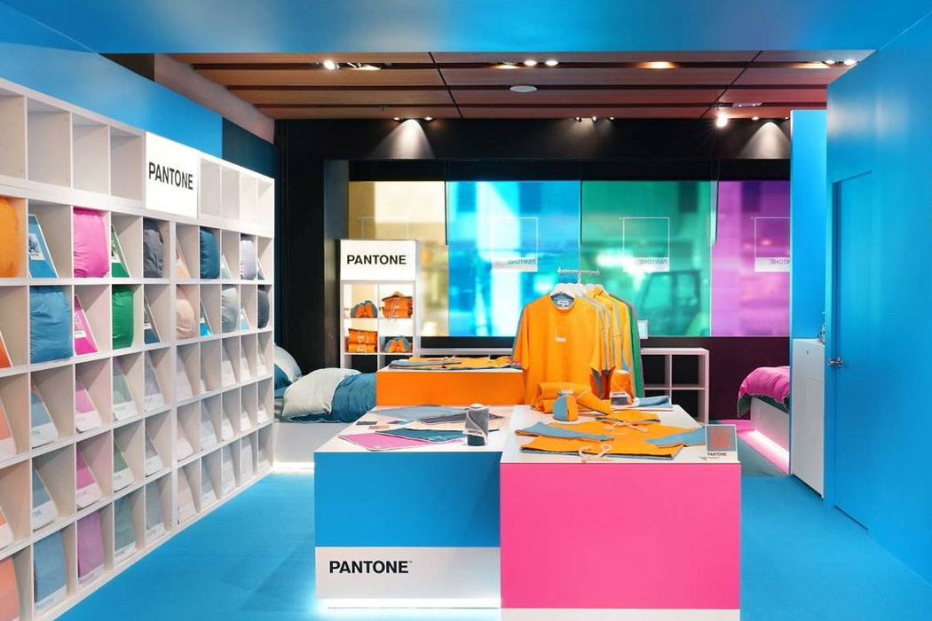
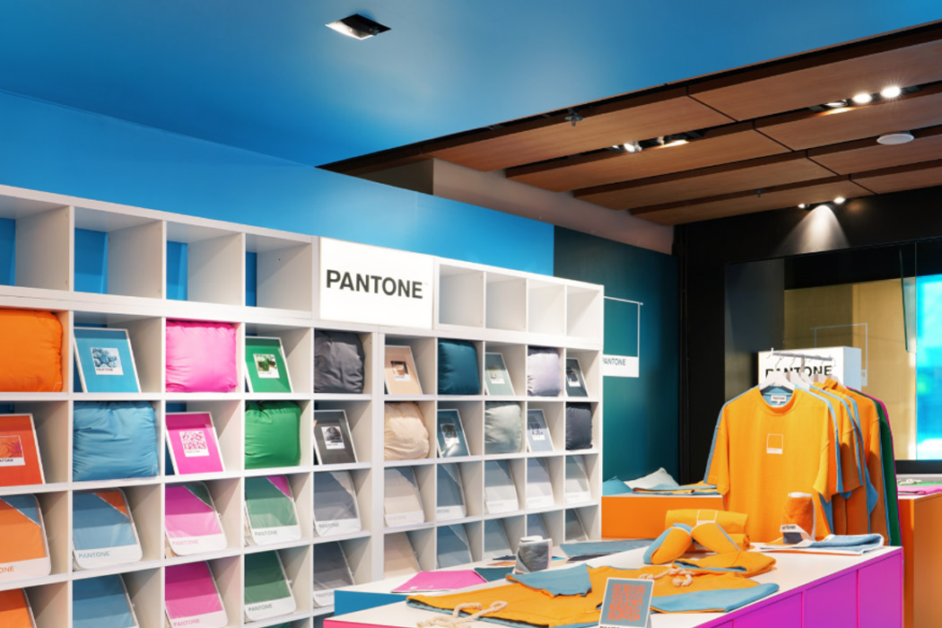
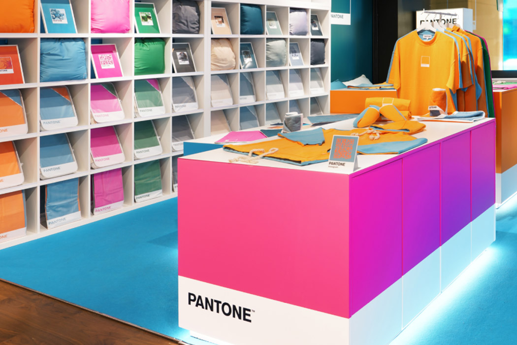
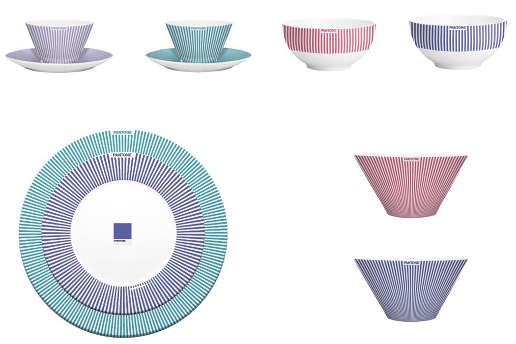
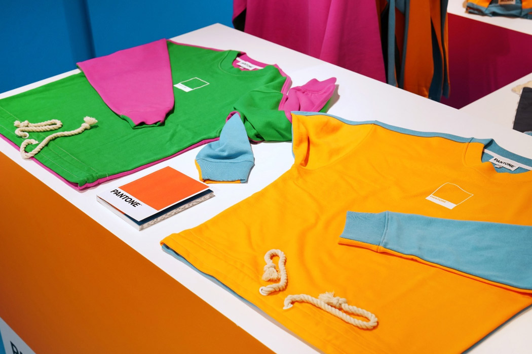
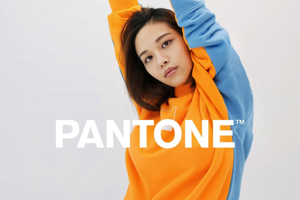
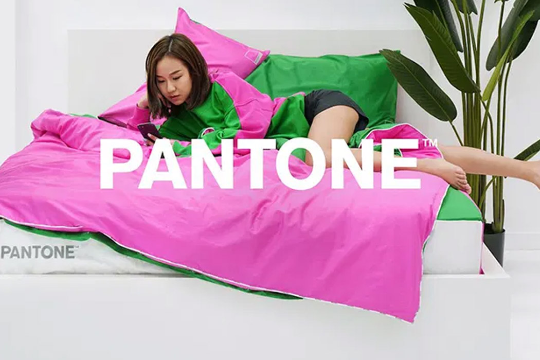
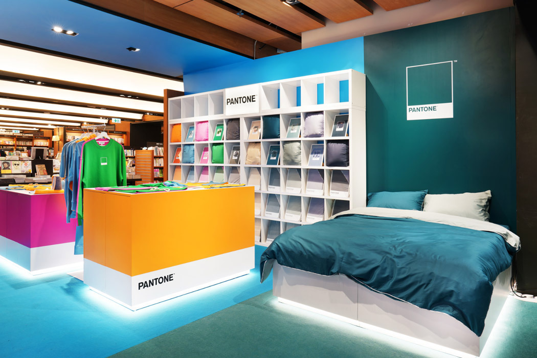
The store is spread across 600 square feet of space – draped in a dash of colors – sexy pink, cool blue, calming green, and refreshing orange – you name it and the store has it. The different displays and islands of the store are marked in blocked patterns – for example, the entrance has a sky blue hue to lure in customers. Inside, the customers will find sections to explore the homeware, loungewear, and home accessories islands. The loungewear section of the lifestyle store has trendy colorful clothes for the young generation – like sweatshirts, fabric slippers, jersey t-shorts, and more. They call it the Funmix collection which, according to Pantone explores the varying emotions and stories with bi-color combos having harmonious or boldly contrasting characters. In the homeware section, the buyers will get to explore the limited edition tableware in striking pinstripes color (four options) which comprises a coffee cup set, bowls, dishes, and more.

Along with the eye-popping retail store that brings a poop of color to the monotony of daily routine, Pantone has plans to stage events in the city this whole year to spread colors in people’s life which has gotten a bit dull lately. Also, they have a strategy in place to open an online store in June with all the updates coming to Issho 46’s social feed.

Designer: Pantone

Timeless or Trendy: How to choose the right design direction for your consumers

Hi, I am Kelly from Knack, where we help mobility brands make their products irresistible.
I recently wrote an article about how to design timeless products. The comments and discussion that followed highlighted the fact that trendy and timeless products serve different purposes. One isn’t necessarily better than the other. However, one IS more irresistible, depending on who your customer is.

So, in this article, we’re going to dive into what makes a product either trendy or timeless and determine which type is right for your product.

IRRESISTIBILITY

To be irresistible, a product must possess an enticing aesthetic, solve a meaningful problem, deliver a delightful user experience, and have a no-brainer price tag. An irresistible product must check all of these boxes, but can also be either trendy or timeless to boot.

It is important that you understand what makes a product trendy or timeless so that your product’s fate is not accidental, but instead part of your design strategy.

Let’s take a close look at each:

TRENDY

The Cambridge Dictionary defines trendy as, “modern and influenced by the most recent fashions or ideas.” Trendy products flaunt hot, popular attributes.

To design a trendy product, focus your product development efforts on exploiting the in-thing your customer is most obsessed with. Trendy products require an understanding or prediction of the current fads and quick action to deliver a relevant product before the trend fades.

With a design that’s trendy, you’ll be able to ride the wave of buyer interest created by the current craze. Heavily influenced by emotion, your consumers will buy more impulsively to fill an immediate need or desire.

TIMELESS

Unlike trendy designs that are focused on being relevant in the present day, timeless design is focused on staying relevant and looking appropriate for many years to come.

When setting out to design timeless products, avoid clues of the current time. Instead, strive for a proper proportion, functional form, and classic colors that were cool way back when, now, and for many years to come. Designing timeless products requires an extra level of thoughtful refinement, void of frivolous aesthetics, often yielding an understated product.

Achieving timelessness in your design gives your product staying power, sparing you a great deal of future new product development costs while allowing your product’s fan base to compound over time.

WHICH ONE?

Again, whether your product should be trendy or timeless depends on your consumer. While many designers would argue that a product should always be timeless, timelessness requires an extra level of aesthetic refinement and subtly that a here-today-gone-tomorrow product can’t always afford.

If your consumer values keeping up with the times, looking cool and flashy in the moment above all else, your product needs to be trendy. A consumer who is obsessed with the latest and greatest will inevitably be onto the next big thing soon. In this case, there’s no reason to over-invest in a timeless aesthetic.

If your consumer values products that endure the test of time and don’t look dated in just a few years, or you just simply want to invest in a product that doesn’t need to be revamped every 3 years, you should pursue a timeless design.

Note: With strategic industrial design execution, it is possible for a product to be both trendy and timeless.

Do you know what your consumer desires? As soon as you do, you’ll be one step closer to achieving irresistibility.


ABOUT THE AUTHOR

Kelly Custer is the Founder + Design Director of Knack

Pairing her transportation design education from the College for Creative Studies in Detroit, Michigan with over 8 years of design consulting experience in consumer products, Kelly has built a strong passion for mobility. She founded Knack in 2014 and leads the studio to deliver irresistible simple mobility products.

When she’s not in the studio, she can be found on a mountain bike trail, trying to keep up with her husband on her dirt bike, or exploring the Tennessee river on their vintage stand-up jet skis.

Follow Knack on Instagram

Nokia Lumia 720 unveiled: 4.3-inch ClearBlack display, 9mm thick, 6.7MP Carl Zeiss, wireless charging capable

Nokia Lumia 720 unveiled 43inch ClearBlack display, 9mm thickness, 67megapixel Carl Zeiss, wireless charging capable

Notice Vogue in that live tile up there? That's because Nokia's toning down its focus on imaging innovation at this year's MWC (remember the PureView 808?) for a hyper-targeted take on the mid-range: the Lumia 720. Made for über-social types prone to late night party shots, selfies and multimedia uploads, this 4.3-inch device builds on the polycarbonate unibody of its 920 elder, albeit in a much slimmer and smoother form factor. Measuring just 9mm in thickness and weighing 128 grams (4.5 ounces), the 720 also bears the distinction of being Nokia's most svelte Windows Phone 8 device to date. It also packs a dual-core 1GHz Snapdragon CPU (the same as the Lumia 520), 512MB RAM, 800 x 480 ClearBlack display, 2,000mAh battery, NFC and an option for wireless charging (enabled by a separate snap-on cover) into the trendiest design the company could create.

To push that trendsetting message forward, Nokia's imbued the 720 with a dual camera setup that's ideal for the party circuit (e.g., lowlight shots and self-portraits). Up front, there's a 1.3-megapixel camera with wide-angle lens and a 6.7-megapixel rear shooter with f/1.9 lens on back, specifically crafted by Carl Zeiss labs to take in more light. And as a further lure for the vainglorious types that may pick it up, the 720 will also ship with a new digital lens pre-loaded: Glam Me.

As the name implies, this proprietary filter allows users to edit their images (whiten teeth, oversaturate colors, widen eyes, etc.) before sharing on social networking sites. In addition to that proprietary camera software perk, Nokia's also tacked-on its full suite of Here apps (Drive, Transit and Maps), as well as Nokia Music -- all exclusives to the Lumia line.

Nokia fans keen on a US release will have to sit and wait this one out (or opt for the Lumia 520 on T-Mobile). At present, the Lumia 720's only set to launch in Asia (specifically China) and parts of Europe in five colors (cyan, black, yellow, red and glossy white) for €249 (about $330 USD) this Q2 2013. Head on past the break for the official PR.

Filed under: , , ,

Comments