Tag Archives: typeface
Recommended Reading: Coachella was built for YouTube
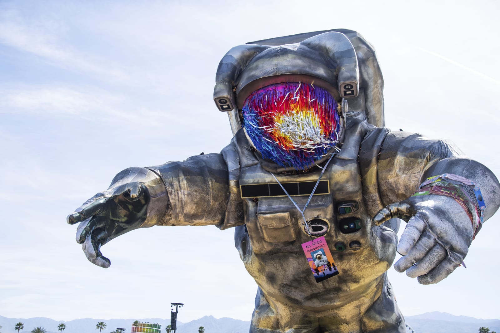 Coachella 2019 review: A festival built for YouTube
Paul A. Thompson,
Pitchfork
For years, Coachella's opening weekend has been a huge event for YouTube. A weekend's worth of livestreams don't deliver all of the acts to your living room, but the s...
Coachella 2019 review: A festival built for YouTube
Paul A. Thompson,
Pitchfork
For years, Coachella's opening weekend has been a huge event for YouTube. A weekend's worth of livestreams don't deliver all of the acts to your living room, but the s...
The National Parks ‘font’ has finally been digitized
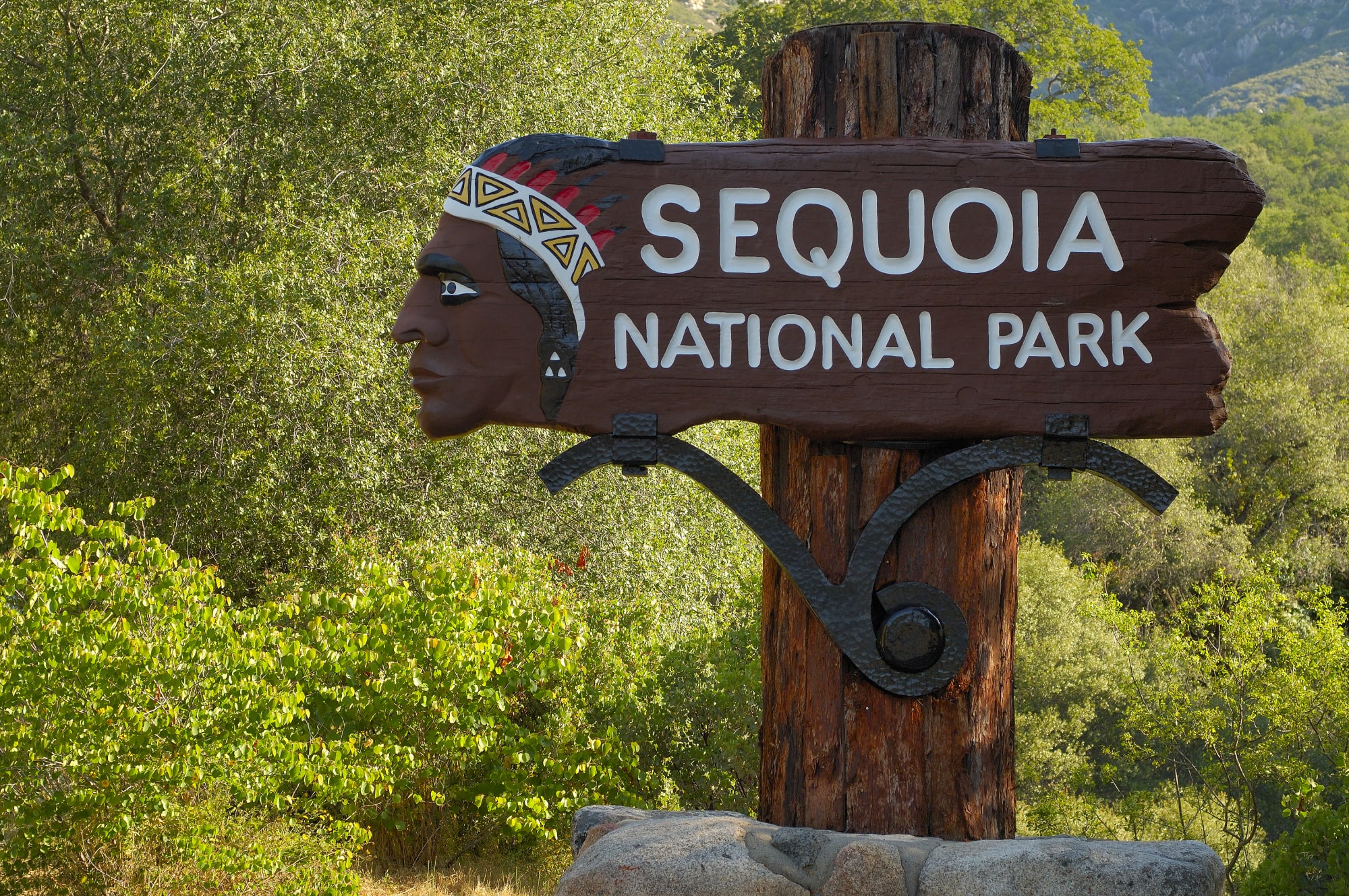 Fonts are as synonymous with a brand as a logo, and these days every kind of company and organization (and some cities) have a design they call their own. Even America's National Parks have their own distinct lettering, found on wooden signs througho...
Uber hopes a new font will symbolize its turnaround
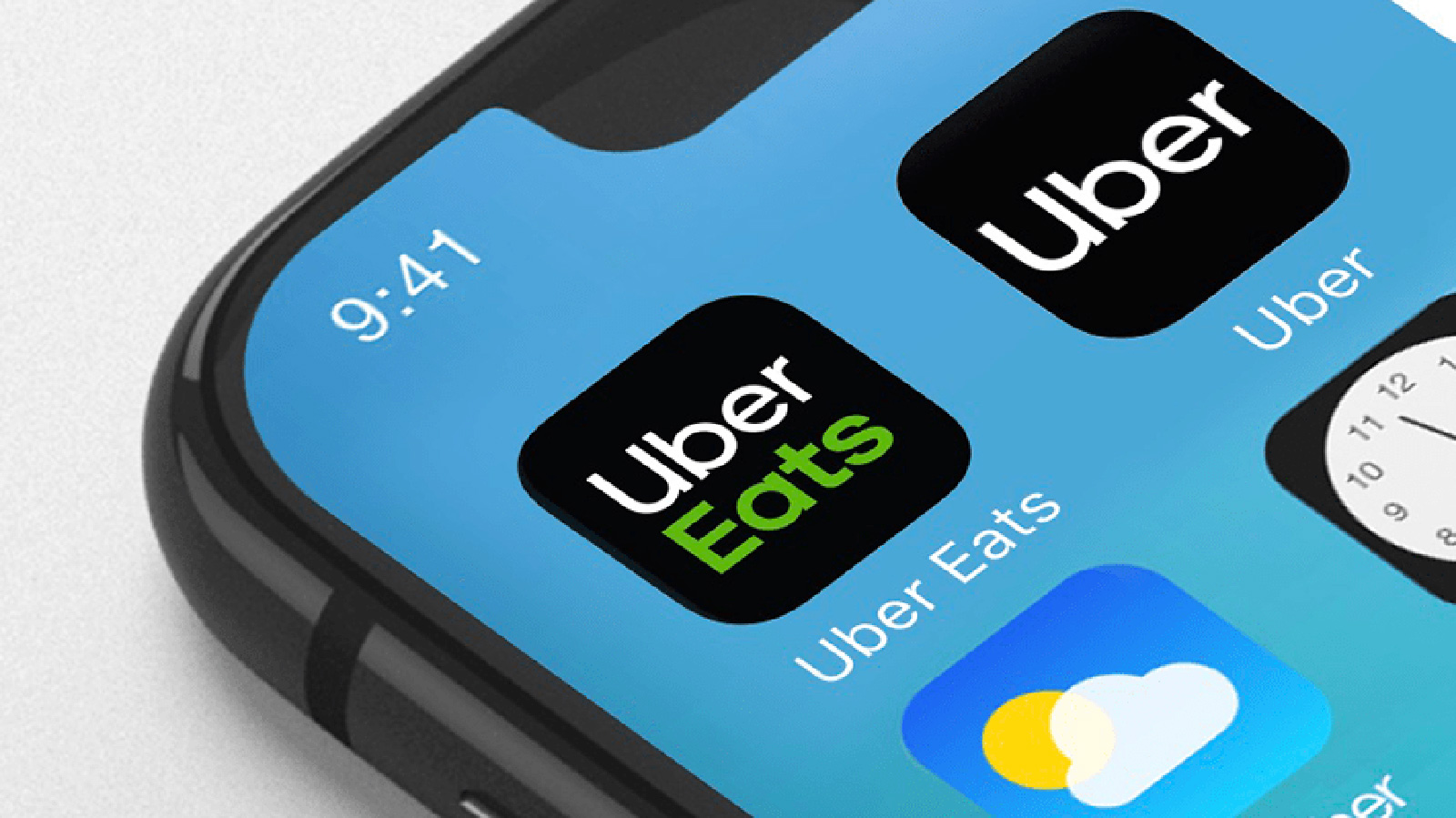 Uber has been through a lot since it booted Travis Kalanick: a new CEO, a new management team and an emphasis on doing things by the book (even if it proves costly). But how is it supposed to convey that it turned a corner besides ads? Through a ne...
This funky new font is made up entirely of brands
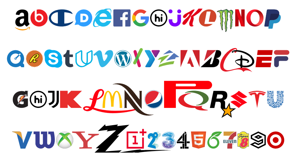 A digital studio called Hello Velocity has created a typeface that embraces well-known corporate logos and is still somehow far less annoying than Comic Sans. The studio says it creates "thought-provoking internet experiences," and its Brand New Roma...
London Tube font redesigned for the internet age
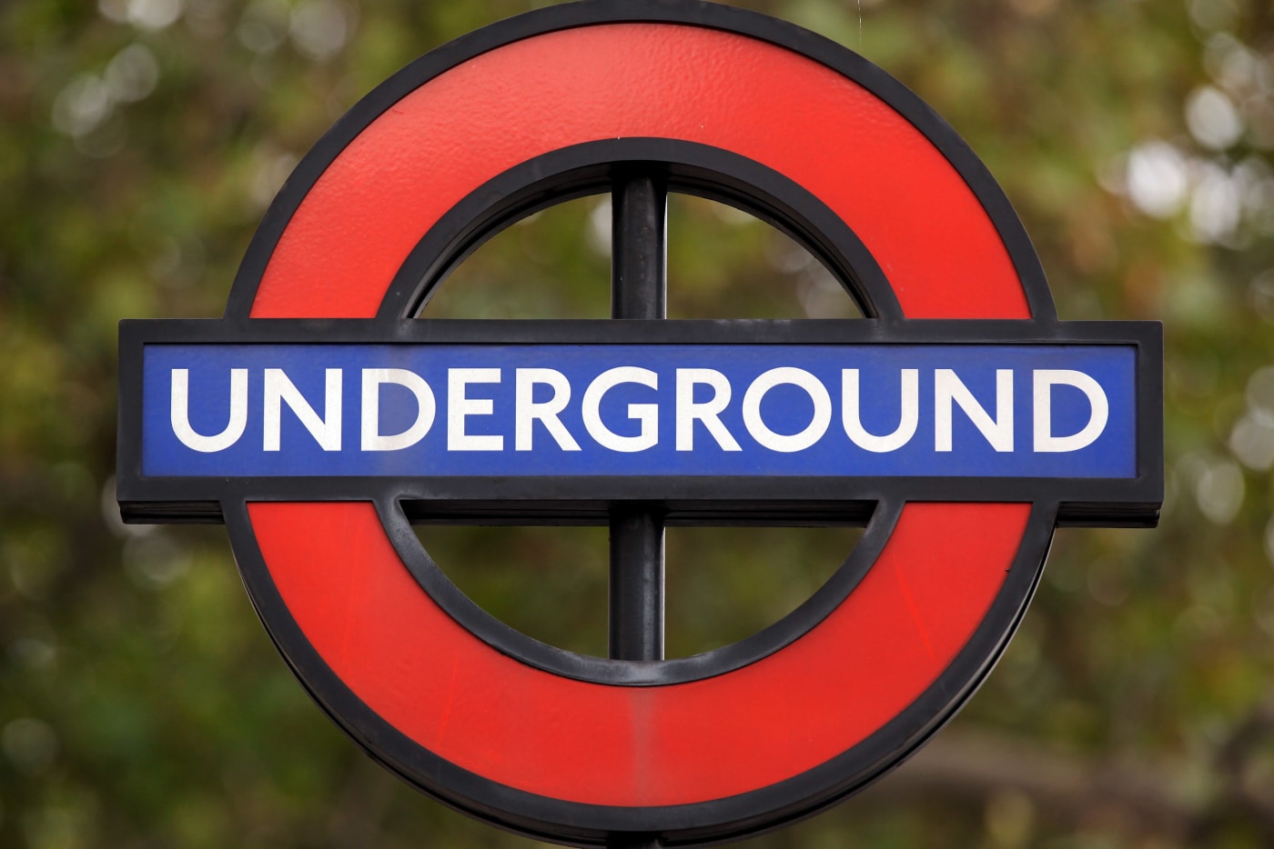 The iconic typeface of the London Underground is getting a revamp. Design firm Monotype has been commissioned to rework the letters, numbers and symbols that people look at every day while they hurriedly board Tube carriages, stand on platforms and l...
Google’s Signature Font Roboto Goes Open Source

If you love Google’s Material Design language, then chances are you are familiar with Roboto, Google’s signature font, created by Google designer Christian Robertson. Roboto is also used across...
Losing out on job interviews? Blame Times New Roman.

Applying for jobs and getting nowhere? Then you should probably take a look at résumé font choice.Bloomberg asked brand and design experts on the best fonts to grab an employer's attention....
“Anti-NSA” Typeface Makes a Statement, Even If You Don’t Have Any Secrets
The NSA isn’t exactly everyone’s favorite agency right now. A lot of people aren’t too pleased about what they’re doing, and they’re not afraid to tell people about it. In artist Sang Mun’s case, he decided to show it.

Mun created ZXX, which has been dubbed as an “anti-NSA” typeface that’ll make it difficult for the agency (or any other agency, for that matter) to use machines to decipher your printed correspondence with other people. The disruptive nature of the typeface makes it difficult for OCR scanners to “read” your exchanges.

While the variants of the typeface are designed to be human-readable, you still might end up giving yourself and your intended recipients a headache by using this font for your documents. I think the ZXX is more of a statement, really, but if you want to download it, you can do so here.
[via Dvice]
Anti-NSA Typeface Makes Your Messages Hard to Decrypt
If you thought that some people were just being paranoid when they said that there was always someone listening in on conversations or reading every message being sent, then I guess the whole NSA debacle proved you wrong. Since the news broke, anti-NSA programs and software have been floating around on the interwebs, although I think most of these don’t really work.
Sang Mun, a graduate of the Rhode Island School of Design, decided to express what he felt about the whole situation by creating ZXX, a “disruptive typeface” that’s named after the Library of Congress’s “no linguistic content” labeling code.
The font is difficult to read, since it looks like a combination of wing dings and randomly capitalized text. Mun has used a creative way to express his thoughts on the NSA scandal.
If you agree with his views or just want to use his very unusual font, then you can download it here.
VIA [ Dvice ]