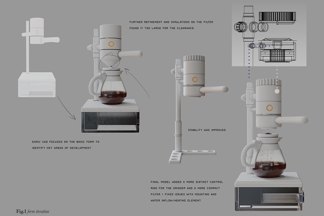
It’s rare for Silicon Valley companies to actually explain their design choices and decisions to their customers. Google flouted convention by beginning their Pixel Fall Launch keynote with a pretty comprehensive look at how they designed their latest flagship phone, from its hardware right down to its software.
Just yesterday Apple had us baffled with their MacBooks bringing back ports, connectors, and keyboard elements that Apple took away 5 years ago. Apple’s design process has always been a complete mystery, so it was really odd to see them finally walking back on their past design decisions and bringing MagSafe, HDMI, the SD Card slot, and the Function keys back to their MacBooks. While the Cupertino giant has a reputation of being shrouded by secrecy, Google on the other hand is perceived as much more open, forthcoming, and vocal… After all, they deliberately leaked their own Pixel 6 design MONTHS before it actually launched.
![]()
Just 10 minutes into the Pixel 6 reveal, head of hardware Rick Osterloh hands the stage to designer Isabelle Olson to talk about the Pixel 6’s design. Isabelle mentions the Pixel 6’s redesign on the back involves highlighting its breakout feature – its camera. With a bar running across the screen almost like a highlighter running across important text, the Pixel 6’s camera is the first thing you look at.
![]()
“So the Industrial Design team designed the phone to celebrate the camera”, Isabel mentions. “The camera bar brings a clean, symmetrical design that puts the camera front and center.” The bar, as strange as it looked back when the images were first leaked, is now an icon of the Pixel’s not-so-subtle evolution, and provides the perfect separating element for the phone’s dual-color back. The Pixel phones originally pioneered this with their split-tone design that had two different colors on the top and bottom of the phone’s rear surface. With the Pixel 6, that split-tone design gets a hearty refresh, with a black belt adding its fair share of contrast in the middle. The phones instantly look refreshing, and are immediately recognizable (a feature that really helps in a market where all smartphones are beginning to look alike).
![]()
The Pixel 6 comes in two variants, a 6 and a 6 Pro, which are different sized, and have slightly different designs, but are unified by the same visual language, UI, and the Tensor chip inside the phone. The 6 sports a black metal armature, with 3 color variants with their signature quirky names – Sorta Seafoam, Kinda Coral, and Stormy Black. The 6 Pro, on the other hand, has a more chrome armature (the team used jewelry references to highlight the differences between the Pro and regular models), and comes in Cloudy White, Sorta Sunny, and Stormy Black.
![]()
![]()
![]()
A concern I had earlier with the Pixel 6’s odd camera bump (it’s now referred to a camera bar) was how it made case-design impossible, or rather, difficult to elegantly execute. To subvert these worries, Google even released its own set of cases with a slightly tinted frosted design, matching colors with the phone you have underneath. When paired correctly, the case would actually complement the phone and highlight its color palette rather than being an obstructive piece of plastic that’s only purpose was to protect the phone. The cases, Isabelle claims, are also designed out of recycled plastic (the phone’s chassis is made from recycled aluminum too), helping further Google’s mission to build devices that have a minimal negative impact on the environment. From what it looks like, though, the cases don’t do much to protect the Pixel’s camera bar from direct impact, although that’s the kind of thing you find out months after customers actually buy and use the phones.
![]()
![]()
![]()
Moving onto software, Google has big plans for the Pixel thanks to how powerful its Tensor SoC is designed to be. The new chip unlocks a new era of Material Design that Google calls Material You. Instead of having you adjust to your phone’s settings, Material You has the phone adjust to YOU. For starters, the entire screen’s color palette changes to match your wallpaper, giving you an experience that’s unified. Widgets, icons, and elements complement your theme and they change when you change your wallpaper too. The phone also understands context exceptionally well, serving you up with the information you need right when you need it, from your fitness app’s stats while you’re jogging, to your boarding pass while you’re heading for a flight. As Rick Osterloh keeps reiterating, the Pixel 6 is a completely new take on smartphones, both inside as well as out.
Designer: Google
![]()
![]()
Watch the Pixel 6 and Pixel 6 Pro video below.
 Windows 10 now has one billion active monthly users -- likely thanks in part to the deprecation of Windows 7 in January. To celebrate the milestone, Microsoft's chief product officer, Panos Panay, shared an Instagram video recounting the various iter...
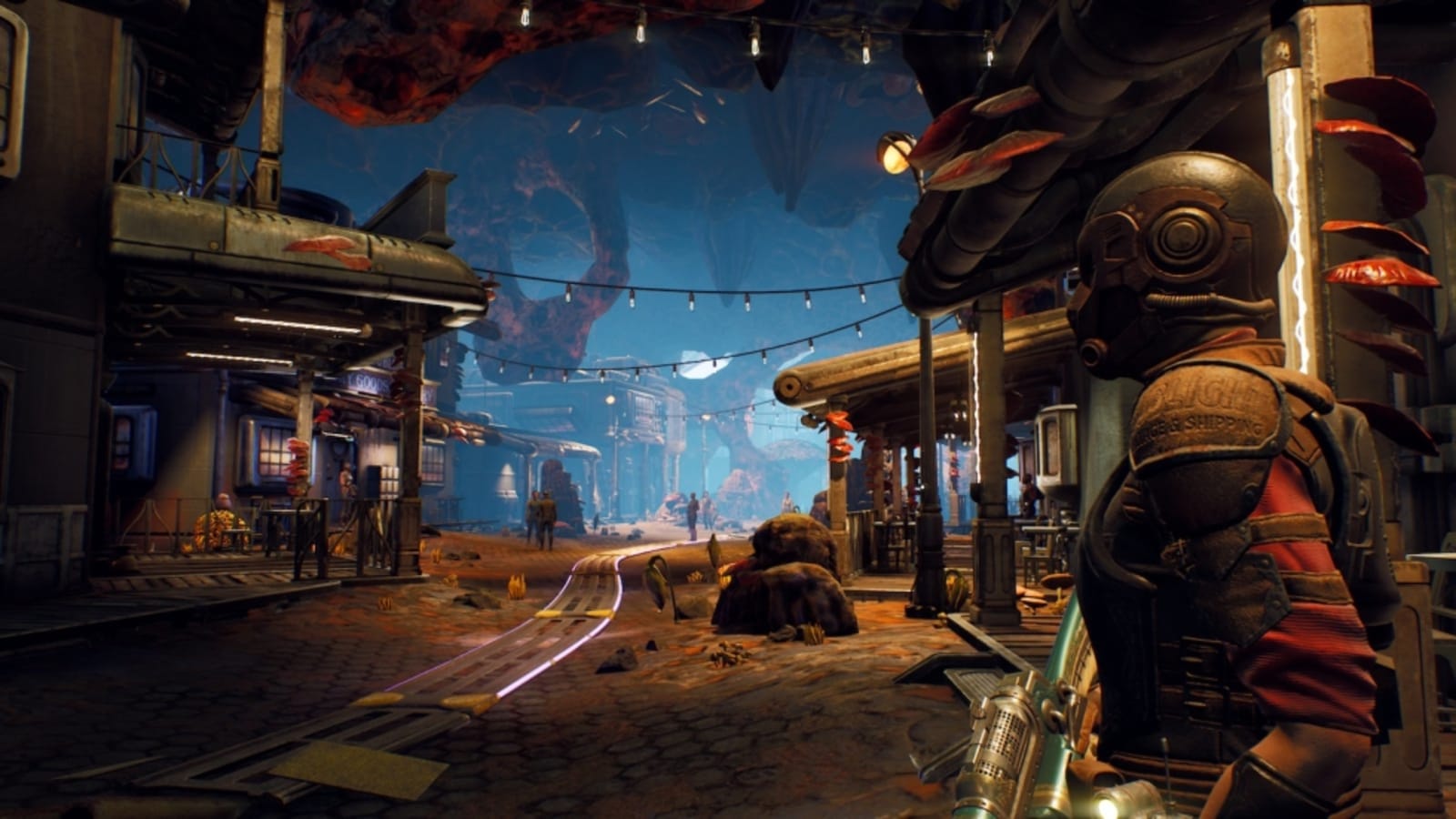 If there's one major criticism of The Outer Worlds, it's surely the bewilderingly tiny text size used for menus and dialogs. Squinting and scooching does not make for enjoyable game play, and for those with visual impairments, it renders the game unp...
 One of the more prevalent criticisms of Hideo Kojima's Death Stranding is that the onscreen text is often pretty small and difficult to read. Kojima Productions has been working on a fix for the issue, and you'll be able to increase the font size.
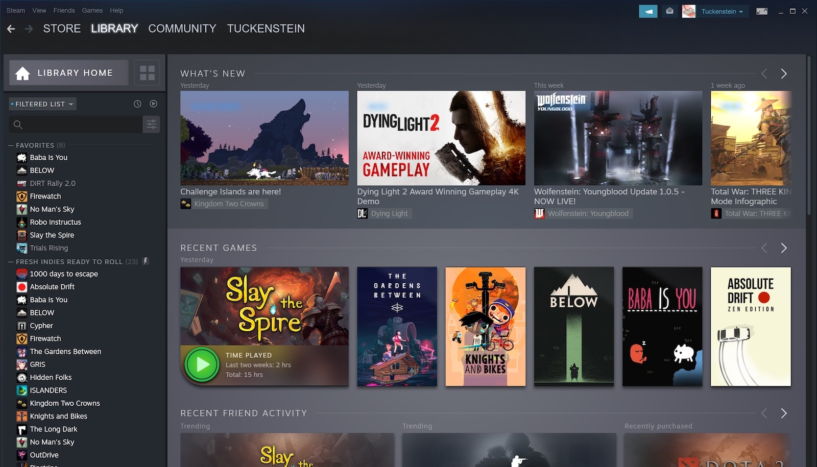 Take a good look around, folks. This will be the home of your PC video game collection for the next decade or so, if history is anything to go by. The new Steam Library, complete with a fresh hub for events and a redesigned Categories section, will l...