Give your Laptop the Keyboard Experience it Deserves with these Innovative Magnetic Attachments

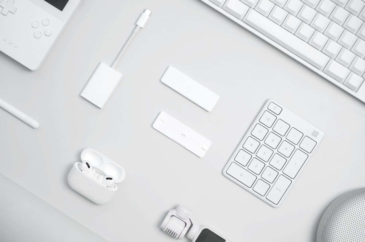
In the ever-evolving landscape of technology, laptop keyboards have come a long way in terms of portability and design. However, for those who spend a significant portion of their day typing, the convenience of sleek, compact laptop keyboards sometimes falls short of providing a truly satisfying typing experience. Enter Typesticks, designed with a vision to bridge the gap between laptop keyboards and the desire for a more comfortable and efficient typing experience, Typesticks offers an innovative solution that opens new possibilities for laptop users.

Designers: Far East GadgetTobalog


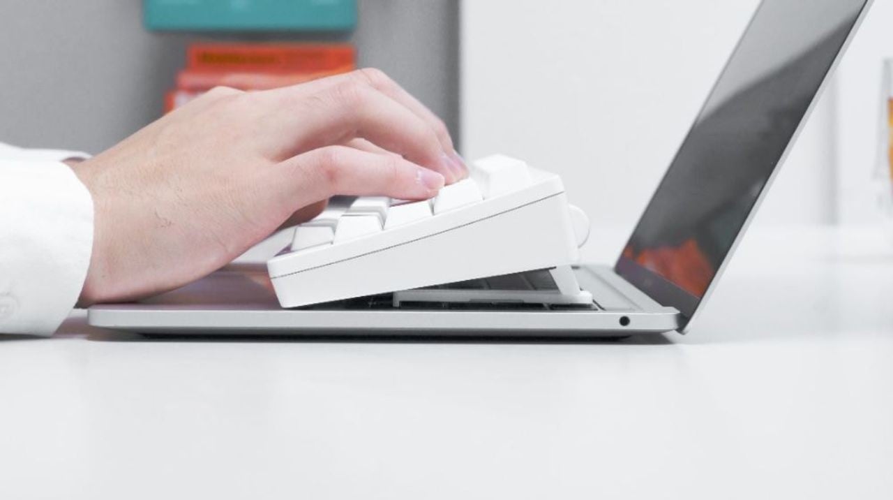
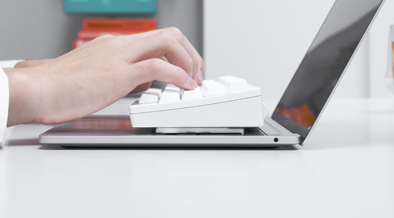
At first glance, Typesticks might seem like a simple yet unassuming product. However, beneath their unobtrusive exterior lies a clever design that promises to transform the way you interact with your laptop. Imagine being able to enjoy the tactile feel and responsiveness of a full-sized external keyboard while working directly on your laptop – that’s precisely what Typesticks offers.

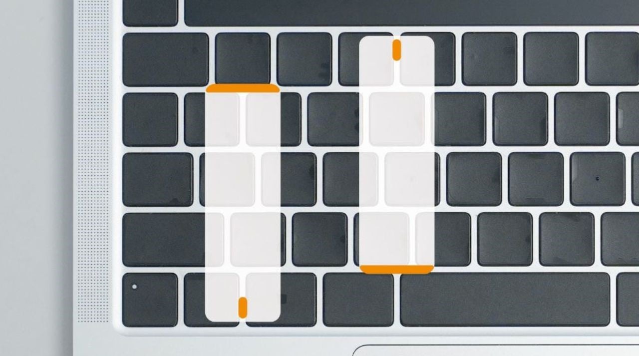
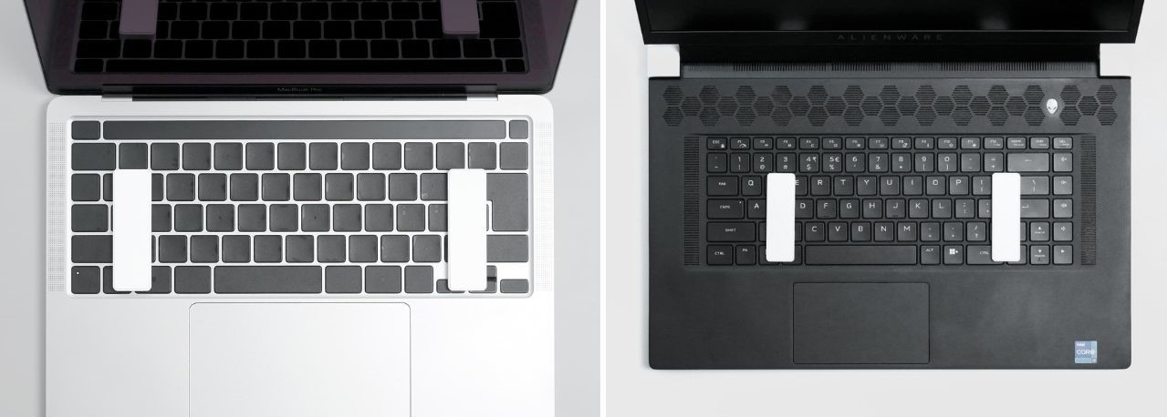
Designed as magnetic attachments, Typesticks are meticulously crafted to clip onto virtually any laptop keyboard that features a gap of 2.5 millimeters or more between each button and a key height of two millimeters or under. The materials used in their construction, including rigid plastic and silicone, ensure a secure hold on the external keyboard even when the laptop is tilted. This means you can enjoy the comfort of a secondary keyboard without compromising the angle of your laptop screen.

Compatibility is also a key consideration for Typesticks. They are designed to work seamlessly with a wide range of laptop models, both Windows and Mac. This makes them a versatile solution for users across different devices.

For individuals who are accustomed to the tactile satisfaction of mechanical keyboards, Typesticks present an enticing proposition. While you could certainly connect an external mechanical keyboard to your laptop, this can create a sense of separation between you and the laptop screen. Typesticks elegantly address this issue by allowing users to experience the familiarity of typing directly on their laptops while still benefiting from the use of their trackpad.

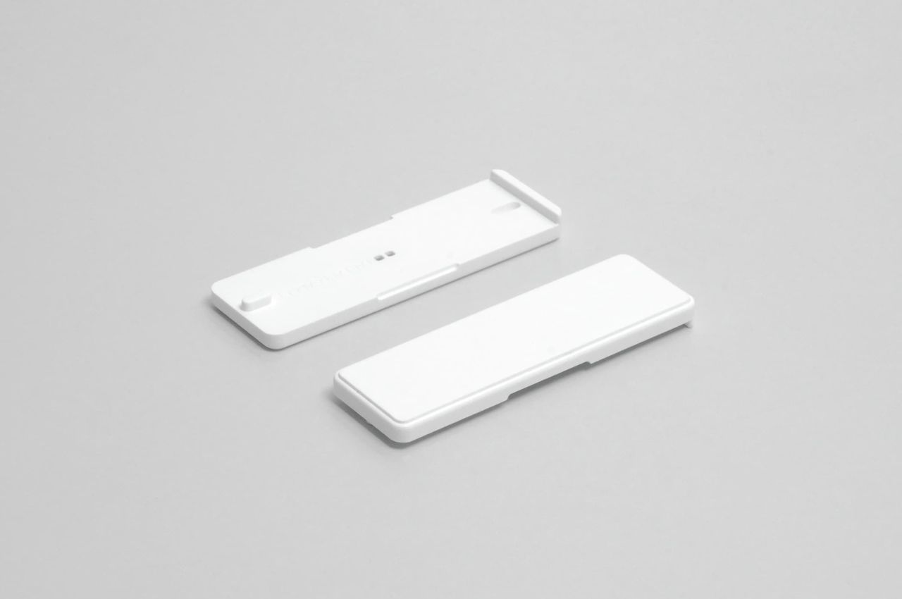
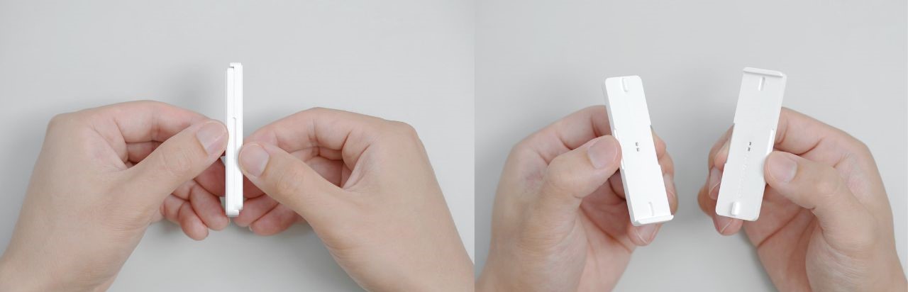
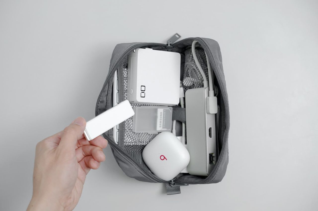
The magnetic aspect of Typesticks further enhances their appeal. Weighing a mere 15 grams and equipped with built-in magnets, these accessories easily fuse together for effortless transport. Their compact size, similar to that of a piece of chewing gum or a USB stick, ensures that they can be carried without adding bulk to your gadget pouch.

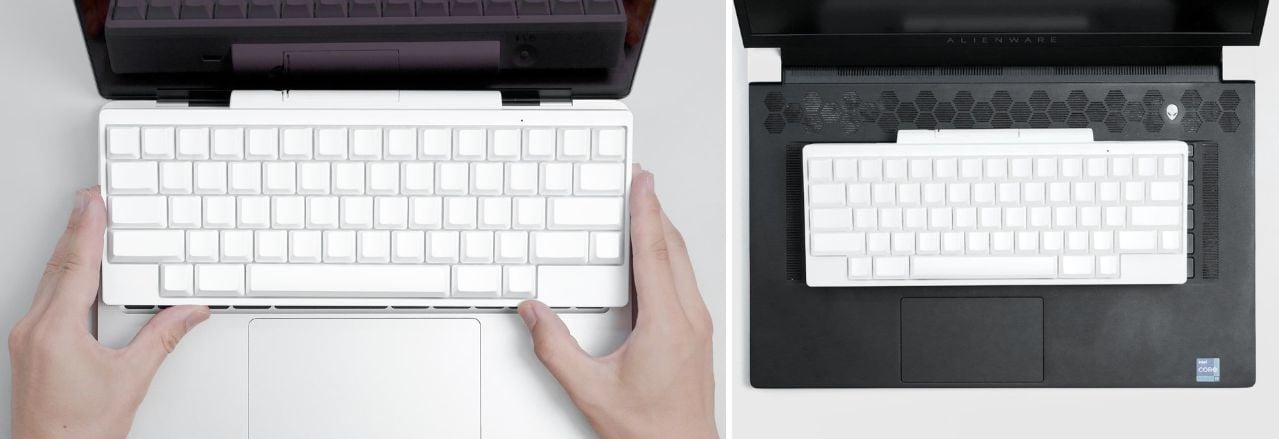
One of the standout features of Typesticks is their adaptability to different user preferences. The magnetic attachments not only provide a stable base for an external keyboard but can also be adjusted to incline the keyboard slightly. This feature enhances typing comfort, but it’s worth noting that it may impact the view of the lower part of the laptop’s display.

While Typesticks offer numerous advantages, it’s important to heed a few cautionary recommendations from the manufacturer. Users are advised not to close their laptops with the Typesticks still attached to the keyboard to prevent any potential damage. Additionally, due to the presence of magnets in the attachments, it’s advisable to keep them away from magnetic-sensitive items like hard drives and credit cards.

Typesticks, priced at ¥2,480 (approximately US$17), offer a cost-effective way to elevate your laptop typing experience without investing in a separate mechanical keyboard or compromising on portability.

In conclusion, Typesticks exemplifies the spirit of innovation by providing a creative solution to a common problem faced by laptop users. By seamlessly combining the comfort of an external keyboard with the practicality of laptop portability, these magnetic attachments hold the potential to enhance productivity and redefine the way we interact with our laptops. Whether you’re a prolific writer, a diligent email responder, or simply someone who values an efficient typing experience, Typesticks offers a compelling solution that aligns perfectly with modern work habits and demands.

The post Give your Laptop the Keyboard Experience it Deserves with these Innovative Magnetic Attachments first appeared on Yanko Design.

OPPO ColorOS 13 brings a touch of nature to its smartphones

The design field covers a wide range of industries, from physical artifacts of product design to the virtual elements of user interface design. It’s sometimes too easy to take for granted the importance of a well-designed user experience, but even the most beautiful computer or smartphone becomes just an expensive paperweight if the software running on it is unusable. Smartphone user experiences or UX have come a long way ever since the first iPhone and Android phones launched, embracing different aesthetics and design languages over the years. From skeuomorphism to minimalism, UX has taken inspiration from many beautiful things in our world, and OPPO’s latest iteration of ColorOS tries to take a page from the greatest artist and designer in the world, Mother Nature.

Designer: OPPO

Smartphone UI designs have gone from trying to recreate physical objects in the digital realm to designing completely new metaphors that would be impossible to produce in the real world. The trend these days has swung towards minimalism, though the pendulum has started to move to a middle ground that adds a few embellishments to give a bit of life to what would normally be a literally flat design. This, in turn, has opened the doors to design languages that build on top of conventional minimalism, adding some character to a user interface.

ColorOS 13, for example, introduces what OPPO calls its “Aquamorphic Design” language, taking inspiration from how water flows in nature. In its calmer state, water is naturally fluid, smooth, and compliant, preferring the path of least resistance and flowing around obstacles rather, slowly eroding rocks rather than trying to smash them. Whether intentional or not, it’s a fitting metaphor for the serene design language that OPPO adopted for its award-winning Find X5 Pro flagship earlier this year.

In practice, this Aquamorphic Design manifests itself in colors, shapes, and animations that feel smoother and more natural. The default color scheme, for example, tries to take hues from dusk at sea level. Icons are larger but also have smooth rounded corners as if they were pebbles picked up from the banks of a gently flowing river. Transition animations between various parts of the phone are also smoother and more fluid, trying to imitate the natural cadence of water rather than something as simple as a timer. Many people take animations for granted, and some even despise them as a waste of CPU time or battery, but properly designed animations actually help our brains form associations when parts of the screen move around. After all, nothing in real life just pops up out of thin air, something that would be jarring to our minds, whether physical or digital.

OPPO ColorOS 13’s nod to nature doesn’t stop with its appearance. A new Always-on-Display feature called Homeland, for example, tries to raise awareness of how even a minute change in temperature caused by global warming could affect wildlife. The Blossom live wallpaper, on the other hand, ties the idea of growing a plant with your screen time. If you go over your set screen time, the plant stops growing and starts to wither.

On the technology side, ColorOS 13 promises not just smoother animations but also more efficient battery usage. In addition to a 30% reduction in power consumption with Always-on-Display mode, this version of OPPO’s Android user experience tries to save as much battery as it can, which means fewer charging times and longer battery life. These may sound like minor improvements, but they are still small steps forward that increase a phone’s longevity and sustainability in the long run.

The post OPPO ColorOS 13 brings a touch of nature to its smartphones first appeared on Yanko Design.

Apple and Star Trek inspired the neat, interactive, and clean design and UX/UI for this coffee machine!

I love coffee, I love Apple and I love Star Trek, and thereby I love the Elemental coffee machine because it combines ‘elements’ from them all! The sleek machine has a silhouette of an espresso group-head with an intuitive modern touch interface. The clean form is a nod to how easy it is to use and a freshly brewed pot of coffee is still the center of attention here.

Torres takes a very stripped-back, modernist approach, with nothing hidden in terms of the machine’s function. You can see everything you need to make a good cup of coffee which adds clarity to the simple form. The interface is completely touch-based and therefore the UI had to be intuitive while still communicating movement as well as a sense of urgency. The UI is a homage to the ‘okudagrams’, an loving name given to the interactive and usually re-organizable displays found on control panels and computer interfaces in 23rd and 24th-century starships. It started with Star Trek and then spread to every sci-fi thing ever. The idea of integrating it here was to alleviate the comparatively long time it takes for filter coffee to brew, it almost gives the illusion that more is happening than there actually is.”I wanted to avoid the basic – almost traditional at this point – style of touch UI so I went with more of a sci-fi theme inspired by TNG LCARS, but actually, you know – usable,” says Torres.

The conceptual coffee maker also incorporates a digital scale to the hopper lid and a simple twist will push the beans into the grinder. The latch would also have a switch to activate the grinder and the cover has to be shut in order to complete the circuit. There is a sneaky little MacPro reference in the internal compartments because it looked much neater than bare PCBs and offered more protection from any potential leaks. The intricate grooves on the dripper were an attempt to avoid having a sprinkler in order to distribute the water evenly to the coffee grounds. The heating element is also woven into this section to prevent hot water from needing to be pumped up the exposed pipe and potentially causing a safety hazard.

“There was limited capacity for physical prototyping, so CAD + simulation software was used to quickly iterate and solve problems with the design. Surprisingly, this actually worked fairly well, at least in this case. Blender mantaflow simulations were used on the CAD models were used to help drive the water channels and filter arrangement,” explained Torres. Now, all I can think of is getting a good cup of coffee and watching sci-fi movies.

Designer: Leo Torres

Recommended Reading: The world of Lego interface panel design

The UX of Lego interface panelsGeorge Cave, designbycave.co.ukWhether it’s a spaceship, a cash register or a car instrument cluster, Lego interface panels play a relatively small role in the grand scheme of most builds. They offer finer details for a...

Questions UX Designers should ask while designing

01 Title

Ask and you shall know. Ask the correct questions and you shall know better!

Designing is a very empathetic process, wherein understanding the user’s troubles is the most important step. The fact of the matter is that often we end up assuming the problems faced by the users instead of finding their actual problems. And those problems can be found out only by asking some detailed questions regarding the product. To highlight the correct research process and make it easier for all the designers out there, the article below by Garrett Kroll (Head of Product Design @ Spent) published on Medium lists down the pertinent questions each of us should be asking while designing.

Want to recruit a designer who is thorough with the design process? Post your requirement with YD Job Board to connect with some of the most talented designers on the planet.

Looking for an interesting job opportunity? Check out Yanko Design Job Board to find relevant job openings in the best design companies.


The ability to ask meaningful questions is a fundamental yet often overlooked skill in the UX Designer’s toolkit. I’ve begun to notice a clear correlation between the number of questions a designer asks throughout the process and the quality of the final design output.

It’s much more than creating, it’s about understanding your problem so well that the solution is obvious.

In order to understand the challenge at hand, UX Designers must ask great questions at every stage of the process. I’ve cataloged a robust list of questions (100 to be exact) that I’ve found to be useful for projects spanning industries, devices, and personas. While by no means comprehensive, it should provide a framework for design thinking through different stages of a project.

02 image

Kickoff Meeting

In order to align the delivery team and stakeholders around the vision and project plan, the big questions need to be asked. Avoid jumping to solutions, instead focus on the underlying problems and insights that can give the team foundational knowledge to design from later.

  • What is the problem or need we are aiming to solve?
  • What does the product need to do?
  • What is the business opportunity? (e.g. acquisition, activation, retention, revenue, referral, etc.)
  • What are the Key Performance Indicators (KPIs)?
  • How else will we define success for this project?
  • How does this product fit into the overall strategy?
  • Who are the users or customers?
  • Why is this important to them?
  • Why do they care?
  • What are the users trying to do?
  • What are their pain points?
  • How can we reach users through this design process?
  • Are there any constraints (technological, business, etc.)?
  • How are we better than our competitors?
  • Are there any relevant products we can look at?
  • Who are the primary decision-makers on this project?
  • Does any relevant documentation exist (personas, user flows, etc.)?
  • Do brand guidelines exist?
  • Does a style guide exist?

Stakeholder Interviews

Further, understand the business and market by speaking with individuals who have a vested interest in the organization and the project. Many of these questions can be asked during kickoffs, but if asked individually they can yield better answers.

  • What is your role in this project?
  • What is the one thing we must get right to make this project worth undertaking?
  • How will you, personally, define success for this project?
  • What is the role of this project in achieving that success?
  • What are the goals you need to achieve from this project?
  • What have you tried that has/hasn’t worked?
  • What went wrong in that case?
  • Who are the biggest competitors and what worries you about them?
  • How do you expect to differentiate this product?
  • Where do you want the product to be in the next year, 5 years?
  • What keeps you up at night with regards to your users?
  • What assumptions do you think you are making about your users?
  • What do you know for sure about your users?
  • What are the most common problems your users face?
  • What worries you about this project?

03 image

User Research

Avoid the risk and expense of creating something users don’t want by first understanding their goals and pain points. Answers to these questions can give you the all-important “why” behind user behavior. These are best supplemented with observational findings (what users say and do can be different) and analytics if they exist.

The Context

  • What does your typical weekday look like?
  • Tell me about your role at your company.
  • What are your daily responsibilities?
  • What are some of the apps and websites you use the most?

The Problem

  • How do you currently go about [problem/task]?
  • Are you looking for a solution or alternative for [problem/task]?
  • Tell me about the last time you tried to [problem/task].
  • What are you currently doing to make this [problem/task] easier?
  • Have you tried any workarounds to help you with this?
  • Have you tried any other products or tools?
  • If so, how did you hear about them?
  • What’s the most frustrating part about [problem/task]?
  • How often do you encounter/perform [problem/task]?
  • How long do you spend on [problem/task]?

04 image

User Testing

Validate your assumptions and improve the experience by watching real users interact with your prototype or product. While this is to mostly gather qualitative feedback, there are opportunities to supplement these findings with qualitative answers (e.g. testing against success metrics).

First Impressions

  • What is your first reaction to this?
  • What is going through your mind as you look at this?
  • How does this compare to your expectations?
  • What can you do here?
  • What is this for?
  • Do you have any questions right now?
  • Why would someone use this?
  • How do you think this is going to help you?
  • What is the first thing you would do?

Task-Focused

  • If you wanted to perform [task], what would you do?
  • What would you expect to happen?
  • What parts of this were the most/least important for you?
  • How could we present the information in a more meaningful way?
  • Is there anything you would change/add/remove to make this better for you?
  • What was the hardest part about this?
  • Was there anything surprising or unexpected?
  • On a scale of 1–5, how [adjective] was this?

Summary

  • Would you use this today?
  • What might keep people from using this?
  • What is the most you would be willing to pay for this?
  • What, if anything, do you like or dislike?
  • If you had a magic wand, what would you change?
  • Does this feel like it was designed for you?
  • Is anything missing?
  • What adjectives would you use to describe this?
  • On a scale of 1–5, how likely or unlikely would you be to recommend this to a friend?
  • Since this isn’t finished, what would you like to see in the final version?

05 image

Design Reviews

Conducted with fellow designers or the larger project team, design reviews can ensure the “whys” behind design decisions align with user and business goals. Ask these questions to better understand how a designer arrived at their solution. Good design requires intentionality.

Overall

  • What part of this design are you looking for feedback on?
  • What constraints are you working within?

Interaction Design

  • What is the user trying to accomplish on this screen?
  • What problem is this solving?
  • How could this design fail?
  • How did you arrive at this solution?
  • What’s the simpler version of this?
  • Is there anything we can remove?
  • What assumptions are you making?
  • Why is that there?
  • Why is that shown at all?
  • Is that worth displaying by default?
  • Why is the screen organized this way?
  • Why is this a better solution than [established design pattern]?

Visual Design

  • What is your type hierarchy?
  • What UI patterns are you using?
  • What rules have you defined for these patterns?
  • Are there opportunities to be more consistent?
  • What are your margin and padding rules?
  • What rules have you defined for the color palette?

06 image

Stakeholders Reviews

Receive feedback from stakeholders that is clear, relevant, and helpful. They’re probably not experts in giving design feedback, so it’s your responsibility to ask questions that steer the feedback towards project goals and areas they are subject matter experts in.

  • Does this solve your users’ needs?
  • Does this effectively address [project goal(s)]?
  • Does this meet all functional requirements?
  • Does this effectively reflect the brand?
  • Why is [design request] important?

Parting Thoughts

  • Follow questions with a healthy dose of “why?” or “tell me more about that”.
  • Know what you don’t know.
  • Think of a product you love. Then think of the great questions the design team had to ask to arrive at that solution.

The original write up by Garrett Kroll (Head of Product Design @Spent) published on Medium can be found here.

YD has published the best of Industrial Design for over 15 years, so the designers you want are already on our network. YD Job Boards is our endeavor to connect recruiters with our super talented audience. To recruit now,  Post a Job with us!

07 mockup