This fan-made Sony PlayStation 2020 console + controller is far better-looking than the original

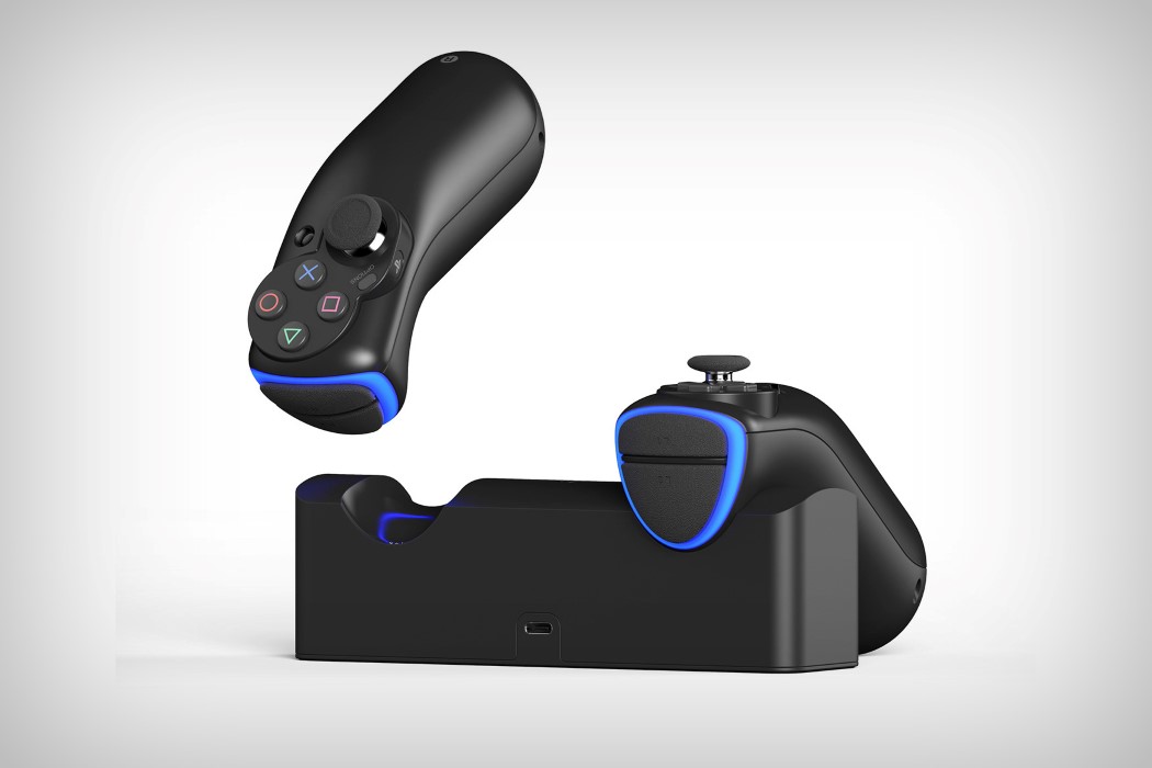
Well, we don’t know what the official Sony PlayStation 5 will look like, but Sony’s debuted their new controller design and here’s really what I think. It looks great, but it isn’t Sony-DNA. Sony’s DualSense controller feels a lot like an evolution of an Xbox controller, rather than a direct progression of its own design heritage, and that isn’t sitting well with Yonghwan Kim, who prefers Sony retain its brand DNA. In fact, he’s even designed his own console and controller combo to show Sony the path forward.

Let’s ignore the fact that the top-view of the conceptual PS5 console looks like one of Buzzfeed Tasty’s induction cooktops and move onto its monolithic design that actually follows the architecture that Microsoft set with its 2020 Xbox. The vertical pillar-shaped design is optimized for air-flow, pulling wind from the bottom and pushing it out the back. The design even features a rounded-hexagon top that extrudes upwards to reveal a CD tray, and a host of ports on the back, from the standard Power Delivery port to an HDMI, LAN, and USB ports. It seems like there’s a 3.5mm jack too for an aux out.

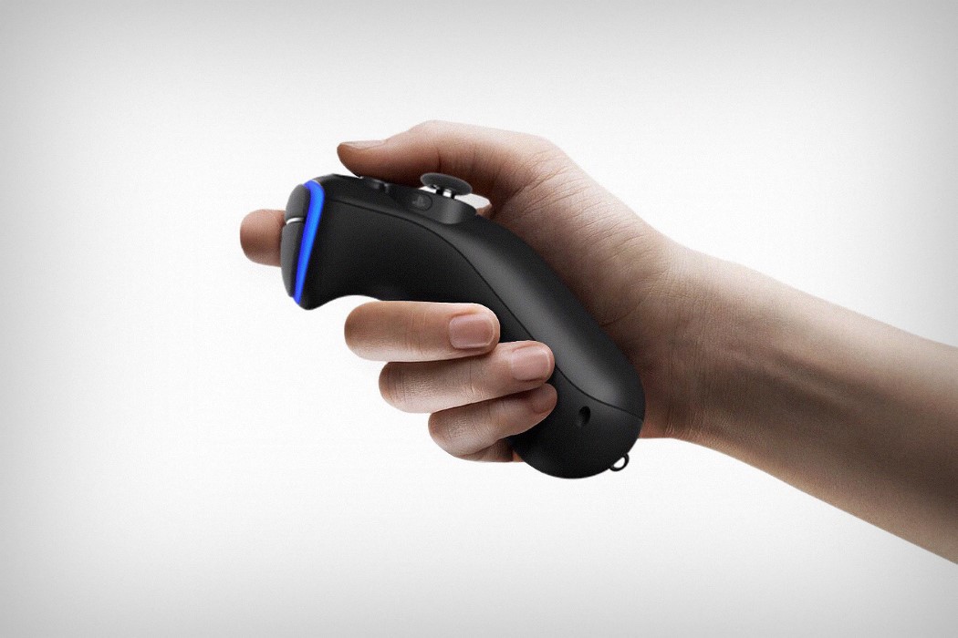
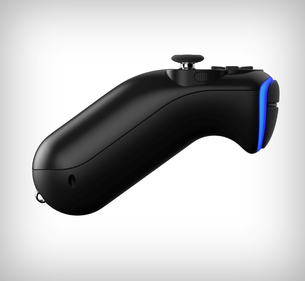
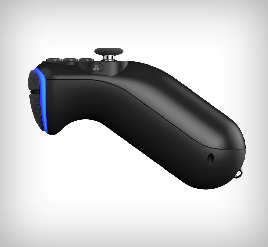
What I really like is Kim’s controller, which truly looks like the soul successor of the PS range. It retains the light bar’s position, keeps the touchpad the way it is, and doesn’t change much in way of the layout… but it gives the controller a refreshed aesthetic. I mean, if it ain’t broke don’t fix it, right?

Thoughts, anyone? Besides the fact that it looks like Apple’s 2015 Mac Pro? Or an enlarged Amazon Echo? I mean I really think the form factor makes sense. It’s familiar, and that CD tray is actually pretty cool!

Designer: Yonghwan Kim

Audi meets Audio with these wireless earphones!

It isn’t likely that the German car manufacturer would ever need to enter the audio industry, but owning them would be quite a power-move… like flashing that branded red cap while riding around in your Ferrari. Created as a concept by designer Yonghwan Kim, the Audi Hear (I’d mich prefer if they’d been called the Audi-O) is a set of truly wireless earbuds designed for the car aficionado. They come in a super compact design that sit neatly within the ear, displaying the Audi branding to passers-by. What’s more is that they even come with a rather dashing looking charging dock that takes direct inspiration from a car’s form. Wouldn’t it be pretty amazing if you could use these to authenticate your car, using voice commands to get it to start, stop, or seamlessly shift into self-driving mode??

Designer: Yonghwan Kim

This Microsoft Ultrabook converts into a gaming workstation with the reinforcer dock!

The Microsoft XYV concept beautifully bridges the gap between immensely capable gaming laptops and the conveniently thin media laptops. In the ever-adapting world of laptops, if you want a laptop that carries desktop-level of performance, it’s likely that you will have to compromise on both aesthetics and practicality, which is far from ideal when using the laptop in a more conventional and casual manner, where a thinner laptop would be more suited.

The Microsoft XYV concept is a sleek and compact laptop that is accompanied by its very own graphics-reinforcer dock. This dock provides the thin laptop with superior performance, thanks to the external graphics card and power supply, as well as more efficient operation due to the addition of improved cooling. The laptop sits on the dock in a raised position, providing the user with a more ergonomic position for typing. This is certainly an intriguing concept to anyone who wants to experience the best of both worlds!

Designer: Yonghwan Kim

Reimagining the joypad for VR

moveshock_1

Play a PS4 and you don’t ever need to look away from your screen. Your hands and fingers know EXACTLY where each button is, as they intuitively move across the joypad, mashing away to create intricate, complex commands that affect your gameplay. That intuitiveness, however, hasn’t carried forward to VR, with the PSVR’s PSMove controllers having a completely different layout that puts you back at the bottom of the learning curve. Besides, with a VR headset around your eyes, you can’t even look at the controller to see what you’re pressing, making a major part of the gameplay experience about trial and error.

Yonghwan Kim has a solution. Take the joypad from the PS4 and separate it into two individual handheld controllers. Your fingers will instantly know the layout the minute your hand grabs the controllers… while the independent controllers also offer motion tracking, working marvelously within the VR environment. Once you’re done, just place the MoveShock controllers on their dock to charge through the magnetic pin connectors at the base. It’s rather simple and hassle-free… which is exactly how a VR experience should be, given that your eyes stay covered throughout the entire thing.

Designer: Yonghwan Kim

moveshock_2

moveshock_3

moveshock_4

moveshock_5

moveshock_6

This PSP has its own version of the “notch”

psp_2018_1

With ever-expanding screens on phones and disappearing earpieces and home buttons, it only makes sense that you’d see that trend everywhere else. TVs are all screen and no bezel too, and Huawei’s laptop is exploring a similar path too. So it makes sense that the PSP (should Sony choose to release a new version) would do something on the same lines. Yonghwan Kim’s vision for the PSP may, in that regard, be a little too drastic, but it sure looks interesting. Here’s a couple of reasons why it would work, and why it wouldn’t.

First of all, look at that shape. It’s beautiful, with its rounded corners, much like most smartphones today. Even the screen does a bend, curving gently at the top, and with flair at the bottom. There’s no doubt that this PSP would be great to hold for long intervals. Besides being curved at the corners, this PSP is literally all screen. Barring the controls that pop up through the middle, the PSP actually explores a more than 16:10 aspect ratio, so a game feels more cinematic. Look to the bottom and you’ll see two sets of pretty big speakers, allowing you to immerse yourself completely in the game with a large screen and big sound. Nice, ain’t it?

The most obvious con (and mind you, this is just a perception problem) are the way the controls appear through the screen, essentially cutting through the display, causing massive blind spots in the gameplay. From the standpoint of a hardcore gamer (who doesn’t like too much change), this may infuriate you. It makes less sense, and to be fair, is a literal hindrance. However, like any feature, I believe this also just needs getting used to. While the tactile controls pretty much cut into the screen, it would make little to no difference in the gameplay, because your eye tends to operate within the same 16:9 area, so the extra screen to the sides is just to increase one’s periphery and make the game feel immersive. It also isn’t a problem for Sony to execute too, since the PSP eco-system is completely within Sony’s control. They can modify a game’s experience to accommodate the controls sitting within the screen. Aside from this detail, nothing much changes with the PSP as a concept. The controls and their placement remain the same, making sure gamers don’t have to follow a new learning curve, the only update is the fact that the gaming device, like every display-based device you own, is more screen, and less of that bezel we hate so much!

Designer: Yonghwan Kim

psp_2018_2

psp_2018_4

psp_2018_5

psp_2018_6

psp_2018_7

psp_2018_8

psp_2018_9

psp_2018_10

Tactile+Versatile: Wacom’s digital eraser is better than a stylus

wacom_normal_series_1

Take any stylus you find, and it closely resembles a writing instrument. It’s never been anything visually more than a pen or a pencil. Yonghwan’s Wacom Normal Series concept brings diversity to that approach. The conceptual series come as a set comprising a stylus, that looks like the one we’re all too familiar with, and an eraser that isn’t mounted on the reverse end of the stylus, but is rather a separate entity, opening up the gates for a new product, interaction, experience, and language. The eraser, a thing of sheer beauty, is much more versatile than the stylus, coming with three ways to use it. Based on an amalgamation of different eraser shapes, the digital eraser (let’s call it that for now) comes with a slanted flat head, and a rounded backside, allowing you to use its tip for erasing sharp lines, the entire flat edge for wider sharp strokes, and the rounded part for a soft eraser effect. What’s more, they’re also pressure sensitive.

Truly mimicking an artist’s instruments, the stylus and digital eraser together open a wide number of possibilities, giving the artist more freedom to use the digital format as they would a traditional setup. The two instruments come together as a set, with a case that also doubles up as a stand for the stylus… partially because you’re not going to be using the stylus’ back end as an eraser, while the true reason being you’re probably going to want to play more with the eraser’s brilliant new experience!

Designer: Yonghwan Kim

wacom_normal_series_2

wacom_normal_series_3

wacom_normal_series_4

wacom_normal_series_5

wacom_normal_series_6

wacom_normal_series_7

wacom_normal_series_8