Basketball player Stephen Curry has long collaborated with Google, and last year took on the role of “Performance Advisor” at the company as part of a multi-year partnership. It appears the first product of this union is “coming soon,” based on a video posted to Curry’s Instagram account. The 15-second clip shows shots of Curry playing with a basketball, and a gray-and-orange band sits conspicuously on his left wrist. Interspersed are the words “A new relationship with your health coming soon,” and the video ends on the Google logo.
We reached out to Google for comment and details, and the company said “Our Performance Advisor has been working with the team to cook up something special 👀. More to share soon.”
In a voiceover in the video, Curry says, “I’m excited for what this is going to mean for the world, for health, for wellness. It’s the first of its kind in a way. I won’t spoil it — you kind of have to see it for yourself.”
Based on what we see in footage, the band seems to resemble a Whoop wearable, although a screen or any module is never shown. It’s unclear how Google’s product would be different, although it wouldn’t be a stretch to guess that AI might feature somehow.
Whoop was started in 2012, and announced today that it had raised $575 million with a valuation of $10 billion. Whoop’s investors include athletes like LeBron James and Cristiano Ronaldo, among other celebrities.
This article originally appeared on Engadget at https://www.engadget.com/wearables/googles-performance-advisor-steph-curry-teases-probable-new-wearable-183612209.html?src=rss
Shark has been making some intriguing devices lately, and its newest offering is one I’m personally very excited about. The company has just announced the ChillPill — a gadget it’s describing as a “3-in-1 personal cooling system.” It’s a modular system that offers a fan, mister and cold plate in one portable accessory, and is available today (March 10) for $150. Just in time for the summer, I guess. I’ve had a ChillPill to test for a few days and while I think it’s a bit pricey, I’m impressed by the sophistication and versatility you get for the money.
The ChillPill looks kind of like a strange, modern pair of binoculars. It is made up of two tubes connected via an inch-long silver rotating hinge. Unlike a pair of binoculars, though, one of the halves of the ChillPill can swivel on its hinge to about 100 degrees in either direction, so you can twist it to your heart’s desire. The hinge clicks firmly into place, and feels solid, so it can hold steady in whatever position you’ve chosen.
The smaller of the two tubes is where the controls and the USB-C charging port sit. There is a switch near the bottom here that locks the controls so the ChillPill doesn’t accidentally turn on when it’s in your cluttered purse. This is important, since turning on the device and adjusting the intensity levels is a matter of pressing the other end of this tube and rotating the dial. There’s a screen that takes up the top surface and it’ll show your battery level and what speed or mode you’ve selected.
The matte, slightly larger tube is where the attachments go, and the other end of this is an air inlet. Shark calls the attachments “caps,” and like mentioned earlier, these are the “High-speed fan” cap, a “Dry Touch Mist” cap and the “InstaChill Cooling Plate.” The fan is basically an inch-thick disc, while the other two are a bit taller (or deeper), and the misting pod has a tank with a wick in it. You have to fill this with potable water (and the instruction manual repeatedly warns against using oils, fragrances or other additives) before turning the device on.
Swapping the caps out is a fairly easy affair thanks to the self-explanatory symbols on the edge. Twist the parts till the circle or lock icons are on top of the solid white dot on the other side, and you’re all set.
The Shark ChillPill in use in various scenarios.
Shark
Of the three attachments, I was most excited for the cold plate, but was pleasantly surprised by how much I liked the mister. I was initially skeptical when Shark’s reps told me it was a “dry mist,” and I assumed it was probably much wetter than they promised. But when I filled the container with cold tap water and turned the ChillPill on, I found the resulting cool air and mist very refreshing. And though my chin, which got the most of the water vapor, did get a bit wet, it all dried off very quickly. Plus, if I didn’t want to risk any moisture on my face at all, I could just hold the device a bit further away. I also think it would be thoroughly enjoyable when aimed at other areas, like my neck or back, for a quick cooldown.
Same goes for the cooling plate attachment. It uses basically the same technology as the under-eye plates on the Shark CryoGlow LED face mask and the Shark DePuffi device. The company’s InstaChill technology essentially gives you a super cold surface that you can press to your skin (or, in theory, any surface that needs to chill) to quickly cool things off. Not only can this be great after, say, a hot yoga session or running to the subway in the middle of summer, but it can also be quite calming. I set the plate to the lower of the two chill settings and rubbed it all over my face before a call with my boss. I can’t say I was completely relaxed during the chat, but I was certainly a lot less strung out than I might have been without the ChillPill.
Finally, though the fan is the least exciting, it does work as promised and gets so powerful at the top level of 10 that I was genuinely shocked. It was like a mini cyclone in my hand, and if all you want is for moving air (that doesn’t have to be cooled), the ChillPill offers plenty of oomph and a wide range of intensity options.
For the money, I wish that Shark included some ChillPill accessories like the wrist strap, clamp, belt clip, crossbody strap or travel case. I also would love for the company to find a way to keep all the attachments on the device so I don’t have to carry loose caps with my ChillPill or buy a carrying case. I also found the half of the device with the power button on it to be a bit prone to becoming slick or greasy, making it a bit slippery at times.
Ultimately, I really enjoyed using the ChillPill to keep me cool. I can see this being a popular device in a hot, humid country like Singapore (where I’m from), and you best believe I’ll be ordering a few as gifts for my family members. Well, maybe just one or two. I’m not rich, after all, and these aren’t that affordable.
Update, March 10 2026, 3:42 PM ET: This story has been updated to edit the degree at which the two tubes can rotate on the hinge.
This article originally appeared on Engadget at https://www.engadget.com/home/sharks-chillpill-puts-a-mister-fan-and-cold-plate-in-one-portable-package-123000848.html?src=rss
By introducing the iPhone 17e just a year after the iPhone 16e, Apple is closing some gaps. Before, the company would only roll out a new entry-level iPhone every few years, with the iPhone 5c (2013), iPhone XR (2018) and iPhone SE (2016, 2020, 2022) all having two to four years between their releases. But Apple is getting into an annual groove now, and having renamed the device to integrate better with the rest of the iPhone lineup, Apple is making a clear statement: It cares about the midrange now.
With the current state of global economics, Apple’s focus on lower cost devices like the iPhone 17e and newly launched MacBook Neo is timely. Most people probably don’t make full use of the high-powered machines in their pockets and on their laps, and might be reconsidering whether they need to spend as much money on the Pros and the Airs of Apple’s product lineup. At $599, the iPhone 17e is about half the price of an iPhone 17 Pro or the iPhone Air. It’s $200 cheaper than the base iPhone 17, too.
Since I reviewed the iPhone 16e last year, I’ve been using it as a work phone, mostly for Slack, email and light editing in Docs. The way I see it, most people considering the iPhone 17e are likely in a similar situation — either thinking of getting a supplementary device or looking for a good enough phone for a child or other dependent. For this review, I’ve tried to cover most of those scenarios whether it be a person that would spend most of their phone time on social media and games like a teenager or someone that’s largely using it for administrative work purposes. I mostly want to answer this question: If you’re getting your first iPhone or buying one for someone else, should you get the iPhone 17e or the iPhone 17?
iPhone 17e vs iPhone 16e, for testing’s sake
It’s very clear from Apple’s website that it doesn’t want you comparing the iPhone 17e to the iPhone 16e. The company doesn't allow you to do so in the comparison tool on the iPhone 17e product page, limiting you to the iPhone 11, iPhone 12 and the iPhone SE (second and third generations). Sure, I understand that no one is really thinking about getting an iPhone 17e after just buying the 16e last year. But for the purposes of this review, it makes sense for me to shout out what’s new from the previous generation. The most significant additions this year are the A19 chip, double the storage, improved Portrait photography and MagSafe with faster wireless charging. Oh, and a new pink color option, adding an ever so subtle splash of color to the previously monochromatic lineup.
The A19 chip is supposed to make AI processes faster, thanks to the neural accelerators in its GPU. In my testing so far, the difference has been negligible at best. Initially I was seeing the iPhone 17e perform slower than the 16e, but after a software update, the iPhone 17e caught up. In Apple Intelligence-powered tools like Cleanup, the iPhone 17e was a split second faster at identifying unwanted objects in photos and erasing them than the 16e. If you’ve just received your iPhone 17e and run into issues where image generation or cleanup is slow or stalling, give it a day or so for the software to stabilize.
Oddly, in some side-by-side Image Playground testing, the iPhone 17e and iPhone 16e were neck and neck. Sometimes, the iPhone 16e was faster. Occasionally, the iPhone 17e was ahead. I’ll continue to keep an eye on how both phones do here, as it could still be due to some early software issues, but for now the improvements from the A19’s GPU seem to be hit or miss.
The pink iPhone 17e and the white iPhone 16e held up in one palm in front of a red brick wall.
Cherlynn Low for Engadget
Improved portraits on the iPhone 17e
Of all the improvements to the iPhone 17e, to me, one of the most important is in portraits. In my review of the iPhone 16e, I said that the majority of my grievances with the single camera setup was the fact that Apple ended up using an older version of Portrait mode.
That version was much more limited and didn’t allow for applying a background blur to pictures of non-human subjects. This time, Apple borrowed the algorithms it developed for the iPhone Air for the iPhone 17e’s rear and front cameras. This not only delivers a general improvement to portraits, with better segmentation and a more natural-looking bokeh effect, but also allows for depth information to be captured when applicable. For instance, when a person, cat or dog is detected, the iPhone 17e will automatically capture depth information so you can apply a blur after the picture is taken, even if you didn’t use Portrait mode initially.
Importantly, these “next-gen portraits” also allow you to edit the level of blur and change up the focal point of the picture after you’ve taken the shot. In some photos of my neighbor’s grumpy shih-poo, I was shocked that my colleagues actually preferred the samples I shared from the iPhone 16e over the ones from the iPhone 17e. But their critique was fair: the newer phone blurred out Oreo’s tail, keeping only his face in focus. I was able to address this by going into the editing tools and dragging the slider for aperture to bring more of the dog into focus. I also played around and tapped on Oreo’s tail to make it clear, and the iPhone 17e blurred up his face instead.
Two photo samples side by side, featuring a dog on a blue leash staring up into the camera.
Cherlynn Low for Engadget
When using Portrait mode to photograph people, the iPhone 17e did indeed deliver more pleasant bokeh than its predecessor. In pictures of my friend Brenda Stolyar, with the “depth” or aperture set to f/4.5 across both devices, there was more softness in the brick wall behind her on the new phone. I was slightly confused since it seemed like the older iPhone actually delivered a sharper picture, until I realized it was actually just softer bokeh.
For those coming from older phones like the iPhone 11, 12 or SE, the addition of next-gen portraits should feel like a major step up. Even when compared to the iPhone 16e, the fact that I was now able to apply the effect on photos of food and other inanimate objects with no faces made me happier. It makes the camera more versatile, and feels like a noteworthy update that makes your photos feel more modern.
But that is definitely because I like pictures with the artificial depth of field effect. If you don’t care for bokeh and really only want a phone’s cameras to be good enough to snap pictures of menus or receipts, for instance, the 17e’s improvements here won’t mean much.
MagSafe and wireless charging
The rear of the iPhone 17e catches the light in front of a stone wall.
Cherlynn Low for Engadget
What might matter more, then, is this generation’s wireless charging speeds. While the iPhone 16e could only support up to 7.5W, the iPhone 17e goes up to 15W (with adapters of 20W or higher) and also works with MagSafe accessories. I can’t imagine anyone considering a new iPhone 17e already has magnetic cases or stands, but if you decide to invest in those accessories, you’ll find them convenient and satisfying.
I placed both models on my wireless charging stand — the 17e snapped on and started charging, while the 16e clattered helplessly off the stand. I placed it on the charging pad at the base instead and noted how much power each of them gained in 15 minutes. The improvement is clear: the iPhone 17e went up by 16 percent (30 percent to 46 percent), while the 16e only gained 3 percent (69 percent to just 72 percent).
Beyond the numbers, what this means is that when you’re in a pinch and trying to quickly top up your phone on, say, a wireless charger you found at a cafe, you won’t need to sit around as long with the iPhone 17e. For those of you that simply leave your phone on a stand overnight, this is less likely to meaningfully impact you.
There are a few other updates that I haven’t really tested in this review, like the improved durability with Ceramic Shield 2 on the iPhone 17e’s screen. The new display also has a treatment that is supposed to reduce glare, and considering the week of wonderfully gloomy weather we’ve had here in New York, this isn’t something I’ve truly had a chance to evaluate. Also, while I do appreciate the doubled storage, which is sure to please the media hoarders among us, I will say I’ve already been served warnings about my iCloud storage running out. It still feels like something else Apple might need to address, but for newcomers to the iOS world, the higher base storage is absolutely a positive.
Elsewhere, there are virtually no differences between the iPhone 17e and iPhone 16e. They have the same size displays with the same resolution, brightness, refresh rate, contrast ratio and color gamuts. Both are rated IP68 for dust and water resistance, and have similar battery lives (up to 26 hours of video playback, according to Apple). They also have the exact same dimensions of 5.78 x 2.82 x 0.31 inches, although the iPhone 17e does weigh a whole 2 grams (0.8 ounces) more than the 16e, which is almost definitely attributable to the addition of MagSafe. Unless you have weighing scales for hands, though, this difference is negligible.
An iPhone 17e held up in front of a tree trunk.
Cherlynn Low for Engadget
Should you get the iPhone 17e or the iPhone 17?
Where you might find more meaningful distinctions is when comparing the iPhone 17e to the iPhone 17. For $200 more, you’ll get longer battery life and slightly better performance thanks to one more GPU core. The iPhone 17 also has a larger, sharper and brighter display that’s 6.3-inches, with higher refresh rates and a full-screen design incorporating the Dynamic Island. It also supports the Always On Display and has an 18MP front camera with the Center Stage feature that allows for easy switching between landscape and vertical orientations in your selfies without having to rotate your phone.
In fact, the camera upgrades alone on the iPhone 17 might be worth the money. On top of getting the additional ultrawide camera, you’ll also gain the dedicated camera control button on the right edge, the latest generation of Photographic Styles, support for macro photography, Cinematic mode and Dual Capture in videos as well as spatial and macro recording capabilities. It also comes with sensor-shift optical image stabilization, which is more advanced than the OIS on the iPhone 17e. Rounding out that long list of differences is higher recharge speeds (with compatible chargers) and Apple’s second-generation Ultra Wideband chip for more precise Find My support. The iPhone 17 also offers dual-frequency GPS and works with the latest standards in connectivity, like Thread, Wi-Fi 7 and Bluetooth 6 (whereas the iPhone 17e only gets to Wi-Fi 6 and Bluetooth 5.3).
Sure, the iPhone 17 is slightly taller and heavier, but considering all the bonuses and the extra camera, that feels like a tradeoff that is more than fair. It’s a lot more advanced for $200, and feels like a better starter phone than the iPhone 17e. But if your budget is tight and camera performance isn’t a priority, you’ll get a great experience from Apple’s latest.
The iPhone 17e held up in mid-air in front of some red foliage.
Cherlynn Low for Engadget
Wrap-up
In 2026, it feels like Apple has done the impossible. It’s managed to serve up multiple iPhones at various price points with enough meaningful differentiations to justify each tier. Meanwhile, each iPhone 17 in the full lineup is a capable and satisfying device for its price. Upgrading to the iPhone 17e from the iPhone 11, 12 or SE will certainly feel significant, although getting almost any current-gen phone will feel modern compared to those.
In fact, if you’re platform agnostic and wouldn’t mind an Android device, there are options out there with significantly superior screens and cameras. The Pixel 10a, for instance, offers a larger display with a 120Hz refresh rate and a dual-camera system all for $100 less. With Apple seeming to be setting its sights on the midrange market, it should seriously consider stepping up in those two areas in the next e-series iPhone.
But of course, the name “iPhone” carries its own premium, and the iPhone 17e is a solid entry-level handset for those who need a basic, no-frills path into the Apple ecosystem.
This article originally appeared on Engadget at https://www.engadget.com/mobile/smartphones/iphone-17e-review-the-economical-choice-130000647.html?src=rss
The iPhone 17e was announced on Monday through a press release, so there was no real chance to immediately get a hands-on with it. But at Apple’s event in New York today, the phone was on display alongside the new MacBook Neo, iPad Air M4, MacBook Pro M5 and Studio Display XDR. I managed to take it for a quick spin to see if it is truly as similar to the iPhone 16e as it appeared from pictures. Spoiler: It mostly is.
One of the most noteworthy changes to the iPhone 17e is the addition of MagSafe support, and aside from confirming whether that works, I don’t really have any impressions to add. I also can’t tell you at the moment whether the increased wireless charging speed makes a difference, although mathematically I have to imagine it would.
I did get a chance to try out the new Portrait photography here. I brought my iPhone 16e and tried taking portraits with both devices. I could immediately see that the iPhone 17e allowed me to apply an artificial background blur to pictures I was framing up of the new MacBook Air M5, whereas my iPhone 16e just said “No person detected.” In the Photos app, I was able to adjust the level of blur and adjust the focal point to bring a different group of flowers in focus, too.
The other thing I can tell from seeing the iPhone 17e in person is that this new pink color option is absolutely delightful. I won’t go as far as to call it stunning or vibrant — it’s too subtle to be either of those things. It’s almost the same shade of pink as the Pixel 3, except a bit rosier. I do really like this color, it’s understated and elegant.
Other changes include the stronger Ceramic Shield 2 covering the iPhone 17e’s screen, which is a step up from the Ceramic Shield on the iPhone 16e. Obviously I didn’t attempt to throw the new phone around at this event, and would not have been allowed to, so we’ll have to wait till I spend more time with a unit in the real world to better gauge its durability.
I’ll also work on testing things like battery life, charge time and performance improvements with the A19 chip in my full review. For now, my early look at the iPhone 17e tells me everything I expected is largely true, and that pink is a surprising scene stealer. The iPhone 17e retails for $599 and is available for pre-order now, with in-store and shipping arrivals slated for March 11.
This article originally appeared on Engadget at https://www.engadget.com/mobile/smartphones/iphone-17e-hands-on-pretty-in-pink-with-portraits-enabled-163946647.html?src=rss
As part of its big week of announcements, Apple has unveiled a new pair of M5 chips alongside two new MacBooks. The new M5 Pro and M5 Max chips will power the new MacBook Pro that was just announced today, while the new MacBook Air comes with the base M5. According to the company’s press release, the M5 Pro and M5 Max come with an “advanced GPU with Neural Accelerators and higher unified memory bandwidth for a massive increase in AI compute.”
At the heart of the M5 Pro and M5 Max are what Apple is calling a new “Fusion Architecture” that “combines two dies into a single system on a chip (SoC).” The chips both feature a new 18-core CPU, six of which Apple is now calling “super cores, that are the word’s fastest CPU core.”
The other 12 are “all-new performance cores, optimized for power-efficient, multithreaded workloads.” Altogether, Apple says these CPU changes improve performance by “up to 30 percent for pro workloads.” Meanwhile, the GPU is a jump over the next-gen design we saw in the M5, as it goes to up to 40 cores. Each GPU core has a Neural Accelerator in it, and together with the higher unified memory bandwidth, the company says the M5 Pro and M5 Max offer “over 4x the peak GPU compute for AI compared to the previous generation.”
Apple added that graphics performance is also getting a substantial boost, by up to “35 percent for apps using ray tracing” compared to the M4 Pro and M4 Max.
To be clear, this isn’t the first time Apple has claimed it has the “world’s fastest” core. According to our resident Apple Silicon expert Devindra Hardawar, the benchmarks have proven the company’s claims true. It’s also worth noting that the two-die design isn’t novel or unique, as companies like Intel and AMD have been doing similar.
The M5 Pro and M5 Max will first show up in the new MacBook Pro, which is available for pre-order starting March 4, and will arrive on Wednesday, March 11.
This article originally appeared on Engadget at https://www.engadget.com/computing/apple-unveils-the-m5-pro-and-m5-max-chips-which-feature-new-faster-super-cores-141533420.html?src=rss
Our review of the new AirTag went up yesterday, and that involved testing the new Precision Finding feature on Apple Watches. In the process, I found the setup to be confusing and counterintuitive, and was relieved to discover it wasn’t just me. If, like me, you’ve been trying to set up Precision Finding on your Apple Watch for the AirTag you’ve just unboxed and attached to a precious belonging, here are the exact steps to take.
First, make sure your Apple Watch is compatible with the feature. That means verifying you’re using the Series 9 or later (you would have bought it in or after 2023) or the Ultra 2 and newer. Then, go to the Watch app on your phone and do the following to make sure you’ve received the latest software update that adds the functionality.
Tap General.
Press Software update.
Make sure the page says you are running watchOS 26.2.1. If not, tap Install Now.
If you need to download the software, make sure your watch is on its charging cradle. Even though my Apple Watch Series 11 was fully charged, I was still told to make sure it’s connected to power and had at least 50 percent of juice left for the software to install. After a few minutes, my watch restarted and the app said it was updated to the newest version of watchOS.
Now that you have the right hardware and software, you can set up Precision Finding. I assume you’ve already connected the new AirTag to the iPhone that’s linked to your watch (and if you haven’t, make sure to do that).
This was the part of the process that confused me. Instead of opening the Find Items app on the watch, Precision Finding for the new AirTag actually exists as a shortcut in the Control Center. Here are the steps to add it there:
Open the Control Center by pushing the button below the dial on the side of the watch.
Scroll all the way to the bottom and press “Edit.”
Push the + button at the top left of the screen.
Scroll down and tap Find Items.
Press Find AirTag, then tap Choose. You should see the new AirTag you’ve linked to your account here.
Select the AirTag you want to precisely find.
Drag the icon to whichever position you prefer within the Control Center.
Hit Done.
Now, whenever you want to locate your item, you can pull up the Control Center, press this button and the Precision Finding interface will appear, showing how far away it is. You can also push the button on the bottom right of this screen to get the AirTag to ring, guiding you to where your item is.
This article originally appeared on Engadget at https://www.engadget.com/computing/accessories/how-to-use-your-apple-watch-to-precisely-find-your-new-airtag-164922731.html?src=rss
I have a love-hate relationship with Spotify that might just be leaning more towards love today. While I struggle with some of the company's choices about the type of content it allows on its platform, I have always had a soft spot for its Wrapped roundups and the monthly audiobook hours included with my Premium subscription. For those like me, Spotify’s news today will likely enhance the appeal of its audiobook offerings. It’s announcing a partnership with Bookshop.org — which lets indie bookstores sell their wares online through a unified platform — allowing users to buy physical books from within its app, and launching a new Page Match feature that helps sync your progress across the physical books you read and the audiobooks in Spotify’s catalog. Also, the audiobook recap feature that summarizes the plot so far is expanding to Android this spring, following its iOS debut (in beta form) last fall.
Page Match is coming to all places where Spotify’s audiobooks are available, starting with the English language titles in its 500,000-strong library. Meanwhile, you can access Bookshop within the Spotify app in the US and the UK, where Bookshop operates.
Though I’m thrilled that this will mean easier and greater support of independent bookstores in those areas, I’m more excited by the prospect of Page Match, which I previewed at a recent launch event in the company’s offices in New York. I’m the sort of person who reads the same title in its ebook, physical and audio forms. (I often wish that a purchase of a physical book came with free ebook and audio versions, but that’s besides the point.)
While Kindles currently do a decent job of getting you to your latest page read across various devices, switching between, say, Martha Wells’ All Systems Red on Spotify and the paperback copy is not quite as easy. With Page Match, though, that should get a lot easier.
How does Spotify Page Match work?
When you get access to the feature (which is rolling out today), you’ll find the Page Match button under the title of each audiobook. You’ll have to first look up the book on Spotify and tap into its full chapter list to find this, which means the book you want to use has to be one of the hundreds of thousands in the company’s library. Then, tap the green “Scan to listen” button if you’re looking to move over to the audio version or “Scan to read” below it if you’re switching over to a hard copy instead.
Whichever you pick, you’ll need to enable access to your device’s camera and then scan the page of the book you’re on. This should work on ereaders as well, and appears to be using some form of optical character recognition to match the part of the book to its audio counterpart.
If you’re scanning to listen, the process is fairly straightforward. Once you’ve placed the page in the viewfinder, the app will quickly jump to that very spot in the chapter track. I’ll note that it was hard for me to confirm whether this actually worked during my first demo, since I never felt like I found the words being spoken on the page I was looking at. In this case, it was Lights Out: An Into Darkness novel by Navessa Allen, and I mostly felt like the narration had simply gone past the page I was on, rather than a complete failure. Subsequent attempts with other books, like Stephen King’s It, were more effective.
Things get a bit trickier when you’re trying to move from audio book to the paper (or ereader). After pressing “Scan to read,” you’ll need to place a page in front of the camera and wait for it to tell you to move forward or backward. Ideally, you’d already know more or less where you were, so you won’t have to flip too many pages.
In my demo, because we were a few chapters too far from where we paused in the early part of It, there was a lot more page-turning required to get to the right spot. What I found helpful was the progress bar at the bottom of the screen, which highlighted the correct location and how far away we were from it. The instructions “Move forward” and “Move back” were clear and came up in a timely manner. When we finally landed on the right page, the screen highlighted the specific lines on the page to start from, too.
I have to caveat this with the observation that there were a few starts and stops during my demo, which were resolved once I established a solid internet connection. And though “Scan to read” did eventually work as promised, there was a bit of flipping around that seemed to be part of the process, which might be tedious and not quite the magical experience some might expect.
The good news is that Spotify seems to already be working on even more features to make it easier to read physical books in tandem with listening to audiobooks. The company said it sees “the future of reading as one that’s personalized, flexible, and built to move fluidly across formats and moments. Page Match is an early example of how Spotify is helping shape that future at scale. “
This article originally appeared on Engadget at https://www.engadget.com/entertainment/spotifys-page-match-seamlessly-swaps-between-real-books-and-audiobooks-120000819.html?src=rss
Eric Migicovsky has been thinking a lot about friction. Specifically, he’s been thinking about how too much friction in the way of using a device can put people off wearing it altogether. The founder of Pebble is here at CES 2026 with a few new devices from the company he recently started to bring back the beloved smartwatch brand, including the Pebble Round 2 and the Index 01. That second one is a simple ring with a button on it that you push down to talk to Pebble’s AI whenever you want it to help you remember something.
In the sea of AI gadgets that clutter the showfloors of CES (and the current tech industry in general), the Index 01 is refreshingly simple. The prototypes I saw here in Las Vegas weren’t connected to phones, so they weren’t actually working. They also seemed a little unfinished, like there was still some polishing to do. But I was able to put a few on and push their buttons. I also checked out the one Migicovsky wears — more on that in a bit.
I have to caveat that the rings that Migicovsky and his team had for us to try on were way too large for me. I did manage to get sized and found out I was a Pebble size 7, while my colleague Dan Cooper was determined to be a size 11. These demo rings sat loosely on my finger — and Migicovsky was particular that I wear it on my index finger and not my thumb or middle finger.
I suspect that has to do with how you reach for and press the button. It’s much easier to push the key if it’s closer to your thumb. Since the idea of the Index 01 began as an app on the Pebble watch, Migicovsky has been working hard to figure out how best to make it easy to access. Back when it was an app, “friction points were having to use your other hand” to press the screen, he said. “We also experimented with gestures and voice activation, wake words,” he added. But as many of us are painfully familiar with, those triggers don’t always work well.
“The whole thing that drives this ring is it being something that you can rely on. It being something that you can incorporate into your… habits,” Migicovsky said. So putting a button right by your thumb not only makes sense, but might even be, in my opinion, a bit more accessible for people with, say, speech impediments or only one hand.
I have to admit I initially found the Index 01’s design to be a bit bulky-looking, and the rubbery button protrudes a lot more than I expected from looking at it in its glamor shots. It’s like in place of a diamond or a gemstone on the ring, there’s a weird little nipple that you twiddle around until you want to push it.
I did find the button easy to press, if that allays any of your concerns at all. But, really, the Index’s powers aren’t visible. It’s what happens after you push the button that matters.
Using the Pebble Index 01 ring
The actual demo was brief. Migicovsky prefaced things by telling me what he was about to ask, held up his hand to his mouth, pushed the button and asked me “What’s your favorite book these days?” I explained I had recently been reading Kaiju Preservation Society by John Scalzi and then Migicovsky let go of the button.
After a few starts and stops due to internet woes, the companion app on his phone responded, showing a transcription of what we said, followed by an answer “That sounds like a fun read! I can create a note about the book you are reading if you’d like.”
I didn’t get to ask many more questions, and I think I’d need to live with an actual unit in my life to start to rely on it more. But I love the idea of a second brain or an AI assistant that’s always ready for my random thoughts at the push of a button. Migicovsky said the Index 01 is water resistant, so you never have to take it off, even in the shower. So for those times when you’re sudsing up and have a random stroke of inspiration about soap art, you can still tell the Index 01 to remember your Eureka moment.
Migicovsky said you can also double click the button (and then hold it) to access a different side of the AI. Instead of simply remembering things you tell it, the AI can try to provide answers. Pebble’s AI is powered by Claude, so the usefulness of these results is going to be dependent on that model.
Depending on how you use it, Migicovsky said the Index 01 can last for years — up to three if you’re not too heavy of a user. Since he doesn’t want for you to have to place the ring on a charger and forget to put it back on again, the device is not rechargeable. When you’re about a month away from running out of juice, the app will send you a warning and ask if you want to order a replacement. You’ll also be offered the option of sending it in for recycling.
That still feels a bit wasteful and potentially expensive, but Migicovsky’s thinking is that if you still are using the ring enough after two years to be thinking about extending its battery life, the price might be justifiable to you.
Why a Pebble AI ring instead of others?
It’s things like this that make me think Migicovsky (and the Pebble team) have the right approach to making an AI ring. Though the hardware is not the most advanced and there is a quaint simplicity to the software, there is a level of thought and care that feels important to any product’s success.
Migicovsky is quick to acknowledge that Pebble watches won’t be for everyone. That if you want a health-tracking device or something with a bright, colorful screen, you should consider something else. He’s even considering placing ads for other smartwatches on the website listing the new Pebble devices.
“Look — I’m the first person to call myself out when I fail,” Migicovsky wrote in a blog he posted last November. And when he spoke with Engadget, he also recognized that Pebble at one point might have tried to do too much. These days, there are other companies making smart rings that are all about tracking your sleep and fitness, and the Index 01 is not that. “And Pebble is absolutely 100 percent not that company.” Maybe with a renewed focus on a sustainable business model, Pebble actually has a chance to survive and continue making its AI ring and other devices.
Nowadays, Migicovsky just wants to make gadgets that will make you smile. And when I look at a cute little nyan cat wiggling about in its lo-fi, lo-res and low-frame-rate glory on the new Pebble smartwatches, I just feel warm inside.
This article originally appeared on Engadget at https://www.engadget.com/wearables/pebbles-founder-might-be-just-the-right-person-to-make-an-ai-ring-170104222.html?src=rss
Over the lastten or soyears, L'Oréal has brought a taste of beauty tech to the masses at CES 2026. This time, it has three devices to show off: the “Light Straight + Multi-styler” as well as the helpfully named LED Face Mask and LED Eye Mask.
Don’t let the unassuming names mislead you. These three products actually harbor some unique traits. The Light Straight (and multi-styler, which I’m going to just call the Light Straight from here on), for instance, uses infrared light to help generate the heat required to style your hair. Meanwhile, the LED Face Mask is different from those made by companies like Dr. Dennis Gross, Omnilux, Therabody and Shark. Instead of fairly hard shells that sit rigidly on your face, L'Oréal’s version looks to be pliable and thin.
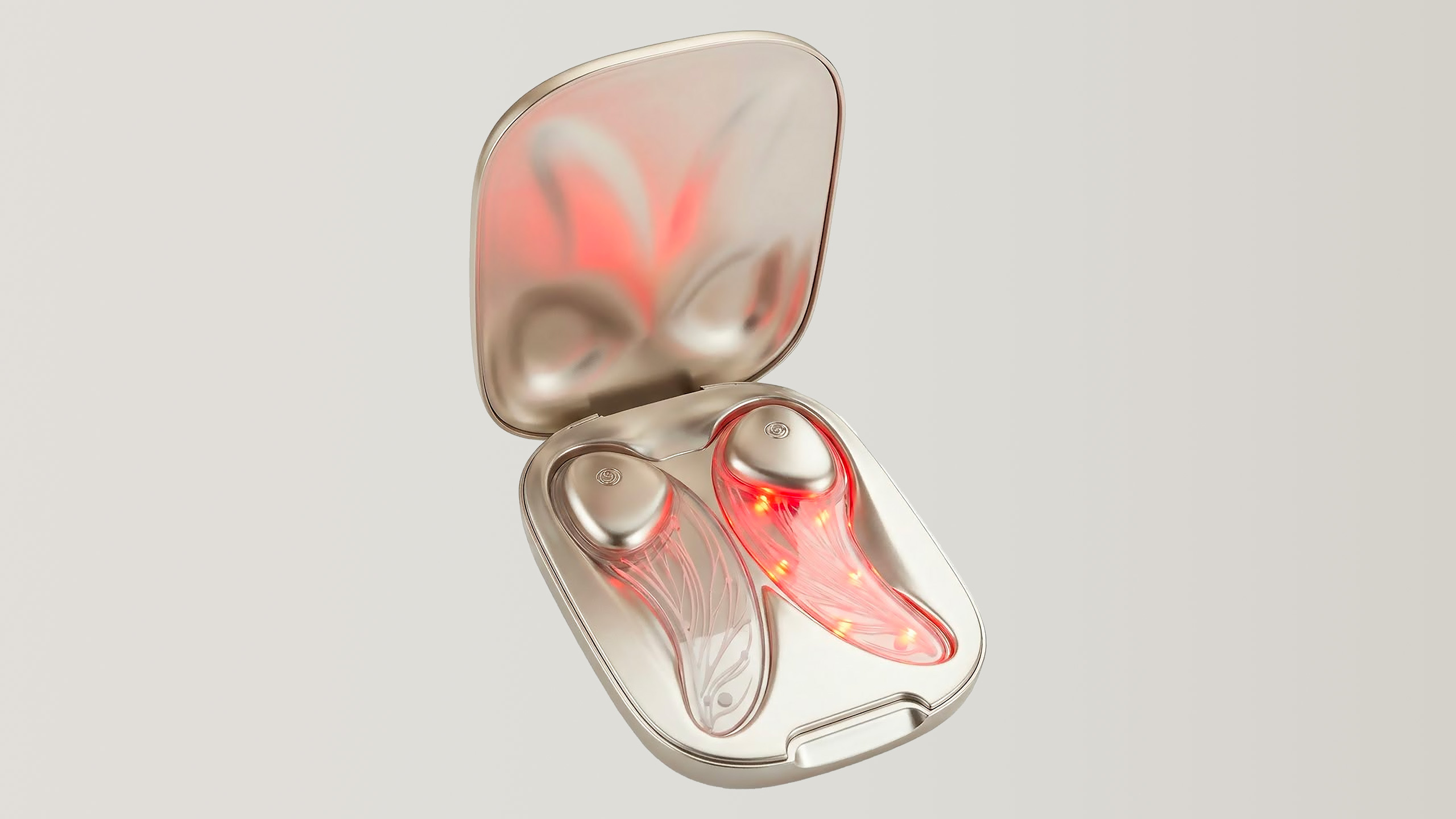
I haven’t seen this in person yet, though I do intend to do so as soon as possible, but the pictures of the LED Eye Mask look, and I mean this in the best way, ridonkulous. Not only do they appear supple, but they also seem to be transparent, with bulbs and wires you can see inside. In some of the images that the company provided, the masks are completely awash in red as the lights are on. In others, only parts of it are red. One of them even shows the masks sitting in a little carrying case and they almost look like wireless earbuds. I haven’t seen any photos of the LED Face Mask but I can imagine they’d be fairly similar to these.
The L'Oréal LED Eye Mask in a carrying case
L'Oréal
According to the press release, this “ultra-thin, flexible silicone mask” is currently “in prototype form” and was developed in collaboration with LED solutions company iSmart. The company said this mask “delivers light directly to the face” in 10-minute automatically timed sessions. That’s not too different from existing red light masks, but L’Oréal said it believes “the key to the mask’s effectiveness is its advanced, transparent support, which integrates a skin-safe microcircuit to precisely control the emission of two selected wavelengths of light—red light (630 nm) and near-infrared light (830 nm).”
Since the mask is only launching in 2027, there aren’t details yet on pricing and availability, though the company’s global vice president of tech and open innovation Guive Balooch told Engadget that it would be a premium product that would sit somewhere below the highest priced offerings currently out there.
One of my problems with full-face LED masks is that my skin always feels too parched under them, because you have to use them on clean, dry skin for 10 minutes at a time. Balooch told me that L'Oréal would have a serum developed to be used with its mask that would help with that, while also improving the effectiveness of the light treatment.
That certainly is intriguing, and Balooch indicated that creating formulations that are designed to work with devices like the LED masks is a future direction for the company.
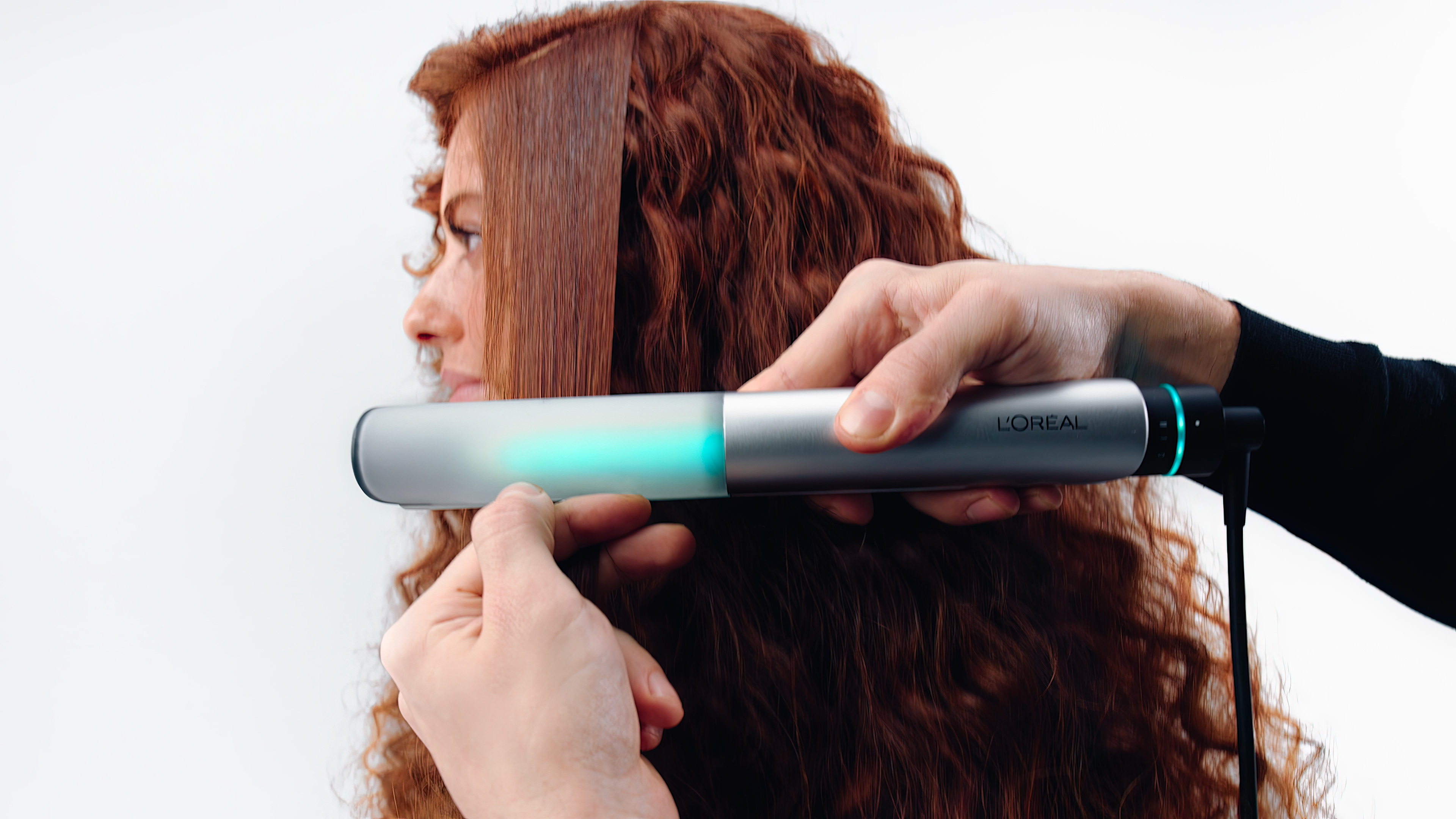
A pair of hands using the L'Oréal Light Straight and multi-styler on a person's hair.
L'Oréal
I’m also interested in the Light Straight, which like the company’s AirLight Pro uses infrared light to help dry or style hair. According to the company’s press release, hair straighteners with “ordinary heating places can reach temperatures of 400°F and higher—above the threshold at which keratin denatures, leading to weakened cuticles, breakage and reduced shine.” For context, I used to turn my flatiron all the way up to 425 degrees Fahrenheit to tame my tresses (though these days I find a more reasonable 330 degrees is good enough).
L’Oréal says the Light Straight and its “patented infrared light technology” can “help provide exceptional styling results at lower temperatures, to better protect the health of the hair.” The device’s glass plates never exceed 320 degrees, and the company says its testing found that the Light Straight is three times faster and leaves hair twice as smooth as “leading premium hair stylers.” I’m not sure how you would quantify smoothness, but I’m hopeful the results do pan out in the real world.
The Light Straight uses near-infrared light that L’Oréal says “penetrates deeply into hair fibers” to “reshape internal hydrogen bonds.” It also has sensors onboard with “built-in proprietary algorithms and machine learning” to adapt to your gestures “to maximize individual experience.” I’m not sure what that means, but I hope to find out more this week at CES. Given the Light Straight doesn’t launch till 2027, it’s not surprising that pricing and other details aren’t yet available. But for now, I’m keen to see companies continue to investigate novel, hopefully healthier ways for us to look and feel beautiful.
This article originally appeared on Engadget at https://www.engadget.com/science/loreals-ces-2026-beauty-devices-include-a-skin-like-flexible-led-mask-070000576.html?src=rss
For the longest time, I refused to upgrade my work-issued MacBook. I was leery of the hassle, and would much rather hang on to an aging Intel-powered laptop than have to transfer files, set up apps and sign in to accounts all over again. What did it matter if my notebook barely lasted long enough to cover an iPhone launch? My petty brain blamed it all on external factors (like being forced to use a MacBook instead of a PC), and left me dripping in stress as I watched the power levels dip down to zero at many of the live events I attend every year. So when I saw the Anker Laptop Power Bank was one of the items in our Labor Day deals roundup this year, I decided to get one to alleviate my battery anxiety (instead of, you know, doing the sane thing and agreeing to a new laptop).
When I unboxed my new Laptop Power Bank the night before the iPhone 17 Pro launch, I wasn’t expecting to be so taken by its features. All I knew before then was that this was a solid, beefy laptop battery pack, squeezing 25,000mAh in a compact package that would save me from having to worry too much about finding an outlet. But when I saw the screen light up with details on the amount of energy left (to two decimal places!) and the real-time charge data when I plugged it in, I was impressed. How modern!
Then I noticed the built-in cables — one retractable and neatly tucked inside the charger and the other artfully curved into a groove and doubling as a handle. Both wires were braided and felt like they’d be resistant to fraying and destroying themselves over time. Altogether, the general build quality and functionality of all the components made it clear this was a thoughtfully designed product worthy of all the praise and money we’ve hurled at it since my colleagues first tested it.
But what truly made me smile (and giggle, honestly) was a naughty little Easter egg. I saw posts on Threads indicating that if you tugged on that retractable cable and let it go in and out a few times, the screen would show a smiley face. I didn’t believe this was true until I saw it for myself. Sure, it felt a little bit odd, but I told myself I was revving a chainsaw, and doing legitimate testing for professional reasons, not jerking off a device. And when I saw the funny face appear, I felt the effect was humorous rather than pervy. The good news for the more staid readers is that if you don’t want to ever see that face, you never have to. And if you like cheeky little touches in your tech products, the Anker Laptop Battery Charger will delight.
Regardless of how I felt about having pleasured a laptop battery charger, it doesn’t take away from the fact that this is a well-made, well-rounded product. It managed to get my MacBook a few extra hours, so I made it all the way to the end of a multi-hour keynote, though it did run completely empty so I couldn’t recharge my phone after. Blast Apple Park and its utter lack of available power outlets!
Anker’s Laptop Battery Pack effectively allayed my battery anxiety, brought me some mirth and won me over with its thoughtful design. And because I got it on sale, it was $90 well spent.
This article originally appeared on Engadget at https://www.engadget.com/mobile/the-anker-laptop-power-bank-soothed-my-self-inflicted-battery-anxiety-123000024.html?src=rss