Siri AI first look: How Apple’s rebuilt AI-powered assistant behaves across iPhone, iPad and Mac
Here's your first look at Siri AI, and how it works across Apple's devices.


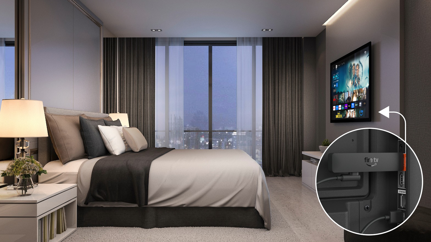
After unveiling a 4K version of its Fire TV Stick Select at its hardware event last September, Amazon is launching the latest version of its HD dongle today. The Fire TV Stick HD costs $35, comes with Alexa+ built in and offers the redesigned experience that the company previewed at CES in January. It might be confusing, considering Amazon makes at least five different configurations of its streaming stick, but the model announced today comes in at the entry-level and brings some meaningful upgrades.
First, it’s about 30 percent narrower, according to the company, which makes it easier to fit into tight spaces (or to wedge between your TV and wall, perhaps). It comes with a short USB-C cable with a USB-A head that plugs into one of the USB ports on your TV, allowing it to draw power without the typically longer cables that would connect to wall adapters. To quote the company, the new Fire TV Stick HD is “optimized for Direct Power through a TV’s USB port, so it fits more neatly behind a TV without requiring a separate power adapter.”
But if your TV doesn’t have a USB port for that, you can still use a USB-C cable with a traditional wall adapter to power the new Fire TV Stick HD. Given how little power the USB ports on a TV provide, it's likely any old charger will do.
The new dongle also comes with other improvements like support for Wi-Fi 6 and Bluetooth 5.3, and Amazon says it’s “more than 30 percent faster on average” compared to its predecessor, “which means it turns on and opens apps more quickly.” That, together with the redesigned layout, should make it easier to find what you want to watch.
And if you’re a Prime Member or subscribed to Alexa+, you can also ask the assistant for show recommendations, dim your lights or pick up where you left off on a Prime video in a different room, if you have a compatible TV set in there.
Amazon also said that “in the coming months,” it will add a “new Adaptive Display setting to the Fire TV Stick HD.” This is supposed to be an accessibility feature that makes onscreen elements like words, menus and images easier to see. The company said that it would proportionally scale content artwork while enlarging text and menus, so the overall experience is “more balanced.” Multiple size options will be available.
Like its predecessors, the Fire TV Stick HD is a pretty straightforward device that brings modern features to older TVs. At $35, it’s a relatively budget-friendly price, though we recommend springing for the 4K Max model if you have a bit more to spare. If not, the new Fire TV Stick HD will start shipping on April 29 to those in the US, the UK, Canada, Mexico, Japan, Australia and New Zealand, with more regions coming later.
This article originally appeared on Engadget at https://www.engadget.com/home/home-theater/amazons-new-fire-tv-stick-hd-is-slimmer-than-ever-and-has-no-power-adapter-130000885.html?src=rssWhen Amazon introduced the Ember Artline TVs in January, it didn’t have a specific date of availability to share. Now, the company is ready to supply the details: Pre-orders open today, and units ship on April 22 in the US and Canada, “with the UK and Germany to follow.” The company also announced a new version of its Fire TV Stick HD this morning, as well as some new features for its Fire TV software.
For those who don’t remember offhand, the Ember Artline is basically Amazon’s answer to Samsung’s Frame TV. It’s a matte, 4K QLED panel that can double as artwork when you’re not watching TV, and to that end, Amazon is including more than 2,000 pieces of art for free. That’s also part of the Fire TV package that comes on the new Fire TV Stick HD, so you don’t necessarily need an Ember Artline to access them.
In its press release, Amazon said “Our collection spans artistic movements and includes Impressionist classics by Monet, Degas, and Renoir, alongside contemporary works of street art, murals, mixed media, and photography. Customers also have access to 60 exclusive motion video pieces commissioned by documentary filmmaker Sam Nuttmann, who traveled the world capturing landscape and wildlife scenes.”
To make it easier to match the Ember Artline to your room’s decor, there are 10 frame color options to choose from, and the varieties I saw (a faux wood grain and a muted teal metallic finish) looked quite pleasant. If you really want some help finding artwork that will fit your space, Amazon’s “Match the room” feature might come in handy.
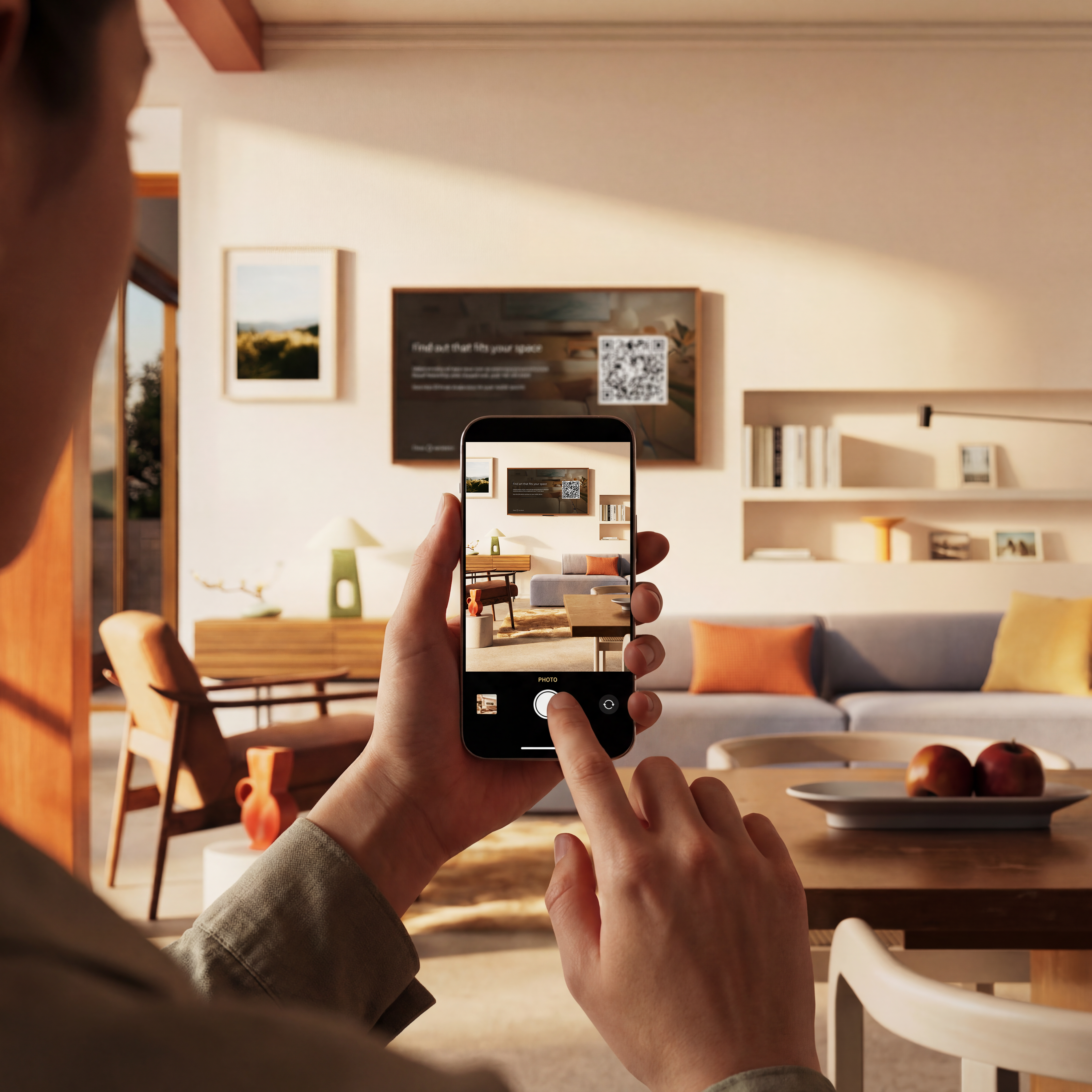
At a recent demo, I watched as the company’s representatives scanned a QR code from the TV to pull up the tool on their phone. There, they took three photos of the environment (surrounding walls and furniture, for example) and the system generated suggested pieces of art from the gallery. Using the TV remote, they were then able to choose from the recommendations on the big screen.
In my brief experience, the suggestions were typically quite good at matching the vibe, while offering a variety of styles (geometric, landscapes, modern etc) each time. According to the press release, “the AI tool will suggest artwork from our collection based on the room's colors, overall style, and any recurring themes in their existing artwork, including nature or travel photography.”
If you’d like a more personal touch, you can showcase your own photos instead by connecting your Amazon Photos account. You can also ask Alexa+ to
“play a slideshow of us biking in the mountains,” for example, to pull up memories ad hoc.
That’s not the only new feature coming to the Fire TV ecosystem, by the way. In addition to adding Alexa+ support and the new Fire TV UI it showed off in January, Amazon said that this month, it’s “adding another tool for US customers to seamlessly transfer a show or sports game by asking Alexa to move the content to another enabled Fire TV device in your home.”
So say you started watching a show in your bedroom and wanted to continue on the bigger screen in your living area. You could say “Alexa, move this to the living room.” The demo I saw took place on two Ember Artline TVs on adjacent walls, so the speediness was quite noticeable.
After the VP for Fire TV Aidan Marcuss asked the assistant to move the content over, the second TV picked up where the first left off in just about a second or two. Maybe real-world performance may vary but I can't imagine dashing from my bed to my couch in under three seconds just to avoid missing precious moments of The Boys drama.
For now, the feature is limited to Prime Video content, and Amazon said it plans “to roll it out to more services over time.”
The Ember Artline comes in 55-inch and 65-inch sizes and starts at $900. For context, Samsung’s The Frame (not the Pro versions) is available as a 32-inch model that costs $600, while the 65-inch configuration starts at $1,100 at the moment.
This article originally appeared on Engadget at https://www.engadget.com/home/home-theater/amazons-budget-friendly-answer-to-the-frame-tv-will-start-shipping-on-april-22-130000337.html?src=rss