A 3D-Printed Lamp That Finally Makes Sustainability Look Great

Most lamps do one thing. They sit on your desk, light your space, and get buried under the slow-moving chaos of charger cables and forgotten receipts. The Drop Light by Teixeira Design Studio doesn’t just resist that fate; it anticipates it.

The lamp is 3D printed entirely from recycled, plant-based PLA, designed in collaboration with Oftwise Studio. It’s a desk lamp with a built-in tray at the base that holds the usual suspects: pen drives, earphones, that one charging cable you’re always looking for. The storage isn’t an afterthought bolted onto a design that already existed. It’s baked into the silhouette from the start, which is a distinction I wish more designers paid attention to.

Designer: Teixeira Design Studio

What makes the Drop Light genuinely interesting isn’t just the function-forward thinking, although that’s a big part of it. It’s the way the material actually drives the design. The base and top tray carry a fuzzy, matte PLA texture that’s scratch-resistant and tactile, almost soft to look at. The shade is printed smooth and semi-translucent, scattering light evenly without showing you the bulb. Two completely different surface behaviors, one material, one object.

That contrast between matte and diffuse isn’t just visual. It communicates function before you even plug anything in. You know instinctively where to rest your things and where the light comes from, and nothing about that has to be labeled or explained. Good design, in my opinion, should always work like that. The object tells you what it needs from you before you ask.

I’ve seen a lot of “sustainable” product design that feels more like an excuse than a commitment. Recycled materials get used in ways that look recycled. Rough edges, uneven finishes, a vague suggestion that the environmental good will outweigh the aesthetic compromise. Drop Light doesn’t do that. The layered build lines from the printing process are barely visible under the fuzzy texture, reading as intentional surface detail rather than manufacturing artifact. It looks fabricated, deliberate, finished. The plant-based PLA carries a warmth that petroleum-based plastics simply don’t, and the design leans into that warmth rather than trying to disguise it.

This is also where 3D printing, as a production method, starts to become genuinely exciting for everyday objects. For a long time, additive manufacturing lived almost entirely in the prototyping world. You used it to test a form before committing to injection molding. Drop Light is part of a growing wave of products that treat 3D printing as the final destination, not a stepping stone to something else. The result is a lamp that looks like it was designed to be made this way, not like it was designed for a factory and then adapted.

Teixeira Design Studio has done this kind of work before. Their Fold luminaire, also 3D printed, tackled the challenge of combining task and mood lighting into a single form. The studio seems genuinely interested in what the process makes possible, rather than just using it for the sustainability talking points. That consistency matters. It’s the difference between a design practice and a design trend.

Is Drop Light for everyone? Probably not. Minimalist in its silhouette, muted in its palette, it rewards people who appreciate restraint. If you’re someone who wants your lamp to announce itself, this isn’t it. But if you’re drawn to objects that feel considered, that do more than one thing without trying to look like they do, the Drop Light hits a note that a lot of current lighting design misses completely.

We talk a lot about what sustainable design could be, and not nearly enough about what it actually looks like when it works. This lamp is a solid answer to that question. Not a perfect one, but a convincing one, and sometimes that’s exactly what the conversation needs.

The post A 3D-Printed Lamp That Finally Makes Sustainability Look Great first appeared on Yanko Design.

Herman Miller Finally Built a Gaming Desk That Matches Its Chairs

If you’ve ever spent real money on a Herman Miller chair, you know the particular satisfaction that comes with it. It’s not just the lumbar support or the breathable mesh. It’s the feeling that someone actually thought hard about how you sit, and then engineered accordingly. That philosophy is exactly what’s been missing from the gaming desk category for years, and now Herman Miller has stepped in to fill the gap with the Coyl Gaming Desk.

The Coyl is the brand’s first desk built specifically for gamers, which is a little surprising considering Herman Miller Gaming has been around since 2020. Better late than polished, I suppose. But after seeing what they’ve put together, it’s clear they spent that time observing how people actually use their spaces, rather than just rushing to market with something forgettable.

Designer: Herman Miller

The most talked-about detail is the rotary dial. While traditional sit-to-stand desks feature up-down toggle switches, the Coyl Gaming Desk features a rotary dial, a round knob you turn to raise or lower the height, allowing for greater control and seamless adjustment. That feels like a meaningful upgrade over the toggle switch that costs pennies and has somehow survived on products that cost over a thousand dollars. Inspired by premier audio equipment, the dial features detent notches to allow players to easily identify the exact setting for their preferred position. It’s a small change that makes a surprisingly big difference. When your hands are already on autopilot during a long session, not having to hunt for a button matters more than you’d think.

The desk also has a built-in cable management trough tucked underneath toward the back, which handles the chaotic tangle of wires that plagues most gaming setups. It’s one of those features that seems obvious in hindsight but is inexplicably absent from most desks in this category. Whoever decided to finally make this standard deserves a quiet round of applause. There are also built-in hooks for frequently used items, allowing players to stay locked into the play experience, and adjustable glides on the top of the desk feet allowing users to level the desk.

Where things get genuinely interesting is the optional perforated back panel. For those who want to further personalize their set-up, Coyl includes an optional perforated back panel with a smart collection of accessories, including controller holders, phone docks, small shelves, and planters. Think of it as a pegboard-style system you can actually curate. These add-ons can be rearranged as setups evolve, which is the kind of modularity that tends to make a product feel useful long-term rather than dated in two years. It’s also the design detail that signals what Herman Miller is really going after here: the desk isn’t meant just for gaming, it’s meant for the modern person who games, works, creates, and streams, often from the same surface.

The Coyl comes in four desktop finishes: black, white, walnut, and ash, with the rounded laminate top giving the whole thing a cleaner look than the sharp-cornered, RGB-saturated aesthetic that dominates most gaming furniture. You can program up to four height presets, which is useful if your desk doubles as a standing workstation during the day. The base version starts at $1,095, rising to $1,495 with the cable trough and $1,635 if you want the back panel included.

That price point will be a sticking point for some people. Gaming desks at a fraction of the cost do exist and do the job adequately. But the Coyl isn’t really competing on value, it’s competing on intention. The same way a Herman Miller chair isn’t for someone who just needs somewhere to sit, the Coyl is for someone who wants their desk to be an actual design decision and not just a surface with legs.

Is it groundbreaking? Not technically. The features themselves aren’t revolutionary. But the execution and the restraint are notable, especially from a brand entering a product category already crowded with competitors trying too hard to look cool. Herman Miller didn’t try to out-RGB anyone. They just made something that looks like it belongs in the same room as their chairs, which is, frankly, exactly what the gaming space has been waiting for.

The post Herman Miller Finally Built a Gaming Desk That Matches Its Chairs first appeared on Yanko Design.

This $30 Gadget Gives Claude a Face That Reacts to What It’s Doing

AI assistants have mostly lived inside screens, and that’s been fine, until you’re deep in a coding session and Claude is quietly running shell commands, editing files, and hitting tool after tool in the background. Knowing what’s happening without constantly alt-tabbing is harder than it should be, and approving or denying an action while keeping your hands on the keyboard is even harder.

That’s the gap Claude Desktop Buddy was built to fill. Released as an open-source project by Anthropic in April 2026 and built as a prototype by OpenELAB, it turns a small ESP32-based device into a physical companion that sits on your desk and mirrors the activity of the Claude desktop app over Bluetooth Low Energy. It wakes when a Claude Code session starts, idles quietly while Claude works, and gets visibly impatient when a permission prompt is waiting for your attention.

Designer: Anthropic, OpenELAB

The reference hardware is the M5StickC Plus, a pocket-sized board with a 135×240 color display, buttons, a built-in IMU, and a LiPo battery. It costs around $30 and comes pre-supported by the firmware. When Claude Code asks to run a shell command or access a sensitive file, the device lights its screen, buzzes, and shows the prompt. Button A approves. Button B denies. No switching windows, no hunting for the right modal.

Beyond the permission workflow, the device also doubles as a passive status indicator. A full vocabulary of animated states, including idle, busy, attention, celebrate, dizzy, and heart, plays out on the small screen depending on what Claude is doing. Shake the device to make it dizzy, flip it face-down to put it in nap mode, and it’ll power off the screen after 30 seconds to preserve battery. The built-in IMU handles all of this through physical gestures.

Transcript scrollback is another feature that makes more sense once you’ve used it. Rather than breaking focus to check what Claude just said, you can scroll recent messages directly on the device’s display. It keeps the primary workflow uninterrupted in a way that alt-tabbing simply doesn’t. The device pairs once and reconnects automatically whenever both sides are awake, so there’s no daily setup ritual.

Character customization adds a layer of personality that feels unexpectedly considered for what is, technically, a developer tool. You can drag a custom GIF character pack directly onto the Hardware Buddy window, and the device switches to the new character live. The default character, a small frog called Bufo, ships with the firmware.

There’s something genuinely different about having a physical object on your desk that reacts to an AI working in the background. It turns an invisible process into something with a face, a mood, and a pair of buttons that put control back in your hands without disrupting what you were doing.

The post This $30 Gadget Gives Claude a Face That Reacts to What It’s Doing first appeared on Yanko Design.

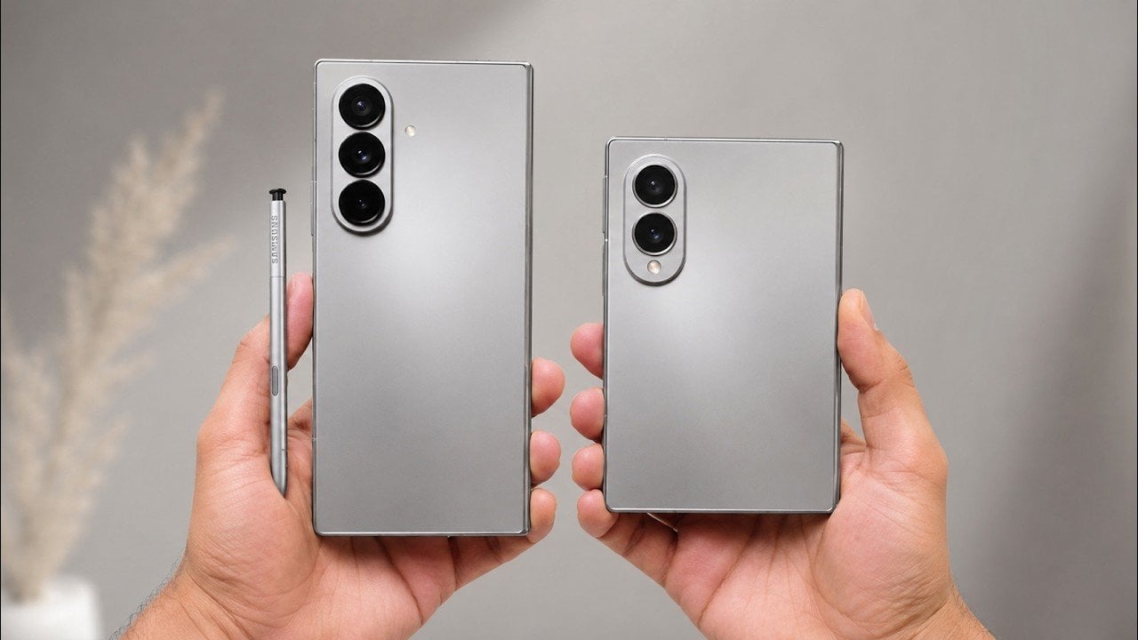
The Galaxy Z Fold 8 Brings a Thinner Design, but There is Bad News for S Pen Fans

The Galaxy Z Fold 8 Brings a Thinner Design, but There is Bad News for S Pen Fans Samsung Galaxy Z Fold 8

The Galaxy Z Fold 8 represents a significant step forward in foldable smartphone technology, offering a more refined design and improved usability. With its slimmer profile, lighter build, and enhanced battery life, the device caters to users seeking portability and convenience. However, these advancements come with certain compromises, such as the removal of S Pen […]

The post The Galaxy Z Fold 8 Brings a Thinner Design, but There is Bad News for S Pen Fans appeared first on Geeky Gadgets.

Posted in Uncategorized

The Robots That Built Seoul’s Robot Museum

The Seoul Robot & AI Museum is the definitive parametric architecture reference of 2026, and it’s easy to understand why the design world keeps returning to it. Every few years, a building comes along that doesn’t just represent a movement; it is the argument. RAIM is that building right now, and the reason has less to do with how it looks and more to do with how it got made.

Opened in 2024 in the Chang-dong district of northeast Seoul, the museum was designed by Turkish studio Melike Altınışık Architects. From the street, it reads like something that landed rather than was built: a spherical, mirror-finish shell that catches the sky and refuses to look like any cultural institution you’ve encountered before. The facade is wrapped in 3,422 double-curved metal panels, each one a unique geometry, each one positioned according to a structural logic you can actually read from the outside. The gridded surface pattern isn’t decorative. It follows the structural steel grid concealed behind it, making the building’s skeleton visible through its skin. That level of architectural honesty is rarer than it should be.

Designer: Melike Altınışık Architects

The geometry didn’t come from sketching. Melike Altınışık and her team scripted the form parametrically, then reverse-engineered the entire envelope to make it buildable. That second part is where most parametric ambitions historically die. Double-curved panelization at this scale is the kind of thing that gets value-engineered into something flatter and sadder during construction documentation. But Melike Altınışık Architects designed specifically for fabrication from the start, using a methodology called DFMA (Design for Manufacture and Assembly), which meant the form and the production method evolved together rather than fighting each other.

The fabrication pipeline is where the story gets genuinely interesting. The panels were cut using laser CNC machines and welded using industrial robots. On-site, 3D scanning ensured alignment that human measurement couldn’t consistently achieve at that tolerance. What this unlocks, practically, is that double-curved metal panelization stops being a budget line reserved for landmark commissions and becomes something mid-scale cultural buildings can actually afford. Robot welding doesn’t get tired. It doesn’t accumulate small errors across 3,422 repetitions. The precision holds, and holding precision across a spherical envelope is a very different proposition from getting it right once.

Now layer in the subject matter of the museum itself. RAIM is dedicated to robotics and artificial intelligence. Its permanent exhibitions trace the evolution of AI from predictive fraud detection systems to generative models. Robots greet visitors at the entrance. The interior reads like a spaceship, with a vertical exhibition tunnel at the building’s center blurring the boundary between the physical and the technological. So when you consider that robots also assembled the facade above your head, the recursion is almost too neat. Architect Altınışık framed it clearly: the architecture is “both shelter and pedagogy.” The building doesn’t just house the argument. It makes it.

Parametric facades are having a genuine cultural moment in 2026, and it’s not limited to the usual European flagships. Studios in South Korea and India are pushing computational design into more projects, and the international awards circuit is beginning to reflect that geographic shift. The conversation has moved from “can parametric architecture actually be built?” to “what does it cost, and who controls the pipeline?” RAIM answers both questions at once, which is probably why it’s the reference point of record for this particular moment.

That shift is worth paying attention to. For decades, the most ambitious architectural geometries required either enormous budgets or a willingness to absorb serious construction risk. Robotic fabrication and CNC manufacturing are quietly changing that calculus. In Altınışık’s own words, “the division between design and construction is becoming obsolete. The parametric model becomes not just a design tool but a construction platform.” The next wave of museums and civic buildings won’t choose simpler geometry because they have to. They’ll choose the complex version because their fabricators can deliver it, and because, as RAIM proves, the building becomes a more interesting object for it. Seoul’s robot museum was built by robots. The next one might be anywhere.

The post The Robots That Built Seoul’s Robot Museum first appeared on Yanko Design.