$199 Galaxy A17 Beat the Galaxy S22 to One UI 8.5

Budget smartphones have always existed in a sort of software slow lane. Manufacturers have typically prioritized their flagship and upper-midrange lines when rolling out major updates, leaving the cheaper devices to wait months, sometimes longer, before seeing the same software features. That pecking order has been so consistent for so long that it’s practically become an unspoken rule of the Android ecosystem, especially within Samsung’s own Galaxy lineup.

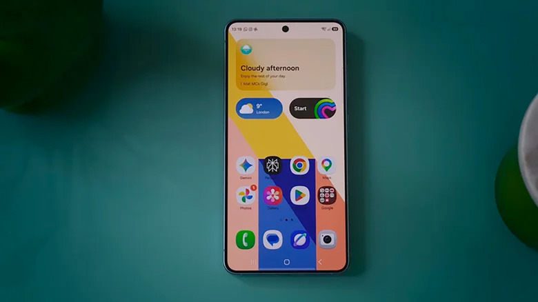
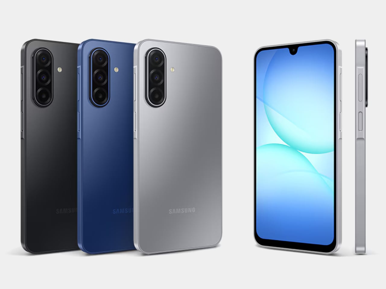
Samsung’s Galaxy A17 5G is changing that, at least for now. The $199 phone, which only made its way to US store shelves earlier this year, began receiving One UI 8.5 before several pricier Galaxy models, including the Galaxy S22, the A55, and the A35. That makes it not only the cheapest Galaxy phone on the new software, but also a very unexpected one to lead the charge.
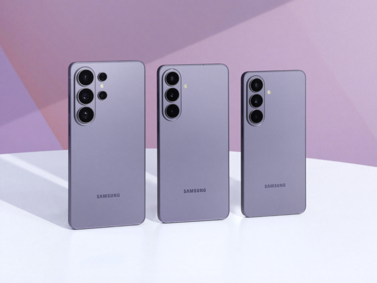
Designer: Samsung

The rollout began in South Korea on May 26, 2026, with firmware version A175NKSU5CZE9, before expanding to other regions. Samsung releases updates to multiple devices at a time, so getting new software the same week as other phones isn’t remarkable. The order, however, tells a different story. The Galaxy S22 was once a top-tier flagship, and both the A55 and A35 sit comfortably above the A17 in Samsung’s current lineup.

On paper, the Galaxy A17 5G doesn’t have much to shout about. It runs on Samsung’s Exynos 1330 chip, pairs that with a 6.7-inch display, and backs everything up with a 5,000 mAh battery. Those are solidly mid-tier numbers, and at $199.99, the phone was never going to compete with the Galaxy S25 or even the A55 on raw performance. That was never really the point, though.

Samsung promises six years of OS and security updates for the Galaxy A17 5G, which is genuinely compelling at this price. Google’s Pixel 9a offers seven years of support but costs $499 to start. At $199, the A17 gets surprisingly close to that coverage level, putting it in a different conversation entirely, one that’s less about what the hardware can do today and more about how long it’ll stay relevant.

One UI 8.5 brings a range of new features and interface improvements, including enhancements to Gemini AI. Not everything will run at full capacity on the A17’s Exynos 1330, since some of the more demanding AI tools favor higher-end chipsets. But for someone who bought a $199 phone expecting years of use, getting a meaningful software update rather than just a security patch is the kind of thing that counts.

Android 17 is also expected to hit stable release in the coming weeks, based on where Google’s release notes currently stand, which means Samsung will soon have to decide which phones get One UI 9. The A17 just showed it’s on the list for timely updates, and with six years of committed support on the books, there’s good reason to think it’ll be there when that time comes.

The post $199 Galaxy A17 Beat the Galaxy S22 to One UI 8.5 first appeared on Yanko Design.

Smart rings just had their breakout week

Smartwatches have had an impressive run, but the category is starting to feel a bit crowded and tired. Most recent releases have been iterative, adding a sensor here or a display tweak there, while the core form stays essentially the same: a small screen on your wrist buzzing at you constantly. Consumers are starting to wonder what the next genuinely interesting chapter of wearables looks like.

It turns out the answer might be right on your finger. In one week during May 2026, the smart ring went from niche wellness accessory to the category everyone in wearables should be watching. Oura confidentially filed an S-1 with the SEC, RingConn opened pre-orders for its Gen 3, and fresh leaks in iOS 26 code reignited the idea that Apple might be circling the space.

Designer: Oura Ring, RingConn, Apple, Samsung

Part of what makes this moment feel significant is that it isn’t purely a business story. The smart ring’s appeal is rooted in something the smartwatch was never designed for: disappearing. A ring doesn’t have a screen demanding your attention, doesn’t buzz through dinner, and doesn’t get taken off at bedtime. For passive health tracking, especially overnight, the finger turns out to be a surprisingly elegant surface.

RingConn Gen 3

RingConn’s Gen 3 is the clearest hardware proof that the category is maturing. At $349, the titanium ring ships with a 14-day battery, vascular health tracking, and haptic alerts, all without a subscription fee. That battery figure alone is worth pausing on. A ring that only needs charging once a fortnight fits into daily life in a way that a device needing nightly top-ups simply doesn’t.

RingConn Gen 3

RingConn Gen 3

What RingConn’s launch really signals is a shift in the category brief. Buyers aren’t just asking whether a ring can track their sleep anymore. They want richer health data, meaningful feedback, and hardware that feels finished rather than experimental. Titanium construction, cardiovascular insights, and a no-subscription model together suggest that the smart ring has stopped apologizing for what it can’t do and started showing off what it can.

Oura’s confidential S-1 filing adds a different kind of weight to the week. Filing with the SEC isn’t something companies do casually. It means Oura believes the smart ring market is stable enough, scalable enough, and financially convincing enough to withstand public-market scrutiny. It’s also a signal that the subscription model, which charges users a monthly fee to access their own health data, has real staying power.

Oura Ring 4

That subscription debate cuts to something interesting about how these companies see what a smart ring is. Oura is essentially selling a sensor paired with an ongoing interpretation service. RingConn is selling a finished object you own outright. Neither is wrong, but the two approaches create very different relationships between wearer and device, and that relationship shapes every other decision the product team ends up making.

Then there’s Apple, which hasn’t confirmed anything but whose shadow is already affecting the conversation. References buried in iOS 26 code have fueled speculation that Cupertino is at least exploring a ring-shaped device, possibly one that ties into the broader Vision Pro ecosystem. Apple hasn’t shipped a ring yet, but its apparent interest alone changes how developers, investors, and competing hardware teams think about the category’s long-term potential.

Samsung Galaxy Ring

The harder question, of course, is what comes next for a category that’s barely five grams and still trying to grow up. Blood pressure monitoring, non-invasive glucose tracking, and finer cardiovascular sensing are all on the roadmap, but they’ll demand even more from a form factor that’s already pushing the limits of miniaturization. Getting there without sacrificing comfort or wearability is the real design challenge ahead.

The post Smart rings just had their breakout week first appeared on Yanko Design.

Google’s Android XR Glasses Pick Gentle Monster and Warby Parker

The biggest design announcement to come out of Google I/O 2026 did not involve a language model. It involved a pair of frames. On May 19, Google and Samsung unveiled their Android XR intelligent eyewear, a product that still has no official name, no confirmed price, and no exact ship date beyond “this fall.” What it does have is two very deliberate aesthetic camps: Gentle Monster on the disruptive end, Warby Parker anchoring the refined and timeless side. And leading with eyewear partners instead of chipset specs felt like the most coherent product launch decision Google has made in years.

Two form factors are on the way. Audio glasses ship first, landing later this fall. Display glasses follow at some point after that. The audio version is exactly what it sounds like: Gemini in your ear, accessed by saying “Hey Google” or tapping the frame. From there, you can pull up turn-by-turn navigation, real-time translation, hands-free calls, photo capture, and multi-step task execution through third-party apps like DoorDash and Uber. The glasses work with both Android and iOS, which is smarter than it sounds. Picking a platform fight at launch would have cut the potential audience in half before a single pair hit a face.

Designer: Google x Samsung

The more interesting story, though, is what the Gentle Monster and Warby Parker pairing actually signals. These are not interchangeable options with different colorways. Gentle Monster built its entire identity on turning eyewear into conceptual art, the kind of brand that stages gallery-scale retail installations and has never been embarrassed to make a statement. Warby Parker, on the other hand, is the brand that convinced a whole generation that glasses could be accessible, thoughtful, and quietly cool without trying too hard. Putting both on the same platform is Google saying, very clearly, that Android XR is not a single-consumer product. It is a platform designed to flex across aesthetic identities the same way Android flexes across phone manufacturers.

That framing matters a lot when you look at the competitive landscape. When Meta launched its Ray-Ban Display glasses with EssilorLuxottica, it made a calculated bet on one legacy brand and one aesthetic: cool-casual, lifestyle-adjacent, slightly sporty. The strategy has worked reasonably well. Google is trying something architecturally different. Two visual identities, baked in from day one, each with its own mood and customer. Whether that becomes a genuine advantage or a positioning headache will depend entirely on execution, but the intent is worth paying attention to.

The missing information in this announcement is not accidental. No price. No product name. No exact release date. All of that has been deliberately saved for fall, which means we are still in the phase where the visual story matters more than the spec sheet. That is the right call. If Google had led with processor benchmarks and battery life numbers right now, the conversation would have immediately turned into a hardware comparison against Meta. By leading with Gentle Monster and Warby Parker, they shifted the frame entirely. We are not talking about a spec race. We are talking about what you actually want to wear.

Industrially, the frames read as genuinely wearable. Temple thickness, hinge detailing, and touchpad placement all suggest that someone with a real brief about daily wear and aesthetic integrity was in the room during development. The original Google Glass was technically ambitious and aesthetically alienating, and that gap between capability and wearability became the most expensive lesson in smart glasses history. The Android XR eyewear, at least from what has been shown, appears to have absorbed it.

The fall window is real. Prescriptions, pricing, and the question of what this product is actually called will all arrive before year’s end. But right now, two days out from the reveal, the conversation that Google and Samsung have started feels like the right one. Not what can these glasses do, but who are these glasses for. When the design partners are Gentle Monster and Warby Parker, the answer is already pretty interesting.

The post Google’s Android XR Glasses Pick Gentle Monster and Warby Parker first appeared on Yanko Design.

Galaxy Z Fold 7 Hit 4.2mm by Killing the S Pen: Worth the Trade?

Foldables have spent the last two years chasing a simpler goal: to feel less like category experiments and more like normal premium phones that happen to open wider. Samsung pushed that idea hardest with the Galaxy Z Fold 7, officially measuring 4.2mm when unfolded and 215 grams in weight, making it the company’s slimmest and lightest book-style foldable yet, with thinness as the product’s defining promise.

That promise came with a quieter subtraction. Samsung removed S Pen support from the Galaxy Z Fold 7, cutting off a feature that had helped earlier Fold models feel connected to the company’s productivity-first identity. Nearly a year later, that choice carries more weight because the Fold 7 can now be judged as a finished design decision rather than a fresh flagship still riding its novelty.

Designer: Samsung

In practice, the Fold 7’s thinness changes behavior more than bragging rights. Reviews consistently described it as startlingly slim and easier to carry, suggesting Samsung had something more deliberate in mind than a good keynote number. The lighter frame, narrower pocket profile, and more usable 21:9 cover display all push toward the same goal: making the Fold feel less like a second device and more like your actual main one.

The missing stylus, though, changed the Fold 7’s identity as much as its feature list. On earlier Fold devices, pen support helped justify the large inner display as a workspace, somewhere to annotate documents, sketch ideas, and do precise work beyond just tapping through apps. The Galaxy Z Fold 7 doesn’t support S Pen in any form, which means the phone has let go of that precision-first promise entirely.

Outside reporting helps explain why Samsung made that call. T-Mobile’s comparison notes the company removed a layer from the inner display to help achieve the slimmer, lighter body, while others report Samsung cited low stylus adoption among Fold users to justify the cut. Even if that logic makes business sense, it still leaves the Fold 7 feeling like a foldable optimized for comfort over creative ambition.

Samsung also tried to reassure buyers that the thinner body wasn’t a weaker one. The Fold 7 uses a thicker Ultra-Thin Glass layer, a Grade 4 titanium lattice, new adhesive materials, and IP48 resistance, all meant to reinforce a slimmer chassis without making it feel fragile. Those details speak more clearly to Samsung’s engineering intent than to any definitive verdict on how the phone holds up over months of folding.

The rest of the hardware tells a similar story of selective advancement. Samsung paired the Fold 7 with Snapdragon 8 Elite for Galaxy and launched it on One UI 8 with Android 16, giving the device a solid performance base. The battery stayed at 4,400mAh, and the ultra-wide camera remained a 12MP unit alongside the more attention-grabbing 200MP main sensor. The phone moved forward, just not evenly.

That unevenness becomes more interesting when you consider where Samsung might be heading next. We’ve already covered early renders suggesting the Galaxy Z Fold 8 could bring back S Pen support and a bigger battery, at the cost of a thicker chassis. If those rumors hold, the Fold 7 starts to look less like the start of a permanent direction and more like a controlled experiment in subtraction.

Galaxy Z Fold8 Render

For buyers who want the most elegant Samsung foldable for everyday carry, the Fold 7 still makes a strong case. It’s the first Fold that genuinely reduced the physical friction of ownership without a compromise you’d notice daily. For former Note loyalists and pen-reliant users, though, the trade reads differently, because Samsung made the Fold 7 easier to live with by moving it away from the Fold line’s original ambition.

The post Galaxy Z Fold 7 Hit 4.2mm by Killing the S Pen: Worth the Trade? first appeared on Yanko Design.

Galaxy S26 Ultra Buried the Note’s Boxy Soul, and Fans Are Split

The race to make flagship phones thinner, smoother, and more visually unified has become one of the defining stories in premium smartphone design. Hard angles and bold silhouettes that once gave each model its own character have been quietly traded for softer frames and tighter lineup coherence. It’s a direction that makes these phones easier to hold and sell, but not always easier to tell apart.

The Samsung Galaxy S26 Ultra, which hit shelves on March 11, 2026, fits squarely into that movement. Samsung pushed the chassis below 8mm for the first time on any Ultra, trimming it down to 7.9mm. Add to that a softer corner radius, an Armor Aluminum frame, and an anti-reflective Privacy Display, and it starts to feel like something more deliberate than a routine generational update.

Designer: Samsung

To understand why that matters, it helps to remember where the Ultra came from. When Samsung discontinued the Galaxy Note in 2021, it didn’t retire the design language that defined it. The Note’s boxy corners, flat sides, and upright proportions migrated into the Ultra line, giving those phones a distinctly tool-like character. The Ultra felt like a device built for serious use, and its shape made that clear.

Galaxy S25 Ultra

Galaxy S26 Ultra

The Galaxy S26 Ultra leaves most of that behind. Samsung rounded the corners, softened the edges, and made the phone look far more like the standard Galaxy S26 and S26+ than any Ultra model before it. That visual coherence is good design management, but it’s also the moment the Ultra stops looking distinctly like its own thing. It’s harder to spot in a lineup now.

Galaxy S25 Ultra

Those softer edges do make a real difference in how the phone sits in the hand over a long day. When you’re scrolling through a document or holding the device on a commute, the rounded frame distributes pressure more evenly across the palm. The 7.9mm chassis also disappears into a pocket more gracefully than its predecessor, which sounds minor until you realize how often you actually notice it.

Galaxy S26 Ultra

With the silhouette doing less visual heavy lifting, Samsung shifted the premium story into the surface itself. The Armor Aluminum frame carries the finish more evenly from back to edge, giving the phone a cleaner look that doesn’t need dramatic geometry to feel expensive. The anti-reflective Privacy Display adds a different kind of thoughtfulness, letting you check sensitive messages or browse in public without worrying about prying eyes.

What really puts the 7.9mm figure in perspective is the competition. The iPhone 17 Pro Max measures 8.75mm thick, and while a 0.85mm difference might not sound dramatic on its own, the context here matters quite a bit. Samsung is fitting a built-in S Pen into a phone that still comes in thinner than Apple’s stylus-free flagship, which is an engineering tradeoff worth acknowledging.

iPhone 17 Pro Max

What makes this shift more significant is what it says about Samsung’s intentions for the lineup as a whole. The Galaxy S26, S26+, and S26 Ultra now share the same curvature and visual language for the first time. That’s Samsung quietly admitting that the Ultra doesn’t need to look like a separate category; it’s a flagship, not a relic from a discontinued line.

Two months after launch, the Galaxy S26 Ultra’s design verdict has had time to settle, and the conversation is genuinely split. There’s something complete about how it all comes together now, smoother, thinner, and more coherent. The S Pen remains, but the body no longer insists on its Galaxy Note roots. Whether that reads as maturity or loss probably depends on how long you’ve been following the Ultra.

The post Galaxy S26 Ultra Buried the Note’s Boxy Soul, and Fans Are Split first appeared on Yanko Design.