Escape’s eBoho Go Proves You Don’t Need Much Space to Live Well

There’s a certain kind of freedom that comes with owning less. Escape’s eBoho Go leans into that idea with zero apology — a 16-foot, all-electric tiny home that packs a kitchen, bathroom, queen bed, and a surprising amount of breathing room into just 152 square feet. It starts at $39,440, and a production unit is currently available for $45,440. For context, that’s less than some high-end camping trailers, and considerably more livable than any of them.

The eBoho Go rides on a single-axle trailer, making it one of the more portable tiny homes on the market. Escape clads the exterior in engineered wood siding and wraps it in large glazed panels that pull daylight deep into the interior. From outside, it reads as the smaller sibling of Escape’s premium N2 model — the same clean design language, just distilled down to its essentials. An all-steel roof caps the structure, giving it an architectural finish that most homes in this price range don’t deliver.

Designer: Escape

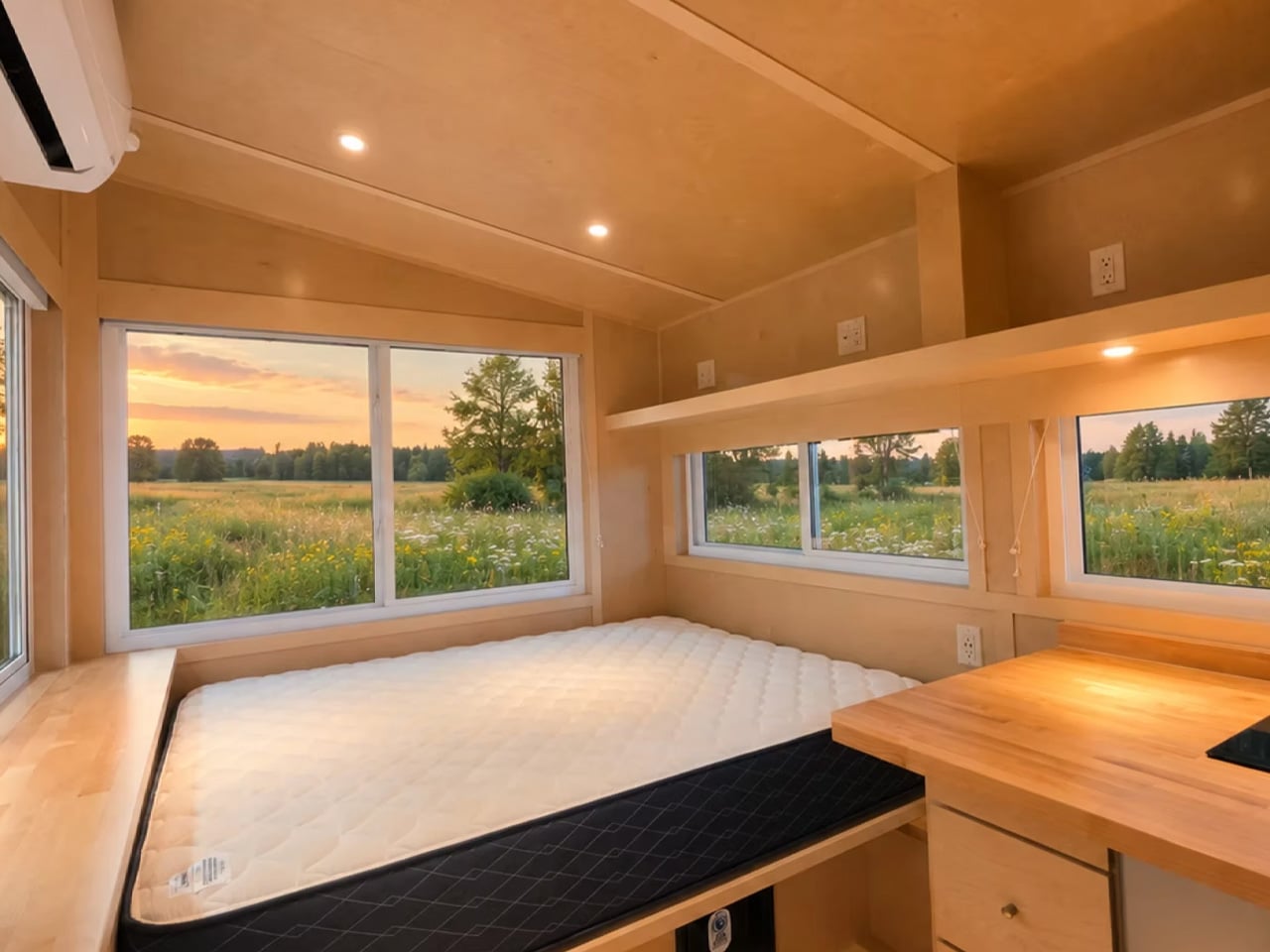
Inside, everything is finished in sealed birch — warm, tactile, and easy to maintain. The layout is a single floor, which is the right call for a home this compact. A dedicated living room would have been a compromise too far. Instead, the sleeping area earns its real estate twice over: the queen-sized bed anchors the space during the night and functions as the primary seating during the day, framed by multiple opening windows and integrated storage underneath and alongside. A mini-split AC unit handles climate control, and it’s more than sufficient for a footprint this size.

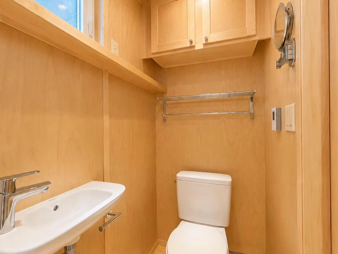
The kitchen is compact but complete. An induction cooktop, fridge/freezer, sink, and butcher block countertops sit along one wall, fronted by solid cabinetry. It won’t host dinner parties, but it handles daily life without friction. The bathroom, behind a wooden door, punches above its weight — walk-in shower, flushing toilet, vanity sink, heater, and a towel rack. Storage is tucked in wherever the geometry allows.

What makes the eBoho Go genuinely interesting isn’t just the footprint or the price. It’s that Escape built it as a real production unit — not a concept, not a preorder — powered entirely by electricity. The brand calls the lineup eESCAPE, and the Go is the entry point. As a rental unit, a guest house, or a private office dropped at the edge of a property, it makes a compelling case. Escape delivers nationwide, with costs depending on location.

At 152 square feet, it won’t suit everyone. But for those who’ve been waiting for a well-designed, genuinely affordable entry into the tiny home space, the eBoho Go might be the most honest answer yet.
The post Escape’s eBoho Go Proves You Don’t Need Much Space to Live Well first appeared on Yanko Design.

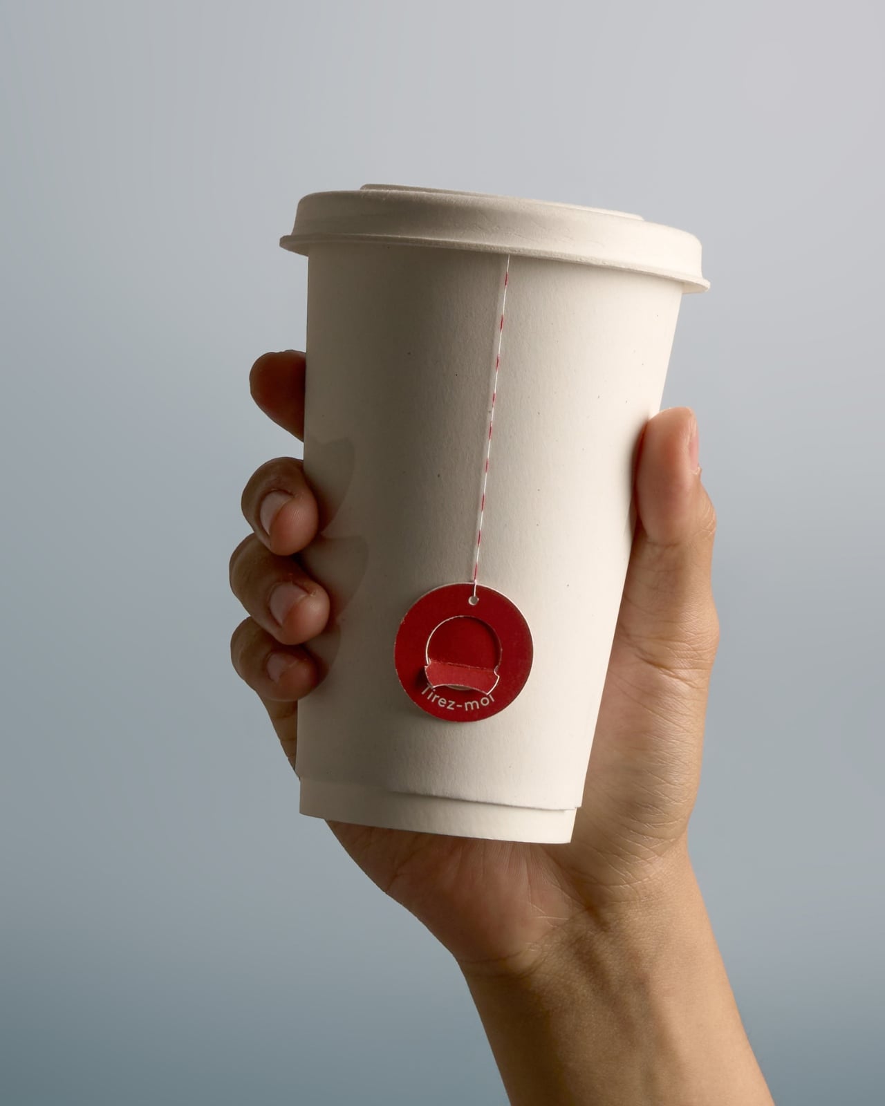
This Tea Takeaway Cup Fixes The Bitter Oversteeped Tea Problem Beautifully

Most people who drink tea on the go will admit, at some point, that they’ve committed the great tea crime: leaving the bag in too long. You meant to pull it out at three minutes. You got distracted by a notification, a phone call, someone asking you a question mid-sip. By the time you remember, the damage is done.

The cup is now a bitter, tannic situation you’re going to drink anyway because you paid for it and you’re already running late. Designer Elwin Kang clearly understood this particular brand of morning failure, because his concept packaging, Dot to Dot, is essentially a solution built around the most human of habits: forgetting.

Designer: Elwin KANG

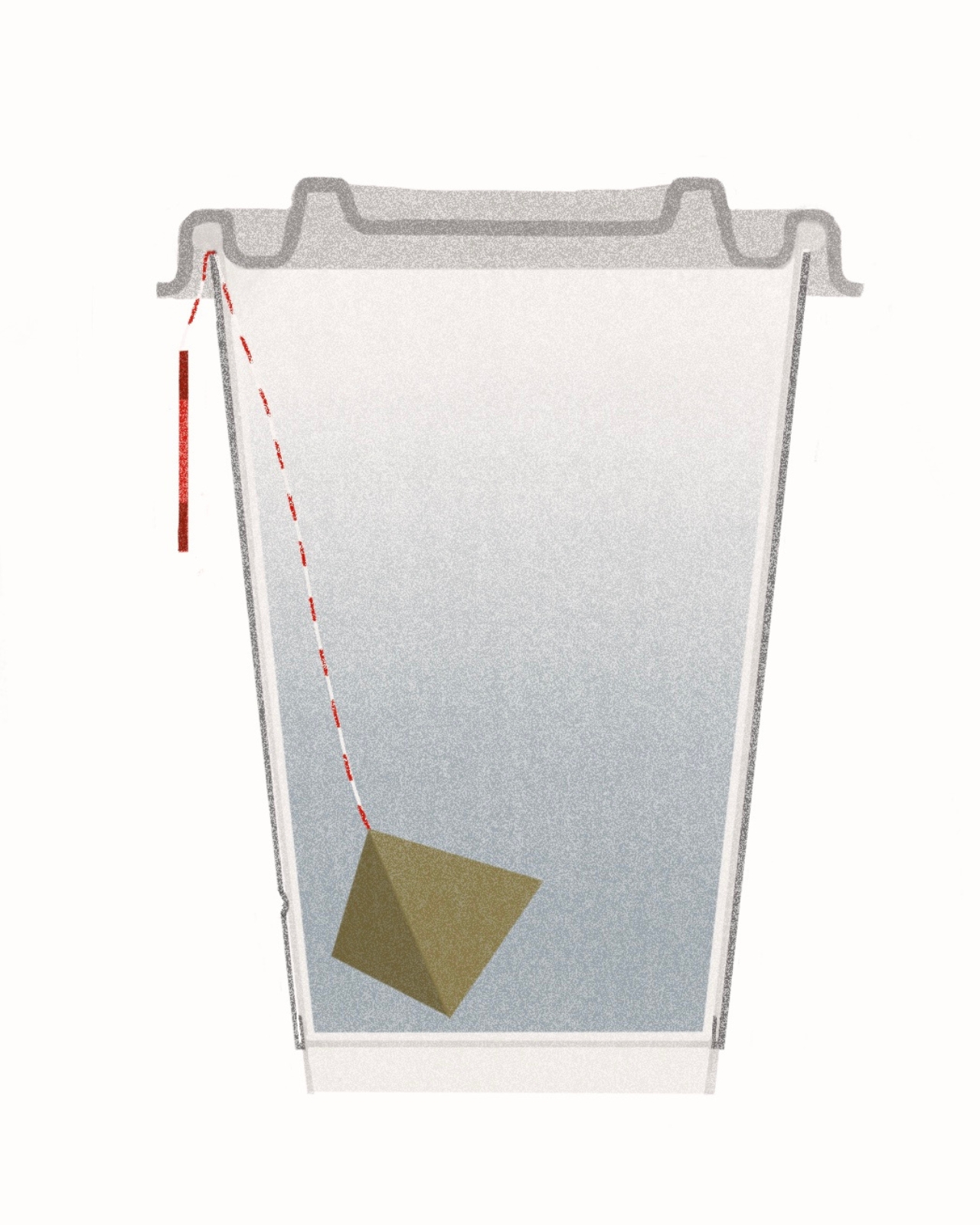
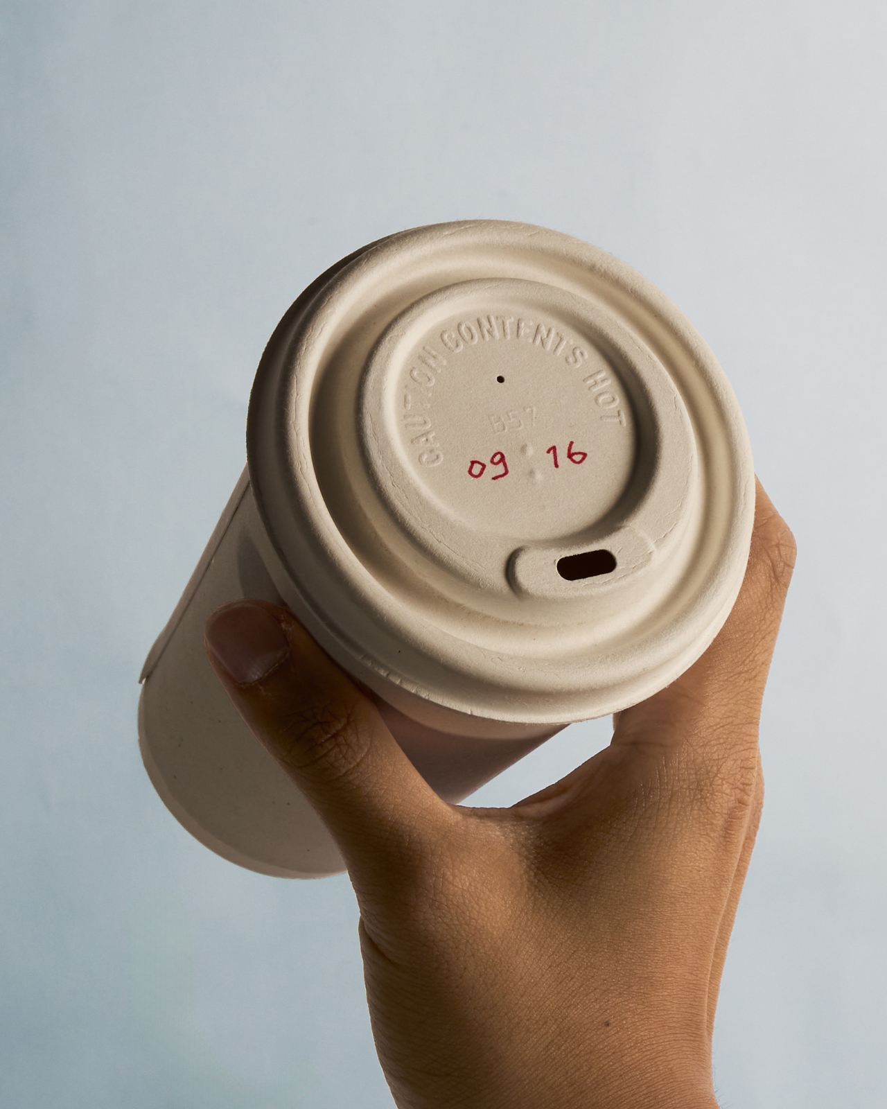
The concept is for a takeaway tea cup that integrates the tea bag, lid, string, and label into a single, choreographed interaction. Before the lid goes on, the barista or café staff writes the recommended finishing time directly onto it by hand. That’s the first clever move. It’s not an app notification or a timer you have to remember to set yourself. It’s just a time, handwritten and staring back at you from the top of the cup, the way a sticky note from a friend might. Hard to ignore. Easy to act on.

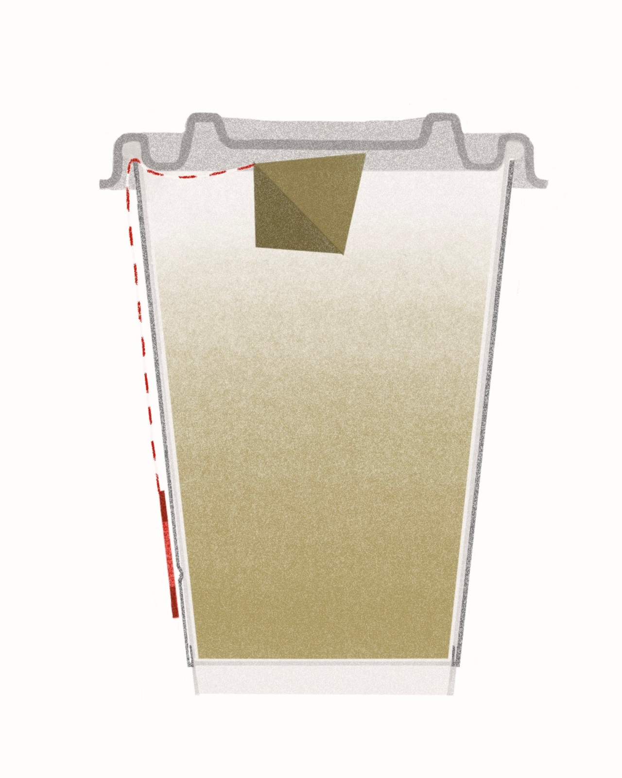
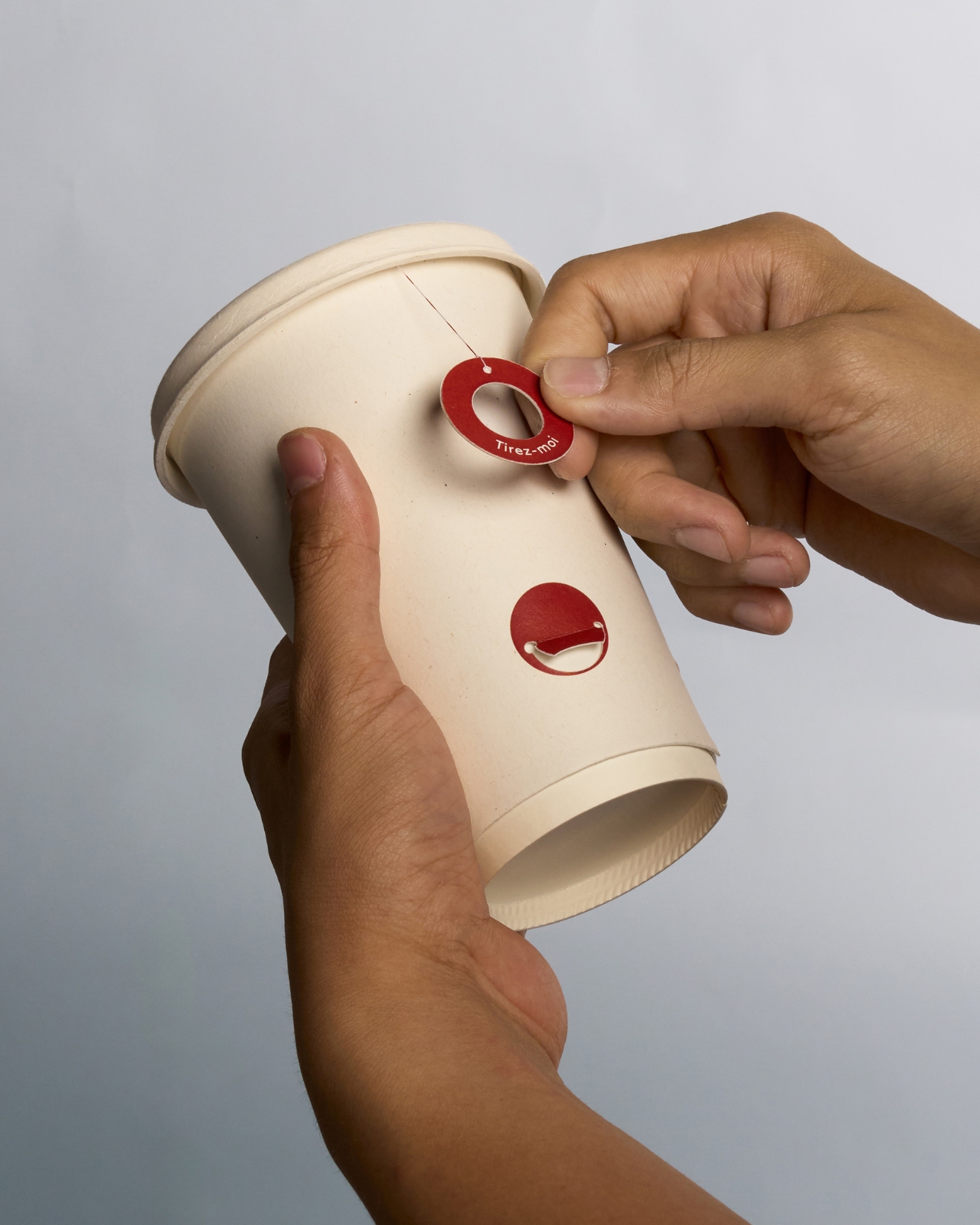
When that time arrives, you pull the circular label downward. The label is red, small, and stamped with a gentle instruction. Pulling it lifts the tea bag out of the water and suspends it just beneath the lid, stopping the infusion without you needing to fish the bag out with your fingers, find a bin, or carry it loose in your hand while you navigate a crosswalk. The used bag stays sealed inside the cup for the entire journey. Contained. Out of the way. Done.

What makes the interaction satisfying, beyond the practical side of things, is the visual logic underneath it. The label is a circle with a hole in the center, like a ring or a small donut. The attachment point on the side of the cup is a solid filled circle. When you press the label onto the attachment point, ring over dot, the two shapes complete each other. A circle becomes whole. Dot to Dot. The name isn’t just clever wordplay; it’s the actual gesture, expressed in form.

That kind of layered meaning is rare in packaging design, which tends to treat function and aesthetics as separate departments. Kang made them the same conversation, and that’s worth pausing on. Most packaging either looks good or works well. This concept does both, without the two qualities cancelling each other out.

I’ll be honest: Dot to Dot hits that particular nerve that good design tends to hit, the sense that the solution was obvious in retrospect but nobody had quite articulated it yet. Over-steeped takeaway tea is such a common, low-stakes frustration that most of us have simply accepted it as an unavoidable condition of the modern commute. Kang treats it as a problem worth solving, which is a design choice in itself. Not every brief begins with a grand crisis. Sometimes it starts with a too-bitter cup of Earl Grey on the way to the office.

There’s also a quieter argument embedded in the concept about slowing down within an otherwise rushed context. You’re still getting your tea to go. You’re still multitasking. But the design builds in a small moment of attention, one pull, one click, one completed circle, that gently asks you to be briefly present with what you’re drinking. That’s a surprisingly generous thing for a disposable cup to offer.

Whether Dot to Dot ever moves from concept to commercial production is another matter entirely, and the distance between a beautiful prototype and an actual supply chain is rarely short. But as a piece of design thinking, it earns its place. It’s specific, it’s human, and it leaves you wondering why every takeaway tea cup hasn’t worked this way all along.

The post This Tea Takeaway Cup Fixes The Bitter Oversteeped Tea Problem Beautifully first appeared on Yanko Design.

LEGO Koenigsegg weighs 480 kg more than the real car and hits 70mph

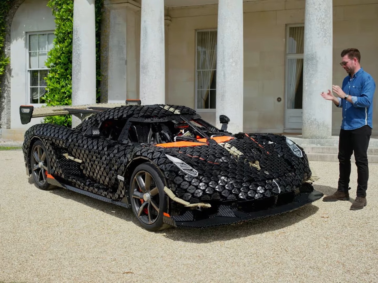
Three hundred twenty-seven thousand, nine hundred and six pieces. Every single one placed by a human hand, pressed into position by a human thumb, across 391 days and more than 9,400 hours of work. No robots, no automated assembly, no laser guided anything. Just people in a room in Denmark, snapping plastic together for over a year.

Here’s the part that should get your attention: they developed this exactly like a real car. Not “we glued bricks to a go-kart and hoped.” They ran it through aero stability testing to confirm the plastic skin would stay attached at speed, which matters a lot when your body panels are held on by nothing but clutch power. They loaded the suspension. They tested brakes. Things failed, because 327,906 individual connections give you a lot of places to fail, and each time the crew dragged it back, hunted down the weak point, reinforced it, and went out for another run. Trial and error, the oldest engineering method there is, applied to a toy. What came out the far end of that process was a LEGO car that will do 70 mph, which is a sentence I did not expect to write today.

Designer: The LEGO Group

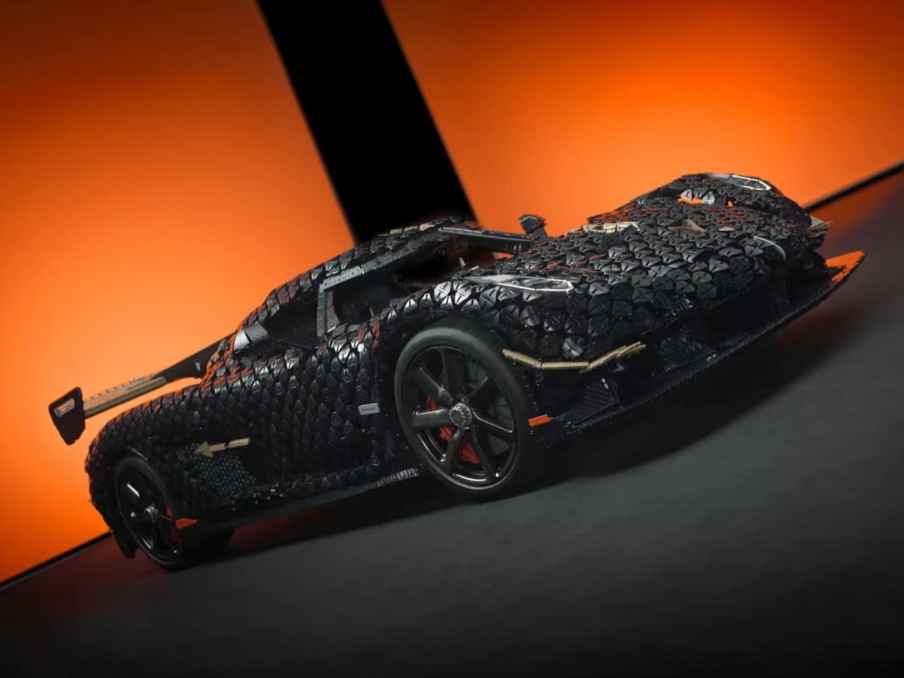
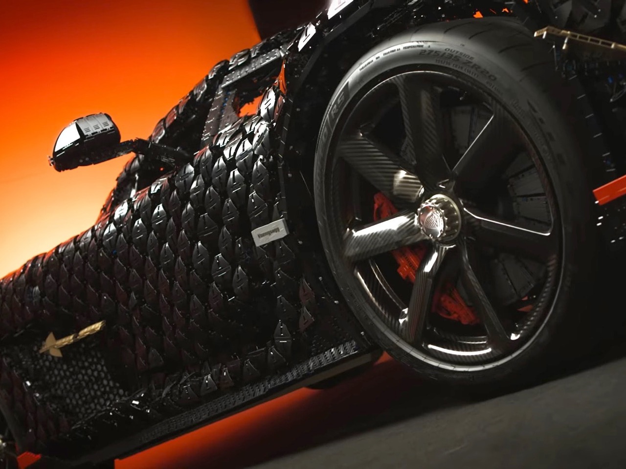
Thousands of small angular panels overlap in shingled rows across the nose, fenders and flanks, like scales on a very expensive fish, each one tilted slightly relative to its neighbor. A Koenigsegg’s surfacing is all compound curvature, the kind of double-bent carbon fiber that LEGO’s rectilinear system has no vocabulary for, so the team approximated it through faceted repetition instead. Step back and the eye reads a continuous curve. Step in and you can see the staircase. It’s the same trick LEGO’s sculpture teams use on large brick-built figures, and the only honest way to render an organic form in a system built on right angles.

Press one button on a Regera and the doors, front hood and rear clamshell all swing open at once, hydraulically, in perfect sync. Koenigsegg calls it Ghost Mode, and it exists for no reason beyond showing off the engineering underneath. The LEGO car does the same thing, automated, on 1,800 kilograms of plastic, with the dihedral synchro-helix doors rotating up and outward while the rear clam lifts behind them. That mass figure is the joke of the entire project. Christian von Koenigsegg built his reputation on drilling holes in bolts to save grams, and the real Sadair’s Spear comes in at 1,320 kg dry. The replica outweighs it by 480 kg, of which 400 kg is Technic elements alone. He engineered a 1,625-horsepower hypercar lighter than its own toy.

Markus Lundh ran the real Sadair’s Spear up the Goodwood hill in 47.14 seconds in July 2025 for a record that still stands, so LEGO handed him the brick version and pointed him down it instead, threading between the flint walls in the wrong direction. It hit 111 kph, more than double the previous LEGO big build record of 50 kph. Lundh got out and described it as incredibly smooth, said the brakes, steering and suspension all behaved, and admitted it reminded him of driving an actual Koenigsegg. He said this after sitting in an orange and black plastic cabin held together by the same clutch power that betrayed us all when the roof caved in on our childhood spaceships.

The 1:8 scale Technic set arrives at 4,104 pieces as the sixth entry in the Ultimate Car Concept Series, following the Porsche 911 GT3 RS, Bugatti Chiron, Lamborghini Sián, Ferrari Daytona SP3 and McLaren P1. It carries a working V8 piston engine, a nine speed sequential gearbox with a rotating gear indicator disc, Triplex suspension front and rear, and a manual Ghost Mode that raises the clam, doors and hood together. Twenty years of Technic supercar sets have been building toward this level of mechanical honesty. Watch your step in the pits, though. A stray piece from this one would be a nightmare to step on.

The post LEGO Koenigsegg weighs 480 kg more than the real car and hits 70mph first appeared on Yanko Design.

Rogbid SpinR is a rugged, budget-friendly smartwatch with optical scroll wheel for navigation

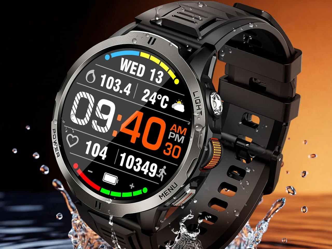
Rogbid believes traditional crowns are so dead. The watches now need mouse-style scroll wheels because, why not? If you think that’s a good idea, and want to give yourself a head start on the design idea without committing too much on the price front, check out the Rogbid SpinR – a budget-friendly smartwatch with rugged features and an optical scroll wheel for navigation.

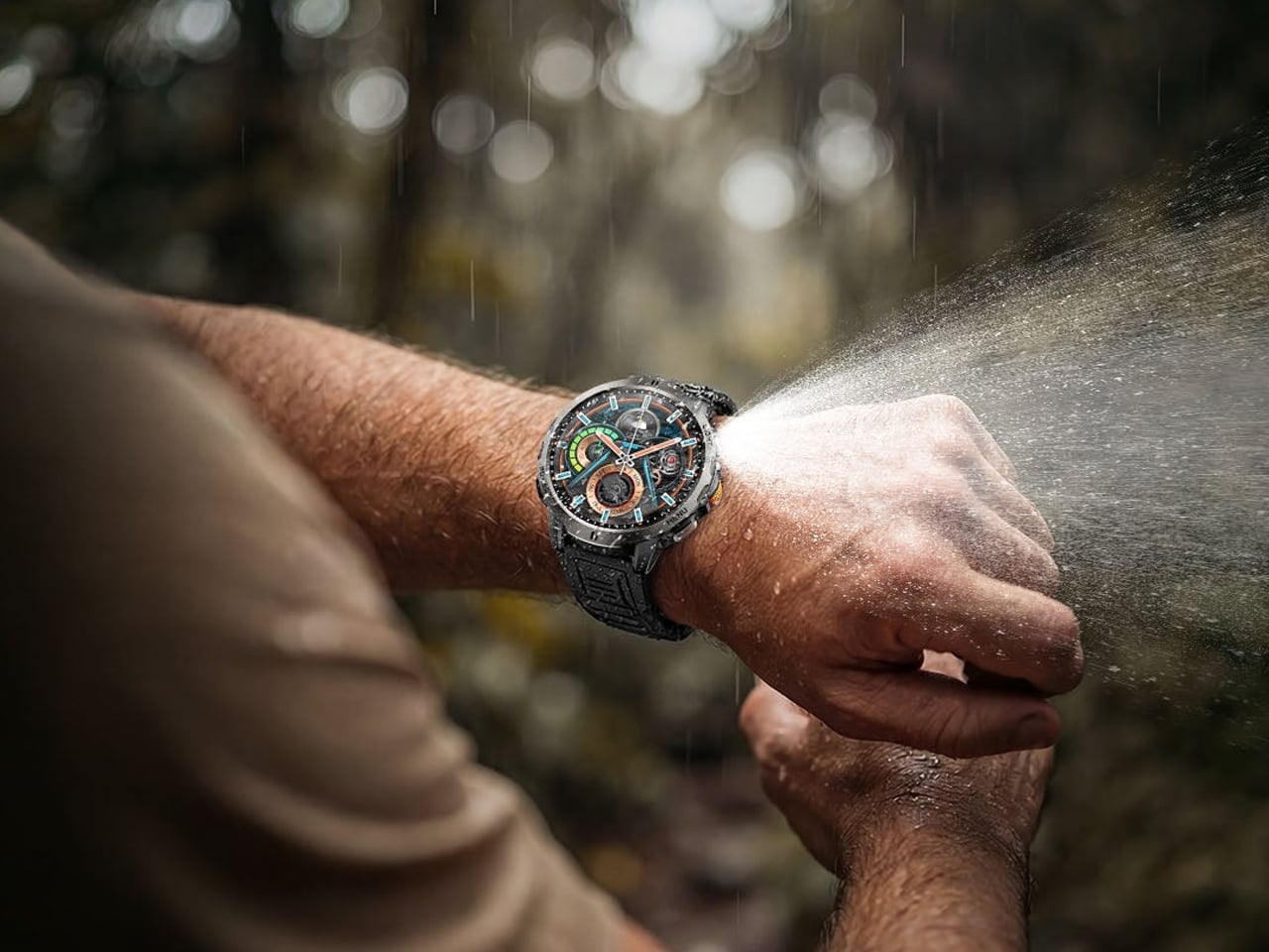
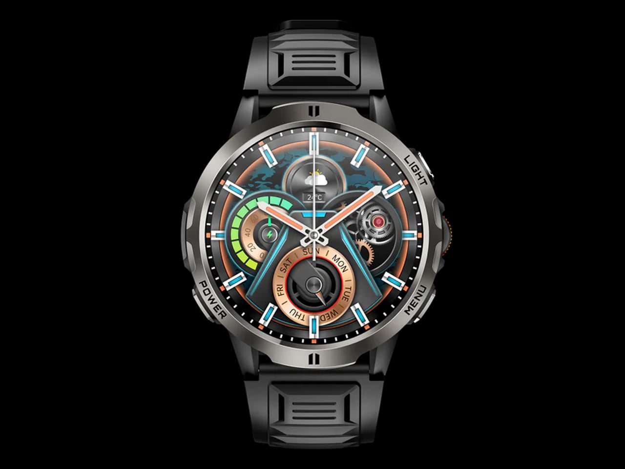
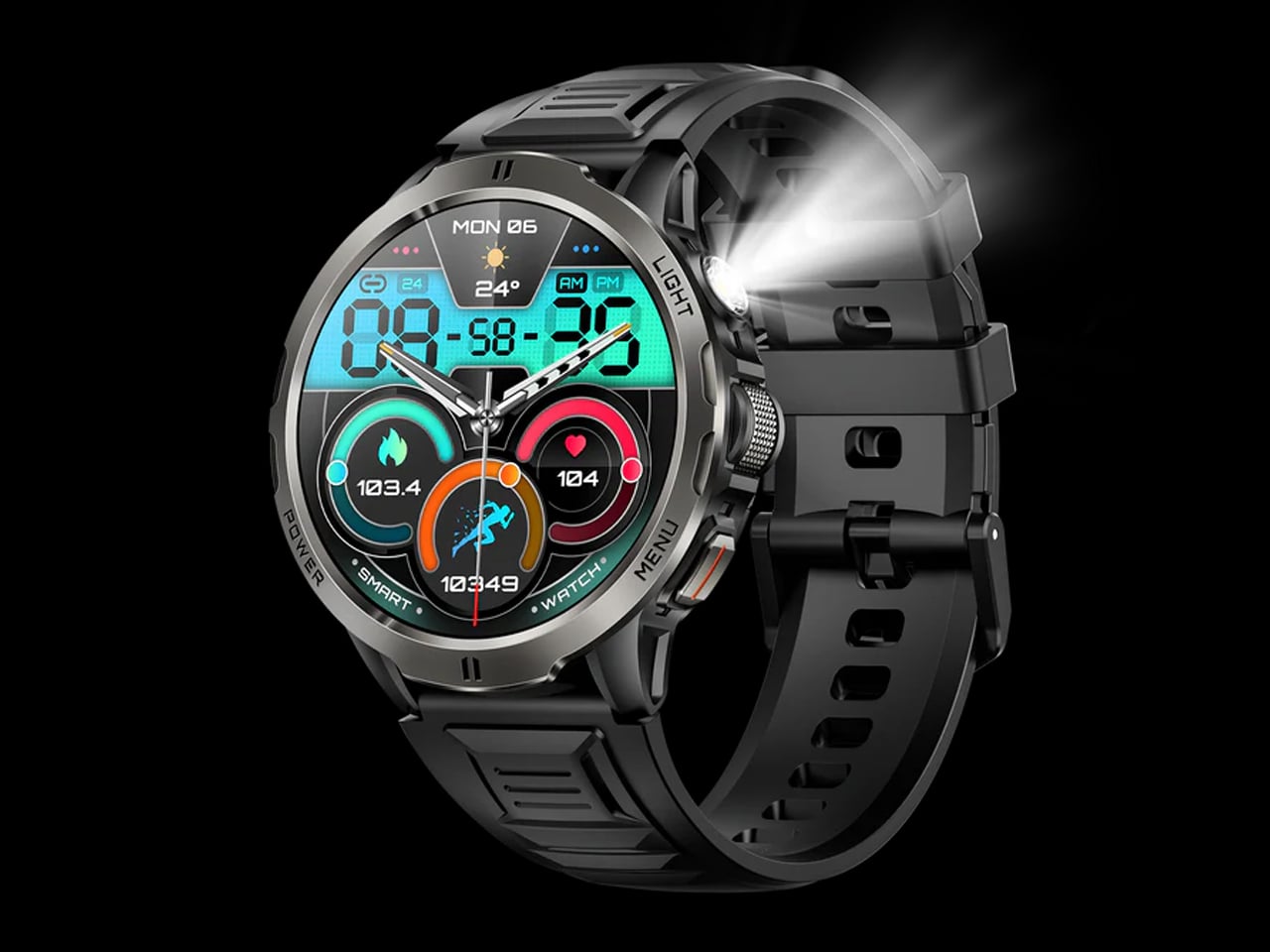
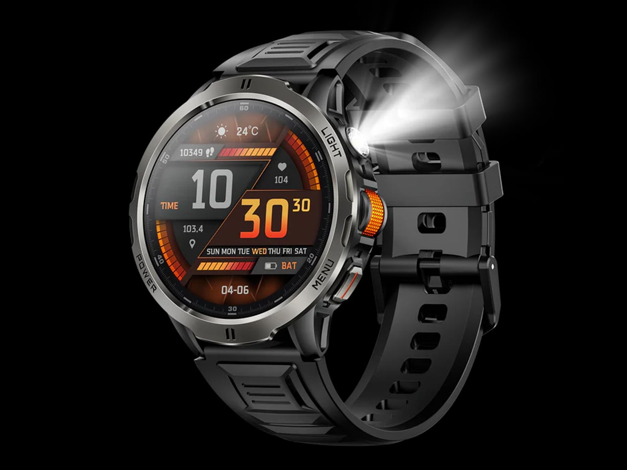
SpinR is an entry-level smartwatch. Rogbid has priced it at a very affordable $49.99. But what you get for the price – minus onboard GPS – is pretty noteworthy. First up, you have the metal case of the watch, which is made from zinc alloy and features a vacuum-plated finish. Offered in two colors – black and orange- the watch feels quite premium on the wrist. Despite the price and material usage, it’s not one of those chunky watches. It’s smart enough to go from work to gym, and anywhere else your adventure may take you.

Designer: Rogbid

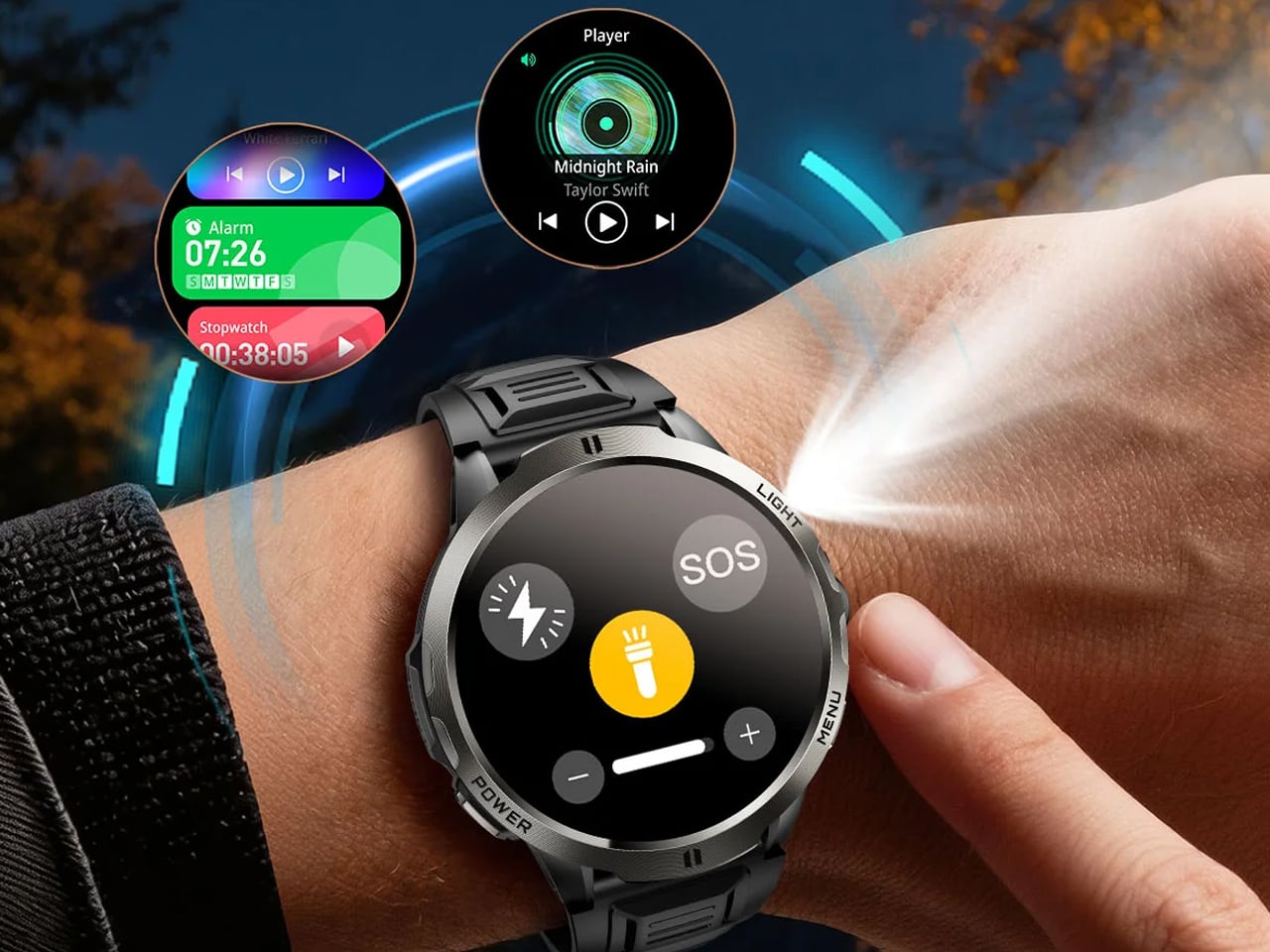
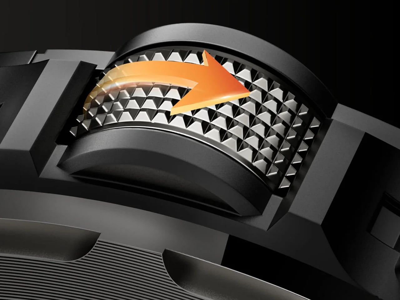
The case, however, is not small in any way. It measures 51 mm diagonally and is 13.4 mm at the thickest point. As noted, the main highlight of the SpinR is not its case. It’s that optical scroller built into the side crown. A jewel on the large case, the optical scroll wheel functions somewhat like the crown on the Apple Watch – for navigation. You can navigate the menu, adjust settings, and control apps with the scroll wheel without touching the screen at any time. This can be particularly helpful when you have sweaty hands or your fingers are covered in chip crumbs.

According to the company, to simplify the interactions, the scroll wheel uses light to register scrolling movement when you are changing the volume, scrolling through your music library, or increasing the flashlight intensity. The process of the wheel’s functioning is pretty similar to that found in gaming mice.

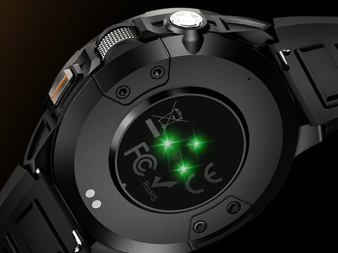
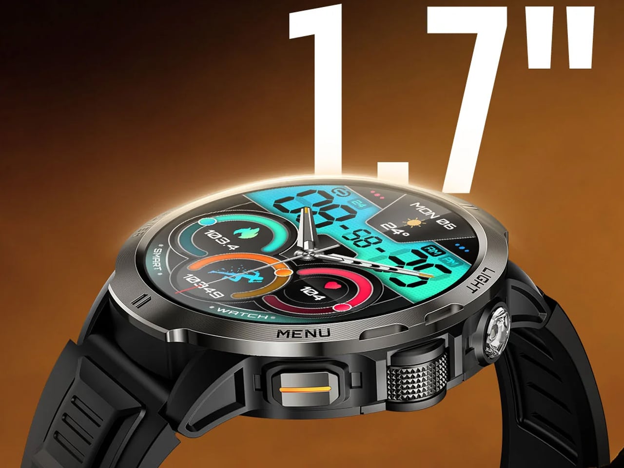
Besides the innovative wheel for navigation, the Rogbid SpinR smartwatch wears a 1.7-inch display. It is unclear whether its LCD or AMOLED panel, but what we do know for certain is that it features a 360 x 360-pixel resolution. The watch draws power from a 7074 A7 chipset with 128 MB of flash storage and comes with some standard smartwatch features such as heart rate tracking and a pedometer. What the SpinR misses is built-in GPS. For precise location tracking, therefore, the watch featuring Bluetooth 5.4 will rely on the paired phone.

You want the smartwatch you own to work for a few days without requiring a recharge. The Rogbid SpinR could be one such offering with its 1100 mAh battery, which the company claims has 100-plus days of standby time. In real-world usage, of course, it’s going to be way less, but with the magnetic charging, it will give you a quick way to refuel if you’re caught up running out of power on the go. SpinR has a plastic caseback and comes paired with a silicone strap. The watch is rated IPX8 and features 30-meter water resistance.

The post Rogbid SpinR is a rugged, budget-friendly smartwatch with optical scroll wheel for navigation first appeared on Yanko Design.