Tati Ferrucio’s Onda Clog Is the Most Geologically Correct Shoe Ever Made

The Yeezy Foam Runner opened a strange and genuinely productive door in footwear design, proving that a monolithic, organically sculpted clog could capture serious cultural attention. Tati Ferrucio‘s Onda walks through that same door but ends up somewhere quite different. Where the Foam Runner borrows loosely from athletic heritage, the Onda goes fully geological, its dense flowing ridges reading more like layered sandstone strata than anything borrowed from a sportswear archive. The comparison is worth making once and then setting aside, because the Onda has its own logic and it holds together well on its own terms.

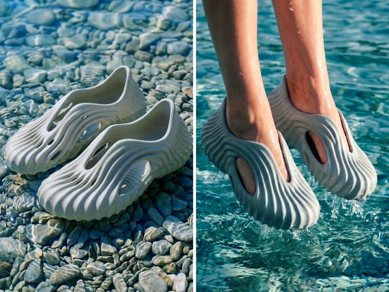
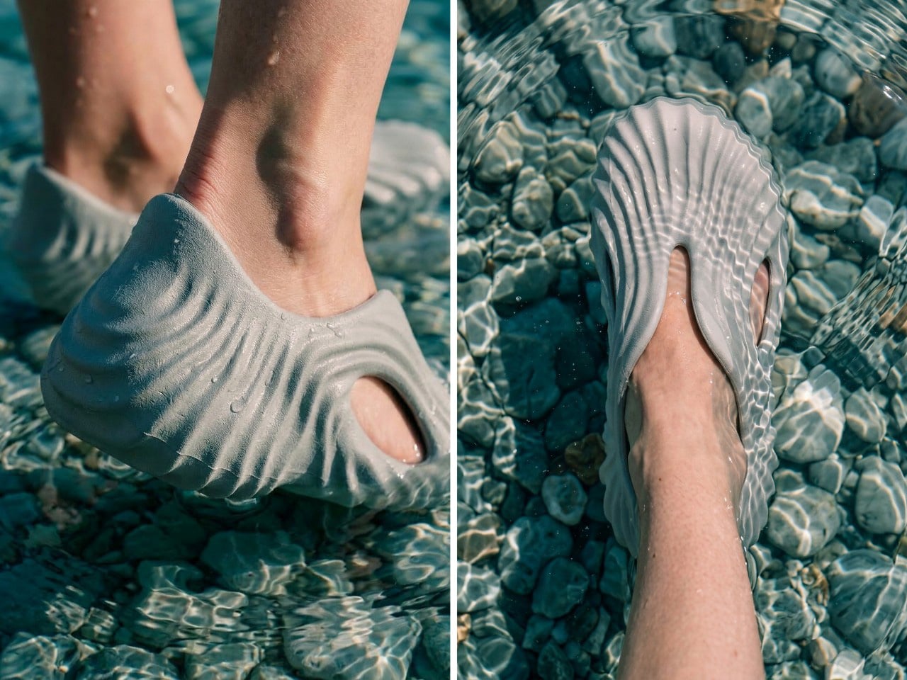
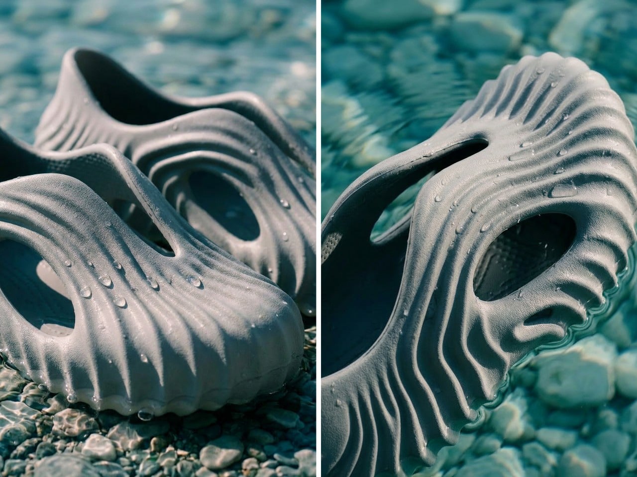
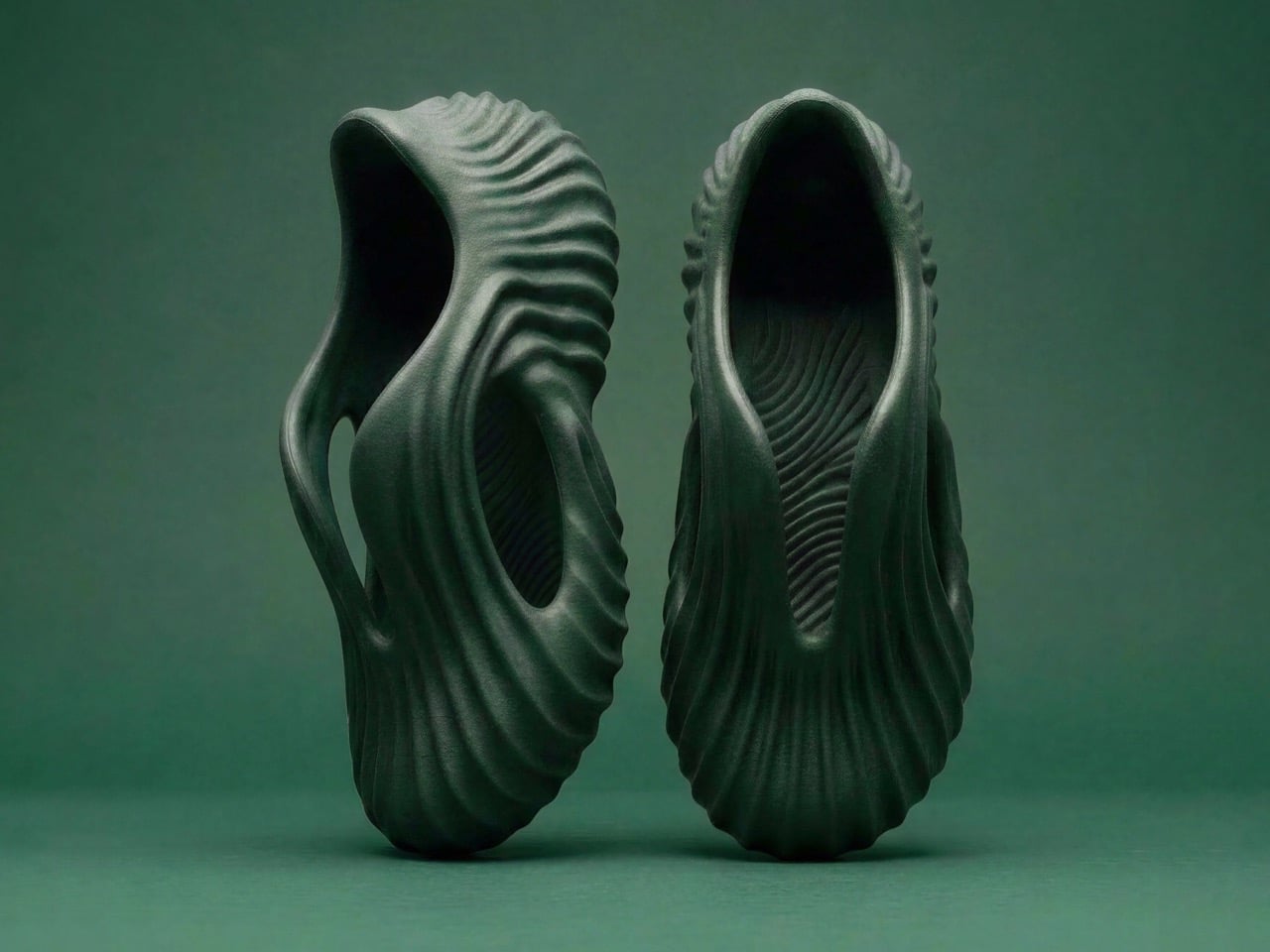
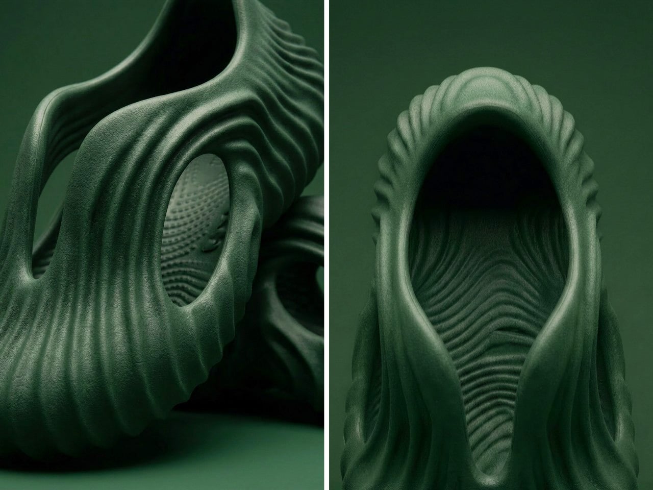
That logic starts with landscape. Ferrucio drew directly from waves, sand patterns, stone surfaces, and tree bark, treating nature as the original generative designer and asking what footwear would look like if it followed the same rules. The cutouts are sculpted voids, not punched holes, and the ribbing on the sole wraps continuously into the upper so there is no visual seam between base and body. It reads as a single carved object, the kind of thing you might find in a tide pool if tide pools produced wearable foam.

Designer: Tati Ferrucio

Ferrucio developed the Onda using Vizcom, an AI-assisted design platform that takes a designer’s sketch and generates a field of iterated possibilities rather than a single resolved outcome. The workflow is worth pausing on because it explains something about the result. The Onda does not look like a design that was decided in one session; it looks like a form that accumulated, the way sediment does, layer by layer under consistent pressure from the same directional force. Just FYI, Vizcom did not generate the design; Ferrucio directed it, feeding creative intention into each round of iteration and pulling the form toward her reference material until the surface stopped arguing with itself and settled into something coherent.

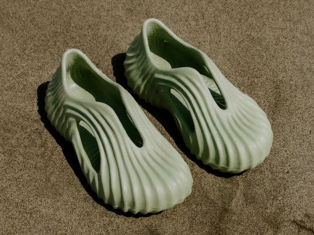
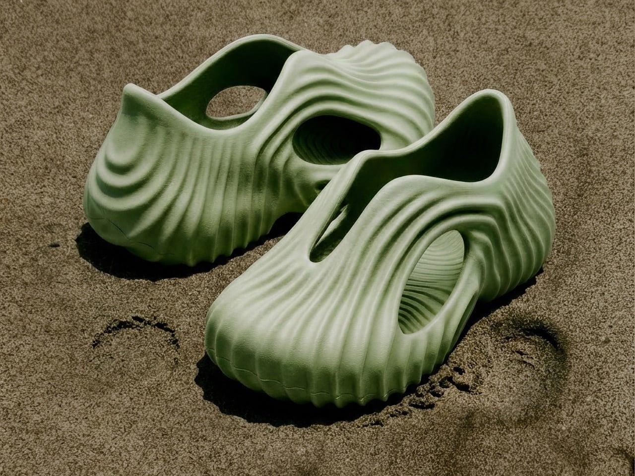
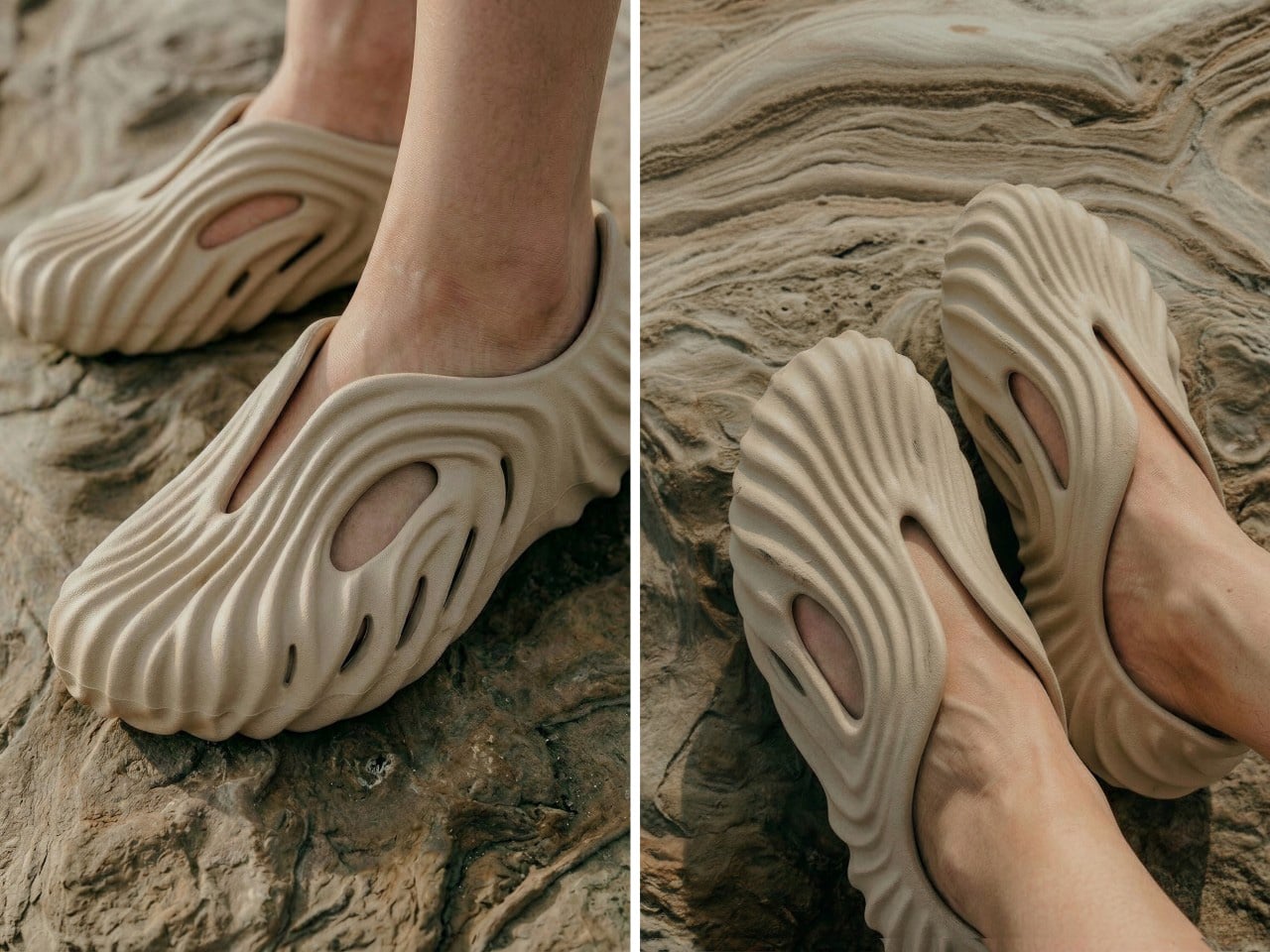
Positioned along the sides of the upper, the cutouts allow water and sand to escape when moving through wet or granular terrain, which is a functional requirement in a clog built for outdoor use. But structurally, they also reduce material mass without compromising the integrity of the upper, and visually, they create depth in the silhouette that a solid body would not have. The oval void near the heel is particularly well resolved; it sits inside the ribbed surface like a window cut into a canyon wall, framed by ridges on all sides, and gives the rear of the shoe a formal completeness that most clogs never bother to achieve.

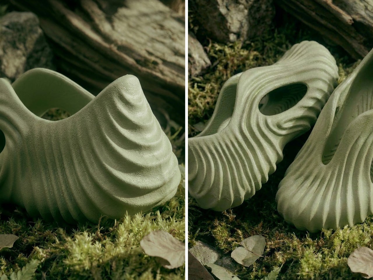
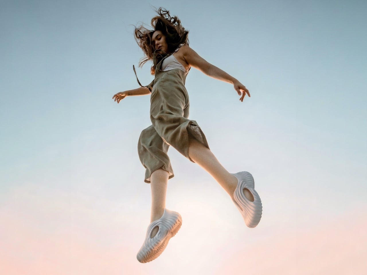
Three colorways exist in the current lineup: a grey-blue that photographs like wet stone, a sand beige that almost disappears against the layered rock surfaces in the campaign imagery, and a sage green that reads somewhere between sea glass and weathered copper depending on the light. Each one is photographed in a context that suits it specifically, which is the kind of creative direction that signals a designer who thought carefully about what the object is actually communicating and to whom. The grey-blue sits on a rocky riverbed in shallow water. The beige is shot against sedimentary cliff faces in warm light. The green lands on dry sand with hard shadows. Every environment reinforces the geological reference without stating it out loud.

The Onda is a mere concept at this stage, developed in collaboration with Vizcom as a demonstration of what AI-assisted industrial design can produce when the designer maintains genuine creative authority over the process. Whether it goes into production depends on factors Ferrucio has not specified, but as a design object it makes a coherent and confident argument: that the clog format, for all its utilitarian plainness, has more formal ambition available to it than most brands have been willing to extract.

The post Tati Ferrucio’s Onda Clog Is the Most Geologically Correct Shoe Ever Made first appeared on Yanko Design.

Bethesda is shutting down The Elder Scrolls: Blades on June 30

It's a sad day for the dozens of players still grinding The Elder Scrolls: Blades. Bethesda announced that it's permanently shutting down the servers for its free-to-play mobile spinoff on June 30. First spotted on Reddit, The Elder Scrolls: Blades has already been delisted from the App Store and Google Play store, and is currently unavailable on the Nintendo Store.

In the meantime, players will receive a free bundle of Gems and Sigils, while all items in the in-game store are available for just one Gem or Sigil each. With a server shutdown imminent, The Elder Scrolls: Blades' will at least cross its six-year mark since its official release was in 2020 for Android, iOS and Nintendo Switch. The dungeon-crawling spinoff did see early success when more than one million iOS users downloaded the game during the first week of its early access period, but it never amounted to the commercial success of Bethesda's mainline titles.

In the end, The Elder Scrolls: Blades ended up with a "Generally Unfavorable" score on Metacritic, with critics calling it "repetitive" and filled with microtransactions. The shutdown doesn't come as a total surprise, since Bethesda also killed off its other spinoff, The Elder Scrolls: Legends, by halting development in 2019 and ultimately taking the game's servers offline in January 2025. For anyone who still wants to play a mobile spinoff of Bethesda's fantasy world, there's still The Elder Scrolls: Castles

This article originally appeared on Engadget at https://www.engadget.com/gaming/bethesda-is-shutting-down-the-elder-scrolls-blades-on-june-30-191016852.html?src=rss

The Avatar fighting game will release on July 2 for PC and consoles

The fighting game community is going to have their hands full this summer between the release of Marvel Tōkon: Fighting Souls and Avatar Legends: The Fighting Game. The studio behind the 2D fighting game based in the Avatar universe announced that a July 2 release date with a trailer that shows off new gameplay and a base price of $29.99.

The game will launch with 12 characters, encompassing both the heroes and villains from Avatar: The Last Airbender and The Legend of Korra. The game's developer, Gameplay Group International, said that there are more than 900 hand-drawn frames for each character, which makes the game look like it came directly out of the beloved TV series. Avatar Legends: The Fighting Game will feature both casual and ranked matches, using a rollback netcode to ensure smooth frame-by-frame action between players, along with crossplay across PS5, Xbox Series X and S, Nintendo Switch 2 and PC.

For those more interested in the lore, there will be a single-player story mode and a gallery mode with "never before seen art." Avatar Legends: The Fighting Game is currently available for pre-order, starting at $29.99, but there's a $59.99 deluxe edition that includes a digital art book, music soundtrack, unique HUDs and a Year 1 Pass, which adds five additional characters that will be released in the future. Those who pre-order will also get a Samurai skin for Appa, exclusive character colors and voting privilege for the Year 1 Pass characters.

This article originally appeared on Engadget at https://www.engadget.com/gaming/the-avatar-fighting-game-will-release-on-july-2-for-pc-and-consoles-174614552.html?src=rss

The Erica by Craft House Is the Tiny Home That Thinks Vertically

Tiny living has always been a negotiation. You trade square footage for freedom, density for mobility, and somewhere in that exchange, comfort usually takes the first hit. The Erica by Craft House is a direct response to that tradeoff, a 24-foot towable tiny home that refuses to accept the ceiling as a ceiling. Craft House, a builder with roots across Poland, Austria, and Ireland, designed the Erica around a simple but underused idea: when you can’t build out, build up.

The rooftop terrace is the home’s defining move — an accessible outdoor space that extends livable square footage without touching the home’s road-legal width. It’s the kind of solution that makes you wonder why more tiny home builders haven’t gone there. The home sits on a double-axle trailer and can be fitted with an optional ground-level deck, shifting it from purely mobile to something closer to semi-permanent. That flexibility is part of the appeal; Erica doesn’t force you to choose between a life on wheels and a home that actually feels settled.

Designer: Craft House

Step inside, and the ground floor, finished in Scandinavian spruce, does a convincing job of feeling larger than its 129 square feet. The open-plan layout keeps the kitchen and living area in conversation with each other, which does a lot of the heavy lifting spatially. It’s a simple design decision that pays off immediately.

The kitchen is well-equipped: induction cooktop, oven, fridge, sink, and enough cabinetry to keep things from feeling like a camping setup. The breakfast bar seats two and doubles as a work surface…exactly the kind of multitasking that earns its keep in a space this size. The bathroom sits at the opposite end of the home with a flushing toilet, vanity sink, and glass-enclosed shower. Tight, but complete.

The bedroom is a loft reached via a staircase smartly built out with integrated storage underneath. The ceiling is low, as loft ceilings in tiny homes tend to be, but the tradeoff is a ground floor that stays clear and breathable. A mini-split air conditioning unit handles climate control; a practical choice that doesn’t eat into the floor plan the way bulkier systems would.

Solar power is available as an optional add-on, giving owners a path toward off-grid living without hardwiring it into the base spec. It’s a considered choice that keeps the entry point accessible while leaving room to grow. The Erica isn’t trying to reinvent tiny living — it’s trying to do it better. And in a market full of homes that look alike, that rooftop terrace alone makes it worth a second look.

The post The Erica by Craft House Is the Tiny Home That Thinks Vertically first appeared on Yanko Design.

Bluesky’s next product is an AI assistant that helps build custom social media feeds

Bluesky is the latest social media platform to throw its hat into the AI chatbot ring. Bluesky, but specifically its chief innovation officer Jay Graber and her new Exploration team, built a new AI assistant called Attie that's designed to help users create custom feeds. Graber called Attie an "agentic social app" that's built on its its open-source framework called the AT Protocol.

To use Attie, users can punch in prompts in natural language to generate social feeds without having to know how to code. On the Attie website, examples include prompts like, "Show me electronic music and experimental sound from people in my network" or "Builders working on agent infrastructure and open protocol design."

An example of a user's prompt for Attie and the feed that's generated from it.
Attie

"It feels more like having a conversation than configuring software," Graber described Attie in a blog post. "You describe the sort of posts you want to see, and the coding agent builds the feed you described."

Graber added that Attie is a separate app from Bluesky and users don't have to use the new AI assistant if they don't want to. However, since Attie and Bluesky were built on the same framework, it could mean there will be some cross-app implementation between the two or any other app built on the AT Protocol. Attie is currently available on an invite-only closed beta, but anyone interested can sign up for the waitlist on its website in the meantime.

This article originally appeared on Engadget at https://www.engadget.com/ai/blueskys-next-product-is-an-ai-assistant-that-helps-build-custom-social-media-feeds-163140902.html?src=rss

DIY Water-Cooled MacBook Neo Just Got A 23% Performance Bump. Here’s How…

The MacBook Neo’s entire premise rests on one audacious question: can a smartphone chip carry a laptop? Apple’s answer was to drop the A18 Pro from the iPhone 16 into a fanless aluminum chassis and ship it. For everyday tasks, the answer is largely yes. For gaming under sustained load, the answer hits a wall at 105°C, where the chip pulls back its clocks to avoid cooking itself inside a case with no fan and no active cooling to speak of. The MacBook Neo is a genuinely compelling machine, repairability included since Apple ditched adhesive entirely and built the whole thing around screws, but that thermal ceiling is a real and measurable constraint.

ETA Prime ran the experiment that every thermally curious engineer has probably daydreamed about: what happens when you actually cool this thing properly? First, a custom copper heat sink bridging the chip to the aluminum shell. Then a liquid-cooled thermoelectric Peltier unit clamped magnetically to the outside. Gaming framerates climbed from 30 to 80 FPS. Cinebench single-core jumped 23.5% over stock. The A18 Pro was never the bottleneck. The cooling was.

Designer: ETA PRIME

The copper heat sink is the more elegant of the two mods, and honestly the more important one. ETA Prime removed the stock graphene pad using a heat gun, cleaned the A18 Pro die with isopropyl alcohol, and applied Noctua thermal paste directly to the chip. A sheet of copper, cut to cover the full mainboard, sits on top. An Arctic TP3 thermal pad on the upper face of the copper makes contact with the MacBook Neo’s aluminum bottom shell when the screws are tightened back down, turning the entire chassis into a proper heat spreader. The graphene pad was cut in half and kept over the surrounding components for protection, but the CPU die itself is now in a real thermal pathway for the first time. With just this mod in place, No Man’s Sky jumped from 30-31 FPS to 58 FPS, average CPU temps dropped to around 83-84°C, and Geekbench 6 multi-core climbed 9.7% while single-core gained 15.2%. A sheet of copper and a tube of paste did what Apple’s entire thermal design could not.

The Peltier cooler is the wilder addition, and it is admittedly overkill in the best possible way. The unit ETA Prime used was originally designed as a phone cooler, a liquid-cooled thermoelectric device with three power settings topping out at 50 watts. One side extracts heat, the other reaches below-freezing temperatures, and ice visibly forms on the cold plate within about a minute of operation. It attaches magnetically to the bottom of the Neo, aligning with the copper heat sink beneath the shell, and pulls the chip’s average idle temp down to 23°C. Under gaming load in No Man’s Sky, the CPU sat at roughly 74°C, and framerates held at 58-59 FPS with VSync engaged. Over a 30-minute sustained session, the machine averaged around 80 FPS at 1408×881 on enhanced settings with Metal scaling set to balanced, compared to the low 30s it would have delivered in stock form.

The benchmark gains with the full liquid cooling setup are worth spelling out. Geekbench 6 multi-core reached 9,394, an 18.6% improvement over the stock 7,921. Single-core hit 3,636, up 17.52%. Cinebench multi-core landed at 1,741 against a stock score of 1,462, a 19% gain, while single-core climbed from 502 to 620, a 23.51% improvement. ETA Prime also tested Fallout 4 running through Crossover, the compatibility layer that lets non-Mac titles run on Apple silicon, and the Neo held a consistent 60 FPS despite relying on SSD swap for additional memory beyond its 8GB ceiling.

The 8GB cap remains the machine’s most stubborn limitation, and no amount of copper or Peltier magic changes that. When the unified memory fills, the Neo starts leaning on SSD swap, which is slower and adds latency that thermal improvements cannot compensate for. It is a real constraint for anyone expecting to run memory-hungry titles at length. That said, the performance ETA Prime extracted here from a chip that costs less than many gaming peripherals is genuinely impressive, and the copper mod in particular requires no permanent modifications and costs almost nothing.

The Peltier is obviously not a portable solution. It draws significant power, runs a liquid loop, and magnetically attaches to the outside of the machine like a barnacle. But the copper mod absolutely is portable, costs next to nothing in materials, and on its own delivers close to double the sustained gaming performance. ETA Prime also tested Fallout 4 running through Crossover on the liquid-cooled setup, hitting a continuous 60 FPS despite the Neo’s 8GB RAM ceiling forcing the system to lean on SSD swap for additional memory. The A18 Pro has more headroom than Apple’s thermal design ever lets it show, and a sheet of copper is apparently all it takes to prove it.

The post DIY Water-Cooled MacBook Neo Just Got A 23% Performance Bump. Here’s How… first appeared on Yanko Design.

Samsung Finally Fixes the Fold: Meet the 5.4-inch Galaxy Z Fold 8 Wide

Samsung Finally Fixes the Fold: Meet the 5.4-inch Galaxy Z Fold 8 Wide Samsung Galaxy Z Fold 8 Wide shown open and closed, highlighting its wider, shorter shape and hinge design.

The Samsung Galaxy Z Fold 8 Wide introduces a significant evolution in foldable smartphone design, offering a wider and shorter form factor that prioritizes usability and media consumption. As a direct competitor to Apple’s anticipated foldable iPhone, this device combines innovative engineering with practical features, aiming to redefine the foldable smartphone market. The video below […]

The post Samsung Finally Fixes the Fold: Meet the 5.4-inch Galaxy Z Fold 8 Wide appeared first on Geeky Gadgets.

Posted in Uncategorized

Use Apple’s Journal App to Organize the Chaos of Your Daily Life

Use Apple’s Journal App to Organize the Chaos of Your Daily Life Face ID lock settings screen for Apple Journal, showing privacy options for personal reflections and work notes.

Apple’s Journal app offers a streamlined way to bring order to the chaos of daily life by combining the reflective nature of journaling with the efficiency of digital organization. As highlighted by Leon’s Affirmations, the app’s features, such as iCloud syncing and advanced search functionality, make it easy to access and manage your entries across […]

The post Use Apple’s Journal App to Organize the Chaos of Your Daily Life appeared first on Geeky Gadgets.

Posted in Uncategorized

The Most Creative Public Space Design Right Now Is Made of Trash

The first time I saw images of Concrete Utopia, I assumed it was a render. The kind of thing that circulates on design Instagram before quietly disappearing into the “concepts that never got built” pile. Chunky grey pipes arranged in an open courtyard, people moving through and around them like it was always supposed to be this way. But the project is real, it lives outside the Museum of Contemporary Art Busan in South Korea, and the more I sat with the images, the more I found myself studying them the way you study something that seems simple until it isn’t.

Concrete Utopia is the work of South Korean designer Hyunje Joo. The material is straightforward: discarded concrete pipes, the kind used in construction infrastructure and typically hauled away once a build wraps up. What Joo does with them is the interesting part. Rather than disguising or dramatically transforming them, he arranges the pipes into a configuration that preserves exactly what they are while completely changing what they do. The cylinders are grouped and stacked at varying orientations, creating a composition that reads less like a salvage pile and more like a spatial argument. You can tell it was designed. You just can’t immediately tell how.

Designer: Hyunje Joo

The circular geometry is doing a lot of work here. Repetition is a classic design tool, but it tends to flatten things when overused. Joo avoids that by letting the pipes vary in how they cluster and orient without introducing anything new to the material vocabulary. The result is a rhythm that feels considered without feeling controlled. There’s a looseness to the arrangement that invites you in rather than holding you at a visual distance, which is harder to pull off than it looks.

What the design gets genuinely right is the question of scale. These are large industrial pipes, and placing them in a public setting without any softening or mediation could easily read as aggressive or alienating. Instead, the proportions end up working in the project’s favor. The openings in the pipes are wide enough to pass through, to sit inside, to lean against. The structure accommodates a body without being designed around one specific use. A child runs through it differently than an adult pauses inside it, and the design makes room for both without trying to orchestrate either. That kind of spatial generosity is something a lot of more considered, more expensive design projects fail to achieve.

The surface quality matters too. Concrete has a particular visual weight that doesn’t disappear regardless of context. It doesn’t soften under museum lighting or become decorative just because it’s been repositioned. Joo leans into that rather than working against it. The rawness of the material is part of the design language, not an obstacle to it. Up close, the texture of the pipes carries the evidence of their previous life, which gives the project a material honesty that polished surfaces simply can’t replicate.

The layout itself avoids fixed hierarchy, meaning there’s no obvious front or back, no primary axis that tells you where to stand or which direction to face. That’s a deliberate compositional choice, and it changes how the space feels to move through. Most public structures, even good ones, have a logic that steers you. Concrete Utopia doesn’t. You arrive at your own reading of it, and that openness is built into the arrangement rather than incidentally landing there.

Placed within the grounds of a contemporary art museum, the project sits in an interesting position between sculpture and architecture. It functions like a building but doesn’t resolve like one. It reads like an installation but behaves like infrastructure. That in-between quality is where the design lives, and it’s what makes Concrete Utopia more compelling than a straightforward sustainability gesture or a purely formal exercise would have been. Joo found a space where the design question and the material answer are the same thing. That’s not a given. Most design keeps those two things at a distance from each other for the whole project.

The post The Most Creative Public Space Design Right Now Is Made of Trash first appeared on Yanko Design.

Forget the iPhone 17: Why the $599 iPhone 17e is Actually the Smarter Buy

Forget the iPhone 17: Why the $599 iPhone 17e is Actually the Smarter Buy Benchmark screen showing A19 results on iPhone 17e, with 3,628 single-core and 9,088 multi-core scores.

Apple’s iPhone 17e is the latest addition to its entry-level lineup, offering a thoughtful balance of affordability, performance, and durability. Priced at $599, it introduces meaningful upgrades over its predecessor, the iPhone 16e, making it an attractive option for users upgrading from older devices or stepping into the Apple ecosystem for the first time. Below […]

The post Forget the iPhone 17: Why the $599 iPhone 17e is Actually the Smarter Buy appeared first on Geeky Gadgets.

Posted in Uncategorized