Someone Fixed Jaguar’s Type 01 With An Aggressive Sports Body Kit

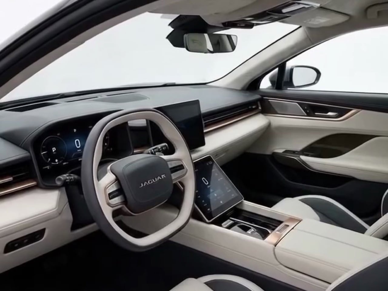
Jaguar kept us waiting two years, and what rolled out in New York on Tuesday looks suspiciously like a very expensive Braun radio on wheels. The tail is a wall of horizontal metal slats stretched across a windowless rear deck, and the nose wears a matching slatted box that could have been borrowed from a vintage hi-fi. I mean that fondly, sort of. The Type 01 starts at $130,500 in the US, with orders opening in early 2027 and deliveries in the second half. At that price, I would like the car to look like somebody finished it.

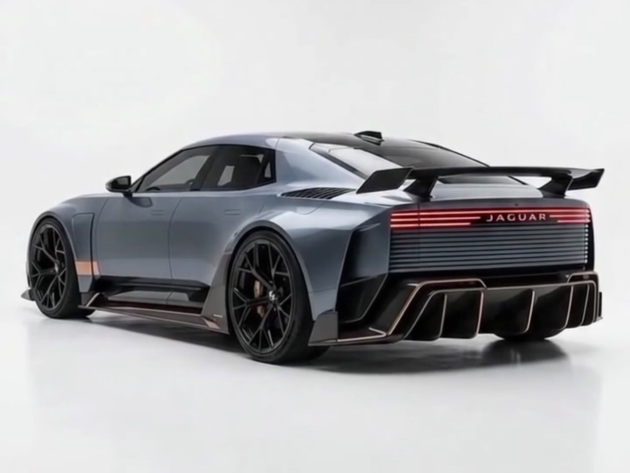
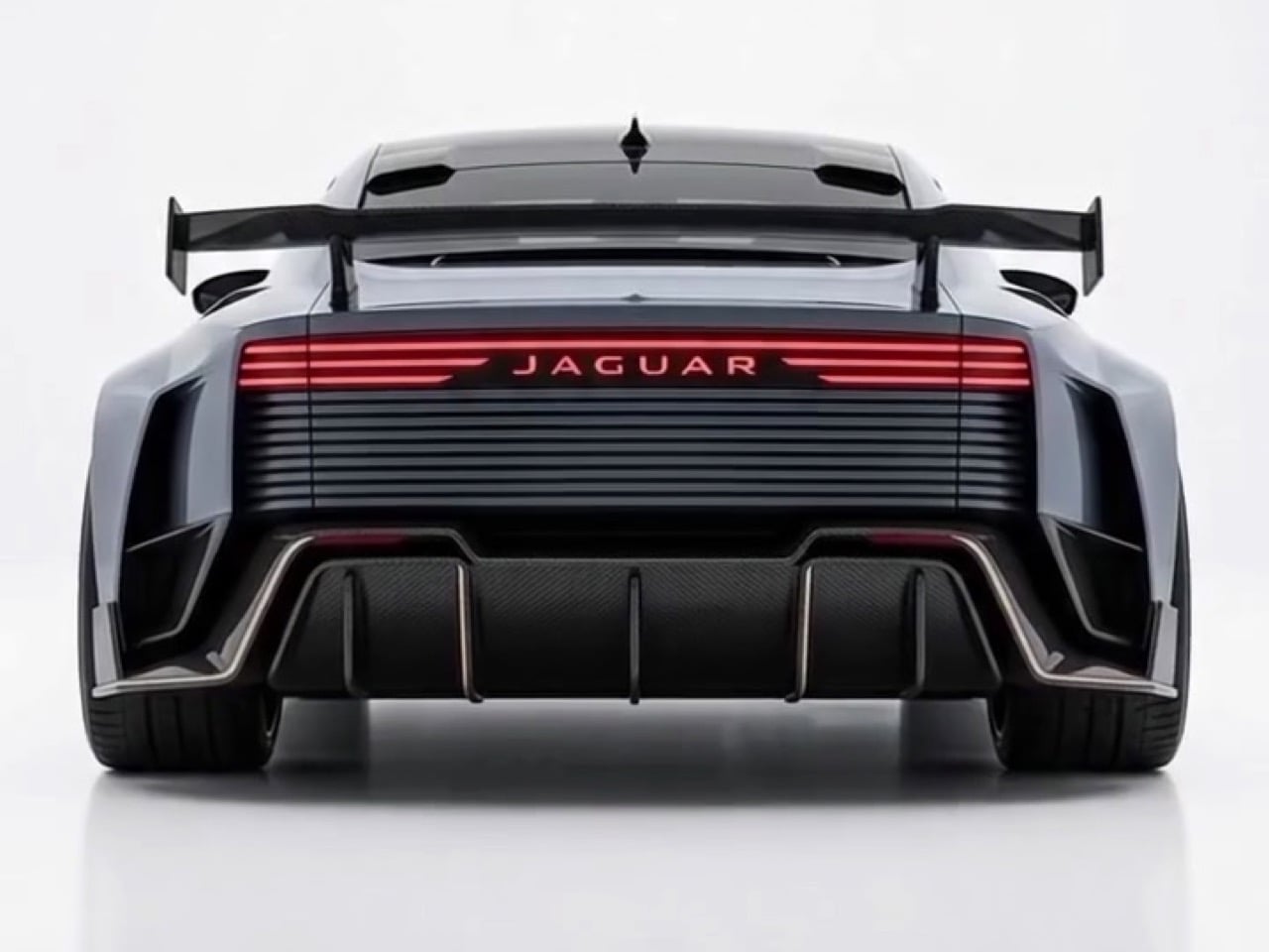
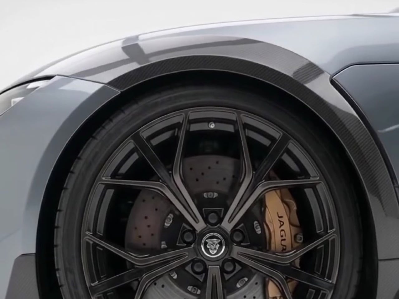
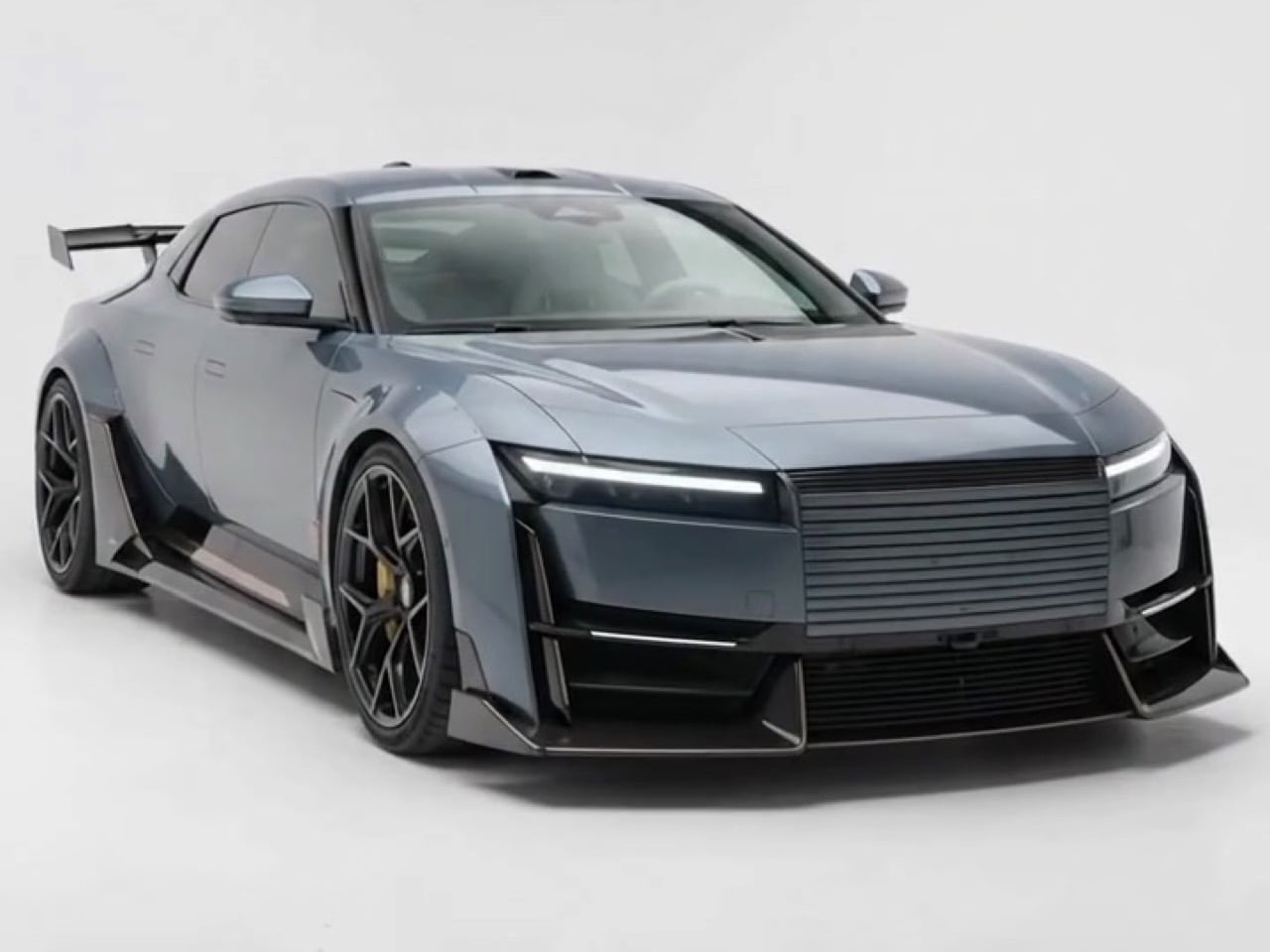
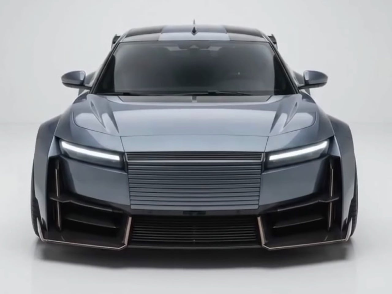
Carbon Noir’s Type 01 Sports Edition concept is the cure, and it works almost entirely by editing. The slatted front panel stays but now sits inside a black carbon surround that ties it to the headlights, so the nose reads as one band instead of a box stuck on a face. A lower stance, stepped overfenders, and open black wheels with gold calipers fix the proportions, and the blue-gray paint helps the carbon trim blend in. Out back, a red light bar carrying the JAGUAR wordmark, a finned diffuser, and a big pedestal wing give the tail something to do. Everything recognizable from Tuesday’s car is still there, just dressed for dinner.

Designer: Carbon Noir

Why the stock Type 01 looks blank from the side
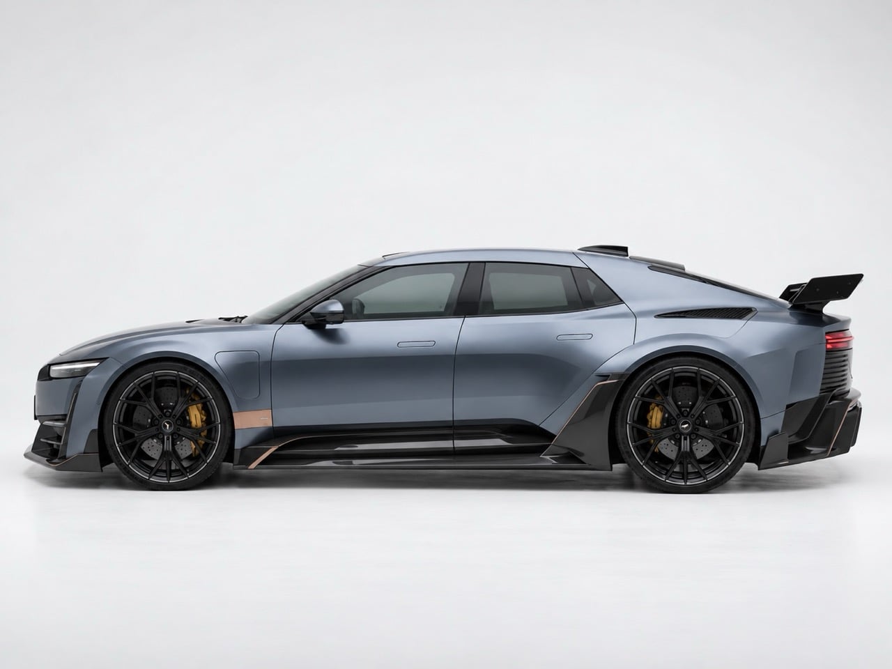
Stretch a tape measure along the Type 01 and you get about 17 feet (5.2m) of car that stands only around 4.6 feet (1.4m) tall, according to Autocar. Almost all of that length is a single satin silver slab from sill to shoulder, interrupted by a charge flap and a pair of flush door handles. A strip of bronze sits low on the door, and it is the only thing out there that looks like a design decision. The car rolls on 23-inch wheels, yet the flat turbine-style covers read as gray discs from any distance. A wheel that size should look like jewelry, and these look like dinner plates.

Hagerty reports that the production car came first and the Type 00 concept was developed from it, so those slab sides are the design rather than something watered down on the way to the showroom. Jaguar has a rear three-quarter pressing it calls the Impossible Panel, where the aluminum is formed across five planes with three feature lines meeting at a single point. That is serious metalwork, and in a flat satin finish it is hard to appreciate. Panels that clever deserve some shadows to play with. A body kit happens to be a shadow delivery system.

Stance, wheels, and a nose with a point of view
Lowering the car and wrapping each tire in a stepped overfender does more work than any wing. The factory car has a visible gap between tire and arch, so the body seems to float above its wheels. Carbon Noir closes that gap, and the fenders flare out in layers that finally give the long flank a rhythm. Open black wheels with gold calipers replace the flat covers, and suddenly the wheels look as big as they are. The dark blue-gray paint pulls the carbon into the body, so the trim looks grown rather than glued on.

Tiered carbon canards stack up the lower bumper, and their edges pick up the same bronze tone as the strip on Jaguar’s door. That is a smart little callback, since it turns one stray detail on the stock car into a theme for the whole kit. A pair of sculpted vents also cut into the hood, which is dead flat on the factory car. Together they give the face a head-down, ready-to-pounce posture, which seems fair for something named after a big cat. The slats stay, the headlamps stay, and the Jaguar-ness survives the surgery.

A tail with a wing, and what Jaguar could borrow
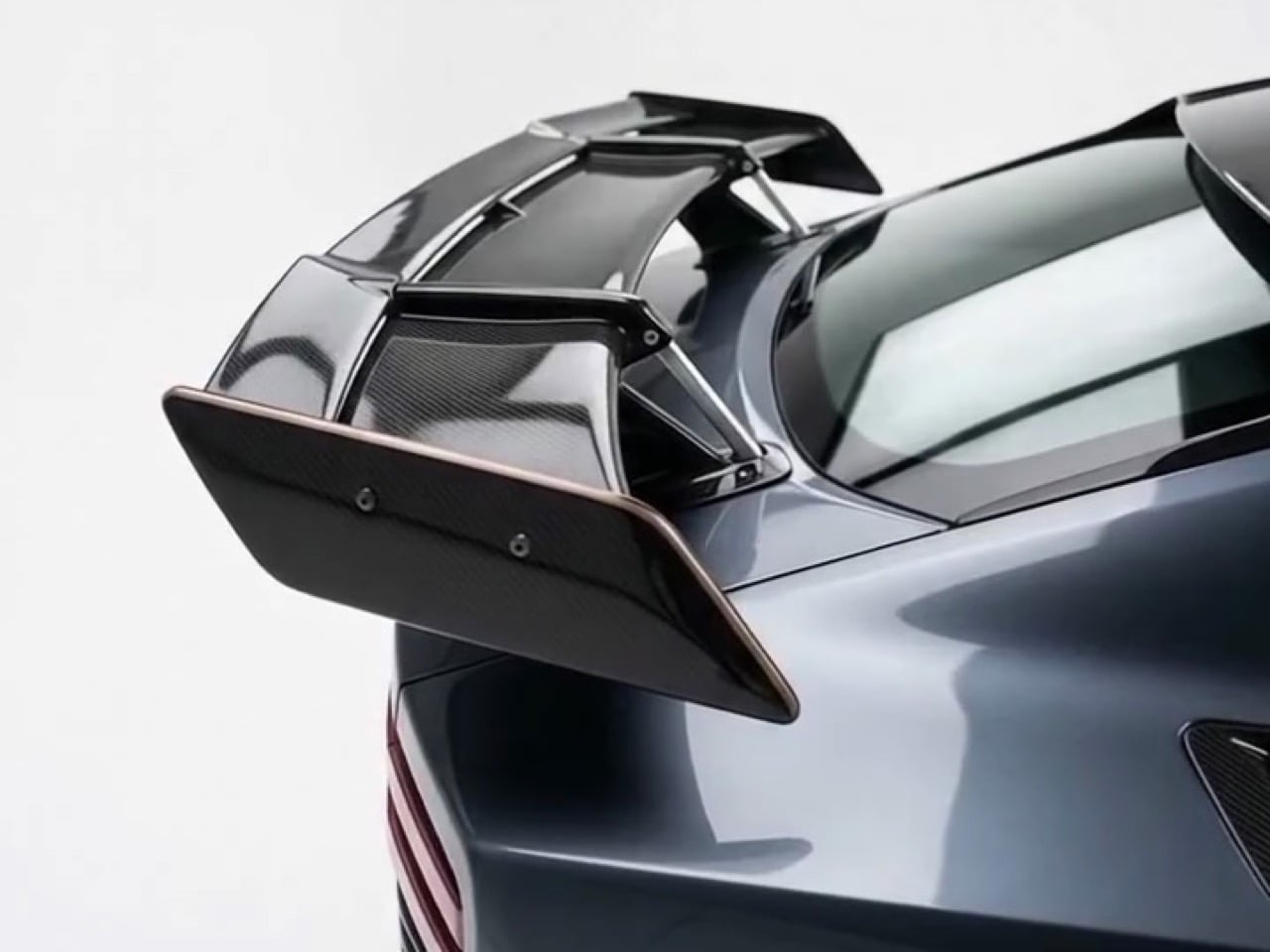
The factory tail is one uninterrupted surface, with bright slats edge to edge, a black band below, and a plate floating in the middle. Carbon Noir splits it into zones. A red light bar with the JAGUAR wordmark crowns the slats, a finned diffuser anchors the bottom, and a pedestal wing perches on the deck like a tray on a butler’s arm. A wing that size would look silly on a small car, but a 17-foot GT has the deck space to carry it. Copper trim traces the diffuser edges too, which keeps the back tied to that door strip.

Carbon Noir is the designer who gave India’s auto rickshaw a Renault-style electric makeover a few weeks ago, so jumping from a three-wheeler to a $130,500 British GT is quite the commute. Both projects show an eye for the shape already hiding inside a design. Managing director Rawdon Glover told Robb Report that more than 50,000 people have registered interest and 78 percent are new to Jaguar. Newcomers spending six figures will probably notice what the stock car leaves unfinished. Orders open in early 2027, which leaves Jaguar plenty of time to scroll Instagram. Jaguar gave us the radio, and Carbon Noir added the subwoofer.
The post Someone Fixed Jaguar’s Type 01 With An Aggressive Sports Body Kit first appeared on Yanko Design.
Jaguar’s Rebranding feels ‘Confusingly Generic’ as the Luxury Carmaker Announces New Visual Identity

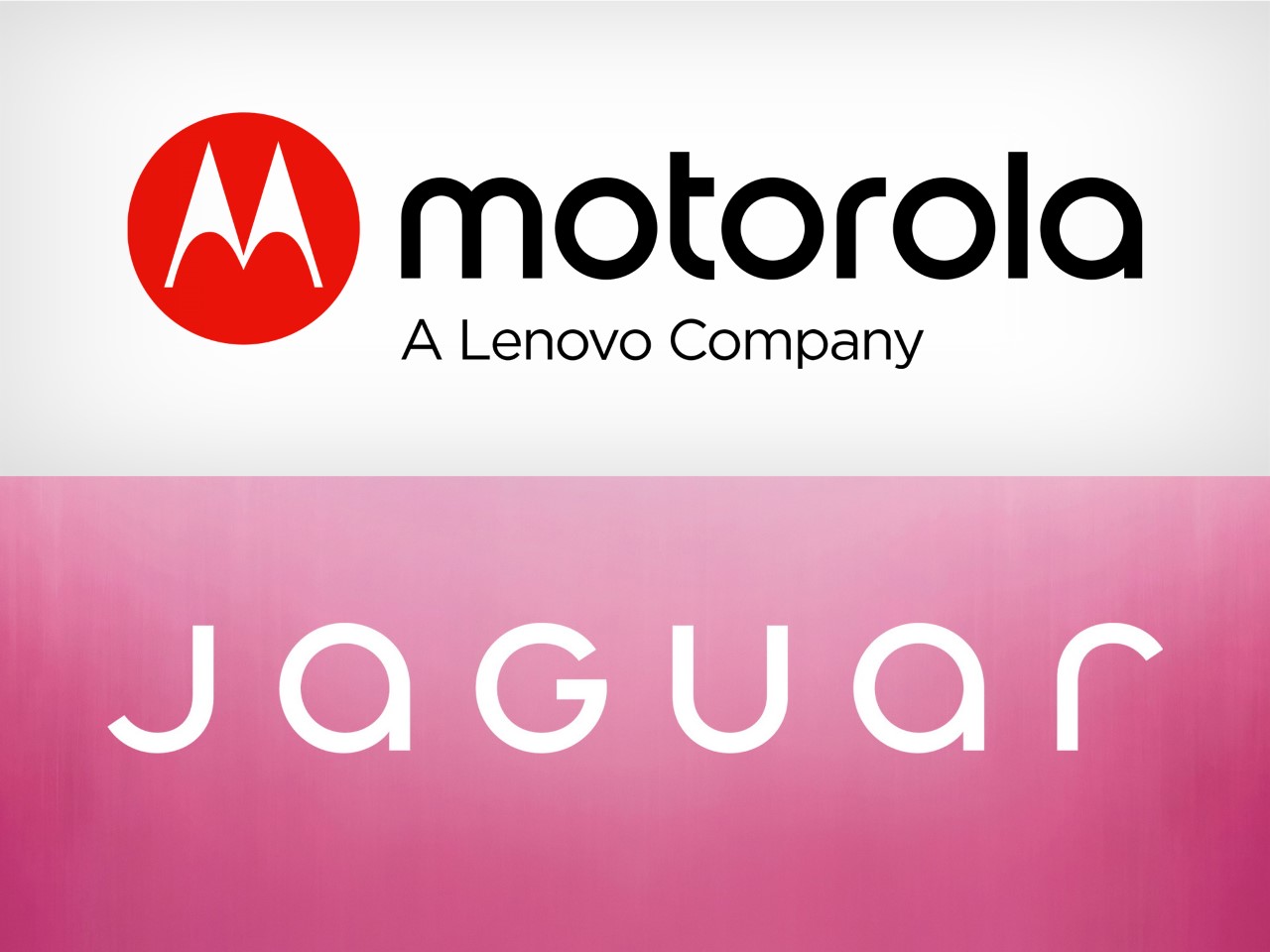
The new logotype, which looks indistinguishable from the Motorola font, makes the Jaguar feel ‘toothless’.

I didn’t have a Jaguar rebrand in my 2024 bingo cards, but honestly, this year has been curveball after curveball, hasn’t it? The British luxury automobile brand just unveiled its rebranding, characterized by 4 new elements that make up Jaguar’s fresh look to usher in its EV-only push. The new branding orbits around four meticulously designed elements.

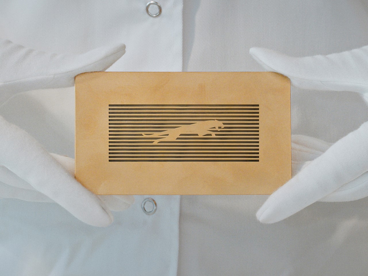
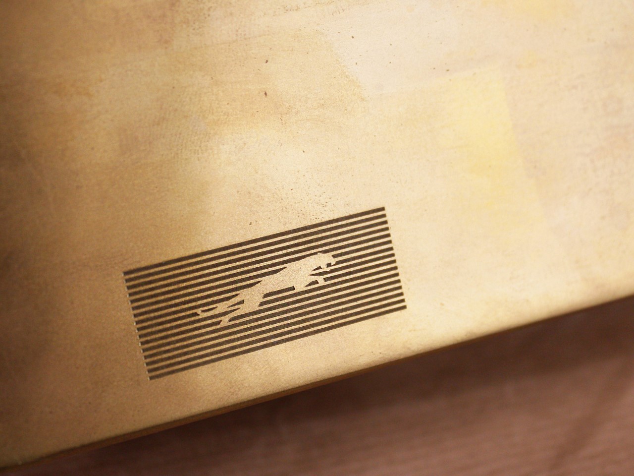
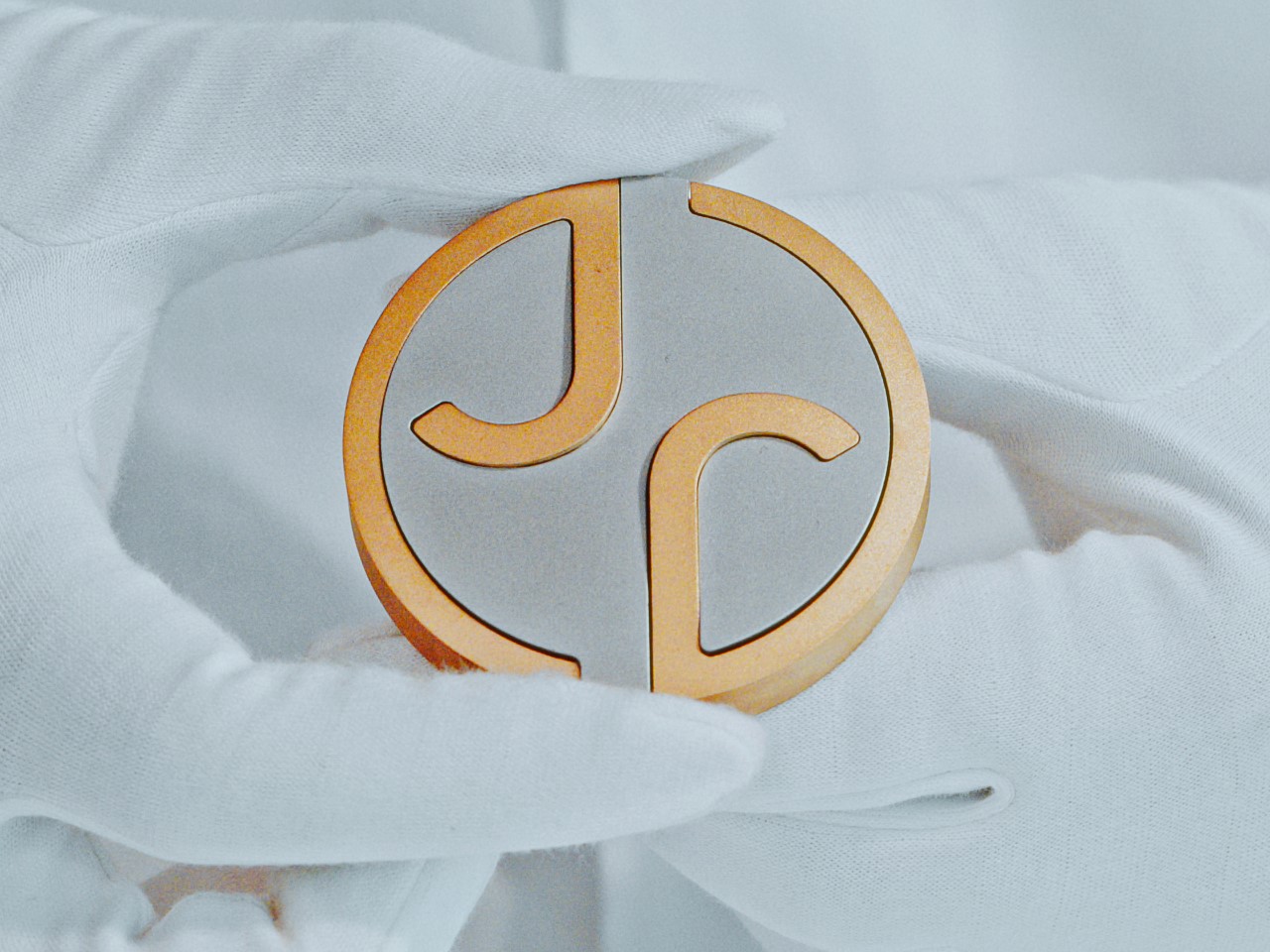
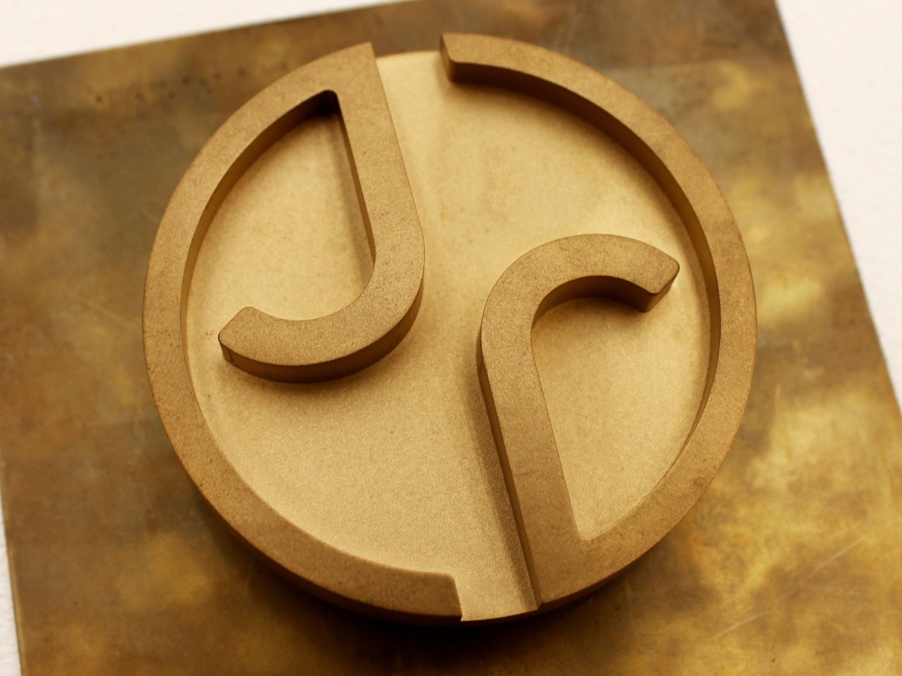
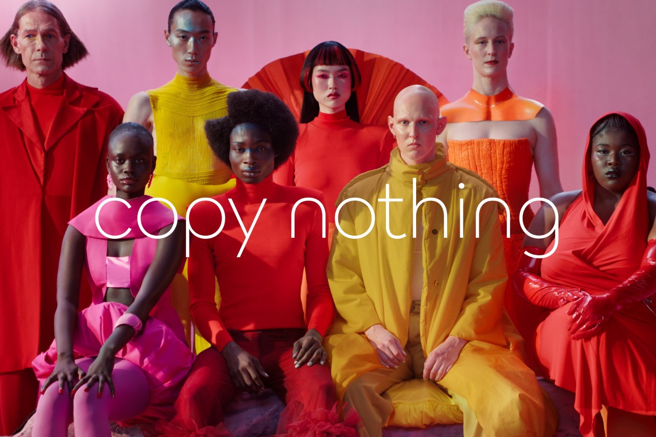
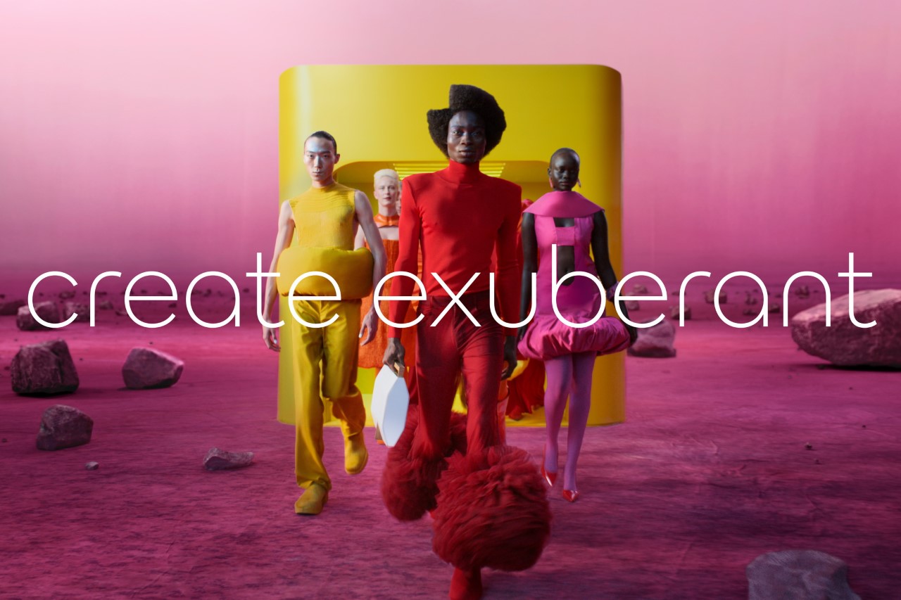
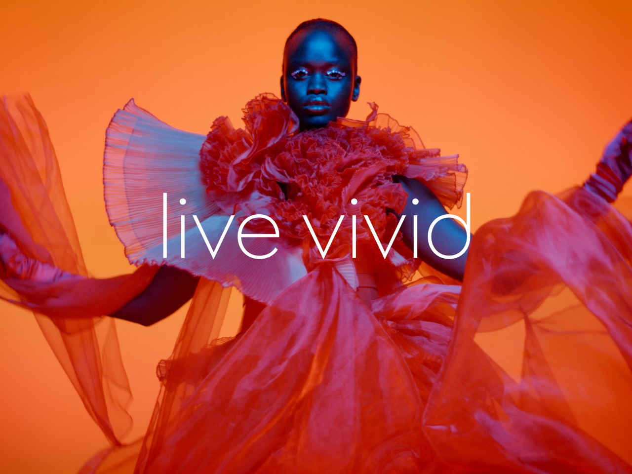
First is the “Device Mark,” a logo stripped of excess yet bold in its restraint. Its symmetry hints at balance—a nod, perhaps, to the duality of tradition and innovation Jaguar aims to master. Then there’s the “Strikethrough,” a graphic motif that almost slices through the air with modernity, destined to carve a permanent space in Jaguar’s visual lexicon. The “Exuberant Colors” go even further, injecting vibrancy and connecting the brand to the artistic world. Finally, the “Makers Marks”—a duo of the traditional leaper emblem and a sleek monogram—grounds the brand in its storied history while letting its typography flirt with the contemporary.

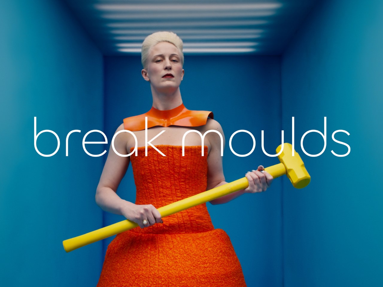
Jaguar’s Chief Creative Officer, Professor Gerry McGovern, frames this shift as a reclamation of identity. This is a reimagining that recaptures the essence of Jaguar, returning it to the values that once made it so loved, but making it relevant for a contemporary audience,” he says. The implication (given the assets shared by Jaguar) hints at the company viewing themselves as less of a car brand and more of a luxury brand. The exuberant colors of the campaign imagery look like something out of a fashion magazine, which fails to address the most important part of Jaguar’s brand – its automotive part. In fact, none of the images even have a car in them, or hint at anything car-related.

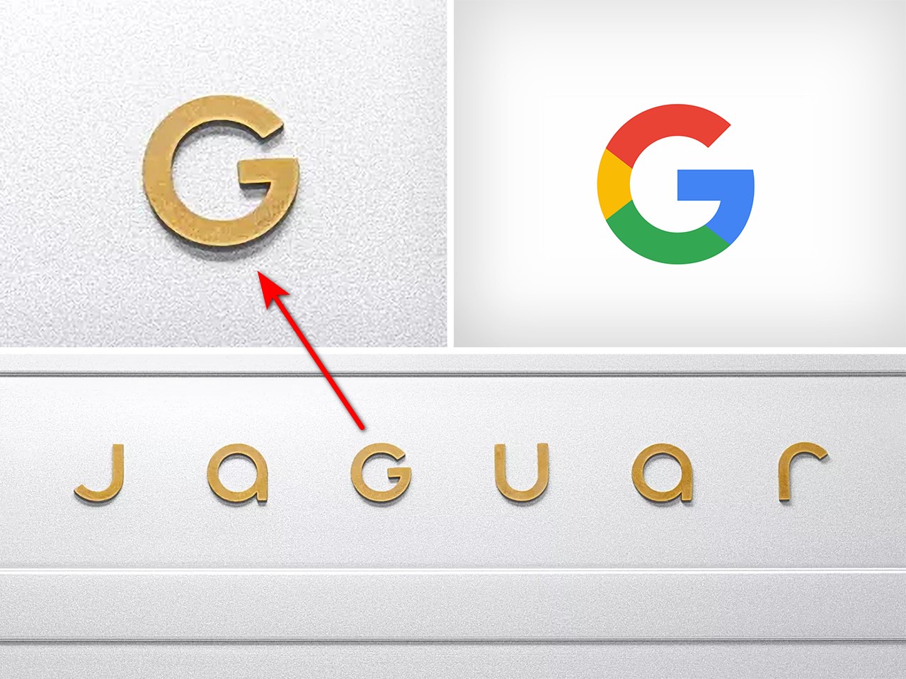
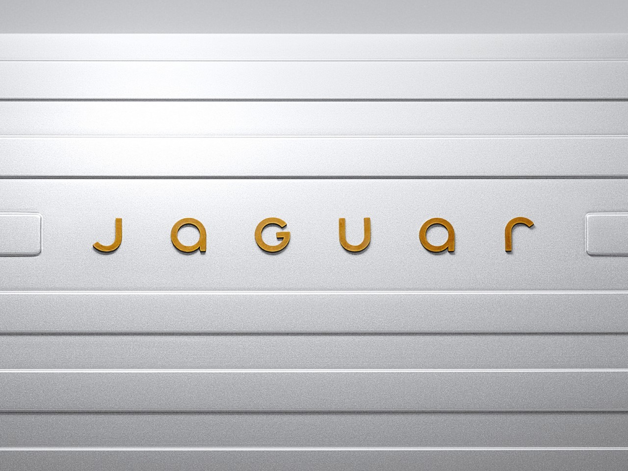
The new logotype opts for a curved, sans-serif font that ditches Jaguar’s original aesthetic entirely. It’s somewhat ironic that Jaguar brings up a quote by its founder, Sir William Lyons who said “A Jaguar should be a copy of nothing,” when the logo instantly appears generic or ‘seen before’. The Device Mark tries to create a difference by boldly eschewing the branding styles of automotive companies; but in doing so, falls into the trap of feeling familiar, and not the good kind. The font somewhat resembles the logotype of Motorola, with the Jaguar’s G looking vaguely like Google’s G.

Obviously, my opinions are broadly my own, but show the logotype to someone completely new to the automotive world and they’re least likely to guess it belongs to a company that made something as ferociously fast as the F-Type. The Strikethrough gets a subtle yet significant change, however, with the jaguar being flipped to face towards the right instead of the left. A little easier to grasp as an outsider, this change does two things – it differentiates Jaguar from Puma, which both had left-facing feline logos, and secondly, it makes the jungle cat look like it’s lunging forward instead of backward. The lines of the strikethrough don’t provide much of an explanation for their presence, although they could at least bend around the Jaguar to make it look like a wind tunnel test.

Overall, the branding feels drastic, confusing, and outright rejects everything the British marque built over the past 102 years. It isn’t like Audi’s rebrand from last week, which meaningfully announced a new collaborative EV line exclusive to its China marketplace while still retaining the four-logo identity for the global brand. This rebrand on Jaguar’s part doesn’t explain much, especially when there’s no actual context in the picture.

The car company hasn’t announced any new cars that go with the branding, making the logo and visual identity feel confusing. The Device Mark presents a strange mashup of Motorola and Google, the Strikethrough creates ‘grills’ that famously don’t feature on EVs, the Makers Mark looks appealing but lacks any context, and the Exuberant Colors (the posters shown below) have absolutely zero reference to cars at all.

Jaguar’s campaign imagery mentions nothing about automobiles. There isn’t a car to be seen in any of the posters.

I don’t want to discount Jaguar’s efforts with its rebrand – let’s just say they probably know something I don’t. My opinions aside (even though they’re rather strong), Jaguar’s new identity comes just days before the company unveils the Jaguar Design Vision Concept – a conceptual automobile that serves as a guiding point for the carmaker’s future endeavors. With a commitment to launch a completely new slew of all-electric vehicles by the end of the decade, Jaguar is hoping the rebrand performs a ‘complete reset’ according to Managing Director Rawdon Glover.

History, at least, is on Jaguar’s side. The brand has repeatedly proven its ability to adapt and evolve, from the sleek lines of the E-Type to the modern flair of the I-PACE. This latest transformation is timed perfectly, albeit with the stakes turned up to eleven. Yet, reinvention always comes with risks. Will this new identity alienate loyalists who cherish Jaguar’s old-world charm? Can the brand authentically straddle the line between exclusivity and accessibility, artistry and practicality? These are the big questions Jaguar faces, and they’ll only be answered as its plans unfold in the years to come.

The post Jaguar’s Rebranding feels ‘Confusingly Generic’ as the Luxury Carmaker Announces New Visual Identity first appeared on Yanko Design.