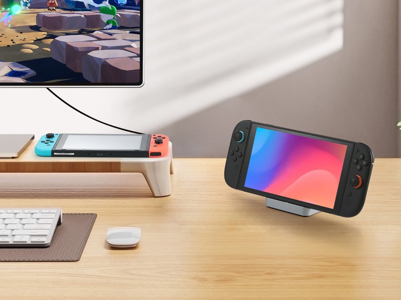
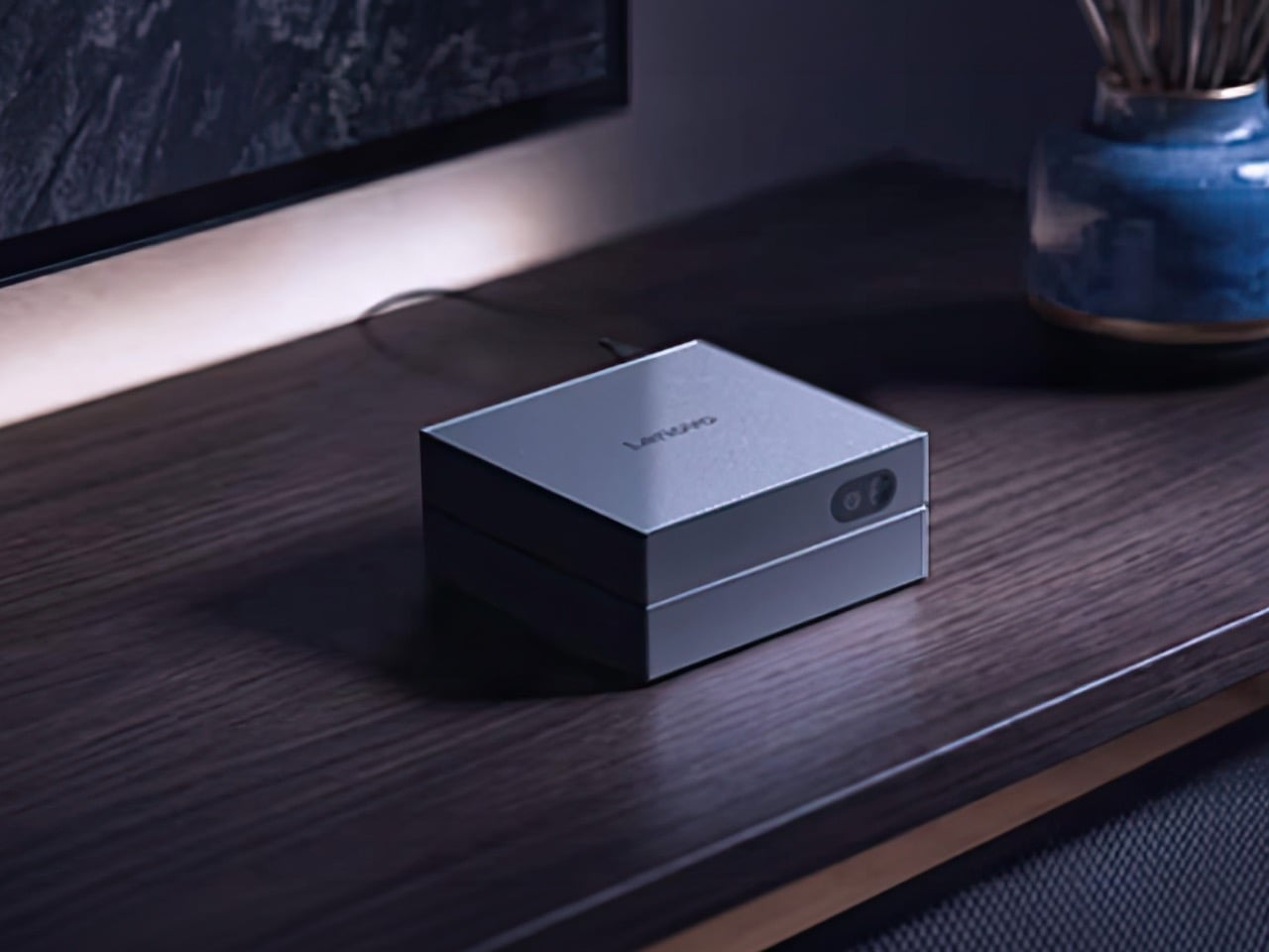
Nintendo invented a magic trick in 2017 and most of the industry still hasn’t figured out how to copy it properly. Slide the Switch out of its dock and you have a handheld; slam it back in and the same console inherits your television instantly, no cables to fumble, no menu to chase. The PSP never had that option, the Vita barely attempted it, and even the Steam Deck treats docking like an afterthought rather than a core feature. The trick only really works at home though, since Nintendo’s official dock weighs 383 grams and behaves more like furniture than a travel companion. GuliKit apparently noticed that gap and decided the magic trick deserved to leave the house.
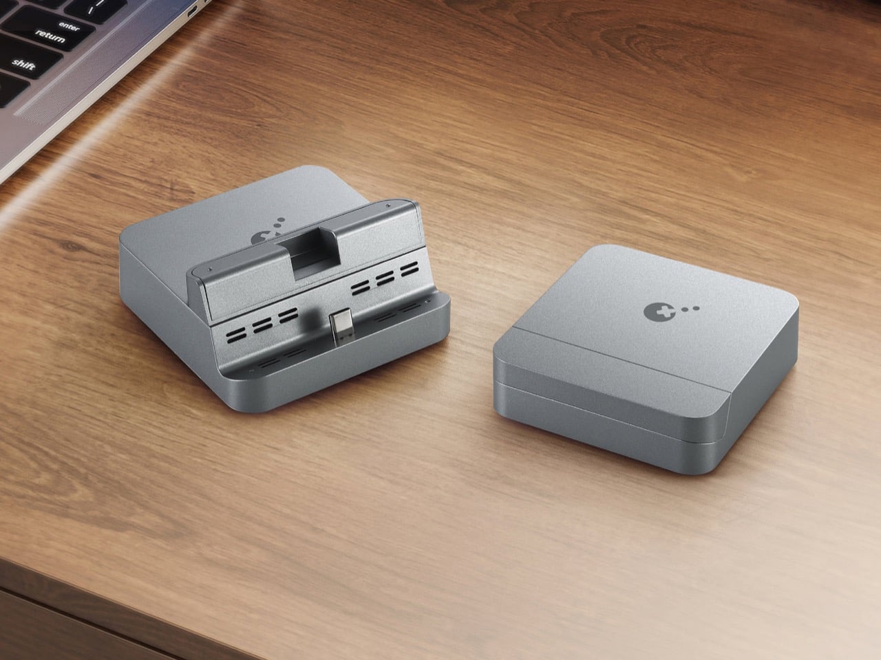
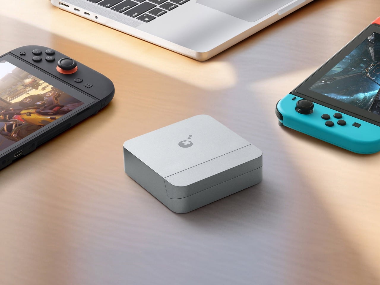
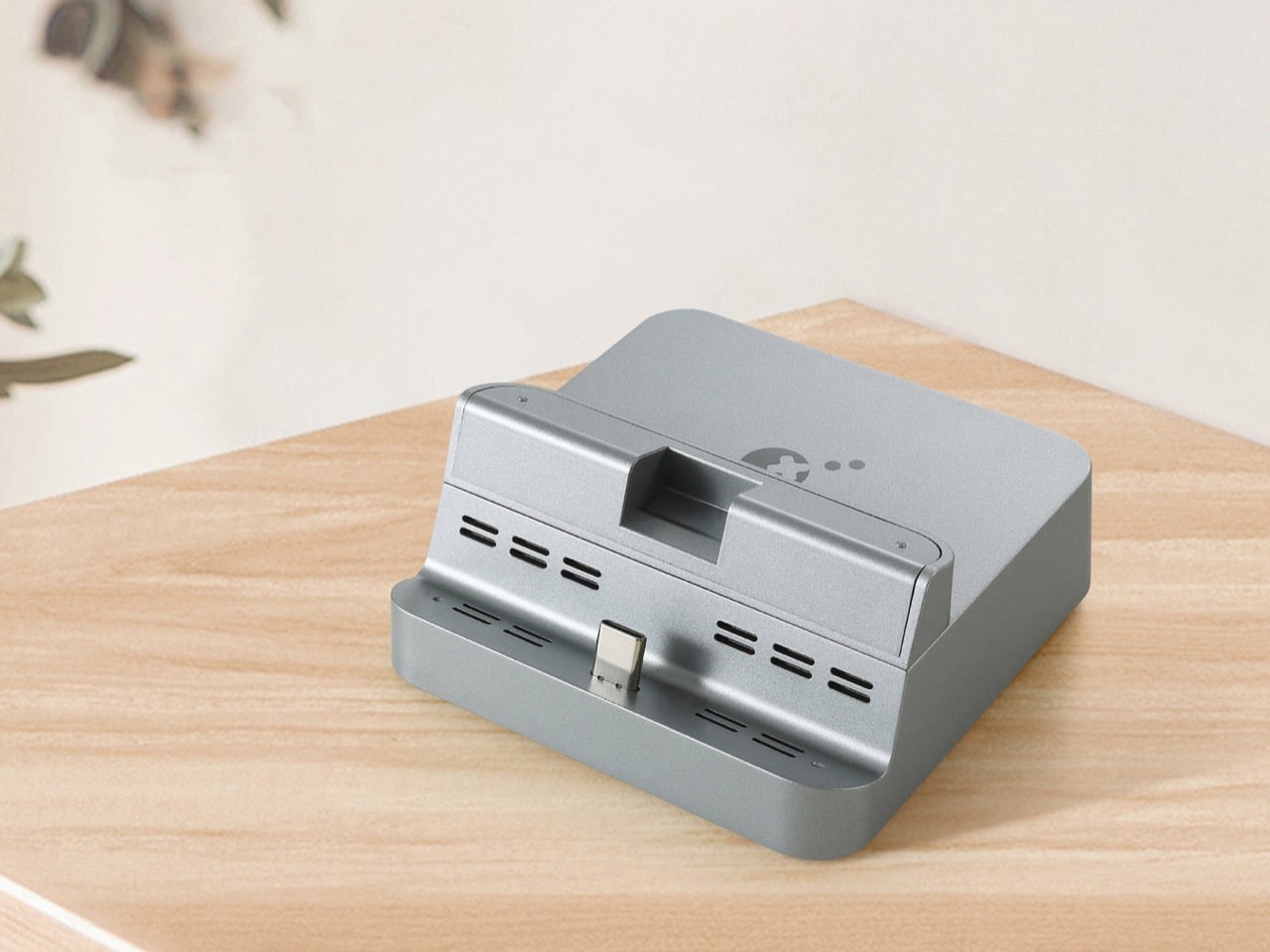
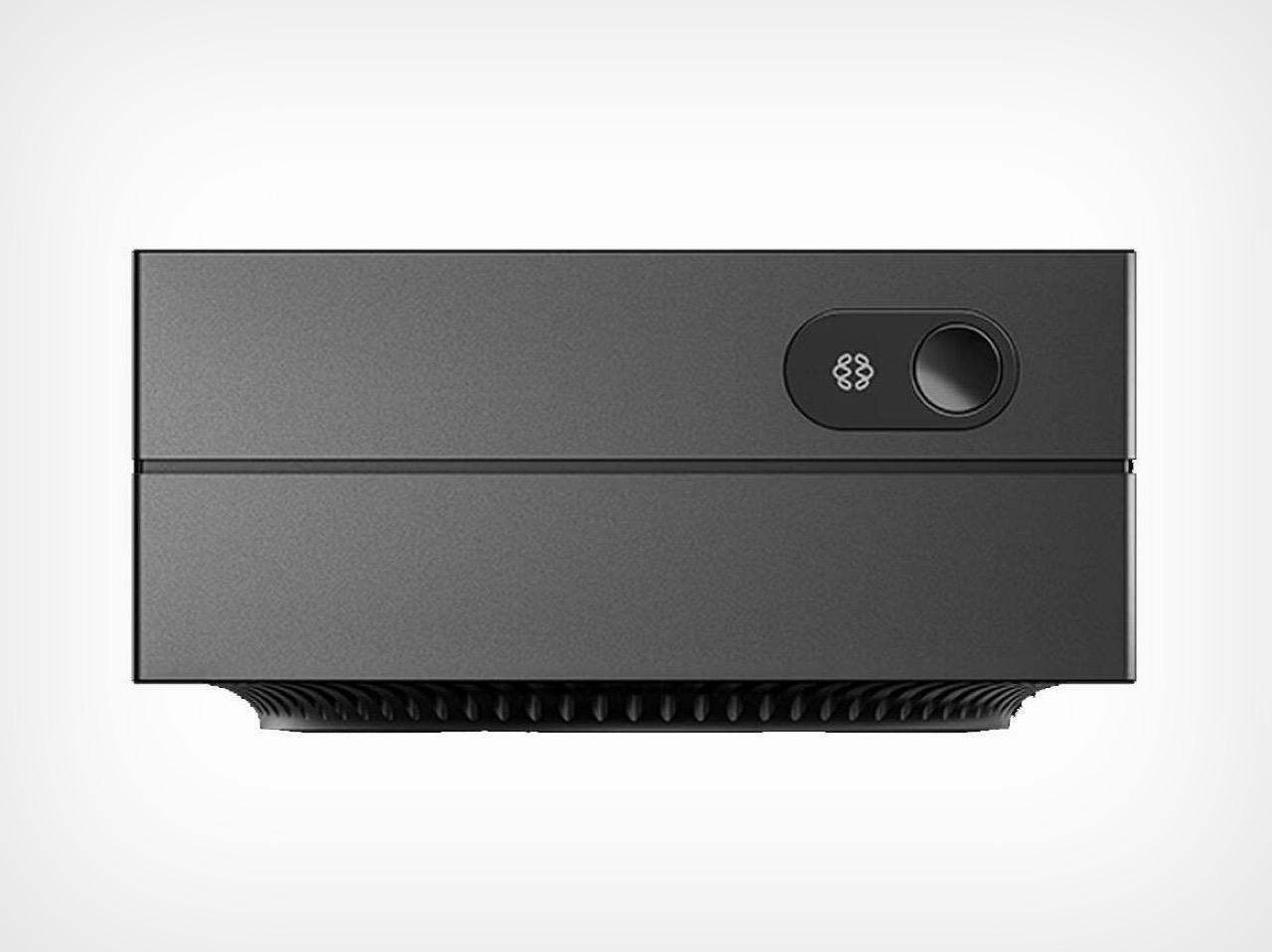
GuliKit’s answer ships as a dock measuring 8.6 centimeters per side and weighing 105 grams, light enough to disappear into a backpack pocket built for cables. A flap on the back conceals the USB-C input and the ventilation slots, keeping dust out whether the dock spends its time in an airport tray or a gravel campsite. Around back, three ports cover the essentials, USB-C for power, USB-A for accessories, and HDMI supporting 4K at 60 frames per second with HDR and ALLM for responsive play on a real television. A built-in slider shifts the connector across three depths, so the dock still clicks home even through a protective case. It costs $29.99, works across the original Switch, the OLED model, and the Switch 2, and skips only the Lite, which never had video output to dock in the first place.
The shell reads more workstation accessory than gaming peripheral, a gray aluminum block with chamfered edges and no visible screws you’d see. That visual DNA puts it closer to a Satechi hub than the black plastic boxes usually parked next to a Steam Deck. GuliKit splits the unit into two volumes instead of one, a slim cradle for the console and a separate base for power delivery, mirroring how premium charging stands separate function from form. The dust flap over the USB-C input and vents gives away the real design brief, built to survive a backpack bottom rather than a coffee table. Restraint like that is rare at this price.
At $29.99, the GuliKit Dock undercuts most third party Switch accessories that bother with full 4K HDMI output, a category that often charges twice as much for less portability. The official Nintendo dock remains the most reliable option, but it was never built for travel, and most owners leave it permanently wired to a television. Compare that to the Steam Deck ecosystem, where Valve sells a dock separately and third parties have flooded the gap with everything from docking stations to cheap HDMI dongles. GuliKit’s bet centers on size rather than price, wagering that portability is what travelers actually want. Judging by the spec sheet, that bet looks well placed.
The GuliKit Dock’s real significance has less to do with its spec sheet and more to do with the signal it sends to accessory makers still treating Switch docks as an afterthought. Nintendo built a console that promises gaming anywhere, and for eight years the dock has been the one piece of hardware that broke that promise the moment you left the house. A 105 gram aluminum block won’t replace the official dock for a permanent setup, nor should it try to. But for anyone who has shoved the official dock into a suitcase and regretted it, this finally treats portability as a feature. If the experiment sells, expect the market to notice.
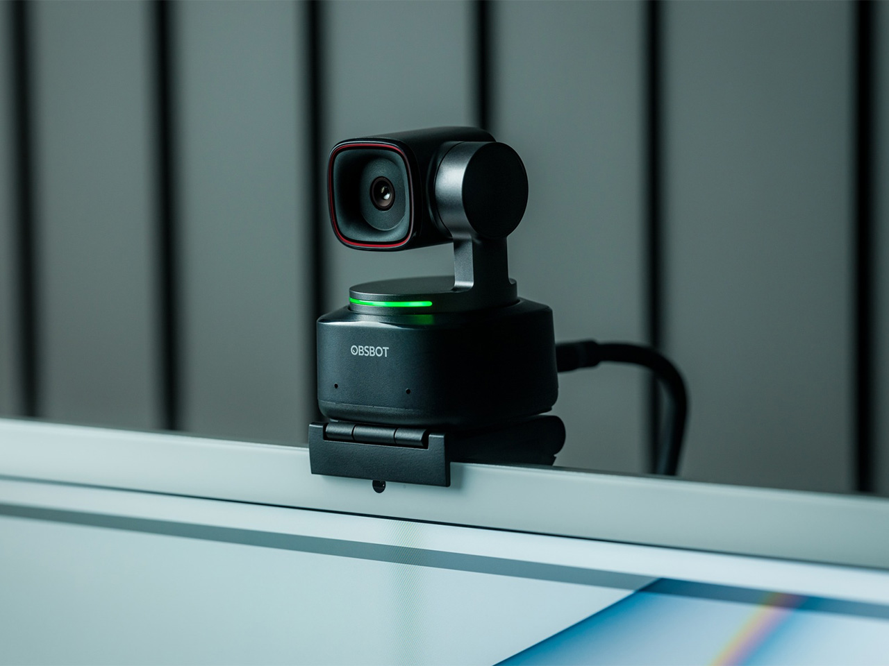
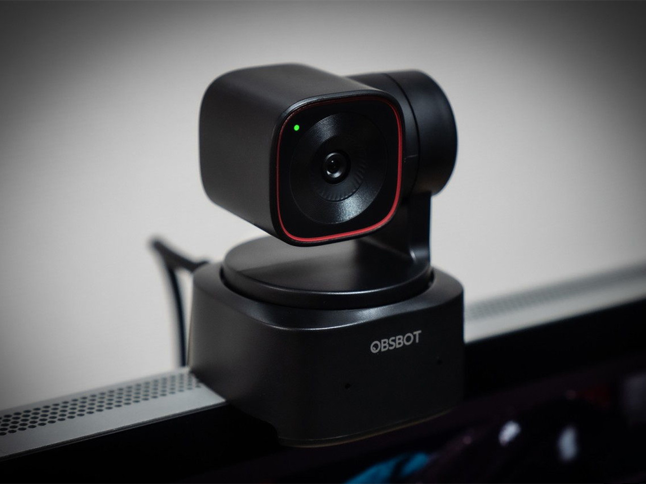
There is a camera brand that has shown up at International Broadcasting Conference, partnered with the Esports World Cup as an official camera provider, earned Editor’s Choice awards from music and DJ publications, and landed in the desk setups of remote workers, streamers, worship AV teams, and solo creators, all while keeping a relatively low profile compared to the legacy names in the category. OBSBOT, founded in 2016, has built its reputation the way durable hardware brands tend to: by making things that keep working, and keep getting better. Reviewers have consistently noted that firmware updates meaningfully improve OBSBOT cameras after purchase, which is a rarer quality in hardware than it should be.
Prime Day 2026 will put seven OBSBOT cameras on sale simultaneously, running through June 29 across Amazon and the OBSBOT official store. The lineup covers three distinct use cases: the Meet series for plug-and-play video calls and casual streaming, the Tiny series for creators and hybrid workers who want PTZ tracking at their desk, and the Tail 2 for anyone running a live production setup that used to require a full crew. The discounts range from around 15% on the newer Tiny 3 series to over 30% on the Tiny 2, which arrives at a price point that has not been seen before. Discounts hit on June 23rd – here is the full breakdown.
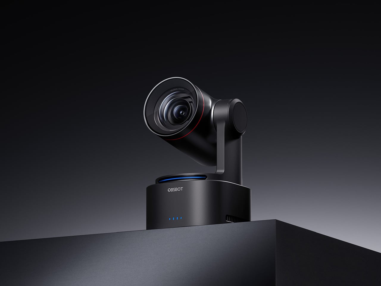
OBSBOT Tail 2 ($1088) – The AI Camera That Puts a Production Crew on Your Tripod
The OBSBOT Tail 2 is what happens when a camera is designed to solve the most persistent problem in solo and small-team video production: the need for a human operator. This is the company’s flagship live production camera, built around an advanced AI tracking system and a three-axis gimbal that does more than just pan and tilt. It is the world’s first PTZR (Pan-Tilt-Zoom-Roll) camera, with the Roll being a new game-changing feature that allows the entire lens and sensor assembly to rotate 90 degrees. This delivers true, uncropped vertical video, a clever piece of engineering that makes it immediately relevant for anyone creating content for mobile-first platforms. It pairs that mechanical intelligence with serious imaging hardware, including a large 1/1.5-inch CMOS sensor, a 5x optical zoom, and the ability to capture sharp 4K footage at a fluid 60 frames per second.
What separates the Tail 2 from a high-end webcam is how it fits into a professional workflow. It comes equipped with a full suite of broadcast-standard ports, including NDI, SDI, HDMI, and Ethernet, allowing it to integrate directly with live switching hardware and streaming software with minimal latency. For solo operators, the system works with gesture controls for hands-free adjustments, and a dedicated app provides granular remote control over framing and movement. This combination of broadcast-grade connectivity and intelligent automation is what makes the Tail 2 so versatile. It is equally at home as the primary camera for a DJ’s live stream, a dynamic tracking camera for a church service, or part of a multi-camera setup for a corporate event.
Why We Recommend
At its core, the Tail 2 is an investment in workflow efficiency. Tech reviewers have consistently framed it as a tool that can pay for itself, replacing the cost and complexity of hiring a camera operator for recurring shoots. The Prime Day discount reinforces that value proposition, knocking $200 off the price and bringing the non-NDI version down to $999. Breaking the thousand-dollar barrier is significant, shifting the Tail 2 from a niche professional tool to a much more accessible option for serious creators, small businesses, and organizations looking to upgrade their production quality. For anyone who needs cinematic, automated camera movement without a dedicated crew, this is the camera to get.
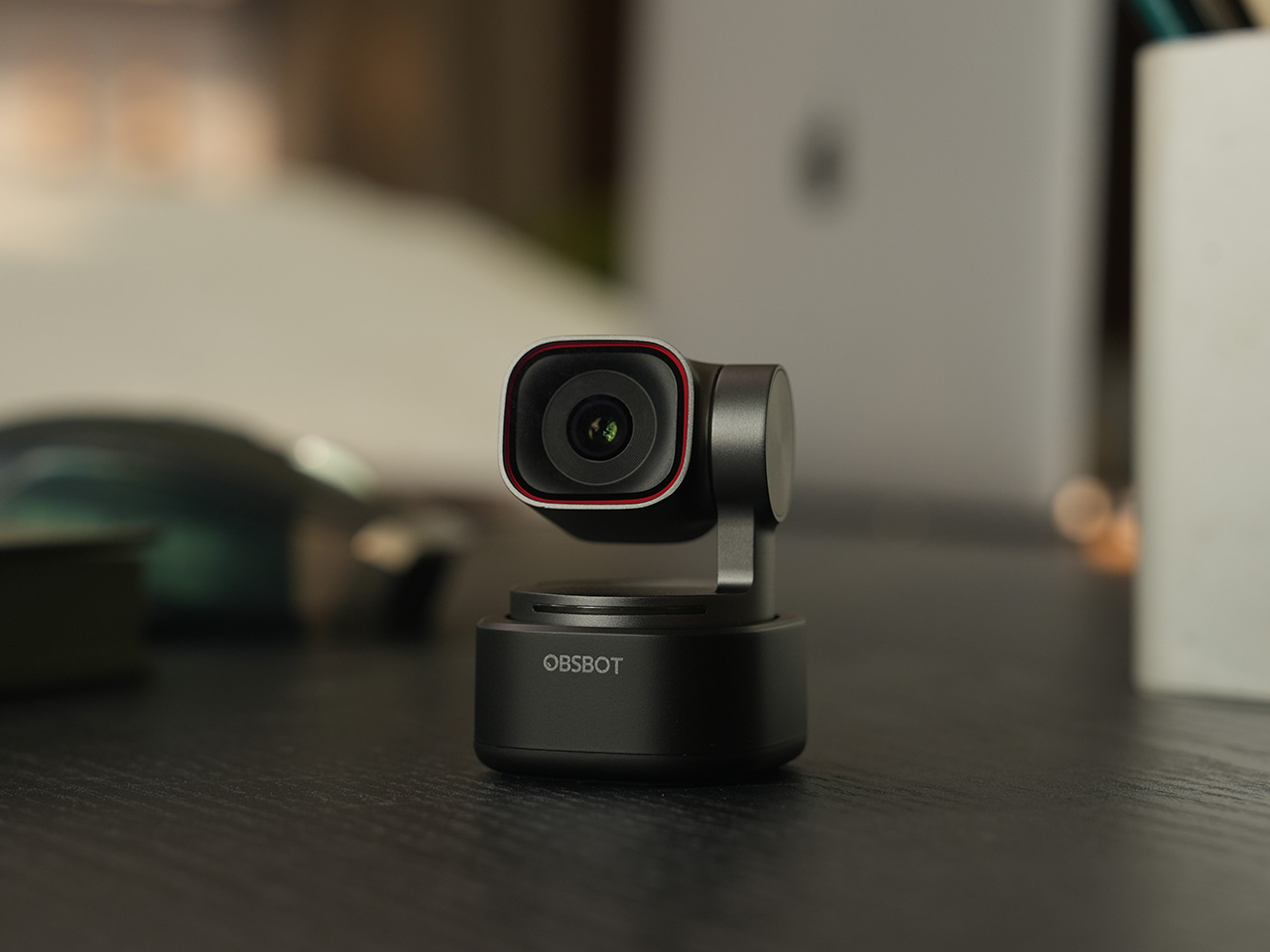
OBSBOT Tiny 3 ($296) – A Palm-Sized PTZ Camera with Full-Sized Ambition
The OBSBOT Tiny 3 is the company’s answer to a simple question: how much professional-grade technology can you fit into a webcam that is smaller than a cup of coffee? The answer, it turns out, is quite a lot. This is the flagship of the Tiny series, designed for creators and hybrid workers who want the absolute best imaging and tracking performance in a desk-friendly format. It starts with a massive 1/1.28-inch CMOS sensor, which is exceptionally large for a webcam and allows it to capture more light for a cleaner, more detailed 4K image. That sensor is paired with a pan-tilt-zoom system that moves with near-silent precision, keeping the subject perfectly framed.
Where the Tiny 3 really shows its intelligence is in the software and processing that drive its hardware. It inherits the refined AI Tracking 2.0 from the larger Tail 2, making its auto-framing and subject tracking remarkably smooth and reliable. It also features Gesture Control 2.0, allowing users to manage zoom and tracking with simple hand signals, a feature that feels genuinely useful in practice. For streamers and power users, the native integration with Elgato’s Stream Deck is a critical addition, bringing PTZ controls directly into their existing workflow. OBSBOT even added creative tools like virtual avatars and improved the audio with a five-mode stereo microphone system, rounding out a feature set that feels both powerful and polished.
Why We Recommend
The Tiny 3 is the pick for anyone who prioritizes having the latest and most refined technology on their desk. While other models in the lineup offer steeper discounts, the Prime Day price drop brings this premium, current-generation flagship under the $300 mark. This is the camera for the user who wants the best sensor, the most advanced AI tracking, and the tightest software integration OBSBOT offers in a webcam. It represents the peak of the Tiny series, and this is the most affordable it has been since its launch.
OBSBOT Tiny 3 Lite ($169) – The Same Intelligence with a Focus on Value
For many users, the appeal of the flagship Tiny 3 lies in its advanced AI brain, not necessarily its top-of-the-line sensor. OBSBOT created the Tiny 3 Lite for exactly that audience. This camera is built on the same intelligent foundation as its more expensive sibling, delivering the same seamless AI Tracking 2.0, responsive Gesture Control 2.0, and sharp 4K resolution. It is, for all practical purposes, the same smart user experience. The key difference, and the reason for its more accessible price, is the move to a slightly smaller 1/2-inch CMOS sensor. This strategic trade-off makes the Tiny 3 Lite an incredibly compelling option for anyone who works in a space with reasonably good lighting.
In practice, the Tiny 3 Lite feels nearly identical to the flagship during everyday use. It keeps you perfectly in frame during video calls, responds to hand gestures to zoom in on a whiteboard, and integrates with the same powerful OBSBOT software suite, including Stream Deck support. It also features a slightly different physical design with an integrated stand, making it incredibly simple to set up on any monitor or desk. By preserving the core software and AI features that define the Tiny 3 experience, OBSBOT has distilled the product down to its most important essentials, creating a camera that performs well above its price point.
Why We Recommend
The Tiny 3 Lite is the pragmatic choice in the Tiny 3 series. It offers access to OBSBOT’s latest-generation AI tracking and software ecosystem for a fraction of the flagship’s cost. The Prime Day deal, which brings the price down to $169, makes it one of the best values in the entire lineup for a current-generation product. If you want the smartest PTZ webcam on the market but do not need the absolute best low-light performance that the Tiny 3’s larger sensor provides, the Lite version is the smarter purchase. It delivers the features that matter most without the premium price tag.
OBSBOT Tiny 2 ($229) – The Champion Webcam Now Available at Under $250
Before the Tiny 3 arrived, the Tiny 2 was OBSBOT’s undisputed flagship desk camera, and it remains a formidable piece of hardware. This is the camera that set the standard for what a premium AI webcam could be, pairing a huge 1/1.5-inch CMOS sensor with exceptionally fast autofocus and reliable AI tracking. That large sensor is a critical detail, as it gives the Tiny 2 excellent low-light capabilities and a natural depth of field that rivals even some of the newer models in the lineup. It established the features that now define the Tiny series, including effective auto-zoom, dynamic gesture controls, and even voice commands for a completely hands-free experience.
The Tiny 2 is a proven workhorse. It has benefited from years of firmware updates that have refined its performance, making it a stable and dependable choice for streamers, content creators, and professionals who need consistently great video. While it may not have every single new software feature from the Tiny 3 series, its core performance remains top-tier. The image quality from its large sensor and premium lens system is still a benchmark for the category, delivering a crisp, professional look that cheaper webcams simply cannot match. For many users, this level of raw performance is far more important than the latest software gimmicks.
Why We Recommend
This is arguably the single best deal of the entire Prime Day event. The Tiny 2 is seeing a massive price drop of $100, bringing it down to just $229, a discount of over 30% and its lowest price ever. This is a rare opportunity to get a former flagship product with a best-in-class sensor for the price of a mid-range webcam. For anyone prioritizing pure image quality over having the absolute newest model, the Tiny 2 offers a value proposition that is impossible to ignore. It is the smartest purchase for the performance-focused buyer.
OBSBOT Tiny 2 Lite ($129) – The Smartest Way to Get into AI-Powered PTZ
The OBSBOT Tiny 2 Lite takes the intelligent core of the celebrated Tiny 2 and packages it into an even more accessible and affordable design. This camera is built for the user who wants to step up from a static webcam to the world of AI-powered pan, tilt, and zoom without paying a premium. It delivers the essential features that made its bigger brother a success, including reliable AI tracking with auto-zoom, crisp 4K resolution, and multipurpose tracking modes that can follow a subject’s whole body or focus just on their head and shoulders. It is a streamlined experience focused entirely on delivering smart, automated framing.
While it does not have the same massive sensor as the standard Tiny 2, the Tiny 2 Lite still produces a clean, professional image that is a significant upgrade over nearly any built-in laptop camera or budget webcam. The real magic, however, is in the motion. For presenters, educators, or streamers who move around, the camera’s ability to smoothly follow them is a game-changer. It also includes useful features like preset PTZ positions, allowing users to instantly switch between a tight shot and a wide view with the press of a button, a function typically found on much more expensive hardware.
Why We Recommend
This is the ultimate entry point into intelligent webcams. With the Prime Day discount bringing its price down to just $129, the Tiny 2 Lite is in a class of its own. At that price, it competes with high-end static webcams while offering a full suite of AI and PTZ features that its rivals lack. For anyone who has been frustrated by fixed-frame cameras but felt priced out of the AI tracking market, this deal removes that barrier. It offers the most important features of the Tiny 2 generation at a cost that makes it an easy and obvious upgrade.
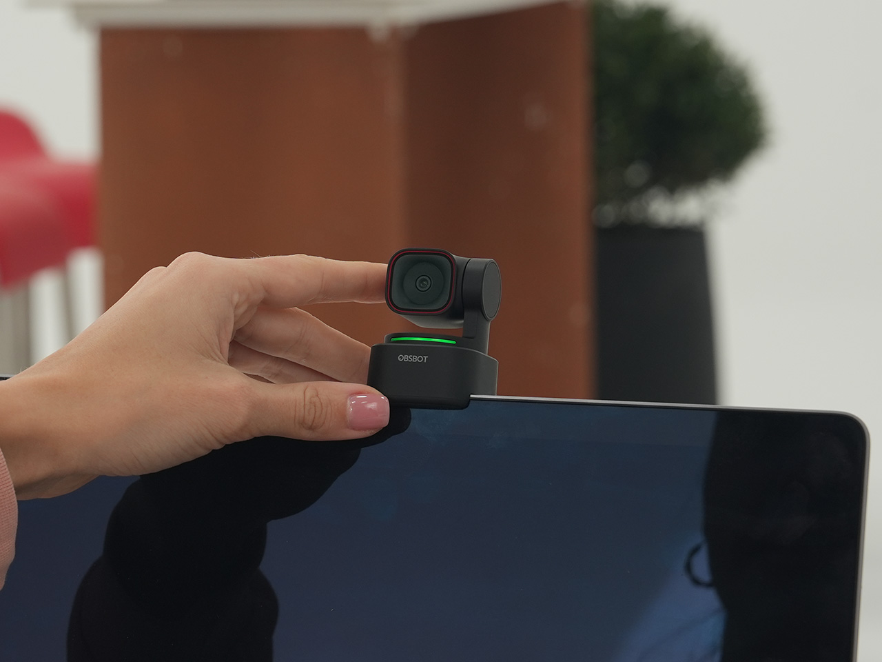
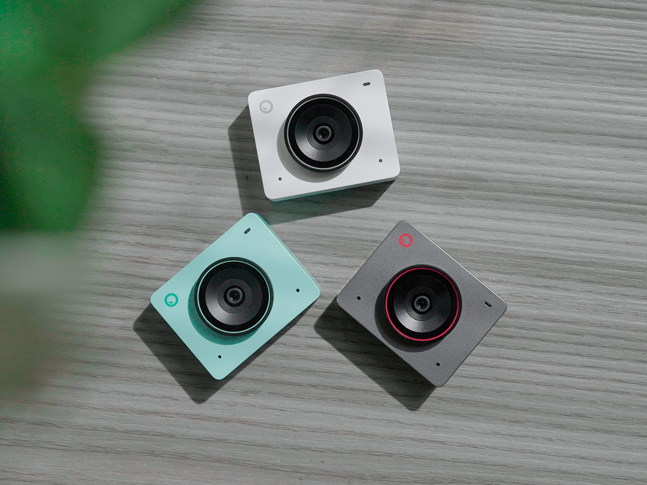
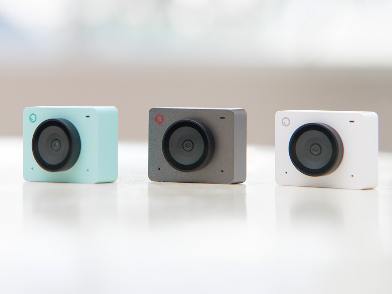
OBSBOT Meet 2 ($99) – The 4K Webcam That Makes Every Meeting Smarter
The OBSBOT Meet 2 is designed to solve a very specific, modern problem: making you look and sound as professional as possible on a video call with the least amount of effort. This is not a complex PTZ camera for creators; it is a sleek, intelligent webcam for the hybrid worker, the remote professional, and anyone who spends their day in virtual meetings. It delivers a sharp, vibrant 4K image at 30 frames per second, providing a significant leap in clarity over standard-issue laptop cameras. Its compact and lightweight design allows it to sit discreetly atop any monitor or laptop, instantly elevating the look of a desk setup.
The real intelligence of the Meet 2 lies in its automation. It features fast, reliable AI-powered auto-framing that keeps you perfectly centered in the shot, even if you shift or lean. It can also widen its frame to include a second person, making it ideal for small group meetings in a huddle room. This is paired with a fast autofocus system that keeps the image sharp and professional. The setup is pure plug-and-play; you connect it via USB, and it works seamlessly with Zoom, Microsoft Teams, Google Meet, and other major platforms without requiring any complicated software or drivers. It is designed to be an invisible upgrade that simply makes you look better.
Why We Recommend
The Meet 2 hits the sweet spot between performance and simplicity. It offers two of the most important features from high-end cameras, 4K resolution and AI auto-framing, in an accessible, user-friendly package. The Prime Day deal makes its value proposition even stronger, dropping the price to just $99. For under a hundred dollars, it provides a massive upgrade in video quality and intelligence for any professional. This is the ideal camera for anyone who wants to improve their virtual presence without adding the complexity of a PTZ system.
OBSBOT Meet SE ($58) – The Easiest and Most Affordable Upgrade for Any Setup
Sometimes, the best upgrade is the one you do not have to think about. The OBSBOT Meet SE is built on that principle. It takes the single most useful intelligent feature from its more expensive siblings, AI-powered auto-framing, and delivers it in a simple, incredibly affordable package. This camera is designed for anyone and everyone who is still using a basic, fixed-frame webcam and wants a better experience without any complexity. It captures clean, clear 1080p video and uses its AI brain to make sure you are always centered in the frame, looking professional and engaged.
The Meet SE is a masterclass in thoughtful, essentialist design. It is a true plug-and-play device that works the moment you connect it, with no drivers to install or complicated settings to configure. It even includes a physical privacy cover, a simple but crucial feature that provides peace of mind for remote workers and students. While its primary focus is on effortless video calls, OBSBOT also included a surprisingly capable 1/2.8-inch stacked CMOS sensor, which gives it better-than-expected image quality and even allows for high frame rate capture for smooth slow-motion effects, a rare bonus in a webcam at this price.
Why We Recommend
This is the definitive “no-brainer” upgrade. With its Prime Day price of just $58, the OBSBOT Meet SE is likely cheaper than the keyboard on your desk, yet it delivers a feature that was, until recently, reserved for premium cameras. It completely eliminates the problem of awkward, off-center framing on video calls for less than the cost of a nice dinner out. For students, remote workers, or anyone who simply wants to look better in their daily meetings without spending a lot of money or time, there is no better value to be found in this entire sale.
The mind of David Delahunty is something no LLM can capture. With the speed most marketing teams would be envious of, David churns out idea after idea on his Instagram, turning brands and visual icons into fun products that creatively challenge how you look at logos, shapes, and designs. We’ve covered a bunch before, including an MS Paint-inspired makeup kit, along with this Finder icon-inspired backpack. A recurring theme in Delahunty’s collection, the Finder icon ‘finds’ itself in a new avatar this time – interlocking flipflops.
A lot of his designs lean on heavy visual puns, which make for great eye-candy on Instagram, but on rare occasions they make for great products too! Delahunty’s made MacOS Finder-inspired necklaces (which you can still buy, btw), and it’s about time that these flipflops enter the production hall of fame too. They’re fairly uncomplicated, molded as a single-piece polyurethane flip-flop, with left and right units being blue and white respectively. And no, a Latina mother throwing these at a misbehaving child wouldn’t classify as ‘Airdrop’.
When Bill Hernandez and Steve Jobs designed the original Finder icon, I doubt they realized what meme material it possessed. The icon is innately memorable, but it’s also easily reproducible as different products – Delahunty’s flipflops are a great example. The icon is split into two, making it perfect to turn into flipflops, although that weird jagged central cut is a sort of unique challenge when it comes to wearability. However, with a fair amount of planning, it’s easy to account for the fact that the flipflops aren’t entirely bilaterally symmetrical. I guess that’s the beauty about them.
Each shoe is made the same way Crocs are – molded as a single piece with no interlocking, stitching, or gluing of extra parts. This makes each flipflop incredibly strong, fairly comfortable, and long-lasting. The flipflops in question come with cutouts that depict the Finder icon’s face too, which I think is a great idea because they serve as ventilation, so your footwear doesn’t smell like death because the polyurethane isn’t particularly breathable. The cutouts are great for airing the footwear out after a day at the beach too, although try not to get sand into them through the cuts – it’s no fun dealing with gritty shoes rubbing against your feet like literal sandpaper.
Delahunty’s mind works much faster than most people’s hands, so a lot of his ideas get mocked up using AI (it’s honestly one of the best examples of AI enhancing someone’s workflow). That being said, a lot of tweaking needs to be done before these shoes hit production. If you do want to wear your love for macOS on your feet, however, give Delahunty a follow on Instagram and be sure to drop him a message!
On May 10, 1869, a photographer named Andrew J. Russell set up his camera at Promontory Summit, Utah, and captured one of the most reproduced images in American history. Two locomotives facing each other, nose to nose, with a crowd of workers and dignitaries packed between them, bottles raised, hammers in hand. The image became shorthand for an entire era: the moment a nation stitched itself together with 1,776 miles of iron rail.
BrickBrain29 has recreated that exact image in LEGO, and the result is something that stops you cold. The Jupiter No. 60 in its distinctive blue and red livery faces off against the dark, brooding Union Pacific No. 119, with a cast of minifigures gathered at the meeting point, one of them manning a period camera on a tripod, capturing the moment all over again.
Designer: BrickBrain29
The two locomotives are the heart of the build – the Jupiter earns its visual dominance immediately: a cobalt blue boiler jacket with red cab and pilot, gold trim running along the body, and the name “JUPITER” printed across the tender in bold lettering. Facing it, the No. 119 goes darker and heavier, leaning into black and deep red with brass accents and spoked red driving wheels that both engines share. The wheel arrangements, smokestacks, domes, and coupling rods are all accounted for, and the side rods on both locomotives have that satisfying mechanical specificity that separates a serious train build from a toy approximation. Looking at the two engines nose to nose, you genuinely feel the drama of the occasion.
The tan baseplate evokes the dusty Utah landscape at Promontory Summit, and telegraph poles line the scene with the kind of environmental detail that grounds the whole thing in its 19th-century context. My favorite detail, though, is the small wooden table set between the locomotives, carrying gold and silver ceremonial spikes alongside what appears to be a telegraph key and a framed photographic print of the ceremony itself. It is a build within a build, a tiny artifact of the actual historical record tucked into a scene that is already recreating history.
The minifigure cast completes the picture – workers, dignitaries, and onlookers crowd the meeting point in period-appropriate dress, while two engineers perch on the pilots of their respective locomotives, bottles raised toward each other in a toast. The photographer on the right, camera mounted on a tripod, is a particularly sharp touch, referencing the Russell photograph that made this moment immortal.
This MOC (My Own Creation) is currently gathering votes on LEGO Ideas, the fan submission platform where community creations that reach 10,000 supporter votes get reviewed by LEGO’s internal team for potential production as a retail set. With its combination of historical weight, visual drama, and surprisingly rich scene-setting, BrickBrain29’s Golden Spike diorama makes a strong case for what LEGO Ideas does best: putting a beloved subject in the hands of someone who genuinely cares about getting it right. You can head to the page here to cast your vote!
When Eck Studio launched the FixBoy in 2025, it found a dedicated audience that loved its compact form and clever revolver-style bit holder. The tool was small, fidget-friendly, and perfect for light-duty tasks. Community feedback, however, pointed toward a clear desire for something more. Users wanted the same smart design principles applied to a tool built for bigger jobs, something with more leverage, more strength, and the professional capability to become a primary driver rather than a backup. It was a call for an evolution, asking for a tool that could graduate from a pocket novelty to a serious piece of hardware.
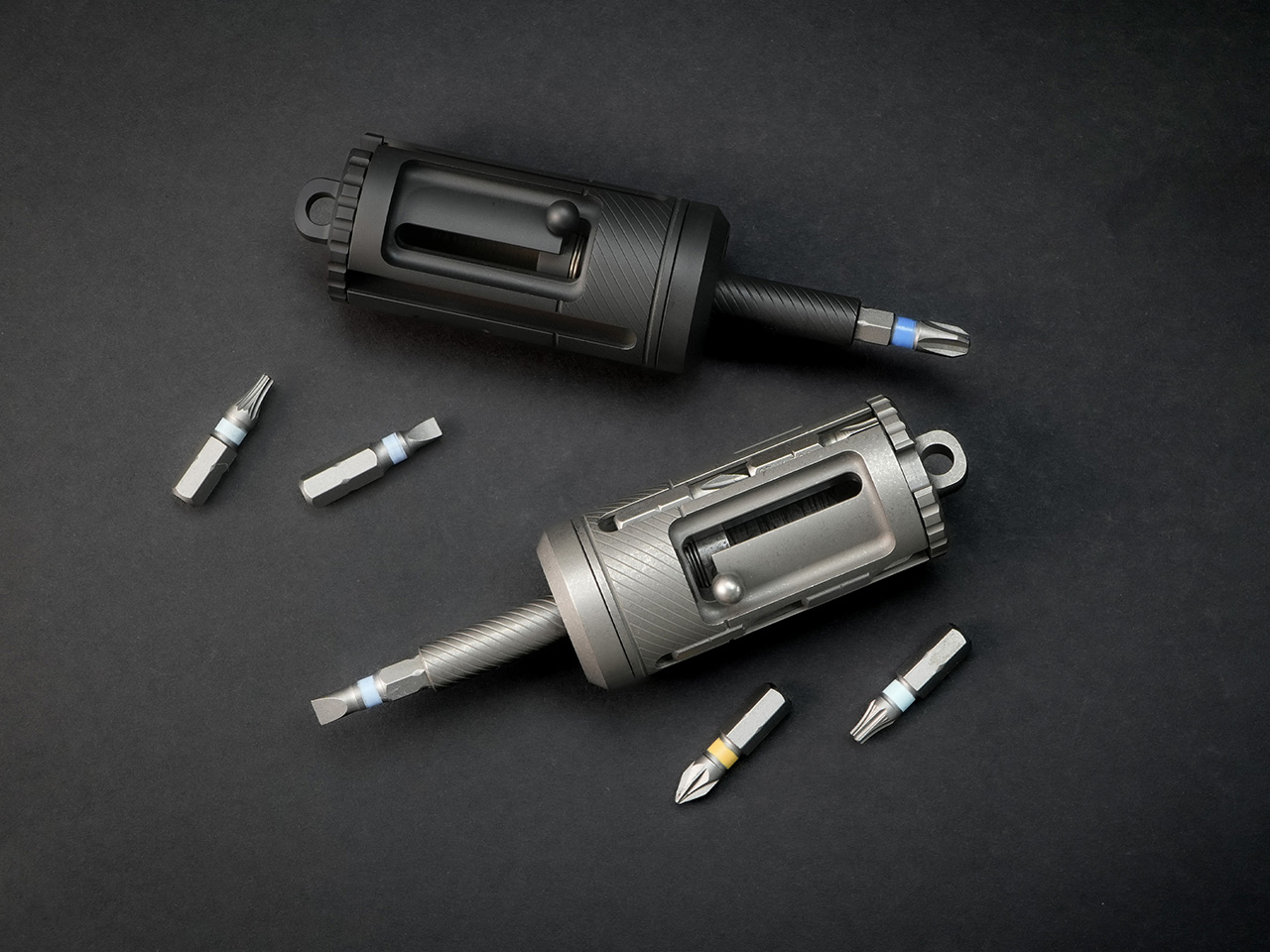
The FixMan is the answer to that call. It represents a complete redesign from the ground up, scaling the original concept into a more powerful and refined tool. While it keeps the iconic revolver bit chamber and bolt-action extension, the FixMan is a larger, more robust instrument built from Grade 5 titanium. It accommodates standard 1/4-inch bits, integrates a three-mode ratchet system, and delivers the torque needed for actual repairs, from assembling furniture to adjusting gear in the field. It’s what happens when a good idea is given the space to become a great one.
The ratchet mechanism is the functional heart of the FixMan, and its execution reveals a deliberate approach to both utility and aesthetics. Most ratchet screwdrivers on the market rely on off-the-shelf steel ratchet components, with manufacturers focusing customization efforts on the outer shell while leaving the core mechanism standard and exposed. Over time, those steel internals are prone to rust, the mode switching can feel clunky or inconvenient, and the bulky ratchet head remains visible, compromising the tool’s profile. Eck Studio took a different path. The ratchet structure in the FixMan was developed entirely in-house, allowing the team to engineer a hidden ratchet system that sits cleanly inside the titanium body. Even the internal ratchet components are CNC-machined from titanium, creating a mechanism that resists corrosion, maintains tighter tolerances, and delivers stronger torque capability compared to typical steel assemblies. The result is a more durable, more refined, and longer-lasting system that operates smoothly and feels premium in hand.
The system operates in three distinct modes: tighten, loosen, and locked. Tighten mode enables continuous forward driving with smooth, controlled ratcheting that eliminates the need for constant repositioning. Loosen mode reverses the action for clean screw removal, while locked mode disables the ratchet entirely, providing full manual control for precision tasks where feel and feedback matter more than speed. Switching between these modes takes seconds and can be done one-handed, a design detail that becomes especially useful when working in awkward positions or tight spaces. Each position locks firmly into place with a satisfying mechanical click. Eck Studio precision-machined every component of the ratchet assembly, avoiding injection-molded or stamped parts in favor of individual CNC-machined pieces. The knurling on the grip is also CNC-cut rather than pressed, creating grooves that provide secure purchase without being abrasive during extended use. Titanium, brass, and ceramic bearings work together to deliver smooth operation, strong torque transfer, and zero wobble under load. The entire assembly is built for longevity, designed to get smoother and more familiar with use rather than looser or less precise.
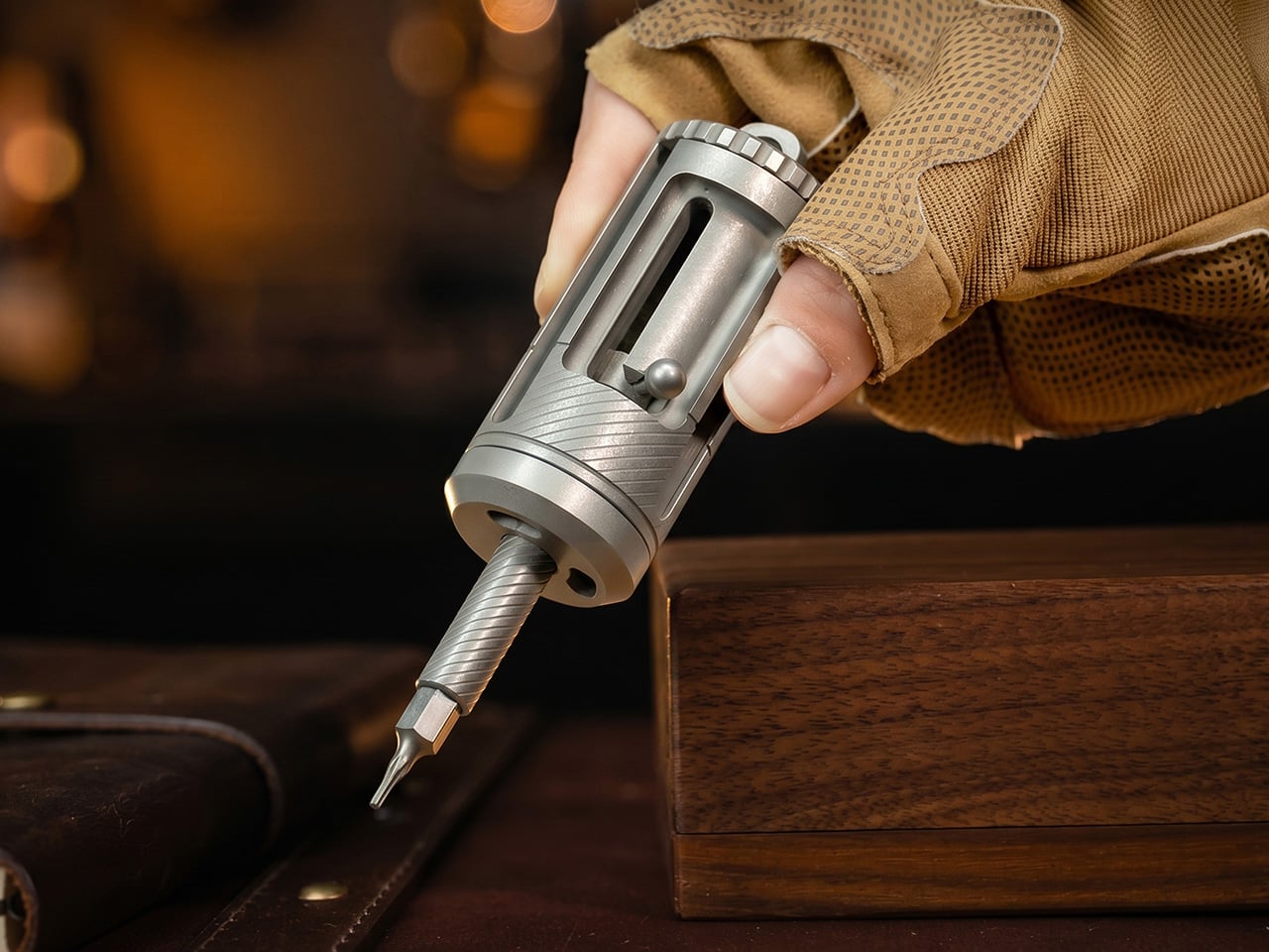
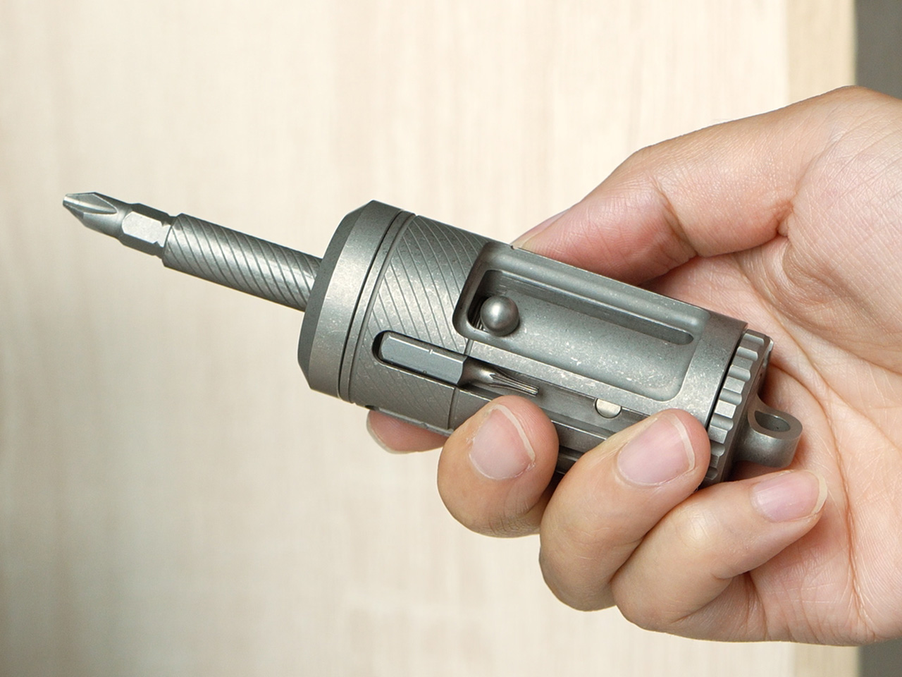
Reaching screws in deep or narrow spaces is where most compact drivers fall short, and the FixMan solves this with its bolt-action hidden extension. A spring-loaded slide mechanism deploys an additional 26 millimeters of reach with a single push, transforming the driver from a compact 77.5-millimeter tool into a 103.5-millimeter extender. The extension snaps out smoothly and locks securely, providing stable support even when working at awkward angles or applying significant torque. When the extra reach is no longer needed, the mechanism retracts just as cleanly, collapsing back into the main body without requiring any disassembly or bit removal. The bolt-action design is fast, intuitive, and deeply satisfying to operate, turning a practical feature into a kinetic experience. When you factor in the length of the bits stored inside the revolver chamber, the FixMan can reach approximately 75 millimeters into deep or narrow spaces, making it capable of accessing screws that would be completely out of reach for standard compact drivers.
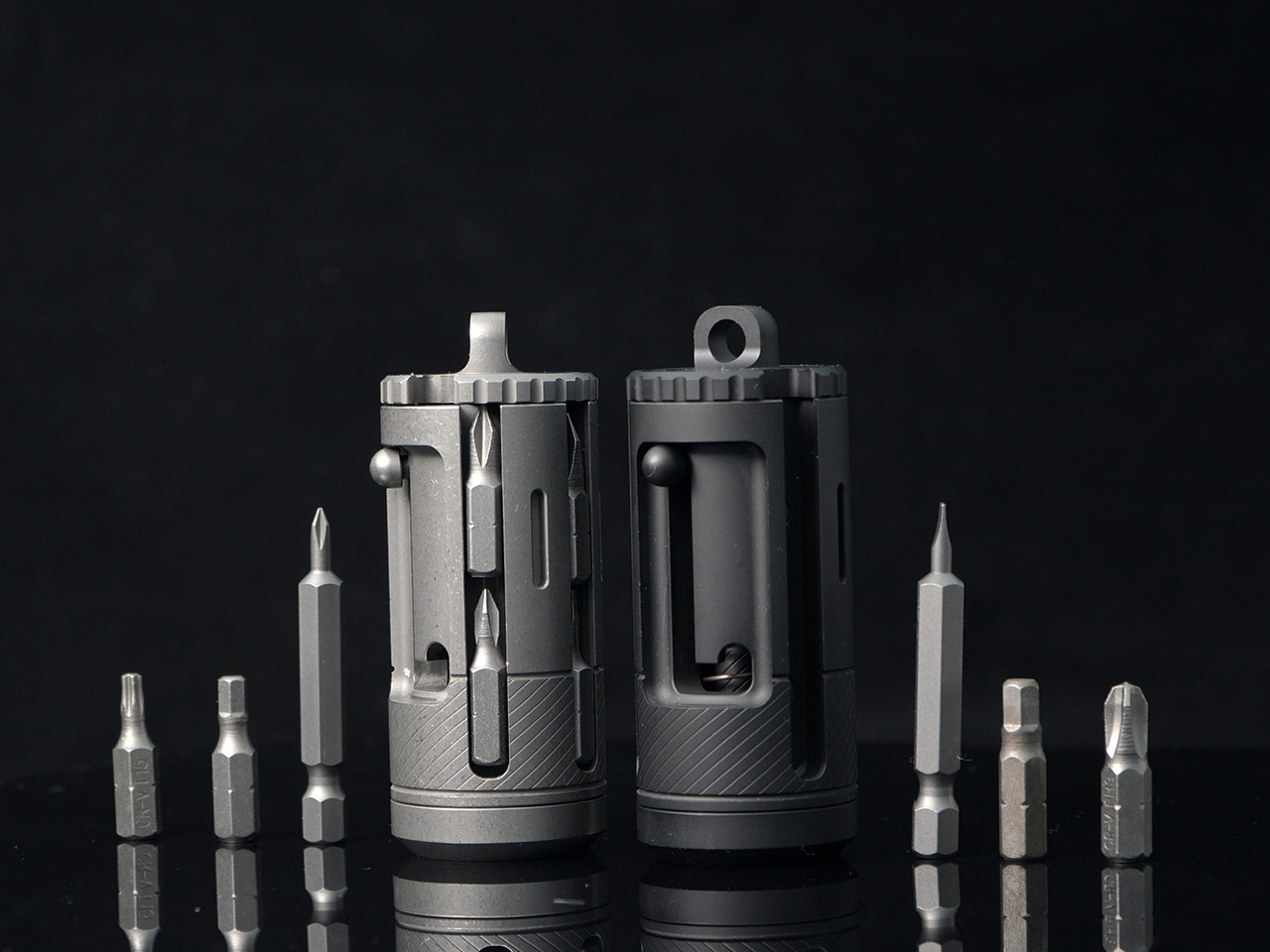
The revolver-style bit chamber is the visual and mechanical signature of the FixMan, borrowing directly from its predecessor. The chamber stores up to ten standard 1/4-inch bits, with each slot capable of fitting bits up to 53 millimeters long. Each bit is held securely in its own magnetic slot, and a rotating selector lets you dial through the chamber to find the bit you need. Each position clicks firmly into place as the mechanism indexes, providing clear tactile feedback. The chamber eliminates the need for a separate bit case or loose bits rattling around in a pocket, consolidating everything into a single, self-contained tool. The included bits cover the most common fastener types: PH1, PH2, PH3, SL4, SL6, H3, H4, H5, T20, and T25. Once selected, a bit snaps into the magnetic holder with a clean, secure fit that keeps it firmly locked during use while remaining easy to swap out when the job changes.
The FixMan’s compatibility with the standard 1/4-inch ecosystem gives it flexibility beyond the included bits. Any standard bit, socket, or extension designed for the 1/4-inch interface will work seamlessly with the driver, opening up a wide range of possibilities for specialized tasks. The magnetic bit holder pulls bits into place instantly, providing dependable retention without requiring excessive force to remove them. This universal compatibility means the FixMan can grow with your needs, adapting to new tasks without being locked into a proprietary system. You can use the bits that came with it, or reach for the specialty drivers and sockets you already trust.
Grade 5 titanium forms the structural foundation of the FixMan, offering an ideal balance of strength, weight, and corrosion resistance. At 144 grams, the driver has enough mass to feel substantial in hand without becoming a burden in a pocket or bag. Titanium’s resistance to rust and corrosion means the tool can handle exposure to moisture, sweat, and outdoor conditions without requiring constant maintenance or protective coatings. The stonewashed finish gives the surface a matte, tactile texture that looks refined and hides the inevitable wear that comes from daily carry. Over time, the finish develops a patina that reflects use without looking worn out, aging gracefully rather than appearing damaged or neglected.
The FixMan is built for people who want a capable, professional-grade screwdriver that fits into an everyday carry rotation. It’s suited to those who assemble, adjust, repair, and tinker regularly, whether that means maintaining camera gear, building custom keyboards, adjusting bikes, assembling furniture, or handling the kinds of small mechanical tasks that show up unexpectedly throughout the week. The tool’s compact dimensions and integrated storage make it practical for pocket or bag carry, while its ratchet system and extendable reach give it the performance needed for real work. The fidget-friendly mechanisms, from the spinning chamber to the bolt-action slide, make it a tool you’ll want to pick up and interact with, not one that sits forgotten in a drawer.
Eck Studio offers the FixMan in two finishes: a stonewashed titanium version and a black PVD option for those who prefer a darker, more subdued aesthetic. Custom engraving is available for personalization, and a handmade leather sheath provides additional protection and easier carry for those who prefer belt or bag mounting over direct pocket storage. For those who want low-light visibility, the driver features four enlarged tritium slots designed to accommodate 2 x 12 millimeter tritium tubes, which provide up to 20 years of self-powered glow without batteries or charging. Chosen tritium tubes are installed before shipping, making the tool ready to use straight out of the box.
The FixMan is priced at $158 for the stonewashed version and $168 for the black PVD finish. The tool is currently available through its campaign, with deliveries expected to begin in October 2026.
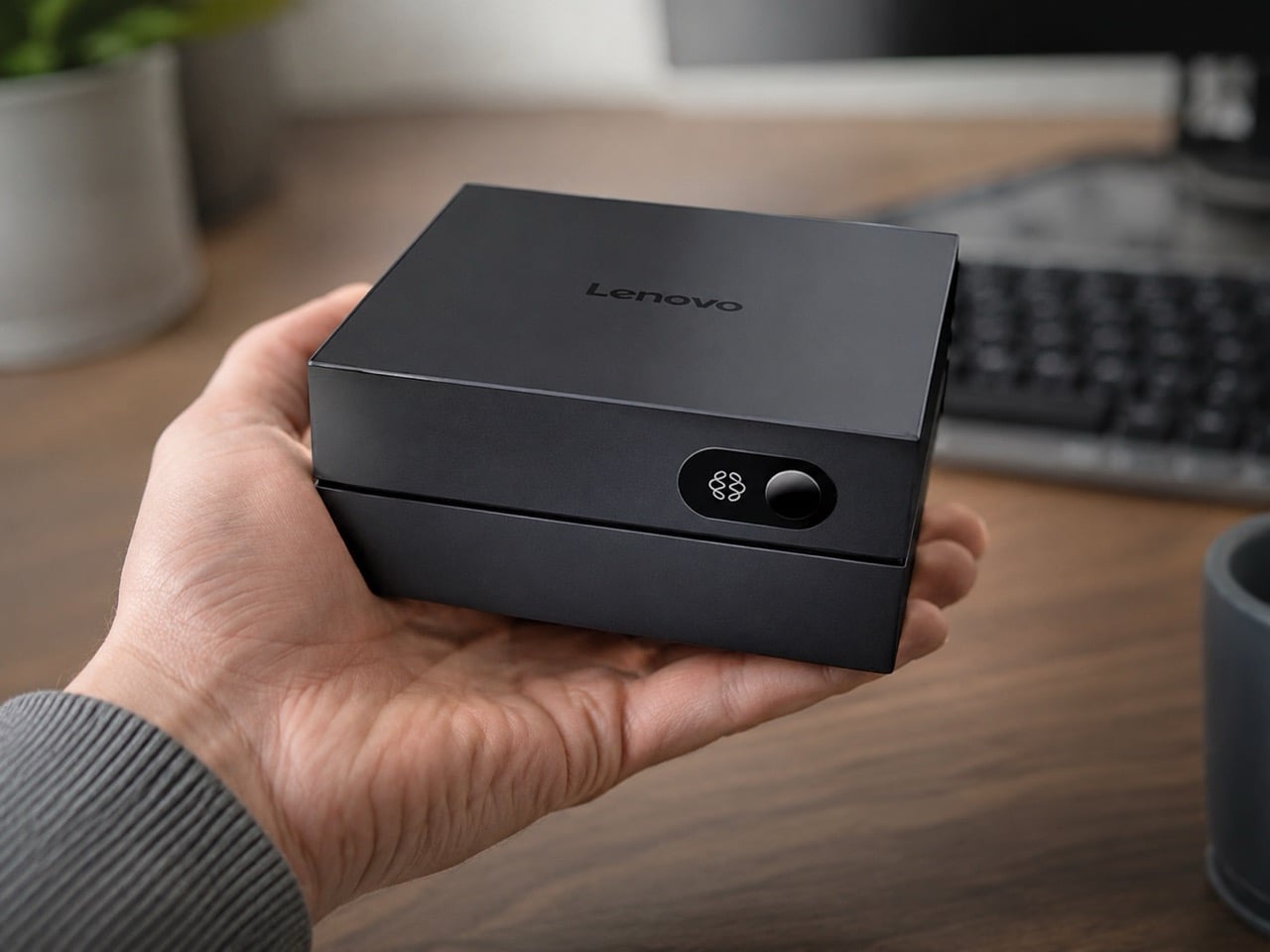
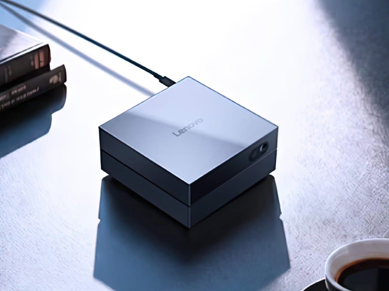
For the past two years, on-device AI has been a hardware arms race, a contest to see whose NPU could post the most TOPS before the next product cycle. Qualcomm claimed the Snapdragon X Elite was the laptop chip AI deserved. Intel answered with Core Ultra and its own NPU tier. Apple quietly kept winning by making its Neural Engine feel native to everything the operating system actually does. Lenovo’s AI Host Mini, a $440 mini PC launching in China on July 1, approaches the whole argument from the opposite direction, starting with 8,000 software tools and asking how little hardware you need to run them well. At 45 TOPS and 8GB of RAM, the answer it proposes is going to make a lot of spec-chasers uncomfortable.
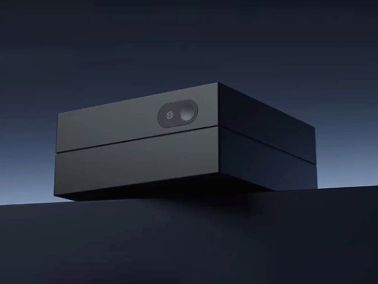
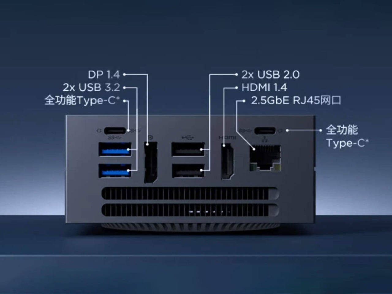
The physical object is a plain black box, 10 x 10 x 4.8 centimeters and 0.48 liters in volume, smaller than the Mac mini, which starts at $769. The processor is a Cixin P1 CD8180, a Chinese ARM chip with twelve CPU cores and an Immortalis-G720 GPU carrying ten cores, backed by 8GB of LPDDR5-6000 RAM and a 256GB SSD. Lenovo runs the platform on Ubuntu Linux with a proprietary Tianxi Claw layer handling access to the AI skills marketplace, and the system reportedly handles multiple agent instances running simultaneously. Connectivity covers two USB-C, four USB-A, 2.5 Gbit/s Ethernet, HDMI 1.4, and DisplayPort 1.4. CNY 2,999 (about $440) buys a China-exclusive launch with no confirmed path to international shelves.
Designer: Lenovo
The Cixin P1 chip is the most politically loaded component in any mini PC announced this year. US export controls have cut Chinese manufacturers off from TSMC’s advanced nodes and Nvidia’s AI accelerators, forcing a generation of engineers to solve hard problems with constrained tools. That pressure has already produced genuine surprises: Huawei’s Kirin 9000s proved domestic silicon could power a sold-out flagship, and DeepSeek R1 showed that a frontier-class language model could be trained on a fraction of the compute budget everyone assumed was mandatory. The Cixin P1 follows that lineage, delivering 45 TOPS from hardware no Western analyst would have put on a competitive spec sheet two years ago. Doing more with less has always been a survival strategy; in China’s tech industry right now, it looks increasingly like a competitive advantage.
A skill, in Lenovo’s Tianxi Claw framework, is a purpose-built AI agent: a compact, fine-tuned model trained to do exactly one job well. Whether translating a document, transcribing audio, or automating a repetitive workflow, each runs lean and fast by design. A 1-billion-parameter model fine-tuned for translation outperforms a general 7-billion-parameter model on that same task while consuming a fraction of the memory, which is why 8GB can feel adequate here when it would feel genuinely limiting on a machine trying to run a full LLM. The system handles multiple agent instances simultaneously, so one processes voice input while another works through an image task in the background. That is a fundamentally different vision for personal AI: less one omniscient assistant, more a small and efficient team of specialists.
The honest caveat sits in the software stack: Tianxi Claw is a proprietary platform built for Chinese consumers, and the skills catalog is oriented toward Mandarin-speaking users for now. There is also a China-exclusive July 1 launch date with nothing confirmed internationally. The 8GB RAM ceiling matters at the edge of demanding generative tasks, where the Yoga Mini i Gen 11’s 32GB ceiling and the Minisforum MS-S1 Max’s 128GB unified pool have headroom this machine simply doesn’t. But none of that changes what the AI Host Mini signals: if domestic Chinese silicon delivers 45 TOPS at $440 in 2026, the trajectory points toward personal AI computers that cost less than a mid-range smartphone within two product cycles. China’s tech industry is answering the affordability question faster than almost anyone predicted, and as usual, it is doing it with whatever tools the room allowed.
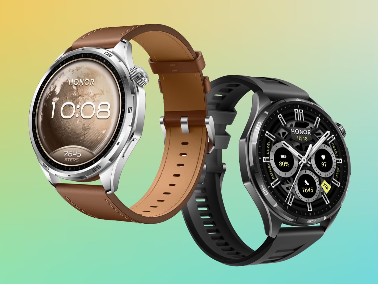
Every smartwatch eventually comes off. The reasons vary: the charge ran out, the case dug in, the weight got old. Battery anxiety and wrist fatigue are the two great enemies of wearable compliance, and the industry has spent years solving one at the expense of the other. HONOR has taken a different approach with the Watch 6.
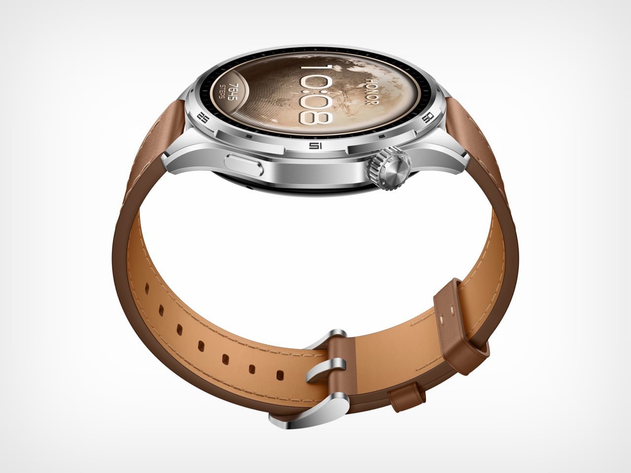
The case weighs 41 grams, which puts it in the same neighborhood as a set of car keys. The battery inside it is 980mAh, a capacity that delivers up to 35 days of use and has no comparable precedent in a smartwatch this light. HONOR achieved it through a sandblasted aluminium alloy construction, designed around a Racing Dashboard aesthetic that borrows visual tension from high-performance automotive design. The Watch 6 is built to stay on. And at 41 grams, there is very little reason to take it off.
Designer: HONOR
The wearable industry’s battery problem has always been architectural. Garmin solved it by making watches thick enough to house serious cells, producing devices that track ultramarathons flawlessly but look faintly ridiculous at a dinner table. Apple went the opposite direction, keeping the Watch Series ultra-slim and ultra-light while accepting that you will charge it every night like a phone. The Apple Watch Ultra 3 splits the difference with a 599mAh battery in a titanium case, and while that is genuinely impressive engineering, it still asks you to charge weekly and costs north of $700 for the privilege. Samsung’s Galaxy Watch 7 lands closer to HONOR’s price bracket but tops out around 425mAh, delivering maybe three days of real-world use. HONOR’s Watch 6 arrives at 980mAh and 41 grams, and neither of those numbers should coexist in the same sentence.
The secret is in the surface. HONOR’s construction process runs the aluminium alloy case through a precision sandblasting treatment that produces a finish comparable to titanium in texture and perceived premium-ness, without titanium’s weight penalty. This is the same category of material intelligence that made the Watch 5 Ultra’s grade 5 titanium case feel like such a statement at MWC 2025, except here HONOR is pulling the trick in reverse, making aluminium feel like it punches upward. The beveled edges add a three-dimensional quality to the 46.5mm round case that photographs well and catches light differently depending on angle, borrowing visual language from automotive air intakes in a way that feels considered rather than decorative. At 317 PPI on a 1.46-inch AMOLED panel hitting 3,000 nits of peak brightness, the display holds up in direct sunlight in a way that cheaper panels simply cannot.
Where the Watch 6 earns its credibility beyond the spec sheet is in the specificity of its sports intelligence. HONOR’s badminton mode tracks smash speeds, rally counts, and shot distribution in a way that goes well beyond the generic “racket sport” detection most smartwatches offer. The football mode generates heat maps and trajectory data that a Sunday league player will find genuinely useful, not just flattering. Trail running gets an AI coaching layer on top of dual-band six-star GPS, with route deviation alerts that matter when you are actually in the hills. These are features borrowed in spirit from Garmin’s sport-specific playbook, delivered at a price point Garmin has never seriously entertained.
The one honest caveat is software. HONOR’s proprietary MagicOS ecosystem has historically been the ceiling on what their hardware could achieve, and the Watch 5 Ultra illustrated that tension clearly when reviewers found the tracking data compelling but the platform limiting. The Watch 6 inherits that same closed loop, meaning your 35 days of biometric data lives inside the Honor Health app and nowhere else. For athletes already inside that ecosystem, that is fine. For anyone hoping to pipe data to Strava, Garmin Connect, or Apple Health with any consistency, it remains a friction point worth knowing about before you buy.
Most creator setups get built backwards. The camera comes first, the lighting comes second, and audio ends up being whatever fits in the bag. That compromise has a cost, and anyone who has sat through a well-shot video ruined by hollow, wind-wrecked, or flat dialogue knows exactly what it sounds like. The gap between professional-grade audio and genuinely portable gear has narrowed considerably in the last two years, and a lot of that credit goes to AI noise processing that actually delivers rather than just advertises.
BOYA has put forward Prime Day options that cover nearly every recording scenario a working creator runs into, at discounts that make this a reasonable time to close that gap. The five products span a wide range, from a thumb-sized lapel that disappears on clothing to a transformable four-mode wireless system to a button-sized transmitter that scales for multi-device team shoots. One of them, BOYA Notra, breaks from the creator audio format entirely and lands in the meeting room, turning live conversations into organized transcripts, summaries, and to-do lists in over 140 languages.
BOYA mini 2: the Ultra-Compact Everyday Mic
Where the BOYA Magic is built around transformation, the BOYA mini 2 is built around invisibility. Weighing only 5 grams, the transmitter is the lightest in this roundup, designed to be a set-it-and-forget-it solution for mobile creators, vloggers, and anyone who needs clean audio without the bulk. Its thumb-sized form factor clips onto clothing without pulling or weighing down fabric, making it ideal for casual shoots, social media content, and on-the-go recording where a larger microphone would be too conspicuous. The focus here is pure portability and ease of use, delivering a significant audio upgrade over a phone’s internal microphone in a package that is small enough to live in a pocket.
Despite its size, the mini 2 shares much of the same audio DNA as its larger counterparts. It features the same 48 kHz / 24-bit audio resolution and AI noise cancellation, with a “Strong” mode for loud environments and a “Light” mode to preserve natural room tone. The companion BOYA Central app allows for quick adjustments to volume, EQ, and noise cancellation levels directly from a smartphone. With a 30-hour battery life via its charging case and a robust 328-foot wireless range, the mini 2 is a surprisingly capable microphone that prioritizes convenience and discretion above all else.
BOYA Magic directly addresses the problem of carrying multiple microphones for different shooting styles. Instead of asking creators to choose between a lavalier, a handheld, a desktop, or an on-camera mic, it combines all four into one compact kit. The core of the system is a 7-gram transmitter that can be used as a discreet clip-on, but it also docks into a handheld grip for street interviews, mounts on a desktop stand for podcasts, and slides into a cold shoe adapter for on-camera use. This transformable design makes it the most physically versatile option in the lineup, built for creators who move between formats and do not want their gear to dictate their workflow.
The technical specifications are strong enough to support that flexibility. The system captures 48 kHz / 24-bit audio and uses AI noise cancellation to reduce ambient sound by up to 40 dB, which is more than enough to clean up dialogue in busy environments. It also includes thoughtful professional features like a smart limiter and a safety track to prevent audio clipping, an 80 dB signal-to-noise ratio, and up to 30 hours of total recording time with the charging case. For a creator who wants one kit that adapts to nearly any situation, from a desk recording to a field interview, the Magic is engineered to be a clever, all-in-one solution.
While mics like the mini 2 and Air SE are perfect for solo creators, the BOYALINK 3 is designed for more complex productions. This is the system for small teams, interviewers, and creators who need to feed audio to multiple devices at once. Its key feature is a 2TX-4RX expansion capability, which allows the system to scale up to support eight devices recording simultaneously. This makes it possible to run a two-person interview while sending clean audio to two different cameras and a backup recorder, all from one compact kit. It is a button-sized system that brings a level of workflow flexibility usually found in much larger, more expensive setups.
The BOYALINK 3 reinforces its professional credentials with a higher 85 dB signal-to-noise ratio for cleaner recordings and includes essential tools like automatic gain control, a limiter, and a safety track to protect against distortion. Each transmitter weighs just 9 grams and features a dustproof grille, making it durable enough for field use. With EQ tuning, real-time monitoring, and up to 30 hours of total battery life, the Link 3 is positioned as the upgrade for creators who are moving beyond basic setups and need a reliable, scalable audio hub for more demanding shoots.
The final product in the lineup takes the AI audio technology seen in the microphones and applies it to a completely different problem: remembering conversations. The BOYA Notra is not a creator tool, it is a dedicated AI note-taking device designed for professionals, students, and anyone who needs to capture meetings, lectures, or calls without losing focus. It records conversations from three sources, ambient room audio, phone calls, and Bluetooth earbuds, and then turns the raw audio into structured, usable information. This is a device built for productivity and memory relief, not for content production.
The Notra’s intelligence lies in its post-recording processing. It transcribes speech in over 140 languages, automatically identifies different speakers, and generates summaries, to-do lists, and mind maps from the conversation. All recordings are stored on its 64 GB of local storage with a private cloud backup. With up to 24 hours of continuous recording and a slim, magnetic design, the Notra is a powerful tool for anyone who has ever wished they had a perfect record of a conversation. It turns every discussion into organized, searchable knowledge, ensuring that no key details are ever missed.
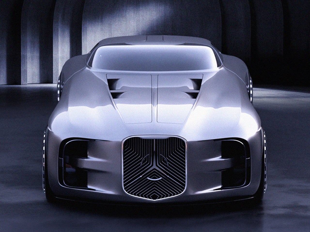
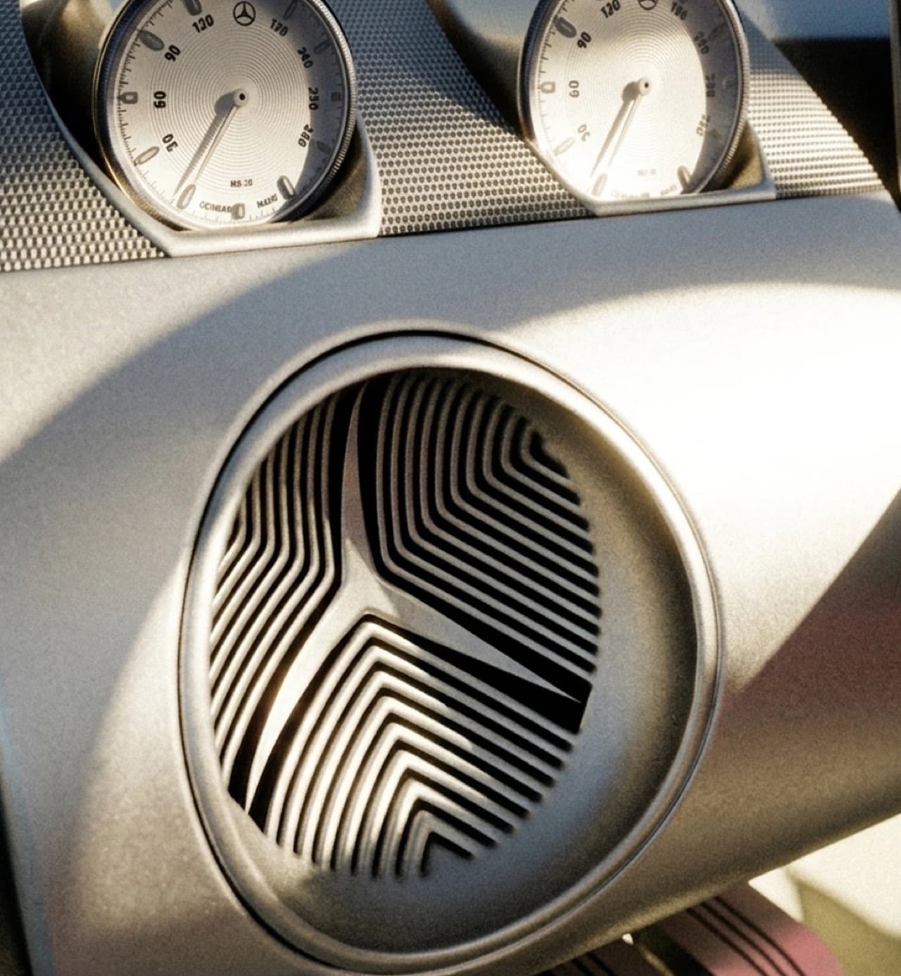
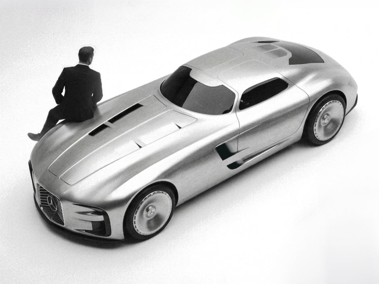
Design school thesis projects rarely get permission to be reckless. Most are built to please a panel of professors, sanded down until every surface looks defensible on a resume. Jaeun Park ignored that instinct entirely with his MA thesis project, a Mercedes concept he calls Vision Timeless, framed around a simple tension he labels modernity over heritage. Rather than softening Mercedes’ most aggressive vintage design cues, Park amplified them until the result looks more predator than luxury sedan. The question driving the whole project seems to be how far you can push a heritage grille before it stops referencing the past and starts threatening the present.
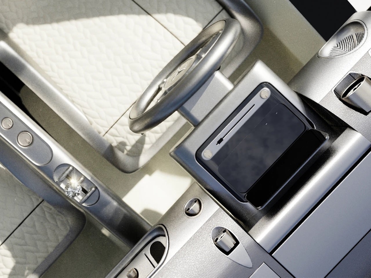
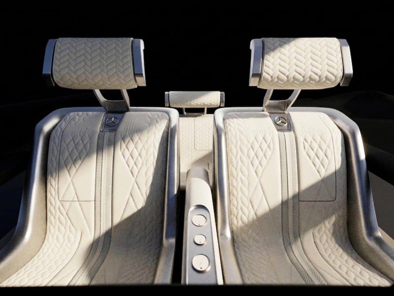
Built entirely in Blender by Park himself, the concept reimagines the brand’s vertical slat grilles from the 300 SL and W100 Pullman as one continuous trapezoidal mesh that consumes the three pointed star into its own structure. The proportions lean long and low, with a stretched hood, a teardrop fastback roofline, and gullwing doors that nod directly to Mercedes’ most iconic body style. Around back, the badge reappears as fractured triangular taillights rendered in red, a graphic flourish that turns a regulatory necessity into a design statement. Park rendered the body in multiple finishes, cycling between mirror chrome, gunmetal black, and an iridescent maroon that shifts hue under different lighting setups. Inside, a crystal shift knob and brushed metal trim suggest he was thinking about jewelry as much as ergonomics. This is heritage design with the brakes cut.
Designer: Jaeun Park
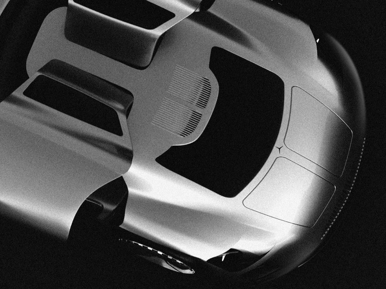
Park stacked dozens of vertical slats into a single trapezoidal block that narrows slightly at the base, a shape lifted from the W100 600 Pullman’s upright nose and stretched until it covers most of the front fascia. Thin LED strips run along either side instead of sitting in separate housings, so the face reads as one continuous slab rather than a stack of parts. The three pointed star gets folded into the lattice itself instead of sitting centered and isolated the way it does on every other Mercedes, visible only as a faint outline depending on the angle. The Pullman used this grille shape to signal formality and state car presence. Park uses the same vertical rhythm to signal something closer to a predator’s grille.
The hood runs long and flat in the classic front engine GT layout, while the cabin sits pushed back into a teardrop greenhouse that tapers almost to a point at the tail. Gullwing doors hinge upward the way they did on the original 300 SL, which tracks given how directly this project pulls from that car. The surfacing skips hard character lines almost entirely, relying on continuous curvature instead. Park rendered the body in several finishes: a polished silver, a near black gunmetal against raw concrete, and a maroon that shifts toward violet depending on the light. Each finish changes how the car reads, from industrial to something more expensive looking.
Park breaks the three pointed star apart at the rear instead of folding it into a single shape, splitting the badge into triangular red taillight clusters that look like shards. A Kamm style cutoff gives the tail a clean edge rather than letting the teardrop roofline trail off. The rear glass sits nearly flush with the body, with no spoiler or wing breaking up the surface, so the fractured taillight graphic stays the focal point. Most Mercedes badges sit centered and symmetrical at the back. This one looks like it got hit with a hammer, and that’s clearly the intent.
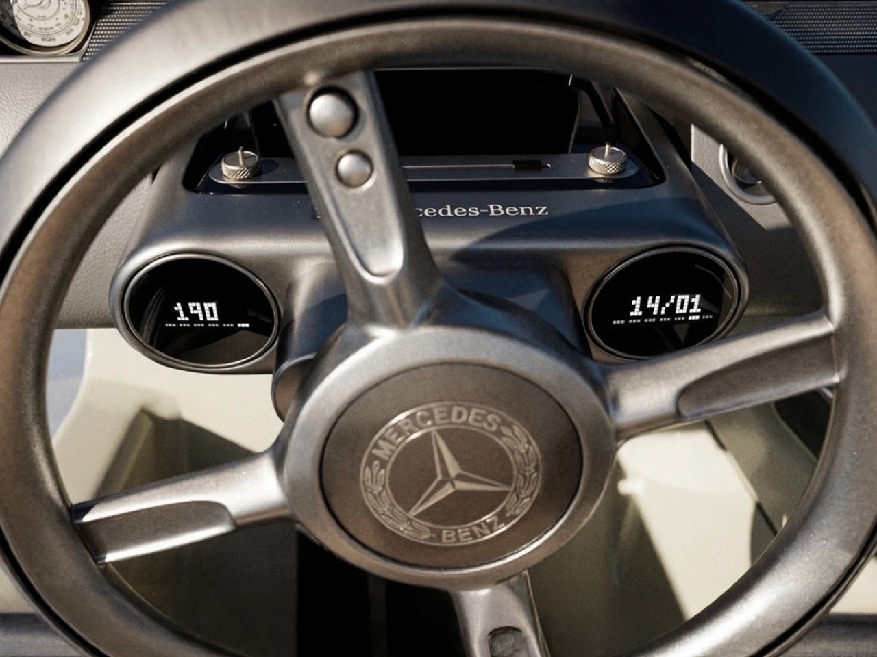
Inside, a twin dial gauge cluster sits behind a small, low steering wheel with the Mercedes badge centered at the hub, next to a strip of brushed metal toggle switches that look pulled from a vintage aircraft panel. A faceted shift knob rises from the center console, catching light the same way the exterior’s chrome finishes do. Quilted cream leather covers the seats and door panels, the only soft material in a cabin built mostly from metal and glass. Park pairs a 1950s instrument layout with materials that lean closer to a wristwatch than a dashboard. It reads more like a cockpit than a passenger cabin.
None of this comes from Mercedes, which is worth being clear about. Vision Timeless is Park’s MA thesis, modeled entirely in Blender 3D out of his studio in Paris, part of a growing pool of independent automotive renders, alongside work like Gabriel Naretto’s Uhlenhaut Shooting Brake, that look close enough to factory output to get mistaken for it. The render quality holds up under scrutiny: lighting, reflections, and material transitions are handled at a level that wouldn’t look out of place in an actual Mercedes press kit. Naretto’s Uhlenhaut leaned nostalgic. Park’s leans aggressive. Same heritage cues, two very different takes on what to do with them.
A grille this dense would be expensive to stamp or mold at scale, and a glass heavy cabin with doors this long would need real engineering before it met crash standards. That’s not really the point of a thesis project. Park set out to see how far a heritage shape could be pushed before it stopped looking respectful and started looking aggressive, and Vision Timeless answers that cleanly. The modernity over heritage framing he built this around reads less like an academic exercise and more like a real design position once you see the finished renders. Mercedes has used its own concepts, like the Vision Iconic, as farewell statements rather than production previews. Park doesn’t have that institutional backing, and the project doesn’t need it to land.
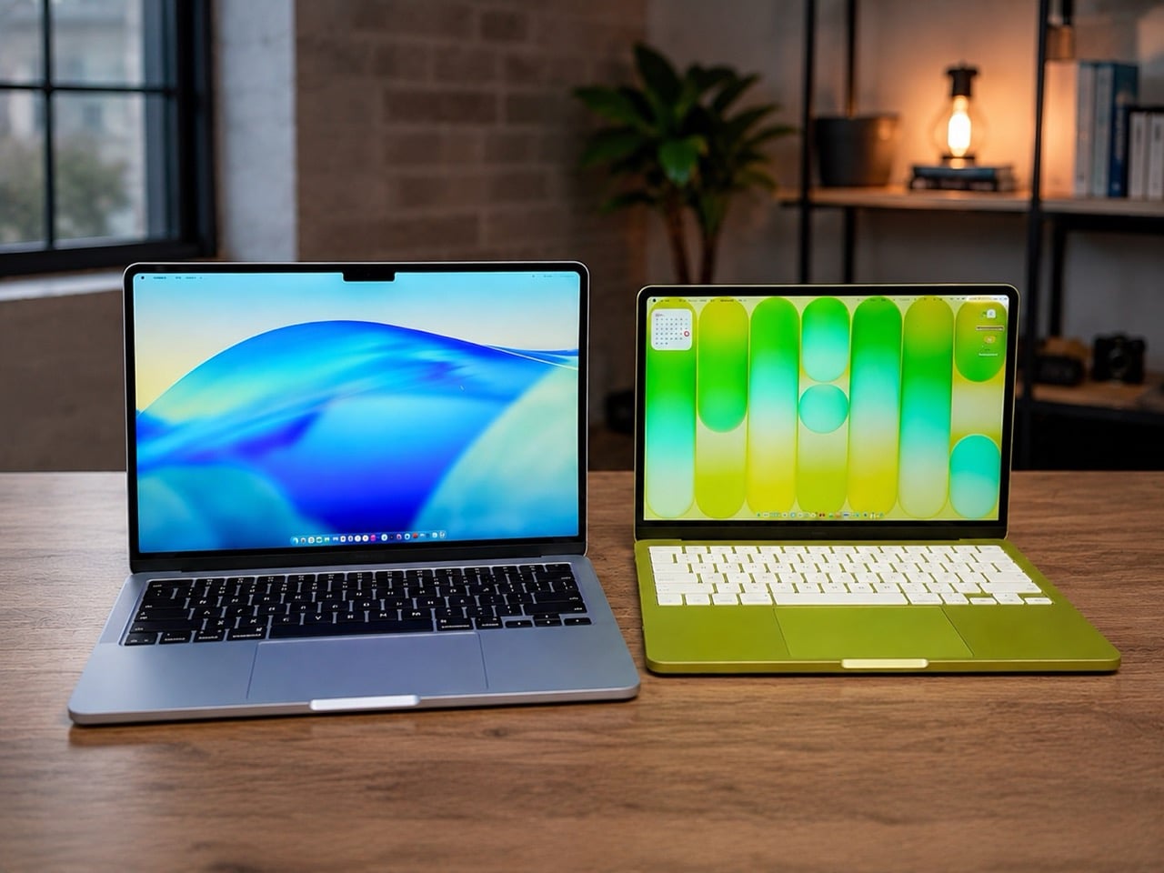
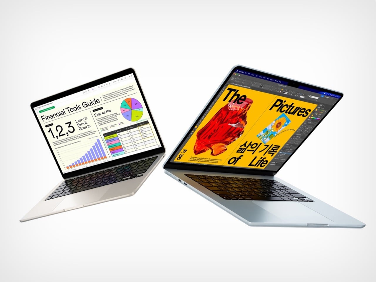
Apple’s 2026 laptop lineup presents a clean, almost philosophical choice. On one side sits the MacBook Neo, a machine built around the powerful idea of access. It lowers the barrier to entry, putting a capable Apple notebook within reach of more people than ever. It is a compelling argument rooted in the present, designed to solve an immediate need for a good, affordable computer. For a few hundred dollars more, the M5 MacBook Air makes a different promise, one that is less about immediate savings and more about long-term value and capability.
For months, that choice felt ambiguous, a simple trade-off between price and power. The arrival of macOS 27, however, brought a new clarity to the decision. Apple’s vision for the next generation of its operating system, with its heavy reliance on sophisticated on-device AI, reframed the entire lineup. The question is no longer just about what you need today, but about which machine is properly equipped for the software you will be using tomorrow. The Neo gets you in the door; the M5 Air gets you a seat at the table.
Designer: Apple
The M5 chip is what separates these two machines, and that difference stands out far more now than it did at launch. Apple announced the M5 MacBook Air in March with doubled base storage and modest performance gains, framing it as a solid evolutionary update. The M5 features a 10-core CPU and up to a 10-core GPU, but the real story lives inside those GPU cores. Each one includes a Neural Accelerator, a dedicated AI processing unit that dramatically increases the machine’s ability to handle on-device machine learning tasks. Apple explicitly positioned the M5 Air as capable of delivering up to 4x faster performance for AI tasks than the M4 Air, and up to 9.5x faster than the M1 generation. Those numbers were abstract in March. After WWDC, they became a requirement.
macOS 27 Golden Gate leans heavily on Apple Intelligence, the company’s suite of AI-powered features that process data locally rather than relying on cloud servers. Visual Intelligence, enhanced Spotlight with conversational AI capabilities, and system-wide machine learning workflows all depend on silicon that can handle the computational load without slowing down everyday tasks. The M5’s architecture was designed specifically to support this kind of workload at scale, making it the baseline for an uncompromised experience. Apple described the M5 Air as capable for Apple Intelligence across apps and system experiences, as well as for running large language models on device in enterprise environments. The Neo, with older silicon, may technically run macOS 27, but the gap between eligibility and capability is the entire value argument for spending more.
The storage equation also tilts decisively toward the M5 Air. Apple doubled the base configuration to 512GB, up from the 256GB that previous generations started with. That increase addresses one of the most persistent criticisms of Apple’s entry-level pricing strategy, particularly as on-device AI models require significant local storage to function properly. Larger machine learning models, extensive photo libraries processed with AI features, and the general expectation that a 2026 laptop should have breathing room all make 512GB feel like the real starting point. The $100 price increase over the previous M4 Air generation is easier to justify when half of it is effectively the cost of storage you would have upgraded to anyway. The Neo’s storage configuration was not surfaced in available reporting, but if it follows typical budget laptop patterns, it likely sits closer to the older 256GB baseline, which immediately creates friction for users planning to lean into Apple’s AI-forward software vision.
The M5 Air launched in March to a relatively muted reception, with early reviews treating it as a competent, predictable update rather than a transformational product. That framing was accurate at the time, because the machine’s value was not yet fully apparent. WWDC changed the story by revealing what the M5 was actually designed to do. The real product was never just the laptop; it was the laptop as a vessel for a more intelligent operating system. The Neo, by contrast, remains a strong value for users whose needs are defined by today’s software, but it starts to look underpowered the moment you project forward even a year.
The MacBook Air M5 is where Apple’s 2026 Mac story begins to feel aligned with its software ambitions. It is not the cheapest way into the ecosystem, but it may be the cheapest way to avoid compromise as macOS 27 arrives this fall. The Neo has its place, but for anyone planning to live on this machine for the next three to five years, the M5 Air is the safer, smarter, and ultimately more cost-effective choice. You can preorder both machines now through Apple’s website, but only one of them feels like it was built for the operating system Apple just announced.