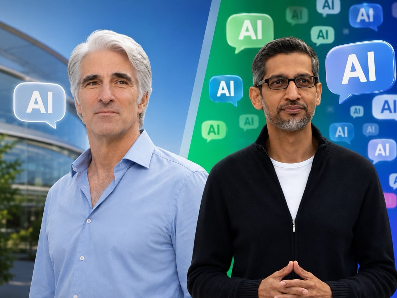
By the end of this year’s big tech keynotes, one comparison stood out more than any product demo. Apple said “AI” 28 times at WWDC 2026. Google said it nearly 100 times at I/O 2026. Same industry, same race, same obsession, but two very different instincts about how to sell the next phase of computing.
Google’s keynote reflected the current rhythm of the AI industry, loud, relentless, and eager to stamp the term onto everything in sight. Apple’s presentation moved differently. It kept circling back to what people could actually do with the technology, how private it would be, and where it would fit into everyday routines. That softer framing may frustrate people who want Apple to move faster and compete harder. It may also be exactly why Apple’s pitch feels easier to absorb at a moment when audiences are already saturated with AI promises.
AI fatigue is real, and it has been building for a while. After years of keynotes, product launches, and press releases leading with the same two letters, the word has started to lose its grip on audiences. What once signaled breakthrough capability now signals marketing effort. When a company says “AI” 100 times in a single presentation, the listener stops hearing a technology and starts hearing a strategy. The signal becomes noise, and somewhere in that noise, the actual products get harder to see.
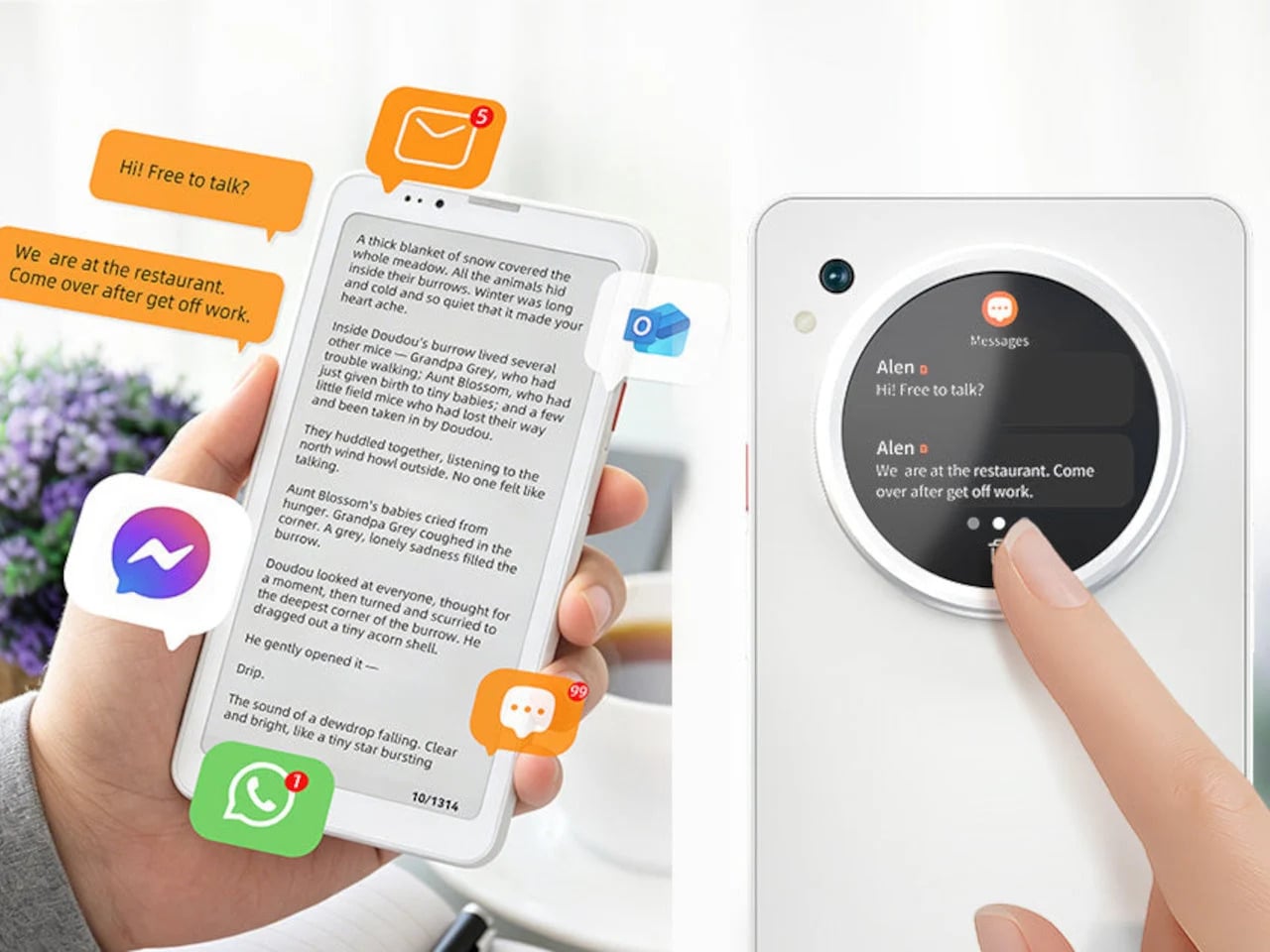
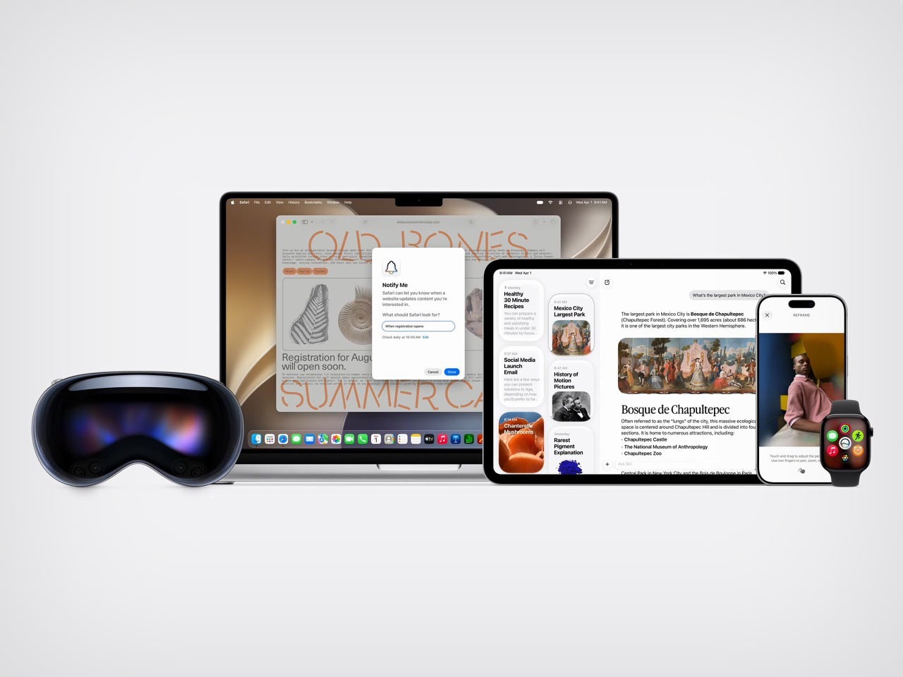
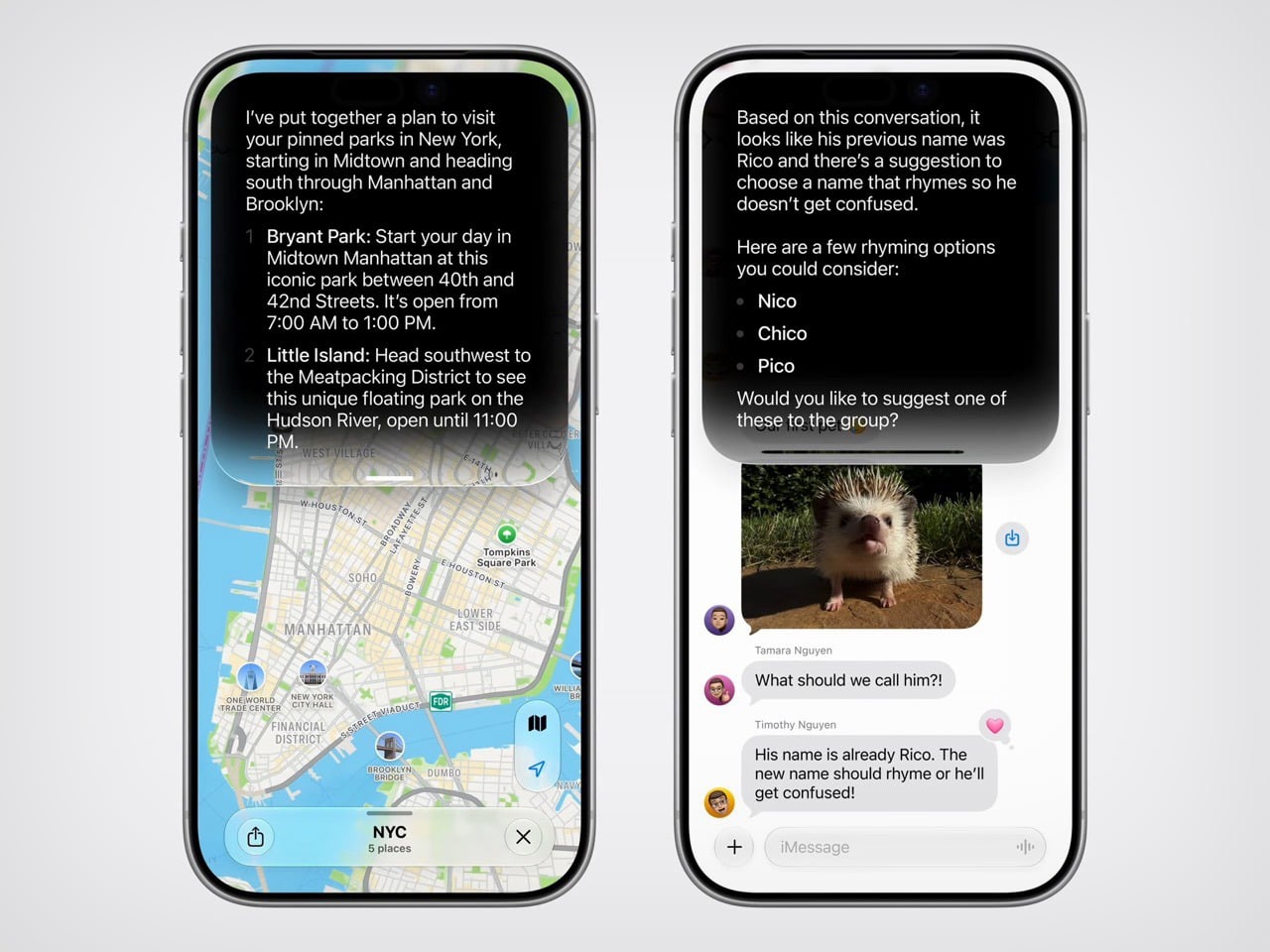
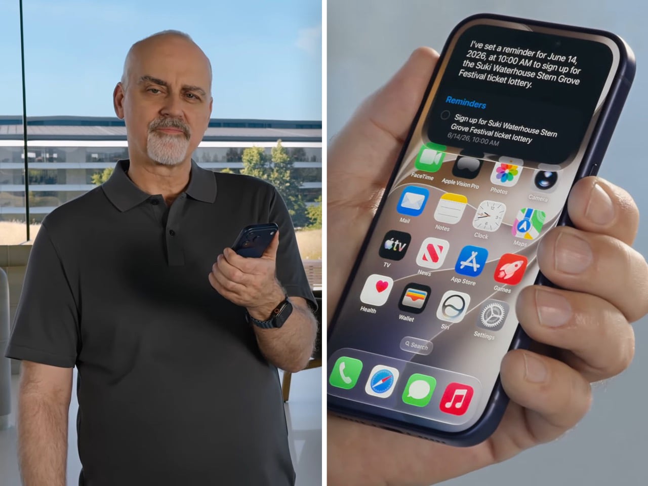
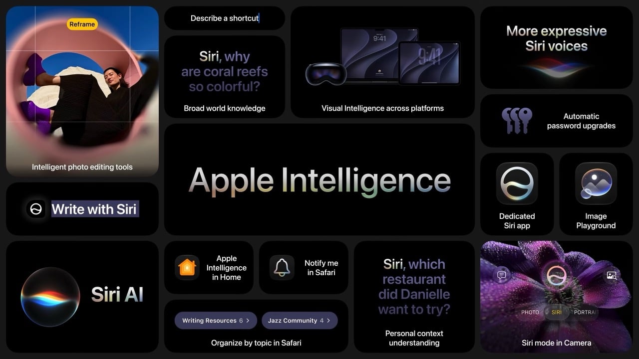
Apple’s approach at WWDC 2026 worked around that problem by reframing the conversation entirely. Instead of leading with technology, it led with moments. Siri finding a friend’s new address buried in a weeks-old message thread. A photo being reframed after the fact, as if you had stepped to the right before pressing the shutter. A restaurant bill split with Apple Cash by pointing a camera at it. These are small things, but they are the kind of small things that people actually think about during their day. Anchoring the keynote to those moments gave the technology a human scale that raw AI talk rarely achieves.
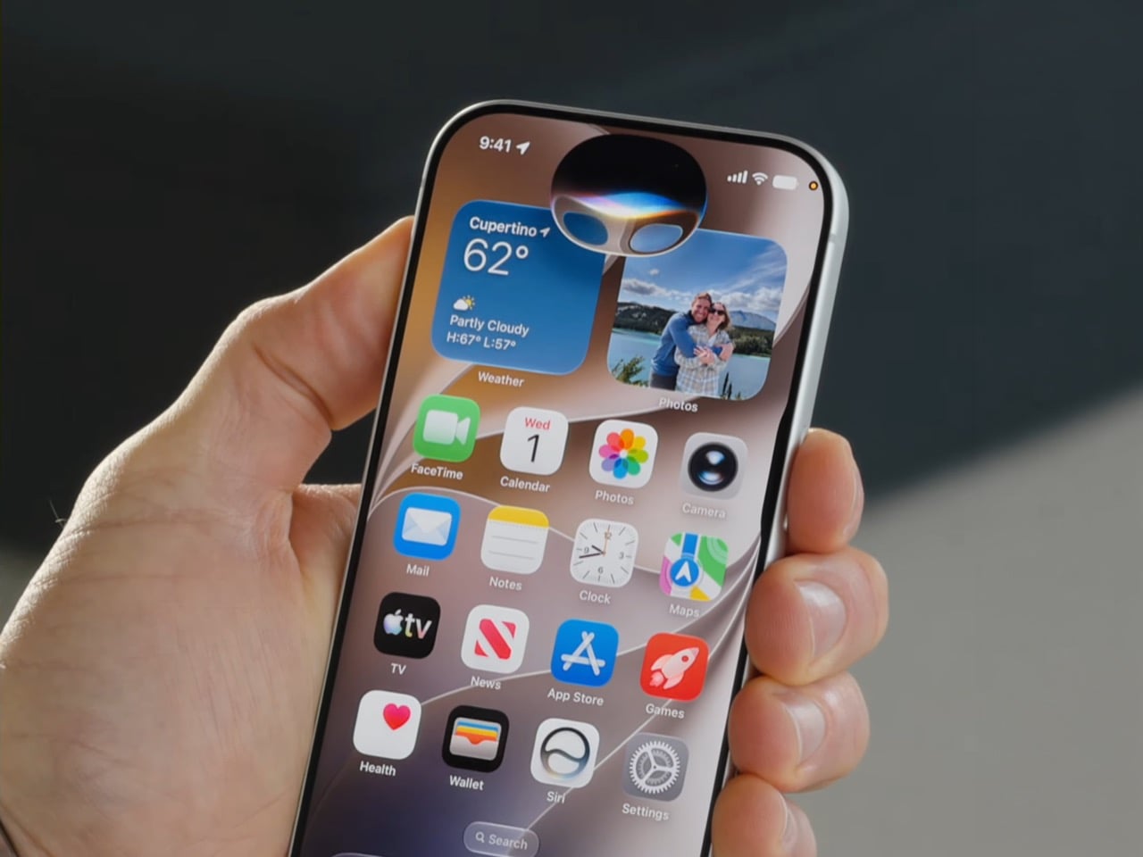
The branding reflects the same thinking. Apple calls it “Apple Intelligence,” a label that keeps the company name front and center while quietly sidestepping the overcrowded AI conversation. It is a deliberate choice, and it shows. Google’s keynote was structured around the technology itself, its power, its speed, its range. Apple’s keynote was structured around the people using it. That difference in framing shapes how audiences receive the same underlying capability, and Apple’s version is considerably easier to trust.
Privacy played a central role in building that trust. Apple returned to on-device processing and Private Cloud Compute repeatedly throughout WWDC, not as a footnote but as a feature. At a time when public concern about how AI companies handle personal data is growing steadily, that emphasis lands differently than it might have a few years ago. Google builds powerful models and serves them at enormous scale. Apple builds careful models and makes a point of telling you where your data goes and where it stays. For a meaningful portion of consumers, that distinction matters more than benchmark scores.
None of this means Apple is winning the AI race on capability. Google’s models are more powerful, more publicly accessible, and more deeply woven into the daily workflows of people around the world. Gemini’s reach across Search, Gmail, YouTube, and Android gives Google a distribution advantage that Apple’s ecosystem, for all its loyalty, cannot easily match. If the competition were judged purely on technical ambition and model performance, Google’s 100 mentions would feel earned.
But technology keynotes are not judged purely on technical ambition. They are judged on how they make audiences feel, what they make people want, and whether they leave the room energised or overwhelmed. On those terms, Apple’s 28 mentions of “AI” accomplished something that Google’s near-100 did not. They kept the word rare enough to mean something. Every time Apple said it, there was a feature attached, a privacy assurance nearby, and a use case grounded in daily life. The word carried weight because it was not being used to fill space.
The larger irony is that Apple may be the company best positioned to benefit from a backlash it did not entirely create. Google, Microsoft, Meta, and others have spent years flooding the conversation with AI language, and the fatigue that has followed is a byproduct of their own enthusiasm. Apple watched, built quietly, and showed up at WWDC 2026 with a keynote that treated restraint as a product decision. Whether that restraint reflects genuine strategic confidence or simply a capability gap dressed up in good marketing is the question the next few years will answer. For now, 28 versus 100 tells a story that Apple’s communications team could not have scripted better.
The post Apple said ‘AI’ exactly 28 times at WWDC 2026. Google mentioned it nearly 100 times at I/O. first appeared on Yanko Design.