This New London Café Has a Ceiling Inspired by St Paul’s Dome, and It Sits Right on the Thames

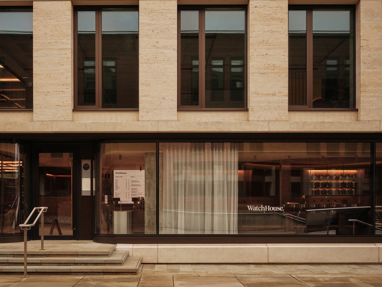
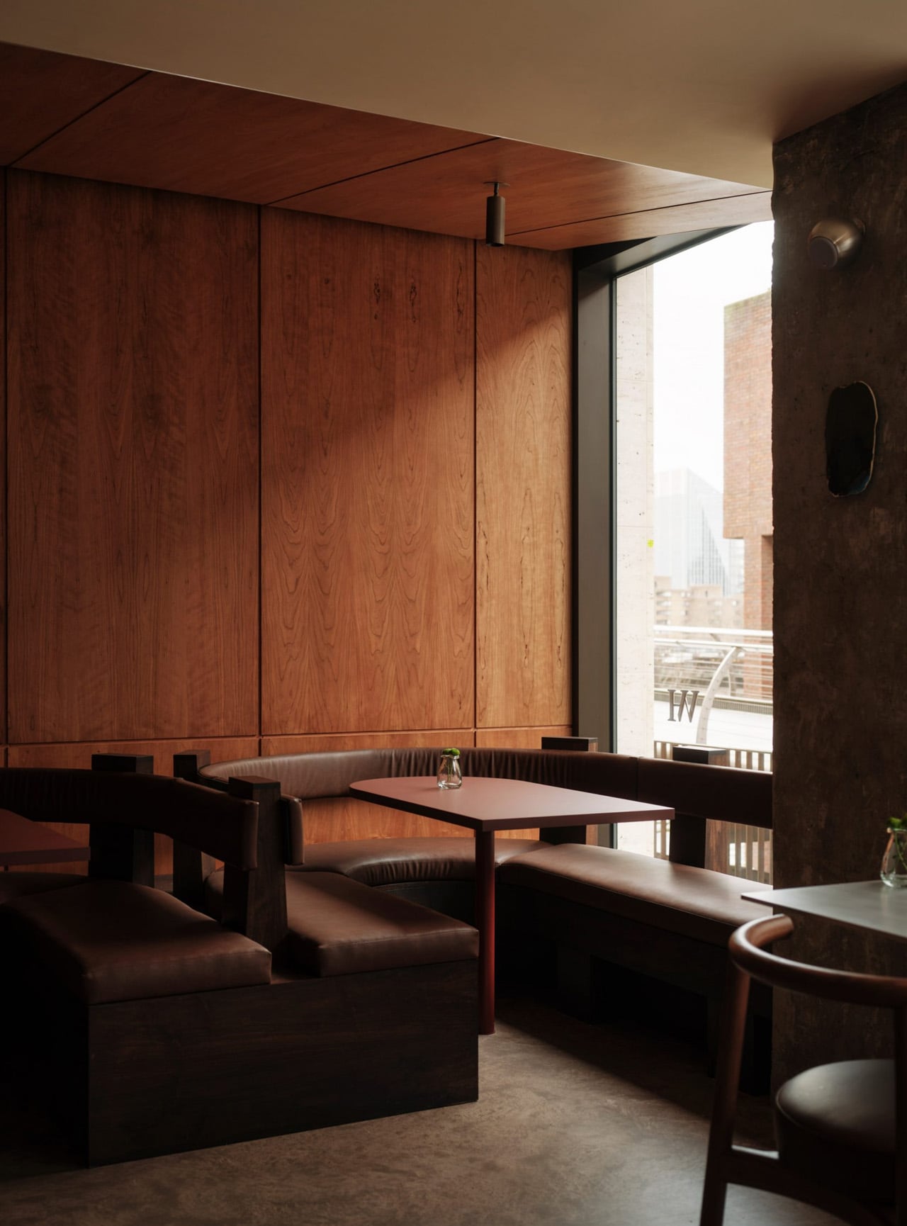
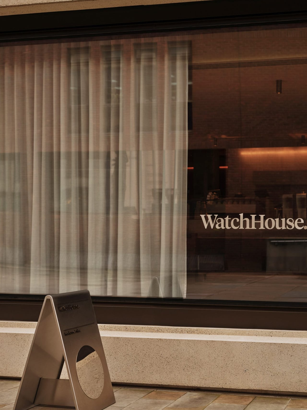
The stretch of the Thames running between Tate Modern and St Paul’s is one of those London views that never quite loses its effect — and London studio Cake Architecture made that exact backdrop the entire design brief for WatchHouse’s newest café, a 60-seat riverside space that absorbs some of the city’s most iconic architecture and folds it into something intimate and grounded.

The project sits directly beside the Thames, though it never leans on the view as a crutch. The design operates at a more atmospheric level, rooted in the tension between the monumental permanence of London’s skyline and the restless, shifting energy of the river running past it. It’s a conceptual starting point that could easily stay theoretical. Here, it doesn’t.

Designer: Cake Architecture

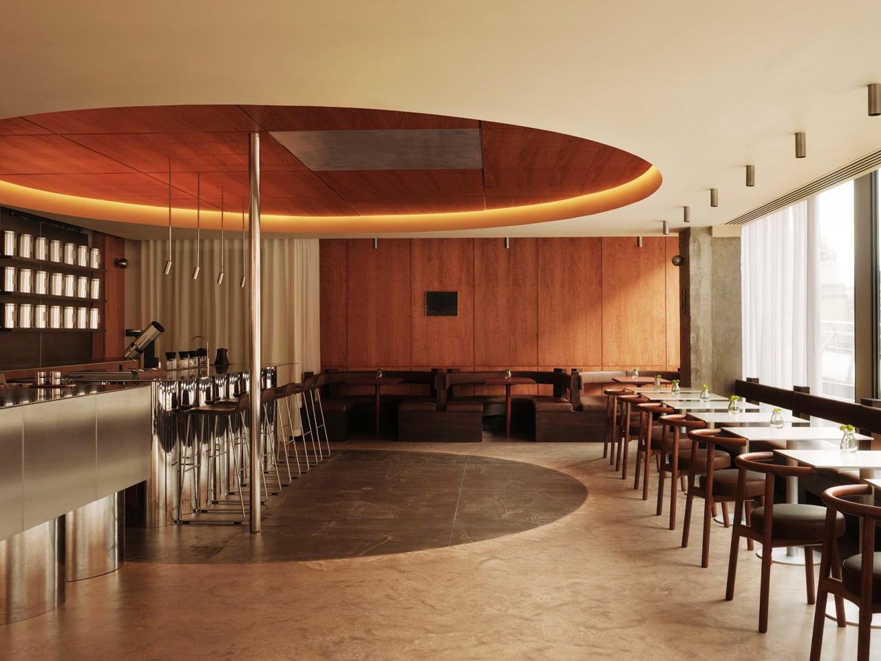
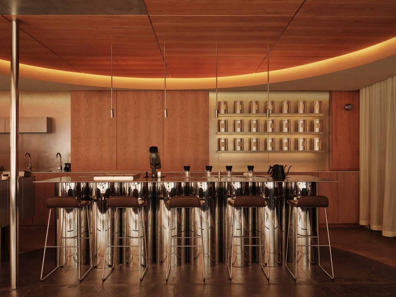
That thinking earns its keep through specific, well-resolved gestures. The most arresting is a dramatic circular void carved into the ceiling, a spatial echo of St Paul’s dome, translated from the sacred to the everyday. Below it, a monolithic espresso counter holds the room together, its weight and material language borrowed from Tate Modern’s industrial character and the infrastructural logic of the riverbanks themselves. Neither move is decorative. Both shift the room into territory that most café designs never reach.

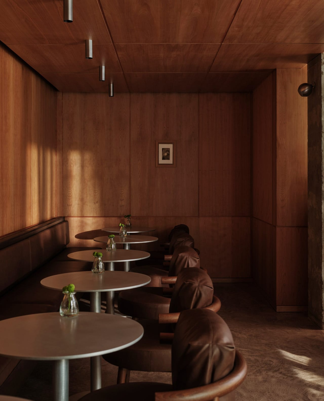
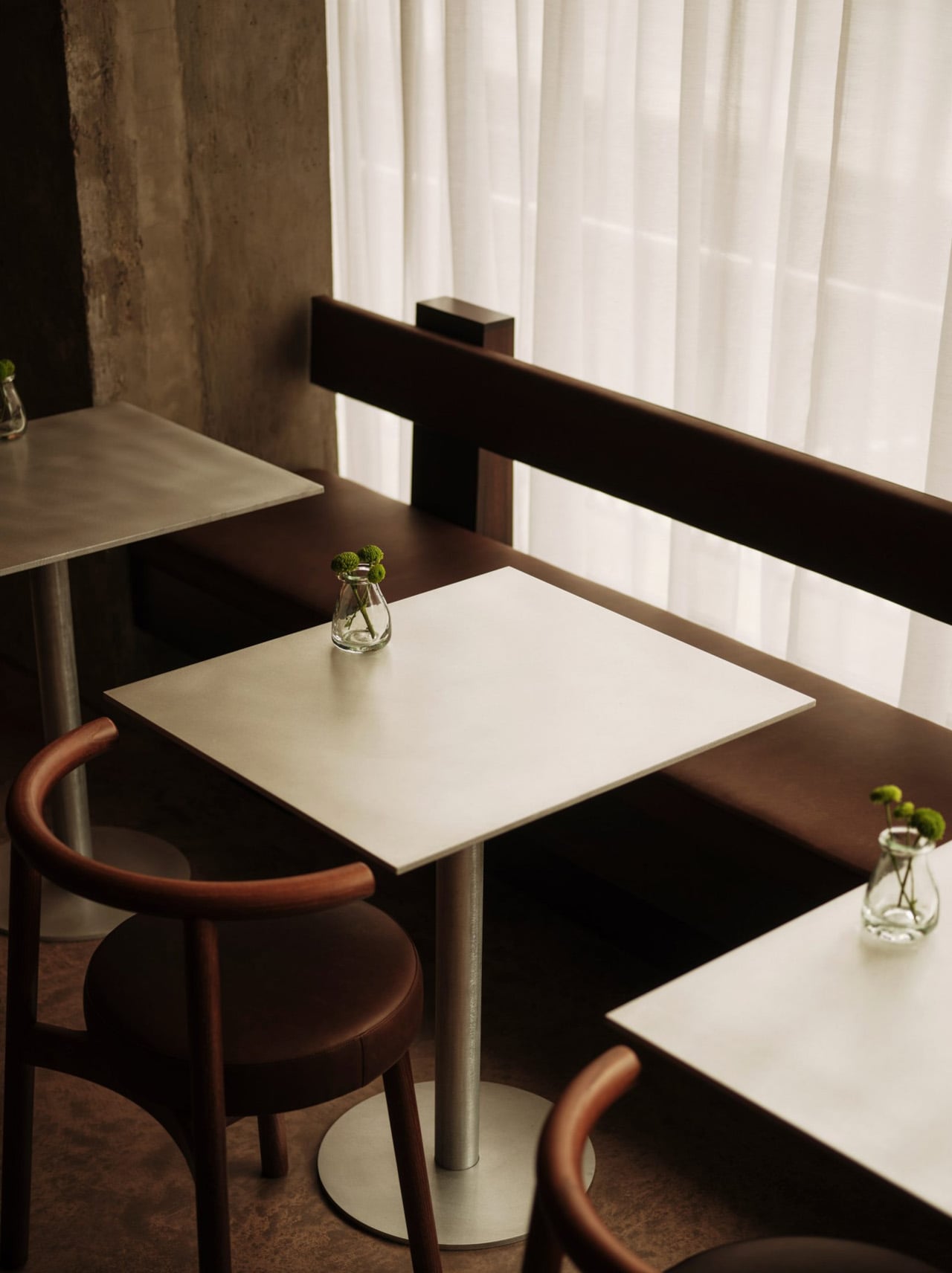
The palette is handled with the same restraint. Colour is drawn from the immediate surroundings: the tonal range of the river at different hours, the bleached stone of the embankment walls, the open and often overcast London sky. Back-painted finishes introduce a soft iridescence to the surfaces, so the room doesn’t read as a fixed thing. It responds to the time of day, softening in morning light and warming as the afternoon settles in.

WatchHouse has always been deliberate about place; each of its London locations takes its visual cues from the neighbourhood it occupies, but this Thames-side outpost feels like one of the most fully resolved in the portfolio. The 60-seat space will serve rare and special coffees alongside breakfast, viennoiserie, and bakery options, giving the room both the footfall and the menu to justify the ambition behind its design. For Cake Architecture, it’s another assured project from a studio building a reputation for spaces that think carefully about where they are. Here, the scale is modest, and the mood is quiet, and it’s all the stronger for it.

The post This New London Café Has a Ceiling Inspired by St Paul’s Dome, and It Sits Right on the Thames first appeared on Yanko Design.

This Bright Green Fountain Just Made London’s New District Unmissable

There’s something delightfully unexpected about stumbling upon a fountain that looks like it might start dancing at any moment. That’s exactly what design studio Neon has created for Brent Cross Town in London, and honestly, it’s the kind of public art that makes you stop scrolling through your phone and actually look up.

The Fountain isn’t your grandmother’s classical water feature with cherubs and symmetrical tiers. Instead, imagine a stack of bright green sculptural plates that seem to defy gravity and good manners. They’re asymmetrical, angular, and unapologetically bold. It’s like someone took the idea of what a fountain should be, tossed it in the air, and let it land however it wanted.

Designer: Neon

What makes this installation particularly clever is how it plays with our expectations. We’re so conditioned to see fountains as these elegant, balanced structures centered in plazas and parks. But Neon flipped that script entirely. The green isn’t a subtle sage or muted mint. It’s vibrant, almost electric, demanding attention in the best possible way. It’s the color of highlighters and neon signs, which feels perfectly appropriate for a studio literally named Neon.

The sculptural plates themselves look like they’re caught mid-motion, as if they’re perpetually tumbling through space but somehow frozen at the perfect moment. There’s a playfulness to the design that feels refreshing in the world of public installations, where things can sometimes skew too serious or too safe. This piece doesn’t apologize for taking up space or being seen. It wants to be noticed, and it succeeds.

Located in Brent Cross Town, the fountain sits in a developing area of London that’s been transforming from a shopping center hub into a mixed-use neighborhood. Public art like this becomes crucial in those transitional spaces. It gives people something to gather around, something to use as a meeting point, and most importantly, something that adds character and identity to a place still finding its voice.

What’s particularly interesting about The Fountain is how it bridges multiple design philosophies. There’s definitely a contemporary art sensibility with the abstract forms and bold color choice. But there’s also a functional design element since it’s still, at its core, a working fountain. Water presumably flows through or around these sculptural elements, adding movement and sound to the visual spectacle. That combination of form and function, especially when executed this dramatically, is what separates memorable public installations from forgettable ones.

Neon, the studio behind this work, has built a reputation for creating experiential designs that engage people in unexpected ways. They’re not interested in background pieces that politely fade into their surroundings. Their portfolio demonstrates a consistent commitment to work that provokes reaction, whether that’s delight, curiosity, or even a bit of bewilderment. The Fountain fits perfectly into that philosophy.

There’s also something to be said about using such a saturated color in a public space. Green is often associated with nature, growth, and renewal, but this particular shade pushes past those gentle associations into something more energetic and urban. It’s a green that belongs to street art and graphic design rather than pastoral landscapes. That choice feels intentional for a location that’s urban and forward-looking.

The asymmetry deserves special attention too. In an era where Instagram-perfect symmetry dominates so much of our visual culture, there’s something rebellious about embracing imbalance. The plates appear to stack and tilt at odd angles, creating different silhouettes depending on where you’re standing. That means the fountain isn’t just one experience but multiple ones, changing as you move around it.

Public art should do more than just occupy space. It should create conversation, add joy, and give people a reason to engage with their environment differently. The Fountain manages all three. It’s weird enough to be memorable but accessible enough that you don’t need an art degree to appreciate it. You just need to be willing to accept that fountains can be bright green, delightfully lopsided, and a little bit rebellious. And honestly, couldn’t we all use a bit more of that energy in our public spaces?

The post This Bright Green Fountain Just Made London’s New District Unmissable first appeared on Yanko Design.