Most of us never really figured out how to leave work at home because, at some point, home became work. The pandemic turned dining tables into conference rooms and bedroom corners into permanent offices, and while the world has technically moved on, the desk hasn’t. It’s still there, covered in cables and sticky notes, glowing at you at 9 PM like a passive-aggressive coworker who never clocks out. For the millions of people still living and working in compact spaces, that boundary between “on” and “off” remains one of the most stubbornly unsolved problems in modern life. That’s the exact gap designer Seung Bin Bae is addressing with DuoShift, and the solution is refreshingly physical.
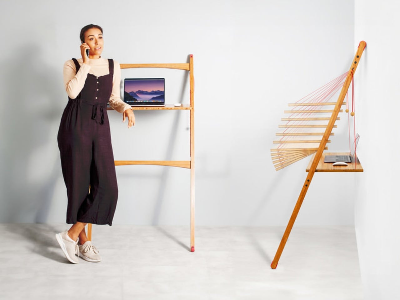
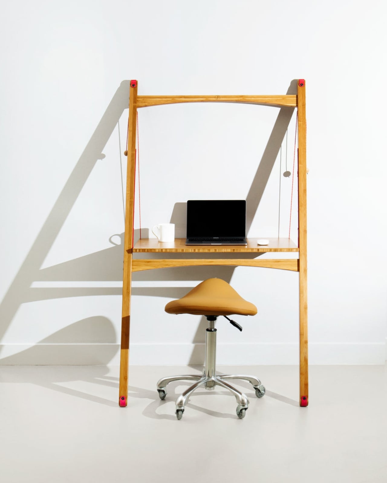
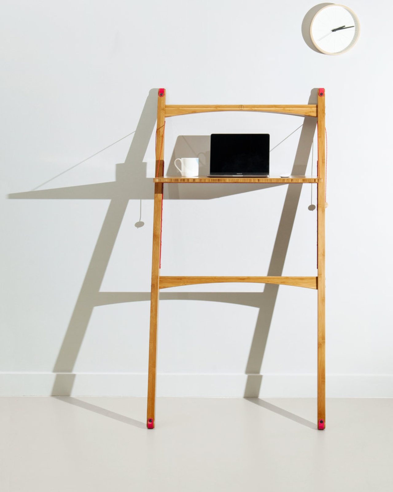
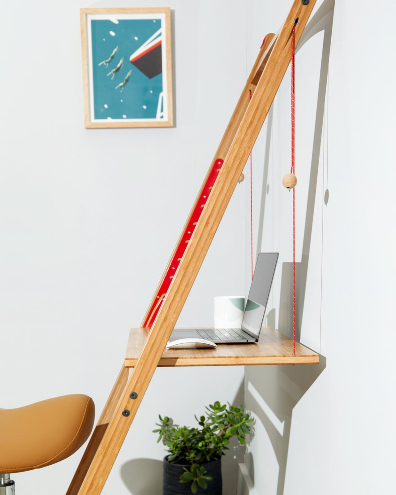
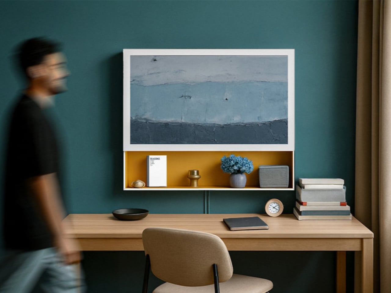
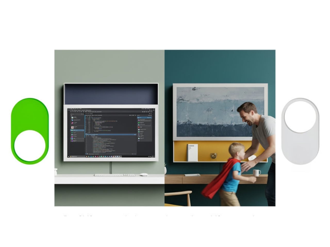
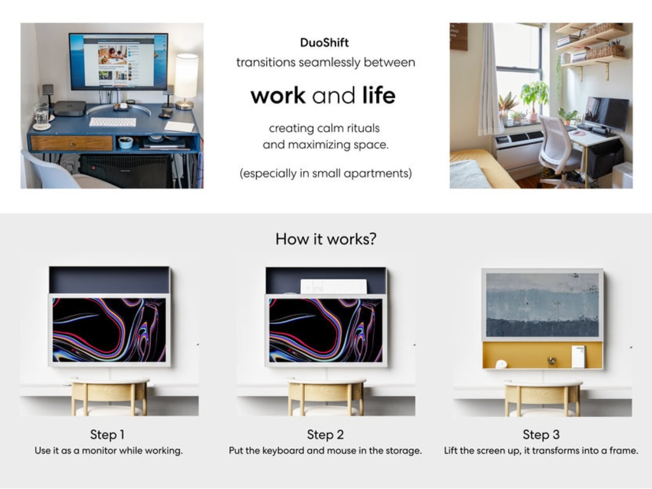
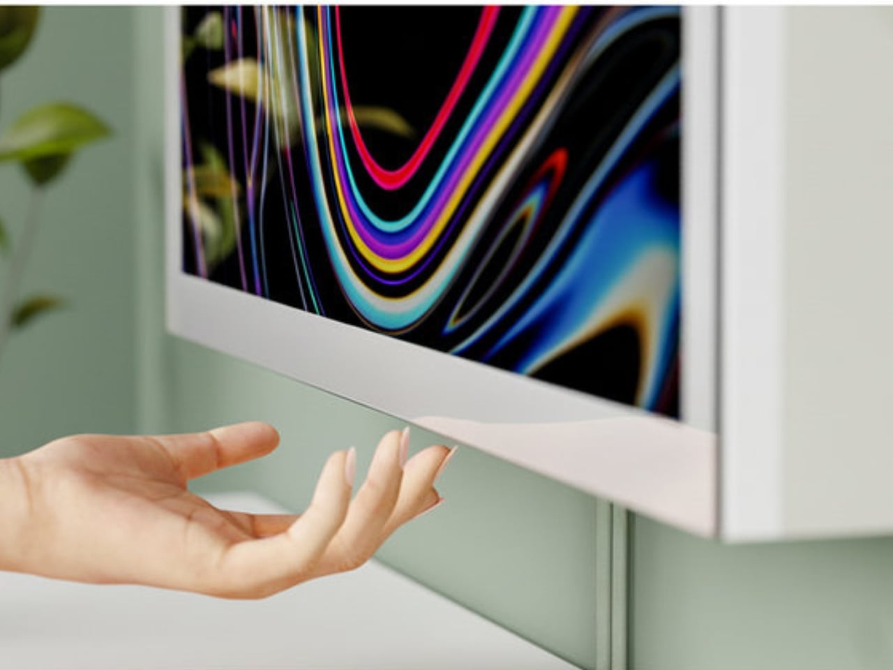
DuoShift is a dual-purpose display designed for small home offices. It has two modes, and switching between them requires exactly one motion: a single upward shift of the screen. In Work Mode, it sits at standard monitor height and does what a monitor does: it holds your spreadsheets, your browser tabs, your video calls. But when you physically push it upward, it enters Life Mode, transforming into a digital art frame while freeing the entire desk surface below it. That’s your signal. Work is done. The desk is yours again.
Designer: Seung Bin Bae
The elegance here is intentional and worth pausing on. We’ve spent years trying to solve work-life balance through apps, timers, calendar blocks, and browser plugins, basically asking software to impose discipline on behavior that software helped unravel in the first place. Bae flips that logic entirely. DuoShift solves a psychological problem through a physical act. It doesn’t ping you or send a notification. You have to physically move it, and that movement is the whole point.
There’s a behavioral psychology concept in here that designers don’t always get credit for tapping into. Rituals matter. The act of shutting down a laptop, hanging up a coat, or changing out of work clothes serves a real cognitive function: it tells your brain that a transition has happened. DuoShift is engineered to be exactly that kind of ritual, embedded directly into an object you already use every day. One push, and the desk stops being an office.
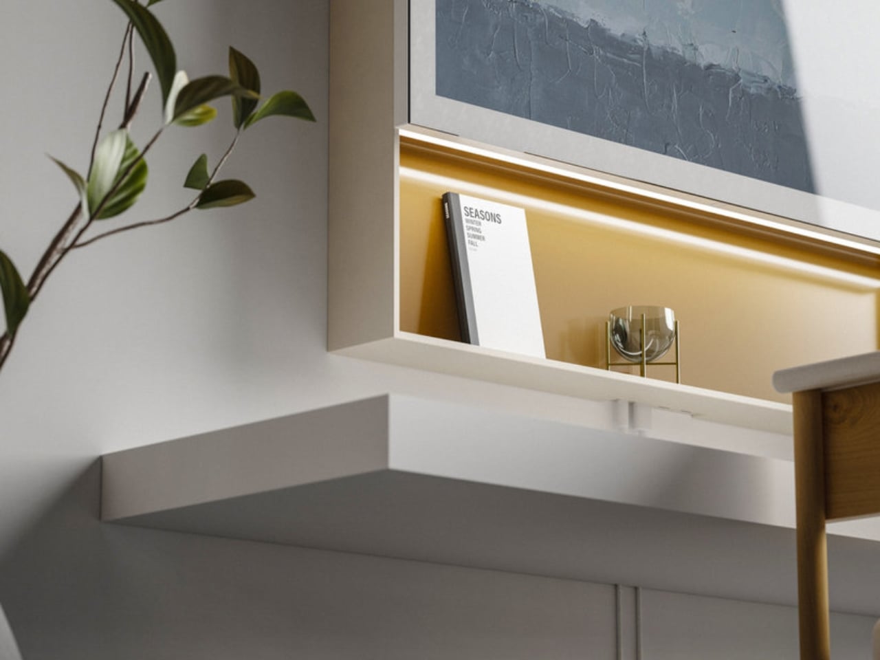
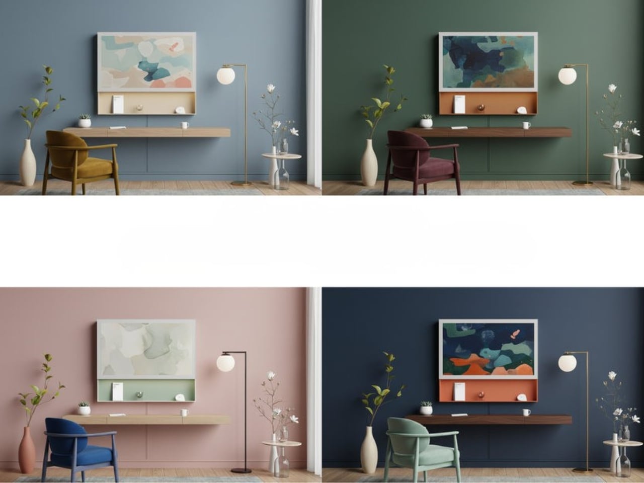
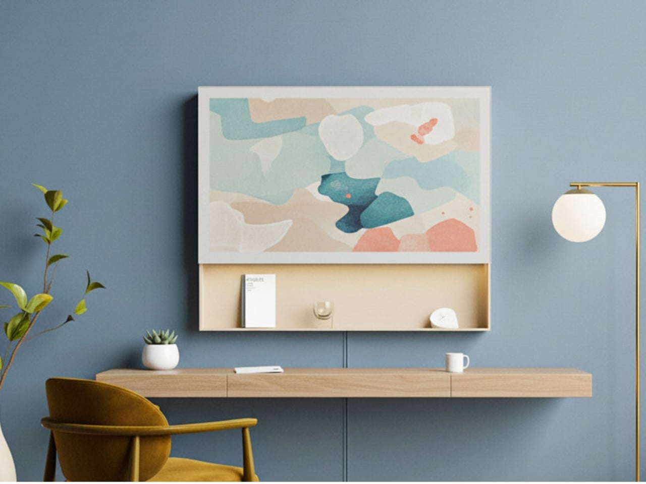
Visually, the design is minimal in a way that feels considered rather than cold. It’s slim, clean, and customizable, built to integrate with a living space rather than dominate it. In Life Mode, it becomes something closer to wall art than tech equipment. Bae’s design philosophy centers on creating practical, user-friendly products that solve real-world problems rather than merely chasing novelty, and DuoShift reflects that clearly. It doesn’t oversell itself. It doesn’t have seventeen features. It has one good idea, executed well.
The context matters too. Compact living isn’t a temporary trend or a demographic niche. Urban apartments are getting smaller, remote work remains widespread, and the people navigating both are still largely on their own when it comes to creating functional, psychologically healthy environments at home. Most monitor design has simply not caught up to this reality. DuoShift is one of the rare products that treats the WFH experience as a design problem worthy of a serious, considered design response.
Is it a complete answer to burnout? No, and it doesn’t claim to be. But it gets at something that most tech products completely sidestep: the importance of having a physical, tangible signal that your workday has ended. Not a notification. Not an alarm. A gesture. A real, physical thing you do with your hands that marks the shift from one mode to another.
The fact that this came from a student designer makes it more interesting, not less. It suggests that the next generation of product designers is less interested in adding features and more focused on subtracting friction from the parts of life that matter most. DuoShift is a small product with a genuinely large idea behind it, and that kind of thinking is exactly what the WFH era still needs.
The post One Push Finally Fixes the WFH Desk Problem first appeared on Yanko Design.