The Kanuka Is the Tiny Home That Opens Up Instead of Closing In

The tiny house movement has long promised a life unburdened by excess — but few models deliver on that promise as quietly and confidently as the Kanuka by Tiny Timber Homes. Named after a native New Zealand tree, the Kanuka is a compact dwelling that earns its place not through spectacle, but through craft, warmth, and a clear design philosophy that puts livability above everything else.

Founded in 2014 by craftsman Phil Edwards, Tiny Timber Homes has spent over a decade refining what it means to build small without building less. The Kanuka is arguably the clearest expression of that ethos — a home that feels considered at every turn, from the choice of materials to the way it engages with the landscape around it.

Designer: Tiny Timber Homes

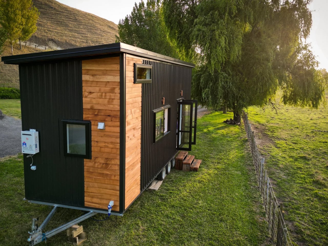
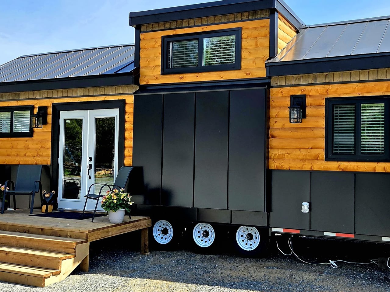
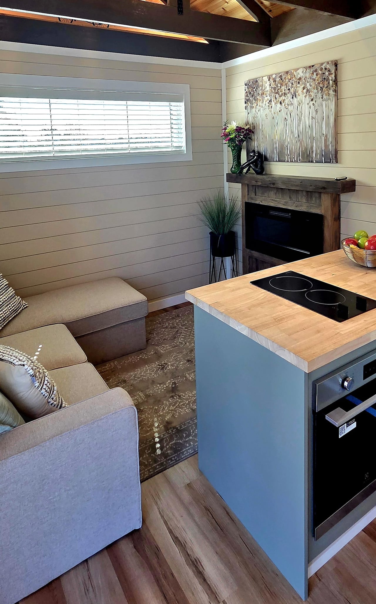
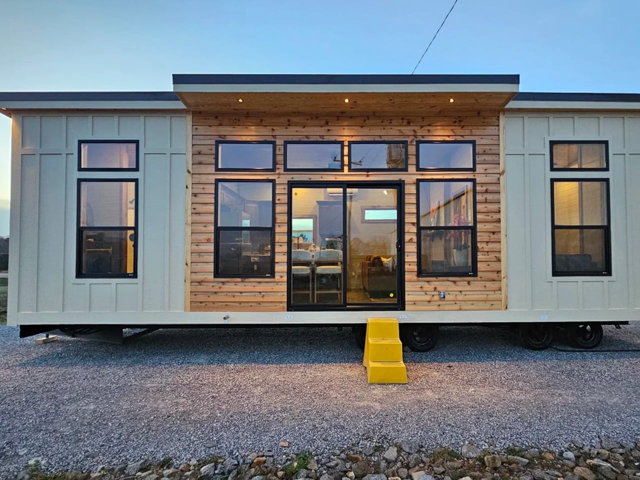
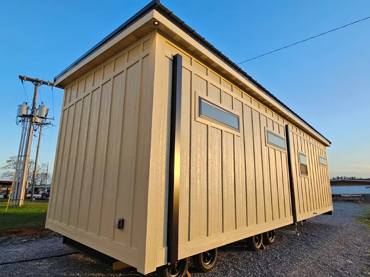
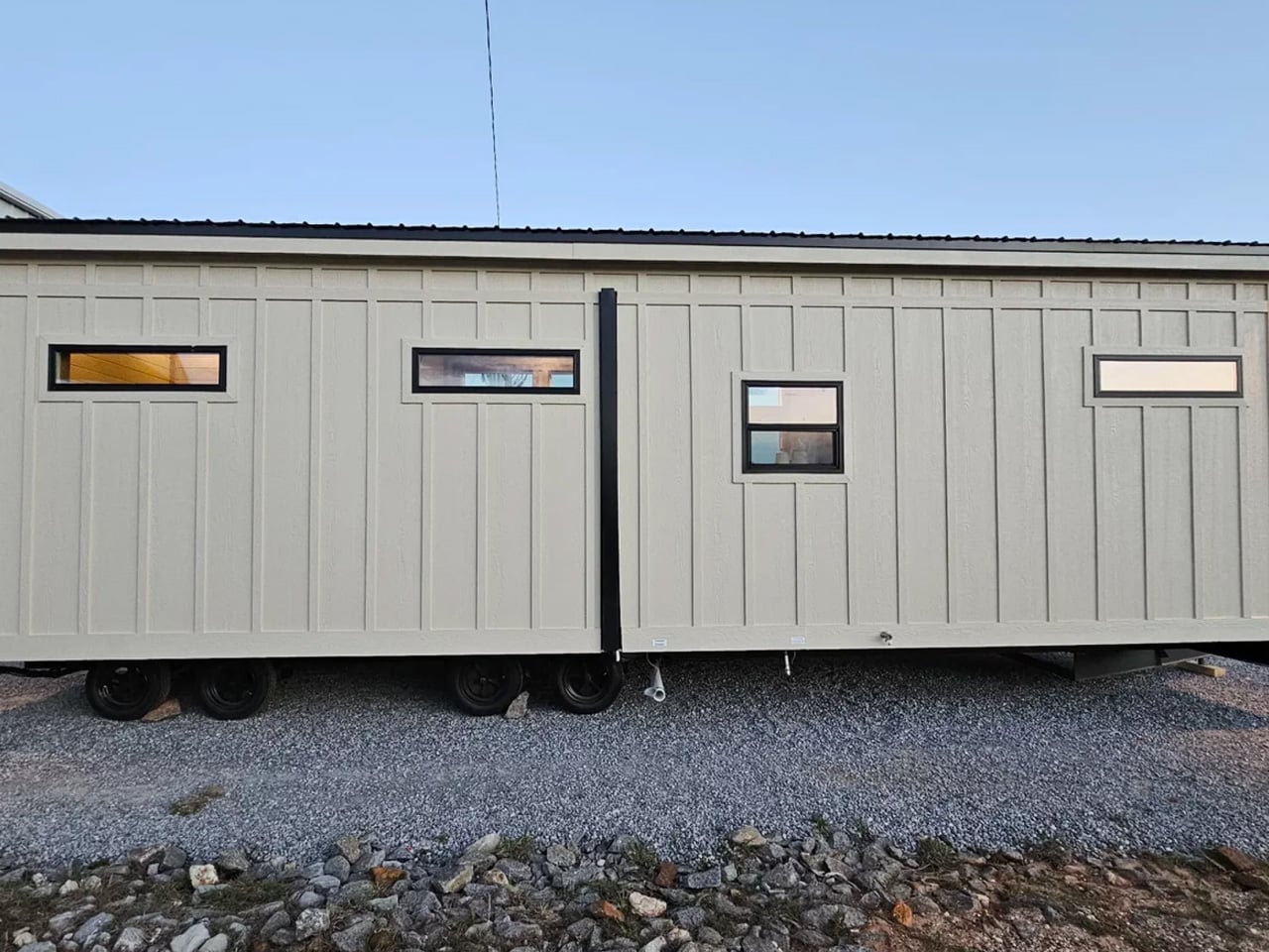
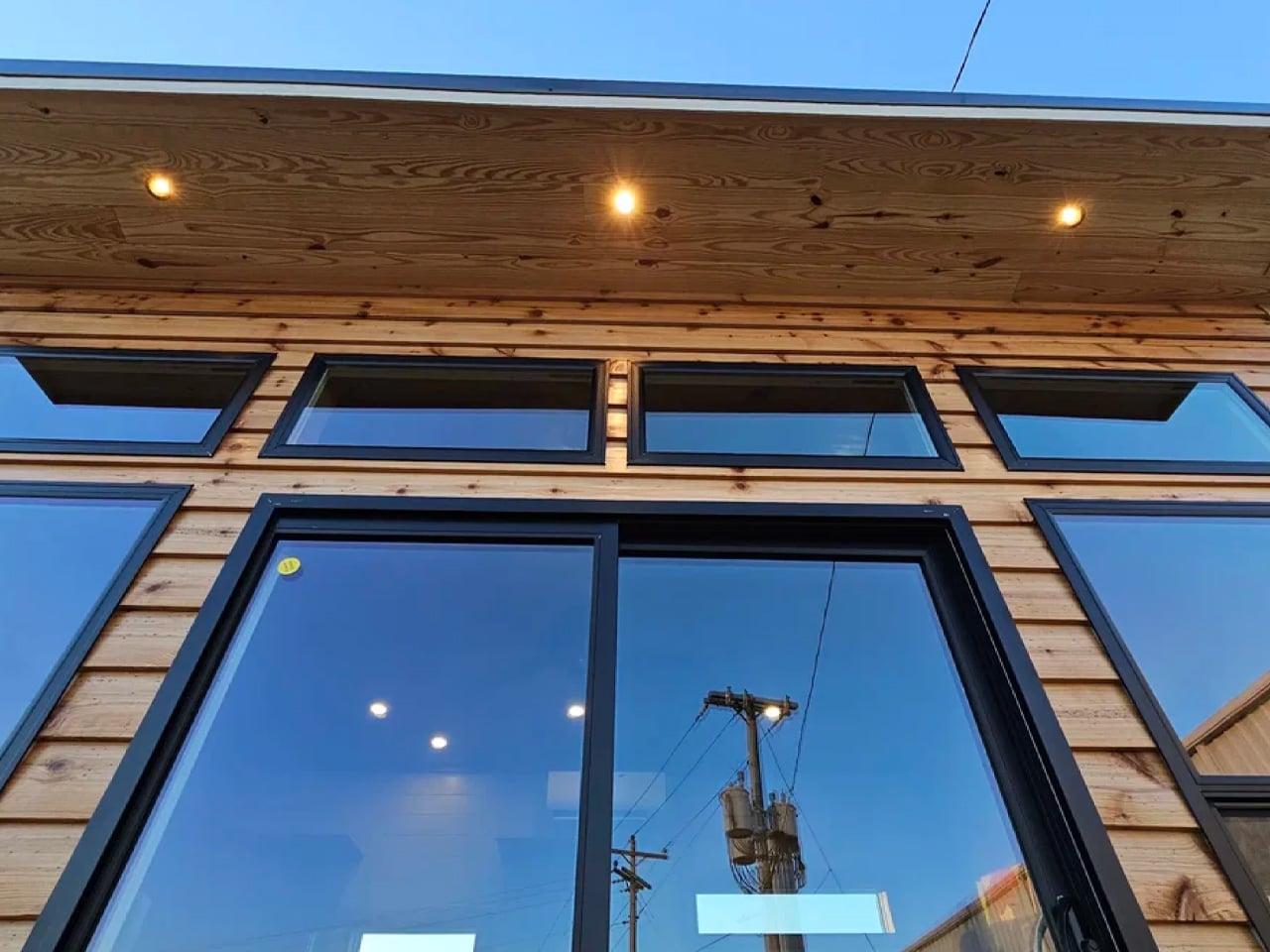
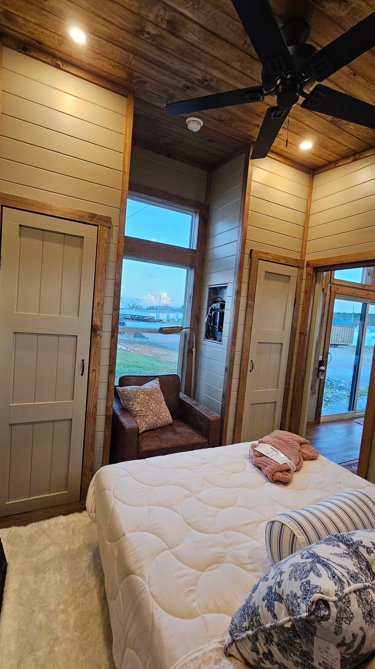
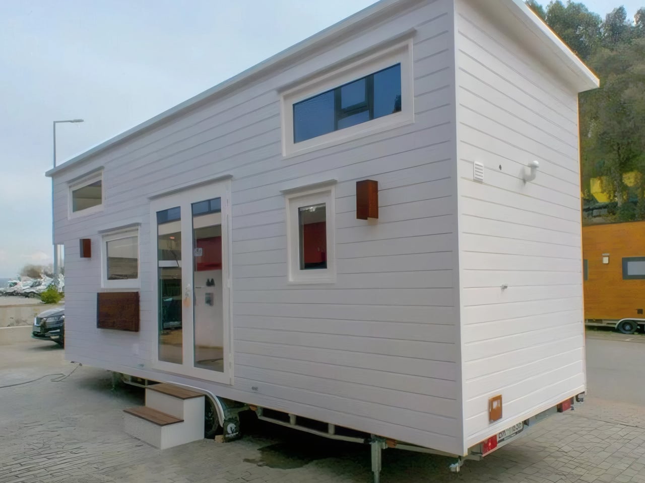
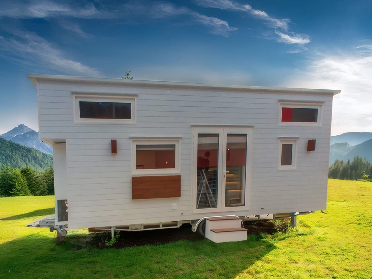
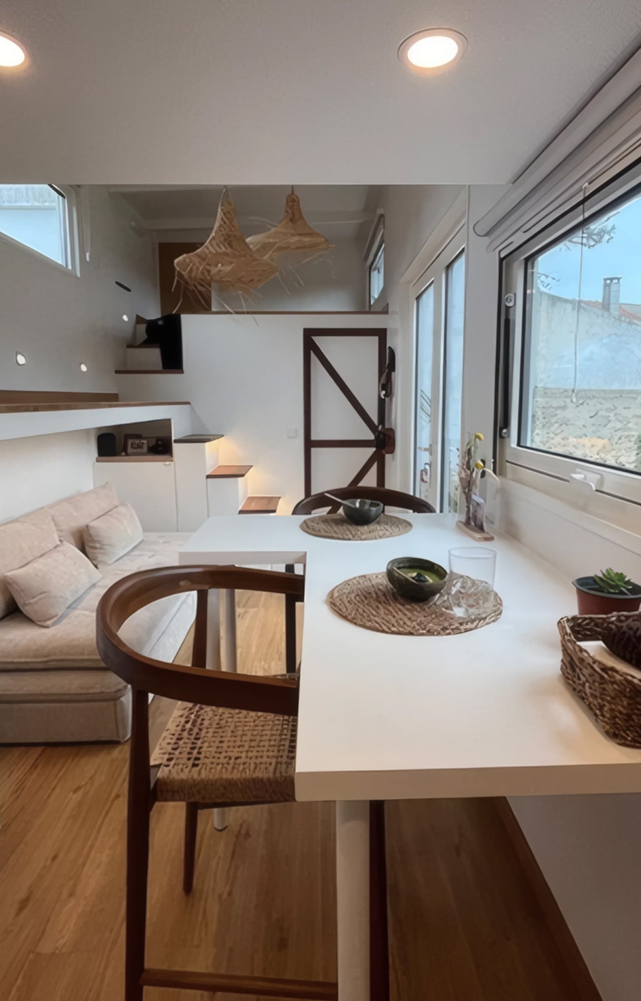
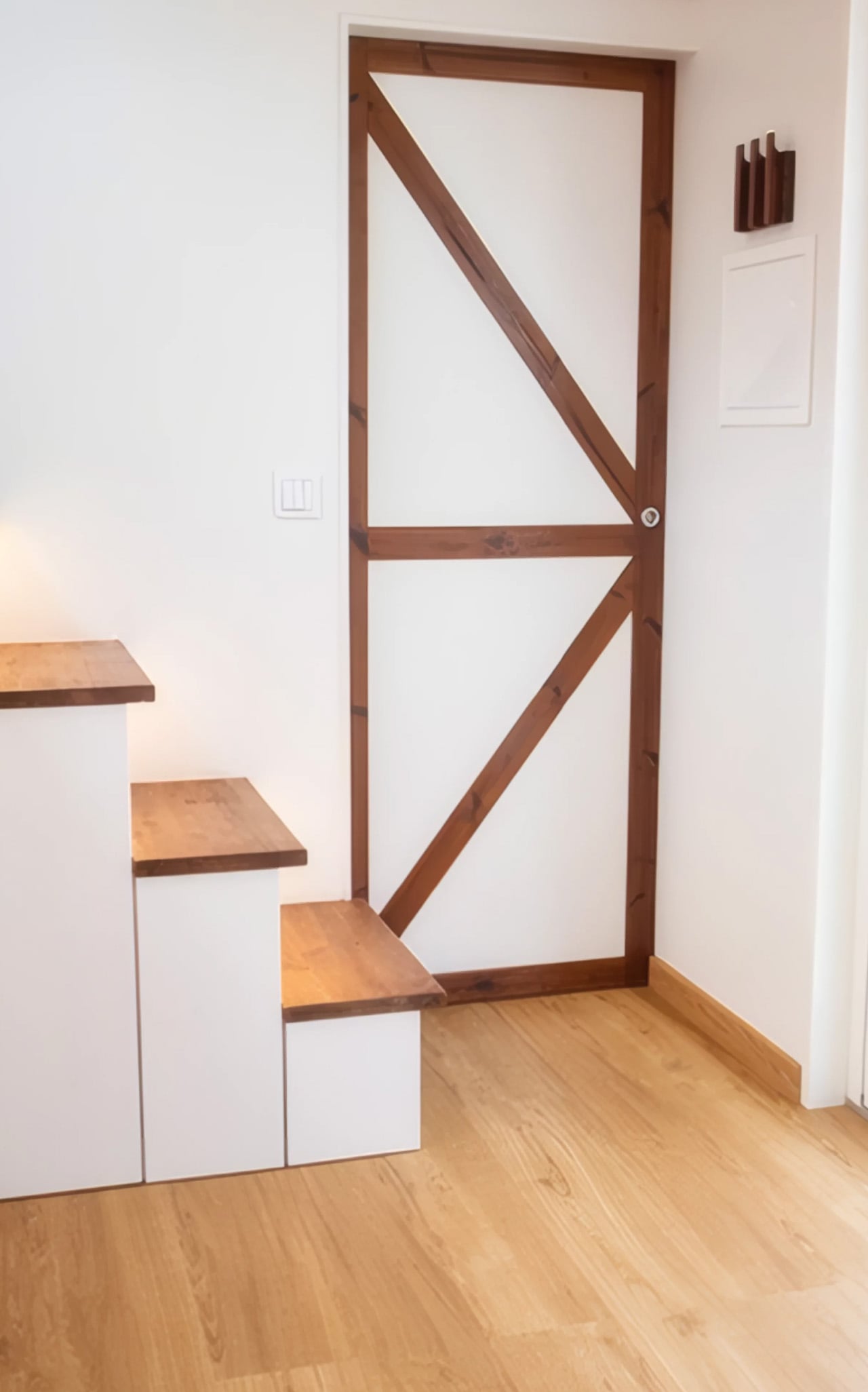
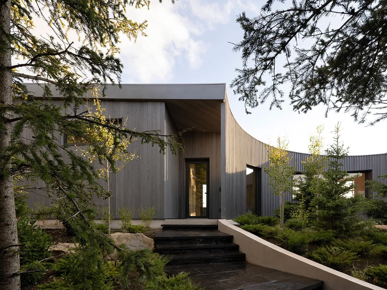
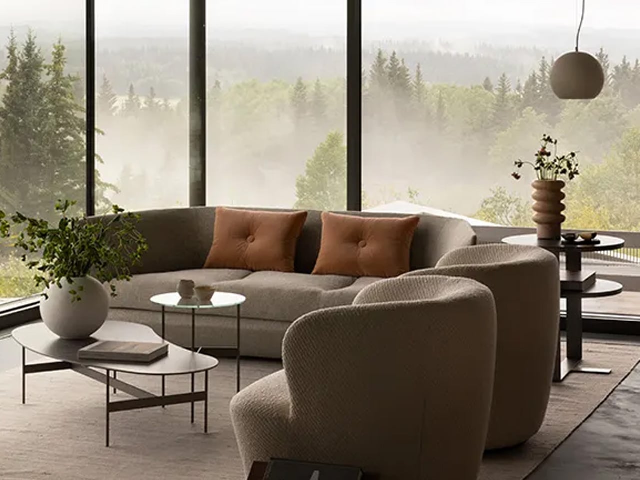
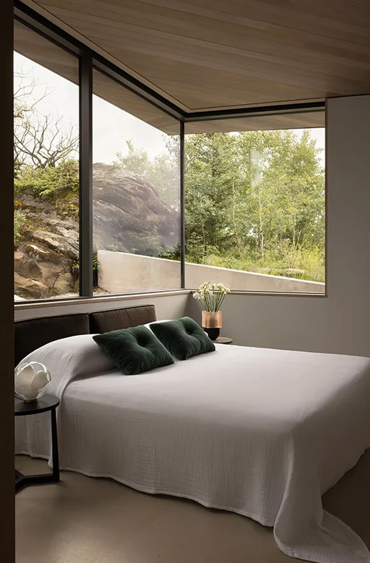
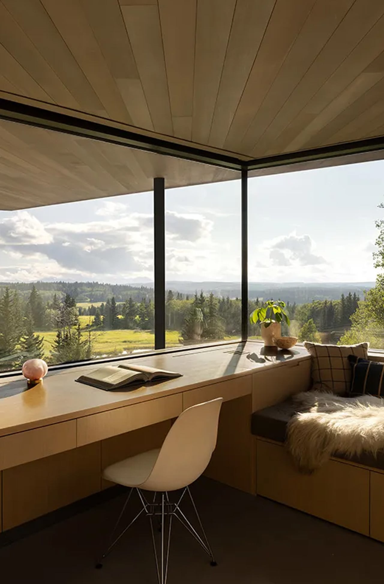
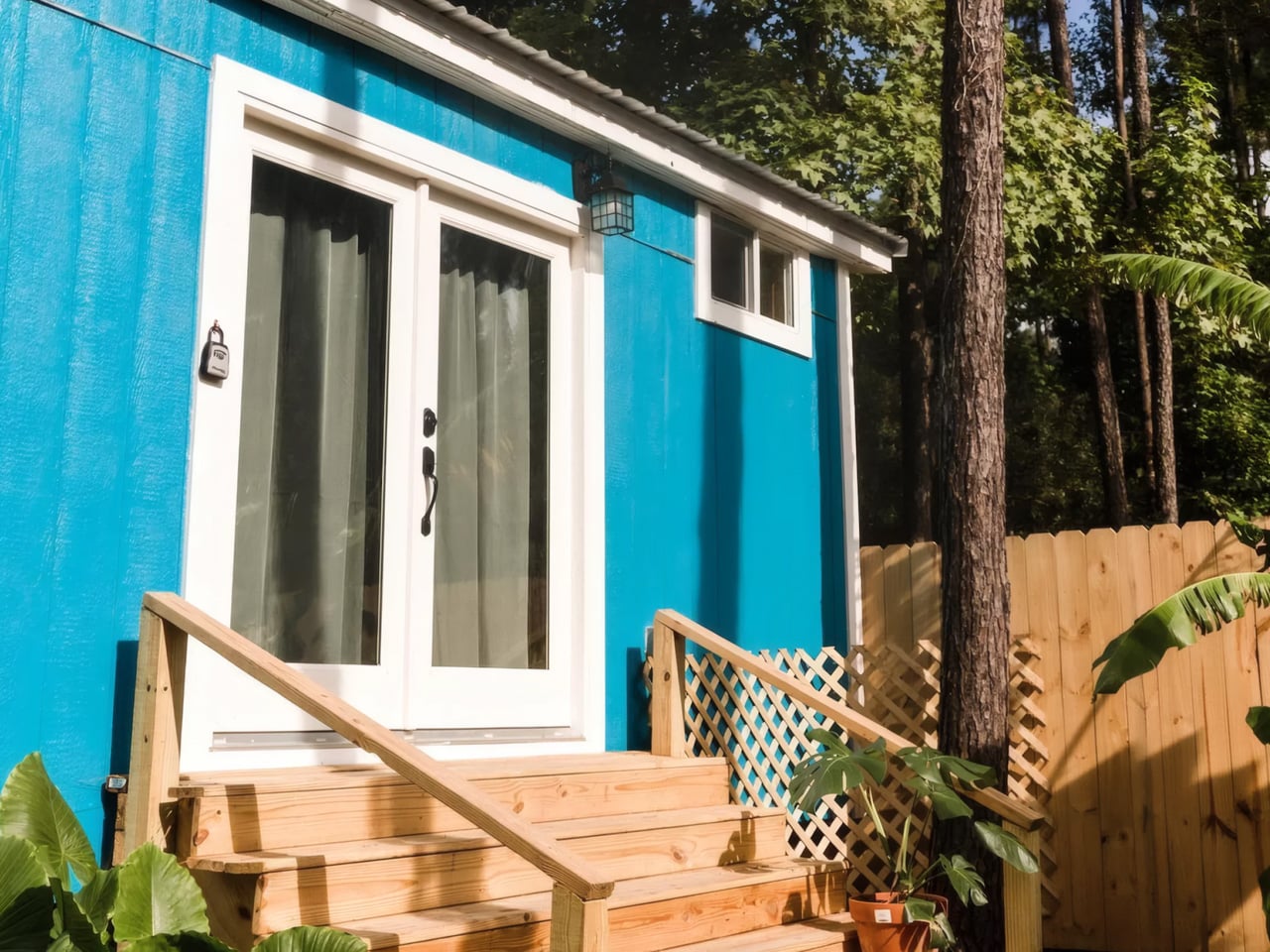
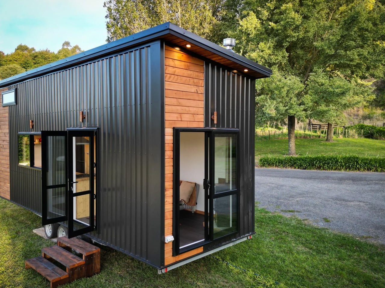
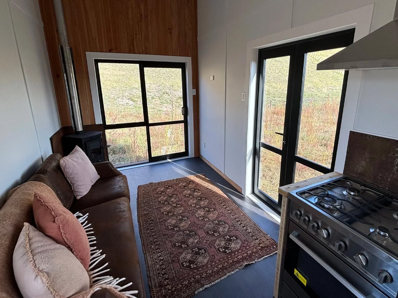
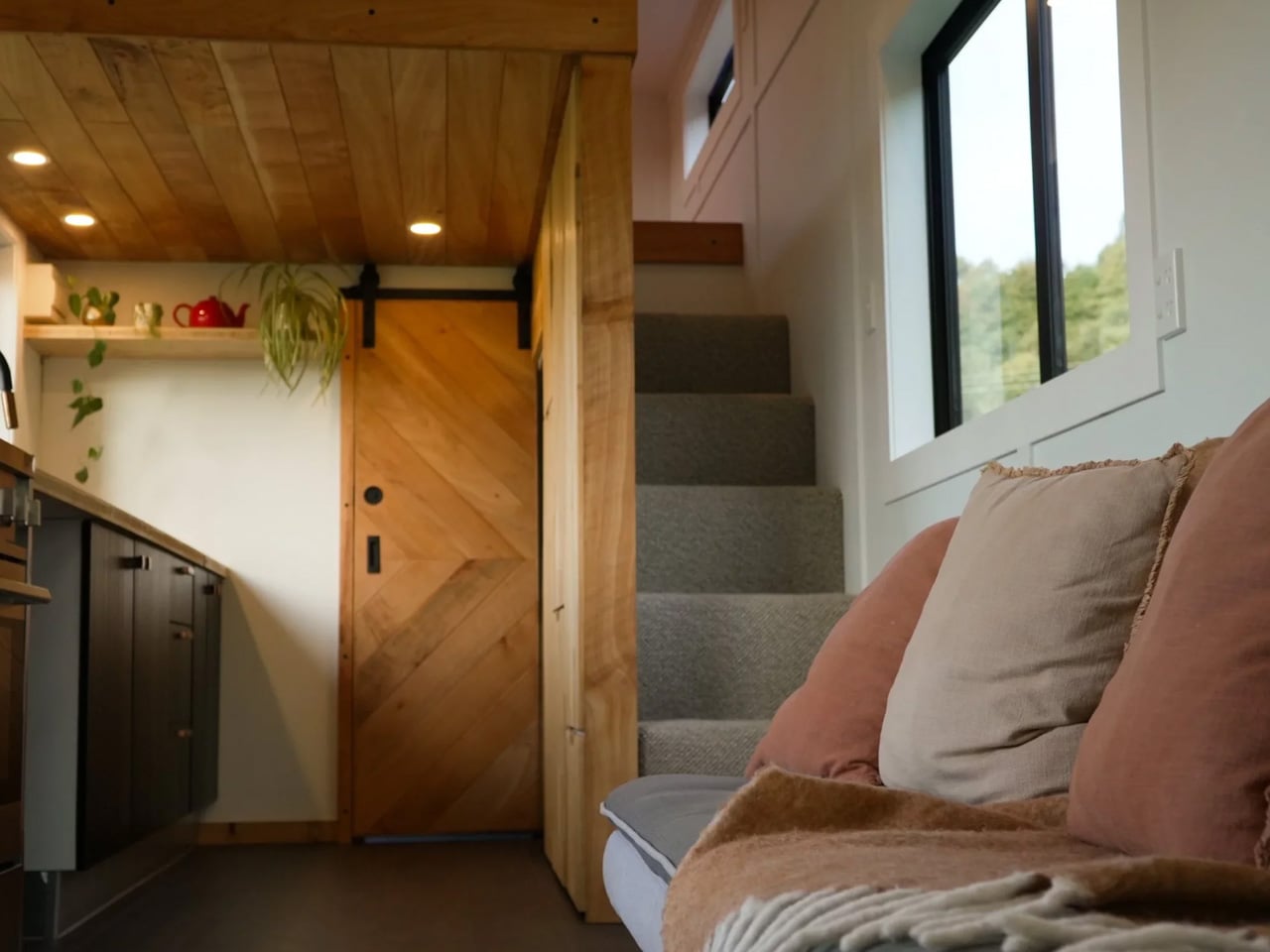
Sitting on a triple-axle trailer, the Kanuka measures 8.1 meters (26.5 ft) long and 2.6 meters (8.5 ft) wide — compact, but not cramped. Its exterior pairs durable metal cladding with warm timber accents, a combination that manages to feel both modern and rooted in something older. What sets the façade apart is its dual-door design: two glass entry doors open the interior directly to the outside, blurring the line between indoor and outdoor living in a way that larger homes often fail to achieve. Multiple windows reinforce the openness, pulling in natural light and keeping the interior feeling airy despite the tight footprint.

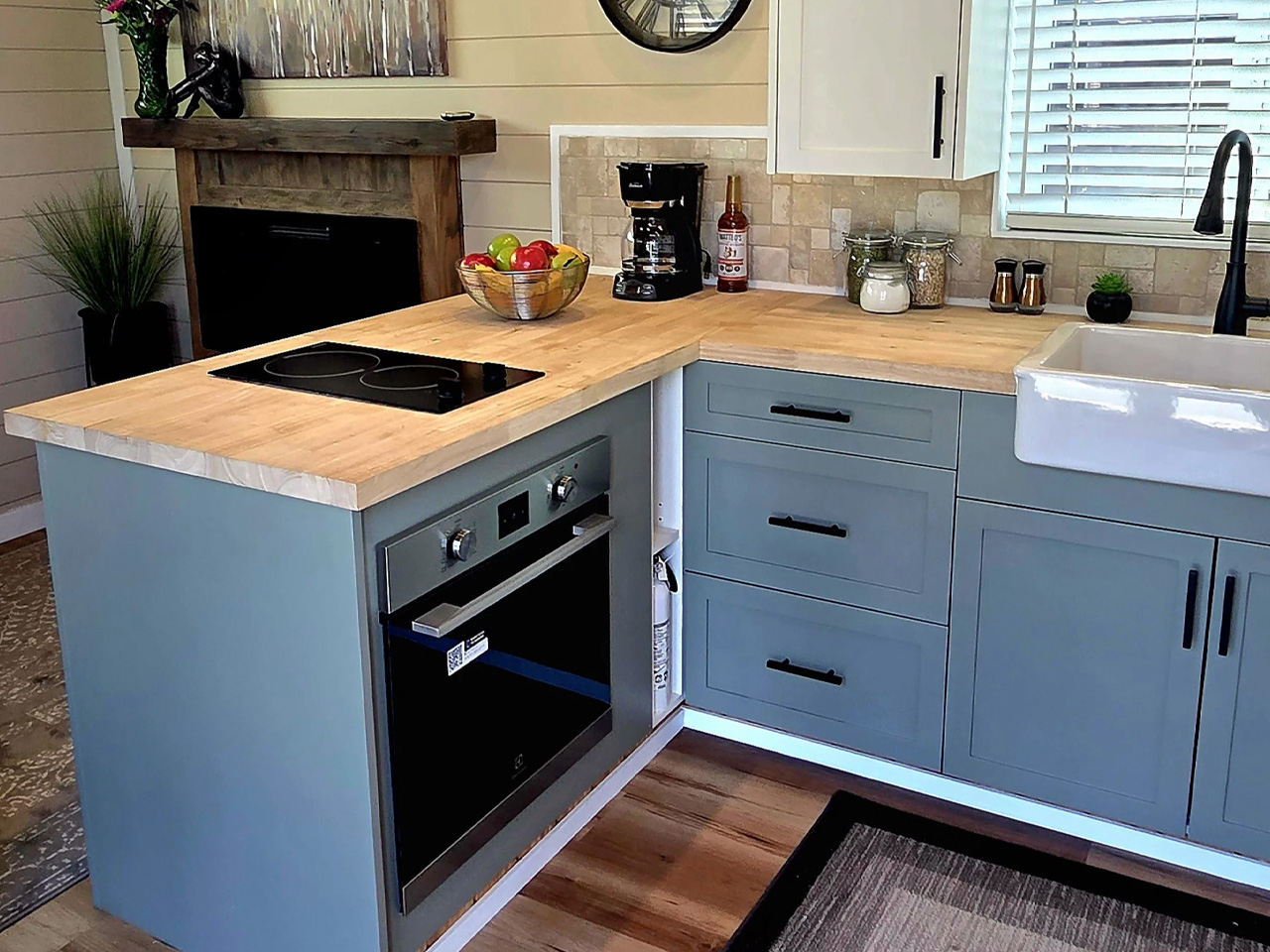
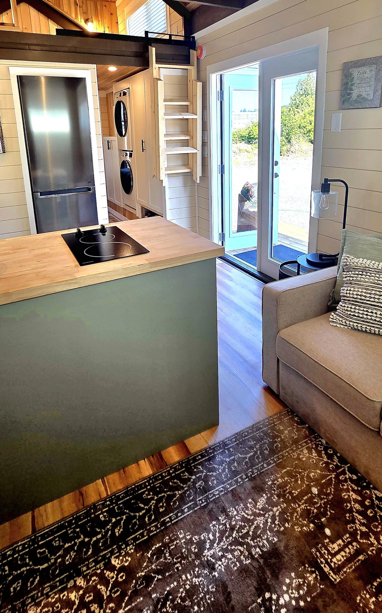
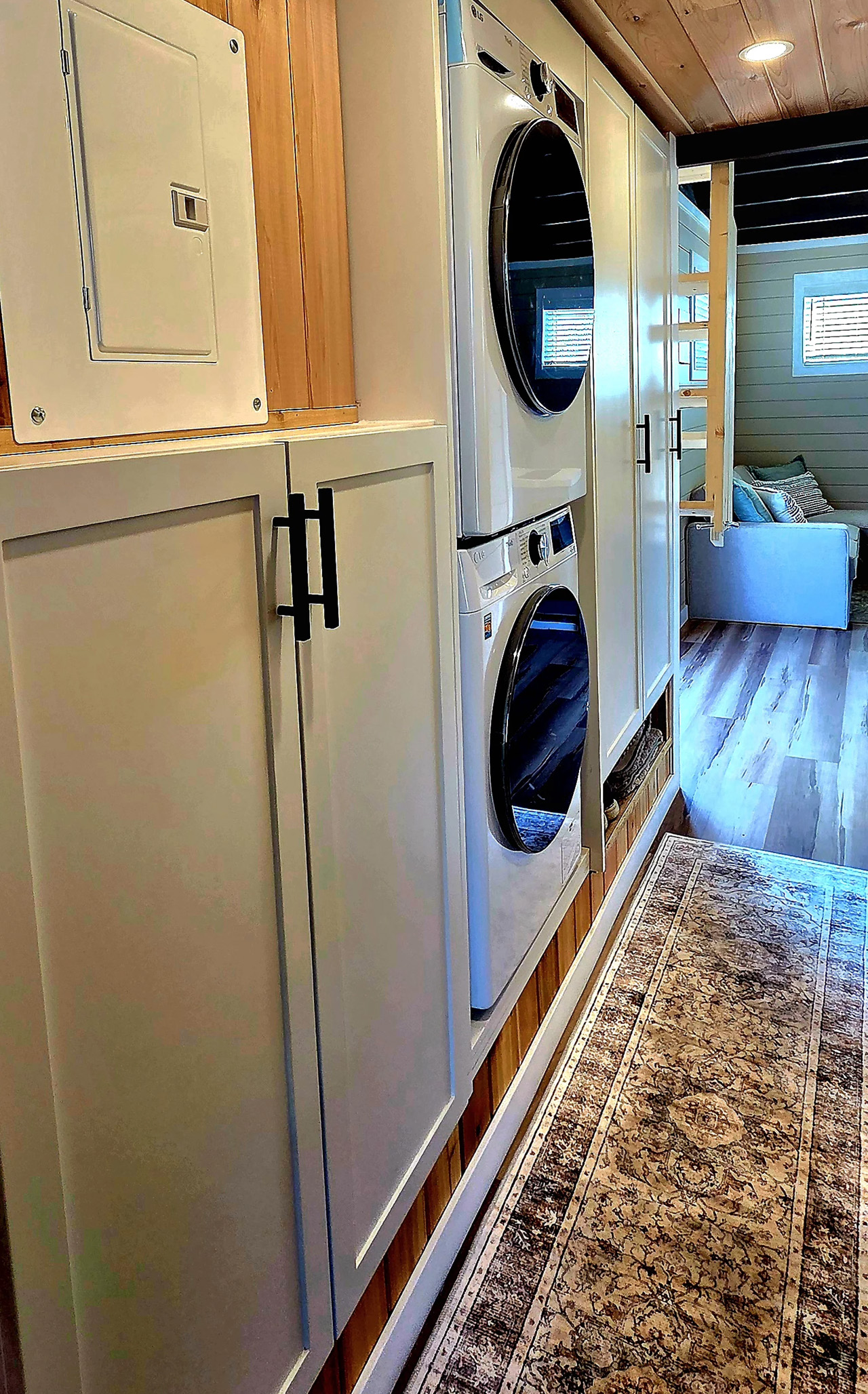
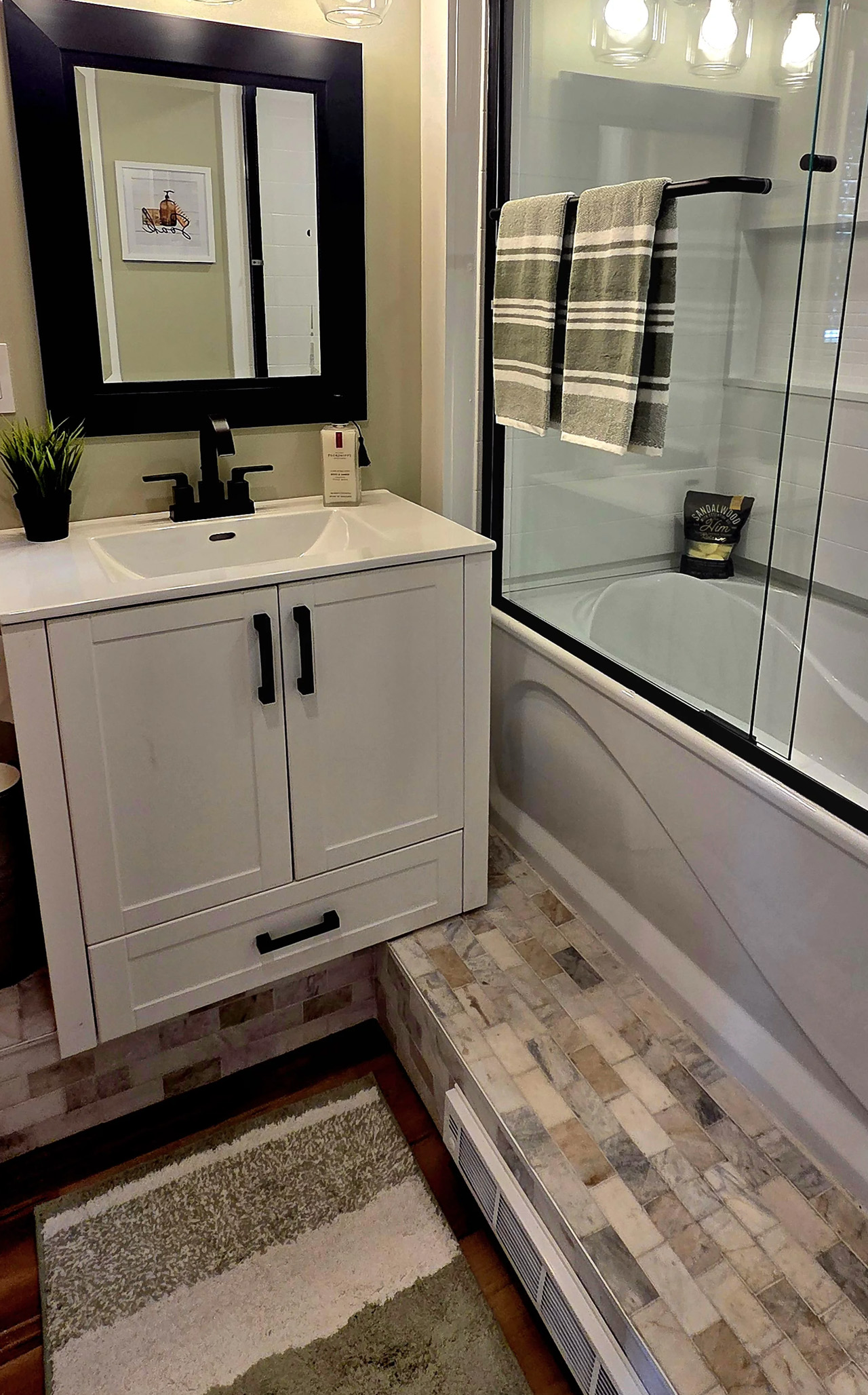
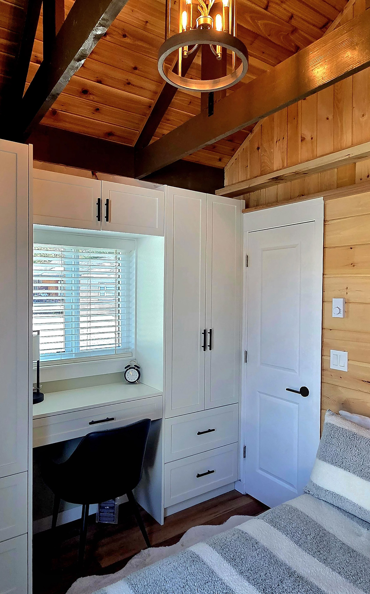
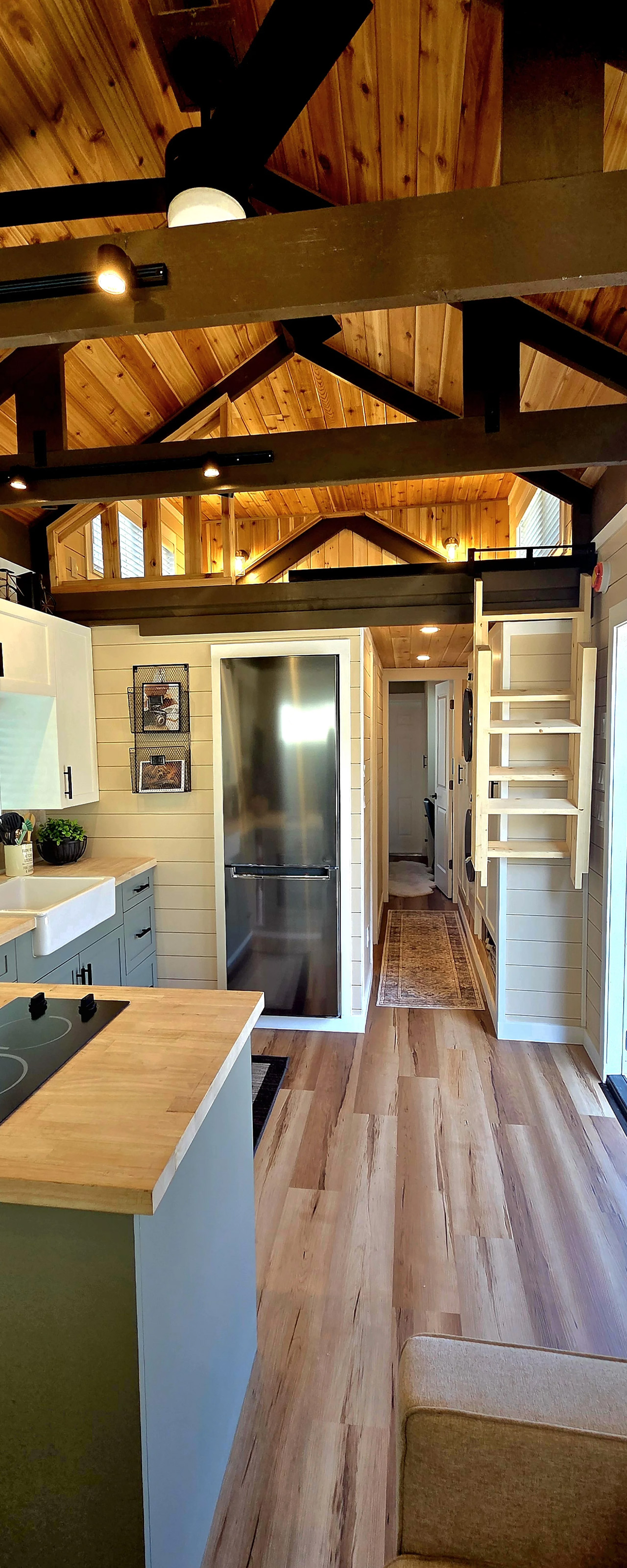
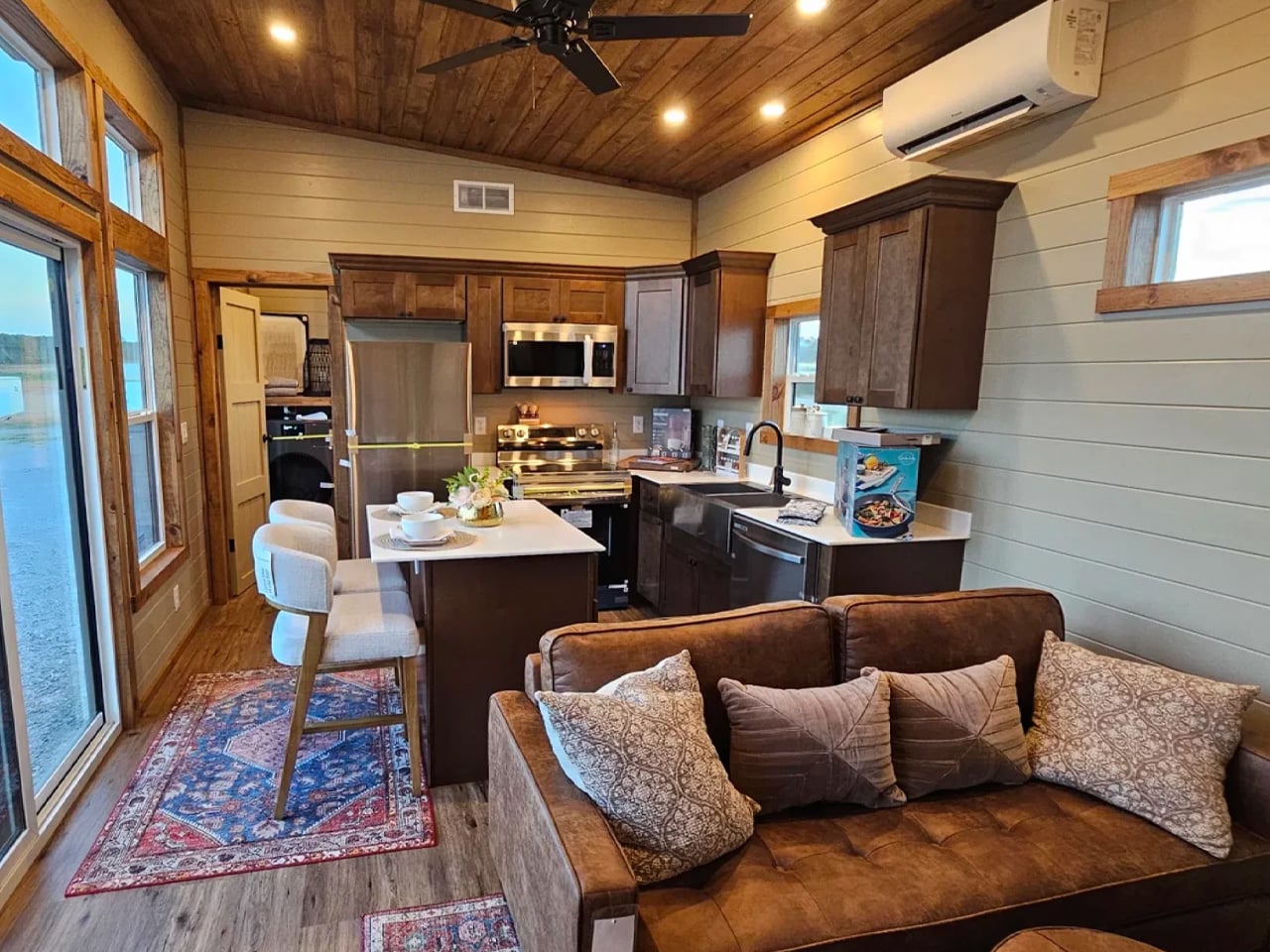
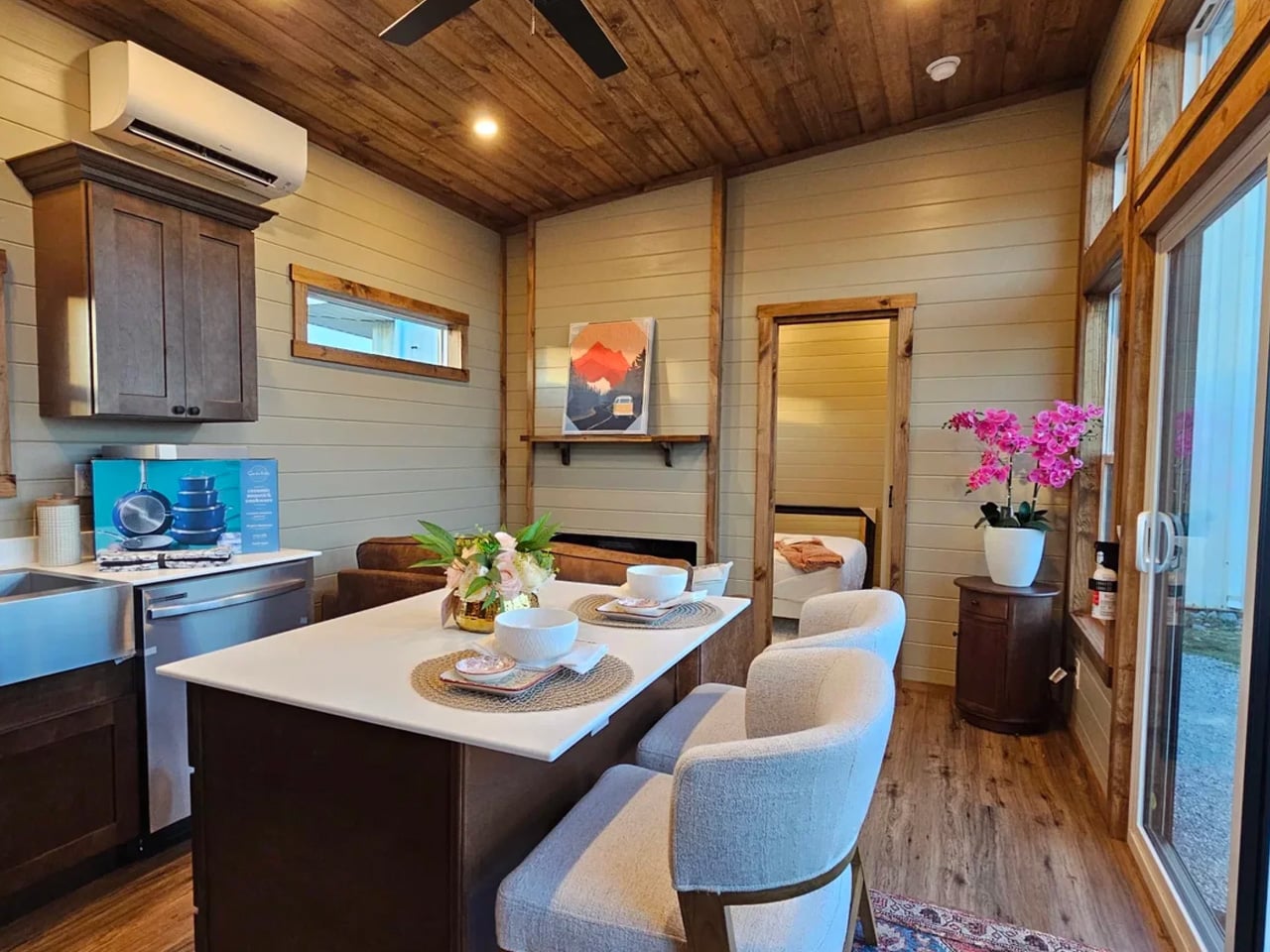
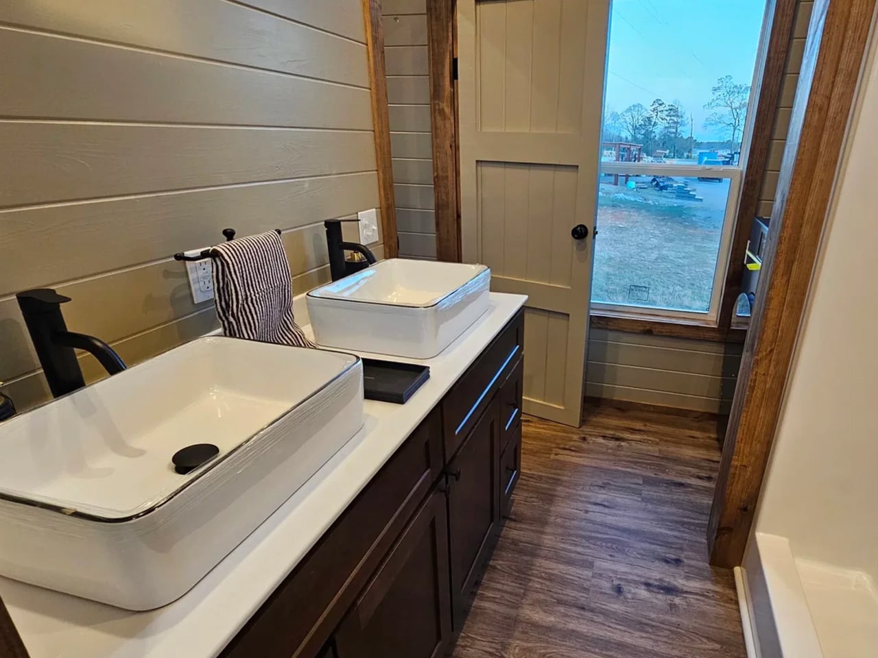
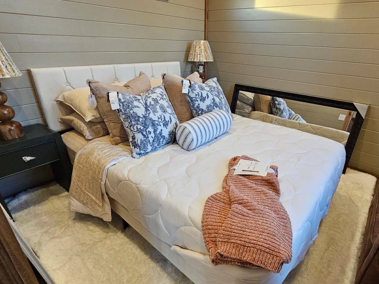
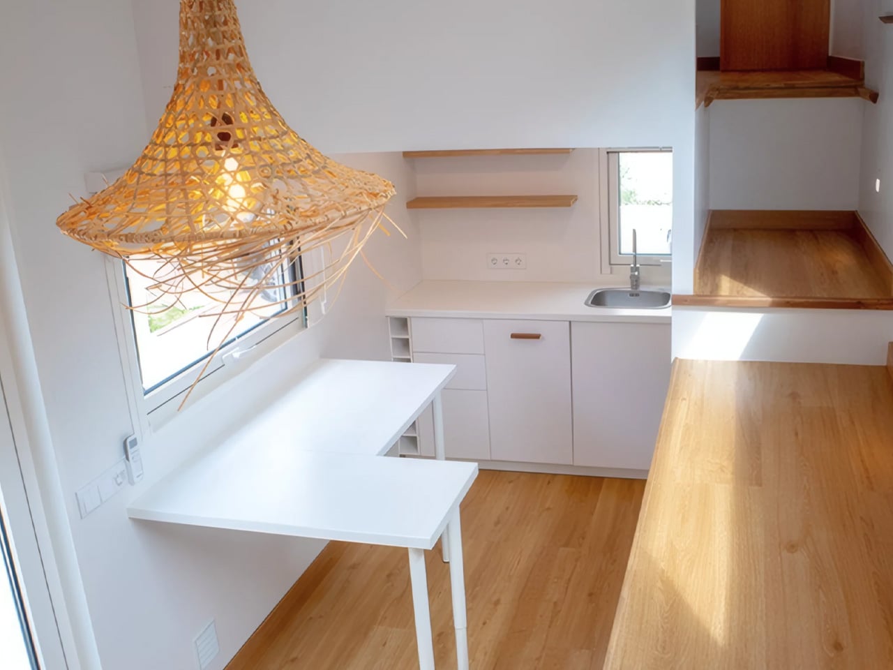
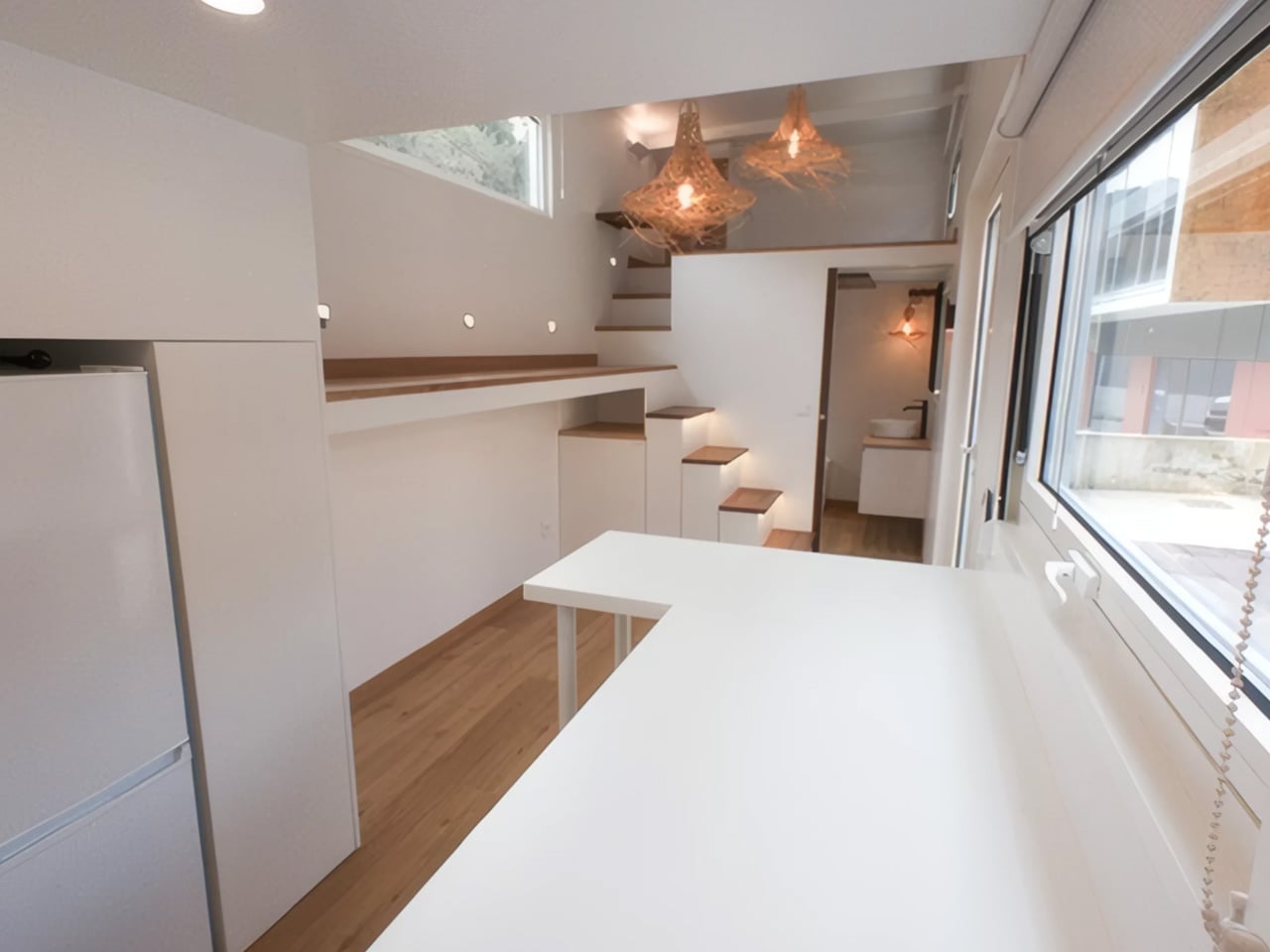
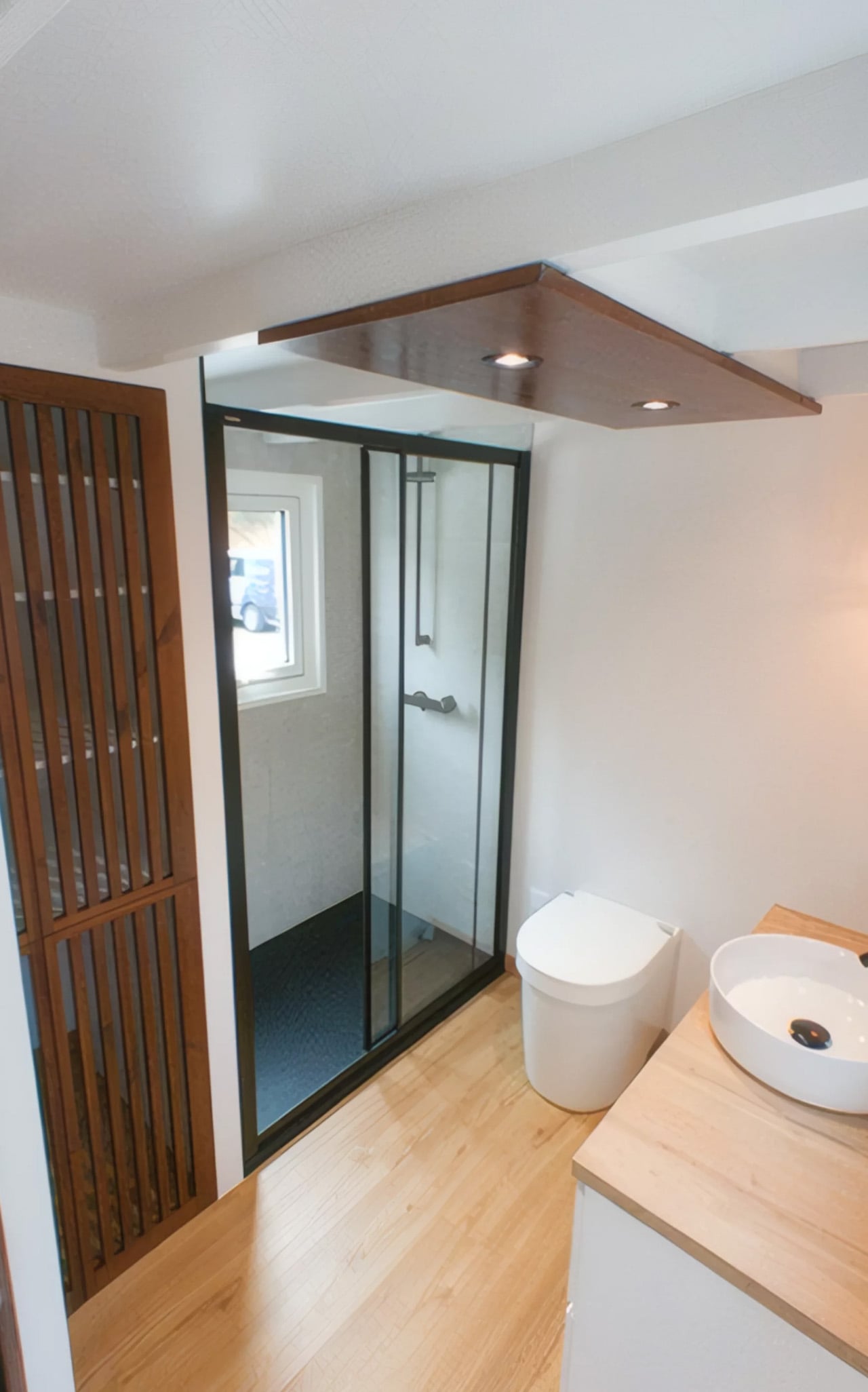
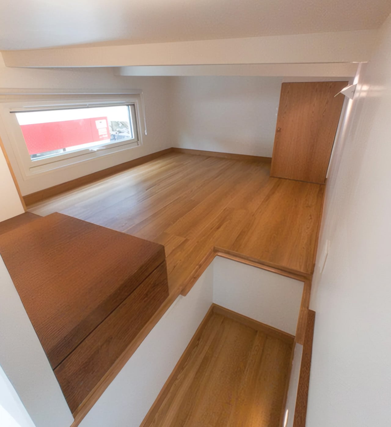
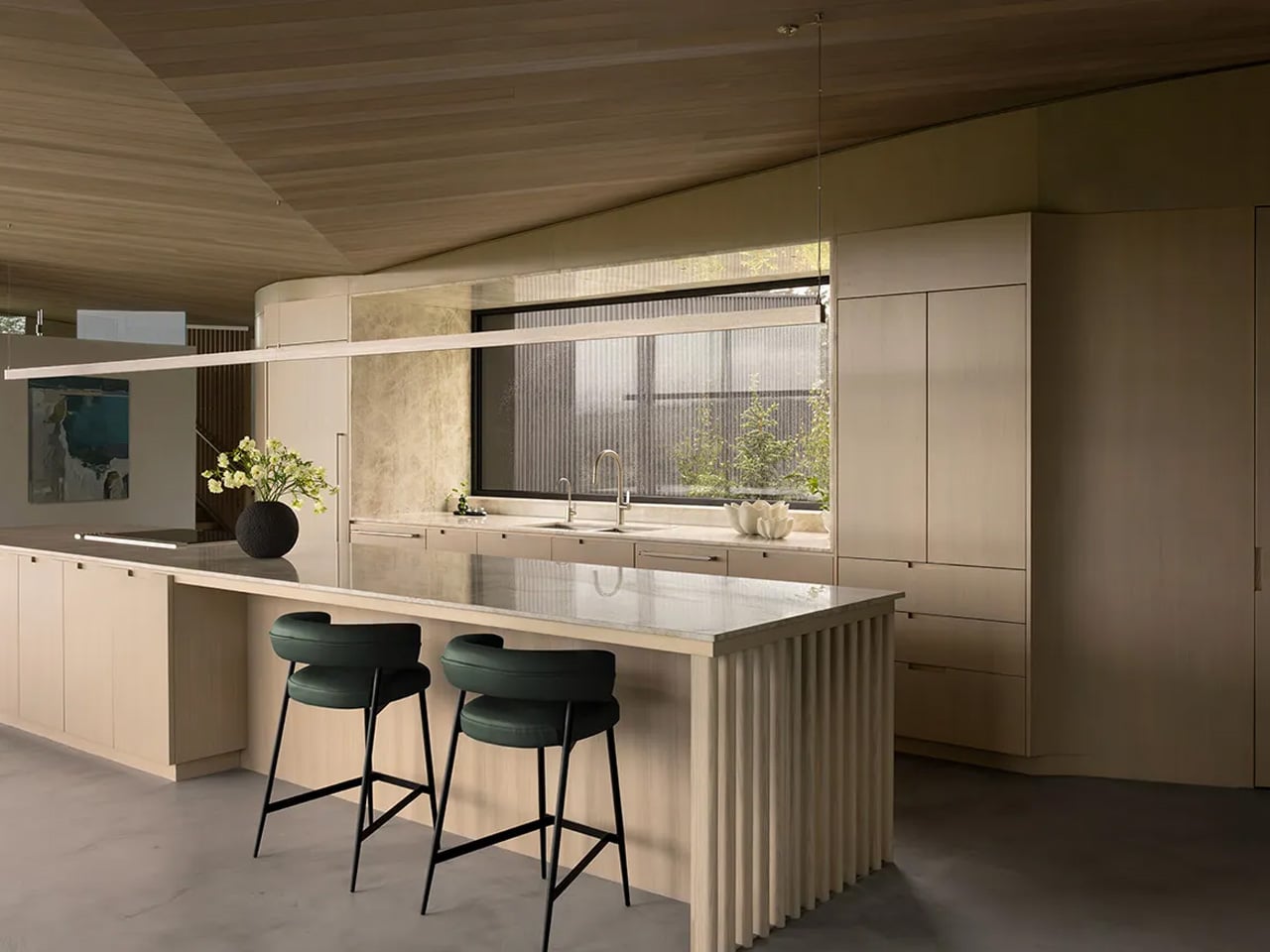
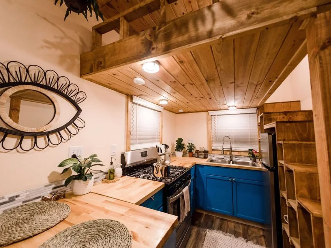
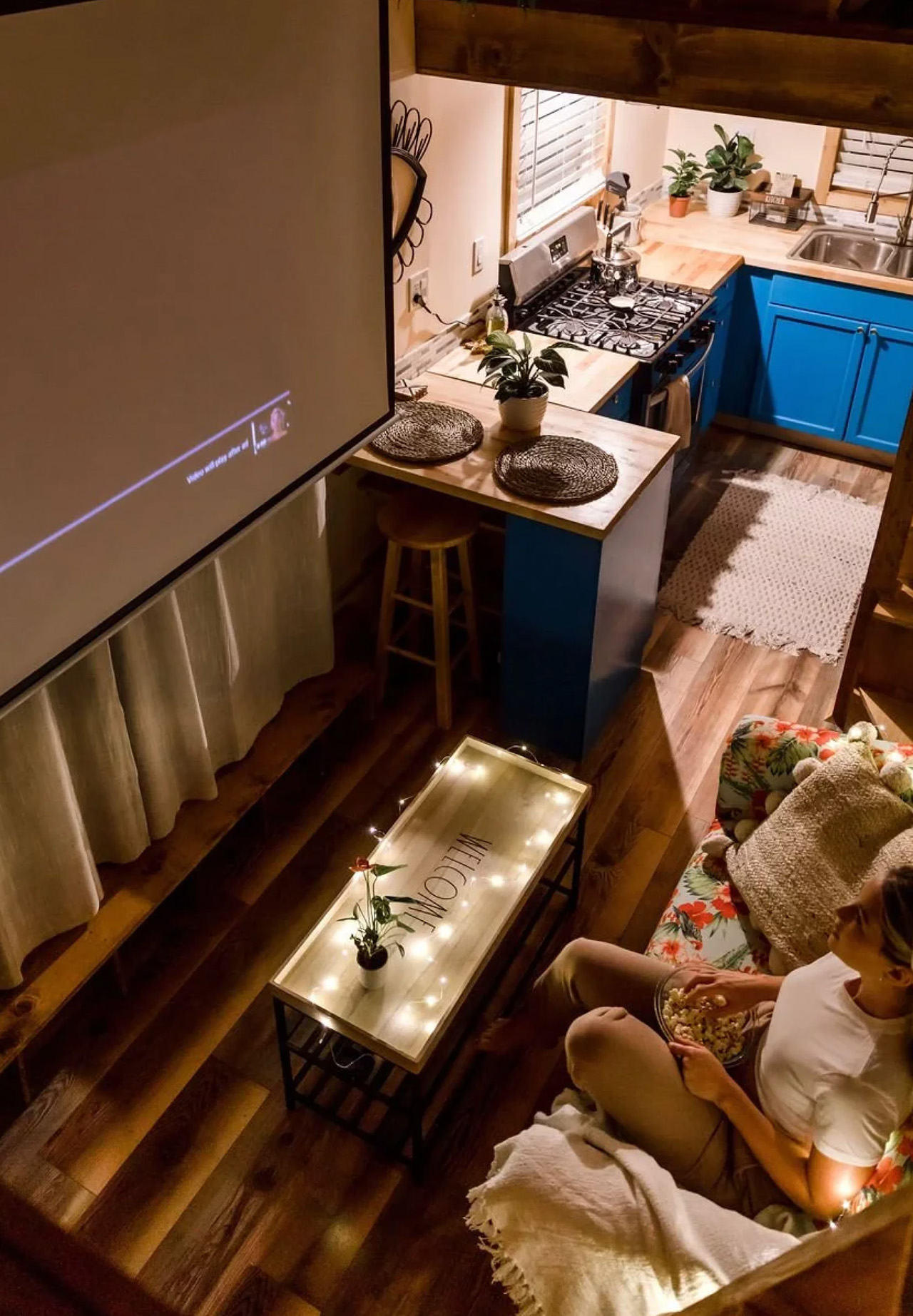
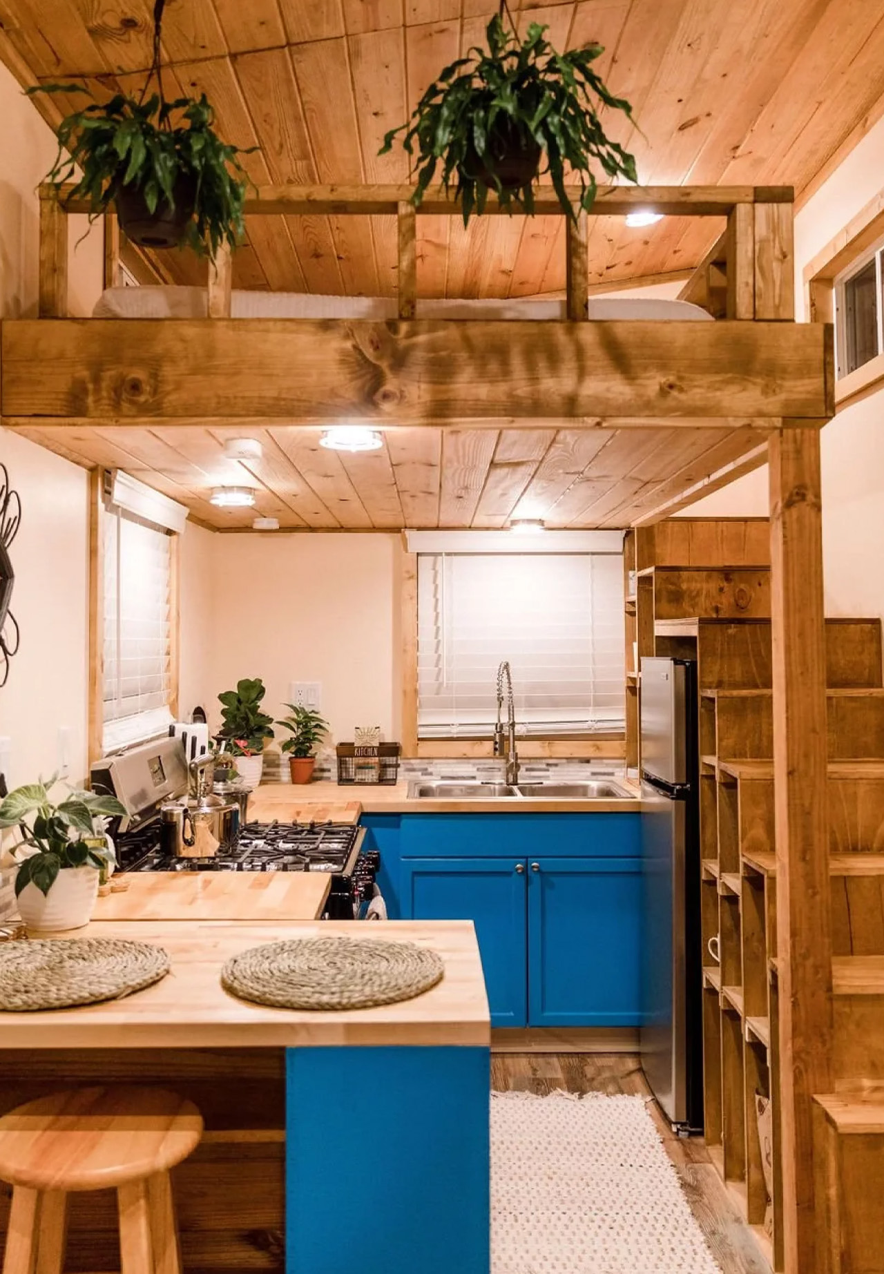
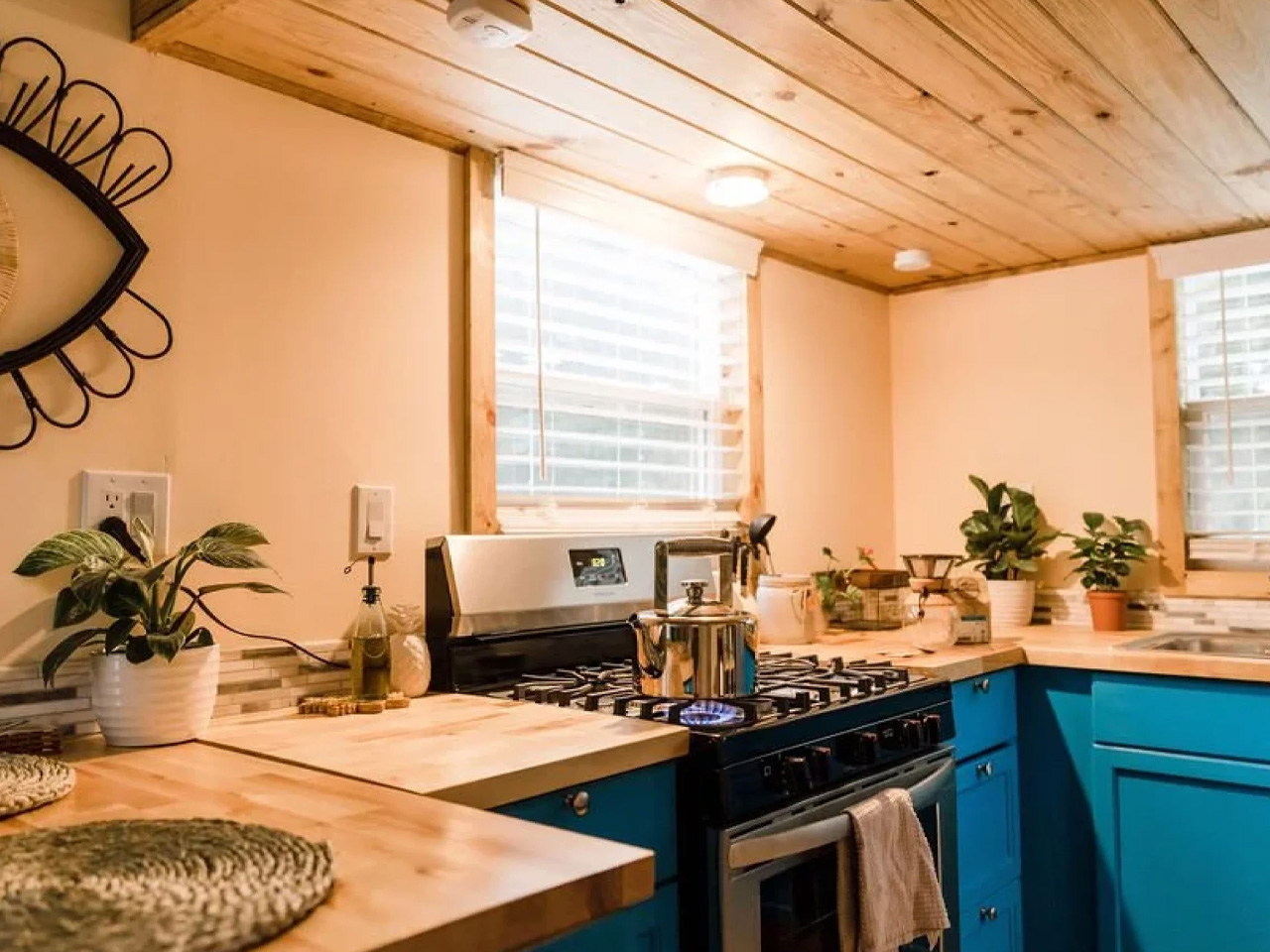
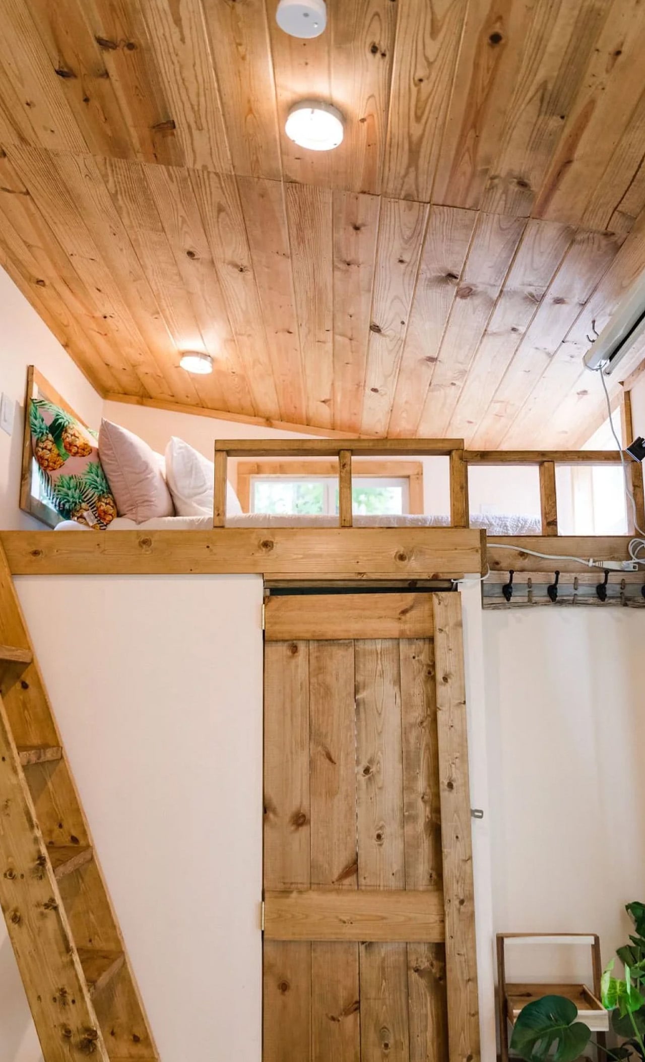
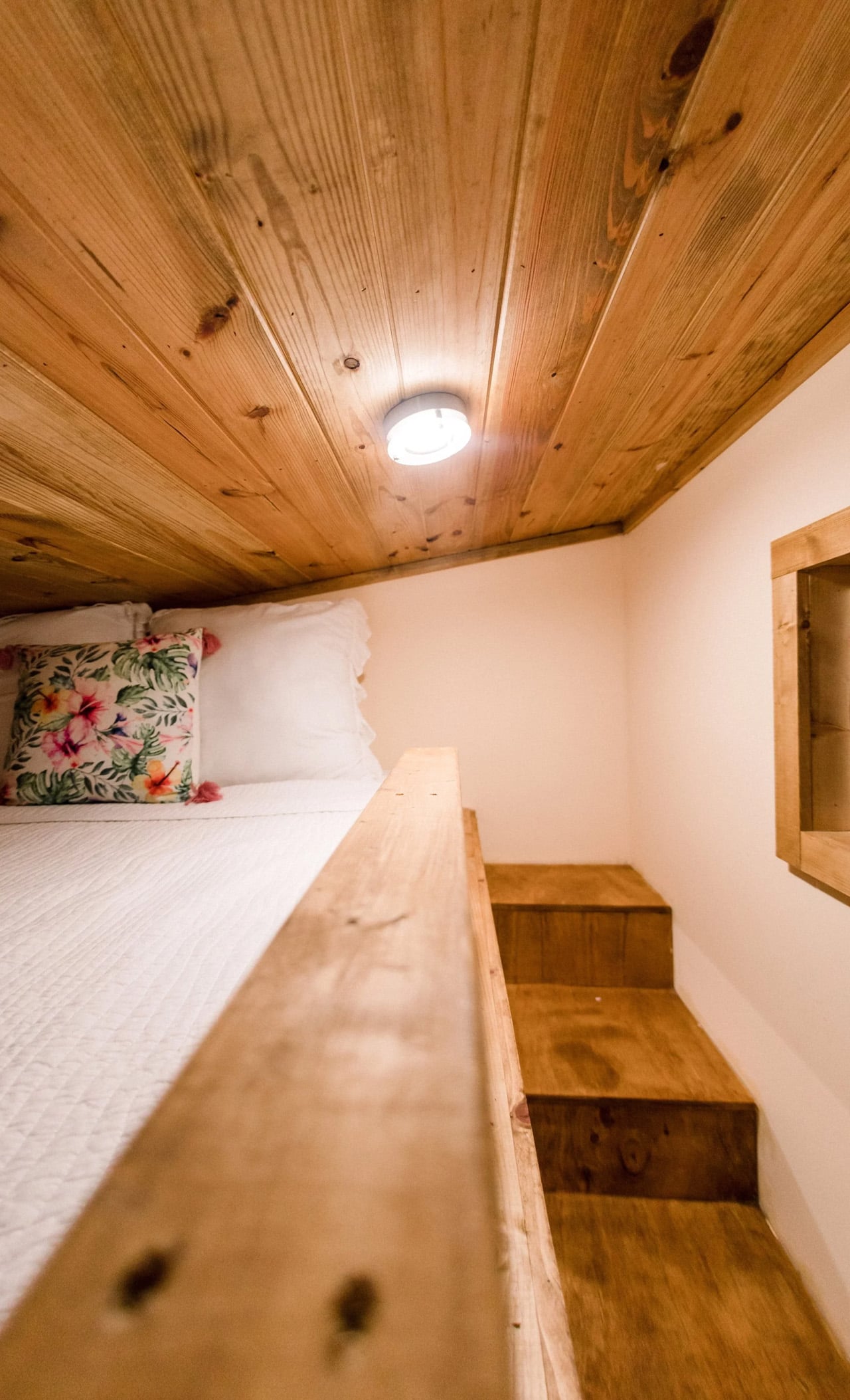
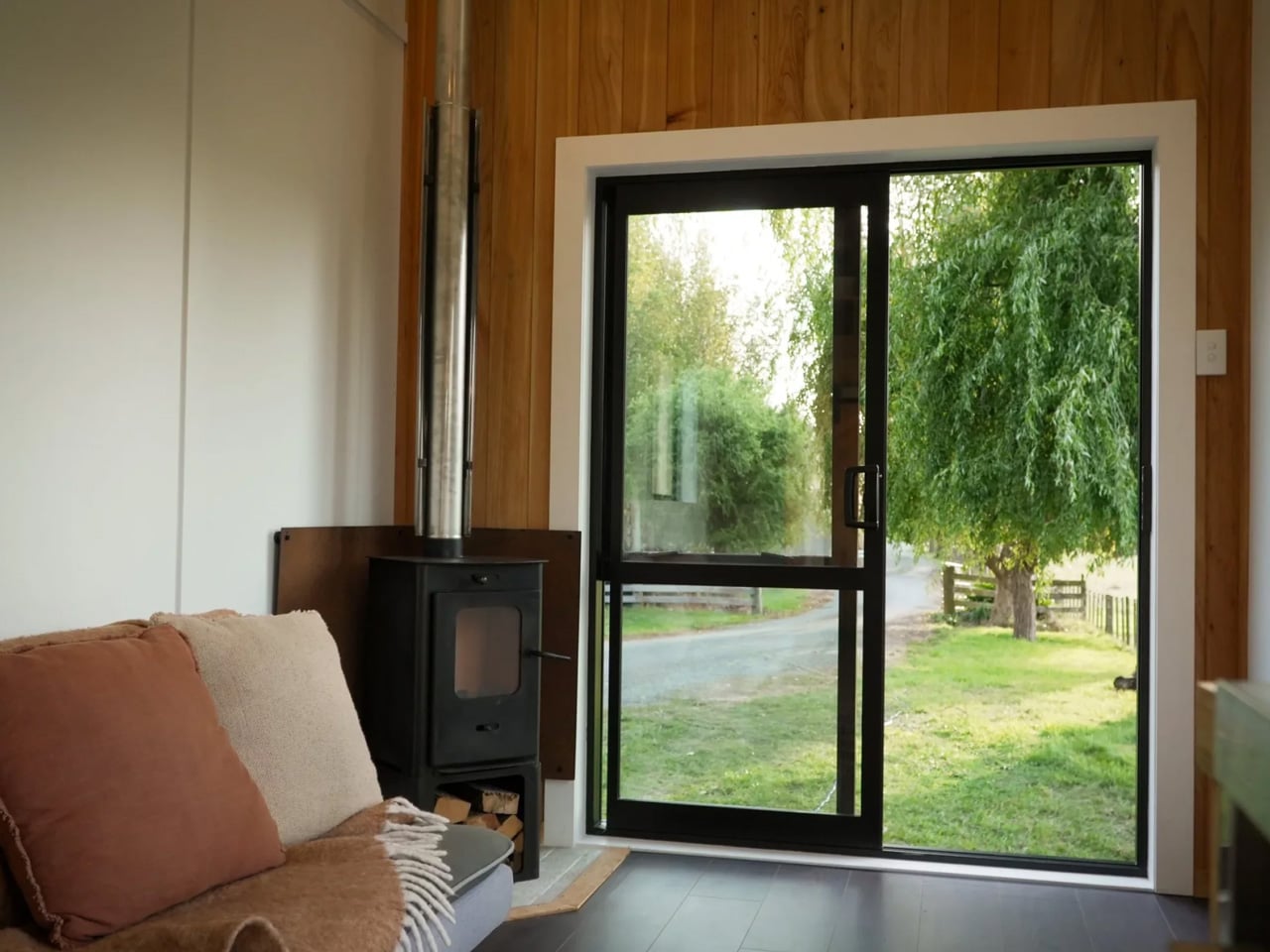
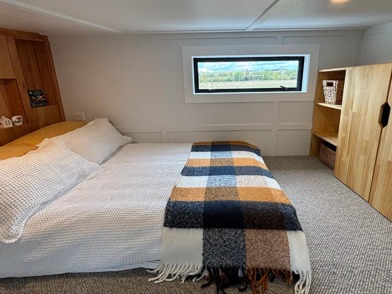
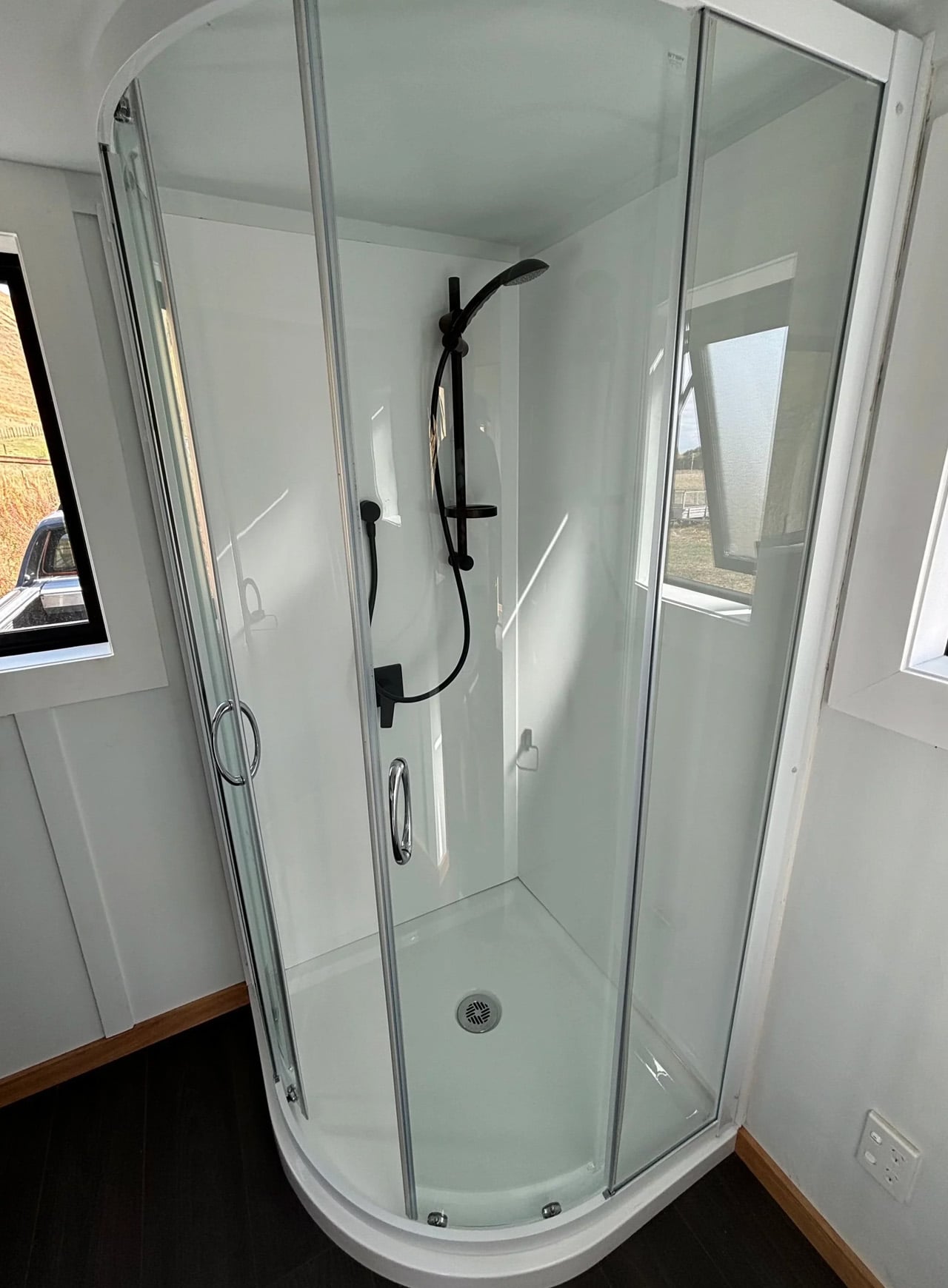
Inside, the Kanuka leans into a Scandi-inspired aesthetic — clean lines, natural materials, warm tones, and a timber-lined ceiling that gives the space genuine coziness rather than the clinical minimalism that plagues so many compact interiors. The layout is a simple one-loft configuration, well-suited to a solo resident or a couple, though a convertible couch in the living area can stretch capacity to four when needed. The kitchen is functional and well-appointed, while the bathroom — accessed through a sliding barn door — keeps things clean with a black-and-white palette and modern fixtures.

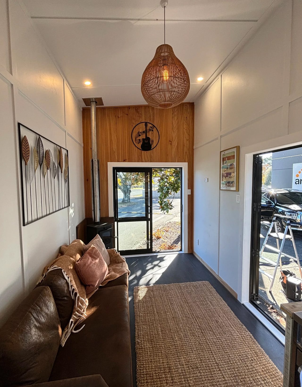
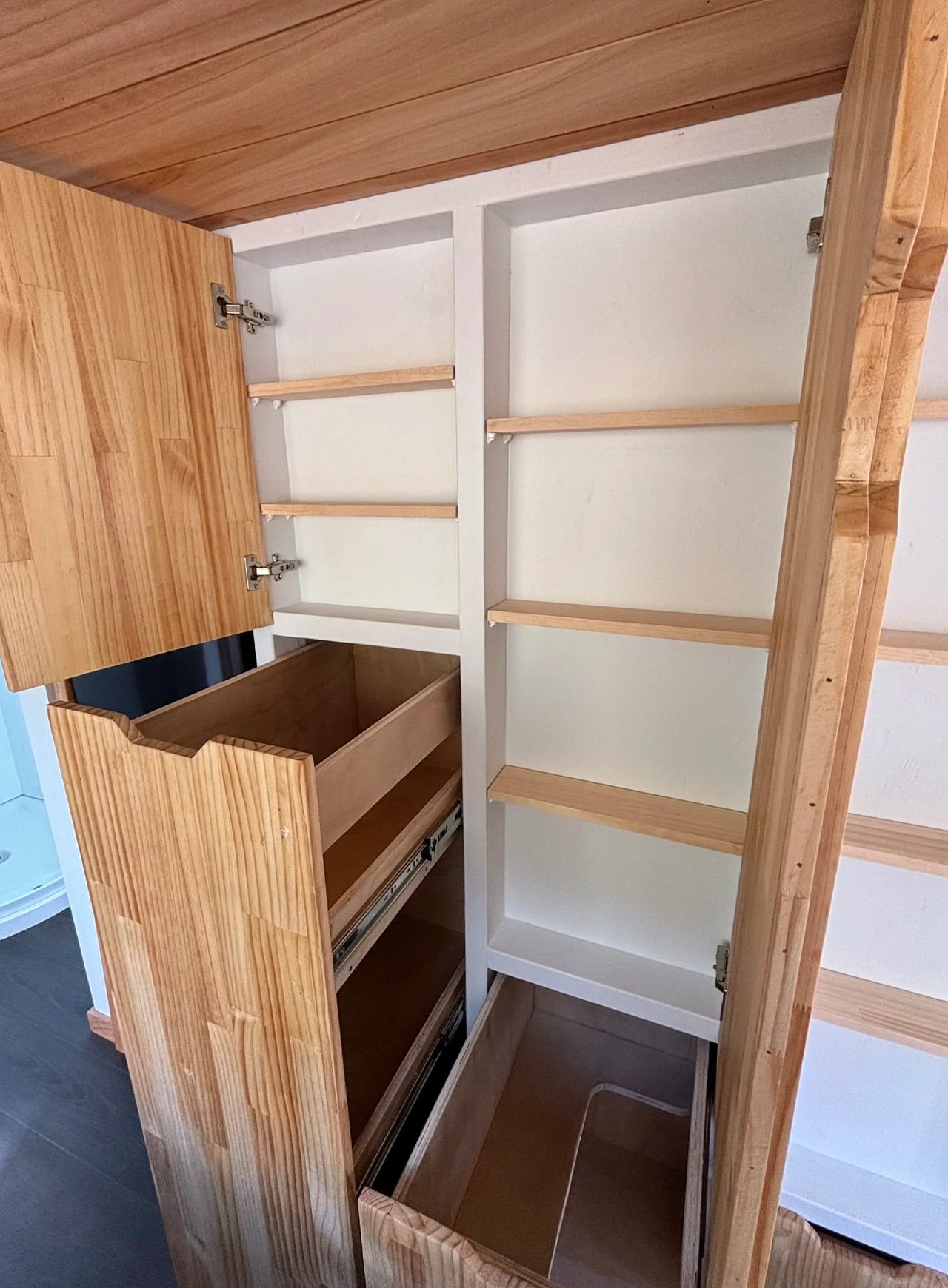
Throughout, locally sourced timber does the heavy lifting, lending the Kanuka the warmth of a rustic cabin without sacrificing the precision of modern construction. Tiny Timber Homes has always leaned into sustainable building practices, and the Kanuka reflects that commitment at every level — the materials, the craftsmanship, and the intentional restraint in the design itself.

The Kanuka doesn’t try to be everything. It is a home for people who have already decided what matters — and who want a space that reflects that clarity without apology. In a market increasingly cluttered with over-designed micro-dwellings, that kind of honesty is quietly radical.

The post The Kanuka Is the Tiny Home That Opens Up Instead of Closing In first appeared on Yanko Design.

The 60-Ton Blue Whale You Walk Through to Get Home

If you told most architects to design a residential gate, you’d probably end up with something clean, understated, and entirely forgettable. A nice water feature, maybe. Some carefully shaped hedges. Wutopia Lab looked at the same brief and decided the answer was a whale. A full, mid-leap, cobalt blue whale, placed at the entrance of a residential complex in Shangqiu, Henan, China. It is one of the most confidently strange things built in recent memory, and I mean that as the highest possible compliment.

The project is called Whale Gate, and it serves as the entrance structure for Golden Island, a development by Jinsha Group. The masterplan for the entire site is built around an archipelago concept, with residential buildings that appear to float across a landscape of water and greenery, as if scattered across a private sea. The client’s stated goal was to create the feeling of entering a different world when residents came home. Wutopia Lab took that mandate seriously, perhaps more literally than anyone expected.

Designer: Wutopia Lab (photos from LIU Guowei)

Architect Yu Ting froze the exact moment a whale breaches the ocean surface and translated that image directly into architecture. The result spans 242 square meters and weighs sixty tons, covered in 1,170 double-curved aluminum panels, not one of which is identical. The exterior is that deep, specific cobalt blue that reads instantly as oceanic. The entry point cuts through the belly of the structure as a golden vertical opening, giving the whole composition a two-act quality: the whale from the outside, a golden threshold from within. Perforated white aluminum panels above suggest water spray mid-exhale. It works on every level it is trying to work on, and the total absence of subtlety feels like a feature rather than a flaw. Most architecture of this scale tries to keep its options open. This one doesn’t.

What gets me about Whale Gate isn’t the strangeness of it, though that’s certainly part of the appeal. It’s the clarity of conviction behind it. The design doesn’t hedge. There’s no half-measure where it almost looks like a whale but could also be read as a biomorphic abstraction. Wutopia Lab made an animal, and they committed. The studio has been explicit that symbolism is a function, that arriving home deserves the kind of architecture willing to acknowledge what that moment actually means to people.

That position is worth sitting with. So much of what gets labeled “landmark architecture” in residential design is really just scale. Big things that feel important because they are big. Whale Gate earns its presence differently. The structure runs on a six-layer construction system with nearly 4,000 individual components, and every steel and aluminum member was custom-fabricated to account for varying curvatures and torsions across the form. The engineering involved in making a sixty-ton whale look like it’s mid-leap is genuinely extraordinary. But the engineering serves the story, which is the right order of operations.

There’s also a viewing platform at the top, accessible exclusively to residents via a golden staircase that climbs through the whale’s head. From up there, the entire compound unfolds below: water, cypress trees, buildings still under construction. The platform transforms the gate into something more than a threshold. It’s a place that belongs specifically to the people who live there, a reward for the commute home, a brief moment of elevation and perspective. One that quietly asks you to look at where you live and actually feel something about it.

I know biomorphic architecture has a complicated history of landing closer to spectacle than to substance. Plenty of “iconic” gateway designs end up aging like novelty; the initial wow gives way to “why, though?” within a decade. Whale Gate sidesteps that trap because the symbolism isn’t arbitrary. The whale connects to the water, the water connects to the archipelago layout, and the archipelago connects to the mythological idea of arriving at an island realm. The logic holds all the way down.

Whether or not you’d want to drive through a whale every morning is a fair question. But few people would argue it’s worse than a security booth and a speed bump.

The post The 60-Ton Blue Whale You Walk Through to Get Home first appeared on Yanko Design.

Tetro Arquitetura’s Xingu House Turns a Complex Brazilian Hillside Into Something Extraordinary

Perched above ancient stone walls in Nova Lima, Minas Gerais, the Xingu House reads less like a building and more like a geological event. Designed by Belo Horizonte–based studio Tetro Arquitetura — led by principal architects Carlos Maia, Débora Mendes, and Igor Macedo — the residence occupies an 8,000-square-meter plot that arrives with its own history, its own landscape, and its own set of demands.

The site is layered in a way that most architects only dream about. Stone walls left over from a previous structure carve through the terrain, native forests press in from the edges, grassy plateaus open to sweeping mountain views, and somewhere beneath it all, a cave sits waiting — earmarked as the home’s future winery and cheese cellar. Tetro didn’t try to simplify any of it. The shape of the house is a direct answer to every peculiarity the land threw at the team.

Designer: Tetro Arquitetura

The studio’s starting point was straightforward: find the best view and push the residents toward nature at every opportunity. That intent shaped everything. The main volume of the house lifts six meters above the natural ground level, floating over the old stone walls and giving the two primary suites an uninterrupted panorama of the surrounding mountains. What makes this possible are the thick, irregularly-shaped concrete pillars rising from below — structural forms that pull double duty by housing bathrooms, the staircase, an elevator, and service areas within their mass.

The program is divided across three distinct sectors, referred to internally as “tips.” The elevated main volume holds the primary suites; the other two tips extend outward and settle onto the plateau created by the old stone walls, containing the guest accommodation. The result is a home that doesn’t sit on its land so much as reach across it — arms extended, each pointed toward a different fragment of the terrain.

The relationship between structure and nature becomes even more deliberate at the spa. Rather than attach it to the main house, Tetro designed it as an entirely separate volume — one that threads itself between existing trees rather than displacing them. Inside, a sauna, changing rooms, a resting area, and a gym make up the program, all sheltered within a shape that responds to the forest rather than imposing on it.

At 1,500 square meters, the Xingu House carries the kind of complexity that can easily become noise. Tetro keeps it quiet — letting raw concrete, native landscape, and a clear sense of purpose do the talking.

The post Tetro Arquitetura’s Xingu House Turns a Complex Brazilian Hillside Into Something Extraordinary first appeared on Yanko Design.

The Berenstein Bear Is a Log-Clad Tiny Home That Lives Bigger Than Its Footprint Suggests

Rolling Bear Tiny Homes has been building some of the most character-rich tiny homes in British Columbia, and the Berenstein Bear is the one that puts them on the map. Built by the Richmond-based builder that has been crafting handcrafted, log cabin-style tiny homes since 2018, the Berenstein is the next evolution of the brand’s beloved Black Bear model, refined with better craftsmanship, more thoughtful upgrades, and a layout that genuinely lives large.

Sitting on a footprint of 33 feet long by 11 feet wide, the Berenstein packs approximately 450 square feet of living space into a frame that includes a loft, a main-floor bedroom, and even a roof deck. That’s not a studio workaround — it’s a proper two-bedroom home. The downstairs offers a queen-size bedroom, while the loft sleeps a king, giving couples, families, or remote workers real options without the usual tiny-home trade-offs.

Designer: Rolling Bear Tiny Homes

The exterior sets the tone immediately. Pine log siding finished in two stain options wraps the structure in warmth, while a 26-gauge standing-seam metal roof promises lifetime durability. It’s the kind of build that looks rooted to a property even when it’s sitting on wheels — specifically, a Canadian-made Rainbow triple-axle trailer rated at 21,000 GVW, which is included in the base price.

Inside, the kitchen earns its square footage. A farmhouse-style sink, induction cooktop, full oven, and fridge-freezer make it a space you’d actually want to cook in — not a galley you squeeze past. The bathroom downstairs brings the same level of intention, with a tile-surrounded tub and shower combo enclosed in glass sliding doors, a vanity, a mirrored medicine cabinet, and proper shelving for towels and toiletries. It’s the kind of bathroom that belongs in a boutique hotel, not just a tiny home.

The living area benefits from double French doors that open to a potential deck, blurring the line between indoor comfort and outdoor living. Add a home office nook into the mix and the Berenstein starts to feel less like a lifestyle experiment and more like a genuinely livable full-time residence — one that also works beautifully as a weekend retreat or short-term rental.

The Berenstein made its debut at a soft launch in Langley, BC, drawing over 400 visitors including residential home builders and generating coverage across more than five local publications. The response was telling. This isn’t just a well-built tiny home — it’s a signal that compact living is growing up. Base pricing starts at US$121,000, with the Rainbow trailer included.

The post The Berenstein Bear Is a Log-Clad Tiny Home That Lives Bigger Than Its Footprint Suggests first appeared on Yanko Design.

This Tiny House Spreads Out Like an Apartment and Lives Like One Too

Most tiny houses try to be everything at once. The Miami, the latest park model from Phoenix Building Solutions, gets that. Rather than stacking lofts and squeezing in storage tricks, it spreads out — single-floor, open plan, and unapologetically apartment-like. At 400 square feet, it’s one of the more generously proportioned models in its class, and it wears that space well.

Built on a quad-axle trailer and measuring 11 feet 8 inches wide by 40 feet 3 inches long, the Miami sits closer to the wider end of park model specs. That extra width changes everything. It’s what separates a home that feels borrowed from one that actually feels lived in. The exterior keeps it tight — board-and-batten engineered wood siding, warm timber accents, a clean metal roof, and a monoslope roofline that cuts a sharp silhouette against any backdrop.

Designer: Phoenix Building Solutions

Step inside and the single-level layout does the heavy lifting. The kitchen is the kind of setup most apartment renters would envy — dual-basin stainless steel sink, oven and cooktop, microwave, dishwasher, and a full fridge/freezer. It’s a proper kitchen, not a kitchenette dressed up with good lighting. The living area flows naturally from it, and the large windows pull in enough natural light to make the 400 square feet feel considerably more generous than the number suggests.

The bedroom is where the Miami earns its keep as a two-person dwelling. A double bed sits alongside two built-in wardrobes and a small chair — practical without being sparse. There are no loft ladders to navigate in the dark, no tucked-away sleeping nooks. The single-floor commitment means everything is accessible, which matters more than most people realize until they’re actually living in a small space long-term.

Phoenix Building Solutions, based in Greenville, Alabama, manufactures from a 75,000-square-foot facility certified to ANSI A119.5 standards — a detail that speaks to build quality rather than just curb appeal. The Miami isn’t a concept or a render. It’s a production model from a company with over 130 years of combined industry experience, built for people who want something that lasts.

What makes the Miami genuinely interesting isn’t any single feature — it’s the restraint. Phoenix didn’t overcomplicate it. They took a straightforward idea — comfortable, modern, single-floor tiny living — and executed it cleanly. In a market full of houses competing to cram in one more clever feature, that kind of discipline is harder to pull off than it looks.

The post This Tiny House Spreads Out Like an Apartment and Lives Like One Too first appeared on Yanko Design.

This Tiny House Under 36 Square Meters Sleeps Six — and Looks Incredible Doing It

Tiny house culture has spent years fighting the perception that downsizing means settling. The Porto, designed by Portuguese builder Casagaea, makes that argument feel outdated. Built on a double-axle trailer and wrapped in engineered wood cladding, it arrives in two sizes — a 7.8-meter frame at 34.2 square meters, and an 8.4-meter version stretching to 35.6 square meters — with a 4-meter height and 2.5-meter width that keeps it road-legal and genuinely mobile. It’s compact by definition. Cramped, it is not.

What Casagaea has done with the Porto’s footprint is worth paying attention to. The ground floor revolves around an open living area anchored by a sofa — one that moonlights as a guest bed — keeping the social heart of the home generous and uncluttered. The kitchen runs fully equipped: fridge, stove, oven, extractor fan, and sink, built for actual cooking rather than the performative kind you see in renders. An outdoor table integrated into the exterior facade extends the living space outward, blurring the line between inside and out in a way that feels intentional rather than incidental.

Designer: Casagaea

Upstairs, two mezzanine bedrooms are connected by a shared platform — a structural move that does more than just link two rooms. It creates a sense of flow across the upper level that most tiny homes never manage, where loft bedrooms typically feel like afterthoughts bolted above the main floor. Here, the sleeping quarters have a coherence to them. With the sofa bed factored in, the Porto sleeps up to six people — a number that would seem implausible if the floor plan didn’t actually support it.

Casagaea builds its homes in Portugal with a philosophy centered on comfort, design, and sustainability working in parallel rather than in tension. The Porto reflects that clearly. Off-grid configurations are available for those who want to cut ties with utility infrastructure entirely, and all parameters can be adjusted to suit specific project needs. This isn’t a one-size solution dressed up in lifestyle photography — it’s a customizable structure designed to meet real living requirements.

For a home that clocks in under 36 square meters, the Porto carries a surprising amount of ambition. It doesn’t try to mimic a conventional house at reduced scale. It works within its constraints and finds something better on the other side — a living space that feels considered, calm, and quietly confident in what it is. That’s harder to pull off than it looks.

The post This Tiny House Under 36 Square Meters Sleeps Six — and Looks Incredible Doing It first appeared on Yanko Design.

Young Projects’ Cut Out House Proves Subtraction Is the Most Powerful Tool in Architecture

Most mountain houses try too hard. Cut Out House, designed by New York-based studio Young Projects, does the opposite — it sits in the foothills of the Canadian Rocky Mountains, tucked into a low-density development where the land does most of the talking.

The project was conceived as a family vacation home, and it wears that intention openly. Rather than asserting itself against the landscape, the house responds to it — balancing intimate spaces oriented toward the dense surrounding woodland with communal areas that open dramatically toward the mountains. That duality is the architecture. Everything else follows from it.

Designer: Young Projects

The defining move is the butterfly roof, which Young Projects uses not just as a formal gesture but as a tool for orchestrating experience. The angled planes slope in opposite directions, directing views outward from within while reflecting the terrain’s gradient from outside. Where the roofline climbs, communal living spaces claim the panoramic views. Where tree density compresses the sightlines, private bedrooms pull back into quieter, more sheltered corners of the plan. The roof, in a sense, is the planner.

The “cut out” in the name refers to a series of subtractions carved from the building’s overall volume — openings and recesses that give the house its sculptural character without overworking it. This is a form shaped as much by removal as by addition. The result reads as something confidently simple, which is the harder thing to achieve. Most houses at altitude either defer too much to the landscape or compete with it. Cut Out House does neither.

Gray Accoya wood clads the exterior, a material choice that ages gracefully and lends the structure a tonal continuity with the rock and timber of the surrounding terrain. It doesn’t announce itself. From across a nearby body of water, the butterfly roofline is the first thing you read — a dynamic silhouette that shifts with the light and suggests movement even when the house is still.

Bryan Young founded Young Projects in New York in 2010, and the studio has built a reputation for work that thinks carefully about the relationship between built form and context. Cut Out House extends that sensibility into alpine territory, where the stakes of getting that relationship wrong are immediately visible in every window. The house doesn’t compete with the Rockies. It leans into them, shapes itself around them, and in doing so becomes something more interesting than a retreat — it becomes a calibrated act of looking.

The post Young Projects’ Cut Out House Proves Subtraction Is the Most Powerful Tool in Architecture first appeared on Yanko Design.

The Hangzhou Prism by OMA Is the Mixed-Use Landmark China’s Tech Capital Deserves

There’s a centuries-old Chinese proverb that goes: ‘above, there is heaven; below, there is Suzhou and Hangzhou.’ OMA’s newly completed Hangzhou Prism doesn’t just reference it — it builds toward it. Peaking at 106.5 metres in the heart of Hangzhou’s Future Tech City district, the Prism has arrived as one of China’s most formally daring mixed-use structures.

The project, led by OMA partner Chris van Duijn and project architect Michael Hadjistyllis, broke ground in 2019 and has been years in the making. Commissioned by Xinhu Real Estate Group, the 43,000-square-metre building departs entirely from the logic of the conventional tower. Rather than stacking a cluster of residential volumes in the usual fashion, OMA collapsed them into a single, porous structure — what van Duijn describes as a “three-dimensional village for young professionals and visitors.”

Designer: OMA

The form is immediately arresting. Two radical oblique cuts slice through the building envelope, giving the Prism its angular, asymmetric silhouette and creating cascading terraced lofts with sweeping views across the city. The projecting cubic balconies that line these oblique facades give the structure texture and depth, so the building reads differently from every angle — less like a static object, more like something mid-transformation.

At ground level, the geometry opens up. A large void punctures the flat facades, giving way to a publicly accessible atrium that connects directly to the adjacent park. This base-level square is designed for events, community gatherings, and everyday movement — the kind of activated ground plane that high-rises in China rarely prioritize. It’s a meaningful gesture in a building that could have easily turned inward.

Programmatically, the Prism holds a remarkable amount within its singular form: a 20,000-square-metre hotel, 10,000 square metres of residential units, 5,000 square metres of office space, and 8,000 square metres of retail. The brief is dense, but the architecture handles it without feeling overcrowded. The mixed-use stacking is intuitive, each program finding its natural vertical position within the building’s tapered volume.

Future Tech City is home to companies like Alibaba and NetEase, and Hangzhou is actively positioning itself as one of Asia’s most important innovation corridors. The Prism lands squarely in that ambition — a building that signals civic intent as much as commercial function. Van Duijn put it plainly: “The design of the Prism shares this ambition to innovate.” For OMA, it’s another sharp proof that bold formal moves and genuine public utility don’t have to be in conflict. The Prism earns its skyline position.

The post The Hangzhou Prism by OMA Is the Mixed-Use Landmark China’s Tech Capital Deserves first appeared on Yanko Design.

What If the Internet Had a Building You Could Actually Walk Inside?

The internet has always been invisible. It moves information at a scale and speed the human mind can’t fully grasp, yet we access it through the most ordinary of interfaces: a flat screen, a pair of earphones, a keyboard. Nothing about how we physically engage with it reflects the enormity of what it represents, or what it means to be connected to the entire world from a single chair.

Michael Jantzen’s Internet Observatory concept addresses that disconnect directly by building a physical structure around the idea of internet access. Placed outdoors, the structure uses its architectural form to stand in for the abstract mechanics of the web. The outer support grid frame represents the internet’s matrix, while the curved space it encloses represents where a person enters and engages with the flow of information.

Designer: Michael Jantzen

You reach the interior by climbing a staircase up to an elevated platform and stepping inside the curved shell. At its center sits an interactive workstation that rises through a glass floor and can also rotate along the floor’s surface, letting the person inside face in any direction. It’s a deliberately simple setup that places one person at the physical center of a structure designed to represent the entire internet.

All of the large curved panels that form the enclosing space can be automatically repositioned around the occupant. The core can be fully open, fully closed, or any variation in between, depending on the activity. Some configurations allow for projecting images and sounds from the internet or the main computer onto the surrounding panels, turning the interior into a fully immersive display environment.

Some of those projected images also appear on the exterior faces of the panels, making what happens inside the structure visible to anyone nearby. A private internet session becomes something closer to a public exhibition, with the curved panels acting as screens that anyone outside the grid frame can see. The distinction between the individual’s experience and the community’s visibility gets built directly into the architecture.

Each structure would also have its own website, through which people could visit and interact with it remotely in real time, selecting images and sounds to be projected inside or directing the movement of the panels. Someone seated at the workstation might find the content surrounding them being shaped by a stranger thousands of miles away. The structure becomes a live, physical interface for the collaborative possibilities of the internet.

The design also contemplates many of these structures existing simultaneously around the world, each publicly or privately owned, all communicating with each other as they interact with their respective occupants. What begins as one architectural statement scales into a distributed global network, a physical version of the very internet it represents, built from steel frames and curved panels rather than servers and cables.

Jantzen calls this a “symbolic temple for the computer age,” and there’s something deliberate in that description. Climbing a staircase, entering a curved space, and sitting at the center while content from around the world flows around you is a kind of ritual that a laptop screen doesn’t offer. It’s an architectural argument for what it might feel like if the internet had a home you could walk into.

The post What If the Internet Had a Building You Could Actually Walk Inside? first appeared on Yanko Design.

Simplify Further’s Goa Tiny Home Fits a Full Life Into 252 Square Feet

Most tiny homes ask you to give something up. The Goa by Simplify Further Tiny Homes is built around the idea that you shouldn’t have to. It’s a 24 x 8-foot home on wheels designed for people who want to genuinely live small, not just survive it. At 252 square feet, the Goa is built to sleep four to five people, which already tells you something about how thoughtfully the space has been planned.

Two sleeping lofts — one measuring 7×8 feet and another at 7×5 feet — sit overhead, leaving a loft height clearance of 36 inches at the low side and 6 feet 4 inches of headroom beneath them. It’s a layout that stacks the private spaces upward and reserves the ground level for living, cooking, and everything in between.

Designer: Simplify Further Tiny Homes

The kitchen is the centerpiece of the Goa, and Simplify Further leans into that fully. A U-shaped layout tucks beneath one of the sleeping lofts, fitted with a four-burner electric range, a 7.1 cubic foot refrigerator, and generous built-in storage — including more tucked beneath the staircase that leads to the loft. It’s a kitchen that actually invites you to cook, not just reheat. A small dining table and seating area sit nearby, keeping the social flow between the kitchen and living room easy and natural.

The bathroom is full-sized — a detail that shouldn’t feel remarkable but often does in homes this compact. Buyers can opt for a full-size bathtub or a 36-inch shower with additional storage, depending on how they want to use the space. A washer/dryer combo is also included as standard, which rounds out the Goa as a proper full-time residence rather than an extended camping experience.

Finish-wise, the interior is dressed in drywall, pine tongue-and-groove ceilings, and vinyl flooring — warm without trying too hard. Upgrade options include shiplap interior walls and furnishings for those who want to move in without lifting a finger beyond signing a check.

The Goa rolls on a hand-built chassis with double axles rated at 7,500 pounds each, trailer brakes, and DOT-approved highway lighting. It carries NOAH certification as an RV and can also be built to satisfy IRC Appendix AQ standards by request. Starting at $65,000, the Goa lands as one of the more compelling full-time tiny home options on the market — a house that earns its footprint rather than apologizing for it.

The post Simplify Further’s Goa Tiny Home Fits a Full Life Into 252 Square Feet first appeared on Yanko Design.