While I will probably always be a maximalist at heart, I sometimes think about what it would be like to live in a tiny house and to cut down on what I own to fit into that tiny space. There has been a renewed attention to this kind of living, specifically the Japanese-inspired minimalist lifestyle trend. Ikigai Collective, named after the famous Ikigai philosophy of living (reason for being), has designed another tiny home to fit this aesthetic.
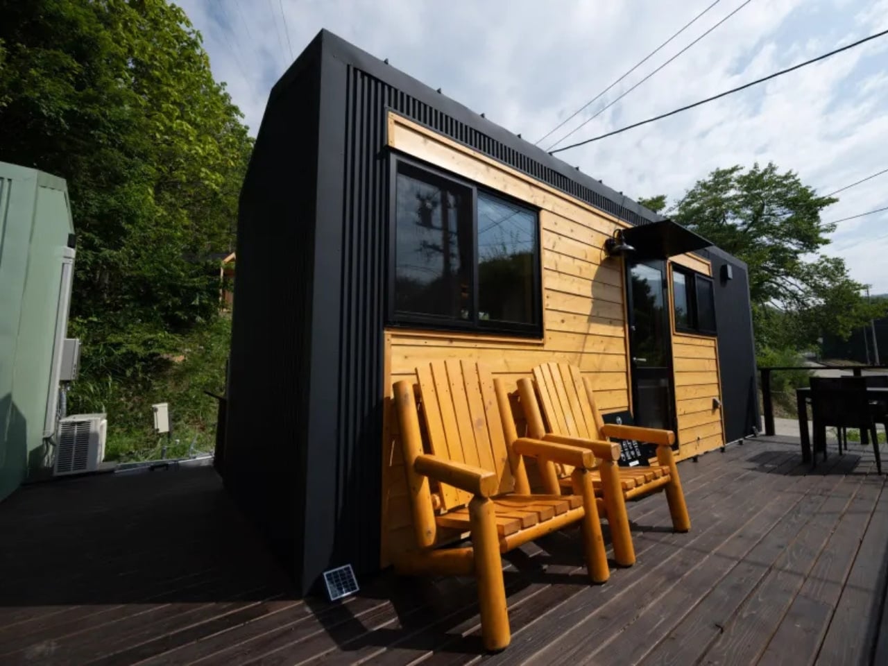
The Mizuho home combines traditional Japanese aesthetics with modern building technology into a tiny space (6.6m (L) x 2.4m (W) x 3.8m (H)) fit for a single person or a couple. It is perfect for those who want to explore simple and mindful living, as well as eco-friendly living features. The design embodies the principles of simplicity and intentional living, bringing the tranquility of Japanese lifestyle practices into everyday modern life. It also employs authentic Japanese craftsmanship as Ikigai Collective works with local partners in Nozawaonsen to create their tiny homes with strict quality standards.
Designer: Ikigai Collective
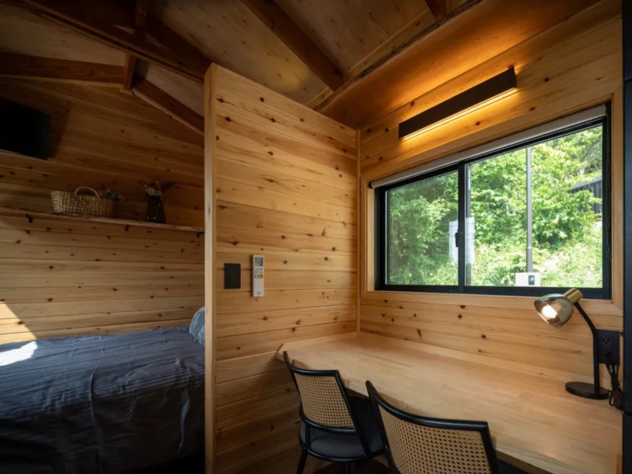
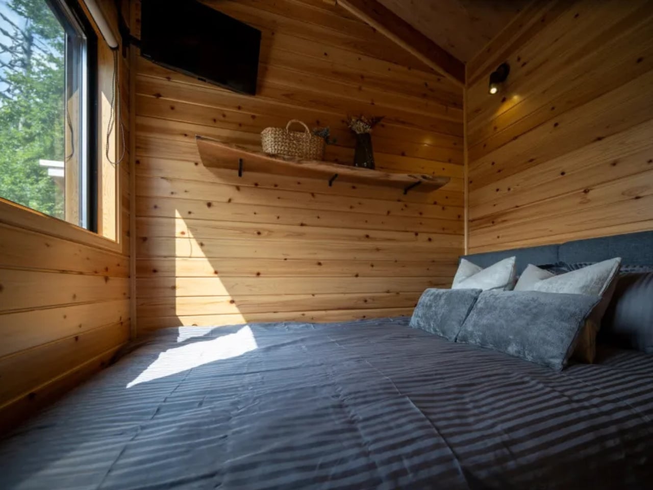
The living space doubles as the bedroom and working area as well, since you’re working with limited space. However, the open-plan layout has been thoughtfully designed to maximize every square inch. There’s a dedicated desk space that can be used for remote work and hobbies while the cozy bedroom space is for rest and relaxation. The desk can also be turned into the dining area when you need it. There are also storage solutions integrated throughout the warm, cozy interiors, proving that small spaces don’t have to mean sacrificing organization or style.
A big part (well, as big as you can get in the 21-foot home) of the interior is the kitchen that is designed for functional daily cooking with its modern and efficient layout. It has a two-burner stovetop, a sink, and space to put other small appliances like a kettle or rice cooker. Despite its compact size, the kitchen doesn’t feel cramped. It’s designed with the same attention to efficiency that makes Japanese kitchens so functional. There’s also a private bathroom complete with shower and toilet, and it’s designed to have a serene and spa-like atmosphere. You can even choose between a standard or composting toilet depending on your sustainability preferences.


The Mizuho house uses Galvalume steel cladding that should make it comfortable for all kinds of climates. It is also fully insulated, weather-resistant, and is built to endure with its durable materials. The design is sleek with a modern finish and can blend with both nature and cityscapes, whichever area you choose to live in with your tiny house. There are also customization options like the color scheme, exterior finishes, flooring selections, and shower designs. Every detail can be tailored to create your own unique home.


What makes the Mizuho special isn’t just its compact footprint. It’s the philosophy behind it. This isn’t about deprivation; it’s about intention. It’s about choosing quality over quantity, experiences over possessions, and mindfulness over mindless consumption. For collectors like us who appreciate beautiful, well-crafted things, the Mizuho offers a different kind of collection: a curated life where every item earns its place.


Would I trade my maximalist lifestyle for tiny house living? Maybe not permanently. But there’s something undeniably appealing about the idea of stripping away the excess and discovering what truly matters. And if you’re curious too, Ikigai Collective actually lets you book a stay in their Mizuho model before committing. It’s a chance to test-drive the minimalist dream and see if it fits.

The post This Japanese Tiny House Just Solved the Minimalist Living Dream first appeared on Yanko Design.