A car may be designed to get you from one place to another, but the most memorable parts of a journey often happen in the pauses. The roadside stop. The quiet view after a long drive. The spontaneous coffee break that turns into an afternoon outside. Took, an industrial design and mobility lifestyle concept, builds its entire experience around those in-between moments.
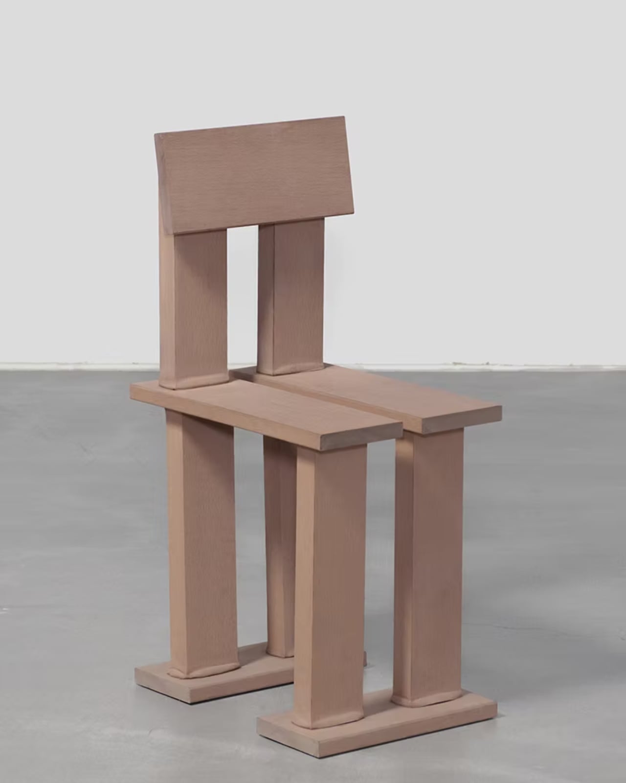
At its core, Took is a portable chair system designed for people who see driving as more than transportation. It responds to a growing shift in mobility culture, where car-based lifestyles are becoming lighter, more casual, and more integrated into everyday life. Auto camping and quick outdoor breaks turn the vehicle into a small basecamp for rest, play, and self-expression. Took fits neatly into this world by staying ready in the trunk, waiting for the moment someone decides to stop, unfold, and simply enjoy where they are.
Designer: Jimin Nam, Donggwan Heo, and 민석 김
What makes the idea compelling is that it does not frame sustainability as a heavy responsibility. Instead, Took presents it as a style of living. The project defines this attitude as “Eco-core,” a lifestyle where green values become part of personal expression rather than a grand statement. Much like carrying a tumbler or picking up litter during a walk, sustainability here feels casual, visual, and habitual. Took imagines what that mindset could look like in a mobility lifestyle: familiar drives becoming small adventures, and ordinary stops becoming opportunities for more mindful rest.
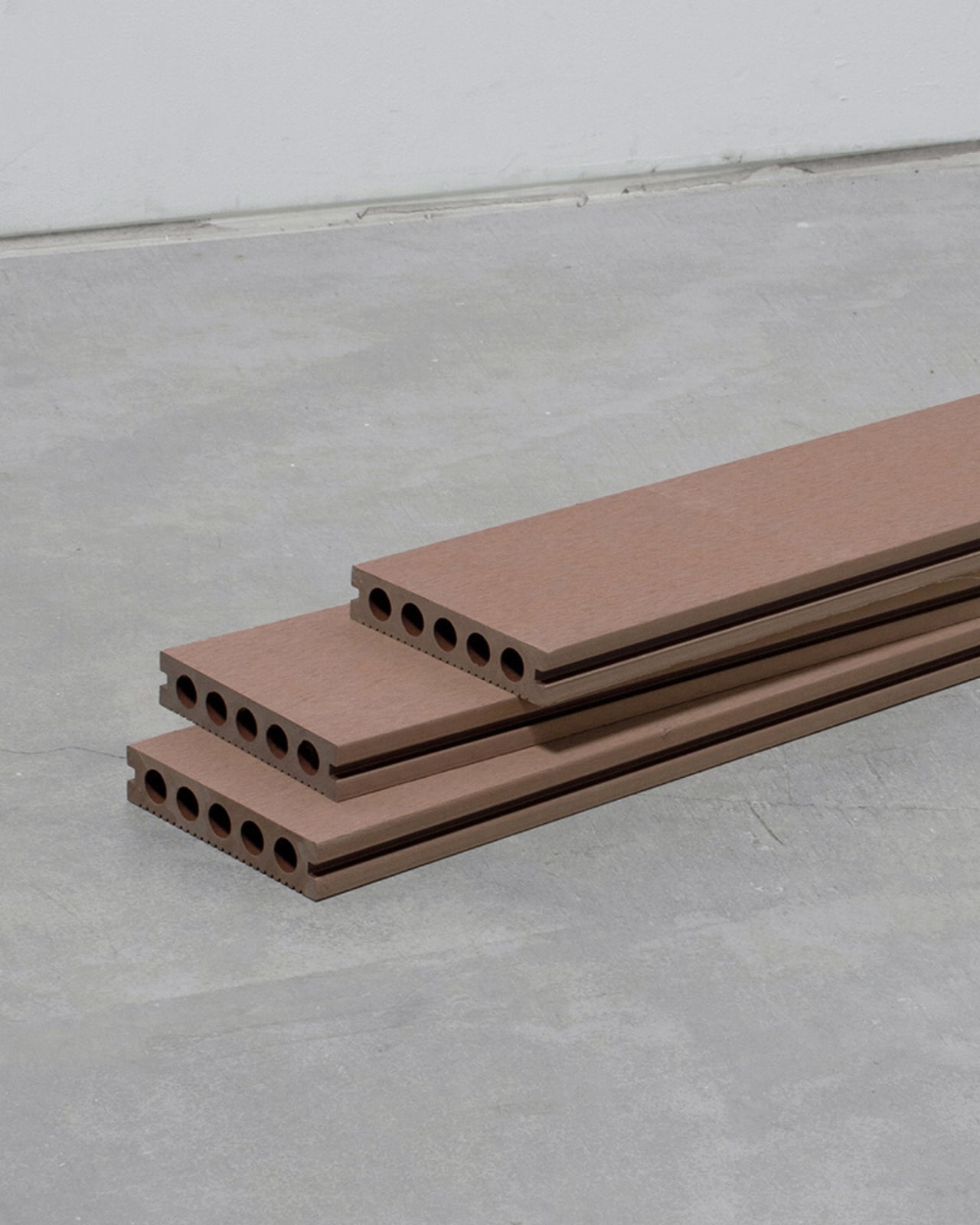
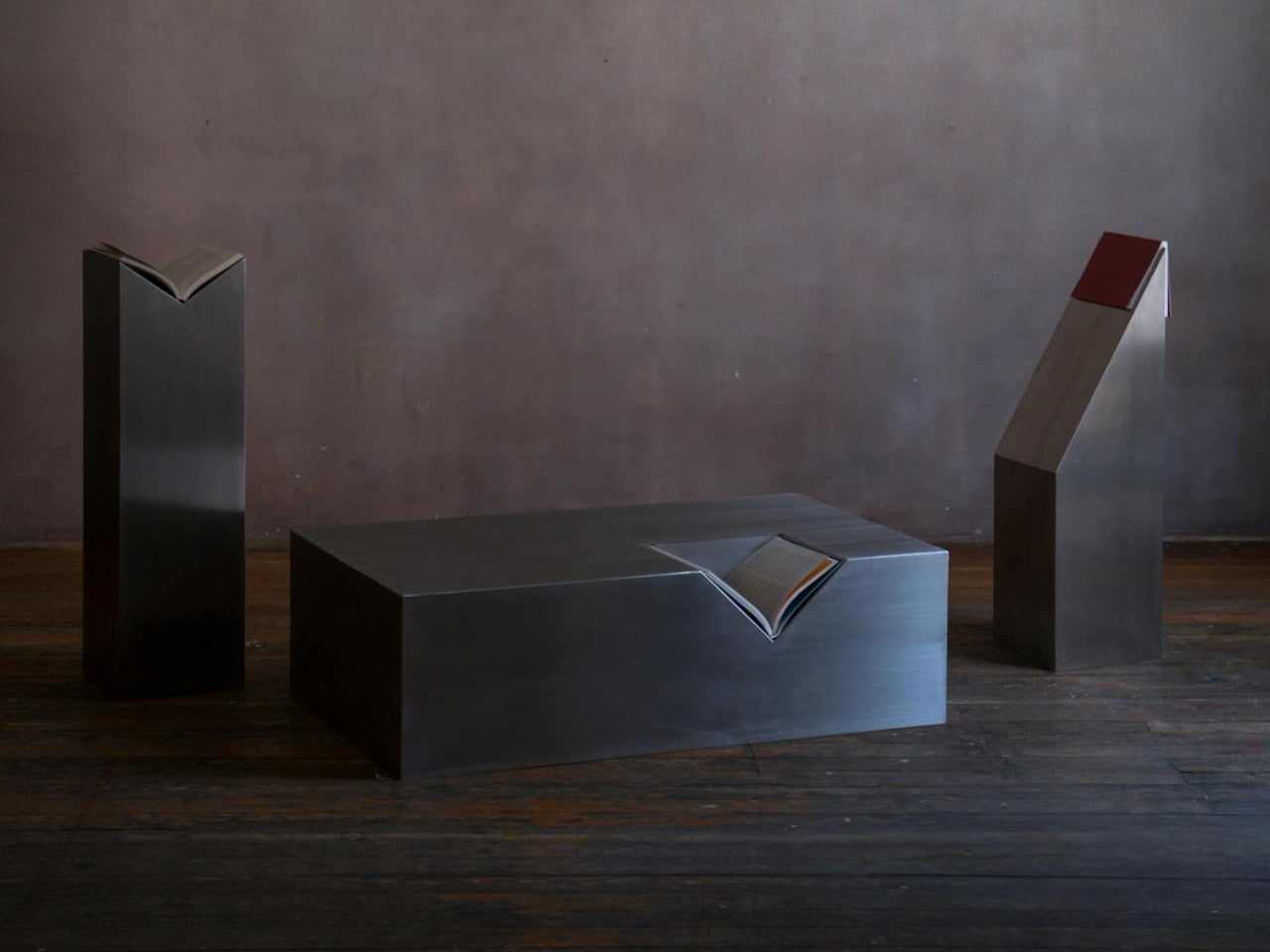
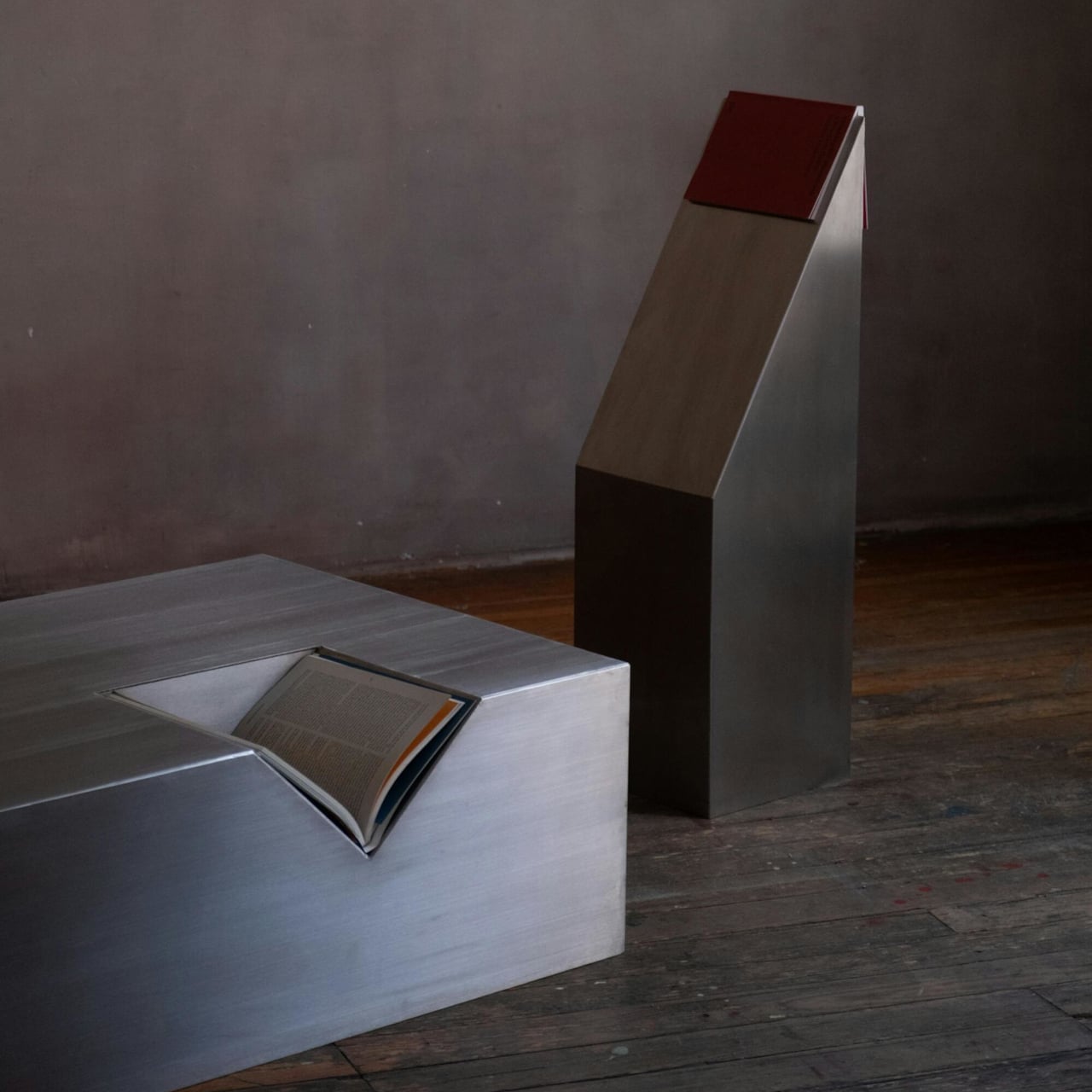
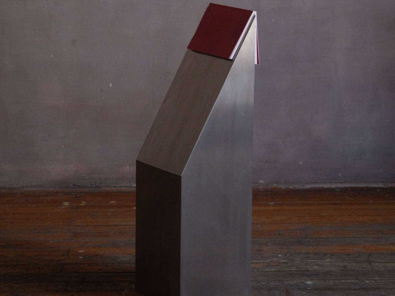
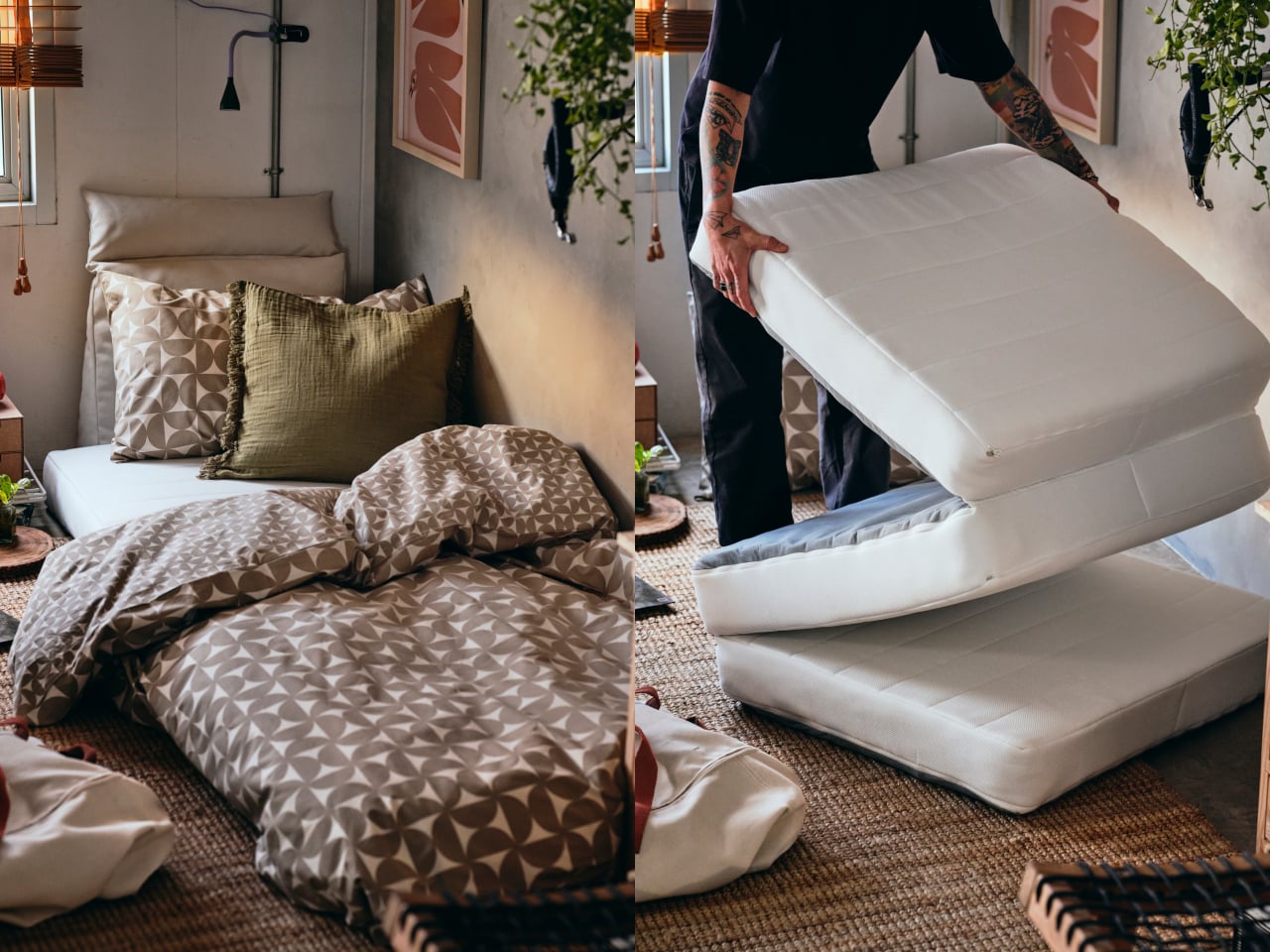
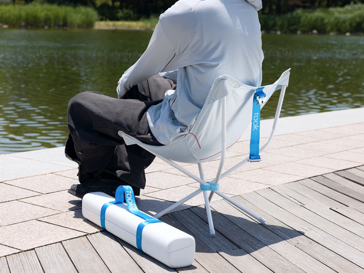
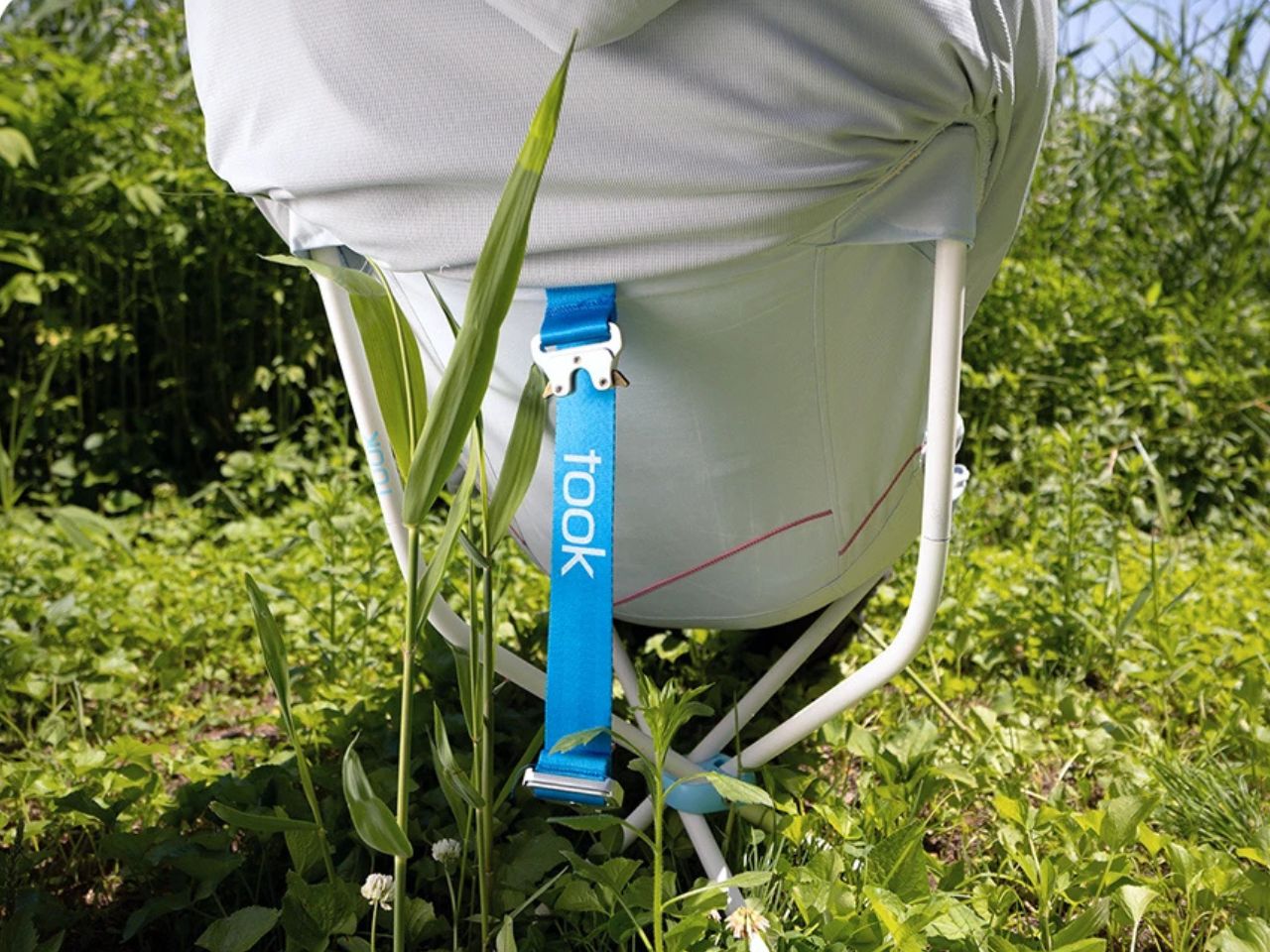
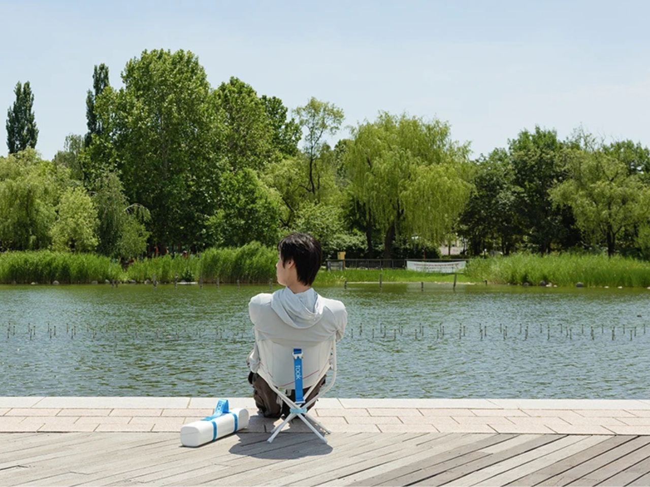
The material story gives the product its emotional weight. When cars reach the end of their life, airbags and seatbelts are usually discarded, despite being made from materials engineered to protect, absorb impact, and bear load. Took reclaims these materials and gives them a second role. Once designed to guard the driver during movement, they now support the driver during stillness. It is a thoughtful form of recycling because it preserves the memory of the car’s protective function while giving it a new, softer purpose.
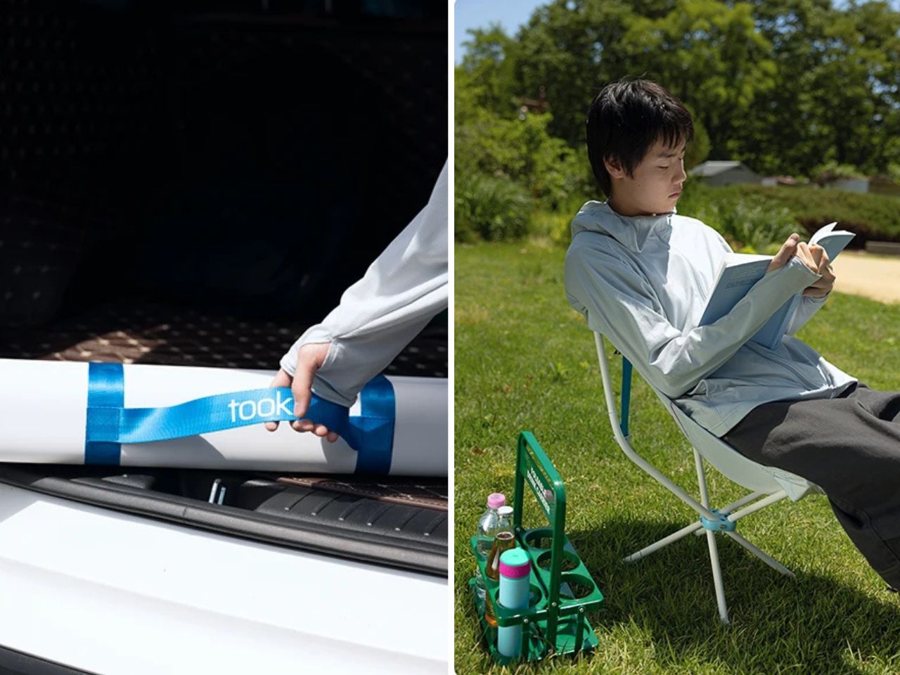
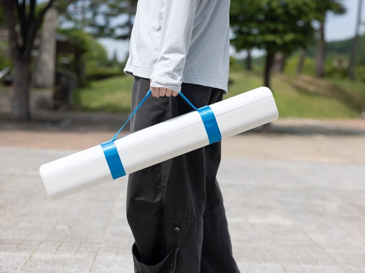
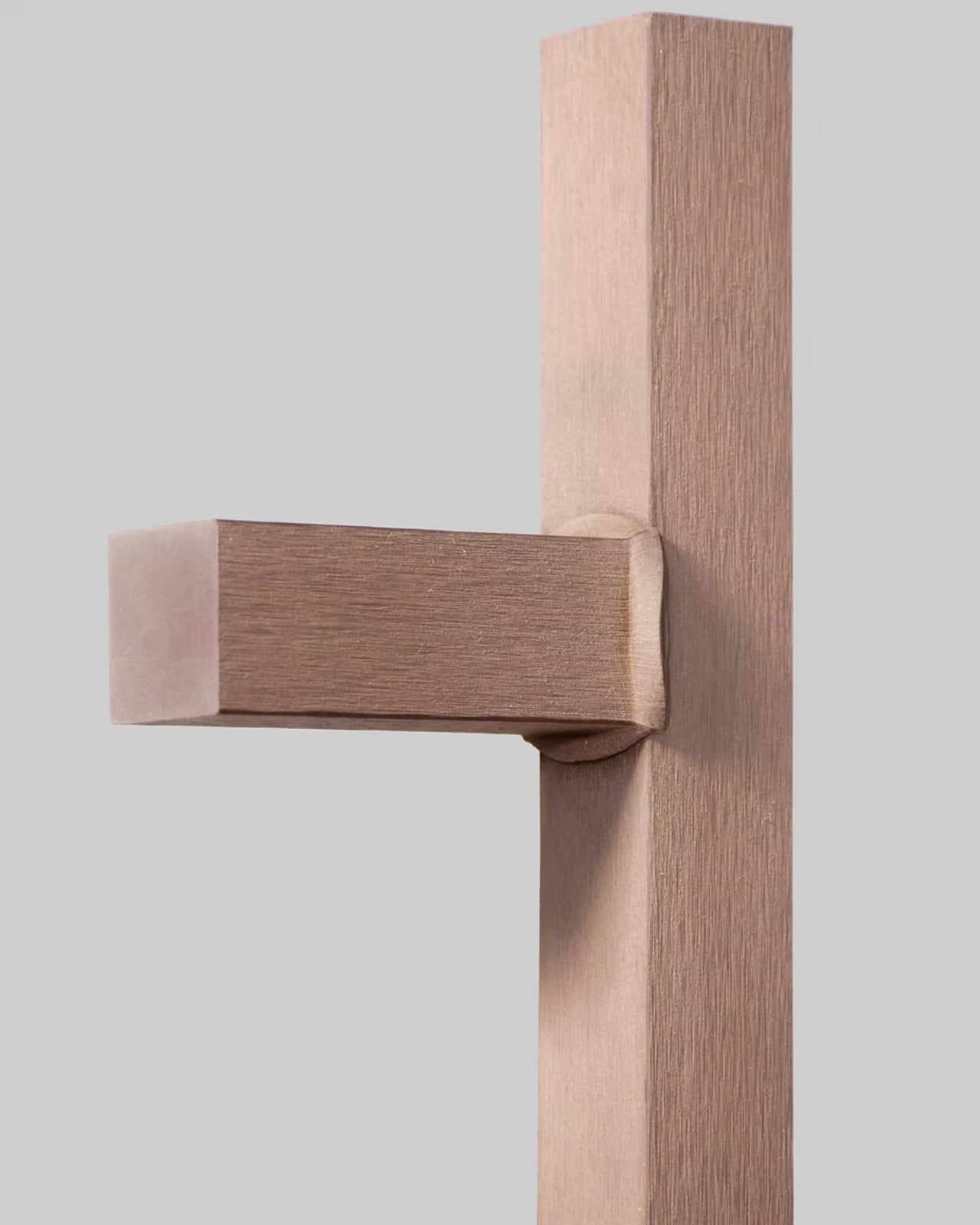
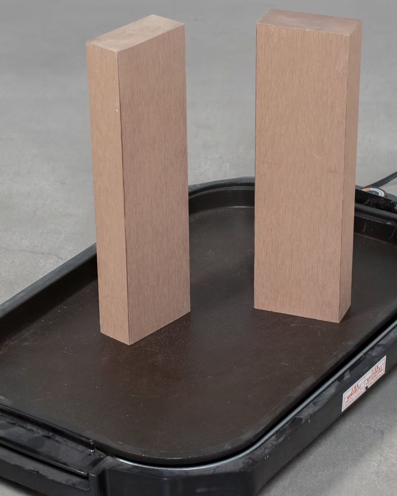
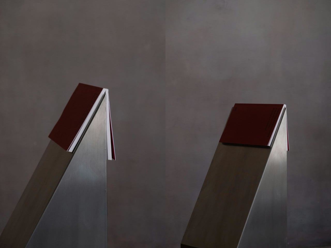
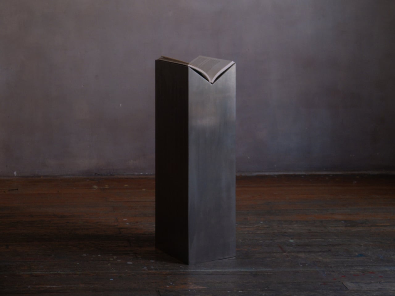
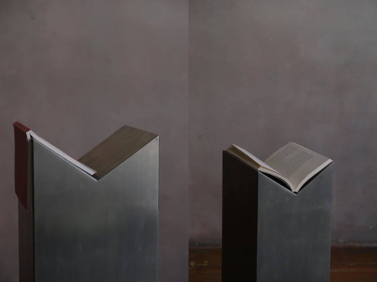
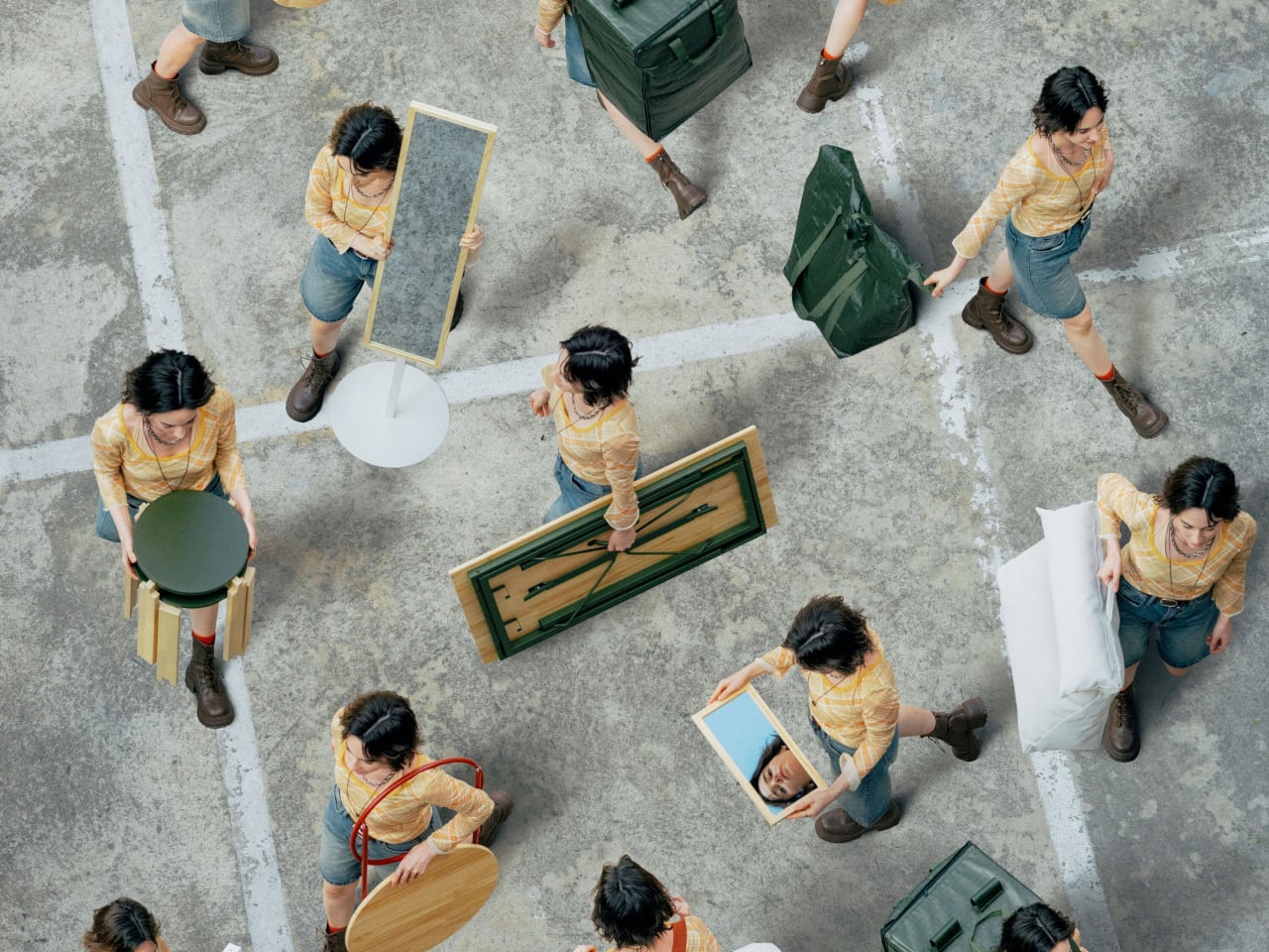
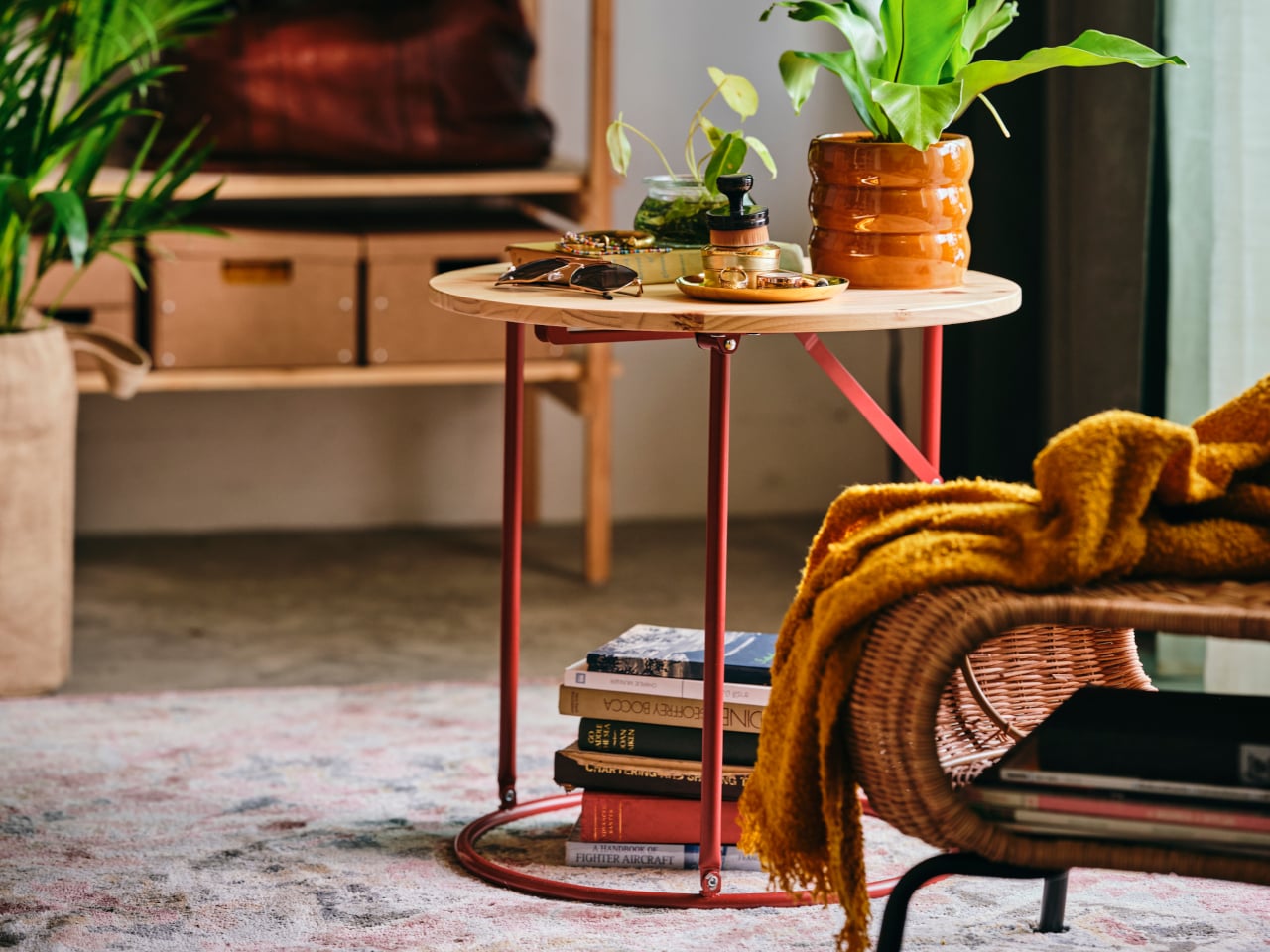
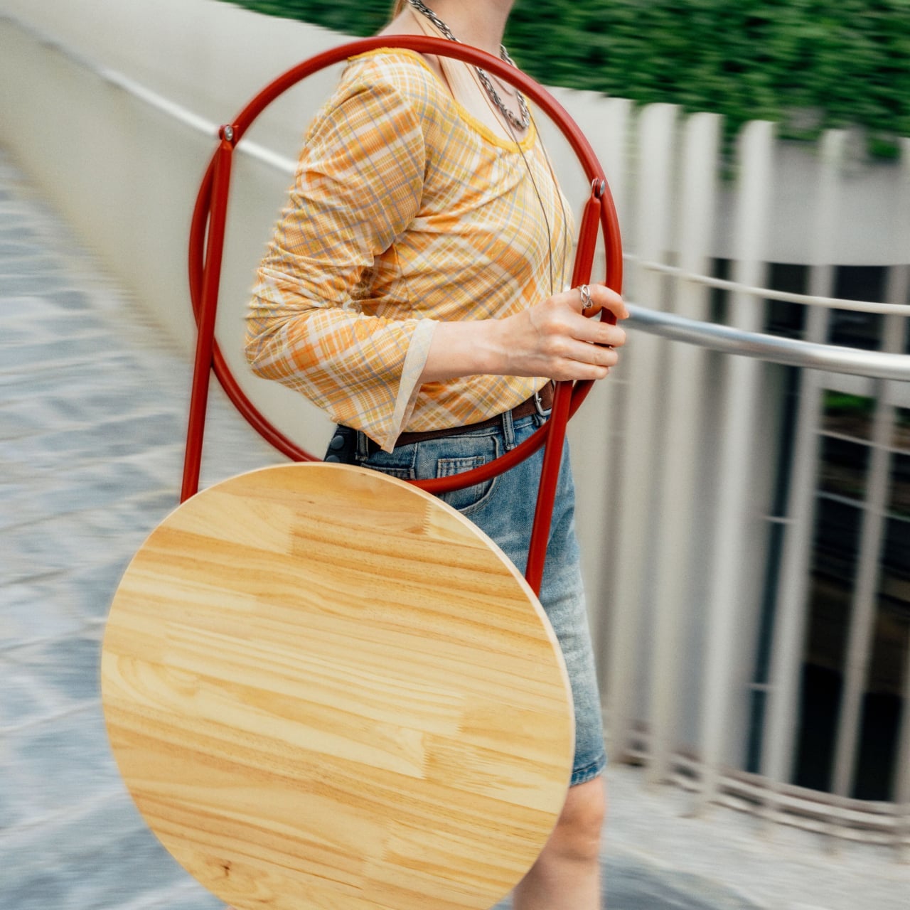
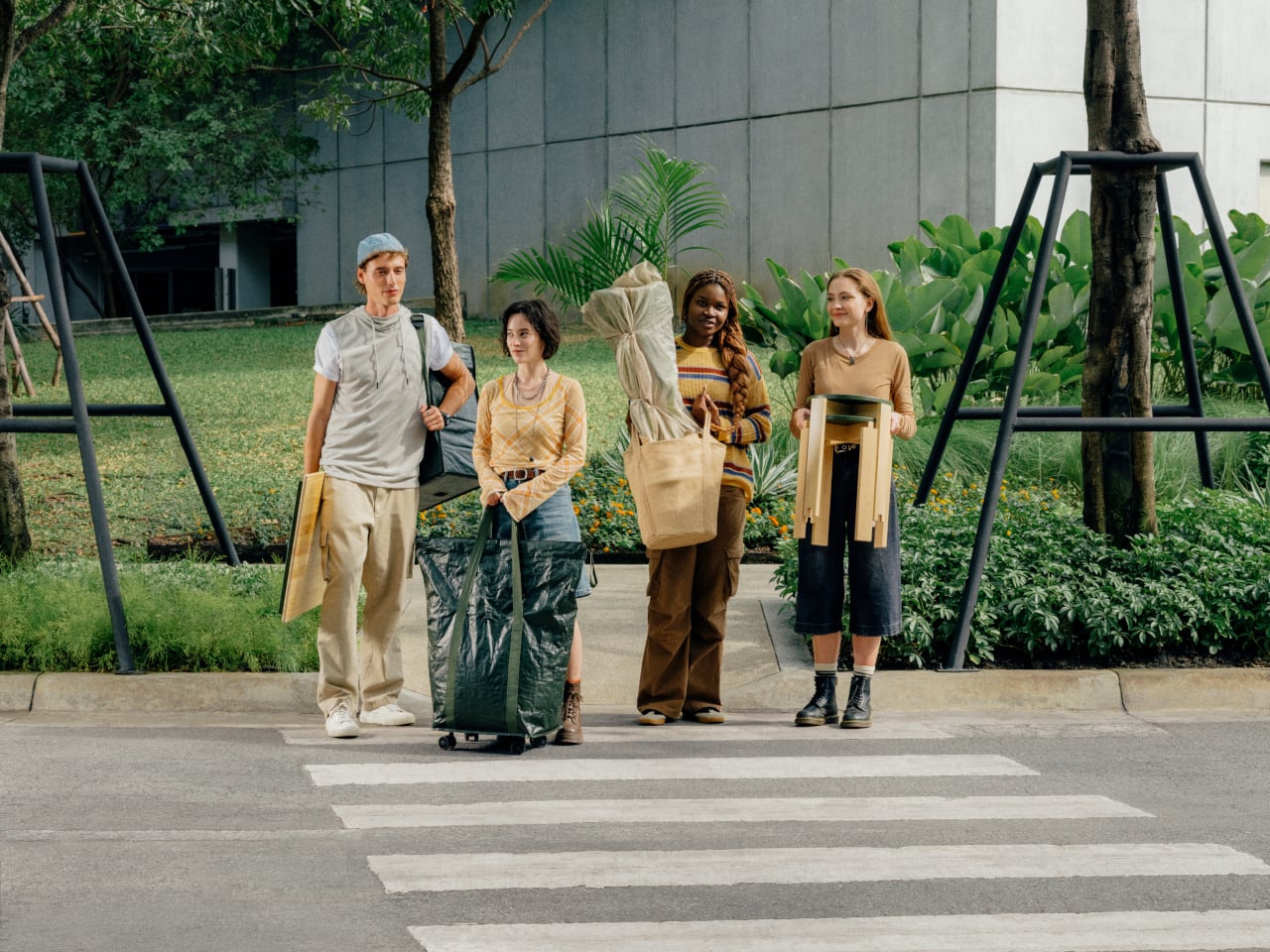
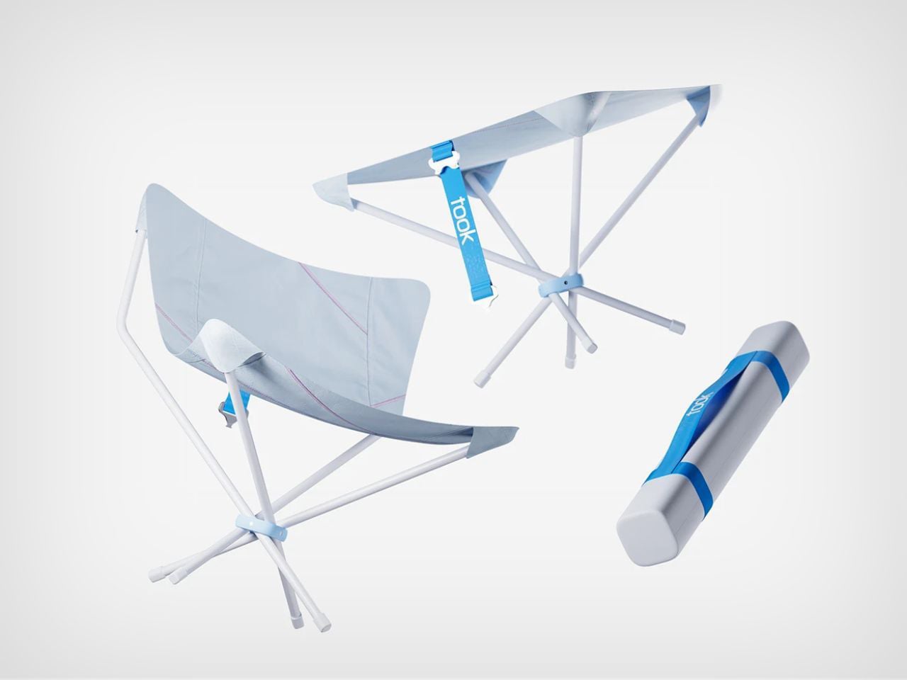
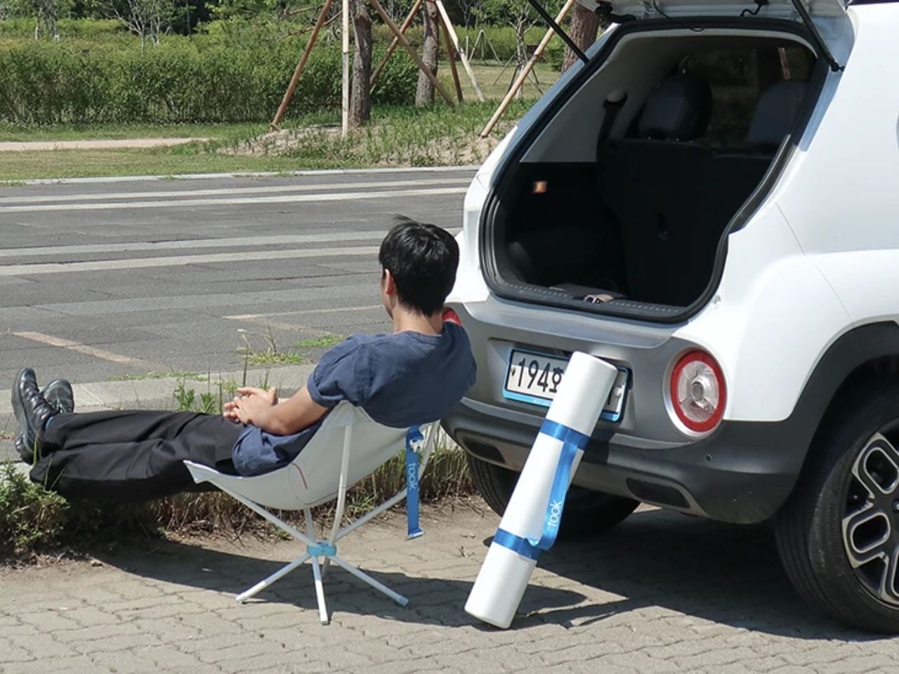
The chair itself is designed around immediacy. Conventional outdoor gear can feel like an entire event before the actual rest even begins. Took removes that friction through a compact case, strap handle, and one-touch hinge mechanism. The case fits neatly in the trunk, keeps the chair protected, and makes it easy to carry from car to destination. Once there, the system unfolds in a single motion. Extend the legs, drape the recycled skin, and the chair is ready. The gesture is simple enough to feel almost ceremonial: arrive, open, rest.
That simplicity is important because Took is not trying to compete with heavy-duty camping equipment. It is designed for the light, everyday outdoor moment. A short break during a road trip. A sunset stop after work. A quiet parking spot by the water. It makes comfort feel accessible without demanding planning, packing, or a complicated setup.
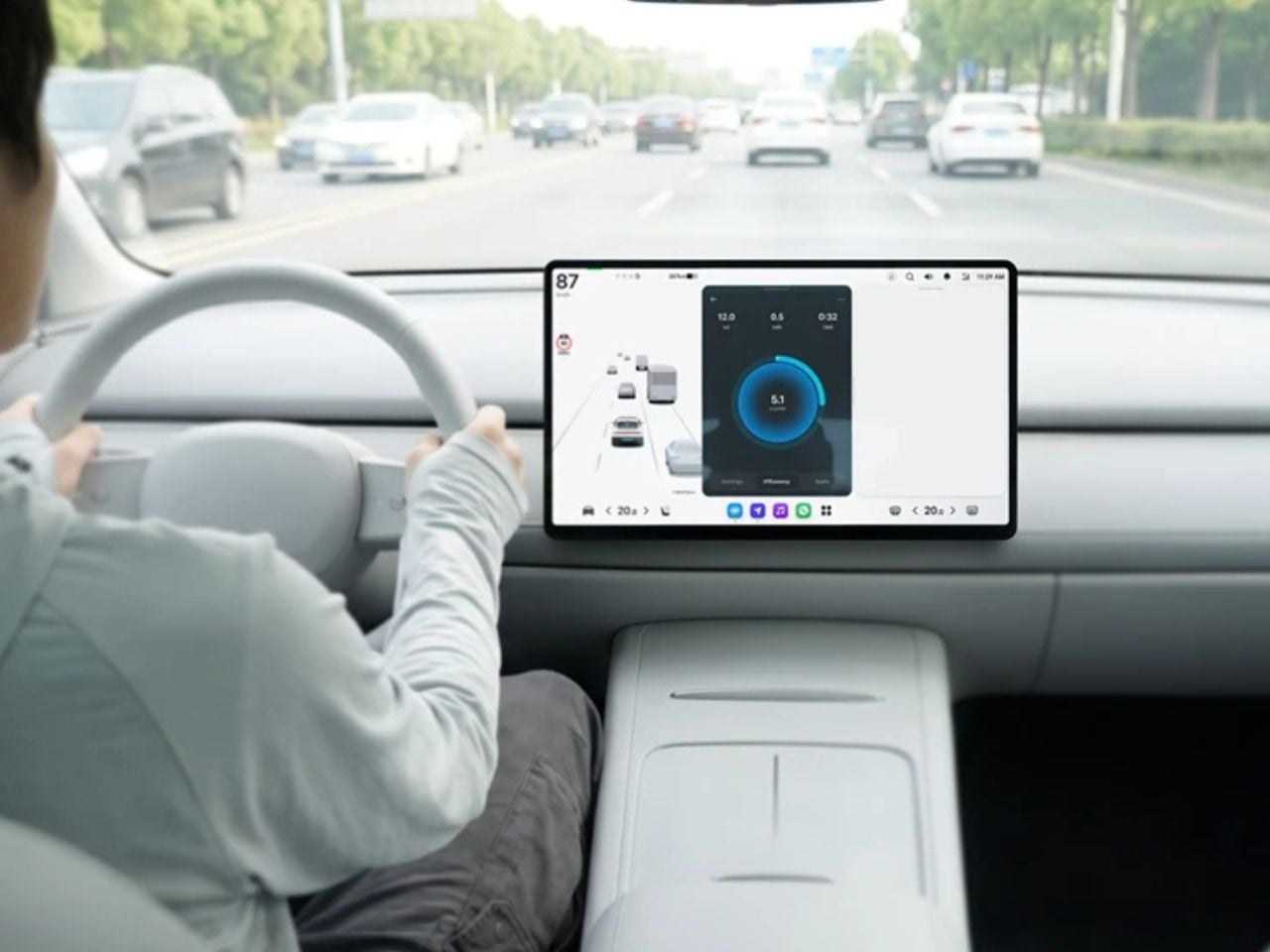
The concept also extends beyond the physical chair. Took imagines driving itself as a more engaging sensory experience through a digital layer called “Play Your Drive.” Instead of treating efficiency as a dry metric, the interface turns it into live feedback. Fluid circles respond to pedaling behavior, while an energy recovery ring helps the driver understand and balance their movement. The result is a playful system where greener driving feels visible, responsive, and rewarding.
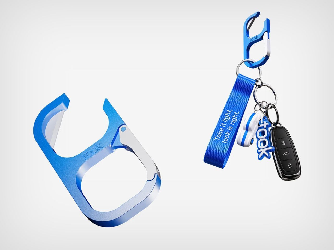
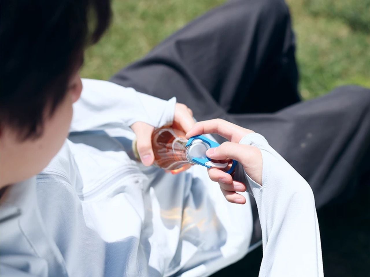
This lifestyle approach continues through small accessories, including a carabiner for the car key. It acts as both a practical holder and a personal object, something that can reflect the driver’s identity. With an added opener function, it quietly supports the kind of relaxed, outdoor ritual Took is built around. Even the welcome package considers the full journey, from active driving to parking, offering the brand’s first greeting as a thoughtful gesture of privacy and care.
Took feels relevant because it understands that future mobility will not only be about smarter vehicles or autonomous systems. It will also be about how people inhabit the spaces around those vehicles. As software-defined vehicles and seamless mobility experiences continue to evolve, the car may become less of a machine we operate and more of a companion in daily life. Took leans into that possibility with warmth, lightness, and a clear sense of purpose.
It does not ask users to become outdoor experts or sustainability activists. It simply makes room for a better pause. With one compact chair, recycled automotive materials, and a playful driving ecosystem, Took turns the ordinary car journey into something more personal, more expressive, and more worth remembering.
The post This foldable outdoor chair occupies the same amount of space as a soundbar first appeared on Yanko Design.