Bertolli Just Gave Alfredo Sauce Its Own Official Pantone Color

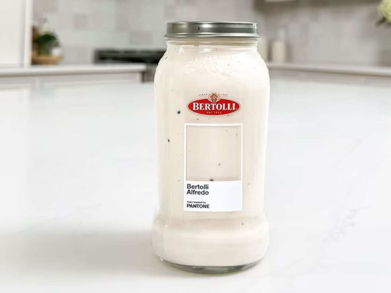
Pantone has officially colored pasta night, and I’m not even slightly mad about it. Bertolli, the Italian food brand that’s been a pantry staple since 1865, just partnered with Pantone to give its best-selling Alfredo sauce an official “Inspired by Pantone” color. The shade? A creamy, off-white hue that’s as comforting to look at as it is to eat. And while some might chalk this up to a clever marketing stunt, I think the collaboration is actually doing something more interesting than it appears.

Let’s start with what Pantone actually does, because it matters here. Pantone doesn’t just slap its name on a color for fun. For decades, the brand has been the definitive authority on color across industries ranging from fashion to interiors to product design. When Pantone certifies a color, it assigns it cultural and commercial weight. It says: this hue means something. Giving that recognition to a pasta sauce is either absurd genius or genuinely inspired branding, depending on your appetite for that sort of thing. Personally, I lean toward the former.

Designer: Bertolli x Pantone
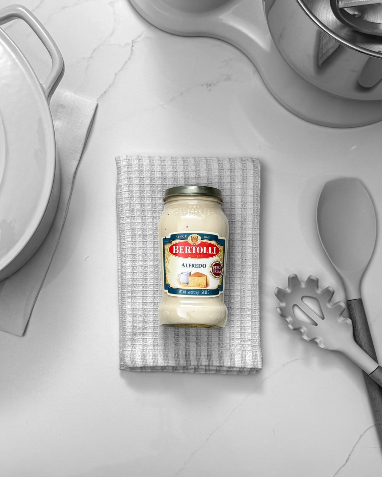
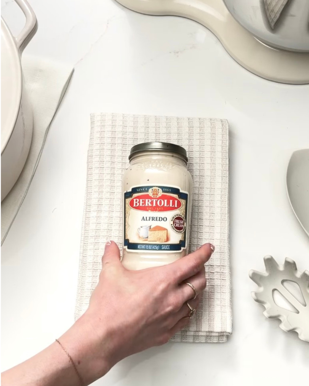
The campaign introduces the creamy off-white as Alfredo’s defining visual identity, with limited-edition Bertolli jars wrapped in Pantone-inspired branding that puts the color front and center. The familiar Pantone square appears on the jar packaging, with a transparent cutout so the sauce itself becomes the swatch. It’s a clever design choice. You’re not just looking at the color, you’re looking through the label to see it in its most natural state.

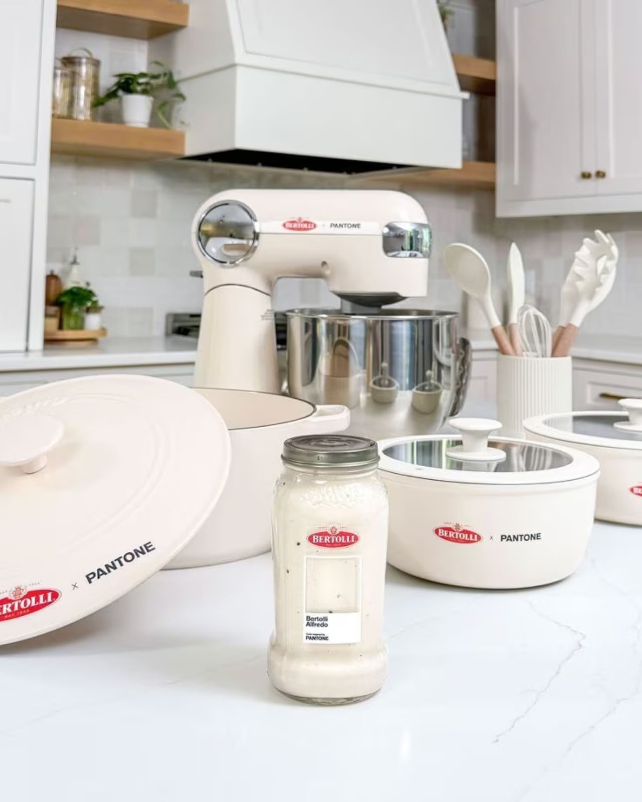
The brand also ran a sweepstakes giveaway with cookware and kitchen accessories curated in the same creamy off-white palette. Think: a stand mixer, pots and pans, a Dutch oven, cooking utensils. All in Alfredo. The fact that Bertolli thought to extend the color story beyond the jar itself shows real creative confidence. A kitchen dressed in Alfredo white is, objectively, a mood.
Now, is this a bit of a marketing flex? Yes. Absolutely. But brands claiming colors as their own is nothing new. Tiffany Blue has its own Pantone number. UPS brown is officially trademarked. Owning a color is a legitimate form of brand identity. The difference is that Alfredo sauce has always had an identity problem. Tomato sauce gets the cultural spotlight. Marinara is the classic. Arrabbiata gets the personality points. Alfredo, despite being wildly popular, tends to get lumped into “the other one.” Rich, creamy, beloved by practically everyone who has ever sat down to a bowl of pasta, but rarely celebrated on its own terms.
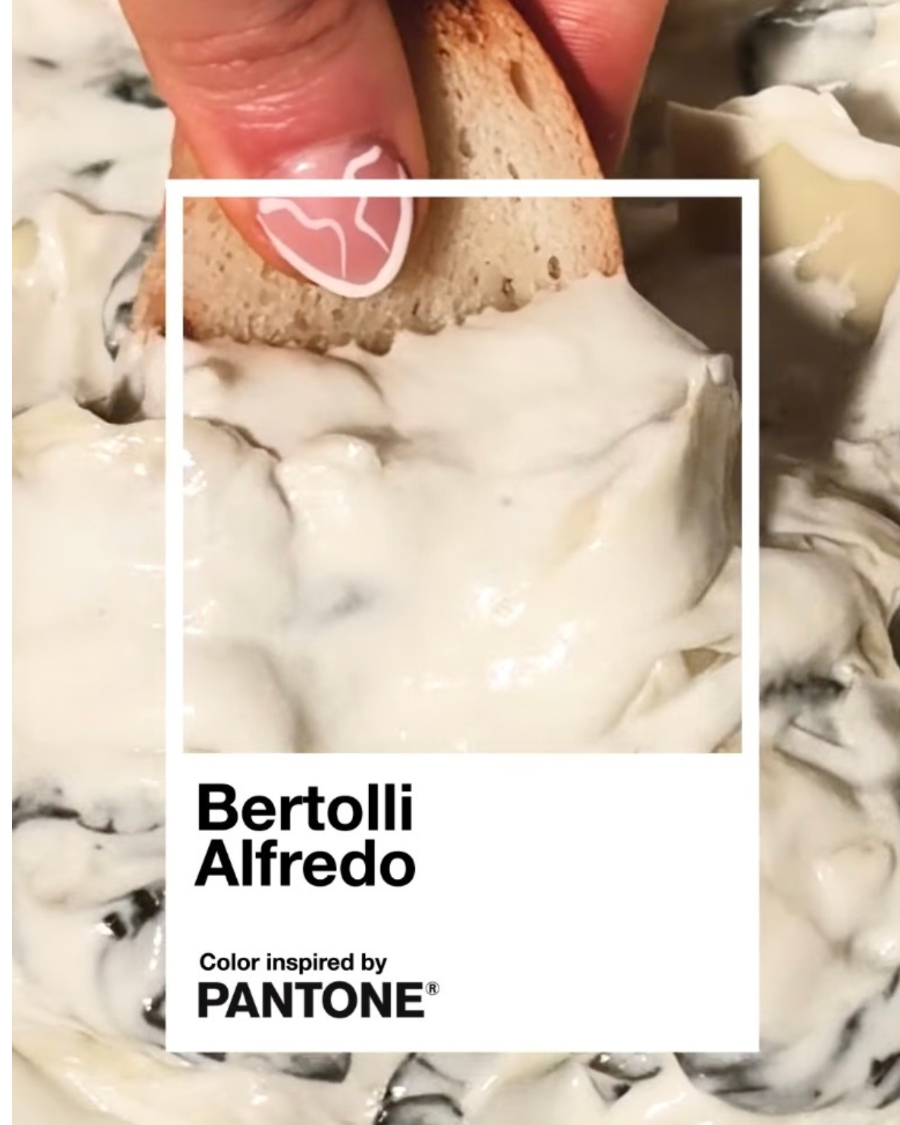
This is Bertolli’s argument that Alfredo deserves its own moment, its own aesthetic language. And credit where it’s due: using Pantone to tell that story is a smart move. Color is one of the most immediate, emotional forms of communication we have. When Pantone named Viva Magenta the Color of the Year, people talked about it for months. Attaching that same institutional gravitas to a sauce most people have in their fridge right now? That’s a cultural bridge worth crossing.

The campaign also encouraged people to “Take the Alfredo” through social media activations and influencer partnerships. The phrase is a little clunky, but the intention behind it is clear: they want Alfredo to feel like a statement, not just a side dish.
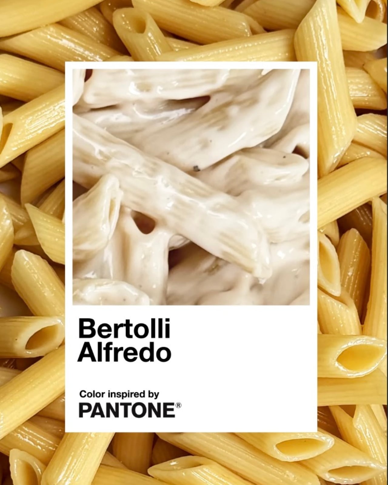
I do think the success of a campaign like this lives or dies by whether it earns its concept, and this one mostly does. The visual execution is clean and considered. The product and the partner make intuitive sense together. Pantone’s “Inspired by” series has previously drawn from art and culture, so extending it to food isn’t much of a leap when you think about how central color is to the way we experience appetite. We eat with our eyes first, and that creamy off-white carries its own quiet appeal.

Bertolli has been feeding people for over 150 years. Getting Pantone to officially say the brand’s signature sauce has a color worth naming? That’s just a long overdue introduction.
The post Bertolli Just Gave Alfredo Sauce Its Own Official Pantone Color first appeared on Yanko Design.
How Pasta Became Interior Design’s Most Playful Muse

There is something wonderfully unserious, and yet oddly elegant, about pasta-inspired decor. What began as an April Fools’ joke by luxury stone and tile company Artistic Tile has now become part of a broader design movement that treats pasta as form, memory, geometry, and material inspiration.

In April, Artistic Tile posted its newest “product line” on Instagram: mosaics featuring macaroni and farfalle shapes arranged like pasta in sauce. The collection, cheekily called Al Dente, immediately caught attention. Followers loved the concept, with many joking that Italian restaurants should take the idea seriously. The only problem? It was posted on April 1. The tiles were never originally meant to be real. But the joke had too much flavor to stay fictional.

Designer: Studio Yellowdot

The idea first emerged while Artistic Tile’s president and chief product officer, Zach Epstein, was reviewing another design with a boomerang-like shape. The curve suggested something more familiar and playful: macaroni. After the enthusiastic online response, Artistic Tile decided to bring the concept to life through its Tailored To program, which allows for custom designs. What started with macaroni and farfalle expanded into vodka rigatoni made from limestone and Rosa Perlino, and butter noodles made with Limone Marmi marble. Beneath the humor, the pattern works because it is recognizable, abstract, and decorative without feeling too literal.

That balance between wit and refinement is exactly why pasta has become such an appealing muse for designers. Pasta is familiar, playful, sculptural, and deeply emotional. It carries family memories, comfort, culture, and craft, while offering an endless library of shapes: ridges, curls, tubes, shells, folds, ribbons, and spirals.

Pasta-inspired design does not need to belong only in Italian restaurants or food-focused spaces. Its value lies in its ability to spark conversation anywhere. A pasta-shaped pull on a cabinet, a lasagna-inspired chair, or a macaroni mosaic creates a moment of recognition. People pause, smile, and look closer. That small moment of surprise adds emotional value to an interior. It makes a space feel more human, less predictable, and more open to storytelling.

In an age where many interiors can feel overly polished or algorithmically similar, pasta brings a charming disruption. It introduces humor without making the space feel childish. It creates nostalgia without becoming overly sentimental. Because nearly everyone has some relationship with pasta, through family dinners, grocery aisles, childhood meals, or comfort food memories, the motif carries an easy emotional resonance. It becomes a shared reference point, allowing design to feel more approachable and social.

Canadian Italian artist and industrial designer Chris Fusaro’s work shows how pasta can operate as a design language. His bronze objects appear to be built from hyperrealistic pasta pieces, transforming bowls, strainers, trivets, lamps, pendants, and chairs into playful studies of repetition and form. In this context, pasta becomes a modular system. Its many shapes allow the idea to expand across different scales and objects without feeling immediately exhausted.

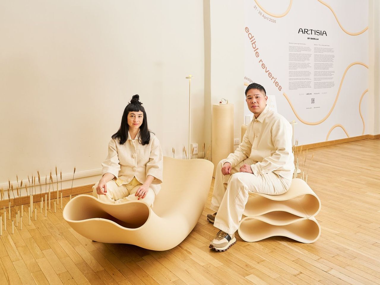
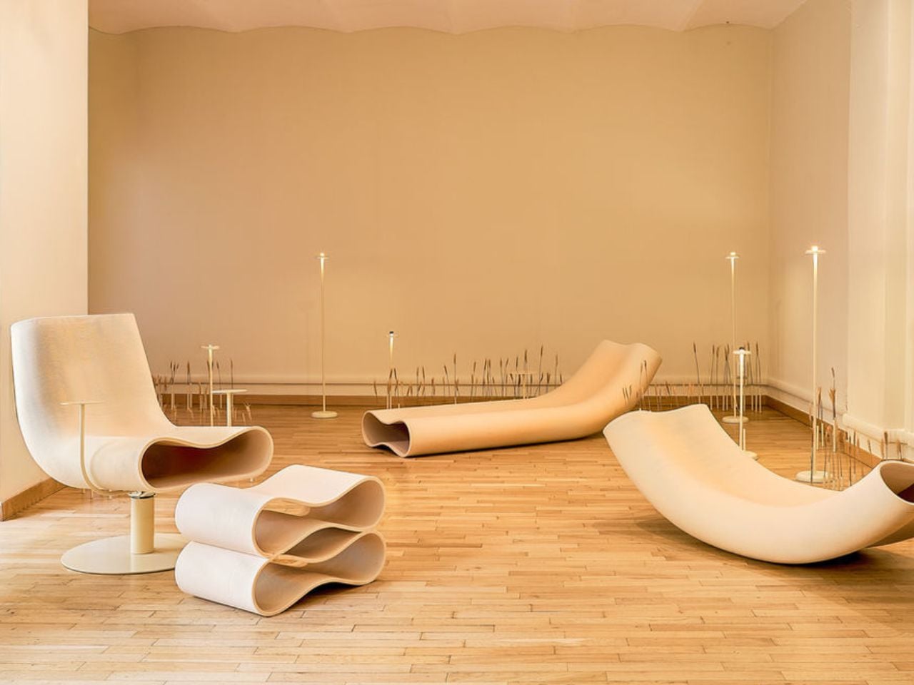
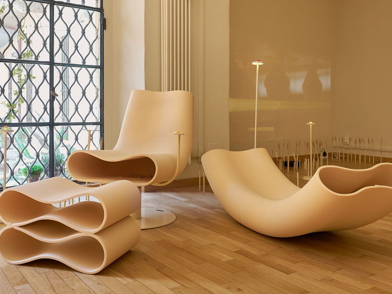
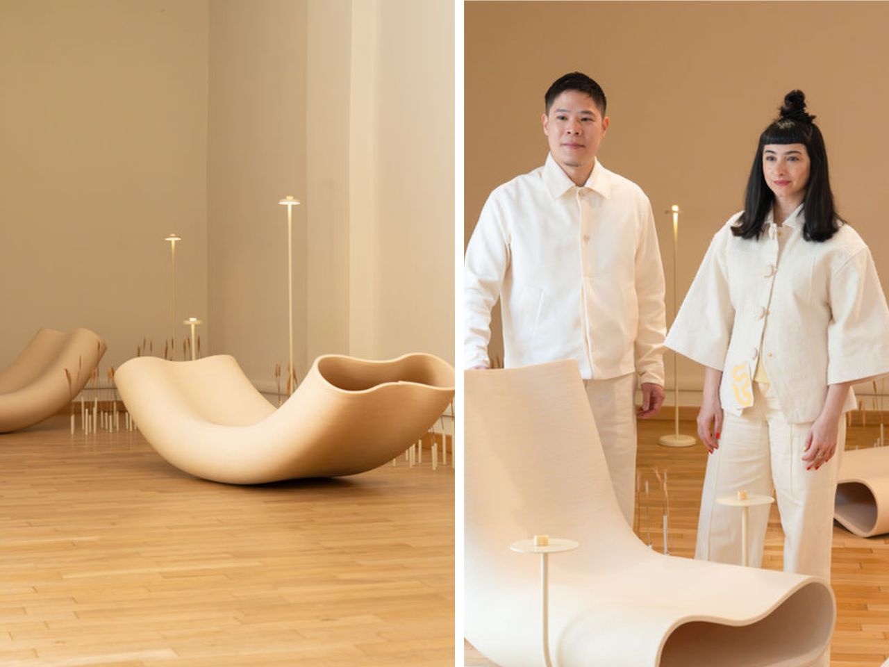
At Milan Design Week, pasta moved into an even larger spatial language through Edible Reveries, an exhibition by Artisia, a Barilla-owned company specializing in 3D-printed dry pasta, and Studio Yellowdot. Alongside tastings, visitors encountered pasta-inspired furniture, including a lounge seat, rocking chair, and ottoman shaped like enlarged dry noodles. The furniture was also 3D-printed, using a wood-composite material that echoed the process of shaping pasta dough. The result was surreal yet functional: soft and noodle-like in appearance, stable and architectural as furniture.

Other designers are exploring pasta at a more intimate scale. Australian hardware brand Lo & Co Interiors released its own Al Dente collection, featuring orecchiette-inspired knobs and lasagne-like pulls. These pieces bring a subtle wink to furniture and cabinetry. Their appeal lies in the way they feel familiar and sophisticated. A pasta-inspired drawer pull can be humorous, and when treated with the right material, finish, and proportion, it becomes unexpectedly elegant.

This trend feels timely because contemporary interiors are moving away from overly disciplined, sterile perfection and toward objects with personality, tactility, and a stronger sense of handcraft. Pasta forms naturally offer irregularity and charm. They feel shaped rather than engineered. They carry presence without becoming intimidating.

San Francisco designer Caleb Ferris found inspiration in pasta while observing the range of shapes found in grocery store aisles during the pandemic. The variety of pasta forms revealed itself as a kind of mass-produced design library. His lasagna chair, made in a ruffled black satin silhouette, brought tongue-in-cheek humor into furniture and went on to win the 2023 ICFF Editors Award for Seating. In a moment when people were craving lightness, pasta offered comedy, craft, and a break from overly serious design language.

New York interior designer Tara McCauley has leaned into the theatrical side of pasta. Her lamp, made with real linguine, faux parsley, and a clam shell base, plays with the line between decorative object and edible absurdity. The piece creates a moment of surprise: at first glance, it reads as a whimsical design object, but up close, the use of real pasta turns it into something stranger and more memorable.

Pasta-inspired design works because it is funny without feeling disposable. It adds value to interior spaces by being memorable. It gives people something to notice, talk about, and connect with. Whether placed in a home, boutique hotel, retail space, gallery, or restaurant, it can soften the atmosphere and make the environment feel more personal.

Pasta has always carried the logic of design. It is engineered to hold sauce, shaped for texture, scaled for the hand and mouth, and tied to ritual. Now, designers are moving it from the kitchen table into the wider world of interiors. The result is a little ridiculous, surprisingly refined, and very hard not to love.

The post How Pasta Became Interior Design’s Most Playful Muse first appeared on Yanko Design.
Barilla Snowfall Pasta Just Claimed Winter: Is This The New Pumpkin Spice?

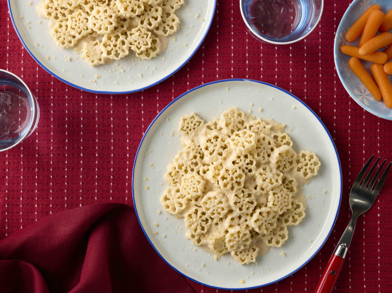
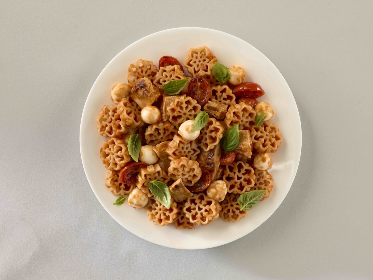
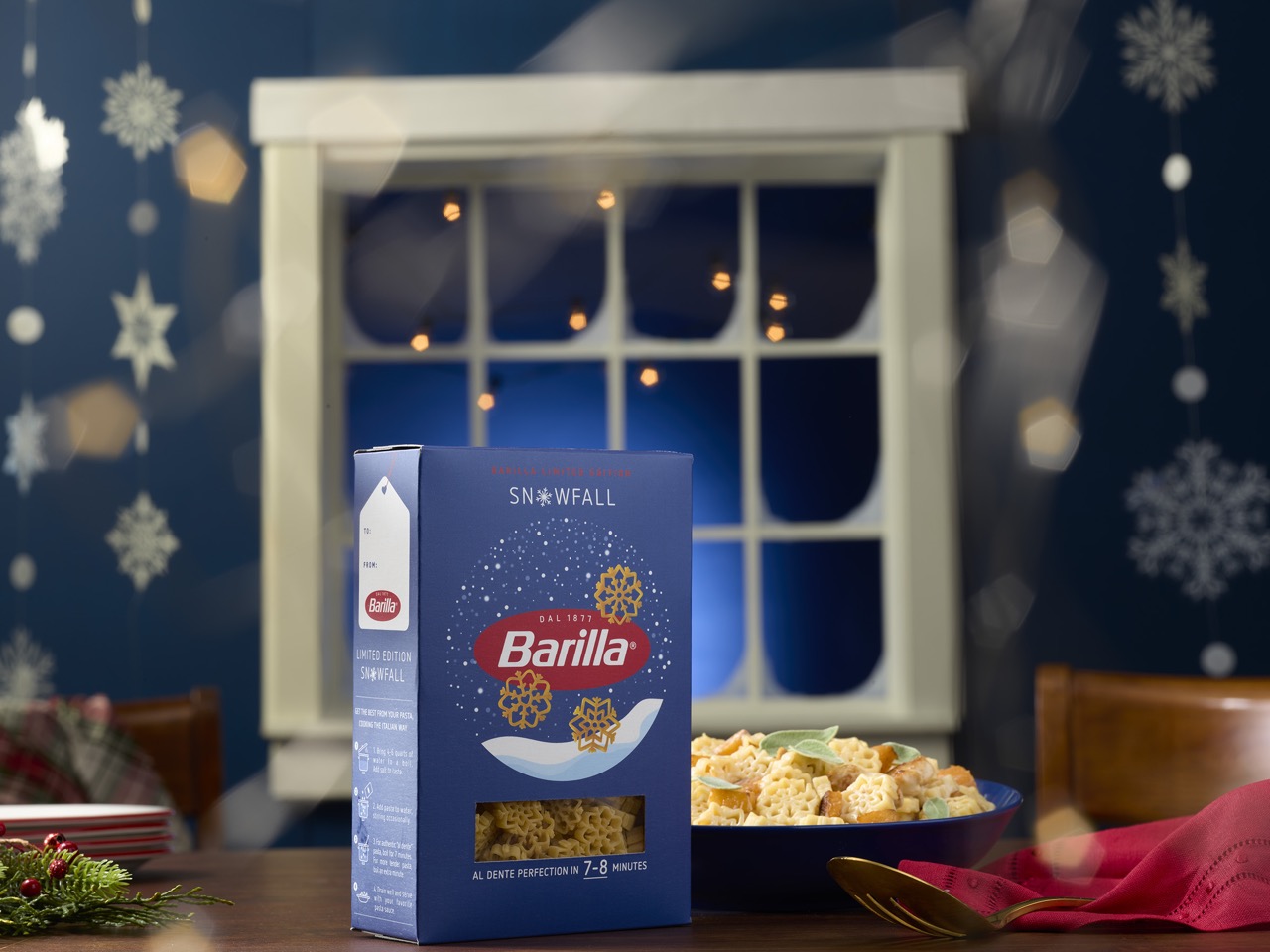
Just when the last of the pumpkin spice dust settles, a new seasonal harbinger arrives, and this one you can boil. Barilla’s Snowfall Pasta is stepping up as winter’s official mascot, a tiny, edible snowflake designed to signal that it is now socially acceptable to cancel all plans in favor of a blanket and a large bowl of something warm.

The whole concept is a fascinating piece of product marketing. Instead of merely suggesting pasta for a cold night, Barilla has manufactured the cold night in pasta form. It’s a limited edition play that transforms a pantry staple into a piece of seasonal decor you can actually eat, making it the perfect centerpiece for the official sport of winter: hibernation.

Designer: Barilla

This move is part of a larger, more deliberate calendar Barilla seems to be building. According to their own press releases, Snowfall Pasta is the official kickoff for “cozy season,” a term they are clearly trying to own. It’s the winter bookend to their other successful limited run, the heart-shaped Love Pasta that appears just in time for Valentine’s Day. This isn’t just about selling a novelty shape; it’s about creating a recurring, seasonal ritual. Barilla is conditioning us to associate their brand with specific emotional moments on the calendar, turning a trip to the grocery store into a timely, festive occasion.

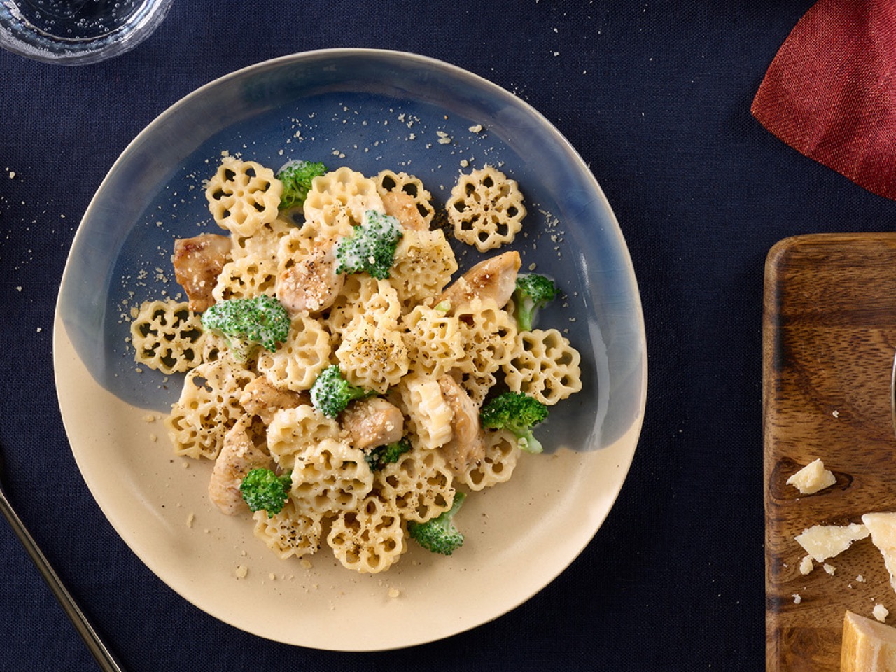
Of course, the engineering behind a shape like this is where things get interesting. Anyone who has cooked with novelty pasta knows the risks: delicate points that break off in boiling water, or a shape so intricate it turns to mush while the thicker parts remain undercooked. The real test for Snowfall Pasta is whether its snowflake design is robust enough to survive the journey from box to bowl. You have to assume Barilla’s food scientists and die-cut engineers spent considerable time finding the balance between a recognizable shape and structural integrity. A well-designed novelty pasta will also have plenty of surfaces and ridges to catch sauce, which is the ultimate functional purpose of any pasta shape.

The post Barilla Snowfall Pasta Just Claimed Winter: Is This The New Pumpkin Spice? first appeared on Yanko Design.