The 4th of July has a way of surfacing the gear you wish you already owned. The flashlight nobody can find. The pocket tool left at home. The radio that needs Wi-Fi to work. This year, instead of defaulting to another box of sparklers, consider something that earns a permanent spot in someone’s daily carry. These seven picks are design-forward, genuinely useful, and built for long days outdoors.
The range runs from ten dollars to under a hundred, spans keychain carry to campsite audio, and skews toward objects that solve problems the recipient didn’t know they had. A 4th of July gift isn’t really about the holiday — it’s about summer. Long evenings, unfamiliar parks, parking lots that feel like a mile from the fireworks. The best EDC is already in your pocket before you realize you needed it.
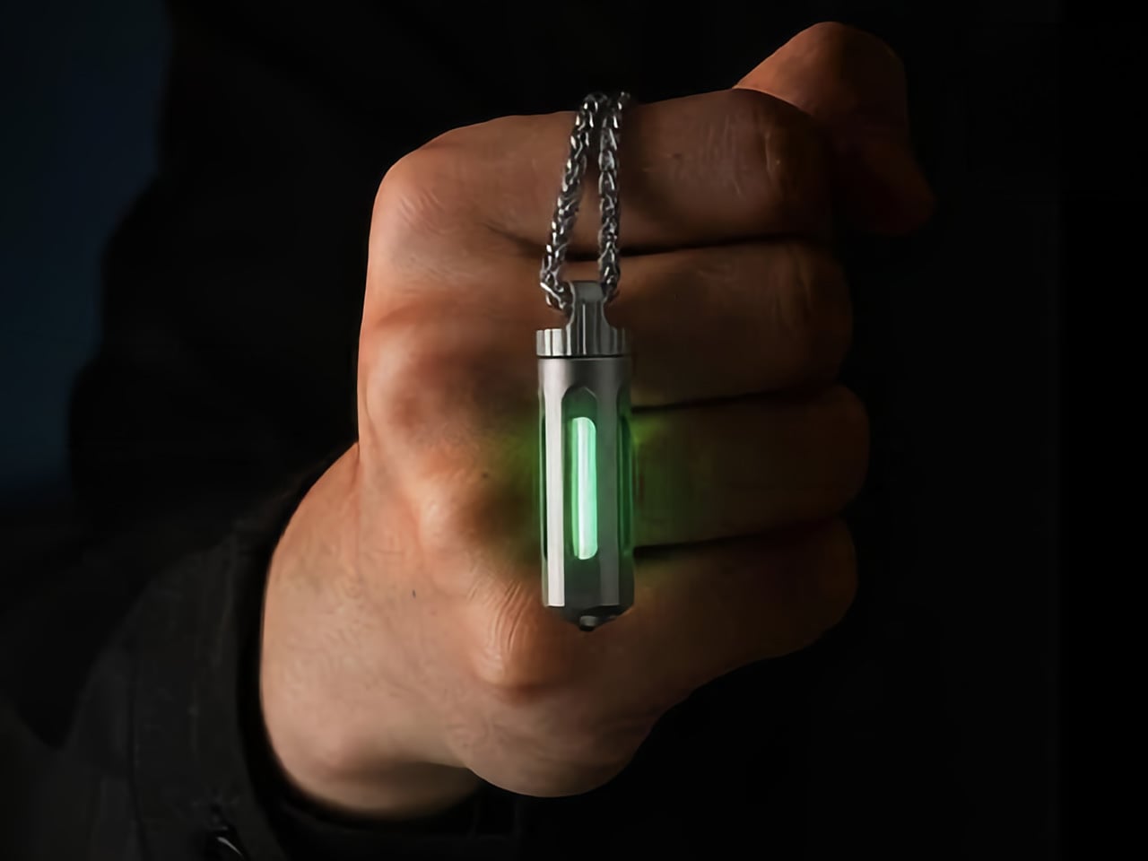
1. NoxTi Titanium Glow Keychain


Most keychain tools solve for function and ignore everything else. The NoxTi starts from a different premise entirely. Inside a 45mm Gr5 titanium body machined to aerospace tolerances lives a tritium vial — a hydrogen isotope that releases beta particles, which strike a phosphor coating and produce light. No batteries. No charging. No switch to press. The physics simply runs, continuously and silently, for 25 years. Six color options span Apple Green, the brightest to the human eye, through Ice Blue, Red, Sunset Orange, Violet, and Ocean Blue.
At 10.7 grams, roughly two US pennies, the NoxTi disappears on a keychain until darkness falls and it becomes the most visible thing in your pocket. The quartz tube transmits 92% of available light and will still be optically clear in 2050. A ceramic-tipped glass breaker sits at the tail end for emergencies. When the tritium dims after two decades, you press the old vial out and slide a new one in. The titanium body is designed to outlast every other item in your carry, twice over.
What we like
- Tritium glow requires no battery, no charging, and no activation — just physics running without interruption for 25 years
- User-serviceable vial replacement means the titanium body becomes a permanent carry piece that improves rather than degrades over time
What we dislike
- The glow is intentionally faint — this is a locator light, not a work light, and that distinction matters when gifting
- The tritium version costs nearly double the luminescent model; the difference only reveals itself in complete darkness
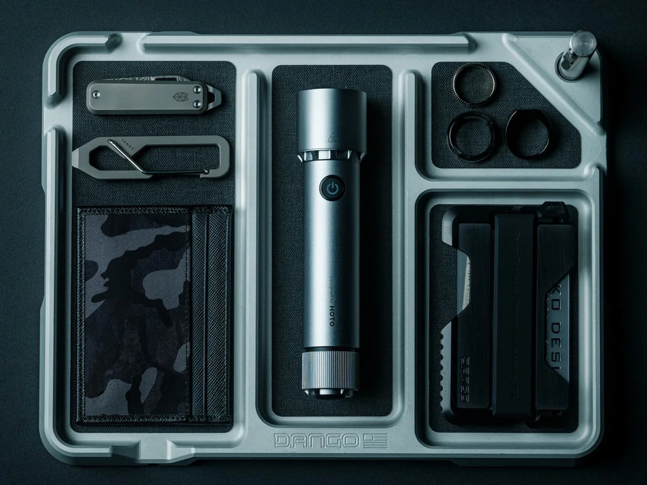
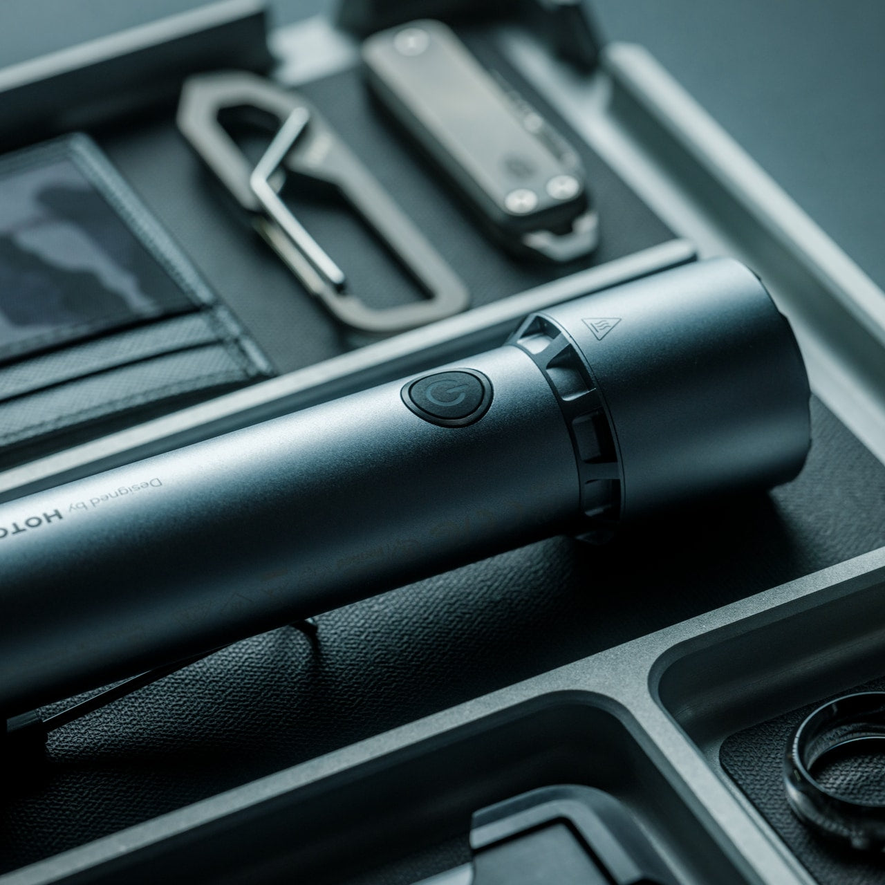
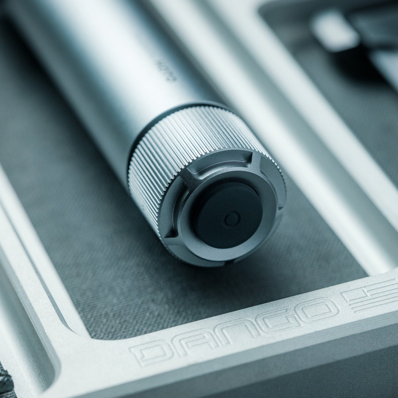
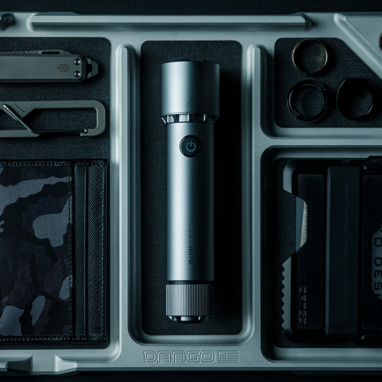
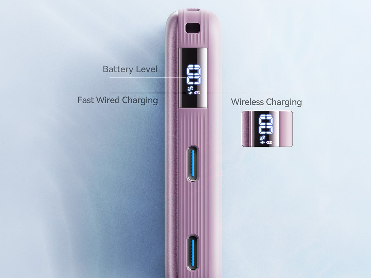
2. CasaBeam Everyday Flashlight
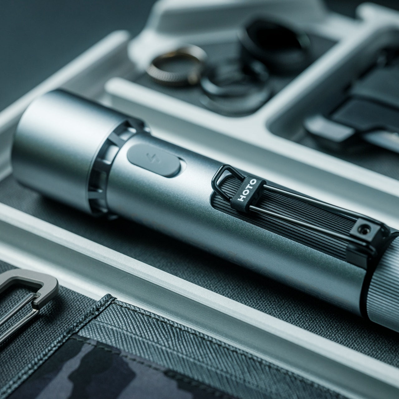
A 1,000-lumen output with a 200-meter throw sounds like overkill for a walk to the fireworks lot. It isn’t. The CasaBeam’s core trick is what happens when you stand it upright: it becomes a lantern, casting ambient light across a blanket, a tailgate, or a campsite without requiring a second device. Twist the front to shift between focused spotlight and wide floodlight. Five lighting modes handle everything from reading fine print on a map to signaling across a dark field.
The form factor is the story. Cylindrical, compact, no exposed bezels or tactical knurling — it reads as a designed object rather than a piece of survival gear. That matters when the gift lives on a kitchen counter for 50 weeks a year and earns its place the other two. The dual-mode beam and standing lantern configuration solve two distinct problems with a single product and no attachments required. Most flashlights beg to be put away. This one earns a shelf spot.
Click Here to Buy Now: $50.00
What we like
- 1,000 lumens and an upright lantern mode solve two distinct lighting problems within a single compact form
- Clean cylindrical profile reads as a designed object rather than tactical gear, earning permanent display rather than a drawer
What we dislike
- Battery life at maximum output isn’t specified, which becomes a real concern during extended outdoor use
- No integrated power bank function means a phone running low still needs a separate solution
3. Cubik

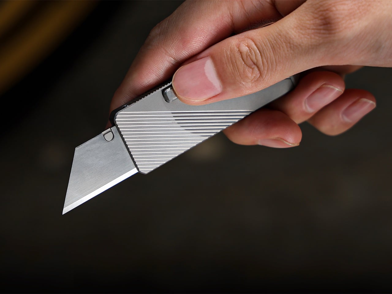
Knife design has explored most of its available territory. Springs, flippers, bearings, assisted openers — the variations are incremental. The Cubik does something genuinely different. Press the trigger, tip the handle down, and the SK5 trapezoid blade drops into place using nothing but gravity. Release and it locks. No spring to rust, no bearing to fail, no mechanism that requires maintenance over years of carry. The outer body is fully machined titanium at 1.65 ounces, measuring 2.6 inches long and 0.2 inches thin.
The swappable blade design turns a potential limitation into a genuine advantage. When an edge dulls, you replace it rather than resharpening. Five blades come included, and the trapezoid format is dual-ended — when one tip wears, flip it. Remove the blade entirely, and the handle clears TSA checkpoints. Tritium slots on both sides accept glow vials for low-light visibility. A tungsten carbide glass breaker sits at the rear end, and a pocket clip handles daily carry. The Cubik removes friction from every step except the cut.
What we like
- Gravity deployment eliminates springs and bearings, making the mechanism nearly impervious to the wear that compromises most folding knives over time
- TSA-friendly with blade removed, making it genuinely packable for any travel scenario without sacrificing the handle as a daily tool
What we dislike
- Gravity deployment requires a deliberate wrist motion that takes practice — less intuitive than a flipper under real pressure
- SK5 is functional blade steel but won’t match the edge retention of higher-alloy alternatives at this price
4. Gerber Shard
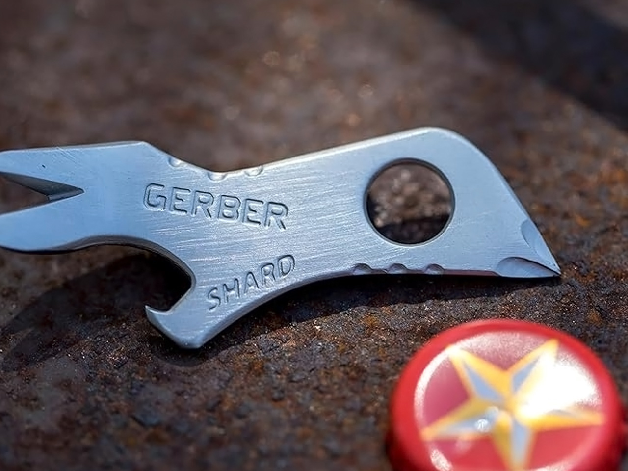
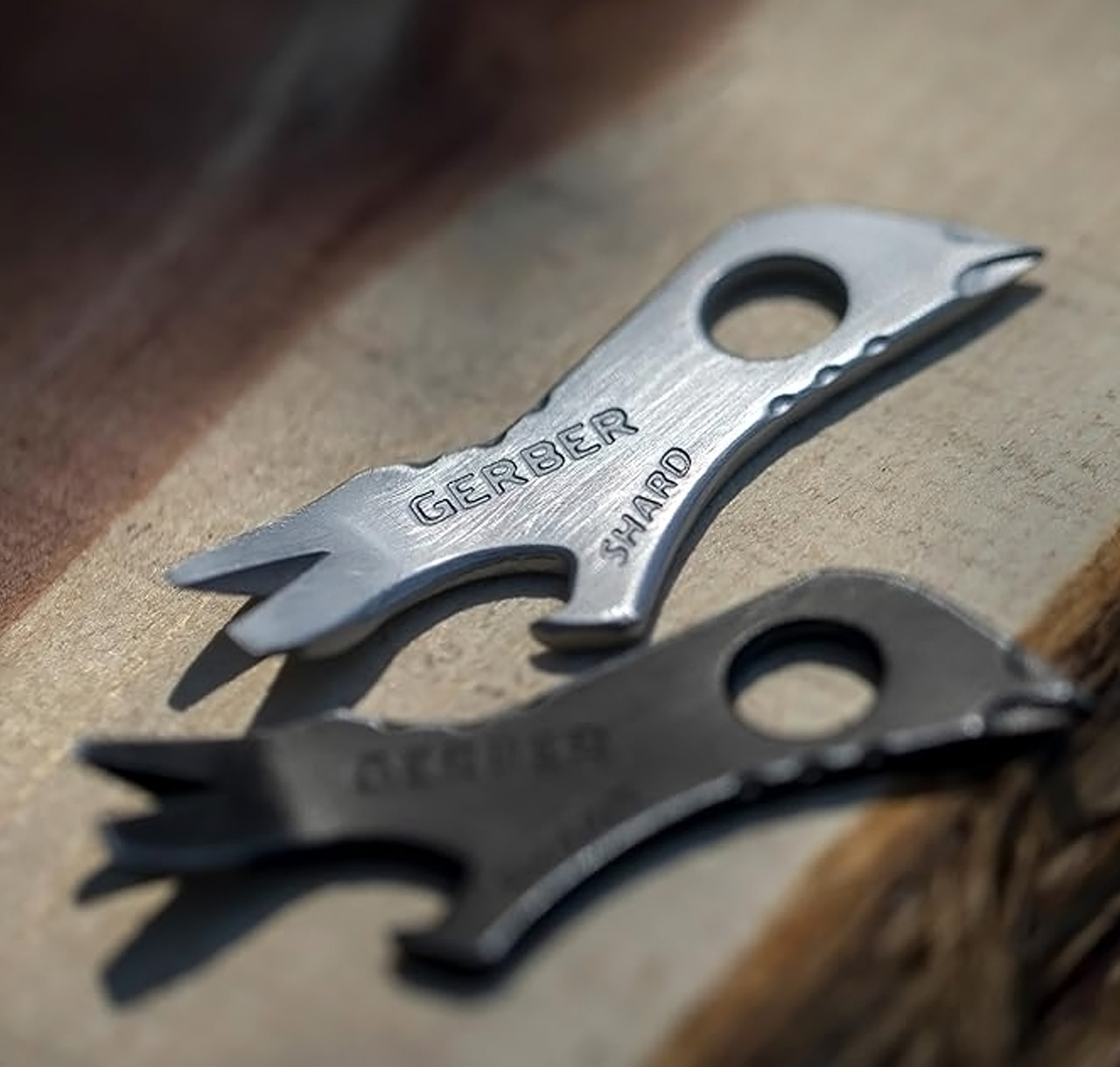
There is a specific kind of gift that costs almost nothing and immediately becomes indispensable. The Gerber Shard is exactly that. Seven functions in a 2.75-inch titanium nitride-coated steel body: small flathead, medium flathead, cross driver, pry bar, wire stripper, lanyard hole, and bottle opener. The coating handles sweat, saltwater, and general outdoor abuse without corrosion or tarnish. Gerber backs it with a limited lifetime warranty. At roughly ten dollars, the case against it is genuinely difficult to construct.
The airline-safe design is the detail that separates the Shard from every competitor at this price point. No blade means it travels in carry-on luggage, clears international security, and stays in a bag that never gets checked. Most multitools get confiscated at security checkpoints or packed reluctantly into checked bags. This one goes everywhere without a second thought. Clip it to a keychain, a zipper pull, or a lanyard and forget it exists until someone nearby needs exactly what it offers.
What we like
- Airline-safe and TSA-compliant, seven functions that travel literally anywhere without planning around security
- A limited lifetime warranty from an established brand at a price that removes any justification for not owning one
What we dislike
- Seven functions cover the daily basics but won’t satisfy carry needs that demand pliers or a dedicated blade
- Small size reduces leverage on stubborn fasteners — torque-heavy tasks require a full-sized tool regardless
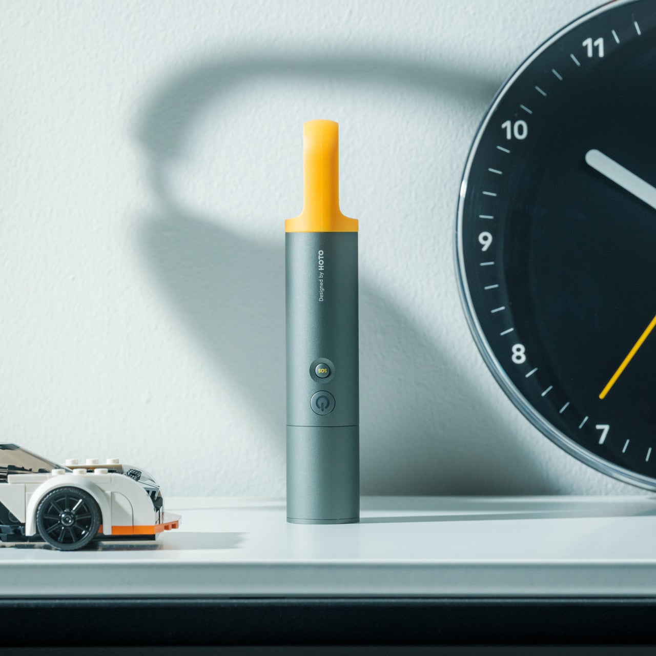
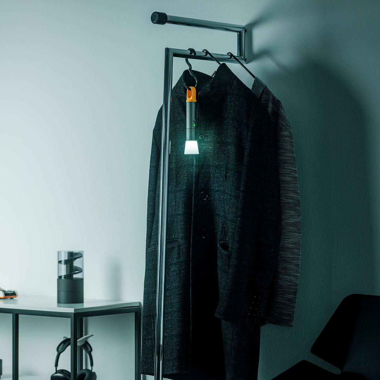
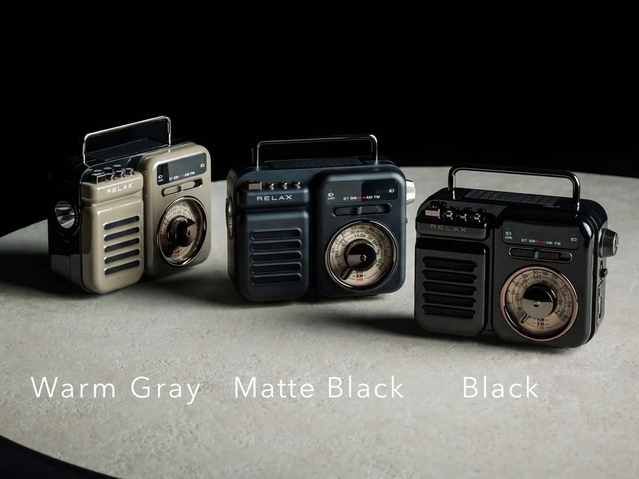
5. RetroWave 7-in-1 Radio
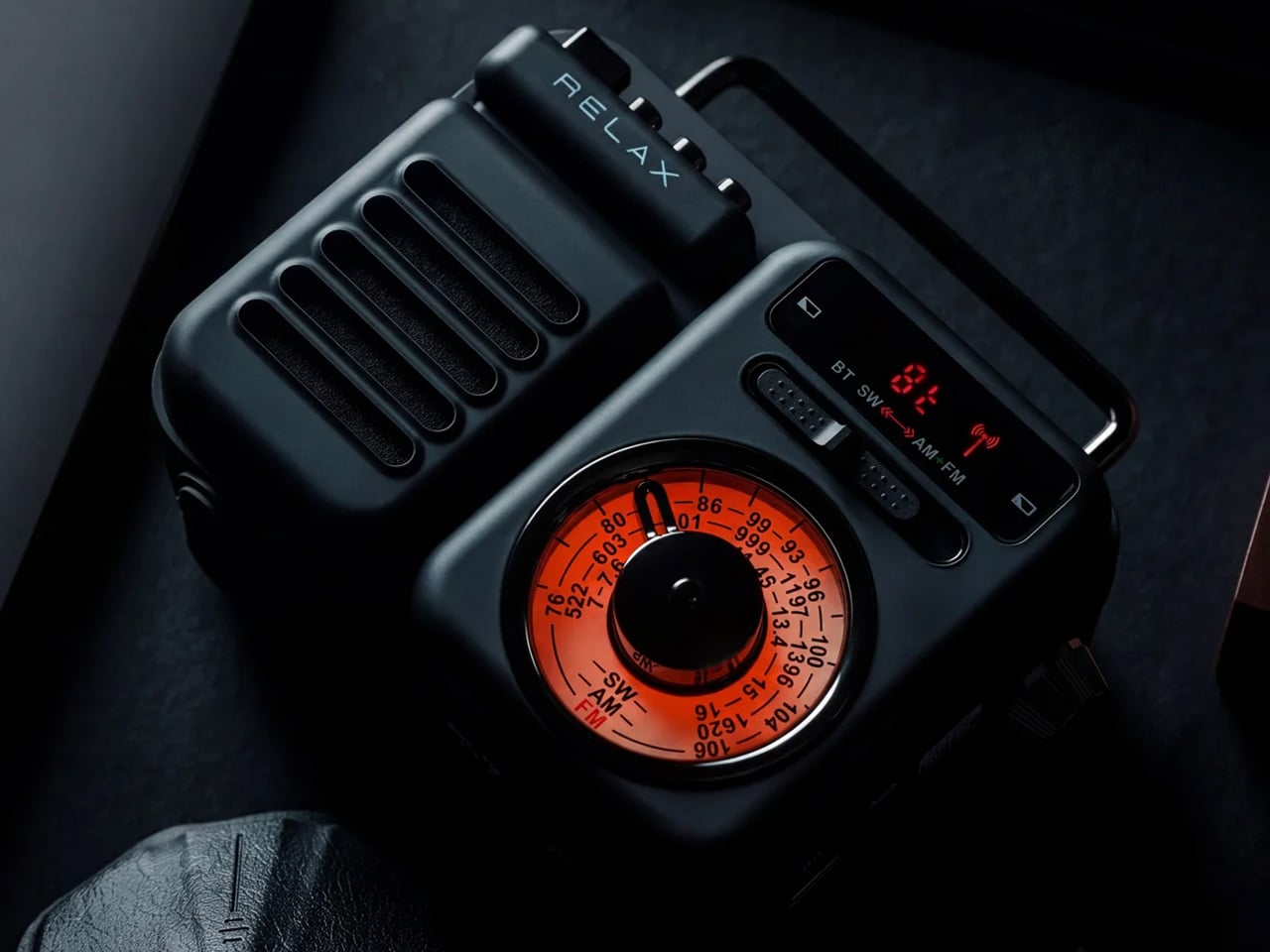
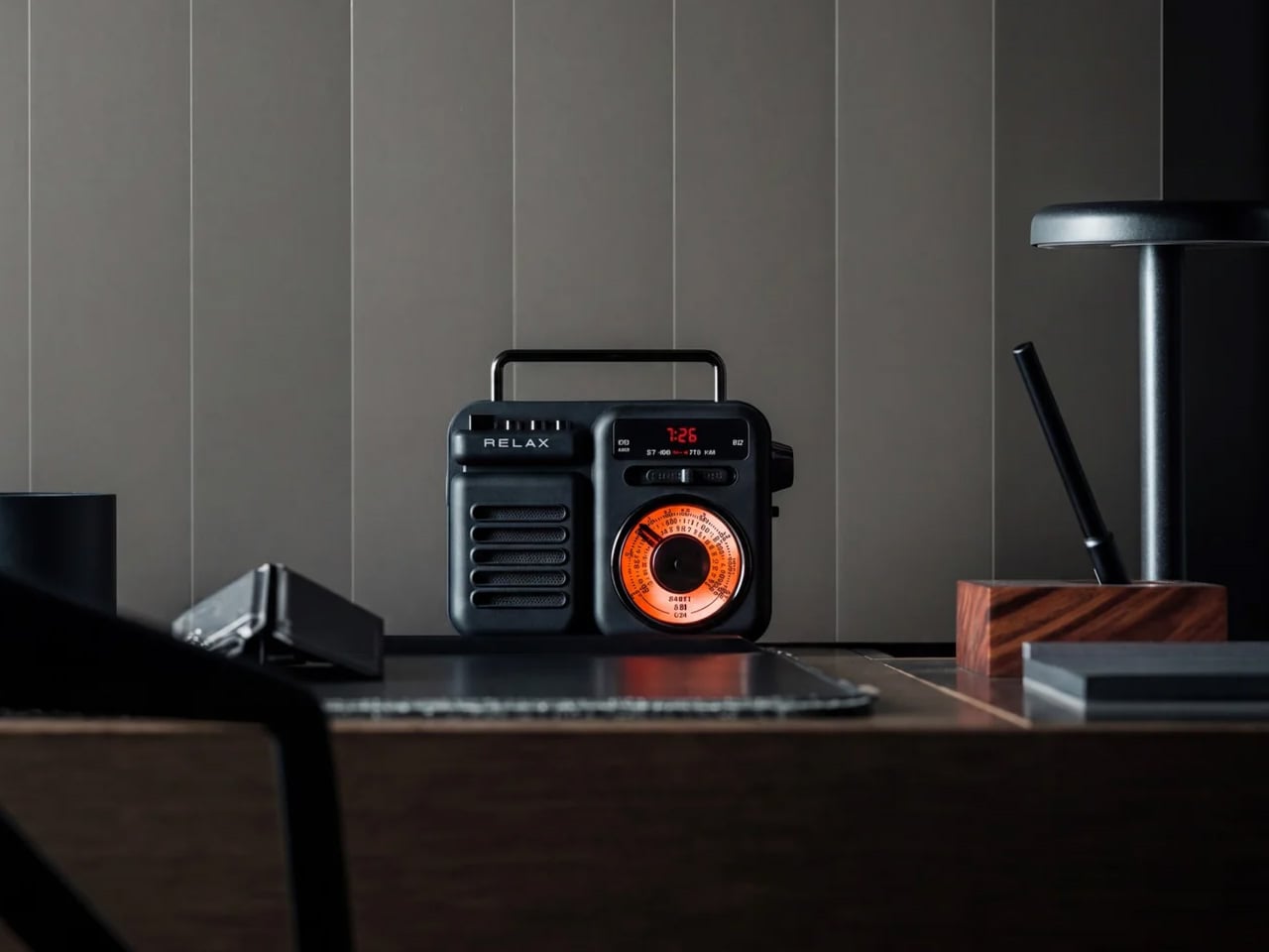
Smart speakers go quiet when the Wi-Fi drops. Phones drain exactly when you need them. The RetroWave Radio is built for the moments modern devices quietly fail. FM, AM, and shortwave radio run analog without internet. Bluetooth and microSD handle streaming and offline playback. A 2000mAh battery charges your phone when outlets aren’t available. A hand crank and solar panel keep the radio running when neither power source is reachable. An SOS alarm stays ready in the background, doing nothing until it’s the only thing needed.
The design earns its shelf space long before the power cuts. The retro Japanese-inspired silhouette has genuine tactile weight — a tuning dial with real feedback, proportions that feel resolved rather than nostalgic for effect. On a picnic blanket with fireworks building overhead, it handles audio without pulling anyone’s phone from their pocket. During a summer storm a week later, it handles the emergency without requiring a different device. Up to 20 hours of radio playback, six hours of emergency lighting, and one object that earns its place every day between holidays.
Click Here to Buy Now: $89.00
What we like
- Hand crank and solar charging mean the radio keeps working when power and signal both fail — a genuinely rare capability at this price
- The retro Japanese silhouette earns its shelf presence on design alone, before any function is considered
What we dislike
- 2000mAh power bank capacity is modest — enough for an emergency top-up, not a full phone charge from zero
- Shortwave reception quality depends on antenna position and local interference, requiring some adjustment in new environments
6. Loki Nav Compass
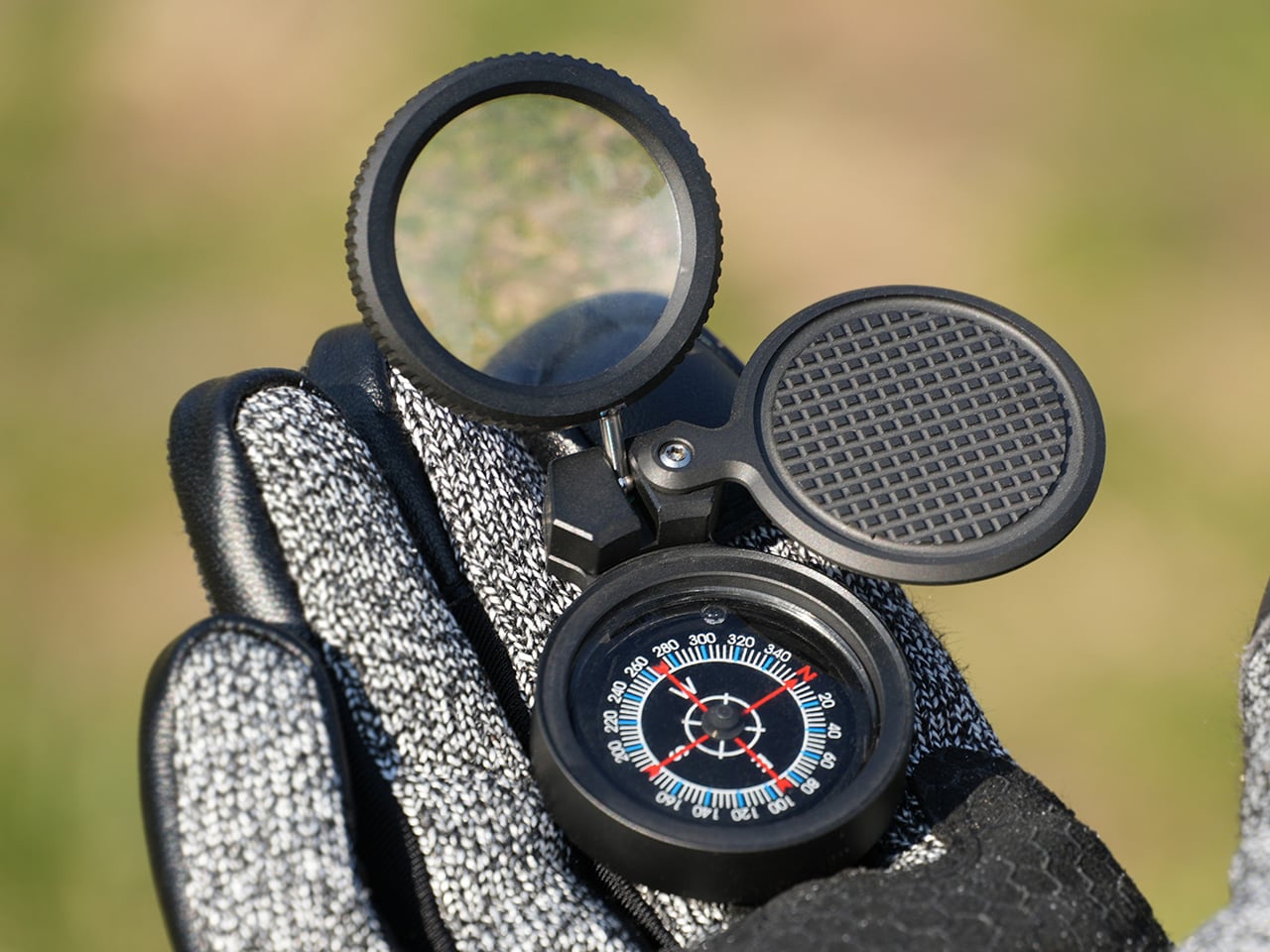
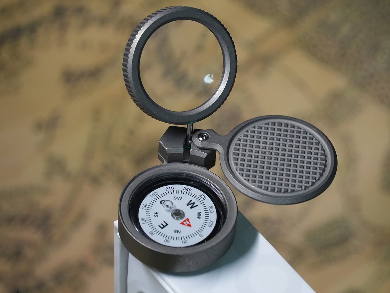
Grade 5 titanium, 48 grams, IPX8 waterproof to one meter for thirty minutes. The Loki Nav by EckDesign compresses a serious navigation system into a 46.5mm body you forget is in your pocket until the phone battery dies on a trail with no cell signal. Three interchangeable oil-filled compass modules create built-in redundancy where most compasses offer only one. The cap houses a 12x magnifying loupe, an emergency signal mirror, and a wood file for making fire-starting tinder from available material.
The design logic rewards attention. Every component earns its inclusion. The loupe rotates to protect its lens between uses. The mirror deploys without disassembly. Compass modules swap through a base hole using a toothpick — no tools, field-serviceable in seconds. For a day that starts in a park and ends on a hiking trail, or begins with fireworks and continues into unfamiliar terrain after dark, analog navigation that requires no signal and no battery is a quiet, specific kind of reassurance that no smart device can replicate.
What we like
- Three interchangeable compass modules create a navigation system with real redundancy — reliability treated as a first principle, not a feature mention
- IPX8 waterproofing and Grade 5 titanium construction match the durability demands of any outdoor carry without adding weight that defeats the purpose
What we dislike
- At 48 grams in titanium, noticeably heavier than a basic compass — the weight is justified, but worth factoring into ultralight setups
- Compass module swapping via toothpick requires some practice to execute cleanly under field conditions
7. Orbitkey Key Organiser
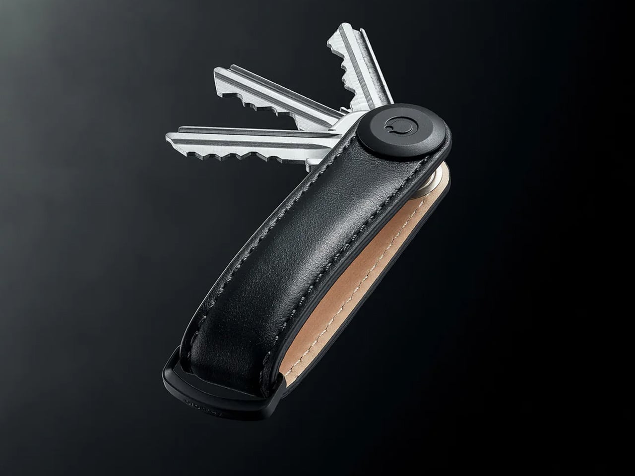
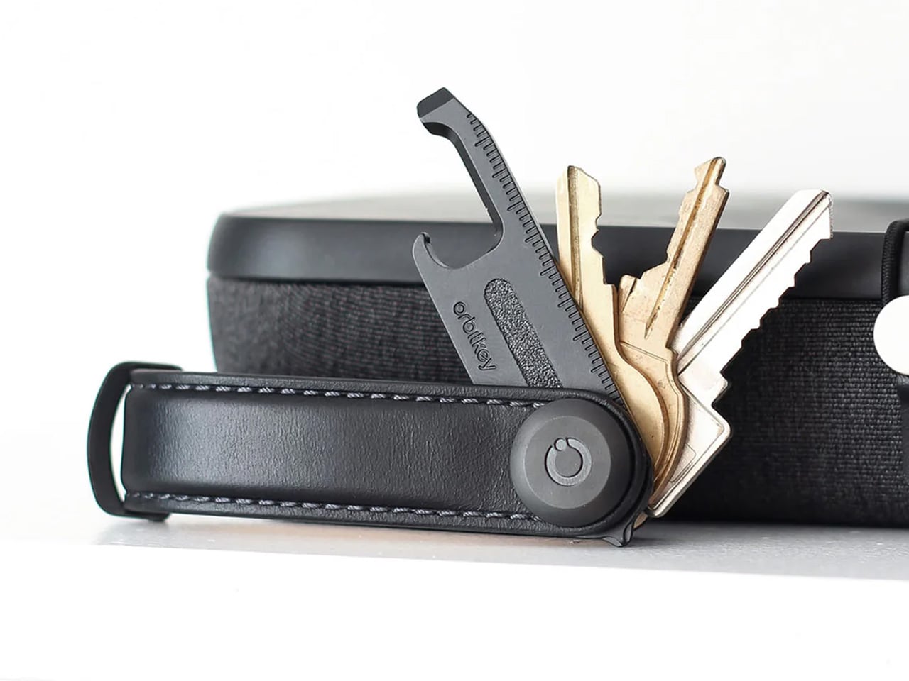
Standard key rings solve the wrong problem. They keep keys together while ensuring they jingle constantly, press metal ridges into pockets all day, and resist every attempt to add or remove a key without a fight. The Orbitkey stacks two to seven keys flat inside a full-grain leather spine with stainless steel hardware, held under tension. Closed, it sits flat and produces no sound. In a pocket, it disappears. Five colorways run from black dress leather to warm cognac.
The gift case for the Orbitkey is strong because the problem it solves is one most people have accepted rather than noticed. Hand one to someone who has carried a key ring for years and watch the change happen within a week. The full-grain leather develops its own wear pattern over years of daily carry — a position on longevity that most keychain products decline to take. One week in, returning to a standard key ring feels genuinely regressive. That’s the kind of product worth giving.
What we like
- Tension stacking eliminates key jingle — a quality-of-life improvement that compounds quietly across every single day of carry
- Full-grain leather construction ages into character rather than showing damage, signaling a product designed to outlast the trend cycle
What we dislike
- Initial key installation requires a screwdriver and careful threading — not difficult, but not intuitive on the first attempt
- Oversized or irregularly shaped keys may not stack cleanly within the system’s flat geometry, worth checking before purchase
The Best Gifts Are the Ones That Outlast the Holiday
The best 4th of July gifts aren’t themed — they’re useful in ways that outlast the holiday by years. Every product here earns a permanent spot in daily carry rather than a drawer by August. The NoxTi glows on a keychain for 25 years. The Orbitkey replaces a friction point people had quietly accepted. The Loki Nav works when every other tool has gone silent. That’s the standard worth giving.
Spending a long day outdoors with people you like is a design problem, and the solution is reducing friction. Less searching for the flashlight. Less draining someone’s phone for music. Less fumbling with a key ring in a dark parking lot after the show. These seven objects do exactly that — each one eliminating a small problem before it becomes one. That’s the kind of gift that doesn’t get returned, explained, or forgotten.
The post 7 EDC Gifts for the 4th of July That Are Way More Useful Than Fireworks first appeared on Yanko Design.


 Passport Cover