There’s a reason Michelin-starred Japanese kitchens don’t look like the ones you see on American cooking shows. No plastic cutting boards. No thin-gauge nonstick pans. The tools themselves carry the weight of centuries of refinement: cast iron developed over generations, blades sharpened to tolerances measured in fractions of a millimeter, clay vessels fired in kilns with thousand-year histories. These eight tools bring that level of kitchen confidence home.
Japan’s approach to cookware has never been about accumulating tools. It’s about choosing the right one and understanding it deeply. The best Japanese kitchen gadgets don’t ask you to cook faster or easier. They ask you to cook better, with more presence, more attention, more respect for the ingredient. For a dad who cooks with intention rather than convenience, these eight pieces are the kind of upgrade that changes how a kitchen feels to work in.
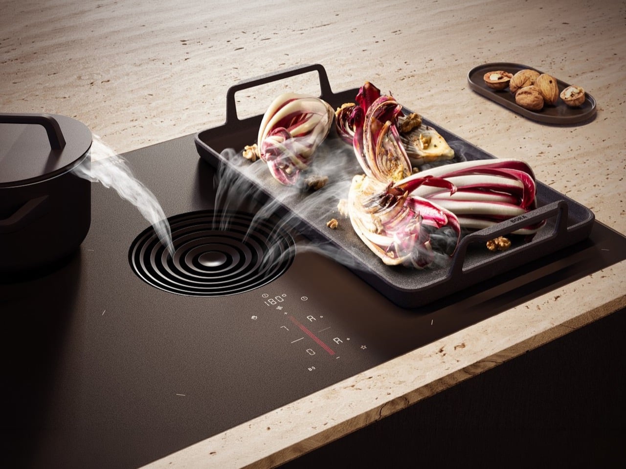
1. Precision Ceramic Sashimi Knife
![]()
![]()
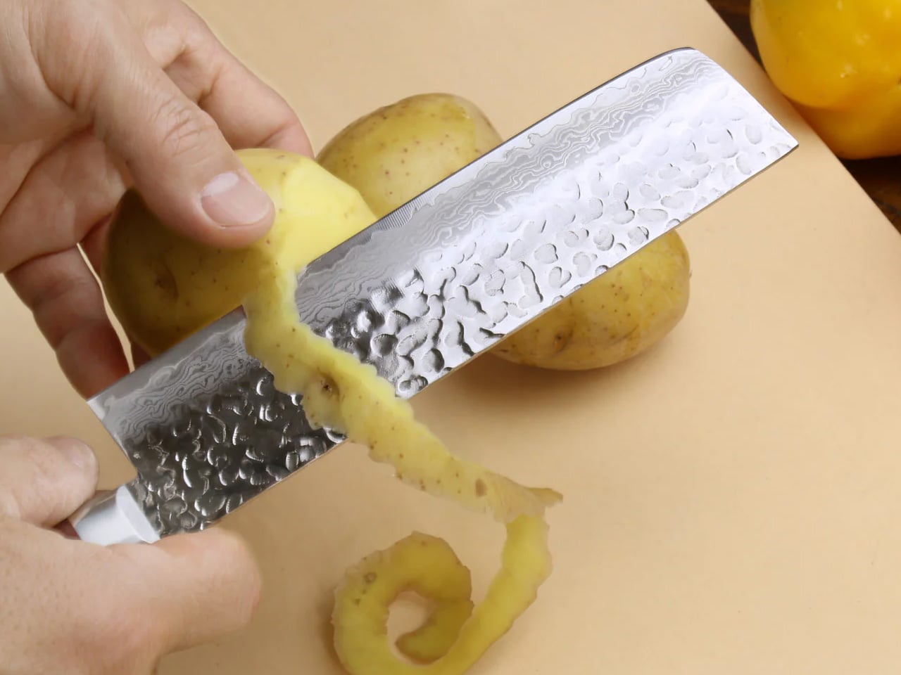
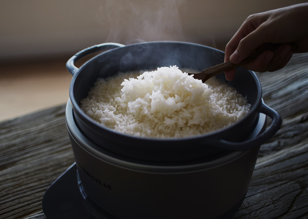
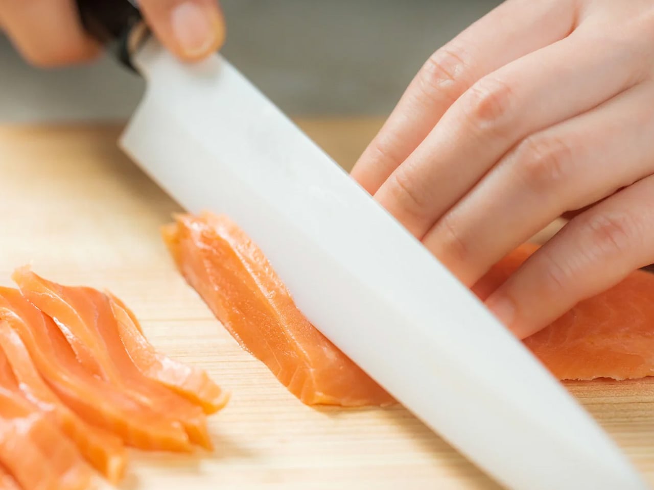
Raw fish demands knife performance that metal blades, for all their centuries of refinement, struggle to deliver. The Precision Ceramic Sashimi Knife represents the convergence of Japanese craftsmanship and advanced materials science, creating a blade twice as hard as stainless steel, with sharpness that lasts 200 times longer than conventional edges. The single-bevel design emulates the classic yanagiba with a concave back, reducing friction for effortless, drag-free cuts. The lightweight ceramic construction enables extended use without hand fatigue, while the advanced material requires minimal maintenance and virtually eliminates sharpening routines.
The cutting experience transforms sashimi preparation from a technical challenge into a flowing motion. The exceptional sharpness preserves delicate fish texture and cell structure that duller blades tear and compress. The friction-reducing concave back allows the blade to glide through ingredients with minimal resistance and maximum control. The lightweight design enables the precise, continuous strokes required for proper sashimi cutting without the arm fatigue associated with metal blades. The ceramic material doesn’t impart metallic taste or oxidation to delicate seafood, keeping every flavor entirely clean.
Click Here to Buy Now: $300.00
What We Like
- The ceramic material maintains sharpness 200 times longer than conventional steel blades
- The non-reactive material prevents metallic taste transfer to delicate seafood
What We Dislike
- The ceramic blade, while exceptionally hard, is more brittle than steel and requires careful handling
- The specialized design focuses on sashimi and delicate work rather than general-purpose cutting
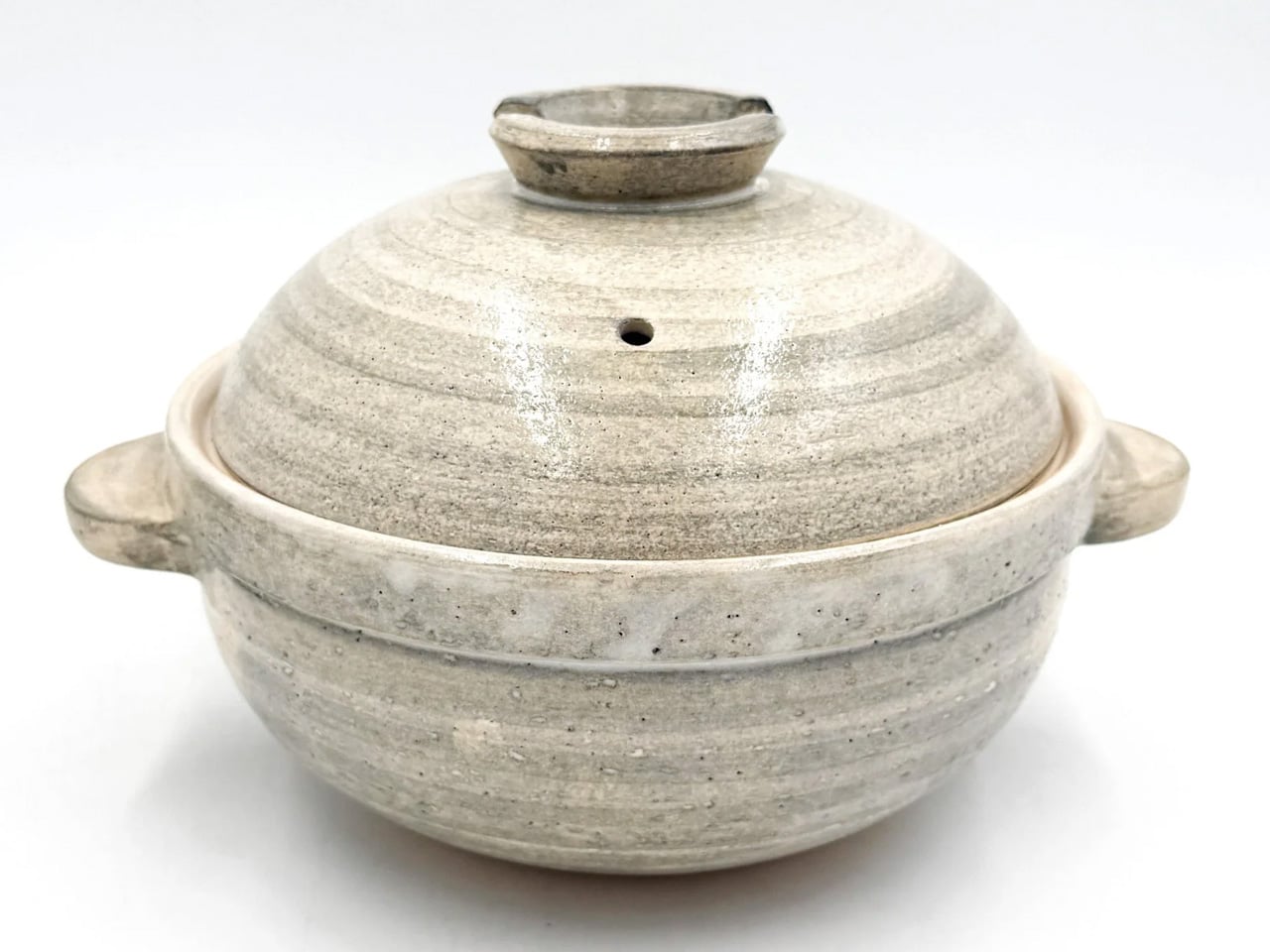
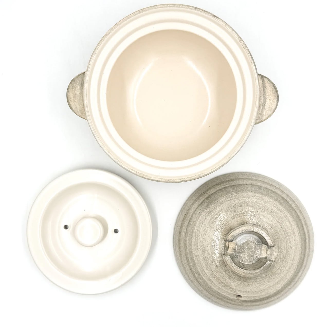
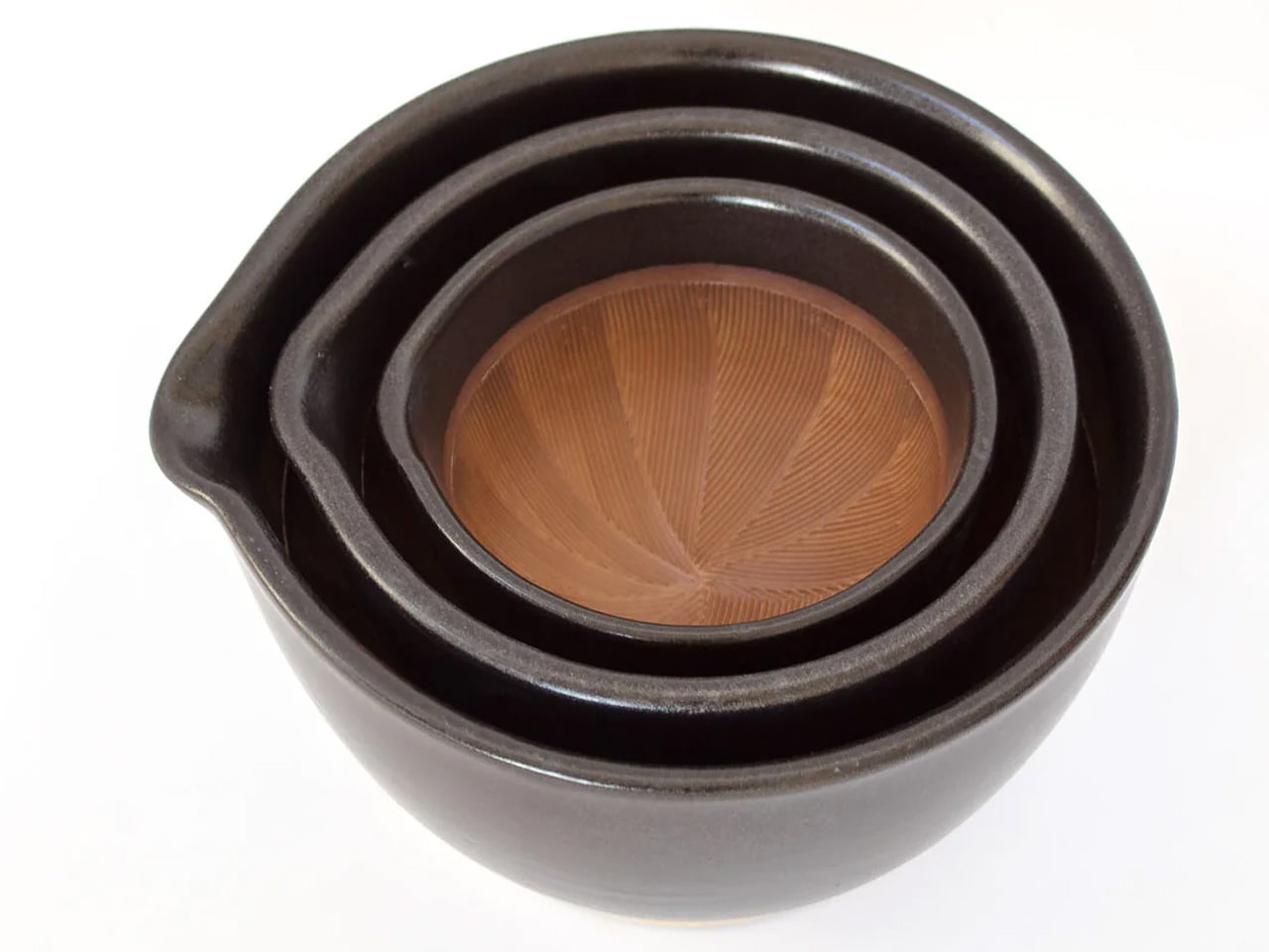
2. Nagatani-en Iga-yaki Donabe
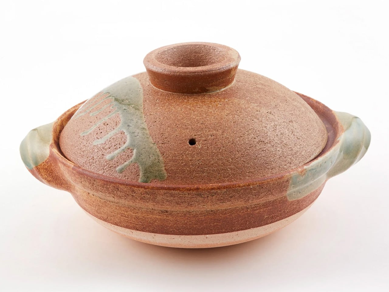
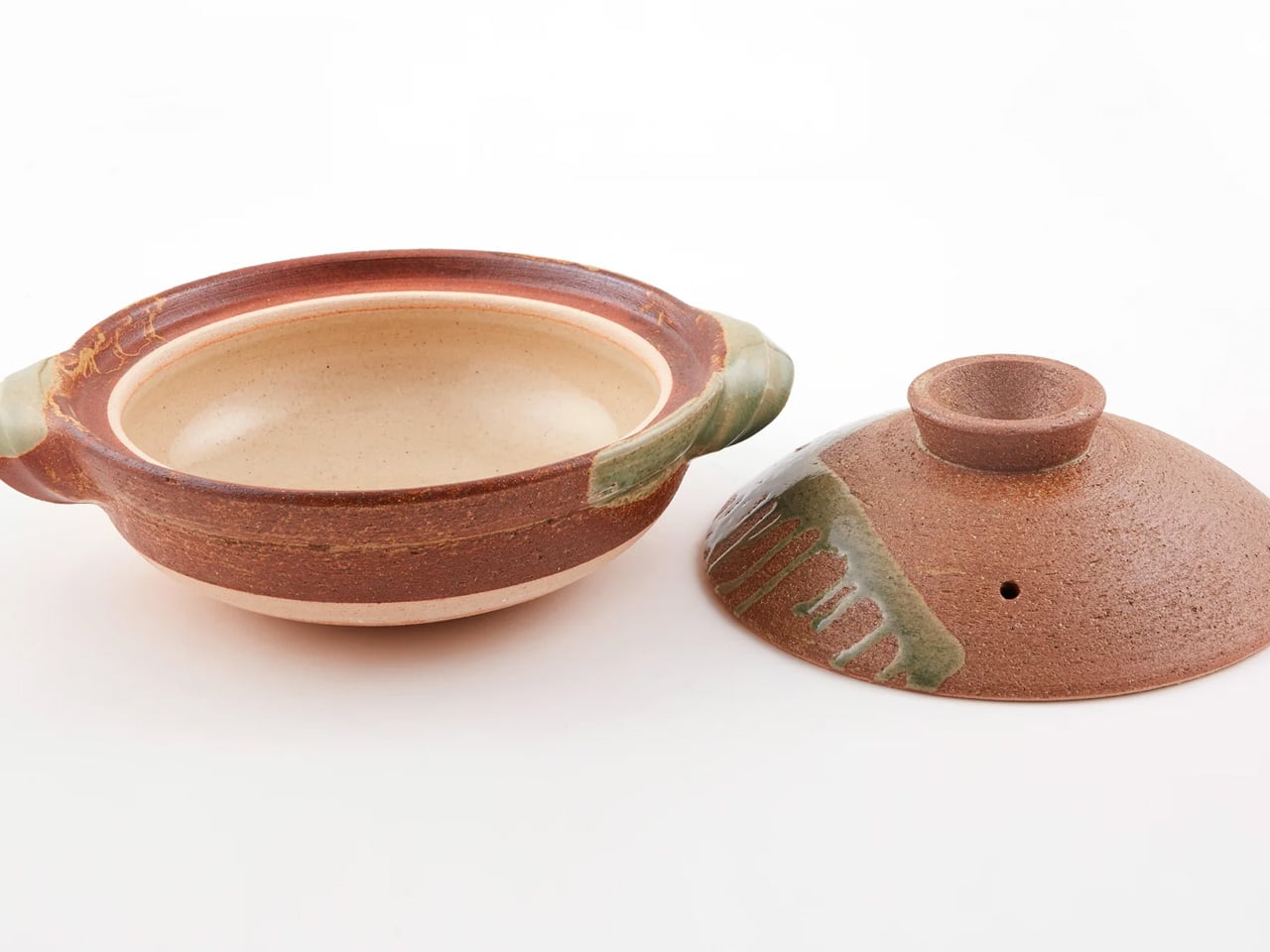
The donabe is arguably the single most important vessel in Japanese home cooking, and the Nagatani-en Iga-yaki version is the one professionals reference when the subject comes up. Made in Iga, Mie Prefecture, from clay drawn from ancient sediment layers unique to the region, the pot’s porous walls absorb heat slowly and distribute it evenly, creating conditions that braise meat, steam vegetables, and cook rice in ways that modern stainless steel and ceramic-coated vessels simply cannot replicate. There is a textural depth to food cooked in a donabe that registers immediately.
Nagatani-en has been crafting donabe in Iga for generations, and the design reflects that continuity. The textured clay exterior and smooth interior create a vessel that reads as a sculptural object as readily as a cooking tool, something worth leaving on the stovetop between uses. Available in the US through TOIRO Kitchen, where each piece is individually checked before shipping, it arrives ready for first use after a simple initial preparation. For a dad who treats cooking as a practice rather than a task, the donabe reframes what a pot is capable of entirely.
What We Like
- The porous Iga clay distributes heat with remarkable consistency, transforming braises, steaming, and rice cooking
- The design is as much sculpture as cookware, worthy of staying out on the stovetop between uses
What We Dislike
- Requires a short initial preparation process before first use to condition the clay
- Not compatible with induction cooktops without a separate converter plate
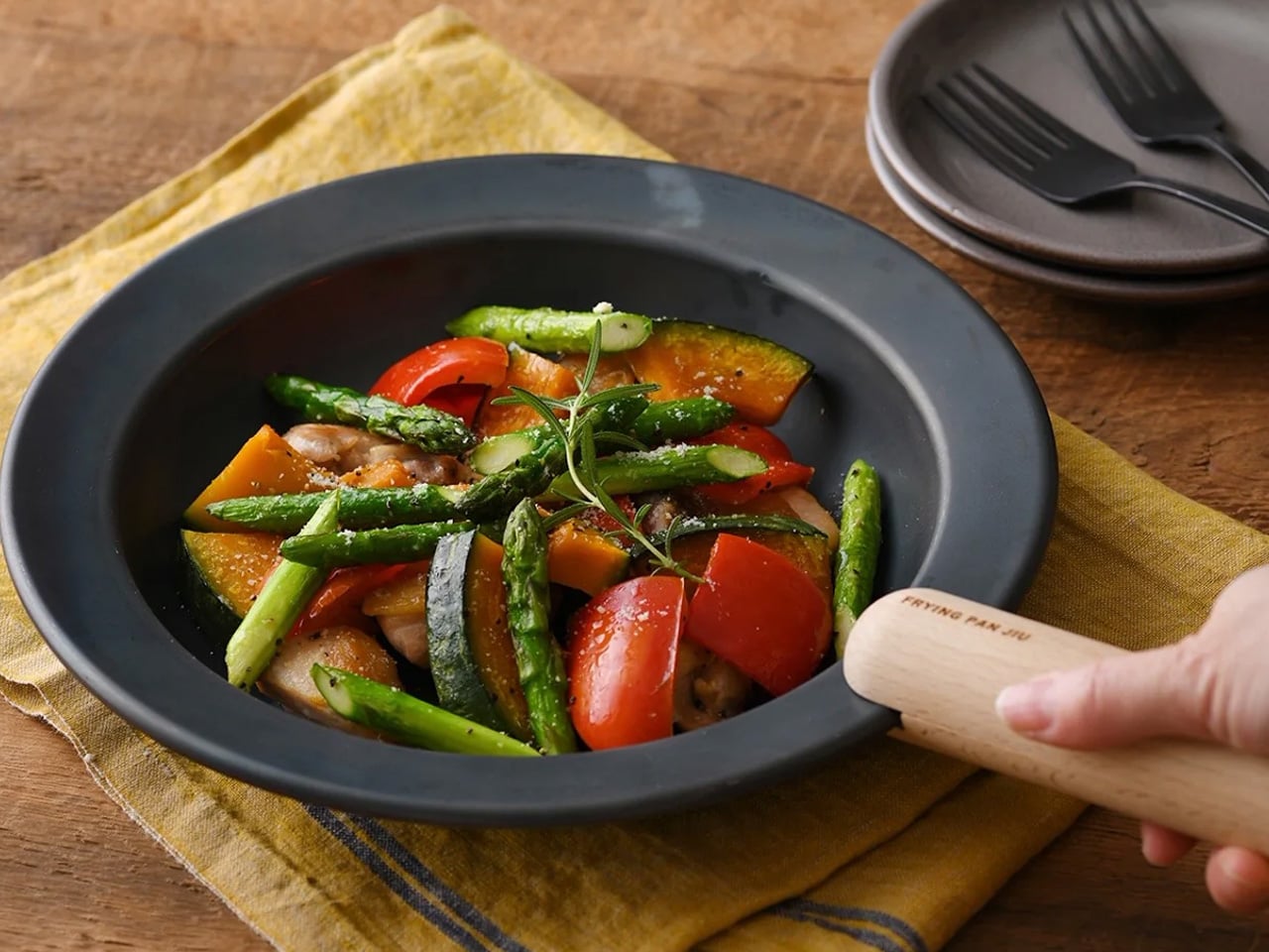
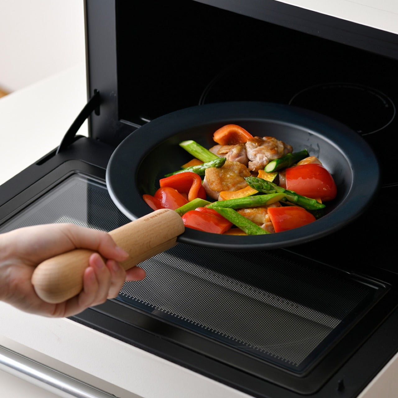
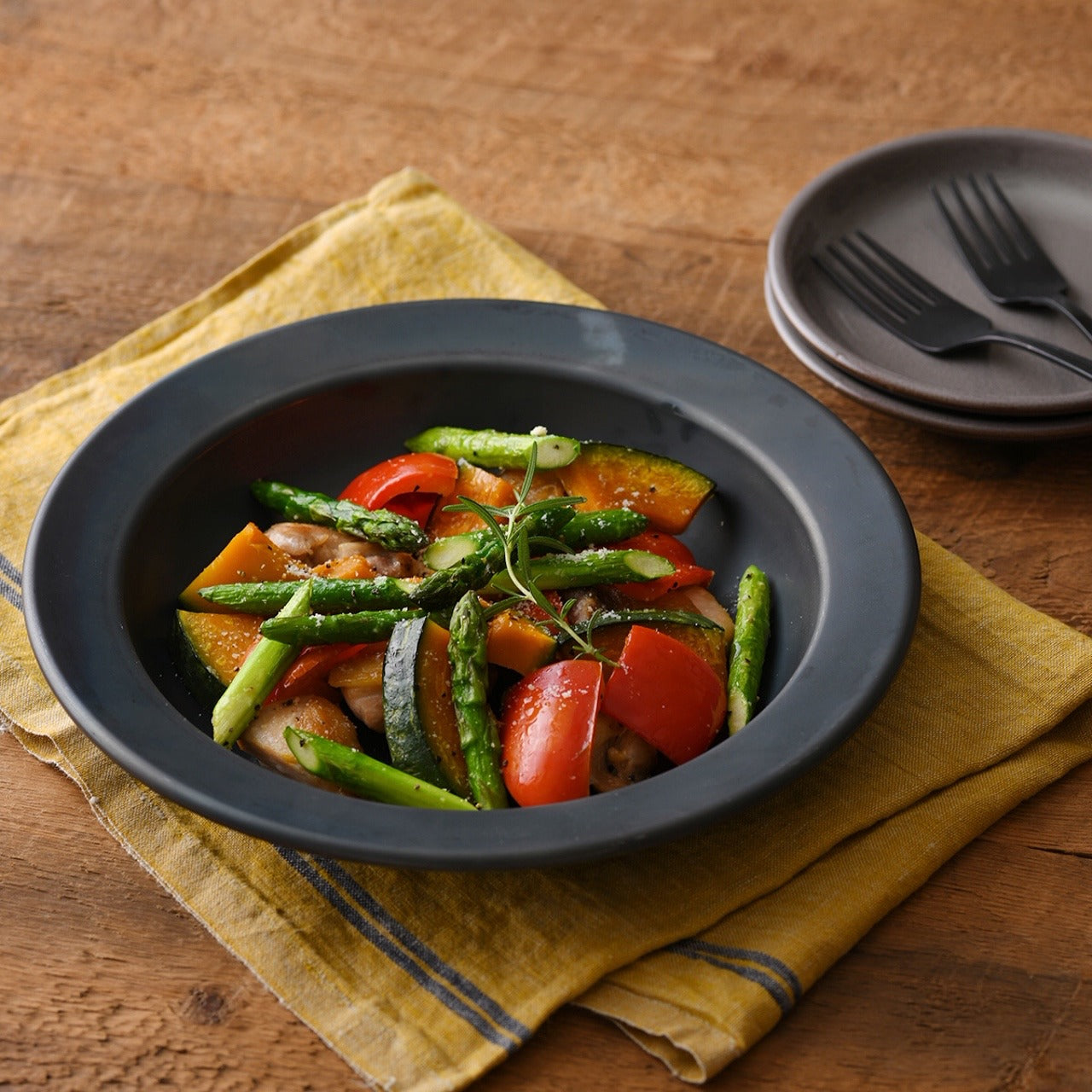
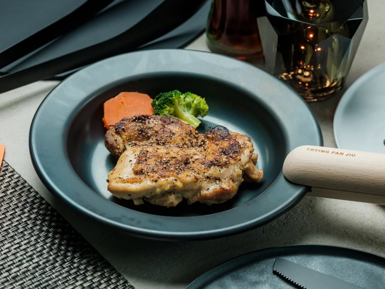
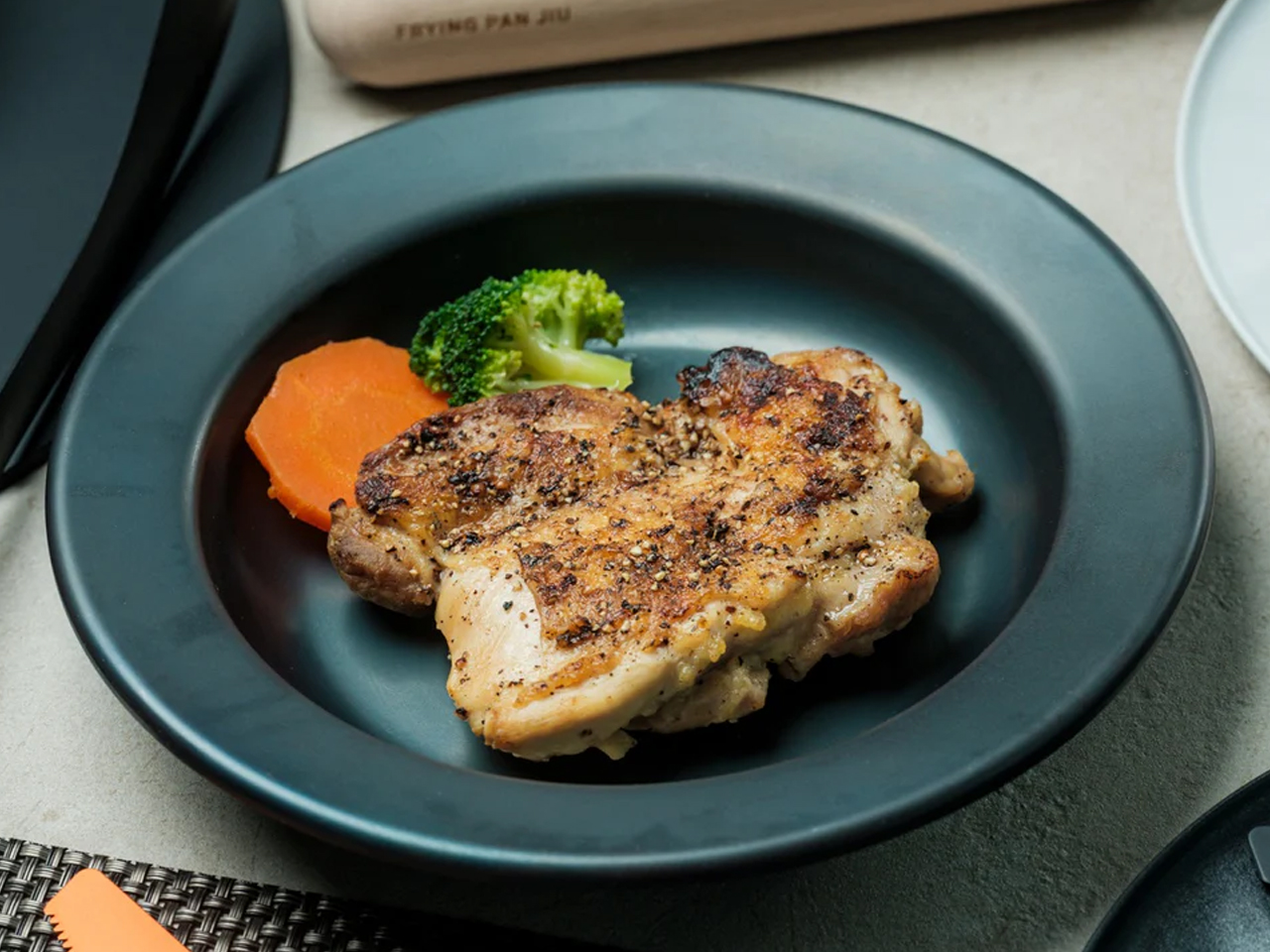
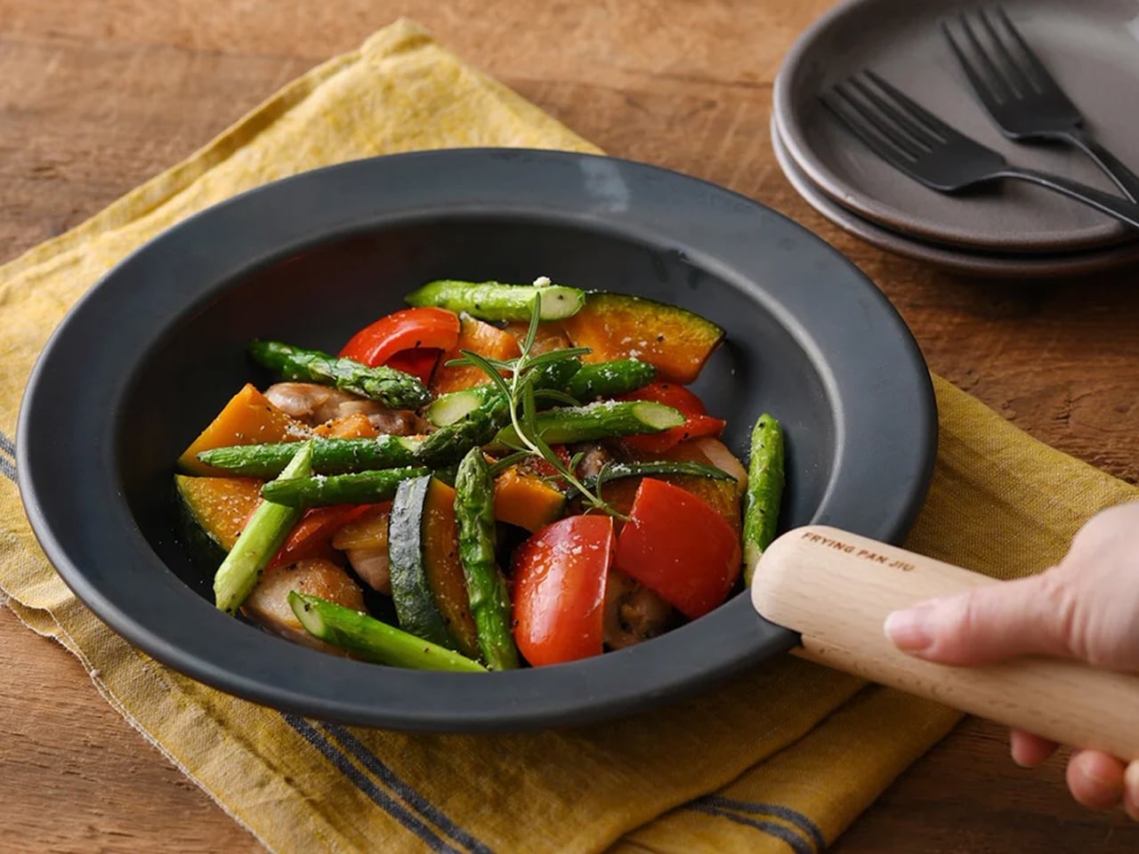
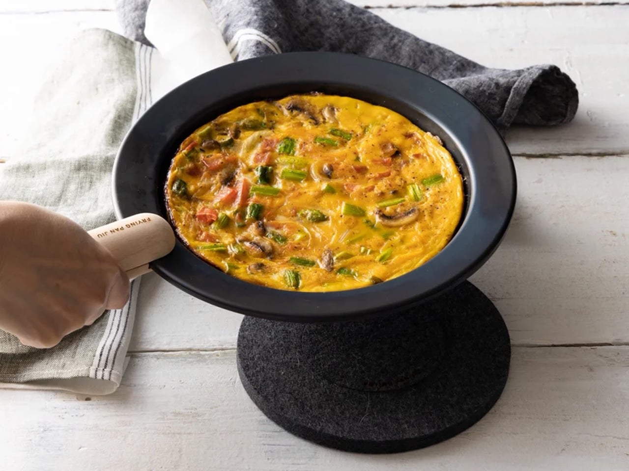
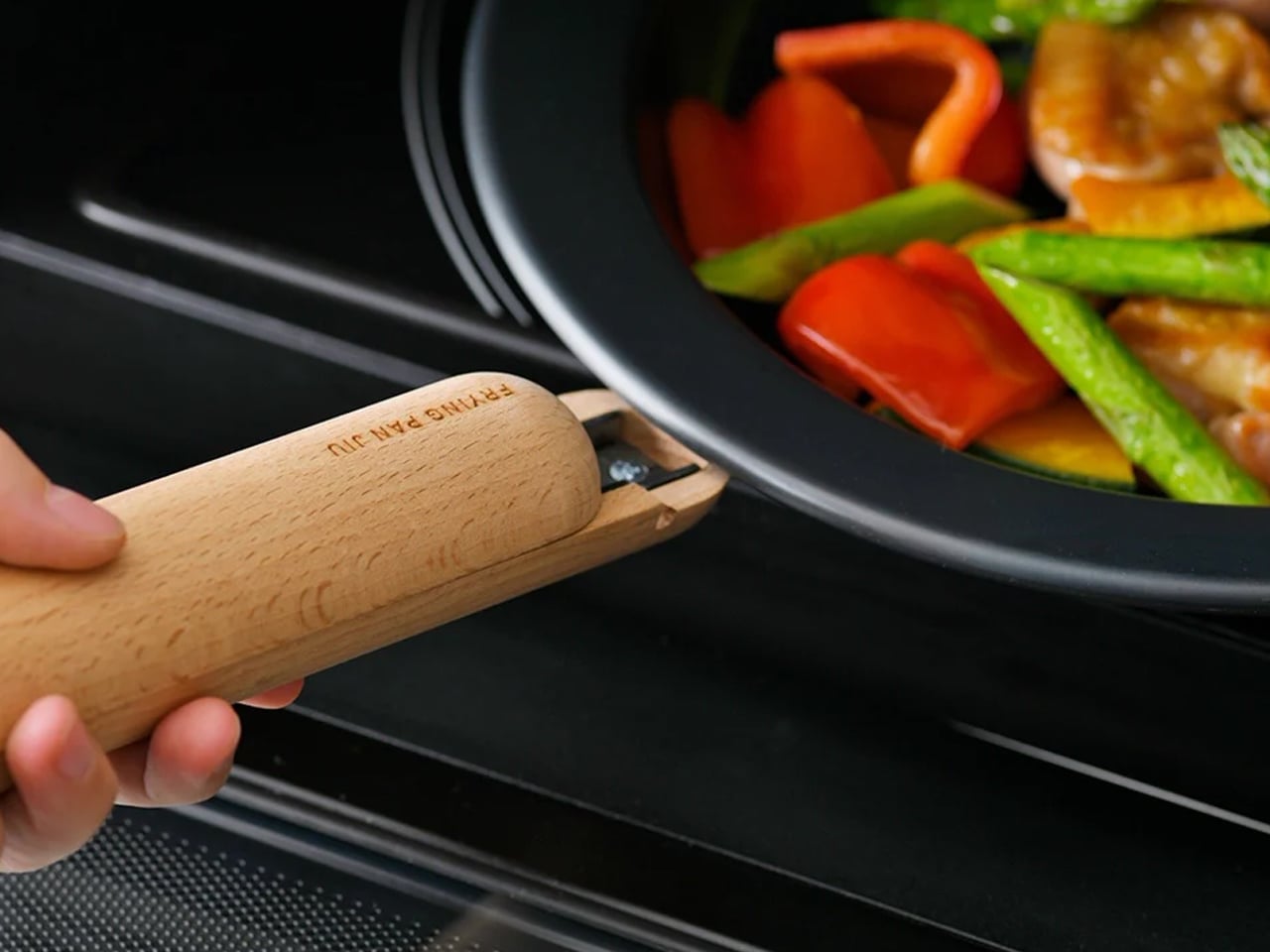
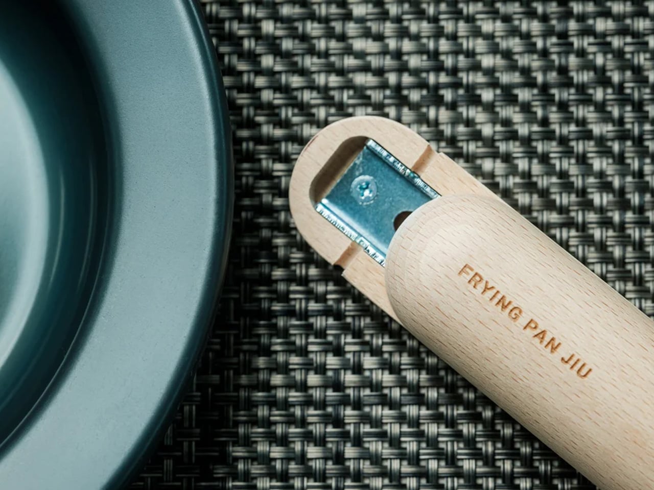
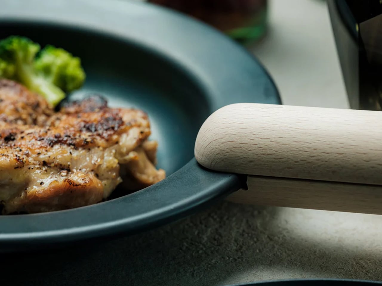
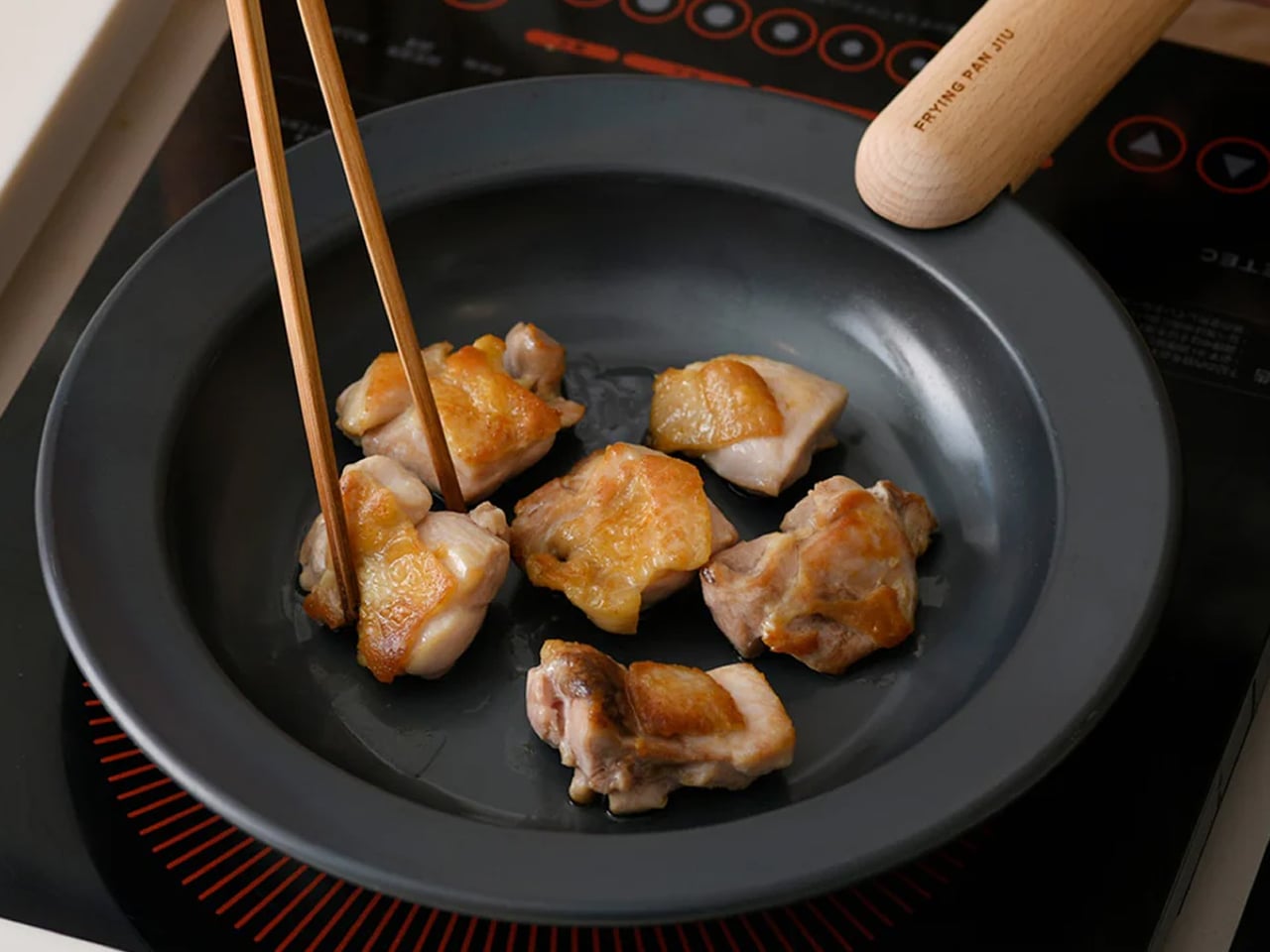
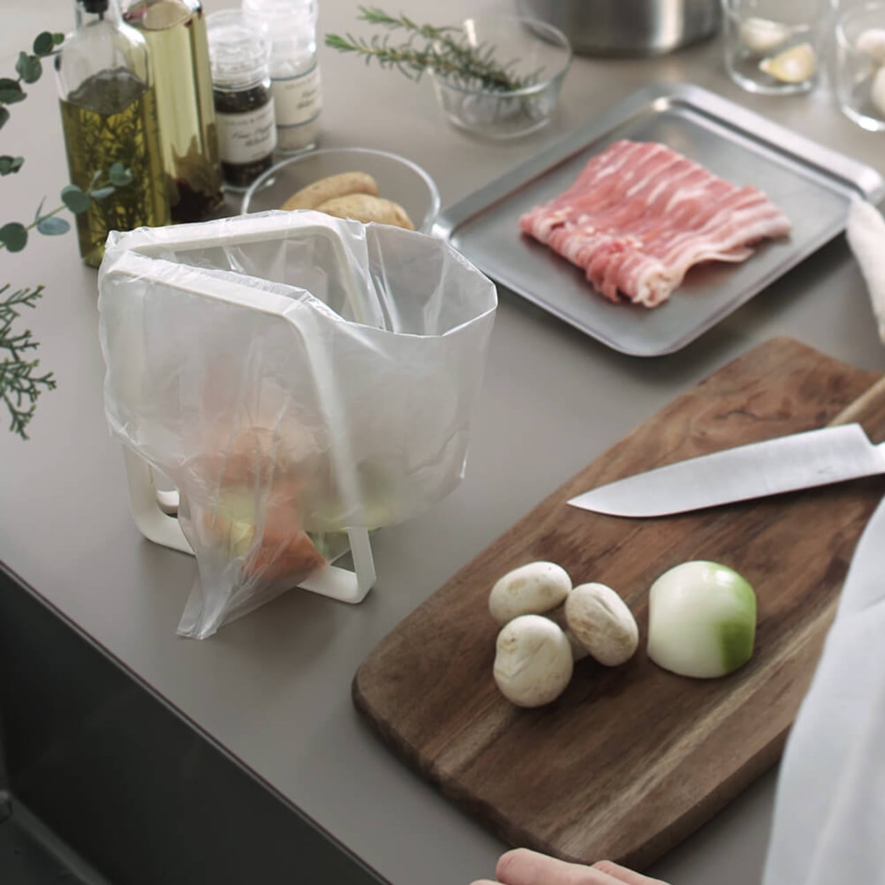
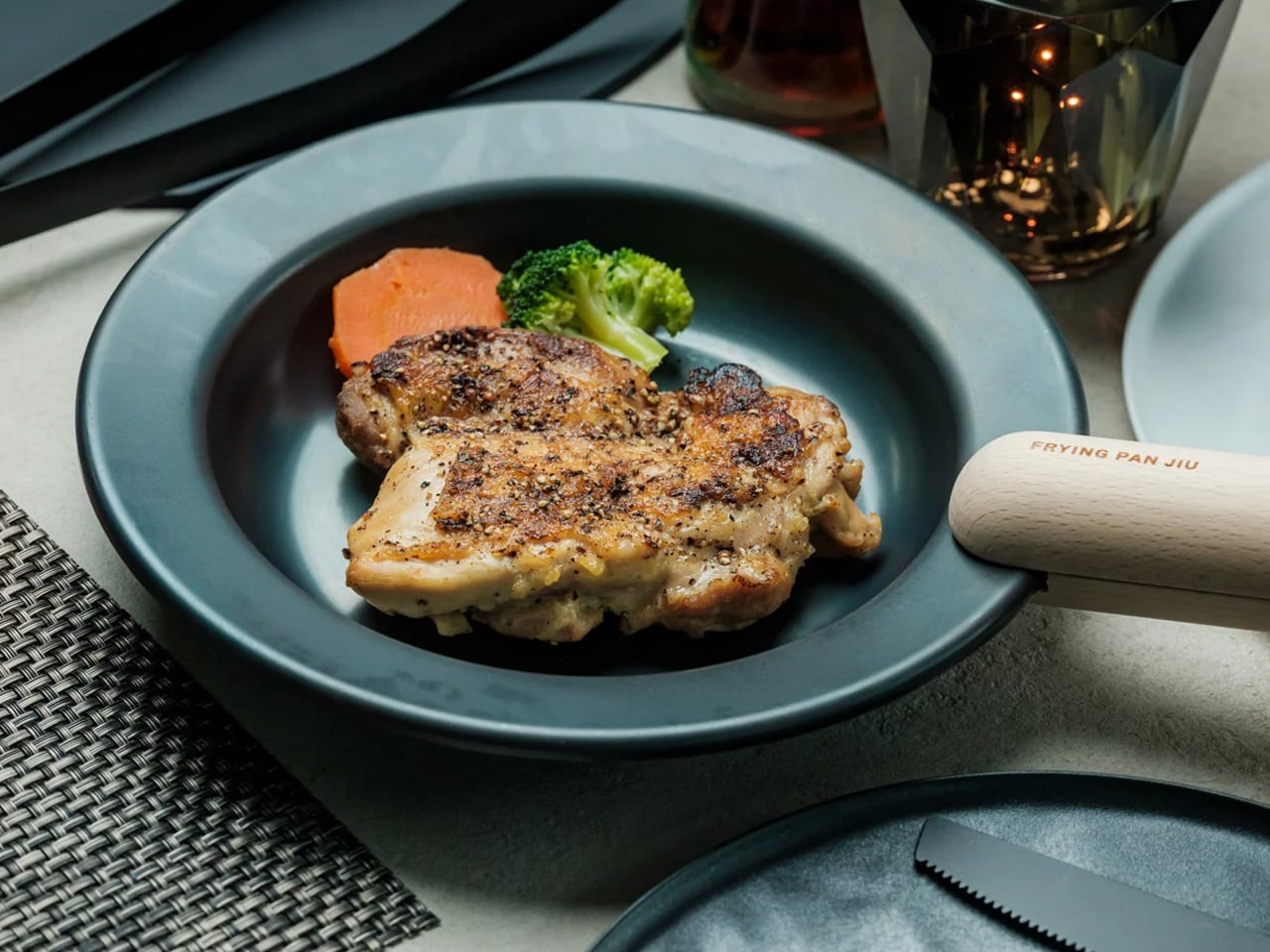
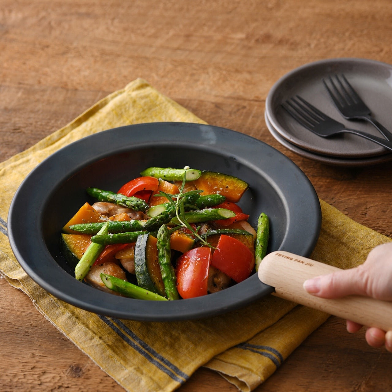
3. Iron Frying Plate
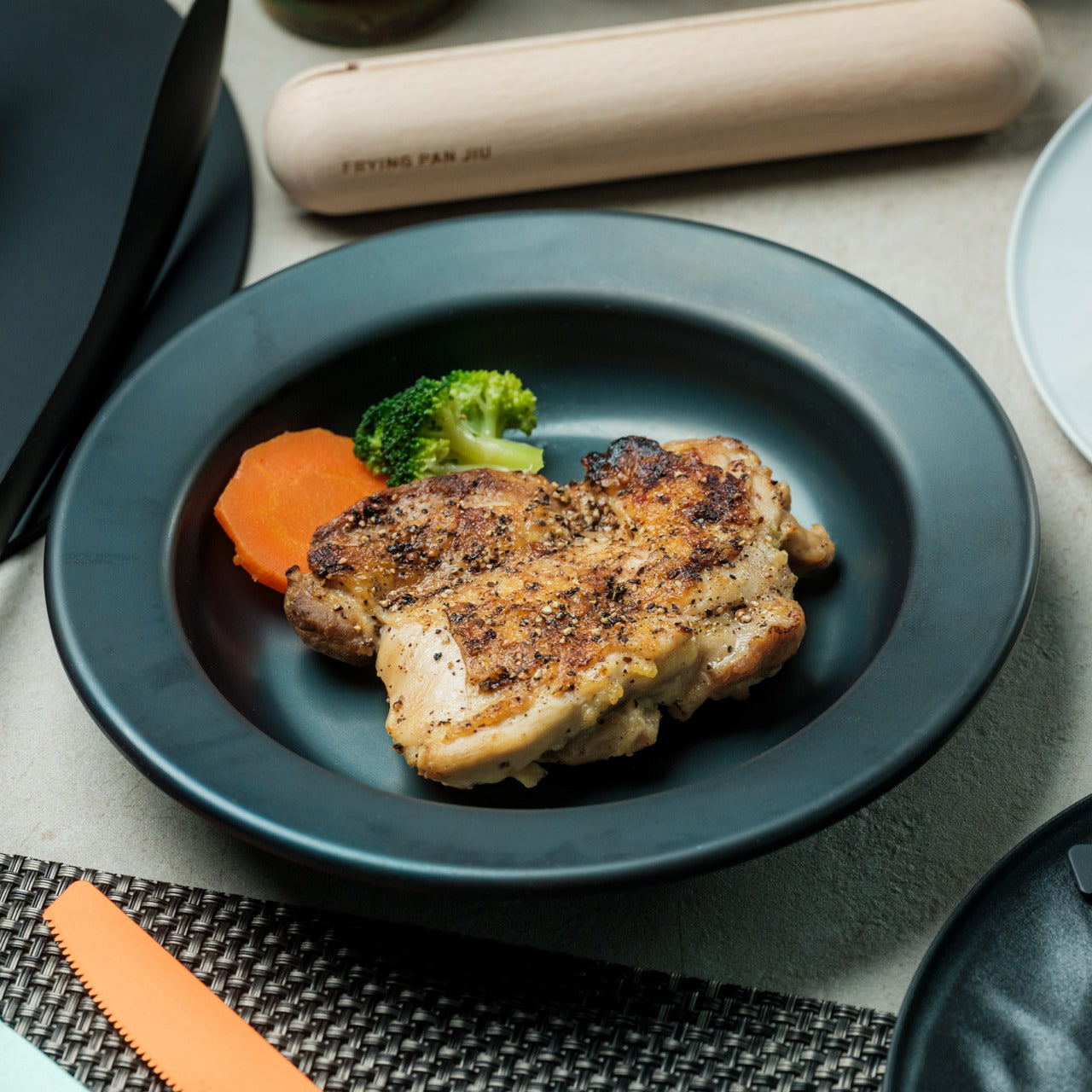
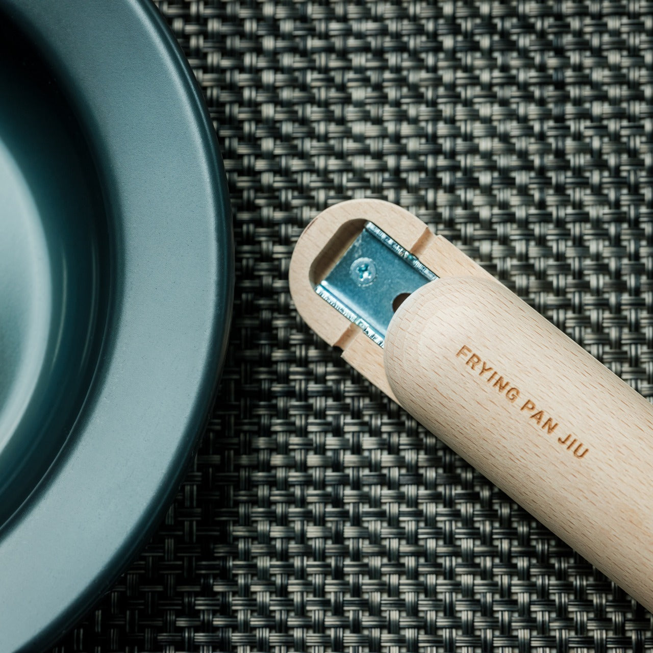
Western dining creates an artificial separation between cooking vessel and serving dish, transferring food from pan to plate in a ritual that cools ingredients and adds cleanup steps. The Iron Frying Plate eliminates that middleman: the frying pan is your plate, the plate is your frying pan, collapsing cooking and eating into a seamless experience. Crafted from rust-resistant mill scale steel with a detachable wooden handle, this cookware brings out superior flavors and textures while reducing the barriers between preparation and enjoyment. The uncoated surface comes ready to use immediately, requiring no seasoning or special preparation rituals.
The boundary-blurring design creates intimacy with your food that standard plating disrupts. Eggs sizzle on your breakfast table, fish arrives still crackling from the heat, and vegetables steam visibly as you lift your fork to your mouth. The immediacy preserves temperature, texture, and visual drama that dissipate during transfers. The detachable wooden handle attaches and releases with one hand, transforming cookware into serveware in seconds. The rust-resistant mill scale steel develops natural non-stick properties through use without chemical coatings. The design invites slower, more attentive eating, pacing yourself with a vessel that retains heat and presence throughout the meal.
What We Like
- The cook-and-serve design preserves temperature and texture better than transferred plating
- The one-handed handle attachment provides seamless transitions from stove to table
What We Dislike
- The hot serving surface requires careful handling and might not suit households with young children
- The iron construction adds weight compared to standard plates
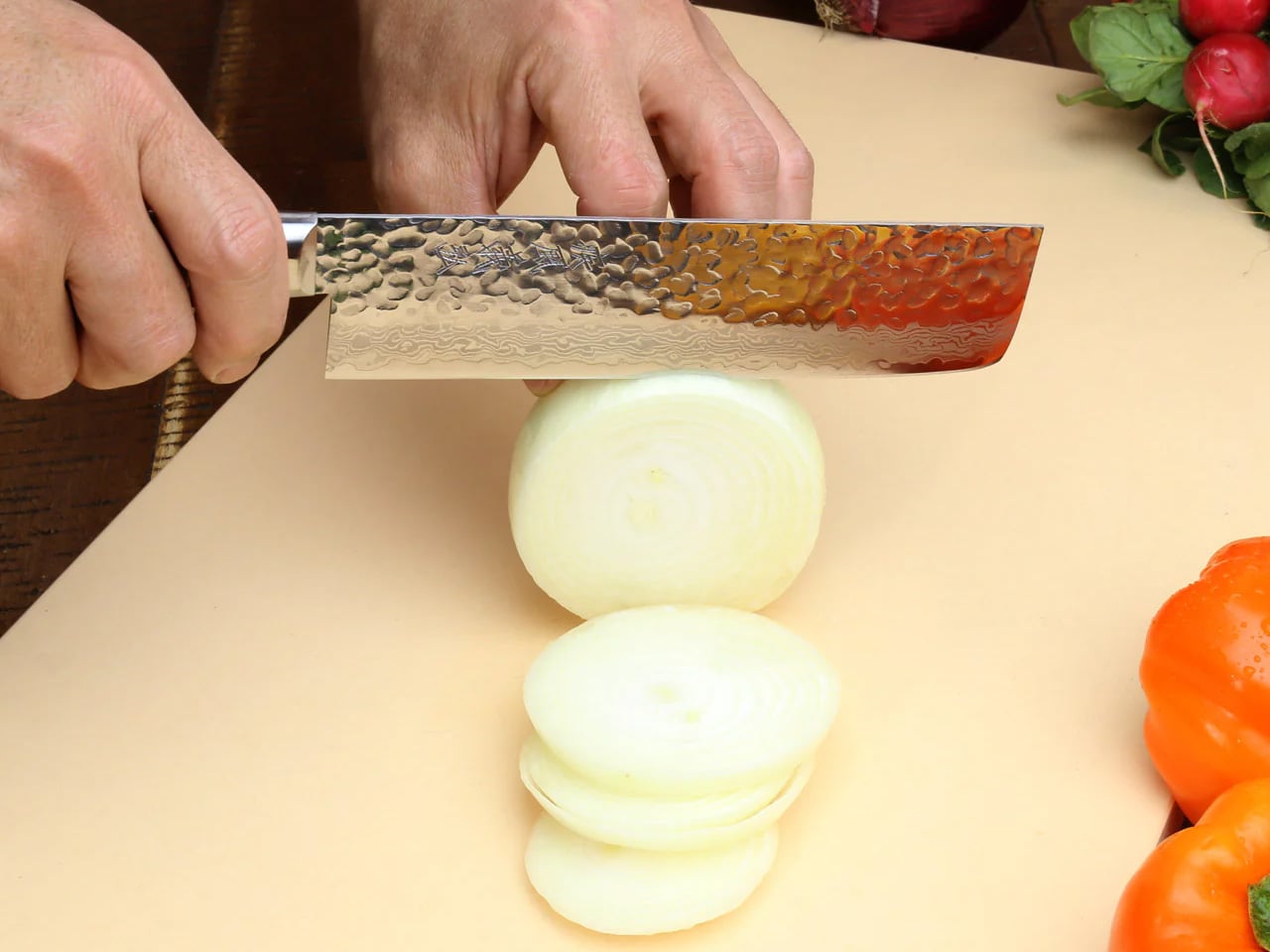
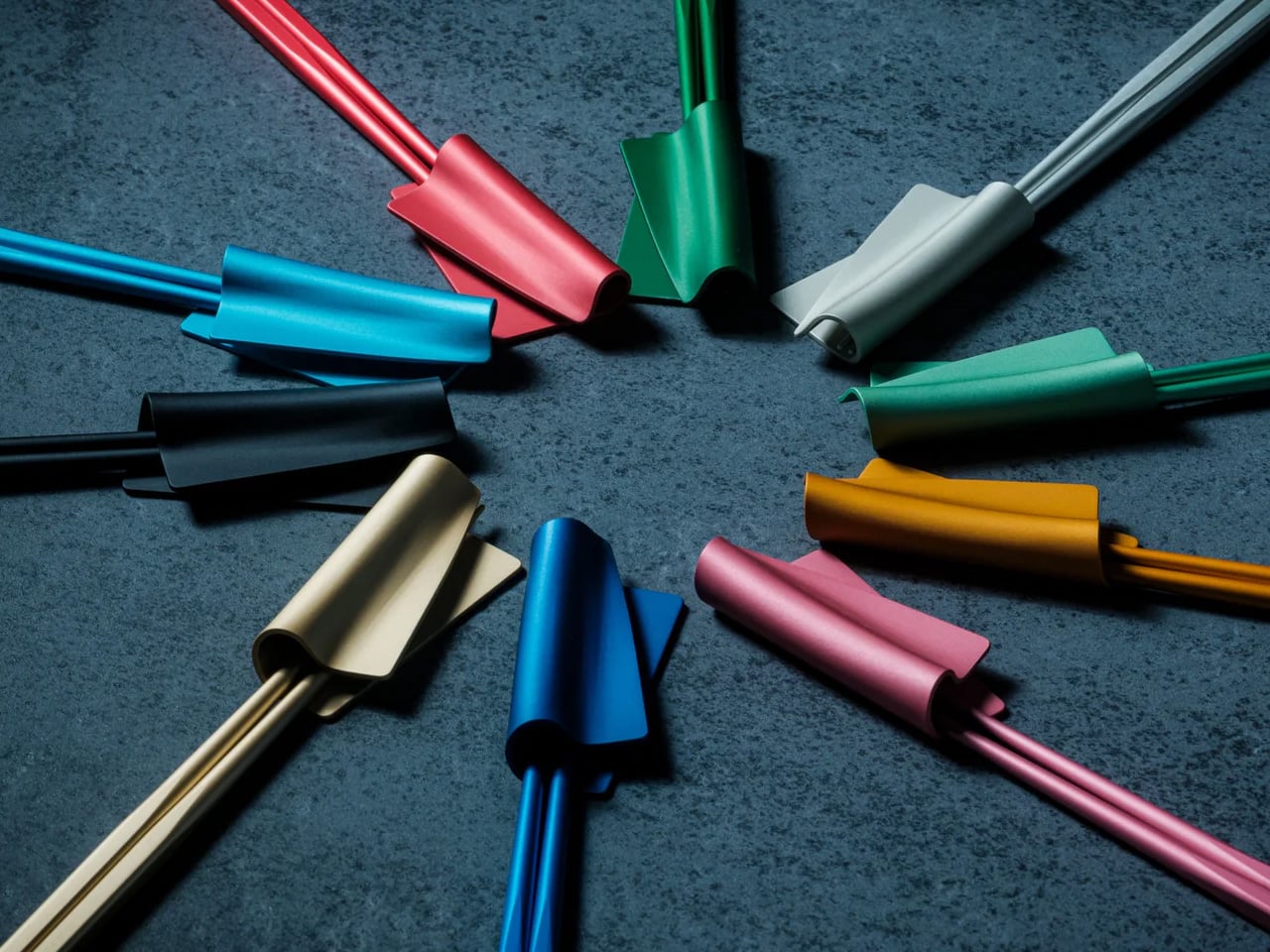
4. Benriner Super Mandoline Slicer No. 95
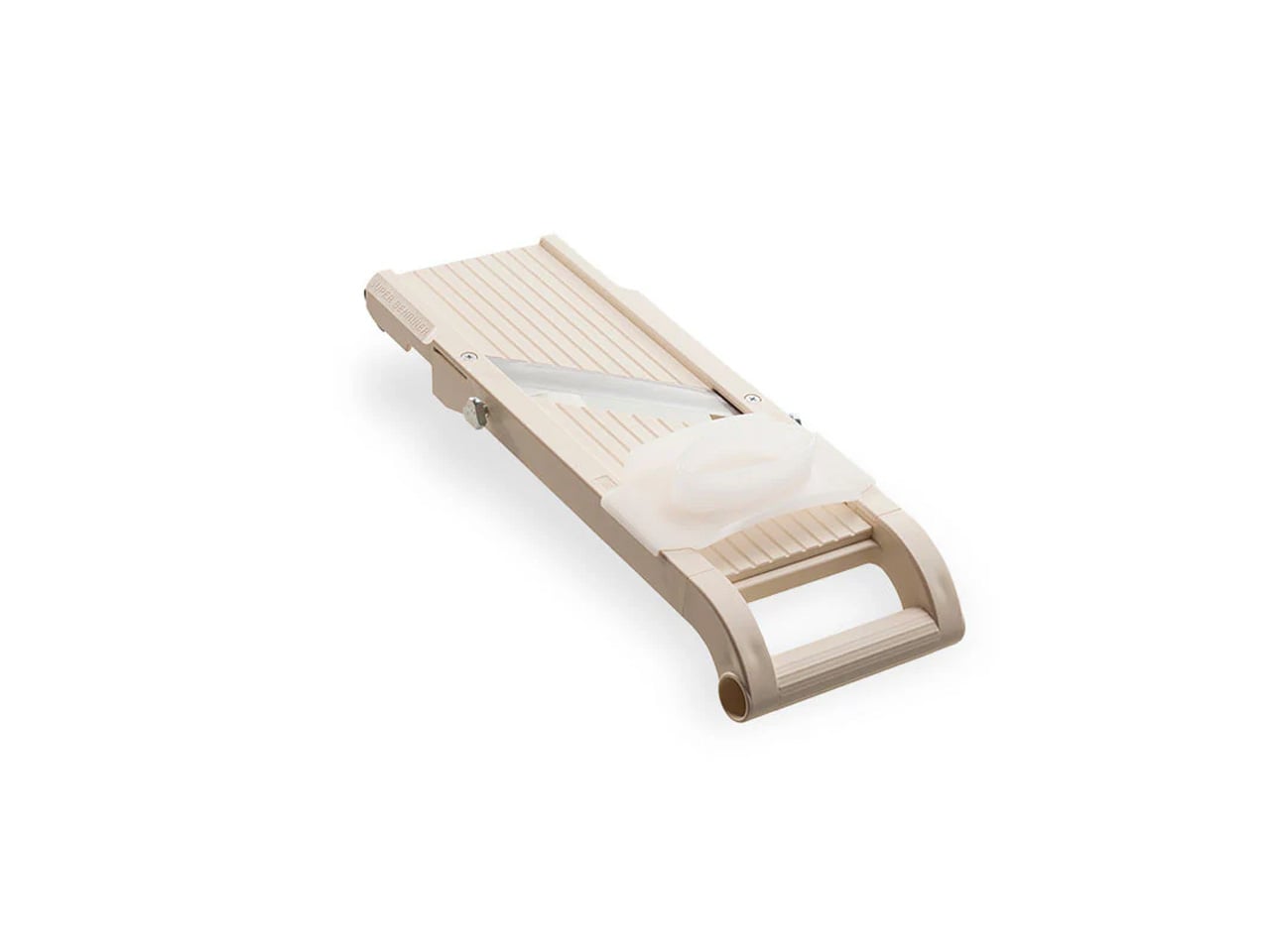
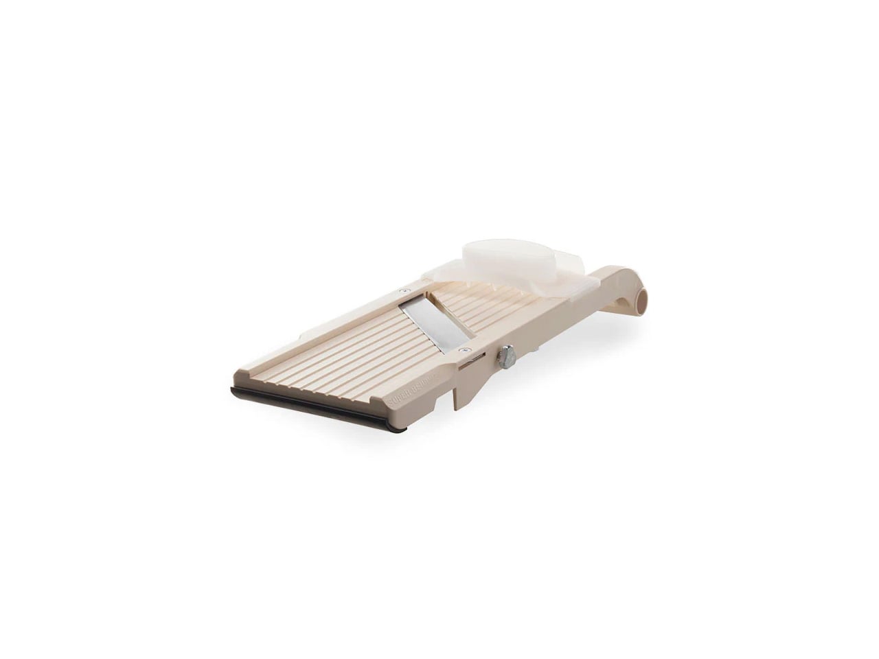
The Benriner has been the vegetable slicer of record in professional Japanese kitchens for decades, made in Yamaguchi Prefecture with an edge quality that made it standard equipment long before Western food media caught up. The No. 95 Super Benriner is the larger professional model, featuring four ultra-sharp Japanese stainless steel blades covering uniform slicing, julienne, and fry-cut work at a price that makes it one of the few genuine bargains in serious kitchen equipment.
Where most mandolines frustrate cooks with inconsistent blade adjustment and loose mounting, the Benriner holds its settings reliably cut after cut. Katsuobushi shaved paper-thin, daikon cut to near-translucent rounds, cucumber ribboned for sunomono: the cuts that separate restaurant-quality Japanese food from home attempts are largely a function of this tool.
What We Like
- Four interchangeable Japanese steel blades handle everything from paper-thin slices to julienne cuts with professional-grade precision
What We Dislike
- A cut-resistant glove is essential for safe use, and one isn’t included with the slicer
- Can feel slightly unstable when processing larger produce without the finger guard properly seated
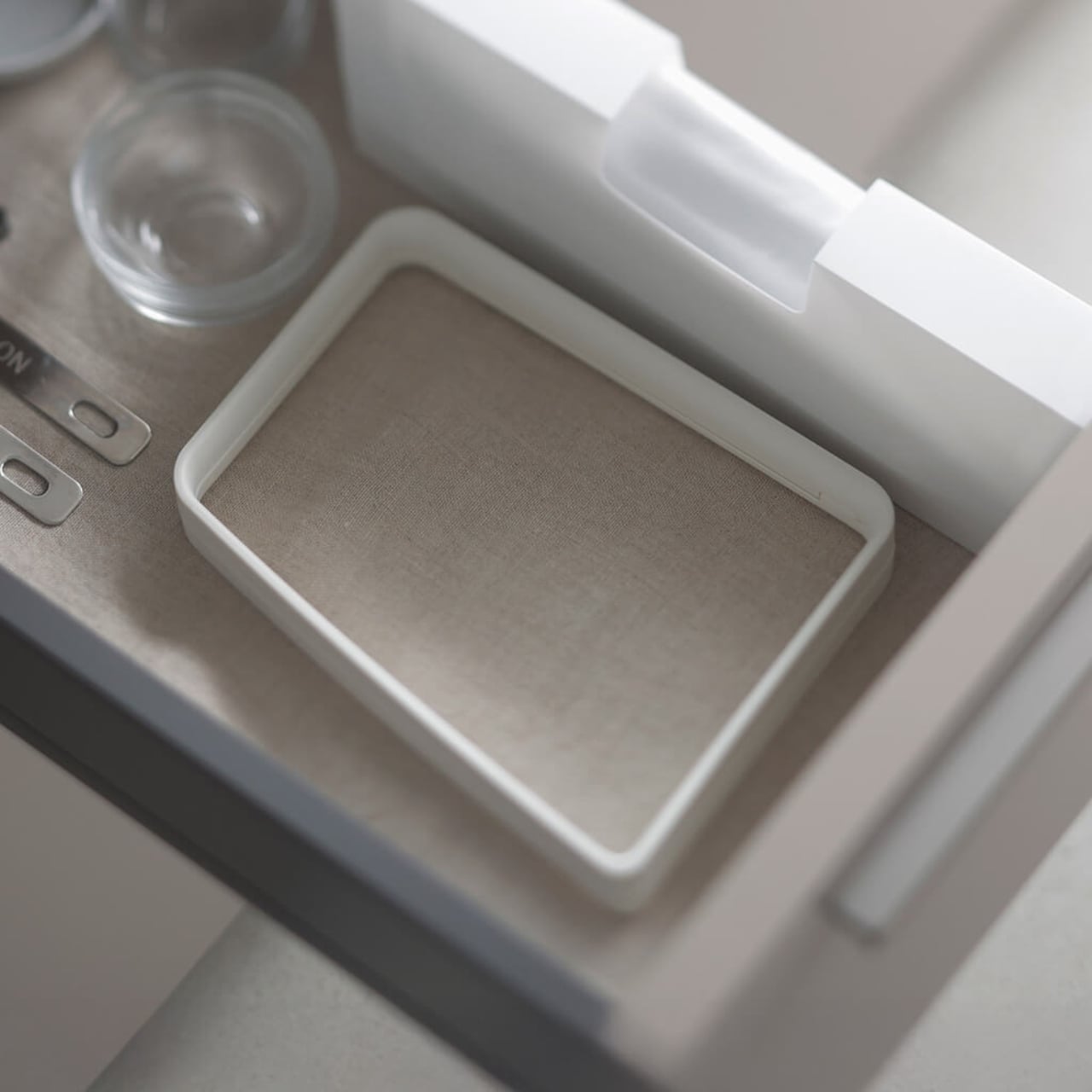
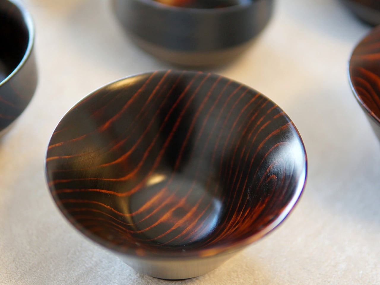
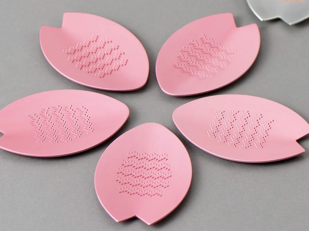
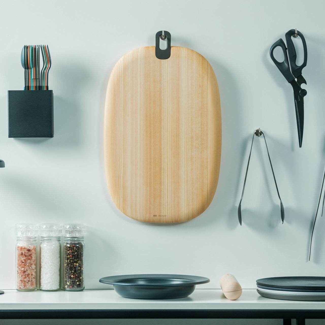
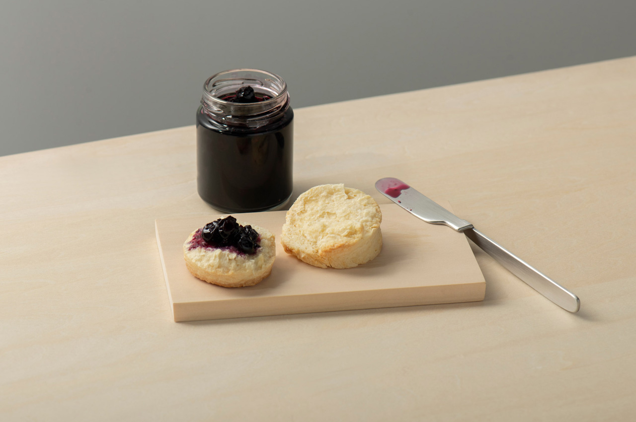
5. Hinoki Essence Cutting Board
![]()
Cutting boards in Western kitchens lean toward two extremes: hard plastic that preserves knife edges but feels clinical, or soft wood that comforts hands but dulls blades. The Hinoki Essence Cutting Board achieves the balance that Japanese cypress is renowned for: medium hardness that offers resistance without damaging knives. The majestic hinoki wood naturally resists mold, while the water-resistant silicone coating penetrates wood fibers to prevent damage. The gentle, rounded shapes and integrated handle provide both aesthetic grace and practical functionality for hanging and hygienic drying.
The cutting experience on hinoki transforms knife work from task into sensory practice. The wood provides satisfying feedback without the harsh impact of hard surfaces or the mushy give of soft materials. The natural aroma of cypress adds olfactory dimension to food preparation, creating an atmosphere that plastic and bamboo cannot replicate. The integrated handle facilitates hanging storage that promotes air circulation and drying. The water-resistant treatment extends durability without coating the surface in synthetic films. The gentle curves blend naturally with contemporary kitchen interiors while honoring traditional Japanese woodworking aesthetics. Paired with the ceramic sashimi knife, this is the right surface for the right blade.
What We Like
- Hinoki’s medium hardness protects knife edges while delivering satisfying, precise cutting feedback
- The natural cypress aroma adds a sensory quality to prep work that no synthetic material can offer
What We Dislike
- Wood requires more care than plastic, including occasional oiling and thorough drying after washing
- The premium material comes at a higher price point than most cutting boards on the market
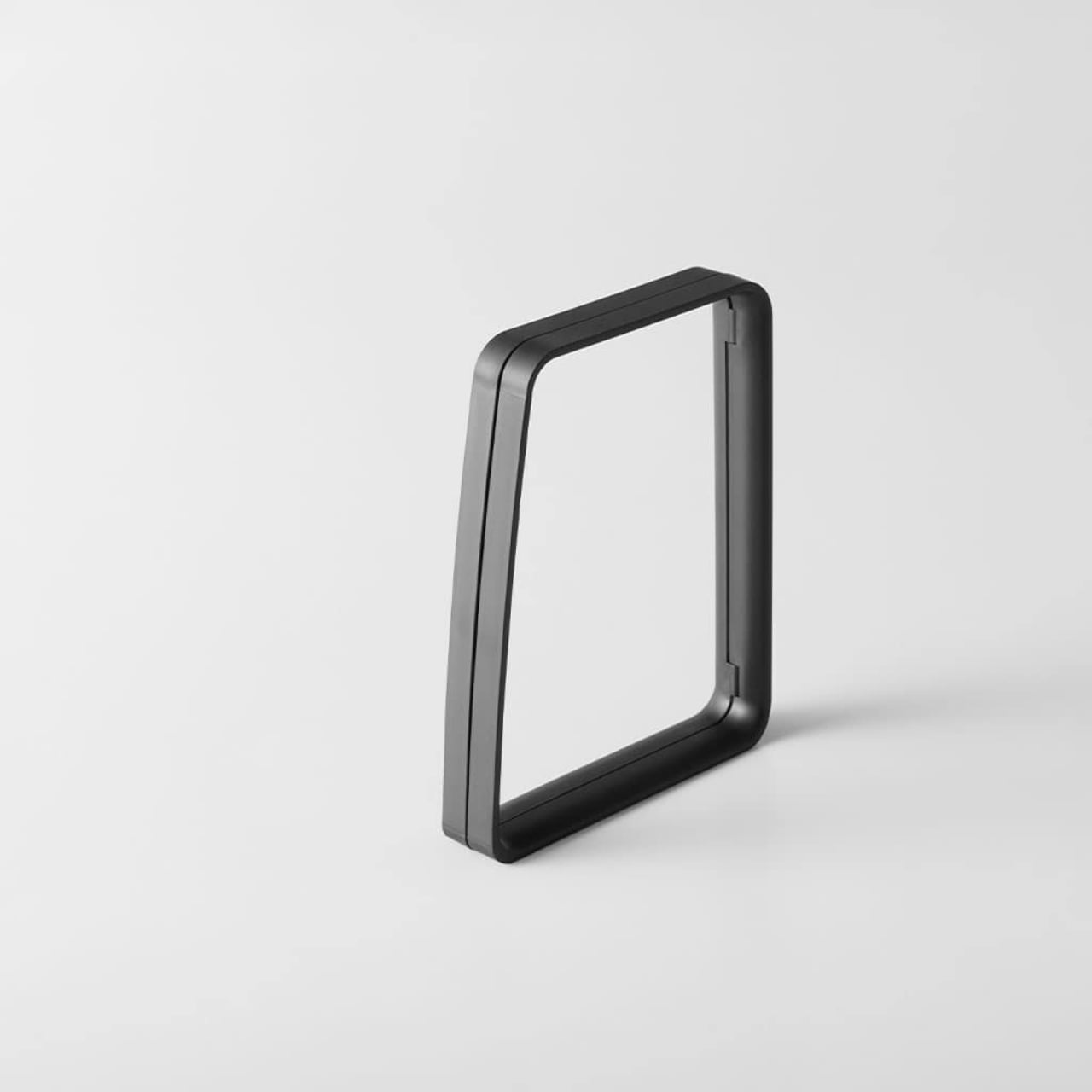
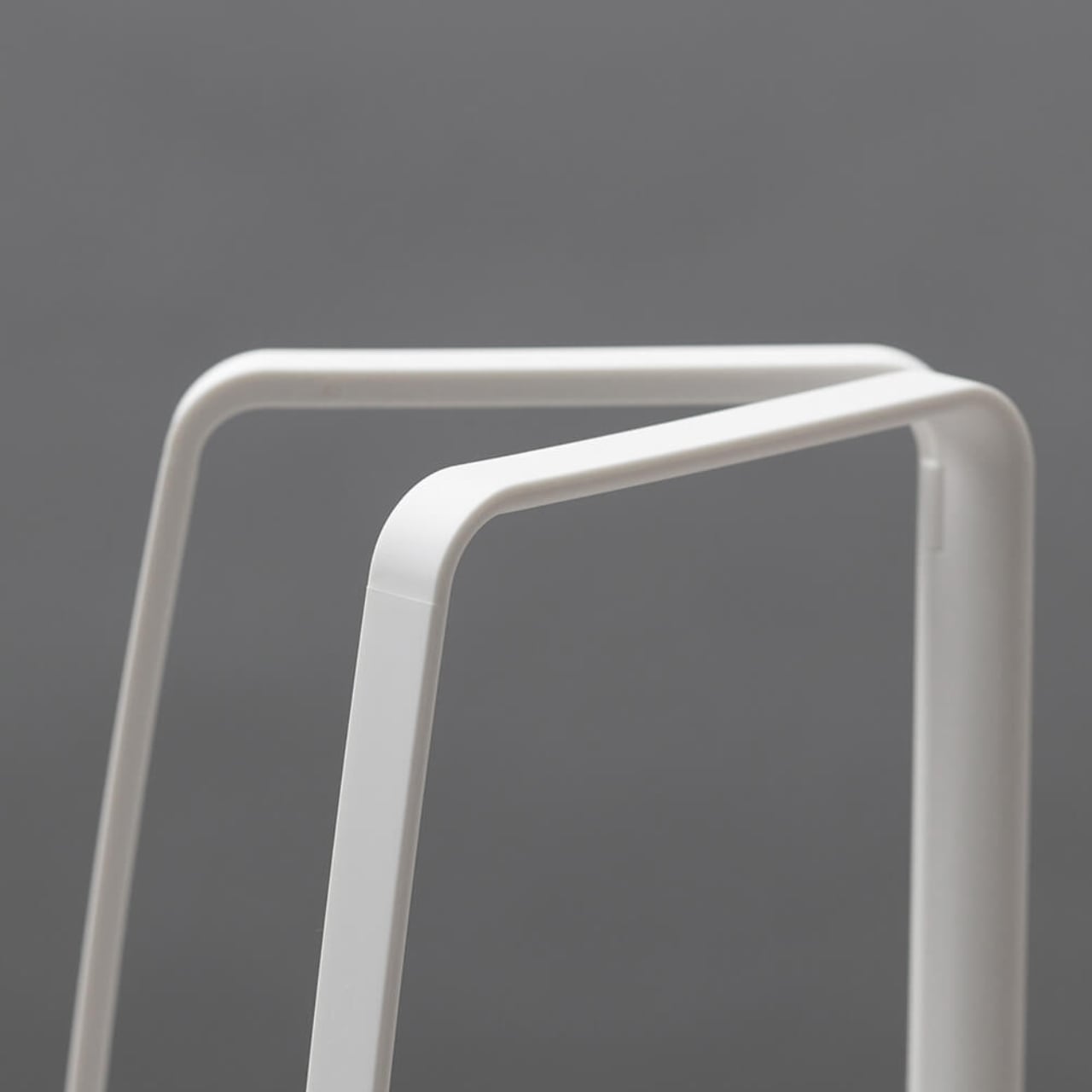
6. Oku Knife
Every knife you own lies flat on the table. That’s not a law of physics, just a 400-year-old habit nobody bothered to question. Scottish metalworker Kathleen Reilly questioned it during a residency in Tsubame-Sanjo, Niigata Prefecture, one of Japan’s most celebrated metalworking regions, and the answer was Oku: a table knife with a folded handle that hooks over the edge of a plate or wooden board, holding the blade elevated entirely off the surface.
The knife is made by craftspeople in Tsubame-Sanjo using techniques refined over four centuries, from domestically produced high-quality stainless steel. The paired wooden boards come from Karimoku Furniture, Japan’s leading wooden furniture maker, using sustainably sourced Japanese forest wood. For a dad who cooks with intention, Oku adds something most kitchen tools cannot: a design that creates dialogue between cultures, between Eastern arrangement philosophy and Western dining conventions, and between the object and whatever surface it is placed on. Nothing else on the table will look like it.
What We Like
- The folded handle elevates the blade completely off the table, keeping the cutting edge cleaner between uses
- A genuine cultural collaboration between Scottish design sensibility and 400-year-old Japanese metalworking craft, with a story worth telling at the table
What We Dislike
- Availability is through the designer’s studio rather than a mainstream retail channel, which takes more effort to source
- The concept-forward design is purposefully singular, working as a table knife rather than a multi-purpose kitchen workhorse
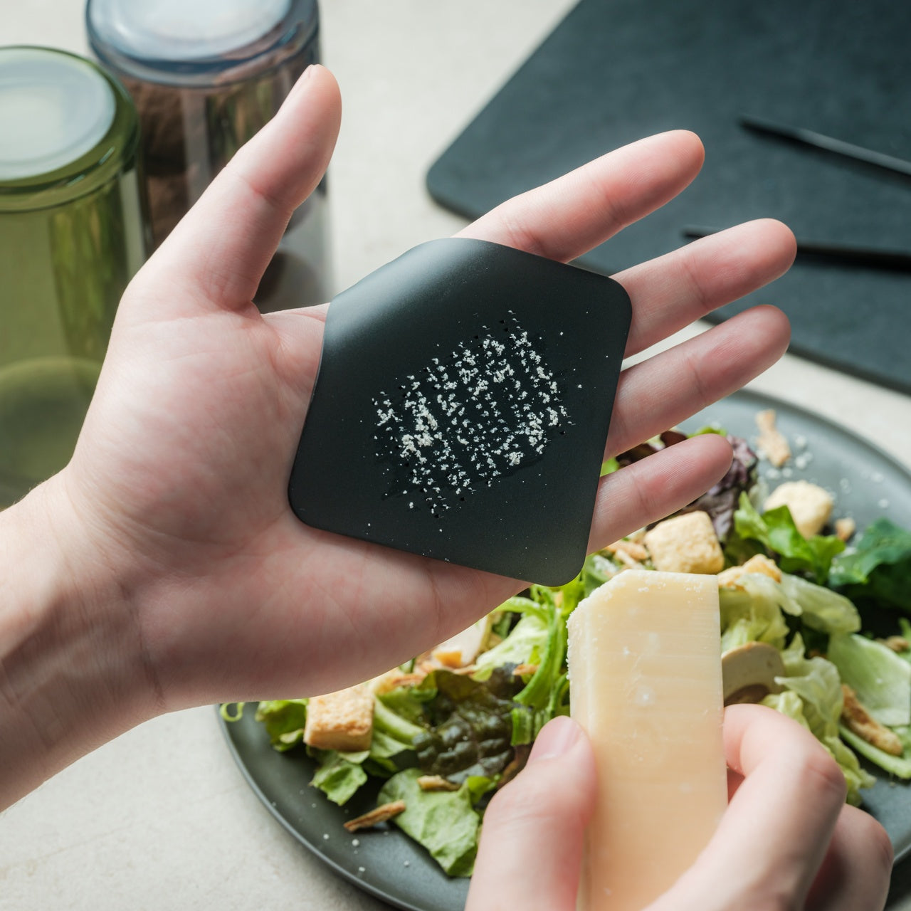
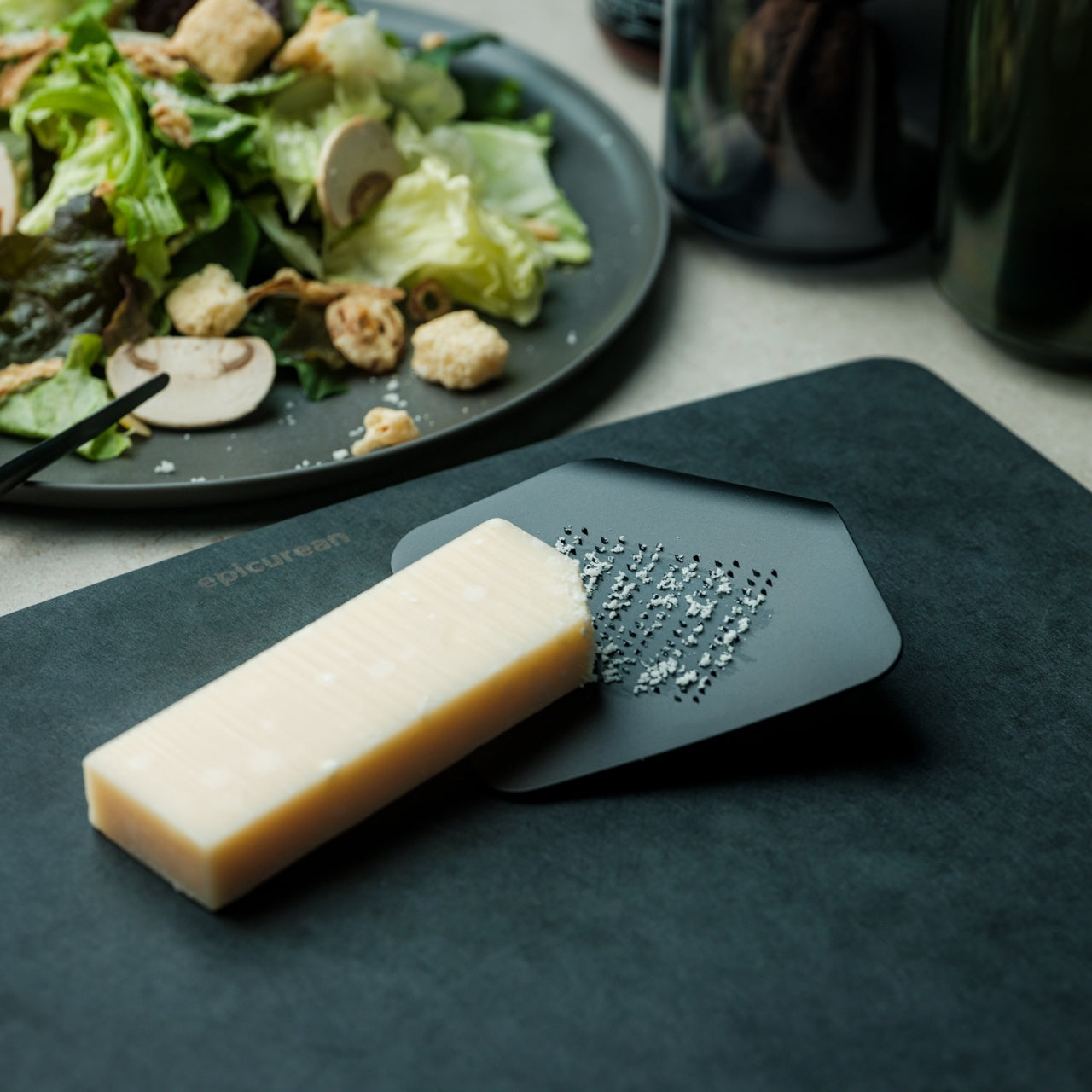
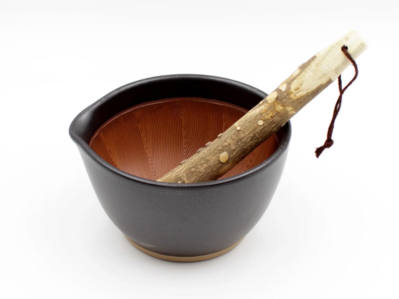
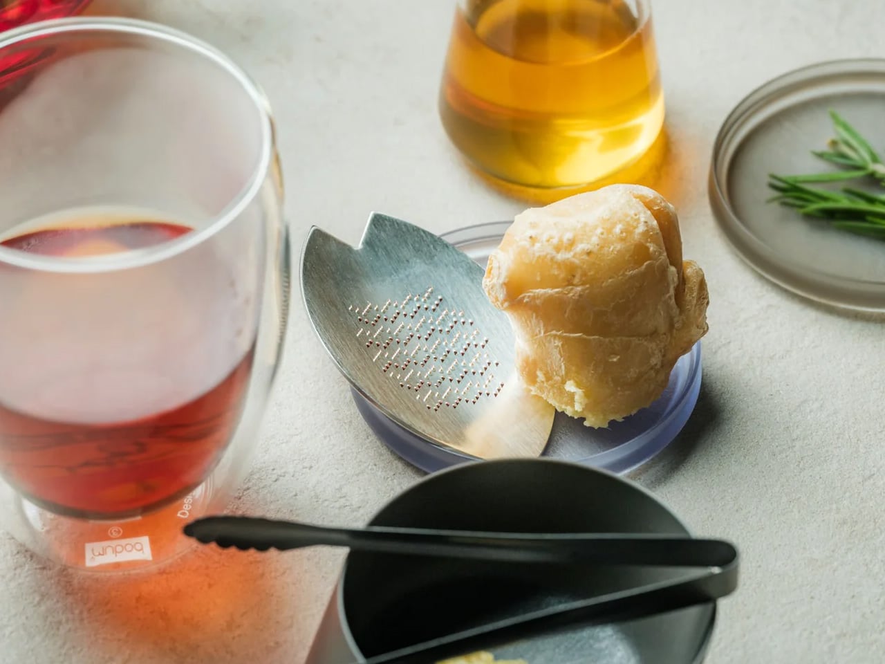
7. Suribachi and Surikogi Set
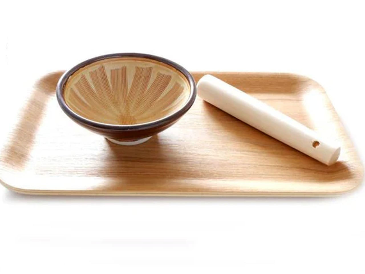
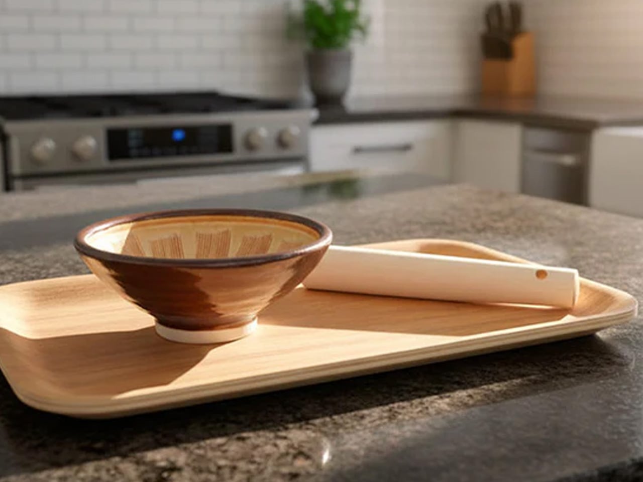
Grinding in Japanese cooking is fundamentally different from crushing. The suribachi achieves that distinction through its ridged ceramic interior, where scored grooves catch and shear ingredients rather than simply pressing them flat. Making gomadare sesame sauce, the kind that appears in cold noodle dishes and spinach salads at high-end Japanese restaurants, depends entirely on this action: sesame seeds releasing their oils through friction against the ridges rather than being pulverized against a smooth surface. No Western mortar produces this result or this texture.
The suribachi and surikogi set from Akazuki comes in three nested sizes, made from unglazed ceramic with the traditional scored interior that defines the tool. The wooden surikogi pestle grips the ridges effectively without damaging the bowl. For a dad who already cooks Japanese food with confidence, this closes the last gap in most Japanese-inspired home kitchens. For one who is beginning to explore the cuisine properly, it introduces a grinding technique that changes how sauces and dressings taste from the very first use.
What We Like
- The ridged ceramic interior releases oils and extracts flavor from seeds and aromatics in ways no smooth mortar can replicate
- The nested three-piece set covers different ingredient volumes without requiring multiple tools
What We Dislike
- The ceramic bowl requires careful handling and won’t survive a drop onto a hard floor
- Developing a consistent grinding rhythm takes a few sessions, particularly when working with sesame seeds
8. BALMUDA The Kettle


Temperature is one of the least visible but most consequential variables in Japanese cooking. Dashi performs best within a specific heat range. Green tea becomes bitter above 80°C. BALMUDA The Kettle approaches precision temperature control with the same seriousness that Tokyo-based BALMUDA brings to every product it makes: a minimal design language wrapped around functional performance that makes the object as intentional to look at as it is to use.
BALMUDA’s attention to proportion is visible in the kettle’s structure: a wide base tapering to a narrow, curved gooseneck spout engineered for controlled, targeted pouring. This matters for precise dashi work, for pour-over preparations, for the temperature discipline that separates a thoughtful Japanese home cook from someone following a recipe. The Kettle is not a generic appliance that happens to look elegant. It’s an object designed to make a daily preparation ritual feel considered, which is exactly what Japanese kitchen culture asks of every tool it produces.
What We Like
- The precision gooseneck spout allows controlled, targeted pouring for dashi, tea, and any temperature-sensitive preparation
- BALMUDA’s build quality and visual design make it as worthy of display as of daily use
What We Dislike
- The premium brand carries a price considerably higher than functional alternatives with comparable temperature control
- Some home cooks may want more granular degree-specific settings than the kettle’s range provides
The Gift That Gets Better Every Time He Cooks
Japanese kitchen tools don’t compete with each other for drawer space. They each occupy a specific role with such precision that using the wrong version becomes apparent the moment you try the right one. This collection covers that full range: the tools that produce results no substitute can replicate and the surfaces that make everything they touch perform better. Together, they build a kitchen that takes cooking seriously from prep board to serving vessel.
Father’s Day gifts often end up used once and forgotten. The tools here don’t work that way. A donabe improves every time it’s fired. An Oku knife perches at the edge of every plate it touches, carrying the weight of four centuries of craft. A hinoki board holds the character of every preparation made on its surface. These aren’t purchases. They’re the beginning of a cooking practice that rewards attention for years.
The post 8 Japanese Kitchen Gadgets & Tools That Make Dad Feel Like a Michelin-Star Chef This Father’s Day first appeared on Yanko Design.