Belkin Charging Case Pro for Switch 2 review: A more elegant solution

Last year, Belkin released a couple of cases for the Nintendo Switch 2 just in time for launch, including one that came with a handy battery pack. That one was simple and effective, but it felt a bit crude because it wasn't much more than a basic travel pouch with a generic power cell tossed inside. Now, Belkin is back with a Pro version of its Charging Case for the Nintendo Switch 2, featuring a more sophisticated battery pack along with a higher price tag ($100 vs. $70). So here’s the question for any Switch 2 owners still looking for a way to protect their console while keeping it topped off: Is a more elegant charging solution really worth the extra money?

At 11.7 x 6.1 x 2.5 inches and weighing 1 pound 12 ounces, the Pro Charging Case is a touch larger and heavier than its non-pro sibling. It also features a very similar design with the same color options and materials, including a tough polyester outer shell that’s balanced by a softer, velvet-like material and cutouts for your Switch 2 on the inside. 

The Pro Charging Case (bottom) is a touch bigger and heavier than the previous model, but aside from that its sports a nearly identical design.
Sam Rutherford for Engadget

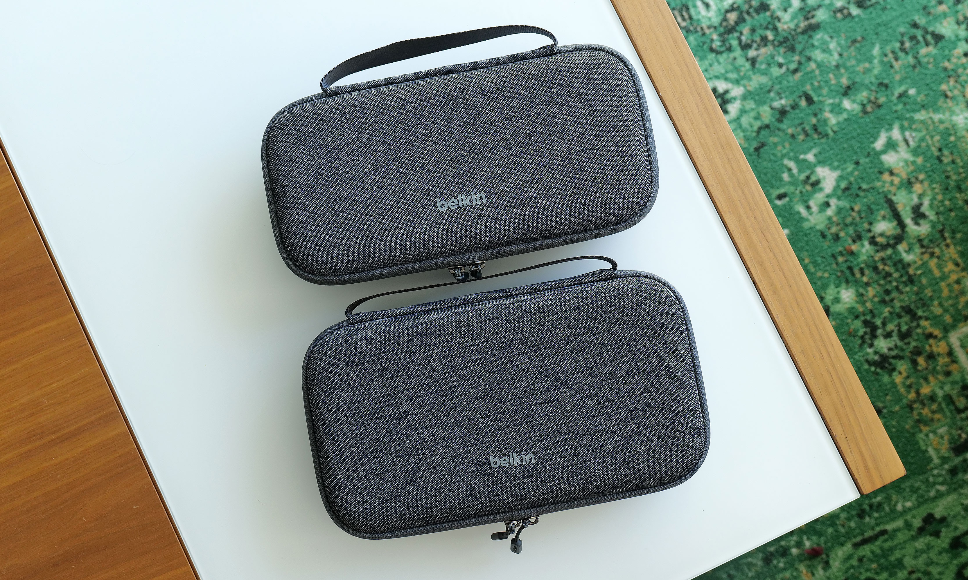
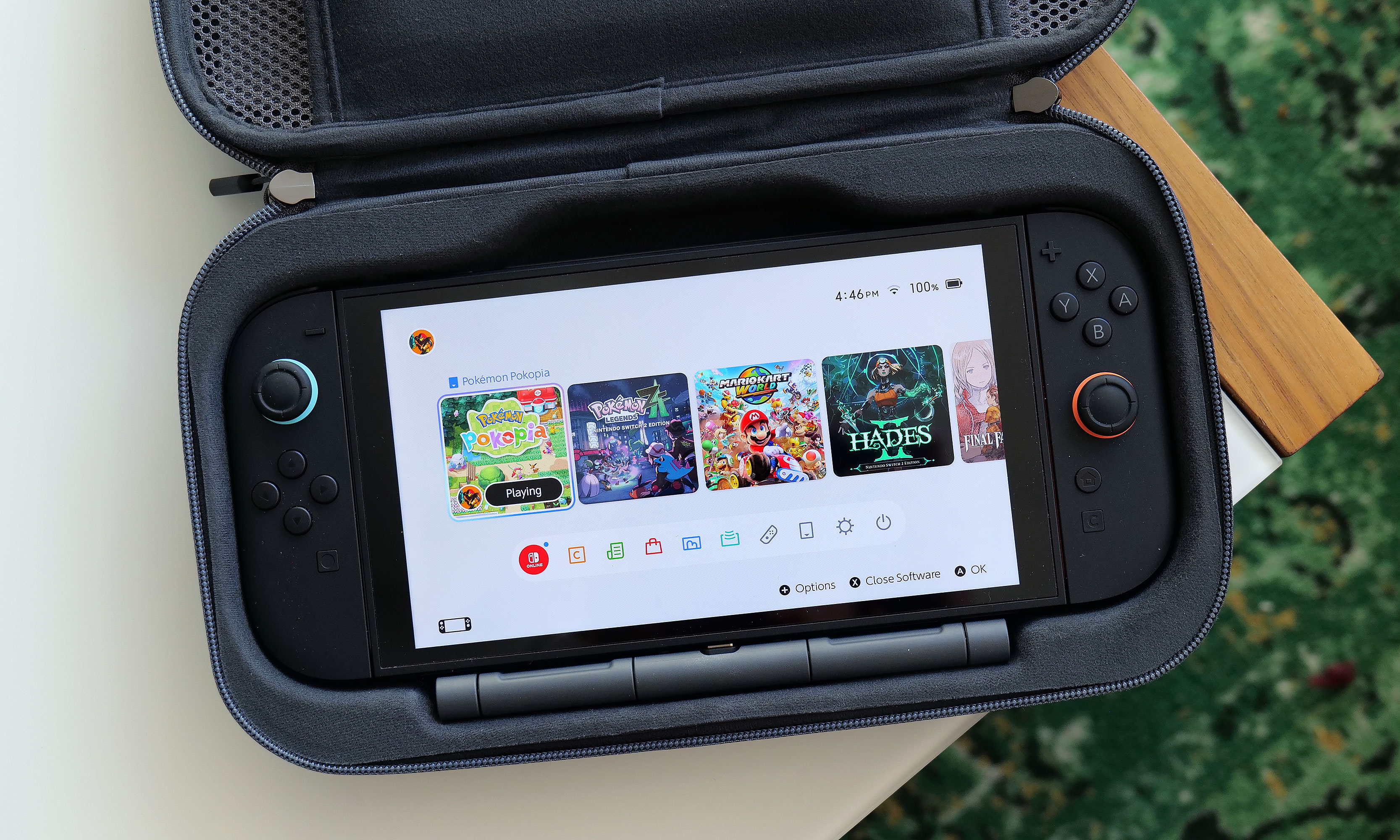
Once again, Belkin has done a good job of providing a snug cabin to store your console while still making it easy to take it in and out. That said, if your system also has an extra-thick protector or hardshell case like the Killswitch from Dbrand, it may not fit. There's also a padded flap that swings down to protect your Switch 2's screen that also pulls double duty as a place to stash up to 12 game cartridges, which is a very thoughtful touch. 

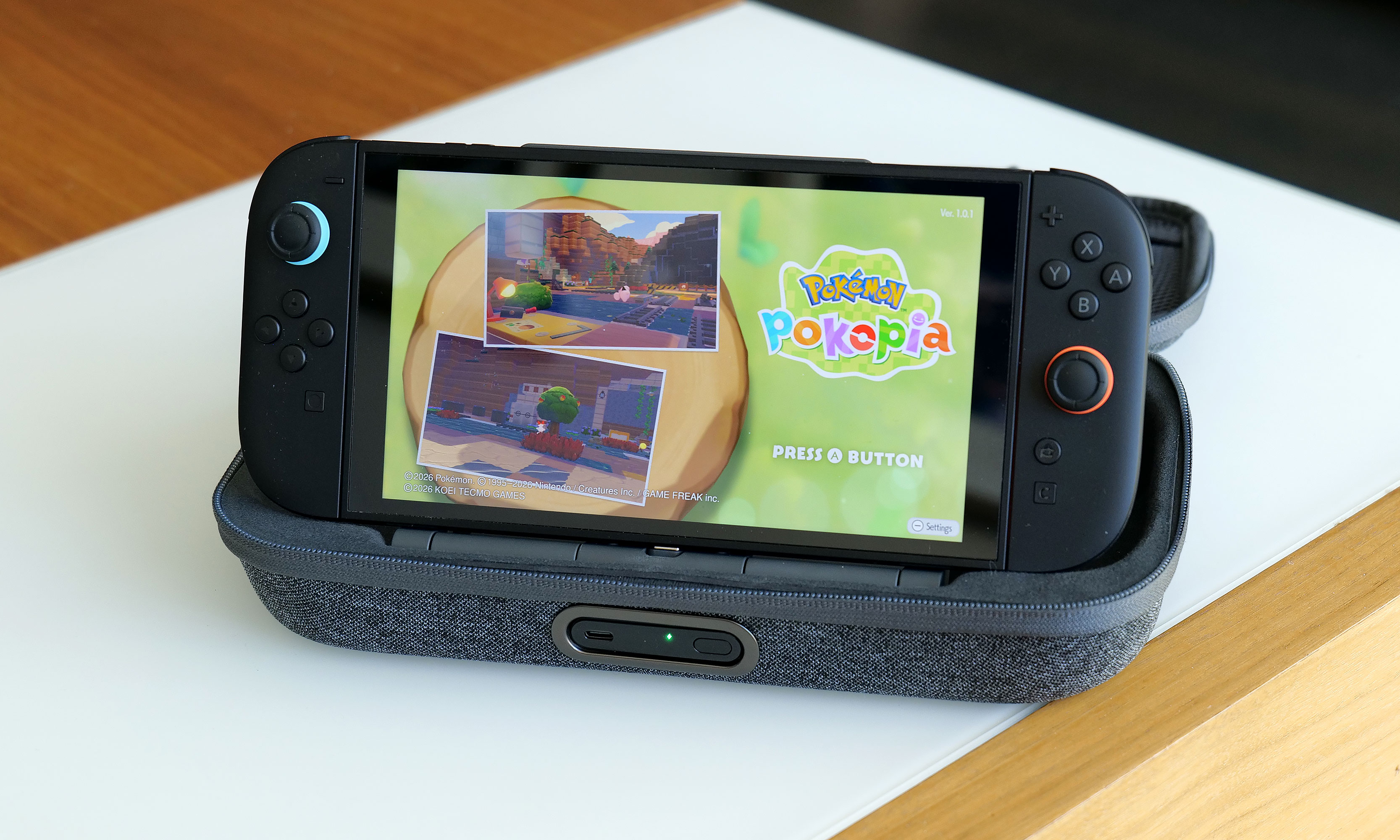
However, the biggest change to the Pro Charging Case's exterior design is a new cutout on the front edge, which allows you to top off other gadgets (or a Switch) by plugging a USB-C cable into Belkin's included battery pack. Unfortunately, the case doesn't come with a cord, which seems a bit odd until you take a closer look at the power pack's layout. That’s because once you open up the case, you’ll see a second port designed to fit right into the bottom power jack on the Switch 2 without the need for a cable.

The inside of the Pro Charging Case features a handy mesh pocket, 12 slots for game carts and a hidden AirTag pouch.
Sam Rutherford for Engadget

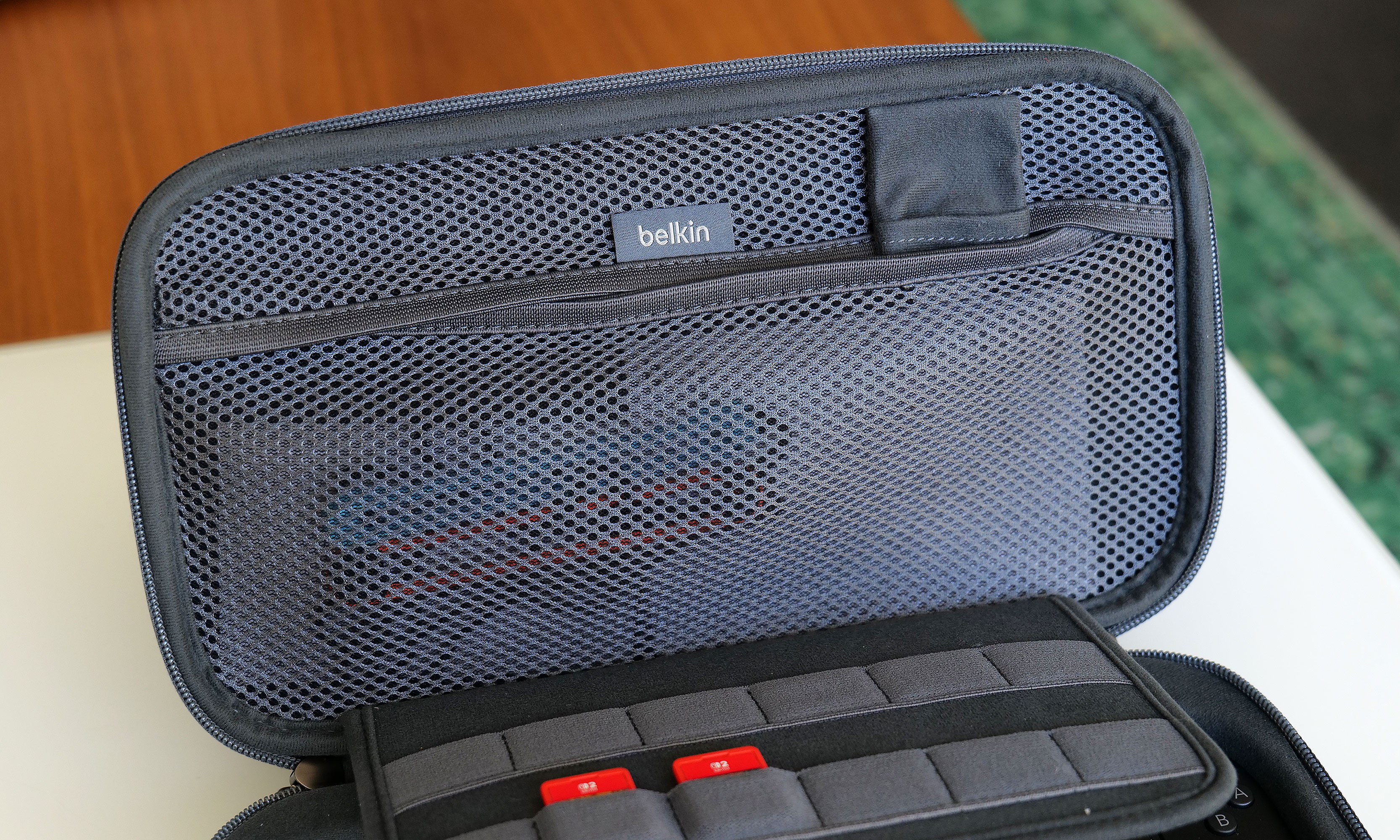
Other small touches on Belkin's Pro Charging Case include a mesh pocket for storing things like cables, Joy-Con straps or cleaning cloths, which is very handy. However, my favorite thing might be the AirTag pouch that's also hidden inside that pocket, which could give you a fighting chance of recovering your system if it's ever lost or stolen (though I wouldn't count on it). 

The arrangement of the included 10,000mAh battery pack and the placement of its internal USB-C port makes it super easy to recharge your Switch 2 every time you put it in the case.
The arrangement of the included 10,000mAh battery pack and the placement of its internal USB-C port makes it a cinch to recharge your Switch 2 every time you put it in the case.
Sam Rutherford for Engadget

Despite the increased size of the Pro Charging Case's included battery, it has the same 10,000mAh capacity as what you get from its less expensive sibling. That means you'll typically have enough juice for a little more than 1.5 recharges for your Switch 2 and its onboard 5,220mAh cell. Instead of relying on a simple external power pack like before, Belkin's bundled battery comes with a second USB-C port and a kickstand. This makes it super easy to plug in your Switch 2 every time you put it in the case. This way, you know the next time you turn it on, it'll be at 100 percent. 

Here's what the battery pack looks like when you take it out of the case. As you can see, its size and shape means it's not a great standalone external power pack any more.
Sam Rutherford for Engadget

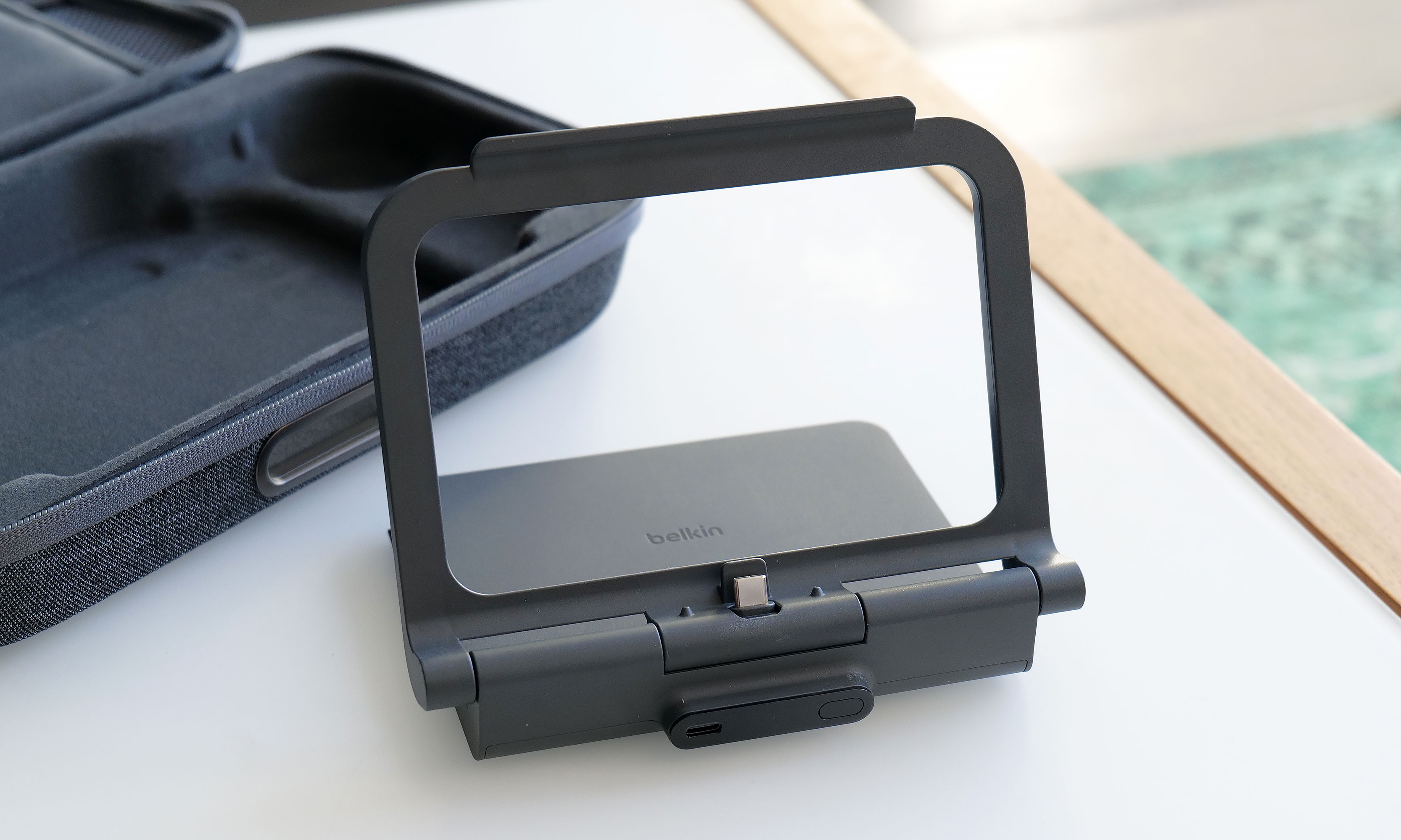
Alternatively, you can raise the kickstand to prop up the Switch 2 and game on it while it stays nestled inside the case. This might seem a bit redundant as Nintendo's console already has its own kickstand, but Belkin’s allows you to continue charging the system while you're playing without needing a cord. There's even a handy display on the side of the battery, so it's super easy to see how much juice is left, even when the case is closed. Furthermore, when you need to recharge the power pack, you can do so without removing it from the case or disconnecting your Switch thanks to that bonus USB-C port on the outside. Compared to the previous model, this is certainly a more elegant solution that provides some subtle quality of life improvements. The one downside is that the battery pack is somewhat awkwardly shaped, so you won't really want to use it on its own.

There's no doubt the Pro Charging Case's new battery pack is a more premium solution that's easier to use and manage. When you need to recharge it, you can do so from the outside without opening the pouch. It also lets you charge a Switch 2 without ever needing a cable. The built-in kickstand is another bonus that helps elevate the whole kit from a simple case to something closer to a tiny all-in-one gaming booth. 

One of the neat things about giving the battery  a kickstand is that it turns the case into a mini all-in-one. This makes wish Belkin gave the included power pack some sort of docking functionality for connecting the Switch 2 to an external display.
One of the neat things about giving the battery a kickstand is that it turns the case into a mini all-in-one. This makes me wish Belkin gave the included power pack some sort of docking functionality for connecting the Switch 2 to an external display.
Sam Rutherford for Engadget

That said, after using it for a couple of weeks, I'm still not sure the added convenience is worth an extra $30 over the original. Due to the battery packs' new shape, it's less useful as a standalone power cell, and the rest of the case's design is largely unchanged. Of course, it's always nice to have options, and if you're the kind of person who doesn't mind spending a little extra for a more streamlined and convenient kit, Belkin's Pro Charging Case for the Switch 2 is still very much worth consideration.


This article originally appeared on Engadget at https://www.engadget.com/gaming/nintendo/belkin-charging-case-pro-for-switch-2-review-a-more-elegant-solution-144820809.html?src=rss

Midjourney 8 vs Midjourney 7 : Prompt Accuracy, Interfaces, Raw Mode, Speed, Text & Style Compared

Midjourney 8 vs Midjourney 7 : Prompt Accuracy, Interfaces, Raw Mode, Speed, Text & Style Compared Stylized illustration made in Midjourney 7 showing richer color and more artistic texture than version 8.

Midjourney 8 introduces faster rendering speeds, enhanced text generation and a stronger emphasis on photorealism, marking a departure from the artistic focus of Midjourney 7. Wade McMaster from Creator Impact, takes you through the new version 8 interface currently available at alpha.mjourney.com, offering features like HD mode and stylization settings. While these changes improve technical […]

The post Midjourney 8 vs Midjourney 7 : Prompt Accuracy, Interfaces, Raw Mode, Speed, Text & Style Compared appeared first on Geeky Gadgets.

Posted in Uncategorized

Amazon is reportedly working on a new phone built around Alexa

Amazon is reportedly planning to re-enter the smartphone market more than 10 years after its last attempt. According to a Reuters report, the mysterious phone is internally codenamed "Transformer" and is being developed by the company’s devices and services unit.

There isn’t a whole lot to go on right now, but it probably won’t surprise many to learn that the phone will likely lean heavily on AI. According to Reuters’ sources, Alexa functionality would be a core part of the experience, but Amazon wouldn’t necessarily build a custom OS around its voice assistant. The phone would make buying products on Amazon and using services like Prime Music and Prime Video "easier than ever," and may bypass traditional app stores.

Reuters reports that the Transformer project is being led by the recently established ZeroOne, an Amazon devices unit headed up by ex-Microsoft executive and Xbox co-founder J Allard, who was also one of the creators of Zune. Allard joined Amazon last year to lead a "a special projects team dedicated to inventing breakthrough consumer product categories."

The development team has reportedly considered launching both a traditional smartphone and a so-called "dumbphone," which would presumably strip away anything that needlessly distracted you from the Amazon empire. Reuters’ anonymous sources suggest the latter could help combat screen addiction by offering fewer features.

ZeroOne is apparently inspired by the ultra-minimalist Light Phone, suggesting that Amazon might be reluctant to take on the flagship devices of Apple and Samsung. The report adds that the Transformer phone could even be positioned as a secondary handset.

This, of course, would not be Amazon’s first crack at the smartphone business. The company launched the Fire Phone in 2014, an ambitious and interesting device that ultimately failed to tempt people away from the more established smartphone ecosystems. It’s widely remembered as perhaps the company’s biggest hardware misstep.

With analysts forecasting an unprecedented decline in the smartphone market in 2026, now seems like a risky time for Amazon to try again, and Reuters was unable to determine exactly how much the company has committed to the Transformer project. Sources also wouldn’t rule out it being scrapped altogether if the company’s priorities suddenly shifted.

This article originally appeared on Engadget at https://www.engadget.com/mobile/amazon-is-reportedly-working-on-a-new-phone-built-around-alexa-142244500.html?src=rss

A $500 Cat Scratcher That Looks Like a Floating Shelf

Most cat owners have made peace with a certain kind of compromise. You get the cat, the cat gets the furniture, and whatever mass-produced scratching post comes in the box gets wedged into a corner where you try not to look at it. It wobbles. It sheds sisal like it’s molting. And after three months, it leans at a fifteen-degree angle that tells you something about both your cat’s enthusiasm and the product’s build quality. We accepted this because we assumed pet furniture just couldn’t do better.

The RELEX wall panel by stylecats is a direct challenge to that assumption, and it makes a pretty convincing case. Designed by the stylecats Design-Team and a winner of the 2025 European Product Design Award, the RELEX is a wall-mounted cat scratching and lounging system that, at first glance, reads more like a floating shelf unit than pet furniture. That’s entirely intentional. The panels are made from birch plywood with an HPL coating, the hardware mounts are completely hidden behind the panel, and the whole structure sits flush against the wall like it was always supposed to be there. If you swapped the sisal for a few hardcover books, guests might not even ask. That’s a sentence I never thought I’d write about a cat scratcher.

Designer: stylecats Design-Team

The three-platform version, the RELEX 3, measures 70 x 37.5 x 120 cm and offers three staggered lounging surfaces, each rated to hold up to 15 kilograms. That’s enough for even a particularly confident Maine Coon. The platforms themselves are cushioned with a microfiber sandwich construction: a durable top layer, a middle foam layer for actual comfort, and a velor base that retains body heat. The covers are washable at 40 degrees on a gentle cycle, which, if you’ve ever owned a cat, you know is not a minor detail. The integrated sisal scratching surface is also replaceable when it wears out, which extends the lifespan of the whole unit considerably.

What the design gets right, beyond the aesthetics, is understanding what a cat actually needs from its environment. Cats want height. They want varied vantage points. They want to scratch something that isn’t your sofa. The RELEX gives them all three in a format that takes up wall space rather than floor space, which is, for anyone living in a flat or a smaller home, a genuinely meaningful distinction.

I’ll admit I have a bias here. I’ve long been irritated by how the pet industry has historically treated design as an afterthought. Function got the priority, and style was whatever was left over. That’s slowly changing, and the RELEX feels like part of that shift rather than just a single clever product. The European Product Design Award jury, which drew from more than 30 design leaders across the globe, clearly saw the same thing. Awards don’t automatically validate a product, but they do confirm that people who think seriously about design paid attention.

The price reflects the seriousness of the build. The three-surface version starts at €499.99, and the four-surface configuration goes up to €599.99. That’s not impulse-purchase territory. It’s the kind of number that makes you pause, think about how much you’ve already spent replacing sofa corners, and then proceed anyway.

Stylecats is a brand under HUNTER International GmbH, a German manufacturer, and the “Made in Germany” label isn’t just marketing on this one. The material choices and construction quality back it up. Birch plywood, 100% sisal, proper load ratings per shelf, and concealed hardware are not the specs of something designed to be cheap.

The RELEX line is available in two, three, or four lounging surface configurations. It’s currently offered with a white coating and works particularly well positioned near a window, where a cat’s need to observe the world and your need to look at something decent can finally, peacefully, coexist.

The post A $500 Cat Scratcher That Looks Like a Floating Shelf first appeared on Yanko Design.

Building Apps with Google Antigravity & Firebase, Step by Step

Building Apps with Google Antigravity & Firebase, Step by Step Code editor with Firebase Cloud Functions handling API calls while keeping secrets and keys off the front end.

Google’s Antigravity AI, powered by Gemini 3.1 and Firebase offer a compelling combination for developers aiming to streamline app creation. In a guide below by the Your AI Workflow team, you’ll see how these technologies can be used together to build a functional appointment booking app. Antigravity AI enhances coding efficiency by automating repetitive tasks […]

The post Building Apps with Google Antigravity & Firebase, Step by Step appeared first on Geeky Gadgets.

Posted in Uncategorized

iPhone Fold Leak: Apple Finally Perfects the ‘Zero-Crease’ Display

iPhone Fold Leak: Apple Finally Perfects the ‘Zero-Crease’ Display Diagram-style view of a foldable phone hinge concept, highlighting parts meant to reduce screen bending stress.

Apple is reportedly preparing to launch its first foldable iPhone, a device that could reshape the foldable smartphone landscape. The most anticipated feature is a crease-free display, addressing one of the most persistent flaws in current foldable devices. By using advanced materials and innovative engineering, Apple aims to deliver a seamless visual experience that sets […]

The post iPhone Fold Leak: Apple Finally Perfects the ‘Zero-Crease’ Display appeared first on Geeky Gadgets.

Posted in Uncategorized

How to Use Claude Dispatch : Run Local Tasks & Keeps Sessions in Sync

How to Use Claude Dispatch : Run Local Tasks & Keeps Sessions in Sync Workflow diagram showing several AI agents handing off steps while Claude Dispatch tracks status across devices.

Claude Dispatch offers a fresh approach to managing tasks and automating workflows, combining advanced AI capabilities with practical features to streamline operations. Jannis Moore highlights how this platform simplifies complex processes by centralizing task management and allowing local execution directly on your device. For example, its ability to execute tasks without relying on cloud services […]

The post How to Use Claude Dispatch : Run Local Tasks & Keeps Sessions in Sync appeared first on Geeky Gadgets.

Posted in Uncategorized

The Macaron Collection That’s Actually Built to Last

Furniture rarely makes me stop scrolling. Most of what cycles through my feed either looks too clinical to feel livable or too trendy to last past next season. But when I came across Macarons, a modular furniture system by Taiwanese designers HanYi Huang and Fong-Yi Liou, I actually paused. Not because it was trying too hard, but because it wasn’t.

The name gives it away, and that’s the point. Macarons draws its visual language directly from the French confection, right down to the rounded forms, the layered silhouette, and that quietly playful quality that makes you smile before you even understand why. The design came from 03 Design Ltd. in Taiwan and was created for longtime furniture manufacturer Shiang Ye Industrial Co. It picked up a double win at the 2025 European Product Design Award, taking home recognition in both Home Furniture and Eco Design, which tells you this isn’t just a pretty concept piece.

Designers: HanYi Huang

What actually makes Macarons interesting as a furniture system is the modularity. You get a configurable set of stools, chairs, and side tables built around a simple logic: swap the legs, change the seat, add on what you need. The components connect through a rotational seat mechanism that makes assembly genuinely easy and, more importantly, makes repair possible. That second part tends to get glossed over in product launches, but it matters a lot. A piece of furniture you can actually fix is one you’ll keep for a decade. That’s the quiet kind of sustainability nobody puts in the headline.

The structural engineering behind the legs is where things get clever. Huang and Liou designed an off-centered, cloverleaf knot leg structure that improves both strength and comfort simultaneously. That’s a harder problem to solve than it sounds. Most furniture designers pick one or the other and call it a day. The fact that the leg geometry does both while also contributing to the visual identity of the product is the kind of decision that separates designers who think holistically from those who think in silos.

The material choice is equally deliberate. The entire system is made from post-consumer recycled polypropylene, which cuts down on waste and makes the pieces lighter to ship. Shipping weight is one of those sustainability factors that rarely gets talked about in design discourse, but it compounds fast. Lighter furniture means lower emissions per unit moved, and when you’re thinking about a modular system that’s meant to scale, that math matters.

I’ll be upfront about what I find genuinely compelling here: this isn’t sustainability as aesthetic, which is a trend I find exhausting. You know the type, raw edges, reclaimed wood, a beige palette that wants you to feel virtuous for just looking at it. Macarons doesn’t do that. It leans into color, playfulness, and modularity first, and builds the sustainability into the structure and material rather than the surface. That’s the right order of operations.

HanYi Huang brings a sharp design background to this. Her postgraduate work in Italy earned her a Red Dot Design award, and she’s been leading the design team at Shiang Ye as Creative Director, steering a traditional B2B furniture manufacturer toward work that competes internationally. That kind of trajectory, from a classic manufacturing context to award-winning modular systems with a global footprint, is worth paying attention to.

What Macarons ultimately argues is that modular, repairable, and recyclable furniture doesn’t have to feel like a compromise or a lecture. It can feel light, joyful, and considered. It can look like something you’d actually want in your home rather than something you bought to feel better about your carbon footprint. That’s a harder balance to strike than most people realize, and Huang and Liou struck it. Design that makes you feel good and does good at the same time is still the rarest kind. Macarons comes close.

The post The Macaron Collection That’s Actually Built to Last first appeared on Yanko Design.

Google Stitch "Vibe Design” Update : Gemini 3, Canvas & Export Tools

Google Stitch Designer speaking commands during Stitch Vibe Design while Gemini Live adjusts spacing and colors in real time.

Google’s latest Stitch update, featuring the Gemini Vibe Design framework, introduces a host of AI-driven enhancements aimed at streamlining creative workflows. As highlighted by Sam Witteveen, one of the standout features is the integration of agentic systems, which allow multiple AI agents to handle tasks like typography optimization, color scheme refinement and placeholder image generation […]

The post Google Stitch “Vibe Design” Update : Gemini 3, Canvas & Export Tools appeared first on Geeky Gadgets.

Posted in Uncategorized