Audi’s electrification messaging has been relentless. Press releases foreground battery density. Concept reveals emphasize range anxiety solutions. The brand’s future, by every official metric, runs on electrons. Then the GT50 surfaces, quietly, through social channels and enthusiast blogs rather than a formal unveiling, and poses a question the corporate roadmap doesn’t answer: what cultural work can a five-cylinder engine still perform when the company building it has publicly committed to moving beyond internal combustion?
Designer: Audi
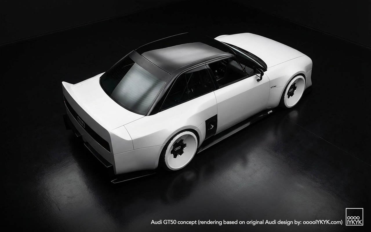
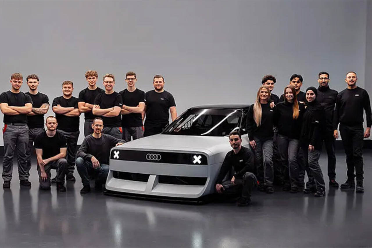
The concept car itself offers one response. Built by apprentices at Audi’s Neckarsulm training center, the GT50 wraps an unmodified RS3 powertrain in new fiberglass panels that visually lower the car (even if Audi has not detailed any suspension changes) while refusing every styling convention the parent company currently practices. The result reads less as tribute and more as provocation.
Visual Defiance: Reading the Surfaces
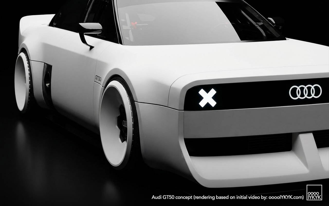
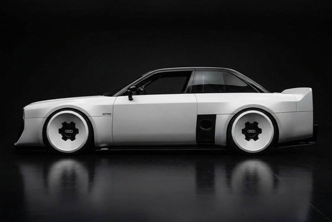
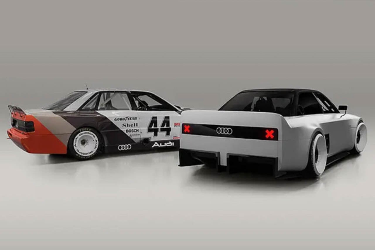
Start with what the photographs show that no press release describes. The C-pillar treatment carves a sharp notch where contemporary Audis would flow into a smooth shoulder line. Light catches the edge and dies. Below the rear glass, the decklid drops away at an angle that creates a shadow pocket, a visual trick borrowed from Group B rally cars, where abrupt surface breaks disrupted airflow less than they announced aggression.
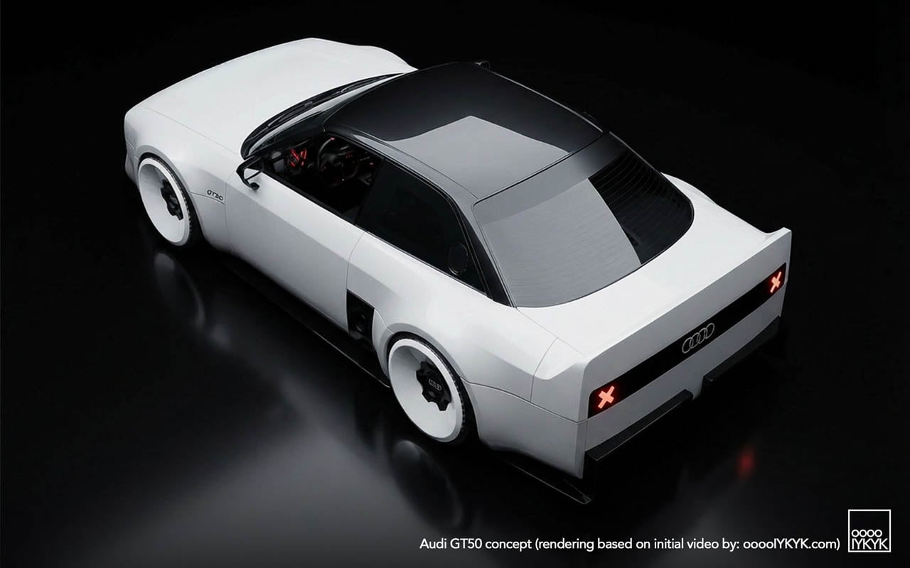
The diffuser tells another story. Where modern RS models tuck their aerodynamic elements into integrated bumper designs, the GT50 exposes a finned undertray that reads like industrial equipment. No attempt to blend. No body-color covers. The functional hardware becomes ornament by being left visible.
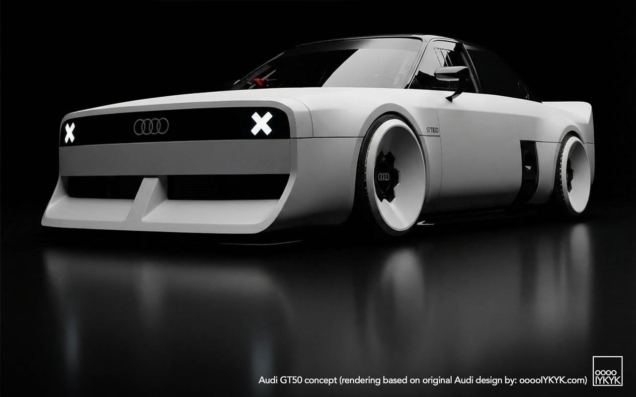
Wheel graphics interact with the body in ways that suggest deliberate coordination. The turbofan blades repeat the horizontal slat motif from the grille, creating a visual echo across the car’s length. Whether this was intentional design language or happy accident, the effect unifies the silhouette: front face and wheel face speak the same vocabulary.
Three-box geometry defines the overall proportion. Flat hood. Upright greenhouse. Hard rear edge. Each volume asserts itself rather than dissolving into the next. This is geometry as argument, a rejection of the flowing sculpture that defines the e-tron GT and its siblings.
The Engine as Artifact
The 2.5-liter turbocharged five-cylinder produces 394 horsepower. The apprentice team changed nothing about it. No additional boost. No revised mapping. No intake modifications. This restraint is the point.

Enthusiasts know the platform. Basic modifications unlock nearly 500 horsepower. The aftermarket has mapped this engine extensively. Choosing to leave it stock reframes the powertrain as something worth preserving rather than improving: a museum piece still capable of performance, displayed in running condition rather than under glass.
The configuration itself has become rare. Volvo abandoned inline-fives years ago. Ford’s brief experiment ended. Fiat moved on. Among major manufacturers, Audi alone continues production, and only in the RS3. Fifty years after the layout debuted in the 1976 Audi 100 as a packaging compromise (five cylinders fit engine bays designed for fours while delivering displacement advantages) the configuration survives as brand signature rather than engineering necessity.
Racing Ghosts: Two Distinct Legacies
The GT50’s visual references split into separate histories that share an engine family but little else.
Rally heritage came first. The original Quattro road car and its competition derivatives established the five-cylinder as Audi’s performance identifier through the early 1980s. Gravel. Snow. Tarmac stages. The configuration proved itself in conditions that punished mechanical weakness.
North American racing followed a different path. The 90 Quattro IMSA GTO and 200 Quattro Trans-Am cars ran on circuits rather than stages, competing against purpose-built machinery from manufacturers with deeper racing budgets. The blocky bodywork, the aggressive aero addenda, the turbofan wheels: these elements came from that asphalt racing context, not from rally.
The GT50 draws primarily from the second lineage. Its proportions quote the IMSA cars directly: the way the fenders box out rather than curve, the stance created by wheels pushed to the body’s corners, the rear wing that spans the full decklid width. Rally Quattros looked different. The concept acknowledges this distinction through specific formal choices rather than generic “heritage” styling.
Apprentice Programs as Design Laboratory
Neckarsulm’s training program has produced boundary-testing work before. The RS6 GTO concept eventually influenced production decisions. That project proved the pipeline exists: ideas developed under apprentice freedom can migrate into showroom reality.
Other builds have pushed further from commercial viability. An electrified A2. A 236-horsepower NSU Prinz running modern EV hardware. These projects test technical integration as much as design direction.
The GT50 fits a different category. It uses a production powertrain unchanged. The bodywork is additive rather than structural. What the project tests is audience response, whether visual commitment to mechanical heritage generates the kind of enthusiasm that justifies development investment in combustion performance when corporate strategy points elsewhere.
Manufacturing Quality as Statement
Execution matters in this context. The released photography shows panel gaps that read as production-grade. Surface alignments hold. The fiberglass work displays none of the waviness or inconsistency that marks student-built specials at other institutions.
This finish level functions as argument. The GT50 is not a sketch in three dimensions. It is a proposal that could, with different business decisions, reach production. The apprentices built something that asks to be taken seriously as a potential product direction rather than dismissed as training exercise.
The Quiet Reveal and Its Implications
No stage. No livestream. No embargo coordination. The GT50 initially surfaced through social and niche outlets rather than the press machinery Audi deploys for products it expects to sell. This distribution choice communicates uncertainty, or perhaps strategic patience.
If reception proves enthusiastic, the soft launch becomes origin story. If response flatters less, the project remains an apprentice exercise, easily distanced from official product planning. The approach hedges corporate exposure while allowing genuine audience testing.
What the GT50 asserts, regardless of its production future, is that the five-cylinder’s cultural position within Audi’s identity has not been resolved by electrification commitments. The engine configuration still generates response. The racing heritage still communicates. Whether that cultural capital translates into business justification for extended combustion development remains the open question the concept was built to help answer.
The post The GT50 Asks What Happens When Combustion Heritage Becomes a Design Argument first appeared on Yanko Design.