Ancient Egyptian architecture is deeply rooted in the divine relationship between humans the kings and their Gods. This symbolism is echoed in the tombs, pyramids, and temples of Egypt. The prevalent use of materials such as limestone, sandstone, and granite evolved from sun-baked mud bricks, with architectural designs reflecting a harmonious mix of religious, social, and political influences.
Designer: I. M. Pei
Egyptian Art Timeline
Egyptian art history is characterized by three key epochs:
Old Kingdom (circa 2,700-2,200 B.C.E.)
The Old Kingdom was characterized by political stability and economic prosperity. This period witnessed the construction of grand pyramidal tombs for Egyptian monarchs, while early Egyptians employed mastabas for marking their deceased graves.
The Middle Kingdom (2,050-1,800 B.C.E.)
This period is often regarded as the golden age which gave rise to some of its most exceptional works of art and literature.
The New Kingdom (approximately 1,550-1,100 B.C.E)
The history of Egyptian Architecture is marked as a flourishing era of architecture and art. During this period, the Pharaoh’s empire was achieved through diplomacy, trade, and warfare, securing centuries of political stability and prosperity.
Characteristics of Egyptian Architecture
• Materials: The temples and pyramids were constructed from stone, while houses were primarily made from mud brick. Most of the Egyptian structures featured flat roofs, which were supported by exterior walls and columns.
• Monumental Scale: Egyptian architecture is known for its monumental scale as in the Great Pyramid of Giza, standing over 450 feet tall.
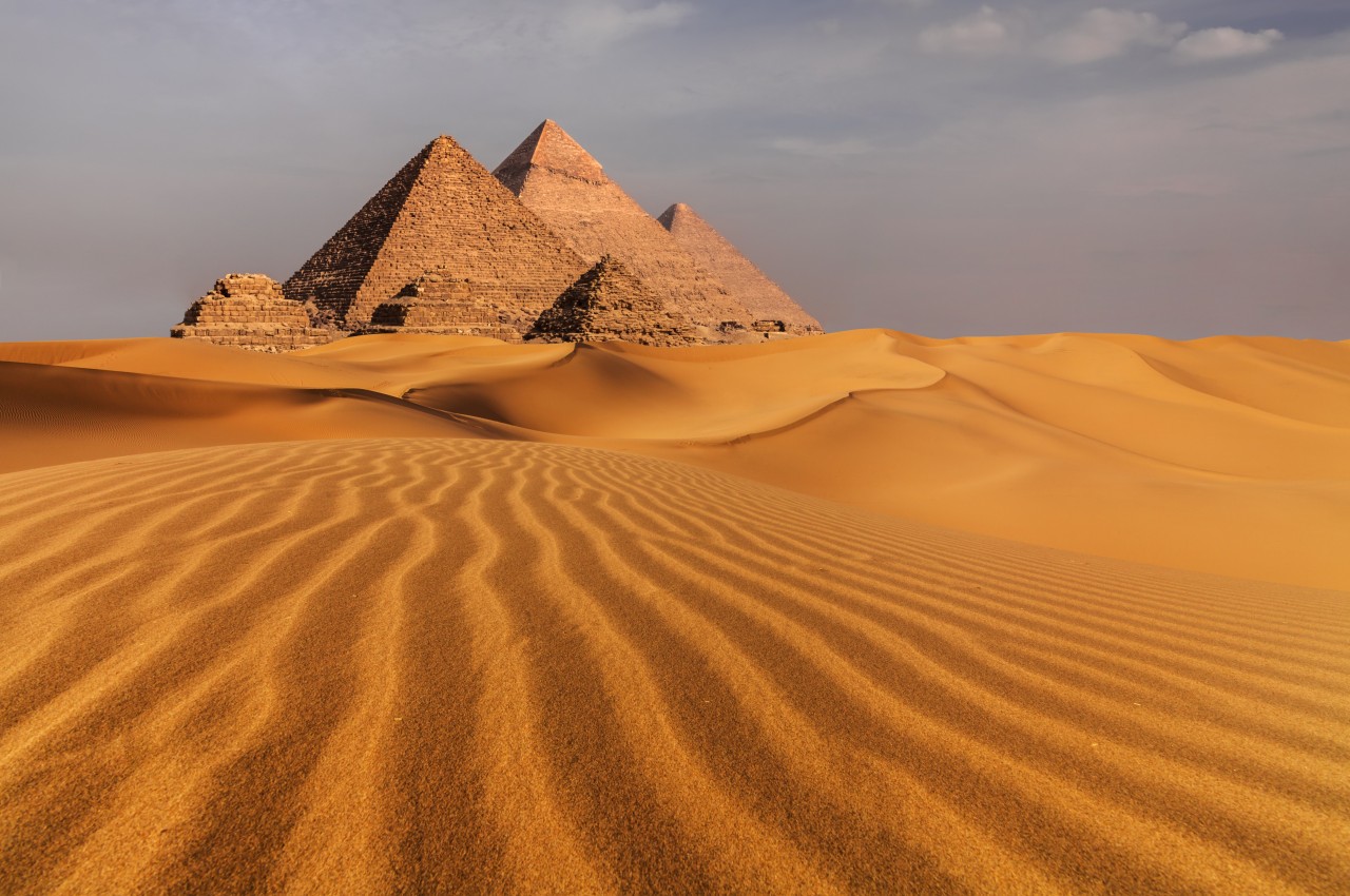
Image courtesy of: antonpetrus
• Hierarchical Planning: Hierarchical Planning in Egyptian architecture arranges spaces deliberately. Karnak Temple Complex is a testament to the planning skills as it incorporates a strategic layout, leading to the grand Hypostyle Hall, emphasizing its religious importance.
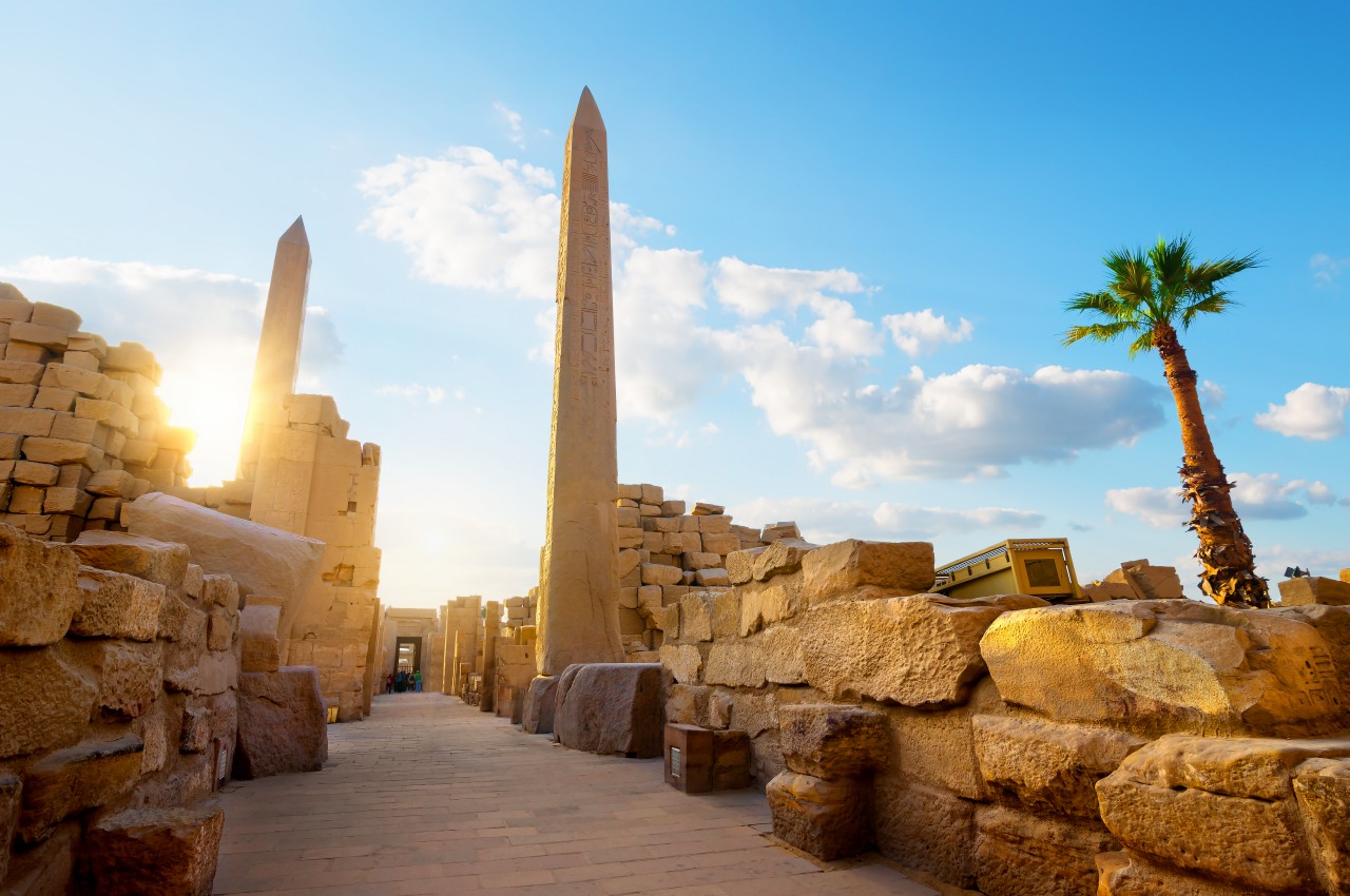
Image courtesy of: Givaga
• Symbolic Decoration: Symbolism forms an integral part of Egyptian architecture. Deir el-Bahari’s Temple of Hatshepsut is beautified with intricately carved reliefs and sculptures that narrate her divine birth, reign, and religious significance.
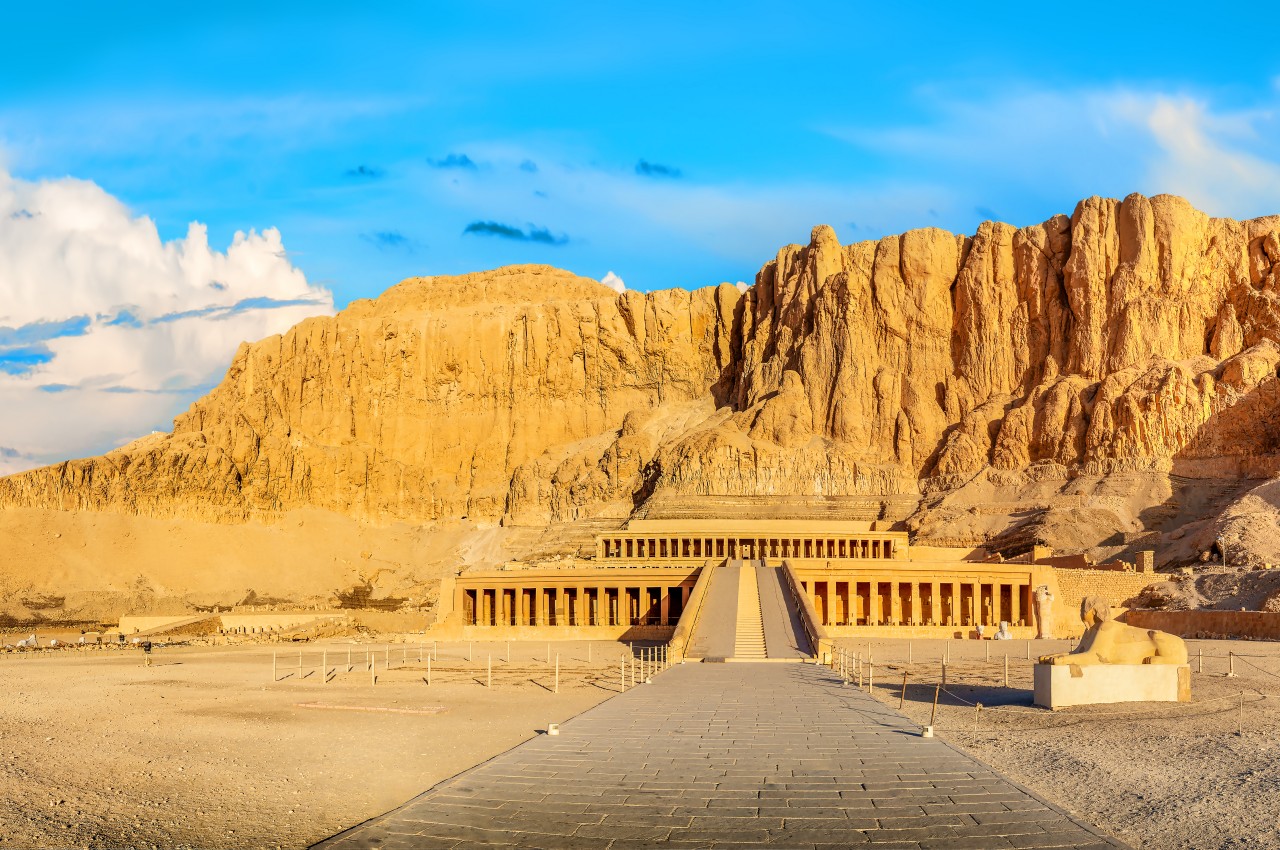
Image courtesy of: Givaga
• Hieroglyphs: Hieroglyphs are formal inscriptions on papyrus and wood. They encompass logographic, syllabic, and alphabetic elements, portraying real or abstract concepts, and holding religious significance.
Image courtesy of: animix
• Pylon Gateways: Pylon gates of the Temple of Horus at Edfu, feature immense, sloping structures marking the transition from the secular to the sacred world and it is adorned with intricate artwork.
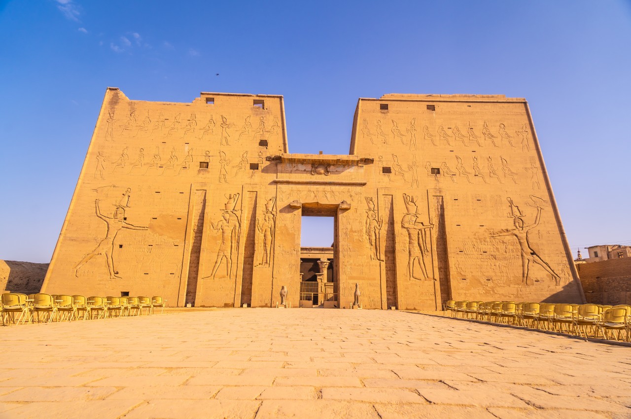
Image courtesy of: wirestock
• Mortuary Temples: Mortuary temples are dedicated to pharaohs like Ramesses II. They were places of worship, featuring colossal statues and detailed reliefs, aimed at preserving the pharaoh’s legacy and ensuring divine favor.
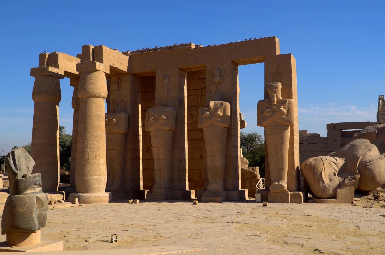
Image courtesy of: Merlinus74
• Hypostyle Halls: In Egyptian architecture, Hypostyle halls are expansive spaces featuring numerous colossal columns, as seen in the Temple of Luxor’s magnificent hall with 74 intricately adorned columns.
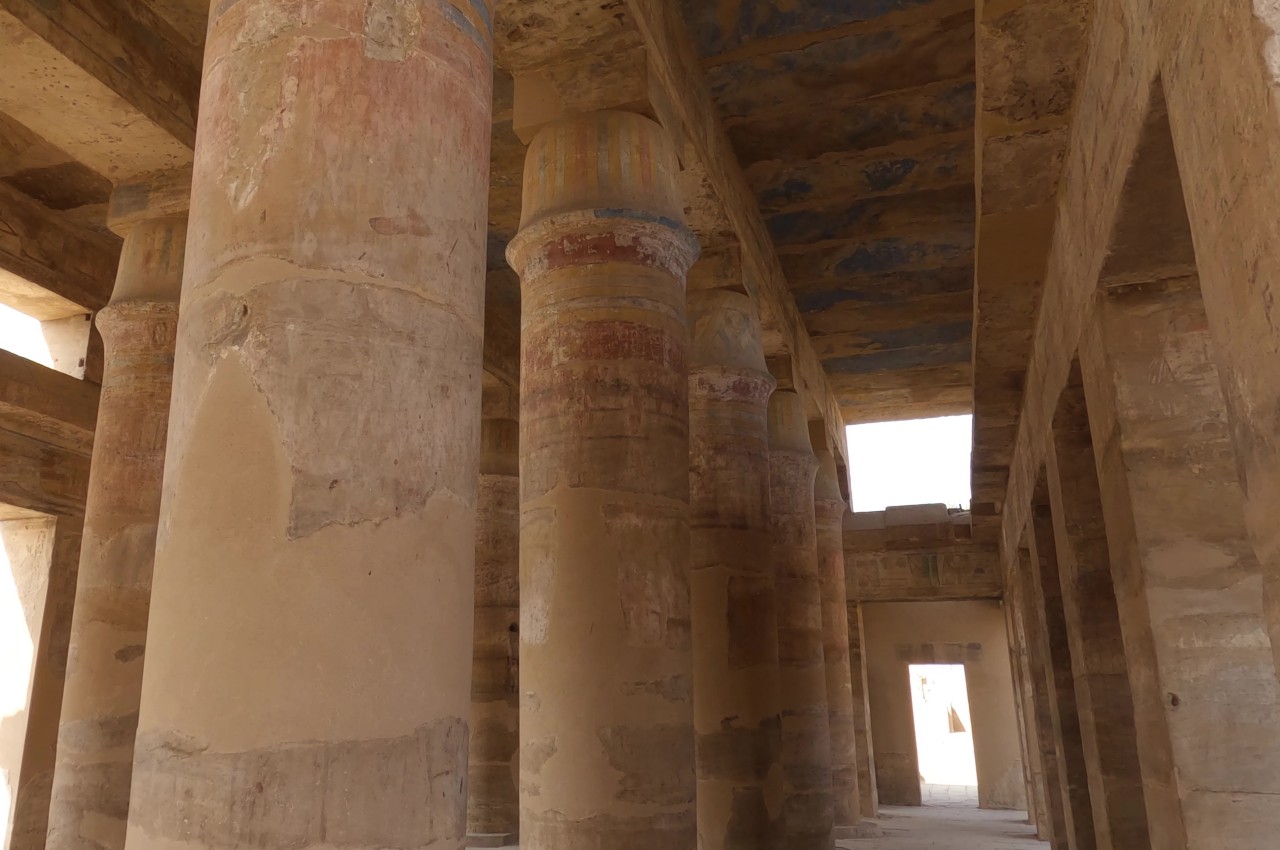
Image courtesy of: BlackBoxGuild
• Carved stone images: Architects utilized indigenous stones like soft limestone, sandstone, calcite, and schist to craft sculptures of deities, monarchs, and royalty. These sculptures conveyed tales of victories, battles, foreign conquests, and pharaohs’ lives.
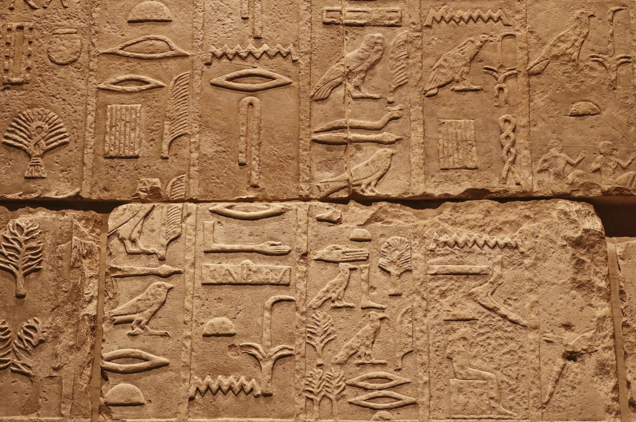
Image courtesy of: BreakingTheWalls
• Mastabas: A hallmark of Egyptian architecture, mastabas, served as burial tombs along the Nile’s banks. Inspired by pyramid construction, these brick and stone structures entombed kings and their families. The structure featured rectangular shapes, sloping walls, and interiors with statues, vaults, and chambers.
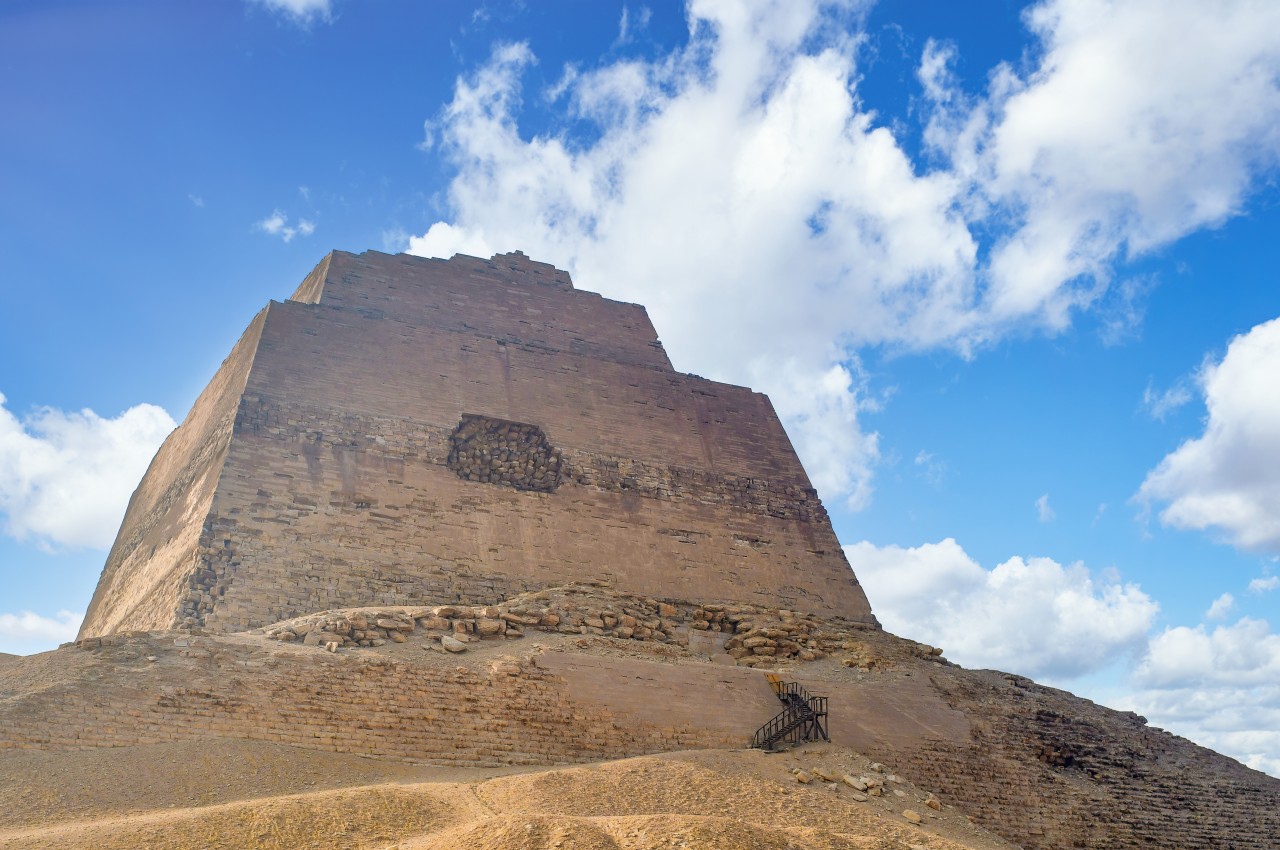
Image courtesy of: wirestock
• Clerestory Windows: Clerestory windows were positioned on high walls as they channel natural light into sanctuaries. This divine illumination enhances spiritual experiences, harmonizing with architecture.
• Obelisks: Obelisks are iconic in Egyptian architecture due to their towering, slender structures topped with pyramids, exemplified by the Luxor Obelisk, formerly located at Luxor Temple.
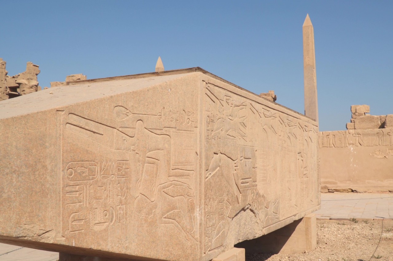
Image courtesy of: filin72
Top Ten Egyptian Structures
Many remarkable ancient Egyptian marvels have withstood the test of time and dedicated archaeologists have unveiled the stories hidden within these grand temples, statues, tombs, and the pharaohs responsible for them. Below, explore ten of Egypt’s most extraordinary ancient monuments.
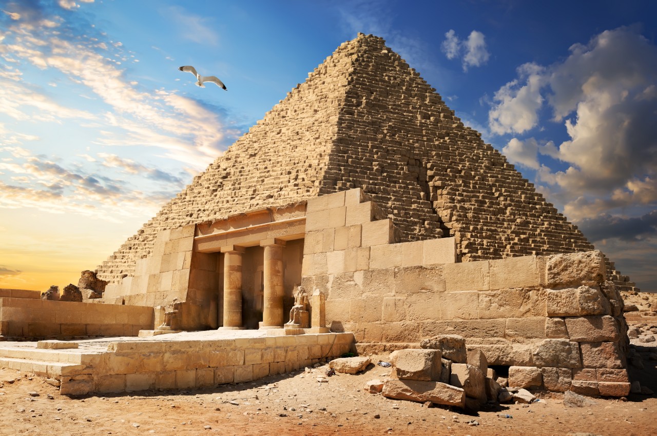
1. Great Pyramids of Giza
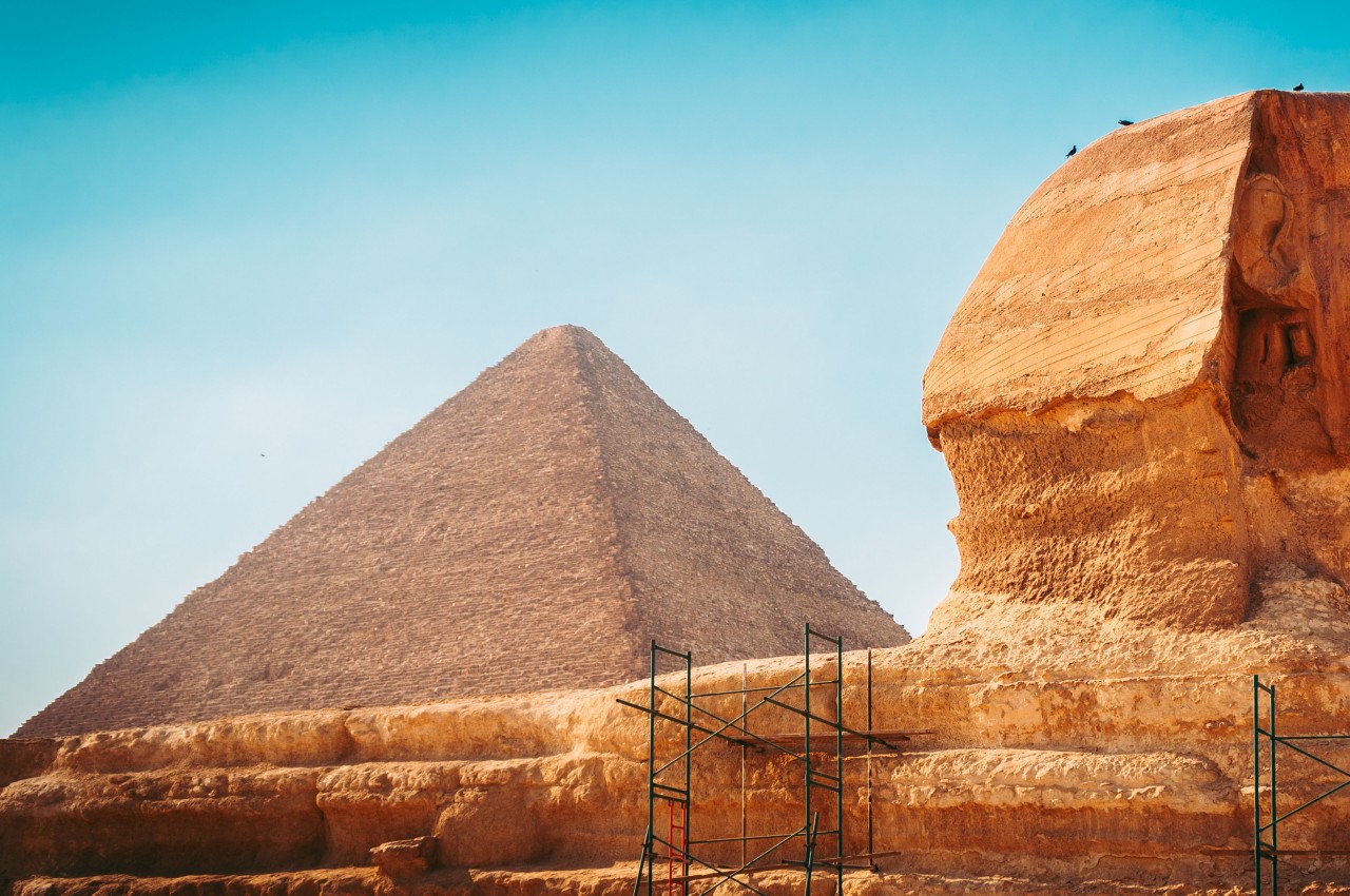
Image courtesy of: wirestock
The Great Pyramid, part of the Giza necropolis in Cairo, was built by Khufu during Ancient Egypt’s 4th Dynasty. Standing at 139 meters and employing 100,000 craftsmen, it’s the last of the Seven Wonders of the World. Khufu’s son, Khafre, built the second, slightly shorter pyramid, while Menkaure constructed the smallest.
2. Abu Simbel
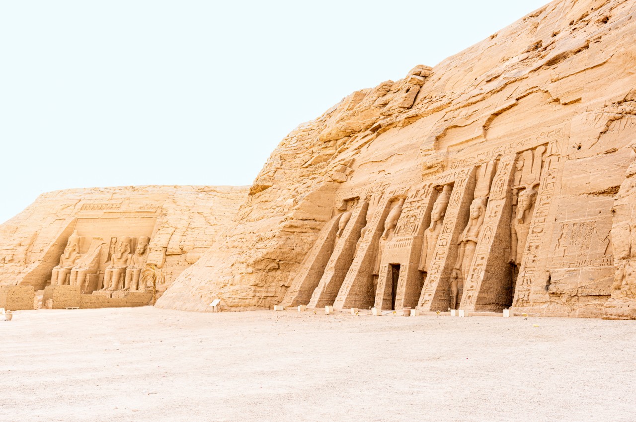
Image courtesy of: ivanmorenosl
During the 19th Dynasty, Ramesses the Great carved the imposing Abu Simbel temple into solid rock to assert his divinity in Nubian territory. The Great Temple’s entrance is guarded by four colossal 20-meter statues of Ramesses II, with hieroglyphs inside depicting his feats and interactions with gods. The Small Temple, dedicated to the sky goddess Hathor, features statues of Ramesses II’s wife, Queen Nefertari, standing 10 meters tall.
3. The Great Sphinx, Giza
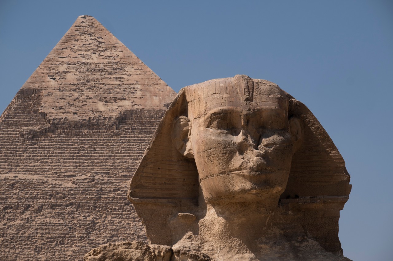
Image courtesy of: wirestock
The Great Sphinx, near Khafre’s pyramid complex, is a unique monument crafted in the 4th Dynasty of Ancient Egypt. Khafre added his face to a lion’s body. The nose, often attributed to Napoleon’s soldiers, was likely removed by 14th-century Muslim groups to discourage offerings from local farmers, dispelling earlier myths.
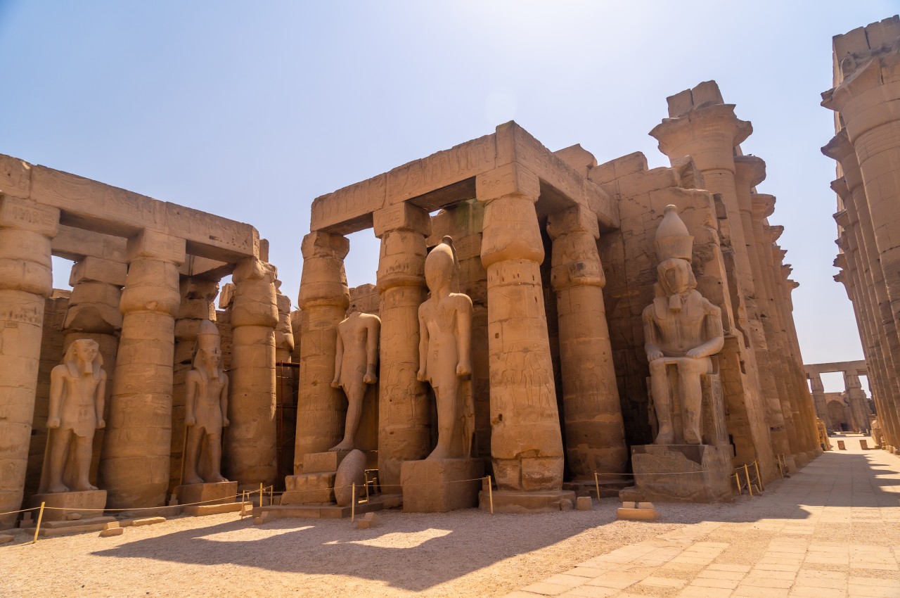
4. Luxor Temple

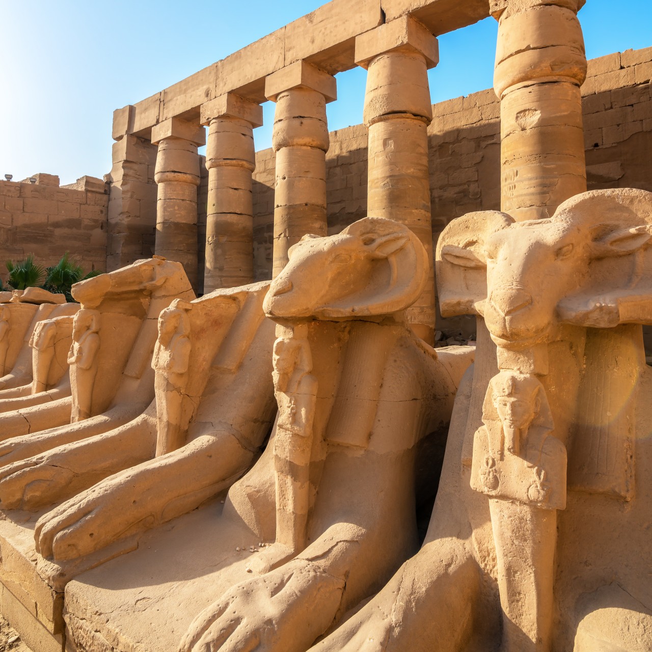
Image courtesy of: Givaga
Luxor Temple served as a site for New Kingdom pharaohs to rejuvenate their kingship before the gods. Amenhotep III and Ramesses II erected monuments to celebrate the Opet festival, during which gods like Amun, Maat, and Khons journeyed from Karnak to Luxor for a 24-day celebration. Notable structures include the Colonnade of Amenhotep III, the Great Court of Ramesses II, the First Pylon, and the Standing Statue of Ramesses II.
5. The Mortuary Temple of Hatshepsut
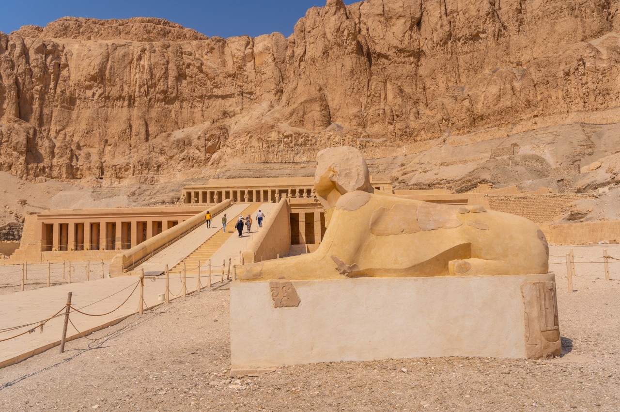
Image courtesy of: Unai82
Built during Egypt’s 18th Dynasty, the Mortuary Temple of Hatshepsut is near the Valley of the Kings, beneath Deir el Bahari’s cliff. Architect Senenmut designed it, dedicated to the god Amun. Hatshepsut, a unique female Pharaoh, ruled for nearly two decades and is considered history’s first “great lady.” She accidentally poisoned herself while treating a hereditary skin condition.
6. Karnak Temple
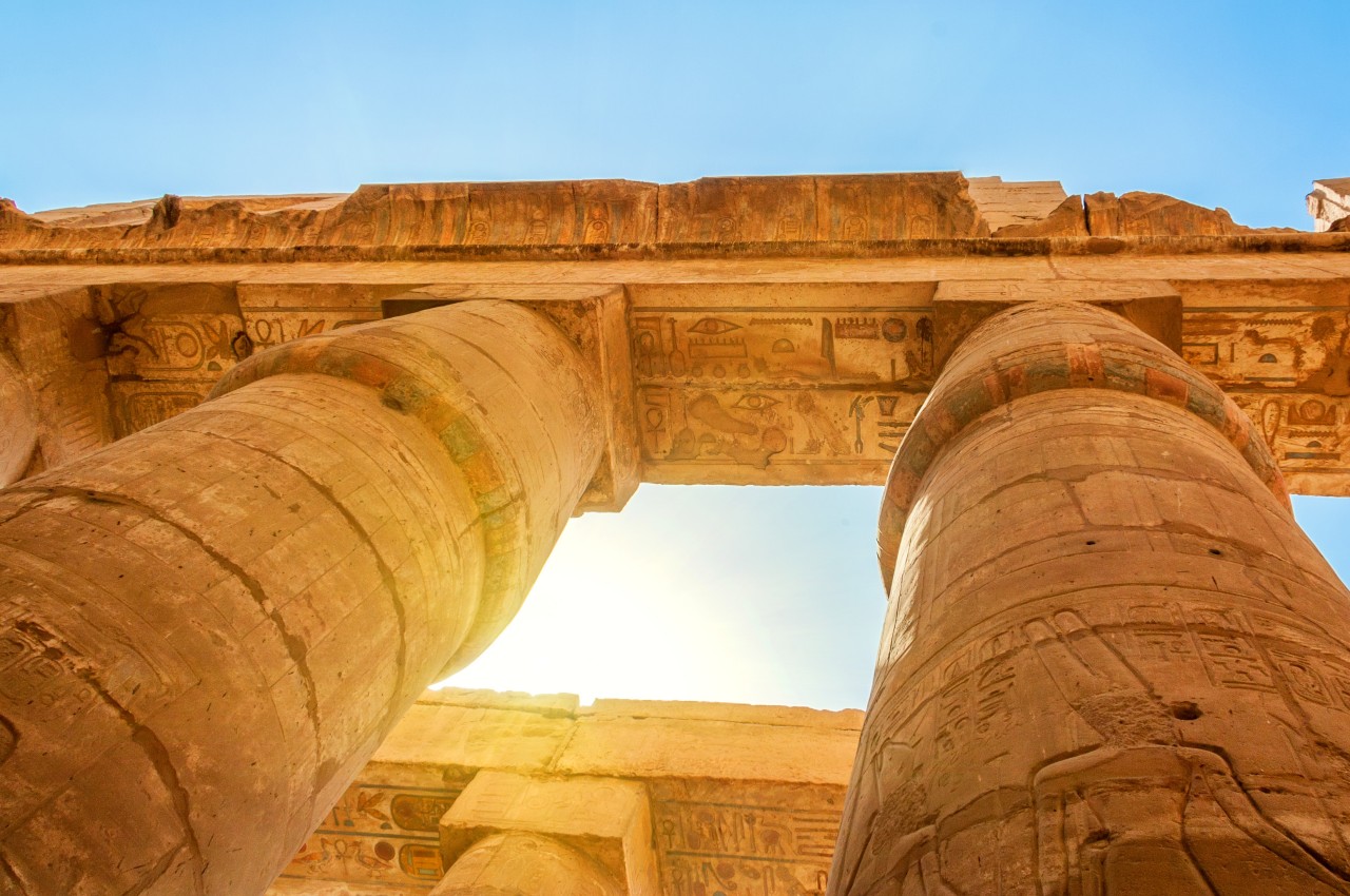
Image courtesy of: Yakov_Oskanov
Karnak, a revered site in Egypt, was dedicated to Amun-Ra’s worship. This complex, central for Thebes’ festivals, evolved over 2,000 years. Akhenaten’s temple to Aten was demolished by Horemheb and Ramesses II. Prominent monuments include the Hypostyle Hall, Thutmose I’s Obelisk, Hatshepsut’s Obelisk, Horemheb’s Great Edict, and the Avenue of Sphinxes.
7. The Valley of The Kings
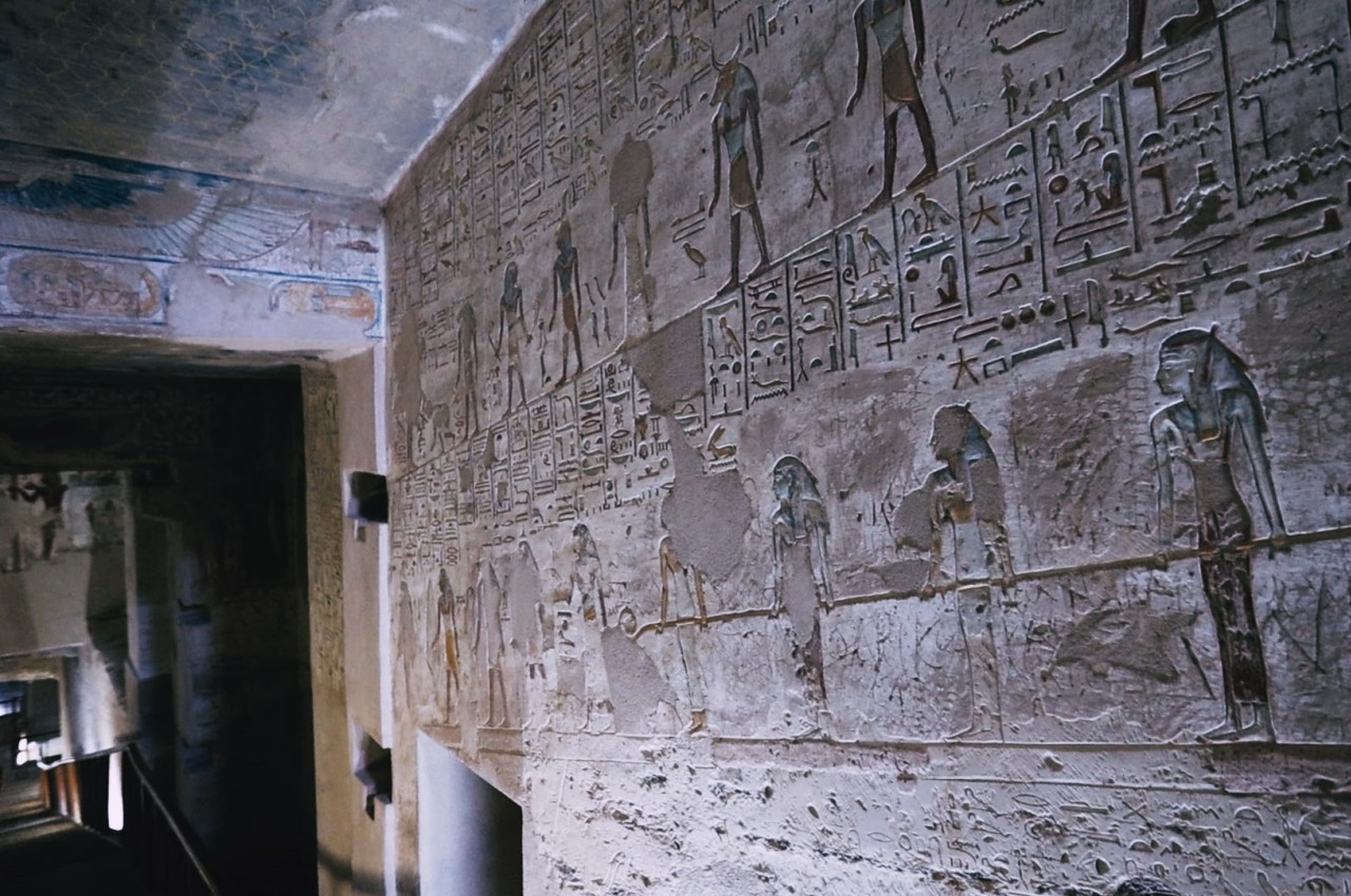
Image courtesy of: DavePrimov
The Valley of the Kings, located on the west bank of the Nile near Luxor, served as the New Kingdom pharaohs’ burial ground. It contains various tombs, ranging from single coffins to elaborate underground family tombs for the afterlife. The most renowned is King Tutankhamun’s, discovered by Howard Carter in 1922. Attempts to erase Tutankhamun from history by later pharaohs protected his tomb from disturbance for nearly 3,500 years.
8. The Bent Pyramid and Red Pyramid of Sneferu
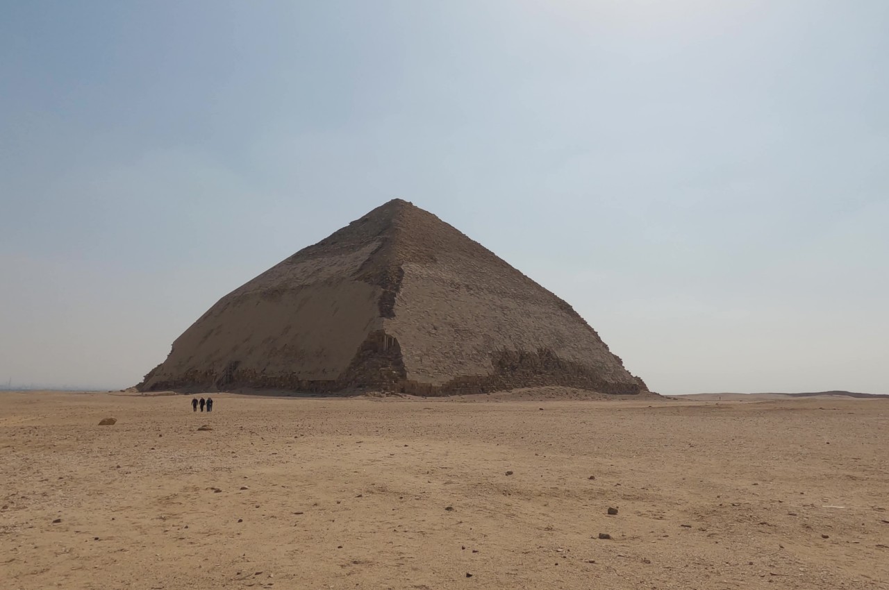
Image courtesy of: BlackBoxGuild
Sneferu, the inaugural pharaoh of Egypt’s 4th Dynasty and Khufu’s father, reigned for around 50 years. He constructed three pyramids, including the Bent Pyramid, named due to mid-construction angle adjustments. The Red Pyramid, known for its reddish color due to limestone oxidation, once had a white limestone casing stolen by robbers due to its flat sides, leaving the red core visible.
9. The Colossi of Memnon

Image courtesy of: Givaga
The Colossi of Memnon, two 20-meter-tall statues of Amenhotep III, are now part of the Theban Necropolis in Luxor. Originally part of his mortuary temple, they are massive stone structures stacked without mortar. The statues were restored multiple times, even by Roman Emperor Septimius Severus, but face recent deterioration due to pollution and wear. Efforts are underway to prevent further damage and collapse. “Memnon” is the Greek name given in honor of their hero from the Trojan War.
10. Temple of Edfu
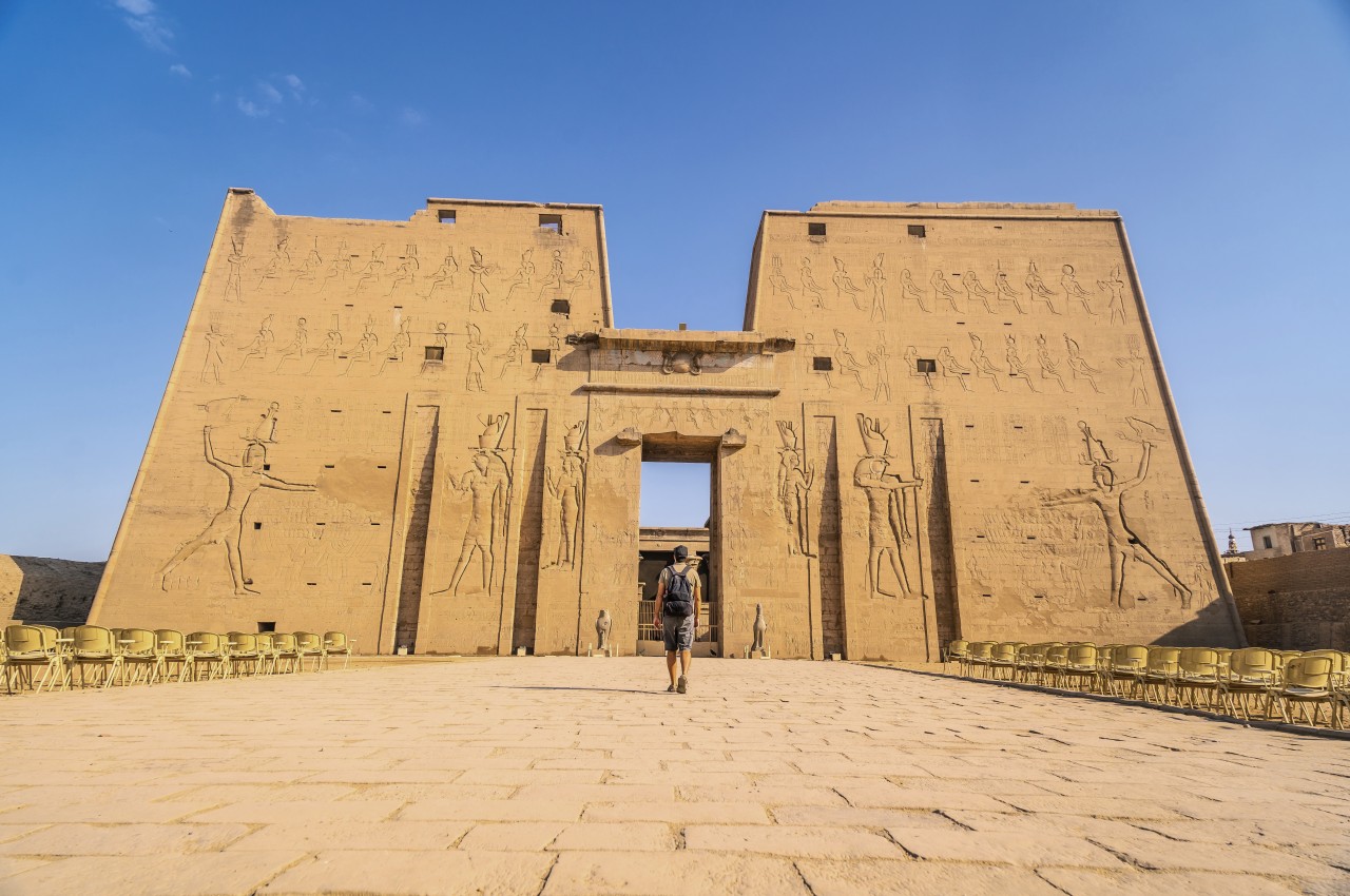
Image courtesy of: Unai82
Constructed in the Ptolemaic Kingdom, the Temple of Edfu is a tribute to Horus and Hathor. With the ascendance of Christianity in the 4th century, the temple lost its religious significance, suffering arson and vandalism. Villagers later built over and nearly buried the site. Today, Edfu attracts tourists on Nile riverboats, offering a glimpse into Egypt’s history.
The post Unveiling Egypt’s Architectural Wonders: A Journey Through Time first appeared on Yanko Design.