PROS:
- Handy 107GB internal storage
- Excellent low-light performance
- Bright screen and creator-friendly controls
CONS:
- Portrait mode tops out at 3K
- Low-light mode for video is 1x zoom only
- No formal water and dust resistance rating
RATINGS:
SUSTAINABILITY / REPAIRABILITY
EDITOR'S QUOTE:
The DJI Osmo Pocket 4 doesn't ask you to compromise between portability and quality. It just delivers both.
The gap between smartphone convenience and dedicated camera quality has never been more complicated to navigate. Smartphones shoot impressive footage, but the moment you start walking, panning, or filming yourself without a stabilizer, the limitations show. Shaky handheld video, compromised low-light performance, and the inconvenience of carrying a larger camera rig have pushed creators to look for a smarter middle ground.
The DJI Osmo Pocket 4 is designed to solve that exact problem. Building on a line of compact gimbal cameras that have quietly become a go-to tool for vloggers and travel creators alike, the fourth generation pushes the formula further with an improved sensor, smarter tracking, and a handful of practical upgrades that address the friction points that have always come with shooting on the go.
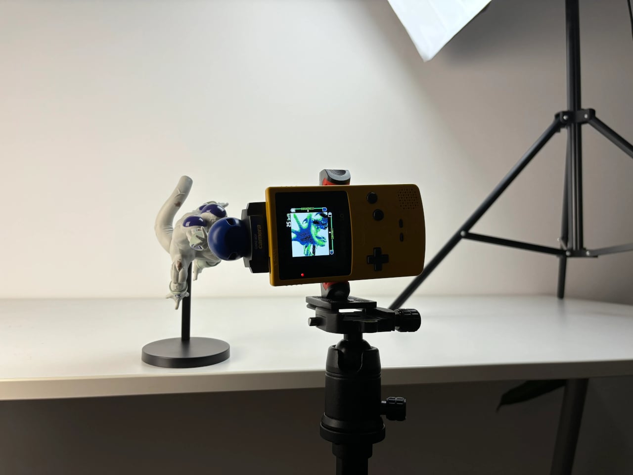
Designer: DJI
Aesthetics
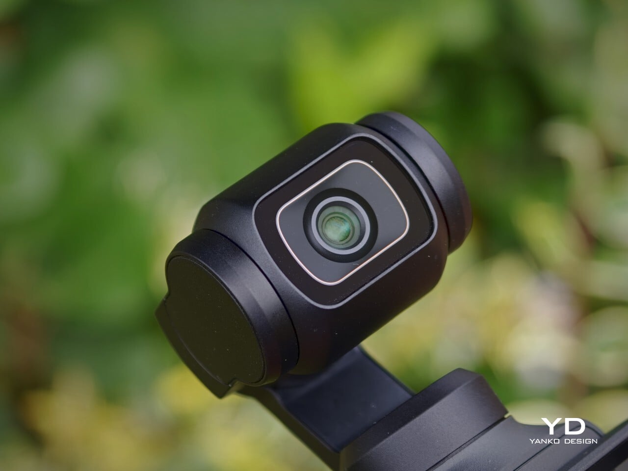
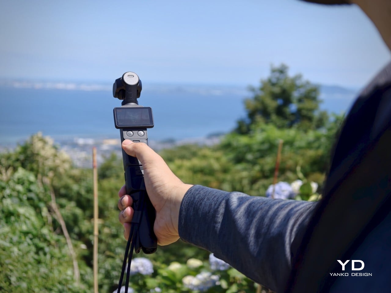
The Osmo Pocket 4 doesn’t try to look exciting. Its silhouette is tall and narrow, with a small three-axis gimbal head sitting at the top. It’s a restrained design that communicates precision rather than personality, and that’s part of the appeal. The matte black finish and clean lines make it look purposeful without being flashy, which is exactly the visual confidence that good industrial design earns.
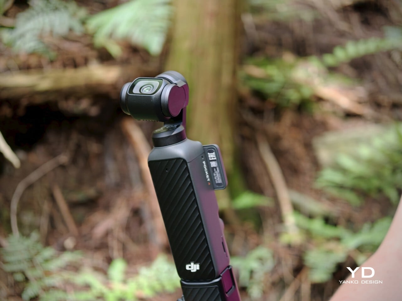
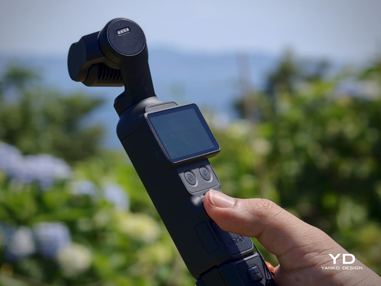
What makes it visually distinctive is the tension between the utilitarian body and the delicate gimbal mechanism at the top. The rotating touchscreen adds a layer of mechanical thoughtfulness to the otherwise straightforward form. Up close, the camera looks precise and well-assembled, with tight tolerances and a consistent finish across its surfaces. It’s the kind of object that rewards a closer look.
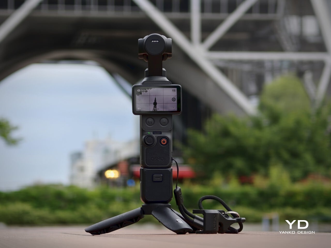
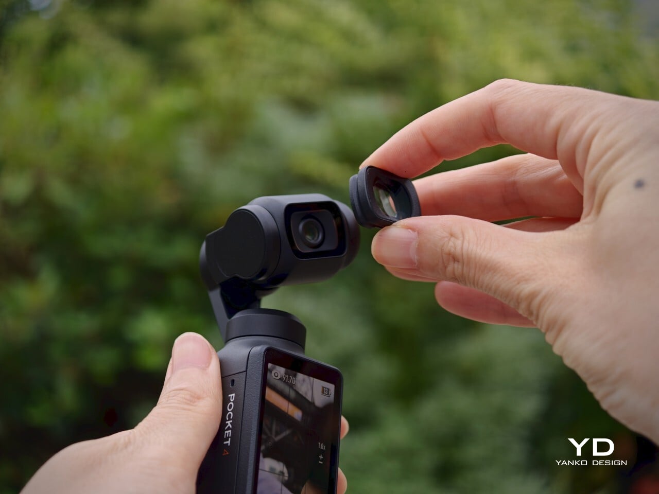
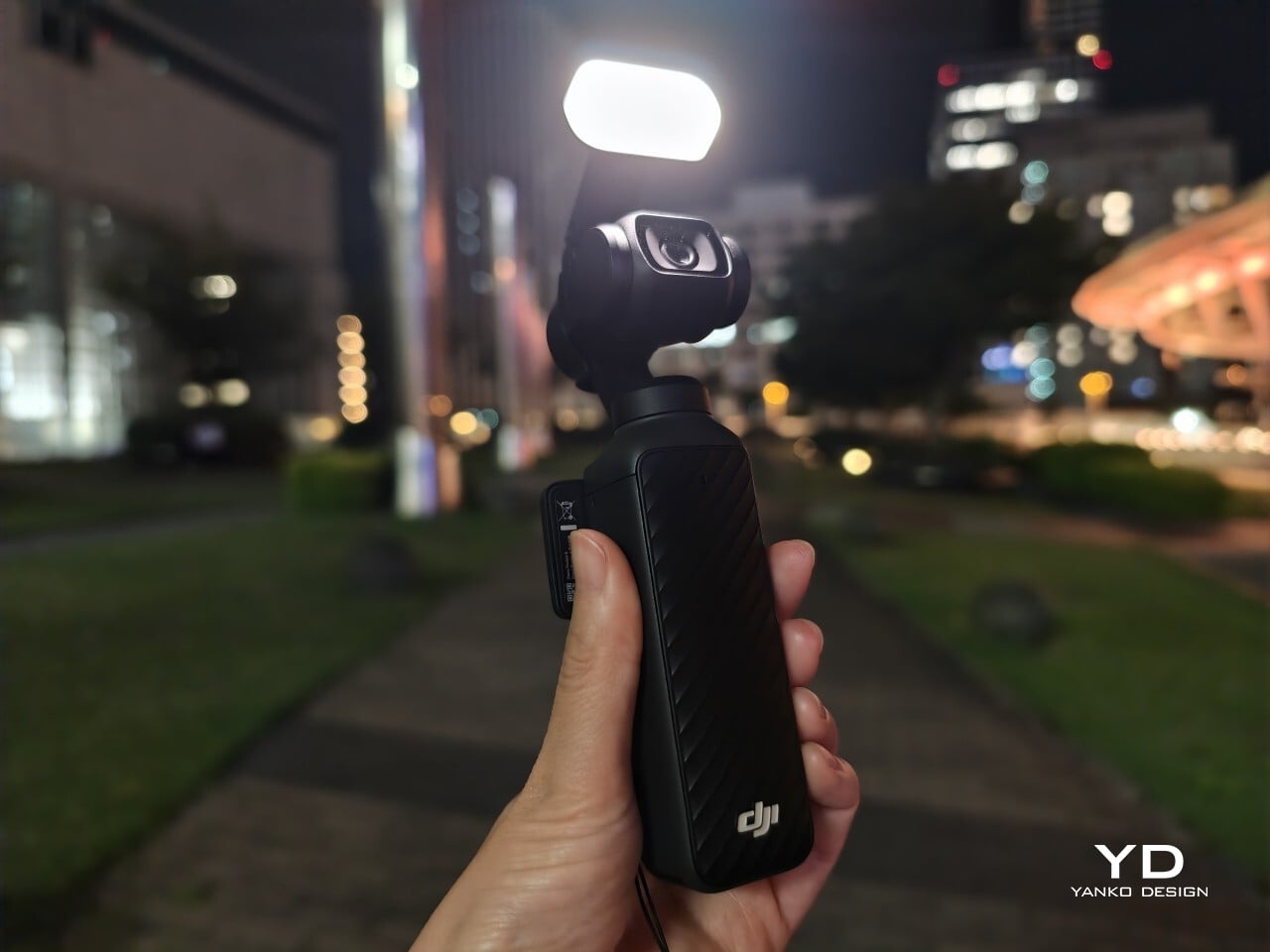
The Creator Combo accessories, including the magnetic fill light and the wide-angle lens, add functional range without dramatically changing the camera’s character. They fit onto the device with minimal fuss and are compact enough to carry without much extra bulk. The wide-angle lens introduces some edge distortion, a minor tradeoff, and it needs to be removed before powering the camera down, making it a small but notable habit to build.
Ergonomics
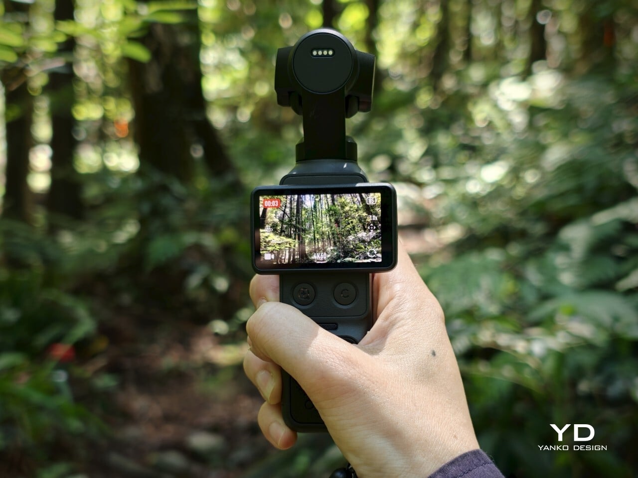
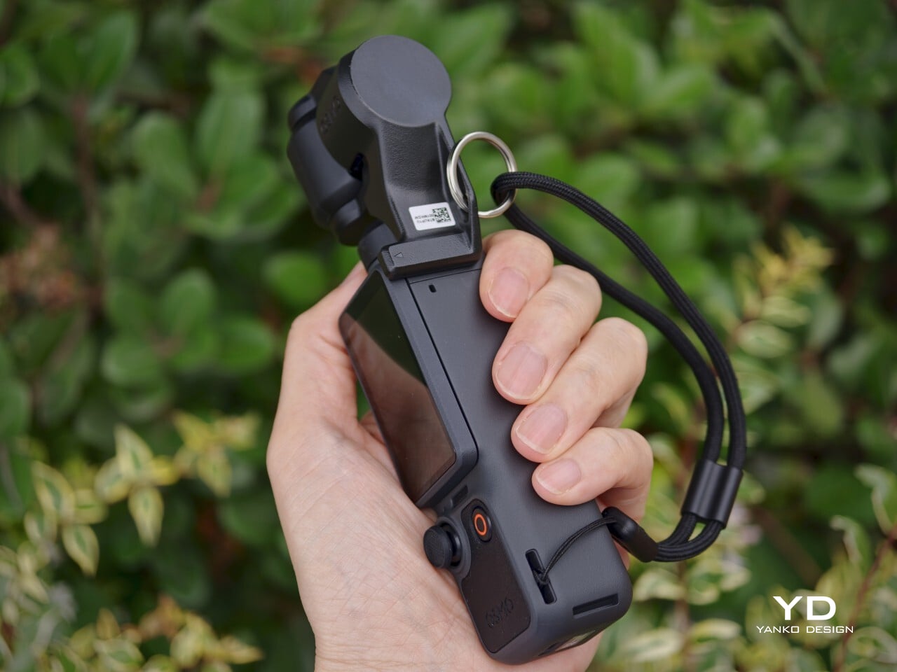
At 190.5g and measuring 144.2mm x 44.4mm x 33.5mm, the Osmo Pocket 4 genuinely fits in a pocket. That sounds like a marketing line, but it’s one of the more meaningful things you can say about a dedicated camera. It’s light enough to forget you have it and small enough that pulling it out feels no more dramatic than reaching for your phone, which is completely the point.
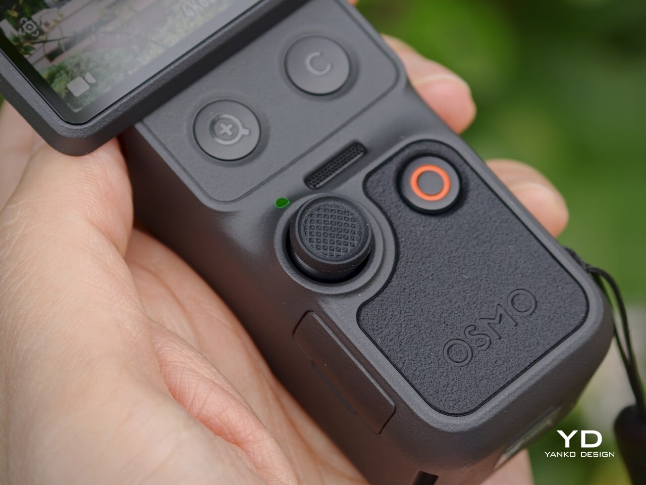
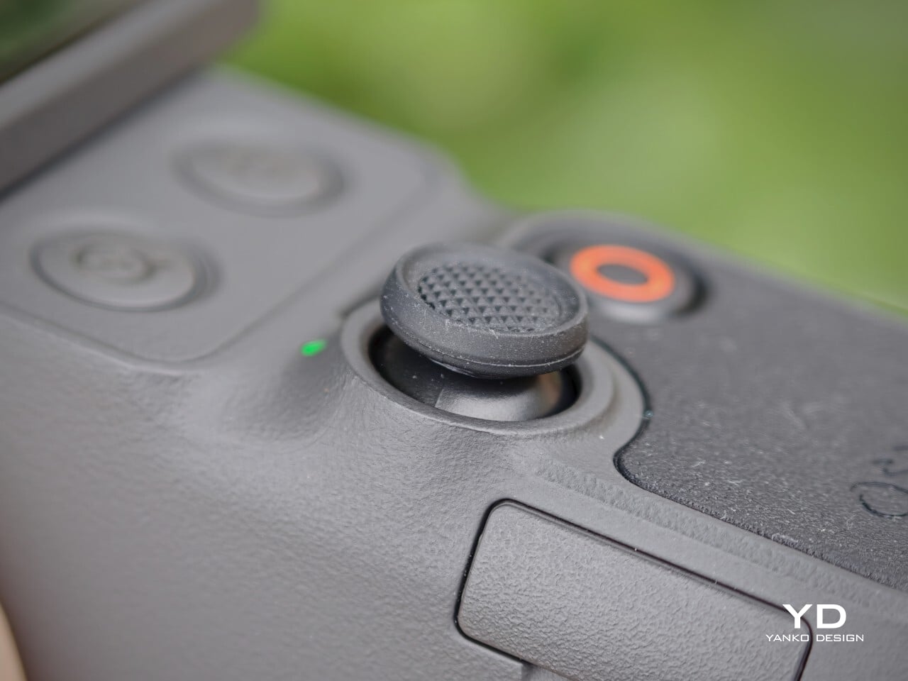
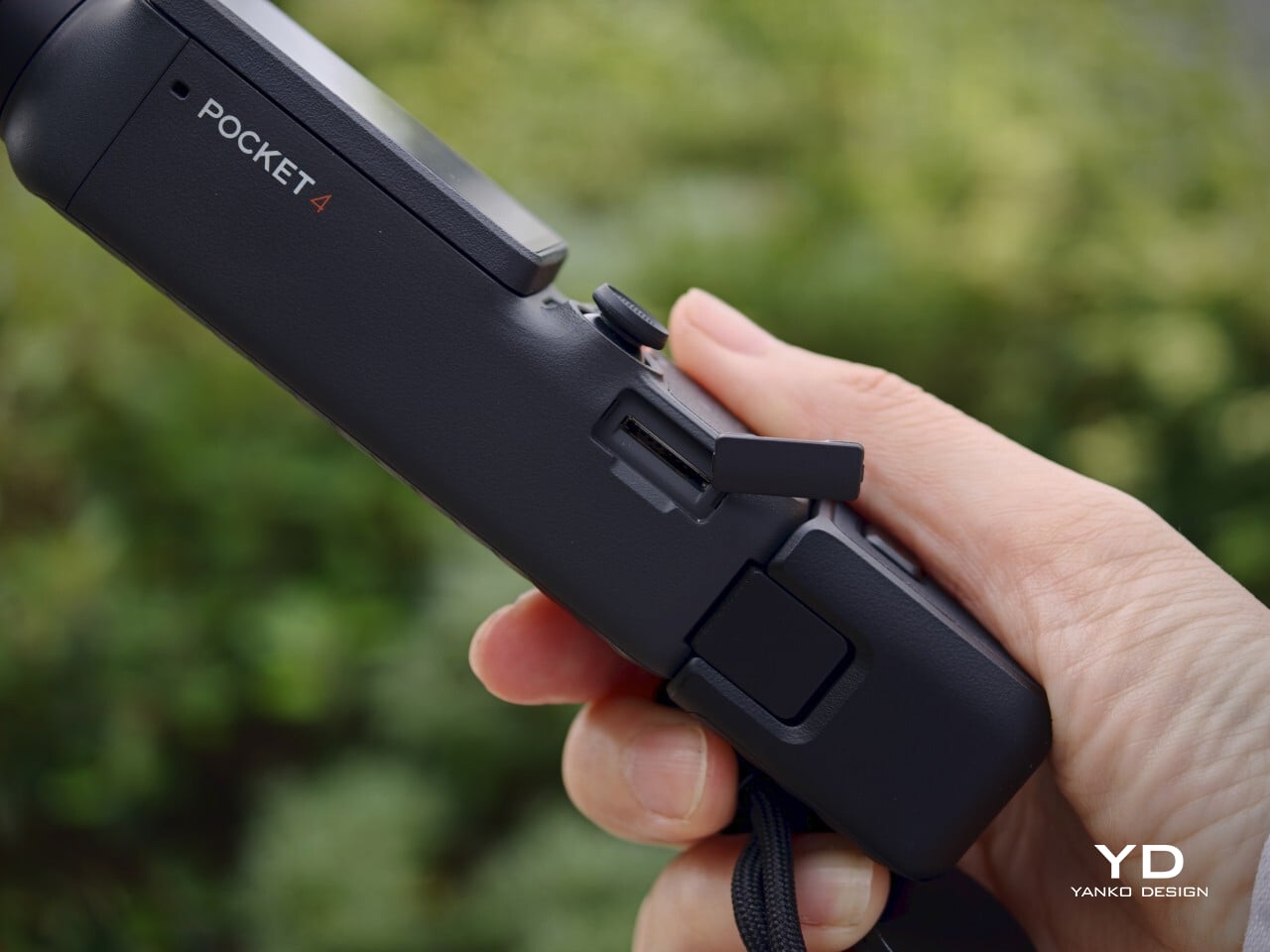
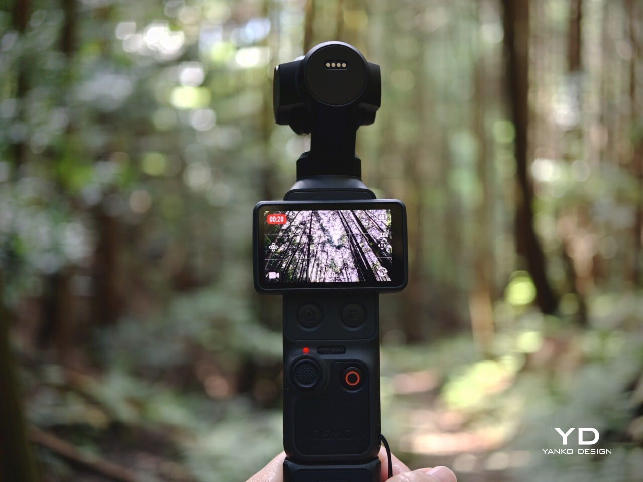
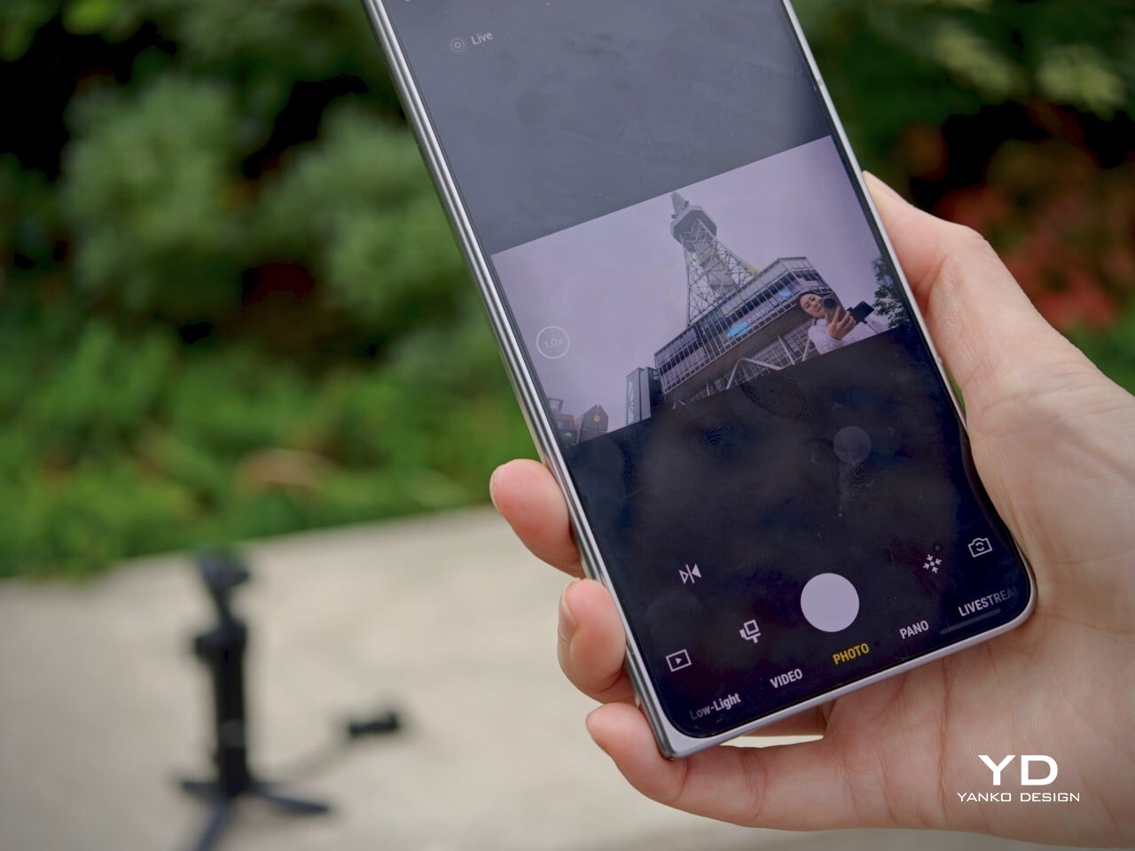
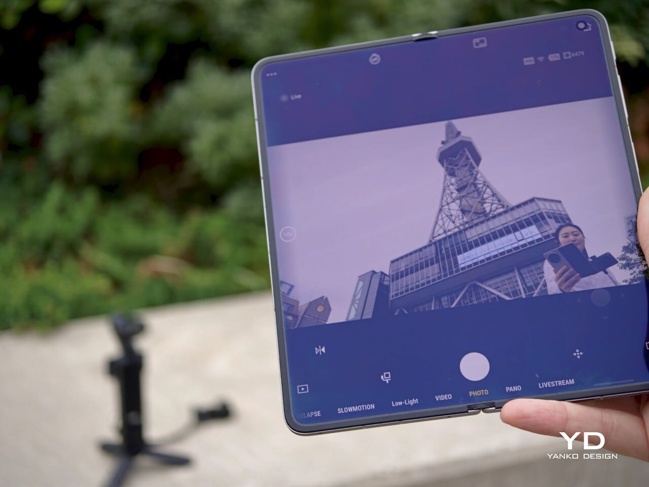
Operating the Osmo Pocket 4 is intuitive. Rotating the screen starts recording automatically, a shortcut that makes spontaneous moments actually capturable. Two new buttons below the screen handle zoom and custom presets, while the 5D joystick lets you reposition the gimbal or flip the camera orientation without going into menus. The controls feel deliberate rather than crowded, and that discipline counts in a device this compact.
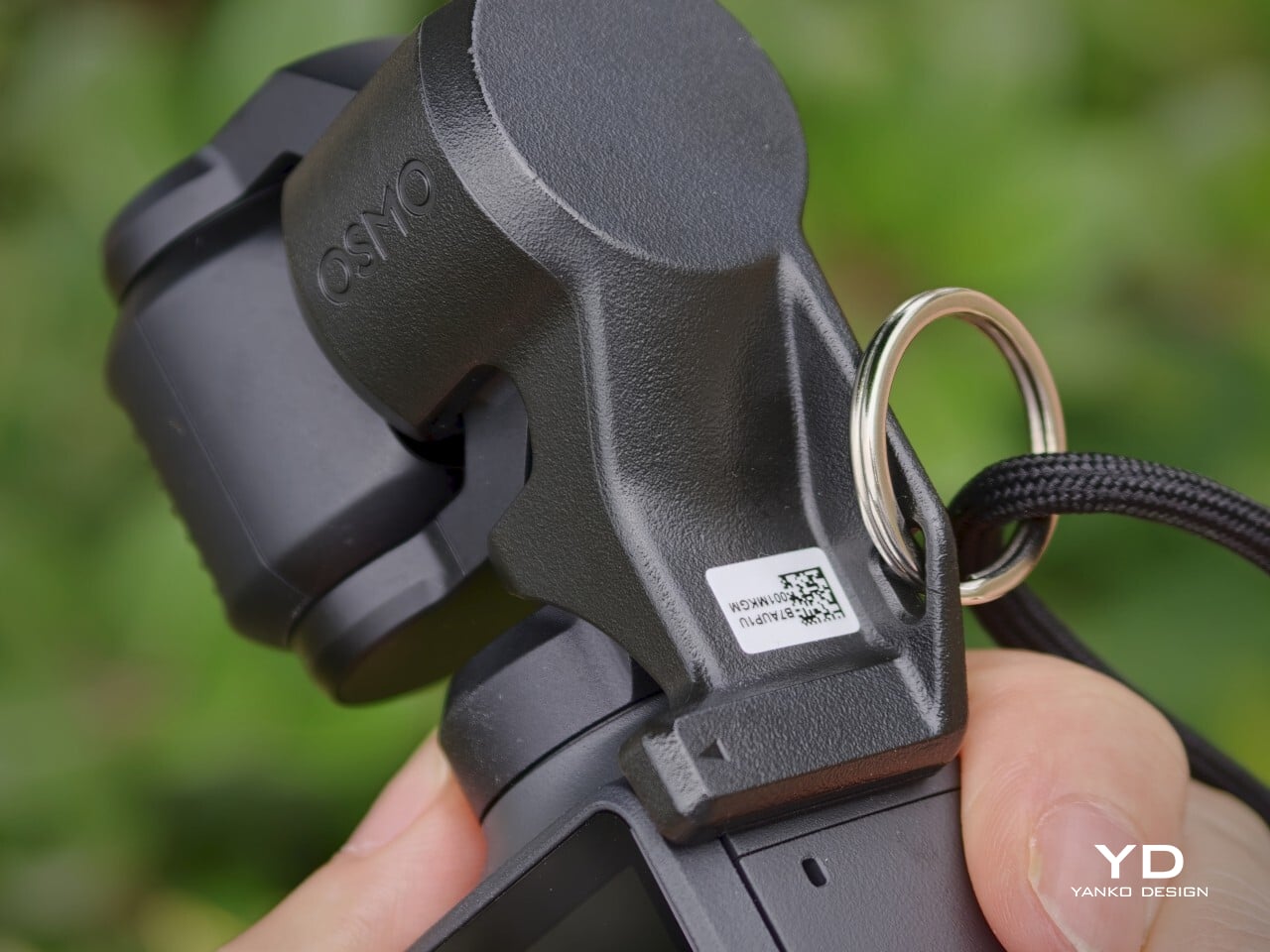
The 2.0-inch touchscreen is bright at 1000 nits, visible enough for outdoor framing, though it could benefit from an anti-reflective surface under harsh direct sunlight. The gimbal clamp that protects the camera head during storage is usefully low-profile, but it’s also easy to misplace precisely because of that. A lanyard attachment helps solve that problem and keeps the clamp reliably on hand whenever the camera needs to be put away.
Performance
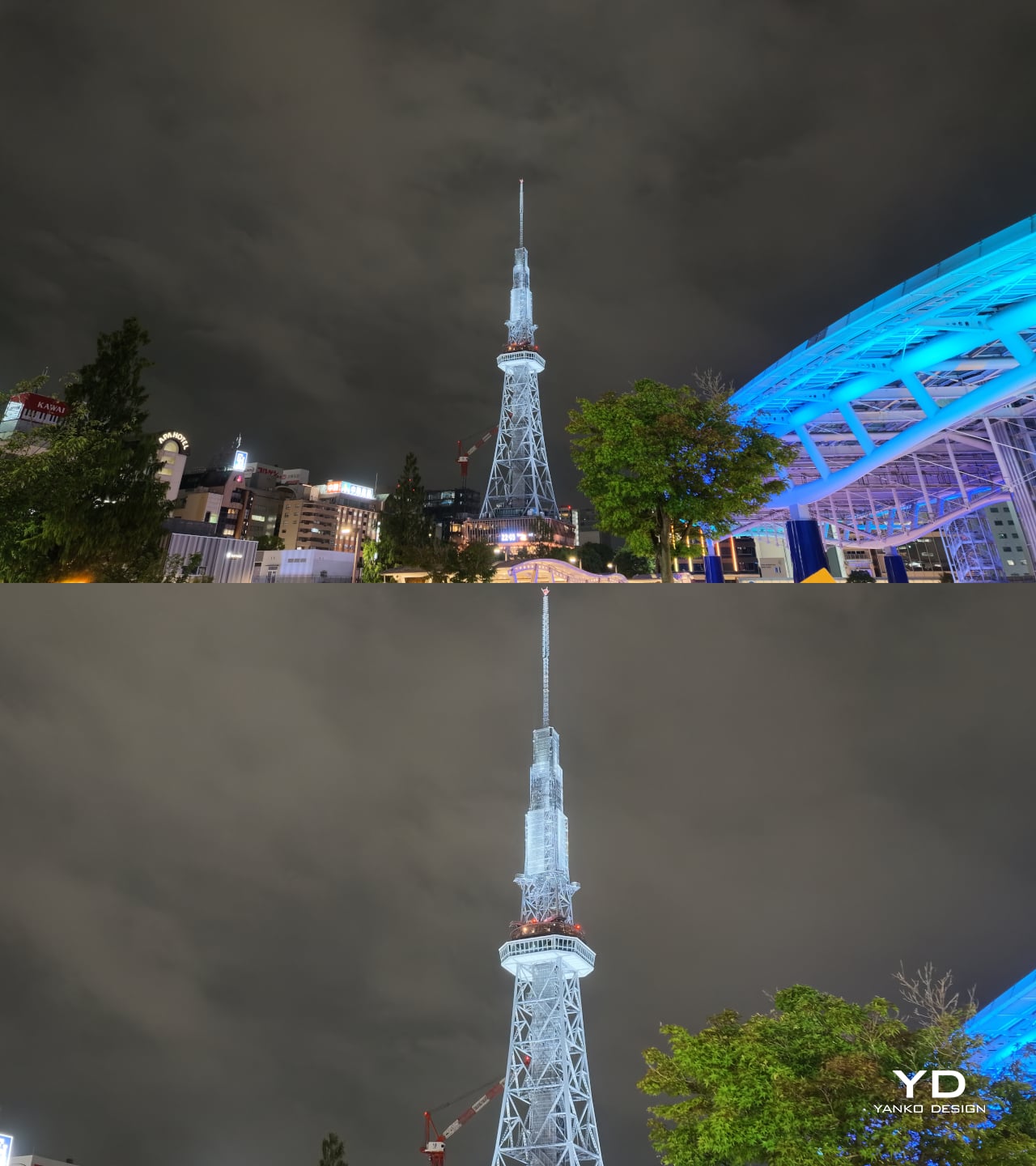
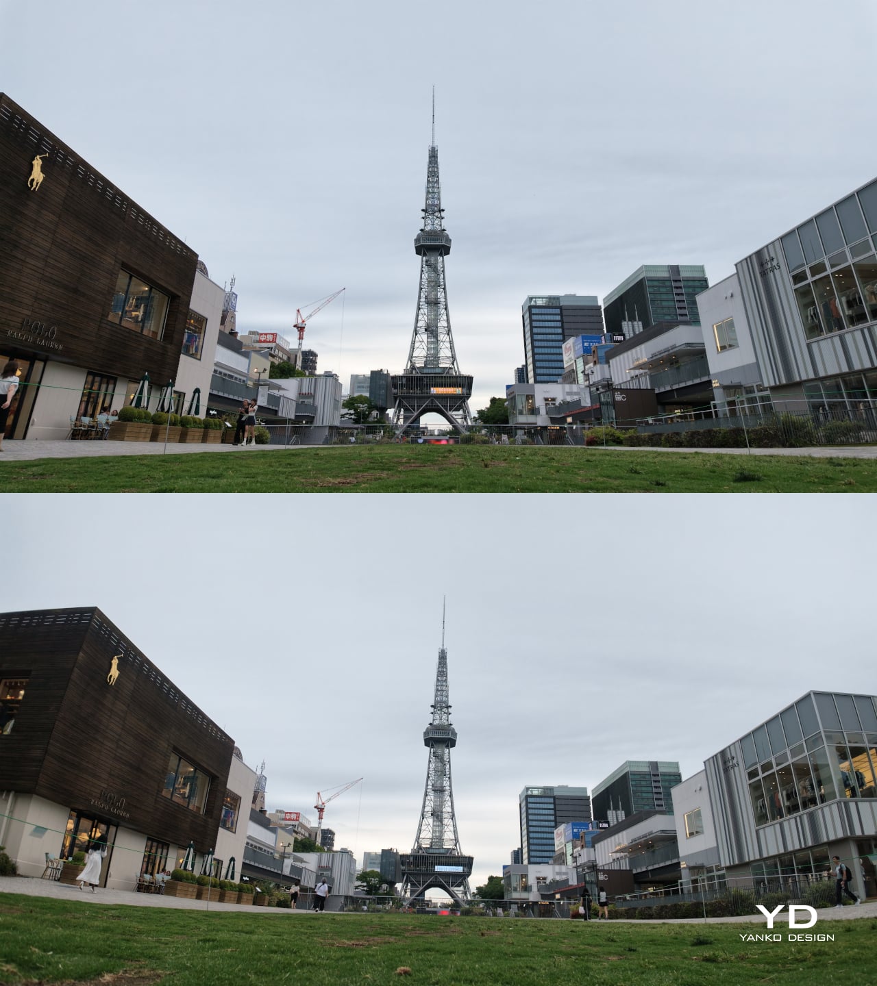
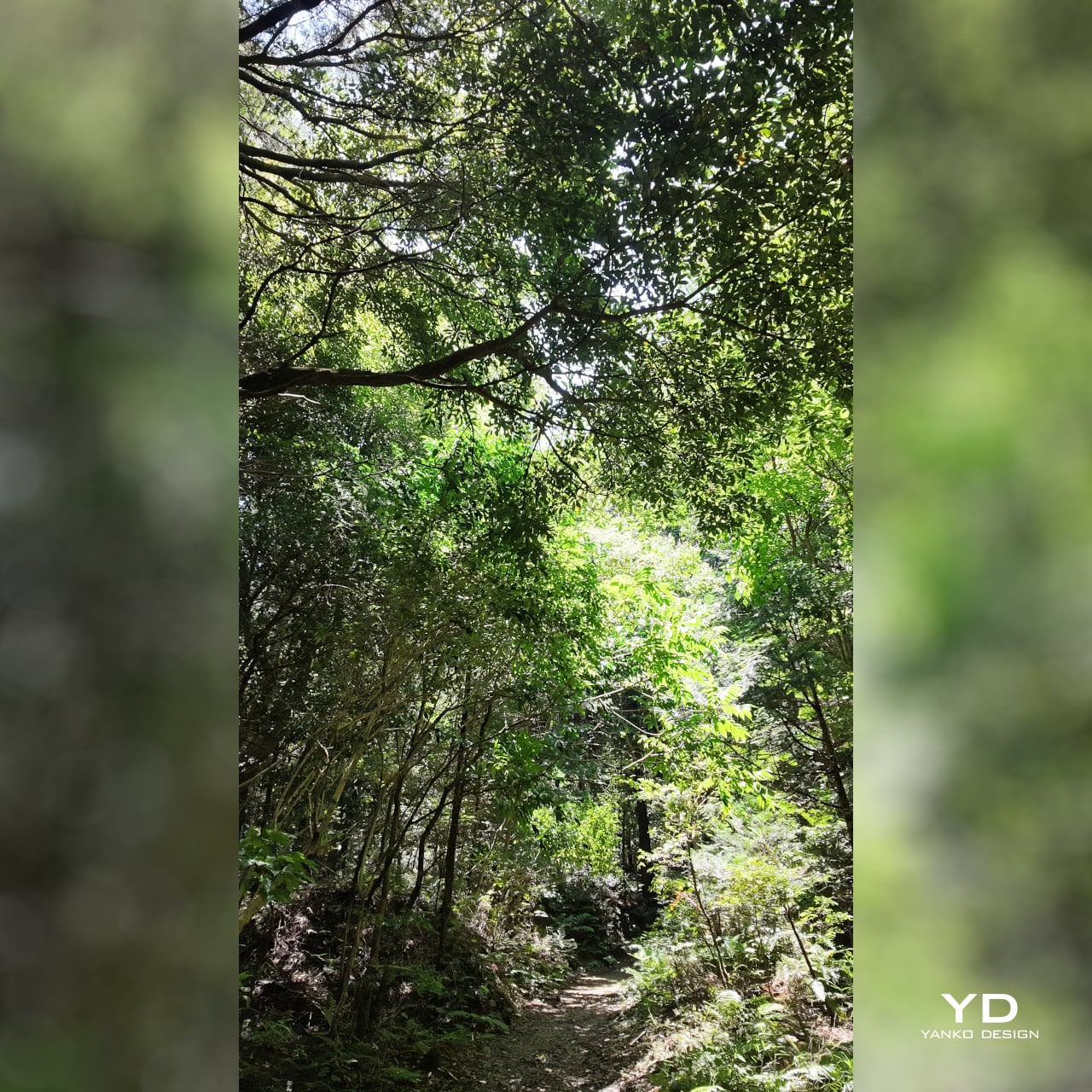
The core of the Osmo Pocket 4’s appeal is its improved 1-inch CMOS sensor, paired with an f/2.0 lens and 14 stops of dynamic range. In practice, that combination produces video with noticeably more texture and tonal depth than a typical smartphone sensor can manage. Highlight retention in bright outdoor scenes holds up well, and shadow detail in mixed-light interiors stays controlled rather than collapsing into noise or flat gray.
1x (Top) | 2x (Bottom)
1x (Top) | Wide Lens Attachment (Bottom)
Low-light performance is one of the Pocket 4’s stronger points, both for still photos and videos. The dedicated low-light video mode produces clean, well-exposed footage in dim environments where smartphones typically struggle with noise and color accuracy. Sadly, the latter comes with a hidden cost: low-light video mode only works at 1x zoom.


The magnetic fill light from the Creator Combo is a helpful companion for indoor portraits and evening setups, adding enough brightness to make skin tones look clear, though it’s more of a useful enhancement than an absolute necessity. The Osmo Pocket 4 works well enough on its own for nighttime photography and low-lit environments, but in pitch-black situations, the fill light snaps on in a flash, pardon the pun.
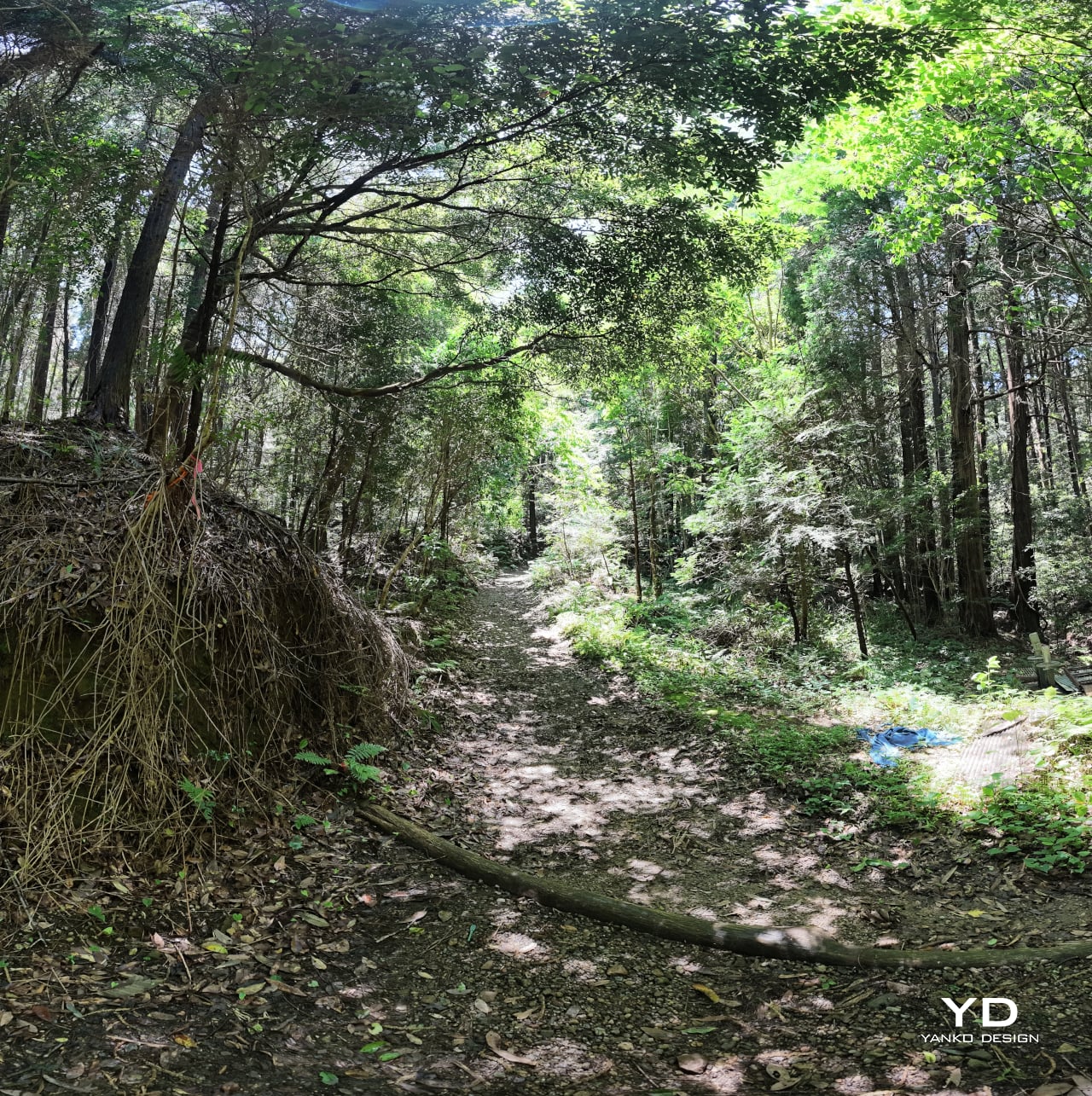
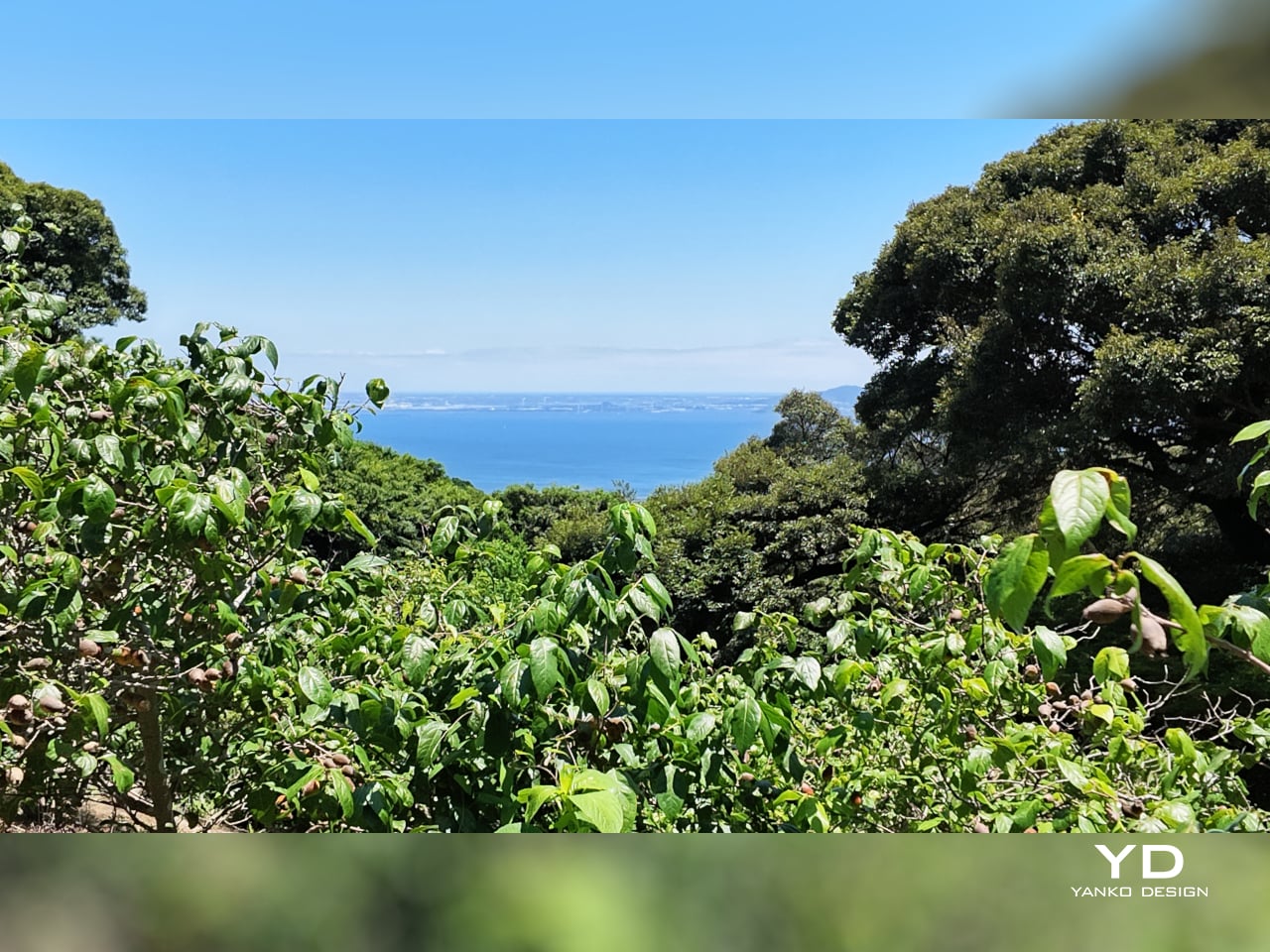
Panorama
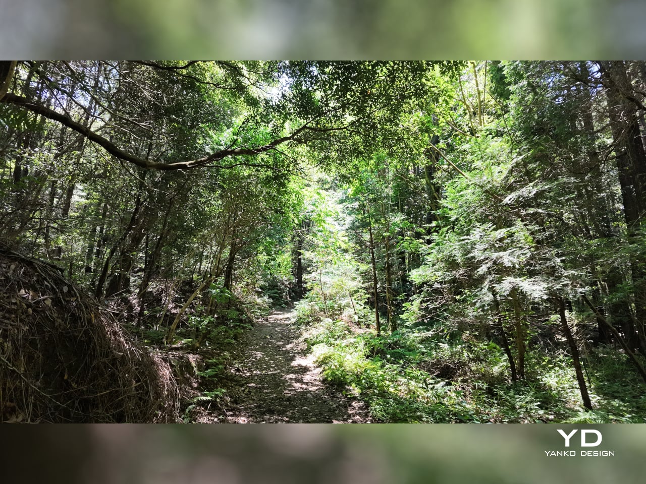
Landscape
Vertical
For video enthusiasts, the 4K/240 fps slow-motion mode is a genuine highlight. Capturing slow motion at that resolution opens up detailed, cinematic-looking sequences that would have required bulkier equipment not long ago. Sadly, that 4K upgrade doesn’t apply to vertical portrait mode, which remains in 3K land. The 10-bit D-Log color profile adds post-production flexibility, capturing a wider tonal range for those who want to grade their footage in editing software. It’s a meaningful upgrade from the lighter D-Log M available on the previous generation.

With Fill Light
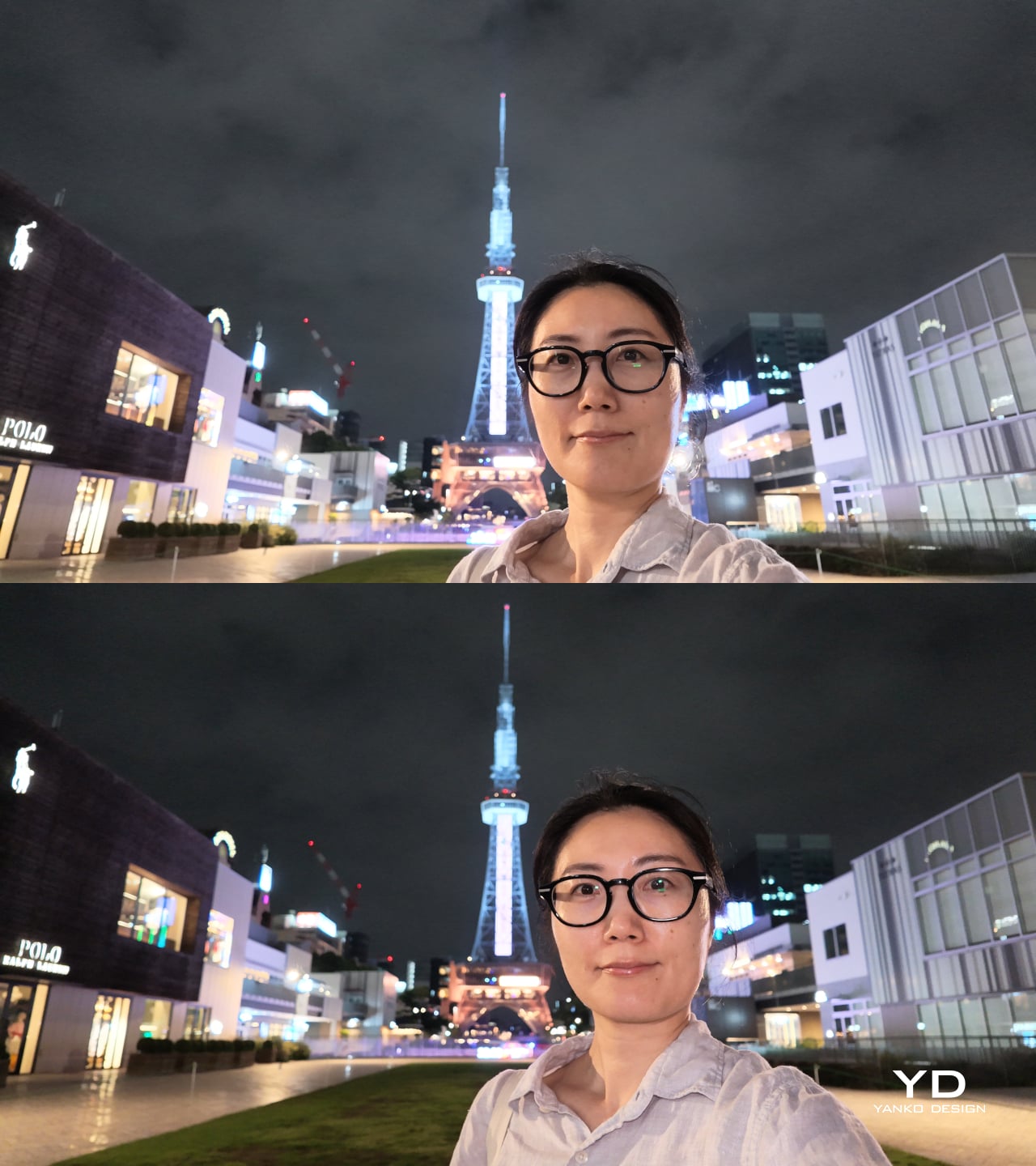
No Fill Light (top) | With Fill Light (bottom)
The three-axis stabilization is the product’s most compelling advantage. Walking footage stays smooth without the warping that aggressive digital stabilization sometimes produces, and ActiveTrack 7.0 tracks subjects confidently through movement at up to 4x zoom. The 107 GB of built-in storage, transferable at up to 800 MB/s via USB 3.1, removes the need for a memory card on most shoots and makes offloading footage back at a desk genuinely fast.
Pitch Black
With Fill Light

Night Shot (Without Fill Light)

Night Shot (With Fill Light)
Sustainability
The Osmo Pocket 4 doesn’t make bold claims about eco-friendly materials, and that honesty is more useful than hollow greenwashing. What it does offer is a well-built product that feels designed to last. The body has no creaking or flex, and the feature set is current enough that it isn’t likely to feel obsolete quickly. That kind of longevity is a meaningful sustainability argument for a consumer electronics device.
Unfortunately, it doesn’t come with any water or dust resistance guarantee, let alone a formal IP (ingress protection) rating. The Osmo Pocket 4 is best used with a bit of care outdoors, since its gimbal-based design doesn’t lend itself to the kind of weather resistance you’d expect from a rugged action camera.
Like most compact gimbal cameras, the Pocket 4 isn’t particularly serviceable at the consumer level. Tightly integrated components make independent repair difficult, so long-term ownership depends on careful handling more than easy maintenance. That said, the modular accessory system means you’re less likely to replace the camera because one peripheral breaks or becomes outdated. The accessories extend the product’s useful life without requiring a full device swap.
Value
At $486, the Osmo Pocket 4 sits at a price point where expectations of serious performance are fair, and for the most part, it delivers. What you’re paying for isn’t just a feature list but the engineering that concentrates stabilization, a 1-inch sensor, internal storage, and creator-focused controls into something pocketable. That concentration costs more than a simpler compact camera, and the footage quality shows where the money went.
The $607 Creator Combo version adds genuine value through the DJI Mic 3 transmitter, the fill light, and a handful of supporting accessories. The wireless microphone alone is a meaningful addition for anyone who records dialogue, since the built-in setup works well but can’t match a properly placed lapel mic. Together, these accessories shift the package from a capable camera into a more complete creator kit.
For creators who shoot on the go regularly and want footage that looks better than what a phone can deliver, the Pocket 4 sits in a position few other devices can match cleanly. The form factor eliminates excuses for not having the camera out, the stabilization removes the need for post-production smoothing, and the image quality means you’re not apologizing for what you captured.
Verdict
The Osmo Pocket 4 is a thoughtfully resolved compact camera that does its intended job with real consistency. The stabilized footage looks clean and confident, the low-light performance holds up better than the size suggests, and the built-in storage removes a quiet but persistent inconvenience. These aren’t small things for a device that has to fit in your jeans pocket while still competing with cameras twice its size.
There are tradeoffs, as there always are with a device optimized this tightly. Portrait shooting tops out at 3K rather than full 4K, the low-light mode locks to 1x zoom, and the lack of weather sealing limits it in unpredictable outdoor conditions. These aren’t dealbreakers so much as parameters, and understanding them is all it takes to decide whether the Pocket 4 fits the footage you actually want to make.
The post DJI Osmo Pocket 4 Review: A $486 Pocket Camera That Earns Its Price first appeared on Yanko Design.


 coating, which helps the display channel ambient light into better visibility, reduce glare, and sharpen image clarity without leaning on its LED backlight. On particularly sunny days, you can switch the backlight off entirely, dropping power consumption down to around 3W, and the screen remains fully usable, bright, and legible.