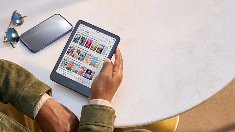
Kindle Unlimited costs $11.99 per month, but here’s how to pay less
Here are some ways you can get a Kindle Unlimited membership at a discounted price.
We’ve all been there. You leave the house, get halfway to the coffee shop, and realize your reusable cup is sitting on the kitchen counter right where you left it. Again. So you grab a paper cup, feel a low-grade guilt for the rest of the morning, and promise yourself tomorrow will be different. Tomorrow rarely is.
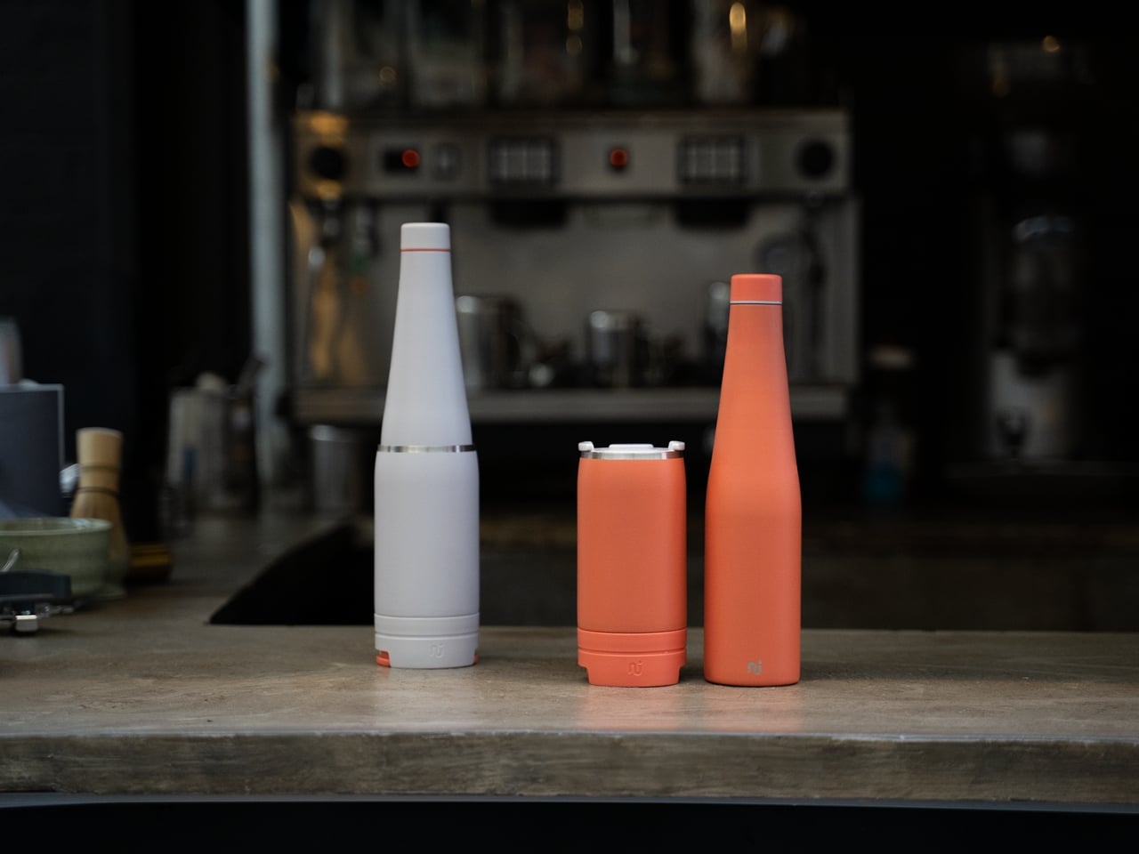
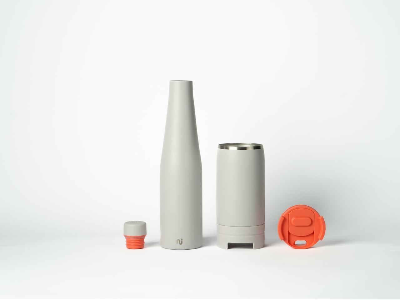
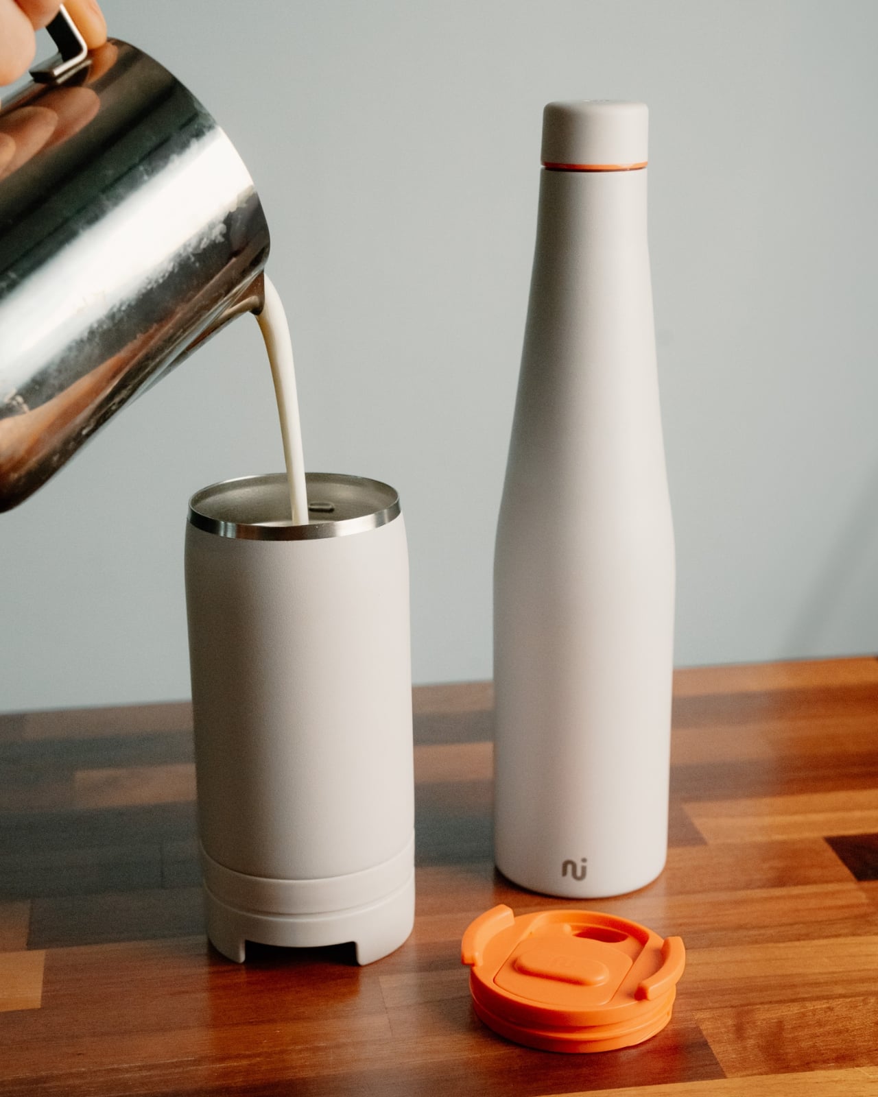
That particular loop is exactly what Daisy Tydeman and her team at Nudge Innovations set out to break with Duet. And the solution is so elegantly simple that it’s the kind of thing that makes you wonder why no one thought of it sooner. The coffee cup attaches to the bottom of a water bottle using magnets. You carry your bottle anyway. Now your cup comes with it.
Designer: Daisy Tydeman (Nudge Innovations)
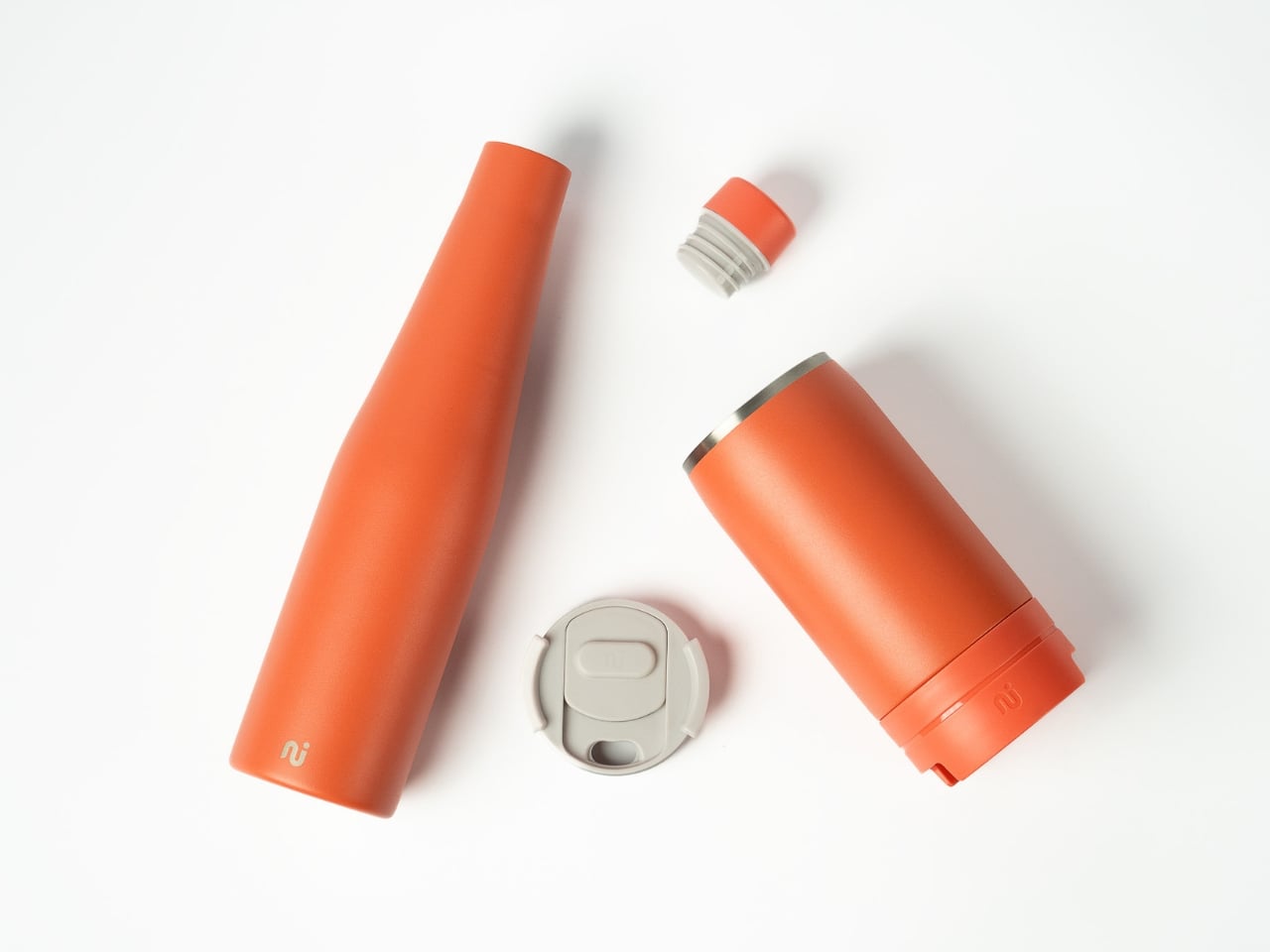
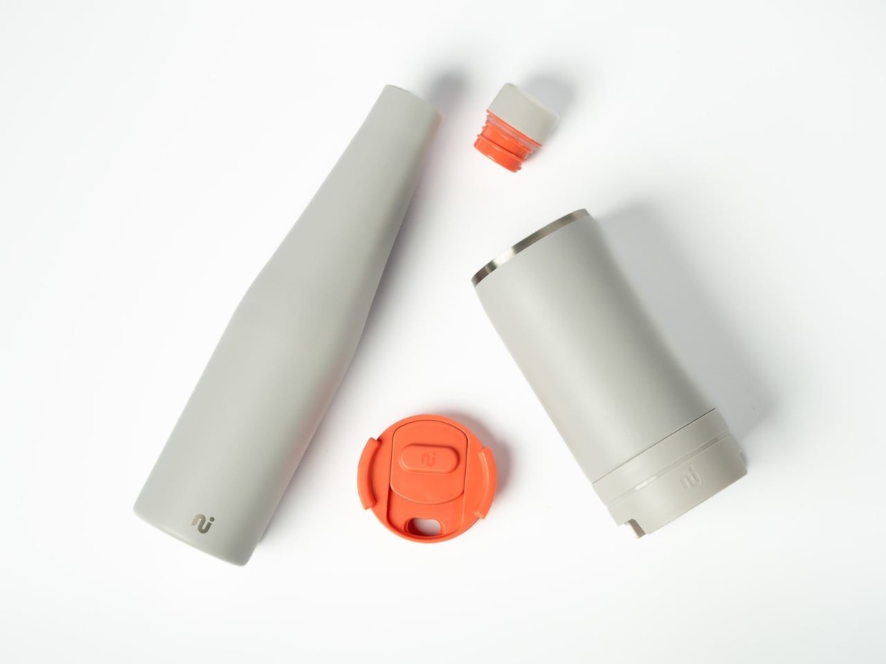
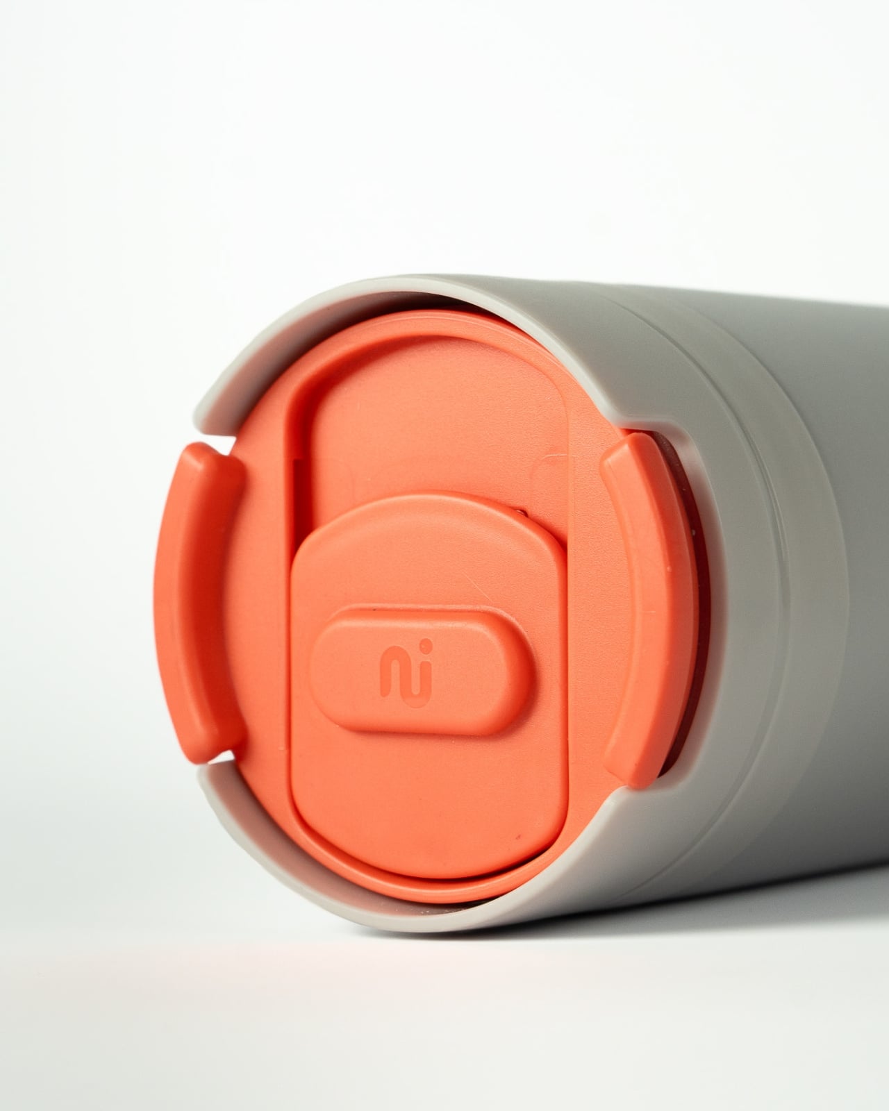
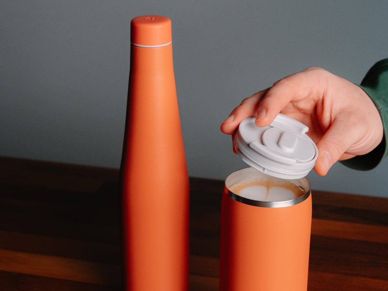
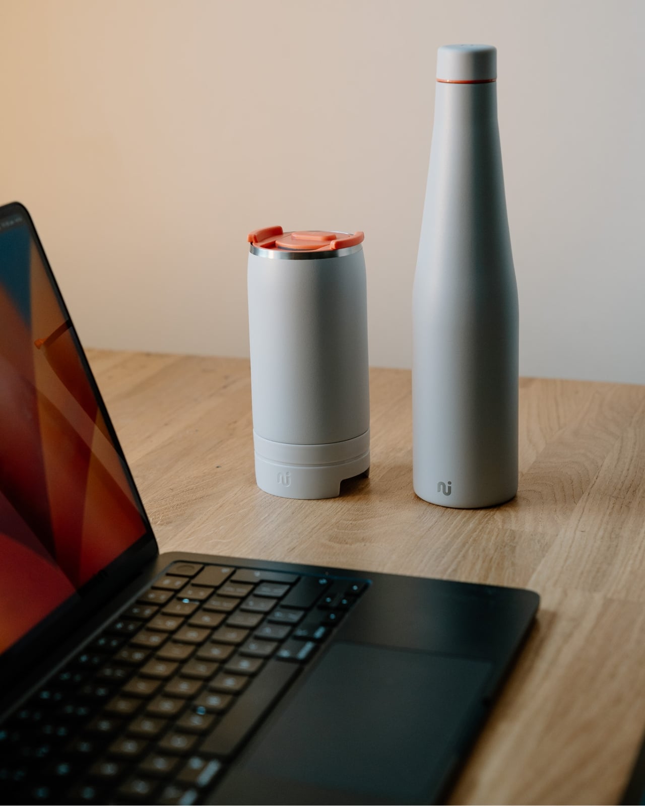
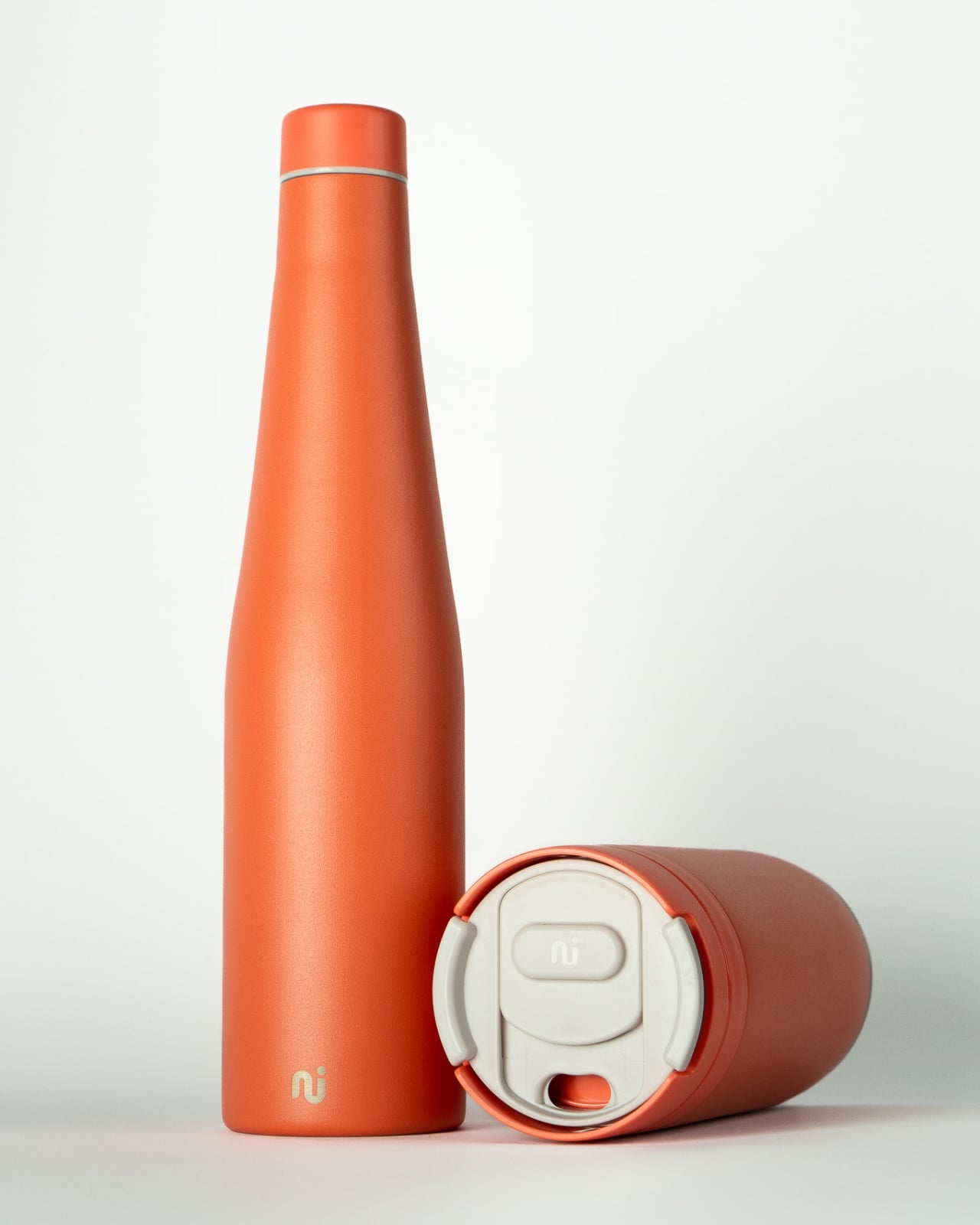
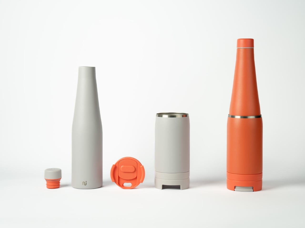
It sounds almost too obvious in theory, but the execution is where Duet earns its place in the conversation about genuinely good design. The insulated coffee cup holds 340ml (12oz) and clips securely to the base of a 600ml stainless steel water bottle. When locked together, they form a single, unified object with a silhouette that looks more like a designer perfume bottle than a functional drinkware solution. The cup’s lid tucks away neatly while it’s attached, so nothing dangles or rattles, and the whole system holds its shape with the quiet confidence of something designed with care rather than haste.
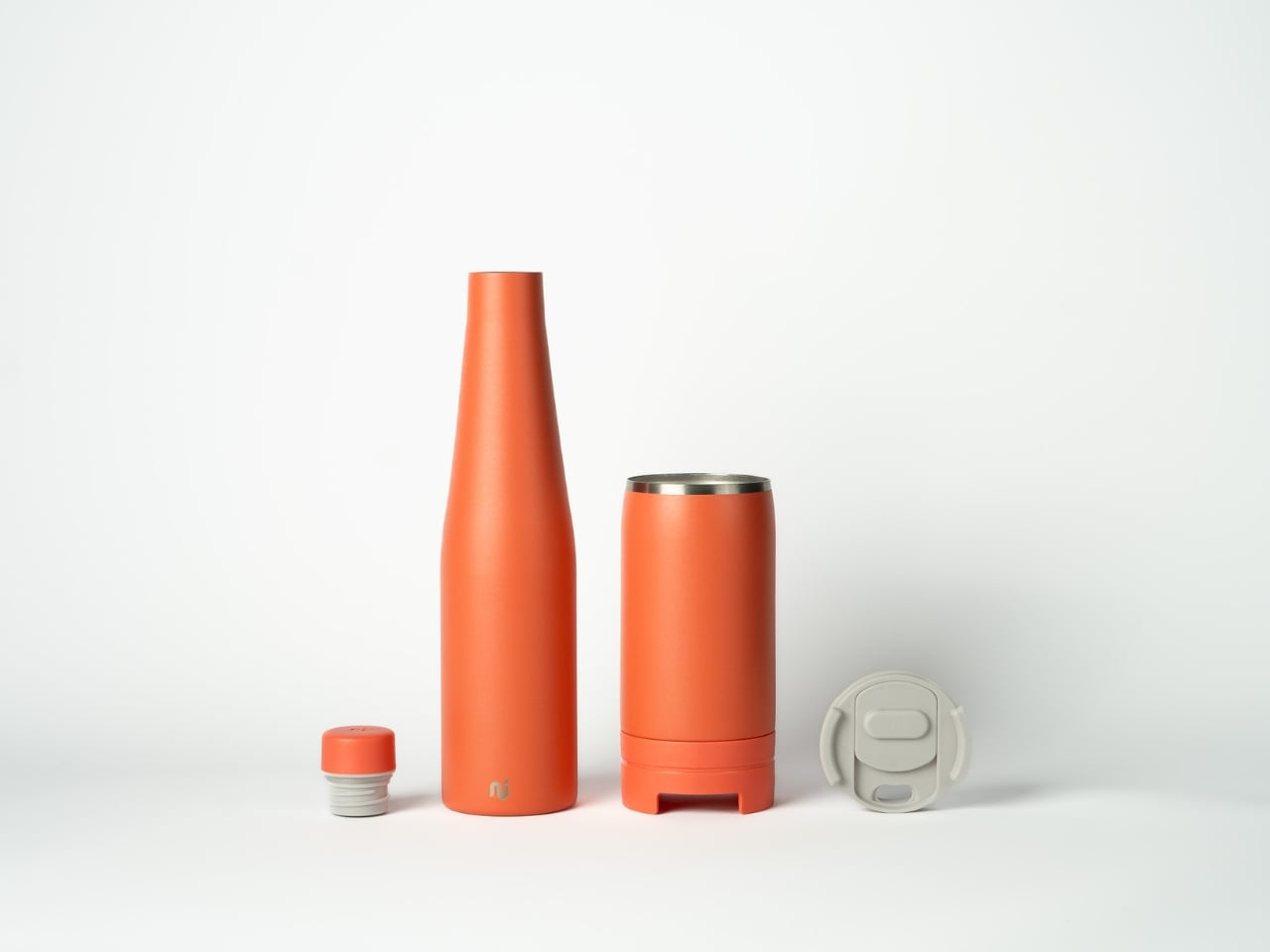
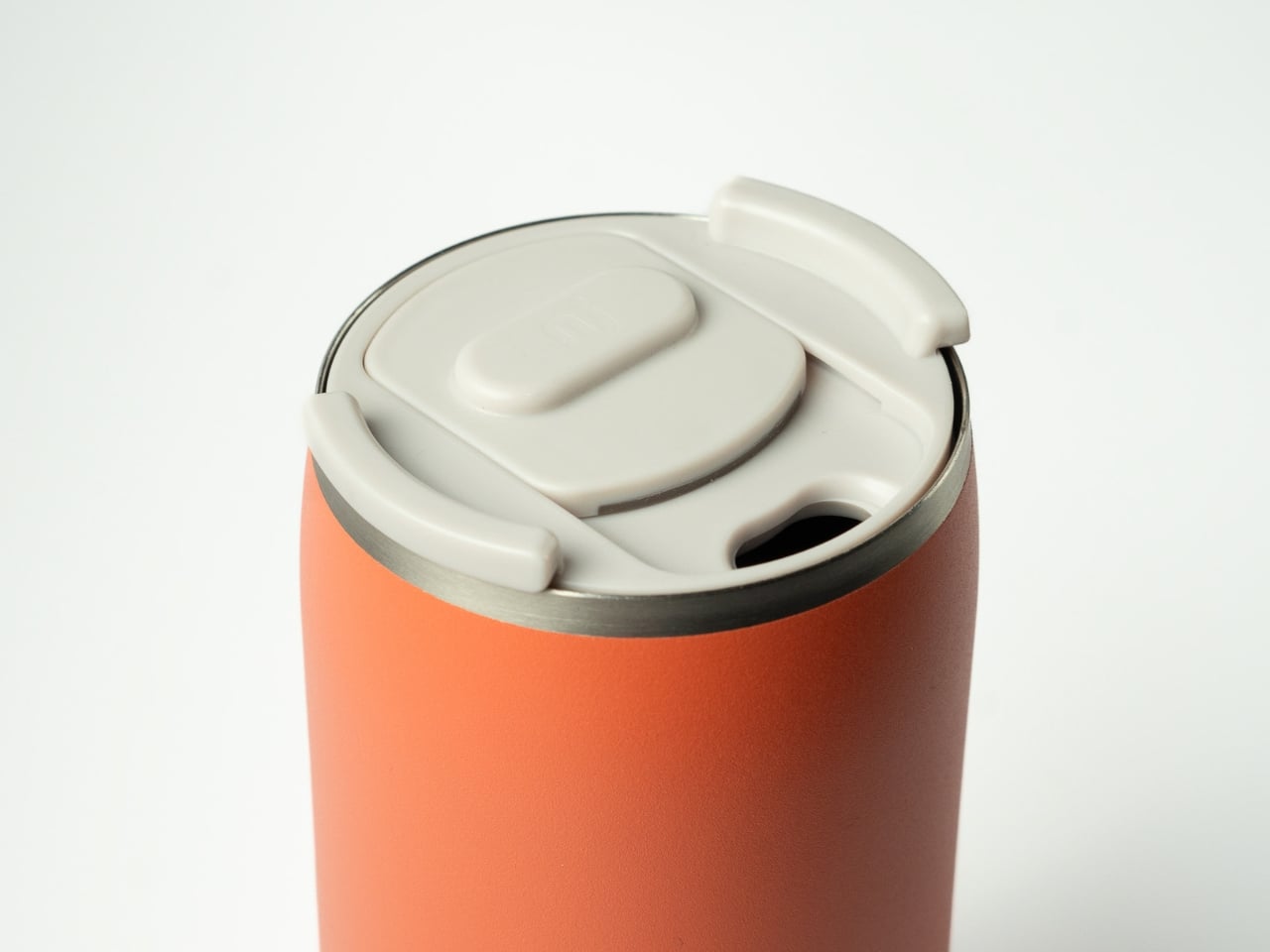
The colorways lean into that aesthetic ambition. The grey version, named Dust, feels like it belongs on a design shelf. The terracotta-orange option is warm, tactile, and surprisingly versatile. Neither of them screams “eco product,” and I think that’s deliberate. Design that signals virtue loudly tends to alienate as many people as it converts. Duet looks good because it just looks good, not because it’s trying to make you feel a certain way.
What makes this more interesting than most product stories is that Tydeman isn’t just designing a cup, she’s designing behavior. The brand’s name, Nudge Innovations, gives the game away. The whole premise is that people generally want to do the right thing but consistently fail to because the inconvenient option requires too much friction. Forget your cup often enough and eventually you stop trying. Reduce the friction, and habits change. It’s a design philosophy borrowed from behavioral economics, and it works because it respects reality.
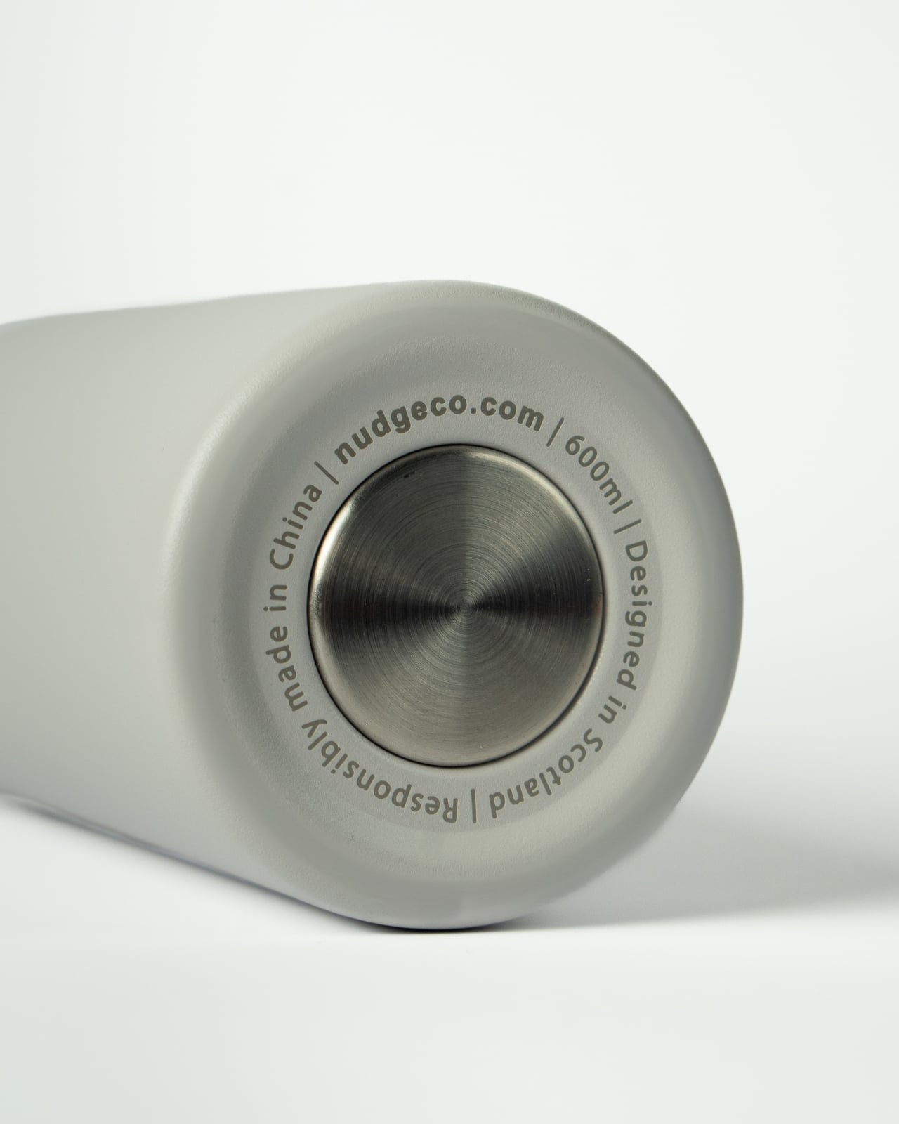
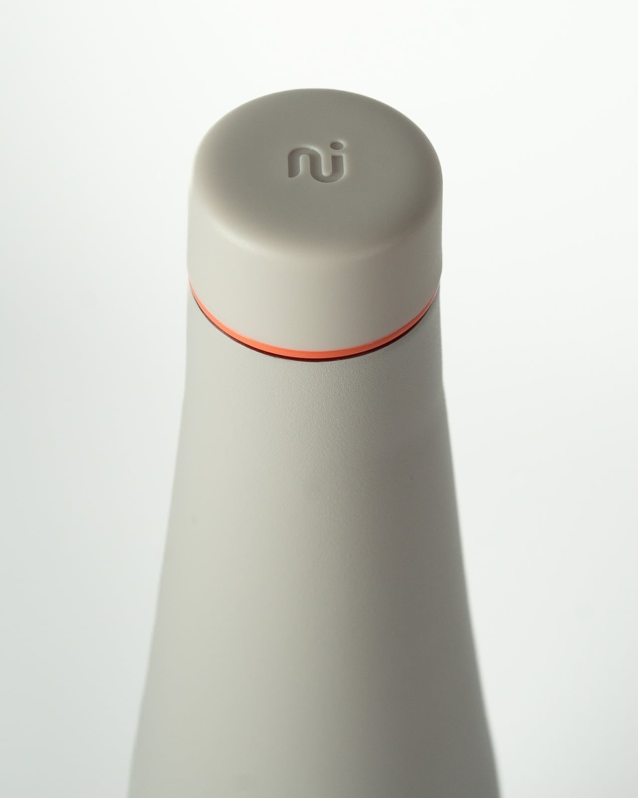
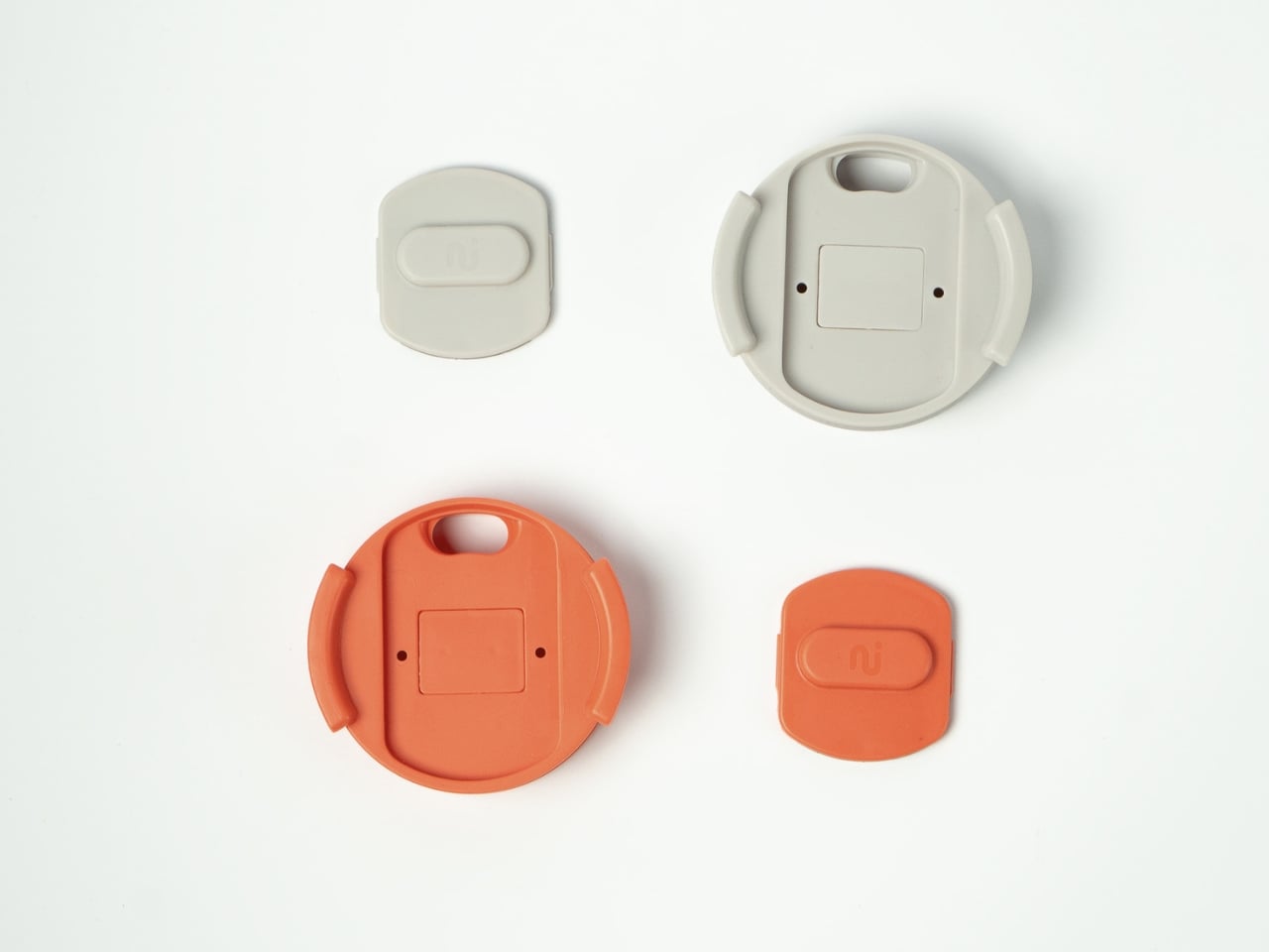
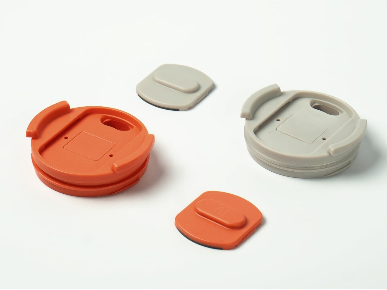
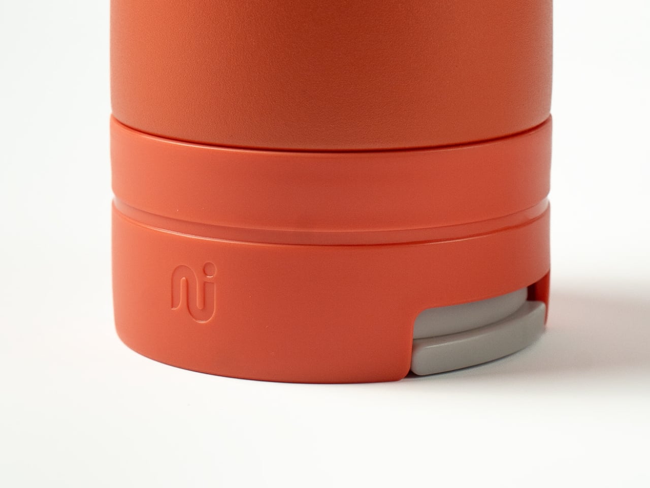
The materials hold up to that promise. Duet is made from recycled stainless steel, with BPA-free components throughout. It’s the kind of build quality that feels serious in your hands, not the thin, plasticky hollow of cheaper alternatives. The magnetic connection between cup and bottle is one of those tactile details you don’t fully appreciate until you use it. There’s a satisfying snap when the two pieces click together, and a small locking tab at the base of the cup keeps things from separating unexpectedly in a bag.
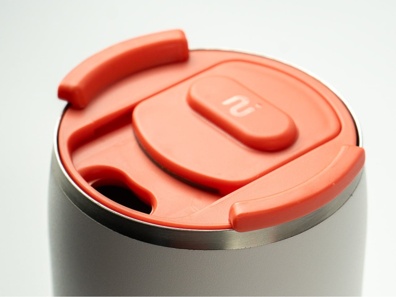
The cup lid is worth singling out. It uses a sliding mechanism that’s smooth, genuinely leak-proof, and easy enough to operate with one hand while you’re walking. Small things, but the kind of small things that determine whether a product earns daily use or ends up in a drawer.
My honest read on Duet is that it occupies an interesting space. It’s practical enough to be a real commuter tool, but designed well enough to attract people who buy things for how they look as much as how they work. That’s a harder balance to strike than it sounds. Plenty of sustainable products are functional but ugly. Plenty of beautiful products are fragile or fussy. Duet manages to be neither, and for a relatively early-stage product from a small British company, that’s a genuine achievement.
The reusable cup market is crowded. Brands have been competing on insulation claims, lid mechanisms, and color palettes for years. What Nudge Innovations did with Duet was step back and ask a more fundamental question: why do people leave their cups at home in the first place? The answer they came back with is the product. Sometimes the most useful thing a designer can do is fix the obvious thing everyone else skipped past.
The post The $66 Cup That Finally Solved Why You Keep Forgetting Yours first appeared on Yanko Design.
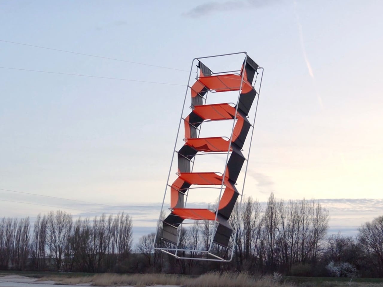
The first image that stops you is the outdoor shot: a tall shelving unit suspended in open sky, hovering above a treeline, trailing a thin string back to the ground like the most unexpected kite you’ve ever seen. The frame catches the light. The fabric panels billow slightly. It looks completely ridiculous and completely beautiful at the same time. That’s Aerodomestics, a furniture collection by Valerio Sampognaro, a student at HFBK Hamburg, and a finalist in the 2026 Rimowa Design Prize. The concept is straightforward and quietly radical: what if furniture was built the way kites are built?
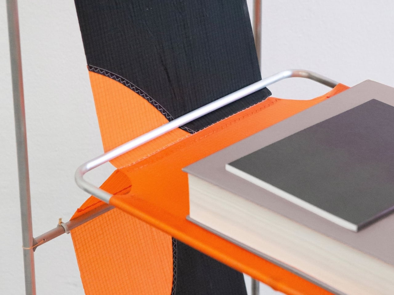
Look at the pieces closely and the logic becomes visible. The frame is thin aluminum tubing, bent into clean rectangular forms and rounded at the corners, the kind of minimal structural skeleton that prioritizes weight savings above everything else. It’s not trying to disappear, but it’s not trying to dominate either. The tubing holds its shape without bulk, which is exactly what a good kite spine does.
Designer: Valerio Sampognaro
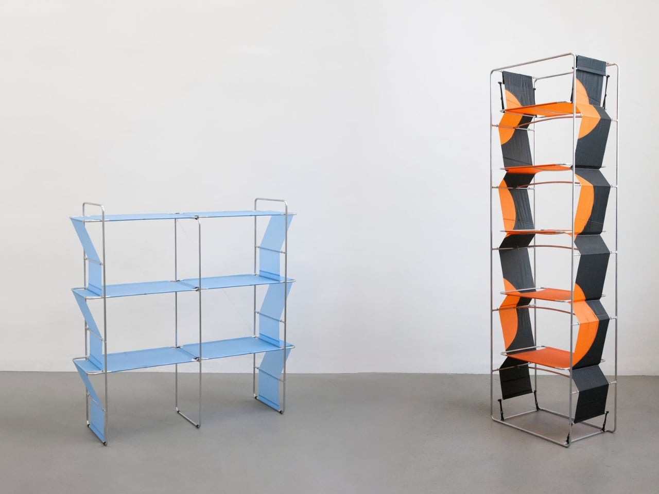
The shelves themselves are where it gets interesting. Rather than wood, glass, or metal panels, Sampognaro used ripstop fabric in bold, flat colors: sky blue, vivid orange, deep charcoal. The fabric is tensioned diagonally between shelf levels, crossing in a zigzag pattern that mirrors how kite sail panels are cut and stitched to distribute load across the frame. Up close, you can see the actual stitching along the fabric edges, neat and deliberate, the same hand of craft you’d find in a proper kite workshop. The shelves are functional. There’s a photograph of a hardcover book sitting cleanly on one of the orange panels, held in place by tension and the slight curve of the material.
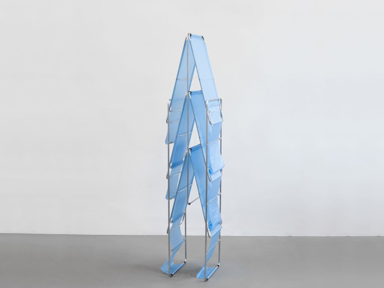
The result, visually, is furniture that looks like it’s already in motion. The diagonal fabric panels create a sense of dynamic energy even when the piece is standing still in a white studio. The tall orange-and-black unit has an almost aggressive graphic quality, the two colors alternating in a chevron rhythm up the full height of the structure. The blue units are softer, more architectural, especially the tall single piece with its A-frame top that tapers to a point like a sail catching wind upward. Indoors, against a neutral wall, these pieces read as sculpture. Outside, with actual wind in the fabric, they become something else entirely.
Portability is part of the design in a way that feels genuinely considered rather than incidental. One photograph shows a person carrying a full-sized unit flat under one arm, the whole thing folded down to roughly the size of a stretched canvas. The aluminum frame collapses, the fabric folds with it, and the entire piece becomes something you could reasonably carry on public transit. That’s not a small thing. Most shelving requires two people, a car, and a level of commitment to a specific wall in a specific apartment. Aerodomestics asks for none of that.
Sampognaro has said that the project is about having a lighter relationship with objects, about not being so dependent on them. You can feel that philosophy in every material decision. Nothing is heavier than it needs to be. The color choices are bold enough to make a statement without requiring permanence. The fabric can presumably be replaced or recolored. The frame is the kind of thing that could last indefinitely or be disassembled in ten minutes.
What makes Aerodomestics stick with you isn’t just the image of a bookshelf in flight, as memorable as that is. It’s the realization that the whole collection follows through on its own premise completely. Every joint, every fabric panel, every color choice points back to the same idea: that a shelf can hold your things without weighing you down. That’s a harder design problem than it looks, and Sampognaro solved it by looking somewhere no one thought to look.
The post A Student Built Shelves That Fly Like Kites first appeared on Yanko Design.
WWDC 2026 concluded without any new hardware announcements, leaving many of you wondering why anticipated products like the Apple TV, HomePod, Mac mini and Mac Studio were absent. Despite months of speculation and leaks, Apple chose to focus solely on software updates. This decision appears to be influenced by a combination of supply chain challenges […]
The post The Real Reason Mac Mini, Apple TV and Mac Studio Were Missing at WWDC appeared first on Geeky Gadgets.

The ASRock NUC BOX-358H combines a compact form factor with notable performance capabilities, making it a versatile choice for a wide range of users. Powered by the Intel Core Ultra X7 358H processor, this mini PC supports up to 128GB of SODIMM DDR5 RAM and features dual M.2 SSD slots for flexible storage options. As […]
The post Why This 4-Inch ASRock Mini PC is a Game Changer for AI Workloads appeared first on Geeky Gadgets.